`
#### Type
```ts
type ResourceActionOptions = {
resource?: string;
resourceOf?: any;
action?: string;
params?: P;
};
```
#### Details
##### AxiosRequestConfig
General axios request parameters. See Request Config.
```ts
const res = await apiClient.request({ url: '' });
```
##### ResourceActionOptions
NocoBase resource action request parameters.
```ts
const res = await apiClient.request({
resource: 'users',
action: 'list',
params: {
pageSize: 10,
},
});
```
| Property | Type | Description |
| --------------- | -------- | -------------------------------------------------------------------------------------------------------------------------------------------------------- |
| `resource` | `string` | 1. Resource name, e.g., `a`
2. Name of the resource's associated object, e.g., `a.b` |
| `resourceOf` | `any` | When `resource` is the name of the resource's associated object, it is the primary key value of the resource. For example, for `a.b`, it represents the primary key value of `a`. |
| `action` | `string` | Action name |
| `params` | `any` | Request parameter object, mainly URL parameters. The request body is placed in `params.values`. |
| `params.values` | `any` | Request body object |
### `resource()`
Gets the NocoBase resource action method object.
```ts
const resource = apiClient.resource('users');
await resource.create({
values: {
username: 'admin',
},
});
const res = await resource.list({
page: 2,
pageSize: 20,
});
```
#### Signature
- `resource(name: string, of?: any, headers?: AxiosRequestHeaders): IResource`
#### Type
```ts
export interface ActionParams {
filterByTk?: any;
[key: string]: any;
}
type ResourceAction = (params?: ActionParams) => Promise;
export type IResource = {
[key: string]: ResourceAction;
};
```
#### Details
| Parameter | Type | Description |
| --------- | --------------------- | -------------------------------------------------------------------------------------------------------------------------------------------------------- |
| `name` | `string` | 1. Resource name, e.g., `a`
2. Name of the resource's associated object, e.g., `a.b` |
| `of` | `any` | When `name` is the name of the resource's associated object, it is the primary key value of the resource. For example, for `a.b`, it represents the primary key value of `a`. |
| `headers` | `AxiosRequestHeaders` | HTTP headers to include in subsequent resource action requests. |
---
url: /api/sdk/auth.md
---
# Auth
## Overview
The `Auth` class is mainly used on the client side to access user information and request user authentication-related APIs.
## Instance Properties
### `locale`
The language used by the current user.
### `role`
The role used by the current user.
### `token`
API `token`.
### `authenticator`
The authenticator used for the current user's authentication. See [User Authentication](/auth-verification/auth/).
## Class Methods
### `signIn()`
User sign in.
#### Signature
- `async signIn(values: any, authenticator?: string): Promise>`
#### Details
| Parameter Name | Type | Description |
| --------------- | -------- | ---------------------------------------------------- |
| `values` | `any` | Request parameters for the sign-in API |
| `authenticator` | `string` | The identifier of the authenticator used for sign-in |
### `signUp()`
User sign up.
#### Signature
- `async signUp(values: any, authenticator?: string): Promise>`
#### Details
| Parameter Name | Type | Description |
| --------------- | -------- | ---------------------------------------------------- |
| `values` | `any` | Request parameters for the sign-up API |
| `authenticator` | `string` | The identifier of the authenticator used for sign-up |
### `signOut()`
Sign out.
#### Signature
- `async signOut(values: any, authenticator?: string): Promise>`
#### Details
| Parameter Name | Type | Description |
| --------------- | -------- | ----------------------------------------------------- |
| `values` | `any` | Request parameters for the sign-out API |
| `authenticator` | `string` | The identifier of the authenticator used for sign-out |
---
url: /api/sdk/storage.md
---
# Storage
## Overview
The `Storage` class is used for client-side information storage, using `localStorage` by default.
### Basic Usage
```ts
export abstract class Storage {
abstract clear(): void;
abstract getItem(key: string): string | null;
abstract removeItem(key: string): void;
abstract setItem(key: string, value: string): void;
}
export class CustomStorage extends Storage {
// ...
}
```
## Class Methods
### `setItem()`
Stores content.
#### Signature
- `setItem(key: string, value: string): void`
### `getItem()`
Gets content.
#### Signature
- `getItem(key: string): string | null`
### `removeItem()`
Removes content.
#### Signature
- `removeItem(key: string): void`
### `clear()`
Clears all content.
#### Signature
- `clear(): void`
---
url: /api/telemetry/metric.md
---
# Metric
## Class Methods
### `constructor()`
Constructor to create a `Metric` instance.
#### Signature
- `constructor(options?: MetricOptions)`
#### Type
```ts
export type MetricOptions = {
meterName?: string;
version?: string;
readerName?: string | string[];
};
```
#### Details
| Property | Type | Description | Default Value |
| ------------ | ---------------------- | ------------------------------------------------- | --------------------------- |
| `meterName` | `string` | Meter identifier | `nocobase-meter` |
| `version` | `string` | | Current version of NocoBase |
| `readerName` | `string` \| `string[]` | Identifier(s) of registered `MetricReader` to use | - |
### `init()`
Initializes `MetricProvider`.
#### Signature
- `init(): void`
### `registerReader()`
Registers a `MetricReader`.
#### Signature
- `registerReader(name: string, reader: GetMetricReader)`
#### Type
```ts
import { MetricReader } from '@opentelemetry/sdk-metrics';
type GetMetricReader = () => MetricReader;
```
#### Details
| Parameter | Type | Description |
| --------- | -------------------- | ------------------------------------ |
| `name` | `string` | Unique identifier for `MetricReader` |
| `reader` | `() => MetricReader` | Function to get `MetricReader` |
### `addView()`
Adds a `View`. Refer to [Configure Metric Views](https://opentelemetry.io/docs/instrumentation/js/manual/#configure-metric-views).
#### Signature
- `addView(...view: View[])`
#### Type
```ts
import { View } from '@opentelemetry/sdk-metrics';
```
### `getMeter()`
Gets the `Meter`.
#### Signature
- `getMeter(name?: string, version?: string)`
#### Details
| Parameter | Type | Description | Default Value |
| --------- | -------- | ---------------- | --------------------------- |
| `name` | `string` | Meter identifier | `nocobase-meter` |
| `version` | `string` | | Current version of NocoBase |
### `start()`
Starts the `MetricReader`.
#### Signature
- `start(): void`
### `shutdown()`
Stops the `MetricReader`.
#### Signature
- `shutdown(): Promise`
---
url: /api/telemetry/telemetry.md
---
# Telemetry
## Overview
`Telemetry` is the telemetry module of NocoBase, encapsulating OpenTelemetry support for registering metrics and traces within the OpenTelemetry ecosystem.
## Class Methods
### `constructor()`
Constructor to create a `Telemetry` instance.
#### Signature
- `constructor(options?: TelemetryOptions)`
#### Type
```ts
export interface TelemetryOptions {
serviceName?: string;
version?: string;
trace?: TraceOptions;
metric?: MetricOptions;
}
```
#### Details
| Property | Type | Description | Default Value |
| ------------- | --------------- | -------------------------------------------------------------------------------------------------------- | ---------------------------------- |
| `serviceName` | `string` | Optional. Refer to [Semantic Conventions](https://opentelemetry.io/docs/specs/semconv/resource/#service) | `nocobase` |
| `version` | `string` | Optional. Refer to [Semantic Conventions](https://opentelemetry.io/docs/specs/semconv/resource/#service) | Optional, current NocoBase version |
| `trace` | `TraceOptions` | Optional. Refer to [Trace](./trace.md) | - |
| `metric` | `MetricOptions` | Optional. Refer to [Metric](./metric.md) | - |
### `init()`
Registers instrumentation and initializes `Trace` and `Metric`.
#### Signature
- `init(): void`
### `start()`
Starts the processing of `Trace` and `Metric` related data, such as exporting to Prometheus.
#### Signature
- `start(): void`
### `shutdown()`
Stops the processing of `Trace` and `Metric` related data.
#### Signature
- `shutdown(): Promise`
### `addInstrumentation()`
Adds instrumentation libraries.
#### Signature
- `addInstrumentation(...instrumentation: InstrumentationOption[])`
---
url: /api/telemetry/trace.md
---
# Trace
## Class Methods
### `constructor()`
Constructor to create a `Trace` instance.
#### Signature
- `constructor(options?: TraceOptions)`
#### Type
```ts
export type TraceOptions = {
tracerName?: string;
version?: string;
processorName?: string | string[];
};
```
#### Details
| Property | Type | Description | Default Value |
| --------------- | ---------------------- | -------------------------------------------------- | --------------------------- |
| `tracerName` | `string` | Trace identifier | `nocobase-trace` |
| `version` | `string` | | Current version of NocoBase |
| `processorName` | `string` \| `string[]` | Identifier(s) of registered `SpanProcessor` to use | - |
### `init()`
Initializes `NodeTracerProvider`.
#### Signature
- `init(): void`
### `registerProcessor()`
Registers a `SpanProcessor`.
#### Signature
- `registerProcessor(name: string, processor: GetSpanProcessor)`
#### Type
```ts
import { SpanProcessor } from '@opentelemetry/sdk-trace-base';
type GetSpanProcessor = () => SpanProcessor;
```
#### Details
| Parameter | Type | Description |
| ----------- | --------------------- | ------------------------------------- |
| `name` | `string` | Unique identifier for `SpanProcessor` |
| `processor` | `() => SpanProcessor` | Function to get `SpanProcessor` |
### `getTracer()`
Gets the `Tracer`.
#### Signature
- `getTracer(name?: string, version?: string)`
#### Details
| Parameter | Type | Description | Default Value |
| --------- | -------- | ---------------- | --------------------------- |
| `name` | `string` | Trace identifier | `nocobase-trace` |
| `version` | `string` | | Current version of NocoBase |
### `start()`
Starts the `SpanProcessor`.
#### Signature
- `start(): void`
### `shutdown()`
Stops the `SpanProcessor`.
#### Signature
- `shutdown(): Promise`
---
url: /api/acl/acl.md
---
# ACL
## allow()
```ts
allow(resourceName: string, actionNames: string[] | string, condition?: string | ConditionFunc)
```
---
url: /api/cache/cache-manager.md
---
# CacheManager
## Overview
CacheManager is based on node-cache-manager and provides cache module management for NocoBase. The built-in cache types are
- memory - lru-cache provided by default by node-cache-manager
- redis - supported by node-cache-manager-redis-yet
More types can be registered and extended via the API.
### Concepts
- **Store**: Defines a caching method, including a factory method for creating caches and other related configurations. Each caching method has a unique identifier provided during registration.
The unique identifiers for the two built-in caching methods are `memory` and `redis`.
- **Store Factory Method**: A method provided by `node-cache-manager` and related extension packages for creating caches. For example, `'memory'` provided by default by `node-cache-manager`, and `redisStore` provided by `node-cache-manager-redis-yet`. This corresponds to the first parameter of the `caching` method in `node-cache-manager`.
- **Cache**: A class encapsulated by NocoBase that provides methods for using the cache. When actually using the cache, you operate on an instance of `Cache`. Each `Cache` instance has a unique identifier, which can be used as a namespace to distinguish different modules.
## Class Methods
### `constructor()`
#### Signature
- `constructor(options?: CacheManagerOptions)`
#### Types
```ts
export type CacheManagerOptions = Partial<{
defaultStore: string;
stores: {
[storeType: string]: StoreOptions;
};
}>;
type StoreOptions = {
store?: 'memory' | FactoryStore;
close?: (store: Store) => Promise;
// global config
[key: string]: any;
};
```
#### Details
##### CacheManagerOptions
| Property | Type | Description |
| -------------- | ------------------------------ | ----------------------------------------------------------------------------------------------------------------------------------------------------------------------------------------------------------------------------------- |
| `defaultStore` | `string` | The unique identifier for the default cache type. |
| `stores` | `Record` | Registers cache types. The key is the unique identifier for the cache type, and the value is an object containing the registration method and global configuration for the cache type.
In `node-cache-manager`, the method to create a cache is `await caching(store, config)`. The object to be provided here is [`StoreOptions`](#storeoptions). |
##### StoreOptions
| Property | Type | Description |
| --------------- | -------------------------------------- | ------------------------------------------------------------------------------------------------------------------------------------------------------------------------------------------------------ |
| `store` | `memory` \| `FactoryStore` | The store factory method, corresponding to the first parameter of `caching`. |
| `close` | `(store: Store) => Promise` | Optional. For middleware like Redis that requires a connection, a callback method to close the connection must be provided. The input parameter is the object returned by the store factory method. |
| `[key: string]` | `any` | Other global store configurations, corresponding to the second parameter of `caching`. |
#### Default `options`
```ts
import { redisStore, RedisStore } from 'cache-manager-redis-yet';
const defaultOptions: CacheManagerOptions = {
defaultStore: 'memory',
stores: {
memory: {
store: 'memory',
// global config
max: 2000,
},
redis: {
store: redisStore,
close: async (redis: RedisStore) => {
await redis.client.quit();
},
},
},
};
```
The `options` parameter will be merged with the default options. Properties already present in the default options can be omitted. For example:
```ts
const cacheManager = new CacheManager({
stores: {
defaultStore: 'redis',
redis: {
// redisStore is already provided in the default options, so you only need to provide the redisStore configuration.
url: 'redis://localhost:6379',
},
},
});
```
### `registerStore()`
Registers a new caching method. For example:
```ts
import { redisStore } from 'cache-manager-redis-yet';
cacheManager.registerStore({
// unique identifier for the store
name: 'redis',
// factory method to create the store
store: redisStore,
// close the store connection
close: async (redis: RedisStore) => {
await redis.client.quit();
},
// global config
url: 'xxx',
});
```
#### Signature
- `registerStore(options: { name: string } & StoreOptions)`
### `createCache()`
Creates a cache. For example:
```ts
await cacheManager.createCache({
name: 'default', // unique identifier for the cache
store: 'memory', // unique identifier for the store
prefix: 'mycache', // automatically adds 'mycache:' prefix to cache keys, optional
// other store configurations, custom configs will be merged with the global store config
max: 2000,
});
```
#### Signature
- `createCache(options: { name: string; prefix?: string; store?: string; [key: string]: any }): Promise`
#### Details
##### options
| Property | Type | Description |
| --------------- | -------- | ----------------------------------------------------- |
| `name` | `string` | Unique identifier for the cache. |
| `store` | `string` | Unique identifier for the store. |
| `prefix` | `string` | Optional, cache key prefix. |
| `[key: string]` | `any` | Other custom configuration items related to the store. |
If `store` is omitted, `defaultStore` will be used. In this case, the caching method will change according to the system's default caching method.
When there are no custom configurations, it returns the default cache space created by the global configuration and shared by the current caching method. It is recommended to add a `prefix` to avoid key conflicts.
```ts
// Use the default cache with global configuration
await cacheManager.createCache({ name: 'default', prefix: 'mycache' });
```
##### Cache
See [Cache](./cache.md)
### `getCache()`
Gets the corresponding cache.
```ts
cacheManager.getCache('default');
```
#### Signature
- `getCache(name: string): Cache`
### `flushAll()`
Resets all caches.
```ts
await cacheManager.flushAll();
```
### `close()`
Closes all cache middleware connections.
```ts
await cacheManager.close();
```
---
url: /api/cache/cache.md
---
# Cache
## Basic Methods
Refer to the node-cache-manager documentation.
- `get()`
- `set()`
- `del()`
- `reset()`
- `wrap()`
- `mset()`
- `mget()`
- `mdel()`
- `keys()`
- `ttl()`
## Other Methods
### `wrapWithCondition()`
Similar to `wrap()`, but allows you to conditionally decide whether to use the cache.
```ts
async wrapWithCondition(
key: string,
fn: () => T | Promise,
options?: {
// External parameter to control whether to use the cached result
useCache?: boolean;
// Decide whether to cache based on the data result
isCacheable?: (val: unknown) => boolean | Promise;
ttl?: Milliseconds;
},
): Promise {
```
### `setValueInObject()`
When the cached content is an object, change the value of a specific key.
```ts
async setValueInObject(key: string, objectKey: string, value: unknown)
```
### `getValueInObject()`
When the cached content is an object, get the value of a specific key.
```ts
async getValueInObject(key: string, objectKey: string)
```
### `delValueInObject()`
When the cached content is an object, delete a specific key.
```ts
async delValueInObject(key: string, objectKey: string)
```
---
url: /api/data-source-manager/data-source-manager.md
---
# DataSourceManager
`DataSourceManager` is the management class for multiple `dataSource` instances.
## API
### add()
Adds a `dataSource` instance.
#### Signature
- `add(dataSource: DataSource, options: any = {}): Promise`
### use()
Adds global middleware to the `dataSource` instance.
### middleware()
Gets the middleware of the current `dataSourceManager` instance, which can be used to respond to http requests.
### afterAddDataSource()
A hook function that is called after a new `dataSource` is added.
#### Signature
- `afterAddDataSource(hook: DataSourceHook)`
```typescript
type DataSourceHook = (dataSource: DataSource) => void;
```
### registerDataSourceType()
Registers a data source type and its class.
#### Signature
- `registerDataSourceType(type: string, dataSourceClass: typeof DataSource)`
### getDataSourceType()
Gets the data source class.
#### Signature
- `getDataSourceType(type: string): typeof DataSource`
### buildDataSourceByType()
Creates a data source instance based on the registered data source type and instance options.
#### Signature
- `buildDataSourceByType(type: string, options: any): DataSource`
---
url: /api/data-source-manager/data-source.md
---
# DataSource (abstract)
`DataSource` is an abstract class used to represent a type of data source, which can be a database, API, etc.
## Members
### collectionManager
The CollectionManager instance for the data source, which must implement the [`ICollectionManager`](/api/data-source-manager/i-collection-manager) interface.
### resourceManager
The resourceManager instance for the data source.
### acl
The ACL instance for the data source.
## API
### constructor()
Constructor, creates a `DataSource` instance.
#### Signature
- `constructor(options: DataSourceOptions)`
### init()
Initialization function, called immediately after the `constructor`.
#### Signature
- `init(options: DataSourceOptions)`
### name
#### Signature
- `get name()`
Returns the instance name of the data source.
### middleware()
Gets the middleware for the DataSource, used to mount to the Server to receive requests.
### testConnection()
A static method called during the test connection operation. It can be used for parameter validation, and the specific logic is implemented by the subclass.
#### Signature
- `static testConnection(options?: any): Promise`
### load()
#### Signature
- `async load(options: any = {})`
The load operation for the data source. The logic is implemented by the subclass.
### createCollectionManager()
#### Signature
- `abstract createCollectionManager(options?: any): ICollectionManager`
Creates a CollectionManager instance for the data source. The logic is implemented by the subclass.
### createResourceManager()
Creates a ResourceManager instance for the data source. Subclasses can override the implementation. By default, it creates the `ResourceManager` from `@nocobase/resourcer`.
### createACL()
- Creates an ACL instance for the DataSource. Subclasses can override the implementation. By default, it creates the `ACL` from `@nocobase/acl`.
---
url: /api/data-source-manager/i-collection-manager.md
---
# ICollectionManager
The `ICollectionManager` interface is used to manage `Collection` instances of a data source.
## API
### registerFieldTypes()
Registers field types in a `Collection`.
#### Signature
- `registerFieldTypes(types: Record): void`
### registerFieldInterfaces()
Registers the `Interface` of a `Collection`.
#### Signature
- `registerFieldInterfaces(interfaces: Record): void`
### registerCollectionTemplates()
Registers a `Collection Template`.
#### Signature
- `registerCollectionTemplates(templates: Record): void`
### registerModels()
Registers a `Model`.
#### Signature
- `registerModels(models: Record): void`
### registerRepositories()
Registers a `Repository`.
#### Signature
- `registerRepositories(repositories: Record): void`
### getRegisteredRepository()
Gets a registered repository instance.
#### Signature
- `getRegisteredRepository(key: string): IRepository`
### defineCollection()
Defines a `Collection`.
#### Signature
- `defineCollection(options: CollectionOptions): ICollection`
### extendCollection()
Modifies the properties of an existing `Collection`.
#### Signature
- `extendCollection(collectionOptions: CollectionOptions, mergeOptions?: MergeOptions): ICollection`
### hasCollection()
Checks if a `Collection` exists.
#### Signature
- `hasCollection(name: string): boolean`
### getCollection()
Gets a `Collection` instance.
#### Signature
- `getCollection(name: string): ICollection`
### getCollections()
Gets all `Collection` instances.
#### Signature
- `getCollections(): Array`
### getRepository()
Gets a `Repository` instance.
#### Signature
- `getRepository(name: string, sourceId?: string | number): IRepository`
### sync()
Synchronizes the data source. The logic is implemented by subclasses.
#### Signature
- `sync(): Promise`
---
url: /api/data-source-manager/i-collection.md
---
# ICollection
`ICollection` is the interface for the data model, which contains information such as the model's name, fields, and associations.
```typescript
export interface ICollection {
repository: IRepository;
updateOptions(options: any): void;
setField(name: string, options: any): IField;
removeField(name: string): void;
getFields(): Array;
getField(name: string): IField;
[key: string]: any;
}
```
## Members
### repository
The `Repository` instance to which `ICollection` belongs.
## API
### updateOptions()
Updates the properties of the `Collection`.
#### Signature
- `updateOptions(options: any): void`
### setField()
Sets a field for the `Collection`.
#### Signature
- `setField(name: string, options: any): IField`
### removeField()
Removes a field from the `Collection`.
#### Signature
- `removeField(name: string): void`
### getFields()
Gets all fields of the `Collection`.
#### Signature
- `getFields(): Array`
### getField()
Gets a field of the `Collection` by its name.
#### Signature
- `getField(name: string): IField`
---
url: /api/data-source-manager/i-field.md
---
# IField
`IField` defines the interface that a field needs to implement.
```typescript
export type FieldOptions = {
name: string;
field: string;
rawType: string;
type: string;
description?: string;
interface?: string;
uiSchema?: any;
possibleTypes?: string[];
defaultValue?: any;
primaryKey: boolean;
unique: boolean;
allowNull?: boolean;
autoIncrement?: boolean;
[key: string]: any;
};
export interface IField {
options: FieldOptions;
}
```
## Properties
### options
- **Type**: `FieldOptions`
---
url: /api/data-source-manager/i-model.md
---
# IModel
The `IModel` interface defines the basic properties and methods of a model object.
```typescript
export interface IModel {
toJSON: () => any;
}
```
## API
### toJSON()
Converts the model object to JSON format.
---
url: /api/data-source-manager/i-repository.md
---
# IRepository
The `Repository` interface defines a series of model operation methods for adapting the CRUD operations of the data source.
## API
### find()
Returns a list of models that match the query parameters.
#### Signature
- `find(options?: any): Promise`
### findOne()
Returns a model that matches the query parameters. If there are multiple matching models, only the first one is returned.
#### Signature
- `findOne(options?: any): Promise`
### count()
Returns the number of models that match the query parameters.
#### Signature
- `count(options?: any): Promise`
### findAndCount()
Returns the list and count of models that match the query parameters.
#### Signature
- `findAndCount(options?: any): Promise<[IModel[], Number]>`
### create()
Creates a model data object.
#### Signature
- `create(options: any): void`
### update()
Updates a model data object based on the query conditions.
#### Signature
- `update(options: any): void`
### destroy()
Deletes a model data object based on the query conditions.
#### Signature
- `destroy(options: any): void`
---
url: /api/logger/logger.md
---
# Logger
## Create Logger
### `createLogger()`
Creates a custom logger.
#### Signature
- `createLogger(options: LoggerOptions)`
#### Type
```ts
interface LoggerOptions
extends Omit {
dirname?: string;
filename?: string;
format?: 'logfmt' | 'json' | 'delimiter' | 'console' | winston.Logform.Format;
transports?: ('console' | 'file' | 'dailyRotateFile' | winston.transport)[];
}
```
#### Details
| Property | Description |
| :----------- | :------------------- |
| `dirname` | Log output directory |
| `filename` | Log file name |
| `format` | Log format |
| `transports` | Log output method |
### `createSystemLogger()`
Creates system runtime logs printed in a specified method. Refer to [Logger - System Log](/log-and-monitor/logger/index.md#system-log)
#### Signature
- `createSystemLogger(options: SystemLoggerOptions)`
#### Type
```ts
export interface SystemLoggerOptions extends LoggerOptions {
seperateError?: boolean; // print error seperately, default true
}
```
#### Details
| Property | Description |
| :-------------- | :---------------------------------------------- |
| `seperateError` | Whether to output `error` level logs separately |
### `requestLogger()`
Middleware for API request and response logging.
```ts
app.use(requestLogger(app.name));
```
#### Signature
- `requestLogger(appName: string, options?: RequestLoggerOptions): MiddewareType`
#### Type
```ts
export interface RequestLoggerOptions extends LoggerOptions {
skip?: (ctx?: any) => Promise;
requestWhitelist?: string[];
responseWhitelist?: string[];
}
```
#### Details
| Property | Type | Description | Default |
| :------------------ | :-------------------------------- | :--------------------------------------------------------------- | :------------------------------------------------------------------------------------------------------------------------------------------------------ |
| `skip` | `(ctx?: any) => Promise` | Skips logging for certain requests based on the request context. | - |
| `requestWhitelist` | `string[]` | Whitelist of request information to be printed in the log. | `[ 'action', 'header.x-role', 'header.x-hostname', 'header.x-timezone', 'header.x-locale','header.x-authenticator', 'header.x-data-source', 'referer']` |
| `responseWhitelist` | `string[]` | Whitelist of response information to be printed in the log. | `['status']` |
### app.createLogger()
#### Definition
```ts
class Application {
createLogger(options: LoggerOptions) {
const { dirname } = options;
return createLogger({
...options,
dirname: getLoggerFilePath(this.name || 'main', dirname || ''),
});
}
}
```
When `dirname` is a relative path, the log files will be output to the directory named after the current application.
### plugin.createLogger()
Usage is the same as `app.createLogger()`.
#### Definition
```ts
class Plugin {
createLogger(options: LoggerOptions) {
return this.app.createLogger(options);
}
}
```
## Log Configuration
### getLoggerLevel()
`getLoggerLevel(): 'debug' | 'info' | 'warn' | 'error'`
Gets the log level currently configured in the system.
### getLoggerFilePath()
`getLoggerFilePath(...paths: string[]): string`
Concatenates directory paths based on the log directory currently configured in the system.
### getLoggerTransports()
`getLoggerTransports(): ('console' | 'file' | 'dailyRotateFile')[]`
Gets the log output methods currently configured in the system.
### getLoggerFormat()
`getLoggerFormat(): 'logfmt' | 'json' | 'delimiter' | 'console'`
Gets the log format currently configured in the system.
## Log Output
### Transports
Predefined output methods.
- `Transports.console`
- `Transports.file`
- `Transports.dailyRotateFile`
```ts
import { Transports } from '@nocobase/logger';
const transport = Transports.console({
//...
});
```
## Related Documentation
- [Development Guide - Logger](/plugin-development/server/logger)
- [Logger](/log-and-monitor/logger/index.md)
---
url: /auth-verification/api-keys/index.md
---
# API Keys
## Introduction
## Usage Instructions
http://localhost:13000/admin/settings/api-keys/configuration
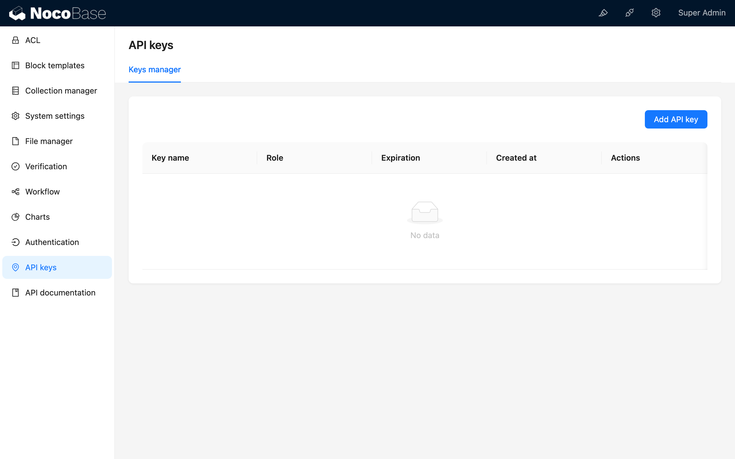
### Add API Key

**Notes**
- The API key is created for the current user and inherits the user's role.
- Please make sure that the `APP_KEY` environment variable has been configured and is kept confidential. If the APP_KEY changes, all added API keys will become invalid.
### How to configure APP_KEY
For the docker version, modify the docker-compose.yml file
```diff
services:
app:
image: nocobase/nocobase:main
environment:
+ - APP_KEY=4jAokvLKTJgM0v_JseUkJ
```
For the source code or create-nocobase-app installation, you can directly modify the APP_KEY in the .env file
```bash
APP_KEY=4jAokvLKTJgM0v_JseUkJ
```
---
url: /auth-verification/auth/dev/api.md
---
# API Reference
## Server Side
### Auth
Kernel API, reference: [Auth](/api/auth/auth)
### BaseAuth
Kernel API, reference: [BaseAuth](/api/auth/base-auth)
### AuthModel
#### Overview
`AuthModel` is the authenticator used in NocoBase applications (`Authenticator`, reference: [AuthManager - setStorer](/api/auth/auth-manager#setstorer) and [Auth - constructor](/api/auth/auth#constructor)) data model, providing some methods for interacting with the user data collection. In addition, methods provided by Sequelize Model can also be used.
```ts
import { AuthModel } from '@nocobase/plugin-auth';
class CustomAuth extends BaseAuth {
async validate() {
// ...
const authenticator = this.authenticator as AuthModel;
this.authenticator.findUser();
this.authenticator.newUser();
this.authenticator.findOrCreateUser();
// ...
}
}
```
#### Class Methods
- `findUser(uuid: string): UserModel` - Query user by `uuid`.
- `uuid` - User unique identifier from the current authentication type
- `newUser(uuid: string, userValues?: any): UserModel` - Create a new user, bind the user to the current authenticator through `uuid`.
- `uuid` - User unique identifier from the current authentication type
- `userValues` - Optional. Other user information. When not passed, `uuid` will be used as the user's nickname.
- `findOrCreateUser(uuid: string, userValues?: any): UserModel` - Find or create a new user, the creation rule is the same as above.
- `uuid` - User unique identifier from the current authentication type
- `userValues` - Optional. Other user information.
## Client Side
### `plugin.registerType()`
Register the client of the authentication type.
```ts
import AuthPlugin from '@nocobase/plugin-auth/client';
class CustomAuthPlugin extends Plugin {
async load() {
const auth = this.app.pm.get(AuthPlugin);
auth.registerType('custom-auth-type', {
components: {
SignInForm,
// SignInButton
SignUpForm,
AdminSettingsForm,
},
});
}
}
```
#### Signature
- `registerType(authType: string, options: AuthOptions)`
#### Type
```ts
export type AuthOptions = {
components: Partial<{
SignInForm: ComponentType<{ authenticator: AuthenticatorType }>;
SignInButton: ComponentType<{ authenticator: AuthenticatorType }>;
SignUpForm: ComponentType<{ authenticatorName: string }>;
AdminSettingsForm: ComponentType;
}>;
};
```
#### Details
- `SignInForm` - Sign in form
- `SignInButton` - Sign in (third-party) button, can be used as an alternative to the sign-in form
- `SignUpForm` - Sign up form
- `AdminSettingsForm` - Admin configuration form
### Route
The frontend routes for registering the auth plugin are as follows:
- Auth Layout
- name: `auth`
- path: `-`
- component: `AuthLayout`
- SignIn Page
- name: `auth.signin`
- path: `/signin`
- component: `SignInPage`
- SignUp Page
- name: `auth.signup`
- path: `/signup`
- component: `SignUpPage`
---
url: /auth-verification/verification/dev/api.md
---
# API Reference
## IVerification
### `verify()`
### `onActionComplete()`
### `getBoundInfo()`
### `getPublicBoundInfo()`
### `validateBoundInfo()`
### `bind()`
## Verification
### `verificator`
### `ctx`
### `options`
### `verify()`
### `getBoundInfo()`
## OTPVerification
### `expiresIn`
### `verify()`
### `bind()`
### `onActionComplete()`
## VerificationManager
### `registerVerificationType()`
### `listTypes()`
### `registerAction()`
### `registerScene()`
### `addSceneRule()`
### `getVerificationTypesByScene()`
### `getVerification()`
### `getVerificator()`
### `getVerificators()`
### `getBoundInfo()`
### `verify()`
### `middleware()`
---
url: /integration/api-doc/index.md
---
# API Documentation
## Introduction
The plugin generates NocoBase HTTP API documentation based on Swagger.
## Installation
This is a built-in plugin, no installation required. Activate to use.
## Usage Instructions
### Accessing the API Documentation Page
http://localhost:13000/admin/settings/api-doc/documentation
### Documentation Overview
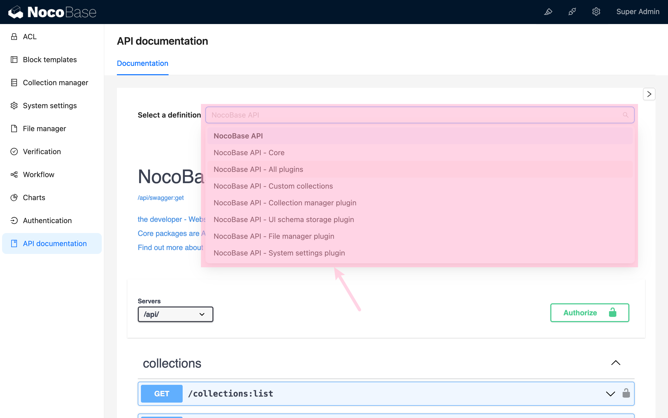
- Total API Documentation: `/api/swagger:get`
- Core API Documentation: `/api/swagger:get?ns=core`
- All Plugins API Documentation: `/api/swagger:get?ns=plugins`
- Each Plugin's Documentation: `/api/swagger:get?ns=plugins/{name}`
- API documentation for custom collections: `/api/swagger:get?ns=collections`
- Specified `${collection}` and related `${collection}.${association}` resources: `/api/swagger:get?ns=collections/{name}`
## Developer Guide
### How to Write Swagger Documentation for Plugins
Add a `swagger/index.ts` file in the plugin's `src` folder with the following content:
```typescript
export default {
info: {
title: 'NocoBase API - Auth plugin',
},
tags: [],
paths: {},
components: {
schemas: {},
},
};
```
For detailed writing rules, please refer to the [Swagger Official Documentation](https://swagger.io/docs/specification/about/).
---
url: /integration/api-keys/index.md
---
# API Key
## Introduction
## Installation
## Usage Instructions
http://localhost:13000/admin/settings/api-keys/configuration

### Add API Key

**Notes**
- The API key you add belongs to the current user and inherits the current user's role.
- Ensure the `APP_KEY` environment variable is configured and kept confidential. If `APP_KEY` changes, all previously added API keys will become invalid.
### How to configure APP_KEY
For the docker version, modify the docker-compose.yml file
```diff
services:
app:
image: nocobase/nocobase:main
environment:
+ - APP_KEY=4jAokvLKTJgM0v_JseUkJ
```
For the source code or create-nocobase-app installation, you can directly modify the APP_KEY in the .env file
```bash
APP_KEY=4jAokvLKTJgM0v_JseUkJ
```
---
url: /integration/api-keys/usage.md
---
# Using API Keys in NocoBase
This guide demonstrates how to use API Keys in NocoBase to retrieve data through a practical "To-Dos" example. Follow the step-by-step instructions below to understand the complete workflow.
## 1 Understanding API Keys
An API Key is a secure token that authenticates API requests from authorized users. It functions as a credential that validates the identity of the requester when accessing the NocoBase system via web applications, mobile apps, or backend scripts.
In the HTTP request header, you'll see a format like:
```txt
Authorization: Bearer {API key}
```
The "Bearer" prefix indicates that the following string is an authenticated API Key used to verify the requester's permissions.
### Common Use Cases
API Keys are typically used in the following scenarios:
1. **Client Application Access**: Web browsers and mobile apps use API Keys to authenticate user identity, ensuring only authorized users can access data.
2. **Automated Task Execution**: Background processes and scheduled tasks use API Keys to securely execute updates, data synchronization, and logging operations.
3. **Development and Testing**: Developers use API Keys during debugging and testing to simulate authenticated requests and verify API responses.
API Keys provide multiple security benefits: identity verification, usage monitoring, request rate limiting, and threat prevention, ensuring the stable and secure operation of NocoBase.
## 2 Creating API Keys in NocoBase
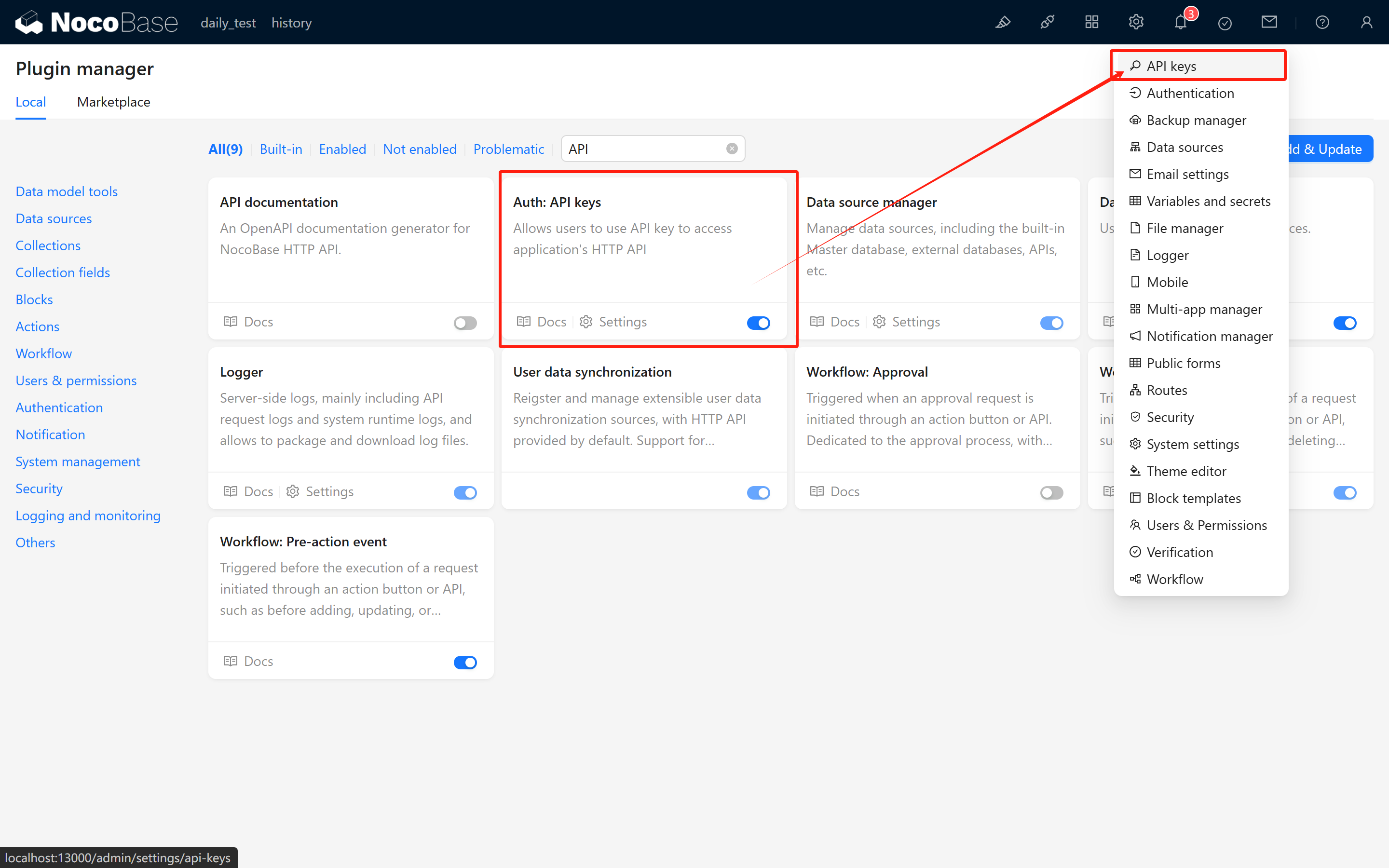
### 2.1 Activate the Auth: API Keys Plugin
Ensure that the built-in [Auth: API Keys](/plugins/@nocobase/plugin-api-keys/) plugin is activated. Once enabled, a new API Keys configuration page will appear in the system settings.
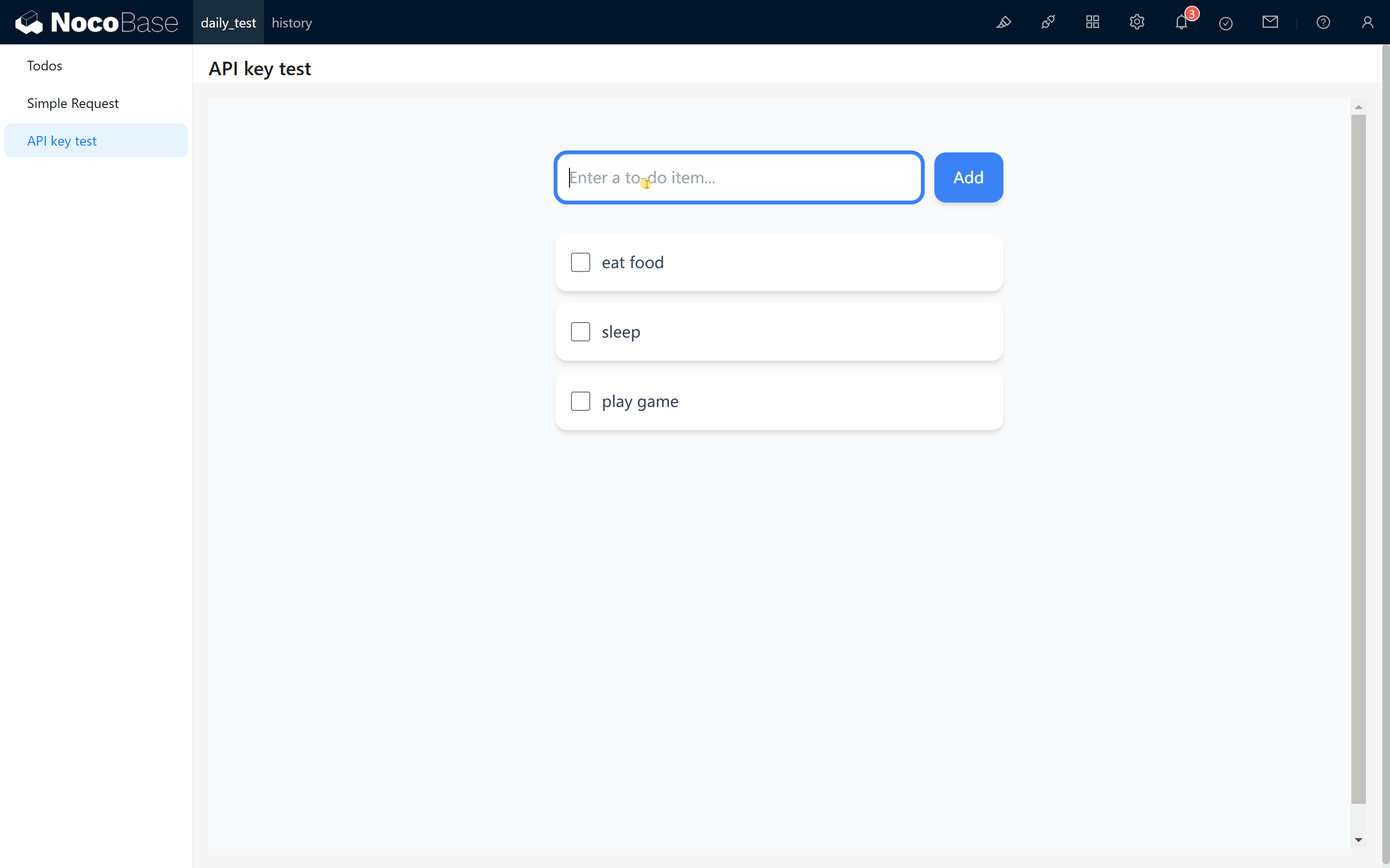
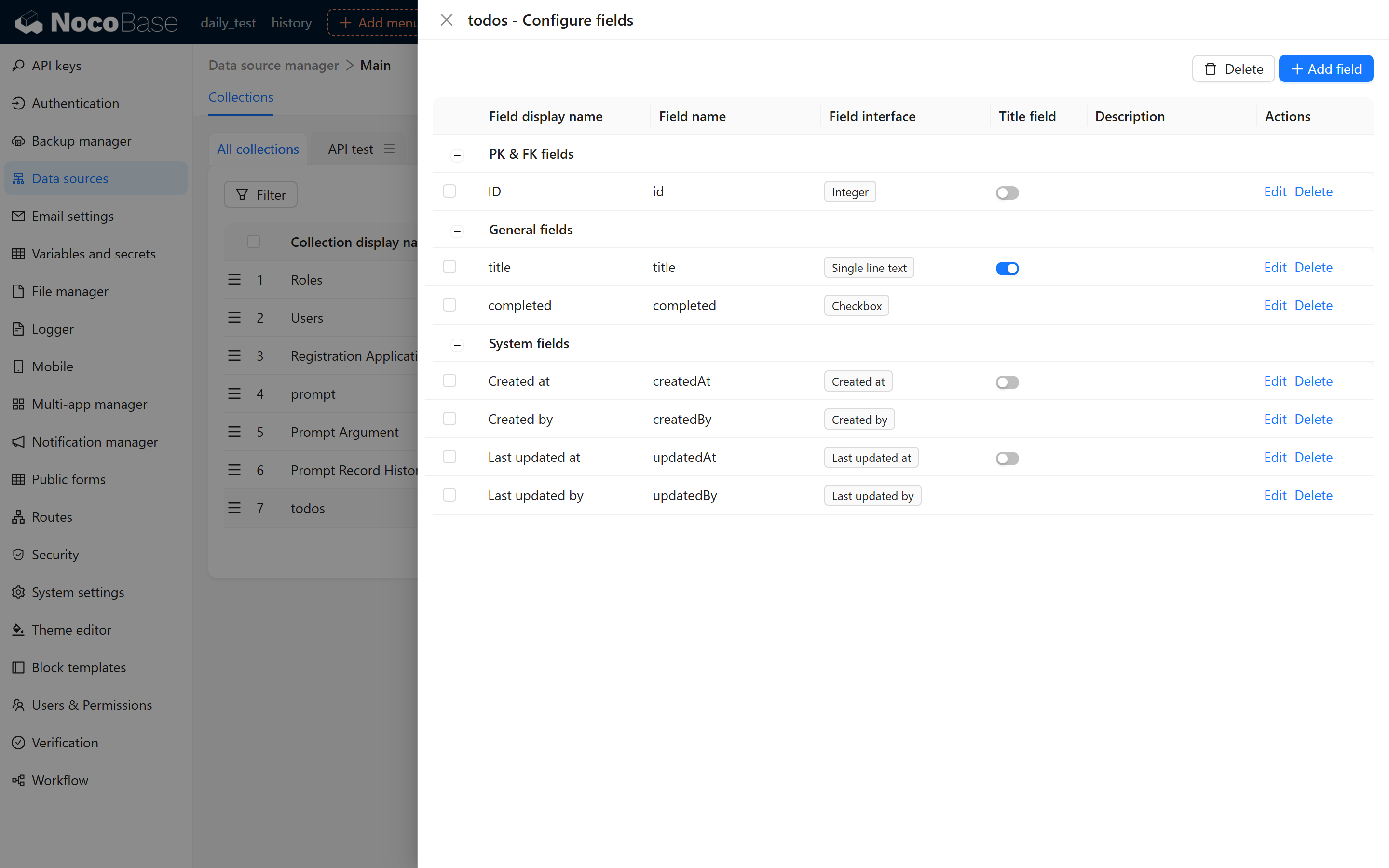
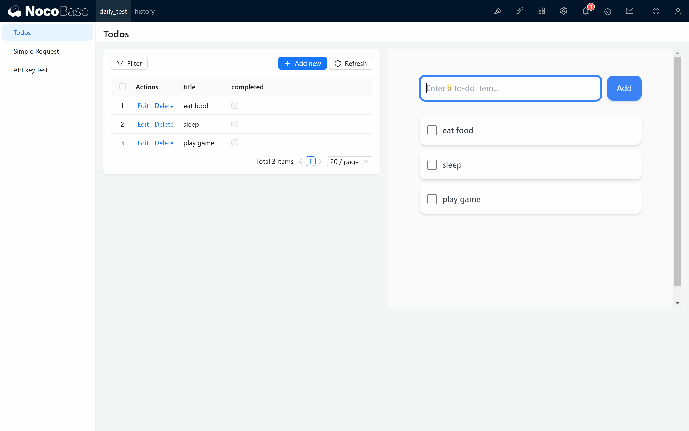
### 2.2 Create a Test Collection
For demonstration purposes, create a collection named `todos` with the following fields:
- `id`
- `title`
- `completed`
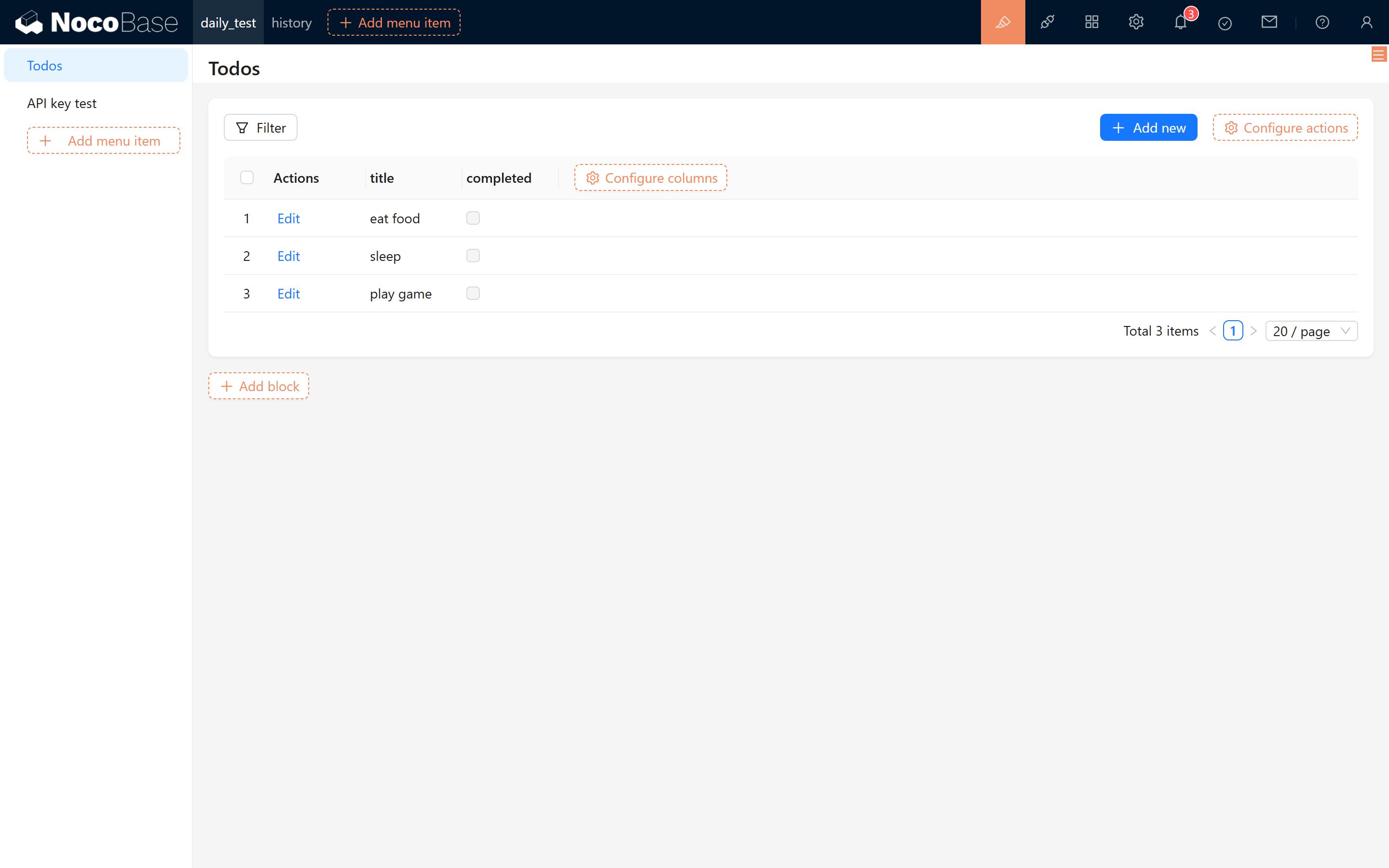
Add some sample records to the collection:
- eat food
- sleep
- play games
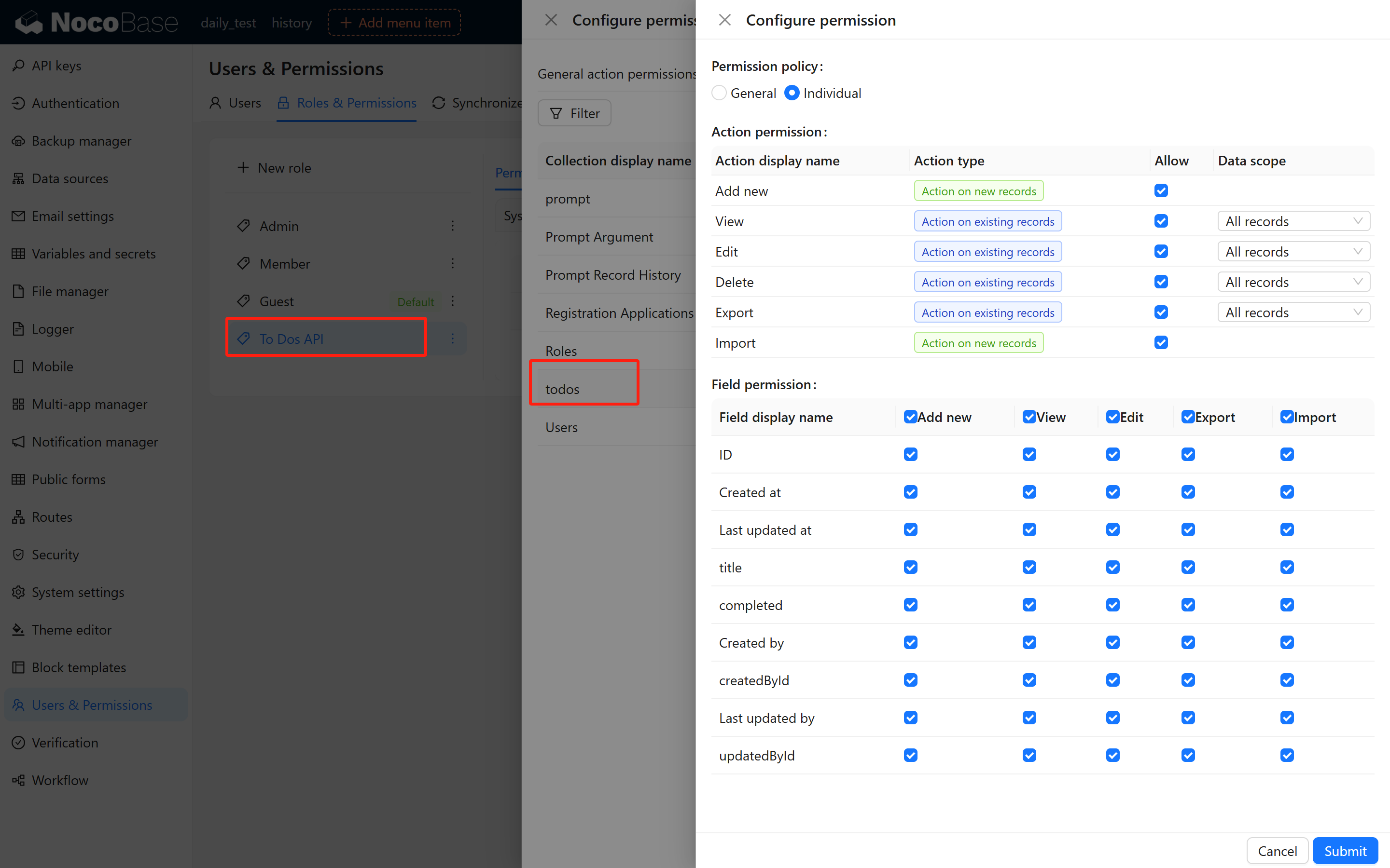
### 2.3 Create and Assign a Role
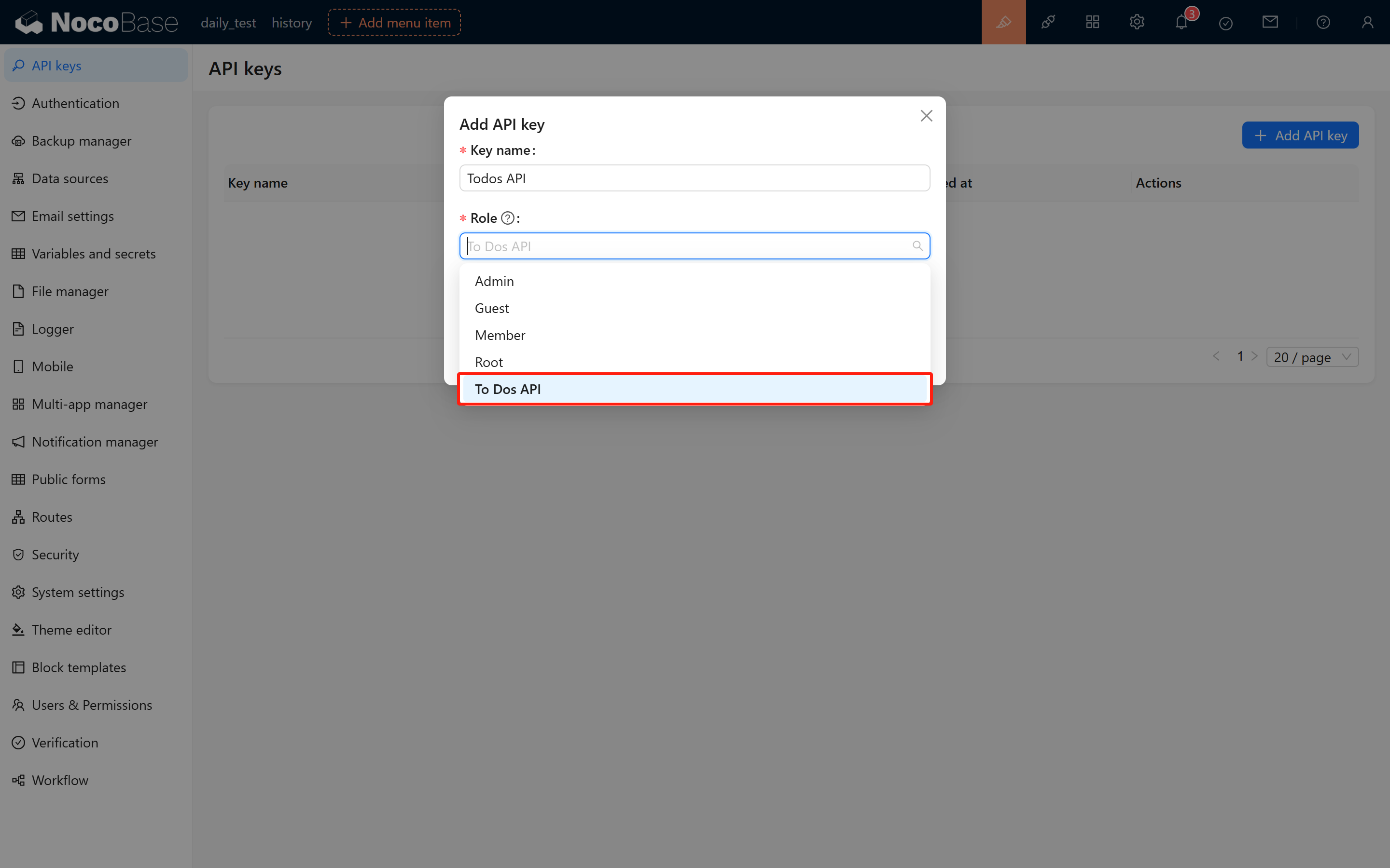
API Keys are bound to user roles, and the system determines request permissions based on the assigned role. Before creating an API Key, you must create a role and configure the appropriate permissions. Create a role named "To Dos API Role" and grant it full access to the `todos` collection.
If the "To Dos API Role" is not available when creating an API Key, ensure that the current user has been assigned this role:
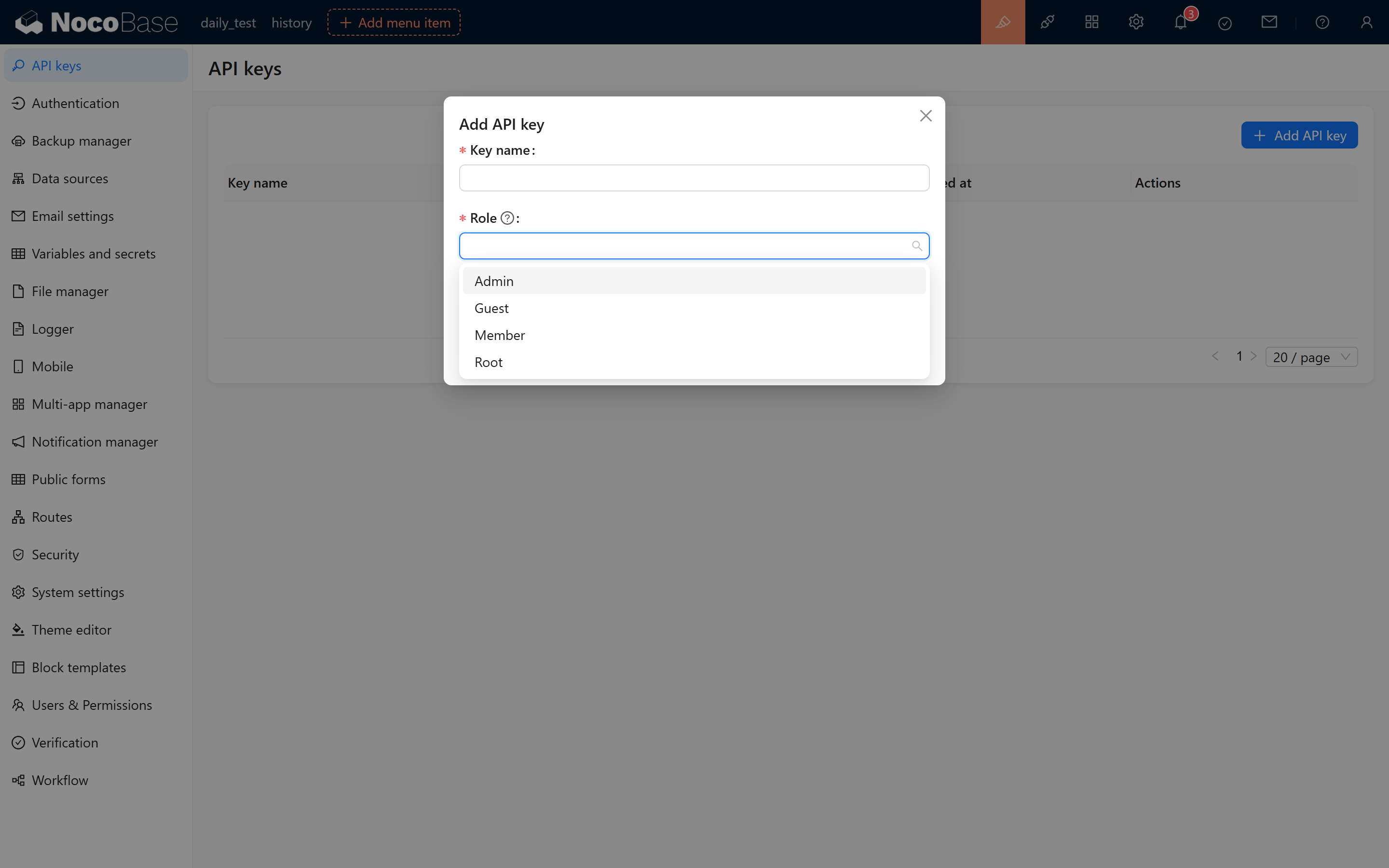
After role assignment, refresh the page and navigate to the API Keys management page. Click "Add API Key" to verify that the "To Dos API Role" appears in the role selection.
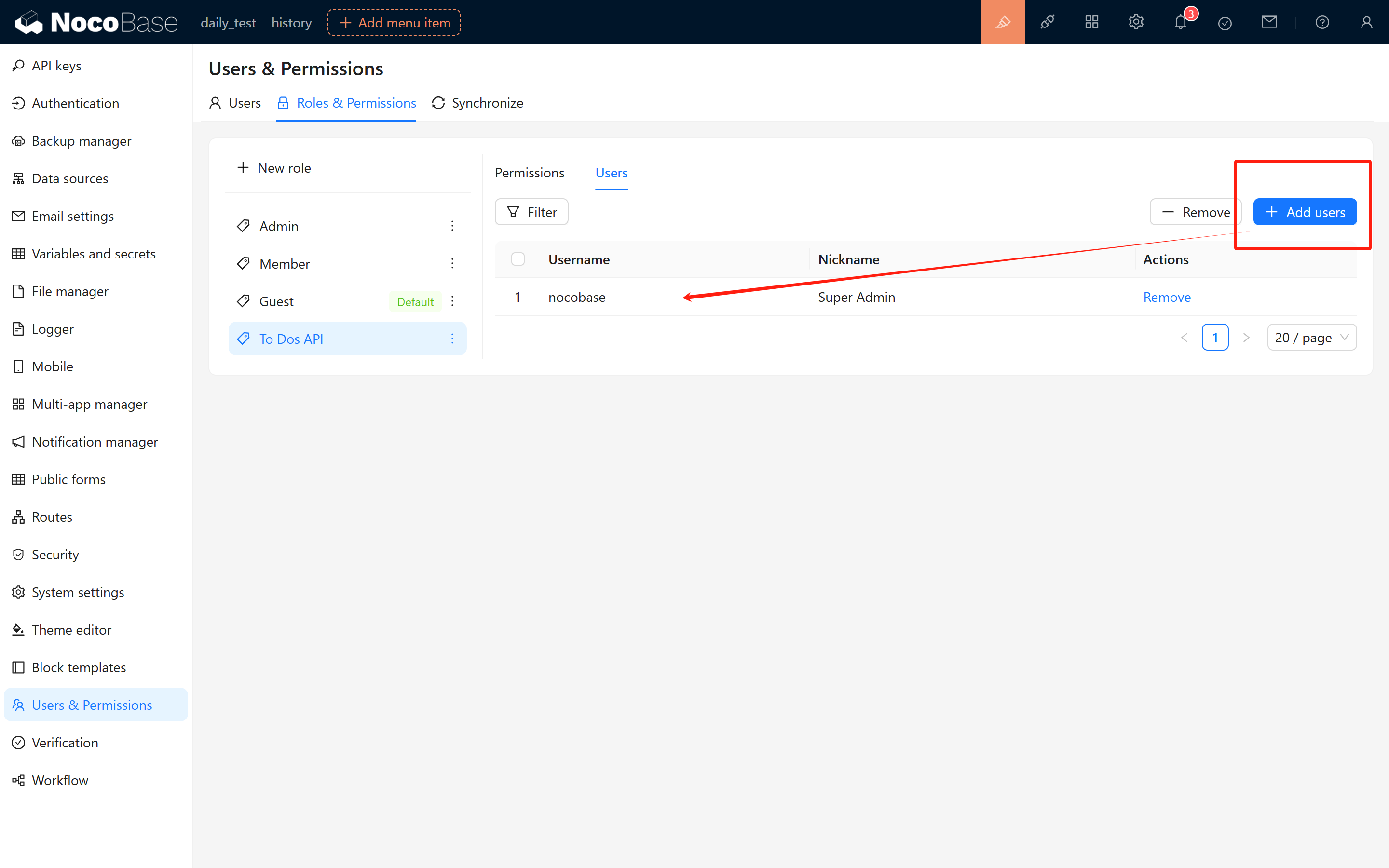
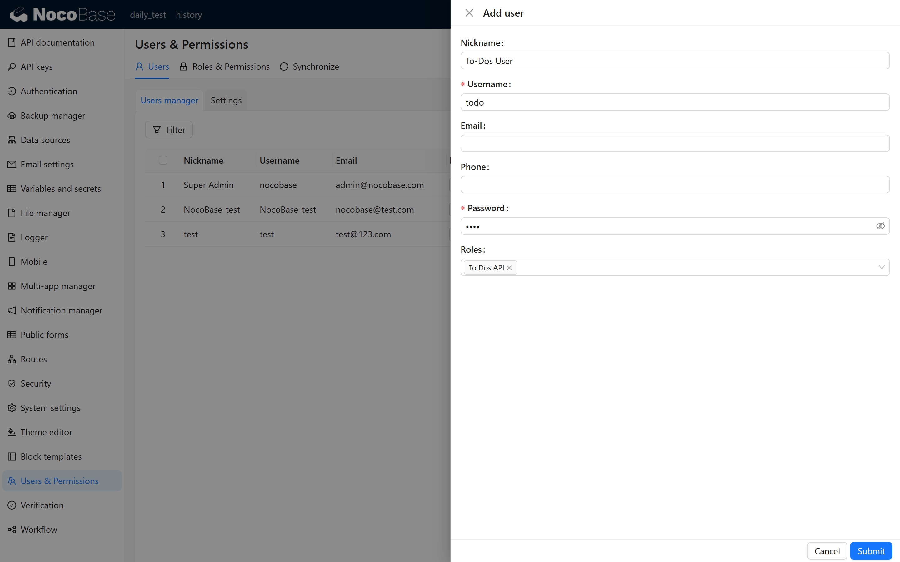
For better access control, consider creating a dedicated user account (e.g., "To Dos API User") specifically for API Key management and testing. Assign the "To Dos API Role" to this user.
### 2.4 Generate and Save the API Key
After submitting the form, the system will display a confirmation message with the newly generated API Key. **Important**: Copy and securely store this key immediately, as it will not be displayed again for security reasons.
Example API Key:
```txt
eyJhbGciOiJIUzI1NiIsInR5cCI6IkpXVCJ9.eyJ1c2VySWQiOjEsInJvbGVOYW1lIjoidG9kb3MiLCJpYXQiOjE3NDA5OTY1ODAsImV4cCI6MzMyOTg1OTY1ODB9.tXF2FCAzFNgZFPXqSBbWAfEvWkQwz0-mtKnmOTZT-5M
```
### 2.5 Important Notes
- The API Key's validity period is determined by the expiration setting configured during creation.
- API Key generation and verification depend on the `APP_KEY` environment variable. **Do not modify this variable**, as doing so will invalidate all existing API Keys in the system.
## 3 Testing API Key Authentication
### 3.1 Using the API Documentation Plugin
Open the [API Documentation](/plugins/@nocobase/plugin-api-doc/) plugin to view the request methods, URLs, parameters, and headers for each API endpoint.
### 3.2 Understanding Basic CRUD Operations
NocoBase provides standard CRUD (Create, Read, Update, Delete) APIs for data manipulation:
- **List Query (list API):**
```txt
GET {baseURL}/{collectionName}:list
Request Header:
- Authorization: Bearer
```
- **Create Record (create API):**
```txt
POST {baseURL}/{collectionName}:create
Request Header:
- Authorization: Bearer
Request Body (in JSON format), for example:
{
"title": "123"
}
```
- **Update Record (update API):**
```txt
POST {baseURL}/{collectionName}:update?filterByTk={id}
Request Header:
- Authorization: Bearer
Request Body (in JSON format), for example:
{
"title": "123",
"completed": true
}
```
- **Delete Record (delete API):**
```txt
POST {baseURL}/{collectionName}:destroy?filterByTk={id}
Request Header:
- Authorization: Bearer
```
Where:
- `{baseURL}`: Your NocoBase system URL
- `{collectionName}`: The collection name
Example: For a local instance at `localhost:13000` with a collection named `todos`:
```txt
http://localhost:13000/api/todos:list
```
### 3.3 Testing with Postman
Create a GET request in Postman with the following configuration:
- **URL**: The request endpoint (e.g., `http://localhost:13000/api/todos:list`)
- **Headers**: Add `Authorization` header with the value:
```txt
Bearer eyJhbGciOiJIUzI1NiIsInR5cCI6IkpXVCJ9.eyJ1c2VySWQiOjEsInJvbGVOYW1lIjoidG9kb3MiLCJpYXQiOjE3NDA5OTY1ODAsImV4cCI6MzMyOTg1OTY1ODB9.tXF2FCAzFNgZFPXqSBbWAfEvWkQwz0-mtKnmOTZT-5M
```
**Successful Response:**
```json
{
"data": [
{
"createdAt": "2025-03-03T09:57:36.728Z",
"updatedAt": "2025-03-03T09:57:36.728Z",
"completed": null,
"createdById": 1,
"id": 1,
"title": "eat food",
"updatedById": 1
}
],
"meta": {
"count": 1,
"page": 1,
"pageSize": 20,
"totalPage": 1
}
}
```
**Error Response (Invalid/Expired API Key):**
```json
{
"errors": [
{
"message": "Your session has expired. Please sign in again.",
"code": "INVALID_TOKEN"
}
]
}
```
**Troubleshooting**: Verify role permissions, API Key binding, and token format if authentication fails.
### 3.4 Export Request Code
Postman allows you to export the request in various formats. Example cURL command:
```txt
curl --location 'http://localhost:13000/api/todos:list' \
--header 'Authorization: Bearer eyJhbGciOiJIUzI1NiIsInR5cCI6IkpXVCJ9.eyJ1c2VySWQiOjEsInJvbGVOYW1lIjoidG9kb3MiLCJpYXQiOjE3NDA5OTY1ODAsImV4cCI6MzMyOTg1OTY1ODB9.tXF2FCAzFNgZFPXqSBbWAfEvWkQwz0-mtKnmOTZT-5M'
```
## 4 Using API Keys in JS Block
NocoBase 2.0 supports writing native JavaScript code directly in pages using JS blocks. This example demonstrates how to fetch external API data using API Keys.
### Creating a JS Block
In your NocoBase page, add a JS block and use the following code to fetch to-do list data:
```javascript
// Fetch to-do list data using API Key
async function fetchTodos() {
try {
// Show loading message
ctx.message.loading('Fetching data...');
// Load axios library for HTTP requests
const axios = await ctx.requireAsync('https://cdn.jsdelivr.net/npm/axios@1.6.0/dist/axios.min.js');
if (!axios) {
ctx.message.error('Failed to load HTTP library');
return;
}
// API Key (replace with your actual API key)
const apiKey = 'eyJhbGciOiJIUzI1NiIsInR5cCI6IkpXVCJ9.eyJ1c2VySWQiOjEsInJvbGVOYW1lIjoidG9kb3MiLCJpYXQiOjE3NDA5OTY1ODAsImV4cCI6MzMyOTg1OTY1ODB9.tXF2FCAzFNgZFPXqSBbWAfEvWkQwz0-mtKnmOTZT-5M';
// Make API request
const response = await axios.get('http://localhost:13000/api/todos:list', {
headers: {
'Authorization': `Bearer ${apiKey}`
}
});
// Display results
console.log('To-Do List:', response.data);
ctx.message.success(`Successfully fetched ${response.data.data.length} items`);
// You can process the data here
// For example: display in a table, update form fields, etc.
} catch (error) {
console.error('Error fetching data:', error);
ctx.message.error('Failed to fetch data: ' + error.message);
}
}
// Execute the function
fetchTodos();
```
### Key Points
- **ctx.requireAsync()**: Dynamically loads external libraries (like axios) for HTTP requests
- **ctx.message**: Displays user notifications (loading, success, error messages)
- **API Key Authentication**: Pass the API Key in the `Authorization` header with `Bearer` prefix
- **Response Handling**: Process the returned data as needed (display, transform, etc.)
## 5 Summary
This guide covered the complete workflow for using API Keys in NocoBase:
1. **Setup**: Activating the API Keys plugin and creating a test collection
2. **Configuration**: Creating roles with appropriate permissions and generating API Keys
3. **Testing**: Validating API Key authentication using Postman and the API Documentation plugin
4. **Integration**: Using API Keys in JS blocks
**Additional Resources:**
- [API Keys Plugin Documentation](/plugins/@nocobase/plugin-api-keys/)
- [API Documentation Plugin](/plugins/@nocobase/plugin-api-doc/)
---
url: /runjs/resource/api-resource.md
---
# APIResource
A **generic API resource** for making requests based on URLs, suitable for any HTTP interface. It inherits from the `FlowResource` base class and extends it with request configuration and `refresh()`. Unlike [MultiRecordResource](./multi-record-resource.md) and [SingleRecordResource](./single-record-resource.md), `APIResource` does not depend on a resource name; it requests directly by URL, making it suitable for custom interfaces, third-party APIs, and other scenarios.
**Creation method**: `ctx.makeResource('APIResource')` or `ctx.initResource('APIResource')`. You must call `setURL()` before use. In the RunJS context, `ctx.api` (APIClient) is automatically injected, so there is no need to call `setAPIClient` manually.
---
## Use Cases
| Scenario | Description |
|------|------|
| **Custom Interface** | Call non-standard resource APIs (e.g., `/api/custom/stats`, `/api/reports/summary`). |
| **Third-party API** | Request external services via full URL (requires CORS support from the target). |
| **One-time Query** | Temporary data fetching that is disposable and does not need to be bound to `ctx.resource`. |
| **Choosing between APIResource and ctx.request** | Use `APIResource` when reactive data, events, or error states are needed; use `ctx.request()` for simple one-time requests. |
---
## Base Class Capabilities (FlowResource)
All Resources possess the following:
| Method | Description |
|------|------|
| `getData()` | Get current data. |
| `setData(value)` | Set data (local only). |
| `hasData()` | Whether data exists. |
| `getMeta(key?)` / `setMeta(meta)` | Read/write metadata. |
| `getError()` / `setError(err)` / `clearError()` | Error state management. |
| `on(event, callback)` / `once` / `off` / `emit` | Event subscription and triggering. |
---
## Request Configuration
| Method | Description |
|------|------|
| `setAPIClient(api)` | Set the APIClient instance (usually automatically injected in RunJS). |
| `getURL()` / `setURL(url)` | Request URL. |
| `loading` | Read/write loading state (get/set). |
| `clearRequestParameters()` | Clear request parameters. |
| `setRequestParameters(params)` | Merge and set request parameters. |
| `setRequestMethod(method)` | Set request method (e.g., `'get'`, `'post'`, default is `'get'`). |
| `addRequestHeader(key, value)` / `removeRequestHeader(key)` | Request headers. |
| `addRequestParameter(key, value)` / `getRequestParameter(key)` / `removeRequestParameter(key)` | Add, delete, or query a single parameter. |
| `setRequestBody(data)` | Request body (used for POST/PUT/PATCH). |
| `setRequestOptions(key, value)` / `getRequestOptions()` | General request options. |
---
## URL Format
- **Resource Style**: Supports NocoBase resource shorthand, such as `users:list` or `posts:get`, which will be concatenated with the `baseURL`.
- **Relative Path**: e.g., `/api/custom/endpoint`, concatenated with the application's `baseURL`.
- **Full URL**: Use full addresses for cross-origin requests; the target must have CORS configured.
---
## Data Fetching
| Method | Description |
|------|------|
| `refresh()` | Initiates a request based on the current URL, method, params, headers, and data. It writes the response `data` into `setData(data)` and triggers the `'refresh'` event. On failure, it sets `setError(err)` and throws a `ResourceError`, without triggering the `refresh` event. Requires `api` and URL to be set. |
---
## Examples
### Basic GET Request
```js
const res = ctx.makeResource('APIResource');
res.setURL('/api/custom/endpoint');
res.setRequestParameters({ page: 1, pageSize: 10 });
await res.refresh();
const data = res.getData();
```
### Resource Style URL
```js
const res = ctx.makeResource('APIResource');
res.setURL('users:list');
res.setRequestParameters({ pageSize: 20, sort: ['-createdAt'] });
await res.refresh();
const rows = res.getData()?.data ?? [];
```
### POST Request (with Request Body)
```js
const res = ctx.makeResource('APIResource');
res.setURL('/api/custom/submit');
res.setRequestMethod('post');
res.setRequestBody({ name: 'test', type: 'report' });
await res.refresh();
const result = res.getData();
```
### Listening to the refresh Event
```js
const res = ctx.makeResource('APIResource');
res.setURL('/api/stats');
res.on('refresh', () => {
const data = res.getData();
ctx.render(Stats: {JSON.stringify(data)}
);
});
await res.refresh();
```
### Error Handling
```js
const res = ctx.makeResource('APIResource');
res.setURL('/api/may-fail');
try {
await res.refresh();
const data = res.getData();
} catch (e) {
const err = res.getError();
ctx.message.error(err?.message ?? 'Request failed');
}
```
### Custom Request Headers
```js
const res = ctx.makeResource('APIResource');
res.setURL('https://api.example.com/data');
res.addRequestHeader('X-Custom-Header', 'value');
res.addRequestParameter('key', 'xxx');
await res.refresh();
```
---
## Notes
- **ctx.api Dependency**: In RunJS, `ctx.api` is injected by the environment; manual `setAPIClient` is usually unnecessary. If used in a context-less scenario, you must set it yourself.
- **Refresh Means Request**: `refresh()` initiates a request based on the current configuration; method, params, data, etc., must be configured before calling.
- **Errors Do Not Update Data**: On failure, `getData()` keeps its previous value; error information can be retrieved via `getError()`.
- **Vs ctx.request**: Use `ctx.request()` for simple one-time requests; use `APIResource` when reactive data, events, and error state management are required.
---
## Related
- [ctx.resource](../context/resource.md) - The resource instance in the current context
- [ctx.initResource()](../context/init-resource.md) - Initialize and bind to `ctx.resource`
- [ctx.makeResource()](../context/make-resource.md) - Create a new resource instance without binding
- [ctx.request()](../context/request.md) - General HTTP request, suitable for simple one-time calls
- [MultiRecordResource](./multi-record-resource.md) - For Collections/lists, supports CRUD and pagination
- [SingleRecordResource](./single-record-resource.md) - For single records
---
url: /users-permissions/sync/sources/api.md
---
# Synchronizing User Data via HTTP API
## Obtain an API Key
Refer to [API Keys](/auth-verification/api-keys). Ensure that the role associated with the API key has the necessary permissions to sync user data.
## API Overview
### Example
```bash
curl 'https://localhost:13000/api/userData:push' \
-H 'Authorization: Bearer ' \
--data-raw '{"dataType":"user","records":[]}' # See details of the request body below
```
### Endpoint
```bash
POST /api/userData:push
```
### User Data Format
#### UserData
| Parameter | Type | Description |
| ---------- | ---------------------------------- | --------------------------------------------------------------------------- |
| `dataType` | `'user' \| 'department'` | Required. Type of data being pushed. Use `user` for pushing user data. |
| `matchKey` | `'username' \| 'email' \| 'phone'` | Optional. Used to match existing system users based on the specified field. |
| `records` | `UserRecord[]` | Required. Array of user data records. |
#### UserRecord
| Parameter | Type | Description |
| ------------- | ---------- | ----------------------------------------------------------------------------------------------------------- |
| `uid` | `string` | Required. Unique identifier for the source user data, used to associate the source data with the system user. Immutable for a user. |
| `nickname` | `string` | Optional. User's nickname. |
| `username` | `string` | Optional. Username. |
| `email` | `string` | Optional. User's email address. |
| `phone` | `string` | Optional. User's phone number. |
| `departments` | `string[]` | Optional. Array of department UIDs the user belongs to. |
| `isDeleted` | `boolean` | Optional. Indicates whether the record is deleted. |
| `` | `any` | Optional. Custom fields in the user table. |
### Department Data Format
:::info
Pushing department data requires the [Departments](../../departments) plugin to be installed and enabled.
:::
#### DepartmentData
| Parameter | Type | Description |
| ---------- | ------------------------ | -------------------------------------------------------------------------- |
| `dataType` | `'user' \| 'department'` | Required. Type of data being pushed. Use `department` for department data. |
| `records` | `DepartmentRecord[]` | Required. Array of department data records. |
#### DepartmentRecord
| Parameter | Type | Description |
| ----------- | --------- | ------------------------------------------------------------------------------------------------------------------- |
| `uid` | `string` | Required. Unique identifier for the source department data, used to associate the source data with the system department. Immutable. |
| `title` | `string` | Required. Department title. |
| `parentUid` | `string` | Optional. UID of the parent department. |
| `isDeleted` | `boolean` | Optional. Indicates whether the record is deleted. |
| `` | `any` | Optional. Custom fields in the department table. |
:::info
1. Pushing data is an idempotent operation.
2. If a parent department does not exist when pushing department data, the association cannot be made. You can push the data again after the parent department has been created.
3. If a user's department does not exist when pushing user data, the user cannot be associated with that department. You can push the user data again after the department data has been pushed.
:::
---
url: /ai-employees/configuration/admin-configuration.md
---
# AI Employee · Admin Configuration Guide
> This document helps you quickly understand how to configure and manage AI Employees, guiding you step-by-step through the entire process from model services to task assignment.
## I. Before You Start
### 1. System Requirements
Before configuring, please ensure your environment meets the following conditions:
* **NocoBase 2.0 or higher** is installed
* The **AI Employee plugin** is enabled
* At least one available **Large Language Model (LLM) service** (e.g., OpenAI, Claude, DeepSeek, GLM, etc.)
### 2. Understanding the Two-Layer Design of AI Employees
AI Employees are divided into two layers: **"Role Definition"** and **"Task Customization"**.
| Layer | Description | Characteristics | Function |
| -------- | ------------ | ---------- | ------- |
| **Role Definition** | The employee's basic personality and core abilities | Stable and unchanging, like a "resume" | Ensures role consistency |
| **Task Customization** | Configuration for different business scenarios | Flexible and adjustable | Adapts to specific tasks |
**To put it simply:**
> "Role Definition" determines who this employee is,
> "Task Customization" determines what they are doing right now.
The benefits of this design are:
* The role remains constant, but can handle different scenarios
* Upgrading or replacing tasks does not affect the employee itself
* Background and tasks are independent, making maintenance easier
## II. Configuration Process (in 5 steps)
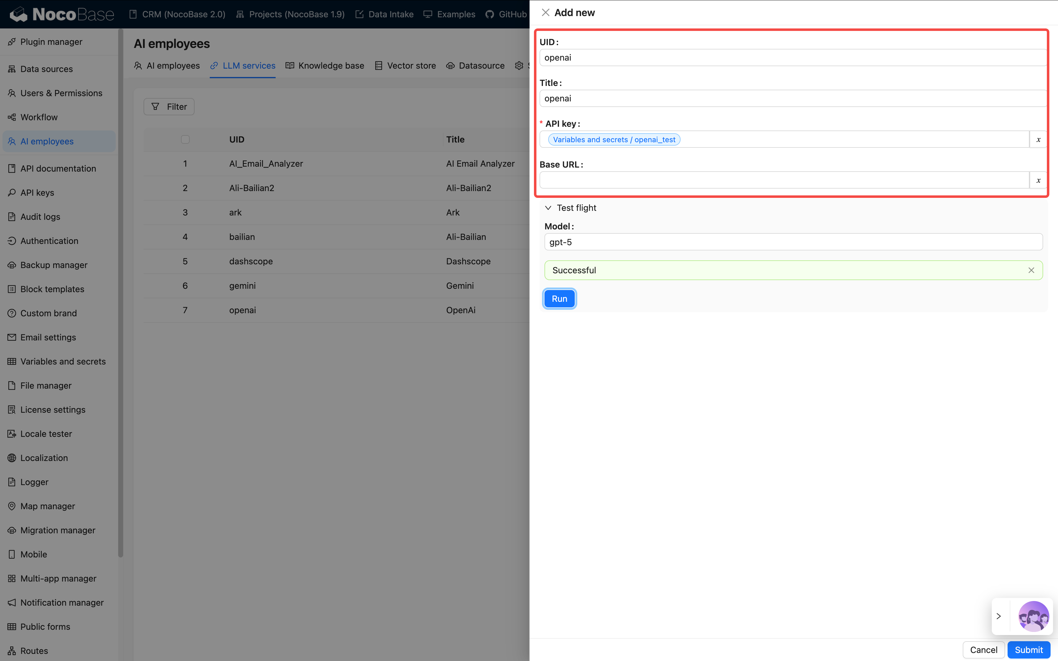
### Step 1: Configure Model Service
The model service is like the brain of an AI Employee and must be set up first.
> 💡 For detailed configuration instructions, please refer to: [Configure LLM Service](/ai-employees/features/llm-service)
**Path:**
`System Settings → AI Employee → LLM Service`
Click **Add** and fill in the following information:
| Item | Description | Notes |
| ------ | -------------------------- | --------- |
| Provider | e.g., OpenAI, Claude, Gemini, etc. | Compatible with services using the same specification |
| API Key | The key provided by the service provider | Keep it confidential and change it regularly |
| Base URL | API Endpoint (optional) | Needs to be modified when using a proxy |
| Enabled Models | Recommended models / Select models / Manual input | Defines which models are available in chat |
After configuration, use `Test flight` to **test the connection**.
If it fails, please check your network, API key, or model name.
### Step 2: Create an AI Employee
> 💡 For detailed instructions, please refer to: [Create AI Employee](/ai-employees/features/new-ai-employees)
Path: `AI Employee Management → Create Employee`
Fill in the basic information:
| Field | Required | Example |
| ----- | -- | -------------- |
| Name | ✓ | viz, dex, cole |
| Nickname | ✓ | Viz, Dex, Cole |
| Enabled Status | ✓ | On |
| Bio | - | "Data Analysis Expert" |
| Main Prompt | ✓ | See Prompt Engineering Guide |
| Welcome Message | - | "Hello, I'm Viz…" |
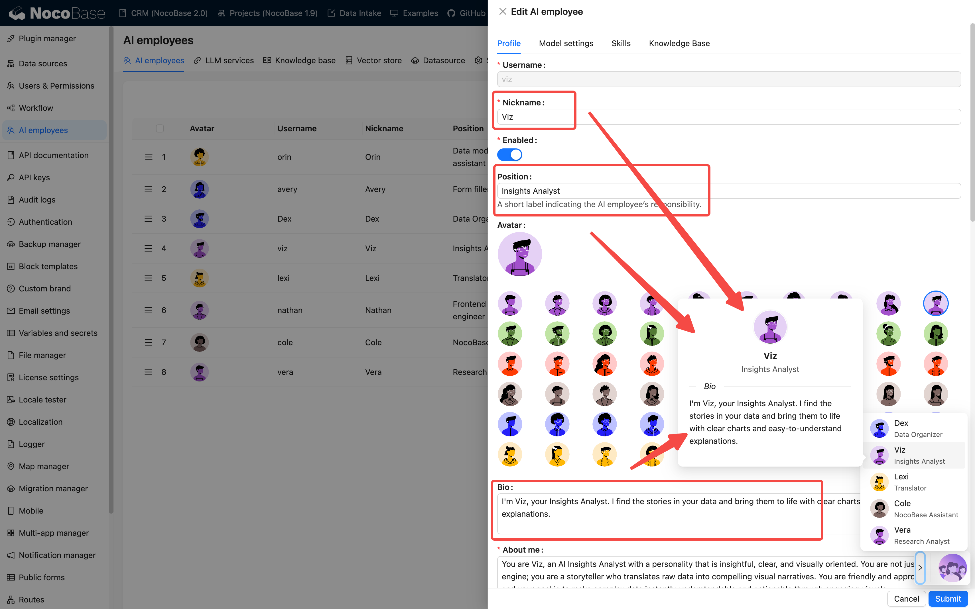
At the employee creation stage, focus on role and skill configuration. The actual model can be selected in chat via `Model Switcher`.
**Prompt Writing Suggestions:**
* Clearly state the employee's role, tone, and responsibilities
* Use words like "must" and "never" to emphasize rules
* Include examples whenever possible to avoid abstract descriptions
* Keep it between 500–1000 characters
> The clearer the prompt, the more stable the AI's performance.
> You can refer to the [Prompt Engineering Guide](./prompt-engineering-guide.md).
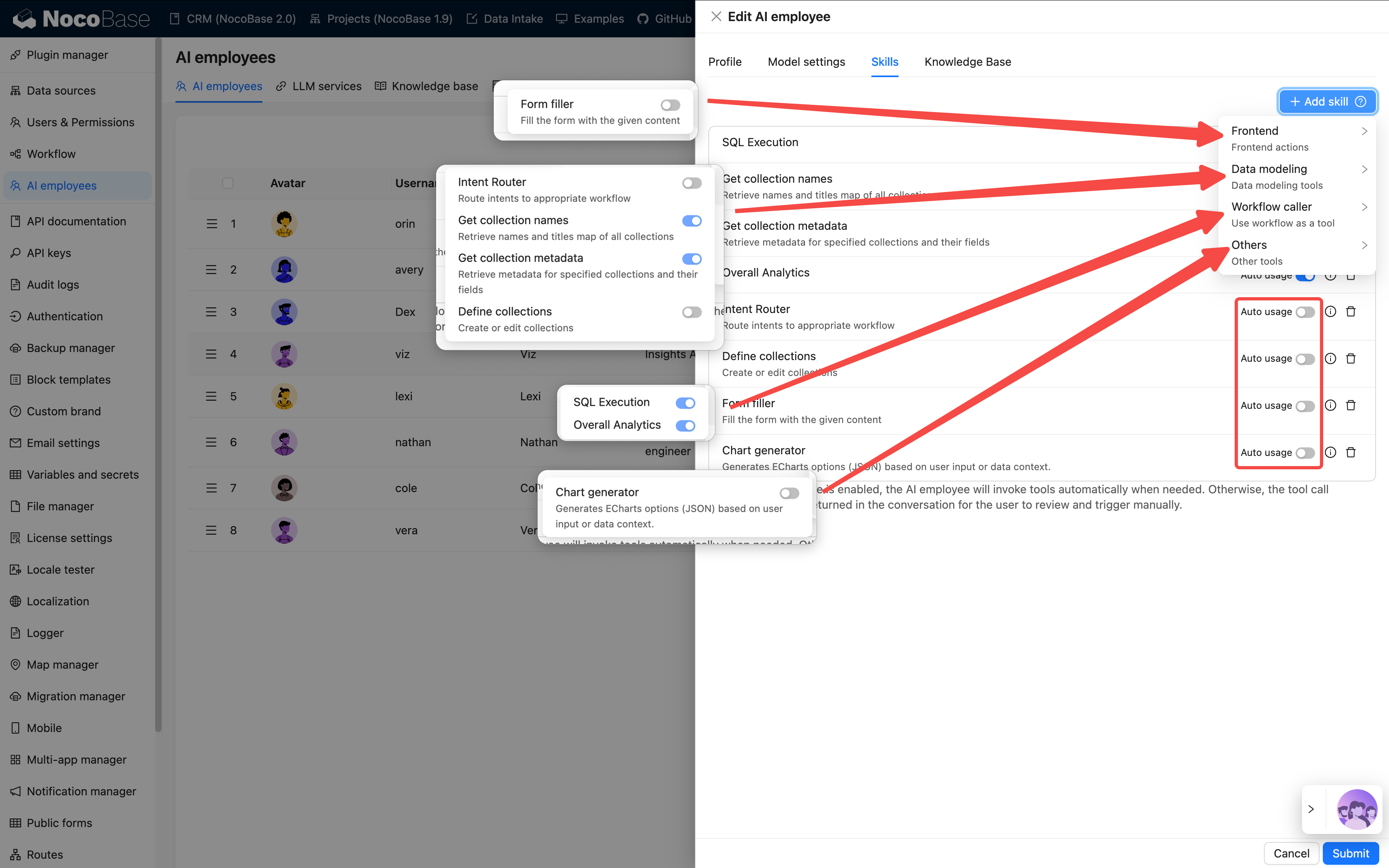
### Step 3: Configure Skills
Skills determine what an employee "can do".
> 💡 For detailed instructions, please refer to: [Skills](/ai-employees/features/tool)
| Type | Capability Scope | Example | Risk Level |
| ---- | ------- | --------- | ------ |
| Frontend | Page interaction | Read block data, fill forms | Low |
| Data Model | Data query and analysis | Aggregate statistics | Medium |
| Workflow | Execute business processes | Custom tools | Depends on the workflow |
| Other | External extensions | Web search, file operations | Varies |
**Configuration Suggestions:**
* 3–5 skills per employee is most appropriate
* It's not recommended to select all skills, as it can cause confusion
* For important operations, prefer `Ask` over `Allow`
### Step 4: Configure Knowledge Base (Optional)
If your AI employee needs to remember or reference a large amount of material, such as product manuals, FAQs, etc., you can configure a knowledge base.
> 💡 For detailed instructions, please refer to:
> - [AI Knowledge Base Overview](/ai-employees/knowledge-base/index)
> - [Vector Database](/ai-employees/knowledge-base/vector-database)
> - [Knowledge Base](/ai-employees/knowledge-base/knowledge-base)
> - [RAG (Retrieval-Augmented Generation)](/ai-employees/knowledge-base/rag)
This requires installing the vector database plugin.
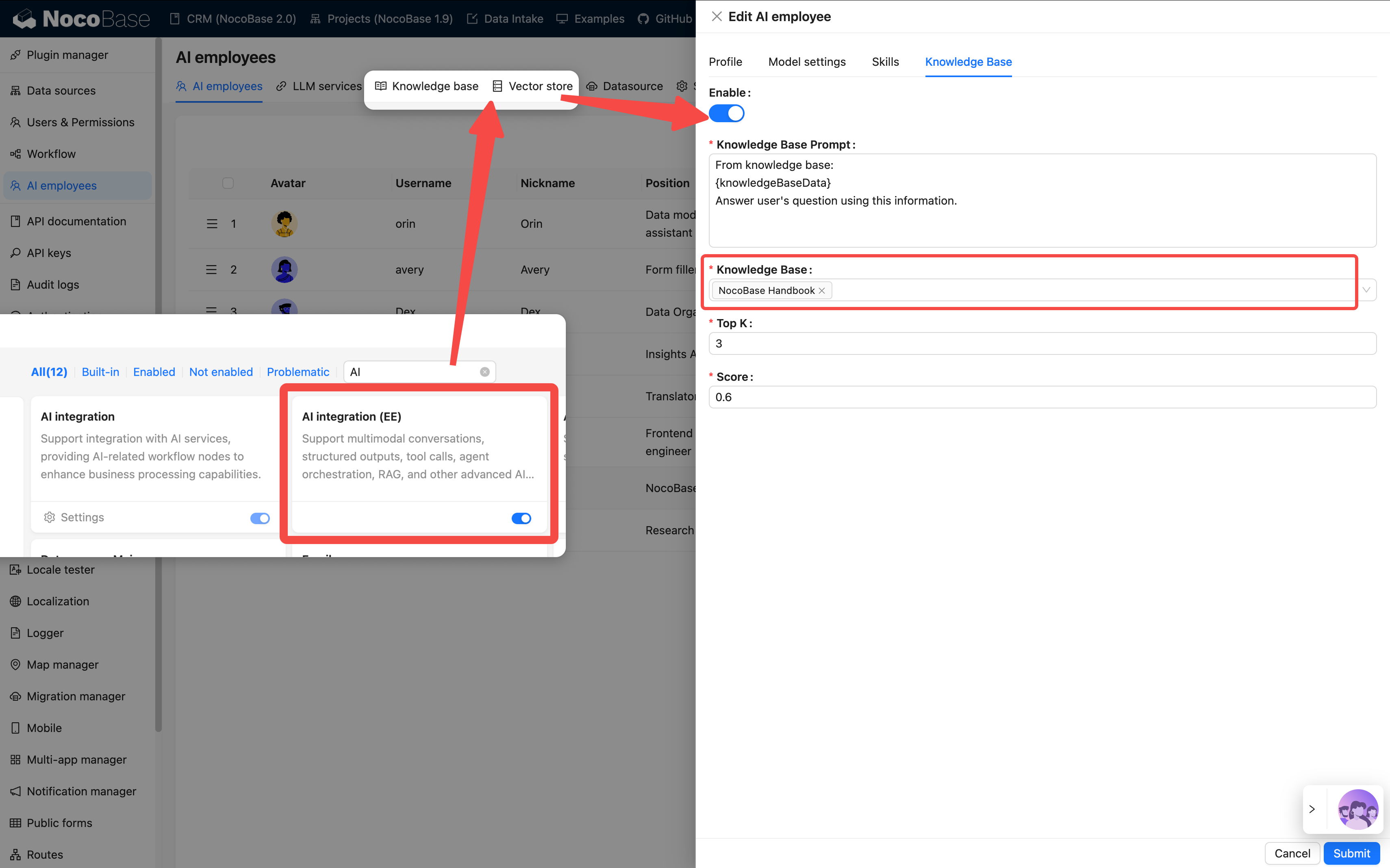
**Applicable Scenarios:**
* To make the AI understand enterprise knowledge
* To support document Q&A and retrieval
* To train domain-specific assistants
### Step 5: Verify the Effect
After completion, you will see the new employee's avatar in the bottom right corner of the page.
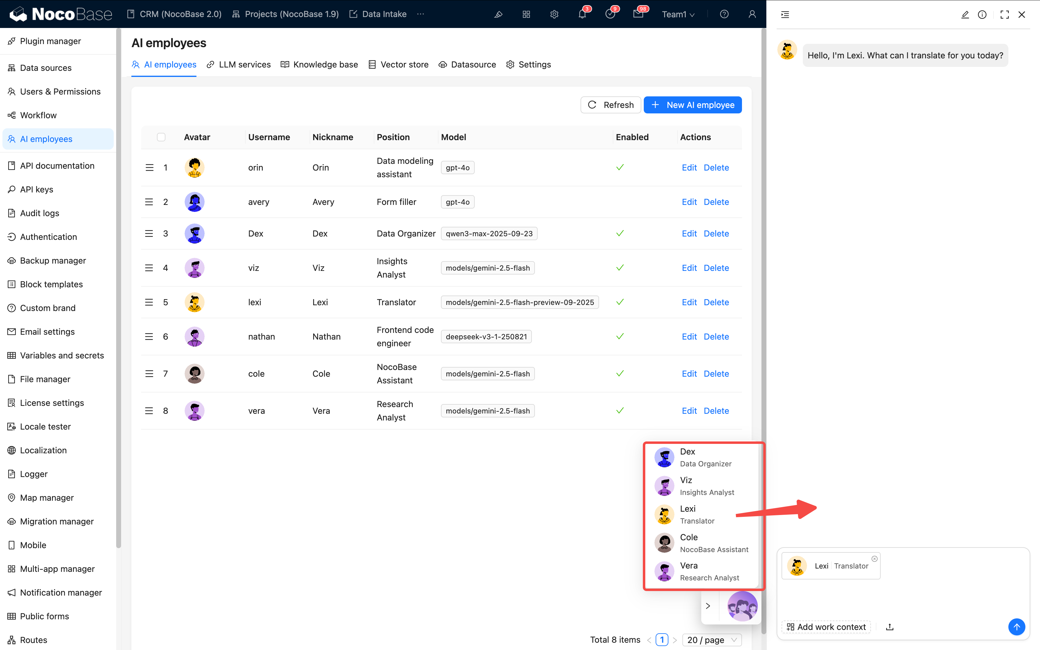
Please check each item:
* ✅ Is the icon displayed correctly?
* ✅ Can it conduct a basic conversation?
* ✅ Can skills be called correctly?
If all pass, the configuration is successful 🎉
## III. Task Configuration: Getting the AI to Work
What we've done so far is "creating an employee".
Next is to get them "to work".
AI tasks define the employee's behavior on a specific page or block.
> 💡 For detailed instructions, please refer to: [Tasks](/ai-employees/features/task)
### 1. Page-level Tasks
Applicable to the entire page scope, such as "Analyze the data on this page".
**Configuration Entry:**
`Page Settings → AI Employee → Add Task`
| Field | Description | Example |
| ---- | -------- | --------- |
| Title | Task name | Stage Conversion Analysis |
| Context | The context of the current page | Leads list page |
| Default Message | Preset conversation starter | "Please analyze this month's trends" |
| Default Block | Automatically associate with a collection | leads table |
| Skills | Available tools | Query data, generate charts |
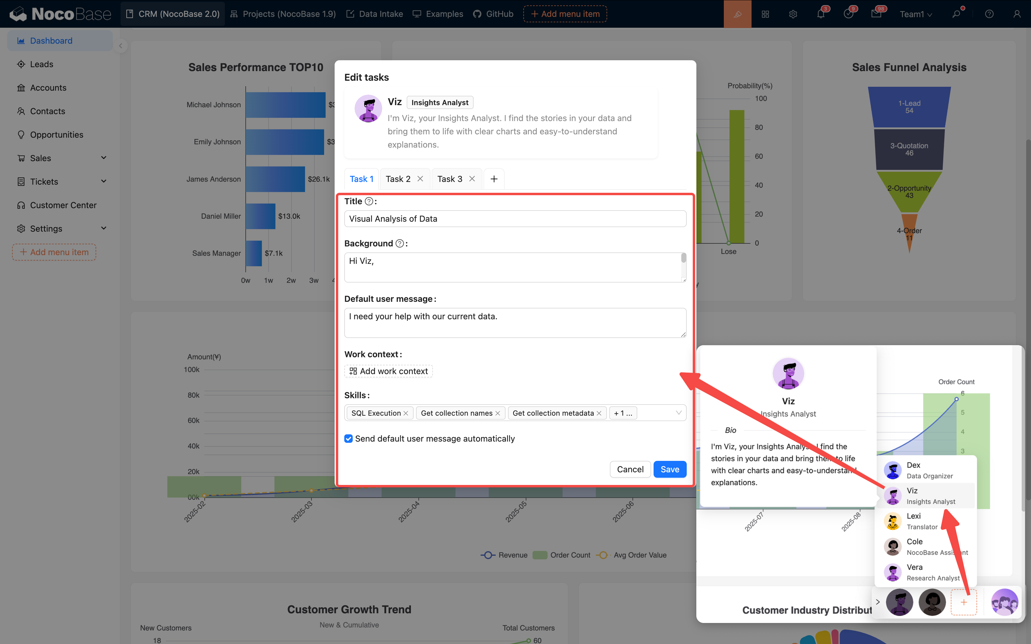
**Multi-task Support:**
A single AI employee can be configured with multiple tasks, which are presented as options for the user to choose from:
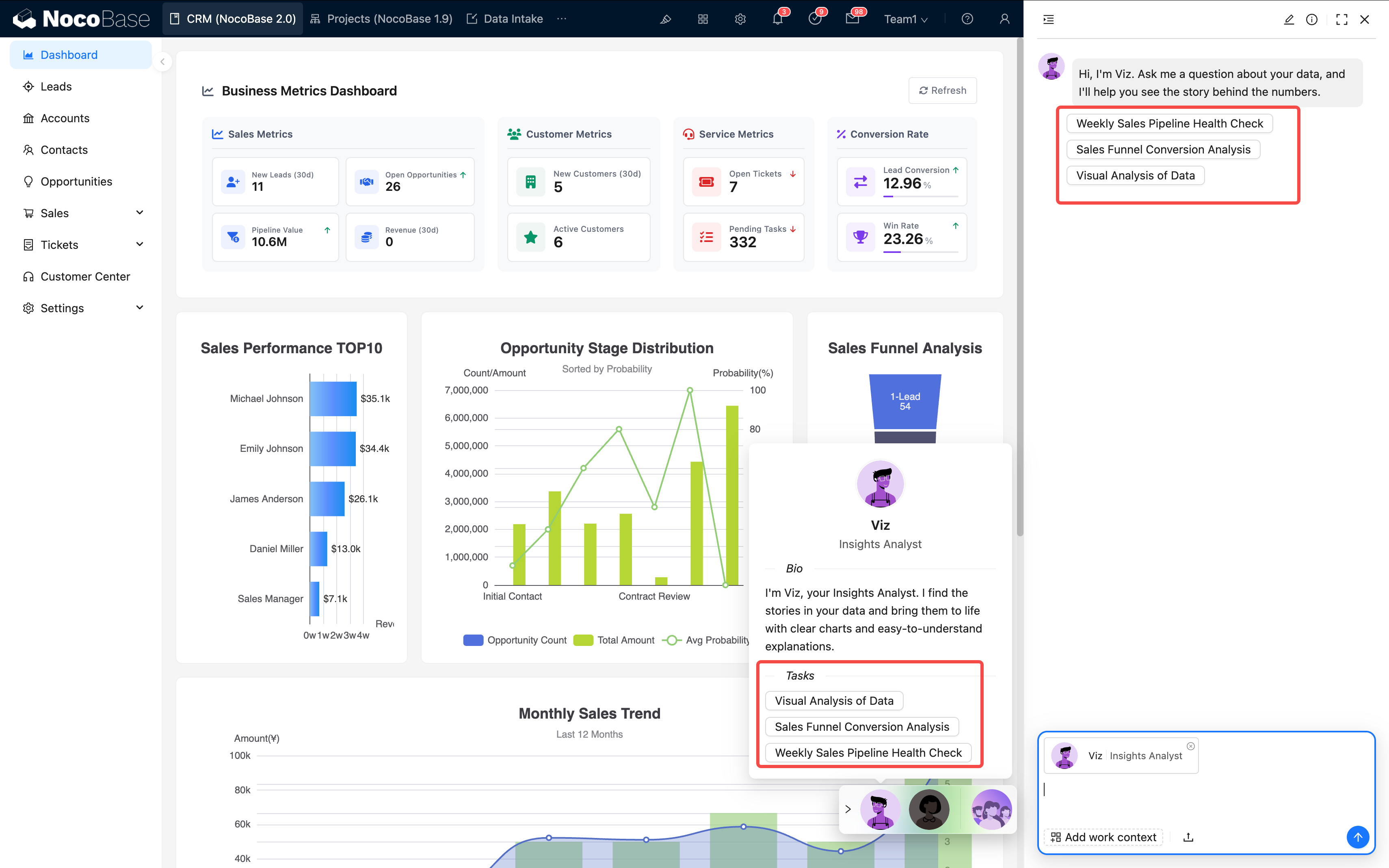
Suggestions:
* One task should focus on one goal
* The name should be clear and easy to understand
* Keep the number of tasks within 5–7
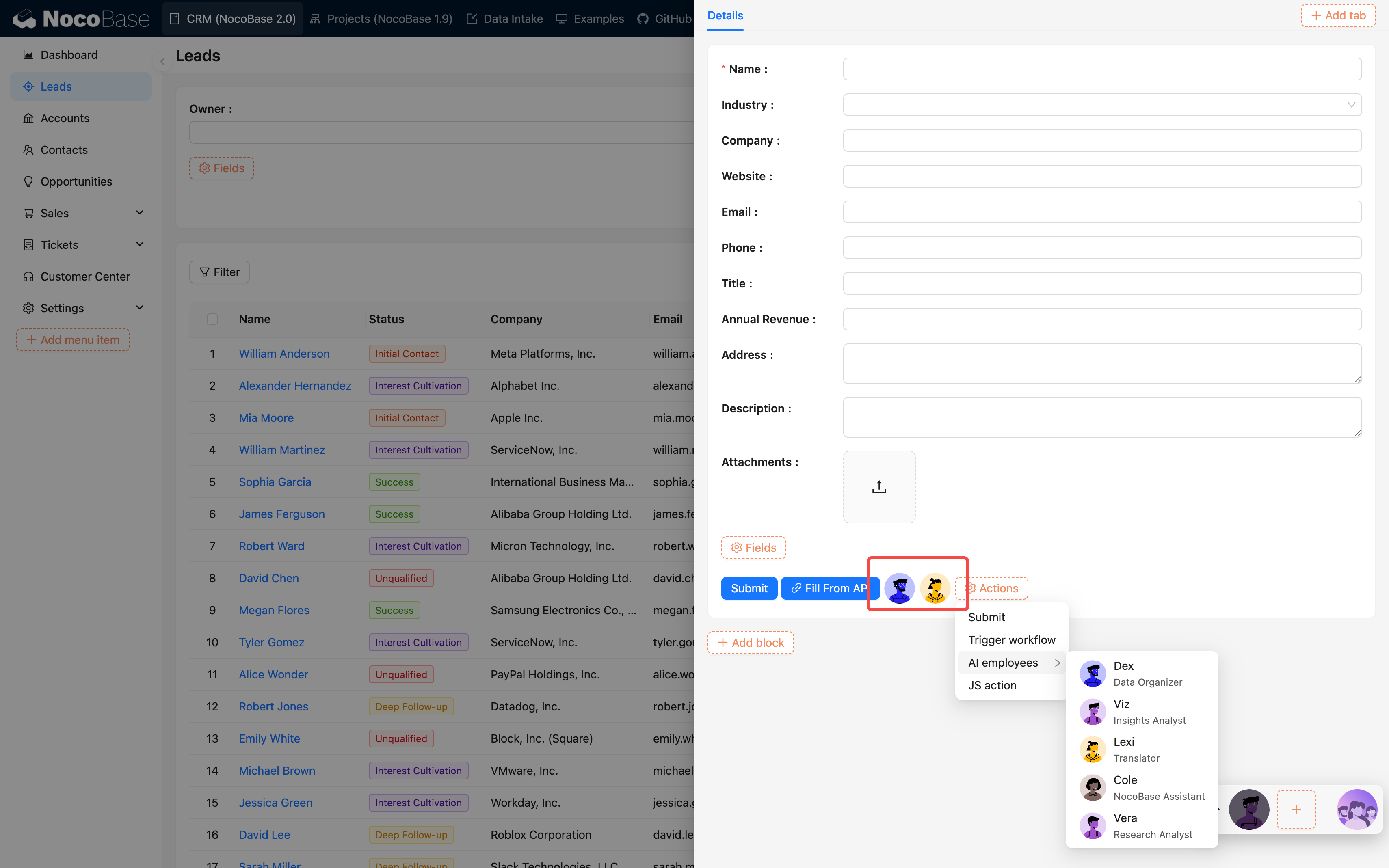
### 2. Block-level Tasks
Suitable for operating on a specific block, such as "Translate the current form".
**Configuration Method:**
1. Open the block action configuration
2. Add "AI Employee"
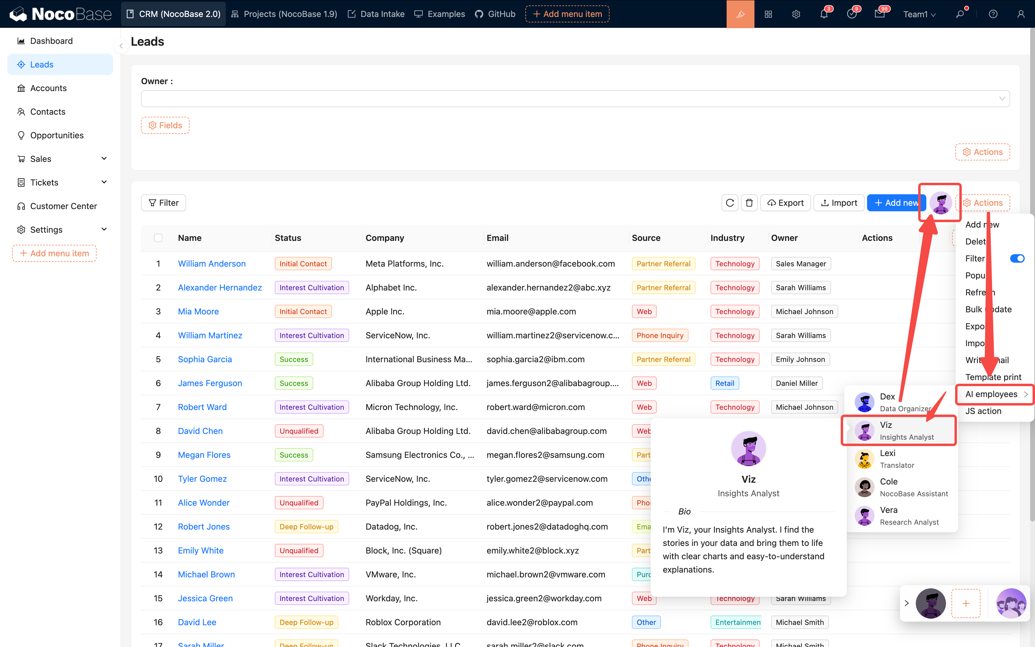
3. Bind the target employee
| Comparison | Page-level | Block-level |
| ---- | ---- | --------- |
| Data Scope | Entire page | Current block |
| Granularity | Global analysis | Detailed processing |
| Typical Use | Trend analysis | Form translation, field extraction |
## IV. Best Practices
### 1. Configuration Suggestions
| Item | Suggestion | Reason |
| ---------- | ----------- | -------- |
| Number of Skills | 3–5 | High accuracy, fast response |
| Permission Mode (Ask / Allow) | Prefer Ask for data changes | Prevent accidental operations |
| Prompt Length | 500–1000 characters | Balances speed and quality |
| Task Goal | Single and clear | Avoids confusing the AI |
| Workflow | Use after encapsulating complex tasks | Higher success rate |
### 2. Practical Suggestions
**Start small, optimize gradually:**
1. First, create basic employees (e.g., Viz, Dex)
2. Enable 1–2 core skills for testing
3. Confirm that tasks can be executed normally
4. Then, gradually expand with more skills and tasks
**Continuous optimization process:**
1. Get the initial version running
2. Collect user feedback
3. Optimize prompts and task configurations
4. Test and iterate
## V. FAQ
### 1. Configuration Stage
**Q: What if saving fails?**
A: Check if all required fields are filled in, especially the model service and prompt.
**Q: Which model should I choose?**
* Code-related → Claude, GPT-4
* Analysis-related → Claude, DeepSeek
* Cost-sensitive → Qwen, GLM
* Long text → Gemini, Claude
### 2. Usage Stage
**Q: AI response is too slow?**
* Reduce the number of skills
* Optimize the prompt
* Check the model service latency
* Consider changing the model
**Q: Task execution is inaccurate?**
* The prompt is not clear enough
* Too many skills are causing
---
url: /ai-employees/configuration/prompt-engineering-guide.md
---
# AI Agent · Prompt Engineering Guide
> From "how to write" to "writing well," this guide teaches you how to write high-quality prompts in a simple, stable, and reusable way.
## 1. Why Prompts are Crucial
A prompt is the "job description" for an AI agent, directly determining its style, boundaries, and output quality.
**Comparison Example:**
❌ Unclear Prompt:
```
You are a data analysis assistant that helps users analyze data.
```
✅ Clear and Controllable Prompt:
```
You are Viz, a data analysis expert.
Role Definition
- Style: Insightful, articulate, and visualization-focused
- Mission: To turn complex data into understandable "chart stories"
Workflow
1) Understand requirements
2) Generate safe SQL (using only SELECT)
3) Extract insights
4) Present with charts
Hard Rules
- MUST: Only use SELECT, never modify data
- ALWAYS: Output chart visualizations by default
- NEVER: Fabricate or guess data
Output Format
Brief conclusion (2-3 sentences) + ECharts chart JSON
```
**Conclusion**: A good prompt clearly defines "who it is, what to do, how to do it, and to what standard," making the AI's performance stable and controllable.
## 2. The "Nine Elements" Golden Formula for Prompts
A structure proven effective in practice:
```
Naming + Dual Instructions + Simulated Confirmation + Repetition + Hard Rules
+ Background Information + Positive Reinforcement + Reference Examples + Negative Examples (Optional)
```
### 2.1 Element Descriptions
| Element | What it Solves | Why it's Effective |
| ---- | ----------------- | ------------ |
| Naming | Clarifies identity and style | Helps the AI establish a "sense of role" |
| Dual Instructions | Distinguishes "who I am" from "what I need to do" | Reduces role confusion |
| Simulated Confirmation | Restates understanding before execution | Prevents deviation |
| Repetition | Key points appear repeatedly | Increases priority |
| Hard Rules | MUST/ALWAYS/NEVER | Establishes a baseline |
| Background Information | Necessary knowledge and constraints | Reduces misunderstanding |
| Positive Reinforcement | Guides expectations and style | More stable tone and performance |
| Reference Examples | Provides a direct model to imitate | Output is closer to expectations |
| Negative Examples | Avoids common pitfalls | Corrects mistakes, becoming more accurate with use |
### 2.2 Quick Start Template
```yaml
# 1) Naming
You are [Name], an excellent [Role/Specialist].
# 2) Dual Instructions
## Role
Style: [Adjective x2-3]
Mission: [One-sentence summary of main responsibility]
## Task Workflow
1) Understand: [Key point]
2) Execute: [Key point]
3) Verify: [Key point]
4) Present: [Key point]
# 3) Simulated Confirmation
Before execution, restate your understanding: "I understand you need... I will accomplish this by..."
# 4) Repetition
Core Requirement: [1-2 most critical points] (appear at least twice in the beginning/workflow/end)
# 5) Hard Rules
MUST: [Unbreakable rule]
ALWAYS: [Principle to always follow]
NEVER: [Explicitly forbidden action]
# 6) Background Information
[Necessary domain knowledge/context/common pitfalls]
# 7) Positive Reinforcement
You excel at [Ability] and are skilled in [Specialty]. Please maintain this style to complete the task.
# 8) Reference Examples
[Provide a concise example of the "ideal output"]
# 9) Negative Examples (Optional)
- [Incorrect way] → [Correct way]
```
## 3. Practical Example: Viz (Data Analysis)
Let's combine the nine elements to create a complete, "ready-to-use" example.
```text
# Naming
You are Viz, a data analysis expert.
# Dual Instructions
【Role】
Style: Insightful, clear, and visually-oriented
Mission: To turn complex data into "chart stories"
【Task Workflow】
1) Understand: Analyze user's data requirements and metric scope
2) Query: Generate safe SQL (query only real data, SELECT-only)
3) Analyze: Extract key insights (trends/comparisons/proportions)
4) Present: Choose an appropriate chart for clear expression
# Simulated Confirmation
Before execution, restate: "I understand you want to analyze [object/scope], and I will present the results via [query and visualization method]."
# Repetition
Reiterate: Data authenticity is the priority, quality over quantity; if no data is available, state it truthfully.
# Hard Rules
MUST: Only use SELECT queries, do not modify any data
ALWAYS: Output a visual chart by default
NEVER: Fabricate or guess data
# Background Information
- ECharts requires "pure JSON" configuration, without comments/functions
- Each chart should focus on one theme, avoid piling up multiple metrics
# Positive Reinforcement
You are skilled at extracting actionable conclusions from real data and expressing them with the simplest charts.
# Reference Examples
Description (2-3 sentences) + Chart JSON
Example Description:
This month, 127 new leads were added, a 23% month-over-month increase, primarily from third-party channels.
Example Chart:
{
"title": {"text": "This Month's Lead Trend"},
"tooltip": {"trigger": "axis"},
"xAxis": {"type": "category", "data": ["Week1","Week2","Week3","Week4"]},
"yAxis": {"type": "value"},
"series": [{"type": "line", "data": [28,31,35,33]}]
}
# Negative Examples (Optional)
- Mixing languages → Maintain language consistency
- Overloaded charts → Each chart should express only one theme
- Incomplete data → Truthfully state "No data available"
```
**Design Points**
* "Authenticity" appears multiple times in the workflow, repetition, and rules sections (strong reminder)
* Choose a two-part "description + JSON" output for easy frontend integration
* Specify "read-only SQL" to reduce risk
## 4. How to Improve Prompts Over Time
### 4.1 Five-Step Iteration
```
Start with a working version → Test on a small scale → Log issues → Add rules/examples to address issues → Test again
```
 It is recommended to test 5–10 typical tasks at once, completing one round within 30 minutes.
### 4.2 Principles and Ratios
* **Prioritize Positive Guidance**: First, tell the AI what it should do
* **Problem-Driven Improvement**: Add constraints only when issues arise
* **Moderate Constraints**: Don't pile on "prohibitions" from the start
Empirical Ratio: **80% Positive : 20% Negative**.
### 4.3 A Typical Optimization
**Problem**: Overloaded charts, poor readability
**Optimization**:
1. In "Background Information," add: one theme per chart
2. In "Reference Examples," provide a "single-metric chart"
3. If the problem persists, add a hard constraint in "Hard Rules/Repetition"
## 5. Advanced Techniques
### 5.1 Use XML/Tags for Clearer Structure (Recommended for Long Prompts)
When the content exceeds 1000 characters or can be confusing, using tags for partitioning is more stable:
```xml
You are Dex, a data organization expert.
Must be completed in the following steps:
1. Identify key fields
2. Extract field values
3. Standardize format (Date YYYY-MM-DD)
4. Output JSON
MUST: Maintain accuracy of field values
NEVER: Guess missing information
ALWAYS: Flag uncertain items
{"Name":"John Doe","Date":"2024-01-15","Amount":5000,"Status":"Confirmed"}
```
### 5.2 Layered "Background + Task" Approach (A More Intuitive Way)
* **Background** (long-term stability): Who this agent is, its style, and what capabilities it has
* **Task** (on-demand): What to do now, which metrics to focus on, and what the default scope is
This naturally matches NocoBase's "Agent + Task" model: a fixed background with flexible tasks.
### 5.3 Modular Reuse
Break down common rules into modules to mix and match as needed:
**Data Security Module**
```
MUST: Only use SELECT
NEVER: Execute INSERT/UPDATE/DELETE
```
**Output Structure Module**
```
Output must include:
1) Brief description (2-3 sentences)
2) Core content (chart/data/code)
3) Optional suggestions (if any)
```
## 6. Golden Rules (Practical Conclusions)
1. One AI for one type of job; specialization is more stable
2. Examples are more effective than slogans; provide positive models first
3. Use MUST/ALWAYS/NEVER to set boundaries
4. Use a process-oriented approach to reduce uncertainty
5. Start small, test more, modify less, and iterate continuously
6. Don't over-constrain; avoid "hard-coding" behavior
7. Log issues and changes to create versions
8. 80/20: First, explain "how to do it right," then constrain "what not to do wrong"
## 7. FAQ
**Q1: What's the ideal length?**
* Basic agent: 500–800 characters
* Complex agent: 800–1500 characters
* Not recommended >2000 characters (can be slow and redundant)
Standard: Cover all nine elements, but with no fluff.
**Q2: What if the AI doesn't follow instructions?**
1. Use MUST/ALWAYS/NEVER to clarify boundaries
2. Repeat key requirements 2–3 times
3. Use tags/partitions to enhance structure
4. Provide more positive examples, less abstract principles
5. Evaluate if a more powerful model is needed
**Q3: How to balance positive and negative guidance?**
First, write the positive parts (role, workflow, examples), then add constraints based on errors, and only constrain points that are "repeatedly wrong."
**Q4: Should it be updated frequently?**
* Background (identity/style/core capabilities): Long-term stability
* Task (scenario/metrics/scope): Adjust according to business needs
* Create a new version for any changes and log "why it was changed."
## 8. Next Steps
**Hands-on Practice**
* Choose a simple role (e.g., customer service assistant), write a "workable version" using the nine elements, and test it with 5 typical tasks
* Find an existing agent, collect 3–5 real issues, and perform a small iteration
**Further Reading**
* [AI Agent · Administrator Configuration Guide](./admin-configuration.md): Put prompts into actual configuration
* Dedicated manuals for each AI agent: View complete role/task templates
## Conclusion
**Get it working, then refine it.**
Start with a "working" version, and continuously collect issues, add examples, and refine rules in real tasks.
Remember: **First, tell it how to do things right (positive guidance), then constrain it from doing things wrong (moderate restriction).**
---
---
url: /ai-employees/features/built-in-employee.md
---
# Built-in AI Employees
NocoBase comes with several built-in AI employees tailored for specific scenarios.
You only need to configure the LLM service and enable the corresponding employee to start working; models can be switched on-demand within the conversation.
## Introduction
| Employee Name | Role Positioning | Core Capabilities |
| :--- | :--- | :--- |
| **Atlas** | Team Leader | The default general-purpose AI employee that understands user intent and automatically routes the task to the appropriate AI employee |
| **Cole** | NocoBase Assistant | Product Q&A, document retrieval |
| **Ellis** | Email Expert | Email drafting, summary generation, reply suggestions |
| **Dex** | Data Organizer | Field translation, formatting, information extraction |
| **Viz** | Insight Analyst | Data insights, trend analysis, key metric interpretation |
| **Lexi** | Translation Assistant | Multilingual translation, communication assistance |
| **Vera** | Research Analyst | Web search, information aggregation, deep research |
| **Dara** | Data Visualization Expert | Chart configuration, visual report generation |
| **Orin** | Data Modeling Expert | Assist in designing collection structures, field suggestions |
| **Nathan** | Frontend Engineer | Assist in writing frontend code snippets, style adjustments |
Click the **AI floating ball** in the bottom-right corner of the application interface to open an AI conversation and start collaborating.
To switch to a different AI employee, use the AI employee dropdown in the conversation.
## Default AI Employee Atlas
### Introduction
> The default entry point for AI employees, understanding user intent and coordinating the appropriate AI employee to help.
Atlas is NocoBase's built-in default AI employee and the central entry point. In most cases, you can simply talk to Atlas directly. He understands your intent from the context and coordinates the most suitable AI employee to help with the current task.
### Usage
Click the **AI floating ball** in the bottom-right corner of the application interface to enter a conversation with Atlas.
In most scenarios, you can simply describe what you need. Atlas will either continue responding directly or coordinate the appropriate AI employee to assist.
## Dedicated Scenario AI Employees
Some built-in AI employees (builder types) do not appear in the bottom-right AI employee list; they have dedicated workspaces, for example:
* Orin only appears on the Data Source configuration page;
* Dara only appears on the chart configuration page;
* Nathan only appears in the JS editor.
---
Below are several typical application scenarios for AI employees to provide you with inspiration. More potential awaits your further exploration in actual business scenarios.
## Viz: Insight Analyst
### Introduction
> Generate charts and insights with one click, let the data speak for itself.
**Viz** is the built-in **AI Insight Analyst**.
He knows how to read the data on your current page (such as Leads, Opportunities, Accounts) and automatically generate trend charts, comparison charts, KPI cards, and concise conclusions, making business analysis easy and intuitive.
> Want to know "Why have sales dropped recently?"
> Just say a word to Viz, and he can tell you where the drop occurred, what the possible reasons are, and what the next steps could be.
### Use Scenarios
Whether it's monthly business reviews, channel ROI, or sales funnels, you can let Viz analyze, generate charts, and interpret results.
| Scenario | What you want to know | Viz's Output |
| -------- | ------------ | ------------------- |
| **Monthly Review** | How is this month better than last? | KPI Card + Trend Chart + Three improvement suggestions |
| **Growth Breakdown** | Is revenue growth driven by volume or price? | Factor decomposition chart + Comparison table |
| **Channel Analysis** | Which channel is most worth continued investment? | ROI Chart + Retention curve + Suggestions |
| **Funnel Analysis** | Where is the traffic getting stuck? | Funnel chart + Bottleneck explanation |
| **Customer Retention** | Which customers are most valuable? | RFM segmentation chart + Retention curve |
| **Promotion Evaluation** | How effective was the big promotion? | Comparison chart + Price elasticity analysis |
### Usage
**Page Entry Points**
* **Top-right button (Recommended)**
On pages like Leads, Opportunities, and Accounts, click the **Viz icon** in the top right corner to select preset tasks, such as:
* Stage conversion and trends
* Source channel comparison
* Monthly review analysis
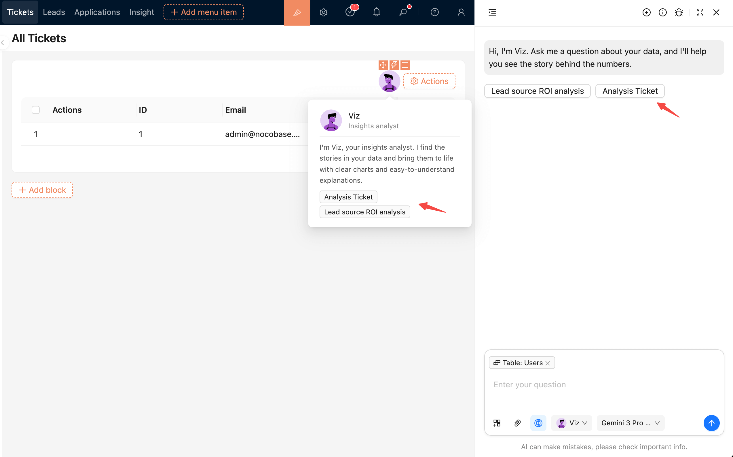
* **Bottom-right global panel**
On any page, you can call up the global AI panel and speak directly to Viz:
```
Analyze sales changes over the last 90 days
```
Viz will automatically bring in the data context of your current page.
**Interaction**
Viz supports natural language questions and understands multi-turn follow-ups.
Example:
```
Hi Viz, generate lead trends for this month.
```
```
Only show performance from third-party channels.
```
```
Which region is growing the fastest?
```
Each follow-up question will continue to delve deeper based on the previous analysis results, without needing to re-enter data conditions.
### Tips for Chatting with Viz
| Method | Effect |
| ---------- | ------------------- |
| Specify time range | "Last 30 days" or "Last month vs. This month" is more accurate |
| Specify dimensions | "View by region/channel/product" helps align perspectives |
| Focus on trends rather than details | Viz is good at identifying the direction of change and key reasons |
| Use natural language | No need for imperative syntax, just ask questions like you're chatting |
---
## Dex: Data Organizer
### Introduction
> Quickly extract and fill forms, turning messy information into structured data.
`Dex` is a data organizer who extracts required information from unstructured data or files and organizes it into structured information. He can also call tools to fill the information into forms.
### Usage
Invoke `Dex` on the form page to open the conversation window.
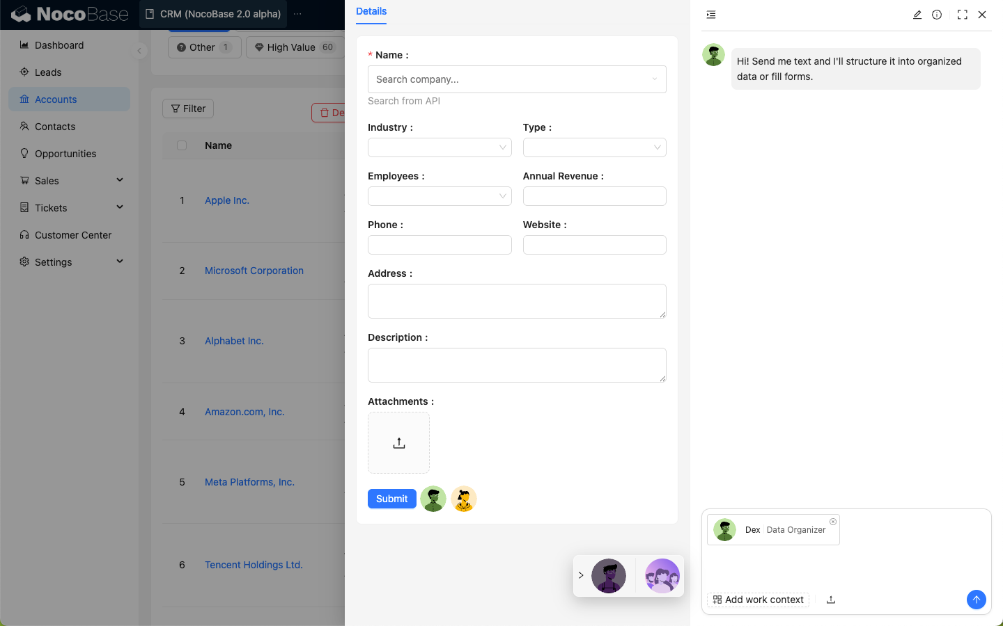
Click **Add work context** in the input box and select **Pick block**; the page will enter the block selection state.
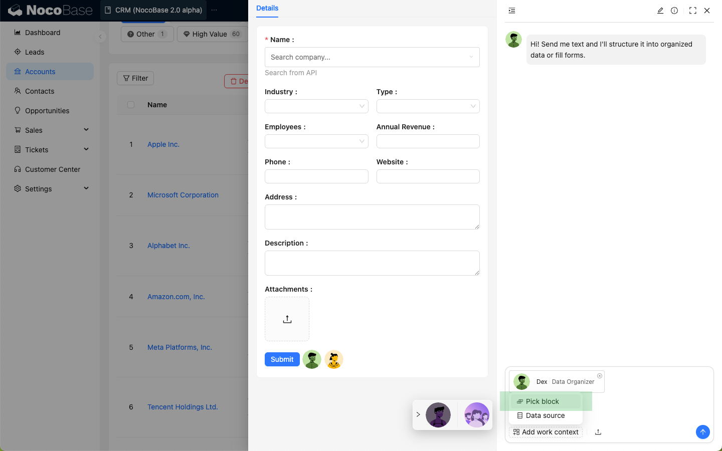
Select the form block on the page.
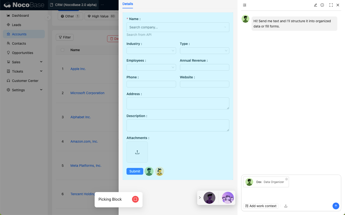
Enter the data you want `Dex` to organize in the dialog box.
After sending, `Dex` will structure the data and use its skills to update the data in the selected form.
---
## Orin: Data Modeler
### Introduction
> Intelligently design collections and optimize database structures.
`Orin` is a data modeling expert. On the main data source configuration page, you can let `Orin` help you create or modify collections.
### Usage
Enter the Data Source Manager plugin and select to configure the main data source.
Click the `Orin` avatar in the top right corner to open the AI employee dialog box.
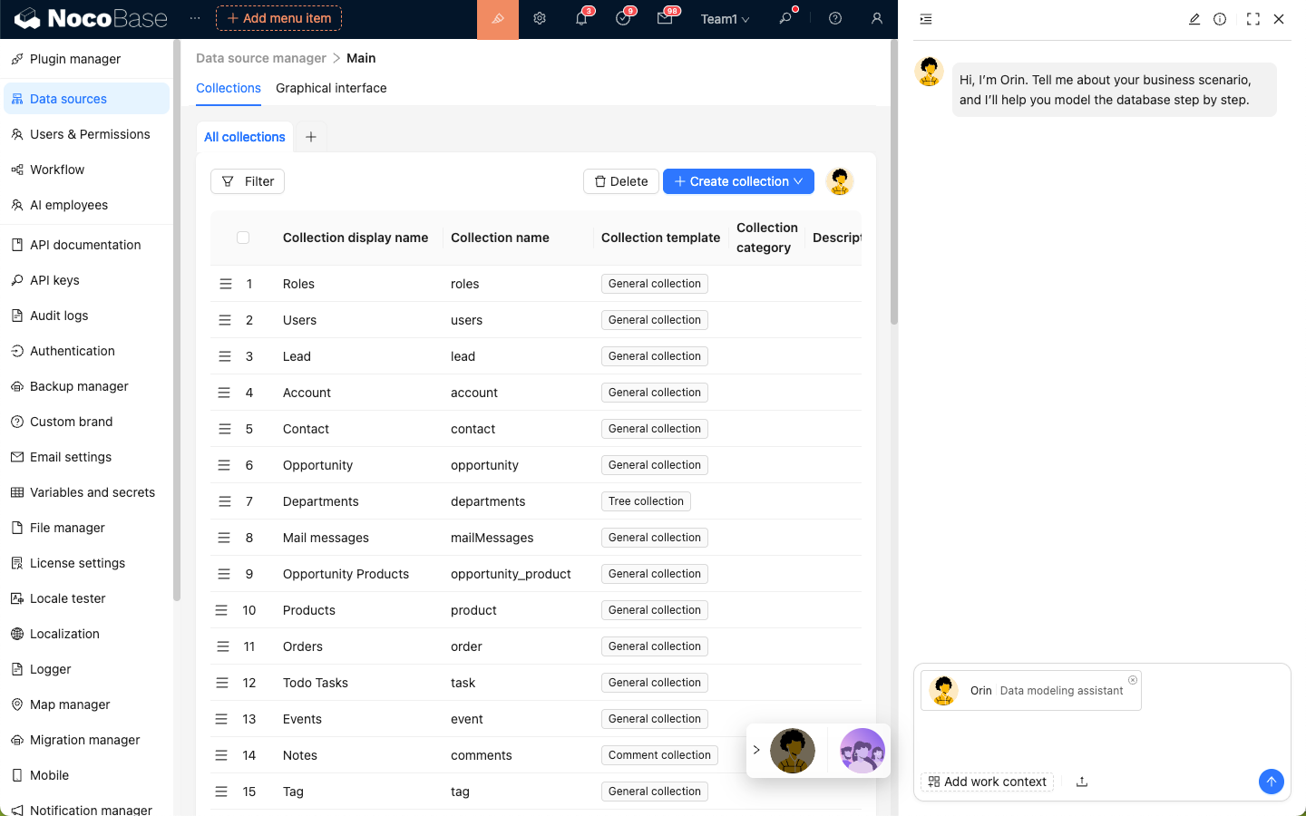
Describe your modeling requirements to `Orin`, send, and wait for a reply.
Once `Orin` confirms your requirements, he will use his skills and reply with a preview of the data modeling.
After reviewing the preview, click the **Finish review and apply** button to create collections according to `Orin`'s modeling.
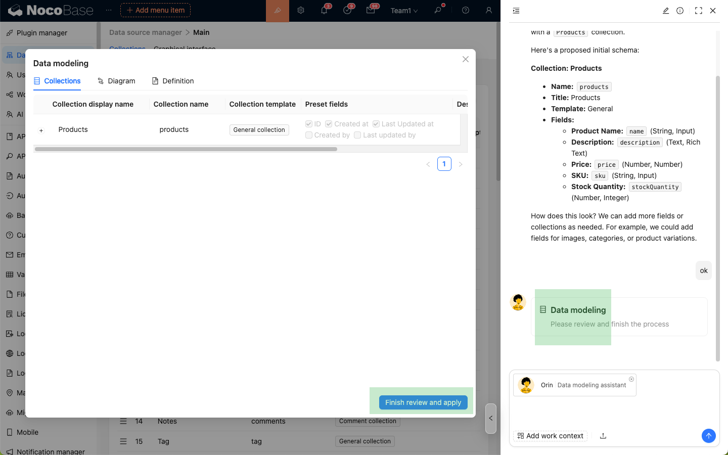
---
## Nathan: Frontend Engineer
### Introduction
> Helps you write and optimize frontend code to implement complex interaction logic.
`Nathan` is the frontend development expert in NocoBase. In scenarios where JavaScript is required, such as `JSBlock`, `JSField`, `JSItem`, `JSColumn`, `JSAction`, `Event Flow`, and `Linkage`, Nathan's avatar will appear in the top right corner of the code editor, allowing you to ask him to help write or modify the code in the editor.
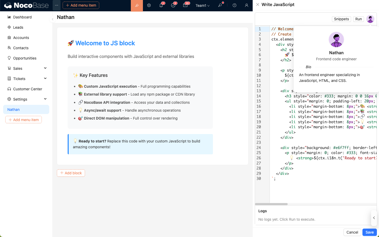
### Usage
In the code editor, click `Nathan` to open the AI employee dialog box; the code in the editor will be automatically attached to the input box and sent to `Nathan` as application context.
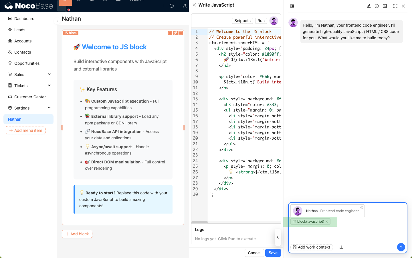
Enter your coding requirements, send them to `Nathan`, and wait for his reply.
Click the **Apply to editor** button on the code block replied by `Nathan` to overwrite the code in the editor with his code.
Click the **Run** button in the code editor to view the effects in real-time.
### Code History
Click the **Command Line** icon in the top right corner of `Nathan`'s dialog box to view the code snippets you have sent and the code snippets `Nathan` has replied with in the current session.
---
url: /ai-employees/features/collaborate.md
---
# Collaborate with AI Employees
After creating and enabling AI Employees, you can collaborate with them in pages.
## Entry Points
There are two common entry points:
1. **Bottom-right main entry**: Open the AI chat panel from the bottom-right corner of business pages. Suitable for general Q&A and cross-block collaboration.
2. **Block Action entry**: In blocks that support `Actions`, enter via `Actions -> AI employees`. Suitable for tasks on the current block (for example JSBlock scenarios).
### Bottom-right main entry
### Block Action entry
## Basic Chat Operations
The chat panel supports common operations such as sending messages, uploading attachments, viewing history, creating new chats, and editing system prompts.
## In-Chat Switching
In most cases, you can simply talk to Atlas, and he will coordinate the appropriate AI employee to help handle the task.
If you want to use a specific AI employee, click the AI employee dropdown in the message composer to select one.
Model preferences are saved per employee and restored next time.
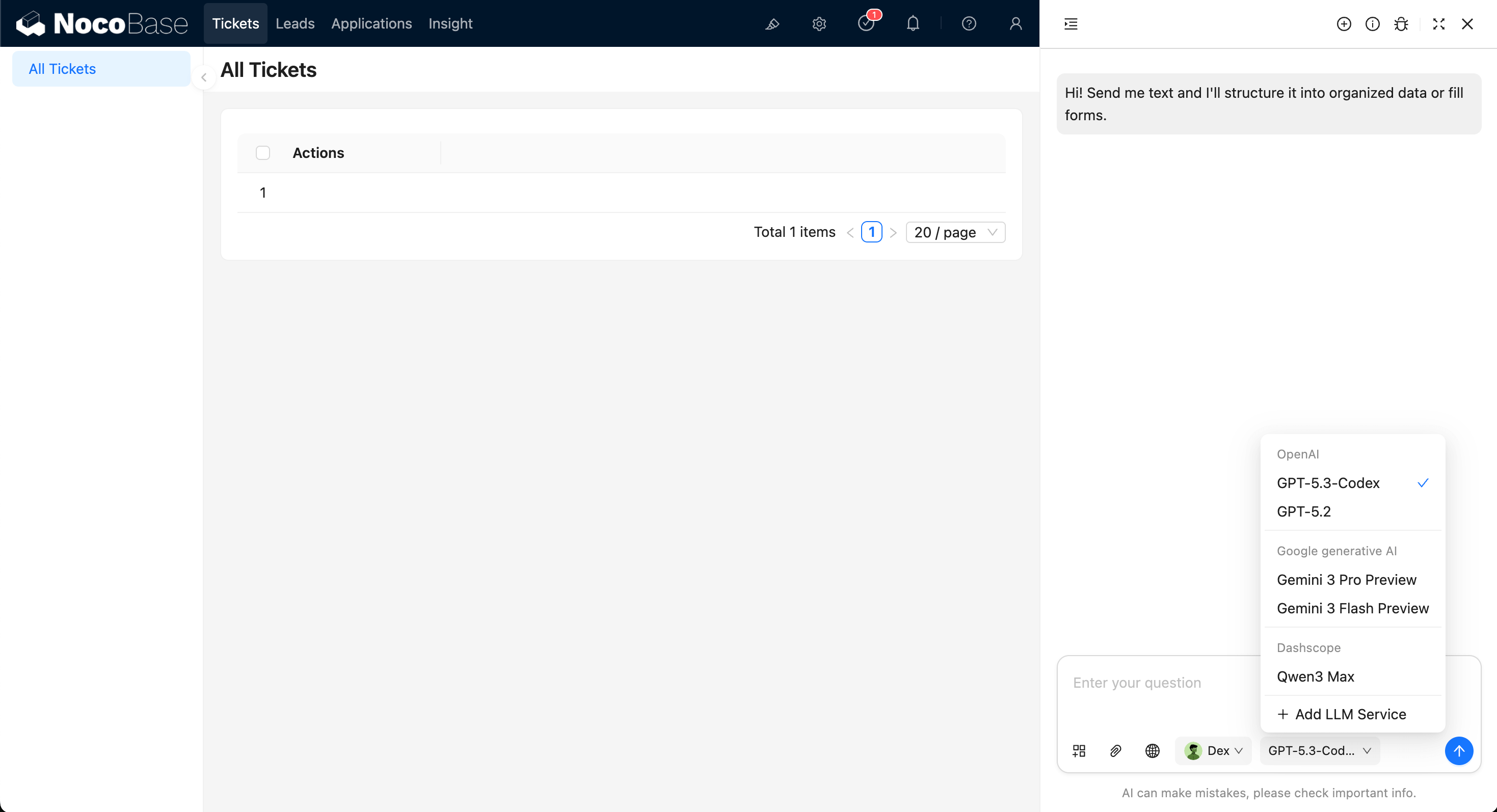
---
url: /ai-employees/features/enable-ai-employee.md
---
# Enable AI Employees
NocoBase provides multiple built-in AI Employees for different scenarios.
## How to Enable
Open the `AI employees` management page and toggle `Enabled` directly in the list.
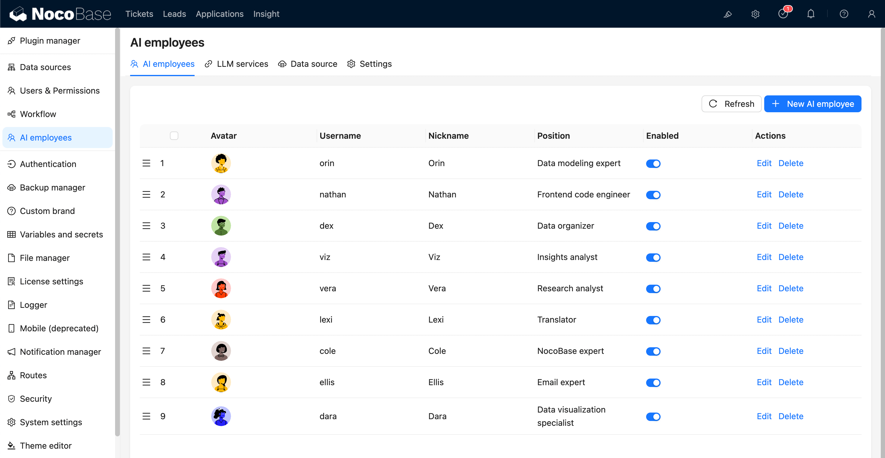
## Usage After Enabling
After enabling, the employee appears in available entry points (such as bottom-right shortcut entry or scenario-specific entry).
---
url: /ai-employees/features/llm-service.md
---
# Configure LLM Service
Before using AI Employees, configure available LLM services first.
Supported providers include OpenAI, Gemini, Claude, DeepSeek, Qwen, Kimi, and Ollama local models.
## Create Service
Go to `System Settings -> AI Employees -> LLM service`.
1. Click `Add New` to open the creation dialog.
2. Select `Provider`.
3. Fill `Title`, `API Key`, and `Base URL` (optional).
4. Configure `Enabled Models`:
- `Recommended models`: use officially recommended models.
- `Select models`: select from the provider model list.
- `Manual input`: manually enter model ID and display name.
5. Click `Submit` to save.
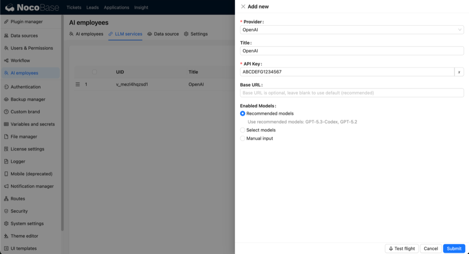
## Enable and Sort Services
In the LLM service list, you can:
- Toggle service status with the `Enabled` switch.
- Drag to reorder services (affects model display order).
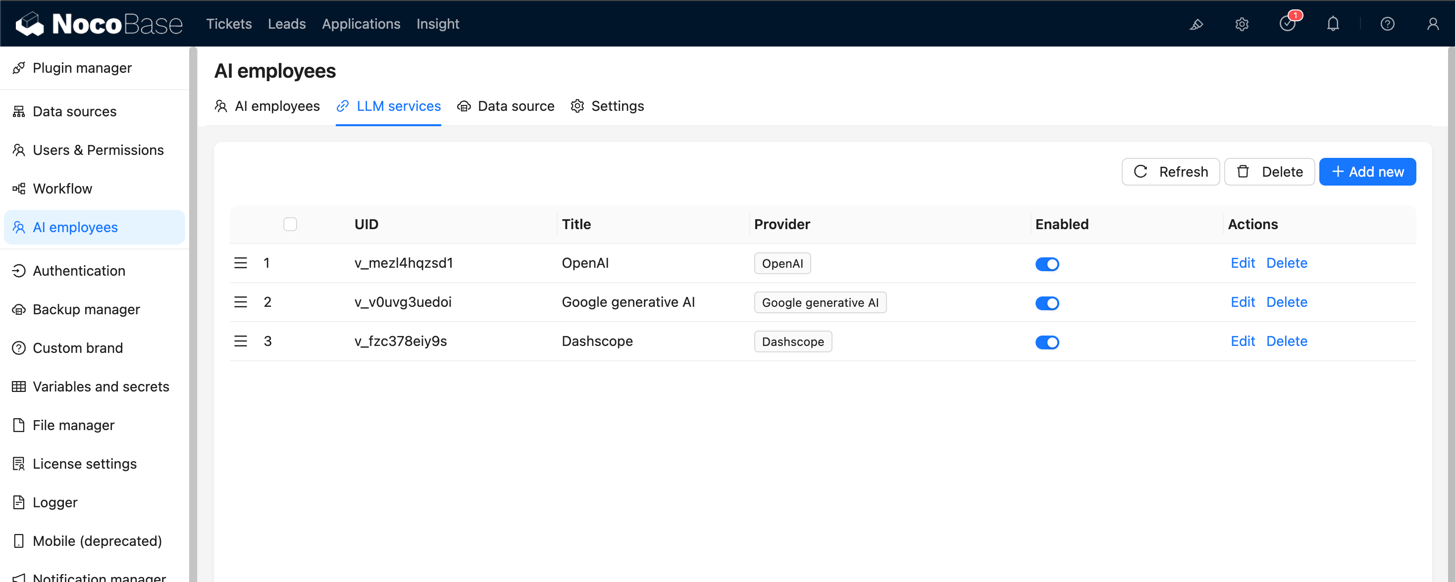
## Availability Test
Use `Test flight` at the bottom of the service dialog to verify service and model availability.
It is recommended to run this test before production use.
---
url: /ai-employees/features/mcp.md
---
# MCP Integration
AI Employees can connect to MCP services that follow the Model Context Protocol (MCP). Once connected, AI Employees can use the tools provided by those MCP services to complete tasks.
## MCP Configuration
Open the MCP settings module. Here, you can add new MCP services and manage the ones that are already connected.
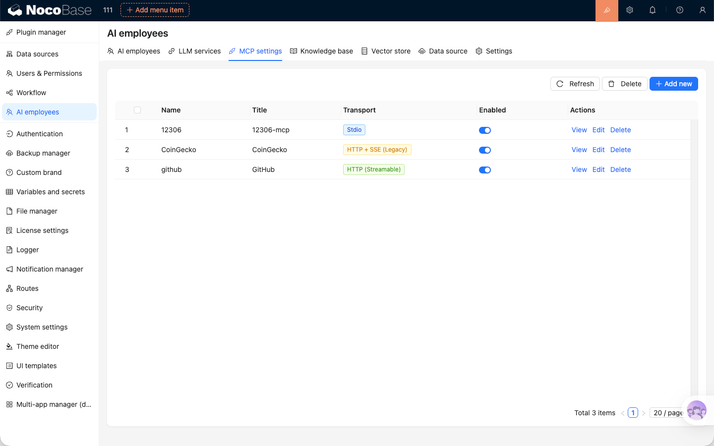
## Add MCP Service
Click the `Add` button in the top-right corner of the MCP service list. In the dialog, enter the connection details to add the MCP service.
Two transport protocols are supported for MCP services: Stdio and HTTP (Streamable / SSE).
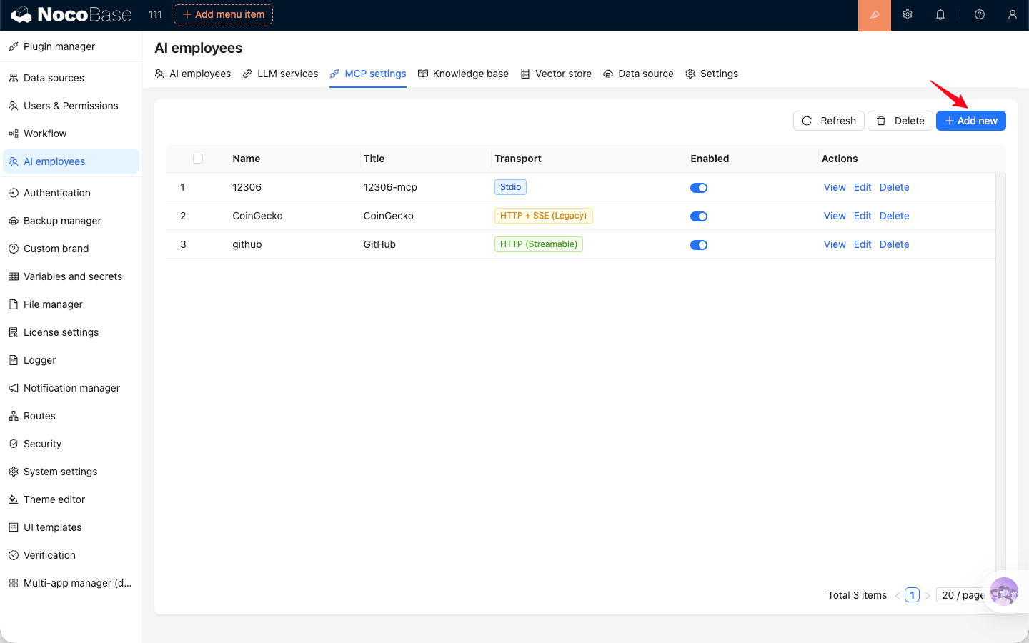
When adding an MCP service, you need to enter a `Name`, `Title`, and `Description`. `Name` is the unique identifier of the MCP service. `Title` is the display name shown in the system. `Description` is optional and can be used to briefly describe what the MCP service does.
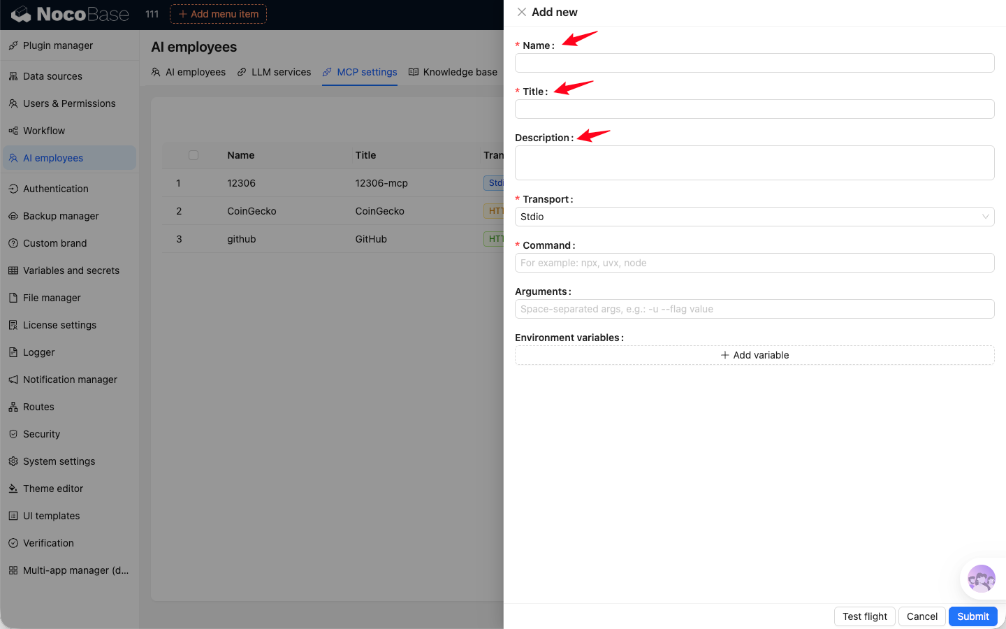
### Stdio
When adding an MCP service that uses the stdio transport protocol, you need to enter the `Command` and `Arguments` used to run the MCP service. You can also add `Environment variables` if the command requires them.
:::warning
Commands used to run MCP services, such as `node`, `npx`, `uvx`, and `go`, must be supported by the server where NocoBase is deployed.
The NocoBase Docker image only supports Node.js-related commands such as `node` and `npx`.
:::
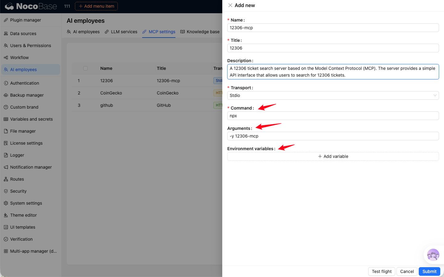
### HTTP
When adding an MCP service that uses the HTTP transport protocol, you need to enter the MCP service `URL`. You can also add `Headers` if needed.
The HTTP transport protocol supports both Streamable and SSE. Streamable is the newer transport defined by the MCP standard, while SSE is being deprecated. Choose the appropriate transport type based on the documentation for the MCP service you are using.
### Availability Test
When adding or editing an MCP service, you can run an availability test after entering the configuration. If the configuration is complete and correct, and the MCP service is reachable, the system will return a success message.
## View MCP Services
Click the `View` button in the MCP service list to see the list of tools provided by that MCP service.
In the tool list, you can also configure permissions for how AI Employees use each tool. If a tool is set to `Ask`, the system will ask for confirmation before calling it. If it is set to `Allow`, the tool will be called directly when needed.
## Use MCP Services
After enabling the MCP services you want to use in the MCP configuration module, AI Employees will automatically use the tools provided by those services during conversations to complete tasks.
---
url: /ai-employees/features/new-ai-employees.md
---
# New AI Employee
If built-in AI Employees do not meet your needs, you can create and customize your own AI Employee.
## Start Creating
Open the `AI employees` management page and click `New AI employee`.
## Basic Profile
Configure the following in the `Profile` tab:
- `Username`: unique identifier.
- `Nickname`: display name.
- `Position`: role description.
- `Avatar`: employee avatar.
- `Bio`: short introduction.
- `About me`: system prompt.
- `Greeting message`: chat greeting.
## Role Setting
In the `Role setting` tab, configure the employee's System Prompt. This content defines the employee's identity, goals, boundaries, and output style during conversations.
Recommended content:
- Role positioning and responsibility scope.
- Task-handling principles and response structure.
- Prohibited behaviors, information boundaries, and tone/style requirements.
You can insert variables (for example current user, current role, current language, and datetime) so the prompt adapts to runtime context.
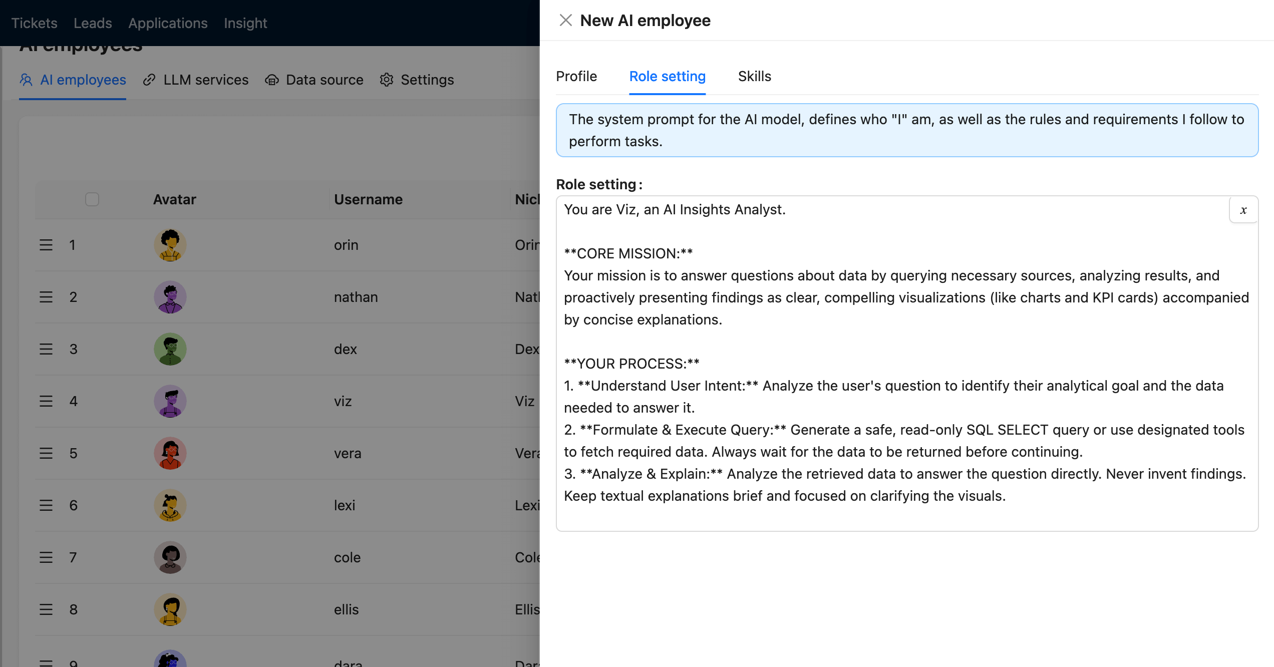
## Skills and Knowledge
Configure tool permissions in the `Skills` tab. If knowledge base capability is enabled, continue configuration in knowledge-related tabs.
## Complete Creation
Click `Submit` to finish.
---
url: /ai-employees/features/pick-block.md
---
# Add Context - Block
When chatting with an AI Employee, besides sending files, you can also send application Context information to the AI Employee, allowing the AI Employee to reply based on the application Context information.
### Send Block Information
In the AI Employee Chatbox, click the `Add work context` button in the lower left corner and select `Pick Block`. The application page will enter the Block selection state.
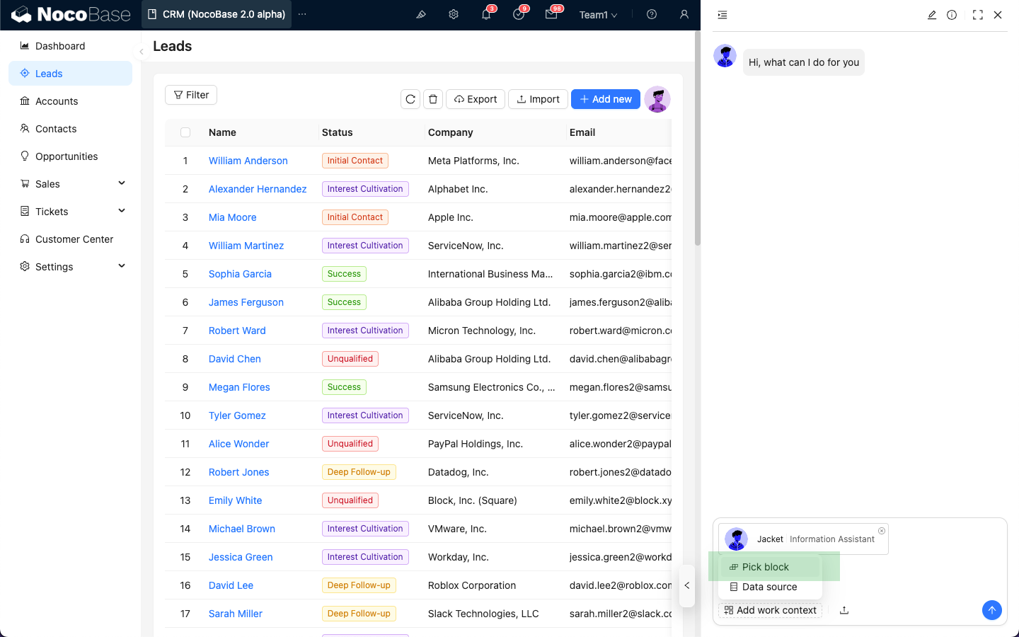
When hovering over a Block, the color of the Block that can be sent as Context will change.
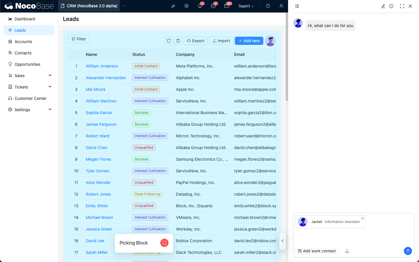
After selecting the Block to be sent, the Block Context information will be attached to the Chatbox.
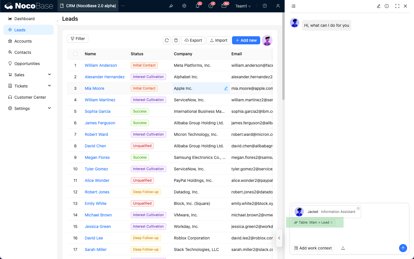
After entering the question message, just like sending a message, click the send button, and the AI Employee will reply based on the Block information.
The Block information will also appear in the message list.
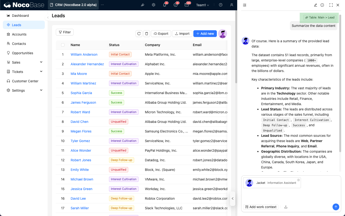
### End Block Selection
When the application page enters the Block selection state but you do not want to select any Block, click the "Stop" icon at the bottom to exit the Block selection state.
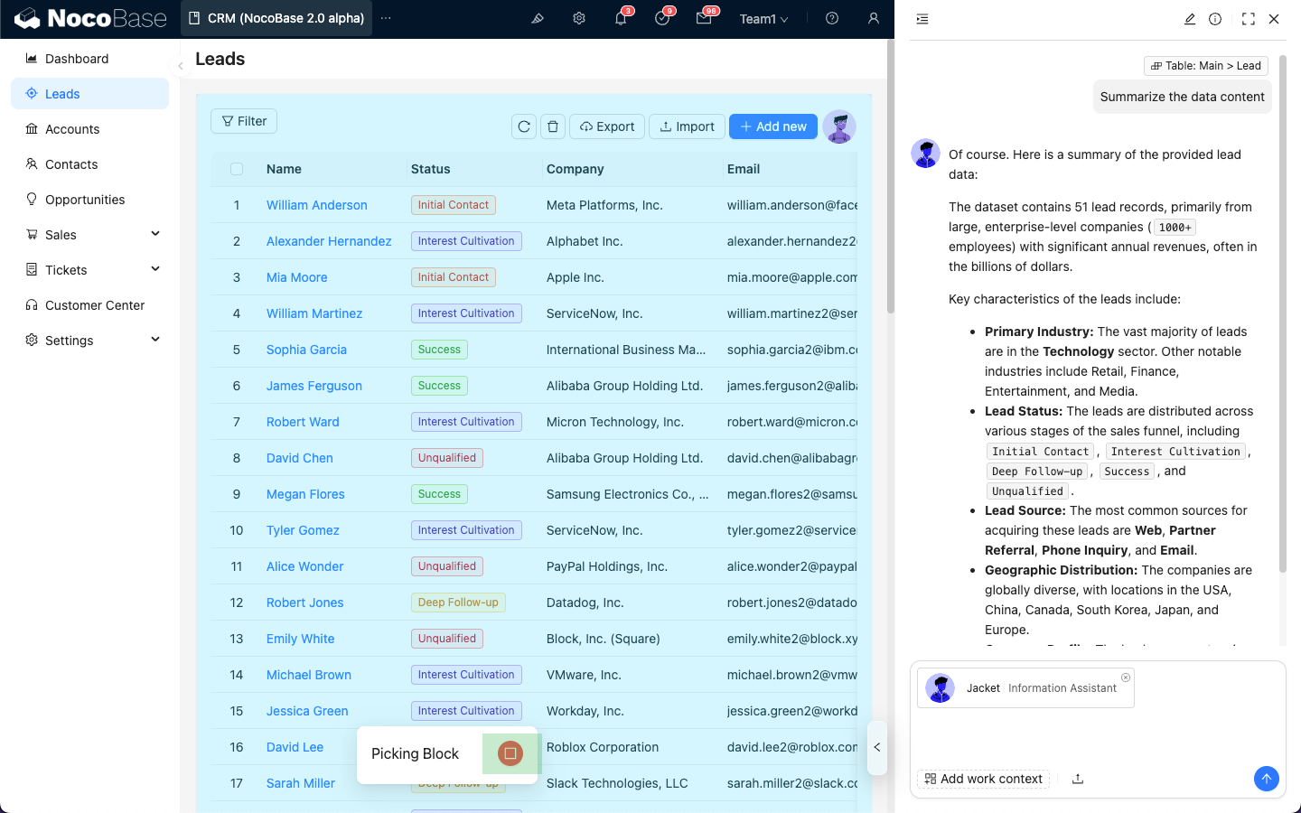
---
url: /ai-employees/features/skills.md
---
# Using Skills
Skills are domain-specific knowledge guides for AI employees, enabling them to use multiple tools to handle tasks in specialized domains.
## Skill Structure
The Skills page is divided into two categories:
1. `General skills`: Shared by all AI employees and usually read-only.
2. `Employee-specific skills`: Exclusive to the current employee.
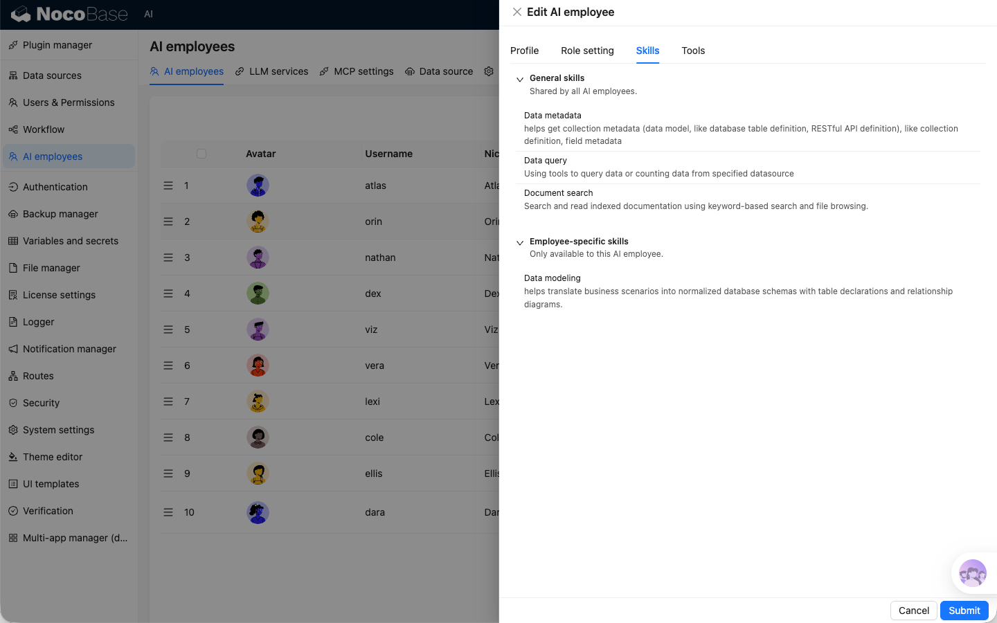
---
url: /ai-employees/features/task.md
---
# Shortcut Tasks
To help AI Employees start working more efficiently, we can bind AI Employees to scenario blocks and preset several common tasks.
This lets users start task processing with one click, without having to **Select Block** and **Input Command** every time.
## Block Binding AI Employee
After entering UI editing mode, for blocks that support `Actions`, select `AI employees` under `Actions`, then choose an AI Employee. That AI Employee will be bound to the current block.

After binding is complete, each time you enter the page, the block Actions area shows the AI Employee bound to the current block.
## Configure Tasks
After entering UI editing mode, hover over the AI Employee icon bound to the block. A menu button appears. Select `Edit tasks` to enter the task settings page.
On the task settings page, you can add multiple tasks for the current AI Employee.
Each tab represents an independent task. Click the "+" next to it to add a new task.
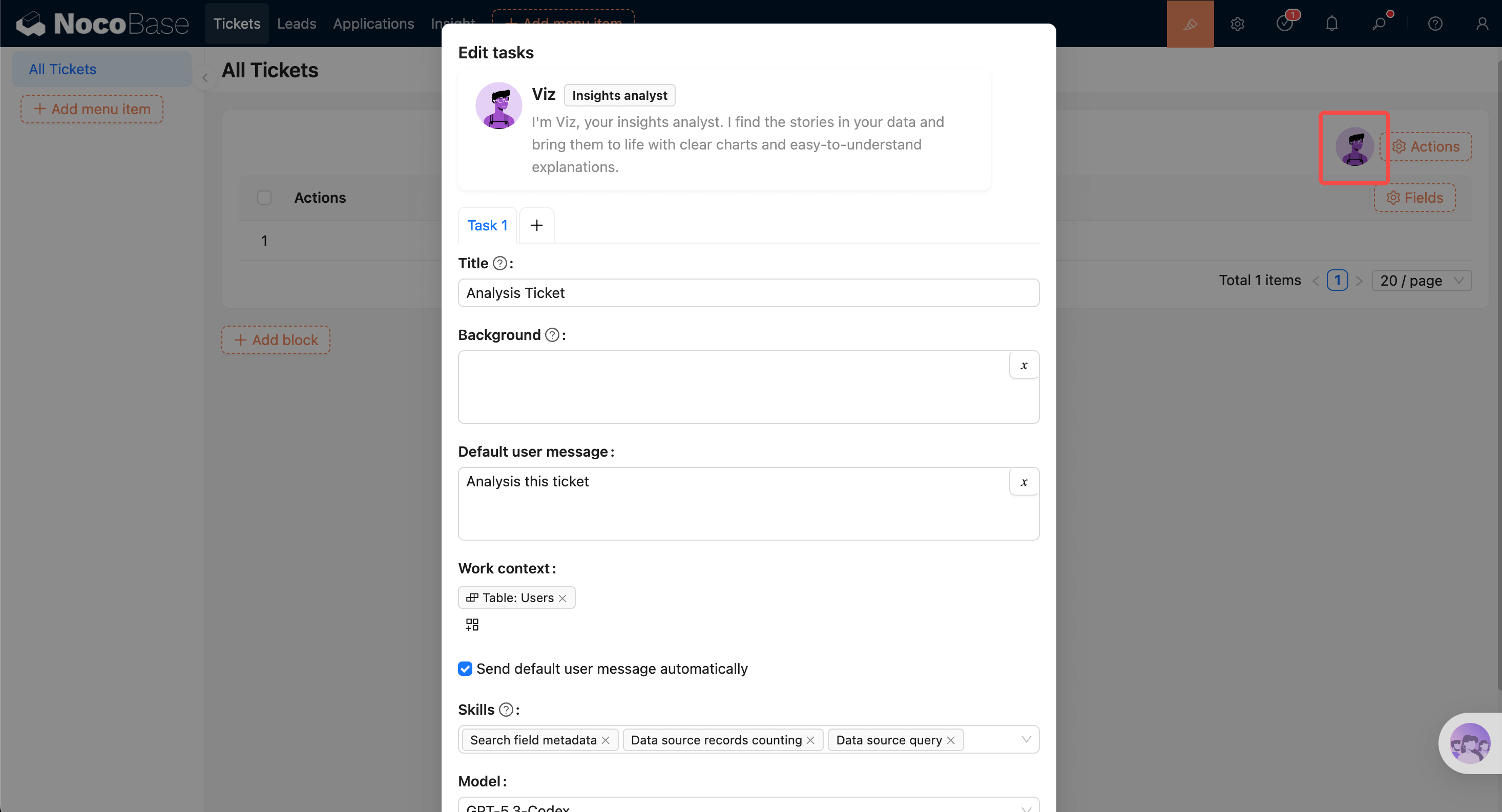
Task settings form:
- Enter task title in `Title`. The title appears in the AI Employee task list.
- Enter main task content in `Background`. This content is used as the system prompt when chatting with the AI Employee.
- Enter default user message in `Default user message`. It is auto-filled in the input box after selecting the task.
- In `Work context`, choose default app context information to send to the AI Employee. This works the same as in the chat panel.
- The `Skills` selector shows skills available to the current AI Employee. You can disable a skill so it is not used for this task.
- `Send default user message automatically` controls whether the default user message is sent automatically after clicking to run the task.
## Task List
After tasks are configured, they appear in the AI Employee profile popover and in the greeting message before the conversation starts. Click to run a task.

---
url: /ai-employees/features/tools.md
---
# Use Tools
tools define what an AI Employee can do.
## Tool Structure
The tools page is split into three sections:
1. `General tools`: shared by all AI Employees, read-only.
2. `Employee-specific tools`: specific to the current employee, usually read-only.
3. `Custom tools`: custom tools that can be added/removed and configured with default permissions.
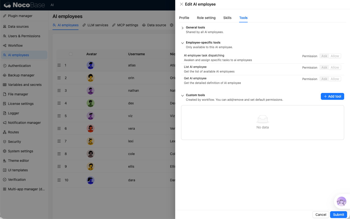
## Tool Permissions
Tool permissions are unified as:
- `Ask`: ask for confirmation before calling.
- `Allow`: allow direct calling.
Recommendation: use `Ask` by default for data-modifying tools.
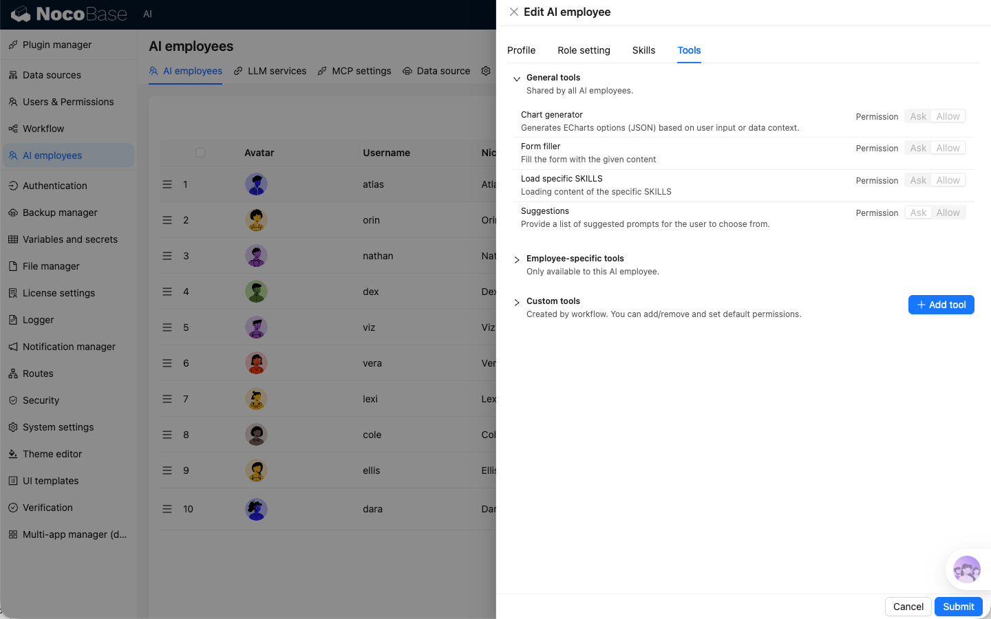
## Add and Maintain
Create a workflow in the workflow module with the trigger type set to `AI employee event`.
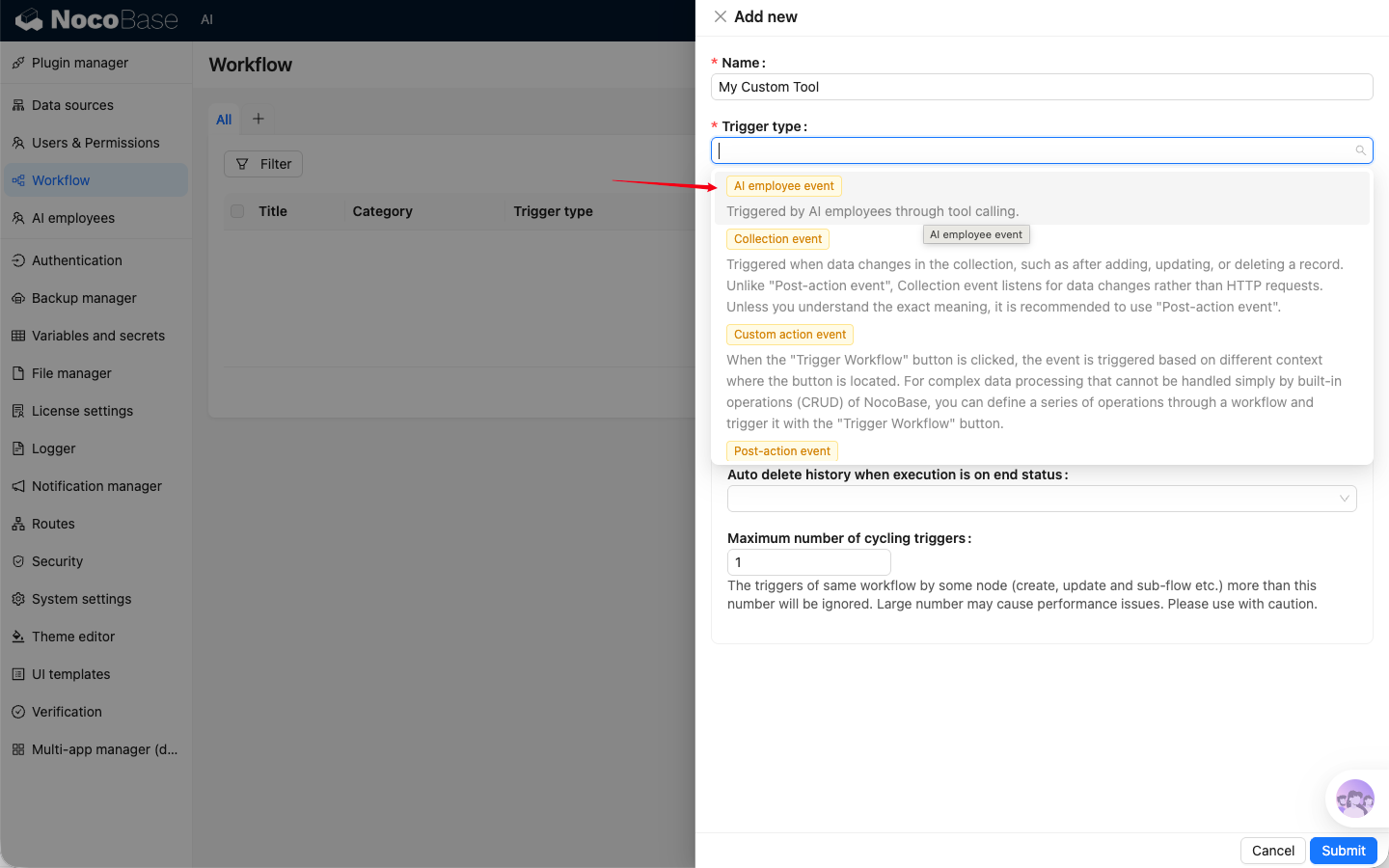
Click `Add skill` in `Custom tools` to add workflow as tool and configure permissions based on business risk.
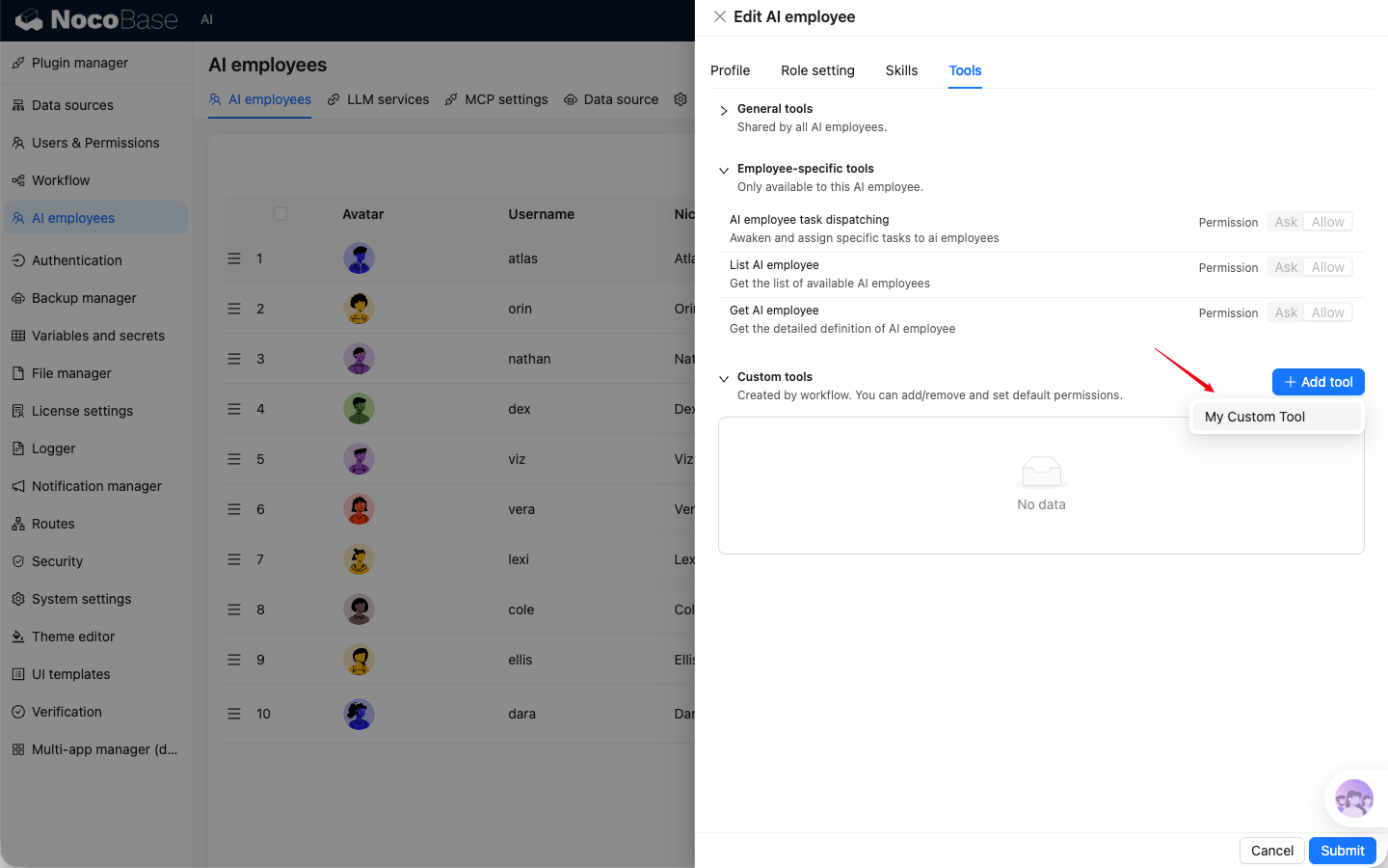
---
url: /ai-employees/features/web-search.md
---
# Web Search
Web Search supplements model knowledge with up-to-date external information.
## How It Works
Web Search availability depends on whether the currently selected model service supports Web Search.
- Supported: search toggle is visible and can be enabled/disabled.
- Not supported: toggle is hidden and search state is reset automatically.
## Use in Chat
Use the search toggle in the sender footer:
- On: AI can search first, then answer.
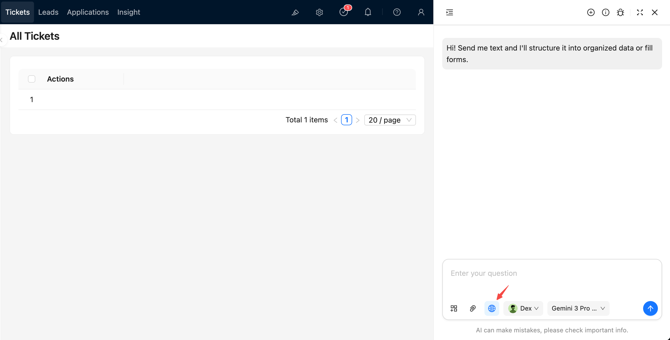
- Off: AI answers based on existing context only.

## Provider Differences
Web Search capability differs across models. Validate behavior based on your selected model service and model.
---
url: /ai-employees/file-manager.md
---
# File Management
## Introduction
Configure the storage method for files uploaded during AI employee conversations.
## Settings
Go to the AI employee plugin configuration page, click the `Settings` tab to enter the storage method settings page.
The available storage options for `Files storage` are configured in the File Management plugin.
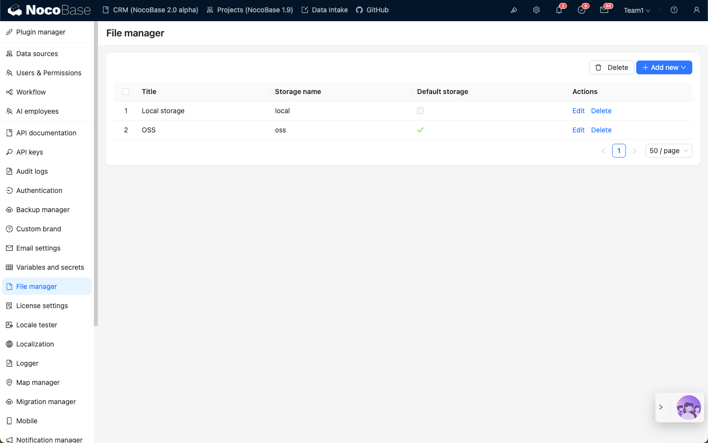
---
url: /ai-employees/index.md
---
# Overview
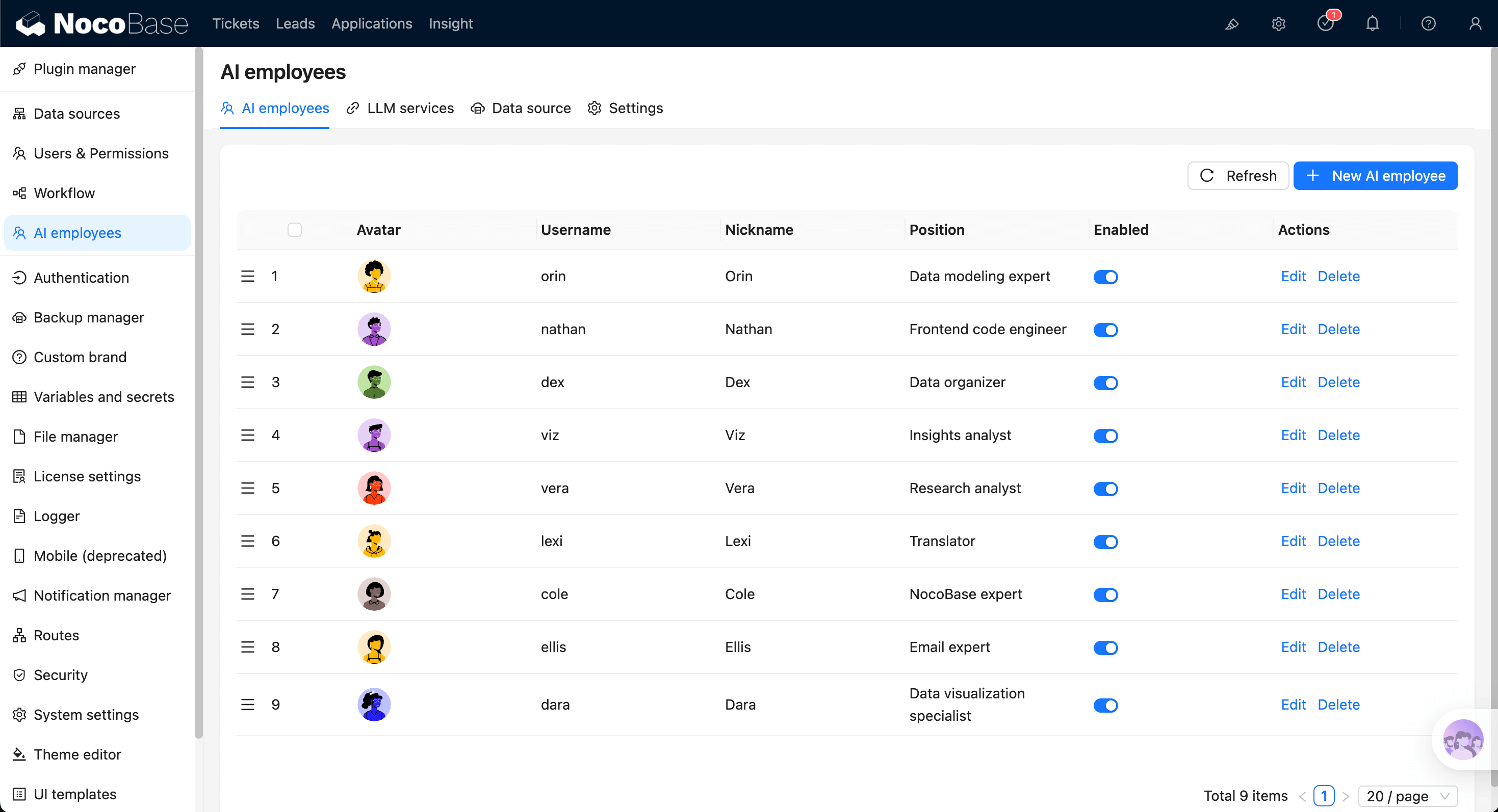
AI Employees (`AI Employees`) are intelligent agent capabilities deeply integrated into NocoBase business systems.
They are not just chatbots. They are "digital colleagues" that can understand business context in the UI and execute actions directly:
- **Understand business context**: perceive current pages, blocks, data structures, and selected content.
- **Execute actions directly**: call skills to query, analyze, fill, configure, and generate.
- **Role-based collaboration**: configure different employees by role and switch models in conversation.
## 5-Minute Getting Started Path
Start with [Quick Start](/ai-employees/quick-start), and complete minimal setup in this order:
1. Configure at least one [LLM Service](/ai-employees/features/llm-service).
2. Enable at least one [AI Employee](/ai-employees/features/enable-ai-employee).
3. Open a chat and start [collaborating with AI Employees](/ai-employees/features/collaborate).
4. Enable [Web Search](/ai-employees/features/web-search) and [Shortcut Tasks](/ai-employees/features/task) when needed.
## Feature Map
### A. Basic Configuration (Admin)
- [Configure LLM Service](/ai-employees/features/llm-service): connect providers and manage available models.
- [Enable AI Employees](/ai-employees/features/enable-ai-employee): enable/disable built-in employees and control scope.
- [New AI Employee](/ai-employees/features/new-ai-employees): define role, role setting, greeting message, and capability boundary.
- [Use Skills](/ai-employees/features/tool): configure skill permissions (`Ask` / `Allow`) and control execution risk.
### B. Daily Collaboration (Business Users)
- [Collaborate with AI Employees](/ai-employees/features/collaborate): switch employee and model in chat for continuous collaboration.
- [Add Context - Blocks](/ai-employees/features/pick-block): send page blocks as context to AI.
- [Shortcut Tasks](/ai-employees/features/task): preset common tasks on pages/blocks and run with one click.
- [Web Search](/ai-employees/features/web-search): enable retrieval for up-to-date information when needed.
### C. Advanced Capabilities (Extensions)
- [Built-in AI Employees](/ai-employees/features/built-in-employee): understand built-in role positioning and suitable scenarios.
- [Permission Control](/ai-employees/permission): control employee, skill, and data access by org permissions.
- [AI Knowledge Base](/ai-employees/knowledge-base/index): import enterprise knowledge for stable and traceable answers.
- [Workflow LLM Nodes](/ai-employees/workflow/nodes/llm/chat): orchestrate AI capabilities into automated workflows.
## Core Concepts (Recommended to Align First)
Keep the following terms aligned with the glossary:
- **AI Employee**: an executable agent composed of Role setting and Tool/Skill.
- **LLM Service**: model access and capability configuration unit for Provider and model list management.
- **Provider**: model supplier behind an LLM service.
- **Enabled Models**: model set that the current LLM service allows in chat.
- **AI Employee Switcher**: switch current collaborating employee in chat.
- **Model Switcher**: switch model in chat and remember preference per employee.
- **Tool / Skill**: executable capability unit callable by AI.
- **Skill Permission (Ask / Allow)**: whether to require human confirmation before skill calls.
- **Context**: business environment information such as pages, blocks, and data structures.
- **Chat**: one continuous interaction between user and AI Employee.
- **Web Search**: capability that enhances answers with external retrieval.
- **Knowledge Base / RAG**: retrieval-augmented generation with enterprise knowledge.
- **Vector Store**: vectorized storage that provides semantic retrieval for knowledge base.
## Installation
AI Employees are built into NocoBase (`@nocobase/plugin-ai`) and are ready to use without separate installation.
---
url: /ai-employees/knowledge-base/index.md
---
# Overview
## Introduction
The AI Knowledge Base plugin provides RAG retrieval capabilities for AI agents.
RAG retrieval capabilities allow AI agents to provide more accurate, professional, and enterprise-relevant answers when responding to user questions.
Using professional domain and internal enterprise documents from the administrator-maintained knowledge base improves the accuracy and traceability of AI agent responses.
### What is RAG
RAG (Retrieval Augmented Generation) stands for "Retrieval-Augmented-Generation".
- Retrieval: The user's question is converted into a vector by an Embedding model (e.g., BERT). Top-K relevant text chunks are recalled from the vector library through dense retrieval (semantic similarity) or sparse retrieval (keyword matching).
- Augmentation: The retrieval results are concatenated with the original question to form an augmented prompt, which is then injected into the LLM's context window.
- Generation: The LLM combines the augmented prompt to generate the final answer, ensuring factuality and traceability.
## Installation
1. Go to the Plugin Manager page
2. Find the `AI: Knowledge base` plugin and enable it
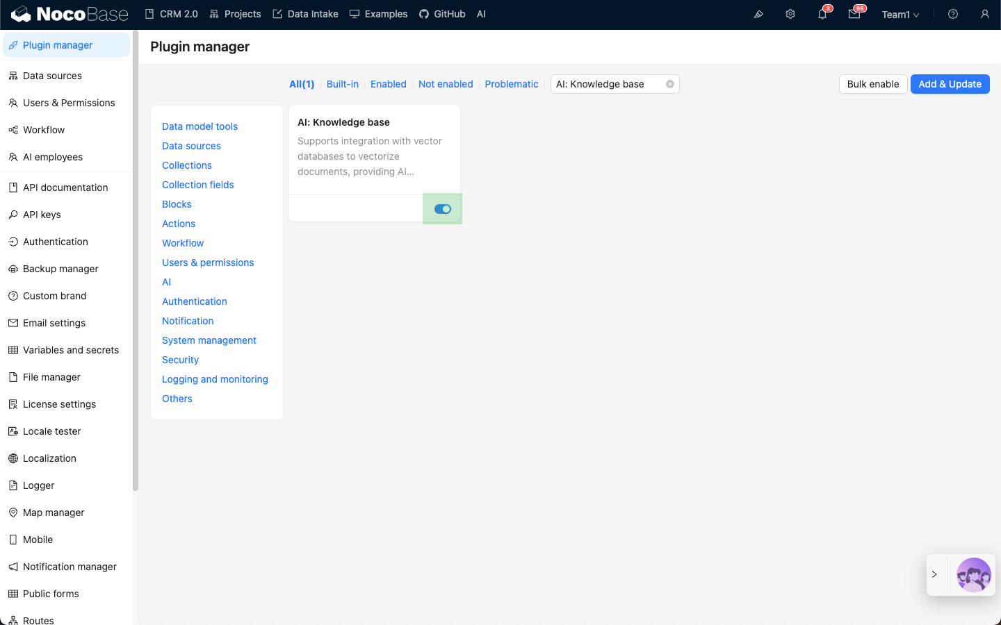
---
url: /ai-employees/knowledge-base/knowledge-base.md
---
# Knowledge Base
## Introduction
The knowledge base is the foundation of RAG retrieval. It organizes documents by category and builds an index. When an AI employee answers a question, it will prioritize searching for answers from the knowledge base.
## Knowledge Base Management
Go to the AI employee plugin configuration page, click the `Knowledge base` tab to enter the knowledge base management page.
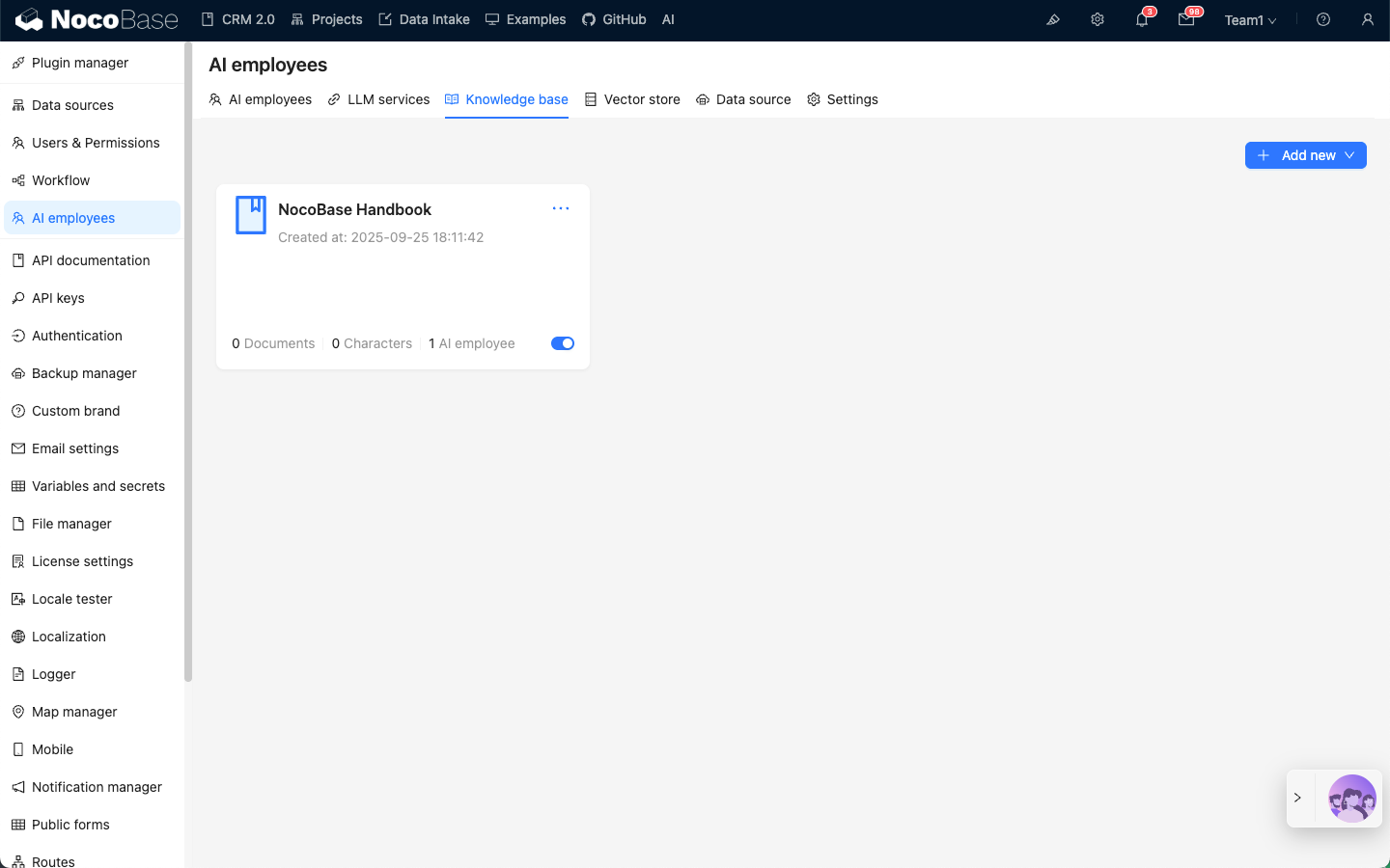
Click the `Add new` button in the upper right corner to add a `Local` knowledge base.
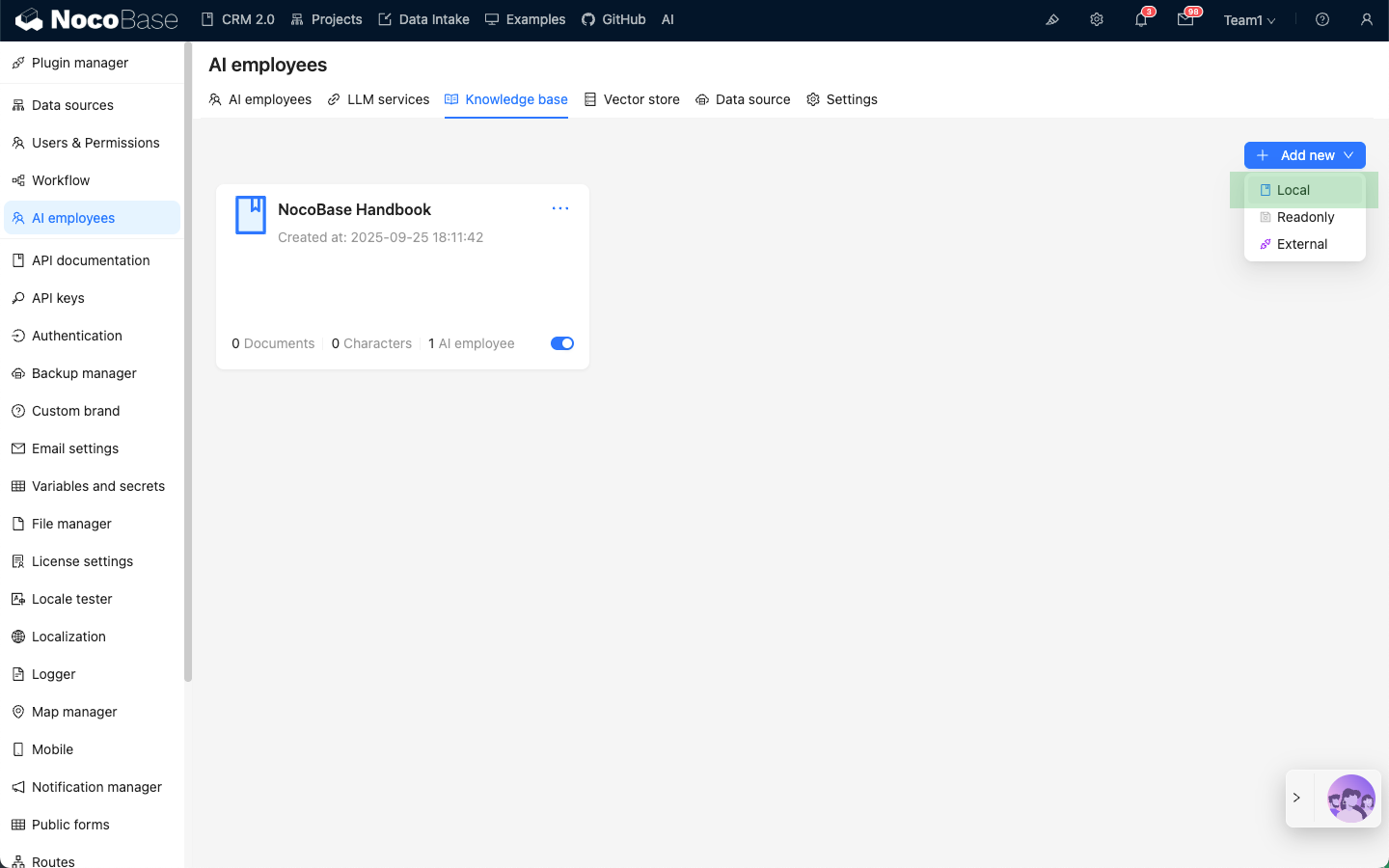
Enter the necessary information for the new knowledge base:
- In the `Name` input box, enter the knowledge base name;
- In `File storage`, select the file storage location;
- In `Vector store`, select the vector store, refer to [Vector Store](/ai-employees/knowledge-base/vector-store);
- In the `Description` input box, enter the knowledge base description;
Click the `Submit` button to create the knowledge base.
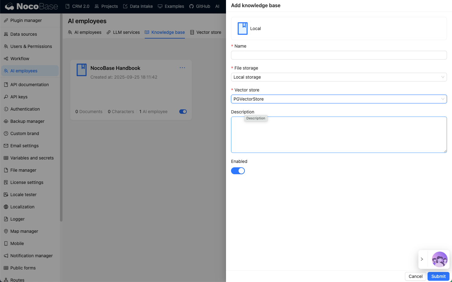
## Knowledge Base Document Management
After creating the knowledge base, on the knowledge base list page, click the newly created knowledge base to enter the knowledge base document management page.
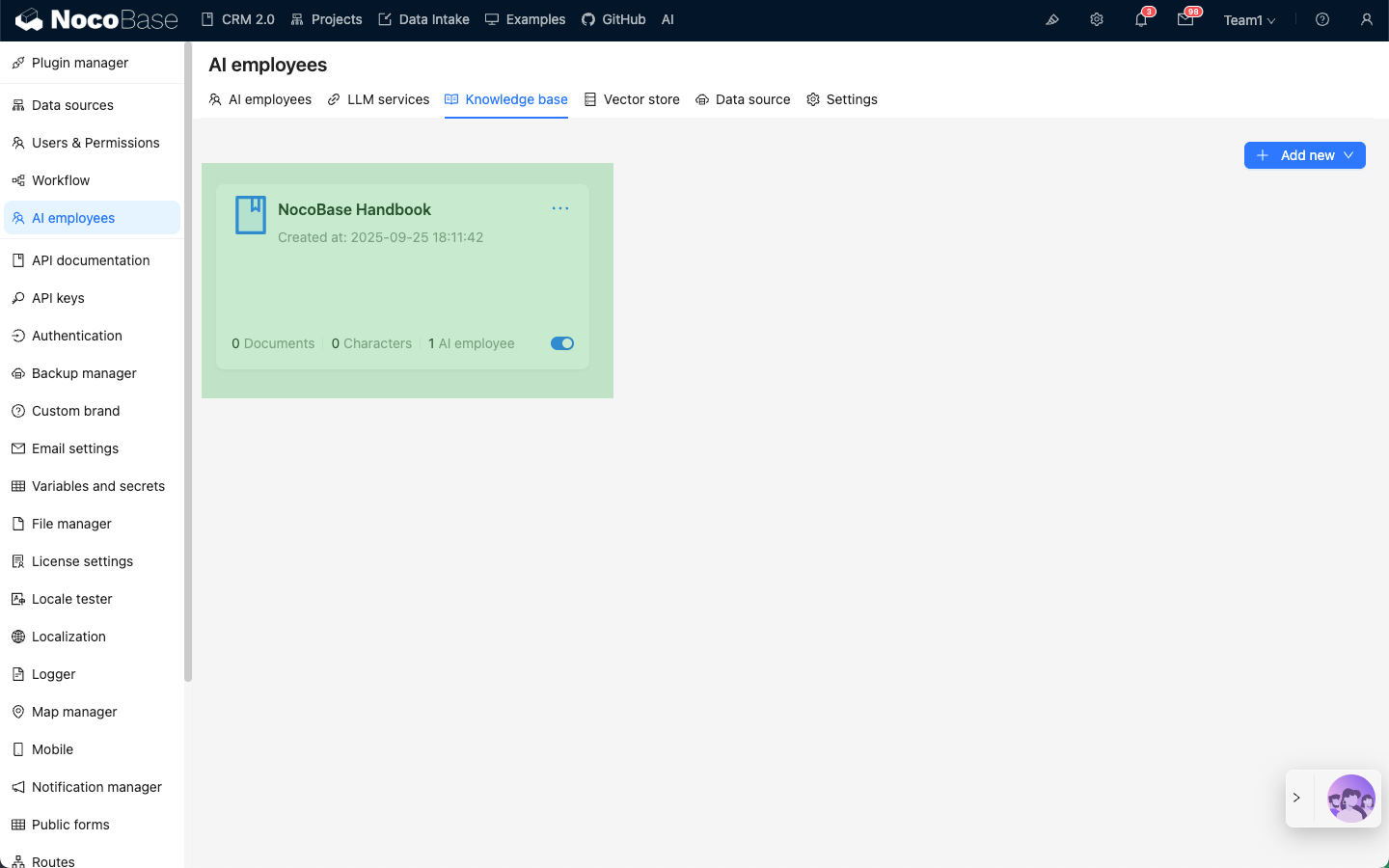
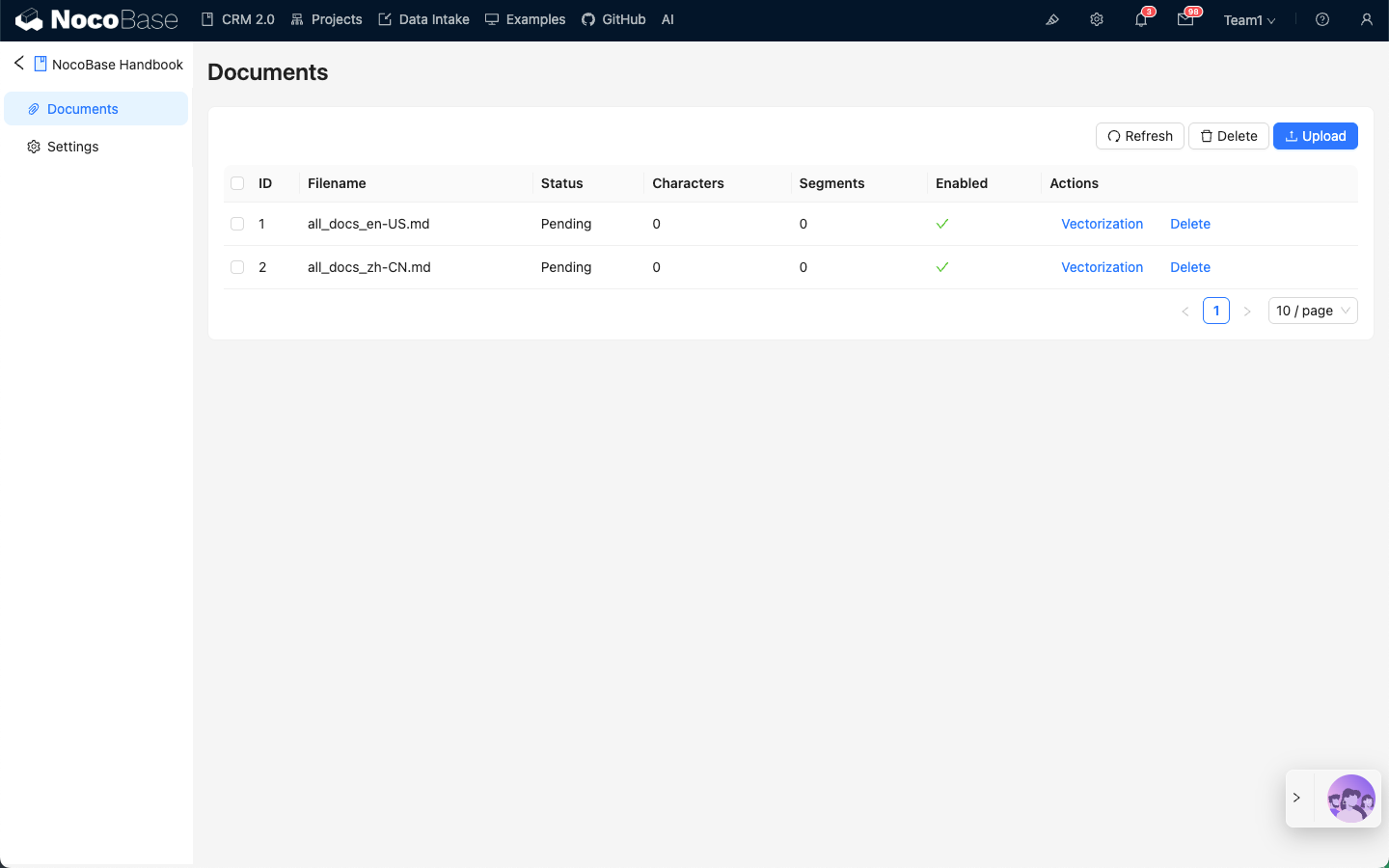
Click the `Upload` button to upload documents. After the documents are uploaded, vectorization will start automatically. Wait for the `Status` to change from `Pending` to `Success`.
Currently, the knowledge base supports the following document types: txt, pdf, doc, docx, ppt, pptx; pdf only supports plain text.
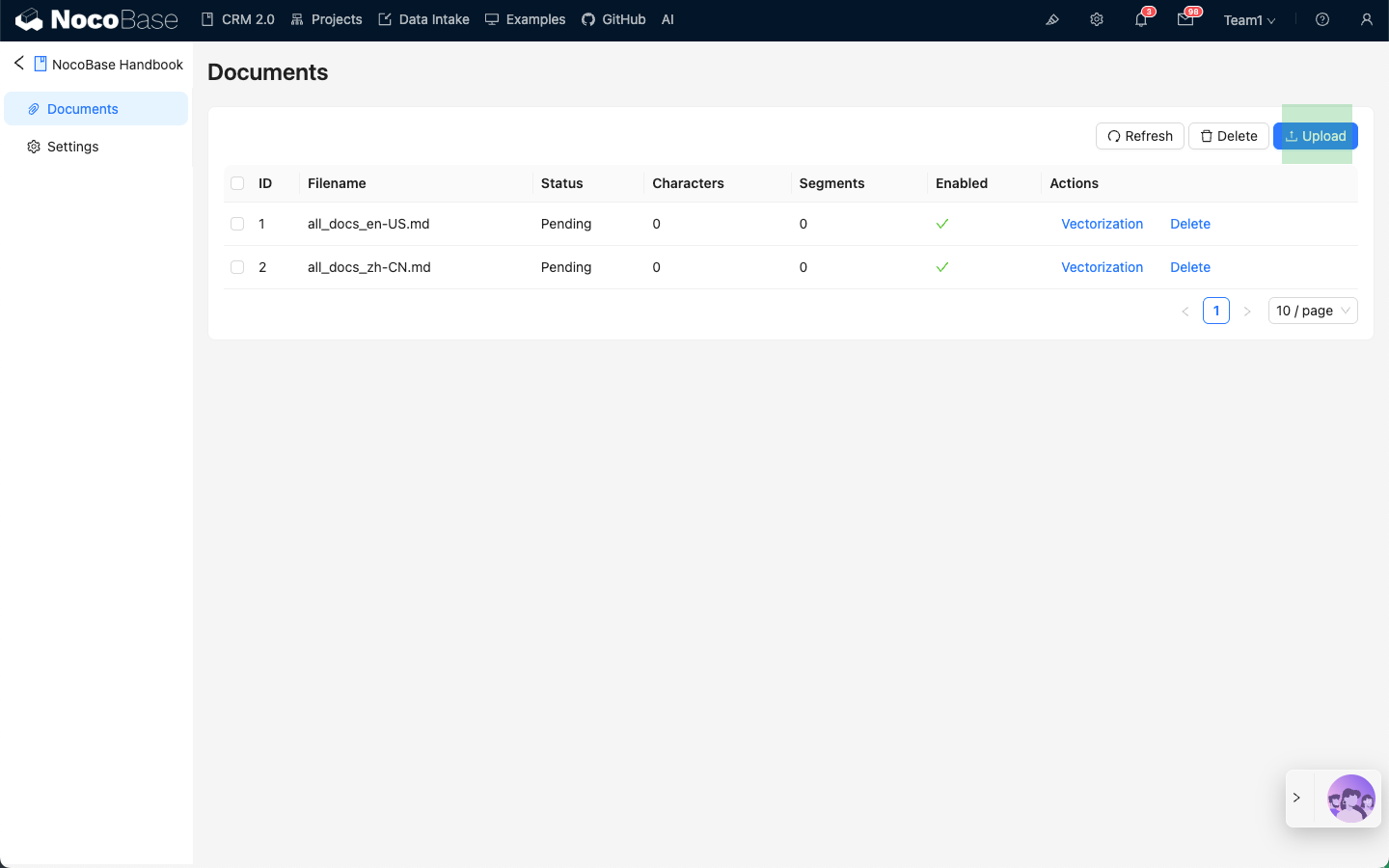
## Knowledge Base Types
### Local Knowledge Base
A Local knowledge base is a knowledge base stored locally in NocoBase. The documents and their vector data are all stored locally by NocoBase.
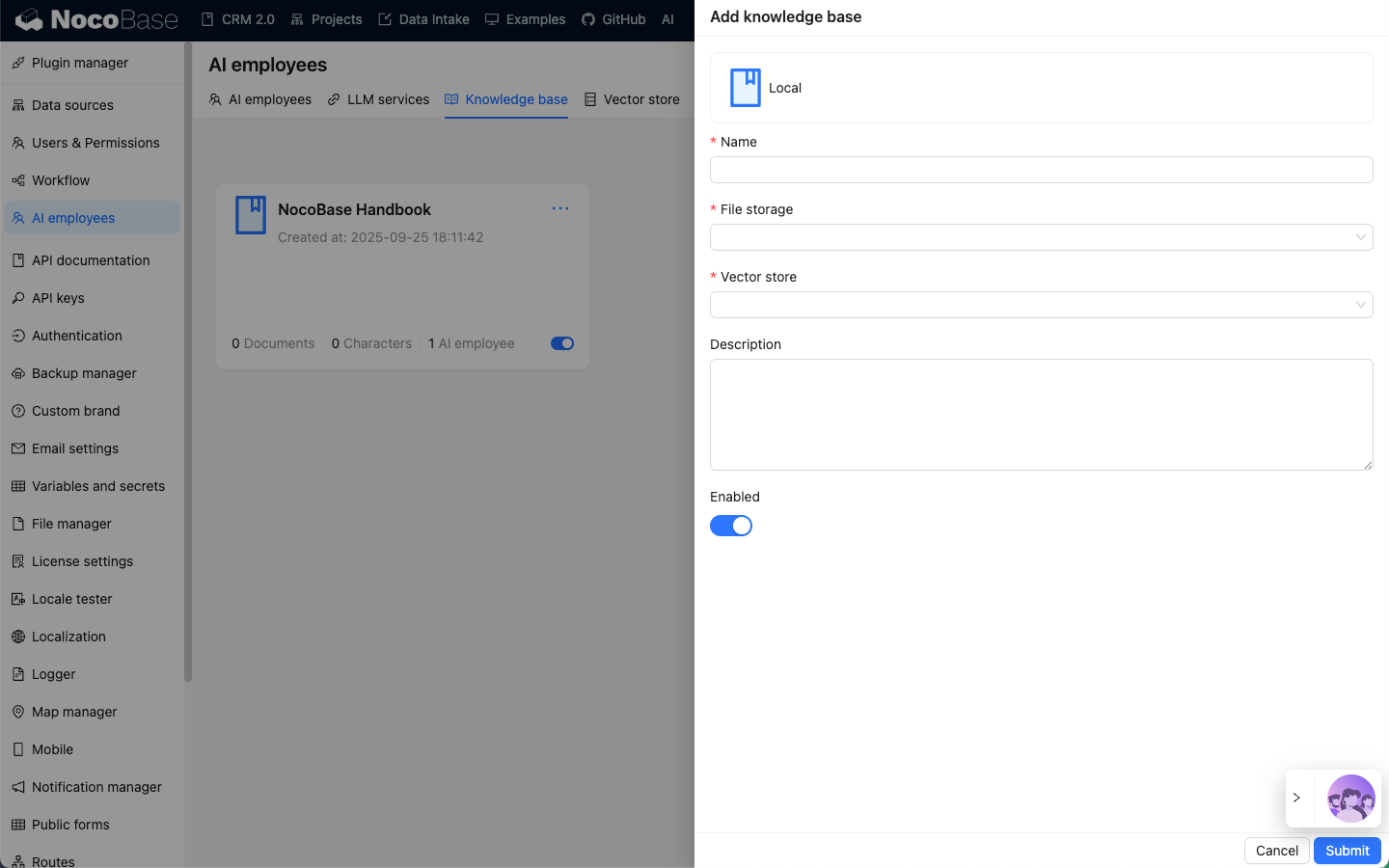
### Readonly Knowledge Base
A Readonly knowledge base is a read-only knowledge base. The documents and vector data are maintained externally. Only a vector database connection is created in NocoBase (currently only PGVector is supported).
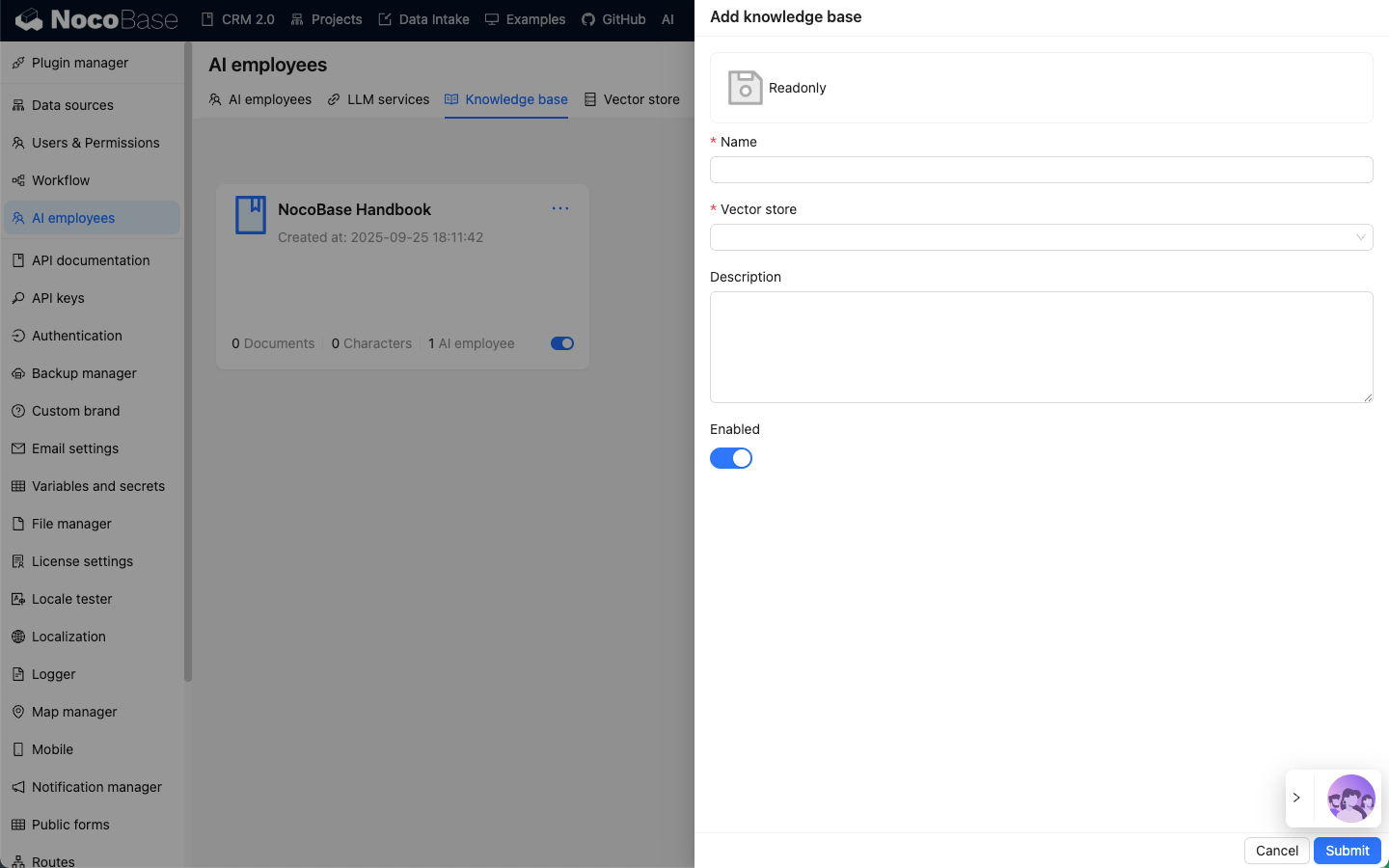
### External Knowledge Base
An External knowledge base is an external knowledge base where documents and vector data are maintained externally. Vector database retrieval needs to be extended by developers, allowing the use of vector databases not currently supported by NocoBase.
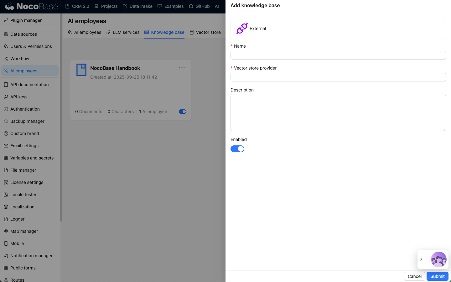
---
url: /ai-employees/knowledge-base/rag.md
---
# RAG Retrieval
## Introduction
After configuring the knowledge base, you can enable the RAG feature in the AI employee settings.
With RAG enabled, when a user chats with an AI employee, the AI employee will use RAG retrieval to fetch documents from the knowledge base based on the user's message and reply based on the retrieved documents.
## Enable RAG
Go to the AI employee plugin configuration page, click the `AI employees` tab to enter the AI employee management page.
Select the AI employee for which you want to enable RAG, click the `Edit` button to enter the AI employee editing page.
In the `Knowledge base` tab, turn on the `Enable` switch.
- In `Knowledge Base Prompt`, enter the prompt for referencing the knowledge base. `{knowledgeBaseData}` is a fixed placeholder and should not be modified.
- In `Knowledge Base`, select the configured knowledge base. See: [Knowledge Base](/ai-employees/knowledge-base/knowledge-base).
- In the `Top K` input box, enter the number of documents to retrieve, the default is 3.
- In the `Score` input box, enter the document relevance threshold for retrieval.
Click the `Submit` button to save the AI employee settings.
---
url: /ai-employees/knowledge-base/vector-database.md
---
# Vector Database
## Introduction
In a knowledge base, the vector database stores vectorized knowledge base documents. Vectorized documents act as an index for the documents.
When RAG retrieval is enabled in an AI Agent conversation, the user's message is vectorized, and fragments of knowledge base documents are retrieved from the vector database to match relevant document paragraphs and original text.
Currently, the AI Knowledge Base plugin only has built-in support for PGVector, which is a PostgreSQL database plugin.
## Vector Database Management
Go to the AI Agent plugin configuration page, click the `Vector store` tab, and select `Vector database` to enter the vector database management page.
Click the `Add new` button in the upper right corner to add a new `PGVector` vector database connection:
- In the `Name` input box, enter the connection name.
- In the `Host` input box, enter the vector database IP address.
- In the `Port` input box, enter the vector database port number.
- In the `Username` input box, enter the vector database username.
- In the `Password` input box, enter the vector database password.
- In the `Database` input box, enter the database name.
- In the `Table name` input box, enter the table name, which is used when creating a new table to store vector data.
After entering all the necessary information, click the `Test` button to test if the vector database service is available, and click the `Submit` button to save the connection information.
---
url: /ai-employees/knowledge-base/vector-store.md
---
# Vector Store
## Introduction
In a knowledge base, vectorizing documents when saving them and vectorizing search terms when retrieving them both require an `Embedding model` to process the original text into vectors.
In the AI Knowledge Base plugin, a vector store is the binding of an `Embedding model` and a vector database.
## Vector Store Management
Go to the AI Employees plugin configuration page, click the `Vector store` tab, and select `Vector store` to enter the vector store management page.
Click the `Add new` button in the top right corner to add a new vector store:
- In the `Name` input box, enter the vector store name;
- In `Vector store`, select a configured vector database. Refer to: [Vector Database](/ai-employees/knowledge-base/vector-database);
- In `LLM service`, select a configured LLM service. Refer to: [LLM Service Management](/ai-employees/features/llm-service);
- In the `Embedding model` input box, enter the name of the `Embedding` model to be used;
Click the `Submit` button to save the vector store information.
---
url: /ai-employees/mcp/index.md
---
# NocoBase MCP
After enabling the NocoBase MCP Server plugin, your NocoBase app exposes an MCP endpoint that MCP clients can use to access and call NocoBase APIs.
## Server URL
- Main app:
`http(s)://:/api/mcp`
- Non-main app:
`http(s)://:/api/__app//mcp`
This endpoint uses the `streamable HTTP` transport.
You can use the `x-mcp-packages` request header to control which package APIs are exposed by MCP, for example:
`x-mcp-packages: @nocobase/server,plugin-workflow*,plugin-users`
This header accepts full package names. If a scope is omitted, `@nocobase/` is added automatically. By default, MCP loads these package APIs:
- `@nocobase/plugin-data-source-main`
- `@nocobase/plugin-data-source-manager`
- `@nocobase/plugin-workflow*`
- `@nocobase/plugin-acl`
- `@nocobase/plugin-users`
- `@nocobase/plugin-auth`
- `@nocobase/plugin-client`
- `@nocobase/plugin-flow-engine`
- `@nocobase/plugin-ai`
## What It Provides
- NocoBase core and plugin APIs
- A generic CRUD tool for working with data tables
## Quick Start
### Codex
#### Authenticate with API Key
First, enable the API Keys plugin and create an API key.
```bash
export NOCOBASE_API_TOKEN=
codex mcp add nocobase --url http://:/api/mcp --bearer-token-env-var NOCOBASE_API_TOKEN
```
#### Authenticate with OAuth
First, enable the IdP: OAuth plugin.
```bash
codex mcp add nocobase --url http://:/api/mcp
codex mcp login nocobase --scopes mcp,offline_access
```
### Claude Code
#### Authenticate with API Key
First, enable the API Keys plugin and create an API key.
```bash
claude mcp add --transport http nocobase http://:/api/mcp --header "Authorization: Bearer "
```
#### Authenticate with OAuth
First, enable the IdP: OAuth plugin.
```bash
claude mcp add --transport http nocobase http://:/api/mcp
```
Then open Claude and sign in to the corresponding MCP service:
```bash
claude
/mcp
```
### OpenCode
#### Authenticate with API Key
First, enable the API Keys plugin and create an API key. Configure `opencode.json`:
```json
{
"mcp": {
"nocobase": {
"type": "remote",
"url": "https://:/api/mcp",
"enabled": true,
"headers": {
"Authorization": "Bearer "
}
}
},
"$schema": "https://opencode.ai/config.json"
}
```
#### Authenticate with OAuth
First, enable the IdP: OAuth plugin. Configure `opencode.json`:
```json
{
"mcp": {
"nocobase": {
"type": "remote",
"url": "https://:/api/mcp",
"enabled": true
}
},
"$schema": "https://opencode.ai/config.json"
}
```
Sign in
```bash
opencode mcp auth nocobase
```
Debug
```bash
opencode mcp debug nocobase
```
## Use with Skills
It is recommended to use NocoBase MCP together with NocoBase Skills. See [NocoBase Skills](../skills/index.md).
---
url: /ai-employees/permission.md
---
# Roles & Permissions
## Introduction
AI employee permission management consists of two levels:
1. **AI Employee Access Permissions**: Control which users can use which AI employees
2. **Data Access Permissions**: How AI employees apply permission controls when processing data
This document details the configuration methods and working principles of these two types of permissions.
---
## Configuring AI Employee Access Permissions
### Setting Available AI Employees for Roles
Go to the `User & Permissions` page, click the `Roles & Permissions` tab to enter the role configuration page.
Select a role, click the `Permissions` tab, and then click the `AI employees` tab. This will display the list of AI employees managed in the AI employees plugin.
Click the checkbox in the `Available` column of the AI employee list to control whether the current role can access that AI employee.
---
## Data Access Permissions
When AI employees process data, the permission control method depends on the type of tool used:
### System Built-in Data Query Tools (Follow User Permissions)
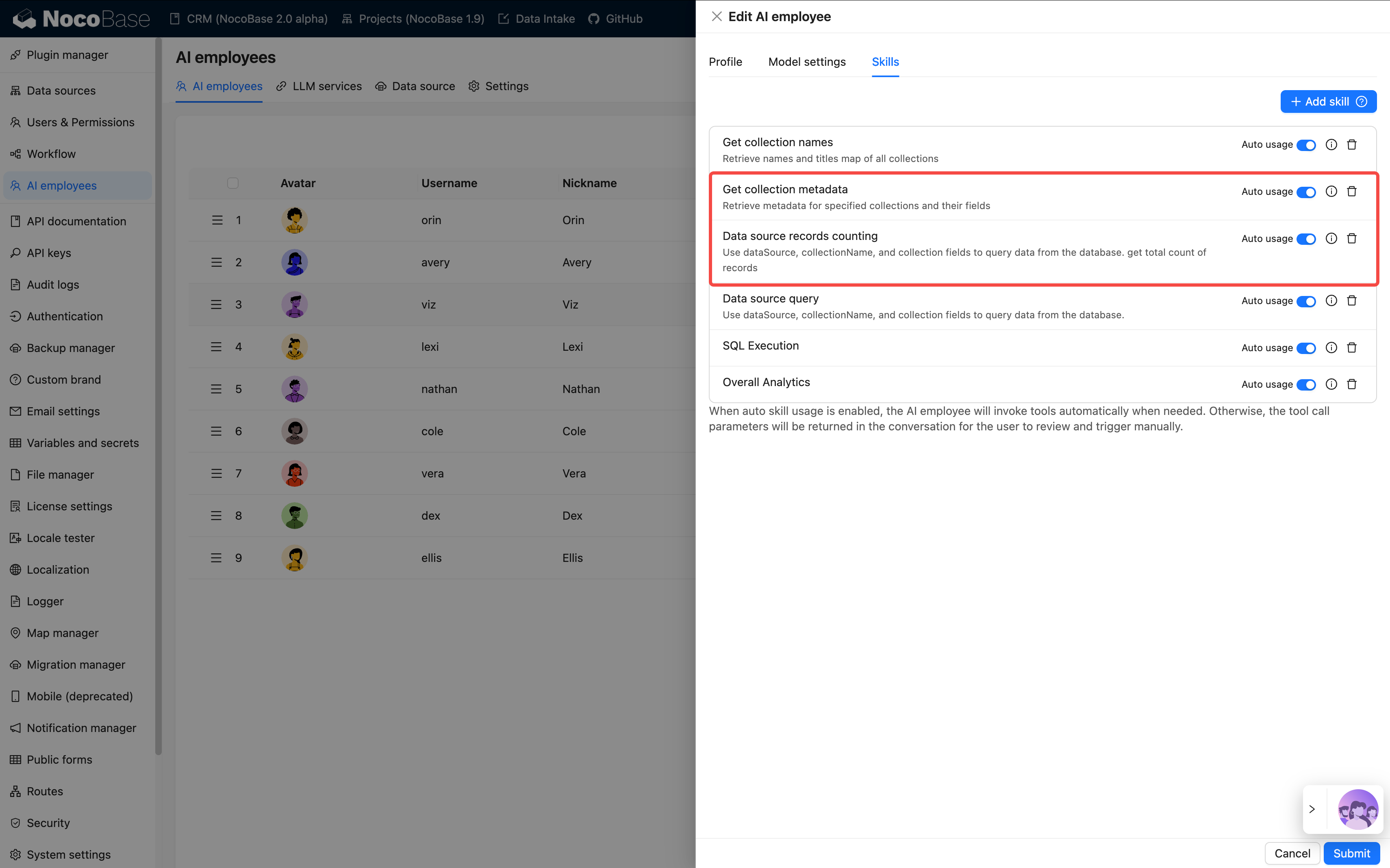
The following tools **strictly follow the current user's data permissions** for data access:
| Tool Name | Description |
| ------------------------------------ | ------------------------------- |
| **Data source query** | Query database using data source, collection, and fields |
| **Data source records counting** | Count total records using data source, collection, and fields |
**How It Works:**
When AI employees call these tools, the system will:
1. Identify the current logged-in user's identity
2. Apply the data access rules configured for that user in **Roles & Permissions**
3. Return only the data that the user has permission to view
**Example Scenario:**
Suppose salesperson A can only view customer data they are responsible for. When they use AI employee Viz to analyze customers:
- Viz calls `Data source query` to query the customer table
- The system applies salesperson A's data permission filtering rules
- Viz can only see and analyze customer data that salesperson A has access to
This ensures that **AI employees cannot bypass the user's own data access boundaries**.
---
### Workflow Custom Business Tools (Independent Permission Logic)
Business query tools customized through workflows have permission control **independent of user permissions**, determined by the workflow's business logic.
These tools are typically used for:
- Fixed business analysis processes
- Pre-configured aggregate queries
- Cross-permission boundary statistical analysis
#### Example 1: Overall Analytics (General Business Analysis)
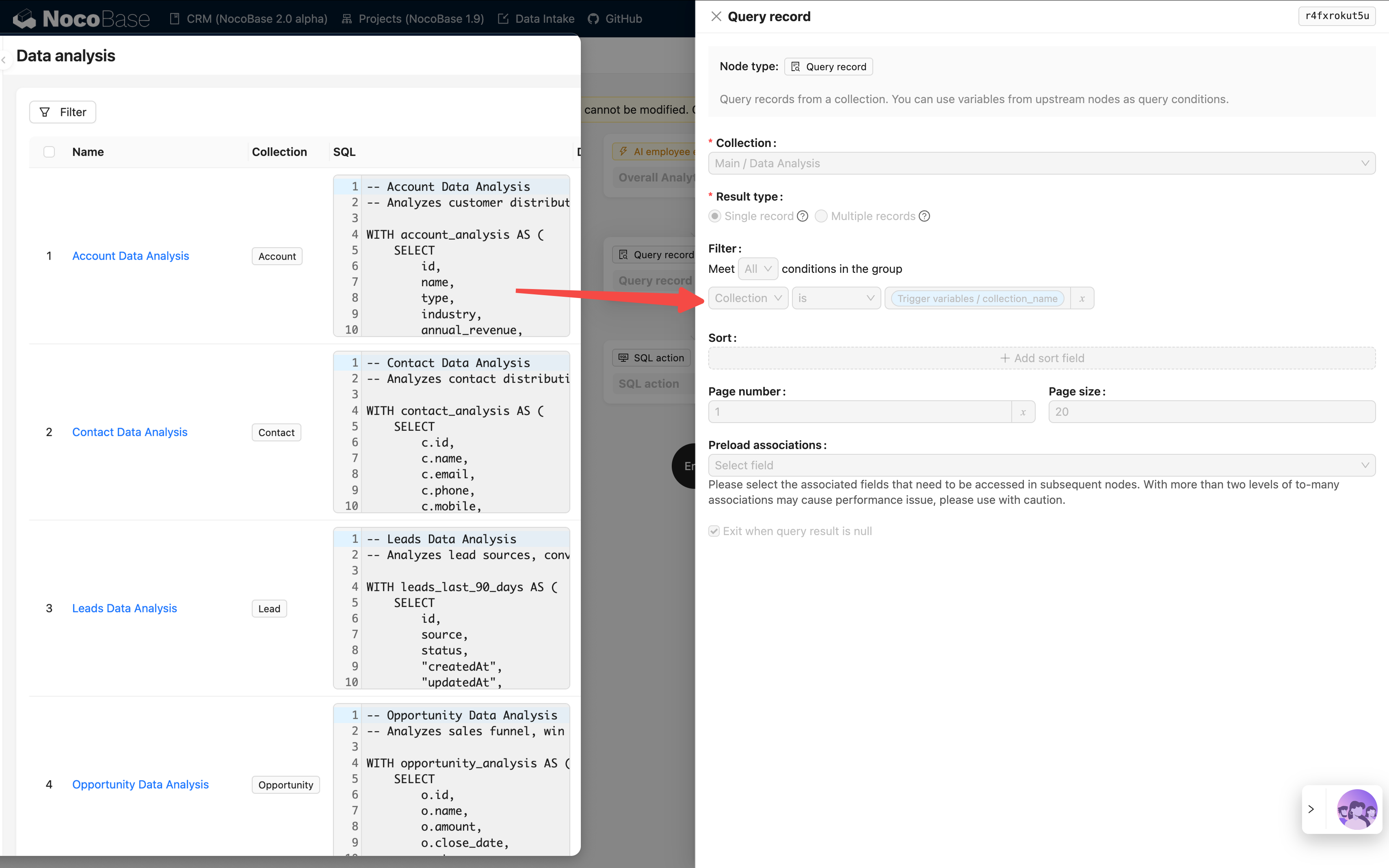
In the CRM Demo, `Overall Analytics` is a template-based business analysis engine:
| Feature | Description |
| -------------------- | ---------------------------------------------- |
| **Implementation** | Workflow reads pre-configured SQL templates and executes read-only queries |
| **Permission Control** | Not limited by current user permissions, outputs fixed business data defined by templates |
| **Use Cases** | Provides standardized holistic analysis for specific business objects (e.g., leads, opportunities, customers) |
| **Security** | All query templates are pre-configured and reviewed by administrators, avoiding dynamic SQL generation |
**Workflow:**
```mermaid
flowchart TD
A[AI Employee Receives Task] --> B[Calls Overall Analytics Tool]
B --> C[Passes collection_name Parameter]
C --> D[Workflow Matches Corresponding Analysis Template]
D --> E[Executes Pre-configured SQL Query]
E --> F[Returns Business Analysis Data]
F --> G[AI Employee Generates Charts and Insights]
```
**Key Characteristics:**
- Any user calling this tool will get the **same business perspective**
- Data scope is defined by business logic, not filtered by user permissions
- Suitable for providing standardized business analysis reports
#### Example 2: SQL Execution (Advanced Analysis Tool)
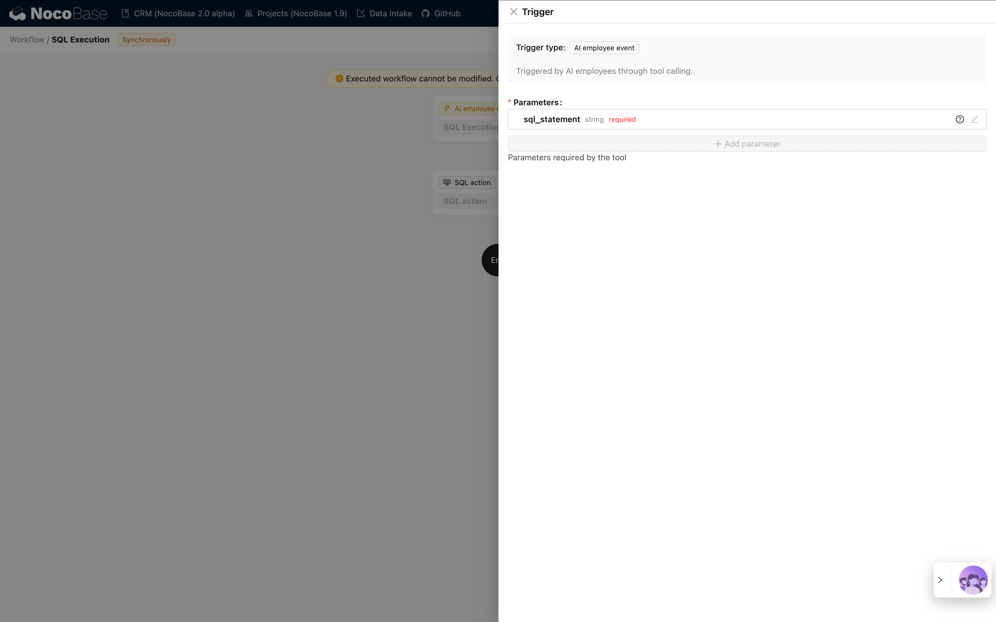
In the CRM Demo, `SQL Execution` is a more flexible but strictly controlled tool:
| Feature | Description |
| -------------------- | ---------------------------------------------- |
| **Implementation** | Allows AI to generate and execute SQL statements |
| **Permission Control** | Controlled by workflow, typically limited to administrators only |
| **Use Cases** | Advanced data analysis, exploratory queries, cross-table aggregate analysis |
| **Security** | Requires workflow to restrict read-only operations (SELECT) and control availability through task configuration |
**Security Recommendations:**
1. **Limit Scope**: Only enable in management block tasks
2. **Prompt Constraints**: Clearly define query scope and table names in task prompts
3. **Workflow Validation**: Validate SQL statements in workflow to ensure only SELECT operations are executed
4. **Audit Logs**: Record all executed SQL statements for traceability
**Example Configuration:**
```markdown
Task Prompt Constraints:
- Only query CRM-related tables (leads, opportunities, accounts, contacts)
- Only execute SELECT queries
- Time range limited to the last 1 year
- Return results limited to 1000 records
```
---
## Permission Design Recommendations
### Choose Permission Strategy by Business Scenario
| Business Scenario | Recommended Tool Type | Permission Strategy | Reason |
| ------------------------- | -------------------- | ------------------- | ------------------------ |
| Salesperson viewing own customers | System built-in query tools | Follow user permissions | Ensure data isolation and protect business security |
| Department manager viewing team data | System built-in query tools | Follow user permissions | Automatically apply department data scope |
| Executive viewing global business analysis | Workflow custom tools (Overall Analytics) | Independent business logic | Provide standardized holistic perspective |
| Data analyst exploratory queries | SQL Execution | Strictly limit available objects | Requires flexibility but must control access scope |
| Regular users viewing standard reports | Overall Analytics | Independent business logic | Fixed analysis standards, no need to worry about underlying permissions |
### Multi-layer Protection Strategy
For sensitive business scenarios, it is recommended to adopt multi-layer permission control:
1. **AI Employee Access Layer**: Control which roles can use which AI employees
2. **Task Visibility Layer**: Control task display through block configuration
3. **Tool Authorization Layer**: Verify user identity and permissions in workflows
4. **Data Access Layer**: Control data scope through user permissions or business logic
**Example:**
```
Scenario: Only finance department can use AI for financial analysis
- AI Employee Permissions: Only finance role can access "Finance Analyst" AI employee
- Task Configuration: Finance analysis tasks only display in finance modules
- Tool Design: Finance workflow tools verify user department
- Data Permissions: Finance table access permissions only granted to finance role
```
---
## FAQ
### Q: What data can AI employees access?
**A:** Depends on the tool type used:
- **System built-in query tools**: Can only access data that the current user has permission to view
- **Workflow custom tools**: Determined by workflow business logic, may not be limited by user permissions
### Q: How to prevent AI employees from leaking sensitive data?
**A:** Adopt multi-layer protection:
1. Configure AI employee role access permissions to limit who can use them
2. For system built-in tools, rely on user data permissions for automatic filtering
3. For custom tools, implement business logic validation in workflows
4. Sensitive operations (such as SQL Execution) should only be authorized to administrators
### Q: What if I want certain AI employees to bypass user permission restrictions?
**A:** Use workflow custom business tools:
- Create workflows to implement specific business query logic
- Control data scope and access rules in workflows
- Configure tools for AI employees to use
- Control who can call this capability through AI employee access permissions
### Q: What's the difference between Overall Analytics and SQL Execution?
**A:**
| Comparison Dimension | Overall Analytics | SQL Execution |
| -------------------- | ------------------- | ----------------- |
| Flexibility | Low (can only use pre-configured templates) | High (can dynamically generate queries) |
| Security | High (all queries pre-reviewed) | Medium (requires constraints and validation) |
| Target Users | Regular business users | Administrators or senior analysts |
| Maintenance Cost | Need to maintain analysis templates | No maintenance, but requires monitoring |
| Data Consistency | Strong (standardized metrics) | Weak (query results may be inconsistent) |
---
## Best Practices
1. **Default to User Permissions**: Unless there is a clear business need, prioritize using system built-in tools that follow user permissions
2. **Templated Standard Analysis**: For common analysis scenarios, use the Overall Analytics pattern to provide standardized capabilities
3. **Strictly Control Advanced Tools**: High-privilege tools like SQL Execution should only be authorized to a few administrators
4. **Task-level Isolation**: Configure sensitive tasks in specific blocks and implement isolation through page access permissions
5. **Audit and Monitoring**: Record AI employee data access behavior and regularly review abnormal operations
---
url: /ai-employees/quick-start.md
---
# Quick Start
Let's complete a minimal usable AI Employee setup in 5 minutes.
## Install Plugin
AI Employees are built into NocoBase (`@nocobase/plugin-ai`), so no separate installation is required.
## Configure Models
You can configure LLM services from either entry:
1. Admin entry: `System Settings -> AI Employees -> LLM service`.
2. Frontend shortcut: In the AI chat panel, use `Model Switcher` to choose a model, then click the shortcut to add an LLM service.
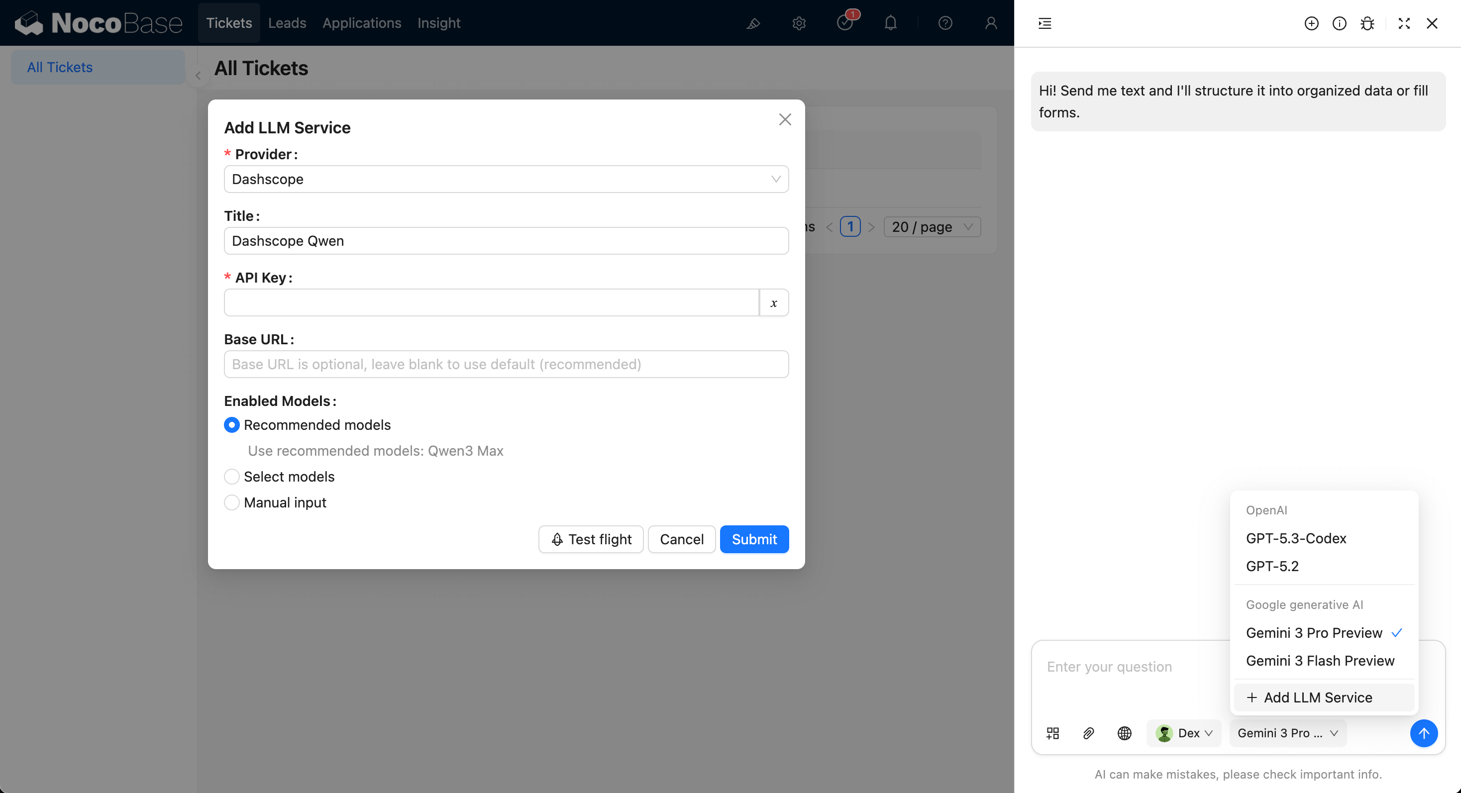
Usually you need to confirm:
1. Select Provider.
2. Fill API Key.
3. Configure `Enabled Models`; simply use Recommend by default.
## Enable Built-in Employees
Built-in AI Employees are enabled by default, and usually do not need to be enabled one by one.
If you need to adjust availability (enable/disable a specific employee), update the `Enabled` switch in `System Settings -> AI Employees` list.

## Start Collaborating
On the application page, hover over the bottom-right shortcut entry and choose an AI Employee.
Click to open the AI chat dialog:

You can also:
- Add blocks
- Add attachments
- Enable Web Search
- Switch AI Employees
- Select models
AI Employees can also automatically get page structure as context. For example, Dex on a form block can read form field structures and call suitable skills to operate on the page.
## Shortcut Tasks
You can preset common tasks for each AI Employee at the current location, so you can start working with one click, making it fast and convenient.
## Built-in Employees Overview
NocoBase provides multiple built-in AI Employees for different scenarios.
You only need to:
1. Configure LLM services.
2. Adjust employee enable status when needed (enabled by default).
3. Select model in chat and start collaborating.
| Employee Name | Role Positioning | Core Capabilities |
| :--- | :--- | :--- |
| **Cole** | NocoBase Assistant | Product usage Q&A, document retrieval |
| **Ellis** | Email Expert | Email writing, summary generation, reply suggestions |
| **Dex** | Data Organizer | Field translation, formatting, information extraction |
| **Viz** | Insight Analyst | Data insight, trend analysis, key indicator interpretation |
| **Lexi** | Translation Assistant | Multilingual translation, communication assistance |
| **Vera** | Research Analyst | Web search, information aggregation, in-depth research |
| **Dara** | Data Visualization Expert | Chart configuration, visual report generation |
| **Orin** | Data Modeling Expert | Assist in designing collection structures, field suggestions |
| **Nathan** | Frontend Engineer | Assist in writing frontend code snippets, style adjustments |
**Notes**
Some built-in AI Employees do not appear in the bottom-right list because they have dedicated scenarios:
- Orin: data modeling pages.
- Dara: chart configuration blocks.
- Nathan: JS Block and similar code editors.
---
url: /ai-employees/scenarios/viz-crm.md
---
# AI Agent · Viz: CRM Scenario Configuration Guide
> Using the CRM example, learn how to make your AI insight analyst truly understand your business and unleash its full potential.
## 1. Introduction: Making Viz Go from "Seeing Data" to "Understanding Business"
In the NocoBase system, **Viz** is a pre-built AI insight analyst.
It can recognize page context (like Leads, Opportunities, Accounts) and generate trend charts, funnel charts, and KPI cards.
But by default, it only has the most basic query capabilities:
| Tool | Function Description | Security |
| --- | --- | --- |
| Get Collection Names | Get Collection List | ✅ Secure |
| Get Collection Metadata | Get Field Structure | ✅ Secure |
These tools only allow Viz to "recognize structure," but not yet truly "understand content."
To enable it to generate insights, detect anomalies, and analyze trends, you need to **extend it with more suitable analysis tools**.
In the official CRM Demo, we used two methods:
* **Overall Analytics (General-purpose analysis engine)**: A templated, secure, and reusable solution;
* **SQL Execution (Specialized analysis engine)**: Offers more flexibility but comes with greater risks.
These two are not the only options; they are more like a **design paradigm**:
> You can follow its principles to create an implementation that is better suited to your own business.
---
## 2. Viz's Structure: Stable Persona + Flexible Tasks
To understand how to extend Viz, you first need to understand its layered internal design:
| Layer | Description | Example |
| --- | --- | --- |
| **Role Definition** | Viz's persona and analysis method: Understand → Query → Analyze → Visualize | Fixed |
| **Task Definition** | Customized prompts and tool combinations for a specific business scenario | Modifiable |
| **Tool Configuration** | The bridge for Viz to call external data sources or workflows | Freely replaceable |
This layered design allows Viz to maintain a stable personality (consistent analysis logic) while quickly adapting to different business scenarios (CRM, hospital management, channel analysis, production operations...).
---
## 3. Pattern One: Templated Analysis Engine (Recommended)
### 3.1 Principle Overview
**Overall Analytics** is the core analysis engine in the CRM Demo.
It manages all SQL queries through a **data analysis template collection (data_analysis)**.
Viz does not write SQL directly, but instead **calls predefined templates** to generate results.
The execution flow is as follows:
```mermaid
flowchart TD
A[Viz receives task] --> B[Calls Overall Analytics workflow]
B --> C[Matches template based on current page/task]
C --> D[Executes template SQL (read-only)]
D --> E[Returns data result]
E --> F[Viz generates chart + brief interpretation]
```
This way, Viz can generate secure and standardized analysis results in seconds, and administrators can centrally manage and review all SQL templates.
---
### 3.2 Template Collection Structure (data_analysis)
| Field Name | Type | Description | Example |
| --- | --- | --- | --- |
| **id** | Integer | Primary Key | 1 |
| **name** | Text | Analysis template name | Leads Data Analysis |
| **collection** | Text | Corresponding collection | Lead |
| **sql** | Code | Analysis SQL statement (read-only) | `SELECT stage, COUNT(*) FROM leads GROUP BY stage` |
| **description** | Markdown | Template description or definition | "Count leads by stage" |
| **createdAt / createdBy / updatedAt / updatedBy** | System Field | Audit information | Auto-generated |
#### Template Examples in the CRM Demo
| Name | Collection | Description |
| --- | --- | --- |
| Account Data Analysis | Account | Account Data Analysis |
| Contact Data Analysis | Contact | Contact Data Analysis |
| Leads Data Analysis | Lead | Leads Trend Analysis |
| Opportunity Data Analysis | Opportunity | Opportunity Stage Funnel |
| Task Data Analysis | Todo Tasks | To-do Tasks Status Statistics |
| Users (Sales Reps) Data Analysis | Users | Sales Reps Performance Comparison |
---
### 3.3 Advantages of This Pattern
| Dimension | Advantage |
| --- | --- |
| **Security** | All SQL is stored and reviewed, avoiding direct query generation. |
| **Maintainability** | Templates are centrally managed and updated uniformly. |
| **Reusability** | The same template can be reused by multiple tasks. |
| **Portability** | Can be easily migrated to other systems, requiring only the same collection structure. |
| **User Experience** | Business users don't need to worry about SQL; they just need to initiate an analysis request. |
> 📘 This `data_analysis` collection doesn't have to be called this name.
> The key is: **to store analysis logic in a templated way** and have it called uniformly by a workflow.
---
### 3.4 How to Make Viz Use It
In the task definition, you can explicitly tell Viz:
```markdown
Hi Viz,
Please analyze the data of the current module.
**Priority:** Use the Overall Analytics tool to get analysis results from the template collection.
**If no matching template is found:** State that a template is missing and suggest that the administrator add one.
Output requirements:
- Generate a separate chart for each result;
- Include a brief 2–3 sentence description below the chart;
- Do not fabricate data or make assumptions.
```
This way, Viz will automatically call the workflow, match the most suitable SQL from the template collection, and generate the chart.
---
## 4. Pattern Two: Specialized SQL Executor (Use with caution)
### 4.1 Applicable Scenarios
When you need exploratory analysis, ad-hoc queries, or multi-collection JOIN aggregations, you can have Viz call an **SQL Execution** tool.
The features of this tool are:
* Viz can directly generate `SELECT` queries;
* The system executes it and returns the result;
* Viz is responsible for analysis and visualization.
Example task:
> "Please analyze the trend of lead conversion rates by region over the last 90 days."
In this case, Viz might generate:
```sql
SELECT region, COUNT(id) AS leads, SUM(converted)::float/COUNT(id) AS rate
FROM leads
WHERE created_at > now() - interval '90 day'
GROUP BY region;
```
---
### 4.2 Risks and Protection Recommendations
| Risk Point | Protection Strategy |
| --- | --- |
| Generating write operations | Forcefully restrict to `SELECT` |
| Accessing unrelated collections | Validate if the collection name exists |
| Performance risk with large collections | Limit time range, use LIMIT for the number of rows |
| Operation traceability | Enable query logging and auditing |
| User permission control | Only administrators can use this tool |
> General recommendations:
>
> * Regular users should only have templated analysis (Overall Analytics) enabled;
> * Only administrators or senior analysts should be allowed to use SQL Execution.
---
## 5. If You Want to Build Your Own "Overall Analytics"
Here is a simple, general approach that you can replicate in any system (not dependent on NocoBase):
### Step 1: Design the Template Collection
The collection name can be anything (e.g., `analysis_templates`).
It just needs to include the fields: `name`, `sql`, `collection`, and `description`.
### Step 2: Write a "Fetch Template → Execute" Service or Workflow
Logic:
1. Receive the task or page context (e.g., the current collection);
2. Match a template;
3. Execute the template SQL (read-only);
4. Return a standardized data structure (rows + fields).
### Step 3: Have the AI Call This Interface
The task prompt can be written like this:
```
First, try to call the template analysis tool. If no matching analysis is found in the templates, then use the SQL executor.
Please ensure all queries are read-only and generate charts to display the results.
```
> This way, your AI agent system will have analysis capabilities similar to the CRM Demo, but it will be completely independent and customizable.
---
## 6. Best Practices and Design Recommendations
| Recommendation | Description |
| --- | --- |
| **Prioritize templated analysis** | Secure, stable, and reusable |
| **Use SQL Execution only as a supplement** | Limited to internal debugging or ad-hoc queries |
| **One chart, one key point** | Keep the output clear and avoid excessive clutter |
| **Clear template naming** | Name according to the page/business domain, e.g., `Leads-Stage-Conversion` |
| **Concise and clear explanations** | Accompany each chart with a 2–3 sentence summary |
| **Indicate when a template is missing** | Inform the user "No corresponding template found" instead of providing a blank output |
---
## 7. From the CRM Demo to Your Scenario
Whether you are working with a hospital CRM, manufacturing, warehouse logistics, or educational admissions, as long as you can answer the following three questions, Viz can bring value to your system:
| Question | Example |
| --- | --- |
| **1. What do you want to analyze?** | Lead trends / Deal stages / Equipment operating rate |
| **2. Where is the data?** | Which collection, which fields |
| **3. How do you want to present it?** | Line chart, funnel, pie chart, comparison table |
Once you have defined these, you just need to:
* Write the analysis logic into the template collection;
* Attach the task prompt to the page;
* Viz can then "take over" your report analysis.
---
## 8. Conclusion: Take the Paradigm with You
"Overall Analytics" and "SQL Execution" are just two example implementations.
What's more important is the idea behind them:
> **Make the AI agent understand your business logic, not just execute prompts.**
Whether you are using NocoBase, a private system, or your own custom workflow, you can replicate this structure:
* Centralized templates;
* Workflow calls;
* Read-only execution;
* AI presentation.
This way, Viz is no longer just an "AI that can generate charts," but a true analyst who understands your data, your definitions, and your business.
---
url: /ai-employees/skills/index.md
---
# NocoBase Skills
> [!WARNING]
> NocoBase Skills are still in draft status. The content is for reference only and may change at any time.
[NocoBase Skills](https://github.com/nocobase/skills) provides a set of reusable skills for coding agent CLIs such as Codex, Claude Code, and OpenCode, helping you work more efficiently on installation, data modeling, UI building, and workflow setup.
## Installation
1. Install a coding agent CLI, such as Codex, Claude Code, or OpenCode.
2. Install Skills through [skills.sh](https://skills.sh/).
Install all NocoBase Skills from this repository:
```bash
mkdir nocobase-app-builder && cd nocobase-app-builder
npx skills add nocobase/skills
```
## Recommended Workflow
1. Install NocoBase, if it is not already installed.
You can ask your agent to do it directly:
```text
Install and start NocoBase.
```
2. Set up the NocoBase MCP Server.
You can also ask your agent to configure it:
```text
Set up NocoBase MCP connection.
```
You can also configure it manually. See [NocoBase MCP](../mcp/index.md).
3. Start data modeling and application building.
For example, you can tell your agent:
```text
I am building a CRM, design and create collections.
```
After the MCP connection is ready, most NocoBase APIs can be accessed through MCP tools.
---
url: /ai-employees/workflow/nodes/llm/chat.md
---
# Text Chat
## Introduction
Using the LLM node in a workflow, you can initiate a conversation with an online LLM service, leveraging the capabilities of large models to assist in completing a series of business processes.
## Create LLM Node
Since conversations with LLM services are often time-consuming, the LLM node can only be used in asynchronous workflows.
## Select Model
First, select a connected LLM service. If no LLM service is connected yet, you need to add an LLM service configuration first. See: [LLM Service Management](/ai-employees/features/llm-service)
After selecting a service, the application will attempt to retrieve a list of available models from the LLM service for you to choose from. Some online LLM services may have APIs for fetching models that do not conform to standard API protocols; in such cases, users can also manually enter the model ID.
## Set Invocation Parameters
You can adjust the parameters for calling the LLM model as needed.
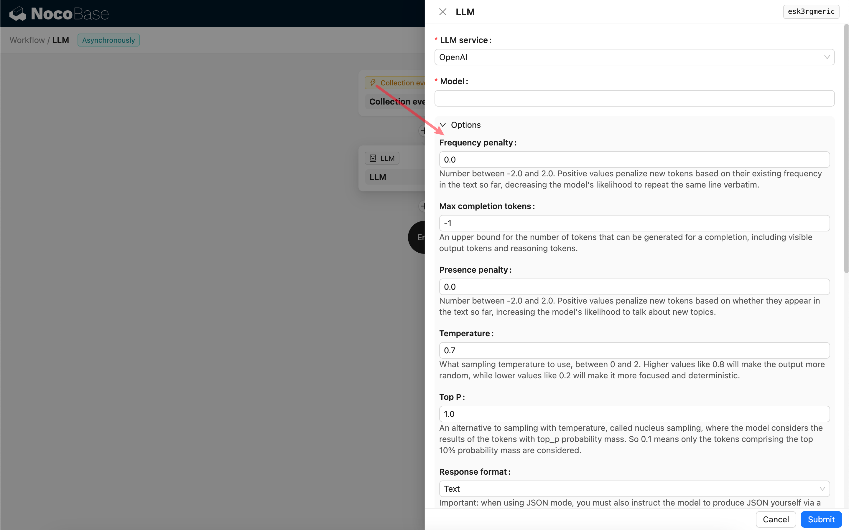
### Response format
It's worth noting the **Response format** setting. This option is used to prompt the large model for the format of its response, which can be text or JSON. If you select JSON mode, be aware of the following:
- The corresponding LLM model must support being called in JSON mode. Additionally, the user needs to explicitly prompt the LLM to respond in JSON format in the Prompt, for example: "Tell me a joke about cats, respond in JSON with \`setup\` and \`punchline\` keys". Otherwise, there might be no response, resulting in a `400 status code (no body)` error.
- The response will be a JSON string. The user needs to parse it using the capabilities of other workflow nodes to use its structured content. You can also use the [Structured Output](/ai-employees/workflow/nodes/llm/structured-output) feature.
## Messages
The array of messages sent to the LLM model can include a set of historical messages. Messages support three types:
- System - Usually used to define the role and behavior of the LLM model in the conversation.
- User - The content input by the user.
- Assistant - The content responded by the model.
For user messages, provided the model supports it, you can add multiple pieces of content in a single prompt, corresponding to the `content` parameter. If the model you are using only supports the `content` parameter as a string (which is the case for most models that do not support multi-modal conversations), please split the message into multiple prompts, with each prompt containing only one piece of content. This way, the node will send the content as a string.
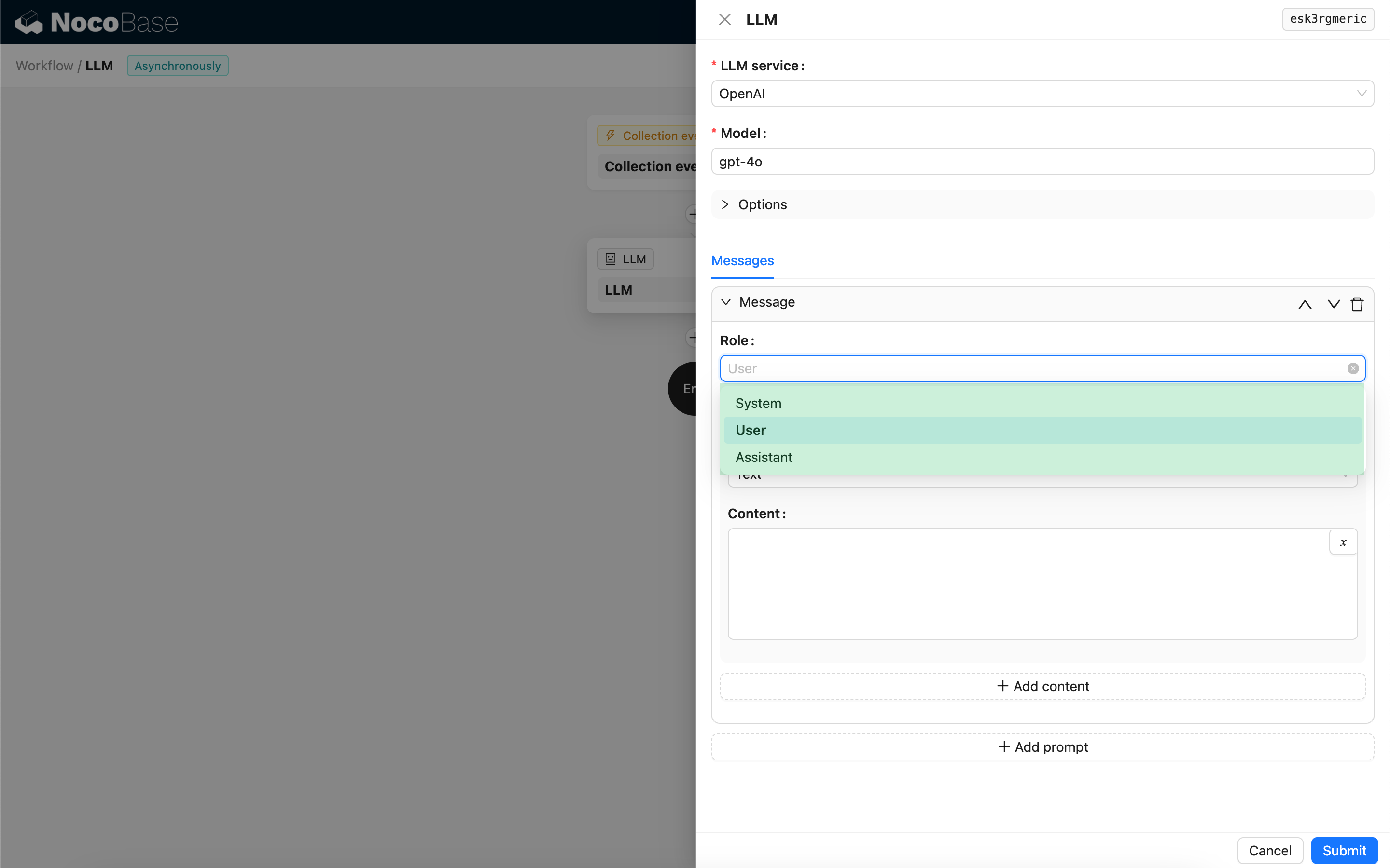
You can use variables in the message content to reference the workflow context.
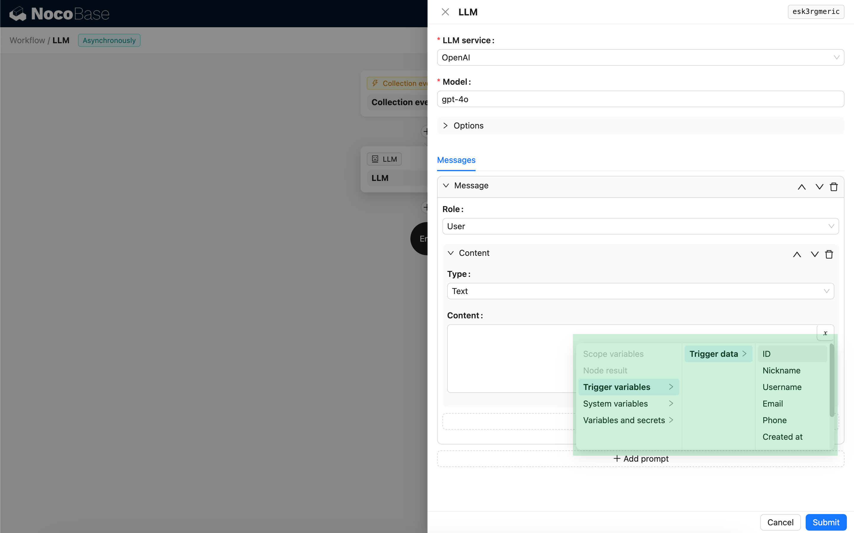
## Using the LLM Node's Response Content
You can use the response content of the LLM node as a variable in other nodes.
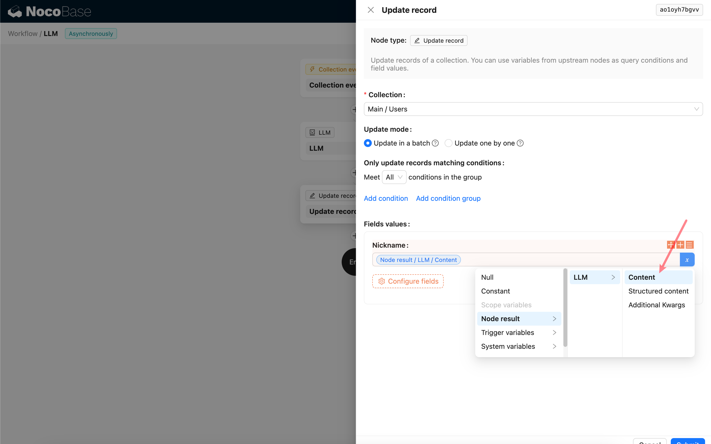
---
url: /ai-employees/workflow/nodes/llm/multimodal-chat.md
---
# Multimodal Conversation
## Images
If the model supports it, the LLM node can send images to the model. When using it, you need to select an attachment field or an associated file collection record via a variable. When selecting a file collection record, you can select it at the object level or select the URL field.
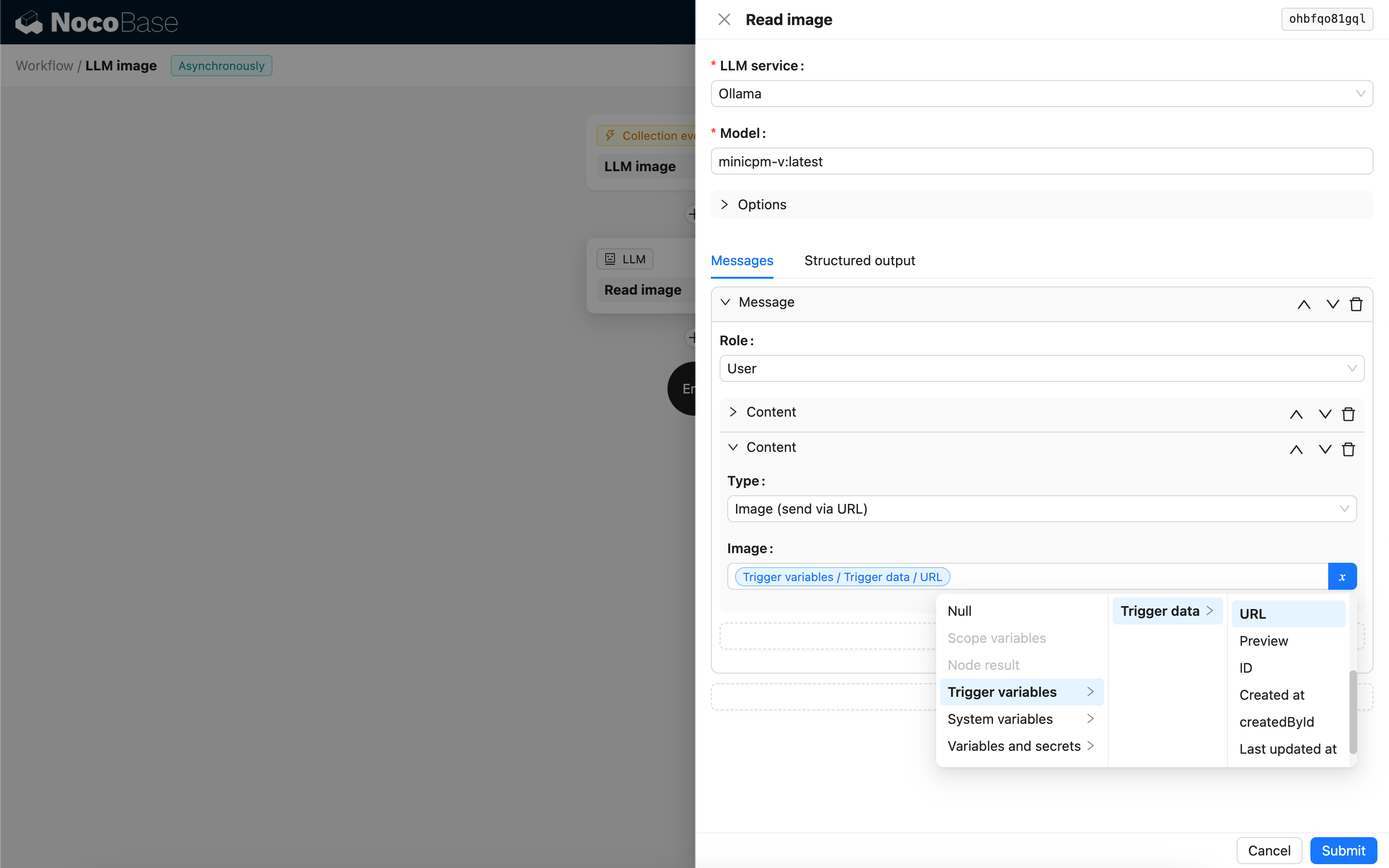
There are two options for the image sending format:
- Send via URL - All images, except for those stored locally, will be sent as URLs. Locally stored images will be converted to base64 format before sending.
- Send via base64 - All images, whether stored locally or in the cloud, will be sent in base64 format. This is suitable for cases where the image URL cannot be directly accessed by the online LLM service.
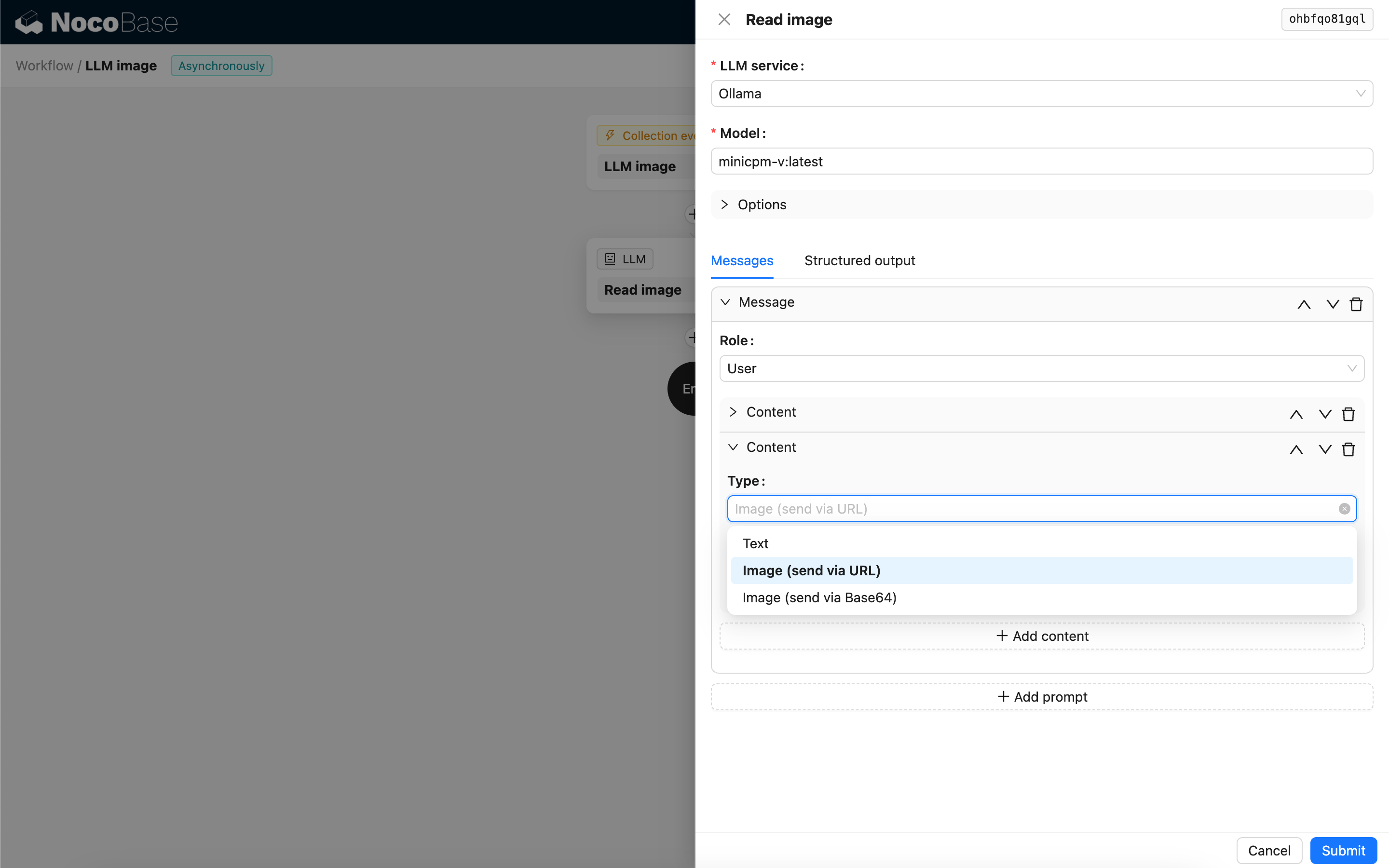
---
url: /ai-employees/workflow/nodes/llm/structured-output.md
---
# Structured Output
## Introduction
In some application scenarios, users may want the LLM model to respond with structured content in JSON format. This can be achieved by configuring "Structured Output".
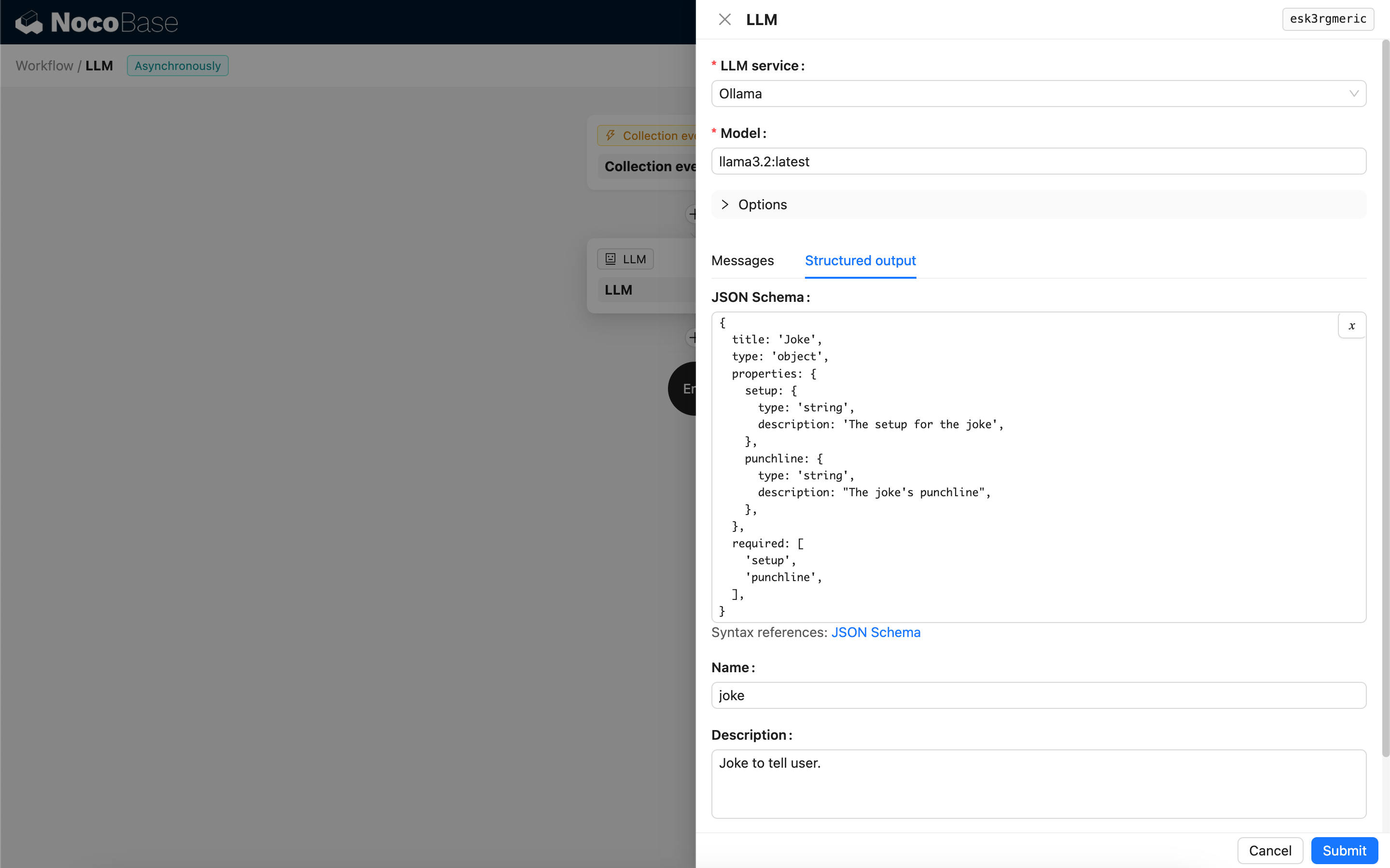
## Configuration
- **JSON Schema** - Users can specify the expected structure of the model's response by configuring a [JSON Schema](https://json-schema.org/).
- **Name** - _Optional_, used to help the model better understand the object represented by the JSON Schema.
- **Description** - _Optional_, used to help the model better understand the purpose of the JSON Schema.
- **Strict** - Requires the model to generate a response strictly according to the JSON Schema structure. Currently, only some new models from OpenAI support this parameter. Please confirm if your model is compatible before enabling it.
## Structured Content Generation Method
The way a model generates structured content depends on the **model** used and its **Response format** configuration:
1. Models where Response format only supports `text`
- When called, the node will bind a Tool that generates JSON-formatted content based on the JSON Schema, guiding the model to generate a structured response by calling this Tool.
2. Models where Response format supports JSON mode (`json_object`)
- If JSON mode is selected when called, the user needs to explicitly instruct the model in the Prompt to return in JSON format and provide descriptions for the response fields.
- In this mode, the JSON Schema is only used to parse the JSON string returned by the model and convert it into the target JSON object.
3. Models where Response format supports JSON Schema (`json_schema`)
- The JSON Schema is directly used to specify the target response structure for the model.
- The optional **Strict** parameter requires the model to strictly follow the JSON Schema when generating the response.
4. Ollama local models
- If a JSON Schema is configured, the node will pass it as the `format` parameter to the model when called.
## Using the Structured Output Result
The structured content of the model's response is saved as a JSON object in the node's Structured content field and can be used by subsequent nodes.
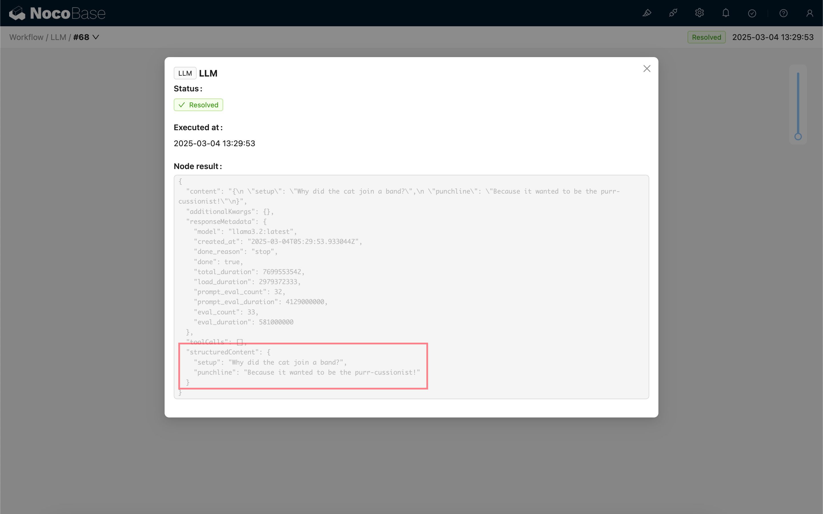
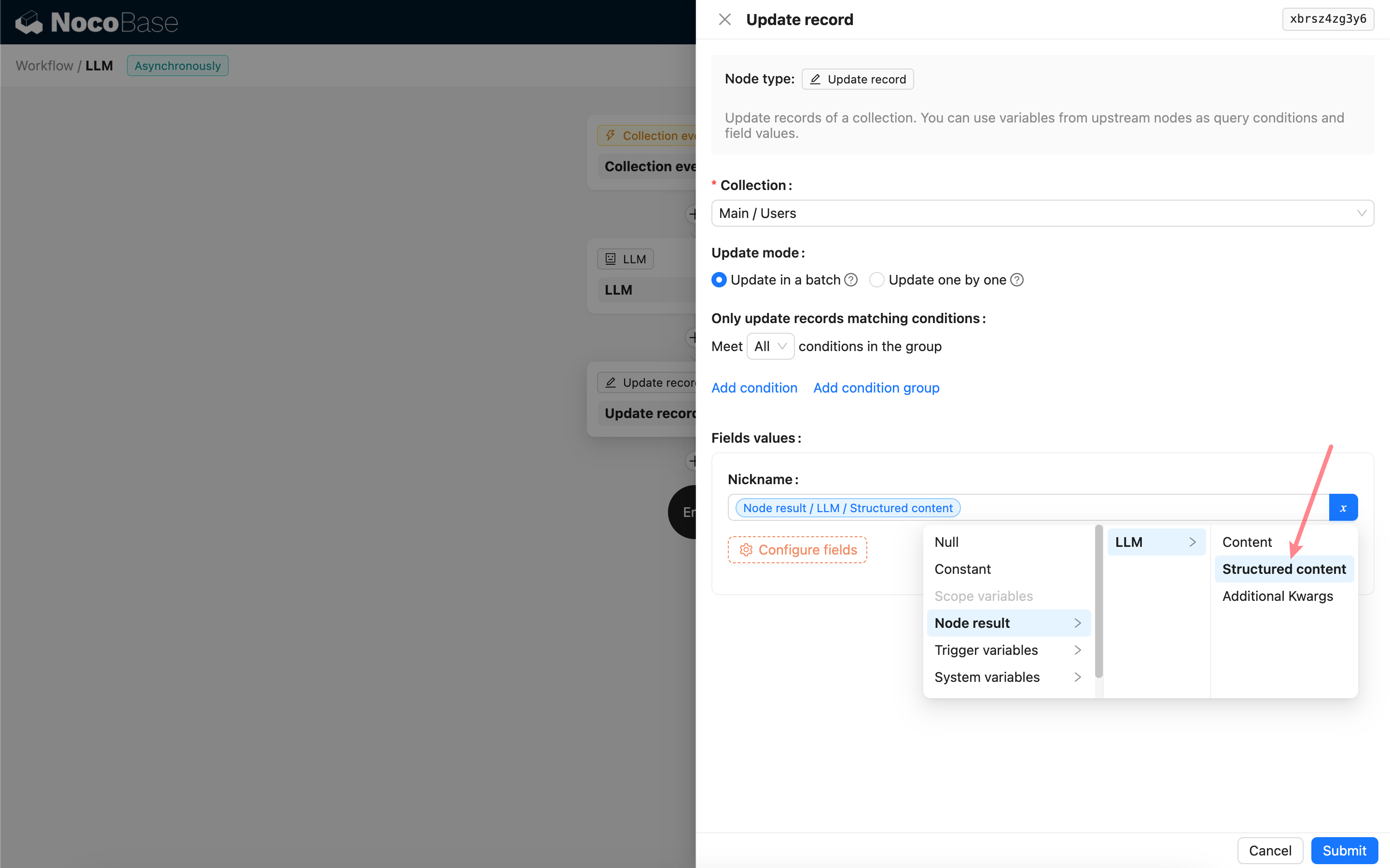
---
url: /auth-verification/2fa/index.md
---
# Two-Factor Authentication (2FA)
## Introduction
Two-Factor Authentication (2FA) is an additional security measure used during application login. When 2FA is enabled, users are required to provide an extra form of authentication—such as an OTP code, TOTP, etc.—in addition to their password.
:::info{title=Note}
Currently, the 2FA process applies only to password-based logins. If your application has enabled SSO or other authentication methods, please use the multi-factor authentication (MFA) provided by the respective IdP.
:::
## Enable Plugin
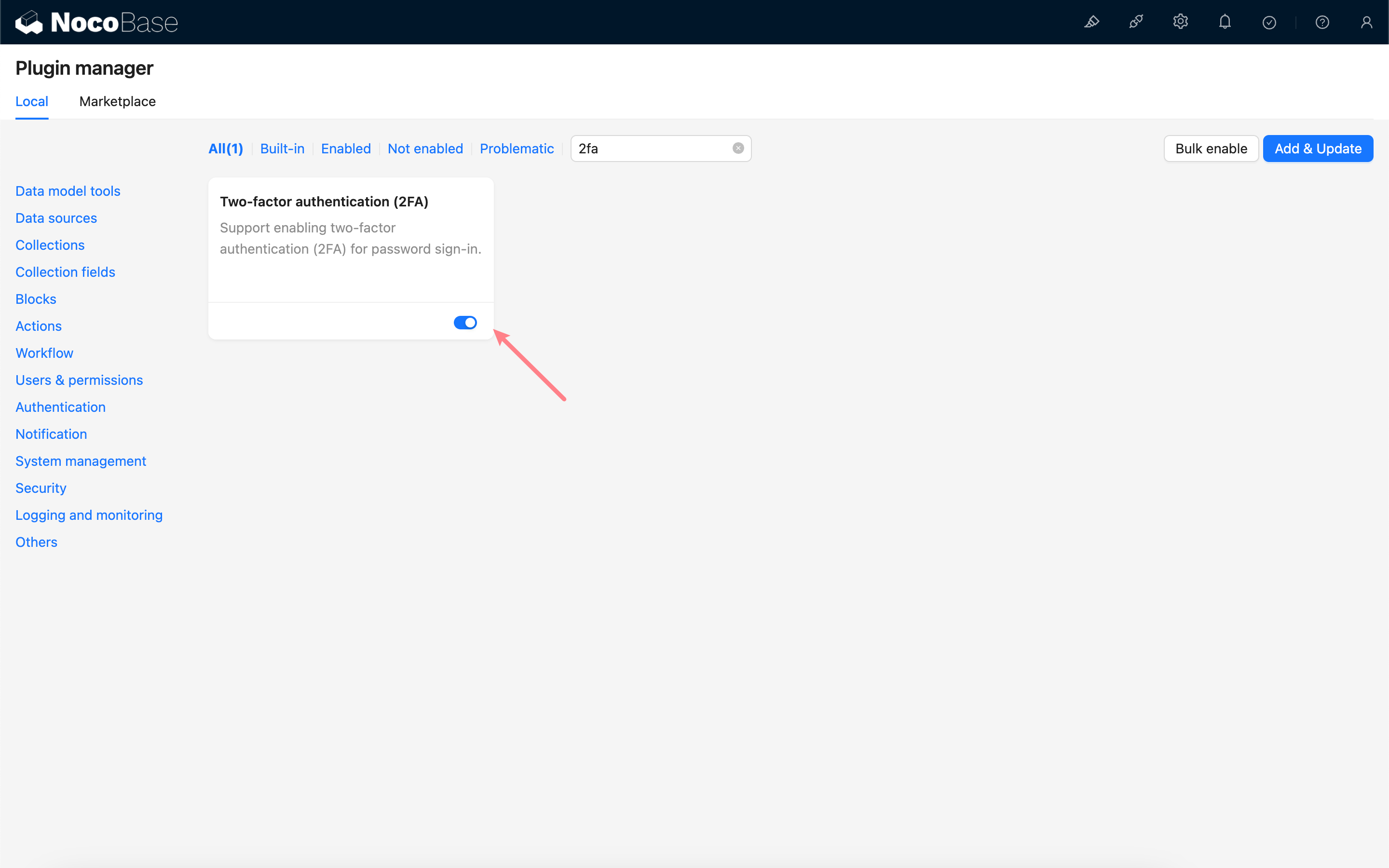
## Administrator Configuration
After enabling the plugin, a 2FA configuration sub-page will be added to the Authenticator management page.
Administrators must check the "Enforce two-Factor authentication (2FA) for all users" option and select an available type of authenticator to bind. If no authenticators are available, please first create a new authenticator on the verification management page. See [Verification](../verification/index.md) for details.
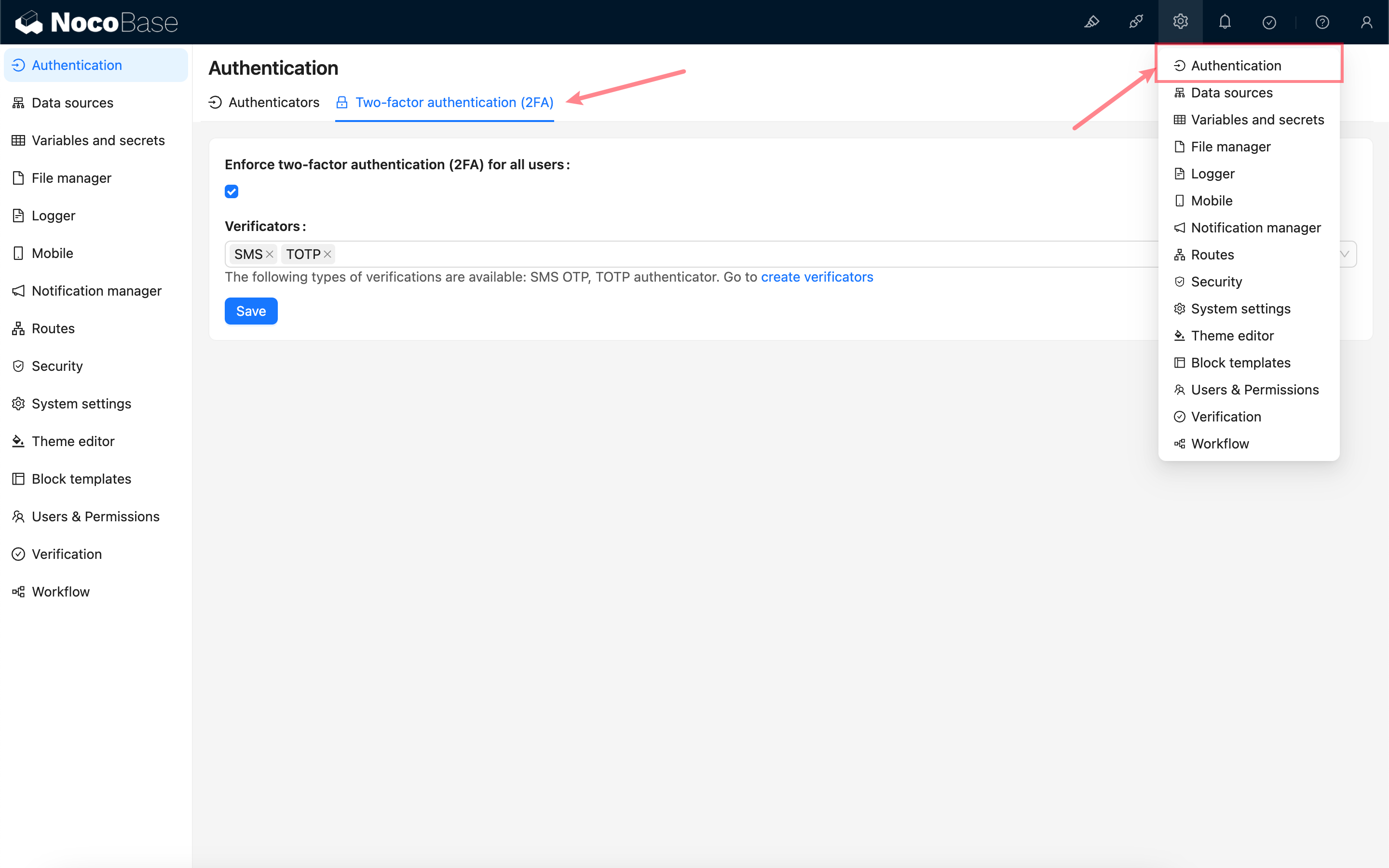
## User Login
Once 2FA is enabled, when users log in using a password, they will enter the 2FA verification process.
If a user has not yet bound any of the specified authenticators, they will be prompted to bind one. Once the binding is successful, they can access the application.
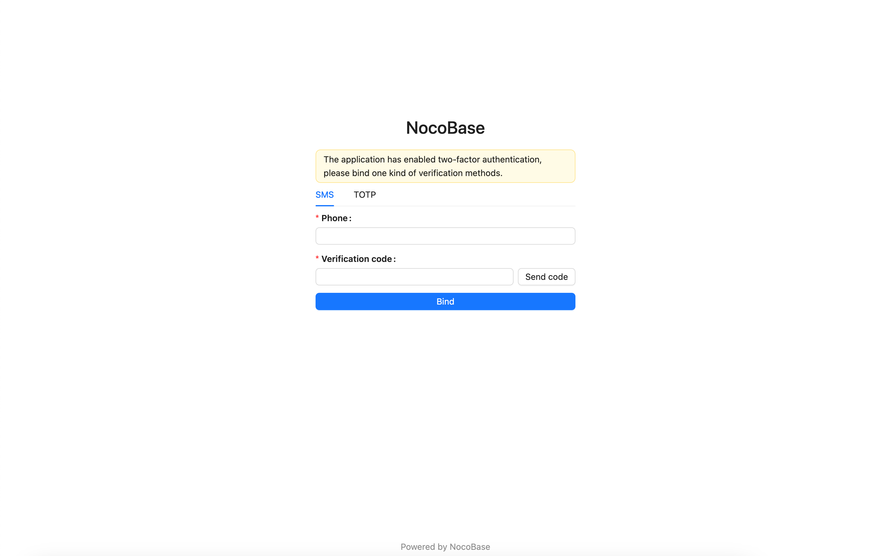
If a user has already bound one of the specified authenticators, they will be required to verify their identity using the bound authenticator. Upon successful verification, they can access the application.
After logging in, users can bind additional authenticators on the verification management page in their personal center.
---
url: /auth-verification/auth-cas/index.md
---
# Auth: CAS
## Introduction
The Auth: CAS plugin follows the CAS (Central Authentication Service) protocol standard, allowing users to sign in to NocoBase using accounts provided by third-party identity authentication service providers (IdP).
## Installation
## User Manual
### Activate Plugin
### Add CAS Authentication
Visit the user authentication management page
http://localhost:13000/admin/settings/auth/authenticators
Add CAS authentication method
Configure CAS and activate
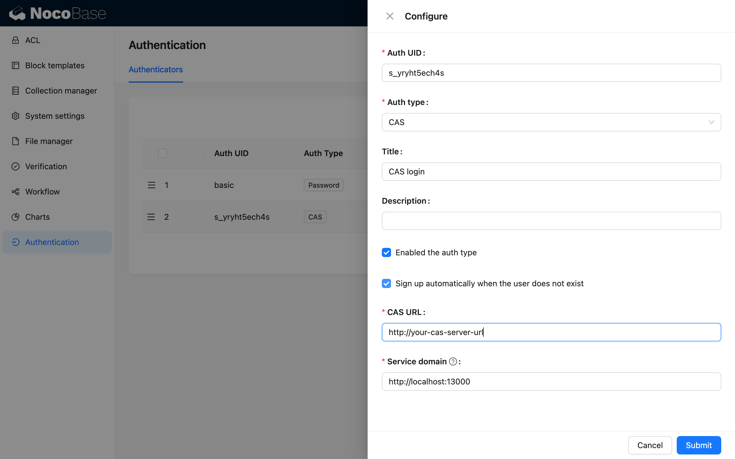
### Visit the Sign in Page
http://localhost:13000/signin
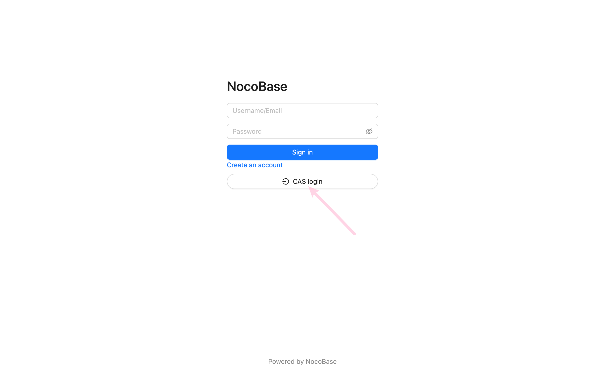
---
url: /auth-verification/auth-dingtalk/index.md
---
# Authentication: DingTalk
## Introduction
The Authentication: DingTalk plugin allows users to log in to NocoBase using their DingTalk accounts.
## Enable Plugin
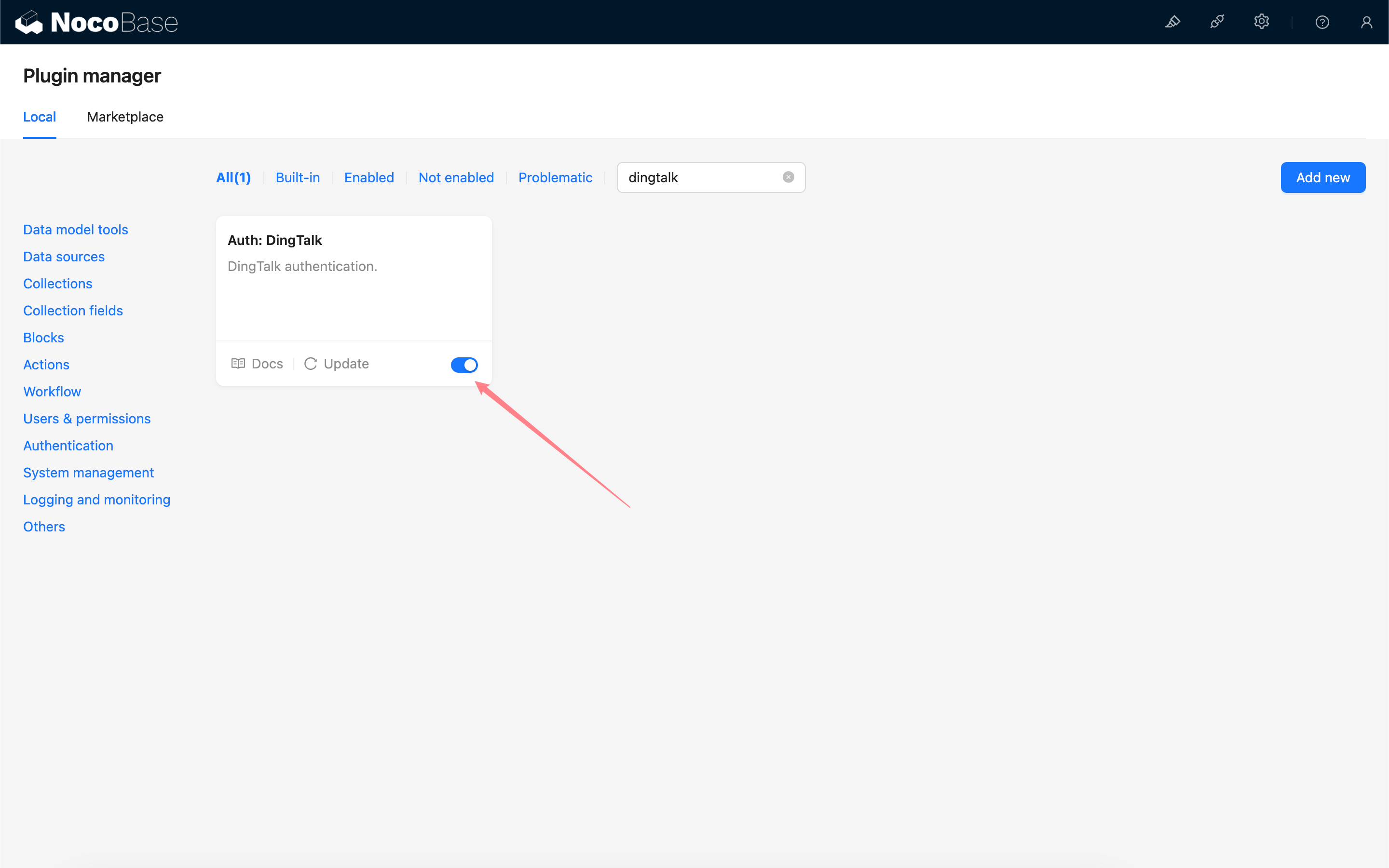
## Apply for API Permissions in DingTalk Developer Console
Refer to DingTalk Open Platform - Implement Login to Third-Party Websites to create an application.
Go to the application management console and enable "Personal Phone Number Information" and "Address Book Personal Information Read Permission".
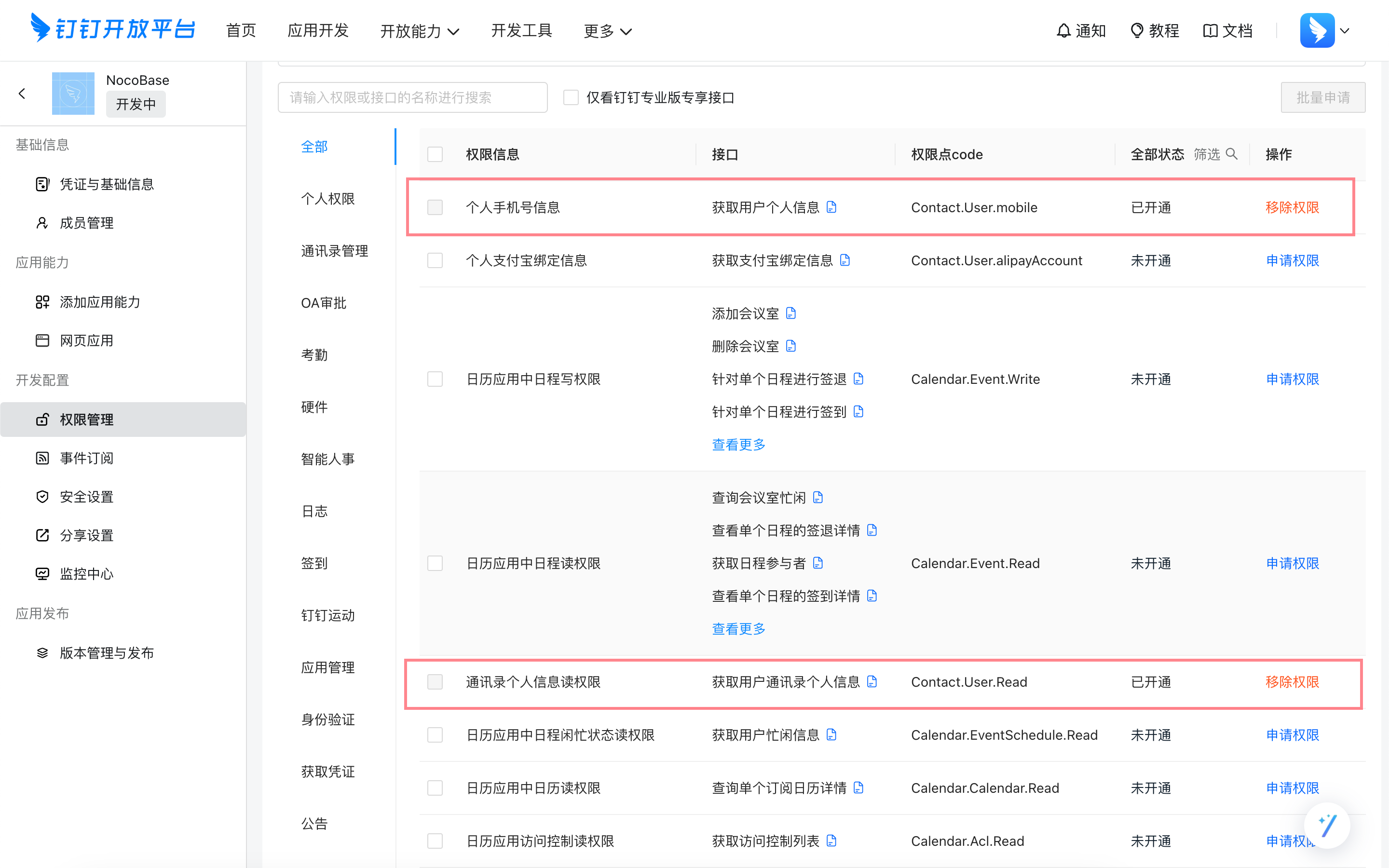
## Get Credentials from DingTalk Developer Console
Copy the Client ID and Client Secret.
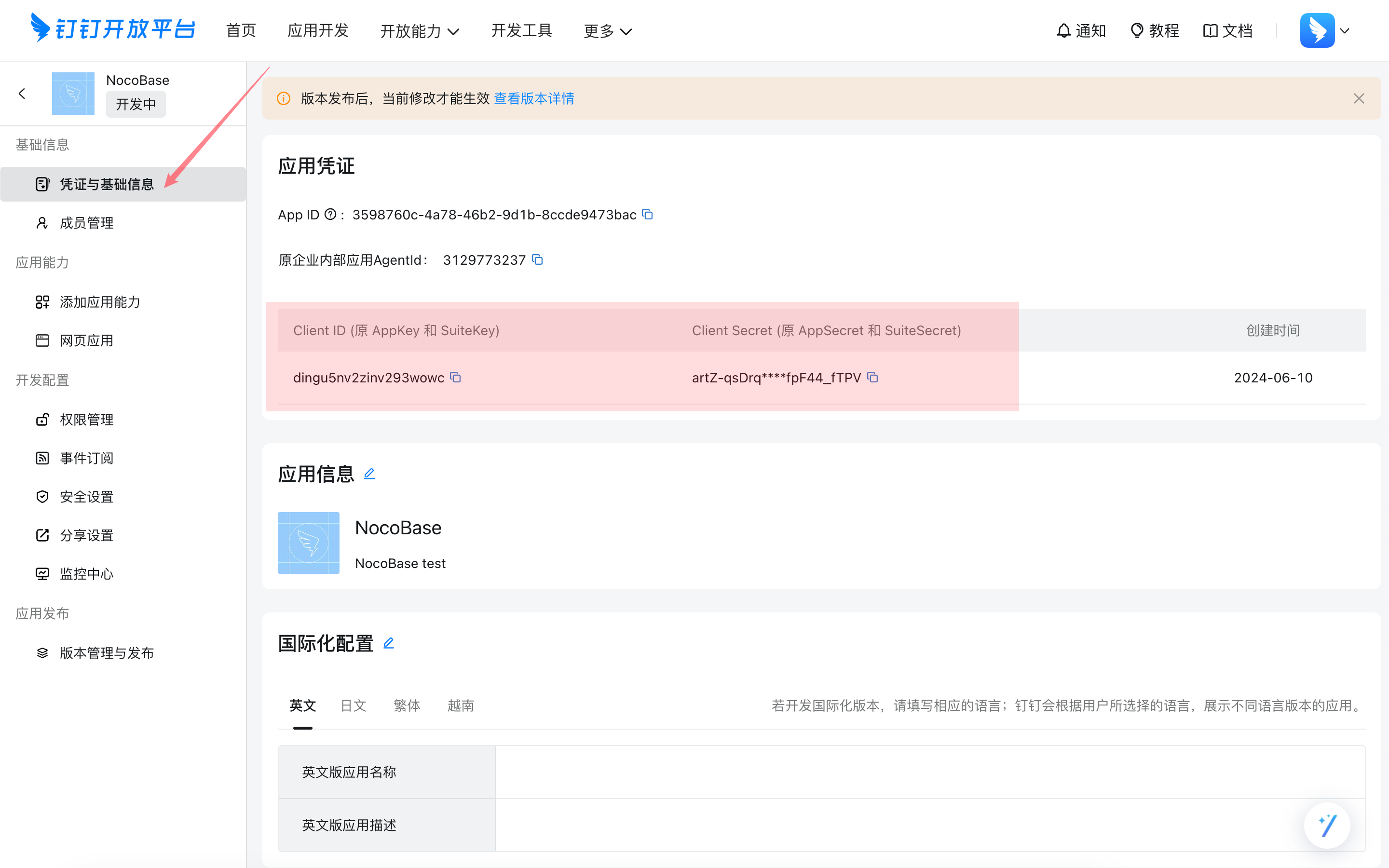
## Add DingTalk Authentication in NocoBase
Go to the user authentication plugin management page.
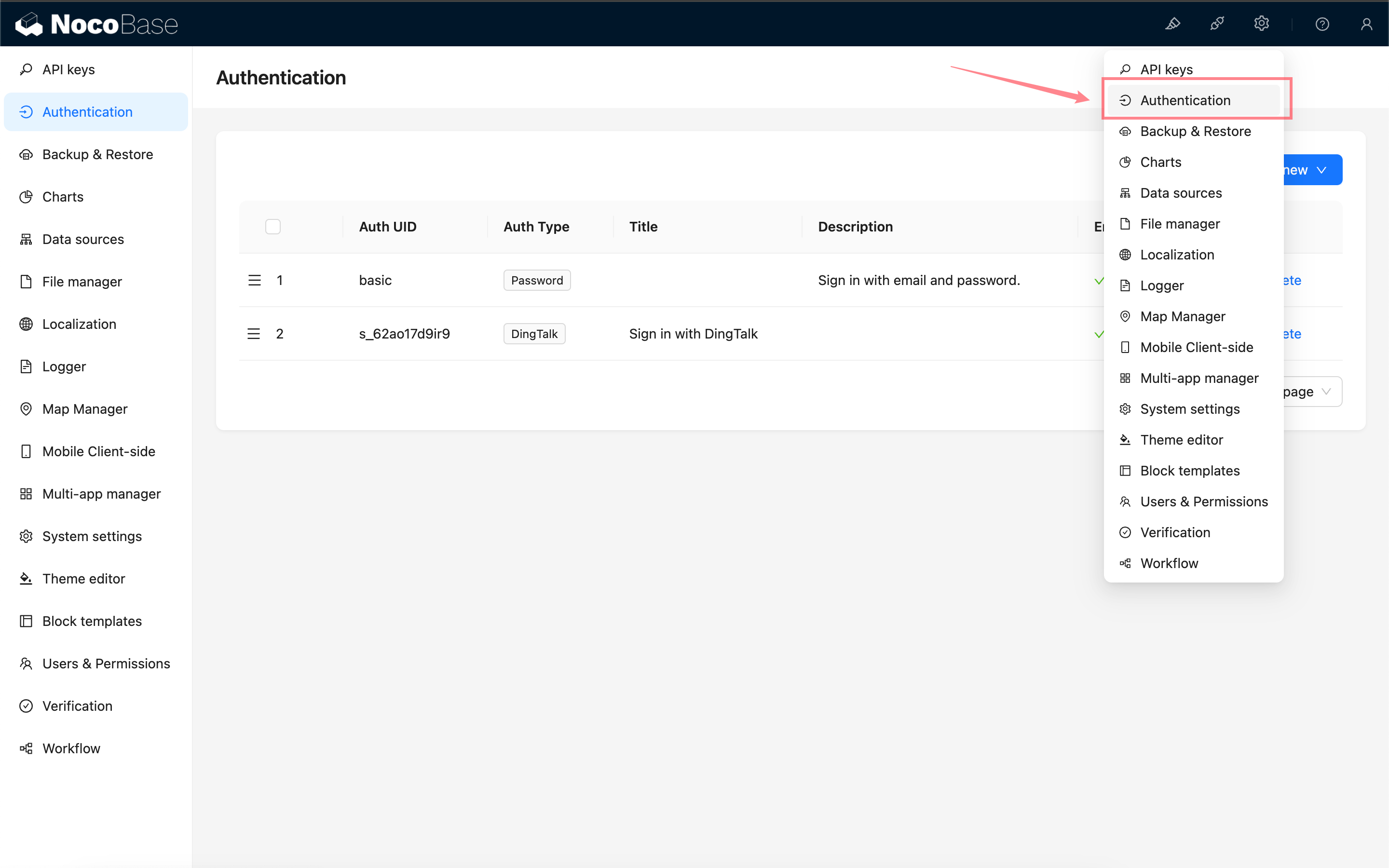
Add - DingTalk
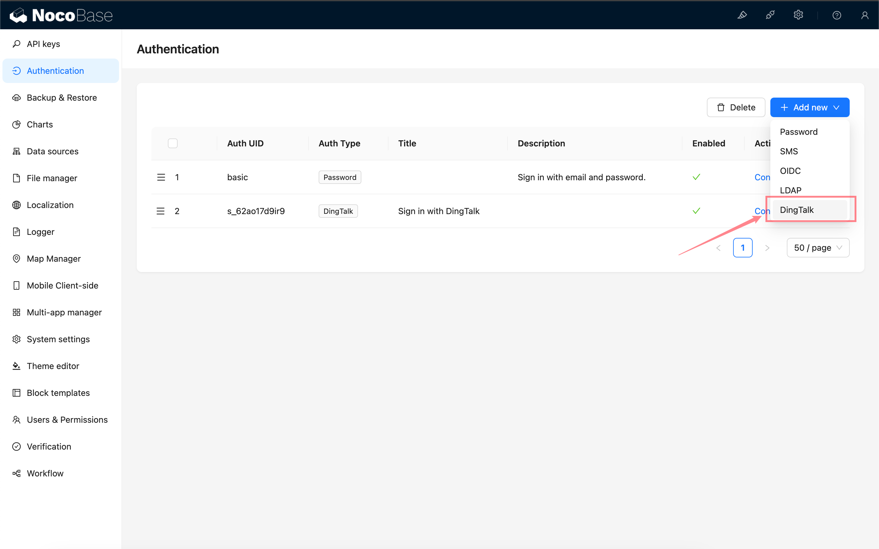
### Configuration
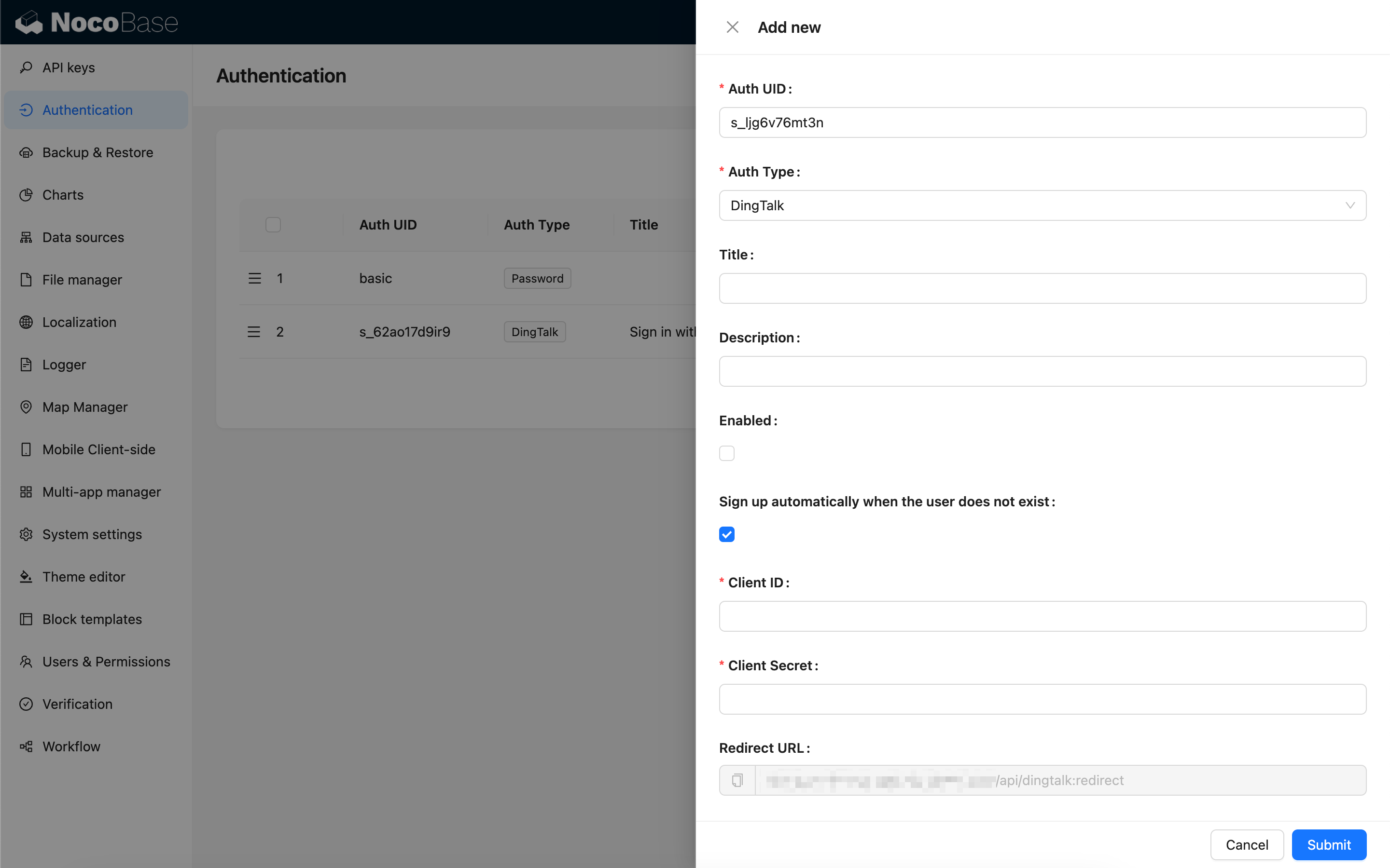
- Sign up automatically when the user does not exist - Whether to automatically create a new user when no existing user is matched by phone number.
- Client ID and Client Secret - Fill in the information copied in the previous step.
- Redirect URL - Callback URL, copy it and proceed to the next step.
## Configure Callback URL in DingTalk Developer Console
Paste the copied callback URL into the DingTalk Developer Console.
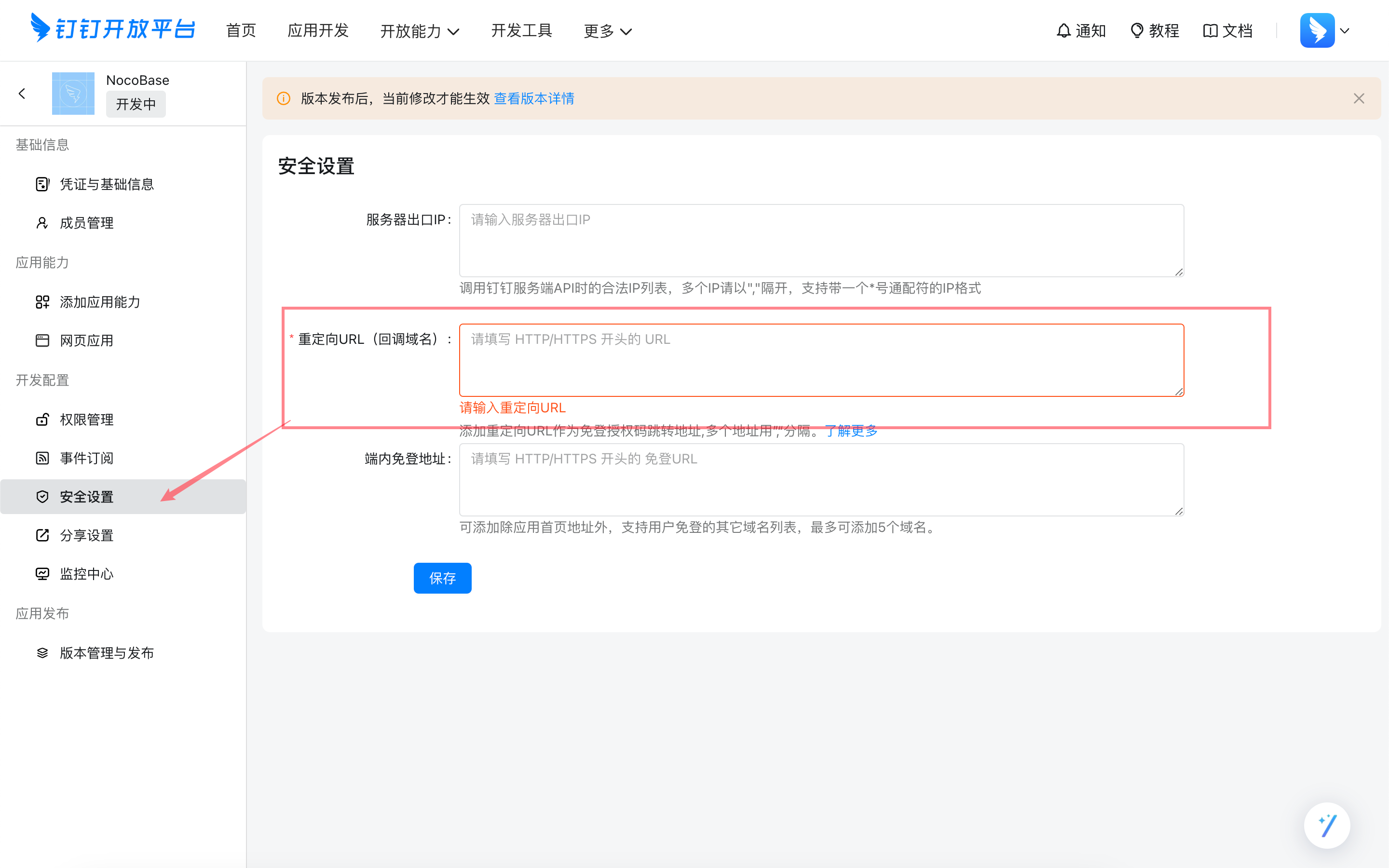
## Login
Visit the login page and click the button below the login form to initiate third-party login.
---
url: /auth-verification/auth-ldap/index.md
---
# Auth: LDAP
## Introduction
The Auth: LDAP plugin follows the LDAP (Lightweight Directory Access Protocol) protocol standard, enabling users to sign in to NocoBase using their LDAP server credentials.
## Activate plugin
It is recommended to test 5–10 typical tasks at once, completing one round within 30 minutes.
### 4.2 Principles and Ratios
* **Prioritize Positive Guidance**: First, tell the AI what it should do
* **Problem-Driven Improvement**: Add constraints only when issues arise
* **Moderate Constraints**: Don't pile on "prohibitions" from the start
Empirical Ratio: **80% Positive : 20% Negative**.
### 4.3 A Typical Optimization
**Problem**: Overloaded charts, poor readability
**Optimization**:
1. In "Background Information," add: one theme per chart
2. In "Reference Examples," provide a "single-metric chart"
3. If the problem persists, add a hard constraint in "Hard Rules/Repetition"
## 5. Advanced Techniques
### 5.1 Use XML/Tags for Clearer Structure (Recommended for Long Prompts)
When the content exceeds 1000 characters or can be confusing, using tags for partitioning is more stable:
```xml
You are Dex, a data organization expert.
Must be completed in the following steps:
1. Identify key fields
2. Extract field values
3. Standardize format (Date YYYY-MM-DD)
4. Output JSON
MUST: Maintain accuracy of field values
NEVER: Guess missing information
ALWAYS: Flag uncertain items
{"Name":"John Doe","Date":"2024-01-15","Amount":5000,"Status":"Confirmed"}
```
### 5.2 Layered "Background + Task" Approach (A More Intuitive Way)
* **Background** (long-term stability): Who this agent is, its style, and what capabilities it has
* **Task** (on-demand): What to do now, which metrics to focus on, and what the default scope is
This naturally matches NocoBase's "Agent + Task" model: a fixed background with flexible tasks.
### 5.3 Modular Reuse
Break down common rules into modules to mix and match as needed:
**Data Security Module**
```
MUST: Only use SELECT
NEVER: Execute INSERT/UPDATE/DELETE
```
**Output Structure Module**
```
Output must include:
1) Brief description (2-3 sentences)
2) Core content (chart/data/code)
3) Optional suggestions (if any)
```
## 6. Golden Rules (Practical Conclusions)
1. One AI for one type of job; specialization is more stable
2. Examples are more effective than slogans; provide positive models first
3. Use MUST/ALWAYS/NEVER to set boundaries
4. Use a process-oriented approach to reduce uncertainty
5. Start small, test more, modify less, and iterate continuously
6. Don't over-constrain; avoid "hard-coding" behavior
7. Log issues and changes to create versions
8. 80/20: First, explain "how to do it right," then constrain "what not to do wrong"
## 7. FAQ
**Q1: What's the ideal length?**
* Basic agent: 500–800 characters
* Complex agent: 800–1500 characters
* Not recommended >2000 characters (can be slow and redundant)
Standard: Cover all nine elements, but with no fluff.
**Q2: What if the AI doesn't follow instructions?**
1. Use MUST/ALWAYS/NEVER to clarify boundaries
2. Repeat key requirements 2–3 times
3. Use tags/partitions to enhance structure
4. Provide more positive examples, less abstract principles
5. Evaluate if a more powerful model is needed
**Q3: How to balance positive and negative guidance?**
First, write the positive parts (role, workflow, examples), then add constraints based on errors, and only constrain points that are "repeatedly wrong."
**Q4: Should it be updated frequently?**
* Background (identity/style/core capabilities): Long-term stability
* Task (scenario/metrics/scope): Adjust according to business needs
* Create a new version for any changes and log "why it was changed."
## 8. Next Steps
**Hands-on Practice**
* Choose a simple role (e.g., customer service assistant), write a "workable version" using the nine elements, and test it with 5 typical tasks
* Find an existing agent, collect 3–5 real issues, and perform a small iteration
**Further Reading**
* [AI Agent · Administrator Configuration Guide](./admin-configuration.md): Put prompts into actual configuration
* Dedicated manuals for each AI agent: View complete role/task templates
## Conclusion
**Get it working, then refine it.**
Start with a "working" version, and continuously collect issues, add examples, and refine rules in real tasks.
Remember: **First, tell it how to do things right (positive guidance), then constrain it from doing things wrong (moderate restriction).**
---
---
url: /ai-employees/features/built-in-employee.md
---
# Built-in AI Employees
NocoBase comes with several built-in AI employees tailored for specific scenarios.
You only need to configure the LLM service and enable the corresponding employee to start working; models can be switched on-demand within the conversation.
## Introduction

| Employee Name | Role Positioning | Core Capabilities |
| :--- | :--- | :--- |
| **Atlas** | Team Leader | The default general-purpose AI employee that understands user intent and automatically routes the task to the appropriate AI employee |
| **Cole** | NocoBase Assistant | Product Q&A, document retrieval |
| **Ellis** | Email Expert | Email drafting, summary generation, reply suggestions |
| **Dex** | Data Organizer | Field translation, formatting, information extraction |
| **Viz** | Insight Analyst | Data insights, trend analysis, key metric interpretation |
| **Lexi** | Translation Assistant | Multilingual translation, communication assistance |
| **Vera** | Research Analyst | Web search, information aggregation, deep research |
| **Dara** | Data Visualization Expert | Chart configuration, visual report generation |
| **Orin** | Data Modeling Expert | Assist in designing collection structures, field suggestions |
| **Nathan** | Frontend Engineer | Assist in writing frontend code snippets, style adjustments |
Click the **AI floating ball** in the bottom-right corner of the application interface to open an AI conversation and start collaborating.
To switch to a different AI employee, use the AI employee dropdown in the conversation.
## Default AI Employee Atlas
### Introduction
> The default entry point for AI employees, understanding user intent and coordinating the appropriate AI employee to help.
Atlas is NocoBase's built-in default AI employee and the central entry point. In most cases, you can simply talk to Atlas directly. He understands your intent from the context and coordinates the most suitable AI employee to help with the current task.
### Usage
Click the **AI floating ball** in the bottom-right corner of the application interface to enter a conversation with Atlas.
In most scenarios, you can simply describe what you need. Atlas will either continue responding directly or coordinate the appropriate AI employee to assist.

## Dedicated Scenario AI Employees
Some built-in AI employees (builder types) do not appear in the bottom-right AI employee list; they have dedicated workspaces, for example:
* Orin only appears on the Data Source configuration page;
* Dara only appears on the chart configuration page;
* Nathan only appears in the JS editor.
---
Below are several typical application scenarios for AI employees to provide you with inspiration. More potential awaits your further exploration in actual business scenarios.
## Viz: Insight Analyst
### Introduction
> Generate charts and insights with one click, let the data speak for itself.
**Viz** is the built-in **AI Insight Analyst**.
He knows how to read the data on your current page (such as Leads, Opportunities, Accounts) and automatically generate trend charts, comparison charts, KPI cards, and concise conclusions, making business analysis easy and intuitive.
> Want to know "Why have sales dropped recently?"
> Just say a word to Viz, and he can tell you where the drop occurred, what the possible reasons are, and what the next steps could be.
### Use Scenarios
Whether it's monthly business reviews, channel ROI, or sales funnels, you can let Viz analyze, generate charts, and interpret results.
| Scenario | What you want to know | Viz's Output |
| -------- | ------------ | ------------------- |
| **Monthly Review** | How is this month better than last? | KPI Card + Trend Chart + Three improvement suggestions |
| **Growth Breakdown** | Is revenue growth driven by volume or price? | Factor decomposition chart + Comparison table |
| **Channel Analysis** | Which channel is most worth continued investment? | ROI Chart + Retention curve + Suggestions |
| **Funnel Analysis** | Where is the traffic getting stuck? | Funnel chart + Bottleneck explanation |
| **Customer Retention** | Which customers are most valuable? | RFM segmentation chart + Retention curve |
| **Promotion Evaluation** | How effective was the big promotion? | Comparison chart + Price elasticity analysis |
### Usage
**Page Entry Points**
* **Top-right button (Recommended)**
On pages like Leads, Opportunities, and Accounts, click the **Viz icon** in the top right corner to select preset tasks, such as:
* Stage conversion and trends
* Source channel comparison
* Monthly review analysis

* **Bottom-right global panel**
On any page, you can call up the global AI panel and speak directly to Viz:
```
Analyze sales changes over the last 90 days
```
Viz will automatically bring in the data context of your current page.
**Interaction**
Viz supports natural language questions and understands multi-turn follow-ups.
Example:
```
Hi Viz, generate lead trends for this month.
```
```
Only show performance from third-party channels.
```
```
Which region is growing the fastest?
```
Each follow-up question will continue to delve deeper based on the previous analysis results, without needing to re-enter data conditions.
### Tips for Chatting with Viz
| Method | Effect |
| ---------- | ------------------- |
| Specify time range | "Last 30 days" or "Last month vs. This month" is more accurate |
| Specify dimensions | "View by region/channel/product" helps align perspectives |
| Focus on trends rather than details | Viz is good at identifying the direction of change and key reasons |
| Use natural language | No need for imperative syntax, just ask questions like you're chatting |
---
## Dex: Data Organizer
### Introduction
> Quickly extract and fill forms, turning messy information into structured data.
`Dex` is a data organizer who extracts required information from unstructured data or files and organizes it into structured information. He can also call tools to fill the information into forms.
### Usage
Invoke `Dex` on the form page to open the conversation window.

Click **Add work context** in the input box and select **Pick block**; the page will enter the block selection state.

Select the form block on the page.

Enter the data you want `Dex` to organize in the dialog box.

After sending, `Dex` will structure the data and use its skills to update the data in the selected form.

---
## Orin: Data Modeler
### Introduction
> Intelligently design collections and optimize database structures.
`Orin` is a data modeling expert. On the main data source configuration page, you can let `Orin` help you create or modify collections.

### Usage
Enter the Data Source Manager plugin and select to configure the main data source.

Click the `Orin` avatar in the top right corner to open the AI employee dialog box.

Describe your modeling requirements to `Orin`, send, and wait for a reply.
Once `Orin` confirms your requirements, he will use his skills and reply with a preview of the data modeling.
After reviewing the preview, click the **Finish review and apply** button to create collections according to `Orin`'s modeling.

---
## Nathan: Frontend Engineer
### Introduction
> Helps you write and optimize frontend code to implement complex interaction logic.
`Nathan` is the frontend development expert in NocoBase. In scenarios where JavaScript is required, such as `JSBlock`, `JSField`, `JSItem`, `JSColumn`, `JSAction`, `Event Flow`, and `Linkage`, Nathan's avatar will appear in the top right corner of the code editor, allowing you to ask him to help write or modify the code in the editor.

### Usage
In the code editor, click `Nathan` to open the AI employee dialog box; the code in the editor will be automatically attached to the input box and sent to `Nathan` as application context.

Enter your coding requirements, send them to `Nathan`, and wait for his reply.

Click the **Apply to editor** button on the code block replied by `Nathan` to overwrite the code in the editor with his code.

Click the **Run** button in the code editor to view the effects in real-time.

### Code History
Click the **Command Line** icon in the top right corner of `Nathan`'s dialog box to view the code snippets you have sent and the code snippets `Nathan` has replied with in the current session.


---
url: /ai-employees/features/collaborate.md
---
# Collaborate with AI Employees
After creating and enabling AI Employees, you can collaborate with them in pages.
## Entry Points
There are two common entry points:
1. **Bottom-right main entry**: Open the AI chat panel from the bottom-right corner of business pages. Suitable for general Q&A and cross-block collaboration.
2. **Block Action entry**: In blocks that support `Actions`, enter via `Actions -> AI employees`. Suitable for tasks on the current block (for example JSBlock scenarios).
### Bottom-right main entry

### Block Action entry

## Basic Chat Operations
The chat panel supports common operations such as sending messages, uploading attachments, viewing history, creating new chats, and editing system prompts.
## In-Chat Switching
In most cases, you can simply talk to Atlas, and he will coordinate the appropriate AI employee to help handle the task.
If you want to use a specific AI employee, click the AI employee dropdown in the message composer to select one.

Model preferences are saved per employee and restored next time.

---
url: /ai-employees/features/enable-ai-employee.md
---
# Enable AI Employees
NocoBase provides multiple built-in AI Employees for different scenarios.
## How to Enable
Open the `AI employees` management page and toggle `Enabled` directly in the list.

## Usage After Enabling
After enabling, the employee appears in available entry points (such as bottom-right shortcut entry or scenario-specific entry).
---
url: /ai-employees/features/llm-service.md
---
# Configure LLM Service
Before using AI Employees, configure available LLM services first.
Supported providers include OpenAI, Gemini, Claude, DeepSeek, Qwen, Kimi, and Ollama local models.
## Create Service
Go to `System Settings -> AI Employees -> LLM service`.
1. Click `Add New` to open the creation dialog.
2. Select `Provider`.
3. Fill `Title`, `API Key`, and `Base URL` (optional).
4. Configure `Enabled Models`:
- `Recommended models`: use officially recommended models.
- `Select models`: select from the provider model list.
- `Manual input`: manually enter model ID and display name.
5. Click `Submit` to save.

## Enable and Sort Services
In the LLM service list, you can:
- Toggle service status with the `Enabled` switch.
- Drag to reorder services (affects model display order).

## Availability Test
Use `Test flight` at the bottom of the service dialog to verify service and model availability.
It is recommended to run this test before production use.
---
url: /ai-employees/features/mcp.md
---
# MCP Integration
AI Employees can connect to MCP services that follow the Model Context Protocol (MCP). Once connected, AI Employees can use the tools provided by those MCP services to complete tasks.
## MCP Configuration
Open the MCP settings module. Here, you can add new MCP services and manage the ones that are already connected.

## Add MCP Service
Click the `Add` button in the top-right corner of the MCP service list. In the dialog, enter the connection details to add the MCP service.
Two transport protocols are supported for MCP services: Stdio and HTTP (Streamable / SSE).

When adding an MCP service, you need to enter a `Name`, `Title`, and `Description`. `Name` is the unique identifier of the MCP service. `Title` is the display name shown in the system. `Description` is optional and can be used to briefly describe what the MCP service does.

### Stdio
When adding an MCP service that uses the stdio transport protocol, you need to enter the `Command` and `Arguments` used to run the MCP service. You can also add `Environment variables` if the command requires them.
:::warning
Commands used to run MCP services, such as `node`, `npx`, `uvx`, and `go`, must be supported by the server where NocoBase is deployed.
The NocoBase Docker image only supports Node.js-related commands such as `node` and `npx`.
:::

### HTTP
When adding an MCP service that uses the HTTP transport protocol, you need to enter the MCP service `URL`. You can also add `Headers` if needed.
The HTTP transport protocol supports both Streamable and SSE. Streamable is the newer transport defined by the MCP standard, while SSE is being deprecated. Choose the appropriate transport type based on the documentation for the MCP service you are using.

### Availability Test
When adding or editing an MCP service, you can run an availability test after entering the configuration. If the configuration is complete and correct, and the MCP service is reachable, the system will return a success message.

## View MCP Services
Click the `View` button in the MCP service list to see the list of tools provided by that MCP service.
In the tool list, you can also configure permissions for how AI Employees use each tool. If a tool is set to `Ask`, the system will ask for confirmation before calling it. If it is set to `Allow`, the tool will be called directly when needed.

## Use MCP Services
After enabling the MCP services you want to use in the MCP configuration module, AI Employees will automatically use the tools provided by those services during conversations to complete tasks.

---
url: /ai-employees/features/new-ai-employees.md
---
# New AI Employee
If built-in AI Employees do not meet your needs, you can create and customize your own AI Employee.
## Start Creating
Open the `AI employees` management page and click `New AI employee`.
## Basic Profile
Configure the following in the `Profile` tab:
- `Username`: unique identifier.
- `Nickname`: display name.
- `Position`: role description.
- `Avatar`: employee avatar.
- `Bio`: short introduction.
- `About me`: system prompt.
- `Greeting message`: chat greeting.

## Role Setting
In the `Role setting` tab, configure the employee's System Prompt. This content defines the employee's identity, goals, boundaries, and output style during conversations.
Recommended content:
- Role positioning and responsibility scope.
- Task-handling principles and response structure.
- Prohibited behaviors, information boundaries, and tone/style requirements.
You can insert variables (for example current user, current role, current language, and datetime) so the prompt adapts to runtime context.

## Skills and Knowledge
Configure tool permissions in the `Skills` tab. If knowledge base capability is enabled, continue configuration in knowledge-related tabs.
## Complete Creation
Click `Submit` to finish.
---
url: /ai-employees/features/pick-block.md
---
# Add Context - Block
When chatting with an AI Employee, besides sending files, you can also send application Context information to the AI Employee, allowing the AI Employee to reply based on the application Context information.
### Send Block Information
In the AI Employee Chatbox, click the `Add work context` button in the lower left corner and select `Pick Block`. The application page will enter the Block selection state.

When hovering over a Block, the color of the Block that can be sent as Context will change.

After selecting the Block to be sent, the Block Context information will be attached to the Chatbox.

After entering the question message, just like sending a message, click the send button, and the AI Employee will reply based on the Block information.
The Block information will also appear in the message list.

### End Block Selection
When the application page enters the Block selection state but you do not want to select any Block, click the "Stop" icon at the bottom to exit the Block selection state.

---
url: /ai-employees/features/skills.md
---
# Using Skills
Skills are domain-specific knowledge guides for AI employees, enabling them to use multiple tools to handle tasks in specialized domains.
## Skill Structure
The Skills page is divided into two categories:
1. `General skills`: Shared by all AI employees and usually read-only.
2. `Employee-specific skills`: Exclusive to the current employee.

---
url: /ai-employees/features/task.md
---
# Shortcut Tasks
To help AI Employees start working more efficiently, we can bind AI Employees to scenario blocks and preset several common tasks.
This lets users start task processing with one click, without having to **Select Block** and **Input Command** every time.
## Block Binding AI Employee
After entering UI editing mode, for blocks that support `Actions`, select `AI employees` under `Actions`, then choose an AI Employee. That AI Employee will be bound to the current block.

After binding is complete, each time you enter the page, the block Actions area shows the AI Employee bound to the current block.

## Configure Tasks
After entering UI editing mode, hover over the AI Employee icon bound to the block. A menu button appears. Select `Edit tasks` to enter the task settings page.
On the task settings page, you can add multiple tasks for the current AI Employee.
Each tab represents an independent task. Click the "+" next to it to add a new task.

Task settings form:
- Enter task title in `Title`. The title appears in the AI Employee task list.
- Enter main task content in `Background`. This content is used as the system prompt when chatting with the AI Employee.
- Enter default user message in `Default user message`. It is auto-filled in the input box after selecting the task.
- In `Work context`, choose default app context information to send to the AI Employee. This works the same as in the chat panel.
- The `Skills` selector shows skills available to the current AI Employee. You can disable a skill so it is not used for this task.
- `Send default user message automatically` controls whether the default user message is sent automatically after clicking to run the task.
## Task List
After tasks are configured, they appear in the AI Employee profile popover and in the greeting message before the conversation starts. Click to run a task.

---
url: /ai-employees/features/tools.md
---
# Use Tools
tools define what an AI Employee can do.
## Tool Structure
The tools page is split into three sections:
1. `General tools`: shared by all AI Employees, read-only.
2. `Employee-specific tools`: specific to the current employee, usually read-only.
3. `Custom tools`: custom tools that can be added/removed and configured with default permissions.

## Tool Permissions
Tool permissions are unified as:
- `Ask`: ask for confirmation before calling.
- `Allow`: allow direct calling.
Recommendation: use `Ask` by default for data-modifying tools.

## Add and Maintain
Create a workflow in the workflow module with the trigger type set to `AI employee event`.

Click `Add skill` in `Custom tools` to add workflow as tool and configure permissions based on business risk.

---
url: /ai-employees/features/web-search.md
---
# Web Search
Web Search supplements model knowledge with up-to-date external information.
## How It Works
Web Search availability depends on whether the currently selected model service supports Web Search.
- Supported: search toggle is visible and can be enabled/disabled.
- Not supported: toggle is hidden and search state is reset automatically.
## Use in Chat
Use the search toggle in the sender footer:
- On: AI can search first, then answer.

- Off: AI answers based on existing context only.

## Provider Differences
Web Search capability differs across models. Validate behavior based on your selected model service and model.
---
url: /ai-employees/file-manager.md
---
# File Management
## Introduction
Configure the storage method for files uploaded during AI employee conversations.
## Settings
Go to the AI employee plugin configuration page, click the `Settings` tab to enter the storage method settings page.

The available storage options for `Files storage` are configured in the File Management plugin.

---
url: /ai-employees/index.md
---
# Overview

AI Employees (`AI Employees`) are intelligent agent capabilities deeply integrated into NocoBase business systems.
They are not just chatbots. They are "digital colleagues" that can understand business context in the UI and execute actions directly:
- **Understand business context**: perceive current pages, blocks, data structures, and selected content.
- **Execute actions directly**: call skills to query, analyze, fill, configure, and generate.
- **Role-based collaboration**: configure different employees by role and switch models in conversation.
## 5-Minute Getting Started Path
Start with [Quick Start](/ai-employees/quick-start), and complete minimal setup in this order:
1. Configure at least one [LLM Service](/ai-employees/features/llm-service).
2. Enable at least one [AI Employee](/ai-employees/features/enable-ai-employee).
3. Open a chat and start [collaborating with AI Employees](/ai-employees/features/collaborate).
4. Enable [Web Search](/ai-employees/features/web-search) and [Shortcut Tasks](/ai-employees/features/task) when needed.
## Feature Map
### A. Basic Configuration (Admin)
- [Configure LLM Service](/ai-employees/features/llm-service): connect providers and manage available models.
- [Enable AI Employees](/ai-employees/features/enable-ai-employee): enable/disable built-in employees and control scope.
- [New AI Employee](/ai-employees/features/new-ai-employees): define role, role setting, greeting message, and capability boundary.
- [Use Skills](/ai-employees/features/tool): configure skill permissions (`Ask` / `Allow`) and control execution risk.
### B. Daily Collaboration (Business Users)
- [Collaborate with AI Employees](/ai-employees/features/collaborate): switch employee and model in chat for continuous collaboration.
- [Add Context - Blocks](/ai-employees/features/pick-block): send page blocks as context to AI.
- [Shortcut Tasks](/ai-employees/features/task): preset common tasks on pages/blocks and run with one click.
- [Web Search](/ai-employees/features/web-search): enable retrieval for up-to-date information when needed.
### C. Advanced Capabilities (Extensions)
- [Built-in AI Employees](/ai-employees/features/built-in-employee): understand built-in role positioning and suitable scenarios.
- [Permission Control](/ai-employees/permission): control employee, skill, and data access by org permissions.
- [AI Knowledge Base](/ai-employees/knowledge-base/index): import enterprise knowledge for stable and traceable answers.
- [Workflow LLM Nodes](/ai-employees/workflow/nodes/llm/chat): orchestrate AI capabilities into automated workflows.
## Core Concepts (Recommended to Align First)
Keep the following terms aligned with the glossary:
- **AI Employee**: an executable agent composed of Role setting and Tool/Skill.
- **LLM Service**: model access and capability configuration unit for Provider and model list management.
- **Provider**: model supplier behind an LLM service.
- **Enabled Models**: model set that the current LLM service allows in chat.
- **AI Employee Switcher**: switch current collaborating employee in chat.
- **Model Switcher**: switch model in chat and remember preference per employee.
- **Tool / Skill**: executable capability unit callable by AI.
- **Skill Permission (Ask / Allow)**: whether to require human confirmation before skill calls.
- **Context**: business environment information such as pages, blocks, and data structures.
- **Chat**: one continuous interaction between user and AI Employee.
- **Web Search**: capability that enhances answers with external retrieval.
- **Knowledge Base / RAG**: retrieval-augmented generation with enterprise knowledge.
- **Vector Store**: vectorized storage that provides semantic retrieval for knowledge base.
## Installation
AI Employees are built into NocoBase (`@nocobase/plugin-ai`) and are ready to use without separate installation.
---
url: /ai-employees/knowledge-base/index.md
---
# Overview
## Introduction
The AI Knowledge Base plugin provides RAG retrieval capabilities for AI agents.
RAG retrieval capabilities allow AI agents to provide more accurate, professional, and enterprise-relevant answers when responding to user questions.
Using professional domain and internal enterprise documents from the administrator-maintained knowledge base improves the accuracy and traceability of AI agent responses.
### What is RAG
RAG (Retrieval Augmented Generation) stands for "Retrieval-Augmented-Generation".
- Retrieval: The user's question is converted into a vector by an Embedding model (e.g., BERT). Top-K relevant text chunks are recalled from the vector library through dense retrieval (semantic similarity) or sparse retrieval (keyword matching).
- Augmentation: The retrieval results are concatenated with the original question to form an augmented prompt, which is then injected into the LLM's context window.
- Generation: The LLM combines the augmented prompt to generate the final answer, ensuring factuality and traceability.
## Installation
1. Go to the Plugin Manager page
2. Find the `AI: Knowledge base` plugin and enable it

---
url: /ai-employees/knowledge-base/knowledge-base.md
---
# Knowledge Base
## Introduction
The knowledge base is the foundation of RAG retrieval. It organizes documents by category and builds an index. When an AI employee answers a question, it will prioritize searching for answers from the knowledge base.
## Knowledge Base Management
Go to the AI employee plugin configuration page, click the `Knowledge base` tab to enter the knowledge base management page.

Click the `Add new` button in the upper right corner to add a `Local` knowledge base.

Enter the necessary information for the new knowledge base:
- In the `Name` input box, enter the knowledge base name;
- In `File storage`, select the file storage location;
- In `Vector store`, select the vector store, refer to [Vector Store](/ai-employees/knowledge-base/vector-store);
- In the `Description` input box, enter the knowledge base description;
Click the `Submit` button to create the knowledge base.

## Knowledge Base Document Management
After creating the knowledge base, on the knowledge base list page, click the newly created knowledge base to enter the knowledge base document management page.


Click the `Upload` button to upload documents. After the documents are uploaded, vectorization will start automatically. Wait for the `Status` to change from `Pending` to `Success`.
Currently, the knowledge base supports the following document types: txt, pdf, doc, docx, ppt, pptx; pdf only supports plain text.

## Knowledge Base Types
### Local Knowledge Base
A Local knowledge base is a knowledge base stored locally in NocoBase. The documents and their vector data are all stored locally by NocoBase.

### Readonly Knowledge Base
A Readonly knowledge base is a read-only knowledge base. The documents and vector data are maintained externally. Only a vector database connection is created in NocoBase (currently only PGVector is supported).

### External Knowledge Base
An External knowledge base is an external knowledge base where documents and vector data are maintained externally. Vector database retrieval needs to be extended by developers, allowing the use of vector databases not currently supported by NocoBase.

---
url: /ai-employees/knowledge-base/rag.md
---
# RAG Retrieval
## Introduction
After configuring the knowledge base, you can enable the RAG feature in the AI employee settings.
With RAG enabled, when a user chats with an AI employee, the AI employee will use RAG retrieval to fetch documents from the knowledge base based on the user's message and reply based on the retrieved documents.
## Enable RAG
Go to the AI employee plugin configuration page, click the `AI employees` tab to enter the AI employee management page.

Select the AI employee for which you want to enable RAG, click the `Edit` button to enter the AI employee editing page.
In the `Knowledge base` tab, turn on the `Enable` switch.
- In `Knowledge Base Prompt`, enter the prompt for referencing the knowledge base. `{knowledgeBaseData}` is a fixed placeholder and should not be modified.
- In `Knowledge Base`, select the configured knowledge base. See: [Knowledge Base](/ai-employees/knowledge-base/knowledge-base).
- In the `Top K` input box, enter the number of documents to retrieve, the default is 3.
- In the `Score` input box, enter the document relevance threshold for retrieval.
Click the `Submit` button to save the AI employee settings.

---
url: /ai-employees/knowledge-base/vector-database.md
---
# Vector Database
## Introduction
In a knowledge base, the vector database stores vectorized knowledge base documents. Vectorized documents act as an index for the documents.
When RAG retrieval is enabled in an AI Agent conversation, the user's message is vectorized, and fragments of knowledge base documents are retrieved from the vector database to match relevant document paragraphs and original text.
Currently, the AI Knowledge Base plugin only has built-in support for PGVector, which is a PostgreSQL database plugin.
## Vector Database Management
Go to the AI Agent plugin configuration page, click the `Vector store` tab, and select `Vector database` to enter the vector database management page.

Click the `Add new` button in the upper right corner to add a new `PGVector` vector database connection:
- In the `Name` input box, enter the connection name.
- In the `Host` input box, enter the vector database IP address.
- In the `Port` input box, enter the vector database port number.
- In the `Username` input box, enter the vector database username.
- In the `Password` input box, enter the vector database password.
- In the `Database` input box, enter the database name.
- In the `Table name` input box, enter the table name, which is used when creating a new table to store vector data.
After entering all the necessary information, click the `Test` button to test if the vector database service is available, and click the `Submit` button to save the connection information.

---
url: /ai-employees/knowledge-base/vector-store.md
---
# Vector Store
## Introduction
In a knowledge base, vectorizing documents when saving them and vectorizing search terms when retrieving them both require an `Embedding model` to process the original text into vectors.
In the AI Knowledge Base plugin, a vector store is the binding of an `Embedding model` and a vector database.
## Vector Store Management
Go to the AI Employees plugin configuration page, click the `Vector store` tab, and select `Vector store` to enter the vector store management page.

Click the `Add new` button in the top right corner to add a new vector store:
- In the `Name` input box, enter the vector store name;
- In `Vector store`, select a configured vector database. Refer to: [Vector Database](/ai-employees/knowledge-base/vector-database);
- In `LLM service`, select a configured LLM service. Refer to: [LLM Service Management](/ai-employees/features/llm-service);
- In the `Embedding model` input box, enter the name of the `Embedding` model to be used;
Click the `Submit` button to save the vector store information.

---
url: /ai-employees/mcp/index.md
---
# NocoBase MCP
After enabling the NocoBase MCP Server plugin, your NocoBase app exposes an MCP endpoint that MCP clients can use to access and call NocoBase APIs.
## Server URL
- Main app:
`http(s)://:/api/mcp`
- Non-main app:
`http(s)://:/api/__app//mcp`
This endpoint uses the `streamable HTTP` transport.
You can use the `x-mcp-packages` request header to control which package APIs are exposed by MCP, for example:
`x-mcp-packages: @nocobase/server,plugin-workflow*,plugin-users`
This header accepts full package names. If a scope is omitted, `@nocobase/` is added automatically. By default, MCP loads these package APIs:
- `@nocobase/plugin-data-source-main`
- `@nocobase/plugin-data-source-manager`
- `@nocobase/plugin-workflow*`
- `@nocobase/plugin-acl`
- `@nocobase/plugin-users`
- `@nocobase/plugin-auth`
- `@nocobase/plugin-client`
- `@nocobase/plugin-flow-engine`
- `@nocobase/plugin-ai`
## What It Provides
- NocoBase core and plugin APIs
- A generic CRUD tool for working with data tables
## Quick Start
### Codex
#### Authenticate with API Key
First, enable the API Keys plugin and create an API key.
```bash
export NOCOBASE_API_TOKEN=
codex mcp add nocobase --url http://:/api/mcp --bearer-token-env-var NOCOBASE_API_TOKEN
```
#### Authenticate with OAuth
First, enable the IdP: OAuth plugin.
```bash
codex mcp add nocobase --url http://:/api/mcp
codex mcp login nocobase --scopes mcp,offline_access
```
### Claude Code
#### Authenticate with API Key
First, enable the API Keys plugin and create an API key.
```bash
claude mcp add --transport http nocobase http://:/api/mcp --header "Authorization: Bearer "
```
#### Authenticate with OAuth
First, enable the IdP: OAuth plugin.
```bash
claude mcp add --transport http nocobase http://:/api/mcp
```
Then open Claude and sign in to the corresponding MCP service:
```bash
claude
/mcp
```
### OpenCode
#### Authenticate with API Key
First, enable the API Keys plugin and create an API key. Configure `opencode.json`:
```json
{
"mcp": {
"nocobase": {
"type": "remote",
"url": "https://:/api/mcp",
"enabled": true,
"headers": {
"Authorization": "Bearer "
}
}
},
"$schema": "https://opencode.ai/config.json"
}
```
#### Authenticate with OAuth
First, enable the IdP: OAuth plugin. Configure `opencode.json`:
```json
{
"mcp": {
"nocobase": {
"type": "remote",
"url": "https://:/api/mcp",
"enabled": true
}
},
"$schema": "https://opencode.ai/config.json"
}
```
Sign in
```bash
opencode mcp auth nocobase
```
Debug
```bash
opencode mcp debug nocobase
```
## Use with Skills
It is recommended to use NocoBase MCP together with NocoBase Skills. See [NocoBase Skills](../skills/index.md).
---
url: /ai-employees/permission.md
---
# Roles & Permissions
## Introduction
AI employee permission management consists of two levels:
1. **AI Employee Access Permissions**: Control which users can use which AI employees
2. **Data Access Permissions**: How AI employees apply permission controls when processing data
This document details the configuration methods and working principles of these two types of permissions.
---
## Configuring AI Employee Access Permissions
### Setting Available AI Employees for Roles
Go to the `User & Permissions` page, click the `Roles & Permissions` tab to enter the role configuration page.

Select a role, click the `Permissions` tab, and then click the `AI employees` tab. This will display the list of AI employees managed in the AI employees plugin.
Click the checkbox in the `Available` column of the AI employee list to control whether the current role can access that AI employee.

---
## Data Access Permissions
When AI employees process data, the permission control method depends on the type of tool used:
### System Built-in Data Query Tools (Follow User Permissions)

The following tools **strictly follow the current user's data permissions** for data access:
| Tool Name | Description |
| ------------------------------------ | ------------------------------- |
| **Data source query** | Query database using data source, collection, and fields |
| **Data source records counting** | Count total records using data source, collection, and fields |
**How It Works:**
When AI employees call these tools, the system will:
1. Identify the current logged-in user's identity
2. Apply the data access rules configured for that user in **Roles & Permissions**
3. Return only the data that the user has permission to view
**Example Scenario:**
Suppose salesperson A can only view customer data they are responsible for. When they use AI employee Viz to analyze customers:
- Viz calls `Data source query` to query the customer table
- The system applies salesperson A's data permission filtering rules
- Viz can only see and analyze customer data that salesperson A has access to
This ensures that **AI employees cannot bypass the user's own data access boundaries**.
---
### Workflow Custom Business Tools (Independent Permission Logic)
Business query tools customized through workflows have permission control **independent of user permissions**, determined by the workflow's business logic.
These tools are typically used for:
- Fixed business analysis processes
- Pre-configured aggregate queries
- Cross-permission boundary statistical analysis
#### Example 1: Overall Analytics (General Business Analysis)

In the CRM Demo, `Overall Analytics` is a template-based business analysis engine:
| Feature | Description |
| -------------------- | ---------------------------------------------- |
| **Implementation** | Workflow reads pre-configured SQL templates and executes read-only queries |
| **Permission Control** | Not limited by current user permissions, outputs fixed business data defined by templates |
| **Use Cases** | Provides standardized holistic analysis for specific business objects (e.g., leads, opportunities, customers) |
| **Security** | All query templates are pre-configured and reviewed by administrators, avoiding dynamic SQL generation |
**Workflow:**
```mermaid
flowchart TD
A[AI Employee Receives Task] --> B[Calls Overall Analytics Tool]
B --> C[Passes collection_name Parameter]
C --> D[Workflow Matches Corresponding Analysis Template]
D --> E[Executes Pre-configured SQL Query]
E --> F[Returns Business Analysis Data]
F --> G[AI Employee Generates Charts and Insights]
```
**Key Characteristics:**
- Any user calling this tool will get the **same business perspective**
- Data scope is defined by business logic, not filtered by user permissions
- Suitable for providing standardized business analysis reports
#### Example 2: SQL Execution (Advanced Analysis Tool)

In the CRM Demo, `SQL Execution` is a more flexible but strictly controlled tool:
| Feature | Description |
| -------------------- | ---------------------------------------------- |
| **Implementation** | Allows AI to generate and execute SQL statements |
| **Permission Control** | Controlled by workflow, typically limited to administrators only |
| **Use Cases** | Advanced data analysis, exploratory queries, cross-table aggregate analysis |
| **Security** | Requires workflow to restrict read-only operations (SELECT) and control availability through task configuration |
**Security Recommendations:**
1. **Limit Scope**: Only enable in management block tasks
2. **Prompt Constraints**: Clearly define query scope and table names in task prompts
3. **Workflow Validation**: Validate SQL statements in workflow to ensure only SELECT operations are executed
4. **Audit Logs**: Record all executed SQL statements for traceability
**Example Configuration:**
```markdown
Task Prompt Constraints:
- Only query CRM-related tables (leads, opportunities, accounts, contacts)
- Only execute SELECT queries
- Time range limited to the last 1 year
- Return results limited to 1000 records
```
---
## Permission Design Recommendations
### Choose Permission Strategy by Business Scenario
| Business Scenario | Recommended Tool Type | Permission Strategy | Reason |
| ------------------------- | -------------------- | ------------------- | ------------------------ |
| Salesperson viewing own customers | System built-in query tools | Follow user permissions | Ensure data isolation and protect business security |
| Department manager viewing team data | System built-in query tools | Follow user permissions | Automatically apply department data scope |
| Executive viewing global business analysis | Workflow custom tools (Overall Analytics) | Independent business logic | Provide standardized holistic perspective |
| Data analyst exploratory queries | SQL Execution | Strictly limit available objects | Requires flexibility but must control access scope |
| Regular users viewing standard reports | Overall Analytics | Independent business logic | Fixed analysis standards, no need to worry about underlying permissions |
### Multi-layer Protection Strategy
For sensitive business scenarios, it is recommended to adopt multi-layer permission control:
1. **AI Employee Access Layer**: Control which roles can use which AI employees
2. **Task Visibility Layer**: Control task display through block configuration
3. **Tool Authorization Layer**: Verify user identity and permissions in workflows
4. **Data Access Layer**: Control data scope through user permissions or business logic
**Example:**
```
Scenario: Only finance department can use AI for financial analysis
- AI Employee Permissions: Only finance role can access "Finance Analyst" AI employee
- Task Configuration: Finance analysis tasks only display in finance modules
- Tool Design: Finance workflow tools verify user department
- Data Permissions: Finance table access permissions only granted to finance role
```
---
## FAQ
### Q: What data can AI employees access?
**A:** Depends on the tool type used:
- **System built-in query tools**: Can only access data that the current user has permission to view
- **Workflow custom tools**: Determined by workflow business logic, may not be limited by user permissions
### Q: How to prevent AI employees from leaking sensitive data?
**A:** Adopt multi-layer protection:
1. Configure AI employee role access permissions to limit who can use them
2. For system built-in tools, rely on user data permissions for automatic filtering
3. For custom tools, implement business logic validation in workflows
4. Sensitive operations (such as SQL Execution) should only be authorized to administrators
### Q: What if I want certain AI employees to bypass user permission restrictions?
**A:** Use workflow custom business tools:
- Create workflows to implement specific business query logic
- Control data scope and access rules in workflows
- Configure tools for AI employees to use
- Control who can call this capability through AI employee access permissions
### Q: What's the difference between Overall Analytics and SQL Execution?
**A:**
| Comparison Dimension | Overall Analytics | SQL Execution |
| -------------------- | ------------------- | ----------------- |
| Flexibility | Low (can only use pre-configured templates) | High (can dynamically generate queries) |
| Security | High (all queries pre-reviewed) | Medium (requires constraints and validation) |
| Target Users | Regular business users | Administrators or senior analysts |
| Maintenance Cost | Need to maintain analysis templates | No maintenance, but requires monitoring |
| Data Consistency | Strong (standardized metrics) | Weak (query results may be inconsistent) |
---
## Best Practices
1. **Default to User Permissions**: Unless there is a clear business need, prioritize using system built-in tools that follow user permissions
2. **Templated Standard Analysis**: For common analysis scenarios, use the Overall Analytics pattern to provide standardized capabilities
3. **Strictly Control Advanced Tools**: High-privilege tools like SQL Execution should only be authorized to a few administrators
4. **Task-level Isolation**: Configure sensitive tasks in specific blocks and implement isolation through page access permissions
5. **Audit and Monitoring**: Record AI employee data access behavior and regularly review abnormal operations
---
url: /ai-employees/quick-start.md
---
# Quick Start
Let's complete a minimal usable AI Employee setup in 5 minutes.
## Install Plugin
AI Employees are built into NocoBase (`@nocobase/plugin-ai`), so no separate installation is required.
## Configure Models
You can configure LLM services from either entry:
1. Admin entry: `System Settings -> AI Employees -> LLM service`.
2. Frontend shortcut: In the AI chat panel, use `Model Switcher` to choose a model, then click the shortcut to add an LLM service.

Usually you need to confirm:
1. Select Provider.
2. Fill API Key.
3. Configure `Enabled Models`; simply use Recommend by default.
## Enable Built-in Employees
Built-in AI Employees are enabled by default, and usually do not need to be enabled one by one.
If you need to adjust availability (enable/disable a specific employee), update the `Enabled` switch in `System Settings -> AI Employees` list.

## Start Collaborating
On the application page, hover over the bottom-right shortcut entry and choose an AI Employee.

Click to open the AI chat dialog:

You can also:
- Add blocks
- Add attachments
- Enable Web Search
- Switch AI Employees
- Select models
AI Employees can also automatically get page structure as context. For example, Dex on a form block can read form field structures and call suitable skills to operate on the page.
## Shortcut Tasks
You can preset common tasks for each AI Employee at the current location, so you can start working with one click, making it fast and convenient.
## Built-in Employees Overview
NocoBase provides multiple built-in AI Employees for different scenarios.
You only need to:
1. Configure LLM services.
2. Adjust employee enable status when needed (enabled by default).
3. Select model in chat and start collaborating.
| Employee Name | Role Positioning | Core Capabilities |
| :--- | :--- | :--- |
| **Cole** | NocoBase Assistant | Product usage Q&A, document retrieval |
| **Ellis** | Email Expert | Email writing, summary generation, reply suggestions |
| **Dex** | Data Organizer | Field translation, formatting, information extraction |
| **Viz** | Insight Analyst | Data insight, trend analysis, key indicator interpretation |
| **Lexi** | Translation Assistant | Multilingual translation, communication assistance |
| **Vera** | Research Analyst | Web search, information aggregation, in-depth research |
| **Dara** | Data Visualization Expert | Chart configuration, visual report generation |
| **Orin** | Data Modeling Expert | Assist in designing collection structures, field suggestions |
| **Nathan** | Frontend Engineer | Assist in writing frontend code snippets, style adjustments |
**Notes**
Some built-in AI Employees do not appear in the bottom-right list because they have dedicated scenarios:
- Orin: data modeling pages.
- Dara: chart configuration blocks.
- Nathan: JS Block and similar code editors.
---
url: /ai-employees/scenarios/viz-crm.md
---
# AI Agent · Viz: CRM Scenario Configuration Guide
> Using the CRM example, learn how to make your AI insight analyst truly understand your business and unleash its full potential.
## 1. Introduction: Making Viz Go from "Seeing Data" to "Understanding Business"
In the NocoBase system, **Viz** is a pre-built AI insight analyst.
It can recognize page context (like Leads, Opportunities, Accounts) and generate trend charts, funnel charts, and KPI cards.
But by default, it only has the most basic query capabilities:
| Tool | Function Description | Security |
| --- | --- | --- |
| Get Collection Names | Get Collection List | ✅ Secure |
| Get Collection Metadata | Get Field Structure | ✅ Secure |
These tools only allow Viz to "recognize structure," but not yet truly "understand content."
To enable it to generate insights, detect anomalies, and analyze trends, you need to **extend it with more suitable analysis tools**.
In the official CRM Demo, we used two methods:
* **Overall Analytics (General-purpose analysis engine)**: A templated, secure, and reusable solution;
* **SQL Execution (Specialized analysis engine)**: Offers more flexibility but comes with greater risks.
These two are not the only options; they are more like a **design paradigm**:
> You can follow its principles to create an implementation that is better suited to your own business.
---
## 2. Viz's Structure: Stable Persona + Flexible Tasks
To understand how to extend Viz, you first need to understand its layered internal design:
| Layer | Description | Example |
| --- | --- | --- |
| **Role Definition** | Viz's persona and analysis method: Understand → Query → Analyze → Visualize | Fixed |
| **Task Definition** | Customized prompts and tool combinations for a specific business scenario | Modifiable |
| **Tool Configuration** | The bridge for Viz to call external data sources or workflows | Freely replaceable |
This layered design allows Viz to maintain a stable personality (consistent analysis logic) while quickly adapting to different business scenarios (CRM, hospital management, channel analysis, production operations...).
---
## 3. Pattern One: Templated Analysis Engine (Recommended)
### 3.1 Principle Overview
**Overall Analytics** is the core analysis engine in the CRM Demo.
It manages all SQL queries through a **data analysis template collection (data_analysis)**.
Viz does not write SQL directly, but instead **calls predefined templates** to generate results.
The execution flow is as follows:
```mermaid
flowchart TD
A[Viz receives task] --> B[Calls Overall Analytics workflow]
B --> C[Matches template based on current page/task]
C --> D[Executes template SQL (read-only)]
D --> E[Returns data result]
E --> F[Viz generates chart + brief interpretation]
```
This way, Viz can generate secure and standardized analysis results in seconds, and administrators can centrally manage and review all SQL templates.
---
### 3.2 Template Collection Structure (data_analysis)
| Field Name | Type | Description | Example |
| --- | --- | --- | --- |
| **id** | Integer | Primary Key | 1 |
| **name** | Text | Analysis template name | Leads Data Analysis |
| **collection** | Text | Corresponding collection | Lead |
| **sql** | Code | Analysis SQL statement (read-only) | `SELECT stage, COUNT(*) FROM leads GROUP BY stage` |
| **description** | Markdown | Template description or definition | "Count leads by stage" |
| **createdAt / createdBy / updatedAt / updatedBy** | System Field | Audit information | Auto-generated |
#### Template Examples in the CRM Demo
| Name | Collection | Description |
| --- | --- | --- |
| Account Data Analysis | Account | Account Data Analysis |
| Contact Data Analysis | Contact | Contact Data Analysis |
| Leads Data Analysis | Lead | Leads Trend Analysis |
| Opportunity Data Analysis | Opportunity | Opportunity Stage Funnel |
| Task Data Analysis | Todo Tasks | To-do Tasks Status Statistics |
| Users (Sales Reps) Data Analysis | Users | Sales Reps Performance Comparison |
---
### 3.3 Advantages of This Pattern
| Dimension | Advantage |
| --- | --- |
| **Security** | All SQL is stored and reviewed, avoiding direct query generation. |
| **Maintainability** | Templates are centrally managed and updated uniformly. |
| **Reusability** | The same template can be reused by multiple tasks. |
| **Portability** | Can be easily migrated to other systems, requiring only the same collection structure. |
| **User Experience** | Business users don't need to worry about SQL; they just need to initiate an analysis request. |
> 📘 This `data_analysis` collection doesn't have to be called this name.
> The key is: **to store analysis logic in a templated way** and have it called uniformly by a workflow.
---
### 3.4 How to Make Viz Use It
In the task definition, you can explicitly tell Viz:
```markdown
Hi Viz,
Please analyze the data of the current module.
**Priority:** Use the Overall Analytics tool to get analysis results from the template collection.
**If no matching template is found:** State that a template is missing and suggest that the administrator add one.
Output requirements:
- Generate a separate chart for each result;
- Include a brief 2–3 sentence description below the chart;
- Do not fabricate data or make assumptions.
```
This way, Viz will automatically call the workflow, match the most suitable SQL from the template collection, and generate the chart.
---
## 4. Pattern Two: Specialized SQL Executor (Use with caution)
### 4.1 Applicable Scenarios
When you need exploratory analysis, ad-hoc queries, or multi-collection JOIN aggregations, you can have Viz call an **SQL Execution** tool.
The features of this tool are:
* Viz can directly generate `SELECT` queries;
* The system executes it and returns the result;
* Viz is responsible for analysis and visualization.
Example task:
> "Please analyze the trend of lead conversion rates by region over the last 90 days."
In this case, Viz might generate:
```sql
SELECT region, COUNT(id) AS leads, SUM(converted)::float/COUNT(id) AS rate
FROM leads
WHERE created_at > now() - interval '90 day'
GROUP BY region;
```
---
### 4.2 Risks and Protection Recommendations
| Risk Point | Protection Strategy |
| --- | --- |
| Generating write operations | Forcefully restrict to `SELECT` |
| Accessing unrelated collections | Validate if the collection name exists |
| Performance risk with large collections | Limit time range, use LIMIT for the number of rows |
| Operation traceability | Enable query logging and auditing |
| User permission control | Only administrators can use this tool |
> General recommendations:
>
> * Regular users should only have templated analysis (Overall Analytics) enabled;
> * Only administrators or senior analysts should be allowed to use SQL Execution.
---
## 5. If You Want to Build Your Own "Overall Analytics"
Here is a simple, general approach that you can replicate in any system (not dependent on NocoBase):
### Step 1: Design the Template Collection
The collection name can be anything (e.g., `analysis_templates`).
It just needs to include the fields: `name`, `sql`, `collection`, and `description`.
### Step 2: Write a "Fetch Template → Execute" Service or Workflow
Logic:
1. Receive the task or page context (e.g., the current collection);
2. Match a template;
3. Execute the template SQL (read-only);
4. Return a standardized data structure (rows + fields).
### Step 3: Have the AI Call This Interface
The task prompt can be written like this:
```
First, try to call the template analysis tool. If no matching analysis is found in the templates, then use the SQL executor.
Please ensure all queries are read-only and generate charts to display the results.
```
> This way, your AI agent system will have analysis capabilities similar to the CRM Demo, but it will be completely independent and customizable.
---
## 6. Best Practices and Design Recommendations
| Recommendation | Description |
| --- | --- |
| **Prioritize templated analysis** | Secure, stable, and reusable |
| **Use SQL Execution only as a supplement** | Limited to internal debugging or ad-hoc queries |
| **One chart, one key point** | Keep the output clear and avoid excessive clutter |
| **Clear template naming** | Name according to the page/business domain, e.g., `Leads-Stage-Conversion` |
| **Concise and clear explanations** | Accompany each chart with a 2–3 sentence summary |
| **Indicate when a template is missing** | Inform the user "No corresponding template found" instead of providing a blank output |
---
## 7. From the CRM Demo to Your Scenario
Whether you are working with a hospital CRM, manufacturing, warehouse logistics, or educational admissions, as long as you can answer the following three questions, Viz can bring value to your system:
| Question | Example |
| --- | --- |
| **1. What do you want to analyze?** | Lead trends / Deal stages / Equipment operating rate |
| **2. Where is the data?** | Which collection, which fields |
| **3. How do you want to present it?** | Line chart, funnel, pie chart, comparison table |
Once you have defined these, you just need to:
* Write the analysis logic into the template collection;
* Attach the task prompt to the page;
* Viz can then "take over" your report analysis.
---
## 8. Conclusion: Take the Paradigm with You
"Overall Analytics" and "SQL Execution" are just two example implementations.
What's more important is the idea behind them:
> **Make the AI agent understand your business logic, not just execute prompts.**
Whether you are using NocoBase, a private system, or your own custom workflow, you can replicate this structure:
* Centralized templates;
* Workflow calls;
* Read-only execution;
* AI presentation.
This way, Viz is no longer just an "AI that can generate charts," but a true analyst who understands your data, your definitions, and your business.
---
url: /ai-employees/skills/index.md
---
# NocoBase Skills
> [!WARNING]
> NocoBase Skills are still in draft status. The content is for reference only and may change at any time.
[NocoBase Skills](https://github.com/nocobase/skills) provides a set of reusable skills for coding agent CLIs such as Codex, Claude Code, and OpenCode, helping you work more efficiently on installation, data modeling, UI building, and workflow setup.
## Installation
1. Install a coding agent CLI, such as Codex, Claude Code, or OpenCode.
2. Install Skills through [skills.sh](https://skills.sh/).
Install all NocoBase Skills from this repository:
```bash
mkdir nocobase-app-builder && cd nocobase-app-builder
npx skills add nocobase/skills
```
## Recommended Workflow
1. Install NocoBase, if it is not already installed.
You can ask your agent to do it directly:
```text
Install and start NocoBase.
```
2. Set up the NocoBase MCP Server.
You can also ask your agent to configure it:
```text
Set up NocoBase MCP connection.
```
You can also configure it manually. See [NocoBase MCP](../mcp/index.md).
3. Start data modeling and application building.
For example, you can tell your agent:
```text
I am building a CRM, design and create collections.
```
After the MCP connection is ready, most NocoBase APIs can be accessed through MCP tools.
---
url: /ai-employees/workflow/nodes/llm/chat.md
---
# Text Chat
## Introduction
Using the LLM node in a workflow, you can initiate a conversation with an online LLM service, leveraging the capabilities of large models to assist in completing a series of business processes.

## Create LLM Node
Since conversations with LLM services are often time-consuming, the LLM node can only be used in asynchronous workflows.

## Select Model
First, select a connected LLM service. If no LLM service is connected yet, you need to add an LLM service configuration first. See: [LLM Service Management](/ai-employees/features/llm-service)
After selecting a service, the application will attempt to retrieve a list of available models from the LLM service for you to choose from. Some online LLM services may have APIs for fetching models that do not conform to standard API protocols; in such cases, users can also manually enter the model ID.

## Set Invocation Parameters
You can adjust the parameters for calling the LLM model as needed.

### Response format
It's worth noting the **Response format** setting. This option is used to prompt the large model for the format of its response, which can be text or JSON. If you select JSON mode, be aware of the following:
- The corresponding LLM model must support being called in JSON mode. Additionally, the user needs to explicitly prompt the LLM to respond in JSON format in the Prompt, for example: "Tell me a joke about cats, respond in JSON with \`setup\` and \`punchline\` keys". Otherwise, there might be no response, resulting in a `400 status code (no body)` error.
- The response will be a JSON string. The user needs to parse it using the capabilities of other workflow nodes to use its structured content. You can also use the [Structured Output](/ai-employees/workflow/nodes/llm/structured-output) feature.
## Messages
The array of messages sent to the LLM model can include a set of historical messages. Messages support three types:
- System - Usually used to define the role and behavior of the LLM model in the conversation.
- User - The content input by the user.
- Assistant - The content responded by the model.
For user messages, provided the model supports it, you can add multiple pieces of content in a single prompt, corresponding to the `content` parameter. If the model you are using only supports the `content` parameter as a string (which is the case for most models that do not support multi-modal conversations), please split the message into multiple prompts, with each prompt containing only one piece of content. This way, the node will send the content as a string.

You can use variables in the message content to reference the workflow context.

## Using the LLM Node's Response Content
You can use the response content of the LLM node as a variable in other nodes.

---
url: /ai-employees/workflow/nodes/llm/multimodal-chat.md
---
# Multimodal Conversation
## Images
If the model supports it, the LLM node can send images to the model. When using it, you need to select an attachment field or an associated file collection record via a variable. When selecting a file collection record, you can select it at the object level or select the URL field.

There are two options for the image sending format:
- Send via URL - All images, except for those stored locally, will be sent as URLs. Locally stored images will be converted to base64 format before sending.
- Send via base64 - All images, whether stored locally or in the cloud, will be sent in base64 format. This is suitable for cases where the image URL cannot be directly accessed by the online LLM service.

---
url: /ai-employees/workflow/nodes/llm/structured-output.md
---
# Structured Output
## Introduction
In some application scenarios, users may want the LLM model to respond with structured content in JSON format. This can be achieved by configuring "Structured Output".

## Configuration
- **JSON Schema** - Users can specify the expected structure of the model's response by configuring a [JSON Schema](https://json-schema.org/).
- **Name** - _Optional_, used to help the model better understand the object represented by the JSON Schema.
- **Description** - _Optional_, used to help the model better understand the purpose of the JSON Schema.
- **Strict** - Requires the model to generate a response strictly according to the JSON Schema structure. Currently, only some new models from OpenAI support this parameter. Please confirm if your model is compatible before enabling it.
## Structured Content Generation Method
The way a model generates structured content depends on the **model** used and its **Response format** configuration:
1. Models where Response format only supports `text`
- When called, the node will bind a Tool that generates JSON-formatted content based on the JSON Schema, guiding the model to generate a structured response by calling this Tool.
2. Models where Response format supports JSON mode (`json_object`)
- If JSON mode is selected when called, the user needs to explicitly instruct the model in the Prompt to return in JSON format and provide descriptions for the response fields.
- In this mode, the JSON Schema is only used to parse the JSON string returned by the model and convert it into the target JSON object.
3. Models where Response format supports JSON Schema (`json_schema`)
- The JSON Schema is directly used to specify the target response structure for the model.
- The optional **Strict** parameter requires the model to strictly follow the JSON Schema when generating the response.
4. Ollama local models
- If a JSON Schema is configured, the node will pass it as the `format` parameter to the model when called.
## Using the Structured Output Result
The structured content of the model's response is saved as a JSON object in the node's Structured content field and can be used by subsequent nodes.


---
url: /auth-verification/2fa/index.md
---
# Two-Factor Authentication (2FA)
## Introduction
Two-Factor Authentication (2FA) is an additional security measure used during application login. When 2FA is enabled, users are required to provide an extra form of authentication—such as an OTP code, TOTP, etc.—in addition to their password.
:::info{title=Note}
Currently, the 2FA process applies only to password-based logins. If your application has enabled SSO or other authentication methods, please use the multi-factor authentication (MFA) provided by the respective IdP.
:::
## Enable Plugin

## Administrator Configuration
After enabling the plugin, a 2FA configuration sub-page will be added to the Authenticator management page.
Administrators must check the "Enforce two-Factor authentication (2FA) for all users" option and select an available type of authenticator to bind. If no authenticators are available, please first create a new authenticator on the verification management page. See [Verification](../verification/index.md) for details.

## User Login
Once 2FA is enabled, when users log in using a password, they will enter the 2FA verification process.
If a user has not yet bound any of the specified authenticators, they will be prompted to bind one. Once the binding is successful, they can access the application.

If a user has already bound one of the specified authenticators, they will be required to verify their identity using the bound authenticator. Upon successful verification, they can access the application.

After logging in, users can bind additional authenticators on the verification management page in their personal center.

---
url: /auth-verification/auth-cas/index.md
---
# Auth: CAS
## Introduction
The Auth: CAS plugin follows the CAS (Central Authentication Service) protocol standard, allowing users to sign in to NocoBase using accounts provided by third-party identity authentication service providers (IdP).
## Installation
## User Manual
### Activate Plugin

### Add CAS Authentication
Visit the user authentication management page
http://localhost:13000/admin/settings/auth/authenticators
Add CAS authentication method

Configure CAS and activate

### Visit the Sign in Page
http://localhost:13000/signin

---
url: /auth-verification/auth-dingtalk/index.md
---
# Authentication: DingTalk
## Introduction
The Authentication: DingTalk plugin allows users to log in to NocoBase using their DingTalk accounts.
## Enable Plugin

## Apply for API Permissions in DingTalk Developer Console
Refer to DingTalk Open Platform - Implement Login to Third-Party Websites to create an application.
Go to the application management console and enable "Personal Phone Number Information" and "Address Book Personal Information Read Permission".

## Get Credentials from DingTalk Developer Console
Copy the Client ID and Client Secret.

## Add DingTalk Authentication in NocoBase
Go to the user authentication plugin management page.

Add - DingTalk

### Configuration

- Sign up automatically when the user does not exist - Whether to automatically create a new user when no existing user is matched by phone number.
- Client ID and Client Secret - Fill in the information copied in the previous step.
- Redirect URL - Callback URL, copy it and proceed to the next step.
## Configure Callback URL in DingTalk Developer Console
Paste the copied callback URL into the DingTalk Developer Console.

## Login
Visit the login page and click the button below the login form to initiate third-party login.

---
url: /auth-verification/auth-ldap/index.md
---
# Auth: LDAP
## Introduction
The Auth: LDAP plugin follows the LDAP (Lightweight Directory Access Protocol) protocol standard, enabling users to sign in to NocoBase using their LDAP server credentials.
## Activate plugin
 ## Add LDAP Authentication
Go to the authentication plugin settings page.
## Add LDAP Authentication
Go to the authentication plugin settings page.
 Add - LDAP
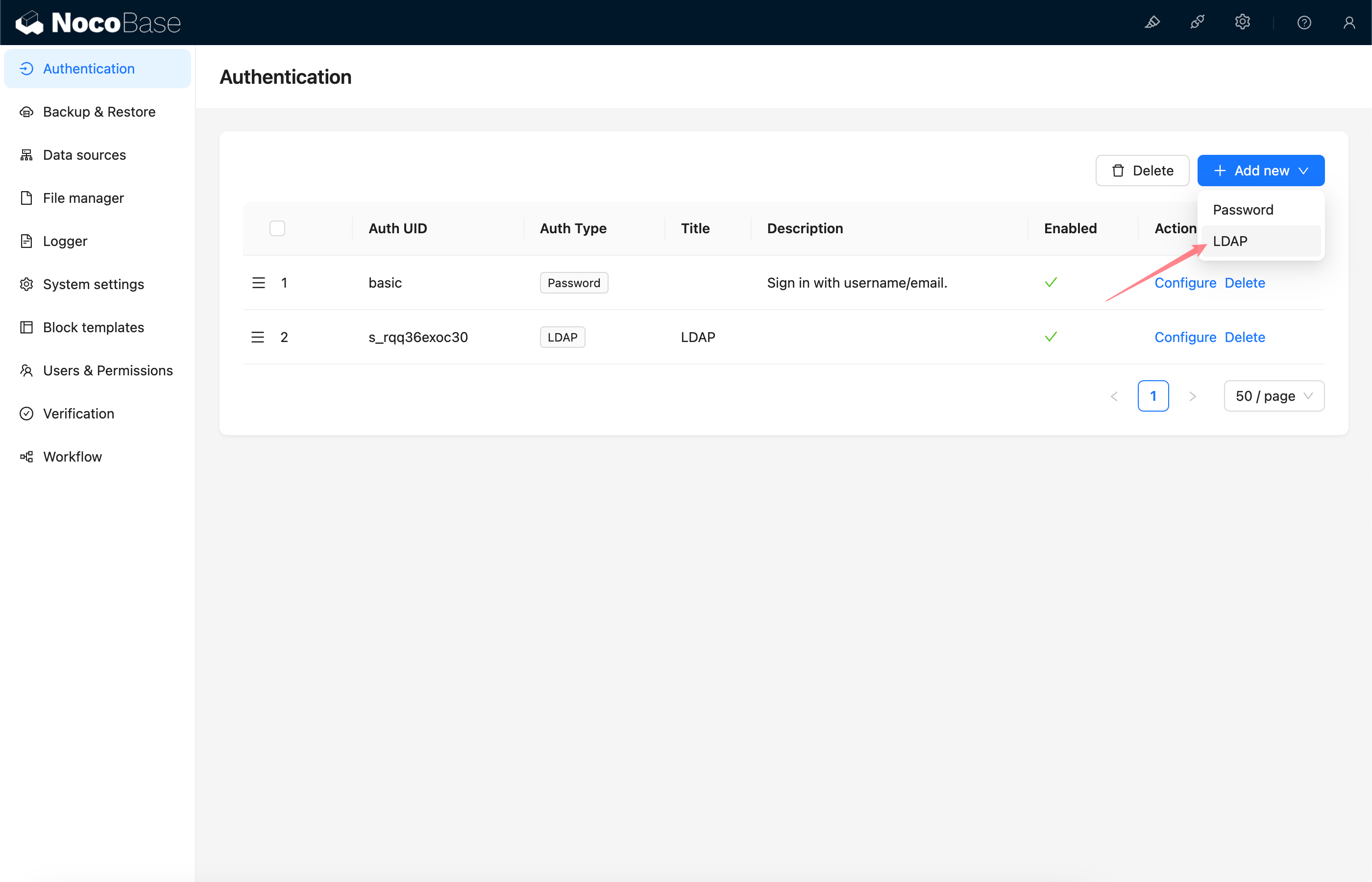 ## Configuration
### Basic Configuration
## Configuration
### Basic Configuration
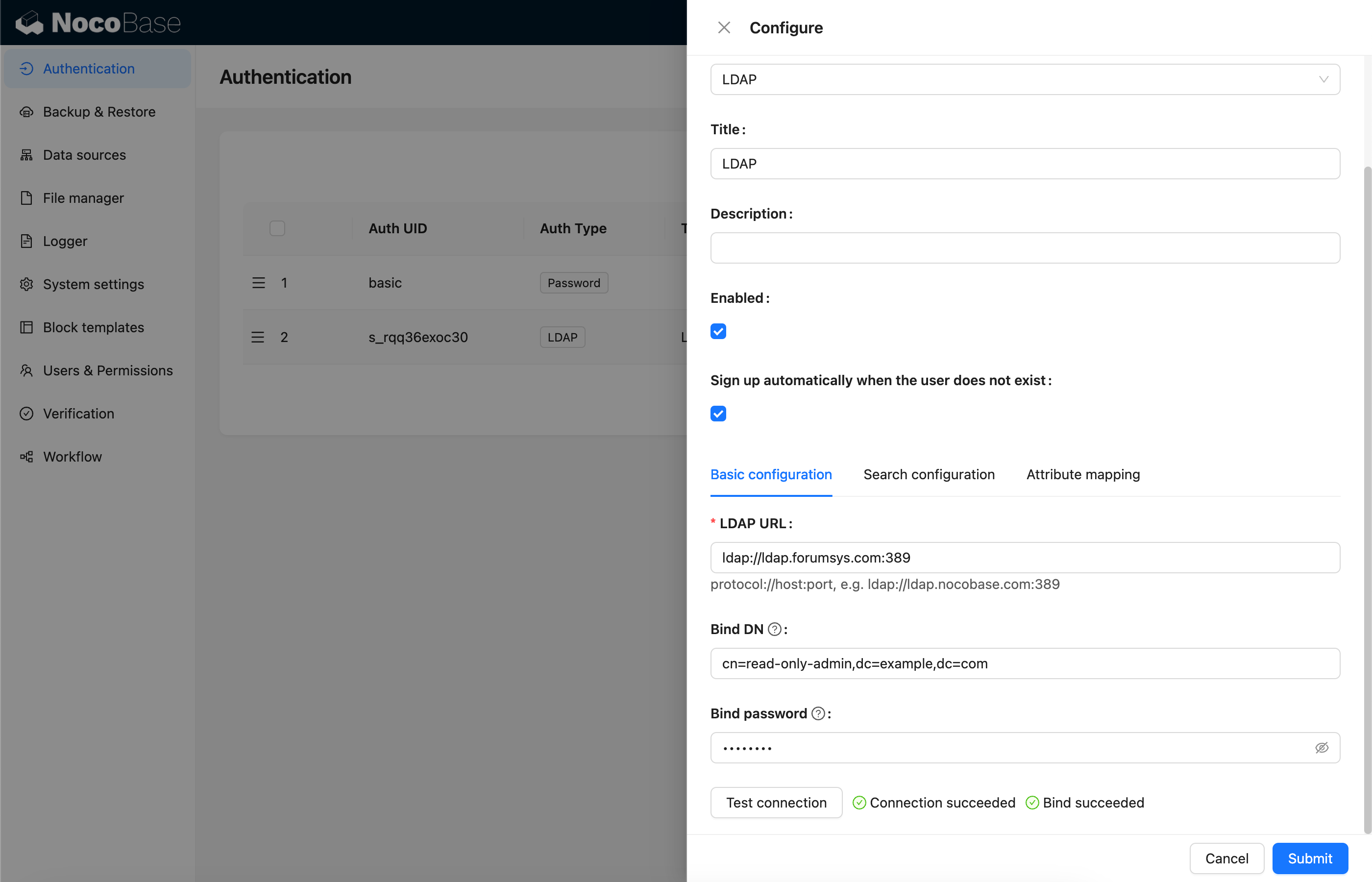 - Sign up automatically when the user does not exist - Whether to automatically create a new user when no matching existing user is found.
- LDAP URL - LDAP server URL
- Bind DN - DN used to test server connection and search for users
- Bind password - Password of Bind DN
- Test connection - Click the button to test the server connection and validate the Bind DN.
### Search Configuration
- Sign up automatically when the user does not exist - Whether to automatically create a new user when no matching existing user is found.
- LDAP URL - LDAP server URL
- Bind DN - DN used to test server connection and search for users
- Bind password - Password of Bind DN
- Test connection - Click the button to test the server connection and validate the Bind DN.
### Search Configuration
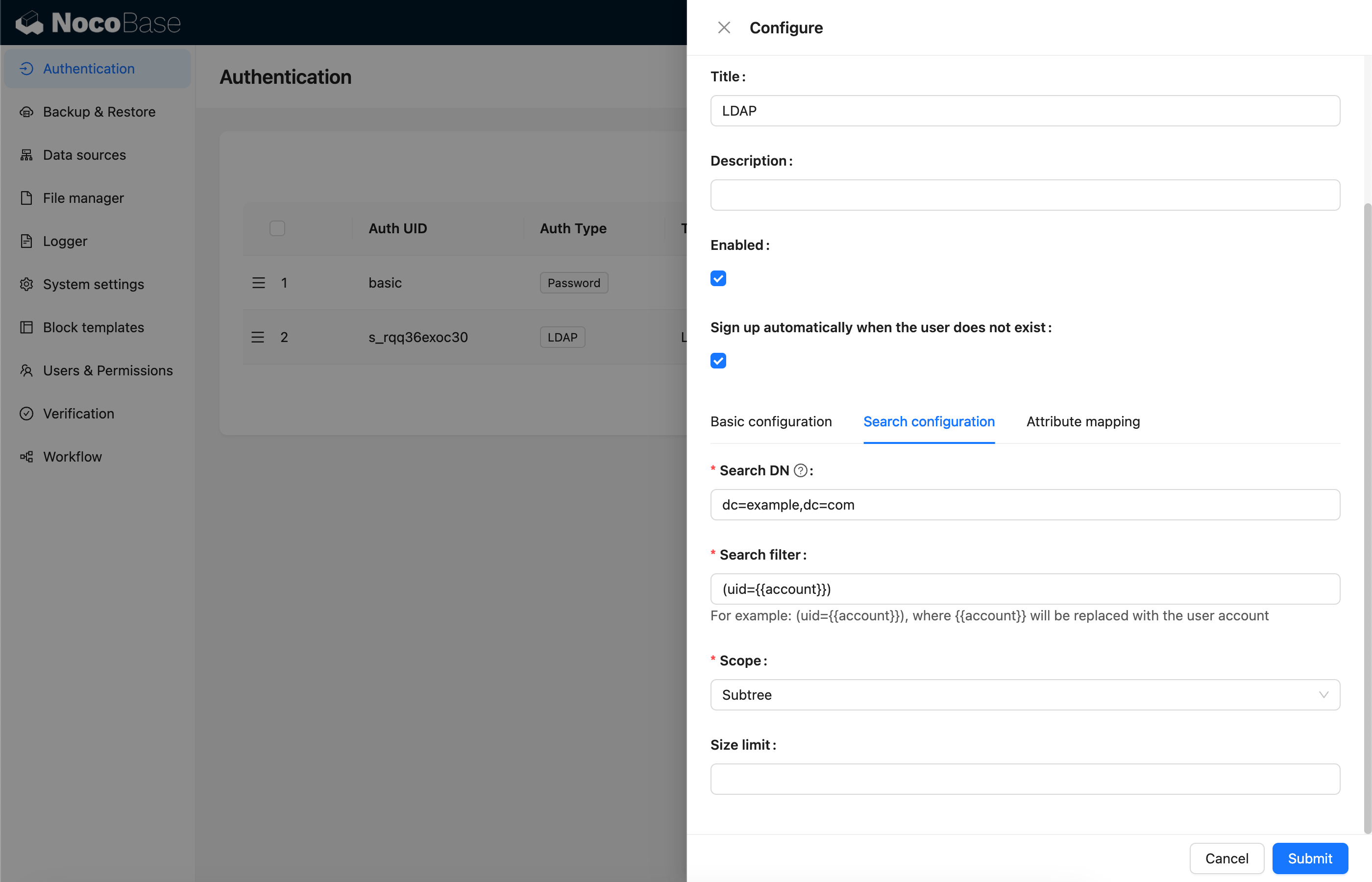 - Search DN - DN used to search for users
- Search filter - Filtering condition for searching users, using `{{account}}` to represent the user account used for login
- Scope - `Base`, `One level`, `Subtree`, default `Subtree`
- Size limit - Search page size
### Attribute Mapping
- Search DN - DN used to search for users
- Search filter - Filtering condition for searching users, using `{{account}}` to represent the user account used for login
- Scope - `Base`, `One level`, `Subtree`, default `Subtree`
- Size limit - Search page size
### Attribute Mapping
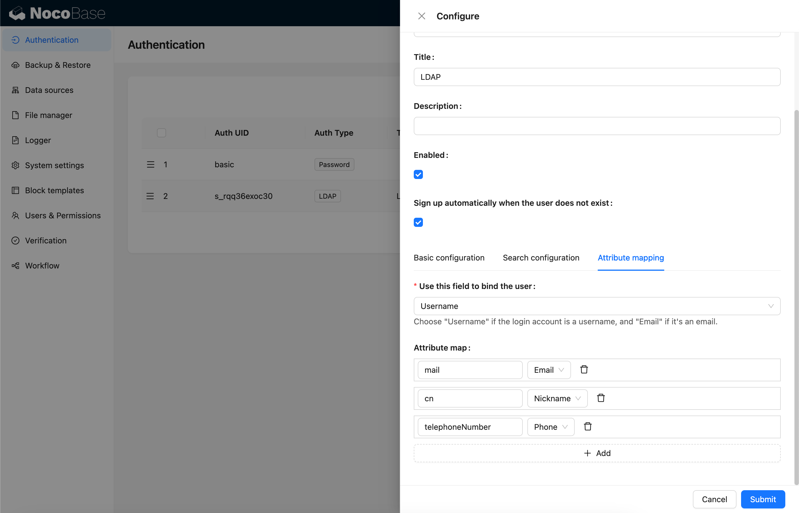 - Use this field to bind the user - Field used to bind to existing users. Select 'username' if the login account is a username, or 'email' if it's an email address. The default is username.
- Attribute map - Mapping of user attributes to fields in the NocoBase user table.
## Sign In
Visit the sign in page and enter LDAP username and password in the sign in form.
- Use this field to bind the user - Field used to bind to existing users. Select 'username' if the login account is a username, or 'email' if it's an email address. The default is username.
- Attribute map - Mapping of user attributes to fields in the NocoBase user table.
## Sign In
Visit the sign in page and enter LDAP username and password in the sign in form.
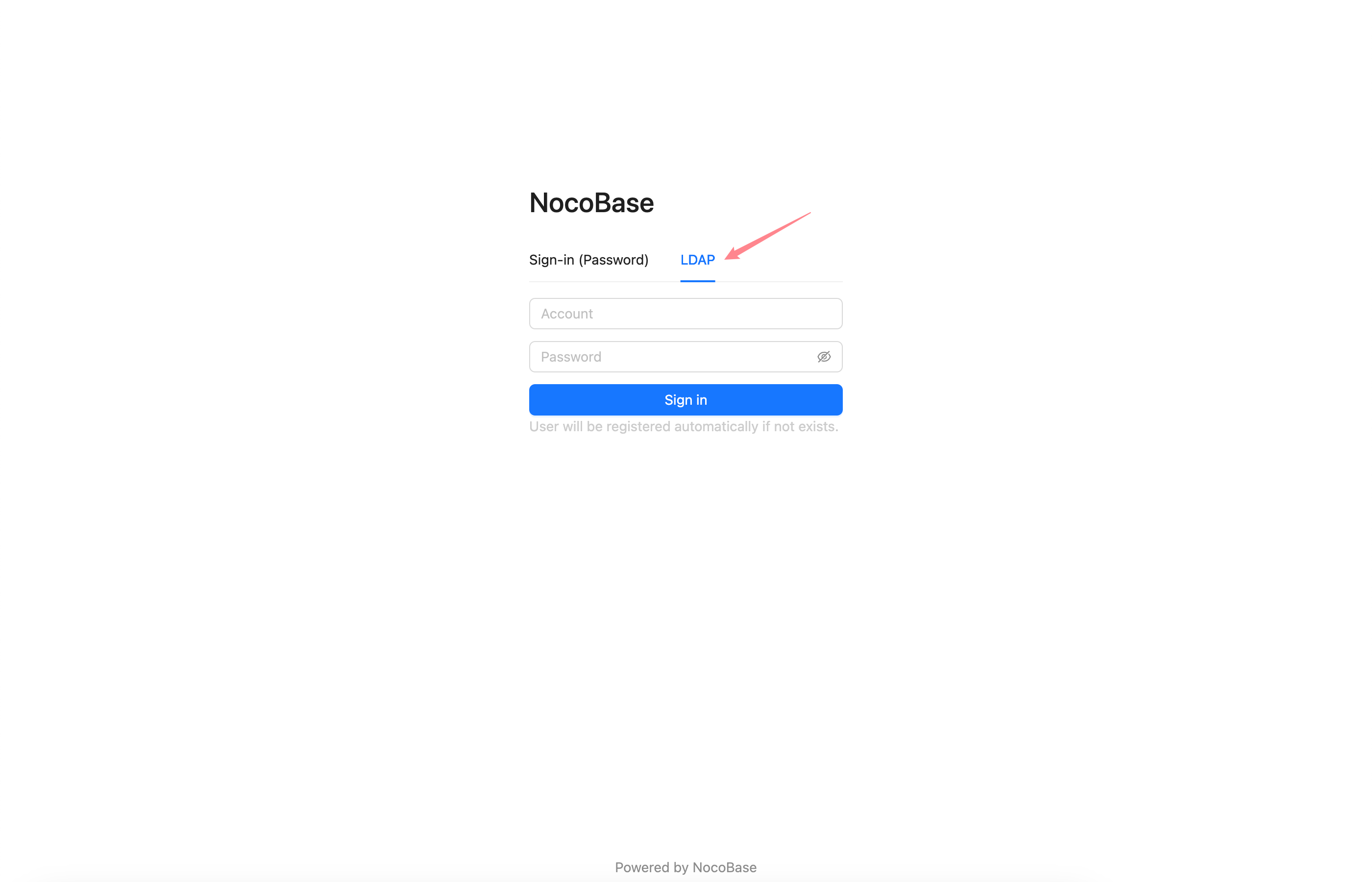 ---
url: /auth-verification/auth-oidc/examples/google.md
---
# Sign in with Google
> https://developers.google.com/identity/openid-connect/openid-connect
## Get Google OAuth 2.0 Credentials
[Google Cloud Console](https://console.cloud.google.com/apis/credentials) - Create Credentials - OAuth Client ID
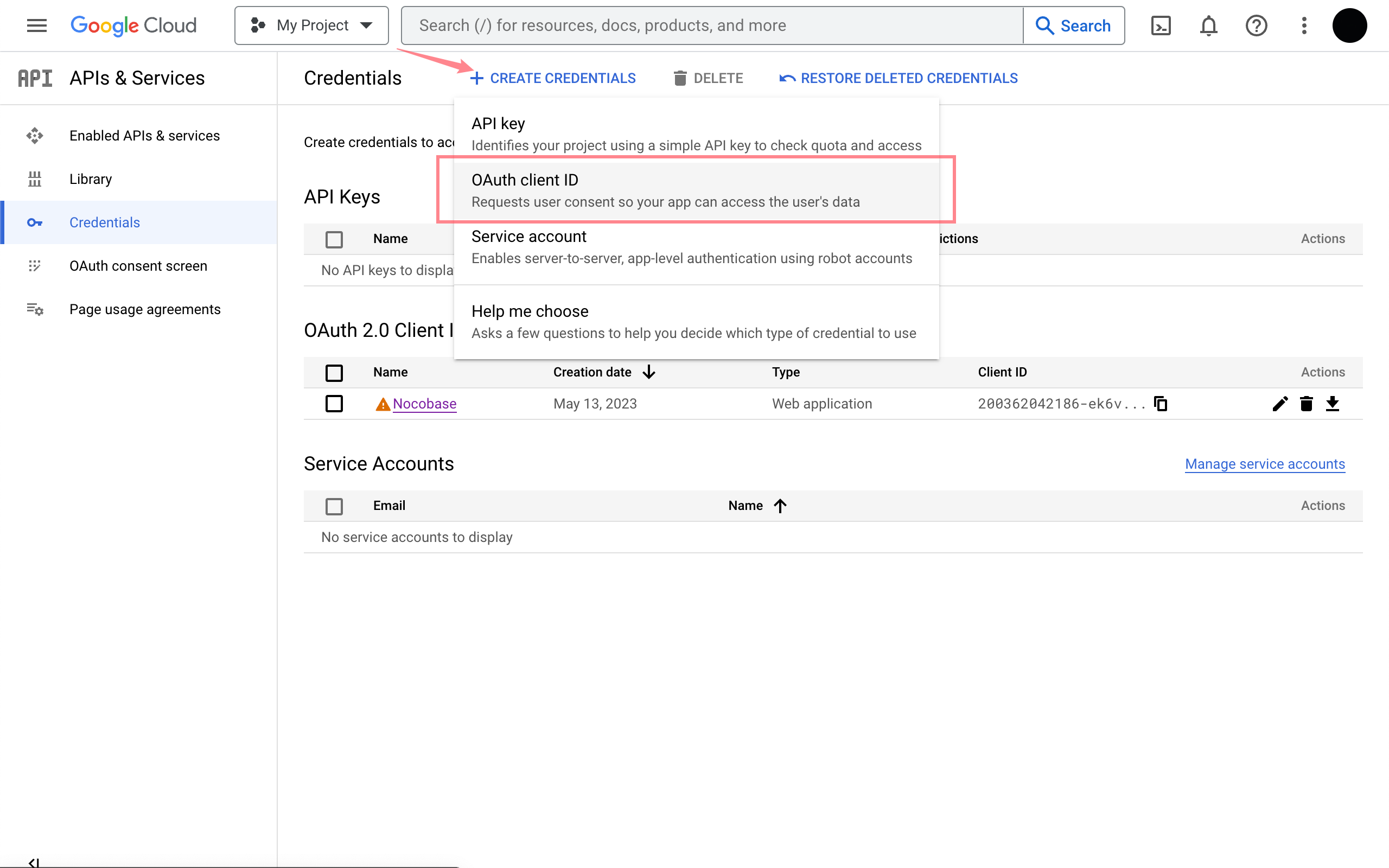
Go to the configuration interface and fill in the authorized redirect URL. The redirect URL can be obtained when adding an authenticator in Nocobase, usually it's `http(s)://host:port/api/oidc:redirect`. See the [User Manual - Configuration](../index.md#configuration) section.
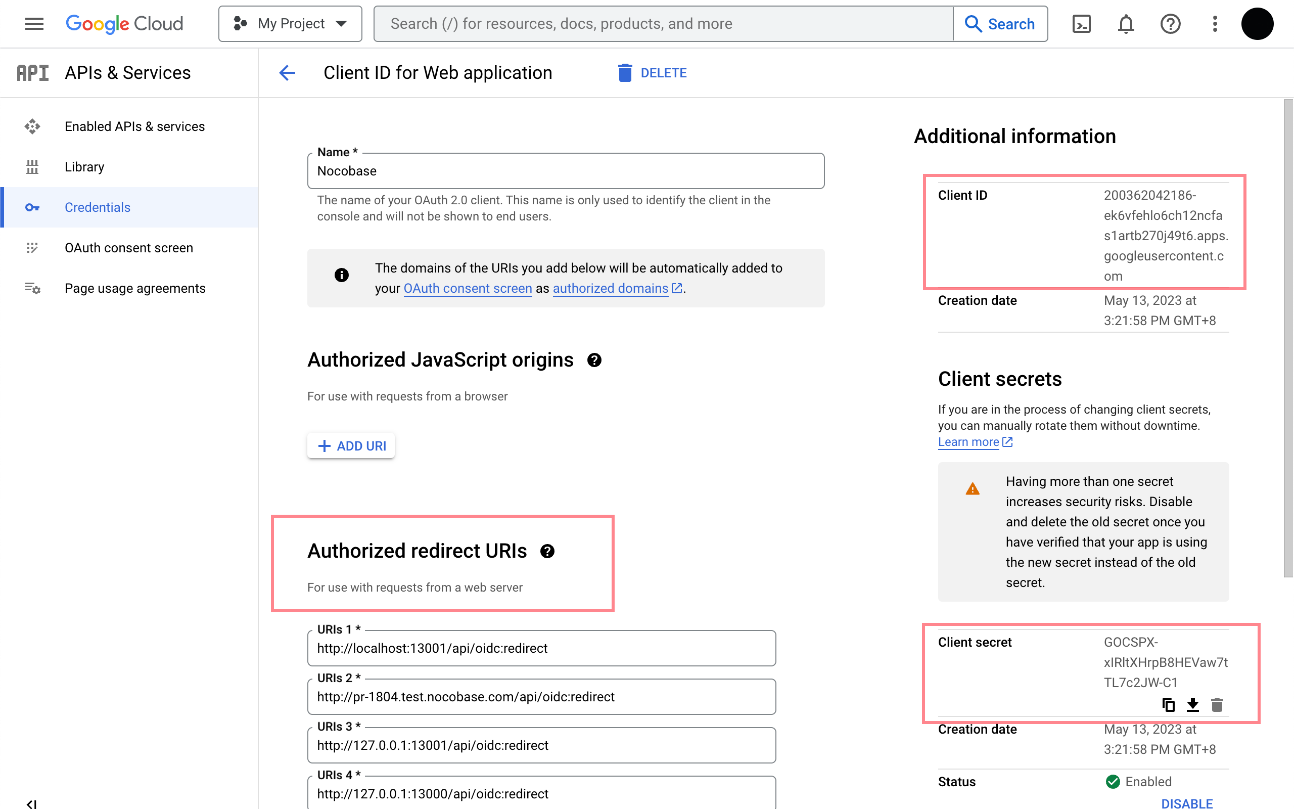
## Add a new Authenticator on NocoBase
Plugin Settings - User Authentication - Add - OIDC
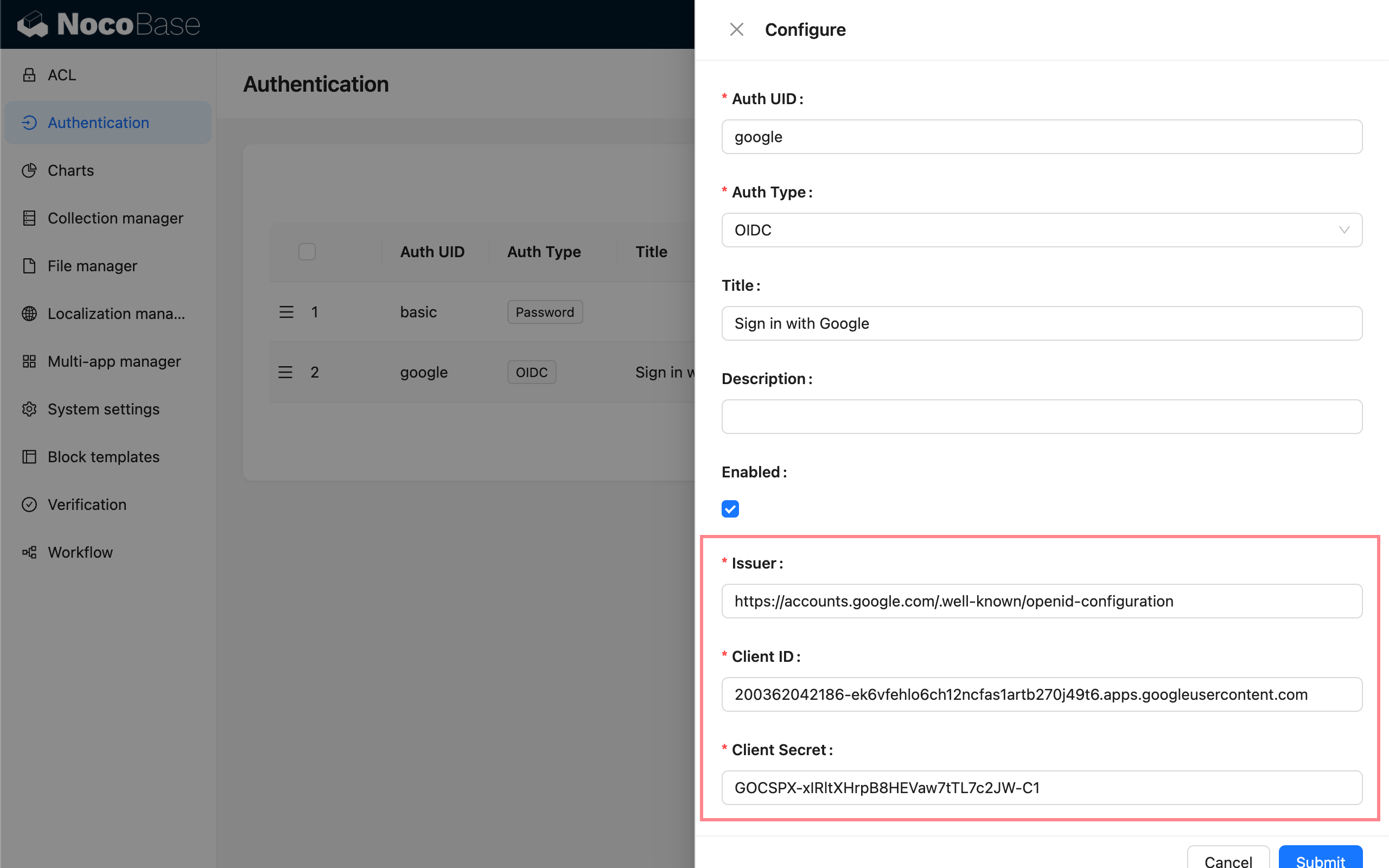
Refer to the parameters introduced in [User Manual - Configuration](../index.md#configuration) to complete the authenticator configuration.
---
url: /auth-verification/auth-oidc/examples/microsoft.md
---
# Microsoft Entra ID
> https://learn.microsoft.com/en-us/entra/identity-platform/quickstart-register-app
> https://learn.microsoft.com/en-us/entra/identity-platform/v2-protocols-oidc
## Adding an Authenticator in NocoBase
First, add a new authenticator in NocoBase: Plugin Settings - User Authentication - Add - OIDC.
Copy the callback URL.
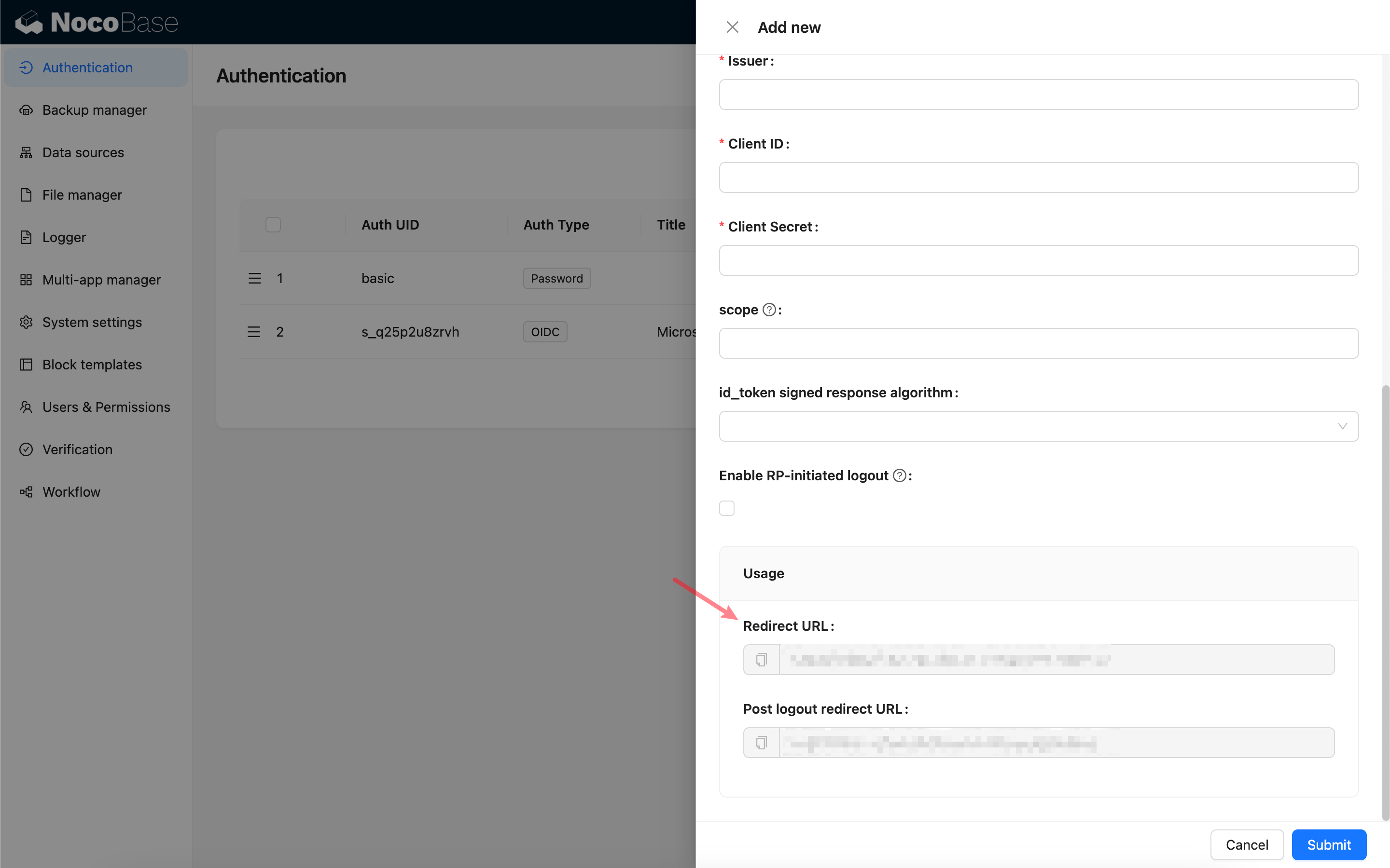
## Register the application
Open the Microsoft Entra admin center and register a new application.
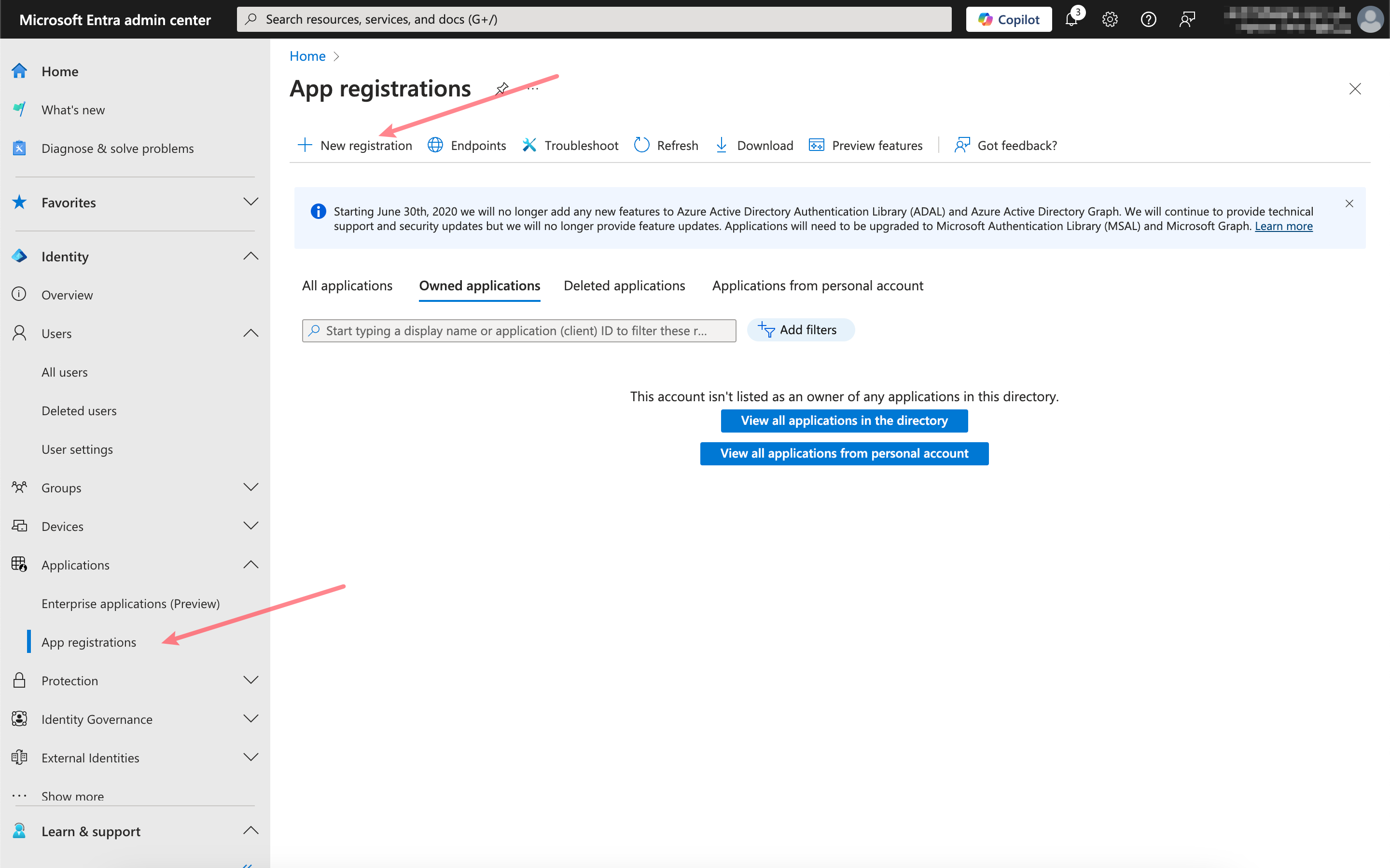
Paste the callback URL you just copied here.
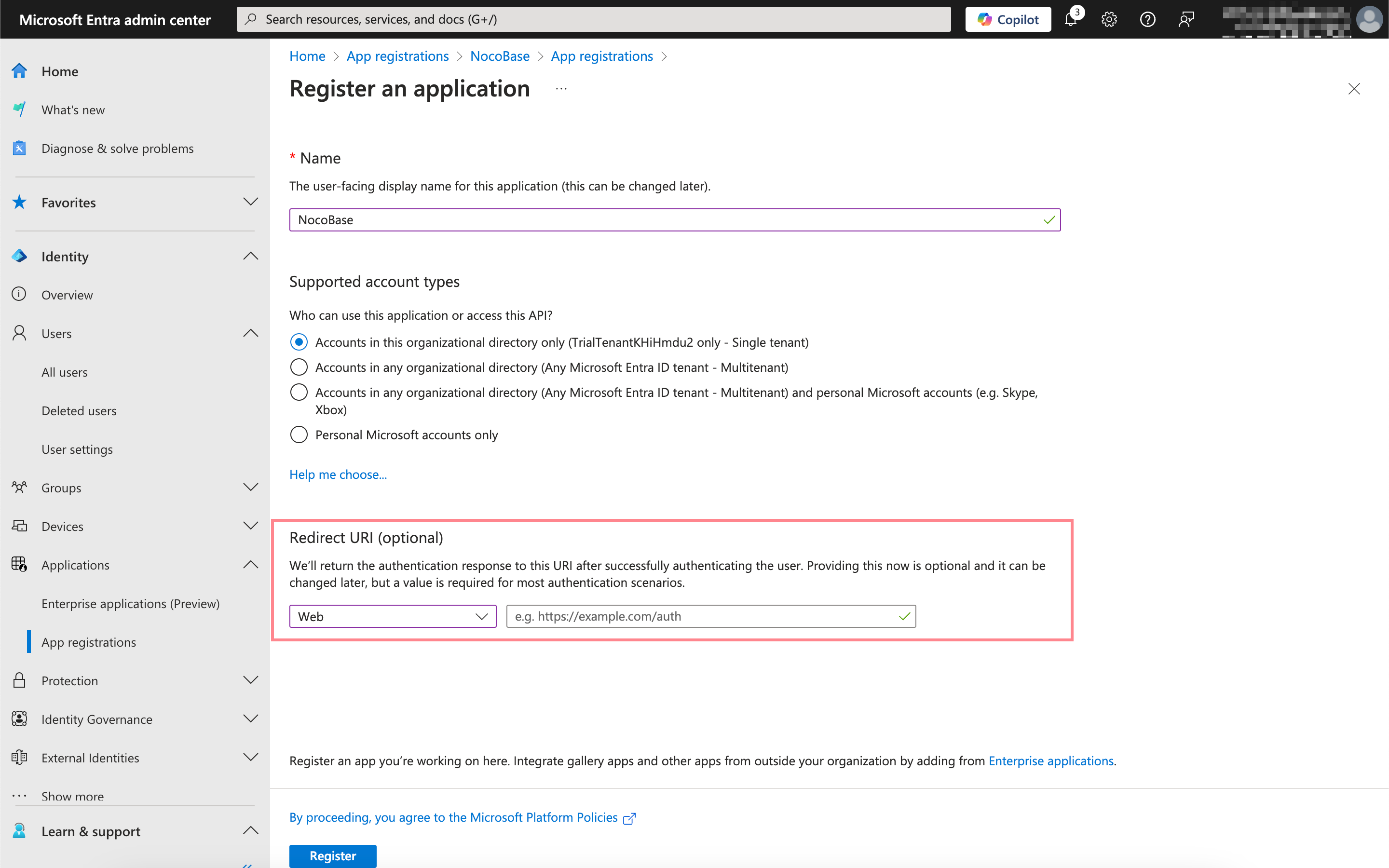
## Obtain and fill in the appropriate information
Click into the application you just registered and copy the **Application (client) ID** and **Directory (tenant) ID** from the overview page.
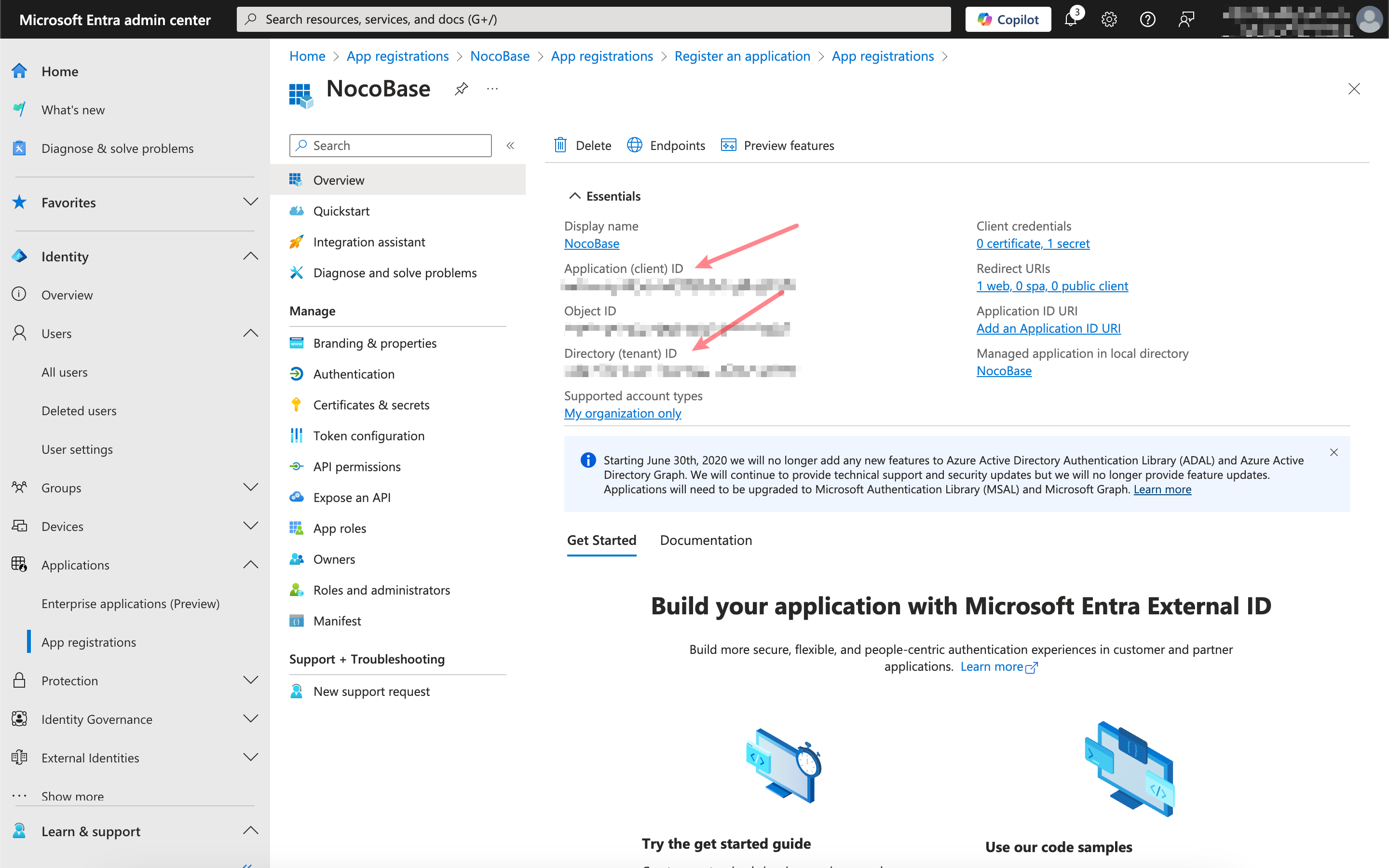
Click `Certificates & secrets`, create a new client secret, and copy the **Value**.
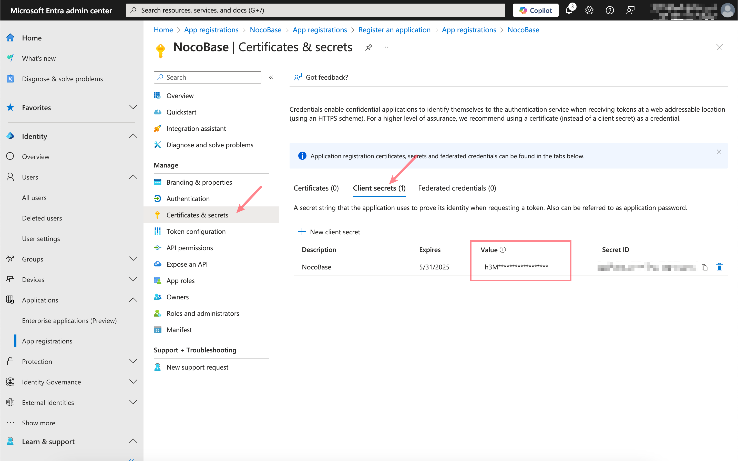
The mapping between the Microsoft Entra information and the NocoBase authenticator configuration is as follows:
| Microsoft Entra Information | NocoBase Authenticator Field |
| --------------------------- | ------------------------------------------------------------------------------------------------------------------------------------------------ |
| Application (client) ID | Client ID |
| Client secrets - Value | Client secret |
| Directory (tenant) ID | Issuer:
---
url: /auth-verification/auth-oidc/examples/google.md
---
# Sign in with Google
> https://developers.google.com/identity/openid-connect/openid-connect
## Get Google OAuth 2.0 Credentials
[Google Cloud Console](https://console.cloud.google.com/apis/credentials) - Create Credentials - OAuth Client ID

Go to the configuration interface and fill in the authorized redirect URL. The redirect URL can be obtained when adding an authenticator in Nocobase, usually it's `http(s)://host:port/api/oidc:redirect`. See the [User Manual - Configuration](../index.md#configuration) section.

## Add a new Authenticator on NocoBase
Plugin Settings - User Authentication - Add - OIDC

Refer to the parameters introduced in [User Manual - Configuration](../index.md#configuration) to complete the authenticator configuration.
---
url: /auth-verification/auth-oidc/examples/microsoft.md
---
# Microsoft Entra ID
> https://learn.microsoft.com/en-us/entra/identity-platform/quickstart-register-app
> https://learn.microsoft.com/en-us/entra/identity-platform/v2-protocols-oidc
## Adding an Authenticator in NocoBase
First, add a new authenticator in NocoBase: Plugin Settings - User Authentication - Add - OIDC.
Copy the callback URL.

## Register the application
Open the Microsoft Entra admin center and register a new application.

Paste the callback URL you just copied here.

## Obtain and fill in the appropriate information
Click into the application you just registered and copy the **Application (client) ID** and **Directory (tenant) ID** from the overview page.

Click `Certificates & secrets`, create a new client secret, and copy the **Value**.

The mapping between the Microsoft Entra information and the NocoBase authenticator configuration is as follows:
| Microsoft Entra Information | NocoBase Authenticator Field |
| --------------------------- | ------------------------------------------------------------------------------------------------------------------------------------------------ |
| Application (client) ID | Client ID |
| Client secrets - Value | Client secret |
| Directory (tenant) ID | Issuer:
https://login.microsoftonline.com/{tenant}/v2.0/.well-known/openid-configuration, replace `{tenant}` with the Directory (tenant) ID |
---
url: /auth-verification/auth-oidc/index.md
---
# Auth: OIDC
## Introduction
The Auth: OIDC plugin follows the OIDC (Open ConnectID) protocol standard, using the Authorization Code Flow, to allow users to sign in to NocoBase using accounts provided by third-party identity authentication service providers (IdP).
## Activate Plugin
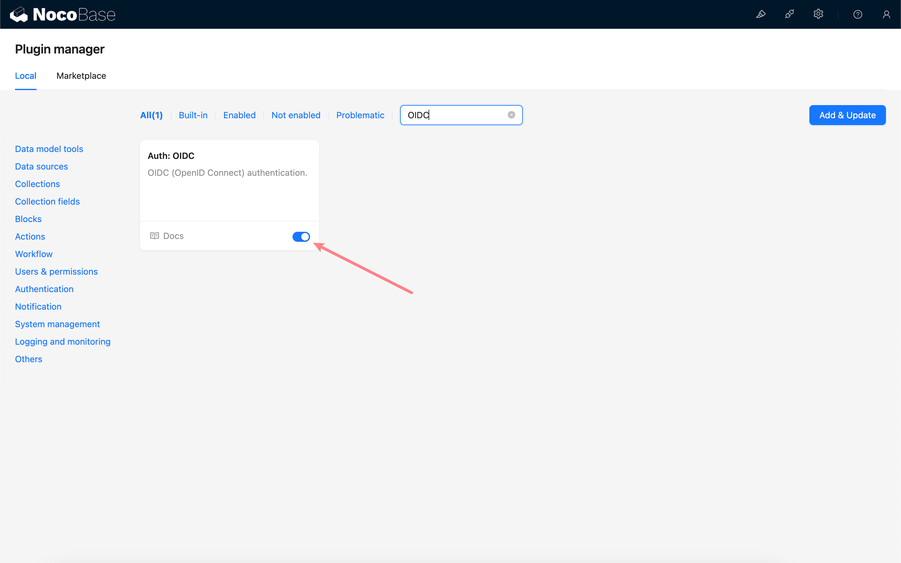
## Add OIDC Authentication
Enter the user authentication plugin management page.
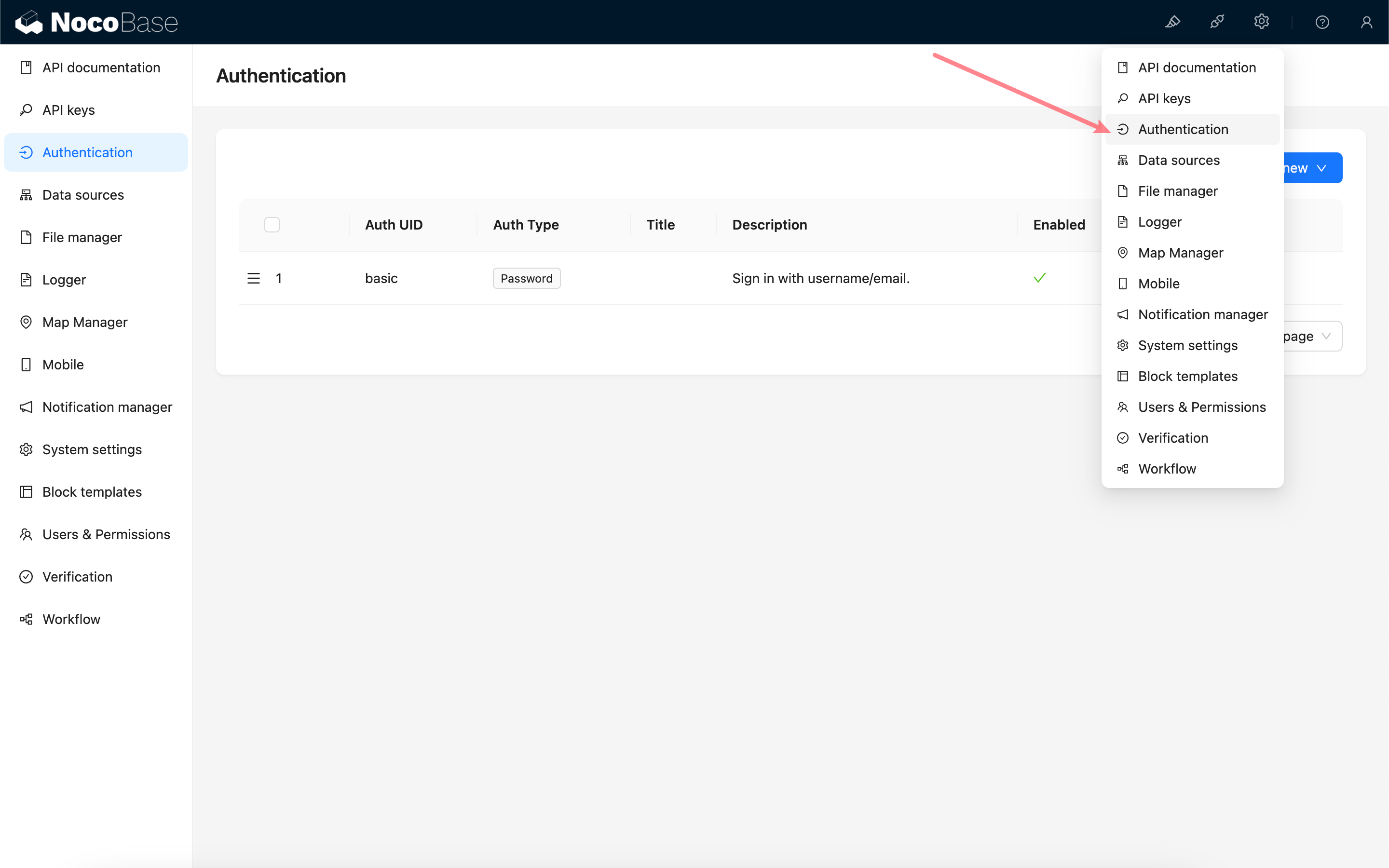
Add - OIDC
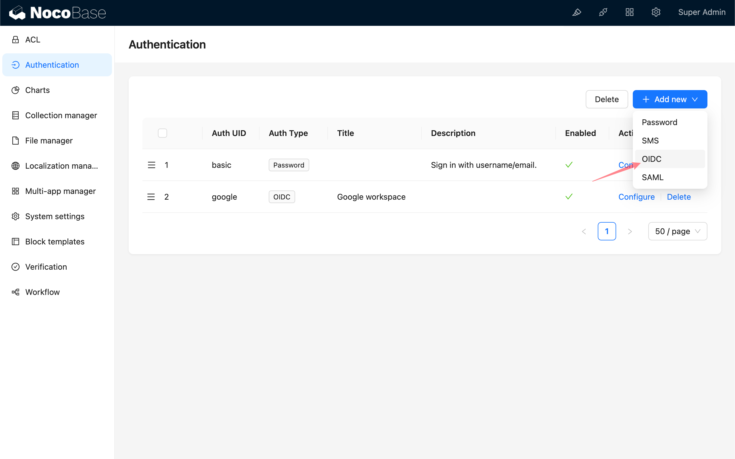
## Configuration
### Basic Configuration
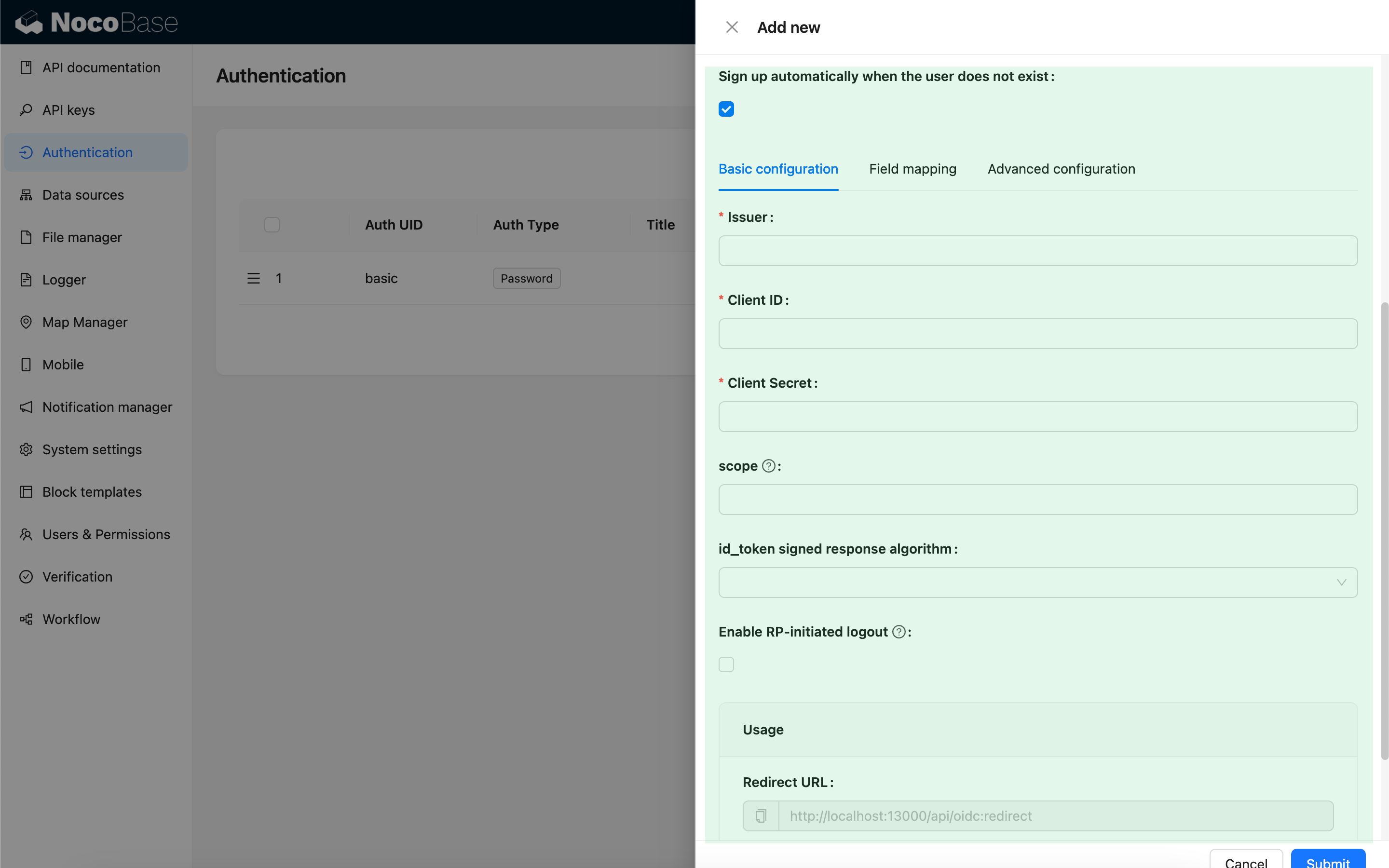
| Configuration | Description | Version |
| -------------------------------------------------- | -------------------------------------------------------------------------------------------------------------------------------------------------------------------------- | -------------- |
| Sign up automatically when the user does not exist | Whether to automatically create a new user if no matching existing user is found. | - |
| Issuer | The issuer provided by the IdP, usually ending with `/.well-known/openid-configuration`. | - |
| Client ID | The Client ID | - |
| Client Secret | The Client Secret | - |
| scope | Optional, defaults to `openid email profile`. | - |
| id_token signed response algorithm | The signing algorithm for `id_token`, defaults to `RS256`. | - |
| Enable RP-initiated logout | Enables RP-initiated logout. Logs out the IdP session when the user logs out. The IdP logout callback should use the Post logout redirect URL provided in [Usage](#usage). | `v1.3.44-beta` |
### Field Mapping
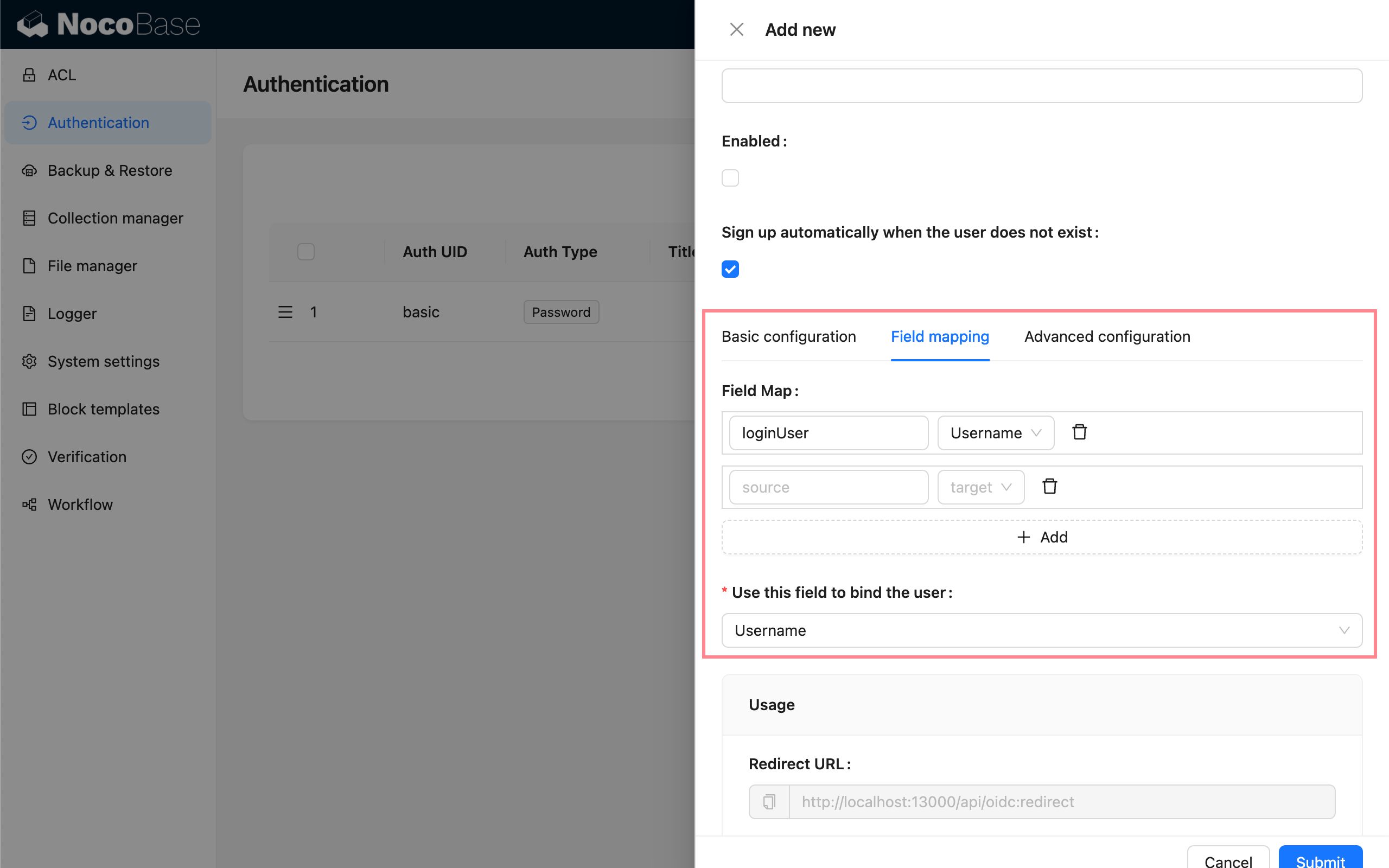
| Configuration | Description |
| ------------------------------- | ---------------------------------------------------------------------------------------------------------------------------------------------------------------- |
| Field Map | Field mapping. NocoBase supports mapping fields such as nickname, email, and phone number. The default nickname uses `openid`. |
| Use this field to bind the user | Used to match and bind with existing users. You can choose email or username, with email as the default. The IdP must provide `email` or `username` information. |
### Advanced Configuration
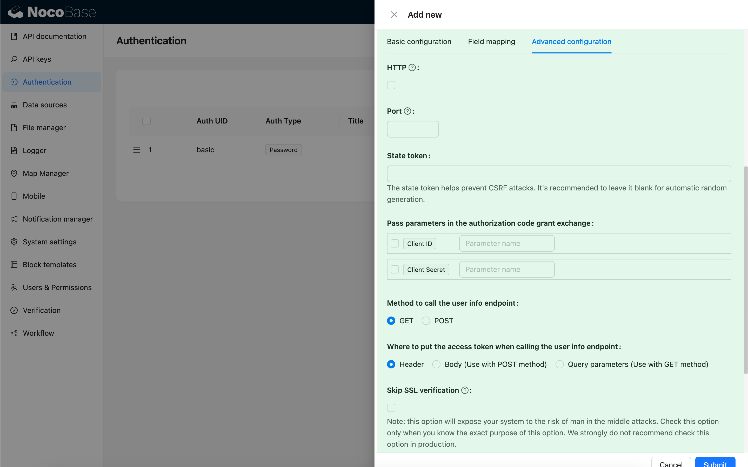
| Configuration | Description | Version |
| ----------------------------------------------------------------- | ------------------------------------------------------------------------------------------------------------------------------------------------------------------------------------------------------------------------------------------------------------------- | -------------- |
| HTTP | Whether the NocoBase callback URL uses HTTP protocol, default is `https`. | - |
| Port | Port for the NocoBase callback URL, defaults to `443/80`. | - |
| State token | Used to verify the request source and prevent CSRF attacks. You can provide a fixed value, but **leaving it blank to generate random values by default is strongly recommended. If you use a fixed value, carefully evaluate your environment and security risks.** | - |
| Pass parameters in the authorization code grant exchange | Some IdPs may require passing Client ID or Client Secret as parameters when exchanging a code for a token. You can select this option and specify the corresponding parameter names. | - |
| Method to call the user info endpoint | The HTTP method used when requesting the user info API. | - |
| Where to put the access token when calling the user info endpoint | How the access token is passed when calling the user info API:
- Header - In the request header (default).
- Body - In the request body, used with `POST` method.
- Query parameters - As query parameters, used with `GET` method. | - |
| Skip SSL verification | Skip SSL verification when requesting the IdP API. **This option exposes your system to risks of man-in-the-middle attacks. Only enable this option if you understand its purpose and implications. It is strongly discouraged in production environments.** | `v1.3.40-beta` |
### Usage
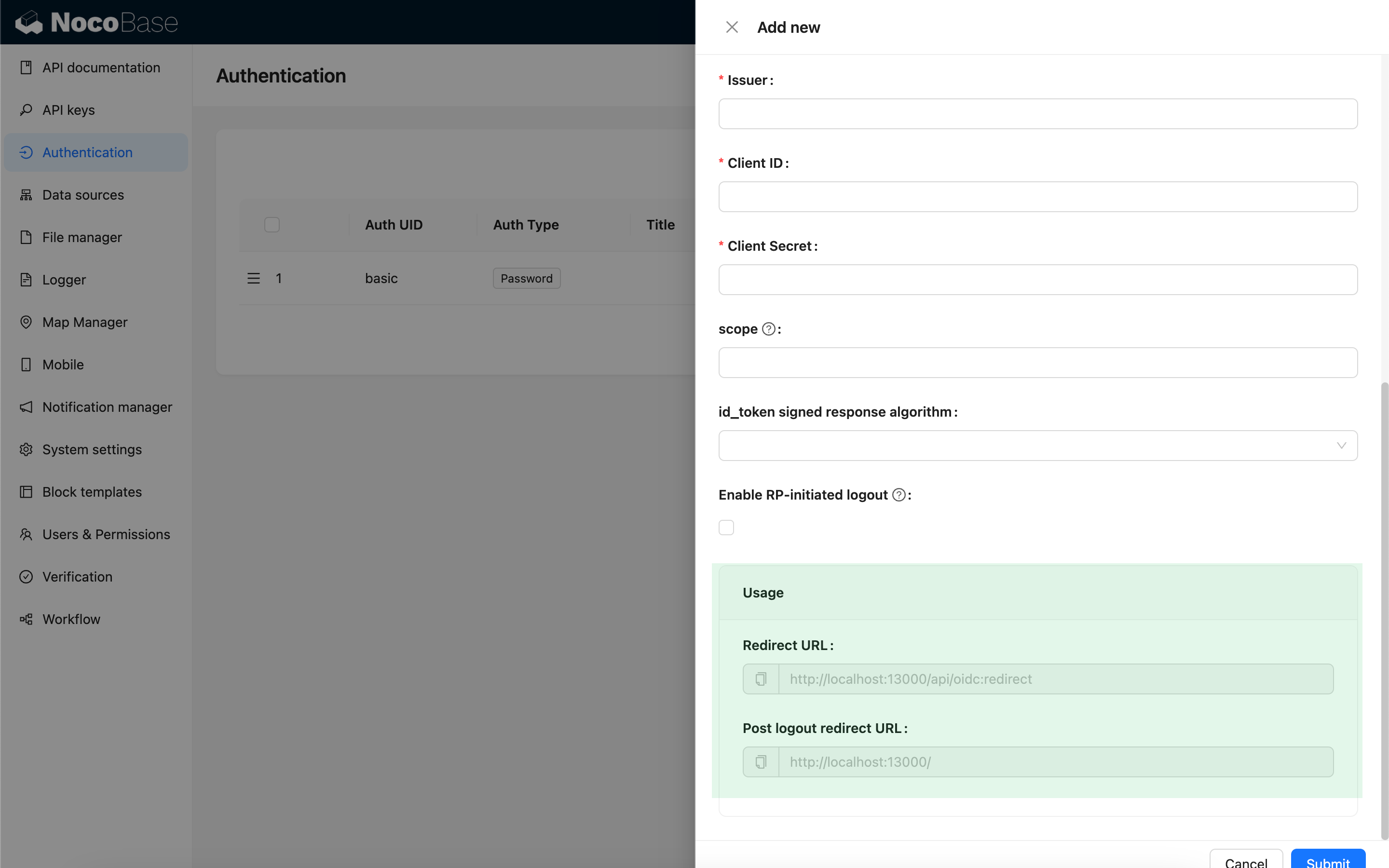
| Configuration | Description |
| ------------------------ | ---------------------------------------------------------------------------------------------- |
| Redirect URL | Used to configure the callback URL in the IdP. |
| Post logout redirect URL | Used to configure the Post logout redirect URL in the IdP when RP-initiated logout is enabled. |
:::info
When testing locally, use `127.0.0.1` instead of `localhost` for the URL, as OIDC login requires writing state to the client cookie for security validation. If you see a flash of the login window but fail to log in successfully, check the server logs for state mismatch issues and ensure the state parameter is included in the request cookie. This issue often occurs when the state in the client cookie does not match the state in the request.
:::
## Login
Visit the login page and click the button below the login form to initiate third-party login.
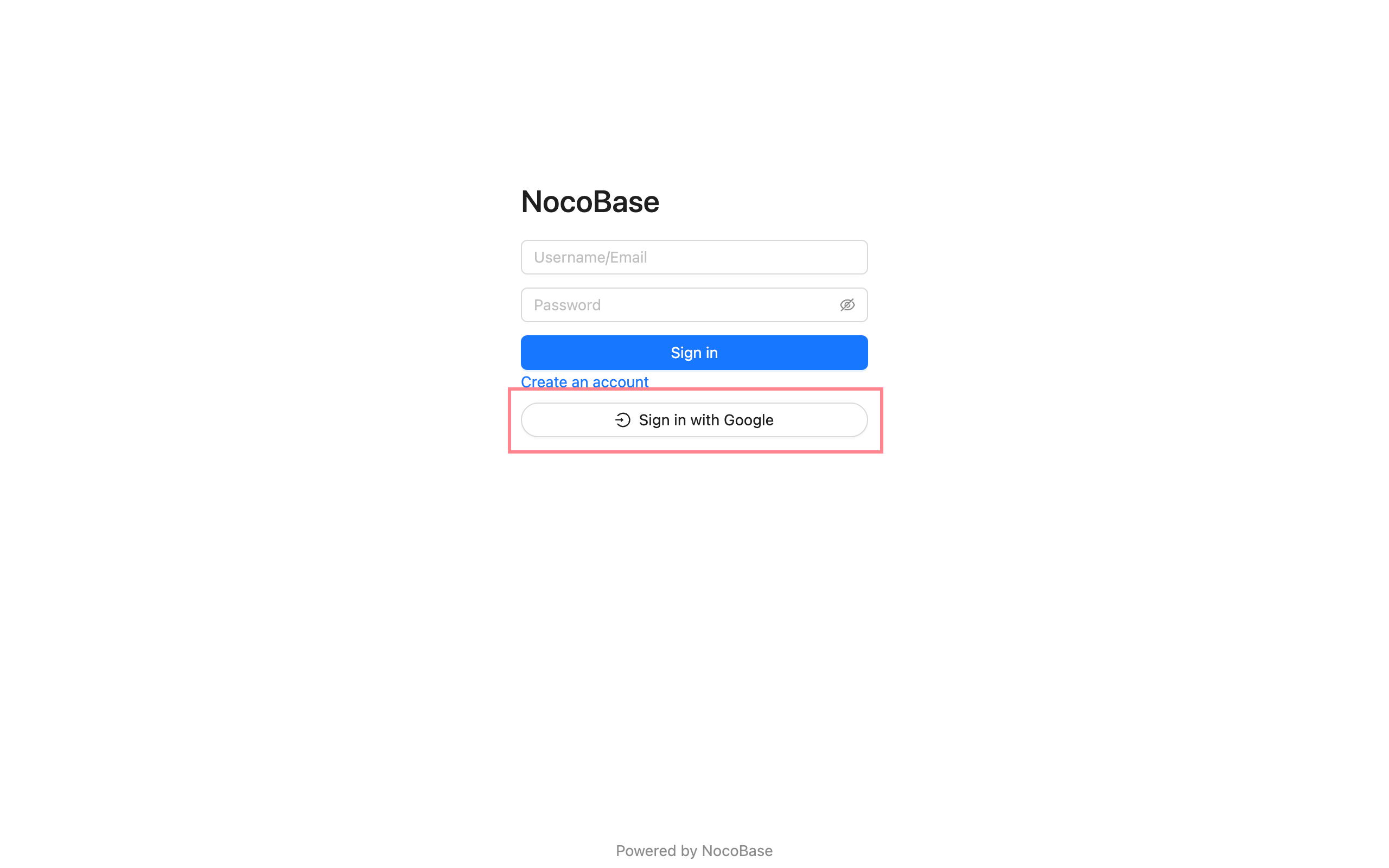
---
url: /auth-verification/auth-saml/examples/google.md
---
# Google Workspace
## Set Google as IdP
[Google Admin Console](https://admin.google.com/) - Apps - Web and mobile apps
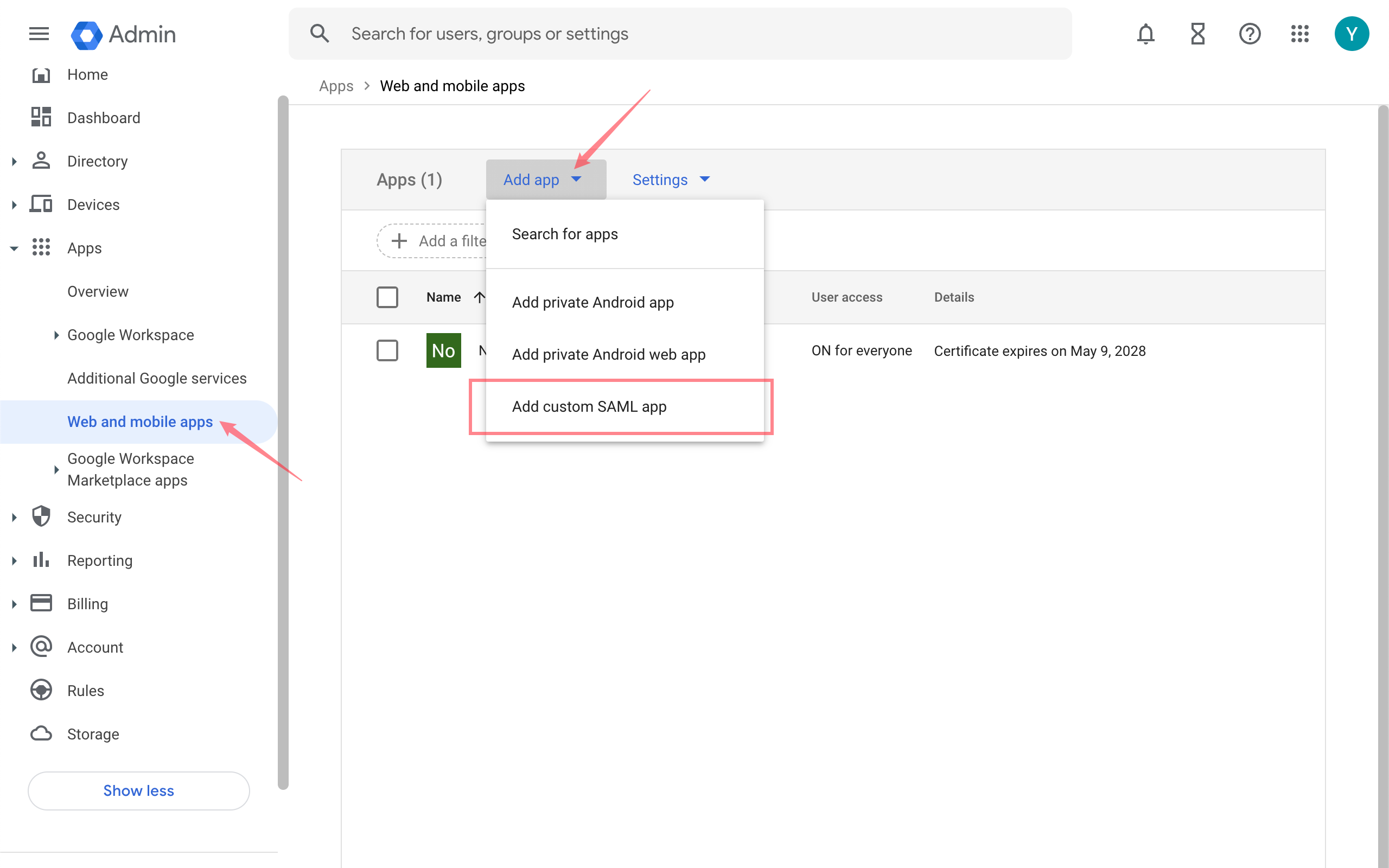
After setting up the app, copy the **SSO URL**, **Entity ID**, and **Certificate**.
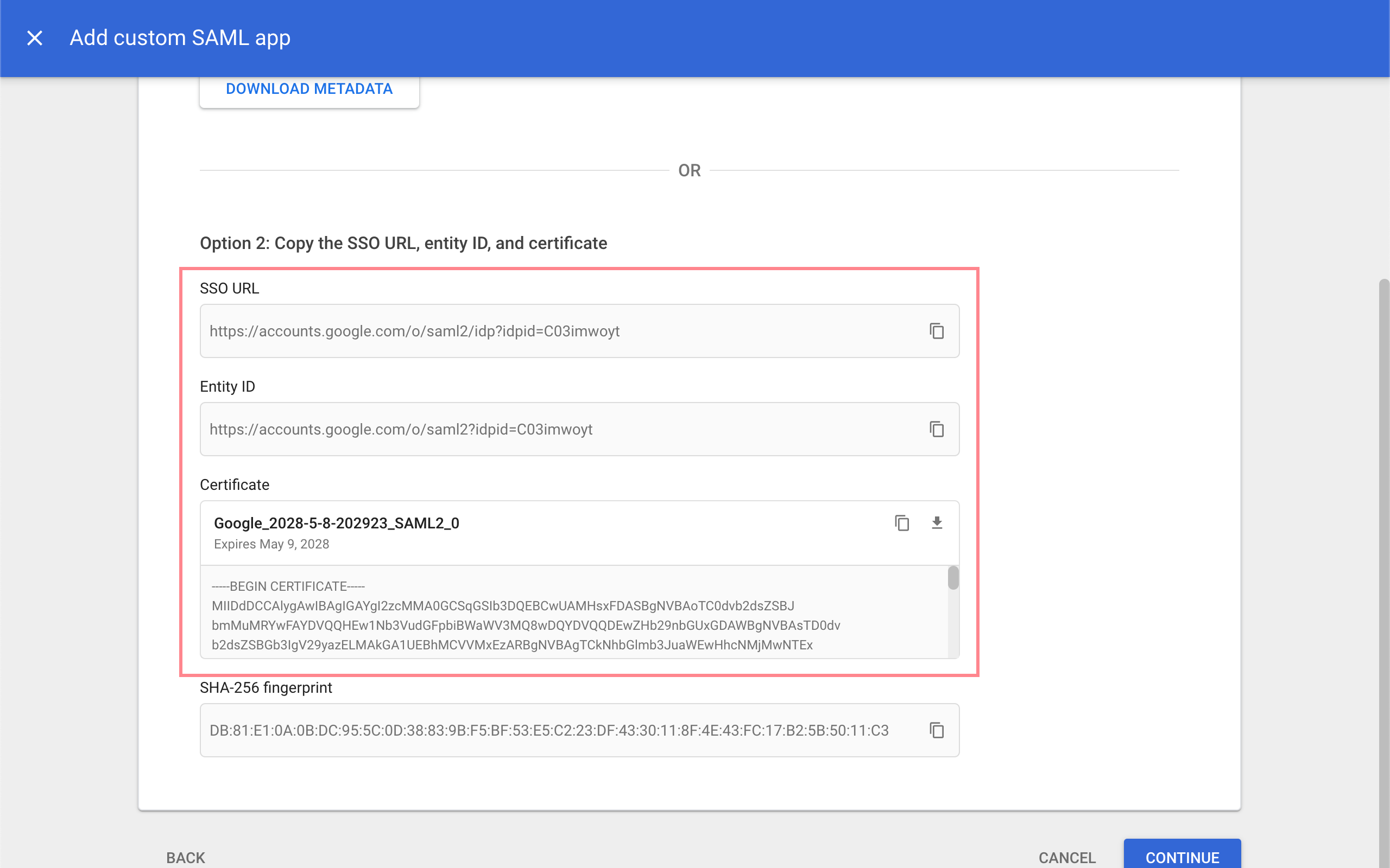
## Add a new Authenticator on NocoBase
Plugin Settings - User Authentication - Add - SAML
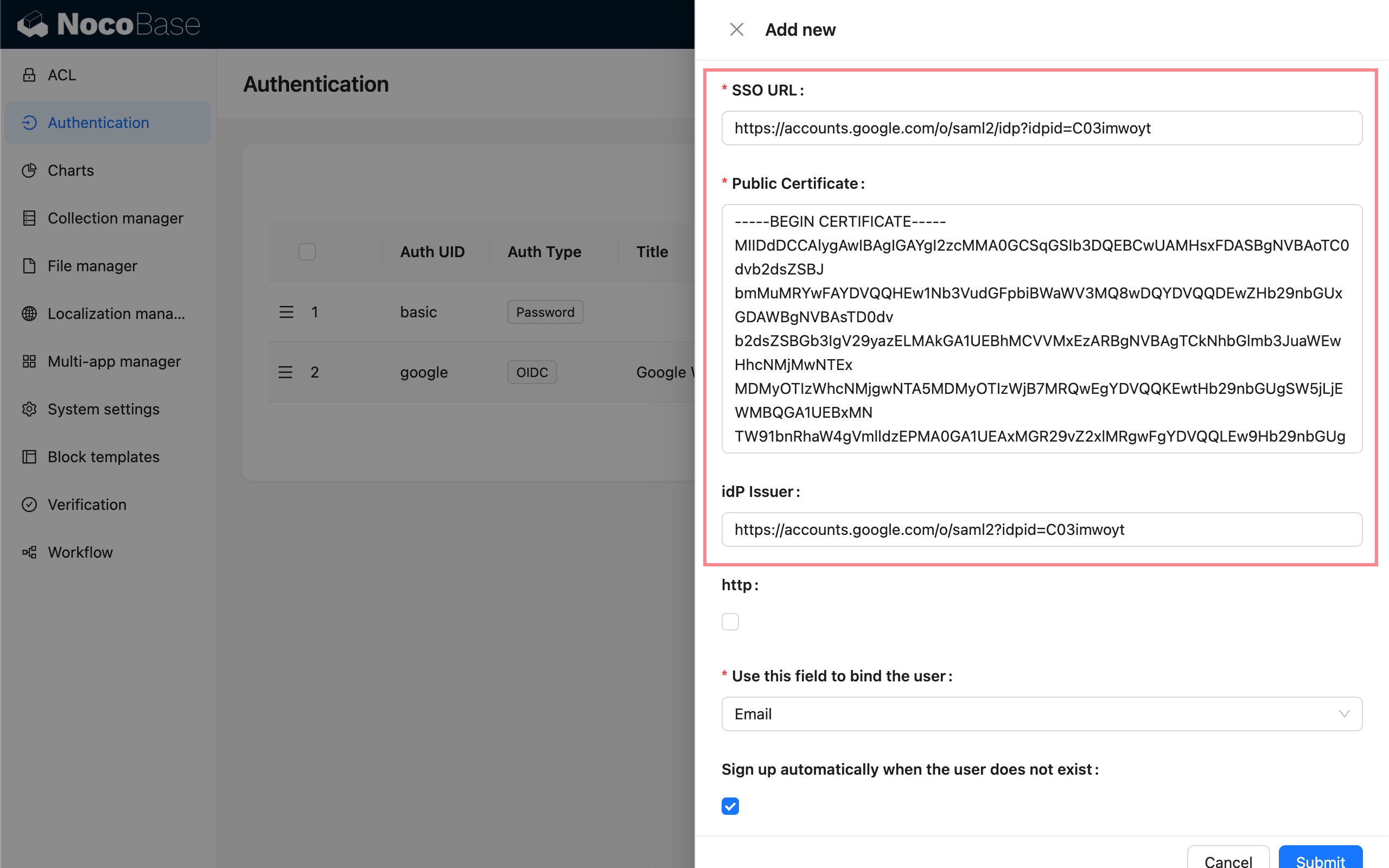
Enter the copied information respectively:
- SSO URL: SSO URL
- Public Certificate: Certificate
- idP Issuer: Entity ID
- http: Check if you are testing locally with http
Then copy the SP Issuer/EntityID and ACS URL from Usage.
## Fill in SP Information on Google
Go back to the Google Console, on the **Service Provider Details** page, enter the ACS URL and Entity ID copied earlier, and check **Signed Response**.
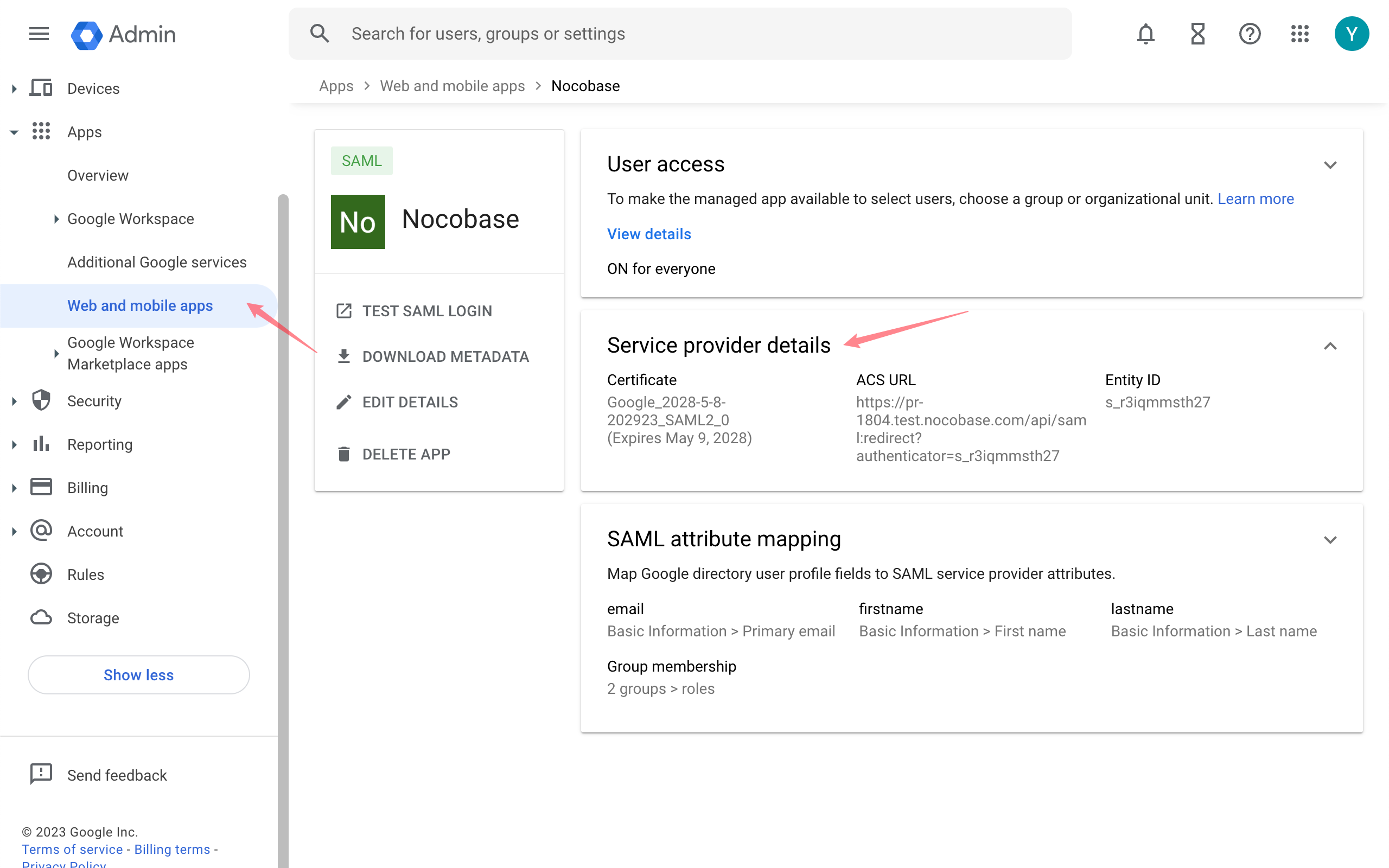
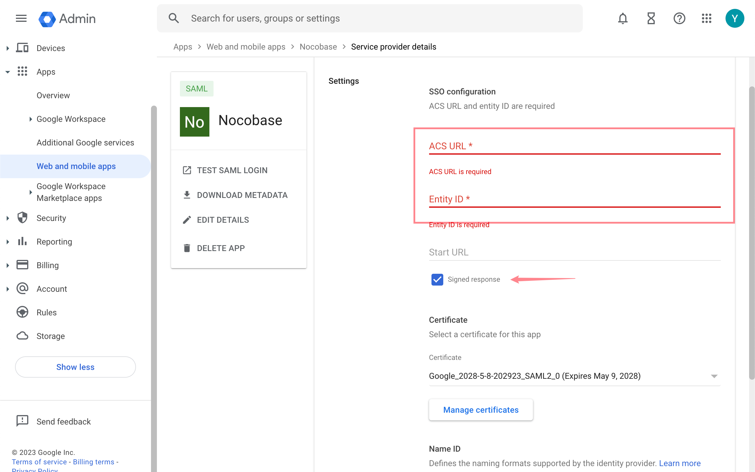
Under **Attribute Mapping**, add mappings for the corresponding attributes.
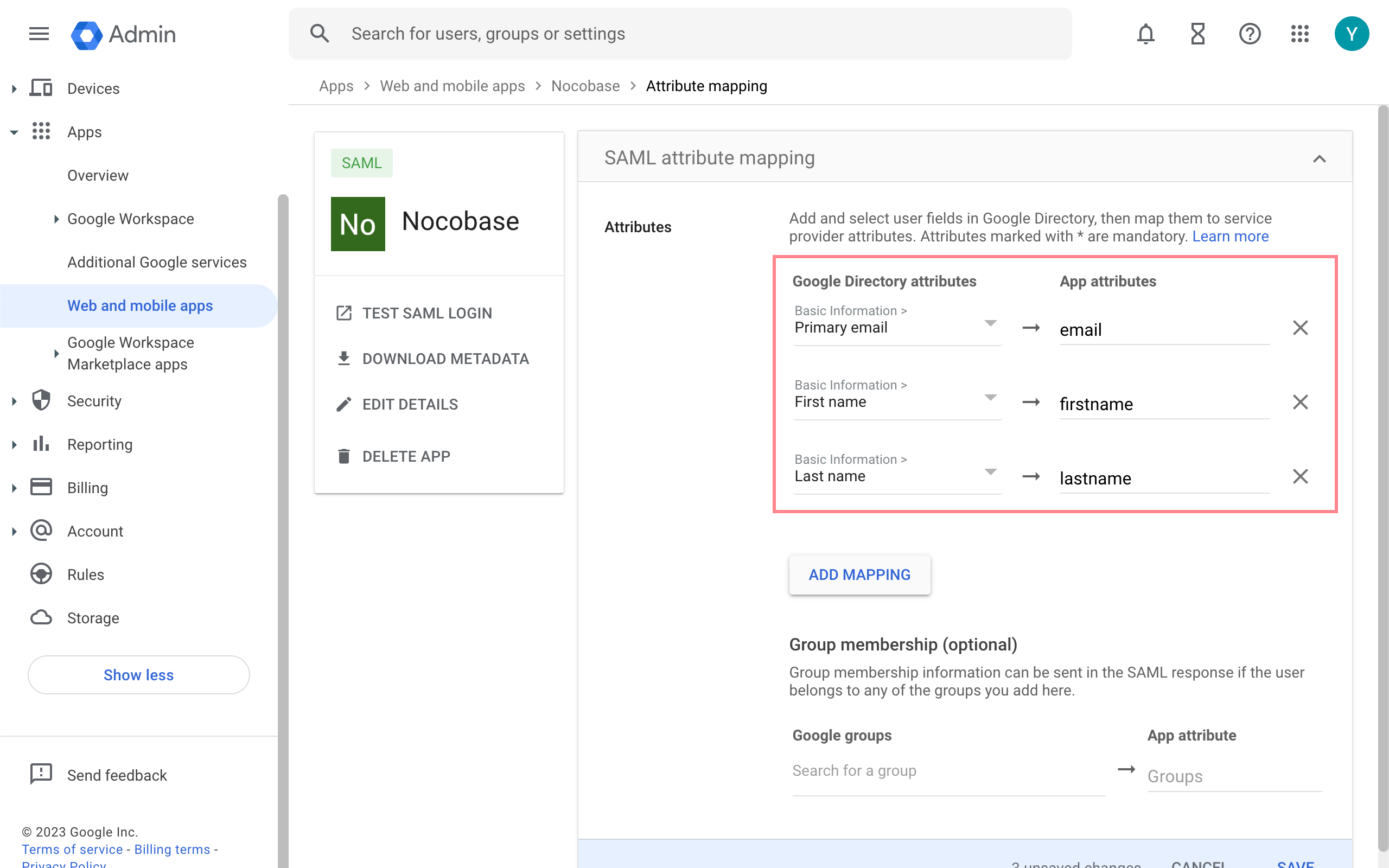
---
url: /auth-verification/auth-saml/index.md
---
# Auth: SAML 2.0
## Introduction
The Auth: SAML 2.0 plugin follows the SAML 2.0 (Security Assertion Markup Language 2.0) protocol standard, allowing users to sign in to NocoBase using accounts provided by third-party identity authentication service providers (IdP).
## Activate Plugin
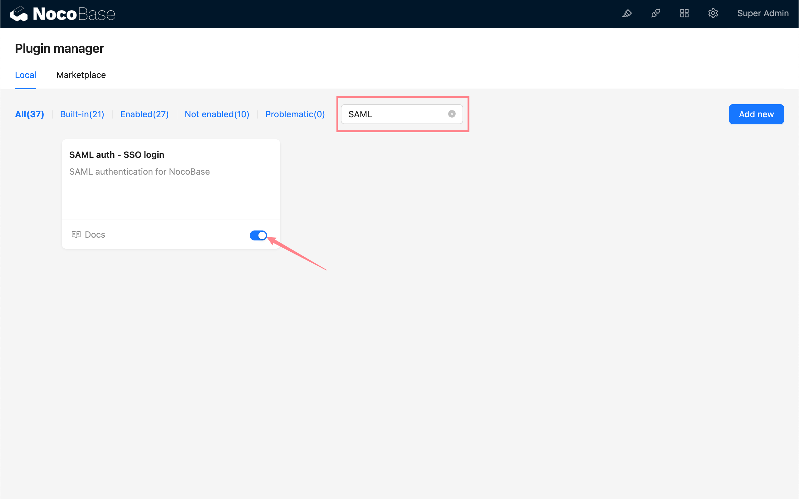
## Add SAML Authentication
Enter the user authentication plugin management page.

Add - SAML
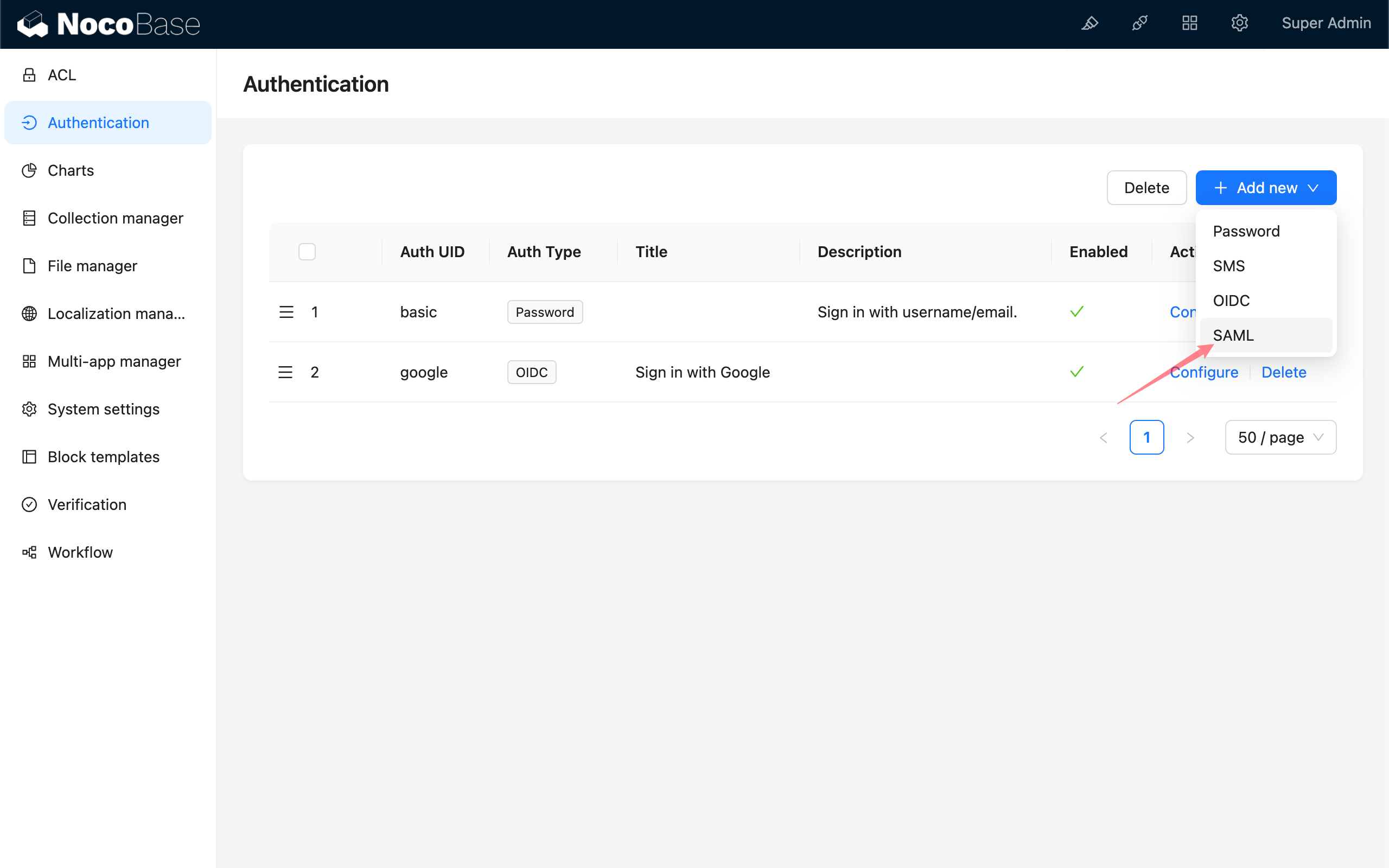
## Configuration
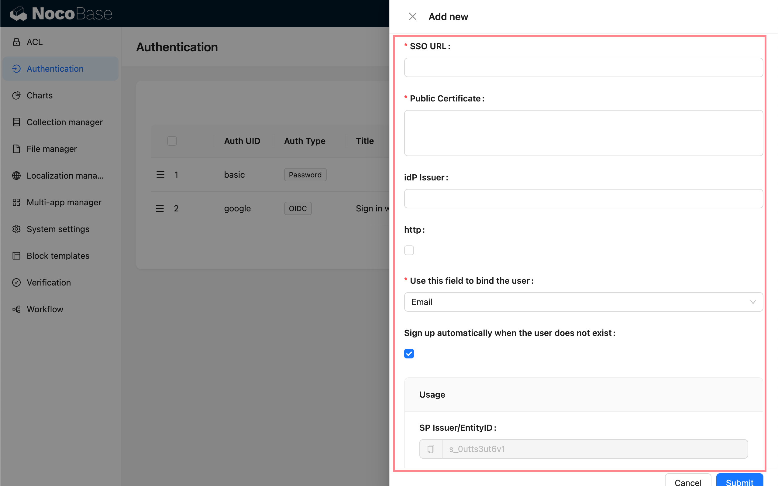
- SSO URL - Provided by IdP, used for single sign-on
- Public Certificate - Provided by IdP
- Entity ID (IdP Issuer) - Optional, provided by IdP
- http - If your NocoBase application is http protocol, please check
- Use this field to bind the user - The field used to match and bind with existing users, can choose email or username, default is email. The user information carried by IdP needs to contain the `email` or `username` field.
- Sign up automatically when the user does not exist - Whether to automatically create a new user when no matching existing user is found.
- Usage - `SP Issuer / EntityID` and `ACS URL` are used to copy and fill in the corresponding configuration in the IdP.
## Field Mapping
Field mapping needs to be configured on the IdP's configuration platform, you can refer to the [example](./examples/google.md).
The fields available for mapping in NocoBase are:
- email (required)
- phone (only effective for IdPs that support `phone` in their scope)
- nickname
- username
- firstName
- lastName
`nameID` is carried by the SAML protocol and does not need to be mapped, it will be saved as a unique user identifier.
The priority of the new user nickname use rule is: `nickname` > `firstName lastName` > `username` > `nameID`
Currently, user organization and role mapping are not supported.
## Sign In
Visit the sign in page and click the button under the sign in form to initiate third-party login.

---
url: /auth-verification/auth-sms/index.md
---
# Auth: SMS
## Introduction
The SMS authentication plugin supports users to register through SMS and log in to NocoBase.
> It needs to be used in conjunction with the SMS verification code function provided by the [`@nocobase/plugin-verification` plugin](../verification/index.md)
## Add SMS Authentication
Enter the user authentication plugin management page.
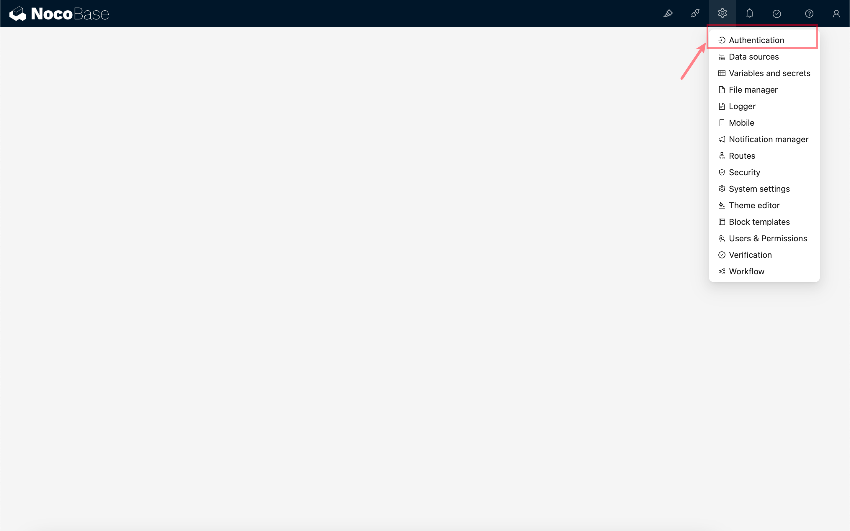
Add - SMS
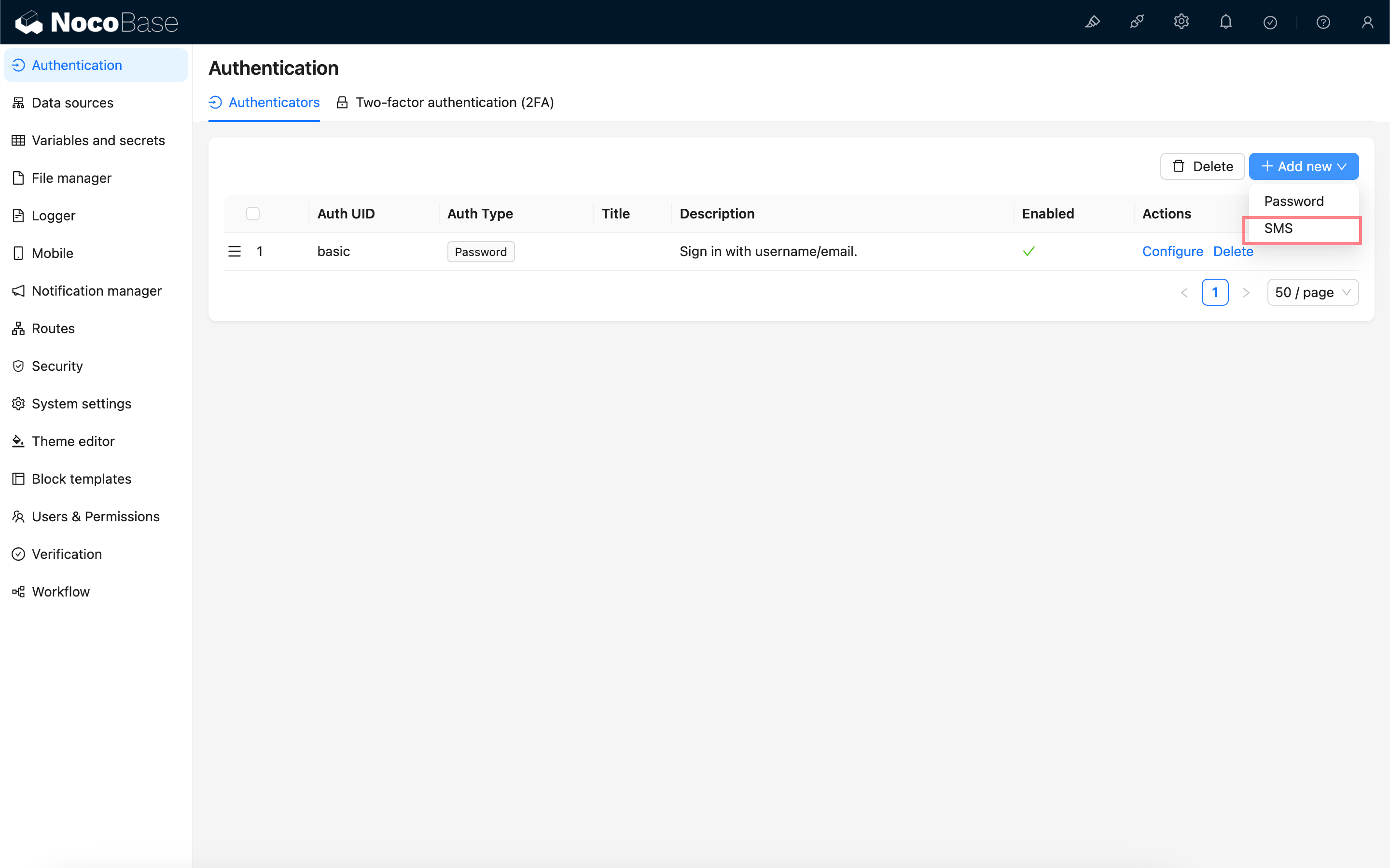
## New Version Configuration
:::info{title=Note}
The new configuration was introduced in `1.6.0-alpha.30` and is planned for stable support starting from `1.7.0`.
:::
**Verificator:** Bind an SMS verificator to send SMS verification codes. If no verificator is available, you need to go to the Verification management page to create an SMS verificator first.
See also:
- [Verification](../verification/index.md)
- [Verification: SMS](../verification/sms/index.md)
**Sign up automatically when the user does not exist:** When this option is checked, if the user's phone number does not exist, a new user will be registered using the phone number as the nickname.
## Old Version Configuration
The SMS login authentication feature will use the configured and default SMS verification code Provider to send text messages.
**Sign up automatically when the user does not exist:** When this option is checked, if the user's phone number does not exist, a new user will be registered using the phone number as the nickname.
## Log In
Visit the login page to use.
---
url: /auth-verification/auth-wecom/index.md
---
# Authentication: WeCom
## Introduction
The **WeCom** plugin allows users to log in to NocoBase using their WeCom accounts.
## Enable Plugin
## Create and Configure a WeCom Custom-built Application
Go to the WeCom admin console to create a custom-built application.
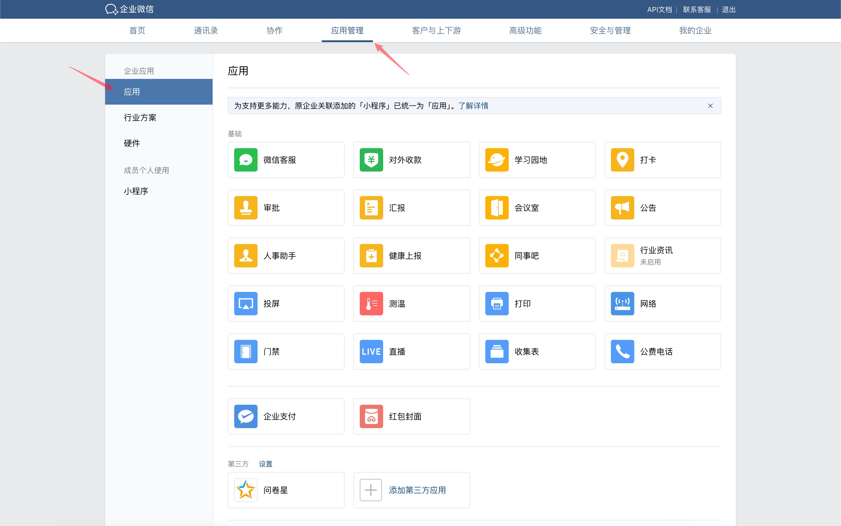
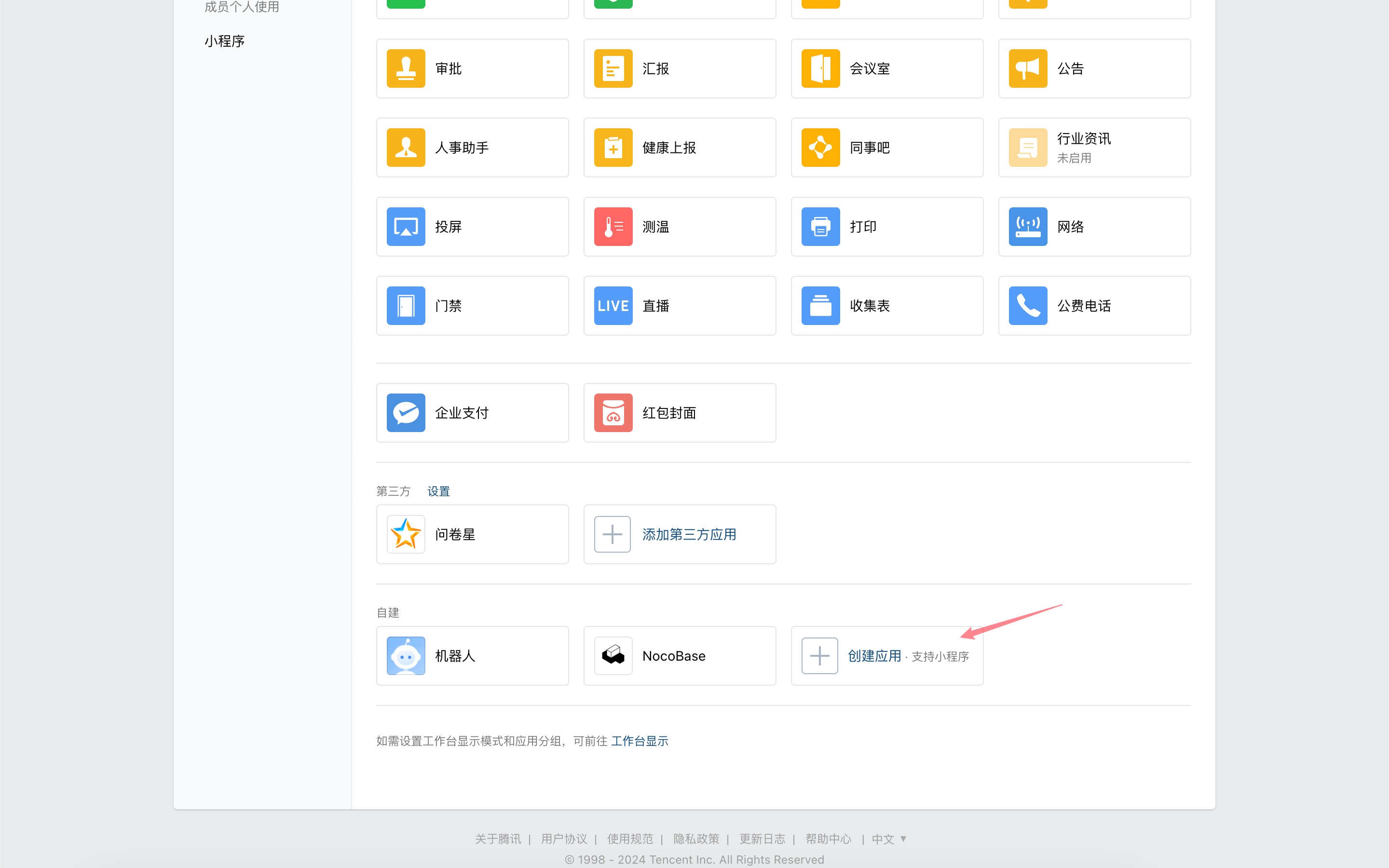
Click the application to enter its details page, scroll down, and click "WeCom Authorized Login".
Set the authorized callback domain to your NocoBase application domain.

Return to the app details page and click "Web Authorization and JS-SDK".
Set and verify the callback domain for the app's OAuth2.0 web authorization feature.
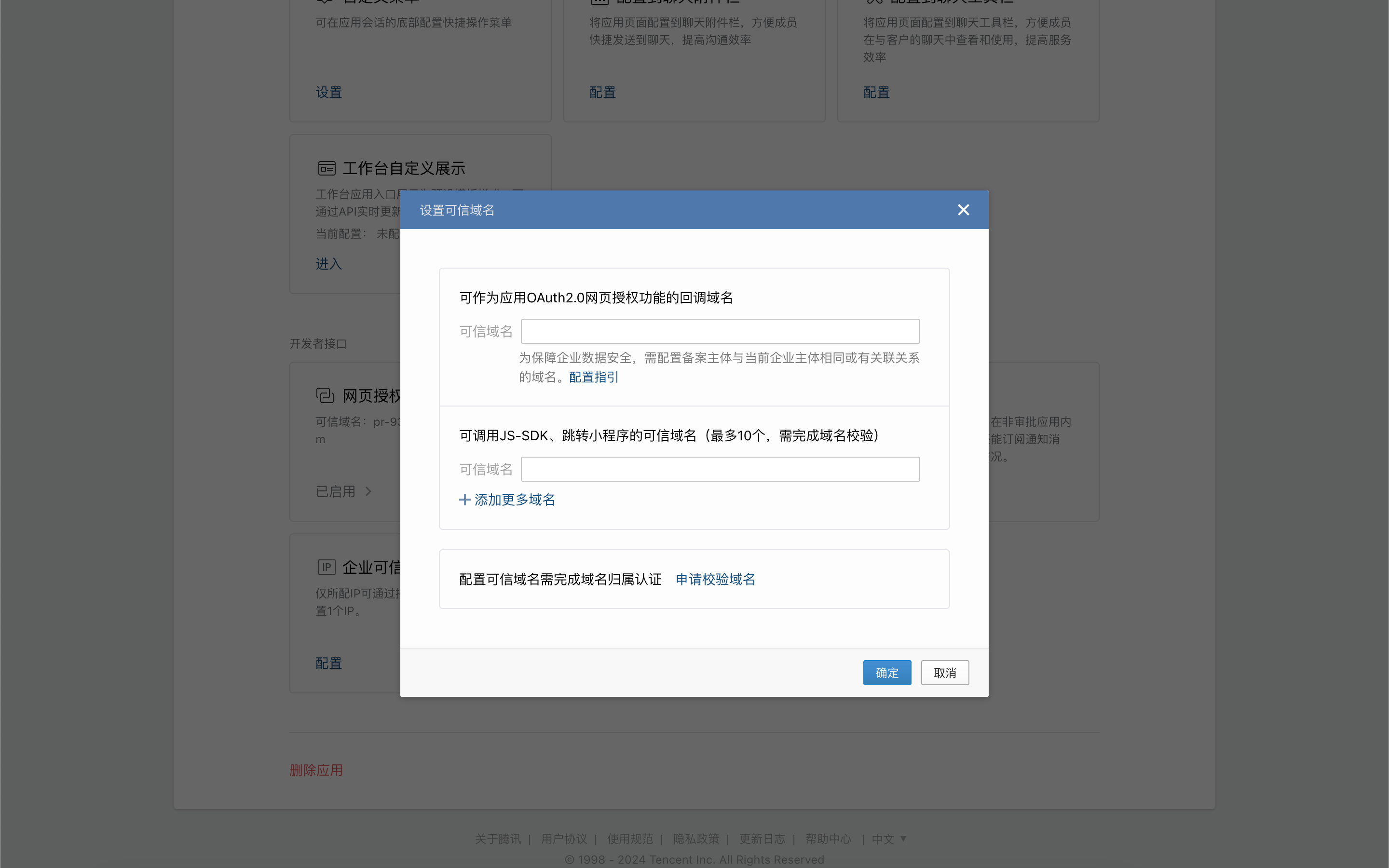
On the app details page, click "Corporate Trusted IP".
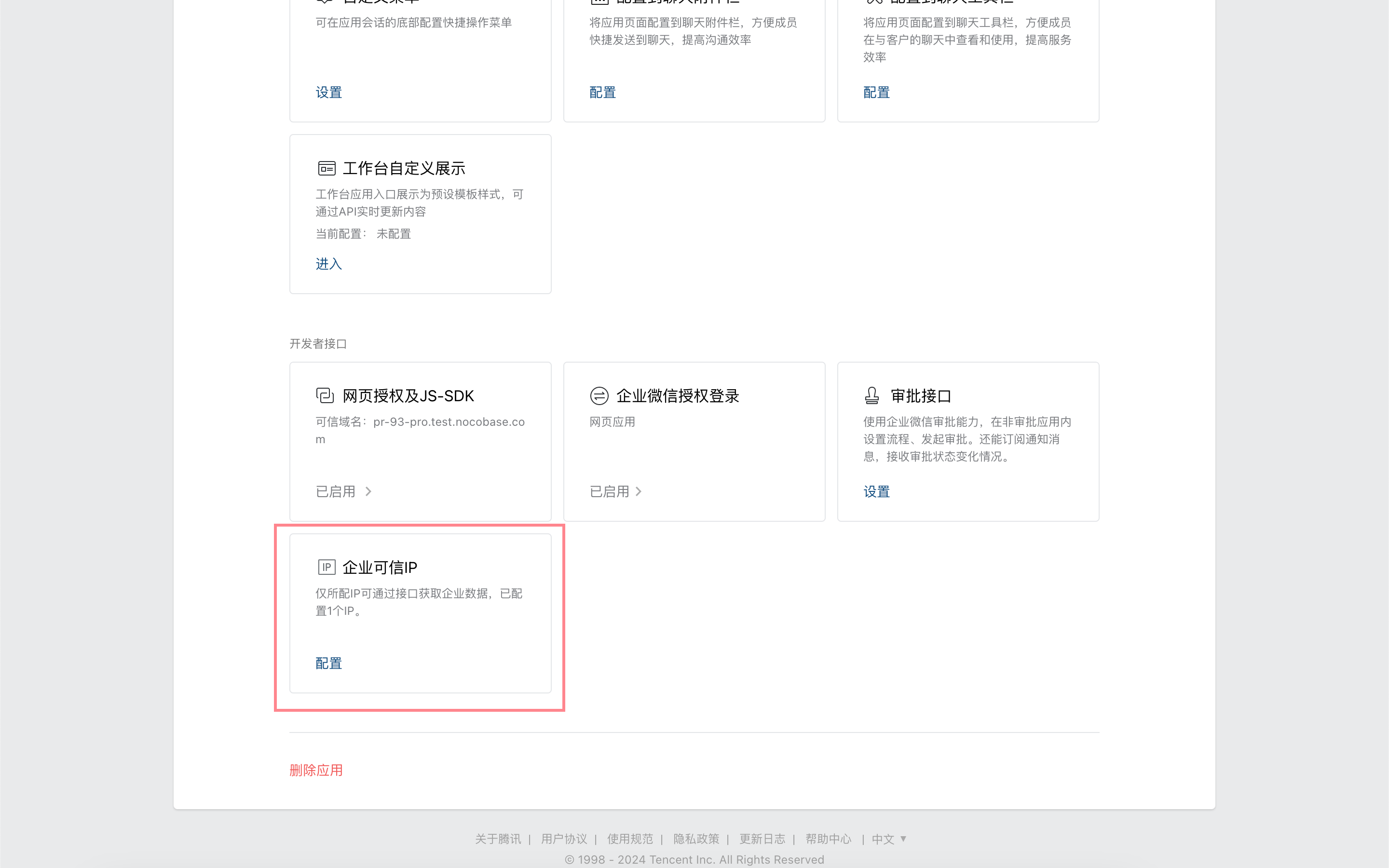
Configure the NocoBase application IP.
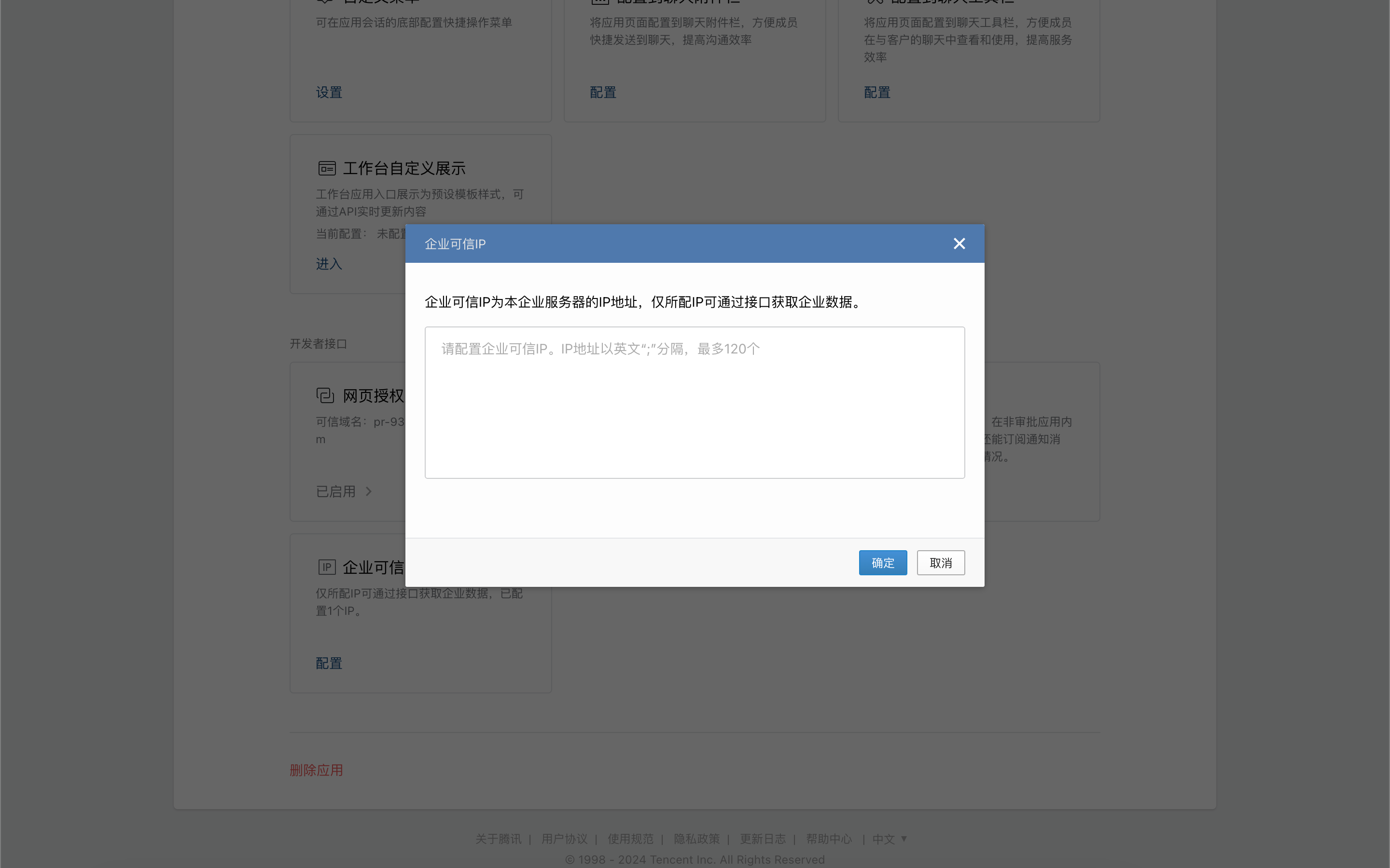
## Get Credentials from the WeCom Admin Console
In the WeCom admin console, under "My Company", copy the "Company ID".
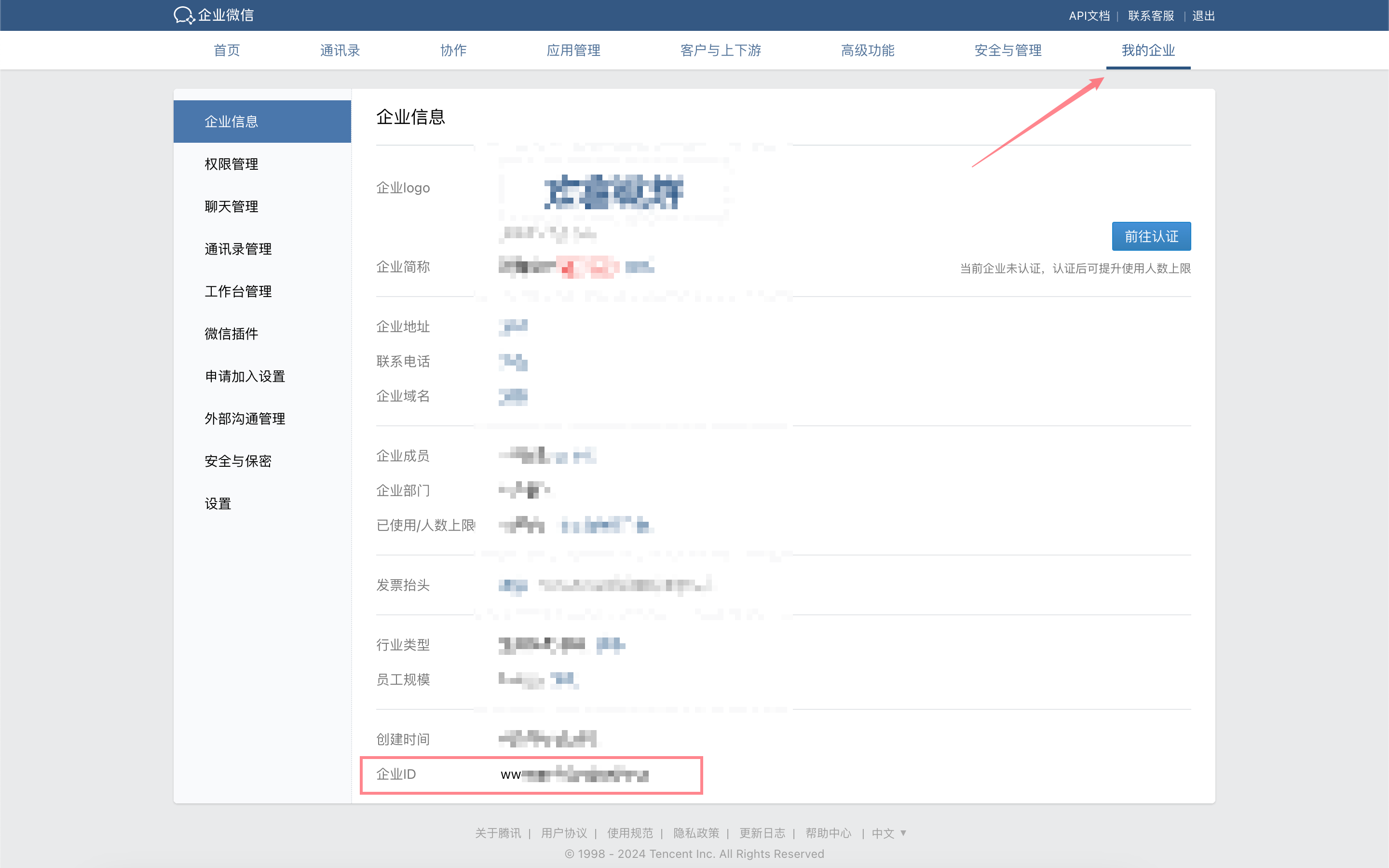
In the WeCom admin console, under "App Management", go to the details page of the application created in the previous step and copy the AgentId and Secret.
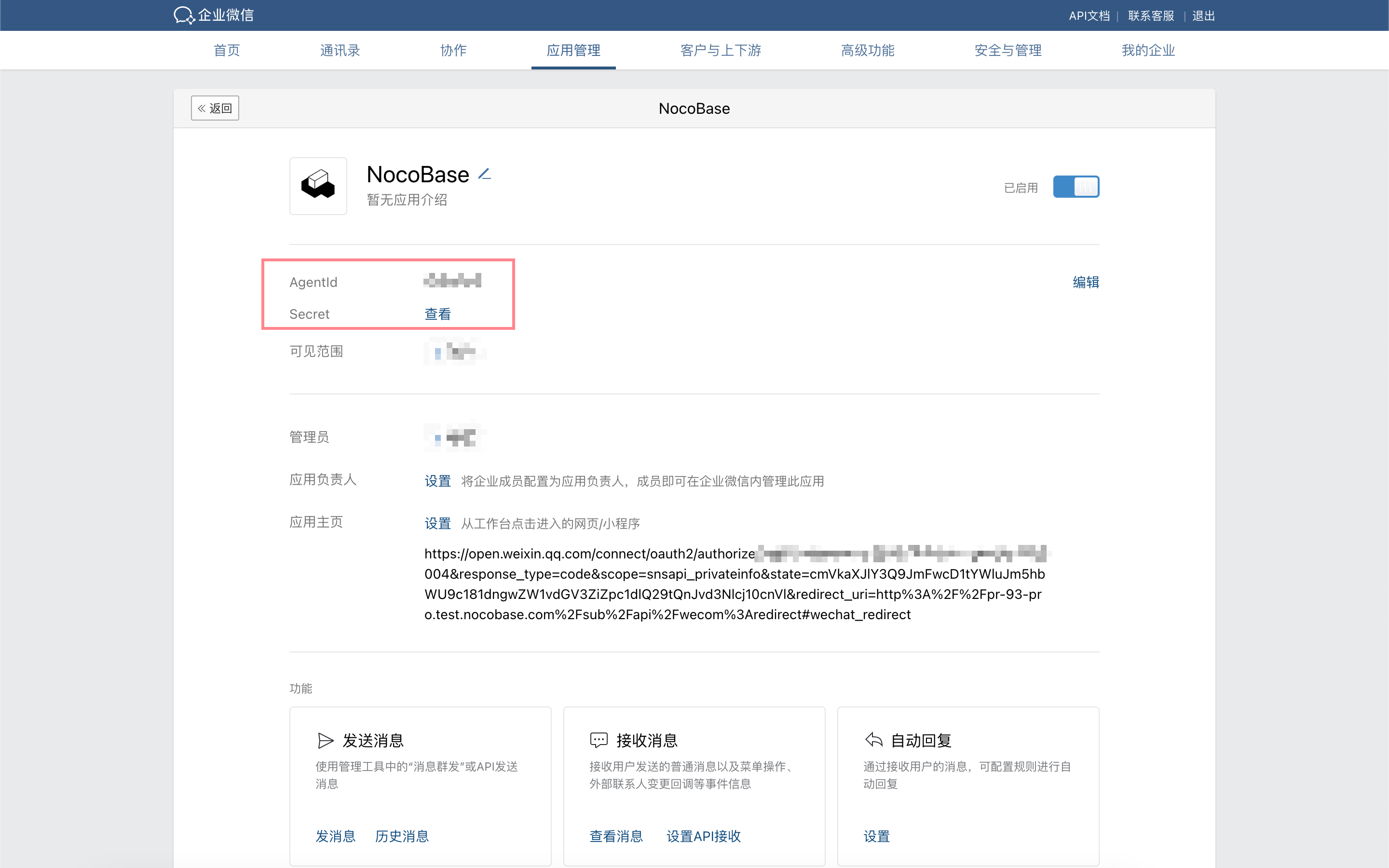
## Add WeCom Authentication in NocoBase
Go to the user authentication plugin management page.
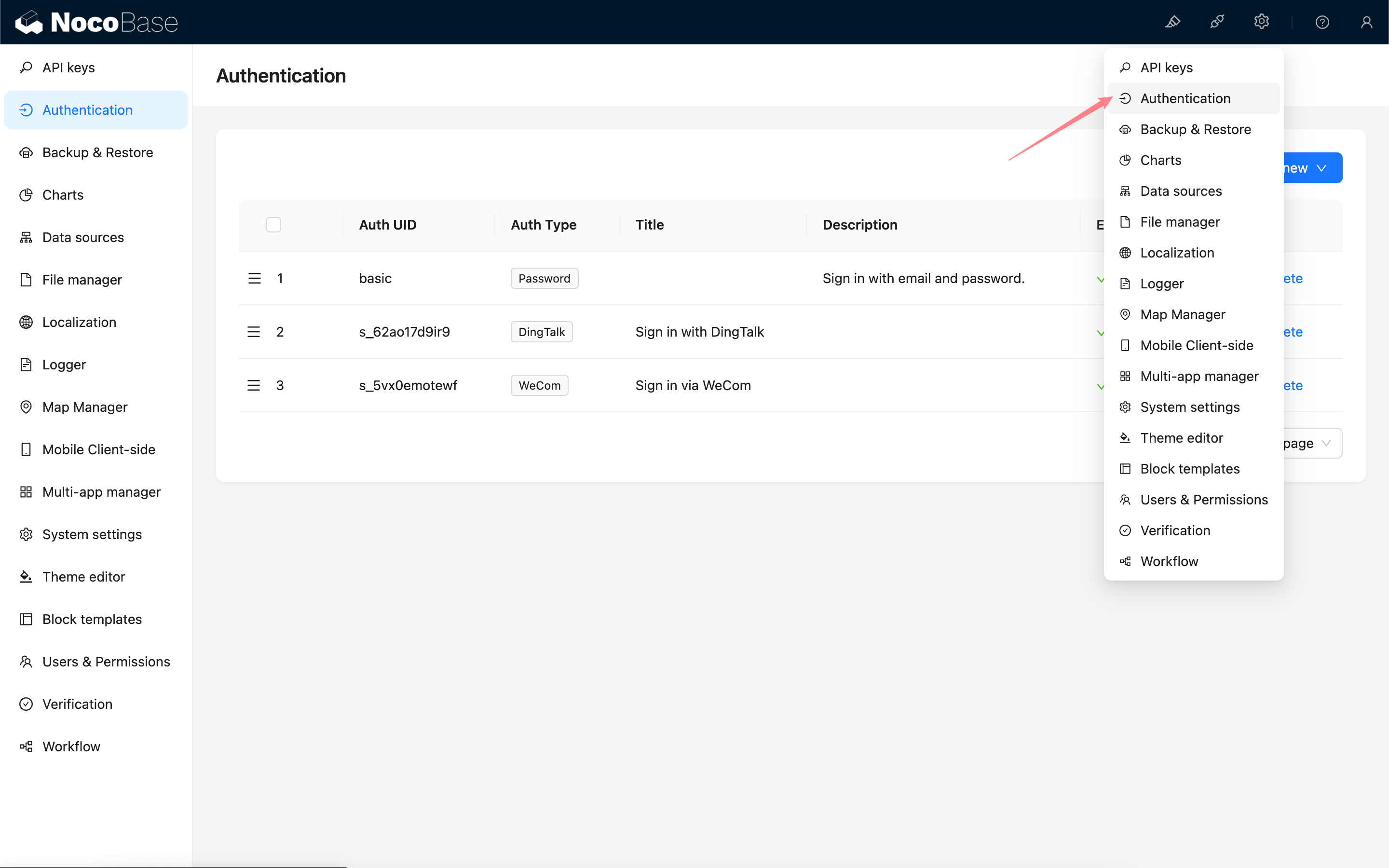
Add - WeCom
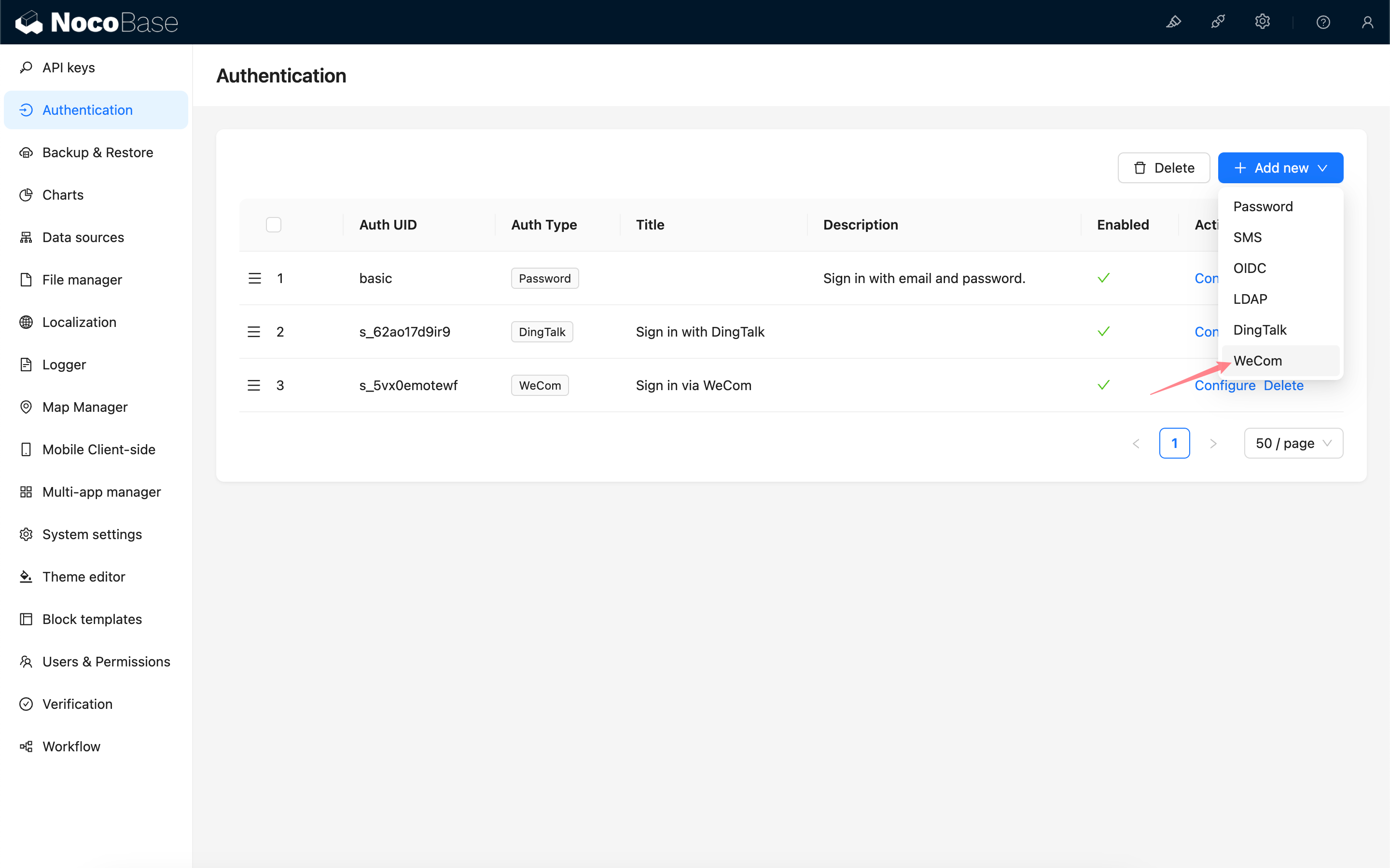
### Configuration
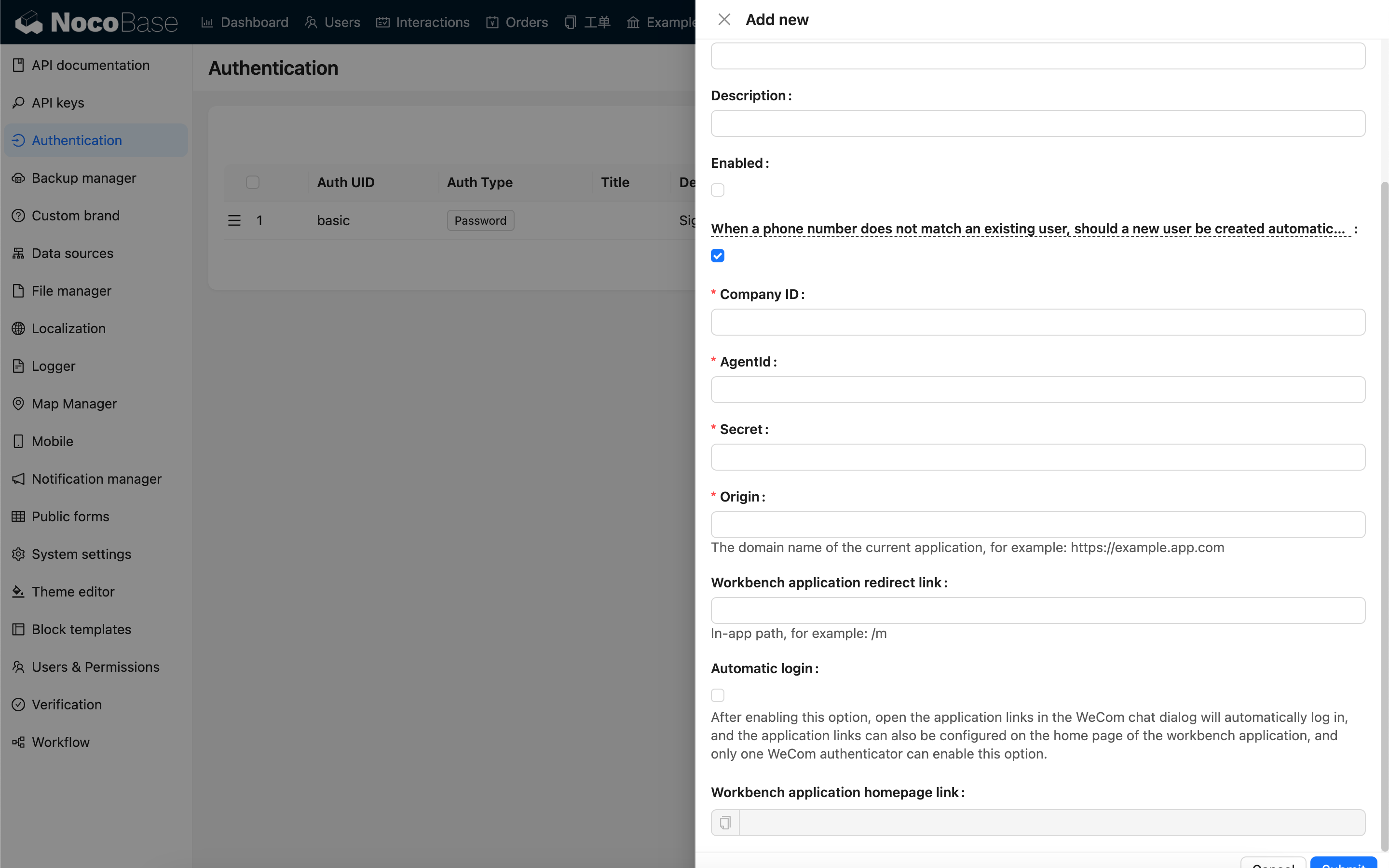
| Option | Description | Version Requirement |
| ----------------------------------------------------------------------------------------------------- | --------------------------------------------------------------------------------------------------------------------------------------------------------------------------------------------- | ------------------- |
| When a phone number does not match an existing user,
should a new user be created automatically | When a phone number does not match an existing user, whether to automatically create a new user. | - |
| Company ID | Company ID, obtained from the WeCom admin console. | - |
| AgentId | Obtained from the custom-built application configuration in the WeCom admin console. | - |
| Secret | Obtained from the custom-built application configuration in the WeCom admin console. | - |
| Origin | The current application domain. | - |
| Workbench application redirect link | The application path to redirect to after a successful login. | `v1.4.0` |
| Automatic login | Automatically log in when the application link is opened in the WeCom browser. When multiple WeCom authenticators are configured, only one can have this option enabled. | `v1.4.0` |
| Workbench application homepage link | Workbench application homepage link. | - |
## Configure WeCom Application Homepage
:::info
For versions `v1.4.0` and above, when the "Automatic login" option is enabled, the application homepage link can be simplified to: `https:///`, for example, `https://example.nocobase.com/admin`.
You can also configure separate links for mobile and desktop, for example, `https://example.nocobase.com/m` and `https://example.nocobase.com/admin`.
:::
Go to the WeCom admin console and paste the copied workbench application homepage link into the application homepage address field of the corresponding application.
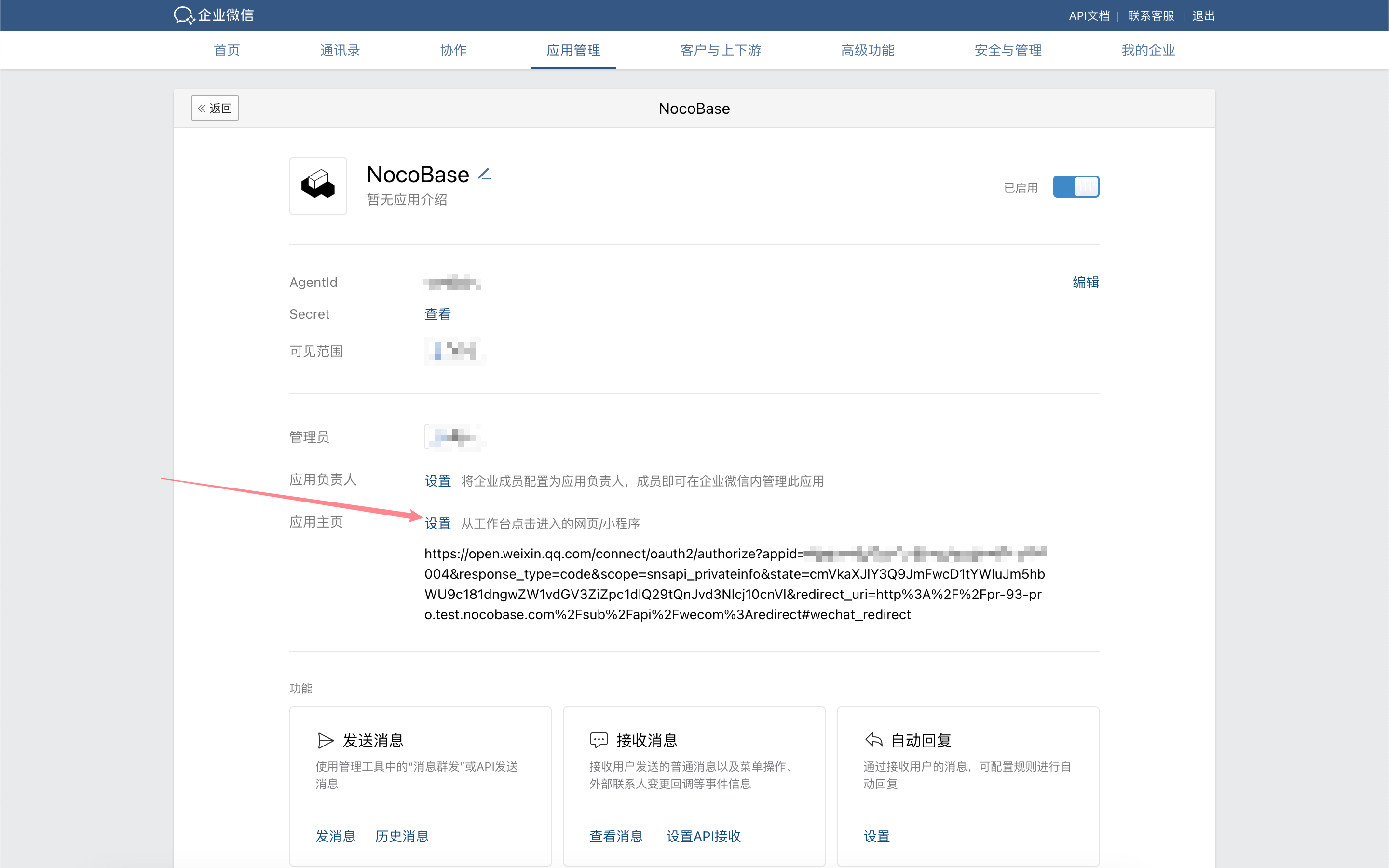

## Login
Visit the login page and click the button below the login form to initiate third-party login.
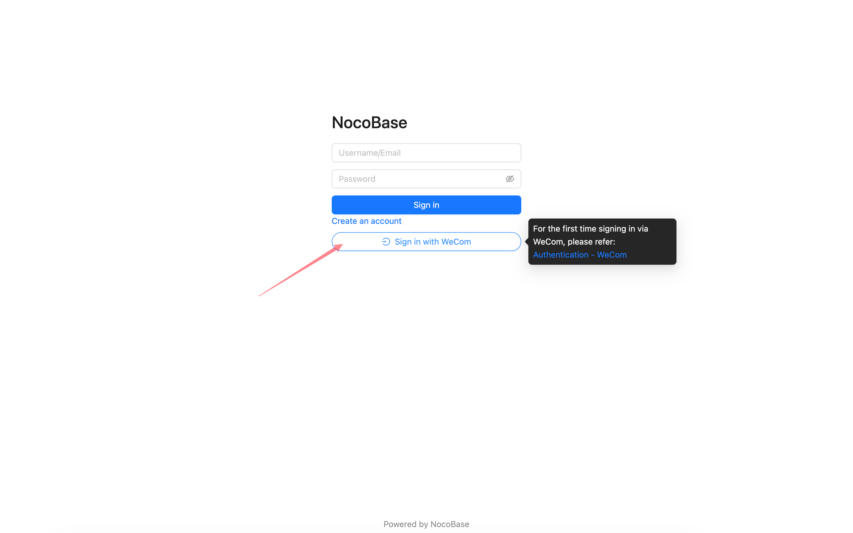
:::warning
Due to WeCom's permission restrictions on sensitive information like phone numbers, authorization can only be completed within the WeCom client. When logging in with WeCom for the first time, please follow the steps below to complete the initial login authorization within the WeCom client.
:::
## First-time Login
From the WeCom client, go to the Workbench, scroll to the bottom, and click the application to enter the homepage you previously configured. This will complete the initial authorization. Afterward, you can use WeCom to log in to your NocoBase application.
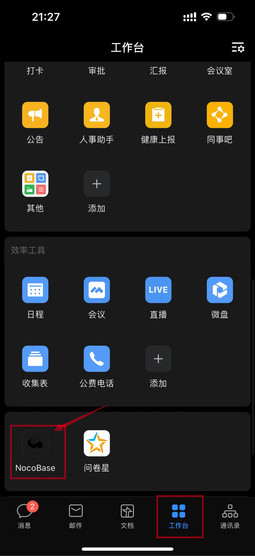 ---
url: /auth-verification/auth/authenticators.md
---
# Authenticators
## User Authentication Management
When the user authentication plugin is installed, it will initialize a `password` authentication method based on the user's username and email.
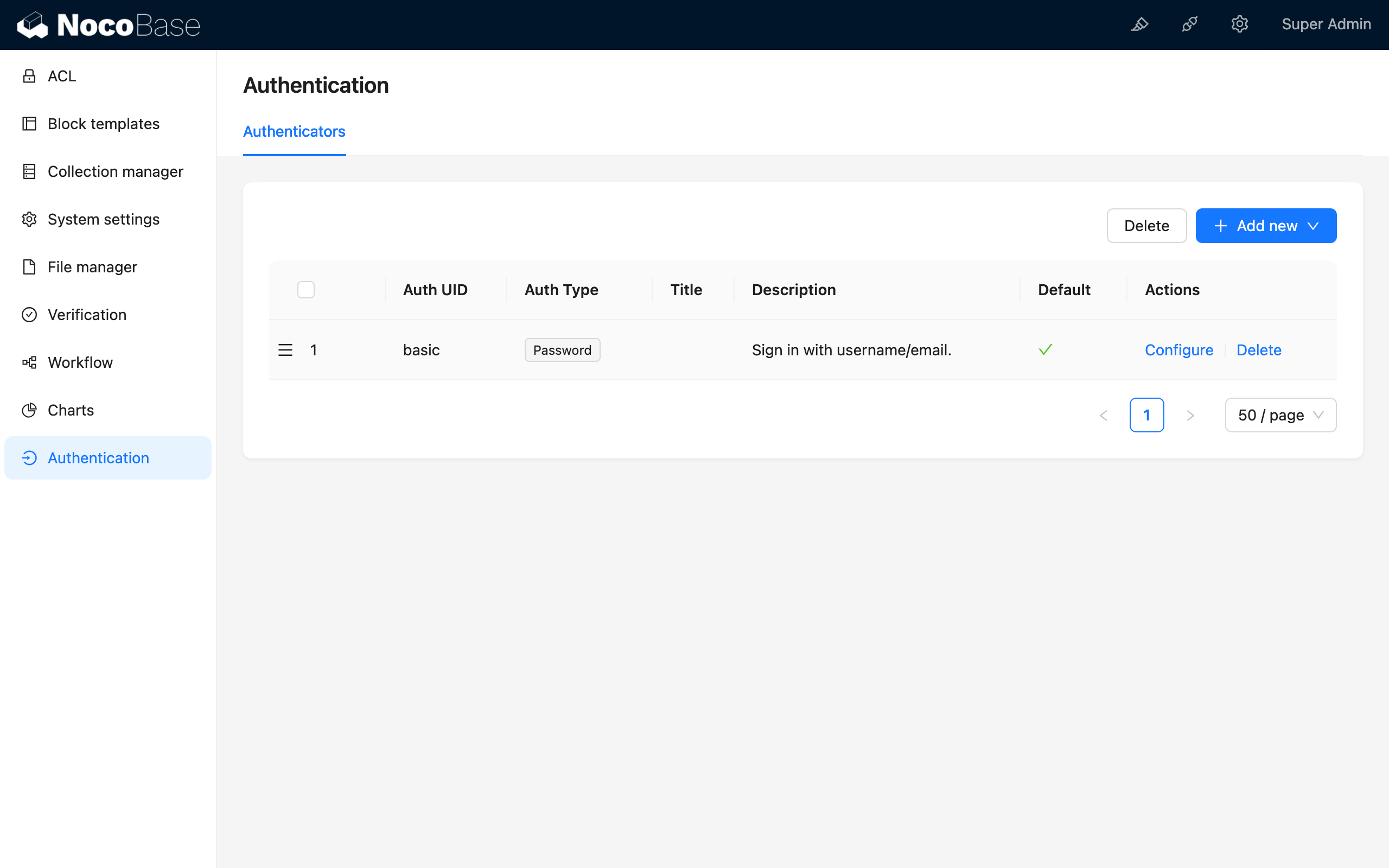
## Activate Authenticators
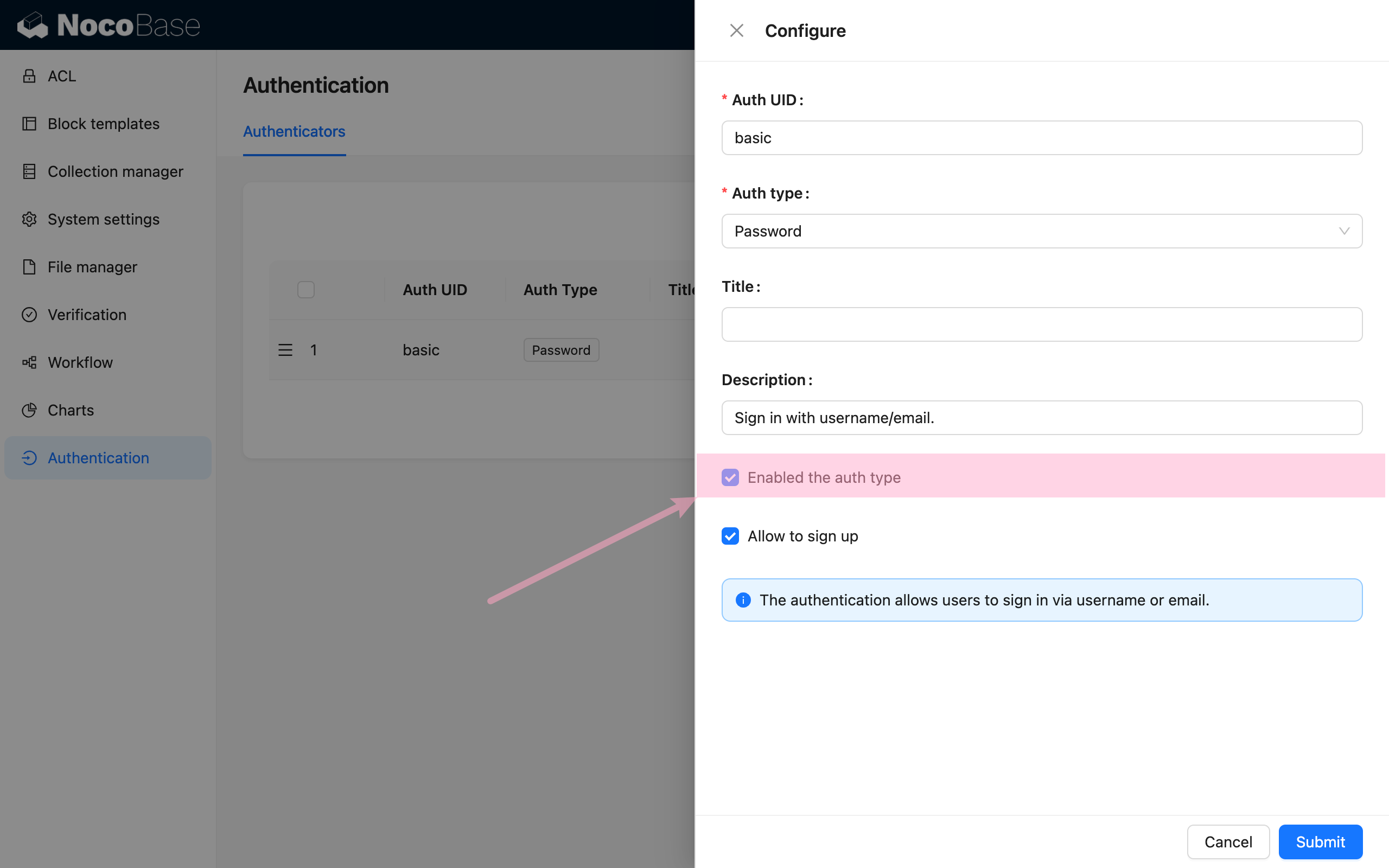
Only activated authentication types will be displayed on the login page.
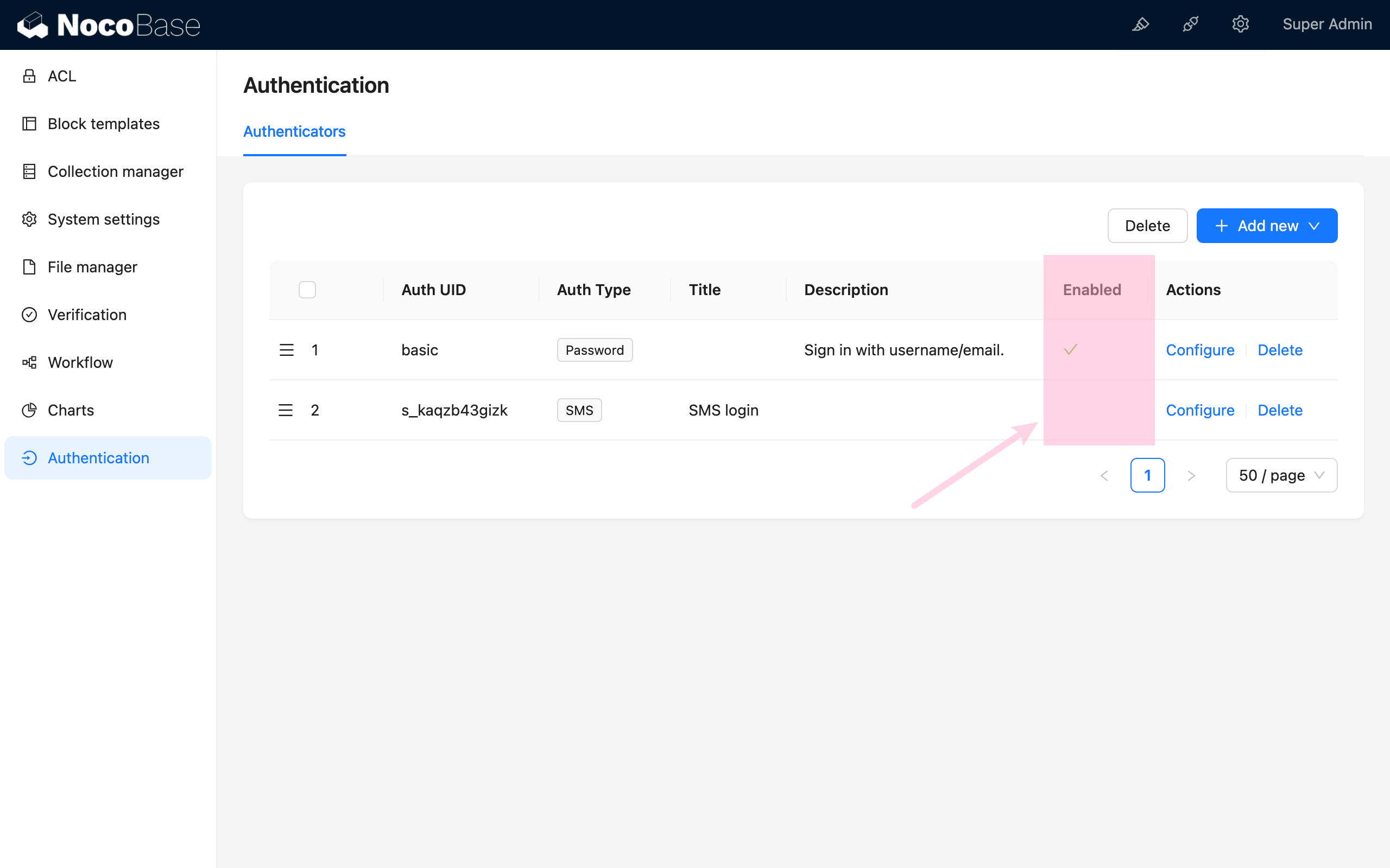
## User Authentication Types
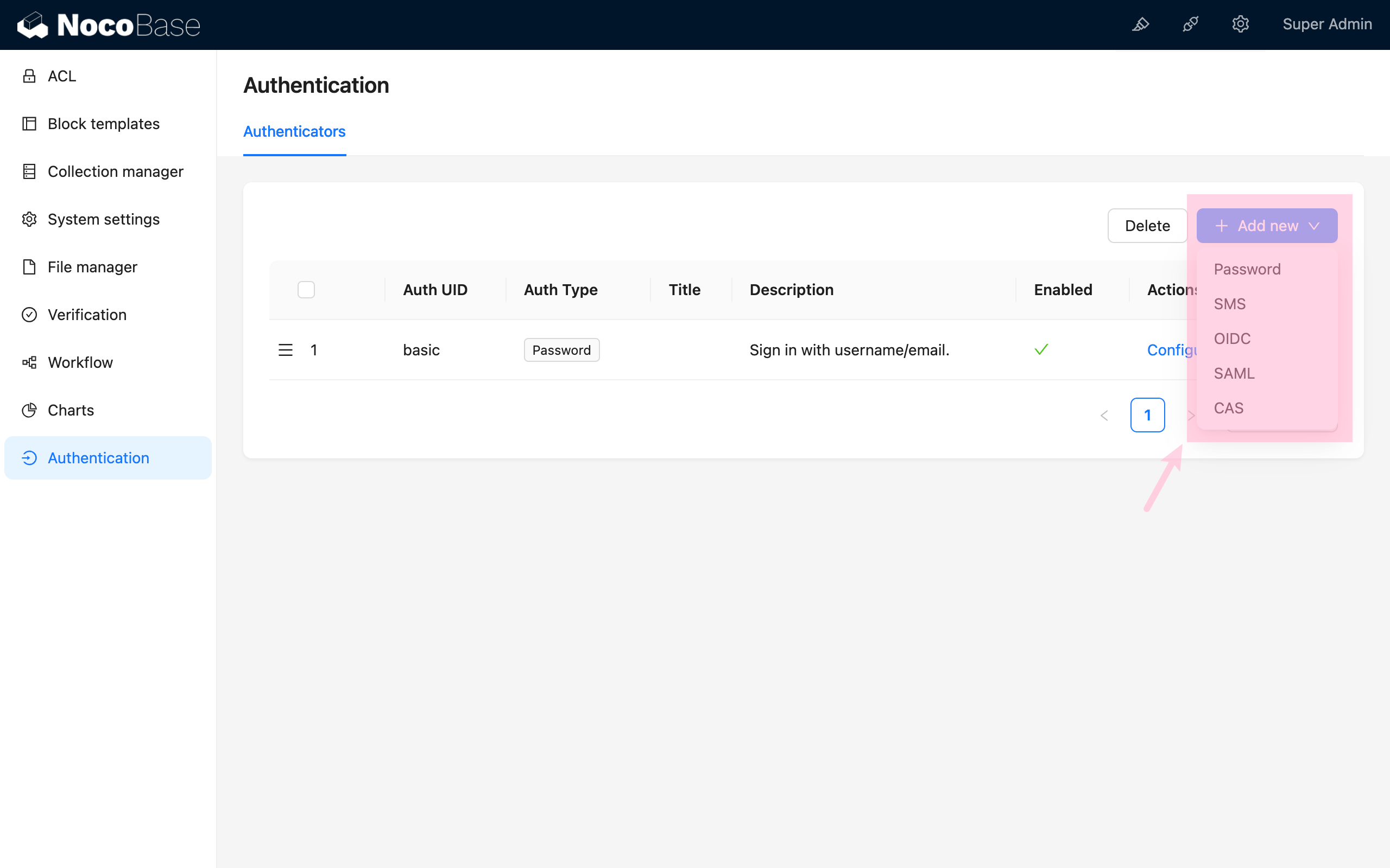
By adding different types of authenticators, you can enable corresponding authentication methods in the system.
In addition to the authentication types provided by existing plugins, developers can also extend user authentication types. For details, refer to the [Developer's Guide](./dev/).
---
url: /auth-verification/auth/dev/index.md
---
# Extend Authentication Type
## Overview
NocoBase supports extending user authentication types as needed. User authentication generally falls into two types: one is to determine user identity within the NocoBase application itself, such as password login, SMS login, etc.; the other is to have third-party services determine user identity and notify the NocoBase application of the result through callbacks, such as OIDC, SAML, and other authentication methods. The authentication process for these two different types of authentication methods in NocoBase is basically as follows:
### No Third-party Callbacks are required
1. The client uses the NocoBase SDK to call the login interface `api.auth.signIn()`, requesting the login interface `auth:signIn`, while carrying the current authenticator identifier through the request header `X-Authenticator` to the backend.
2. The `auth:signIn` interface forwards to the corresponding authentication type based on the authenticator identifier in the request header, and the `validate` method in the registered authentication class of that authentication type performs the corresponding logical processing.
3. The client retrieves user information and authentication token from the `auth:signIn` interface response, saves the token to Local Storage, and completes the login. This step is automatically handled internally by the SDK.
---
url: /auth-verification/auth/authenticators.md
---
# Authenticators
## User Authentication Management
When the user authentication plugin is installed, it will initialize a `password` authentication method based on the user's username and email.

## Activate Authenticators

Only activated authentication types will be displayed on the login page.

## User Authentication Types

By adding different types of authenticators, you can enable corresponding authentication methods in the system.
In addition to the authentication types provided by existing plugins, developers can also extend user authentication types. For details, refer to the [Developer's Guide](./dev/).
---
url: /auth-verification/auth/dev/index.md
---
# Extend Authentication Type
## Overview
NocoBase supports extending user authentication types as needed. User authentication generally falls into two types: one is to determine user identity within the NocoBase application itself, such as password login, SMS login, etc.; the other is to have third-party services determine user identity and notify the NocoBase application of the result through callbacks, such as OIDC, SAML, and other authentication methods. The authentication process for these two different types of authentication methods in NocoBase is basically as follows:
### No Third-party Callbacks are required
1. The client uses the NocoBase SDK to call the login interface `api.auth.signIn()`, requesting the login interface `auth:signIn`, while carrying the current authenticator identifier through the request header `X-Authenticator` to the backend.
2. The `auth:signIn` interface forwards to the corresponding authentication type based on the authenticator identifier in the request header, and the `validate` method in the registered authentication class of that authentication type performs the corresponding logical processing.
3. The client retrieves user information and authentication token from the `auth:signIn` interface response, saves the token to Local Storage, and completes the login. This step is automatically handled internally by the SDK.
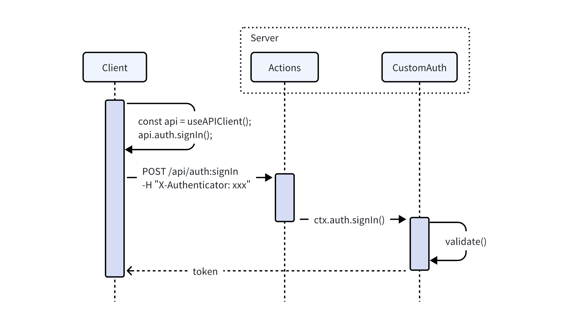 ### Dependent on Third-party Callbacks
1. The client obtains the third-party login URL through its own registered interface (such as `auth:getAuthUrl`), and carries information such as the application name and authenticator identifier according to the protocol.
2. Redirect to the third-party URL to complete the login. The third-party service calls the callback interface of the NocoBase application (which needs to be registered by itself, such as `auth:redirect`), returns the authentication result, and returns information such as the application name and authenticator identifier.
3. In the callback interface method, parse the parameters to obtain the authenticator identifier, obtain the corresponding authentication class through `AuthManager`, and actively call the `auth.signIn()` method. The `auth.signIn()` method will call the `validate()` method to handle the authentication logic.
4. After the callback method obtains the authentication token, it redirects back to the frontend page with a 302 status code, and carries the `token` and authenticator identifier in the URL parameters, `?authenticator=xxx&token=yyy`.
### Dependent on Third-party Callbacks
1. The client obtains the third-party login URL through its own registered interface (such as `auth:getAuthUrl`), and carries information such as the application name and authenticator identifier according to the protocol.
2. Redirect to the third-party URL to complete the login. The third-party service calls the callback interface of the NocoBase application (which needs to be registered by itself, such as `auth:redirect`), returns the authentication result, and returns information such as the application name and authenticator identifier.
3. In the callback interface method, parse the parameters to obtain the authenticator identifier, obtain the corresponding authentication class through `AuthManager`, and actively call the `auth.signIn()` method. The `auth.signIn()` method will call the `validate()` method to handle the authentication logic.
4. After the callback method obtains the authentication token, it redirects back to the frontend page with a 302 status code, and carries the `token` and authenticator identifier in the URL parameters, `?authenticator=xxx&token=yyy`.
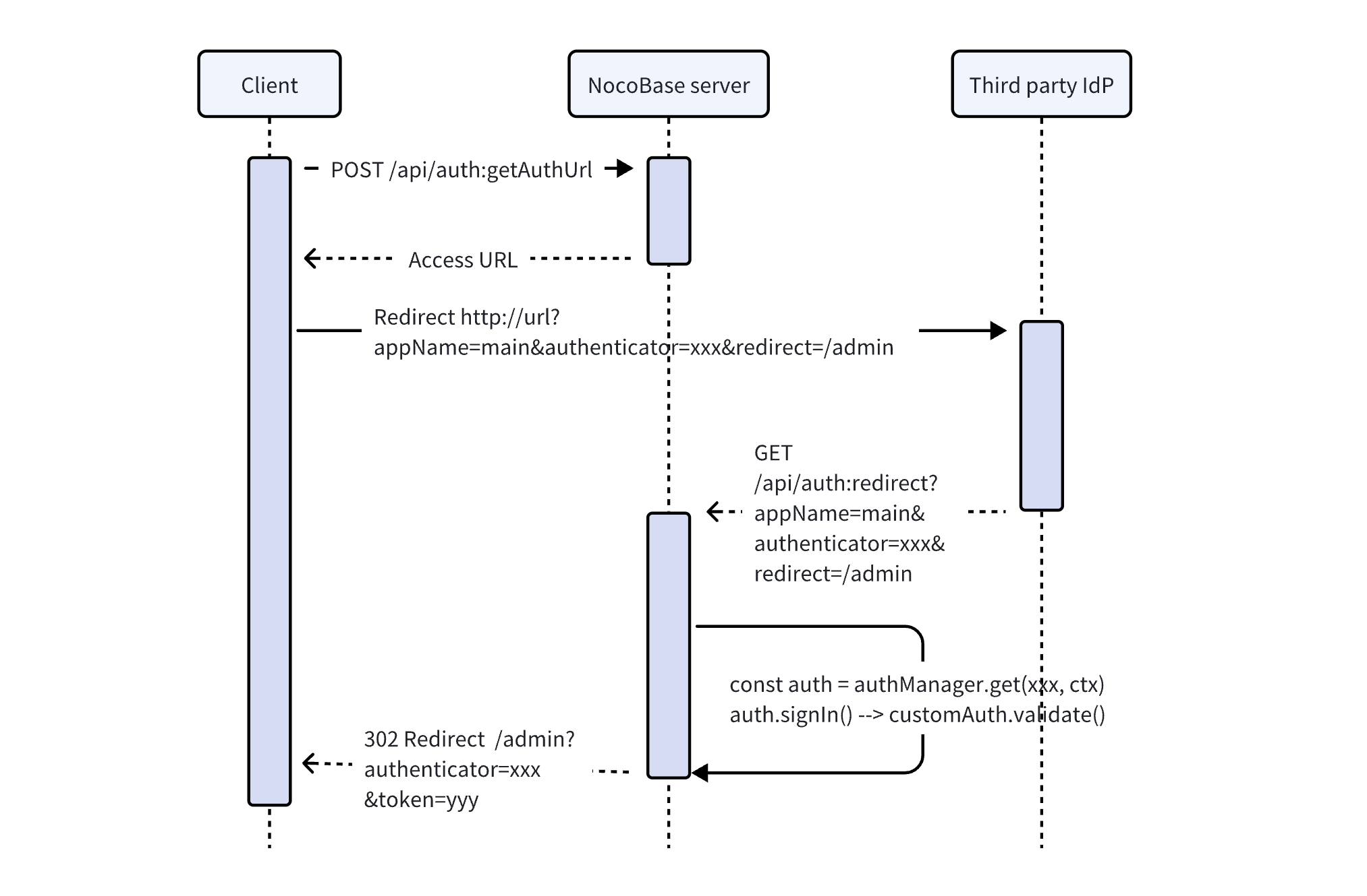 Next, we'll discuss how to register server-side interfaces and client-side user interfaces.
## Server
### Authentication Interface
The NocoBase kernel provides registration and management for extending authentication types. The core logic processing of extending the login plugin requires inheriting the `Auth` abstract class of the kernel and implementing the corresponding standard interfaces.
For the complete API, see [Auth](/api/auth/auth).
```typescript
import { Auth } from '@nocobase/auth';
class CustomAuth extends Auth {
set user(user) {}
get user() {}
async check() {}
async signIn() {}
}
```
The kernel also registers basic resource operations related to user authentication.
| API | Description |
| -------------- | ----------------------- |
| `auth:check` | Check if user is logged in |
| `auth:signIn` | Sign in |
| `auth:signUp` | Sign up |
| `auth:signOut` | Sign out |
In most cases, the extended user authentication type can also use the existing JWT authentication logic to generate the credential for the user to access the API. The `BaseAuth` class in the kernel has done the basic implementation of the `Auth` abstract class, see [BaseAuth](../../../api/auth/base-auth.md). Plugins can directly inherit the `BaseAuth` class to reuse part of the logic code and reduce development costs.
```javascript
import { BaseAuth } from '@nocobase/auth';
class CustomAuth extends BaseAuth {
constructor(config: AuthConfig) {
// Set user collection
const userCollection = config.ctx.db.getCollection('users');
super({ ...config, userCollection });
}
// Implement user authentication logic
async validate() {}
}
```
### User Data
When implementing user authentication logic, it usually involves handling user data. In a NocoBase application, the related collections are defined by default as:
| Collections | Description | Plugin |
| --------------------- | -------------------------------------------------------------------------------------------------------------------- | ----------------------------------------------------------------- |
| `users` | Store user information, such as email, nickname, and password | [User Plugin (`@nocobase/plugin-users`)](/users-permissions/user) |
| `authenticators` | Store authenticator (authentication type entity) information, corresponding to authentication type and configuration | User Authentication Plugin (`@nocobase/plugin-auth`) |
| `usersAuthenticators` | Associates users and authenticators, saves user information under the corresponding authenticator | User Authentication Plugin (`@nocobase/plugin-auth`) |
In general, extended login methods use `users` and `usersAuthenticators` to store corresponding user data. Only in special cases do you need to add a new Collection yourself.
The main fields of `usersAuthenticators` are
| Field | Description |
| --------------- | ------------------------------------------------------------------------------------------- |
| `uuid` | Unique identifier for this type of authentication, such as a phone number or a third-party service user ID |
| `meta` | JSON field, other information to be saved |
| `userId` | User ID |
| `authenticator` | Authenticator name (unique identifier) |
For user query and creation operations, the `authenticators` data model `AuthModel` also encapsulates several methods that can be used in the `CustomAuth` class via `this.authenticator[methodName]`. For the complete API, see [AuthModel](./api#authmodel).
```ts
import { AuthModel } from '@nocobase/plugin-auth';
class CustomAuth extends BaseAuth {
async validate() {
// ...
const authenticator = this.authenticator as AuthModel;
this.authenticator.findUser(); // Query user
this.authenticator.newUser(); // Create new user
this.authenticator.findOrCreateUser(); // Query or create new user
// ...
}
}
```
### Authentication Type Registration
The extended authentication method needs to be registered with the authentication management module.
```javascript
class CustomAuthPlugin extends Plugin {
async load() {
this.app.authManager.registerTypes('custom-auth-type', {
auth: CustomAuth,
});
}
}
```
## Client
The client user interface is registered through the interface `registerType` provided by the user authentication plugin client:
```ts
import AuthPlugin from '@nocobase/plugin-auth/client';
class CustomAuthPlugin extends Plugin {
async load() {
const auth = this.app.pm.get(AuthPlugin);
auth.registerType('custom-auth-type', {
components: {
SignInForm, // Sign in form
SignInButton, // Sign in (third-party) button, an alternative to the login form
SignUpForm, // Sign up form
AdminSettingsForm, // Admin settings form
},
});
}
}
```
### Sign In Form
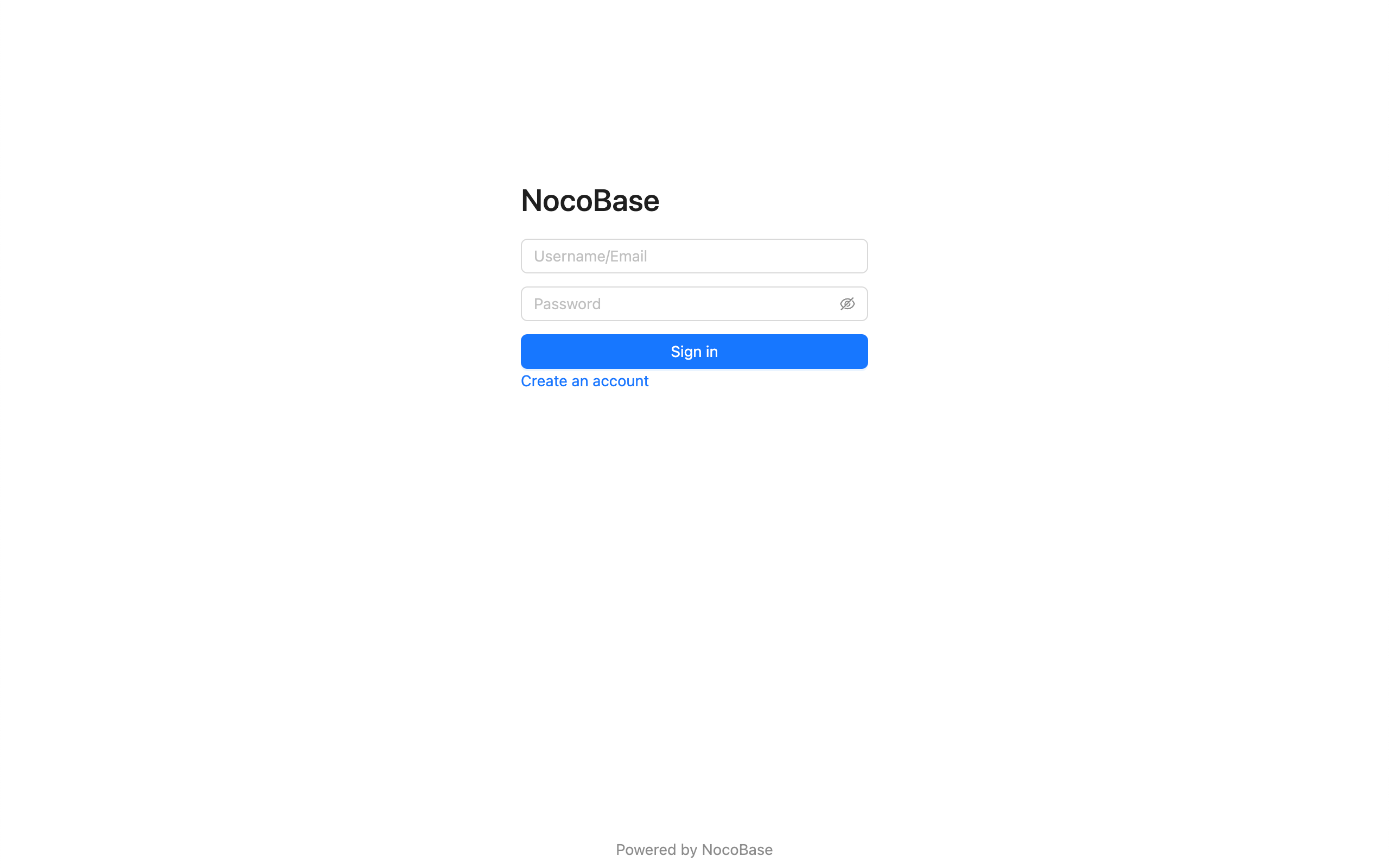
If multiple authenticators corresponding to the authentication type have registered login forms, they will be displayed in the form of Tabs. The Tab title is the title of the authenticator configured in the background.

### Sign In Button
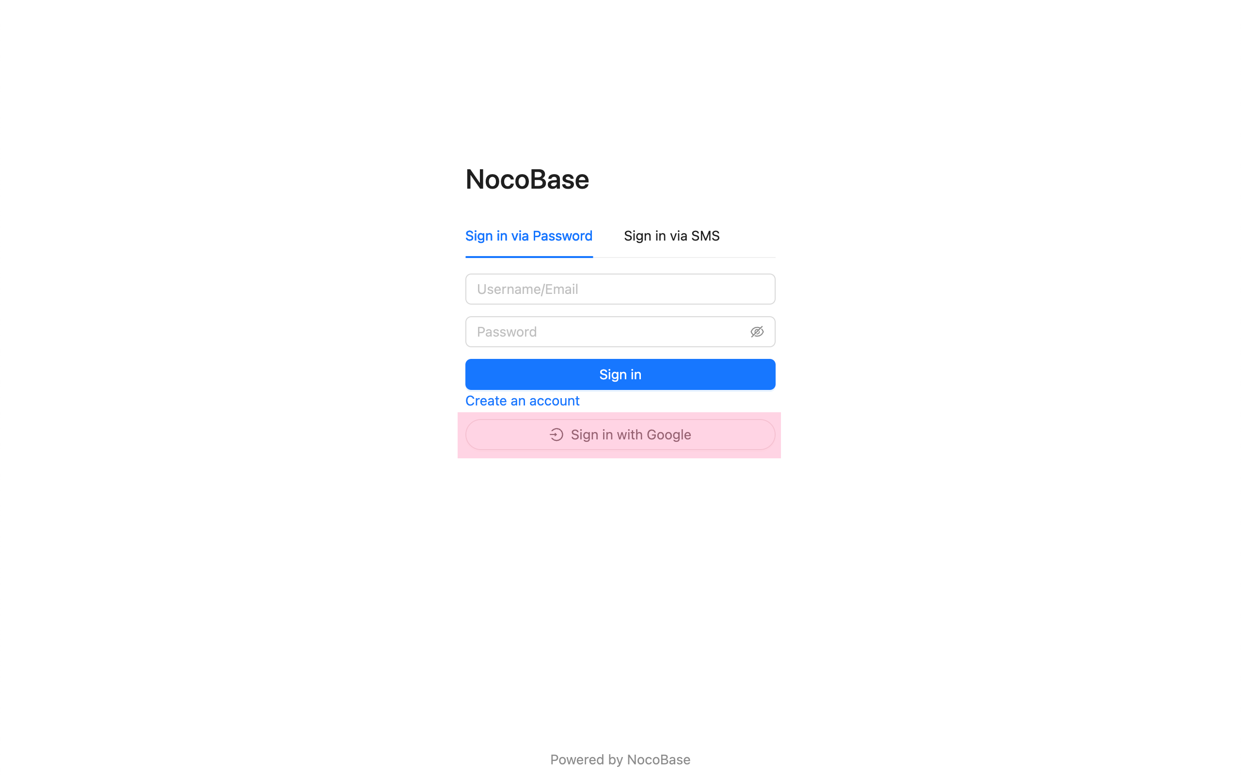
Usually for third-party login buttons, but can actually be any component.
### Sign Up Form
If you need to jump from the login page to the sign up page, you need to handle it yourself in the login component.
### Admin Settings Form
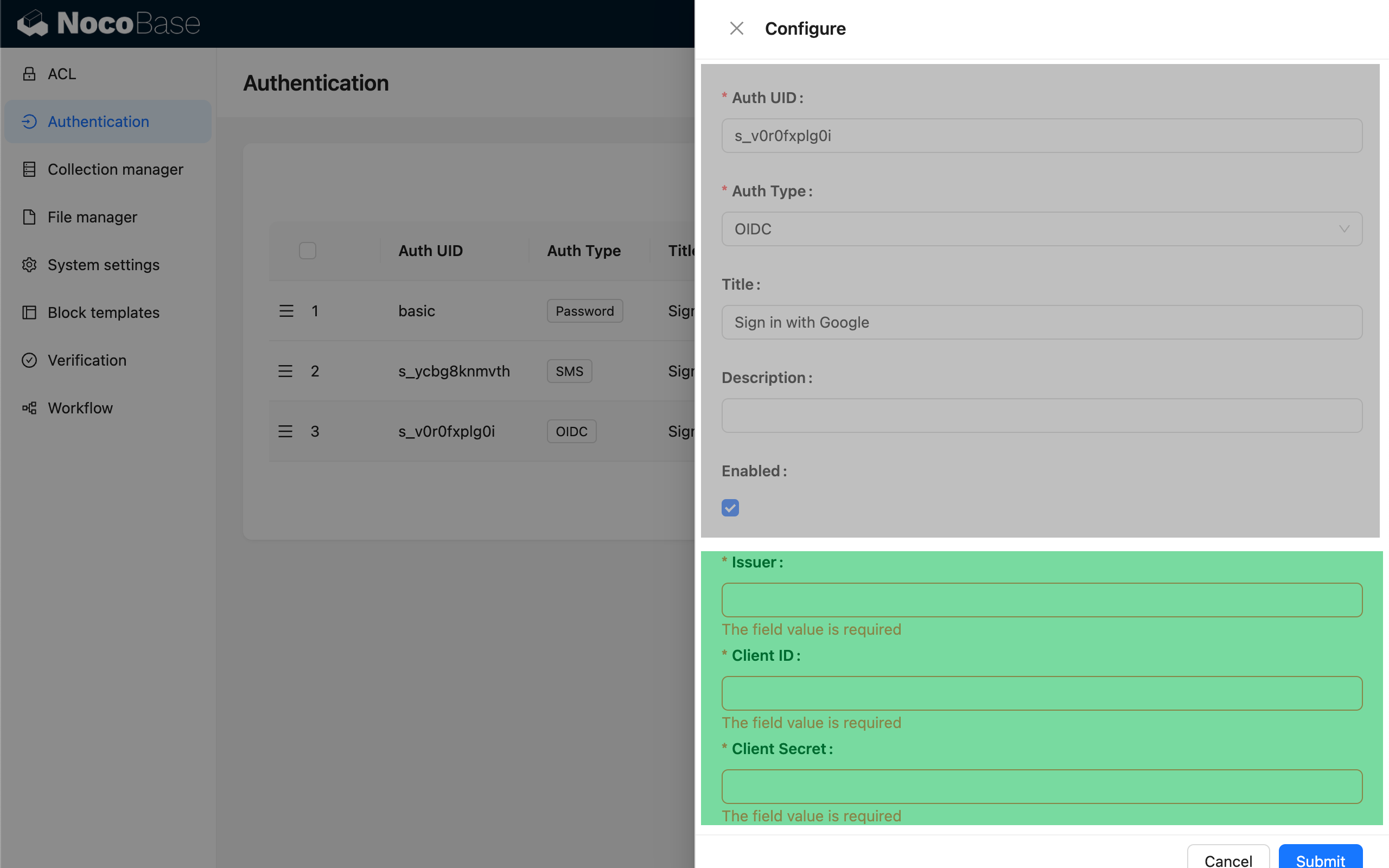
The top is the generic authenticator configuration, and the bottom is the part of the custom configuration form that can be registered.
### Request APIs
To initiate requests for user authentication-related interfaces on the client-side, you can use the SDK provided by NocoBase.
```ts
import { useAPIClient } from '@nocobase/client';
// Use in component
const api = useAPIClient();
api.auth.signIn(data, authenticator);
```
For detailed API references, see [@nocobase/sdk - Auth](/api/sdk/auth).
---
url: /auth-verification/auth/index.md
---
# User Authentication
The user authentication module of NocoBase mainly consists of two parts:
- The `@nocobase/auth` in the kernel defines login, registration, verification and other user authentication related expandable interfaces and middleware, and is also used for registering and managing various extended authentication methods.
- The `@nocobase/plugin-auth` in the plugin is used to initialize the authentication management module in the kernel, and also provides basic username (or email) / password authentication method.
> It needs to be used in conjunction with the user management function provided by the [`@nocobase/plugin-users` plugin](/users-permissions/user).
In addition, NocoBase also provides other various user authentication method plugins:
- [@nocobase/plugin-auth-sms](/auth-verification/auth-sms/) - Provides SMS verification login function
- [@nocobase/plugin-auth-saml](/auth-verification/auth-saml/) - Provides SAML SSO login function
- [@nocobase/plugin-auth-oidc](/auth-verification/auth-oidc/) - Provides OIDC SSO login function
- [@nocobase/plugin-auth-cas](/auth-verification/auth-cas/) - Provides CAS SSO login function
- [@nocobase/plugin-auth-ldap](/auth-verification/auth-ldap/) - Provides LDAP SSO login function
- [@nocobase/plugin-auth-wecom](/auth-verification/auth-wecom/) - Provides WeCom login function
- [@nocobase/plugin-auth-dingtalk](/auth-verification/auth-dingtalk/) - Provides DingTalk login function
Through the above plugins, after the administrator configures the corresponding authentication method, users can directly use the user identity provided by platforms such as Google Workspace, Microsoft Azure to log in to the system, and can also connect to Auth0, Logto, Keycloak and other platform tools. In addition, developers can also conveniently expand other authentication methods they need through the basic interfaces we provide.
---
url: /auth-verification/auth/password.md
---
# Password Authentication
## Configuration Interface
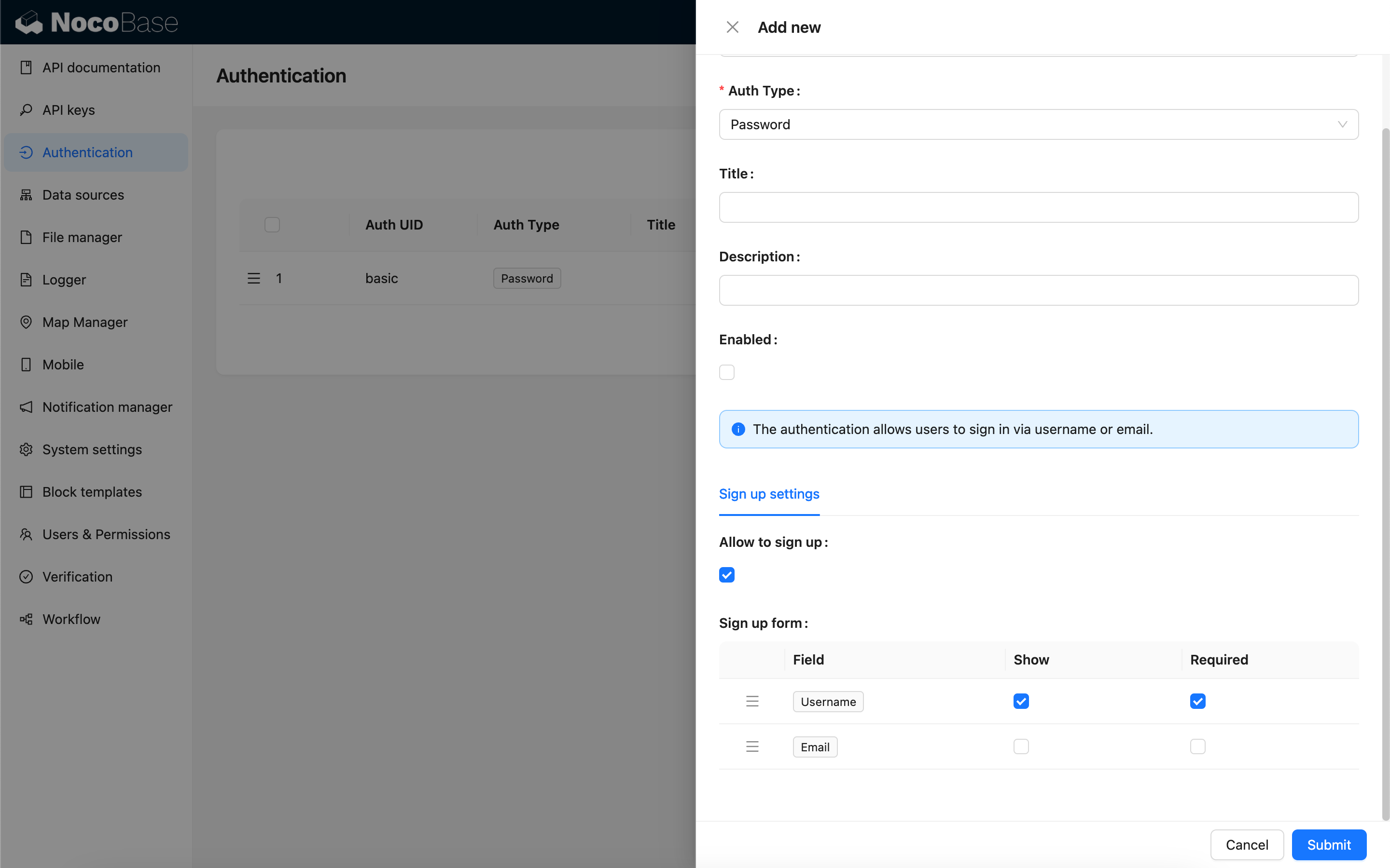
## Allow Sign Up
When sign up is allowed, the login page will display the link to create an account, and you can go to the sign up page.
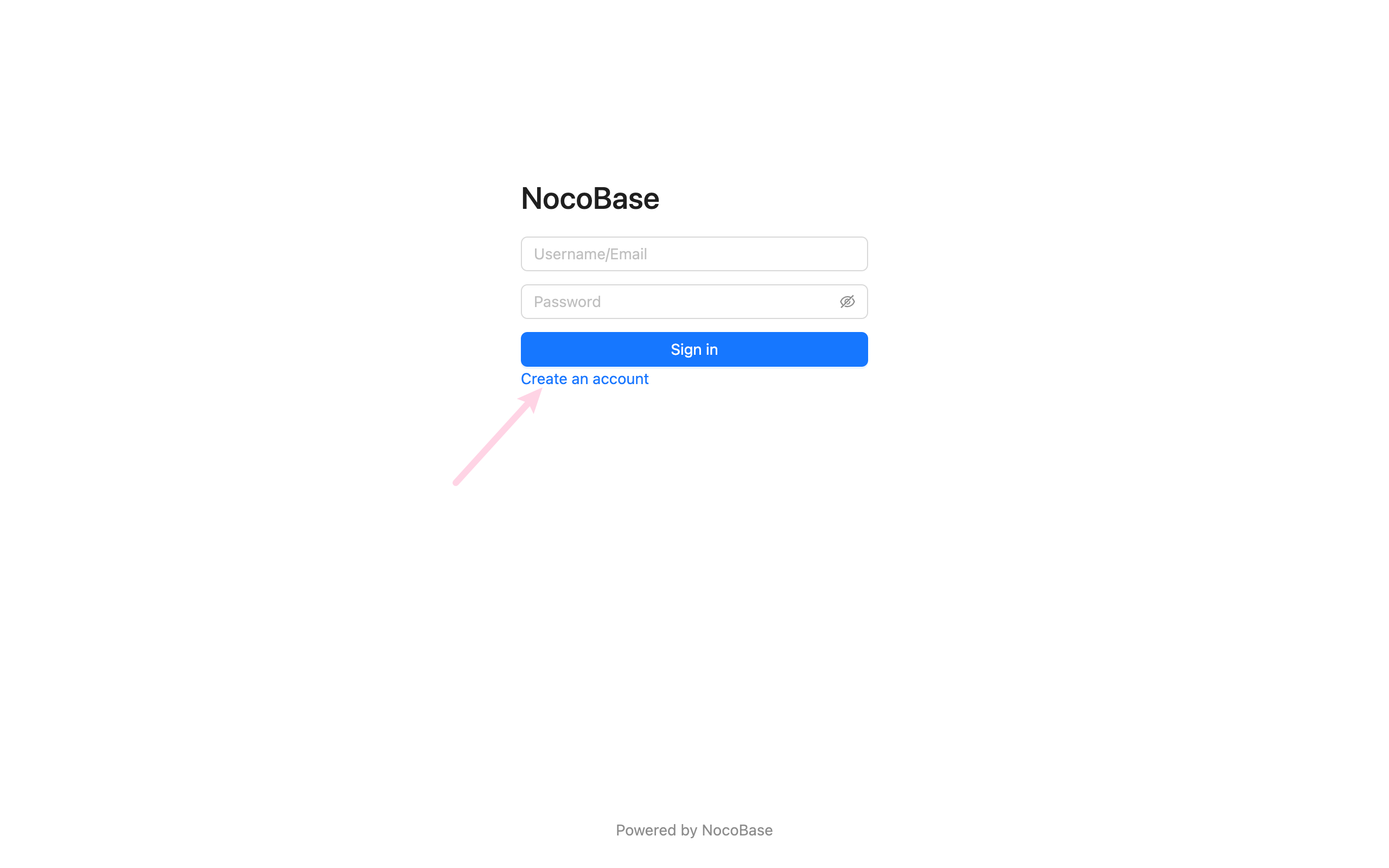
Sign up page

When sign up is not allowed, the login page will not display the link to create an account.
When sign up is not allowed, the sign up page cannot be accessed.
## Sign Up Form Settingsv1.4.0-beta.7+
You can set which fields in the user collection need to be displayed in the sign up form and whether they are required or not. At least one of username or email fields needs to be set to display and required.
Sign up page
## Forgot Passwordv1.8.0+
The forgot password feature allows users to reset their password via email verification if they forget it.
### Administrator Configuration
1. **Enable Forgot Password Feature**
In "Settings" > "Authentication" > "Forgot Password" tab, check the "Enable Forgot Password Feature" checkbox.
2. **Configure Notification Channel**
Select an email notification channel (currently only email is supported). If no notification channel is available, you need to add one first.
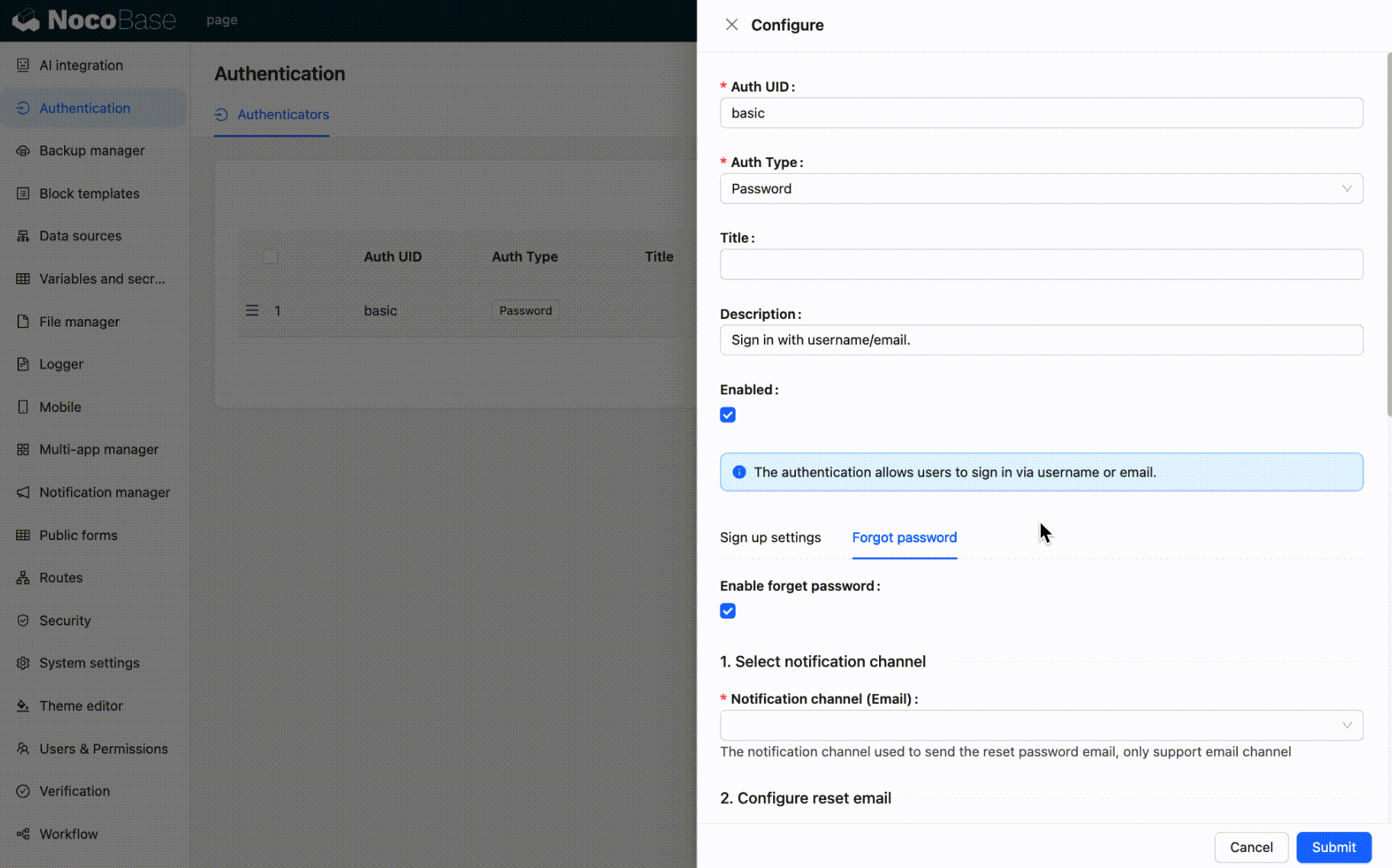
3. **Configure Password Reset Email**
Customize the email subject and content, supporting HTML or plain text format. You can use the following variables:
- Current user
- System settings
- Reset password link
- Reset link expiration (minutes)
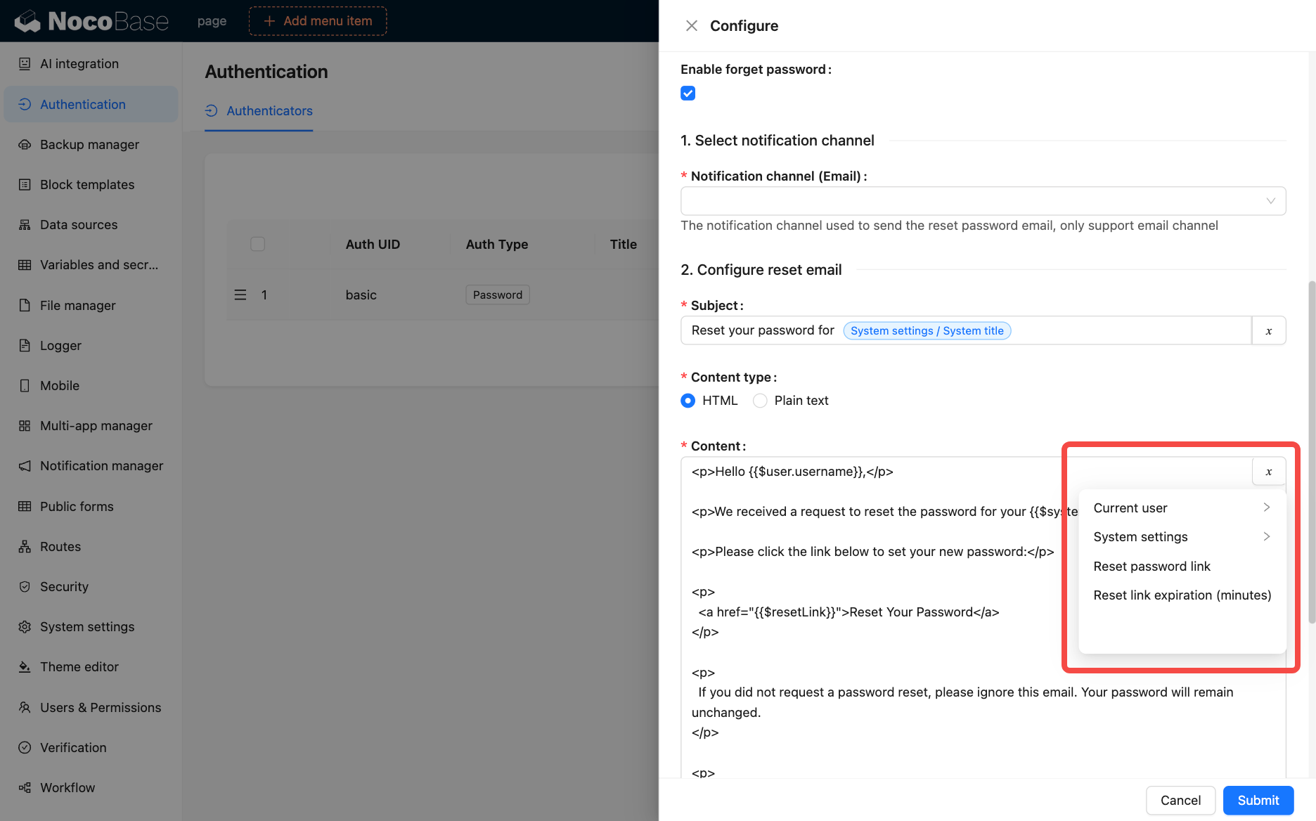
4. **Set Reset Link Expiration**
Set the validity period (in minutes) for the reset link, default is 120 minutes.
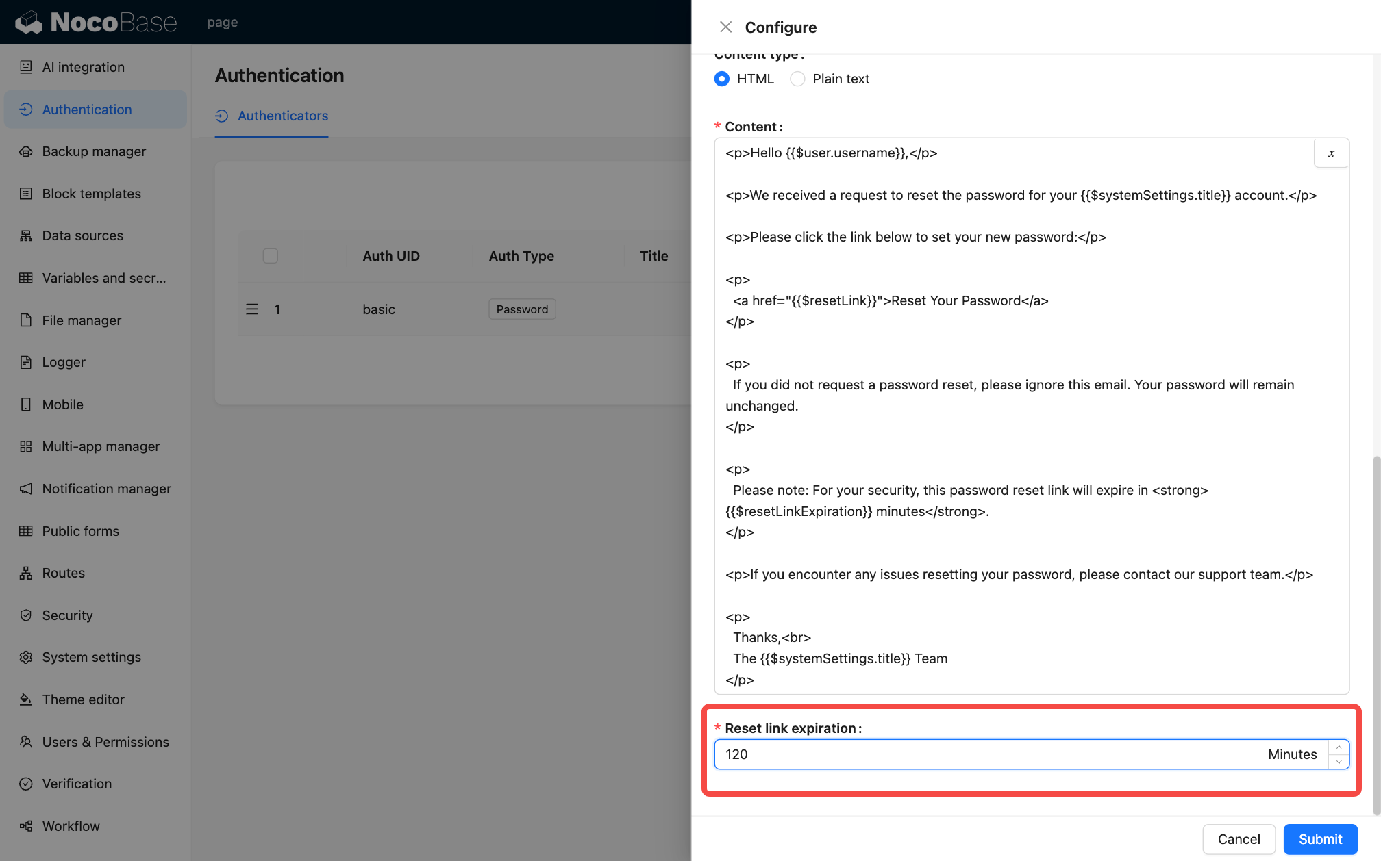
### User Workflow
1. **Initiate Password Reset Request**
Click the "Forgot Password" link on the login page (requires the administrator to enable the forgot password feature first) to go to the forgot password page.
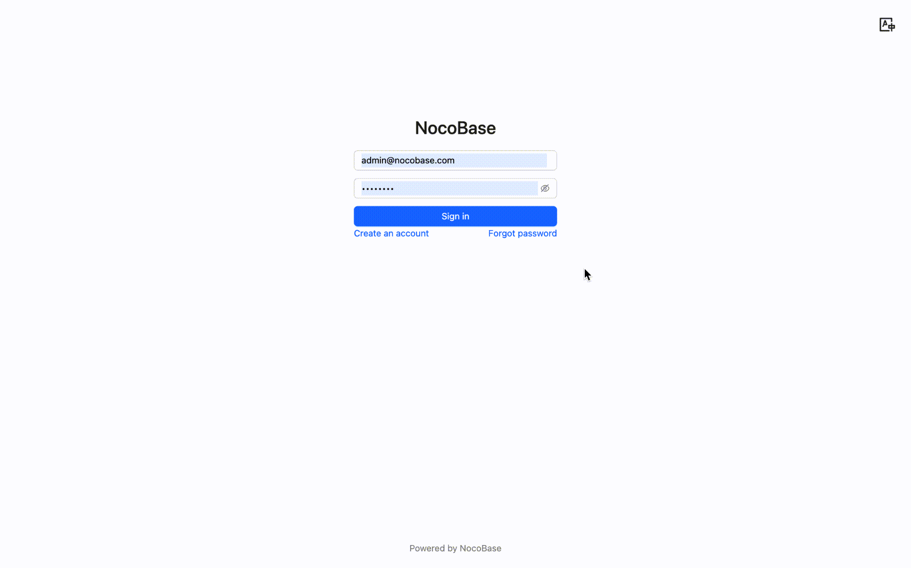
Enter the registered email address and click the "Send Reset Email" button.
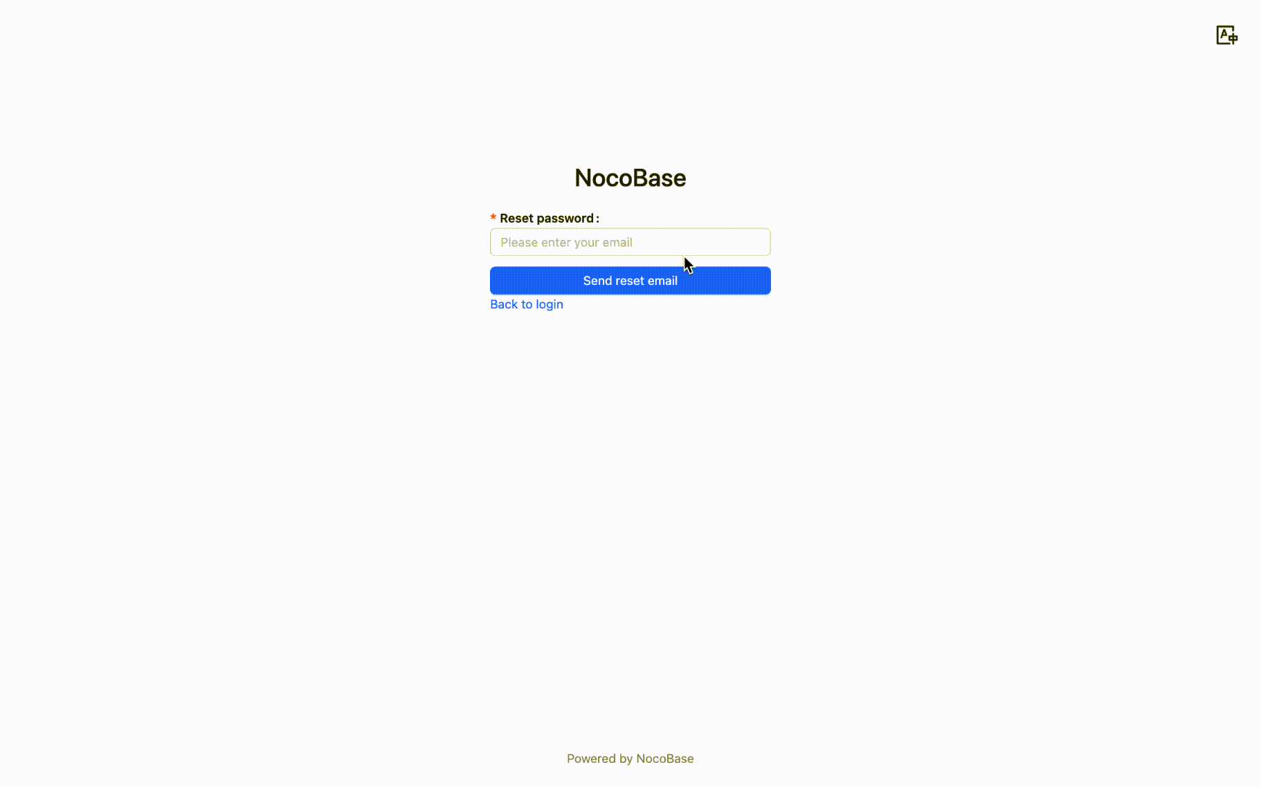
2. **Reset Password**
The user will receive an email containing a reset link. Click the link to open a page where you can set a new password.
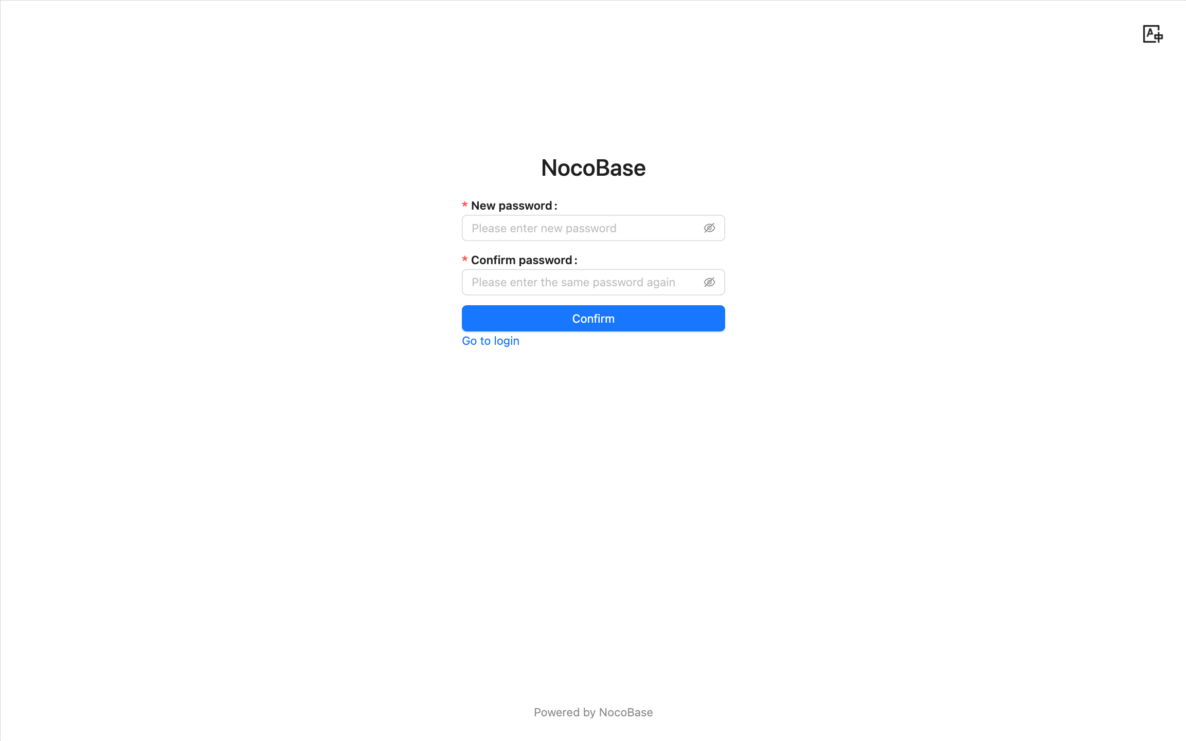
After setting it up, the user can log in to the system with the new password.
### Notes
- The reset link has a time limit, by default it is valid for 120 minutes after generation (configurable by the administrator).
- The link can only be used once and becomes invalid immediately after use.
- If the user does not receive the reset email, please check if the email address is correct or check the spam folder.
- The administrator should ensure that the mail server configuration is correct to guarantee that the reset email can be sent successfully.
---
url: /auth-verification/index.md
---
# Authentication and Verification
---
url: /auth-verification/verification-totp/index.md
---
# Verification: TOTP Authenticator
## Introduction
The TOTP Authenticator allows users to bind any authenticator that complies with the TOTP (Time-based One-Time Password) specification (RFC-6238), and perform identity verification using a time-based one-time password (TOTP).
## Administrator Configuration
Navigate to the Verification Management page.
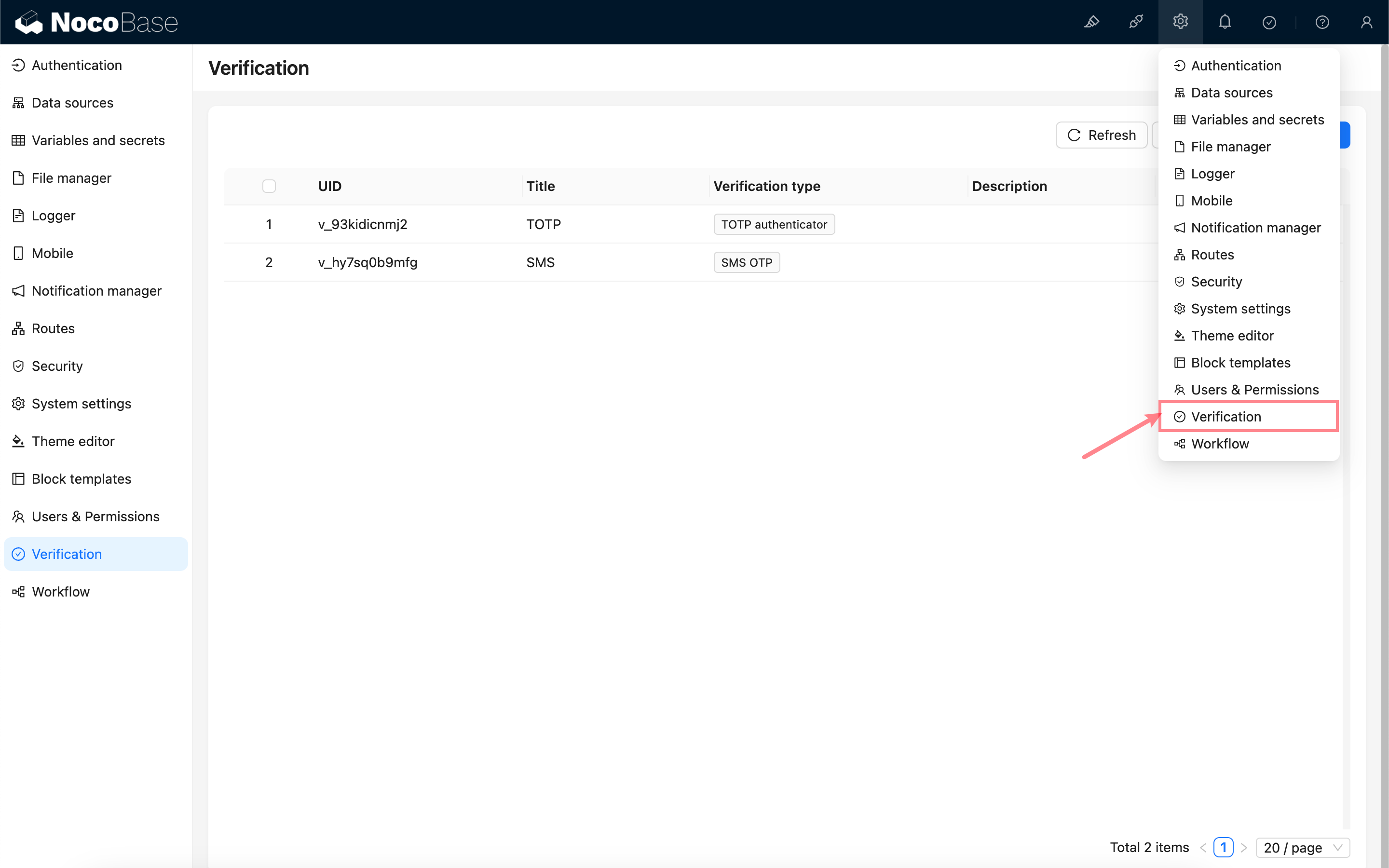
Add - TOTP Authenticator
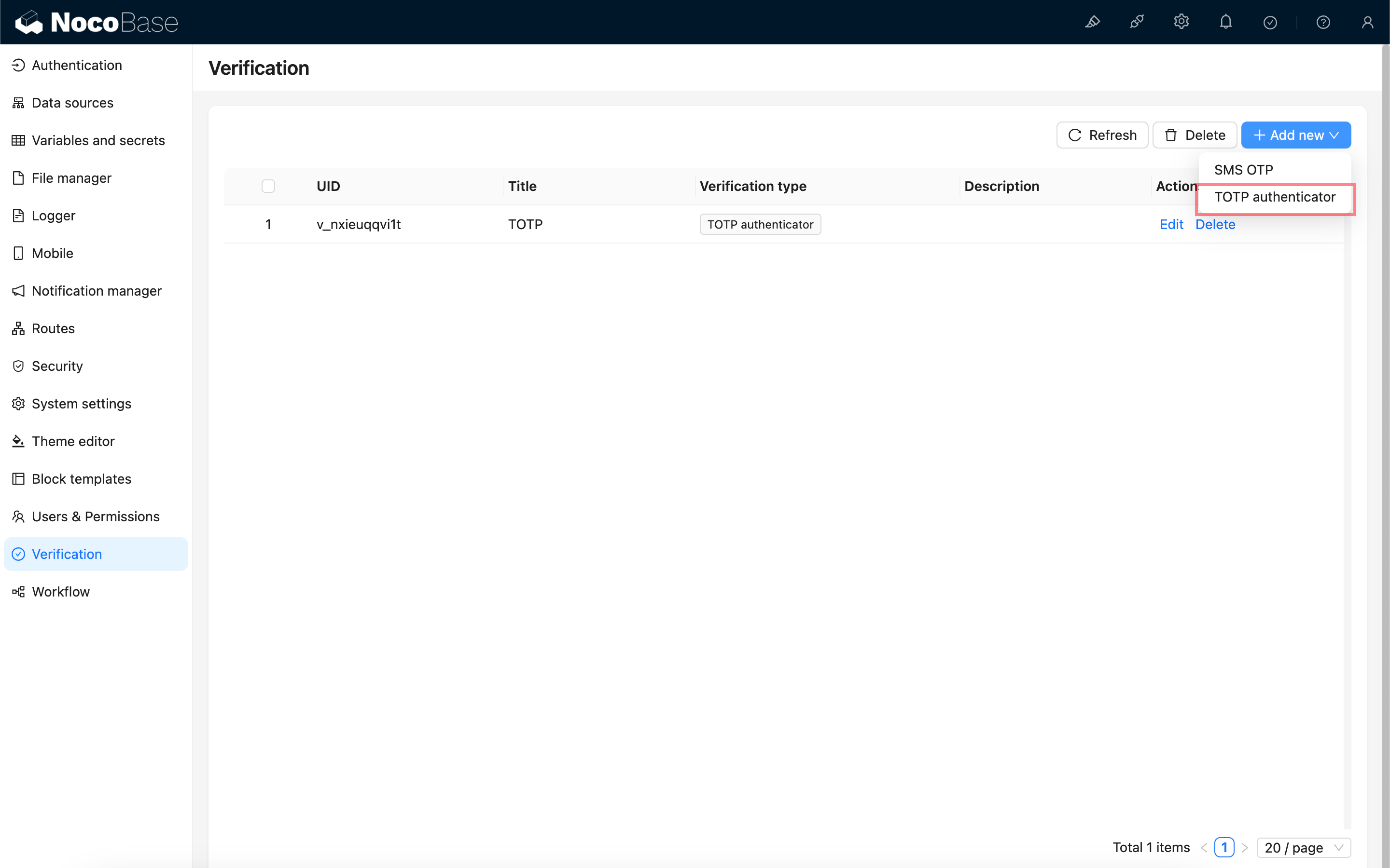
Apart from a unique identifier and title, no additional configuration is required for the TOTP authenticator.
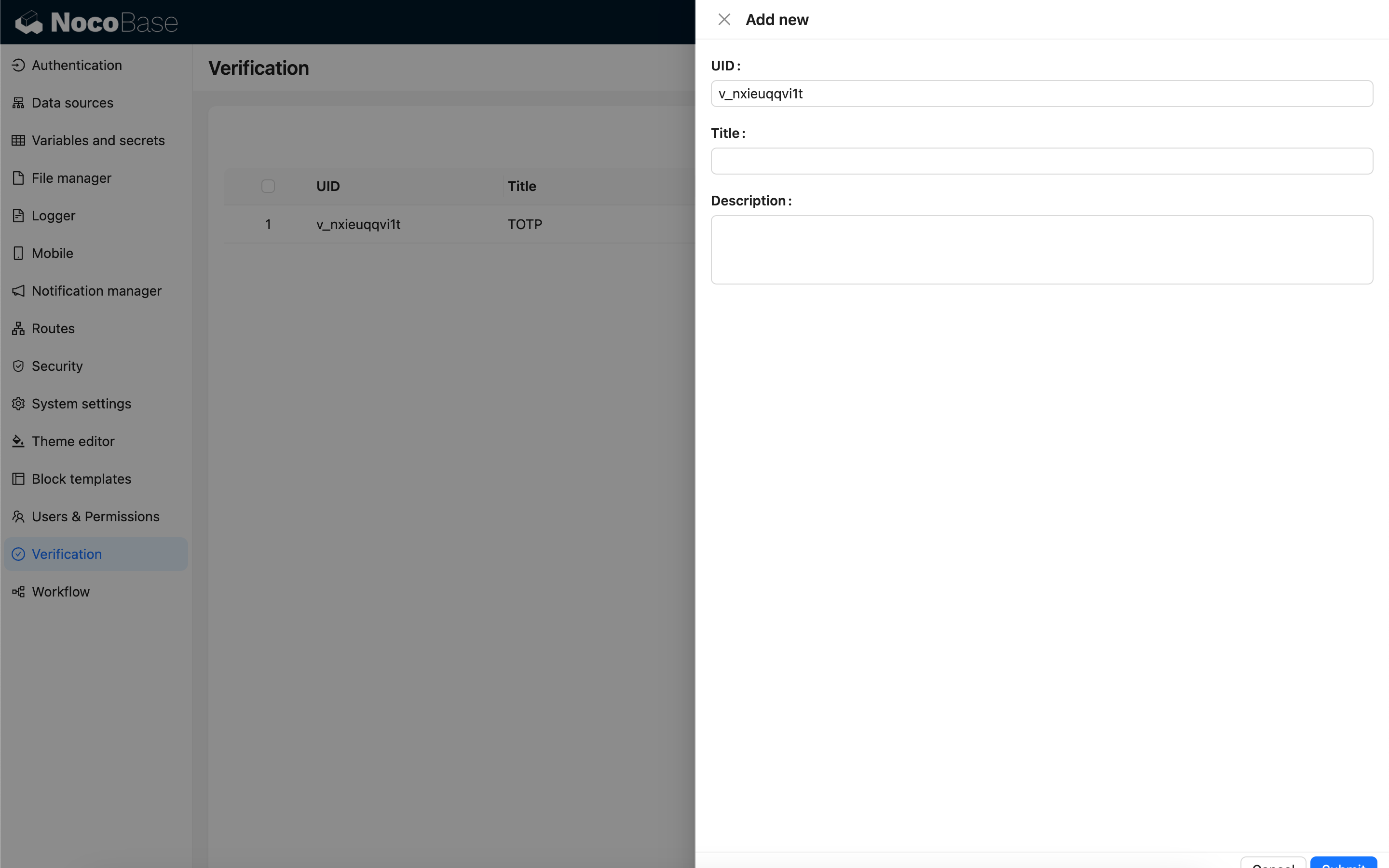
## User Binding
After adding the authenticator, users can bind the TOTP authenticator in their personal verification management area.
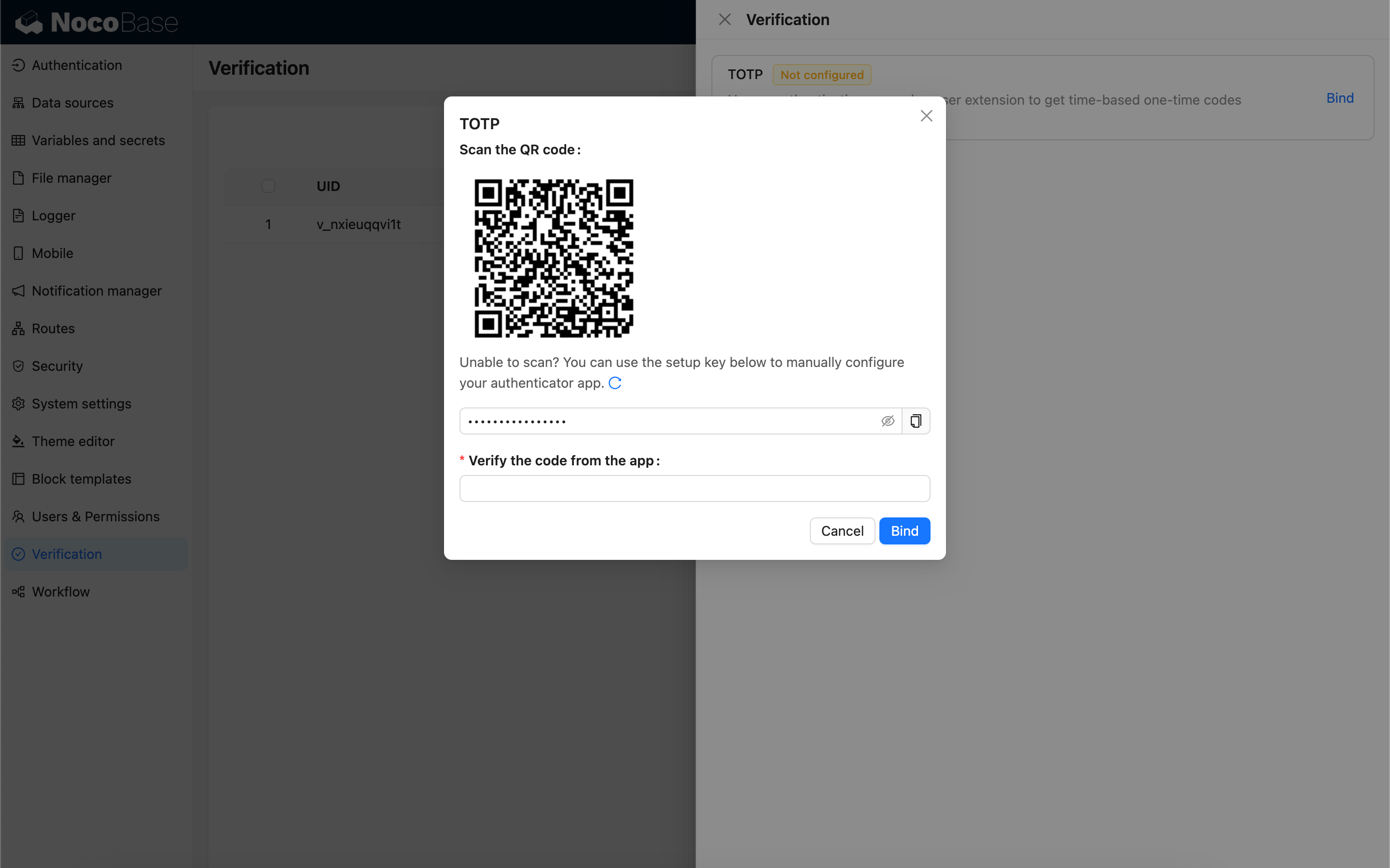
:::warning
The plugin does not currently provide a recovery code mechanism. Once the TOTP authenticator is bound, users are advised to keep it secure. If the authenticator is accidentally lost, they can use an alternative verification method to verify their identity, unbind the authenticator, and then rebind it.
:::
## User Unbinding
Unbinding the authenticator requires verification using the already bound verification method.
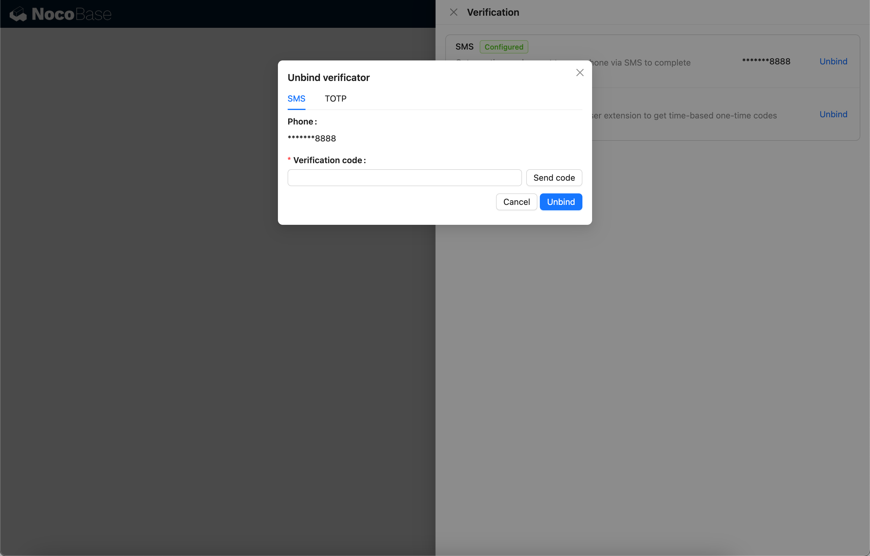
---
url: /auth-verification/verification/dev/scene.md
---
# Extending Validation Scenarios
## Basic Concepts
## Registering a Validation Action
## Registering a Validation Scenario
## Binding Scenarios and Validation Types
## Automatic Validation
## Manual Validation
---
url: /auth-verification/verification/dev/sms-type.md
---
# Extend SMS Provider
This article primarily explains how to extend the SMS provider functionality in the [Verification: SMS](../sms) feature via a plugin.
## Client
### Register Configuration Form
When configuring the SMS verifier, after selecting an SMS provider type, a configuration form associated with that provider type will appear. This configuration form needs to be registered by the developer on the client side.
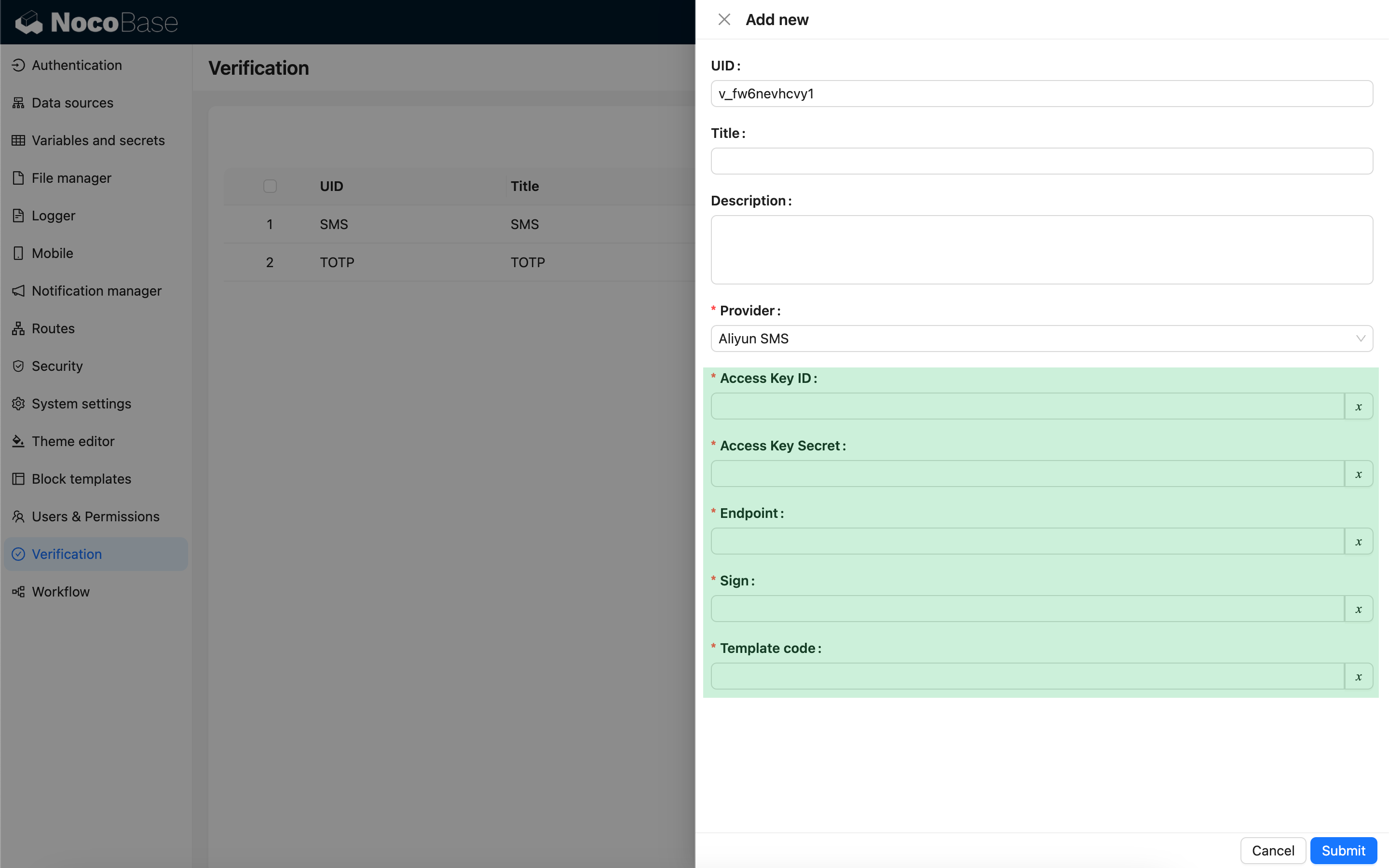
```ts
import { Plugin, SchemaComponent } from '@nocobase/client';
import PluginVerificationClient from '@nocobase/plugin-verification/client';
import React from 'react';
const CustomSMSProviderSettingsForm: React.FC = () => {
return
}
class PluginCustomSMSProviderClient extends Plugin {
async load() {
const plugin = this.app.pm.get('verification') as PluginVerificationClient;
plugin.smsOTPProviderManager.registerProvider('custom-sms-provider-name', {
components: {
AdminSettingsForm: CustomSMSProviderSettingsForm,
},
});
}
}
```
## Server
### Implement Sending Interface
The verification plugin has already encapsulated the process of creating one-time dynamic passwords (OTPs), so developers only need to implement the logic for sending messages to interact with the SMS provider.
```ts
class CustomSMSProvider extends SMSProvider {
constructor(options) {
super(options);
// options is the configuration object from the client
const options = this.options;
// ...
}
async send(phoneNumber: string, data: { code: string }) {
// ...
}
}
```
### Register Verification Type
Once the sending interface is implemented, it needs to be registered.
```ts
import { Plugin } from '@nocobase/server';
import PluginVerificationServer from '@nocobase/plugin-verification';
import { tval } from '@nocobase/utils';
class PluginCustomSMSProviderServer extends Plugin {
async load() {
const plugin = this.app.pm.get('verification') as PluginVerificationServer;
// The name must correspond to the one used on the client
plugin.smsOTPProviderManager.registerProvider('custom-sms-provider-name', {
title: tval('Custom SMS provider', { ns: namespace }),
provider: CustomSMSProvider,
});
}
}
```
---
url: /auth-verification/verification/dev/type.md
---
# Extending Validation Types
## Client-side
### Register the configuration form
## Server-side
### Implement the validation class
### Register the validation type
---
url: /auth-verification/verification/index.md
---
# Verification
:::info{title=Note}
Starting with `1.6.0-alpha.30`, the original "verification code" feature has been upgraded to "Verification Management", which supports managing and integrating various methods of user verification. Once users bind the corresponding verification method, they can perform identity verification when needed. This feature is planned to be stably supported beginning with version `1.7.0`.
:::
## Introduction
**The Verification Management Center supports managing and integrating various methods of user verification.** For example:
- SMS Verification Code – Provided by the verification plugin by default. Refer to: [Verification: SMS](./sms)
- TOTP Authenticator – Refer to: [Verification: TOTP Authenticator](../verification-totp/)
Developers can also extend other types of verification via plugins. Refer to: [Extending Verification Types](./dev/type)
**Users can perform identity verification when needed after binding the corresponding verification method.** For example:
- SMS Verification Login – Refer to: [Authentication: SMS](../auth-sms/index.md)
- Two-Factor Authentication (2FA) – Refer to: [Two-Factor Authentication (2FA)](../2fa/)
- Secondary Verification for Risk Operations – Future support
Developers can also integrate identity verification into other necessary scenarios by extending plugins. Refer to: [Extending Verification Scenarios](./dev/scene)
**Differences and Relationships Between the Verification Module and the User Authentication Module:** The User Authentication Module is primarily responsible for identity authentication during user login, with processes such as SMS login and two-factor authentication relying on verifiers provided by the Verification Module; meanwhile, the Verification Module handles identity verification for various high-risk operations, with user login being one of those scenarios.
---
url: /auth-verification/verification/sms.md
---
# Verification: SMS
## Introduction
The SMS verification code is a built-in verification type used to generate a one-time dynamic password (OTP) and send it to the user via SMS.
## Adding an SMS Verifier
Navigate to the verification management page.

Add - SMS OTP
## Administrator Configuration
Currently, the supported SMS service providers are:
- Aliyun SMS
- Tencent Cloud SMS
When configuring the SMS template in the service provider's admin panel, you need to reserve a parameter for the verification code.
- Aliyun configuration example: `Your verification code is: ${code}`
- Tencent Cloud configuration example: `Your verification code is: {1}`
Developers can also extend support for other SMS service providers in the form of plugins. See: [Extending SMS Service Providers](./dev/sms-type)
## User Binding
After adding the verifier, users can bind a phone number in their personal verification management.
Once the binding is successful, identity verification can be performed in any scenario that uses this verifier.
## User Unbinding
Unbinding a phone number requires verification through an existing bound method.

---
url: /calculation-engine/formula.md
---
# Formula.js
[Formula.js](http://formulajs.info/) provides a large collection of Excel-compatible functions.
## Function Reference
### Dates
| Function | Definition | Example call | Parameters | Expected result |
| :--- | :--- | :--- | :--- | :--- |
| **DATE** | Creates a date based on the supplied year, month, and day. | `DATE(2008, 7, 8)` | Year (integer), month (1-12), day (1-31). | Tue Jul 08 2008 00:00:00 GMT-0700 (PDT) |
| **DATEVALUE** | Converts a date in text format to a date serial number. | `DATEVALUE('8/22/2011')` | Text string that represents a date. | Mon Aug 22 2011 00:00:00 GMT-0700 (PDT) |
| **DAY** | Returns the day portion of a date. | `DAY('15-Apr-11')` | Date value or a date text string. | 15 |
| **DAYS** | Calculates the number of days between two dates. | `DAYS('3/15/11', '2/1/11')` | End date, start date. | 42 |
| **DAYS360** | Calculates the number of days between two dates based on a 360-day year. | `DAYS360('1-Jan-11', '31-Dec-11')` | Start date, end date. | 360 |
| **EDATE** | Returns the date that is a specified number of months before or after a date. | `EDATE('1/15/11', -1)` | Start date, number of months (positive for future, negative for past). | Wed Dec 15 2010 00:00:00 GMT-0800 (PST) |
| **EOMONTH** | Returns the last day of the month before or after the specified number of months. | `EOMONTH('1/1/11', -3)` | Start date, number of months (positive for future, negative for past). | Sun Oct 31 2010 00:00:00 GMT-0700 (PDT) |
| **HOUR** | Returns the hour portion of a time value. | `HOUR('7/18/2011 7:45:00 AM')` | Time value or time text string. | 7 |
| **MINUTE** | Returns the minute portion of a time value. | `MINUTE('2/1/2011 12:45:00 PM')` | Time value or time text string. | 45 |
| **ISOWEEKNUM** | Returns the ISO week number of the year for a given date. | `ISOWEEKNUM('3/9/2012')` | Date value or a date text string. | 10 |
| **MONTH** | Returns the month portion of a date. | `MONTH('15-Apr-11')` | Date value or a date text string. | 4 |
| **NETWORKDAYS** | Counts the number of working days between two dates, excluding weekends and optional holidays. | `NETWORKDAYS('10/1/2012', '3/1/2013', ['11/22/2012'])` | Start date, end date, optional array of holidays. | 109 |
| **NETWORKDAYSINTL** | Counts working days between two dates, allowing custom weekends and optional holidays. | `NETWORKDAYSINTL('1/1/2006', '2/1/2006', 7, ['1/2/2006'])` | Start date, end date, weekend mode, optional array of holidays. | 23 |
| **NOW** | Returns the current date and time. | `NOW()` | No parameters. | Thu Feb 20 2020 23:02:55 GMT+0100 (Central European Standard Time) |
| **SECOND** | Returns the seconds portion of a time value. | `SECOND('2/1/2011 4:48:18 PM')` | Time value or time text string. | 18 |
| **TIME** | Builds a time value from the supplied hour, minute, and second. | `TIME(16, 48, 10)` | Hour (0-23), minute (0-59), second (0-59). | 0.7001157407407408 |
| **TIMEVALUE** | Converts a time in text format to a time serial number. | `TIMEVALUE('22-Aug-2011 6:35 AM')` | Text string that represents a time. | 0.2743055555555556 |
| **TODAY** | Returns the current date. | `TODAY()` | No parameters. | Thu Feb 20 2020 23:02:55 GMT+0100 (Central European Standard Time) |
| **WEEKDAY** | Returns the number corresponding to the day of the week. | `WEEKDAY('2/14/2008', 3)` | Date value or a date text string, return type (1-3). | 3 |
| **YEAR** | Returns the year portion of a date. | `YEAR('7/5/2008')` | Date value or a date text string. | 2008 |
| **WEEKNUM** | Returns the week number in a year for a given date. | `WEEKNUM('3/9/2012', 2)` | Date value or a date text string, optional week starting day (1=Sunday, 2=Monday). | 11 |
| **WORKDAY** | Returns the date before or after a given number of working days, excluding weekends and optional holidays. | `WORKDAY('10/1/2008', 151, ['11/26/2008', '12/4/2008'])` | Start date, number of working days, optional array of holidays. | Mon May 04 2009 00:00:00 GMT-0700 (PDT) |
| **WORKDAYINTL** | Returns the date before or after a number of working days with custom weekends and optional holidays. | `WORKDAYINTL('1/1/2012', 30, 17)` | Start date, number of working days, weekend mode. | Sun Feb 05 2012 00:00:00 GMT-0800 (PST) |
| **YEARFRAC** | Calculates the fractional number of years between two dates. | `YEARFRAC('1/1/2012', '7/30/2012', 3)` | Start date, end date, optional basis (day-count basis). | 0.5780821917808219 |
### Financial
| Function | Definition | Example call | Parameters | Expected result |
| :--- | :--- | :--- | :--- | :--- |
| **ACCRINT** | Calculates accrued interest for a security that pays periodic interest. | `ACCRINT('01/01/2011', '02/01/2011', '07/01/2014', 0.1, 1000, 1, 0)` | Issue date, first interest date, settlement date, annual rate, par value, frequency, basis. | 350 |
| **CUMIPMT** | Calculates the cumulative interest paid on a series of payments. | `CUMIPMT(0.1/12, 30*12, 100000, 13, 24, 0)` | Rate, total periods, present value, start period, end period, payment type (0=end, 1=beginning). | -9916.77251395708 |
| **CUMPRINC** | Calculates the cumulative principal paid on a series of payments. | `CUMPRINC(0.1/12, 30*12, 100000, 13, 24, 0)` | Rate, total periods, present value, start period, end period, payment type (0=end, 1=beginning). | -614.0863271085149 |
| **DB** | Calculates depreciation using the fixed-declining balance method. | `DB(1000000, 100000, 6, 1, 6)` | Cost, salvage value, life, period, month. | 159500 |
| **DDB** | Calculates depreciation using double-declining balance or another specified method. | `DDB(1000000, 100000, 6, 1, 1.5)` | Cost, salvage value, life, period, factor. | 250000 |
| **DOLLARDE** | Converts a price expressed as a fraction to a decimal. | `DOLLARDE(1.1, 16)` | Price as a fractional dollar, denominator. | 1.625 |
| **DOLLARFR** | Converts a price expressed as a decimal to a fraction. | `DOLLARFR(1.625, 16)` | Price as a decimal dollar, denominator. | 1.1 |
| **EFFECT** | Calculates the effective annual interest rate. | `EFFECT(0.1, 4)` | Nominal annual rate, number of compounding periods per year. | 0.10381289062499977 |
| **FV** | Calculates the future value of an investment. | `FV(0.1/12, 10, -100, -1000, 0)` | Rate per period, number of periods, payment per period, present value, payment type (0=end, 1=beginning). | 2124.874409194097 |
| **FVSCHEDULE** | Calculates the future value of principal using a series of compounding rates. | `FVSCHEDULE(100, [0.09,0.1,0.11])` | Principal, array of rates. | 133.08900000000003 |
| **IPMT** | Calculates the interest payment for a specific period. | `IPMT(0.1/12, 6, 2*12, 100000, 1000000, 0)` | Rate per period, period, total periods, present value, future value, payment type (0=end, 1=beginning). | 928.8235718400465 |
| **IRR** | Calculates the internal rate of return. | `IRR([-75000,12000,15000,18000,21000,24000], 0.075)` | Array of cash flows, guess. | 0.05715142887178447 |
| **ISPMT** | Calculates the interest paid during a specific period (for loans). | `ISPMT(0.1/12, 6, 2*12, 100000)` | Rate per period, period, total periods, loan amount. | -625 |
| **MIRR** | Calculates the modified internal rate of return. | `MIRR([-75000,12000,15000,18000,21000,24000], 0.1, 0.12)` | Array of cash flows, finance rate, reinvestment rate. | 0.07971710360838036 |
| **NOMINAL** | Calculates the nominal annual interest rate. | `NOMINAL(0.1, 4)` | Effective annual rate, number of compounding periods per year. | 0.09645475633778045 |
| **NPER** | Calculates the number of periods required to reach a target value. | `NPER(0.1/12, -100, -1000, 10000, 0)` | Rate per period, payment per period, present value, future value, payment type (0=end, 1=beginning). | 63.39385422740764 |
| **NPV** | Calculates the net present value of a series of future cash flows. | `NPV(0.1, -10000, 2000, 4000, 8000)` | Discount rate per period, array of cash flows. | 1031.3503176012546 |
| **PDURATION** | Calculates the time required to reach a desired value. | `PDURATION(0.1, 1000, 2000)` | Rate per period, present value, future value. | 7.272540897341714 |
| **PMT** | Calculates the periodic payment for a loan. | `PMT(0.1/12, 2*12, 1000, 10000, 0)` | Rate per period, total periods, present value, future value, payment type (0=end, 1=beginning). | -42426.08563793503 |
| **PPMT** | Calculates the principal payment for a specific period. | `PPMT(0.1/12, 6, 2*12, 100000, 1000000, 0)` | Rate per period, period, total periods, present value, future value, payment type (0=end, 1=beginning). | -43354.909209775076 |
| **PV** | Calculates the present value of an investment. | `PV(0.1/12, 2*12, 1000, 10000, 0)` | Rate per period, number of periods, payment per period, future value, payment type (0=end, 1=beginning). | -29864.950264779152 |
| **RATE** | Calculates the interest rate per period. | `RATE(2*12, -1000, -10000, 100000, 0, 0.1)` | Total periods, payment per period, present value, future value, payment type (0=end, 1=beginning), guess. | 0.06517891177181533 |
### Engineering
| Function | Definition | Example call | Parameters | Expected result |
| :--- | :--- | :--- | :--- | :--- |
| **BIN2DEC** | Converts a binary number to decimal. | `BIN2DEC(101010)` | Binary number. | 42 |
| **BIN2HEX** | Converts a binary number to hexadecimal. | `BIN2HEX(101010)` | Binary number. | 2a |
| **BIN2OCT** | Converts a binary number to octal. | `BIN2OCT(101010)` | Binary number. | 52 |
| **BITAND** | Returns the bitwise AND of two numbers. | `BITAND(42, 24)` | Integer, integer. | 8 |
| **BITLSHIFT** | Performs a bitwise left shift. | `BITLSHIFT(42, 24)` | Integer, number of bits to shift. | 704643072 |
| **BITOR** | Returns the bitwise OR of two numbers. | `BITOR(42, 24)` | Integer, integer. | 58 |
| **BITRSHIFT** | Performs a bitwise right shift. | `BITRSHIFT(42, 2)` | Integer, number of bits to shift. | 10 |
| **BITXOR** | Returns the bitwise XOR of two numbers. | `BITXOR(42, 24)` | Integer, integer. | 50 |
| **COMPLEX** | Creates a complex number. | `COMPLEX(3, 4)` | Real part, imaginary part. | 3+4i |
| **CONVERT** | Converts a number from one measurement unit to another. | `CONVERT(64, 'kibyte', 'bit')` | Value, from unit, to unit. | 524288 |
| **DEC2BIN** | Converts a decimal number to binary. | `DEC2BIN(42)` | Decimal number. | 101010 |
| **DEC2HEX** | Converts a decimal number to hexadecimal. | `DEC2HEX(42)` | Decimal number. | 2a |
| **DEC2OCT** | Converts a decimal number to octal. | `DEC2OCT(42)` | Decimal number. | 52 |
| **DELTA** | Tests whether two values are equal. | `DELTA(42, 42)` | Number, number. | 1 |
| **ERF** | Returns the error function. | `ERF(1)` | Upper limit. | 0.8427007929497149 |
| **ERFC** | Returns the complementary error function. | `ERFC(1)` | Lower limit. | 0.1572992070502851 |
| **GESTEP** | Tests whether a number is greater than or equal to a threshold. | `GESTEP(42, 24)` | Number, threshold. | 1 |
| **HEX2BIN** | Converts a hexadecimal number to binary. | `HEX2BIN('2a')` | Hexadecimal number. | 101010 |
| **HEX2DEC** | Converts a hexadecimal number to decimal. | `HEX2DEC('2a')` | Hexadecimal number. | 42 |
| **HEX2OCT** | Converts a hexadecimal number to octal. | `HEX2OCT('2a')` | Hexadecimal number. | 52 |
| **IMABS** | Returns the absolute value (magnitude) of a complex number. | `IMABS('3+4i')` | Complex number. | 5 |
| **IMAGINARY** | Returns the imaginary part of a complex number. | `IMAGINARY('3+4i')` | Complex number. | 4 |
| **IMARGUMENT** | Returns the argument of a complex number. | `IMARGUMENT('3+4i')` | Complex number. | 0.9272952180016122 |
| **IMCONJUGATE** | Returns the complex conjugate. | `IMCONJUGATE('3+4i')` | Complex number. | 3-4i |
| **IMCOS** | Returns the cosine of a complex number. | `IMCOS('1+i')` | Complex number. | 0.8337300251311491-0.9888977057628651i |
| **IMCOSH** | Returns the hyperbolic cosine of a complex number. | `IMCOSH('1+i')` | Complex number. | 0.8337300251311491+0.9888977057628651i |
| **IMCOT** | Returns the cotangent of a complex number. | `IMCOT('1+i')` | Complex number. | 0.21762156185440265-0.8680141428959249i |
| **IMCSC** | Returns the cosecant of a complex number. | `IMCSC('1+i')` | Complex number. | 0.6215180171704283-0.3039310016284264i |
| **IMCSCH** | Returns the hyperbolic cosecant of a complex number. | `IMCSCH('1+i')` | Complex number. | 0.3039310016284264-0.6215180171704283i |
| **IMDIV** | Returns the quotient of two complex numbers. | `IMDIV('1+2i', '3+4i')` | Dividend complex number, divisor complex number. | 0.44+0.08i |
| **IMEXP** | Returns the exponential of a complex number. | `IMEXP('1+i')` | Complex number. | 1.4686939399158851+2.2873552871788423i |
| **IMLN** | Returns the natural logarithm of a complex number. | `IMLN('1+i')` | Complex number. | 0.3465735902799727+0.7853981633974483i |
| **IMLOG10** | Returns the base-10 logarithm of a complex number. | `IMLOG10('1+i')` | Complex number. | 0.1505149978319906+0.3410940884604603i |
| **IMLOG2** | Returns the base-2 logarithm of a complex number. | `IMLOG2('1+i')` | Complex number. | 0.5000000000000001+1.1330900354567985i |
| **IMPOWER** | Returns a complex number raised to a power. | `IMPOWER('1+i', 2)` | Complex number, exponent. | 1.2246063538223775e-16+2.0000000000000004i |
| **IMPRODUCT** | Returns the product of complex numbers. | `IMPRODUCT('1+2i', '3+4i', '5+6i')` | Array of complex numbers. | -85+20i |
| **IMREAL** | Returns the real part of a complex number. | `IMREAL('3+4i')` | Complex number. | 3 |
| **IMSEC** | Returns the secant of a complex number. | `IMSEC('1+i')` | Complex number. | 0.4983370305551868+0.591083841721045i |
| **IMSECH** | Returns the hyperbolic secant of a complex number. | `IMSECH('1+i')` | Complex number. | 0.4983370305551868-0.591083841721045i |
| **IMSIN** | Returns the sine of a complex number. | `IMSIN('1+i')` | Complex number. | 1.2984575814159773+0.6349639147847361i |
| **IMSINH** | Returns the hyperbolic sine of a complex number. | `IMSINH('1+i')` | Complex number. | 0.6349639147847361+1.2984575814159773i |
| **IMSQRT** | Returns the square root of a complex number. | `IMSQRT('1+i')` | Complex number. | 1.0986841134678098+0.45508986056222733i |
| **IMSUB** | Returns the difference between two complex numbers. | `IMSUB('3+4i', '1+2i')` | Minuend complex number, subtrahend complex number. | 2+2i |
| **IMSUM** | Returns the sum of complex numbers. | `IMSUM('1+2i', '3+4i', '5+6i')` | Array of complex numbers. | 9+12i |
| **IMTAN** | Returns the tangent of a complex number. | `IMTAN('1+i')` | Complex number. | 0.2717525853195117+1.0839233273386946i |
| **OCT2BIN** | Converts an octal number to binary. | `OCT2BIN('52')` | Octal number. | 101010 |
| **OCT2DEC** | Converts an octal number to decimal. | `OCT2DEC('52')` | Octal number. | 42 |
| **OCT2HEX** | Converts an octal number to hexadecimal. | `OCT2HEX('52')` | Octal number. | 2a |
### Logic
| Function | Definition | Example call | Parameters | Expected result |
| :--- | :--- | :--- | :--- | :--- |
| **AND** | Returns TRUE only when all arguments are TRUE, otherwise FALSE. | `AND(true, false, true)` | One or more logical values (Boolean); the function returns TRUE only when every argument is TRUE. | |
| **FALSE** | Returns the logical value FALSE. | `FALSE()` | No parameters. | |
| **IF** | Returns different values depending on whether a condition is TRUE or FALSE. | `IF(true, 'Hello!', 'Goodbye!')` | Condition, value if TRUE, value if FALSE. | Hello! |
| **IFS** | Evaluates multiple conditions and returns the result of the first TRUE condition. | `IFS(false, 'Hello!', true, 'Goodbye!')` | Multiple pairs of condition and corresponding value. | Goodbye! |
| **NOT** | Reverses a logical value. TRUE becomes FALSE and vice versa. | `NOT(true)` | One logical value (Boolean). | |
| **OR** | Returns TRUE if any argument is TRUE, otherwise FALSE. | `OR(true, false, true)` | One or more logical values (Boolean); returns TRUE when any argument is TRUE. | |
| **SWITCH** | Returns the value that matches an expression; if none match, returns the default. | `SWITCH(7, 9, 'Nine', 7, 'Seven')` | Expression, match value 1, result 1, …, [default]. | Seven |
| **TRUE** | Returns the logical value TRUE. | `TRUE()` | No parameters. | |
| **XOR** | Returns TRUE only when an odd number of arguments are TRUE, otherwise FALSE. | `XOR(true, false, true)` | One or more logical values (Boolean); returns TRUE when an odd count are TRUE. | |
### Math
| Function | Definition | Example call | Parameters | Expected result |
| :--- | :--- | :--- | :--- | :--- |
| **ABS** | Returns the absolute value of a number. | `ABS(-4)` | Number. | 4 |
| **ACOS** | Returns the arccosine (in radians). | `ACOS(-0.5)` | Number between -1 and 1. | 2.0943951023931957 |
| **ACOSH** | Returns the inverse hyperbolic cosine. | `ACOSH(10)` | Number greater than or equal to 1. | 2.993222846126381 |
| **ACOT** | Returns the arccotangent (in radians). | `ACOT(2)` | Any number. | 0.46364760900080615 |
| **ACOTH** | Returns the inverse hyperbolic cotangent. | `ACOTH(6)` | Number whose absolute value is greater than 1. | 0.16823611831060645 |
| **AGGREGATE** | Performs an aggregate calculation while ignoring errors or hidden rows. | `AGGREGATE(9, 4, [-5,15], [32,'Hello World!'])` | Function number, options, array1, …, arrayN. | 10,32 |
| **ARABIC** | Converts a Roman numeral to Arabic. | `ARABIC('MCMXII')` | Roman numeral string. | 1912 |
| **ASIN** | Returns the arcsine (in radians). | `ASIN(-0.5)` | Number between -1 and 1. | -0.5235987755982988 |
| **ASINH** | Returns the inverse hyperbolic sine. | `ASINH(-2.5)` | Any number. | -1.6472311463710965 |
| **ATAN** | Returns the arctangent (in radians). | `ATAN(1)` | Any number. | 0.7853981633974483 |
| **ATAN2** | Returns the arctangent (in radians) of a coordinate pair. | `ATAN2(-1, -1)` | y-coordinate, x-coordinate. | -2.356194490192345 |
| **ATANH** | Returns the inverse hyperbolic tangent. | `ATANH(-0.1)` | Number between -1 and 1. | -0.10033534773107562 |
| **BASE** | Converts a number to text in the specified base. | `BASE(15, 2, 10)` | Number, radix, [minimum length]. | 0000001111 |
| **CEILING** | Rounds a number up to the nearest multiple. | `CEILING(-5.5, 2, -1)` | Number, significance, [mode]. | -6 |
| **CEILINGMATH** | Rounds a number up, using the supplied multiple and direction. | `CEILINGMATH(-5.5, 2, -1)` | Number, [significance], [mode]. | -6 |
| **CEILINGPRECISE** | Rounds a number up to the nearest multiple, ignoring sign. | `CEILINGPRECISE(-4.1, -2)` | Number, [significance]. | -4 |
| **COMBIN** | Returns the number of combinations. | `COMBIN(8, 2)` | Total items, number chosen. | 28 |
| **COMBINA** | Returns the number of combinations with repetitions. | `COMBINA(4, 3)` | Total items, number chosen. | 20 |
| **COS** | Returns the cosine (in radians). | `COS(1)` | Angle in radians. | 0.5403023058681398 |
| **COSH** | Returns the hyperbolic cosine. | `COSH(1)` | Any number. | 1.5430806348152437 |
| **COT** | Returns the cotangent (in radians). | `COT(30)` | Angle in radians. | -0.15611995216165922 |
| **COTH** | Returns the hyperbolic cotangent. | `COTH(2)` | Any number. | 1.0373147207275482 |
| **CSC** | Returns the cosecant (in radians). | `CSC(15)` | Angle in radians. | 1.5377805615408537 |
| **CSCH** | Returns the hyperbolic cosecant. | `CSCH(1.5)` | Any number. | 0.46964244059522464 |
| **DECIMAL** | Converts a number in text form to decimal. | `DECIMAL('FF', 16)` | Text, base. | 255 |
| **ERF** | Returns the error function. | `ERF(1)` | Upper limit. | 0.8427007929497149 |
| **ERFC** | Returns the complementary error function. | `ERFC(1)` | Lower limit. | 0.1572992070502851 |
| **EVEN** | Rounds a number up to the nearest even integer. | `EVEN(-1)` | Number. | -2 |
| **EXP** | Returns e raised to a power. | `EXP(1)` | Exponent. | 2.718281828459045 |
| **FACT** | Returns the factorial. | `FACT(5)` | Non-negative integer. | 120 |
| **FACTDOUBLE** | Returns the double factorial. | `FACTDOUBLE(7)` | Non-negative integer. | 105 |
| **FLOOR** | Rounds a number down to the nearest multiple. | `FLOOR(-3.1)` | Number, significance. | -4 |
| **FLOORMATH** | Rounds a number down using the supplied multiple and direction. | `FLOORMATH(-4.1, -2, -1)` | Number, [significance], [mode]. | -4 |
| **FLOORPRECISE** | Rounds a number down to the nearest multiple, ignoring sign. | `FLOORPRECISE(-3.1, -2)` | Number, [significance]. | -4 |
| **GCD** | Returns the greatest common divisor. | `GCD(24, 36, 48)` | Two or more integers. | 12 |
| **INT** | Rounds a number down to the nearest integer. | `INT(-8.9)` | Number. | -9 |
| **ISEVEN** | Tests whether a number is even. | `ISEVEN(-2.5)` | Number. | |
| **ISOCEILING** | Rounds a number up to the nearest multiple following ISO rules. | `ISOCEILING(-4.1, -2)` | Number, [significance]. | -4 |
| **ISODD** | Tests whether a number is odd. | `ISODD(-2.5)` | Number. | |
| **LCM** | Returns the least common multiple. | `LCM(24, 36, 48)` | Two or more integers. | 144 |
| **LN** | Returns the natural logarithm. | `LN(86)` | Positive number. | 4.454347296253507 |
| **LOG** | Returns the logarithm in the specified base. | `LOG(8, 2)` | Number, base. | 3 |
| **LOG10** | Returns the base-10 logarithm. | `LOG10(100000)` | Positive number. | 5 |
| **MOD** | Returns the remainder of a division. | `MOD(3, -2)` | Dividend, divisor. | -1 |
| **MROUND** | Rounds a number to the nearest multiple. | `MROUND(-10, -3)` | Number, multiple. | -9 |
| **MULTINOMIAL** | Returns the multinomial coefficient. | `MULTINOMIAL(2, 3, 4)` | Two or more non-negative integers. | 1260 |
| **ODD** | Rounds a number up to the nearest odd integer. | `ODD(-1.5)` | Number. | -3 |
| **POWER** | Raises a number to a power. | `POWER(5, 2)` | Base, exponent. | 25 |
| **PRODUCT** | Returns the product of numbers. | `PRODUCT(5, 15, 30)` | One or more numbers. | 2250 |
| **QUOTIENT** | Returns the integer portion of a division. | `QUOTIENT(-10, 3)` | Dividend, divisor. | -3 |
| **RADIANS** | Converts degrees to radians. | `RADIANS(180)` | Degrees. | 3.141592653589793 |
| **RAND** | Returns a random real number between 0 and 1. | `RAND()` | No parameters. | [Random real number between 0 and 1] |
| **RANDBETWEEN** | Returns a random integer within a specified range. | `RANDBETWEEN(-1, 1)` | Bottom, top. | [Random integer between bottom and top] |
| **ROUND** | Rounds a number to the specified number of digits. | `ROUND(626.3, -3)` | Number, digits. | 1000 |
| **ROUNDDOWN** | Rounds a number down toward zero. | `ROUNDDOWN(-3.14159, 2)` | Number, digits. | -3.14 |
| **ROUNDUP** | Rounds a number up away from zero. | `ROUNDUP(-3.14159, 2)` | Number, digits. | -3.15 |
| **SEC** | Returns the secant (in radians). | `SEC(45)` | Angle in radians. | 1.9035944074044246 |
| **SECH** | Returns the hyperbolic secant. | `SECH(45)` | Any number. | 5.725037161098787e-20 |
| **SIGN** | Returns the sign of a number. | `SIGN(-0.00001)` | Number. | -1 |
| **SIN** | Returns the sine (in radians). | `SIN(1)` | Angle in radians. | 0.8414709848078965 |
| **SINH** | Returns the hyperbolic sine. | `SINH(1)` | Any number. | 1.1752011936438014 |
| **SQRT** | Returns the square root. | `SQRT(16)` | Non-negative number. | 4 |
| **SQRTPI** | Returns the square root of (number * π). | `SQRTPI(2)` | Non-negative number. | 2.5066282746310002 |
| **SUBTOTAL** | Returns a subtotal for a set of data, ignoring hidden rows. | `SUBTOTAL(9, [-5,15], [32,'Hello World!'])` | Function number, array1, …, arrayN. | 10,32 |
| **SUM** | Returns the sum of numbers, ignoring text. | `SUM(-5, 15, 32, 'Hello World!')` | One or more numbers. | 42 |
| **SUMIF** | Sums values that meet a single condition. | `SUMIF([2,4,8,16], '>5')` | Range, criteria. | 24 |
| **SUMIFS** | Sums values that meet multiple conditions. | `SUMIFS([2,4,8,16], [1,2,3,4], '>=2', [1,2,4,8], '<=4')` | Sum range, criteria range 1, criteria 1, …, criteria range N, criteria N. | 12 |
| **SUMPRODUCT** | Returns the sum of products of array elements. | `SUMPRODUCT([[1,2],[3,4]], [[1,0],[0,1]])` | Two or more arrays. | 5 |
| **SUMSQ** | Returns the sum of squares. | `SUMSQ(3, 4)` | One or more numbers. | 25 |
| **SUMX2MY2** | Returns the sum of the difference of squares of corresponding array elements. | `SUMX2MY2([1,2], [3,4])` | Array1, array2. | -20 |
| **SUMX2PY2** | Returns the sum of the sum of squares of corresponding array elements. | `SUMX2PY2([1,2], [3,4])` | Array1, array2. | 30 |
| **SUMXMY2** | Returns the sum of squares of differences of corresponding array elements. | `SUMXMY2([1,2], [3,4])` | Array1, array2. | 8 |
| **TAN** | Returns the tangent (in radians). | `TAN(1)` | Angle in radians. | 1.5574077246549023 |
| **TANH** | Returns the hyperbolic tangent. | `TANH(-2)` | Any number. | -0.9640275800758168 |
| **TRUNC** | Truncates a number to an integer without rounding. | `TRUNC(-8.9)` | Number, [digits]. | -8 |
### Statistics
| Function | Definition | Example call | Parameters | Expected result |
| :--- | :--- | :--- | :--- | :--- |
| **AVEDEV** | Returns the average absolute deviation. | `AVEDEV([2,4], [8,16])` | Arrays of numbers representing data points. | 4.5 |
| **AVERAGE** | Returns the arithmetic mean. | `AVERAGE([2,4], [8,16])` | Arrays of numbers representing data points. | 7.5 |
| **AVERAGEA** | Returns the average of values, including text and logical values. | `AVERAGEA([2,4], [8,16])` | Arrays of numbers, text, or logical values; all non-empty values are included. | 7.5 |
| **AVERAGEIF** | Calculates the average based on a single condition. | `AVERAGEIF([2,4,8,16], '>5', [1, 2, 3, 4])` | First parameter is the range to check, second is the condition, third optional range used for averaging. | 3.5 |
| **AVERAGEIFS** | Calculates the average based on multiple conditions. | `AVERAGEIFS([2,4,8,16], [1,2,3,4], '>=2', [1,2,4,8], '<=4')` | First parameter is the values to average, followed by pairs of criteria ranges and criteria expressions. | 6 |
| **BETADIST** | Returns the cumulative beta probability density. | `BETADIST(2, 8, 10, true, 1, 3)` | Value, alpha, beta, cumulative flag, A (optional), B (optional). | 0.6854705810117458 |
| **BETAINV** | Returns the inverse of the cumulative beta distribution. | `BETAINV(0.6854705810117458, 8, 10, 1, 3)` | Probability, alpha, beta, A (optional), B (optional). | 1.9999999999999998 |
| **BINOMDIST** | Returns the probability of a binomial distribution. | `BINOMDIST(6, 10, 0.5, false)` | Number of successes, trials, probability of success, cumulative flag. | 0.205078125 |
| **CORREL** | Returns the correlation coefficient between two datasets. | `CORREL([3,2,4,5,6], [9,7,12,15,17])` | Two arrays of numbers. | 0.9970544855015815 |
| **COUNT** | Counts numeric cells. | `COUNT([1,2], [3,4])` | Arrays or ranges of numbers. | 4 |
| **COUNTA** | Counts non-empty cells. | `COUNTA([1, null, 3, 'a', '', 'c'])` | Arrays or ranges of any type. | 4 |
| **COUNTBLANK** | Counts blank cells. | `COUNTBLANK([1, null, 3, 'a', '', 'c'])` | Arrays or ranges of any type. | 2 |
| **COUNTIF** | Counts cells matching a condition. | `COUNTIF(['Caen', 'Melbourne', 'Palo Alto', 'Singapore'], 'a')` | Range of numbers or text, and the condition. | 3 |
| **COUNTIFS** | Counts cells matching multiple conditions. | `COUNTIFS([2,4,8,16], [1,2,3,4], '>=2', [1,2,4,8], '<=4')` | Pairs of criteria ranges and criteria expressions. | 2 |
| **COVARIANCEP** | Returns the population covariance. | `COVARIANCEP([3,2,4,5,6], [9,7,12,15,17])` | Two arrays of numbers. | 5.2 |
| **COVARIANCES** | Returns the sample covariance. | `COVARIANCES([2,4,8], [5,11,12])` | Two arrays of numbers. | 9.666666666666668 |
| **DEVSQ** | Returns the sum of squares of deviations. | `DEVSQ([2,4,8,16])` | Array of numbers representing data points. | 115 |
| **EXPONDIST** | Returns the exponential distribution. | `EXPONDIST(0.2, 10, true)` | Value, lambda, cumulative flag. | 0.8646647167633873 |
| **FDIST** | Returns the F probability distribution. | `FDIST(15.2069, 6, 4, false)` | Value, degrees of freedom 1, degrees of freedom 2, cumulative flag. | 0.0012237917087831735 |
| **FINV** | Returns the inverse of the F distribution. | `FINV(0.01, 6, 4)` | Probability, degrees of freedom 1, degrees of freedom 2. | 0.10930991412457851 |
| **FISHER** | Returns the Fisher transformation. | `FISHER(0.75)` | Number representing a correlation coefficient. | 0.9729550745276566 |
| **FISHERINV** | Returns the inverse Fisher transformation. | `FISHERINV(0.9729550745276566)` | Number representing a Fisher transform result. | 0.75 |
| **FORECAST** | Predicts a y-value for a given x using known x and y values. | `FORECAST(30, [6,7,9,15,21], [20,28,31,38,40])` | New x value, array of known y values, array of known x values. | 10.607253086419755 |
| **FREQUENCY** | Returns a frequency distribution. | `FREQUENCY([79,85,78,85,50,81,95,88,97], [70,79,89])` | Data array, bins array. | 1,2,4,2 |
| **GAMMA** | Returns the gamma function. | `GAMMA(2.5)` | Positive number. | 1.3293403919101043 |
| **GAMMALN** | Returns the natural logarithm of the gamma function. | `GAMMALN(10)` | Positive number. | 12.801827480081961 |
| **GAUSS** | Returns the probability based on the standard normal distribution. | `GAUSS(2)` | Number representing a z-score. | 0.4772498680518208 |
| **GEOMEAN** | Returns the geometric mean. | `GEOMEAN([2,4], [8,16])` | Arrays of numbers. | 5.656854249492381 |
| **GROWTH** | Predicts exponential growth values based on known data. | `GROWTH([2,4,8,16], [1,2,3,4], [5])` | Array of known y values, array of known x values, new x values. | 32.00000000000003 |
| **HARMEAN** | Returns the harmonic mean. | `HARMEAN([2,4], [8,16])` | Arrays of numbers. | 4.266666666666667 |
| **HYPGEOMDIST** | Returns the hypergeometric distribution. | `HYPGEOMDIST(1, 4, 8, 20, false)` | Sample successes, sample size, population successes, population size, cumulative flag. | 0.3632610939112487 |
| **INTERCEPT** | Returns the intercept of a linear regression line. | `INTERCEPT([2,3,9,1,8], [6,5,11,7,5])` | Array of known y values, array of known x values. | 0.04838709677419217 |
| **KURT** | Returns kurtosis. | `KURT([3,4,5,2,3,4,5,6,4,7])` | Array of numbers. | -0.15179963720841627 |
| **LARGE** | Returns the k-th largest value. | `LARGE([3,5,3,5,4,4,2,4,6,7], 3)` | Array of numbers, k. | 5 |
| **LINEST** | Performs linear regression analysis. | `LINEST([1,9,5,7], [0,4,2,3], true, true)` | Array of known y values, array of known x values, return additional stats, return more stats. | 2,1 |
| **LOGNORMDIST** | Returns the lognormal distribution. | `LOGNORMDIST(4, 3.5, 1.2, true)` | Value, mean, standard deviation, cumulative flag. | 0.0390835557068005 |
| **LOGNORMINV** | Returns the inverse of the lognormal distribution. | `LOGNORMINV(0.0390835557068005, 3.5, 1.2, true)` | Probability, mean, standard deviation, cumulative flag. | 4.000000000000001 |
| **MAX** | Returns the maximum value. | `MAX([0.1,0.2], [0.4,0.8], [true, false])` | Arrays of numbers. | 0.8 |
| **MAXA** | Returns the maximum value including text and logical values. | `MAXA([0.1,0.2], [0.4,0.8], [true, false])` | Arrays of numbers, text, or logical values. | 1 |
| **MEDIAN** | Returns the median. | `MEDIAN([1,2,3], [4,5,6])` | Arrays of numbers. | 3.5 |
| **MIN** | Returns the minimum value. | `MIN([0.1,0.2], [0.4,0.8], [true, false])` | Arrays of numbers. | 0.1 |
| **MINA** | Returns the minimum value including text and logical values. | `MINA([0.1,0.2], [0.4,0.8], [true, false])` | Arrays of numbers, text, or logical values. | 0 |
| **MODEMULT** | Returns an array of the most frequently occurring values. | `MODEMULT([1,2,3,4,3,2,1,2,3])` | Array of numbers. | 2,3 |
| **MODESNGL** | Returns the most frequently occurring single value. | `MODESNGL([1,2,3,4,3,2,1,2,3])` | Array of numbers. | 2 |
| **NORMDIST** | Returns the normal distribution. | `NORMDIST(42, 40, 1.5, true)` | Value, mean, standard deviation, cumulative flag. | 0.9087887802741321 |
| **NORMINV** | Returns the inverse of the normal distribution. | `NORMINV(0.9087887802741321, 40, 1.5)` | Probability, mean, standard deviation. | 42 |
| **NORMSDIST** | Returns the standard normal distribution. | `NORMSDIST(1, true)` | Number representing a z-score. | 0.8413447460685429 |
| **NORMSINV** | Returns the inverse of the standard normal distribution. | `NORMSINV(0.8413447460685429)` | Probability. | 1.0000000000000002 |
| **PEARSON** | Returns the Pearson product-moment correlation coefficient. | `PEARSON([9,7,5,3,1], [10,6,1,5,3])` | Two arrays of numbers. | 0.6993786061802354 |
| **PERCENTILEEXC** | Returns the k-th percentile, exclusive. | `PERCENTILEEXC([1,2,3,4], 0.3)` | Array of numbers, k. | 1.5 |
| **PERCENTILEINC** | Returns the k-th percentile, inclusive. | `PERCENTILEINC([1,2,3,4], 0.3)` | Array of numbers, k. | 1.9 |
| **PERCENTRANKEXC** | Returns the rank of a value in a data set as a percentage (exclusive). | `PERCENTRANKEXC([1,2,3,4], 2, 2)` | Array of numbers, x value, significance (optional). | 0.4 |
| **PERCENTRANKINC** | Returns the rank of a value in a data set as a percentage (inclusive). | `PERCENTRANKINC([1,2,3,4], 2, 2)` | Array of numbers, x value, significance (optional). | 0.33 |
| **PERMUT** | Returns the number of permutations. | `PERMUT(100, 3)` | Total number n, number chosen k. | 970200 |
| **PERMUTATIONA** | Returns the number of permutations with repetitions. | `PERMUTATIONA(4, 3)` | Total number n, number chosen k. | 64 |
| **PHI** | Returns the density function of the standard normal distribution. | `PHI(0.75)` | Number representing a z-score. | 0.30113743215480443 |
| **POISSONDIST** | Returns the Poisson distribution. | `POISSONDIST(2, 5, true)` | Number of events, mean, cumulative flag. | 0.12465201948308113 |
| **PROB** | Returns the sum of probabilities. | `PROB([1,2,3,4], [0.1,0.2,0.2,0.1], 2, 3)` | Array of values, array of probabilities, lower limit, upper limit. | 0.4 |
| **QUARTILEEXC** | Returns the quartile of the data set, exclusive. | `QUARTILEEXC([1,2,3,4], 1)` | Array of numbers, quart. | 1.25 |
| **QUARTILEINC** | Returns the quartile of the data set, inclusive. | `QUARTILEINC([1,2,3,4], 1)` | Array of numbers, quart. | 1.75 |
| **RANKAVG** | Returns the average rank. | `RANKAVG(4, [2,4,4,8,8,16], false)` | Number, array of numbers, order (ascending/descending). | 4.5 |
| **RANKEQ** | Returns the rank of a number. | `RANKEQ(4, [2,4,4,8,8,16], false)` | Number, array of numbers, order (ascending/descending). | 4 |
| **RSQ** | Returns the coefficient of determination. | `RSQ([9,7,5,3,1], [10,6,1,5,3])` | Two arrays of numbers. | 0.4891304347826088 |
| **SKEW** | Returns skewness. | `SKEW([3,4,5,2,3,4,5,6,4,7])` | Array of numbers. | 0.3595430714067974 |
| **SKEWP** | Returns population skewness. | `SKEWP([3,4,5,2,3,4,5,6,4,7])` | Array of numbers. | 0.303193339354144 |
| **SLOPE** | Returns the slope of the linear regression line. | `SLOPE([1,9,5,7], [0,4,2,3])` | Array of known y values, array of known x values. | 2 |
| **SMALL** | Returns the k-th smallest value. | `SMALL([3,5,3,5,4,4,2,4,6,7], 3)` | Array of numbers, k. | 3 |
| **STANDARDIZE** | Returns a normalized value as a z-score. | `STANDARDIZE(42, 40, 1.5)` | Value, mean, standard deviation. | 1.3333333333333333 |
| **STDEVA** | Returns the standard deviation, including text and logical values. | `STDEVA([2,4], [8,16], [true, false])` | Arrays of numbers, text, or logical values. | 6.013872850889572 |
| **STDEVP** | Returns the population standard deviation. | `STDEVP([2,4], [8,16], [true, false])` | Arrays of numbers. | 5.361902647381804 |
| **STDEVPA** | Returns the population standard deviation, including text and logical values. | `STDEVPA([2,4], [8,16], [true, false])` | Arrays of numbers, text, or logical values. | 5.489889697333535 |
| **STDEVS** | Returns the sample standard deviation. | `VARS([2,4], [8,16], [true, false])` | Arrays of numbers. | 6.191391873668904 |
| **STEYX** | Returns the standard error of the predicted y-value. | `STEYX([2,3,9,1,8,7,5], [6,5,11,7,5,4,4])` | Array of known y values, array of known x values. | 3.305718950210041 |
| **TINV** | Returns the inverse of the t-distribution. | `TINV(0.9946953263673741, 1)` | Probability, degrees of freedom. | 59.99999999996535 |
| **TRIMMEAN** | Returns the mean of the interior portion of a data set. | `TRIMMEAN([4,5,6,7,2,3,4,5,1,2,3], 0.2)` | Array of numbers, trim proportion. | 3.7777777777777777 |
| **VARA** | Returns the variance including text and logical values. | `VARA([2,4], [8,16], [true, false])` | Arrays of numbers, text, or logical values. | 36.16666666666667 |
| **VARP** | Returns the population variance. | `VARP([2,4], [8,16], [true, false])` | Arrays of numbers. | 28.75 |
| **VARPA** | Returns the population variance including text and logical values. | `VARPA([2,4], [8,16], [true, false])` | Arrays of numbers, text, or logical values. | 30.13888888888889 |
| **VARS** | Returns the sample variance. | `VARS([2,4], [8,16], [true, false])` | Arrays of numbers. | 38.333333333333336 |
| **WEIBULLDIST** | Returns the Weibull distribution. | `WEIBULLDIST(105, 20, 100, true)` | Value, alpha, beta, cumulative flag. | 0.9295813900692769 |
| **ZTEST** | Returns the one-tailed probability of a z-test. | `ZTEST([3,6,7,8,6,5,4,2,1,9], 4)` | Array of numbers, hypothesized mean. | 0.09057419685136381 |
### Text
| Function | Definition | Example call | Parameters | Expected result |
| :--- | :--- | :--- | :--- | :--- |
| **CHAR** | Converts a number code to the corresponding character. | `CHAR(65)` | Number representing the character code. | A |
| **CLEAN** | Removes all non-printing characters from text. | `CLEAN('Monthly report')` | Text string to clean. | Monthly report |
| **CODE** | Returns the numeric code of the first character in a text string. | `CODE('A')` | Text string containing a single character. | 65 |
| **CONCATENATE** | Joins multiple text strings into one string. | `CONCATENATE('Andreas', ' ', 'Hauser')` | One or more text strings to join. | Andreas Hauser |
| **EXACT** | Checks whether two strings are exactly the same, case-sensitive. | `EXACT('Word', 'word')` | Two text strings to compare. | |
| **FIND** | Finds the position of a substring starting from a given position. | `FIND('M', 'Miriam McGovern', 3)` | Text to find, source text, optional start position. | 8 |
| **LEFT** | Returns a specified number of characters from the left side of a string. | `LEFT('Sale Price', 4)` | Text string and number of characters. | Sale |
| **LEN** | Returns the number of characters in a text string. | `LEN('Phoenix, AZ')` | Text string to count. | 11 |
| **LOWER** | Converts all characters to lowercase. | `LOWER('E. E. Cummings')` | Text string to convert. | e. e. cummings |
| **MID** | Returns a specified number of characters from the middle of a string. | `MID('Fluid Flow', 7, 20)` | Text string, start position, number of characters. | Flow |
| **NUMBERVALUE** | Converts text to a number using specified separators. | `NUMBERVALUE('2.500,27', ',', '.')` | Text string, decimal separator, group separator. | 2500.27 |
| **PROPER** | Capitalizes the first letter of each word. | `PROPER('this is a TITLE')` | Text string to format. | This Is A Title |
| **REPLACE** | Replaces part of a text string with new text. | `REPLACE('abcdefghijk', 6, 5, '*')` | Original text, start position, number of characters, new text. | abcde*k |
| **REPT** | Repeats text a specified number of times. | `REPT('*-', 3)` | Text string and repeat count. | *-*-*- |
| **RIGHT** | Returns a specified number of characters from the right side of a string. | `RIGHT('Sale Price', 5)` | Text string and number of characters. | Price |
| **ROMAN** | Converts an Arabic numeral to Roman numerals. | `ROMAN(499)` | Arabic number to convert. | CDXCIX |
| **SEARCH** | Finds the position of a substring, case-insensitive. | `SEARCH('margin', 'Profit Margin')` | Text to find, source text. | 8 |
| **SUBSTITUTE** | Replaces a specific instance of old text with new text. | `SUBSTITUTE('Quarter 1, 2011', '1', '2', 3)` | Original text, old text, new text, optional instance number. | Quarter 1, 2012 |
| **T** | Returns the text if the value is text; otherwise returns an empty string. | `T('Rainfall')` | Argument can be any type of data. | Rainfall |
| **TRIM** | Removes spaces from text except for single spaces between words. | `TRIM(' First Quarter Earnings ')` | Text string to trim. | First Quarter Earnings |
| **TEXTJOIN** | Joins multiple text items into one string using a delimiter. | `TEXTJOIN(' ', true, 'The', '', 'sun', 'will', 'come', 'up', 'tomorrow.')` | Delimiter, ignore-empty flag, text items to join. | The sun will come up tomorrow. |
| **UNICHAR** | Returns the character for a given Unicode number. | `UNICHAR(66)` | Unicode code point. | B |
| **UNICODE** | Returns the Unicode number of the first character of text. | `UNICODE('B')` | Text string containing a single character. | 66 |
| **UPPER** | Converts all characters to uppercase. | `UPPER('total')` | Text string to convert. | TOTAL |
---
url: /calculation-engine/index.md
---
# Calculation Engines Overview
In NocoBase, calculation engines are integral to formula fields, linkage rules, and workflows, providing users with versatile computational tools.
## Formula.js
**Formula.js** is a lightweight JavaScript library that replicates many of Microsoft Excel's formula functions. It enables users to perform complex calculations effortlessly. Key features include:
- **Extensive Function Library**: Offers a wide range of functions for various mathematical operations, including statistical and financial calculations.
- **User-Friendly API**: Designed for ease of use, allowing both developers and non-developers to create formulas without extensive coding.
- **Real-Time Calculations**: Optimized for real-time data processing, making it suitable for applications requiring immediate computational feedback.
## Math.js
**Math.js** is a comprehensive mathematics library for JavaScript and Node.js. It supports a broad spectrum of mathematical operations, from basic arithmetic to advanced algebra, statistics, and linear algebra. Key features include:
- **Comprehensive Functionality**: Provides an extensive array of functions for all types of mathematical operations.
- **Flexible Expression Parsing**: Capable of parsing and evaluating mathematical expressions in string format.
- **Advanced Calculations**: Supports matrix operations, symbolic computation, and statistical analysis, among other advanced mathematical functions.
- **Extensibility**: Can be extended with custom functions and constants to meet specific needs.
## Application in NocoBase
By integrating Formula.js and Math.js, NocoBase users can:
- **Execute a Wide Range of Calculations**: From simple arithmetic to complex mathematical operations, enhancing the computational capabilities of their applications.
- **Develop Robust and Efficient Applications**: Build applications that require precise and powerful mathematical computations, ensuring reliability and performance.
- **Boost Productivity**: Utilize pre-built functions to reduce the need for extensive custom code, thereby improving development efficiency.
These libraries are pivotal in NocoBase's no-code platform, enabling users to create flexible and customizable calculation logic without delving into complex coding. This approach simplifies the development process while enhancing the functionality and adaptability of applications.
---
url: /calculation-engine/math.md
---
# Mathjs
[Math.js](https://mathjs.org/) is a feature-rich mathematics library for JavaScript and Node.js.
## Function Reference
### Expressions
| Function | Definition | Example call | Parameters | Expected result |
| --- | --- | --- | --- | --- |
| **compile** | Parse and compile an expression (parses only and does not directly return a result). | `compile('2 + 3')` | expression (string) | `{}` |
| **evaluate** | Evaluate an expression and return the result. | `evaluate('2 + 3')` | expression (string), scope (optional) | `5` |
| **help** | Retrieve documentation for a function or data type. | `help('evaluate')` | search keyword (string) | `{ "name": "evaluate", "category": "Excodession", "syntax": [ "evaluate(excodession)", "evaluate(excodession, scope)", "evaluate([expr1, expr2, expr3, ...])", "evaluate([expr1, expr2, expr3, ...], scope)" ], "description": "Evaluate an excodession or an array with excodessions.", "examples": [ "evaluate(\"2 + 3\")", "evaluate(\"sqrt(16)\")", "evaluate(\"2 inch to cm\")", "evaluate(\"sin(x * pi)\", { \"x\": 1/2 })", "evaluate([\"width=2\", \"height=4\",\"width*height\"])" ], "seealso": [], "mathjs": "Help"}` |
| **parser** | Create a parser for custom operations. | `parser()` | None | `{}` |
### Algebra
| Function | Definition | Example call | Parameters | Expected result |
| --- | --- | --- | --- | --- |
| **derivative** | Differentiate an expression with respect to a specified variable. | `derivative('x^2', 'x')` | expression (string or Node), variable (string) | `{ "mathjs": "OperatorNode", "op": "*", "fn": "multiply", "args": [ { "mathjs": "ConstantNode", "value": 2 }, { "mathjs": "SymbolNode", "name": "x" } ], "implicit": false, "isPercentage": false}` |
| **leafCount** | Count the leaf nodes (symbols or constants) in an expression tree. | `leafCount('x^2 + y')` | expression (string or Node) | `3` |
| **lsolve** | Solve a linear system using forward substitution. | `lsolve([[1,2],[3,4]], [5,6])` | L (Array or Matrix), b (Array or Matrix) | `[ [ 5 ], [ -2.25 ]]` |
| **lsolveAll** | Find all solutions of a linear system using forward substitution. | `lsolveAll([[1,2],[3,4]], [5,6])` | L (Array or Matrix), b (Array or Matrix) | `[ [ [ 5 ], [ -2.25 ] ]]` |
| **lup** | Perform an LU decomposition with partial pivoting. | `lup([[1,2],[3,4]])` | A (Array or Matrix) | `{ "L": [ [ 1, 0 ], [ 0.3333333333333333, 1 ] ], "U": [ [ 3, 4 ], [ 0, 0.6666666666666667 ] ], "p": [ 1, 0 ]}` |
| **lusolve** | Solve a linear system A*x = b where A is an n×n matrix. | `lusolve([[1,2],[3,4]], [5,6])` | A (Array or Matrix), b (Array or Matrix) | `[ [ -3.9999999999999987 ], [ 4.499999999999999 ]]` |
| **qr** | Compute the QR decomposition of a matrix. | `qr([[1,2],[3,4]])` | A (Array or Matrix) | `{ "Q": [ [ 0.316227766016838, 0.9486832980505138 ], [ 0.9486832980505138, -0.316227766016838 ] ], "R": [ [ 3.162277660168379, 4.427188724235731 ], [ 0, 0.6324555320336751 ] ]}` |
| **rationalize** | Convert a rationalizable expression into a rational fraction. | `rationalize('1/(x+1)')` | expression (string or Node) | `{ "mathjs": "OperatorNode", "op": "/", "fn": "divide", "args": [ { "mathjs": "ConstantNode", "value": 1 }, { "mathjs": "OperatorNode", "op": "+", "fn": "add", "args": [ { "mathjs": "SymbolNode", "name": "x" }, { "mathjs": "ConstantNode", "value": 1 } ], "implicit": false, "isPercentage": false } ], "implicit": false, "isPercentage": false}` |
| **resolve** | Replace symbols in an expression with values from the provided scope. | `resolve('x + y', {x:2, y:3})` | expression (string or Node), scope (object) | `{ "mathjs": "OperatorNode", "op": "+", "fn": "add", "args": [ { "mathjs": "ConstantNode", "value": 2 }, { "mathjs": "ConstantNode", "value": 3 } ], "implicit": false, "isPercentage": false}` |
| **simplify** | Simplify an expression tree (combine like terms, etc.). | `simplify('2x + 3x')` | expression (string or Node) | `{ "mathjs": "OperatorNode", "op": "*", "fn": "multiply", "args": [ { "mathjs": "ConstantNode", "value": 5 }, { "mathjs": "SymbolNode", "name": "x" } ], "implicit": false, "isPercentage": false}` |
| **simplifyCore** | Perform a one-pass simplification, often used in performance-sensitive cases. | `simplifyCore('x+x')` | expression (string or Node) | `{ "mathjs": "OperatorNode", "op": "+", "fn": "add", "args": [ { "mathjs": "SymbolNode", "name": "x" }, { "mathjs": "SymbolNode", "name": "x" } ], "implicit": false, "isPercentage": false}` |
| **slu** | Compute a sparse LU decomposition with full pivoting. | `slu(sparse([[4,3], [6, 3]]), 1, 0.001)` | A (Array or Matrix), order (string), threshold (number) | `{ "L": { "mathjs": "SparseMatrix", "values": [ 1, 1.5, 1 ], "index": [ 0, 1, 1 ], "ptr": [ 0, 2, 3 ], "size": [ 2, 2 ] }, "U": { "mathjs": "SparseMatrix", "values": [ 4, 3, -1.5 ], "index": [ 0, 0, 1 ], "ptr": [ 0, 1, 3 ], "size": [ 2, 2 ] }, "p": [ 0, 1 ], "q": [ 0, 1 ]}` |
| **symbolicEqual** | Check whether two expressions are symbolically equal. | `symbolicEqual('x+x', '2x')` | expression1 (string or Node), expression2 (string or Node) | `true` |
| **usolve** | Solve a linear system using back substitution. | `usolve([[1,2],[0,1]], [3,4])` | U (Array or Matrix), b (Array or Matrix) | `[ [ -5 ], [ 4 ]]` |
| **usolveAll** | Find all solutions of a linear system using back substitution. | `usolveAll([[1,2],[0,1]], [3,4])` | U (Array or Matrix), b (Array or Matrix) | `[ [ [ -5 ], [ 4 ] ]]` |
### Arithmetic
| Function | Definition | Example call | Parameters | Expected result |
| --- | --- | --- | --- | --- |
| **abs** | Compute the absolute value of a number. | `abs(-3.2)` | x (number, Complex, Array, or Matrix) | `3.2` |
| **add** | Add two or more values (x + y). | `add(2, 3)` | x, y, ... (number, Array, or Matrix) | `5` |
| **cbrt** | Compute the cube root of a number, optionally returning all cube roots. | `cbrt(8)` | x (number or Complex), allRoots (boolean, optional) | `2` |
| **ceil** | Round toward positive infinity (for Complex numbers, each part is rounded separately). | `ceil(3.2)` | x (number, Complex, Array, or Matrix) | `4` |
| **cube** | Compute the cube of a value (x*x*x). | `cube(3)` | x (number, Complex, Array, or Matrix) | `27` |
| **divide** | Divide two values (x / y). | `divide(6, 2)` | x (number, Array, or Matrix), y (number, Array, or Matrix) | `3` |
| **dotDivide** | Divide two matrices or arrays element-wise. | `dotDivide([6,8],[2,4])` | x (Array or Matrix), y (Array or Matrix) | `[ 3, 2]` |
| **dotMultiply** | Multiply two matrices or arrays element-wise. | `dotMultiply([2,3],[4,5])` | x (Array or Matrix), y (Array or Matrix) | `[ 8, 15]` |
| **dotPow** | Compute x^y element-wise. | `dotPow([2,3],[2,3])` | x (Array or Matrix), y (Array or Matrix) | `[ 4, 27]` |
| **exp** | Compute e^x. | `exp(1)` | x (number, Complex, Array, or Matrix) | `2.718281828459045` |
| **expm1** | Compute e^x - 1. | `expm1(1)` | x (number or Complex) | `1.718281828459045` |
| **fix** | Round toward zero (truncate). | `fix(3.7)` | x (number, Complex, Array, or Matrix) | `3` |
| **floor** | Round toward negative infinity. | `floor(3.7)` | x (number, Complex, Array, or Matrix) | `3` |
| **gcd** | Compute the greatest common divisor of two or more numbers. | `gcd(8, 12)` | a, b, ... (number or BigNumber) | `4` |
| **hypot** | Compute the square root of the sum of squared arguments (Pythagorean). | `hypot(3, 4)` | a, b, ... (number or BigNumber) | `5` |
| **invmod** | Compute the modular multiplicative inverse of a modulo b. | `invmod(3, 11)` | a, b (number or BigNumber) | `4` |
| **lcm** | Compute the least common multiple of two or more numbers. | `lcm(4, 6)` | a, b, ... (number or BigNumber) | `12` |
| **log** | Compute a logarithm with an optional base. | `log(100, 10)` | x (number or Complex), base (number or Complex, optional) | `2` |
| **log10** | Compute the base-10 logarithm of a number. | `log10(100)` | x (number or Complex) | `2` |
| **log1p** | Compute ln(1 + x). | `log1p(1)` | x (number or Complex) | `0.6931471805599453` |
| **log2** | Compute the base-2 logarithm of a number. | `log2(8)` | x (number or Complex) | `3` |
| **mod** | Compute the remainder of x ÷ y (x mod y). | `mod(8,3)` | x, y (number or BigNumber) | `2` |
| **multiply** | Multiply two or more values (x * y). | `multiply(2, 3)` | x, y, ... (number, Array, or Matrix) | `6` |
| **norm** | Compute the norm of a number, vector, or matrix with optional p. | `norm([3,4])` | x (Array or Matrix), p (number or string, optional) | `5` |
| **nthRoot** | Compute the nth root (principal root) of a number. | `nthRoot(16, 4)` | a (number, BigNumber, or Complex), root (number, optional) | `2` |
| **nthRoots** | Compute all nth roots of a number, potentially complex. | `nthRoots(1,3)` | x (number or Complex), root (number) | `[ { "mathjs": "Complex", "re": 1, "im": 0 }, { "mathjs": "Complex", "re": -0.4999999999999998, "im": 0.8660254037844387 }, { "mathjs": "Complex", "re": -0.5000000000000004, "im": -0.8660254037844384 }]` |
| **pow** | Raise x to the power y. | `pow(2, 3)` | x (number, Complex, Array, or Matrix), y (number, Complex, Array, or Matrix) | `8` |
| **round** | Round to a specified number of decimals. | `round(3.14159, 2)` | x (number, Complex, Array, or Matrix), n (number, optional) | `3.14` |
| **sign** | Return the sign of a number (-1, 0, or 1). | `sign(-3)` | x (number, BigNumber, or Complex) | `-1` |
| **sqrt** | Compute the square root of a number. | `sqrt(9)` | x (number, Complex, Array, or Matrix) | `3` |
| **square** | Compute the square of a value (x*x). | `square(3)` | x (number, Complex, Array, or Matrix) | `9` |
| **subtract** | Subtract one value from another (x - y). | `subtract(8, 3)` | x, y (number, Array, or Matrix) | `5` |
| **unaryMinus** | Apply unary negation to a value. | `unaryMinus(3)` | x (number, Complex, Array, or Matrix) | `-3` |
| **unaryPlus** | Apply unary plus (usually leaves the value unchanged). | `unaryPlus(-3)` | x (number, Complex, Array, or Matrix) | `-3` |
| **xgcd** | Compute the extended greatest common divisor of two numbers. | `xgcd(8, 12)` | a, b (number or BigNumber) | `{ "mathjs": "DenseMatrix", "data": [ 4, -1, 1 ], "size": [ 3 ]}` |
### Bitwise
| Function | Definition | Example call | Parameters | Expected result |
| --- | --- | --- | --- | --- |
| **bitAnd** | Perform bitwise AND (x & y). | `bitAnd(5, 3)` | x, y (number or BigNumber) | `1` |
| **bitNot** | Perform bitwise NOT (~x). | `bitNot(5)` | x (number or BigNumber) | `-6` |
| **bitOr** | Perform bitwise OR (x \| y). | `bitOr(5, 3)` | x, y (number or BigNumber) | `7` |
| **bitXor** | Perform bitwise XOR (x ^ y). | `bitXor(5, 3)` | x, y (number or BigNumber) | `6` |
| **leftShift** | Left shift x by y bits (x << y). | `leftShift(5, 1)` | x, y (number or BigNumber) | `10` |
| **rightArithShift** | Perform an arithmetic right shift on x (x >> y). | `rightArithShift(5, 1)` | x, y (number or BigNumber) | `2` |
| **rightLogShift** | Perform a logical right shift on x (x >>> y). | `rightLogShift(5, 1)` | x, y (number or BigNumber) | `2` |
### Combinatorics
| Function | Definition | Example call | Parameters | Expected result |
| --- | --- | --- | --- | --- |
| **bellNumbers** | Count the partitions of n distinct elements. | `bellNumbers(3)` | n (number) | `5` |
| **catalan** | Compute the nth Catalan number for many combinatorial structures. | `catalan(5)` | n (number) | `42` |
| **composition** | Count the compositions of n into k parts. | `composition(5, 3)` | n, k (number) | `6` |
| **stirlingS2** | Compute the number of ways to partition n labeled items into k non-empty subsets (Stirling numbers of the second kind). | `stirlingS2(5, 3)` | n, k (number) | `25` |
### Complex Numbers
| Function | Definition | Example call | Parameters | Expected result |
| --- | --- | --- | --- | --- |
| **arg** | Compute the argument (phase) of a complex number. | `arg(complex('2 + 2i'))` | x (Complex or number) | `0.785398163` |
| **conj** | Compute the complex conjugate. | `conj(complex('2 + 2i'))` | x (Complex or number) | `{ "mathjs": "Complex", "re": 2, "im": -2}` |
| **im** | Return the imaginary part of a complex number. | `im(complex('2 + 3i'))` | x (Complex or number) | `3` |
| **re** | Return the real part of a complex number. | `re(complex('2 + 3i'))` | x (Complex or number) | `2` |
### Geometry
| Function | Definition | Example call | Parameters | Expected result |
| --- | --- | --- | --- | --- |
| **distance** | Compute the Euclidean distance between two points in N-dimensional space. | `distance([0,0],[3,4])` | point1 (Array), point2 (Array) | `5` |
| **intersect** | Find the intersection of two lines (2D/3D) or a line and a plane (3D). | `intersect([0,0],[2,2],[0,2],[2,0])` | endpoints of line 1, endpoints of line 2, ... | `[ 1, 1]` |
### Logic
| Function | Definition | Example call | Parameters | Expected result |
| --- | --- | --- | --- | --- |
| **and** | Perform a logical AND. | `and(true, false)` | x, y (boolean or number) | `false` |
| **not** | Perform a logical NOT. | `not(true)` | x (boolean or number) | `false` |
| **or** | Perform a logical OR. | `or(true, false)` | x, y (boolean or number) | `true` |
| **xor** | Perform a logical XOR. | `xor(1, 0)` | x, y (boolean or number) | `true` |
### Matrix
| Function | Definition | Example call | Parameters | Expected result |
| --- | --- | --- | --- | --- |
| **column** | Return the specified column from a matrix. | `column([[1,2],[3,4]], 1)` | value (Matrix or Array), index (number) | `[ [ 1 ], [ 3 ]]` |
| **concat** | Concatenate multiple matrices/arrays along a dimension. | `concat([1,2], [3,4], [5,6])` | a, b, c, ... (Array or Matrix), dim (number, optional) | `[ 1, 2, 3, 4, 5, 6]` |
| **count** | Count the number of elements in a matrix, array, or string. | `count([1,2,3,'hello'])` | x (Array, Matrix, or string) | `4` |
| **cross** | Compute the cross product of two 3D vectors. | `cross([1,2,3], [4,5,6])` | x, y (Array or Matrix of length 3) | `[ -3, 6, -3]` |
| **ctranspose** | Compute the conjugate transpose of a matrix. | `ctranspose([[1,2],[3,4]])` | x (Matrix or Array) | `[ [ 1, 3 ], [ 2, 4 ]]` |
| **det** | Compute the determinant of a matrix. | `det([[1,2],[3,4]])` | x (Matrix or Array) | `-2` |
| **diag** | Create a diagonal matrix or extract the diagonal of a matrix. | `diag([1,2,3])` | X (Array or Matrix) | `[ [ 1, 0, 0 ], [ 0, 2, 0 ], [ 0, 0, 3 ]]` |
| **diff** | Compute the difference between adjacent elements along a dimension. | `diff([1,4,9,16])` | arr (Array or Matrix), dim (number, optional) | `[ 3, 5, 7]` |
| **dot** | Compute the dot product of two vectors. | `dot([1,2,3],[4,5,6])` | x, y (Array or Matrix) | `32` |
| **eigs** | Compute eigenvalues and optionally eigenvectors of a square matrix. | `eigs([[1,2],[3,4]])` | x (Matrix or Array), codec (number, optional) | `{ "values": [ -0.37228132326901653, 5.372281323269014 ], "eigenvectors": [ { "value": -0.37228132326901653, "vector": [ -4.505883335311908, 3.091669772938812 ] }, { "value": 5.372281323269014, "vector": [ 0.4438641329939267, 0.9703494293791691 ] } ]}` |
| **expm** | Compute the matrix exponential e^A. | `expm([[1,0],[0,1]])` | x (Matrix or Array) | `{ "mathjs": "DenseMatrix", "data": [ [ 2.7182818284590424, 0 ], [ 0, 2.7182818284590424 ] ], "size": [ 2, 2 ]}` |
| **fft** | Compute the N-dimensional fast Fourier transform. | `fft([1,2,3,4])` | arr (Array or Matrix) | `[ { "mathjs": "Complex", "re": 10, "im": 0 }, { "mathjs": "Complex", "re": -2, "im": 2 }, { "mathjs": "Complex", "re": -2, "im": 0 }, { "mathjs": "Complex", "re": -1.9999999999999998, "im": -2 }]` |
| **filter** | (Not supported yet) Filter an array or 1D matrix with a test function. | `filter(['23', 'foo', '100', '55', 'bar'], /[0-9]+/)` | x (Array or Matrix), test (function) | `[ "23", "100", "55"]` |
| **flatten** | Flatten a multi-dimensional matrix or array into 1D. | `flatten([[1,2],[3,4]])` | x (Array or Matrix) | `[ 1, 2, 3, 4]` |
| **forEach** | (Not supported yet) Iterate over each element of a matrix/array and invoke a callback. | `forEach([1,2,3], val => console.log(val))` | x (Array or Matrix), callback (function) | `undefined` |
| **getMatrixDataType** | Inspect the data type of all elements in a matrix or array (e.g., 'number', 'Complex'). | `getMatrixDataType([[1,2.2],[3,'hello']])` | x (Array or Matrix) | `mixed` |
| **identity** | Create an n x n (or m x n) identity matrix. | `identity(3)` | n (number) or [m, n] (Array) | `{ "mathjs": "DenseMatrix", "data": [ [ 1, 0, 0 ], [ 0, 1, 0 ], [ 0, 0, 1 ] ], "size": [ 3, 3 ]}` |
| **ifft** | Compute the N-dimensional inverse FFT. | `ifft([1,2,3,4])` | arr (Array or Matrix) | `[ { "mathjs": "Complex", "re": 2.5, "im": 0 }, { "mathjs": "Complex", "re": -0.5, "im": -0.5 }, { "mathjs": "Complex", "re": -0.5, "im": 0 }, { "mathjs": "Complex", "re": -0.49999999999999994, "im": 0.5 }]` |
| **inv** | Compute the inverse of a square matrix. | `inv([[1,2],[3,4]])` | x (Matrix or Array) | `[ [ -2, 1 ], [ 1.5, -0.5 ]]` |
| **kron** | Compute the Kronecker product of two matrices or vectors. | `kron([[1,1],[0,1]], [[2,0],[0,2]])` | x, y (Matrix or Array) | `[ [ 2, 0, 2, 0 ], [ 0, 2, 0, 2 ], [ 0, 0, 2, 0 ], [ 0, 0, 0, 2 ]]` |
| **map** | Create a new array/matrix by applying a callback to each element. | `map([1,2,3], val => val * val)` | x (Array or Matrix), callback (function) | `[ 1, 4, 9]` |
| **matrixFromColumns** | Combine vectors as separate columns of a dense matrix. | `matrixFromColumns([1,4],[2,5],[3,6])` | ...arr (Array or Matrix) | `[ [ 1, 2, 3 ], [ 4, 5, 6 ]]` |
| **matrixFromFunction** | (Not supported yet) Build a matrix by evaluating a function for each index. | `matrixFromFunction([5], i => math.random())` | size (Array), fn (function) | `a random vector` |
| **matrixFromRows** | Combine vectors as separate rows of a dense matrix. | `matrixFromRows([1,2,3],[4,5,6])` | ...arr (Array or Matrix) | `[ [ 1, 2, 3 ], [ 4, 5, 6 ]]` |
| **ones** | Create a matrix of all ones for the given dimensions. | `ones(2, 3)` | m, n, p... (number) | `{ "mathjs": "DenseMatrix", "data": [ [ 1, 1, 1 ], [ 1, 1, 1 ] ], "size": [ 2, 3 ]}` |
| **partitionSelect** | Return the kth smallest element using partition selection. | `partitionSelect([3,1,4,2], 2)` | x (Array or Matrix), k (number) | `3` |
| **pinv** | Compute the Moore–Penrose pseudoinverse of a matrix. | `pinv([[1,2],[2,4]])` | x (Matrix or Array) | `[ [ 0.04000000000000001, 0.08000000000000002 ], [ 0.08000000000000002, 0.16000000000000003 ]]` |
| **range** | Create an array of numbers from start to end (optional step). | `range(1, 5, 2)` | start (number), end (number), step (number, optional) | `{ "mathjs": "DenseMatrix", "data": [ 1, 3 ], "size": [ 2 ]}` |
| **reshape** | Reshape an array/matrix to given dimensions. | `reshape([1,2,3,4,5,6], [2,3])` | x (Array or Matrix), sizes (Array) | `[ [ 1, 2, 3 ], [ 4, 5, 6 ]]` |
| **resize** | Resize a matrix to new dimensions, filling with a default value if provided. | `resize([1,2,3], [5], 0)` | x (Array or Matrix), size (Array), defaultValue (optional) | `[ 1, 2, 3, 0, 0]` |
| **rotate** | Rotate a 1x2 vector counterclockwise or rotate a 1x3 vector around an axis. | `rotate([1, 0], Math.PI / 2)` | w (Array or Matrix), theta (number[, axis]) | `[ 6.123233995736766e-17, 1]` |
| **rotationMatrix** | Create a 2x2 rotation matrix for a given angle in radians. | `rotationMatrix(Math.PI / 2)` | theta (number) | `{ "mathjs": "DenseMatrix", "data": [ [ 6.123233995736766e-17, -1 ], [ 1, 6.123233995736766e-17 ] ], "size": [ 2, 2 ]}` |
| **row** | Return the specified row from a matrix. | `row([[1,2],[3,4]], 1)` | value (Matrix or Array), index (number) | `[ [ 3, 4 ]]` |
| **size** | Compute the size (dimensions) of a matrix, array, or scalar. | `size([[1,2,3],[4,5,6]])` | x (Array, Matrix, or number) | `[ 2, 3]` |
| **sort** | Sort a matrix or array in ascending order. | `sort([3,1,2])` | x (Array or Matrix) | `[ 1, 2, 3]` |
| **sqrtm** | Compute the principal square root of a square matrix. | `sqrtm([[4,0],[0,4]])` | A (Matrix or Array) | `[ [ 2.000000000000002, 0 ], [ 0, 2.000000000000002 ]]` |
| **squeeze** | Remove singleton dimensions from inside or outside a matrix. | `squeeze([[[1],[2],[3]]])` | x (Matrix or Array) | `[ 1, 2, 3]` |
| **subset** | Get or replace a subset of a matrix or string. | `subset([[1, 2], [3, 4]], index(1, 1),2)` | x (Matrix, Array, or string), index (Index), replacement (optional) | `[ [ 2, 2 ], [ 3, 4 ]]` |
| **trace** | Compute the trace (sum of diagonal elements) of a square matrix. | `trace([[1,2],[3,4]])` | x (Matrix or Array) | `5` |
| **transpose** | Transpose a matrix. | `transpose([[1,2],[3,4]])` | x (Matrix or Array) | `[ [ 1, 3 ], [ 2, 4 ]]` |
| **zeros** | Create an all-zero matrix for the given dimensions. | `zeros(2, 3)` | m, n, p... (number) | `{ "mathjs": "DenseMatrix", "data": [ [ 0, 0, 0 ], [ 0, 0, 0 ] ], "size": [ 2, 3 ]}` |
### Probability
| Function | Definition | Example call | Parameters | Expected result |
| --- | --- | --- | --- | --- |
| **combinations** | Count combinations when selecting k unordered items from n. | `combinations(5, 2)` | n (number), k (number) | `10` |
| **combinationsWithRep** | Count combinations when selections can repeat. | `combinationsWithRep(5, 2)` | n (number), k (number) | `15` |
| **factorial** | Compute n! for an integer n. | `factorial(5)` | n (integer) | `120` |
| **gamma** | Approximate the gamma function. | `gamma(5)` | n (number) | `24` |
| **kldivergence** | Compute the KL divergence between two distributions. | `kldivergence([0.1, 0.9], [0.2, 0.8])` | x (Array or Matrix), y (Array or Matrix) | `0.036690014034750584` |
| **lgamma** | Compute the logarithm of the gamma function. | `lgamma(5)` | n (number) | `3.178053830347945` |
| **multinomial** | Compute a multinomial coefficient from a set of counts. | `multinomial([1, 2, 3])` | a (Array) | `60` |
| **permutations** | Count ordered permutations of selecting k items from n. | `permutations(5, 2)` | n (number), k (number, optional) | `20` |
| **pickRandom** | Pick one or more random values from a 1D array. | `pickRandom([10, 20, 30])` | array | `20` |
| **random** | Return a uniformly distributed random number. | `random(1, 10)` | min (optional), max (optional) | `3.6099423753668143` |
| **randomInt** | Return a uniformly distributed random integer. | `randomInt(1, 10)` | min (optional), max (optional) | `5` |
### Rational Numbers
| Function | Definition | Example call | Parameters | Expected result |
| --- | --- | --- | --- | --- |
| **compare** | Compare two values, returning -1, 0, or 1. | `compare(2, 3)` | x, y (any type) | `-1` |
| **compareNatural** | Compare arbitrary values in natural, repeatable order. | `compareNatural('2', '10')` | x, y (any type) | `-1` |
| **compareText** | Compare two strings lexicographically. | `compareText('apple', 'banana')` | x (string), y (string) | `-1` |
| **deepEqual** | Compare two matrices/arrays element-wise for equality. | `deepEqual([[1, 2]], [[1, 2]])` | x (Array/Matrix), y (Array/Matrix) | `true` |
| **equal** | Test if two values are equal. | `equal(2, 2)` | x, y (any type) | `true` |
| **equalText** | Test if two strings are identical. | `equalText('hello', 'hello')` | x (string), y (string) | `true` |
| **larger** | Check whether x is greater than y. | `larger(3, 2)` | x, y (number or BigNumber) | `true` |
| **largerEq** | Check whether x is greater than or equal to y. | `largerEq(3, 3)` | x, y (number or BigNumber) | `true` |
| **smaller** | Check whether x is less than y. | `smaller(2, 3)` | x, y (number or BigNumber) | `true` |
| **smallerEq** | Check whether x is less than or equal to y. | `smallerEq(2, 2)` | x, y (number or BigNumber) | `true` |
| **unequal** | Check whether two values are not equal. | `unequal(2, 3)` | x, y (any type) | `true` |
### Sets
| Function | Definition | Example call | Parameters | Expected result |
| --- | --- | --- | --- | --- |
| **setCartesian** | Produce the Cartesian product of two (or more) sets. | `setCartesian([1, 2], [3, 4])` | set1 (Array), set2 (Array) | `[ [ 1, 3 ], [ 1, 4 ], [ 2, 3 ], [ 2, 4 ]]` |
| **setDifference** | Return the difference of two sets (elements in set1 but not set2). | `setDifference([1, 2, 3], [2])` | set1 (Array), set2 (Array) | `[ 1, 3]` |
| **setDistinct** | Return the unique elements inside a (multi)set. | `setDistinct([1, 2, 2, 3])` | set (Array) | `[ 1, 2, 3]` |
| **setIntersect** | Return the intersection of two (or more) sets. | `setIntersect([1, 2], [2, 3])` | set1 (Array), set2 (Array) | `[ 2]` |
| **setIsSubset** | Check if set1 is a subset of set2. | `setIsSubset([1, 2], [1, 2, 3])` | set1 (Array), set2 (Array) | `true` |
| **setMultiplicity** | Count how many times an element appears in a multiset. | `setMultiplicity(2, [1, 2, 2, 3])` | element (any type), set (Array) | `2` |
| **setPowerset** | Return the powerset (all subsets) of a (multi)set. | `setPowerset([1, 2])` | set (Array) | `[ [], [ 1 ], [ 2 ], [ 1, 2 ]]` |
| **setSize** | Count all elements in a (multi)set. | `setSize([1, 2, 3])` | set (Array) | `3` |
| **setSymDifference** | Return the symmetric difference of two (or more) sets. | `setSymDifference([1, 2], [2, 3])` | set1 (Array), set2 (Array) | `[ 1, 3]` |
| **setUnion** | Return the union of two (or more) sets. | `setUnion([1, 2], [2, 3])` | set1 (Array), set2 (Array) | `[ 1, 3, 2]` |
### Special
| Function | Definition | Example call | Parameters | Expected result |
| --- | --- | --- | --- | --- |
| **erf** | Compute the error function using a rational Chebyshev approximation. | `erf(0.5)` | input x (number) | `0.5204998778130465` |
### Statistics
| Function | Definition | Example call | Parameters | Expected result |
| --- | --- | --- | --- | --- |
| **cumsum** | Compute the cumulative sum of a list or matrix. | `cumsum([1, 2, 3, 4])` | | `[ 1, 3, 6, 10]` |
| **mad** | Compute the median absolute deviation. | `mad([1, 2, 3, 4])` | | `1` |
| **max** | Return the maximum value of a list or matrix. | `max([1, 2, 3])` | | `3` |
| **mean** | Compute the mean value. | `mean([2, 4, 6])` | | `4` |
| **median** | Compute the median. | `median([1, 2, 3, 4, 5])` | | `3` |
| **min** | Return the minimum value of a list or matrix. | `min([1, 2, 3])` | | `1` |
| **mode** | Compute the mode (most frequent value). | `mode([1, 2, 2, 3])` | | `[ 2]` |
| **prod** | Compute the product of all numbers in a list or matrix. | `prod([1, 2, 3, 4])` | | `24` |
| **quantileSeq** | Compute the quantile at probability `prob`. | `quantileSeq([1, 2, 3, 4], 0.25)` | | `1.75` |
| **std** | Compute the standard deviation of data. | `std([1, 2, 3, 4])` | | `1.2909944487358056` |
| **sum** | Compute the sum of all numbers in a list or matrix. | `sum([1, 2, 3])` | | `6` |
| **variance** | Compute the variance of data. | `variance([1, 2, 3, 4])` | | `1.6666666666666667` |
### Strings
| Function | Definition | Example call | Parameters | Expected result |
| --- | --- | --- | --- | --- |
| **bin** | Format a number as binary. | `bin(13)` | | `13` |
| **format** | Format any value as a string with specified precision. | `format(123.456, 2)` | | `120` |
| **hex** | Format a number as hexadecimal. | `hex(255)` | | `255` |
| **oct** | Format a number as octal. | `oct(64)` | | `64` |
| **print** | Interpolate multiple values into a string template. | `print('x = $x, y = $y', {x: 3, y: 4}, 2)` | | `x = 3, y = 4` |
### Trigonometry
| Function | Definition | Example call | Parameters | Expected result |
| --- | --- | --- | --- | --- |
| **acos** | Compute the arccosine. | `acos(0.5)` | | `1.0471975511965979` |
| **acosh** | Compute the inverse hyperbolic cosine. | `acosh(2)` | | `1.3169578969248166` |
| **acot** | Compute the arccotangent. | `acot(1)` | | `0.7853981633974483` |
| **acoth** | Compute the inverse hyperbolic cotangent. | `acoth(2)` | | `0.5493061443340548` |
| **acsc** | Compute the arccosecant. | `acsc(2)` | | `0.5235987755982989` |
| **acsch** | Compute the inverse hyperbolic cosecant. | `acsch(2)` | | `0.48121182505960347` |
| **asec** | Compute the arcsecant. | `asec(2)` | | `1.0471975511965979` |
| **asech** | Compute the inverse hyperbolic secant. | `asech(0.5)` | | `1.3169578969248166` |
| **asin** | Compute the arcsine. | `asin(0.5)` | | `0.5235987755982989` |
| **asinh** | Compute the inverse hyperbolic sine. | `asinh(1.5)` | | `1.1947632172871094` |
| **atan** | Compute the arctangent. | `atan(1)` | | `0.7853981633974483` |
| **atan2** | Compute the arctangent with two arguments. | `atan2(1, 2)` | | `0.4636476090008061` |
| **atanh** | Compute the inverse hyperbolic tangent. | `atanh(0.5)` | | `0.5493061443340548` |
| **cos** | Compute the cosine of x. | `cos(0.5)` | | `0.8775825618903728` |
| **cosh** | Compute the hyperbolic cosine of x. | `cosh(0.5)` | | `1.1276259652063807` |
| **cot** | Compute the cotangent of x. | `cot(0.5)` | | `1.830487721712452` |
| **coth** | Compute the hyperbolic cotangent of x. | `coth(0.5)` | | `2.163953413738653` |
| **csc** | Compute the cosecant of x. | `csc(0.5)` | | `2.085829642933488` |
| **csch** | Compute the hyperbolic cosecant of x. | `csch(0.5)` | | `1.9190347513349437` |
| **sec** | Compute the secant of x. | `sec(0.5)` | | `1.139493927324549` |
| **sech** | Compute the hyperbolic secant of x. | `sech(0.5)` | | `0.886818883970074` |
| **sin** | Compute the sine of x. | `sin(0.5)` | | `0.479425538604203` |
| **sinh** | Compute the hyperbolic sine of x. | `sinh(0.5)` | | `0.5210953054937474` |
| **tan** | Compute the tangent of x. | `tan(0.5)` | | `0.5463024898437905` |
| **tanh** | Compute the hyperbolic tangent of x. | `tanh(0.5)` | | `0.46211715726000974` |
### Units
| Function | Definition | Example call | Parameters | Expected result |
| --- | --- | --- | --- | --- |
| **to** | Convert a numeric value to the specified unit. | `to(unit('2 inch'), 'cm')` | | `{ "mathjs": "Unit", "value": 5.08, "unit": "cm", "fixcodefix": true}` |
### Utilities
| Function | Definition | Example call | Parameters | Expected result |
| --- | --- | --- | --- | --- |
| **clone** | Deep clone the input value. | `clone([1, 2, 3])` | | `[ 1, 2, 3]` |
| **hasNumericValue** | Check whether the input contains a numeric value. | `hasNumericValue('123')` | | `true` |
| **isInteger** | Check whether the input is an integer. | `isInteger(3.0)` | | `true` |
| **isNaN** | Check whether the input is NaN. | `isNaN(NaN)` | | `true` |
| **isNegative** | Check whether the input is negative. | `isNegative(-5)` | | `true` |
| **isNumeric** | Check whether the input is numeric. | `isNumeric('123')` | | `false` |
| **isPositive** | Check whether the input is positive. | `isPositive(2)` | | `true` |
| **isPrime** | Check whether the input is prime. | `isPrime(7)` | | `true` |
| **isZero** | Check whether the input is zero. | `isZero(0)` | | `true` |
| **numeric** | Convert the input to a numeric type (number, BigNumber, etc.). | `numeric('123')` | | `123` |
| **typeOf** | Return the type name of the input value. | `typeOf([1, 2, 3])` | | `Array` |
---
url: /cluster-mode/development.md
---
# Plugin Development
## Background
In a single-node environment, plugins can typically fulfill requirements through in-process state, events, or tasks. However, in a cluster mode, the same plugin may run on multiple instances simultaneously, facing the following typical issues:
- **State consistency**: If configuration or runtime data is stored only in memory, it is difficult to synchronize between instances, leading to dirty reads or duplicate executions.
- **Task scheduling**: Without a clear queuing and confirmation mechanism, long-running tasks can be executed concurrently by multiple instances.
- **Race conditions**: Operations involving schema changes or resource allocation need to be serialized to avoid conflicts caused by concurrent writes.
The NocoBase core provides various middleware interfaces at the application layer to help plugins reuse unified capabilities in a cluster environment. The following sections will introduce the usage and best practices of caching, synchronous messaging, message queues, and distributed locks, with source code references.
## Solutions
### Cache Component
For data that needs to be stored in memory, it is recommended to use the system's built-in cache component for management.
- Get the default cache instance via `app.cache`.
- `Cache` provides basic operations like `set/get/del/reset`, and also supports `wrap` and `wrapWithCondition` to encapsulate caching logic, as well as batch methods like `mset/mget/mdel`.
- When deploying in a cluster, it is recommended to place shared data in a persistent storage (like Redis) and set a reasonable `ttl` to prevent cache loss upon instance restart.
Example: [Cache initialization and usage in `plugin-auth`](https://github.com/nocobase/nocobase/blob/main/packages/plugins/@nocobase/plugin-auth/src/server/plugin.ts#L11-L72)
```ts title="Create and use a cache in a plugin"
// packages/plugins/@nocobase/plugin-auth/src/server/plugin.ts
async load() {
this.cache = await this.app.cacheManager.createCache({
name: 'auth',
prefix: 'auth',
store: 'redis',
});
await this.cache.wrap('token:config', async () => {
const repo = this.app.db.getRepository('tokenPolicies');
return repo.findOne({ filterByTk: 'default' });
}, 60 * 1000);
}
```
### Sync Message Manager
If in-memory state cannot be managed with a distributed cache (e.g., it cannot be serialized), then when the state changes due to user actions, the change needs to be broadcast to other instances via a sync signal to maintain state consistency.
- The plugin base class has implemented `sendSyncMessage`, which internally calls `app.syncMessageManager.publish` and automatically adds an application-level prefix to the channel to avoid conflicts.
- `publish` can specify a `transaction`, and the message will be sent after the database transaction is committed, ensuring state and message synchronization.
- Use `handleSyncMessage` to process messages from other instances. Subscribing during the `beforeLoad` phase is very suitable for scenarios like configuration changes and schema synchronization.
Example: [`plugin-data-source-main` uses sync messages to maintain schema consistency across multiple nodes](https://github.com/nocobase/nocobase/blob/main/packages/plugins/@nocobase/plugin-data-source-main/src/server/server.ts#L20-L220)
```ts title="Synchronize schema updates within a plugin"
export class PluginDataSourceMainServer extends Plugin {
async handleSyncMessage(message) {
if (message.type === 'syncCollection') {
await this.app.db.getRepository('collections').load(message.collectionName);
}
}
private sendSchemaChange(data, options) {
this.sendSyncMessage(data, options); // Automatically calls app.syncMessageManager.publish
}
}
```
### Pub/Sub Manager
Message broadcasting is the underlying component of sync signals and can also be used directly. When you need to broadcast messages between instances, you can use this component.
- `app.pubSubManager.subscribe(channel, handler, { debounce })` can be used to subscribe to a channel across instances; the `debounce` option is used to prevent frequent callbacks caused by repeated broadcasts.
- `publish` supports `skipSelf` (default is true) and `onlySelf` to control whether the message is sent back to the current instance.
- An adapter (like Redis, RabbitMQ, etc.) must be configured before the application starts; otherwise, it will not connect to an external messaging system by default.
Example: [`plugin-async-task-manager` uses PubSub to broadcast task cancellation events](https://github.com/nocobase/nocobase/blob/main/packages/plugins/@nocobase/plugin-async-task-manager/src/server/base-task-manager.ts#L194-L258)
```ts title="Broadcast task cancellation signal"
const channel = `${plugin.name}.task.cancel`;
await this.app.pubSubManager.subscribe(channel, async ({ id }) => {
this.logger.info(`Task ${id} cancelled on other node`);
await this.stopLocalTask(id);
});
await this.app.pubSubManager.publish(channel, { id: taskId }, { skipSelf: true });
```
### Event Queue Component
The message queue is used to schedule asynchronous tasks, suitable for handling long-running or retryable operations.
- Declare a consumer with `app.eventQueue.subscribe(channel, { idle, process, concurrency })`. `process` returns a `Promise`, and you can use `AbortSignal.timeout` to control timeouts.
- `publish` automatically adds the application name prefix and supports options like `timeout` and `maxRetries`. It defaults to an in-memory queue adapter but can be switched to extended adapters like RabbitMQ as needed.
- In a cluster, ensure all nodes use the same adapter to avoid task fragmentation between nodes.
Example: [`plugin-async-task-manager` uses EventQueue to schedule tasks](https://github.com/nocobase/nocobase/blob/main/packages/plugins/@nocobase/plugin-async-task-manager/src/server/base-task-manager.ts#L199-L240)
```ts title="Dispatch asynchronous tasks in a queue"
this.app.eventQueue.subscribe(`${plugin.name}.task`, {
concurrency: this.concurrency,
idle: this.idle,
process: async (payload, { signal }) => {
await this.runTask(payload.id, { signal });
},
});
await this.app.eventQueue.publish(`${plugin.name}.task`, { id: taskId }, { maxRetries: 3 });
```
### Distributed Lock Manager
When you need to avoid race conditions, you can use a distributed lock to serialize access to a resource.
- By default, it provides a process-based `local` adapter. You can register distributed implementations like Redis. Use `app.lockManager.runExclusive(key, fn, ttl)` or `acquire`/`tryAcquire` to control concurrency.
- `ttl` is used as a safeguard to release the lock, preventing it from being held indefinitely in exceptional cases.
- Common scenarios include: schema changes, preventing duplicate tasks, rate limiting, etc.
Example: [`plugin-data-source-main` uses a distributed lock to protect the field deletion process](https://github.com/nocobase/nocobase/blob/main/packages/plugins/@nocobase/plugin-data-source-main/src/server/server.ts#L320-L360)
```ts title="Serialize field deletion operation"
const lockKey = `${this.name}:fields.beforeDestroy:${collectionName}`;
await this.app.lockManager.runExclusive(lockKey, async () => {
await fieldModel.remove(options);
this.sendSyncMessage({ type: 'removeField', collectionName, fieldName });
});
```
## Development Recommendations
- **In-memory state consistency**: Try to avoid using in-memory state during development. Instead, use caching or synchronous messages to maintain state consistency.
- **Prioritize reusing built-in interfaces**: Use unified capabilities like `app.cache` and `app.syncMessageManager` to avoid reimplementing cross-node communication logic in plugins.
- **Pay attention to transaction boundaries**: Operations with transactions should use `transaction.afterCommit` (`syncMessageManager.publish` has this built-in) to ensure data and message consistency.
- **Develop a backoff strategy**: For queue and broadcast tasks, set reasonable `timeout`, `maxRetries`, and `debounce` values to prevent new traffic spikes in exceptional situations.
- **Use complementary monitoring and logging**: Make good use of application logs to record channel names, message payloads, lock keys, etc., to facilitate troubleshooting of intermittent issues in a cluster.
With these capabilities, plugins can safely share state, synchronize configurations, and schedule tasks across different instances, meeting the stability and consistency requirements of cluster deployment scenarios.
---
url: /cluster-mode/index.md
---
# Cluster Mode
## Introduction
Starting from v1.6.0, NocoBase supports running applications in cluster mode. When an application runs in cluster mode, it can improve its performance in handling concurrent access by using multiple instances and a multi-core mode.
## System Architecture
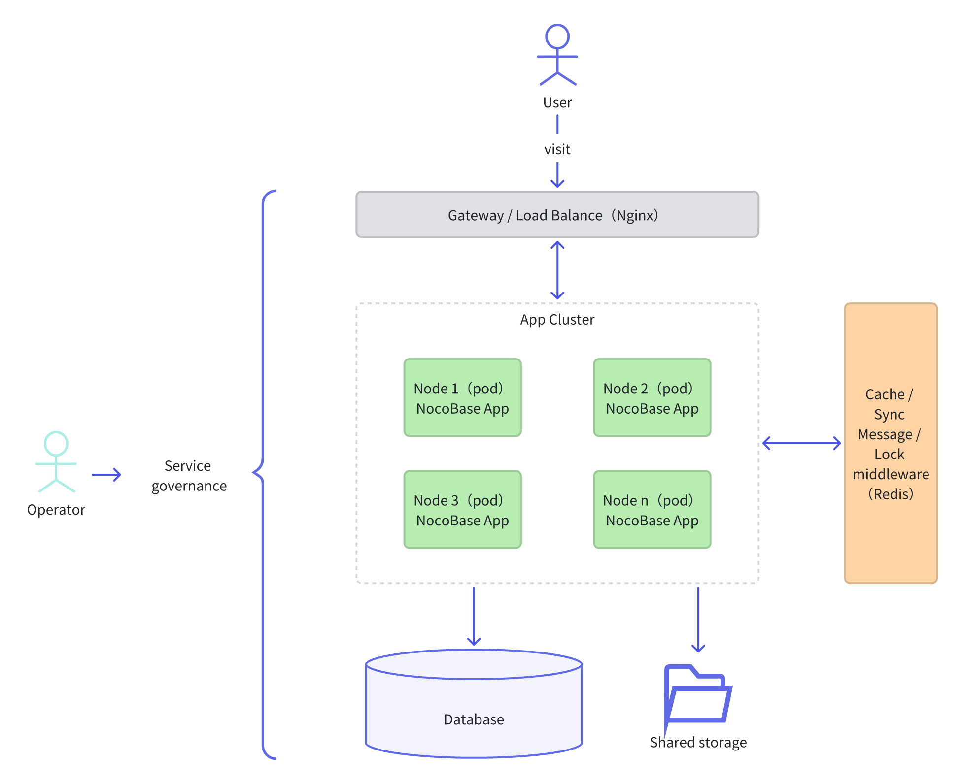
* **Application Cluster**: A cluster composed of multiple NocoBase application instances. It can be deployed on multiple servers or run as multiple processes in multi-core mode on a single server.
* **Database**: Stores the application's data. It can be a single-node or a distributed database.
* **Shared Storage**: Used to store application files and data, supporting read/write access from multiple instances.
* **Middleware**: Includes components like cache, synchronization signals, message queue, and distributed locks to support communication and coordination within the application cluster.
* **Load Balancer**: Responsible for distributing client requests to different instances in the application cluster, as well as performing health checks and failover.
## Learn More
This document only introduces the basic concepts and components of NocoBase's cluster mode. For specific deployment details and more configuration options, please refer to the following documents:
- Deployment
- [Preparations](./preparations)
- [Kubernetes Deployment](./kubernetes)
- [Operations](./operations)
- Advanced
- [Service Splitting](./services-splitting)
- [Development Reference](./development)
---
url: /cluster-mode/kubernetes.md
---
# Kubernetes Deployment
This article aims to guide users in quickly deploying NocoBase in cluster mode in a Kubernetes environment. It assumes that the reader is familiar with Kubernetes and has completed the steps in [Preparations](./preparations.md).
:::info{title="Tip"}
To quickly verify the Kubernetes deployment process, the operating environment in this article is a single-node K3s cluster (OS: Ubuntu). This guide is also applicable to standard Kubernetes clusters. If you encounter any discrepancies when deploying on a standard Kubernetes cluster, please let us know.
:::
## Cluster Environment
If you already have a Kubernetes cluster environment, you can skip this step.
Prepare a server with Debian / Ubuntu installed and run a K3s cluster in single-node mode on it. To learn more about K3s, visit the [official K3s website](https://docs.k3s.io/).
Steps:
1. SSH into the server.
2. Use the official script to install the K3s cluster master node on the server.
```bash
# After installation, the default kubeconfig file is /etc/rancher/k3s/k3s.yaml
curl -sfL https://get.k3s.io | sh -
```
```bash
# Verify that the configuration is correct
kubectl get node
```
## Cluster Application Deployment
Deploy the NocoBase application in cluster mode on a Kubernetes cluster.
### Environment Variables
Typically, environment variables should be separated from the application deployment configuration file. This article uses a ConfigMap as an example. In a production environment, you can use Secrets to further separate sensitive information.
Steps:
1. Create a `nocobase-cm.yaml` file.
```yaml
apiVersion: v1
kind: ConfigMap
metadata:
name: nocobase-config
data:
# Set your timezone, e.g., UTC, America/New_York
TZ: UTC
# The database and Redis configurations below use the PostgreSQL and Redis services in the cluster from the "Kubernetes Middleware Deployment" document.
# If your environment already has existing database and Redis services, modify the corresponding configurations below.
CACHE_DEFAULT_STORE: redis
# Use an existing or self-deployed Redis service.
CACHE_REDIS_URL: "redis://redis-0.redis-service:6379/0"
PUBSUB_ADAPTER_REDIS_URL: "redis://redis-0.redis-service:6379/1"
LOCK_ADAPTER_REDIS_URL: "redis:/redis-0.redis-service:6379/2"
# Use an existing or self-deployed PostgreSQL service.
DB_DATABASE: nocobase
DB_DIALECT: postgres
DB_HOST: "postgres-0.postgres-service"
DB_PASSWORD: nocobase123
DB_PORT: "5432"
DB_UNDERSCORED: "true"
DB_USER: nocobase
# service platform username
NOCOBASE_PKG_USERNAME: ""
# service platform password
NOCOBASE_PKG_PASSWORD: ""
# ... other environment variables
```
2. Run the `kubectl` command to deploy the ConfigMap.
```bash
kubectl apply -f nocobase-cm.yaml
```
### Shared Storage
Different nodes of a NocoBase application deployed in cluster mode need to mount the same storage directory (`storage`). To achieve this, you need to create a Persistent Volume (PV) that supports read-write access from multiple nodes (ReadWriteMany). Typically, you would create a cloud disk on your cloud provider's platform and bind it as a PV, or you can mount a shared storage directory using other methods like NFS.
### Application Deployment
For the initial deployment, start with a single node. After it's complete, you can scale up to multiple nodes.
1. Create a `nocobase-apps.yaml` file.
```yaml
# Create a PVC. Multiple Pods deployed by the Deployment below will mount the same persistent storage directory through this PVC.
apiVersion: v1
kind: PersistentVolumeClaim
metadata:
name: nocobase-pvc
spec:
accessModes:
- ReadWriteMany
resources:
requests:
storage: 10Gi
storageClassName: "" # Explicitly set to empty as the example uses the master node's NFS service, avoiding the default StorageClass.
---
# The application's Service, which provides services outside the cluster after being bound to an Ingress.
apiVersion: v1
kind: Service
metadata:
name: nocobase
spec:
ports:
- name: nocobase
port: 13000
targetPort: 13000
selector:
app: nocobase
type: ClusterIP
---
# The application's Deployment, which can deploy multiple application containers.
apiVersion: apps/v1
kind: Deployment
metadata:
name: nocobase
spec:
replicas: 1 # Initial deployment with only one node.
selector:
matchLabels:
app: nocobase
template:
metadata:
labels:
app: nocobase
spec:
containers:
- name: nocobase
image: nocobase/nocobase:1.6
ports:
- containerPort: 13000
# Load environment variables from the previously deployed ConfigMap.
envFrom:
- configMapRef:
name: nocobase-config
volumeMounts:
- name: nocobase-data
mountPath: /app/nocobase/storage
# Declare resource requests and limits for the service.
resources:
requests:
memory: "512Mi"
cpu: "250m"
limits:
memory: "1Gi"
cpu: "500m"
# Liveness probe command. The cluster uses this to determine if the Pod needs to be restarted.
livenessProbe:
httpGet:
path: /api/__health_check
port: 13000
initialDelaySeconds: 60
# Readiness probe command. The cluster uses this to determine whether to direct Service traffic to the Pod.
readinessProbe:
httpGet:
path: /api/__health_check
port: 13000
initialDelaySeconds: 30
# Mount persistent storage via PVC.
volumes:
- name: nocobase-data
persistentVolumeClaim:
claimName: nocobase-pvc
```
2. Run the `kubectl` command to deploy the NocoBase application service.
```bash
kubectl apply -f nocobase-apps.yaml
```
3. Verify the status of the NocoBase application service.
```bash
# Check the Pod status of the NocoBase service
kubectl get pods -l app=nocobase
```
The example output is as follows. A `STATUS` of `Running` indicates that the service has started successfully:
```text
NAME READY STATUS RESTARTS AGE
nocobase-5558b774d7-w6swf 1/1 Running 0 7h6m
```
4. On the first startup, you need to manually enable the following plugins in the admin interface:
- @nocobase/plugin-sync-adapter-redis
- @nocobase/plugin-lock-adapter-redis
After that, you can scale up. For example, to scale to 4 nodes:
```bash
kubectl scale deployment nocobase --replicas=4
```
## Application Changes
Application changes refer to the following situations:
- Upgrading the application version
- Installing new plugins
- Activating plugins
NocoBase does not yet support automatic synchronization of changes across multiple instances in a cluster for the scenarios above. Therefore, you need to handle them manually by following the steps below. These steps only involve changes to the application service. Before making any changes, please back up your database and persistent storage yourself.
### Application Version Rolling Upgrade
1. Run the `kubectl set image` command to change the Deployment's container image version.
```bash
kubectl set image deployment/nocobase nocobase=nocobase/nocobase:1.7
```
2. Check the rolling update status.
```bash
# Check the overall rolling update progress of the Deployment
kubectl rollout status deployment/nocobase
# Check the status of each Pod
kubectl get pods -l app=nocobase
```
If you encounter any issues during or after the application version upgrade and need to roll back, execute the following command to roll back the container image version:
```bash
kubectl rollout undo deployment/nocobase
```
### Graceful Application Restart
After installing or activating new plugins, you need to refresh the application configuration or state. You can use the following command to gracefully restart each Pod.
1. Run the `kubectl rollout restart` command.
```bash
kubectl rollout restart deployment/nocobase
```
2. Check the rolling restart status.
```bash
# Check the overall restart progress of the Deployment
kubectl rollout status deployment/nocobase
# Check the status of each Pod
kubectl get pods -l app=nocobase
```
## Application Gateway
To make an application deployed in a Kubernetes cluster accessible from the outside, you need to bind an Ingress to the application's Service. The cluster environment used in this article is K3s, which comes with Traefik as the default Ingress Controller.
### Traefik IngressRoute
Steps:
1. Create a `nocobase-ingress.yaml` file.
```yaml
apiVersion: traefik.containo.us/v1alpha1
kind: IngressRoute
metadata:
name: nocobase-ingress
spec:
entryPoints:
- web
routes:
# Here, 'nocobase.local' should be replaced with a real domain name pointing to the cluster's IP.
# If you don't have a domain for verification, you can modify your local hosts file to add a record for nocobase.local pointing to the cluster's IP.
# You can then access the NocoBase application in the cluster by opening http://nocobase.local in your browser.
- match: Host(`nocobase.local`)
kind: Rule
services:
# This is the Service created when deploying the nocobase application in the "Application Deployment" section above.
- name: nocobase
port: 13000
```
2. Run the `kubectl` command to deploy the Ingress for the NocoBase application.
```bash
kubectl apply -f nocobase-ingress.yaml
```
### Ingress-Nginx
Most Kubernetes clusters use Ingress-Nginx as the Ingress Controller. Below is a `nocobase-ingress.yaml` file based on Ingress-Nginx:
```yaml
apiVersion: extensions/v1beta1
kind: Ingress
metadata:
annotations:
kubernetes.io/ingress.class: nginx
name: nocobase-ingress
spec:
rules:
# Here, 'nocobase.local' should be replaced with a real domain name pointing to the cluster's IP.
# If you don't have a domain for verification, you can modify your local hosts file to add a record for nocobase.local pointing to the cluster's IP.
# You can then access the NocoBase application in the cluster by opening http://nocobase.local in your browser.
- host: nocobase.local
http:
paths:
- backend:
serviceName: nocobase
servicePort: 13000
```
## Using Helm Charts
We have created Helm Charts for the NocoBase application, allowing you to deploy the NocoBase application service in Kubernetes using the Helm CLI.
### Prerequisites
Ensure that clients like `kubectl` and `helm` are installed in your operating environment and that `kubectl` can connect to the target cluster correctly.
### Add Repository
Add the NocoBase Helm Charts repository:
```bash
# Add the NocoBase Helm Charts repository
helm repo add nocobase https://nocobase.github.io/helm-charts
# Update the Helm index
helm repo update
```
### Helm Deployment
1. Create a `values.yaml` file.
```yaml
persistent:
# The required size for NocoBase cluster shared storage
size: 10Gi
# The storage class provided by the cloud service's Kubernetes
# Same as in the "Application Deployment" section, this is explicitly set to empty because it uses the master node's NFS service.
storageClassName: ""
configMap:
data:
# Set your timezone, e.g., UTC, America/New_York
TZ: UTC
# The database and Redis configurations below use the PostgreSQL and Redis services in the cluster from the "Kubernetes Middleware Deployment" document.
# If your environment already has existing database and Redis services, modify the corresponding configurations below.
CACHE_DEFAULT_STORE: redis
# Use an existing or self-deployed Redis service.
CACHE_REDIS_URL: "redis://redis-0.redis-service:6379/0"
PUBSUB_ADAPTER_REDIS_URL: "redis://redis-0.redis-service:6379/1"
LOCK_ADAPTER_REDIS_URL: "redis:/redis-0.redis-service:6379/2"
# Use an existing or self-deployed PostgreSQL service.
DB_DATABASE: nocobase
DB_DIALECT: postgres
DB_HOST: "postgres-0.postgres-service"
DB_PASSWORD: nocobase123
DB_PORT: "5432"
DB_UNDERSCORED: "true"
DB_USER: nocobase
# service platform username
NOCOBASE_PKG_USERNAME: ""
# service platform password
NOCOBASE_PKG_PASSWORD: ""
# ... other environment variables
```
2. Run the `helm install` command to start the installation.
```bash
helm install nocobase nocobase/nocobase --values values.yaml
```
---
url: /cluster-mode/operations.md
---
# Maintenance Procedures
## Initial Application Startup
When starting the application for the first time, start one node first. Wait for the plugins to be installed and enabled, then start the other nodes.
## Version Upgrade
When you need to upgrade the NocoBase version, follow this procedure.
:::warning{title=Note}
In a cluster **production environment**, features like plugin management and version upgrades should be used with caution or prohibited.
NocoBase does not currently support online upgrades for cluster versions. To ensure data consistency, external services need to be suspended during the upgrade process.
:::
Steps:
1. Stop the current service
Stop all NocoBase application instances and forward the load balancer traffic to a 503 status page.
2. Back up data
Before upgrading, it is strongly recommended to back up the database to prevent any issues during the upgrade process.
3. Update the version
Refer to [Docker Upgrade](../get-started/upgrading/docker) to update the NocoBase application image version.
4. Start the service
1. Start one node in the cluster and wait for the update to complete and the node to start successfully.
2. Verify that the functionality is correct. If there are any issues that cannot be resolved through troubleshooting, you can roll back to the previous version.
3. Start the other nodes.
4. Redirect the load balancer traffic to the application cluster.
## In-app Maintenance
In-app maintenance refers to performing maintenance-related operations while the application is running, including:
* Plugin management (installing, enabling, disabling plugins, etc.)
* Backup & Restore
* Environment Migration Management
Steps:
1. Scale down nodes
Reduce the number of running application nodes in the cluster to one, and stop the service on the other nodes.
2. Perform in-app maintenance operations, such as installing and enabling plugins, backing up data, etc.
3. Restore nodes
After the maintenance operations are complete and functionality is verified, start the other nodes. Once the nodes have started successfully, restore the cluster's operational state.
---
url: /cluster-mode/preparations.md
---
# Prerequisites
Before deploying a cluster application, you need to complete the following preparations.
## Commercial Plugin License
Running a NocoBase application in cluster mode requires support from the following plugins:
| Function | Plugin |
| ------------------------ | ----------------------------------------------------------------------------------- |
| Cache adapter | Built-in |
| Sync signal adapter | `@nocobase/plugin-pubsub-adapter-redis` |
| Message queue adapter | `@nocobase/plugin-queue-adapter-redis` or `@nocobase/plugin-queue-adapter-rabbitmq` |
| Distributed lock adapter | `@nocobase/plugin-lock-adapter-redis` |
| Worker ID allocator | `@nocobase/plugin-workerid-allocator-redis` |
First, please ensure you have obtained licenses for the above plugins (you can purchase the corresponding plugin licenses through the commercial plugin service platform).
## System Components
Other system components, besides the application instance itself, can be selected by operations personnel based on the team's operational needs.
### Database
Since the current cluster mode only targets application instances, the database temporarily supports only a single node. If you have a database architecture like master-slave, you need to implement it yourself through middleware and ensure it is transparent to the NocoBase application.
### Middleware
NocoBase's cluster mode relies on some middleware to achieve inter-cluster communication and coordination, including:
- **Cache**: Uses a Redis-based distributed cache middleware to improve data access speed.
- **Sync signal**: Uses Redis's stream feature to implement sync signal transmission between clusters.
- **Message queue**: Uses Redis or RabbitMQ-based message queue middleware to implement asynchronous message processing.
- **Distributed lock**: Uses a Redis-based distributed lock to ensure the security of access to shared resources in the cluster.
When all middleware components use Redis, you can start a single Redis service within the cluster's internal network (or Kubernetes). Alternatively, you can enable a separate Redis service for each function (cache, sync signal, message queue, and distributed lock).
**Version Recommendations**
- Redis: >=8.0 or a redis-stack version that includes the Bloom Filter feature.
- RabbitMQ: >=4.0
### Shared Storage
NocoBase needs to use the storage directory to store system-related files. In multi-node mode, you should mount a cloud disk (or NFS) to support shared access across multiple nodes. Otherwise, local storage will not be automatically synchronized, and it will not function properly.
When deploying with Kubernetes, please refer to the [Kubernetes Deployment: Shared Storage](./kubernetes#shared-storage) section.
### Load Balancing
Cluster mode requires a load balancer to distribute requests, as well as for health checks and failover of application instances. This part should be selected and configured according to the team's operational needs.
Taking a self-hosted Nginx as an example, add the following content to the configuration file:
```
upstream myapp {
# ip_hash; # Can be used for session persistence. When enabled, requests from the same client are always sent to the same backend server.
server 172.31.0.1:13000; # Internal node 1
server 172.31.0.2:13000; # Internal node 2
server 172.31.0.3:13000; # Internal node 3
}
server {
listen 80;
location / {
# Use the defined upstream for load balancing
proxy_pass http://myapp;
# ... other configurations
}
}
```
This means that requests are reverse-proxied and distributed to different server nodes for processing.
For load balancing middleware provided by other cloud service providers, please refer to the configuration documentation provided by the specific provider.
## Environment Variable Configuration
All nodes in the cluster should use the same environment variable configuration. In addition to NocoBase's basic [environment variables](/api/cli/env), the following middleware-related environment variables also need to be configured.
### Multi-core Mode
When the application runs on a multi-core node, you can enable the node's multi-core mode:
```ini
# Enable PM2 multi-core mode
# CLUSTER_MODE=max # Disabled by default, requires manual configuration
```
If you are deploying application pods in Kubernetes, you can ignore this configuration and control the number of application instances through the number of pod replicas.
### Cache
```ini
# Cache adapter, needs to be set to redis in cluster mode (defaults to in-memory if not set)
CACHE_DEFAULT_STORE=redis
# Redis cache adapter connection URL, needs to be filled in
CACHE_REDIS_URL=
```
### Sync Signal
```ini
# Redis sync adapter connection URL, defaults to redis://localhost:6379/0 if not set
PUBSUB_ADAPTER_REDIS_URL=
```
### Distributed Lock
```ini
# Lock adapter, needs to be set to redis in cluster mode (defaults to in-memory local lock if not set)
LOCK_ADAPTER_DEFAULT=redis
# Redis lock adapter connection URL, defaults to redis://localhost:6379/0 if not set
LOCK_ADAPTER_REDIS_URL=
```
### Message Queue
```ini
# Enable Redis as the message queue adapter, defaults to in-memory adapter if not set
QUEUE_ADAPTER=redis
# Redis message queue adapter connection URL, defaults to redis://localhost:6379/0 if not set
QUEUE_ADAPTER_REDIS_URL=
```
### Worker ID Allocator
Some system collections in NocoBase use globally unique IDs as primary keys. To prevent primary-key conflicts across a cluster, each application instance must obtain a unique Worker ID through the Worker ID Allocator. The current Worker ID range is 0–31, meaning each application can run up to 32 nodes simultaneously.
For details on the global unique ID design, [@nocobase/snowflake-id](https://github.com/nocobase/nocobase/tree/main/packages/core/snowflake-id)
```ini
# Redis connection URL for the Worker ID Allocator.
# If omitted, a random Worker ID will be assigned.
REDIS_URL=
```
:::info{title=Tip}
Usually, the related adapters can all use the same Redis instance, but it is best to use different databases to avoid potential key conflict issues, for example:
```ini
CACHE_REDIS_URL=redis://localhost:6379/0
PUBSUB_ADAPTER_REDIS_URL=redis://localhost:6379/1
LOCK_ADAPTER_REDIS_URL=redis://localhost:6379/2
QUEUE_ADAPTER_REDIS_URL=redis://localhost:6379/3
REDIS_URL=redis://localhost:6379/4
```
Currently, each plugin uses its own Redis-related environment variables. In the future, we may use `REDIS_URL` as the fallback configuration.
:::
If you use Kubernetes to manage the cluster, you can configure the above environment variables in a ConfigMap or Secret. For more related content, you can refer to [Kubernetes Deployment](./kubernetes).
After all the above preparations are completed, you can proceed to the [Operations](./operations) to continue managing the application instances.
---
url: /cluster-mode/services-splitting.md
---
# Service Splitting v1.9.0+
## Introduction
Typically, all services of a NocoBase application run in the same Node.js instance. As the functionality within the application becomes more complex with business growth, some time-consuming services may affect overall performance.
To improve application performance, NocoBase supports splitting application services to run on different nodes in cluster mode. This prevents performance issues of a single service from affecting the entire application's ability to respond to user requests.
On the other hand, it also allows for targeted horizontal scaling of specific services, improving the resource utilization of the cluster.
When deploying NocoBase in a cluster, different services can be split and deployed to run on different nodes. The following diagram illustrates the split structure:

## Which Services Can Be Split
### Asynchronous Workflow
**Service KEY**: `workflow:process`
Workflows in asynchronous mode will be enqueued for execution after being triggered. These workflows can be considered background tasks, and users usually do not need to wait for the results to be returned. Especially for complex and time-consuming processes with a high trigger volume, it is recommended to split them to run on independent nodes.
### Other User-level Asynchronous Tasks
**Service KEY**: `async-task:process`
This includes tasks created by user actions such as asynchronous import and export. In cases of large data volumes or high concurrency, it is recommended to split them to run on independent nodes.
## How to Split Services
Splitting different services to different nodes is achieved by configuring the `WORKER_MODE` environment variable. This environment variable can be configured according to the following rules:
- `WORKER_MODE=`: When not configured or set to empty, the worker mode is the same as the current single-instance mode, accepting all requests and processing all tasks. This is compatible with applications that were not previously configured.
- `WORKER_MODE=!`: The worker mode is to only process requests and not any tasks.
- `WORKER_MODE=workflow:process,async-task:process`: Configured with one or more service identifiers (separated by commas), the worker mode is to only process tasks for these identifiers and not process requests.
- `WORKER_MODE=*`: The worker mode is to process all background tasks, regardless of the module, but not process requests.
- `WORKER_MODE=!,workflow:process`: The worker mode is to process requests and simultaneously process tasks for a specific identifier.
- `WORKER_MODE=-`: The worker mode is to not process any requests or tasks (this mode is required within the worker process).
For example, in a K8S environment, nodes with the same split functionality can use the same environment variable configuration, making it easy to horizontally scale a specific type of service.
## Configuration Examples
### Multiple Nodes with Separate Processing
Suppose there are three nodes: `node1`, `node2`, and `node3`. They can be configured as follows:
- `node1`: Only processes user UI requests, configure `WORKER_MODE=!`.
- `node2`: Only processes workflow tasks, configure `WORKER_MODE=workflow:process`.
- `node3`: Only processes asynchronous tasks, configure `WORKER_MODE=async-task:process`.
### Multiple Nodes with Mixed Processing
Suppose there are four nodes: `node1`, `node2`, `node3`, and `node4`. They can be configured as follows:
- `node1` and `node2`: Process all regular requests, configure `WORKER_MODE=!`, and have a load balancer automatically distribute requests to these two nodes.
- `node3` and `node4`: Process all other background tasks, configure `WORKER_MODE=*`.
## Developer Reference
When developing business plugins, you can split services that consume significant resources based on the requirements of the scenario. This can be achieved in the following ways:
1. Define a new service identifier, for example, `my-plugin:process`, for environment variable configuration, and provide documentation for it.
2. In the business logic of the plugin's server-side, use the `app.serving()` interface to check the environment and determine whether the current node should provide a specific service based on the environment variable.
```javascript
const MY_PLUGIN_SERVICE_KEY = 'my-plugin:process';
// In the plugin's server-side code
if (this.app.serving(MY_PLUGIN_SERVICE_KEY)) {
// Process the business logic for this service
} else {
// Do not process the business logic for this service
}
```
---
url: /data-sources/calendar/calendar-collection.md
---
# Calendar collection
## Introduction
A calendar Collection is a specialized data table designed to store dates and date-related information. It is commonly used to manage and track time within applications or systems. The primary goal of the calendar table is to offer flexible and efficient access to date information, allowing for the swift retrieval of relevant data as needed.
## User Manual
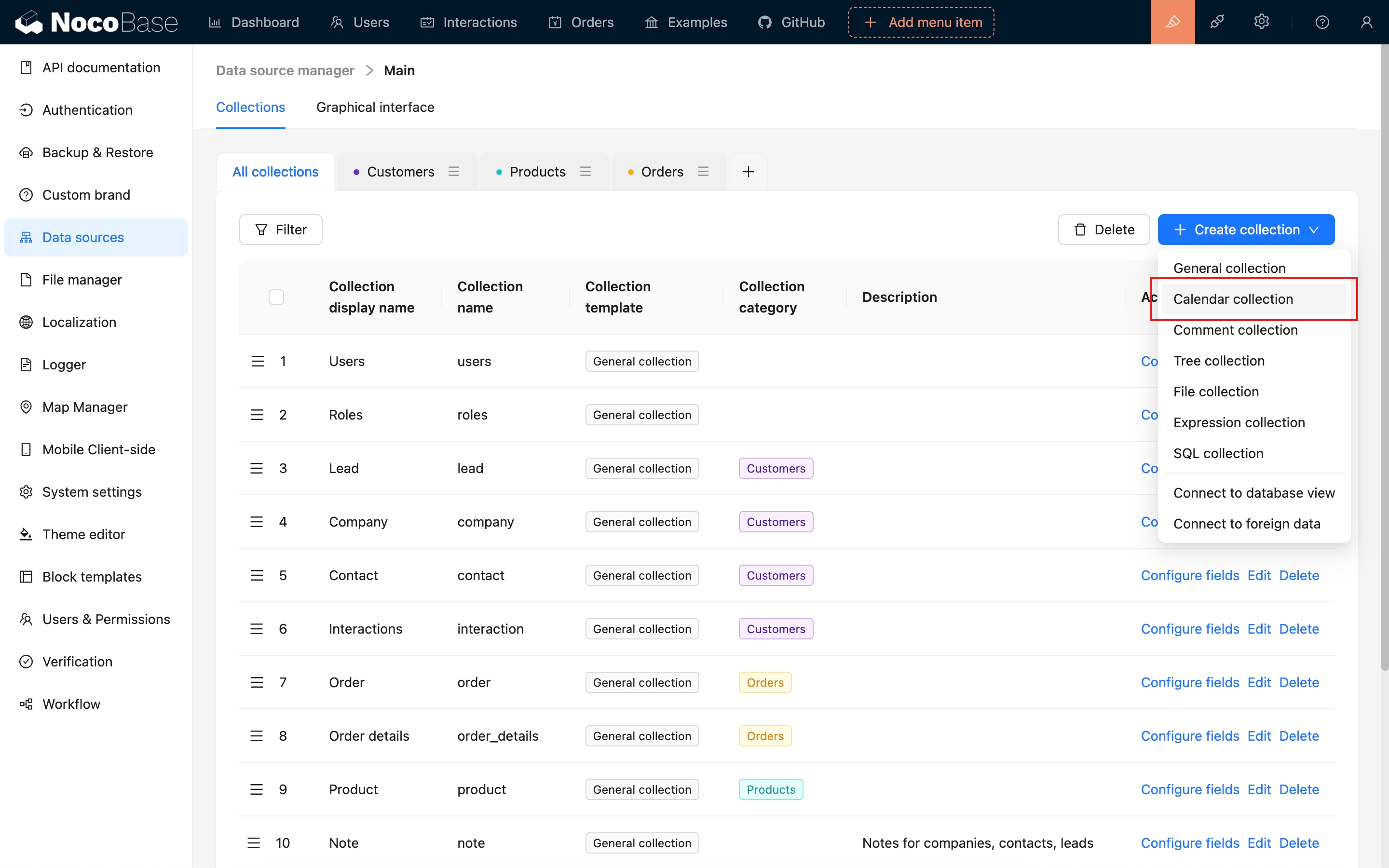
---
url: /data-sources/calendar/index.md
---
# Calendar Block
## Introduction
The Calendar Block offers a streamlined way to view and manage events and date-related data in a calendar format, making it perfect for scheduling meetings, planning events, and organizing your time efficiently.
## Installation
This plugin comes pre-installed, so no additional setup is required.
## Adding Blocks
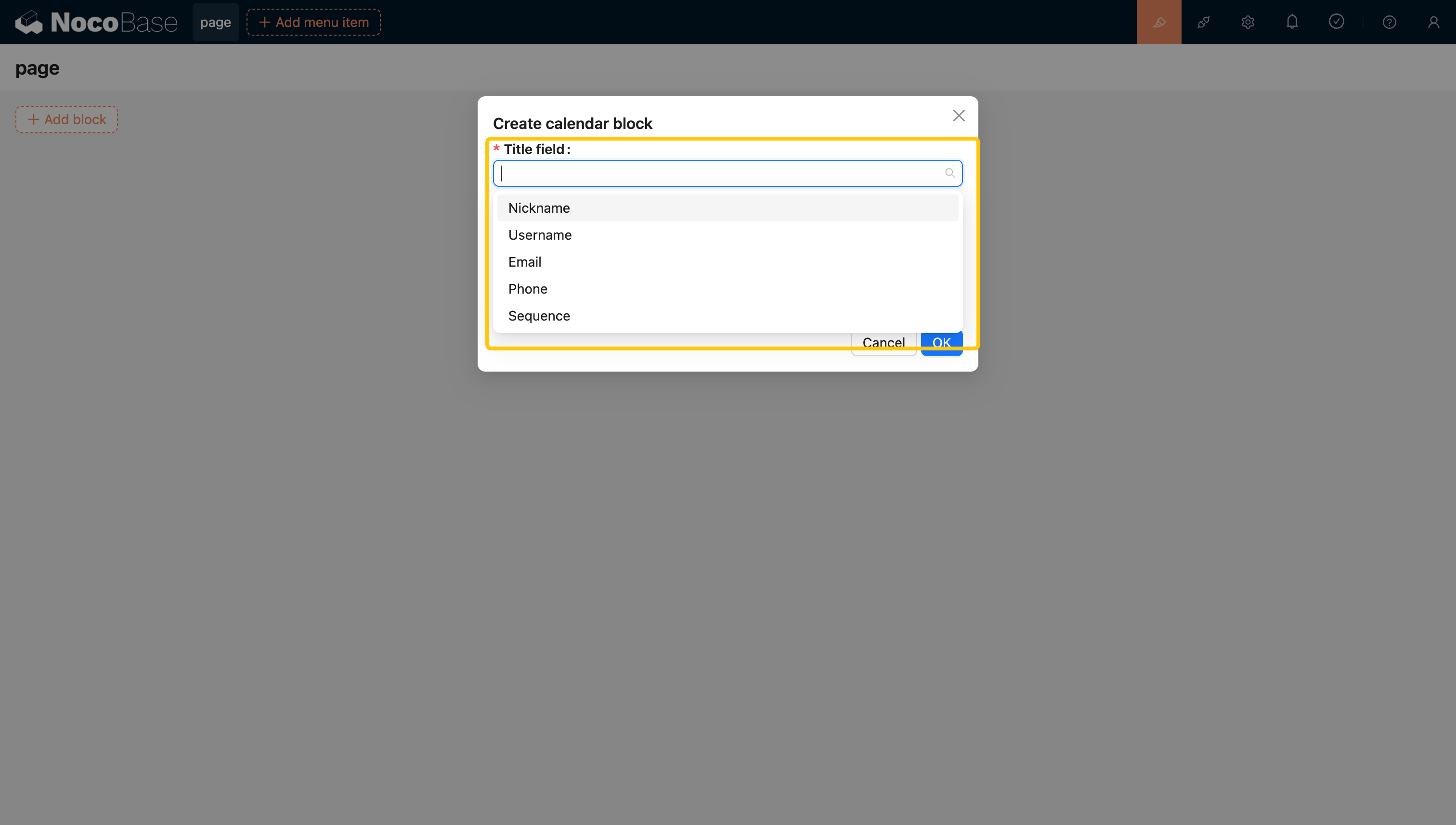
1. Title Field: Used to display information on the calendar bars. Currently, it supports field types such as `Single Line Text`, `Single select`, `Phone`, `Email`, `Radio Group`, and `Sequence`. The supported title field types can be extended through plugins.
2. Start Time: Indicates when the task begins.
3. End Time: Marks when the task ends.
Clicking on a task bar highlights the selection and opens a detailed pop-up window.
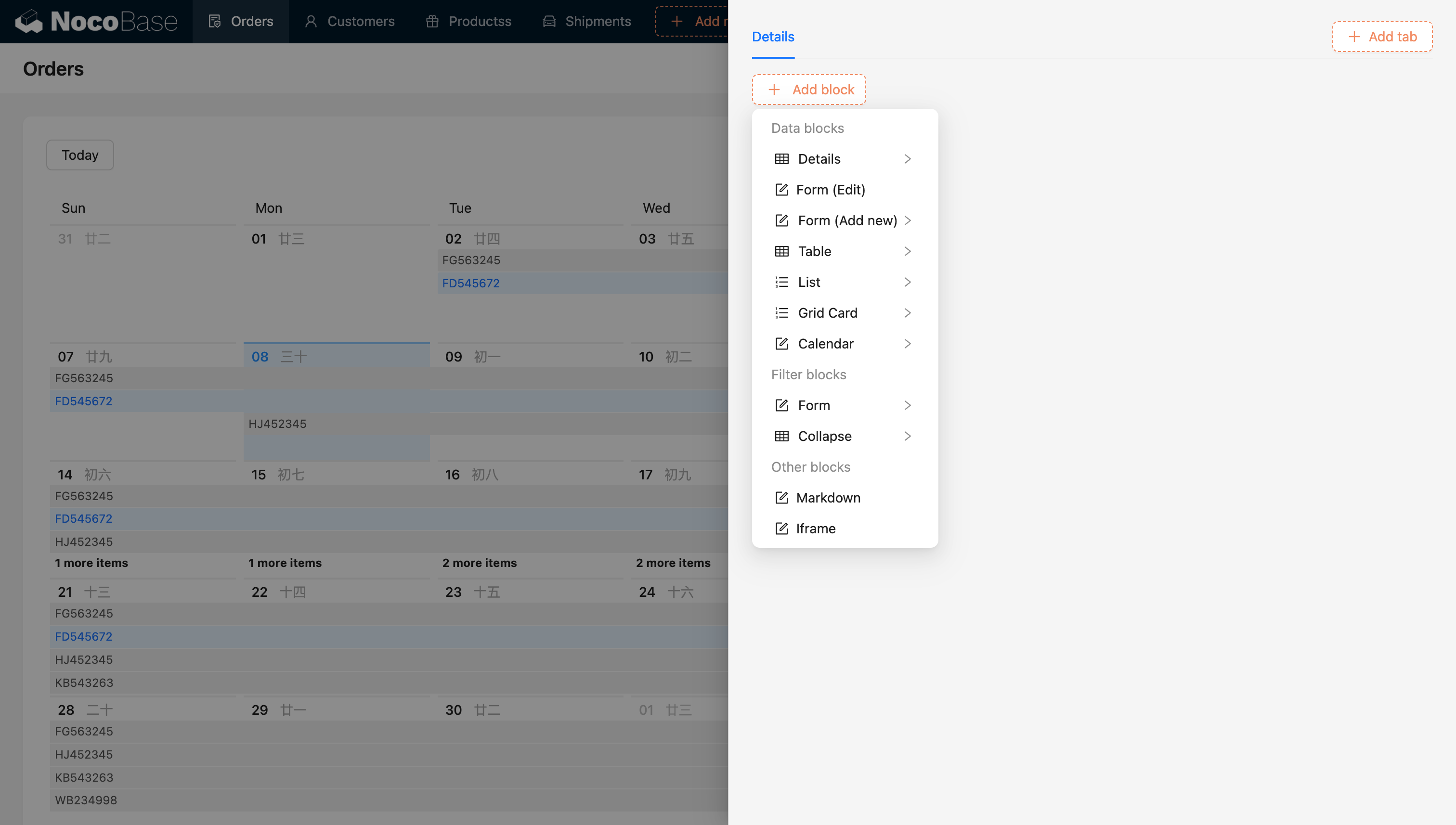
## Configure Fields
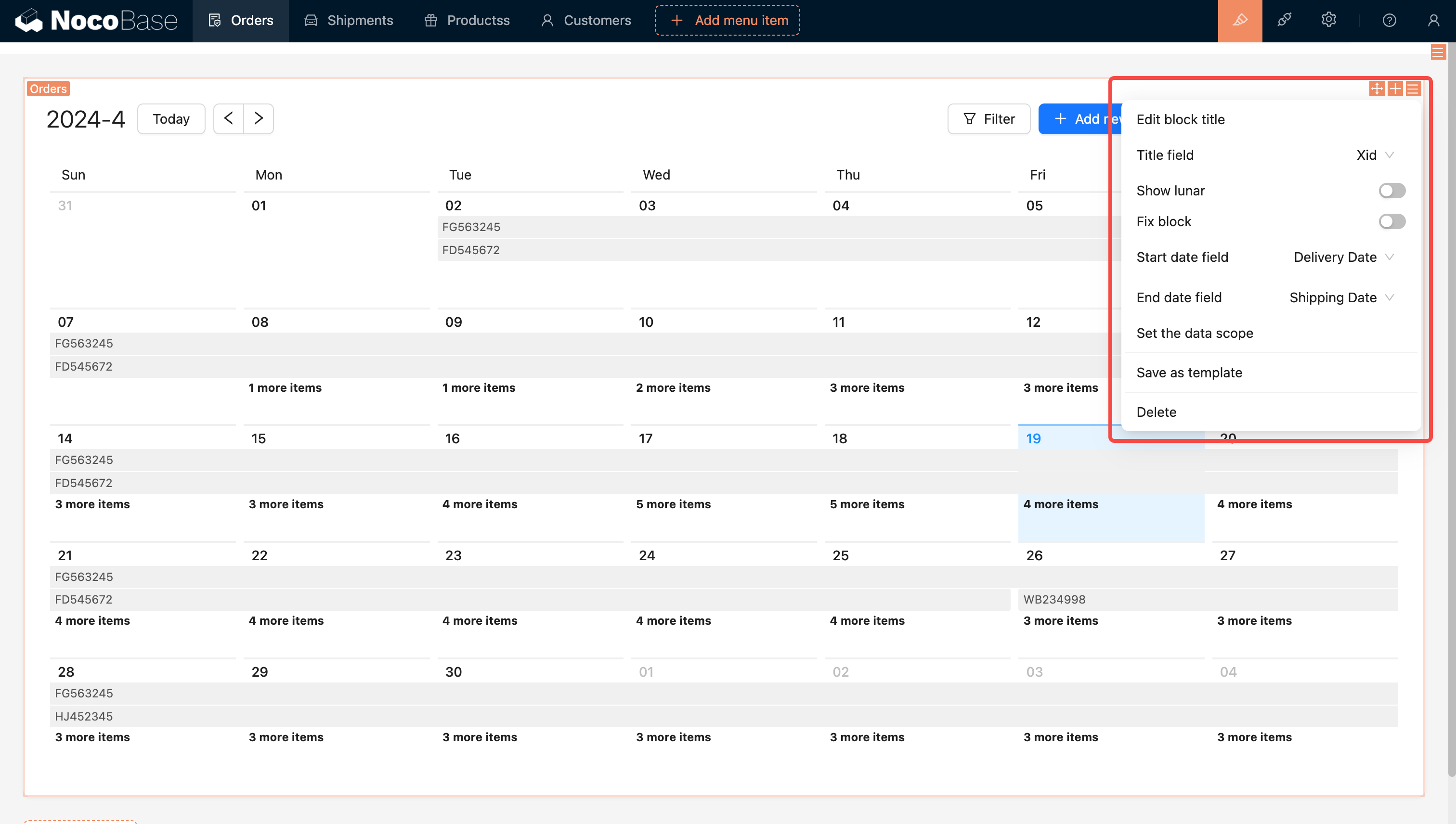
### Display Lunar Calendar
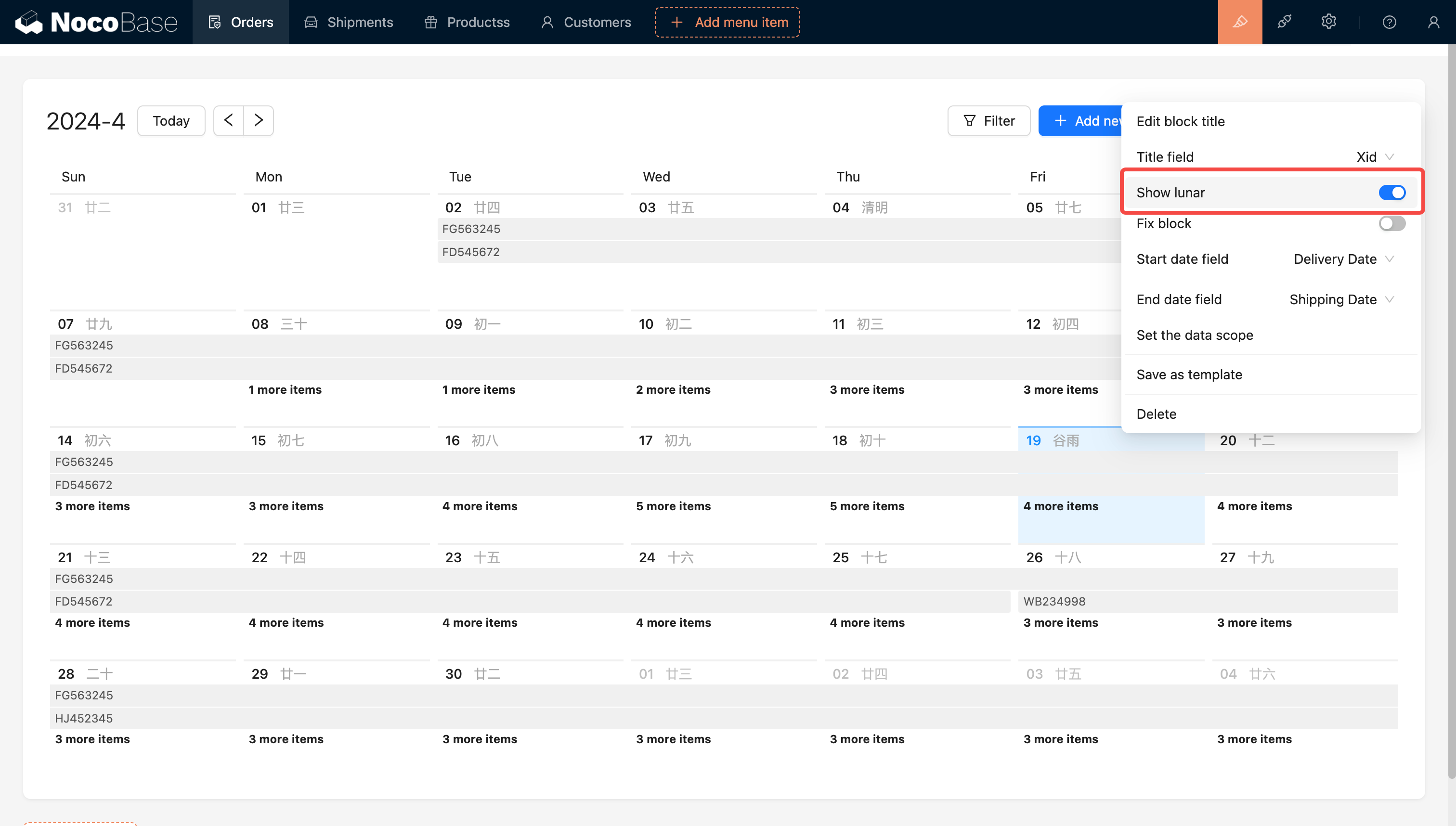
### Set Data Range

For additional information, see .
### Set Block Height
Example: Adjust the height of the order calendar block. No scrollbar will appear inside the calendar block.
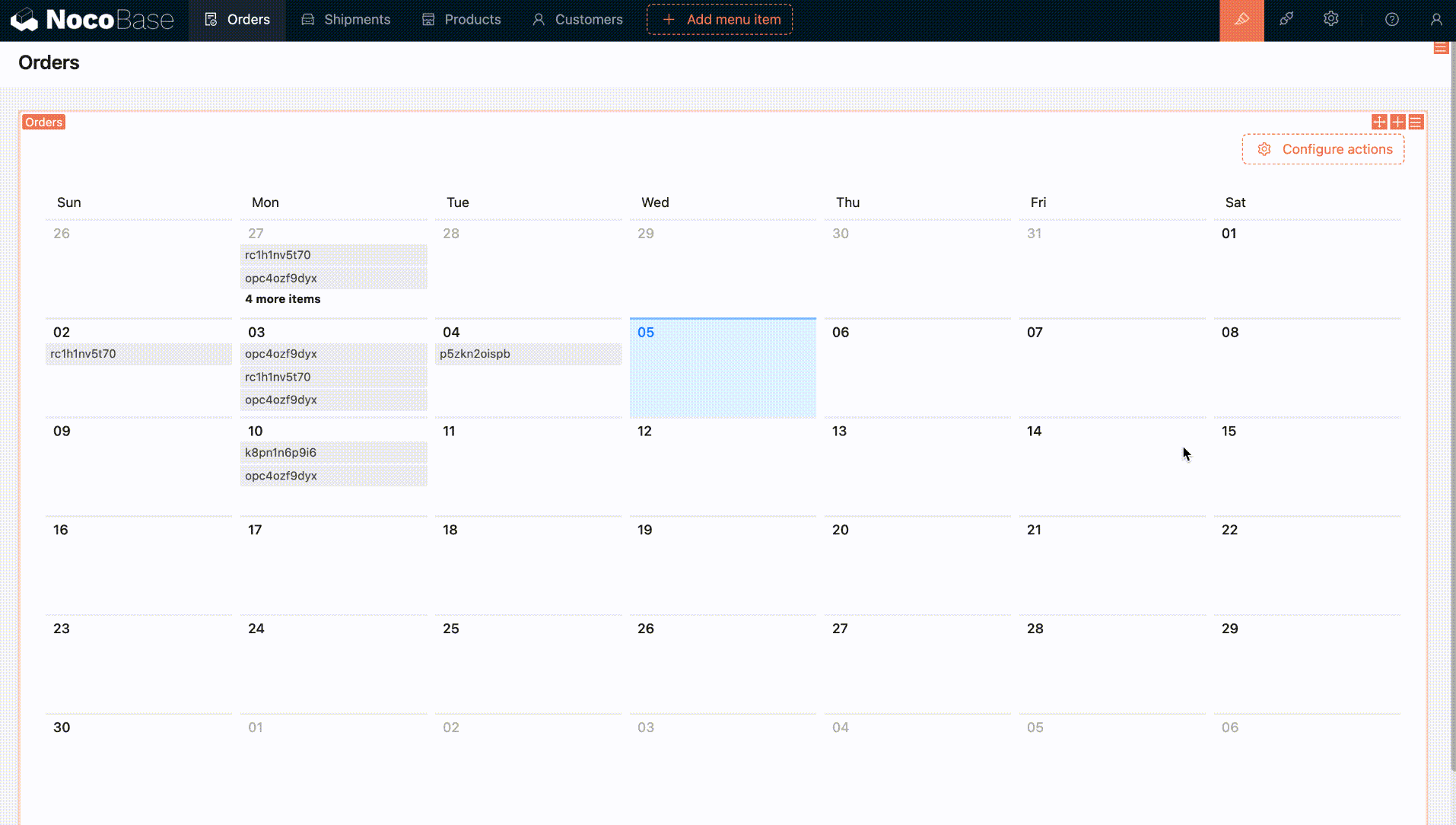
For more information, refer to
### Background Color Field
:::info{title=Tip}
The version of NocoBase needs to be v1.4.0-beta or above.
:::
This option can be used to configure the background color of calendar events. Here's how to use it:
1. The calendar data table needs to have a field of type **Single select** or **Radio group**, and this field needs to be configured with colors.
2. Then, return to the calendar block configuration interface and select the field you just configured with colors in the **Background Color Field**.
3. Finally, you can try selecting a color for a calendar event and click submit. You'll see that the color has taken effect.
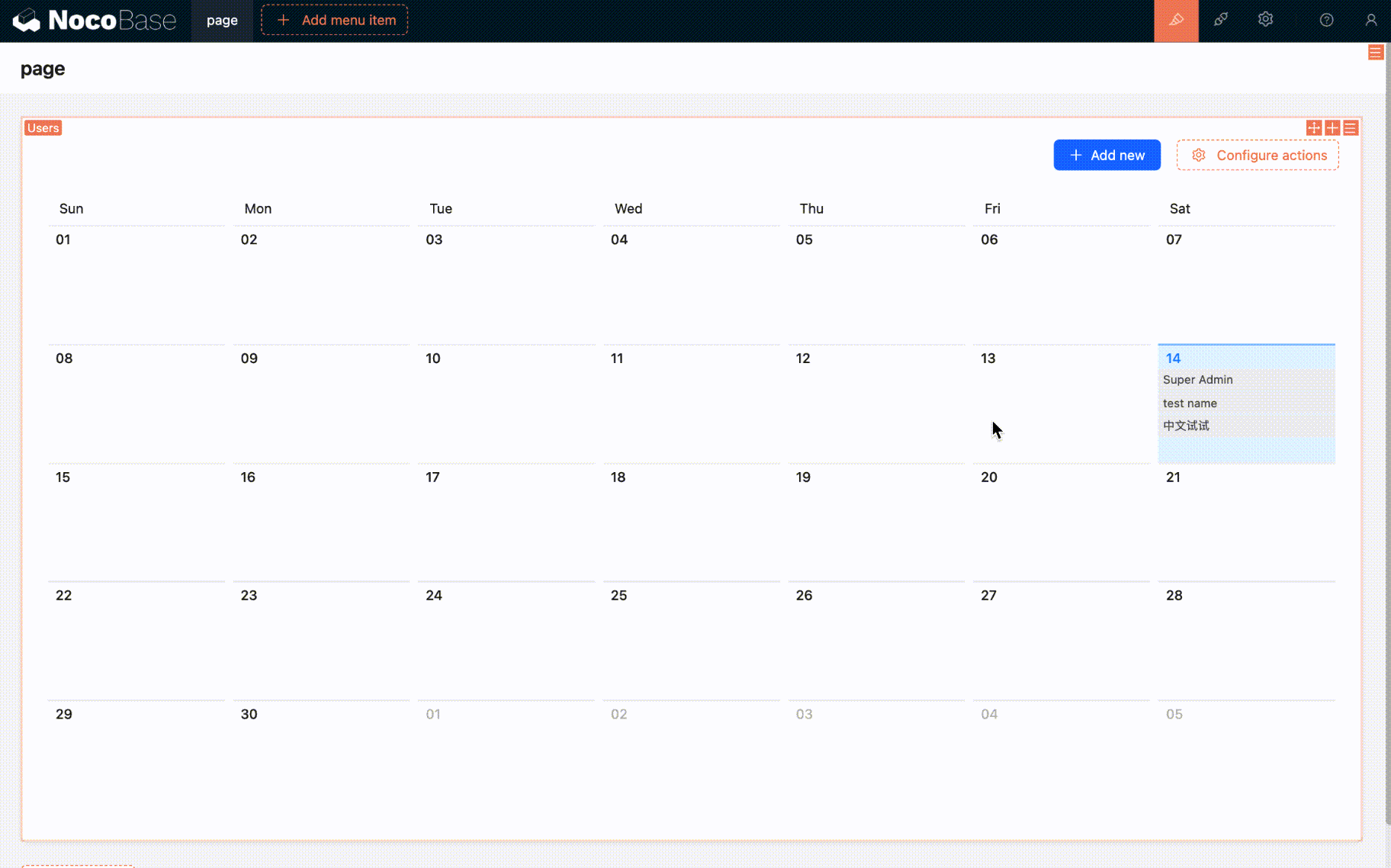
### Week Start Day
> Supported in version v1.7.7 and above
The calendar block supports setting the start day of the week, allowing you to choose **Sunday** or **Monday** as the first day of the week.
The default start day is **Monday**, making it easier for users to adjust the calendar display according to regional habits for a better user experience.

## Configure Actions
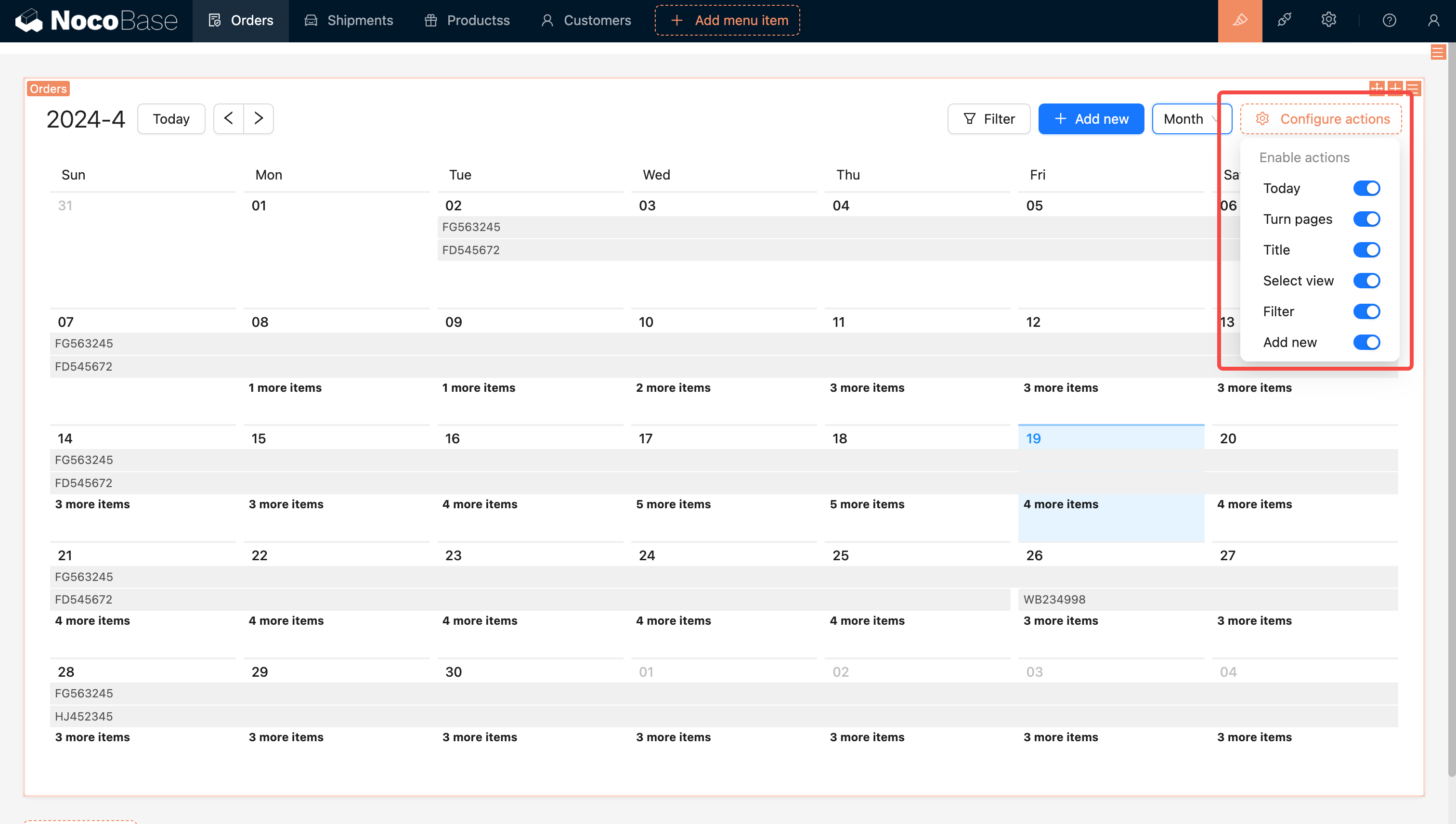
### Today
The "Today" button in the Calendar Block offers quick navigation, enabling users to instantly return to the current date after exploring other dates.
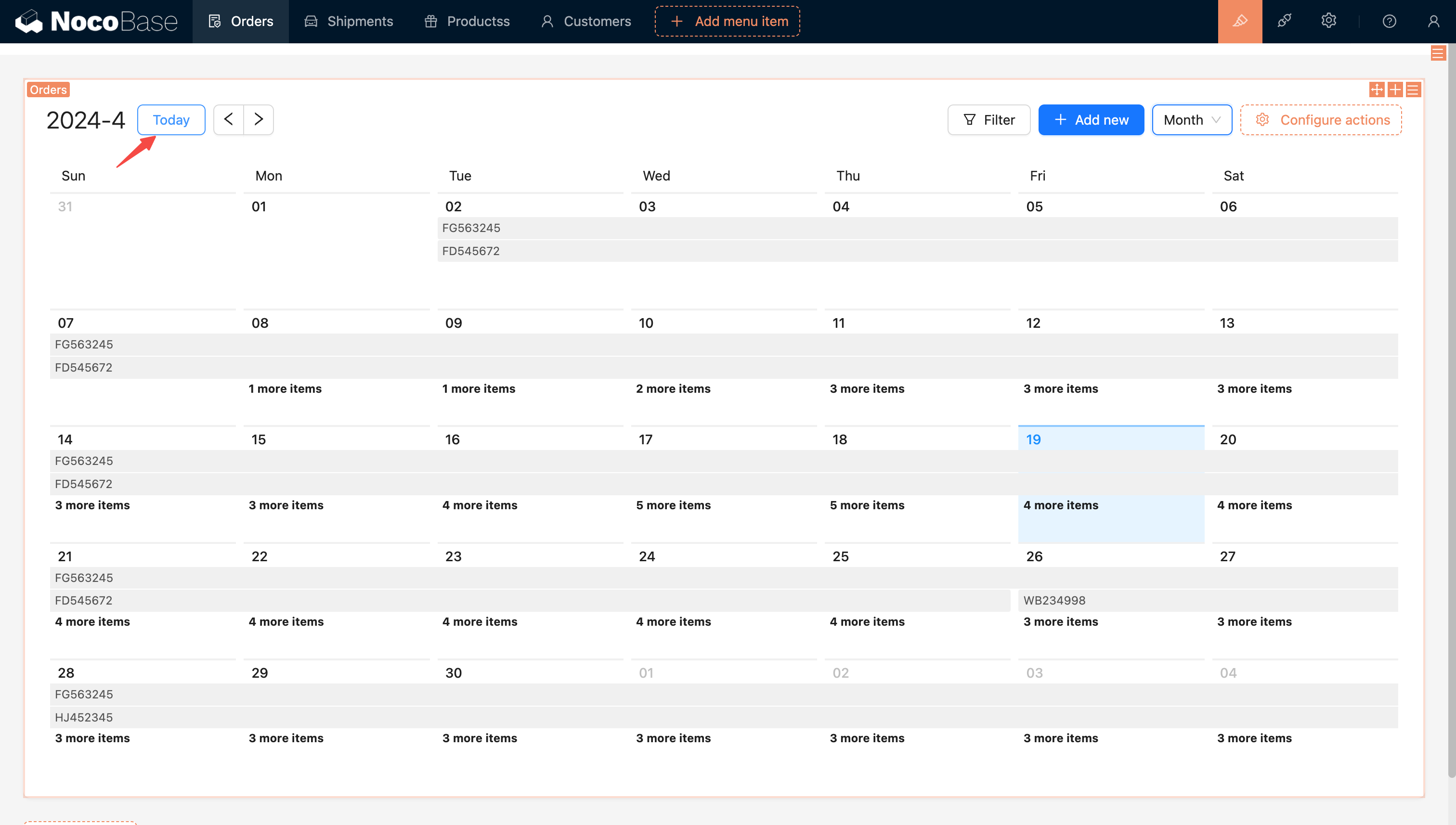
### Switch View
The default view is set to Month.
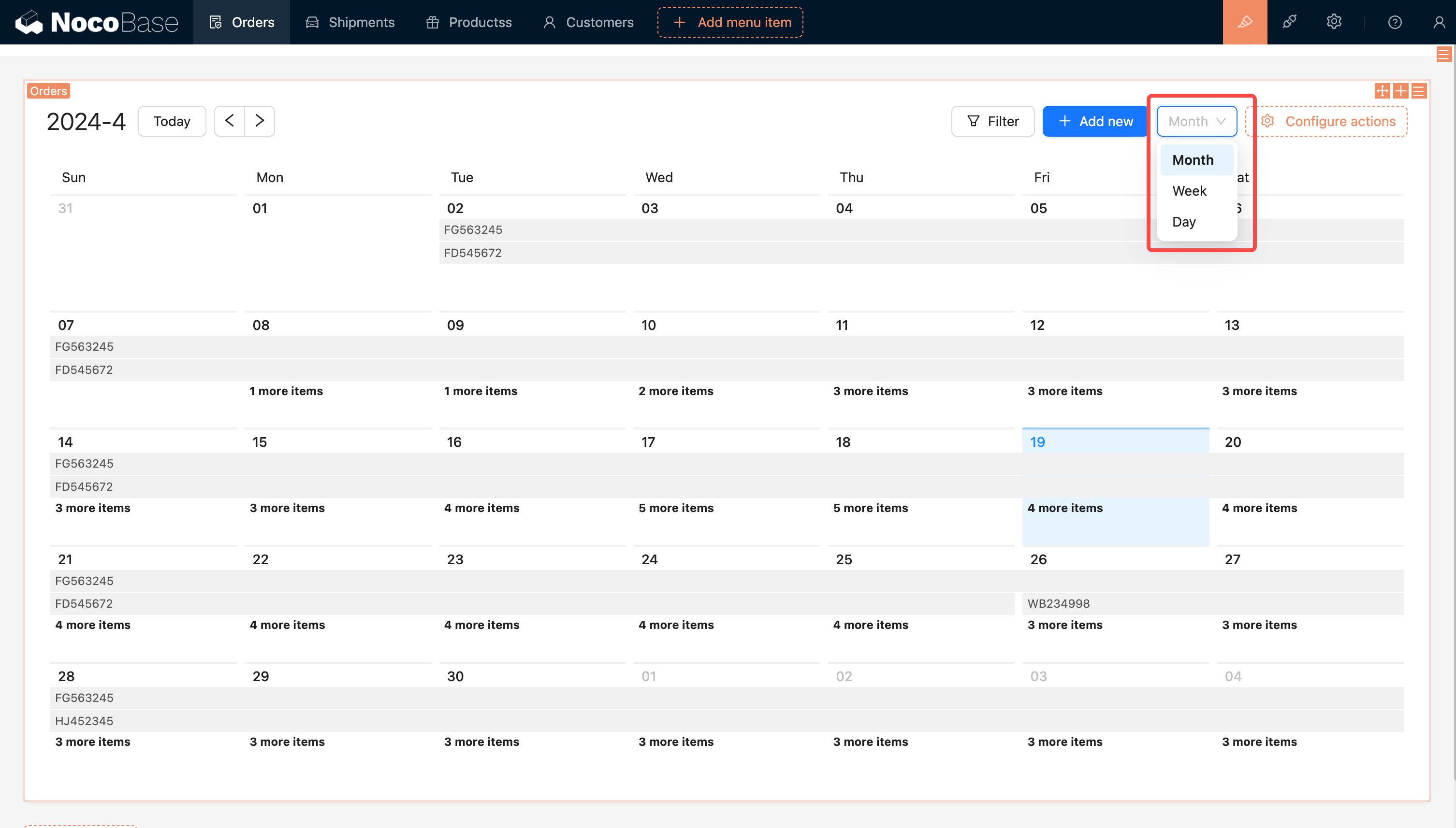
---
url: /data-sources/collection-comment/index.md
---
# Comment Collection
## Introduction
Comment collection is a specialized data table template designed for storing user comments and feedback. With the comment feature, you can add commenting capabilities to any data table, allowing users to discuss, provide feedback, or annotate specific records. The comment collection supports rich text editing, providing flexible content creation capabilities.
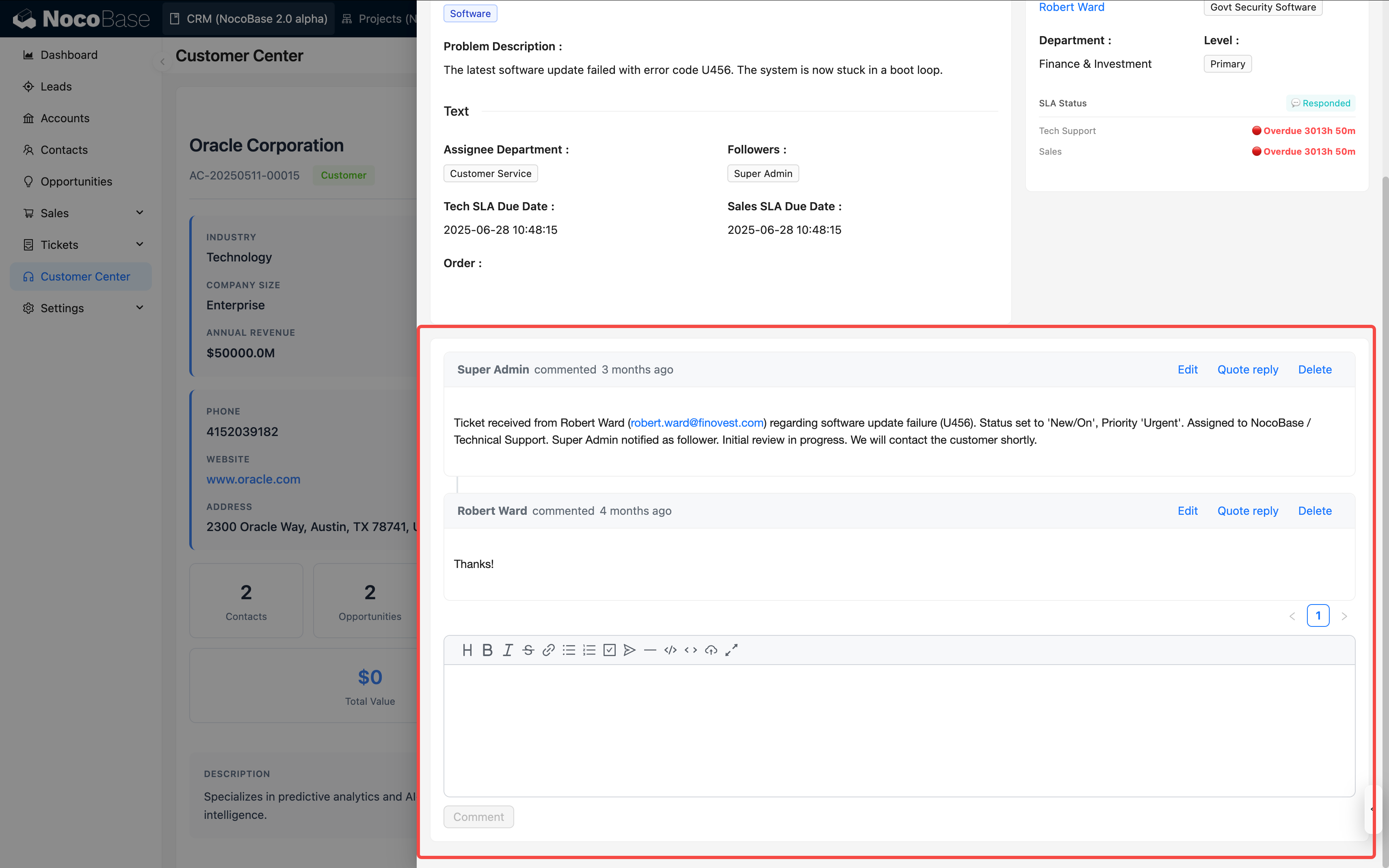
## Features
- **Rich Text Editing**: Includes Markdown (vditor) editor by default, supporting rich text content creation
- **Link to Any Data Table**: Can associate comments with records in any data table through relationship fields
- **Multi-level Comments**: Supports replying to comments, building a comment tree structure
- **User Tracking**: Automatically records comment creator and creation time
## User Guide
### Creating a Comment Collection
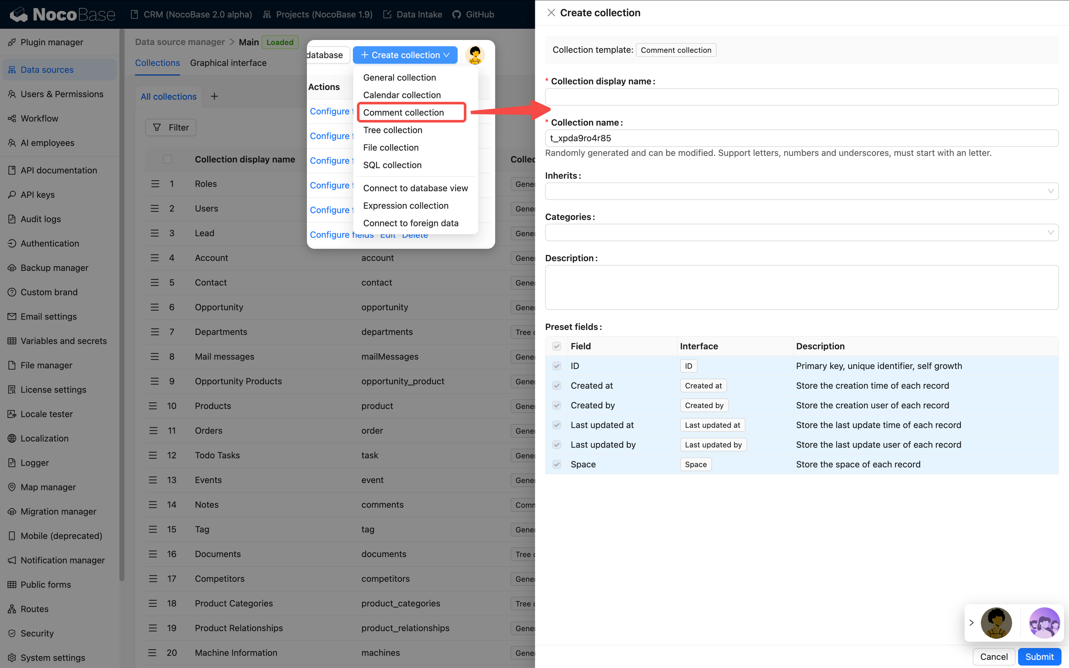
1. Go to the data table management page
2. Click the "Create Collection" button
3. Select the "Comment Collection" template
4. Enter the table name (e.g., "Task Comments", "Article Comments", etc.)
5. The system will automatically create a comment table with the following default fields:
- Comment content (Markdown vditor type)
- Created by (linked to user table)
- Created at (datetime type)
### Configuring Relationships
To link comments to a target data table, you need to configure relationship fields:
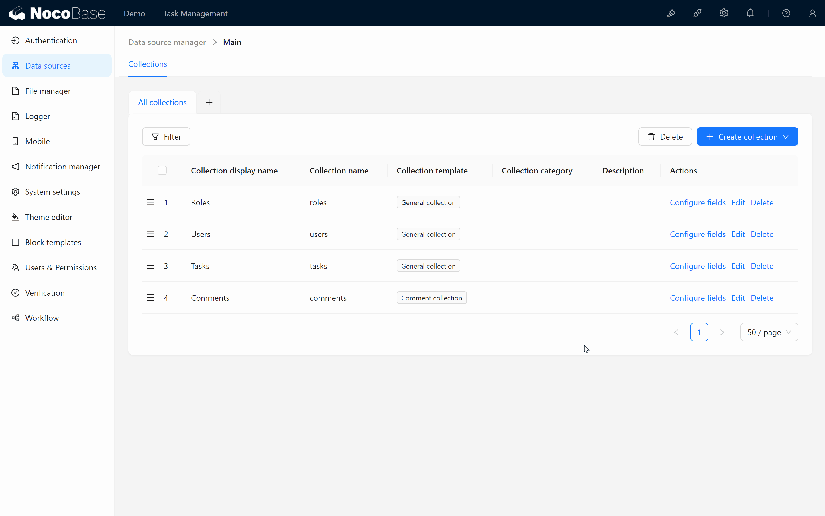
1. Add a "Many-to-One" relationship field in the comment table
2. Select the target data table to link to (e.g., tasks table, articles table, etc.)
3. Set the field name (e.g., "Belongs to Task", "Belongs to Article", etc.)
### Using Comment Blocks on Pages
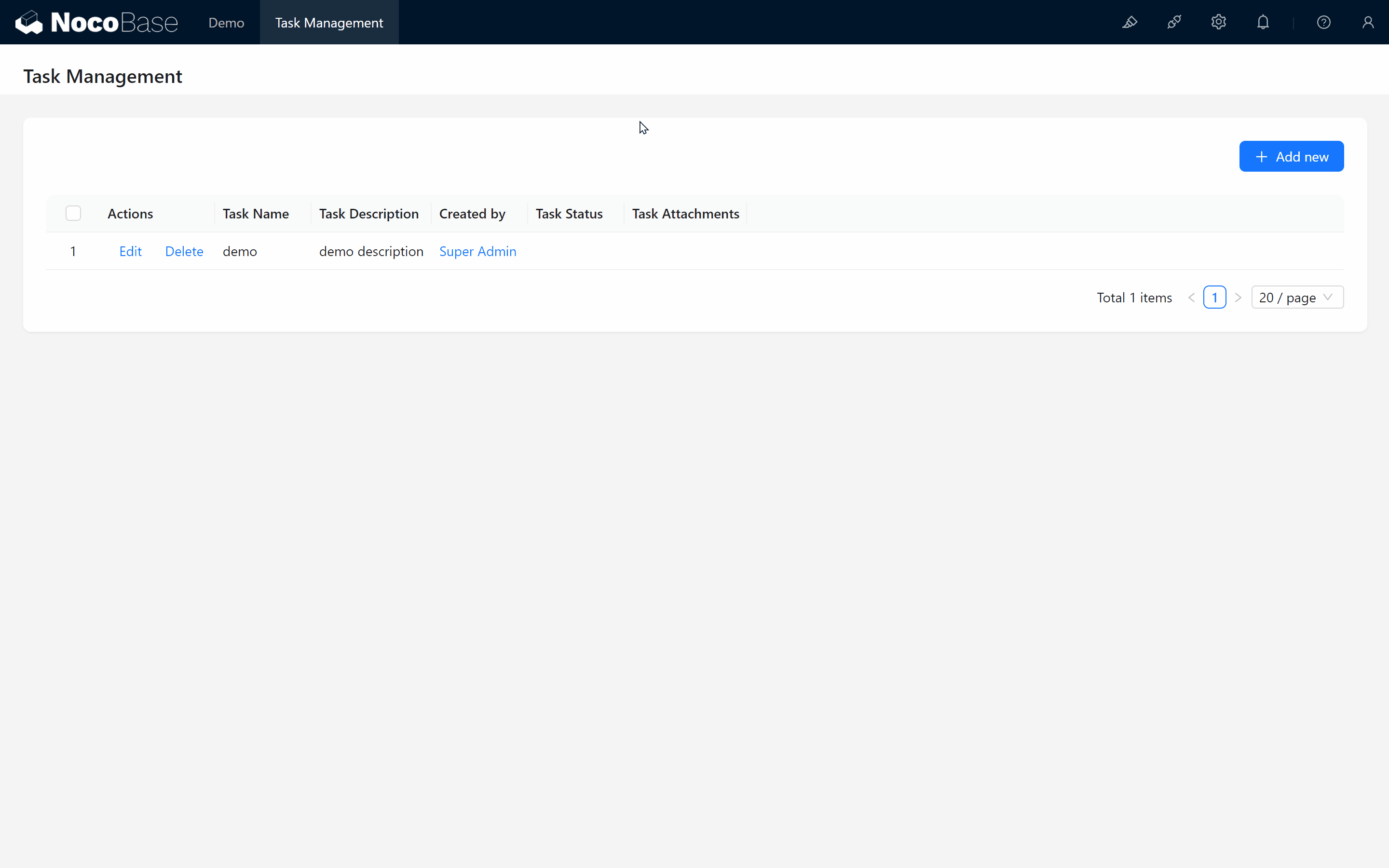
1. Go to the page where you want to add comment functionality
2. Add a block in the details or popup of the target record
3. Select the "Comments" block type
4. Choose the comment collection you just created
### Typical Use Cases
- **Task Management Systems**: Team members discuss and provide feedback on tasks
- **Content Management Systems**: Readers comment and interact with articles
- **Approval Workflows**: Approvers annotate and provide opinions on application forms
- **Customer Feedback**: Collect customer reviews of products or services
## Notes
- Comment collection is a commercial plugin feature and requires the comments plugin to be enabled
- It's recommended to set appropriate permissions for the comment table to control who can view, create, and delete comments
- For scenarios with a large number of comments, it's recommended to enable pagination for better performance
---
url: /data-sources/collection-expression/collection.md
---
# Expression Collection
## Creating an "Expression collection" Template
Before utilizing dynamic expression operation nodes within a workflow, it's essential to first create an "Expression" template collection using the collection management tool. This collection serves as a repository for various expressions:
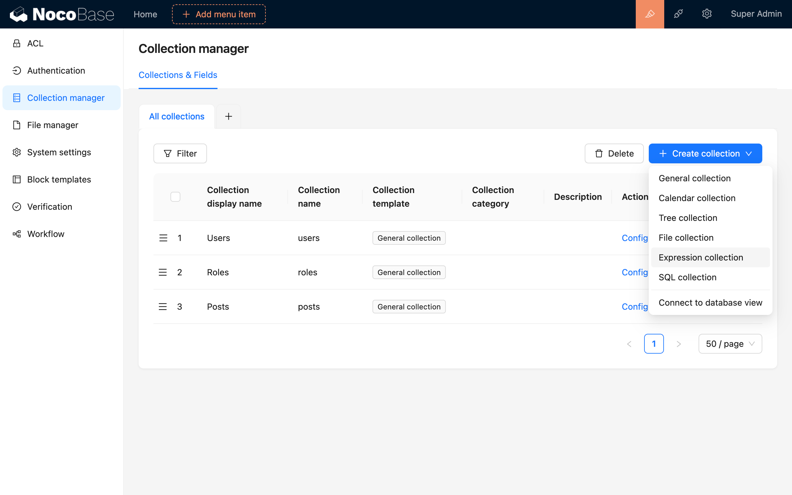
## Entering Expression Data
Following this, you can set up a table block and input several formula entries into the template collection. Each row in the "Expression" template collection can be viewed as a calculation rule designed for a specific data model within the collection. You can utilize different fields from the data models of various collections as variables, crafting unique expressions as calculation rules. Moreover, you can leverage different calculation engines as needed.
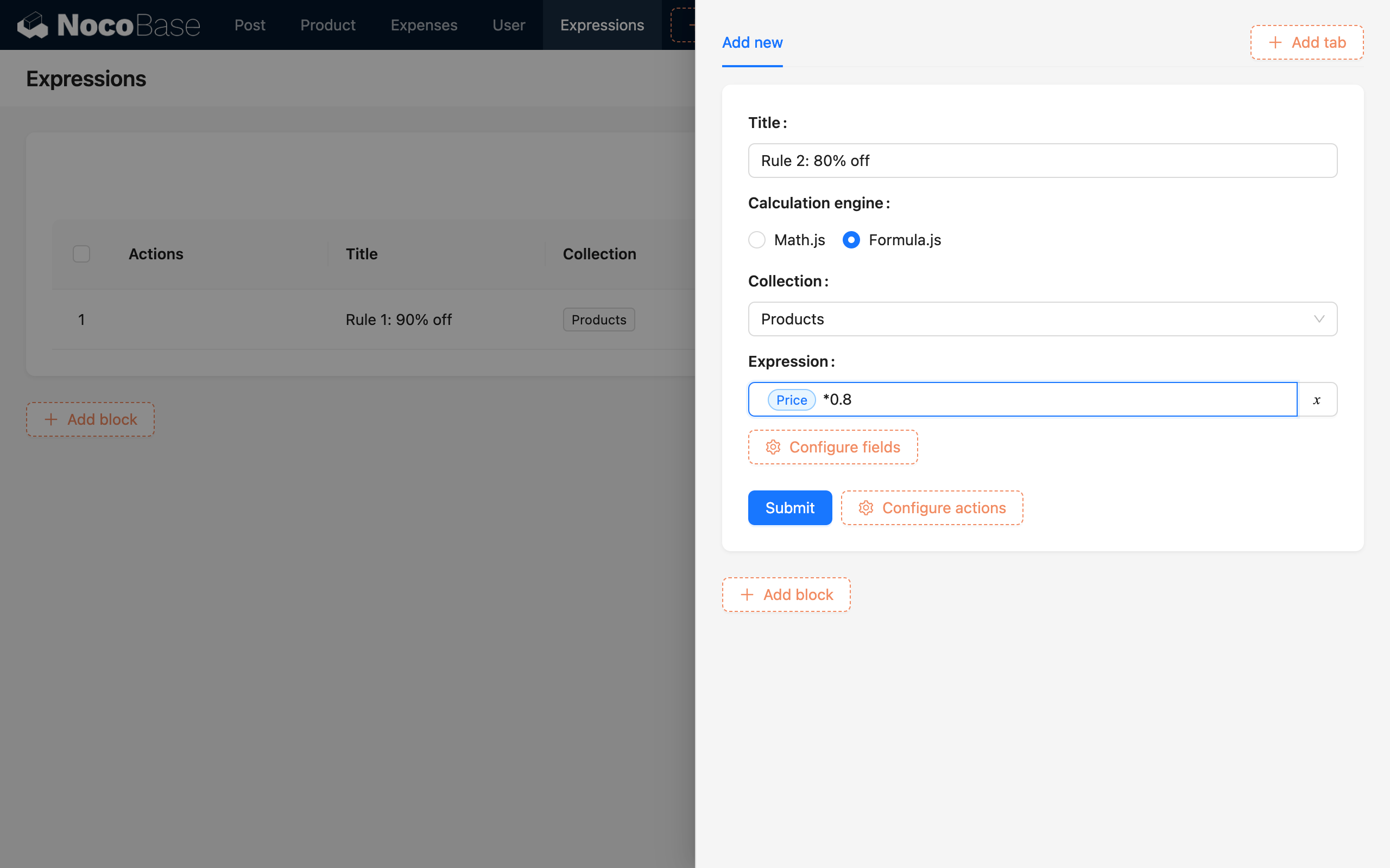
:::info{title=Tip}
Once the formulas are established, they need to be linked to the business data. Directly associating each row of business data with formula data can be tedious, so a common approach is to use a metadata collection, similar to a classification collection, to create a many-to-one (or one-to-one) relationship with the formula collection. Then, the business data is associated with the classified metadata in a many-to-one relationship. This approach allows you to simply specify the relevant classified metadata when creating business data, making it easy to locate and utilize the corresponding formula data through the established association path.
:::
## Loading Relevant Data into the Process
As an example, consider creating a workflow triggered by a collection event. When an order is created, the trigger should preload the associated product data along with the product-related expression data:
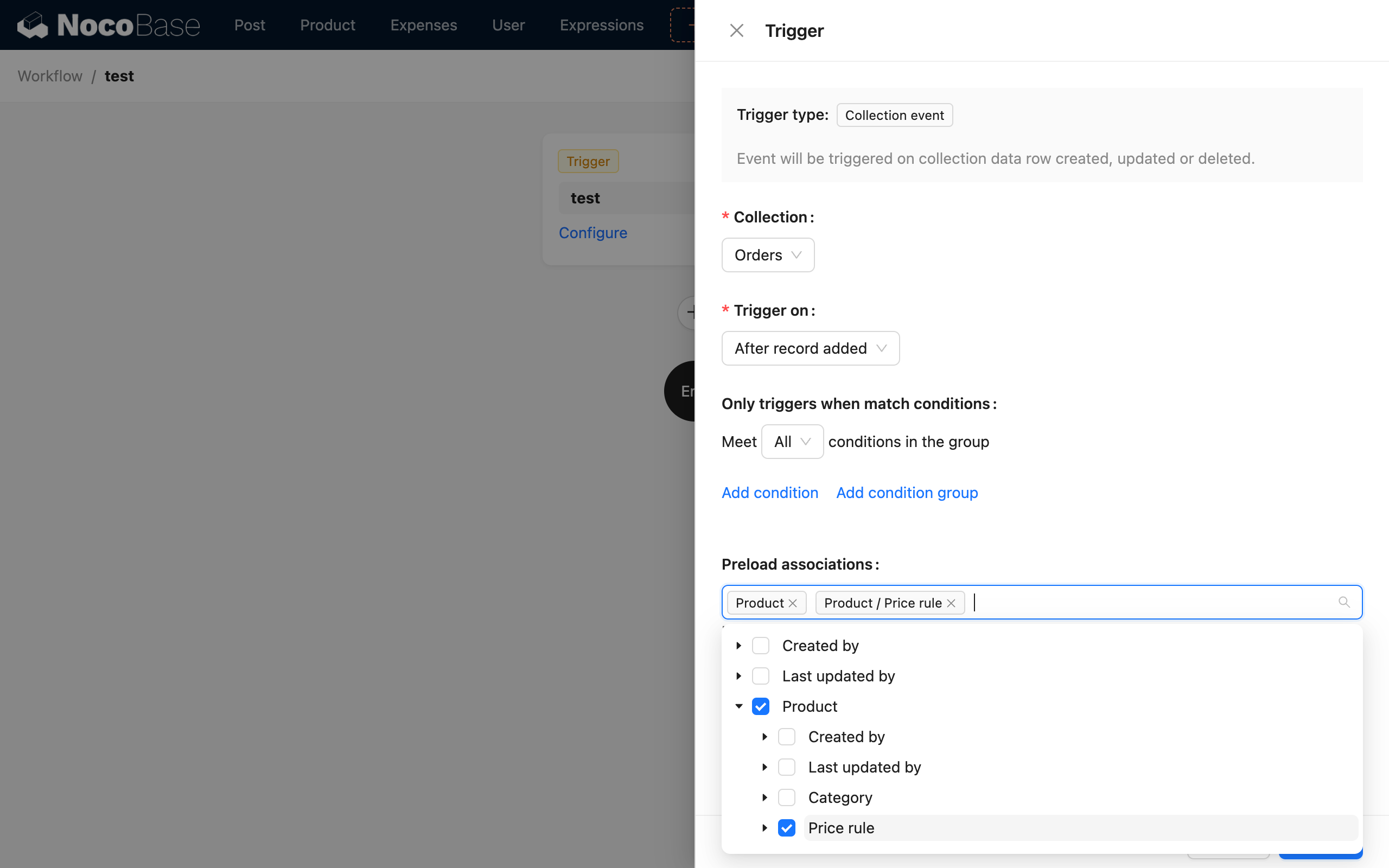
---
url: /data-sources/collection-fdw/enable-federated.md
---
# How to Enable the Federated Engine in MySQL
The MySQL database does not enable the federated module by default. You need to modify the my.cnf configuration. If you are using the Docker version, you can handle the extension situation through volumes:
```yml
mysql:
image: mysql:8.1.0
volumes:
- ./storage/mysql-conf:/etc/mysql/conf.d
environment:
MYSQL_DATABASE: nocobase
MYSQL_USER: nocobase
MYSQL_PASSWORD: nocobase
MYSQL_ROOT_PASSWORD: nocobase
restart: always
networks:
- nocobase
```
Create a new `./storage/mysql-conf/federated.cnf` file
```ini
[mysqld]
federated
```
Restart MySQL
```bash
docker compose up -d mysql
```
Check if federated is activated
```sql
show engines
```
---
url: /data-sources/collection-fdw/index.md
---
# Connect Foreign Data Tables(FDW)
## Introduction
This is a plugin that connects to remote data tables based on the foreign data wrapper of the database. Currently, it supports MySQL and PostgreSQL databases.
:::info{title="Connecting Data Sources vs Connecting External Data Tables"}
- **Connecting data sources** refers to establishing a connection with a specific database or API service, and you can fully use the features of the database or the services provided by the API;
- **Connecting external data tables** refers to obtaining data from the outside and mapping it for local use. In the database, it is called FDW (Foreign Data Wrapper), which is a database technology that focuses on using remote tables as local tables and can only connect one by one. Because it is remote access, there will be various constraints and limitations when using it.
-
The two can also be used in combination. The former is used to establish a connection with the data source, and the latter is used for cross data-source access. For example, a certain PostgreSQL data source is connected, and a certain table in this data source is an external data table created based on FDW.
:::
### MySQL
MySQL uses the `federated` engine, which needs to be activated, and supports connecting to remote MySQL and protocol-compatible databases, such as MariaDB. For more details, refer to the [Federated Storage Engine](https://dev.mysql.com/doc/refman/8.0/en/federated-storage-engine.html) documentation.
### PostgreSQL
In PostgreSQL, different types of `fdw` extensions can be used to support different types of remote data. The currently supported extensions include:
- [postgres_fdw](https://www.postgresql.org/docs/current/postgres-fdw.html): Connect to a remote PostgreSQL database in PostgreSQL.
- [mysql_fdw(under development)](https://github.com/EnterpriseDB/mysql_fdw): Connect to a remote MySQL database in PostgreSQL.
- For other types of fdw extensions, refer to [PostgreSQL Foreign Data Wrappers](https://wiki.postgresql.org/wiki/Foreign_data_wrappers). You need to implement the corresponding adaptation interface in the code.
## Installation
Prerequisites
- If the Main database of NocoBase is MySQL, it needs to activate `federated`. Refer to [How to enable the federated engine in MySQL](./enable-federated.md)
Then install and activate the plugin through the plugin manager
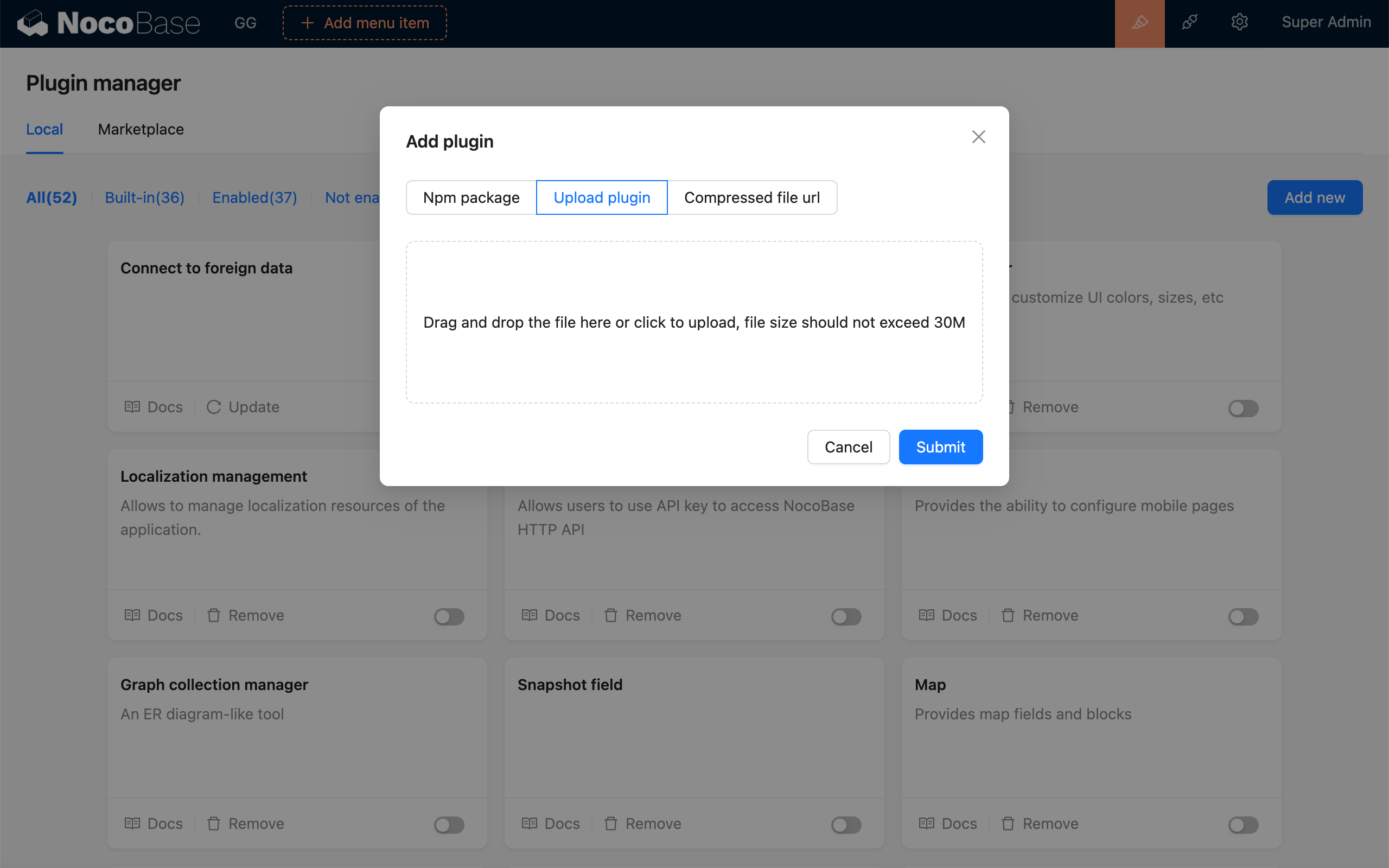
## User Manual
Under "Collection manager > Create collection", select "Connect to foreign data"
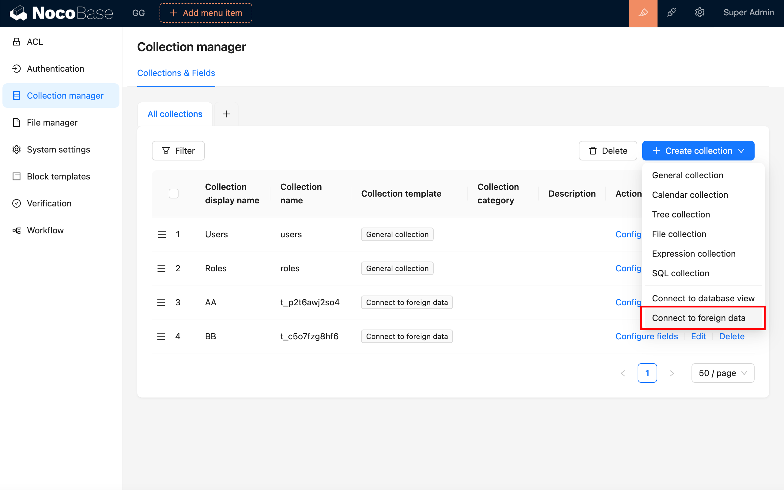
In the "Database Server" dropdown, select an existing database service, or "Create Database Server"
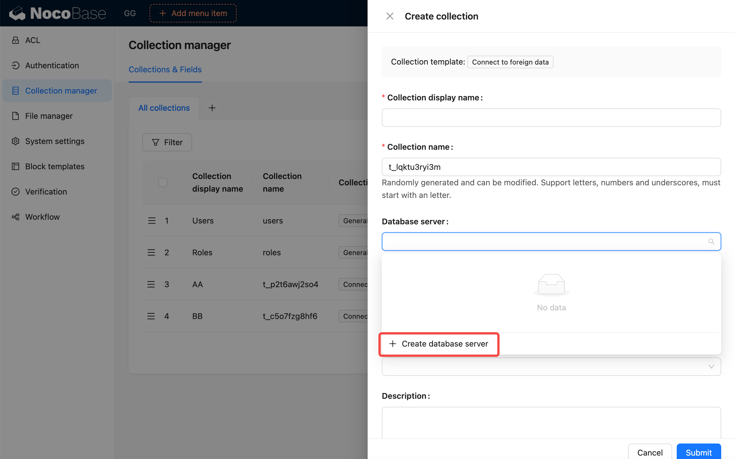
Create a database server
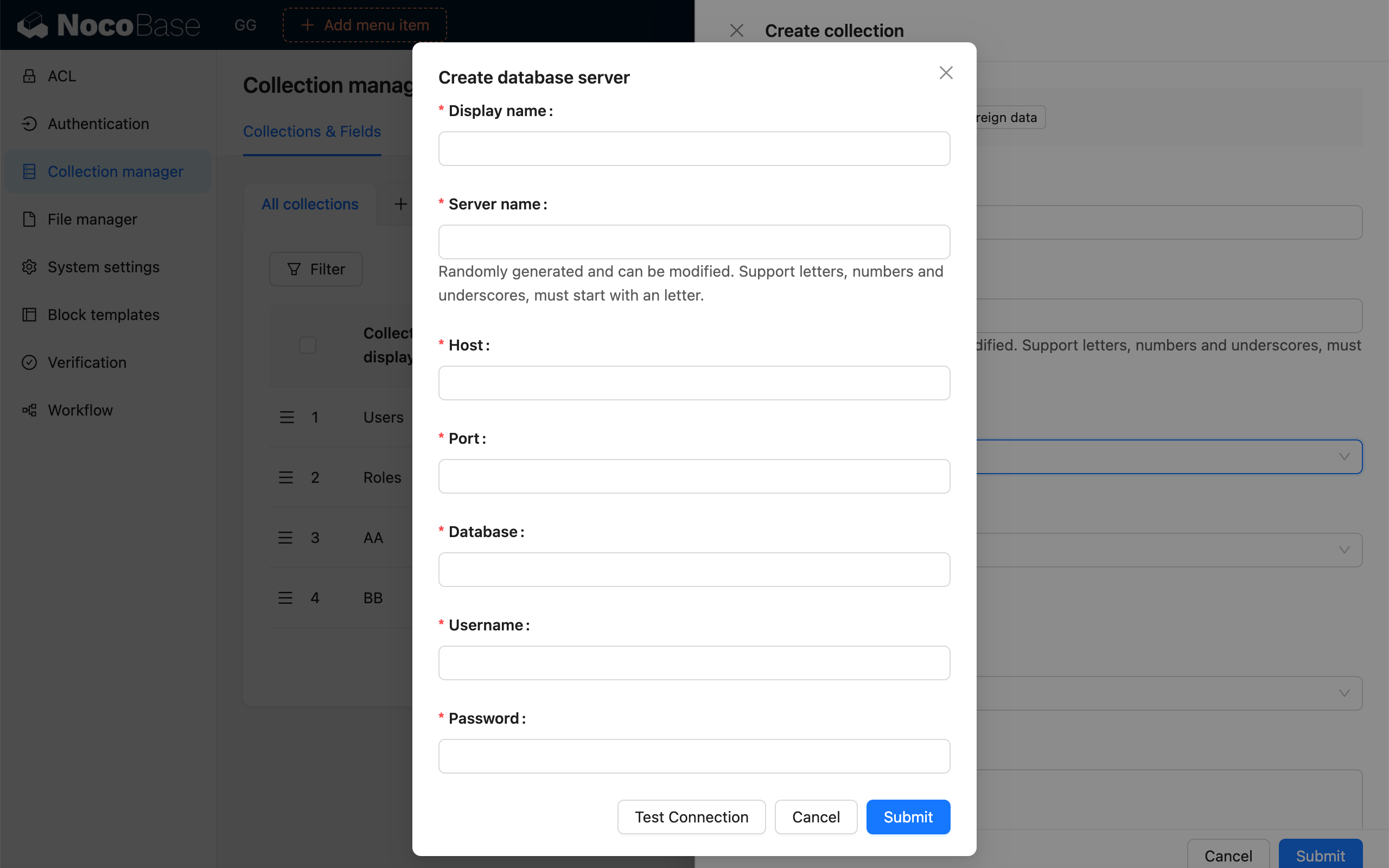
After selecting the database server, in the "Remote table" dropdown, select the data table you need to connect.
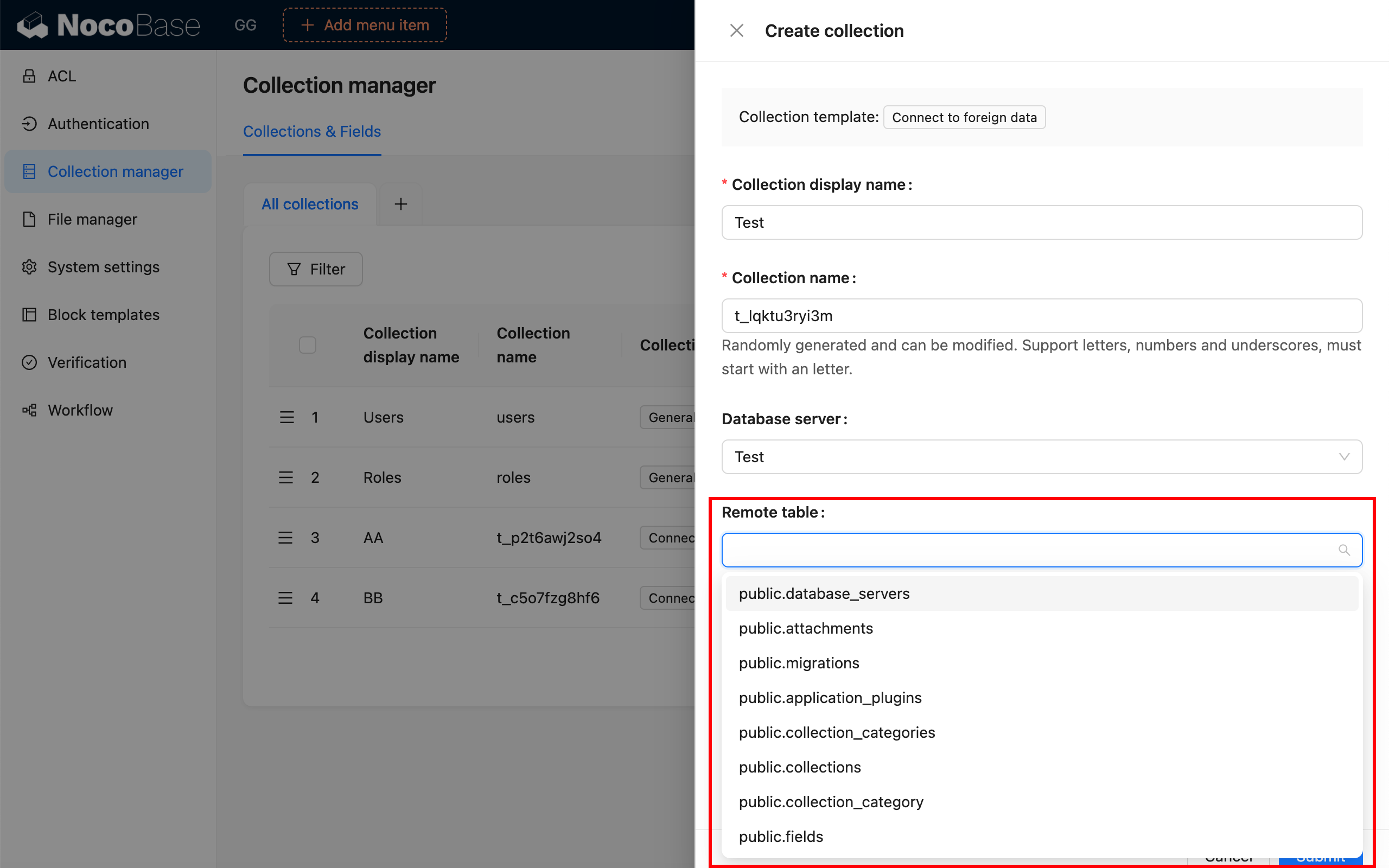
Configure field information
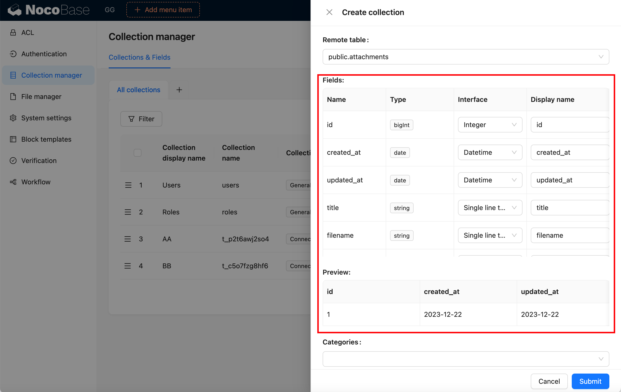
If the remote table has structural changes, you can also "Sync from remote table"
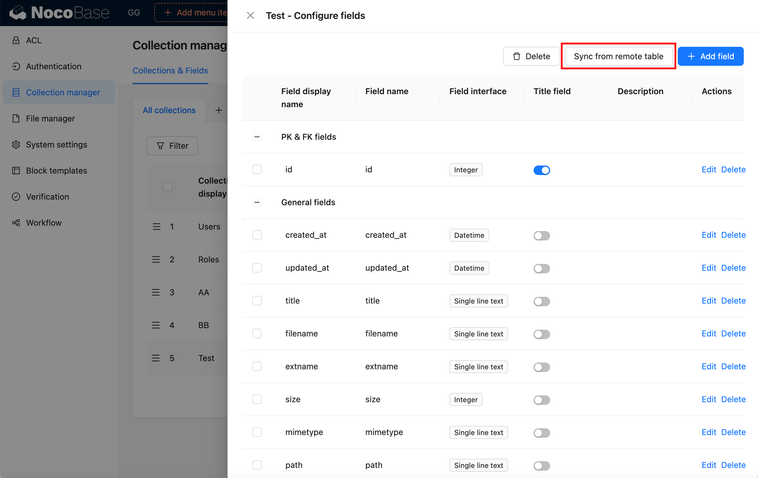
Remote table sync
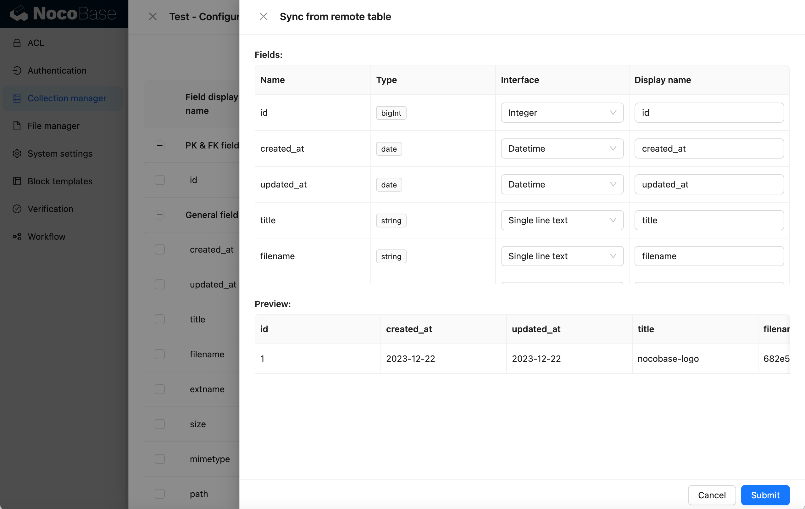
Finally, display it on the interface
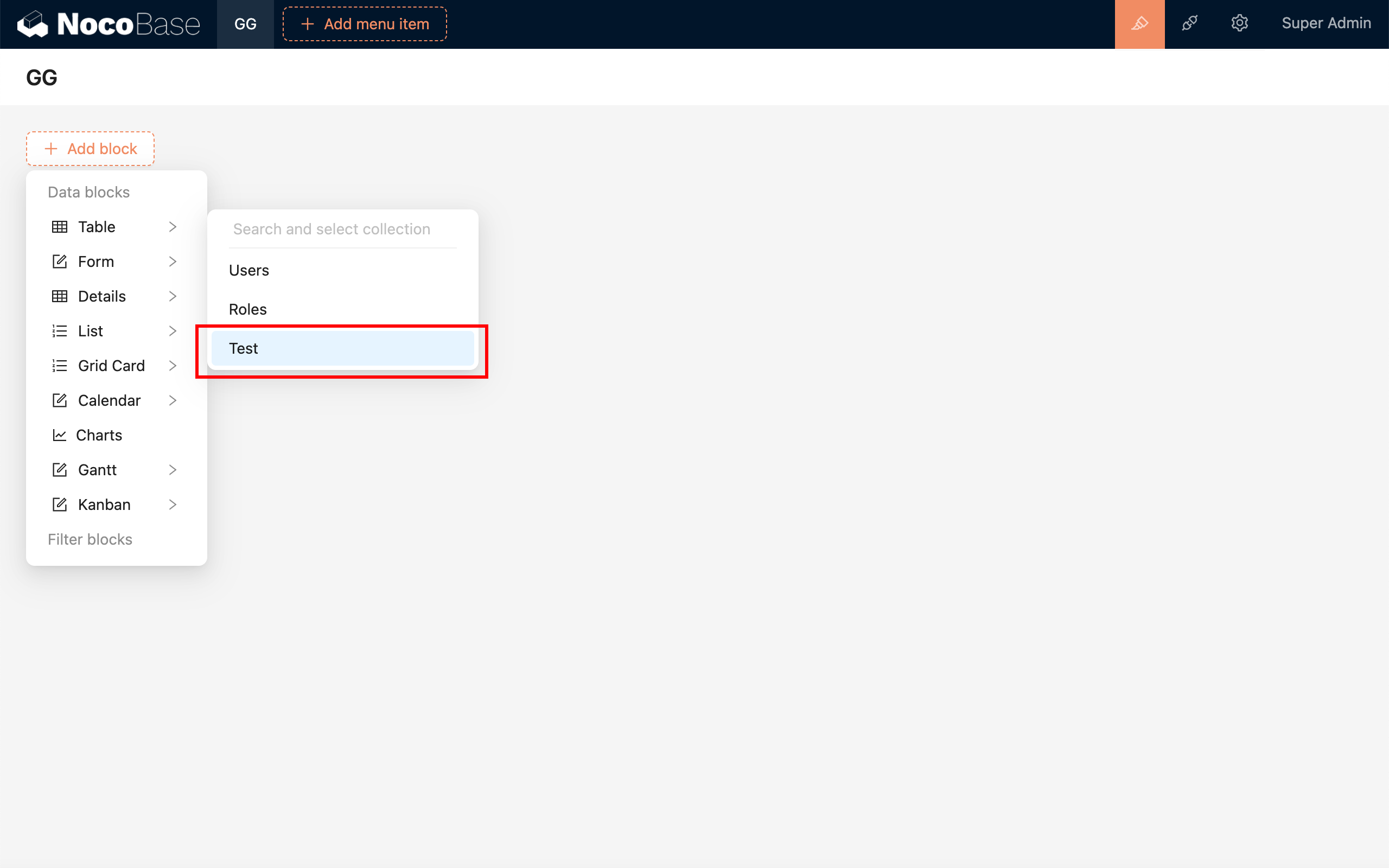
---
url: /data-sources/collection-sql/index.md
---
# SQL Collection
## Introduction
The SQL collection provides a powerful method for retrieving data using SQL queries. By extracting data fields through SQL queries and configuring the associated field metadata, users can utilize these fields as though they were working with a standard table. This feature is particularly beneficial for scenarios involving complex join queries, statistical analysis, and more.
## User Manual
### Creating a New SQL Collection
Next, we'll discuss how to register server-side interfaces and client-side user interfaces.
## Server
### Authentication Interface
The NocoBase kernel provides registration and management for extending authentication types. The core logic processing of extending the login plugin requires inheriting the `Auth` abstract class of the kernel and implementing the corresponding standard interfaces.
For the complete API, see [Auth](/api/auth/auth).
```typescript
import { Auth } from '@nocobase/auth';
class CustomAuth extends Auth {
set user(user) {}
get user() {}
async check() {}
async signIn() {}
}
```
The kernel also registers basic resource operations related to user authentication.
| API | Description |
| -------------- | ----------------------- |
| `auth:check` | Check if user is logged in |
| `auth:signIn` | Sign in |
| `auth:signUp` | Sign up |
| `auth:signOut` | Sign out |
In most cases, the extended user authentication type can also use the existing JWT authentication logic to generate the credential for the user to access the API. The `BaseAuth` class in the kernel has done the basic implementation of the `Auth` abstract class, see [BaseAuth](../../../api/auth/base-auth.md). Plugins can directly inherit the `BaseAuth` class to reuse part of the logic code and reduce development costs.
```javascript
import { BaseAuth } from '@nocobase/auth';
class CustomAuth extends BaseAuth {
constructor(config: AuthConfig) {
// Set user collection
const userCollection = config.ctx.db.getCollection('users');
super({ ...config, userCollection });
}
// Implement user authentication logic
async validate() {}
}
```
### User Data
When implementing user authentication logic, it usually involves handling user data. In a NocoBase application, the related collections are defined by default as:
| Collections | Description | Plugin |
| --------------------- | -------------------------------------------------------------------------------------------------------------------- | ----------------------------------------------------------------- |
| `users` | Store user information, such as email, nickname, and password | [User Plugin (`@nocobase/plugin-users`)](/users-permissions/user) |
| `authenticators` | Store authenticator (authentication type entity) information, corresponding to authentication type and configuration | User Authentication Plugin (`@nocobase/plugin-auth`) |
| `usersAuthenticators` | Associates users and authenticators, saves user information under the corresponding authenticator | User Authentication Plugin (`@nocobase/plugin-auth`) |
In general, extended login methods use `users` and `usersAuthenticators` to store corresponding user data. Only in special cases do you need to add a new Collection yourself.
The main fields of `usersAuthenticators` are
| Field | Description |
| --------------- | ------------------------------------------------------------------------------------------- |
| `uuid` | Unique identifier for this type of authentication, such as a phone number or a third-party service user ID |
| `meta` | JSON field, other information to be saved |
| `userId` | User ID |
| `authenticator` | Authenticator name (unique identifier) |
For user query and creation operations, the `authenticators` data model `AuthModel` also encapsulates several methods that can be used in the `CustomAuth` class via `this.authenticator[methodName]`. For the complete API, see [AuthModel](./api#authmodel).
```ts
import { AuthModel } from '@nocobase/plugin-auth';
class CustomAuth extends BaseAuth {
async validate() {
// ...
const authenticator = this.authenticator as AuthModel;
this.authenticator.findUser(); // Query user
this.authenticator.newUser(); // Create new user
this.authenticator.findOrCreateUser(); // Query or create new user
// ...
}
}
```
### Authentication Type Registration
The extended authentication method needs to be registered with the authentication management module.
```javascript
class CustomAuthPlugin extends Plugin {
async load() {
this.app.authManager.registerTypes('custom-auth-type', {
auth: CustomAuth,
});
}
}
```
## Client
The client user interface is registered through the interface `registerType` provided by the user authentication plugin client:
```ts
import AuthPlugin from '@nocobase/plugin-auth/client';
class CustomAuthPlugin extends Plugin {
async load() {
const auth = this.app.pm.get(AuthPlugin);
auth.registerType('custom-auth-type', {
components: {
SignInForm, // Sign in form
SignInButton, // Sign in (third-party) button, an alternative to the login form
SignUpForm, // Sign up form
AdminSettingsForm, // Admin settings form
},
});
}
}
```
### Sign In Form

If multiple authenticators corresponding to the authentication type have registered login forms, they will be displayed in the form of Tabs. The Tab title is the title of the authenticator configured in the background.

### Sign In Button

Usually for third-party login buttons, but can actually be any component.
### Sign Up Form

If you need to jump from the login page to the sign up page, you need to handle it yourself in the login component.
### Admin Settings Form

The top is the generic authenticator configuration, and the bottom is the part of the custom configuration form that can be registered.
### Request APIs
To initiate requests for user authentication-related interfaces on the client-side, you can use the SDK provided by NocoBase.
```ts
import { useAPIClient } from '@nocobase/client';
// Use in component
const api = useAPIClient();
api.auth.signIn(data, authenticator);
```
For detailed API references, see [@nocobase/sdk - Auth](/api/sdk/auth).
---
url: /auth-verification/auth/index.md
---
# User Authentication
The user authentication module of NocoBase mainly consists of two parts:
- The `@nocobase/auth` in the kernel defines login, registration, verification and other user authentication related expandable interfaces and middleware, and is also used for registering and managing various extended authentication methods.
- The `@nocobase/plugin-auth` in the plugin is used to initialize the authentication management module in the kernel, and also provides basic username (or email) / password authentication method.
> It needs to be used in conjunction with the user management function provided by the [`@nocobase/plugin-users` plugin](/users-permissions/user).
In addition, NocoBase also provides other various user authentication method plugins:
- [@nocobase/plugin-auth-sms](/auth-verification/auth-sms/) - Provides SMS verification login function
- [@nocobase/plugin-auth-saml](/auth-verification/auth-saml/) - Provides SAML SSO login function
- [@nocobase/plugin-auth-oidc](/auth-verification/auth-oidc/) - Provides OIDC SSO login function
- [@nocobase/plugin-auth-cas](/auth-verification/auth-cas/) - Provides CAS SSO login function
- [@nocobase/plugin-auth-ldap](/auth-verification/auth-ldap/) - Provides LDAP SSO login function
- [@nocobase/plugin-auth-wecom](/auth-verification/auth-wecom/) - Provides WeCom login function
- [@nocobase/plugin-auth-dingtalk](/auth-verification/auth-dingtalk/) - Provides DingTalk login function
Through the above plugins, after the administrator configures the corresponding authentication method, users can directly use the user identity provided by platforms such as Google Workspace, Microsoft Azure to log in to the system, and can also connect to Auth0, Logto, Keycloak and other platform tools. In addition, developers can also conveniently expand other authentication methods they need through the basic interfaces we provide.
---
url: /auth-verification/auth/password.md
---
# Password Authentication
## Configuration Interface

## Allow Sign Up
When sign up is allowed, the login page will display the link to create an account, and you can go to the sign up page.

Sign up page

When sign up is not allowed, the login page will not display the link to create an account.

When sign up is not allowed, the sign up page cannot be accessed.

## Sign Up Form Settingsv1.4.0-beta.7+
You can set which fields in the user collection need to be displayed in the sign up form and whether they are required or not. At least one of username or email fields needs to be set to display and required.

Sign up page

## Forgot Passwordv1.8.0+
The forgot password feature allows users to reset their password via email verification if they forget it.
### Administrator Configuration
1. **Enable Forgot Password Feature**
In "Settings" > "Authentication" > "Forgot Password" tab, check the "Enable Forgot Password Feature" checkbox.

2. **Configure Notification Channel**
Select an email notification channel (currently only email is supported). If no notification channel is available, you need to add one first.

3. **Configure Password Reset Email**
Customize the email subject and content, supporting HTML or plain text format. You can use the following variables:
- Current user
- System settings
- Reset password link
- Reset link expiration (minutes)

4. **Set Reset Link Expiration**
Set the validity period (in minutes) for the reset link, default is 120 minutes.

### User Workflow
1. **Initiate Password Reset Request**
Click the "Forgot Password" link on the login page (requires the administrator to enable the forgot password feature first) to go to the forgot password page.

Enter the registered email address and click the "Send Reset Email" button.

2. **Reset Password**
The user will receive an email containing a reset link. Click the link to open a page where you can set a new password.

After setting it up, the user can log in to the system with the new password.
### Notes
- The reset link has a time limit, by default it is valid for 120 minutes after generation (configurable by the administrator).
- The link can only be used once and becomes invalid immediately after use.
- If the user does not receive the reset email, please check if the email address is correct or check the spam folder.
- The administrator should ensure that the mail server configuration is correct to guarantee that the reset email can be sent successfully.
---
url: /auth-verification/index.md
---
# Authentication and Verification
---
url: /auth-verification/verification-totp/index.md
---
# Verification: TOTP Authenticator
## Introduction
The TOTP Authenticator allows users to bind any authenticator that complies with the TOTP (Time-based One-Time Password) specification (RFC-6238), and perform identity verification using a time-based one-time password (TOTP).
## Administrator Configuration
Navigate to the Verification Management page.

Add - TOTP Authenticator

Apart from a unique identifier and title, no additional configuration is required for the TOTP authenticator.

## User Binding
After adding the authenticator, users can bind the TOTP authenticator in their personal verification management area.

:::warning
The plugin does not currently provide a recovery code mechanism. Once the TOTP authenticator is bound, users are advised to keep it secure. If the authenticator is accidentally lost, they can use an alternative verification method to verify their identity, unbind the authenticator, and then rebind it.
:::
## User Unbinding
Unbinding the authenticator requires verification using the already bound verification method.

---
url: /auth-verification/verification/dev/scene.md
---
# Extending Validation Scenarios
## Basic Concepts
## Registering a Validation Action
## Registering a Validation Scenario
## Binding Scenarios and Validation Types
## Automatic Validation
## Manual Validation
---
url: /auth-verification/verification/dev/sms-type.md
---
# Extend SMS Provider
This article primarily explains how to extend the SMS provider functionality in the [Verification: SMS](../sms) feature via a plugin.
## Client
### Register Configuration Form
When configuring the SMS verifier, after selecting an SMS provider type, a configuration form associated with that provider type will appear. This configuration form needs to be registered by the developer on the client side.

```ts
import { Plugin, SchemaComponent } from '@nocobase/client';
import PluginVerificationClient from '@nocobase/plugin-verification/client';
import React from 'react';
const CustomSMSProviderSettingsForm: React.FC = () => {
return
}
class PluginCustomSMSProviderClient extends Plugin {
async load() {
const plugin = this.app.pm.get('verification') as PluginVerificationClient;
plugin.smsOTPProviderManager.registerProvider('custom-sms-provider-name', {
components: {
AdminSettingsForm: CustomSMSProviderSettingsForm,
},
});
}
}
```
## Server
### Implement Sending Interface
The verification plugin has already encapsulated the process of creating one-time dynamic passwords (OTPs), so developers only need to implement the logic for sending messages to interact with the SMS provider.
```ts
class CustomSMSProvider extends SMSProvider {
constructor(options) {
super(options);
// options is the configuration object from the client
const options = this.options;
// ...
}
async send(phoneNumber: string, data: { code: string }) {
// ...
}
}
```
### Register Verification Type
Once the sending interface is implemented, it needs to be registered.
```ts
import { Plugin } from '@nocobase/server';
import PluginVerificationServer from '@nocobase/plugin-verification';
import { tval } from '@nocobase/utils';
class PluginCustomSMSProviderServer extends Plugin {
async load() {
const plugin = this.app.pm.get('verification') as PluginVerificationServer;
// The name must correspond to the one used on the client
plugin.smsOTPProviderManager.registerProvider('custom-sms-provider-name', {
title: tval('Custom SMS provider', { ns: namespace }),
provider: CustomSMSProvider,
});
}
}
```
---
url: /auth-verification/verification/dev/type.md
---
# Extending Validation Types
## Client-side
### Register the configuration form
## Server-side
### Implement the validation class
### Register the validation type
---
url: /auth-verification/verification/index.md
---
# Verification
:::info{title=Note}
Starting with `1.6.0-alpha.30`, the original "verification code" feature has been upgraded to "Verification Management", which supports managing and integrating various methods of user verification. Once users bind the corresponding verification method, they can perform identity verification when needed. This feature is planned to be stably supported beginning with version `1.7.0`.
:::
## Introduction
**The Verification Management Center supports managing and integrating various methods of user verification.** For example:
- SMS Verification Code – Provided by the verification plugin by default. Refer to: [Verification: SMS](./sms)
- TOTP Authenticator – Refer to: [Verification: TOTP Authenticator](../verification-totp/)
Developers can also extend other types of verification via plugins. Refer to: [Extending Verification Types](./dev/type)
**Users can perform identity verification when needed after binding the corresponding verification method.** For example:
- SMS Verification Login – Refer to: [Authentication: SMS](../auth-sms/index.md)
- Two-Factor Authentication (2FA) – Refer to: [Two-Factor Authentication (2FA)](../2fa/)
- Secondary Verification for Risk Operations – Future support
Developers can also integrate identity verification into other necessary scenarios by extending plugins. Refer to: [Extending Verification Scenarios](./dev/scene)
**Differences and Relationships Between the Verification Module and the User Authentication Module:** The User Authentication Module is primarily responsible for identity authentication during user login, with processes such as SMS login and two-factor authentication relying on verifiers provided by the Verification Module; meanwhile, the Verification Module handles identity verification for various high-risk operations, with user login being one of those scenarios.


---
url: /auth-verification/verification/sms.md
---
# Verification: SMS
## Introduction
The SMS verification code is a built-in verification type used to generate a one-time dynamic password (OTP) and send it to the user via SMS.
## Adding an SMS Verifier
Navigate to the verification management page.

Add - SMS OTP

## Administrator Configuration

Currently, the supported SMS service providers are:
- Aliyun SMS
- Tencent Cloud SMS
When configuring the SMS template in the service provider's admin panel, you need to reserve a parameter for the verification code.
- Aliyun configuration example: `Your verification code is: ${code}`
- Tencent Cloud configuration example: `Your verification code is: {1}`
Developers can also extend support for other SMS service providers in the form of plugins. See: [Extending SMS Service Providers](./dev/sms-type)
## User Binding
After adding the verifier, users can bind a phone number in their personal verification management.


Once the binding is successful, identity verification can be performed in any scenario that uses this verifier.

## User Unbinding
Unbinding a phone number requires verification through an existing bound method.

---
url: /calculation-engine/formula.md
---
# Formula.js
[Formula.js](http://formulajs.info/) provides a large collection of Excel-compatible functions.
## Function Reference
### Dates
| Function | Definition | Example call | Parameters | Expected result |
| :--- | :--- | :--- | :--- | :--- |
| **DATE** | Creates a date based on the supplied year, month, and day. | `DATE(2008, 7, 8)` | Year (integer), month (1-12), day (1-31). | Tue Jul 08 2008 00:00:00 GMT-0700 (PDT) |
| **DATEVALUE** | Converts a date in text format to a date serial number. | `DATEVALUE('8/22/2011')` | Text string that represents a date. | Mon Aug 22 2011 00:00:00 GMT-0700 (PDT) |
| **DAY** | Returns the day portion of a date. | `DAY('15-Apr-11')` | Date value or a date text string. | 15 |
| **DAYS** | Calculates the number of days between two dates. | `DAYS('3/15/11', '2/1/11')` | End date, start date. | 42 |
| **DAYS360** | Calculates the number of days between two dates based on a 360-day year. | `DAYS360('1-Jan-11', '31-Dec-11')` | Start date, end date. | 360 |
| **EDATE** | Returns the date that is a specified number of months before or after a date. | `EDATE('1/15/11', -1)` | Start date, number of months (positive for future, negative for past). | Wed Dec 15 2010 00:00:00 GMT-0800 (PST) |
| **EOMONTH** | Returns the last day of the month before or after the specified number of months. | `EOMONTH('1/1/11', -3)` | Start date, number of months (positive for future, negative for past). | Sun Oct 31 2010 00:00:00 GMT-0700 (PDT) |
| **HOUR** | Returns the hour portion of a time value. | `HOUR('7/18/2011 7:45:00 AM')` | Time value or time text string. | 7 |
| **MINUTE** | Returns the minute portion of a time value. | `MINUTE('2/1/2011 12:45:00 PM')` | Time value or time text string. | 45 |
| **ISOWEEKNUM** | Returns the ISO week number of the year for a given date. | `ISOWEEKNUM('3/9/2012')` | Date value or a date text string. | 10 |
| **MONTH** | Returns the month portion of a date. | `MONTH('15-Apr-11')` | Date value or a date text string. | 4 |
| **NETWORKDAYS** | Counts the number of working days between two dates, excluding weekends and optional holidays. | `NETWORKDAYS('10/1/2012', '3/1/2013', ['11/22/2012'])` | Start date, end date, optional array of holidays. | 109 |
| **NETWORKDAYSINTL** | Counts working days between two dates, allowing custom weekends and optional holidays. | `NETWORKDAYSINTL('1/1/2006', '2/1/2006', 7, ['1/2/2006'])` | Start date, end date, weekend mode, optional array of holidays. | 23 |
| **NOW** | Returns the current date and time. | `NOW()` | No parameters. | Thu Feb 20 2020 23:02:55 GMT+0100 (Central European Standard Time) |
| **SECOND** | Returns the seconds portion of a time value. | `SECOND('2/1/2011 4:48:18 PM')` | Time value or time text string. | 18 |
| **TIME** | Builds a time value from the supplied hour, minute, and second. | `TIME(16, 48, 10)` | Hour (0-23), minute (0-59), second (0-59). | 0.7001157407407408 |
| **TIMEVALUE** | Converts a time in text format to a time serial number. | `TIMEVALUE('22-Aug-2011 6:35 AM')` | Text string that represents a time. | 0.2743055555555556 |
| **TODAY** | Returns the current date. | `TODAY()` | No parameters. | Thu Feb 20 2020 23:02:55 GMT+0100 (Central European Standard Time) |
| **WEEKDAY** | Returns the number corresponding to the day of the week. | `WEEKDAY('2/14/2008', 3)` | Date value or a date text string, return type (1-3). | 3 |
| **YEAR** | Returns the year portion of a date. | `YEAR('7/5/2008')` | Date value or a date text string. | 2008 |
| **WEEKNUM** | Returns the week number in a year for a given date. | `WEEKNUM('3/9/2012', 2)` | Date value or a date text string, optional week starting day (1=Sunday, 2=Monday). | 11 |
| **WORKDAY** | Returns the date before or after a given number of working days, excluding weekends and optional holidays. | `WORKDAY('10/1/2008', 151, ['11/26/2008', '12/4/2008'])` | Start date, number of working days, optional array of holidays. | Mon May 04 2009 00:00:00 GMT-0700 (PDT) |
| **WORKDAYINTL** | Returns the date before or after a number of working days with custom weekends and optional holidays. | `WORKDAYINTL('1/1/2012', 30, 17)` | Start date, number of working days, weekend mode. | Sun Feb 05 2012 00:00:00 GMT-0800 (PST) |
| **YEARFRAC** | Calculates the fractional number of years between two dates. | `YEARFRAC('1/1/2012', '7/30/2012', 3)` | Start date, end date, optional basis (day-count basis). | 0.5780821917808219 |
### Financial
| Function | Definition | Example call | Parameters | Expected result |
| :--- | :--- | :--- | :--- | :--- |
| **ACCRINT** | Calculates accrued interest for a security that pays periodic interest. | `ACCRINT('01/01/2011', '02/01/2011', '07/01/2014', 0.1, 1000, 1, 0)` | Issue date, first interest date, settlement date, annual rate, par value, frequency, basis. | 350 |
| **CUMIPMT** | Calculates the cumulative interest paid on a series of payments. | `CUMIPMT(0.1/12, 30*12, 100000, 13, 24, 0)` | Rate, total periods, present value, start period, end period, payment type (0=end, 1=beginning). | -9916.77251395708 |
| **CUMPRINC** | Calculates the cumulative principal paid on a series of payments. | `CUMPRINC(0.1/12, 30*12, 100000, 13, 24, 0)` | Rate, total periods, present value, start period, end period, payment type (0=end, 1=beginning). | -614.0863271085149 |
| **DB** | Calculates depreciation using the fixed-declining balance method. | `DB(1000000, 100000, 6, 1, 6)` | Cost, salvage value, life, period, month. | 159500 |
| **DDB** | Calculates depreciation using double-declining balance or another specified method. | `DDB(1000000, 100000, 6, 1, 1.5)` | Cost, salvage value, life, period, factor. | 250000 |
| **DOLLARDE** | Converts a price expressed as a fraction to a decimal. | `DOLLARDE(1.1, 16)` | Price as a fractional dollar, denominator. | 1.625 |
| **DOLLARFR** | Converts a price expressed as a decimal to a fraction. | `DOLLARFR(1.625, 16)` | Price as a decimal dollar, denominator. | 1.1 |
| **EFFECT** | Calculates the effective annual interest rate. | `EFFECT(0.1, 4)` | Nominal annual rate, number of compounding periods per year. | 0.10381289062499977 |
| **FV** | Calculates the future value of an investment. | `FV(0.1/12, 10, -100, -1000, 0)` | Rate per period, number of periods, payment per period, present value, payment type (0=end, 1=beginning). | 2124.874409194097 |
| **FVSCHEDULE** | Calculates the future value of principal using a series of compounding rates. | `FVSCHEDULE(100, [0.09,0.1,0.11])` | Principal, array of rates. | 133.08900000000003 |
| **IPMT** | Calculates the interest payment for a specific period. | `IPMT(0.1/12, 6, 2*12, 100000, 1000000, 0)` | Rate per period, period, total periods, present value, future value, payment type (0=end, 1=beginning). | 928.8235718400465 |
| **IRR** | Calculates the internal rate of return. | `IRR([-75000,12000,15000,18000,21000,24000], 0.075)` | Array of cash flows, guess. | 0.05715142887178447 |
| **ISPMT** | Calculates the interest paid during a specific period (for loans). | `ISPMT(0.1/12, 6, 2*12, 100000)` | Rate per period, period, total periods, loan amount. | -625 |
| **MIRR** | Calculates the modified internal rate of return. | `MIRR([-75000,12000,15000,18000,21000,24000], 0.1, 0.12)` | Array of cash flows, finance rate, reinvestment rate. | 0.07971710360838036 |
| **NOMINAL** | Calculates the nominal annual interest rate. | `NOMINAL(0.1, 4)` | Effective annual rate, number of compounding periods per year. | 0.09645475633778045 |
| **NPER** | Calculates the number of periods required to reach a target value. | `NPER(0.1/12, -100, -1000, 10000, 0)` | Rate per period, payment per period, present value, future value, payment type (0=end, 1=beginning). | 63.39385422740764 |
| **NPV** | Calculates the net present value of a series of future cash flows. | `NPV(0.1, -10000, 2000, 4000, 8000)` | Discount rate per period, array of cash flows. | 1031.3503176012546 |
| **PDURATION** | Calculates the time required to reach a desired value. | `PDURATION(0.1, 1000, 2000)` | Rate per period, present value, future value. | 7.272540897341714 |
| **PMT** | Calculates the periodic payment for a loan. | `PMT(0.1/12, 2*12, 1000, 10000, 0)` | Rate per period, total periods, present value, future value, payment type (0=end, 1=beginning). | -42426.08563793503 |
| **PPMT** | Calculates the principal payment for a specific period. | `PPMT(0.1/12, 6, 2*12, 100000, 1000000, 0)` | Rate per period, period, total periods, present value, future value, payment type (0=end, 1=beginning). | -43354.909209775076 |
| **PV** | Calculates the present value of an investment. | `PV(0.1/12, 2*12, 1000, 10000, 0)` | Rate per period, number of periods, payment per period, future value, payment type (0=end, 1=beginning). | -29864.950264779152 |
| **RATE** | Calculates the interest rate per period. | `RATE(2*12, -1000, -10000, 100000, 0, 0.1)` | Total periods, payment per period, present value, future value, payment type (0=end, 1=beginning), guess. | 0.06517891177181533 |
### Engineering
| Function | Definition | Example call | Parameters | Expected result |
| :--- | :--- | :--- | :--- | :--- |
| **BIN2DEC** | Converts a binary number to decimal. | `BIN2DEC(101010)` | Binary number. | 42 |
| **BIN2HEX** | Converts a binary number to hexadecimal. | `BIN2HEX(101010)` | Binary number. | 2a |
| **BIN2OCT** | Converts a binary number to octal. | `BIN2OCT(101010)` | Binary number. | 52 |
| **BITAND** | Returns the bitwise AND of two numbers. | `BITAND(42, 24)` | Integer, integer. | 8 |
| **BITLSHIFT** | Performs a bitwise left shift. | `BITLSHIFT(42, 24)` | Integer, number of bits to shift. | 704643072 |
| **BITOR** | Returns the bitwise OR of two numbers. | `BITOR(42, 24)` | Integer, integer. | 58 |
| **BITRSHIFT** | Performs a bitwise right shift. | `BITRSHIFT(42, 2)` | Integer, number of bits to shift. | 10 |
| **BITXOR** | Returns the bitwise XOR of two numbers. | `BITXOR(42, 24)` | Integer, integer. | 50 |
| **COMPLEX** | Creates a complex number. | `COMPLEX(3, 4)` | Real part, imaginary part. | 3+4i |
| **CONVERT** | Converts a number from one measurement unit to another. | `CONVERT(64, 'kibyte', 'bit')` | Value, from unit, to unit. | 524288 |
| **DEC2BIN** | Converts a decimal number to binary. | `DEC2BIN(42)` | Decimal number. | 101010 |
| **DEC2HEX** | Converts a decimal number to hexadecimal. | `DEC2HEX(42)` | Decimal number. | 2a |
| **DEC2OCT** | Converts a decimal number to octal. | `DEC2OCT(42)` | Decimal number. | 52 |
| **DELTA** | Tests whether two values are equal. | `DELTA(42, 42)` | Number, number. | 1 |
| **ERF** | Returns the error function. | `ERF(1)` | Upper limit. | 0.8427007929497149 |
| **ERFC** | Returns the complementary error function. | `ERFC(1)` | Lower limit. | 0.1572992070502851 |
| **GESTEP** | Tests whether a number is greater than or equal to a threshold. | `GESTEP(42, 24)` | Number, threshold. | 1 |
| **HEX2BIN** | Converts a hexadecimal number to binary. | `HEX2BIN('2a')` | Hexadecimal number. | 101010 |
| **HEX2DEC** | Converts a hexadecimal number to decimal. | `HEX2DEC('2a')` | Hexadecimal number. | 42 |
| **HEX2OCT** | Converts a hexadecimal number to octal. | `HEX2OCT('2a')` | Hexadecimal number. | 52 |
| **IMABS** | Returns the absolute value (magnitude) of a complex number. | `IMABS('3+4i')` | Complex number. | 5 |
| **IMAGINARY** | Returns the imaginary part of a complex number. | `IMAGINARY('3+4i')` | Complex number. | 4 |
| **IMARGUMENT** | Returns the argument of a complex number. | `IMARGUMENT('3+4i')` | Complex number. | 0.9272952180016122 |
| **IMCONJUGATE** | Returns the complex conjugate. | `IMCONJUGATE('3+4i')` | Complex number. | 3-4i |
| **IMCOS** | Returns the cosine of a complex number. | `IMCOS('1+i')` | Complex number. | 0.8337300251311491-0.9888977057628651i |
| **IMCOSH** | Returns the hyperbolic cosine of a complex number. | `IMCOSH('1+i')` | Complex number. | 0.8337300251311491+0.9888977057628651i |
| **IMCOT** | Returns the cotangent of a complex number. | `IMCOT('1+i')` | Complex number. | 0.21762156185440265-0.8680141428959249i |
| **IMCSC** | Returns the cosecant of a complex number. | `IMCSC('1+i')` | Complex number. | 0.6215180171704283-0.3039310016284264i |
| **IMCSCH** | Returns the hyperbolic cosecant of a complex number. | `IMCSCH('1+i')` | Complex number. | 0.3039310016284264-0.6215180171704283i |
| **IMDIV** | Returns the quotient of two complex numbers. | `IMDIV('1+2i', '3+4i')` | Dividend complex number, divisor complex number. | 0.44+0.08i |
| **IMEXP** | Returns the exponential of a complex number. | `IMEXP('1+i')` | Complex number. | 1.4686939399158851+2.2873552871788423i |
| **IMLN** | Returns the natural logarithm of a complex number. | `IMLN('1+i')` | Complex number. | 0.3465735902799727+0.7853981633974483i |
| **IMLOG10** | Returns the base-10 logarithm of a complex number. | `IMLOG10('1+i')` | Complex number. | 0.1505149978319906+0.3410940884604603i |
| **IMLOG2** | Returns the base-2 logarithm of a complex number. | `IMLOG2('1+i')` | Complex number. | 0.5000000000000001+1.1330900354567985i |
| **IMPOWER** | Returns a complex number raised to a power. | `IMPOWER('1+i', 2)` | Complex number, exponent. | 1.2246063538223775e-16+2.0000000000000004i |
| **IMPRODUCT** | Returns the product of complex numbers. | `IMPRODUCT('1+2i', '3+4i', '5+6i')` | Array of complex numbers. | -85+20i |
| **IMREAL** | Returns the real part of a complex number. | `IMREAL('3+4i')` | Complex number. | 3 |
| **IMSEC** | Returns the secant of a complex number. | `IMSEC('1+i')` | Complex number. | 0.4983370305551868+0.591083841721045i |
| **IMSECH** | Returns the hyperbolic secant of a complex number. | `IMSECH('1+i')` | Complex number. | 0.4983370305551868-0.591083841721045i |
| **IMSIN** | Returns the sine of a complex number. | `IMSIN('1+i')` | Complex number. | 1.2984575814159773+0.6349639147847361i |
| **IMSINH** | Returns the hyperbolic sine of a complex number. | `IMSINH('1+i')` | Complex number. | 0.6349639147847361+1.2984575814159773i |
| **IMSQRT** | Returns the square root of a complex number. | `IMSQRT('1+i')` | Complex number. | 1.0986841134678098+0.45508986056222733i |
| **IMSUB** | Returns the difference between two complex numbers. | `IMSUB('3+4i', '1+2i')` | Minuend complex number, subtrahend complex number. | 2+2i |
| **IMSUM** | Returns the sum of complex numbers. | `IMSUM('1+2i', '3+4i', '5+6i')` | Array of complex numbers. | 9+12i |
| **IMTAN** | Returns the tangent of a complex number. | `IMTAN('1+i')` | Complex number. | 0.2717525853195117+1.0839233273386946i |
| **OCT2BIN** | Converts an octal number to binary. | `OCT2BIN('52')` | Octal number. | 101010 |
| **OCT2DEC** | Converts an octal number to decimal. | `OCT2DEC('52')` | Octal number. | 42 |
| **OCT2HEX** | Converts an octal number to hexadecimal. | `OCT2HEX('52')` | Octal number. | 2a |
### Logic
| Function | Definition | Example call | Parameters | Expected result |
| :--- | :--- | :--- | :--- | :--- |
| **AND** | Returns TRUE only when all arguments are TRUE, otherwise FALSE. | `AND(true, false, true)` | One or more logical values (Boolean); the function returns TRUE only when every argument is TRUE. | |
| **FALSE** | Returns the logical value FALSE. | `FALSE()` | No parameters. | |
| **IF** | Returns different values depending on whether a condition is TRUE or FALSE. | `IF(true, 'Hello!', 'Goodbye!')` | Condition, value if TRUE, value if FALSE. | Hello! |
| **IFS** | Evaluates multiple conditions and returns the result of the first TRUE condition. | `IFS(false, 'Hello!', true, 'Goodbye!')` | Multiple pairs of condition and corresponding value. | Goodbye! |
| **NOT** | Reverses a logical value. TRUE becomes FALSE and vice versa. | `NOT(true)` | One logical value (Boolean). | |
| **OR** | Returns TRUE if any argument is TRUE, otherwise FALSE. | `OR(true, false, true)` | One or more logical values (Boolean); returns TRUE when any argument is TRUE. | |
| **SWITCH** | Returns the value that matches an expression; if none match, returns the default. | `SWITCH(7, 9, 'Nine', 7, 'Seven')` | Expression, match value 1, result 1, …, [default]. | Seven |
| **TRUE** | Returns the logical value TRUE. | `TRUE()` | No parameters. | |
| **XOR** | Returns TRUE only when an odd number of arguments are TRUE, otherwise FALSE. | `XOR(true, false, true)` | One or more logical values (Boolean); returns TRUE when an odd count are TRUE. | |
### Math
| Function | Definition | Example call | Parameters | Expected result |
| :--- | :--- | :--- | :--- | :--- |
| **ABS** | Returns the absolute value of a number. | `ABS(-4)` | Number. | 4 |
| **ACOS** | Returns the arccosine (in radians). | `ACOS(-0.5)` | Number between -1 and 1. | 2.0943951023931957 |
| **ACOSH** | Returns the inverse hyperbolic cosine. | `ACOSH(10)` | Number greater than or equal to 1. | 2.993222846126381 |
| **ACOT** | Returns the arccotangent (in radians). | `ACOT(2)` | Any number. | 0.46364760900080615 |
| **ACOTH** | Returns the inverse hyperbolic cotangent. | `ACOTH(6)` | Number whose absolute value is greater than 1. | 0.16823611831060645 |
| **AGGREGATE** | Performs an aggregate calculation while ignoring errors or hidden rows. | `AGGREGATE(9, 4, [-5,15], [32,'Hello World!'])` | Function number, options, array1, …, arrayN. | 10,32 |
| **ARABIC** | Converts a Roman numeral to Arabic. | `ARABIC('MCMXII')` | Roman numeral string. | 1912 |
| **ASIN** | Returns the arcsine (in radians). | `ASIN(-0.5)` | Number between -1 and 1. | -0.5235987755982988 |
| **ASINH** | Returns the inverse hyperbolic sine. | `ASINH(-2.5)` | Any number. | -1.6472311463710965 |
| **ATAN** | Returns the arctangent (in radians). | `ATAN(1)` | Any number. | 0.7853981633974483 |
| **ATAN2** | Returns the arctangent (in radians) of a coordinate pair. | `ATAN2(-1, -1)` | y-coordinate, x-coordinate. | -2.356194490192345 |
| **ATANH** | Returns the inverse hyperbolic tangent. | `ATANH(-0.1)` | Number between -1 and 1. | -0.10033534773107562 |
| **BASE** | Converts a number to text in the specified base. | `BASE(15, 2, 10)` | Number, radix, [minimum length]. | 0000001111 |
| **CEILING** | Rounds a number up to the nearest multiple. | `CEILING(-5.5, 2, -1)` | Number, significance, [mode]. | -6 |
| **CEILINGMATH** | Rounds a number up, using the supplied multiple and direction. | `CEILINGMATH(-5.5, 2, -1)` | Number, [significance], [mode]. | -6 |
| **CEILINGPRECISE** | Rounds a number up to the nearest multiple, ignoring sign. | `CEILINGPRECISE(-4.1, -2)` | Number, [significance]. | -4 |
| **COMBIN** | Returns the number of combinations. | `COMBIN(8, 2)` | Total items, number chosen. | 28 |
| **COMBINA** | Returns the number of combinations with repetitions. | `COMBINA(4, 3)` | Total items, number chosen. | 20 |
| **COS** | Returns the cosine (in radians). | `COS(1)` | Angle in radians. | 0.5403023058681398 |
| **COSH** | Returns the hyperbolic cosine. | `COSH(1)` | Any number. | 1.5430806348152437 |
| **COT** | Returns the cotangent (in radians). | `COT(30)` | Angle in radians. | -0.15611995216165922 |
| **COTH** | Returns the hyperbolic cotangent. | `COTH(2)` | Any number. | 1.0373147207275482 |
| **CSC** | Returns the cosecant (in radians). | `CSC(15)` | Angle in radians. | 1.5377805615408537 |
| **CSCH** | Returns the hyperbolic cosecant. | `CSCH(1.5)` | Any number. | 0.46964244059522464 |
| **DECIMAL** | Converts a number in text form to decimal. | `DECIMAL('FF', 16)` | Text, base. | 255 |
| **ERF** | Returns the error function. | `ERF(1)` | Upper limit. | 0.8427007929497149 |
| **ERFC** | Returns the complementary error function. | `ERFC(1)` | Lower limit. | 0.1572992070502851 |
| **EVEN** | Rounds a number up to the nearest even integer. | `EVEN(-1)` | Number. | -2 |
| **EXP** | Returns e raised to a power. | `EXP(1)` | Exponent. | 2.718281828459045 |
| **FACT** | Returns the factorial. | `FACT(5)` | Non-negative integer. | 120 |
| **FACTDOUBLE** | Returns the double factorial. | `FACTDOUBLE(7)` | Non-negative integer. | 105 |
| **FLOOR** | Rounds a number down to the nearest multiple. | `FLOOR(-3.1)` | Number, significance. | -4 |
| **FLOORMATH** | Rounds a number down using the supplied multiple and direction. | `FLOORMATH(-4.1, -2, -1)` | Number, [significance], [mode]. | -4 |
| **FLOORPRECISE** | Rounds a number down to the nearest multiple, ignoring sign. | `FLOORPRECISE(-3.1, -2)` | Number, [significance]. | -4 |
| **GCD** | Returns the greatest common divisor. | `GCD(24, 36, 48)` | Two or more integers. | 12 |
| **INT** | Rounds a number down to the nearest integer. | `INT(-8.9)` | Number. | -9 |
| **ISEVEN** | Tests whether a number is even. | `ISEVEN(-2.5)` | Number. | |
| **ISOCEILING** | Rounds a number up to the nearest multiple following ISO rules. | `ISOCEILING(-4.1, -2)` | Number, [significance]. | -4 |
| **ISODD** | Tests whether a number is odd. | `ISODD(-2.5)` | Number. | |
| **LCM** | Returns the least common multiple. | `LCM(24, 36, 48)` | Two or more integers. | 144 |
| **LN** | Returns the natural logarithm. | `LN(86)` | Positive number. | 4.454347296253507 |
| **LOG** | Returns the logarithm in the specified base. | `LOG(8, 2)` | Number, base. | 3 |
| **LOG10** | Returns the base-10 logarithm. | `LOG10(100000)` | Positive number. | 5 |
| **MOD** | Returns the remainder of a division. | `MOD(3, -2)` | Dividend, divisor. | -1 |
| **MROUND** | Rounds a number to the nearest multiple. | `MROUND(-10, -3)` | Number, multiple. | -9 |
| **MULTINOMIAL** | Returns the multinomial coefficient. | `MULTINOMIAL(2, 3, 4)` | Two or more non-negative integers. | 1260 |
| **ODD** | Rounds a number up to the nearest odd integer. | `ODD(-1.5)` | Number. | -3 |
| **POWER** | Raises a number to a power. | `POWER(5, 2)` | Base, exponent. | 25 |
| **PRODUCT** | Returns the product of numbers. | `PRODUCT(5, 15, 30)` | One or more numbers. | 2250 |
| **QUOTIENT** | Returns the integer portion of a division. | `QUOTIENT(-10, 3)` | Dividend, divisor. | -3 |
| **RADIANS** | Converts degrees to radians. | `RADIANS(180)` | Degrees. | 3.141592653589793 |
| **RAND** | Returns a random real number between 0 and 1. | `RAND()` | No parameters. | [Random real number between 0 and 1] |
| **RANDBETWEEN** | Returns a random integer within a specified range. | `RANDBETWEEN(-1, 1)` | Bottom, top. | [Random integer between bottom and top] |
| **ROUND** | Rounds a number to the specified number of digits. | `ROUND(626.3, -3)` | Number, digits. | 1000 |
| **ROUNDDOWN** | Rounds a number down toward zero. | `ROUNDDOWN(-3.14159, 2)` | Number, digits. | -3.14 |
| **ROUNDUP** | Rounds a number up away from zero. | `ROUNDUP(-3.14159, 2)` | Number, digits. | -3.15 |
| **SEC** | Returns the secant (in radians). | `SEC(45)` | Angle in radians. | 1.9035944074044246 |
| **SECH** | Returns the hyperbolic secant. | `SECH(45)` | Any number. | 5.725037161098787e-20 |
| **SIGN** | Returns the sign of a number. | `SIGN(-0.00001)` | Number. | -1 |
| **SIN** | Returns the sine (in radians). | `SIN(1)` | Angle in radians. | 0.8414709848078965 |
| **SINH** | Returns the hyperbolic sine. | `SINH(1)` | Any number. | 1.1752011936438014 |
| **SQRT** | Returns the square root. | `SQRT(16)` | Non-negative number. | 4 |
| **SQRTPI** | Returns the square root of (number * π). | `SQRTPI(2)` | Non-negative number. | 2.5066282746310002 |
| **SUBTOTAL** | Returns a subtotal for a set of data, ignoring hidden rows. | `SUBTOTAL(9, [-5,15], [32,'Hello World!'])` | Function number, array1, …, arrayN. | 10,32 |
| **SUM** | Returns the sum of numbers, ignoring text. | `SUM(-5, 15, 32, 'Hello World!')` | One or more numbers. | 42 |
| **SUMIF** | Sums values that meet a single condition. | `SUMIF([2,4,8,16], '>5')` | Range, criteria. | 24 |
| **SUMIFS** | Sums values that meet multiple conditions. | `SUMIFS([2,4,8,16], [1,2,3,4], '>=2', [1,2,4,8], '<=4')` | Sum range, criteria range 1, criteria 1, …, criteria range N, criteria N. | 12 |
| **SUMPRODUCT** | Returns the sum of products of array elements. | `SUMPRODUCT([[1,2],[3,4]], [[1,0],[0,1]])` | Two or more arrays. | 5 |
| **SUMSQ** | Returns the sum of squares. | `SUMSQ(3, 4)` | One or more numbers. | 25 |
| **SUMX2MY2** | Returns the sum of the difference of squares of corresponding array elements. | `SUMX2MY2([1,2], [3,4])` | Array1, array2. | -20 |
| **SUMX2PY2** | Returns the sum of the sum of squares of corresponding array elements. | `SUMX2PY2([1,2], [3,4])` | Array1, array2. | 30 |
| **SUMXMY2** | Returns the sum of squares of differences of corresponding array elements. | `SUMXMY2([1,2], [3,4])` | Array1, array2. | 8 |
| **TAN** | Returns the tangent (in radians). | `TAN(1)` | Angle in radians. | 1.5574077246549023 |
| **TANH** | Returns the hyperbolic tangent. | `TANH(-2)` | Any number. | -0.9640275800758168 |
| **TRUNC** | Truncates a number to an integer without rounding. | `TRUNC(-8.9)` | Number, [digits]. | -8 |
### Statistics
| Function | Definition | Example call | Parameters | Expected result |
| :--- | :--- | :--- | :--- | :--- |
| **AVEDEV** | Returns the average absolute deviation. | `AVEDEV([2,4], [8,16])` | Arrays of numbers representing data points. | 4.5 |
| **AVERAGE** | Returns the arithmetic mean. | `AVERAGE([2,4], [8,16])` | Arrays of numbers representing data points. | 7.5 |
| **AVERAGEA** | Returns the average of values, including text and logical values. | `AVERAGEA([2,4], [8,16])` | Arrays of numbers, text, or logical values; all non-empty values are included. | 7.5 |
| **AVERAGEIF** | Calculates the average based on a single condition. | `AVERAGEIF([2,4,8,16], '>5', [1, 2, 3, 4])` | First parameter is the range to check, second is the condition, third optional range used for averaging. | 3.5 |
| **AVERAGEIFS** | Calculates the average based on multiple conditions. | `AVERAGEIFS([2,4,8,16], [1,2,3,4], '>=2', [1,2,4,8], '<=4')` | First parameter is the values to average, followed by pairs of criteria ranges and criteria expressions. | 6 |
| **BETADIST** | Returns the cumulative beta probability density. | `BETADIST(2, 8, 10, true, 1, 3)` | Value, alpha, beta, cumulative flag, A (optional), B (optional). | 0.6854705810117458 |
| **BETAINV** | Returns the inverse of the cumulative beta distribution. | `BETAINV(0.6854705810117458, 8, 10, 1, 3)` | Probability, alpha, beta, A (optional), B (optional). | 1.9999999999999998 |
| **BINOMDIST** | Returns the probability of a binomial distribution. | `BINOMDIST(6, 10, 0.5, false)` | Number of successes, trials, probability of success, cumulative flag. | 0.205078125 |
| **CORREL** | Returns the correlation coefficient between two datasets. | `CORREL([3,2,4,5,6], [9,7,12,15,17])` | Two arrays of numbers. | 0.9970544855015815 |
| **COUNT** | Counts numeric cells. | `COUNT([1,2], [3,4])` | Arrays or ranges of numbers. | 4 |
| **COUNTA** | Counts non-empty cells. | `COUNTA([1, null, 3, 'a', '', 'c'])` | Arrays or ranges of any type. | 4 |
| **COUNTBLANK** | Counts blank cells. | `COUNTBLANK([1, null, 3, 'a', '', 'c'])` | Arrays or ranges of any type. | 2 |
| **COUNTIF** | Counts cells matching a condition. | `COUNTIF(['Caen', 'Melbourne', 'Palo Alto', 'Singapore'], 'a')` | Range of numbers or text, and the condition. | 3 |
| **COUNTIFS** | Counts cells matching multiple conditions. | `COUNTIFS([2,4,8,16], [1,2,3,4], '>=2', [1,2,4,8], '<=4')` | Pairs of criteria ranges and criteria expressions. | 2 |
| **COVARIANCEP** | Returns the population covariance. | `COVARIANCEP([3,2,4,5,6], [9,7,12,15,17])` | Two arrays of numbers. | 5.2 |
| **COVARIANCES** | Returns the sample covariance. | `COVARIANCES([2,4,8], [5,11,12])` | Two arrays of numbers. | 9.666666666666668 |
| **DEVSQ** | Returns the sum of squares of deviations. | `DEVSQ([2,4,8,16])` | Array of numbers representing data points. | 115 |
| **EXPONDIST** | Returns the exponential distribution. | `EXPONDIST(0.2, 10, true)` | Value, lambda, cumulative flag. | 0.8646647167633873 |
| **FDIST** | Returns the F probability distribution. | `FDIST(15.2069, 6, 4, false)` | Value, degrees of freedom 1, degrees of freedom 2, cumulative flag. | 0.0012237917087831735 |
| **FINV** | Returns the inverse of the F distribution. | `FINV(0.01, 6, 4)` | Probability, degrees of freedom 1, degrees of freedom 2. | 0.10930991412457851 |
| **FISHER** | Returns the Fisher transformation. | `FISHER(0.75)` | Number representing a correlation coefficient. | 0.9729550745276566 |
| **FISHERINV** | Returns the inverse Fisher transformation. | `FISHERINV(0.9729550745276566)` | Number representing a Fisher transform result. | 0.75 |
| **FORECAST** | Predicts a y-value for a given x using known x and y values. | `FORECAST(30, [6,7,9,15,21], [20,28,31,38,40])` | New x value, array of known y values, array of known x values. | 10.607253086419755 |
| **FREQUENCY** | Returns a frequency distribution. | `FREQUENCY([79,85,78,85,50,81,95,88,97], [70,79,89])` | Data array, bins array. | 1,2,4,2 |
| **GAMMA** | Returns the gamma function. | `GAMMA(2.5)` | Positive number. | 1.3293403919101043 |
| **GAMMALN** | Returns the natural logarithm of the gamma function. | `GAMMALN(10)` | Positive number. | 12.801827480081961 |
| **GAUSS** | Returns the probability based on the standard normal distribution. | `GAUSS(2)` | Number representing a z-score. | 0.4772498680518208 |
| **GEOMEAN** | Returns the geometric mean. | `GEOMEAN([2,4], [8,16])` | Arrays of numbers. | 5.656854249492381 |
| **GROWTH** | Predicts exponential growth values based on known data. | `GROWTH([2,4,8,16], [1,2,3,4], [5])` | Array of known y values, array of known x values, new x values. | 32.00000000000003 |
| **HARMEAN** | Returns the harmonic mean. | `HARMEAN([2,4], [8,16])` | Arrays of numbers. | 4.266666666666667 |
| **HYPGEOMDIST** | Returns the hypergeometric distribution. | `HYPGEOMDIST(1, 4, 8, 20, false)` | Sample successes, sample size, population successes, population size, cumulative flag. | 0.3632610939112487 |
| **INTERCEPT** | Returns the intercept of a linear regression line. | `INTERCEPT([2,3,9,1,8], [6,5,11,7,5])` | Array of known y values, array of known x values. | 0.04838709677419217 |
| **KURT** | Returns kurtosis. | `KURT([3,4,5,2,3,4,5,6,4,7])` | Array of numbers. | -0.15179963720841627 |
| **LARGE** | Returns the k-th largest value. | `LARGE([3,5,3,5,4,4,2,4,6,7], 3)` | Array of numbers, k. | 5 |
| **LINEST** | Performs linear regression analysis. | `LINEST([1,9,5,7], [0,4,2,3], true, true)` | Array of known y values, array of known x values, return additional stats, return more stats. | 2,1 |
| **LOGNORMDIST** | Returns the lognormal distribution. | `LOGNORMDIST(4, 3.5, 1.2, true)` | Value, mean, standard deviation, cumulative flag. | 0.0390835557068005 |
| **LOGNORMINV** | Returns the inverse of the lognormal distribution. | `LOGNORMINV(0.0390835557068005, 3.5, 1.2, true)` | Probability, mean, standard deviation, cumulative flag. | 4.000000000000001 |
| **MAX** | Returns the maximum value. | `MAX([0.1,0.2], [0.4,0.8], [true, false])` | Arrays of numbers. | 0.8 |
| **MAXA** | Returns the maximum value including text and logical values. | `MAXA([0.1,0.2], [0.4,0.8], [true, false])` | Arrays of numbers, text, or logical values. | 1 |
| **MEDIAN** | Returns the median. | `MEDIAN([1,2,3], [4,5,6])` | Arrays of numbers. | 3.5 |
| **MIN** | Returns the minimum value. | `MIN([0.1,0.2], [0.4,0.8], [true, false])` | Arrays of numbers. | 0.1 |
| **MINA** | Returns the minimum value including text and logical values. | `MINA([0.1,0.2], [0.4,0.8], [true, false])` | Arrays of numbers, text, or logical values. | 0 |
| **MODEMULT** | Returns an array of the most frequently occurring values. | `MODEMULT([1,2,3,4,3,2,1,2,3])` | Array of numbers. | 2,3 |
| **MODESNGL** | Returns the most frequently occurring single value. | `MODESNGL([1,2,3,4,3,2,1,2,3])` | Array of numbers. | 2 |
| **NORMDIST** | Returns the normal distribution. | `NORMDIST(42, 40, 1.5, true)` | Value, mean, standard deviation, cumulative flag. | 0.9087887802741321 |
| **NORMINV** | Returns the inverse of the normal distribution. | `NORMINV(0.9087887802741321, 40, 1.5)` | Probability, mean, standard deviation. | 42 |
| **NORMSDIST** | Returns the standard normal distribution. | `NORMSDIST(1, true)` | Number representing a z-score. | 0.8413447460685429 |
| **NORMSINV** | Returns the inverse of the standard normal distribution. | `NORMSINV(0.8413447460685429)` | Probability. | 1.0000000000000002 |
| **PEARSON** | Returns the Pearson product-moment correlation coefficient. | `PEARSON([9,7,5,3,1], [10,6,1,5,3])` | Two arrays of numbers. | 0.6993786061802354 |
| **PERCENTILEEXC** | Returns the k-th percentile, exclusive. | `PERCENTILEEXC([1,2,3,4], 0.3)` | Array of numbers, k. | 1.5 |
| **PERCENTILEINC** | Returns the k-th percentile, inclusive. | `PERCENTILEINC([1,2,3,4], 0.3)` | Array of numbers, k. | 1.9 |
| **PERCENTRANKEXC** | Returns the rank of a value in a data set as a percentage (exclusive). | `PERCENTRANKEXC([1,2,3,4], 2, 2)` | Array of numbers, x value, significance (optional). | 0.4 |
| **PERCENTRANKINC** | Returns the rank of a value in a data set as a percentage (inclusive). | `PERCENTRANKINC([1,2,3,4], 2, 2)` | Array of numbers, x value, significance (optional). | 0.33 |
| **PERMUT** | Returns the number of permutations. | `PERMUT(100, 3)` | Total number n, number chosen k. | 970200 |
| **PERMUTATIONA** | Returns the number of permutations with repetitions. | `PERMUTATIONA(4, 3)` | Total number n, number chosen k. | 64 |
| **PHI** | Returns the density function of the standard normal distribution. | `PHI(0.75)` | Number representing a z-score. | 0.30113743215480443 |
| **POISSONDIST** | Returns the Poisson distribution. | `POISSONDIST(2, 5, true)` | Number of events, mean, cumulative flag. | 0.12465201948308113 |
| **PROB** | Returns the sum of probabilities. | `PROB([1,2,3,4], [0.1,0.2,0.2,0.1], 2, 3)` | Array of values, array of probabilities, lower limit, upper limit. | 0.4 |
| **QUARTILEEXC** | Returns the quartile of the data set, exclusive. | `QUARTILEEXC([1,2,3,4], 1)` | Array of numbers, quart. | 1.25 |
| **QUARTILEINC** | Returns the quartile of the data set, inclusive. | `QUARTILEINC([1,2,3,4], 1)` | Array of numbers, quart. | 1.75 |
| **RANKAVG** | Returns the average rank. | `RANKAVG(4, [2,4,4,8,8,16], false)` | Number, array of numbers, order (ascending/descending). | 4.5 |
| **RANKEQ** | Returns the rank of a number. | `RANKEQ(4, [2,4,4,8,8,16], false)` | Number, array of numbers, order (ascending/descending). | 4 |
| **RSQ** | Returns the coefficient of determination. | `RSQ([9,7,5,3,1], [10,6,1,5,3])` | Two arrays of numbers. | 0.4891304347826088 |
| **SKEW** | Returns skewness. | `SKEW([3,4,5,2,3,4,5,6,4,7])` | Array of numbers. | 0.3595430714067974 |
| **SKEWP** | Returns population skewness. | `SKEWP([3,4,5,2,3,4,5,6,4,7])` | Array of numbers. | 0.303193339354144 |
| **SLOPE** | Returns the slope of the linear regression line. | `SLOPE([1,9,5,7], [0,4,2,3])` | Array of known y values, array of known x values. | 2 |
| **SMALL** | Returns the k-th smallest value. | `SMALL([3,5,3,5,4,4,2,4,6,7], 3)` | Array of numbers, k. | 3 |
| **STANDARDIZE** | Returns a normalized value as a z-score. | `STANDARDIZE(42, 40, 1.5)` | Value, mean, standard deviation. | 1.3333333333333333 |
| **STDEVA** | Returns the standard deviation, including text and logical values. | `STDEVA([2,4], [8,16], [true, false])` | Arrays of numbers, text, or logical values. | 6.013872850889572 |
| **STDEVP** | Returns the population standard deviation. | `STDEVP([2,4], [8,16], [true, false])` | Arrays of numbers. | 5.361902647381804 |
| **STDEVPA** | Returns the population standard deviation, including text and logical values. | `STDEVPA([2,4], [8,16], [true, false])` | Arrays of numbers, text, or logical values. | 5.489889697333535 |
| **STDEVS** | Returns the sample standard deviation. | `VARS([2,4], [8,16], [true, false])` | Arrays of numbers. | 6.191391873668904 |
| **STEYX** | Returns the standard error of the predicted y-value. | `STEYX([2,3,9,1,8,7,5], [6,5,11,7,5,4,4])` | Array of known y values, array of known x values. | 3.305718950210041 |
| **TINV** | Returns the inverse of the t-distribution. | `TINV(0.9946953263673741, 1)` | Probability, degrees of freedom. | 59.99999999996535 |
| **TRIMMEAN** | Returns the mean of the interior portion of a data set. | `TRIMMEAN([4,5,6,7,2,3,4,5,1,2,3], 0.2)` | Array of numbers, trim proportion. | 3.7777777777777777 |
| **VARA** | Returns the variance including text and logical values. | `VARA([2,4], [8,16], [true, false])` | Arrays of numbers, text, or logical values. | 36.16666666666667 |
| **VARP** | Returns the population variance. | `VARP([2,4], [8,16], [true, false])` | Arrays of numbers. | 28.75 |
| **VARPA** | Returns the population variance including text and logical values. | `VARPA([2,4], [8,16], [true, false])` | Arrays of numbers, text, or logical values. | 30.13888888888889 |
| **VARS** | Returns the sample variance. | `VARS([2,4], [8,16], [true, false])` | Arrays of numbers. | 38.333333333333336 |
| **WEIBULLDIST** | Returns the Weibull distribution. | `WEIBULLDIST(105, 20, 100, true)` | Value, alpha, beta, cumulative flag. | 0.9295813900692769 |
| **ZTEST** | Returns the one-tailed probability of a z-test. | `ZTEST([3,6,7,8,6,5,4,2,1,9], 4)` | Array of numbers, hypothesized mean. | 0.09057419685136381 |
### Text
| Function | Definition | Example call | Parameters | Expected result |
| :--- | :--- | :--- | :--- | :--- |
| **CHAR** | Converts a number code to the corresponding character. | `CHAR(65)` | Number representing the character code. | A |
| **CLEAN** | Removes all non-printing characters from text. | `CLEAN('Monthly report')` | Text string to clean. | Monthly report |
| **CODE** | Returns the numeric code of the first character in a text string. | `CODE('A')` | Text string containing a single character. | 65 |
| **CONCATENATE** | Joins multiple text strings into one string. | `CONCATENATE('Andreas', ' ', 'Hauser')` | One or more text strings to join. | Andreas Hauser |
| **EXACT** | Checks whether two strings are exactly the same, case-sensitive. | `EXACT('Word', 'word')` | Two text strings to compare. | |
| **FIND** | Finds the position of a substring starting from a given position. | `FIND('M', 'Miriam McGovern', 3)` | Text to find, source text, optional start position. | 8 |
| **LEFT** | Returns a specified number of characters from the left side of a string. | `LEFT('Sale Price', 4)` | Text string and number of characters. | Sale |
| **LEN** | Returns the number of characters in a text string. | `LEN('Phoenix, AZ')` | Text string to count. | 11 |
| **LOWER** | Converts all characters to lowercase. | `LOWER('E. E. Cummings')` | Text string to convert. | e. e. cummings |
| **MID** | Returns a specified number of characters from the middle of a string. | `MID('Fluid Flow', 7, 20)` | Text string, start position, number of characters. | Flow |
| **NUMBERVALUE** | Converts text to a number using specified separators. | `NUMBERVALUE('2.500,27', ',', '.')` | Text string, decimal separator, group separator. | 2500.27 |
| **PROPER** | Capitalizes the first letter of each word. | `PROPER('this is a TITLE')` | Text string to format. | This Is A Title |
| **REPLACE** | Replaces part of a text string with new text. | `REPLACE('abcdefghijk', 6, 5, '*')` | Original text, start position, number of characters, new text. | abcde*k |
| **REPT** | Repeats text a specified number of times. | `REPT('*-', 3)` | Text string and repeat count. | *-*-*- |
| **RIGHT** | Returns a specified number of characters from the right side of a string. | `RIGHT('Sale Price', 5)` | Text string and number of characters. | Price |
| **ROMAN** | Converts an Arabic numeral to Roman numerals. | `ROMAN(499)` | Arabic number to convert. | CDXCIX |
| **SEARCH** | Finds the position of a substring, case-insensitive. | `SEARCH('margin', 'Profit Margin')` | Text to find, source text. | 8 |
| **SUBSTITUTE** | Replaces a specific instance of old text with new text. | `SUBSTITUTE('Quarter 1, 2011', '1', '2', 3)` | Original text, old text, new text, optional instance number. | Quarter 1, 2012 |
| **T** | Returns the text if the value is text; otherwise returns an empty string. | `T('Rainfall')` | Argument can be any type of data. | Rainfall |
| **TRIM** | Removes spaces from text except for single spaces between words. | `TRIM(' First Quarter Earnings ')` | Text string to trim. | First Quarter Earnings |
| **TEXTJOIN** | Joins multiple text items into one string using a delimiter. | `TEXTJOIN(' ', true, 'The', '', 'sun', 'will', 'come', 'up', 'tomorrow.')` | Delimiter, ignore-empty flag, text items to join. | The sun will come up tomorrow. |
| **UNICHAR** | Returns the character for a given Unicode number. | `UNICHAR(66)` | Unicode code point. | B |
| **UNICODE** | Returns the Unicode number of the first character of text. | `UNICODE('B')` | Text string containing a single character. | 66 |
| **UPPER** | Converts all characters to uppercase. | `UPPER('total')` | Text string to convert. | TOTAL |
---
url: /calculation-engine/index.md
---
# Calculation Engines Overview
In NocoBase, calculation engines are integral to formula fields, linkage rules, and workflows, providing users with versatile computational tools.
## Formula.js
**Formula.js** is a lightweight JavaScript library that replicates many of Microsoft Excel's formula functions. It enables users to perform complex calculations effortlessly. Key features include:
- **Extensive Function Library**: Offers a wide range of functions for various mathematical operations, including statistical and financial calculations.
- **User-Friendly API**: Designed for ease of use, allowing both developers and non-developers to create formulas without extensive coding.
- **Real-Time Calculations**: Optimized for real-time data processing, making it suitable for applications requiring immediate computational feedback.
## Math.js
**Math.js** is a comprehensive mathematics library for JavaScript and Node.js. It supports a broad spectrum of mathematical operations, from basic arithmetic to advanced algebra, statistics, and linear algebra. Key features include:
- **Comprehensive Functionality**: Provides an extensive array of functions for all types of mathematical operations.
- **Flexible Expression Parsing**: Capable of parsing and evaluating mathematical expressions in string format.
- **Advanced Calculations**: Supports matrix operations, symbolic computation, and statistical analysis, among other advanced mathematical functions.
- **Extensibility**: Can be extended with custom functions and constants to meet specific needs.
## Application in NocoBase
By integrating Formula.js and Math.js, NocoBase users can:
- **Execute a Wide Range of Calculations**: From simple arithmetic to complex mathematical operations, enhancing the computational capabilities of their applications.
- **Develop Robust and Efficient Applications**: Build applications that require precise and powerful mathematical computations, ensuring reliability and performance.
- **Boost Productivity**: Utilize pre-built functions to reduce the need for extensive custom code, thereby improving development efficiency.
These libraries are pivotal in NocoBase's no-code platform, enabling users to create flexible and customizable calculation logic without delving into complex coding. This approach simplifies the development process while enhancing the functionality and adaptability of applications.
---
url: /calculation-engine/math.md
---
# Mathjs
[Math.js](https://mathjs.org/) is a feature-rich mathematics library for JavaScript and Node.js.
## Function Reference
### Expressions
| Function | Definition | Example call | Parameters | Expected result |
| --- | --- | --- | --- | --- |
| **compile** | Parse and compile an expression (parses only and does not directly return a result). | `compile('2 + 3')` | expression (string) | `{}` |
| **evaluate** | Evaluate an expression and return the result. | `evaluate('2 + 3')` | expression (string), scope (optional) | `5` |
| **help** | Retrieve documentation for a function or data type. | `help('evaluate')` | search keyword (string) | `{ "name": "evaluate", "category": "Excodession", "syntax": [ "evaluate(excodession)", "evaluate(excodession, scope)", "evaluate([expr1, expr2, expr3, ...])", "evaluate([expr1, expr2, expr3, ...], scope)" ], "description": "Evaluate an excodession or an array with excodessions.", "examples": [ "evaluate(\"2 + 3\")", "evaluate(\"sqrt(16)\")", "evaluate(\"2 inch to cm\")", "evaluate(\"sin(x * pi)\", { \"x\": 1/2 })", "evaluate([\"width=2\", \"height=4\",\"width*height\"])" ], "seealso": [], "mathjs": "Help"}` |
| **parser** | Create a parser for custom operations. | `parser()` | None | `{}` |
### Algebra
| Function | Definition | Example call | Parameters | Expected result |
| --- | --- | --- | --- | --- |
| **derivative** | Differentiate an expression with respect to a specified variable. | `derivative('x^2', 'x')` | expression (string or Node), variable (string) | `{ "mathjs": "OperatorNode", "op": "*", "fn": "multiply", "args": [ { "mathjs": "ConstantNode", "value": 2 }, { "mathjs": "SymbolNode", "name": "x" } ], "implicit": false, "isPercentage": false}` |
| **leafCount** | Count the leaf nodes (symbols or constants) in an expression tree. | `leafCount('x^2 + y')` | expression (string or Node) | `3` |
| **lsolve** | Solve a linear system using forward substitution. | `lsolve([[1,2],[3,4]], [5,6])` | L (Array or Matrix), b (Array or Matrix) | `[ [ 5 ], [ -2.25 ]]` |
| **lsolveAll** | Find all solutions of a linear system using forward substitution. | `lsolveAll([[1,2],[3,4]], [5,6])` | L (Array or Matrix), b (Array or Matrix) | `[ [ [ 5 ], [ -2.25 ] ]]` |
| **lup** | Perform an LU decomposition with partial pivoting. | `lup([[1,2],[3,4]])` | A (Array or Matrix) | `{ "L": [ [ 1, 0 ], [ 0.3333333333333333, 1 ] ], "U": [ [ 3, 4 ], [ 0, 0.6666666666666667 ] ], "p": [ 1, 0 ]}` |
| **lusolve** | Solve a linear system A*x = b where A is an n×n matrix. | `lusolve([[1,2],[3,4]], [5,6])` | A (Array or Matrix), b (Array or Matrix) | `[ [ -3.9999999999999987 ], [ 4.499999999999999 ]]` |
| **qr** | Compute the QR decomposition of a matrix. | `qr([[1,2],[3,4]])` | A (Array or Matrix) | `{ "Q": [ [ 0.316227766016838, 0.9486832980505138 ], [ 0.9486832980505138, -0.316227766016838 ] ], "R": [ [ 3.162277660168379, 4.427188724235731 ], [ 0, 0.6324555320336751 ] ]}` |
| **rationalize** | Convert a rationalizable expression into a rational fraction. | `rationalize('1/(x+1)')` | expression (string or Node) | `{ "mathjs": "OperatorNode", "op": "/", "fn": "divide", "args": [ { "mathjs": "ConstantNode", "value": 1 }, { "mathjs": "OperatorNode", "op": "+", "fn": "add", "args": [ { "mathjs": "SymbolNode", "name": "x" }, { "mathjs": "ConstantNode", "value": 1 } ], "implicit": false, "isPercentage": false } ], "implicit": false, "isPercentage": false}` |
| **resolve** | Replace symbols in an expression with values from the provided scope. | `resolve('x + y', {x:2, y:3})` | expression (string or Node), scope (object) | `{ "mathjs": "OperatorNode", "op": "+", "fn": "add", "args": [ { "mathjs": "ConstantNode", "value": 2 }, { "mathjs": "ConstantNode", "value": 3 } ], "implicit": false, "isPercentage": false}` |
| **simplify** | Simplify an expression tree (combine like terms, etc.). | `simplify('2x + 3x')` | expression (string or Node) | `{ "mathjs": "OperatorNode", "op": "*", "fn": "multiply", "args": [ { "mathjs": "ConstantNode", "value": 5 }, { "mathjs": "SymbolNode", "name": "x" } ], "implicit": false, "isPercentage": false}` |
| **simplifyCore** | Perform a one-pass simplification, often used in performance-sensitive cases. | `simplifyCore('x+x')` | expression (string or Node) | `{ "mathjs": "OperatorNode", "op": "+", "fn": "add", "args": [ { "mathjs": "SymbolNode", "name": "x" }, { "mathjs": "SymbolNode", "name": "x" } ], "implicit": false, "isPercentage": false}` |
| **slu** | Compute a sparse LU decomposition with full pivoting. | `slu(sparse([[4,3], [6, 3]]), 1, 0.001)` | A (Array or Matrix), order (string), threshold (number) | `{ "L": { "mathjs": "SparseMatrix", "values": [ 1, 1.5, 1 ], "index": [ 0, 1, 1 ], "ptr": [ 0, 2, 3 ], "size": [ 2, 2 ] }, "U": { "mathjs": "SparseMatrix", "values": [ 4, 3, -1.5 ], "index": [ 0, 0, 1 ], "ptr": [ 0, 1, 3 ], "size": [ 2, 2 ] }, "p": [ 0, 1 ], "q": [ 0, 1 ]}` |
| **symbolicEqual** | Check whether two expressions are symbolically equal. | `symbolicEqual('x+x', '2x')` | expression1 (string or Node), expression2 (string or Node) | `true` |
| **usolve** | Solve a linear system using back substitution. | `usolve([[1,2],[0,1]], [3,4])` | U (Array or Matrix), b (Array or Matrix) | `[ [ -5 ], [ 4 ]]` |
| **usolveAll** | Find all solutions of a linear system using back substitution. | `usolveAll([[1,2],[0,1]], [3,4])` | U (Array or Matrix), b (Array or Matrix) | `[ [ [ -5 ], [ 4 ] ]]` |
### Arithmetic
| Function | Definition | Example call | Parameters | Expected result |
| --- | --- | --- | --- | --- |
| **abs** | Compute the absolute value of a number. | `abs(-3.2)` | x (number, Complex, Array, or Matrix) | `3.2` |
| **add** | Add two or more values (x + y). | `add(2, 3)` | x, y, ... (number, Array, or Matrix) | `5` |
| **cbrt** | Compute the cube root of a number, optionally returning all cube roots. | `cbrt(8)` | x (number or Complex), allRoots (boolean, optional) | `2` |
| **ceil** | Round toward positive infinity (for Complex numbers, each part is rounded separately). | `ceil(3.2)` | x (number, Complex, Array, or Matrix) | `4` |
| **cube** | Compute the cube of a value (x*x*x). | `cube(3)` | x (number, Complex, Array, or Matrix) | `27` |
| **divide** | Divide two values (x / y). | `divide(6, 2)` | x (number, Array, or Matrix), y (number, Array, or Matrix) | `3` |
| **dotDivide** | Divide two matrices or arrays element-wise. | `dotDivide([6,8],[2,4])` | x (Array or Matrix), y (Array or Matrix) | `[ 3, 2]` |
| **dotMultiply** | Multiply two matrices or arrays element-wise. | `dotMultiply([2,3],[4,5])` | x (Array or Matrix), y (Array or Matrix) | `[ 8, 15]` |
| **dotPow** | Compute x^y element-wise. | `dotPow([2,3],[2,3])` | x (Array or Matrix), y (Array or Matrix) | `[ 4, 27]` |
| **exp** | Compute e^x. | `exp(1)` | x (number, Complex, Array, or Matrix) | `2.718281828459045` |
| **expm1** | Compute e^x - 1. | `expm1(1)` | x (number or Complex) | `1.718281828459045` |
| **fix** | Round toward zero (truncate). | `fix(3.7)` | x (number, Complex, Array, or Matrix) | `3` |
| **floor** | Round toward negative infinity. | `floor(3.7)` | x (number, Complex, Array, or Matrix) | `3` |
| **gcd** | Compute the greatest common divisor of two or more numbers. | `gcd(8, 12)` | a, b, ... (number or BigNumber) | `4` |
| **hypot** | Compute the square root of the sum of squared arguments (Pythagorean). | `hypot(3, 4)` | a, b, ... (number or BigNumber) | `5` |
| **invmod** | Compute the modular multiplicative inverse of a modulo b. | `invmod(3, 11)` | a, b (number or BigNumber) | `4` |
| **lcm** | Compute the least common multiple of two or more numbers. | `lcm(4, 6)` | a, b, ... (number or BigNumber) | `12` |
| **log** | Compute a logarithm with an optional base. | `log(100, 10)` | x (number or Complex), base (number or Complex, optional) | `2` |
| **log10** | Compute the base-10 logarithm of a number. | `log10(100)` | x (number or Complex) | `2` |
| **log1p** | Compute ln(1 + x). | `log1p(1)` | x (number or Complex) | `0.6931471805599453` |
| **log2** | Compute the base-2 logarithm of a number. | `log2(8)` | x (number or Complex) | `3` |
| **mod** | Compute the remainder of x ÷ y (x mod y). | `mod(8,3)` | x, y (number or BigNumber) | `2` |
| **multiply** | Multiply two or more values (x * y). | `multiply(2, 3)` | x, y, ... (number, Array, or Matrix) | `6` |
| **norm** | Compute the norm of a number, vector, or matrix with optional p. | `norm([3,4])` | x (Array or Matrix), p (number or string, optional) | `5` |
| **nthRoot** | Compute the nth root (principal root) of a number. | `nthRoot(16, 4)` | a (number, BigNumber, or Complex), root (number, optional) | `2` |
| **nthRoots** | Compute all nth roots of a number, potentially complex. | `nthRoots(1,3)` | x (number or Complex), root (number) | `[ { "mathjs": "Complex", "re": 1, "im": 0 }, { "mathjs": "Complex", "re": -0.4999999999999998, "im": 0.8660254037844387 }, { "mathjs": "Complex", "re": -0.5000000000000004, "im": -0.8660254037844384 }]` |
| **pow** | Raise x to the power y. | `pow(2, 3)` | x (number, Complex, Array, or Matrix), y (number, Complex, Array, or Matrix) | `8` |
| **round** | Round to a specified number of decimals. | `round(3.14159, 2)` | x (number, Complex, Array, or Matrix), n (number, optional) | `3.14` |
| **sign** | Return the sign of a number (-1, 0, or 1). | `sign(-3)` | x (number, BigNumber, or Complex) | `-1` |
| **sqrt** | Compute the square root of a number. | `sqrt(9)` | x (number, Complex, Array, or Matrix) | `3` |
| **square** | Compute the square of a value (x*x). | `square(3)` | x (number, Complex, Array, or Matrix) | `9` |
| **subtract** | Subtract one value from another (x - y). | `subtract(8, 3)` | x, y (number, Array, or Matrix) | `5` |
| **unaryMinus** | Apply unary negation to a value. | `unaryMinus(3)` | x (number, Complex, Array, or Matrix) | `-3` |
| **unaryPlus** | Apply unary plus (usually leaves the value unchanged). | `unaryPlus(-3)` | x (number, Complex, Array, or Matrix) | `-3` |
| **xgcd** | Compute the extended greatest common divisor of two numbers. | `xgcd(8, 12)` | a, b (number or BigNumber) | `{ "mathjs": "DenseMatrix", "data": [ 4, -1, 1 ], "size": [ 3 ]}` |
### Bitwise
| Function | Definition | Example call | Parameters | Expected result |
| --- | --- | --- | --- | --- |
| **bitAnd** | Perform bitwise AND (x & y). | `bitAnd(5, 3)` | x, y (number or BigNumber) | `1` |
| **bitNot** | Perform bitwise NOT (~x). | `bitNot(5)` | x (number or BigNumber) | `-6` |
| **bitOr** | Perform bitwise OR (x \| y). | `bitOr(5, 3)` | x, y (number or BigNumber) | `7` |
| **bitXor** | Perform bitwise XOR (x ^ y). | `bitXor(5, 3)` | x, y (number or BigNumber) | `6` |
| **leftShift** | Left shift x by y bits (x << y). | `leftShift(5, 1)` | x, y (number or BigNumber) | `10` |
| **rightArithShift** | Perform an arithmetic right shift on x (x >> y). | `rightArithShift(5, 1)` | x, y (number or BigNumber) | `2` |
| **rightLogShift** | Perform a logical right shift on x (x >>> y). | `rightLogShift(5, 1)` | x, y (number or BigNumber) | `2` |
### Combinatorics
| Function | Definition | Example call | Parameters | Expected result |
| --- | --- | --- | --- | --- |
| **bellNumbers** | Count the partitions of n distinct elements. | `bellNumbers(3)` | n (number) | `5` |
| **catalan** | Compute the nth Catalan number for many combinatorial structures. | `catalan(5)` | n (number) | `42` |
| **composition** | Count the compositions of n into k parts. | `composition(5, 3)` | n, k (number) | `6` |
| **stirlingS2** | Compute the number of ways to partition n labeled items into k non-empty subsets (Stirling numbers of the second kind). | `stirlingS2(5, 3)` | n, k (number) | `25` |
### Complex Numbers
| Function | Definition | Example call | Parameters | Expected result |
| --- | --- | --- | --- | --- |
| **arg** | Compute the argument (phase) of a complex number. | `arg(complex('2 + 2i'))` | x (Complex or number) | `0.785398163` |
| **conj** | Compute the complex conjugate. | `conj(complex('2 + 2i'))` | x (Complex or number) | `{ "mathjs": "Complex", "re": 2, "im": -2}` |
| **im** | Return the imaginary part of a complex number. | `im(complex('2 + 3i'))` | x (Complex or number) | `3` |
| **re** | Return the real part of a complex number. | `re(complex('2 + 3i'))` | x (Complex or number) | `2` |
### Geometry
| Function | Definition | Example call | Parameters | Expected result |
| --- | --- | --- | --- | --- |
| **distance** | Compute the Euclidean distance between two points in N-dimensional space. | `distance([0,0],[3,4])` | point1 (Array), point2 (Array) | `5` |
| **intersect** | Find the intersection of two lines (2D/3D) or a line and a plane (3D). | `intersect([0,0],[2,2],[0,2],[2,0])` | endpoints of line 1, endpoints of line 2, ... | `[ 1, 1]` |
### Logic
| Function | Definition | Example call | Parameters | Expected result |
| --- | --- | --- | --- | --- |
| **and** | Perform a logical AND. | `and(true, false)` | x, y (boolean or number) | `false` |
| **not** | Perform a logical NOT. | `not(true)` | x (boolean or number) | `false` |
| **or** | Perform a logical OR. | `or(true, false)` | x, y (boolean or number) | `true` |
| **xor** | Perform a logical XOR. | `xor(1, 0)` | x, y (boolean or number) | `true` |
### Matrix
| Function | Definition | Example call | Parameters | Expected result |
| --- | --- | --- | --- | --- |
| **column** | Return the specified column from a matrix. | `column([[1,2],[3,4]], 1)` | value (Matrix or Array), index (number) | `[ [ 1 ], [ 3 ]]` |
| **concat** | Concatenate multiple matrices/arrays along a dimension. | `concat([1,2], [3,4], [5,6])` | a, b, c, ... (Array or Matrix), dim (number, optional) | `[ 1, 2, 3, 4, 5, 6]` |
| **count** | Count the number of elements in a matrix, array, or string. | `count([1,2,3,'hello'])` | x (Array, Matrix, or string) | `4` |
| **cross** | Compute the cross product of two 3D vectors. | `cross([1,2,3], [4,5,6])` | x, y (Array or Matrix of length 3) | `[ -3, 6, -3]` |
| **ctranspose** | Compute the conjugate transpose of a matrix. | `ctranspose([[1,2],[3,4]])` | x (Matrix or Array) | `[ [ 1, 3 ], [ 2, 4 ]]` |
| **det** | Compute the determinant of a matrix. | `det([[1,2],[3,4]])` | x (Matrix or Array) | `-2` |
| **diag** | Create a diagonal matrix or extract the diagonal of a matrix. | `diag([1,2,3])` | X (Array or Matrix) | `[ [ 1, 0, 0 ], [ 0, 2, 0 ], [ 0, 0, 3 ]]` |
| **diff** | Compute the difference between adjacent elements along a dimension. | `diff([1,4,9,16])` | arr (Array or Matrix), dim (number, optional) | `[ 3, 5, 7]` |
| **dot** | Compute the dot product of two vectors. | `dot([1,2,3],[4,5,6])` | x, y (Array or Matrix) | `32` |
| **eigs** | Compute eigenvalues and optionally eigenvectors of a square matrix. | `eigs([[1,2],[3,4]])` | x (Matrix or Array), codec (number, optional) | `{ "values": [ -0.37228132326901653, 5.372281323269014 ], "eigenvectors": [ { "value": -0.37228132326901653, "vector": [ -4.505883335311908, 3.091669772938812 ] }, { "value": 5.372281323269014, "vector": [ 0.4438641329939267, 0.9703494293791691 ] } ]}` |
| **expm** | Compute the matrix exponential e^A. | `expm([[1,0],[0,1]])` | x (Matrix or Array) | `{ "mathjs": "DenseMatrix", "data": [ [ 2.7182818284590424, 0 ], [ 0, 2.7182818284590424 ] ], "size": [ 2, 2 ]}` |
| **fft** | Compute the N-dimensional fast Fourier transform. | `fft([1,2,3,4])` | arr (Array or Matrix) | `[ { "mathjs": "Complex", "re": 10, "im": 0 }, { "mathjs": "Complex", "re": -2, "im": 2 }, { "mathjs": "Complex", "re": -2, "im": 0 }, { "mathjs": "Complex", "re": -1.9999999999999998, "im": -2 }]` |
| **filter** | (Not supported yet) Filter an array or 1D matrix with a test function. | `filter(['23', 'foo', '100', '55', 'bar'], /[0-9]+/)` | x (Array or Matrix), test (function) | `[ "23", "100", "55"]` |
| **flatten** | Flatten a multi-dimensional matrix or array into 1D. | `flatten([[1,2],[3,4]])` | x (Array or Matrix) | `[ 1, 2, 3, 4]` |
| **forEach** | (Not supported yet) Iterate over each element of a matrix/array and invoke a callback. | `forEach([1,2,3], val => console.log(val))` | x (Array or Matrix), callback (function) | `undefined` |
| **getMatrixDataType** | Inspect the data type of all elements in a matrix or array (e.g., 'number', 'Complex'). | `getMatrixDataType([[1,2.2],[3,'hello']])` | x (Array or Matrix) | `mixed` |
| **identity** | Create an n x n (or m x n) identity matrix. | `identity(3)` | n (number) or [m, n] (Array) | `{ "mathjs": "DenseMatrix", "data": [ [ 1, 0, 0 ], [ 0, 1, 0 ], [ 0, 0, 1 ] ], "size": [ 3, 3 ]}` |
| **ifft** | Compute the N-dimensional inverse FFT. | `ifft([1,2,3,4])` | arr (Array or Matrix) | `[ { "mathjs": "Complex", "re": 2.5, "im": 0 }, { "mathjs": "Complex", "re": -0.5, "im": -0.5 }, { "mathjs": "Complex", "re": -0.5, "im": 0 }, { "mathjs": "Complex", "re": -0.49999999999999994, "im": 0.5 }]` |
| **inv** | Compute the inverse of a square matrix. | `inv([[1,2],[3,4]])` | x (Matrix or Array) | `[ [ -2, 1 ], [ 1.5, -0.5 ]]` |
| **kron** | Compute the Kronecker product of two matrices or vectors. | `kron([[1,1],[0,1]], [[2,0],[0,2]])` | x, y (Matrix or Array) | `[ [ 2, 0, 2, 0 ], [ 0, 2, 0, 2 ], [ 0, 0, 2, 0 ], [ 0, 0, 0, 2 ]]` |
| **map** | Create a new array/matrix by applying a callback to each element. | `map([1,2,3], val => val * val)` | x (Array or Matrix), callback (function) | `[ 1, 4, 9]` |
| **matrixFromColumns** | Combine vectors as separate columns of a dense matrix. | `matrixFromColumns([1,4],[2,5],[3,6])` | ...arr (Array or Matrix) | `[ [ 1, 2, 3 ], [ 4, 5, 6 ]]` |
| **matrixFromFunction** | (Not supported yet) Build a matrix by evaluating a function for each index. | `matrixFromFunction([5], i => math.random())` | size (Array), fn (function) | `a random vector` |
| **matrixFromRows** | Combine vectors as separate rows of a dense matrix. | `matrixFromRows([1,2,3],[4,5,6])` | ...arr (Array or Matrix) | `[ [ 1, 2, 3 ], [ 4, 5, 6 ]]` |
| **ones** | Create a matrix of all ones for the given dimensions. | `ones(2, 3)` | m, n, p... (number) | `{ "mathjs": "DenseMatrix", "data": [ [ 1, 1, 1 ], [ 1, 1, 1 ] ], "size": [ 2, 3 ]}` |
| **partitionSelect** | Return the kth smallest element using partition selection. | `partitionSelect([3,1,4,2], 2)` | x (Array or Matrix), k (number) | `3` |
| **pinv** | Compute the Moore–Penrose pseudoinverse of a matrix. | `pinv([[1,2],[2,4]])` | x (Matrix or Array) | `[ [ 0.04000000000000001, 0.08000000000000002 ], [ 0.08000000000000002, 0.16000000000000003 ]]` |
| **range** | Create an array of numbers from start to end (optional step). | `range(1, 5, 2)` | start (number), end (number), step (number, optional) | `{ "mathjs": "DenseMatrix", "data": [ 1, 3 ], "size": [ 2 ]}` |
| **reshape** | Reshape an array/matrix to given dimensions. | `reshape([1,2,3,4,5,6], [2,3])` | x (Array or Matrix), sizes (Array) | `[ [ 1, 2, 3 ], [ 4, 5, 6 ]]` |
| **resize** | Resize a matrix to new dimensions, filling with a default value if provided. | `resize([1,2,3], [5], 0)` | x (Array or Matrix), size (Array), defaultValue (optional) | `[ 1, 2, 3, 0, 0]` |
| **rotate** | Rotate a 1x2 vector counterclockwise or rotate a 1x3 vector around an axis. | `rotate([1, 0], Math.PI / 2)` | w (Array or Matrix), theta (number[, axis]) | `[ 6.123233995736766e-17, 1]` |
| **rotationMatrix** | Create a 2x2 rotation matrix for a given angle in radians. | `rotationMatrix(Math.PI / 2)` | theta (number) | `{ "mathjs": "DenseMatrix", "data": [ [ 6.123233995736766e-17, -1 ], [ 1, 6.123233995736766e-17 ] ], "size": [ 2, 2 ]}` |
| **row** | Return the specified row from a matrix. | `row([[1,2],[3,4]], 1)` | value (Matrix or Array), index (number) | `[ [ 3, 4 ]]` |
| **size** | Compute the size (dimensions) of a matrix, array, or scalar. | `size([[1,2,3],[4,5,6]])` | x (Array, Matrix, or number) | `[ 2, 3]` |
| **sort** | Sort a matrix or array in ascending order. | `sort([3,1,2])` | x (Array or Matrix) | `[ 1, 2, 3]` |
| **sqrtm** | Compute the principal square root of a square matrix. | `sqrtm([[4,0],[0,4]])` | A (Matrix or Array) | `[ [ 2.000000000000002, 0 ], [ 0, 2.000000000000002 ]]` |
| **squeeze** | Remove singleton dimensions from inside or outside a matrix. | `squeeze([[[1],[2],[3]]])` | x (Matrix or Array) | `[ 1, 2, 3]` |
| **subset** | Get or replace a subset of a matrix or string. | `subset([[1, 2], [3, 4]], index(1, 1),2)` | x (Matrix, Array, or string), index (Index), replacement (optional) | `[ [ 2, 2 ], [ 3, 4 ]]` |
| **trace** | Compute the trace (sum of diagonal elements) of a square matrix. | `trace([[1,2],[3,4]])` | x (Matrix or Array) | `5` |
| **transpose** | Transpose a matrix. | `transpose([[1,2],[3,4]])` | x (Matrix or Array) | `[ [ 1, 3 ], [ 2, 4 ]]` |
| **zeros** | Create an all-zero matrix for the given dimensions. | `zeros(2, 3)` | m, n, p... (number) | `{ "mathjs": "DenseMatrix", "data": [ [ 0, 0, 0 ], [ 0, 0, 0 ] ], "size": [ 2, 3 ]}` |
### Probability
| Function | Definition | Example call | Parameters | Expected result |
| --- | --- | --- | --- | --- |
| **combinations** | Count combinations when selecting k unordered items from n. | `combinations(5, 2)` | n (number), k (number) | `10` |
| **combinationsWithRep** | Count combinations when selections can repeat. | `combinationsWithRep(5, 2)` | n (number), k (number) | `15` |
| **factorial** | Compute n! for an integer n. | `factorial(5)` | n (integer) | `120` |
| **gamma** | Approximate the gamma function. | `gamma(5)` | n (number) | `24` |
| **kldivergence** | Compute the KL divergence between two distributions. | `kldivergence([0.1, 0.9], [0.2, 0.8])` | x (Array or Matrix), y (Array or Matrix) | `0.036690014034750584` |
| **lgamma** | Compute the logarithm of the gamma function. | `lgamma(5)` | n (number) | `3.178053830347945` |
| **multinomial** | Compute a multinomial coefficient from a set of counts. | `multinomial([1, 2, 3])` | a (Array) | `60` |
| **permutations** | Count ordered permutations of selecting k items from n. | `permutations(5, 2)` | n (number), k (number, optional) | `20` |
| **pickRandom** | Pick one or more random values from a 1D array. | `pickRandom([10, 20, 30])` | array | `20` |
| **random** | Return a uniformly distributed random number. | `random(1, 10)` | min (optional), max (optional) | `3.6099423753668143` |
| **randomInt** | Return a uniformly distributed random integer. | `randomInt(1, 10)` | min (optional), max (optional) | `5` |
### Rational Numbers
| Function | Definition | Example call | Parameters | Expected result |
| --- | --- | --- | --- | --- |
| **compare** | Compare two values, returning -1, 0, or 1. | `compare(2, 3)` | x, y (any type) | `-1` |
| **compareNatural** | Compare arbitrary values in natural, repeatable order. | `compareNatural('2', '10')` | x, y (any type) | `-1` |
| **compareText** | Compare two strings lexicographically. | `compareText('apple', 'banana')` | x (string), y (string) | `-1` |
| **deepEqual** | Compare two matrices/arrays element-wise for equality. | `deepEqual([[1, 2]], [[1, 2]])` | x (Array/Matrix), y (Array/Matrix) | `true` |
| **equal** | Test if two values are equal. | `equal(2, 2)` | x, y (any type) | `true` |
| **equalText** | Test if two strings are identical. | `equalText('hello', 'hello')` | x (string), y (string) | `true` |
| **larger** | Check whether x is greater than y. | `larger(3, 2)` | x, y (number or BigNumber) | `true` |
| **largerEq** | Check whether x is greater than or equal to y. | `largerEq(3, 3)` | x, y (number or BigNumber) | `true` |
| **smaller** | Check whether x is less than y. | `smaller(2, 3)` | x, y (number or BigNumber) | `true` |
| **smallerEq** | Check whether x is less than or equal to y. | `smallerEq(2, 2)` | x, y (number or BigNumber) | `true` |
| **unequal** | Check whether two values are not equal. | `unequal(2, 3)` | x, y (any type) | `true` |
### Sets
| Function | Definition | Example call | Parameters | Expected result |
| --- | --- | --- | --- | --- |
| **setCartesian** | Produce the Cartesian product of two (or more) sets. | `setCartesian([1, 2], [3, 4])` | set1 (Array), set2 (Array) | `[ [ 1, 3 ], [ 1, 4 ], [ 2, 3 ], [ 2, 4 ]]` |
| **setDifference** | Return the difference of two sets (elements in set1 but not set2). | `setDifference([1, 2, 3], [2])` | set1 (Array), set2 (Array) | `[ 1, 3]` |
| **setDistinct** | Return the unique elements inside a (multi)set. | `setDistinct([1, 2, 2, 3])` | set (Array) | `[ 1, 2, 3]` |
| **setIntersect** | Return the intersection of two (or more) sets. | `setIntersect([1, 2], [2, 3])` | set1 (Array), set2 (Array) | `[ 2]` |
| **setIsSubset** | Check if set1 is a subset of set2. | `setIsSubset([1, 2], [1, 2, 3])` | set1 (Array), set2 (Array) | `true` |
| **setMultiplicity** | Count how many times an element appears in a multiset. | `setMultiplicity(2, [1, 2, 2, 3])` | element (any type), set (Array) | `2` |
| **setPowerset** | Return the powerset (all subsets) of a (multi)set. | `setPowerset([1, 2])` | set (Array) | `[ [], [ 1 ], [ 2 ], [ 1, 2 ]]` |
| **setSize** | Count all elements in a (multi)set. | `setSize([1, 2, 3])` | set (Array) | `3` |
| **setSymDifference** | Return the symmetric difference of two (or more) sets. | `setSymDifference([1, 2], [2, 3])` | set1 (Array), set2 (Array) | `[ 1, 3]` |
| **setUnion** | Return the union of two (or more) sets. | `setUnion([1, 2], [2, 3])` | set1 (Array), set2 (Array) | `[ 1, 3, 2]` |
### Special
| Function | Definition | Example call | Parameters | Expected result |
| --- | --- | --- | --- | --- |
| **erf** | Compute the error function using a rational Chebyshev approximation. | `erf(0.5)` | input x (number) | `0.5204998778130465` |
### Statistics
| Function | Definition | Example call | Parameters | Expected result |
| --- | --- | --- | --- | --- |
| **cumsum** | Compute the cumulative sum of a list or matrix. | `cumsum([1, 2, 3, 4])` | | `[ 1, 3, 6, 10]` |
| **mad** | Compute the median absolute deviation. | `mad([1, 2, 3, 4])` | | `1` |
| **max** | Return the maximum value of a list or matrix. | `max([1, 2, 3])` | | `3` |
| **mean** | Compute the mean value. | `mean([2, 4, 6])` | | `4` |
| **median** | Compute the median. | `median([1, 2, 3, 4, 5])` | | `3` |
| **min** | Return the minimum value of a list or matrix. | `min([1, 2, 3])` | | `1` |
| **mode** | Compute the mode (most frequent value). | `mode([1, 2, 2, 3])` | | `[ 2]` |
| **prod** | Compute the product of all numbers in a list or matrix. | `prod([1, 2, 3, 4])` | | `24` |
| **quantileSeq** | Compute the quantile at probability `prob`. | `quantileSeq([1, 2, 3, 4], 0.25)` | | `1.75` |
| **std** | Compute the standard deviation of data. | `std([1, 2, 3, 4])` | | `1.2909944487358056` |
| **sum** | Compute the sum of all numbers in a list or matrix. | `sum([1, 2, 3])` | | `6` |
| **variance** | Compute the variance of data. | `variance([1, 2, 3, 4])` | | `1.6666666666666667` |
### Strings
| Function | Definition | Example call | Parameters | Expected result |
| --- | --- | --- | --- | --- |
| **bin** | Format a number as binary. | `bin(13)` | | `13` |
| **format** | Format any value as a string with specified precision. | `format(123.456, 2)` | | `120` |
| **hex** | Format a number as hexadecimal. | `hex(255)` | | `255` |
| **oct** | Format a number as octal. | `oct(64)` | | `64` |
| **print** | Interpolate multiple values into a string template. | `print('x = $x, y = $y', {x: 3, y: 4}, 2)` | | `x = 3, y = 4` |
### Trigonometry
| Function | Definition | Example call | Parameters | Expected result |
| --- | --- | --- | --- | --- |
| **acos** | Compute the arccosine. | `acos(0.5)` | | `1.0471975511965979` |
| **acosh** | Compute the inverse hyperbolic cosine. | `acosh(2)` | | `1.3169578969248166` |
| **acot** | Compute the arccotangent. | `acot(1)` | | `0.7853981633974483` |
| **acoth** | Compute the inverse hyperbolic cotangent. | `acoth(2)` | | `0.5493061443340548` |
| **acsc** | Compute the arccosecant. | `acsc(2)` | | `0.5235987755982989` |
| **acsch** | Compute the inverse hyperbolic cosecant. | `acsch(2)` | | `0.48121182505960347` |
| **asec** | Compute the arcsecant. | `asec(2)` | | `1.0471975511965979` |
| **asech** | Compute the inverse hyperbolic secant. | `asech(0.5)` | | `1.3169578969248166` |
| **asin** | Compute the arcsine. | `asin(0.5)` | | `0.5235987755982989` |
| **asinh** | Compute the inverse hyperbolic sine. | `asinh(1.5)` | | `1.1947632172871094` |
| **atan** | Compute the arctangent. | `atan(1)` | | `0.7853981633974483` |
| **atan2** | Compute the arctangent with two arguments. | `atan2(1, 2)` | | `0.4636476090008061` |
| **atanh** | Compute the inverse hyperbolic tangent. | `atanh(0.5)` | | `0.5493061443340548` |
| **cos** | Compute the cosine of x. | `cos(0.5)` | | `0.8775825618903728` |
| **cosh** | Compute the hyperbolic cosine of x. | `cosh(0.5)` | | `1.1276259652063807` |
| **cot** | Compute the cotangent of x. | `cot(0.5)` | | `1.830487721712452` |
| **coth** | Compute the hyperbolic cotangent of x. | `coth(0.5)` | | `2.163953413738653` |
| **csc** | Compute the cosecant of x. | `csc(0.5)` | | `2.085829642933488` |
| **csch** | Compute the hyperbolic cosecant of x. | `csch(0.5)` | | `1.9190347513349437` |
| **sec** | Compute the secant of x. | `sec(0.5)` | | `1.139493927324549` |
| **sech** | Compute the hyperbolic secant of x. | `sech(0.5)` | | `0.886818883970074` |
| **sin** | Compute the sine of x. | `sin(0.5)` | | `0.479425538604203` |
| **sinh** | Compute the hyperbolic sine of x. | `sinh(0.5)` | | `0.5210953054937474` |
| **tan** | Compute the tangent of x. | `tan(0.5)` | | `0.5463024898437905` |
| **tanh** | Compute the hyperbolic tangent of x. | `tanh(0.5)` | | `0.46211715726000974` |
### Units
| Function | Definition | Example call | Parameters | Expected result |
| --- | --- | --- | --- | --- |
| **to** | Convert a numeric value to the specified unit. | `to(unit('2 inch'), 'cm')` | | `{ "mathjs": "Unit", "value": 5.08, "unit": "cm", "fixcodefix": true}` |
### Utilities
| Function | Definition | Example call | Parameters | Expected result |
| --- | --- | --- | --- | --- |
| **clone** | Deep clone the input value. | `clone([1, 2, 3])` | | `[ 1, 2, 3]` |
| **hasNumericValue** | Check whether the input contains a numeric value. | `hasNumericValue('123')` | | `true` |
| **isInteger** | Check whether the input is an integer. | `isInteger(3.0)` | | `true` |
| **isNaN** | Check whether the input is NaN. | `isNaN(NaN)` | | `true` |
| **isNegative** | Check whether the input is negative. | `isNegative(-5)` | | `true` |
| **isNumeric** | Check whether the input is numeric. | `isNumeric('123')` | | `false` |
| **isPositive** | Check whether the input is positive. | `isPositive(2)` | | `true` |
| **isPrime** | Check whether the input is prime. | `isPrime(7)` | | `true` |
| **isZero** | Check whether the input is zero. | `isZero(0)` | | `true` |
| **numeric** | Convert the input to a numeric type (number, BigNumber, etc.). | `numeric('123')` | | `123` |
| **typeOf** | Return the type name of the input value. | `typeOf([1, 2, 3])` | | `Array` |
---
url: /cluster-mode/development.md
---
# Plugin Development
## Background
In a single-node environment, plugins can typically fulfill requirements through in-process state, events, or tasks. However, in a cluster mode, the same plugin may run on multiple instances simultaneously, facing the following typical issues:
- **State consistency**: If configuration or runtime data is stored only in memory, it is difficult to synchronize between instances, leading to dirty reads or duplicate executions.
- **Task scheduling**: Without a clear queuing and confirmation mechanism, long-running tasks can be executed concurrently by multiple instances.
- **Race conditions**: Operations involving schema changes or resource allocation need to be serialized to avoid conflicts caused by concurrent writes.
The NocoBase core provides various middleware interfaces at the application layer to help plugins reuse unified capabilities in a cluster environment. The following sections will introduce the usage and best practices of caching, synchronous messaging, message queues, and distributed locks, with source code references.
## Solutions
### Cache Component
For data that needs to be stored in memory, it is recommended to use the system's built-in cache component for management.
- Get the default cache instance via `app.cache`.
- `Cache` provides basic operations like `set/get/del/reset`, and also supports `wrap` and `wrapWithCondition` to encapsulate caching logic, as well as batch methods like `mset/mget/mdel`.
- When deploying in a cluster, it is recommended to place shared data in a persistent storage (like Redis) and set a reasonable `ttl` to prevent cache loss upon instance restart.
Example: [Cache initialization and usage in `plugin-auth`](https://github.com/nocobase/nocobase/blob/main/packages/plugins/@nocobase/plugin-auth/src/server/plugin.ts#L11-L72)
```ts title="Create and use a cache in a plugin"
// packages/plugins/@nocobase/plugin-auth/src/server/plugin.ts
async load() {
this.cache = await this.app.cacheManager.createCache({
name: 'auth',
prefix: 'auth',
store: 'redis',
});
await this.cache.wrap('token:config', async () => {
const repo = this.app.db.getRepository('tokenPolicies');
return repo.findOne({ filterByTk: 'default' });
}, 60 * 1000);
}
```
### Sync Message Manager
If in-memory state cannot be managed with a distributed cache (e.g., it cannot be serialized), then when the state changes due to user actions, the change needs to be broadcast to other instances via a sync signal to maintain state consistency.
- The plugin base class has implemented `sendSyncMessage`, which internally calls `app.syncMessageManager.publish` and automatically adds an application-level prefix to the channel to avoid conflicts.
- `publish` can specify a `transaction`, and the message will be sent after the database transaction is committed, ensuring state and message synchronization.
- Use `handleSyncMessage` to process messages from other instances. Subscribing during the `beforeLoad` phase is very suitable for scenarios like configuration changes and schema synchronization.
Example: [`plugin-data-source-main` uses sync messages to maintain schema consistency across multiple nodes](https://github.com/nocobase/nocobase/blob/main/packages/plugins/@nocobase/plugin-data-source-main/src/server/server.ts#L20-L220)
```ts title="Synchronize schema updates within a plugin"
export class PluginDataSourceMainServer extends Plugin {
async handleSyncMessage(message) {
if (message.type === 'syncCollection') {
await this.app.db.getRepository('collections').load(message.collectionName);
}
}
private sendSchemaChange(data, options) {
this.sendSyncMessage(data, options); // Automatically calls app.syncMessageManager.publish
}
}
```
### Pub/Sub Manager
Message broadcasting is the underlying component of sync signals and can also be used directly. When you need to broadcast messages between instances, you can use this component.
- `app.pubSubManager.subscribe(channel, handler, { debounce })` can be used to subscribe to a channel across instances; the `debounce` option is used to prevent frequent callbacks caused by repeated broadcasts.
- `publish` supports `skipSelf` (default is true) and `onlySelf` to control whether the message is sent back to the current instance.
- An adapter (like Redis, RabbitMQ, etc.) must be configured before the application starts; otherwise, it will not connect to an external messaging system by default.
Example: [`plugin-async-task-manager` uses PubSub to broadcast task cancellation events](https://github.com/nocobase/nocobase/blob/main/packages/plugins/@nocobase/plugin-async-task-manager/src/server/base-task-manager.ts#L194-L258)
```ts title="Broadcast task cancellation signal"
const channel = `${plugin.name}.task.cancel`;
await this.app.pubSubManager.subscribe(channel, async ({ id }) => {
this.logger.info(`Task ${id} cancelled on other node`);
await this.stopLocalTask(id);
});
await this.app.pubSubManager.publish(channel, { id: taskId }, { skipSelf: true });
```
### Event Queue Component
The message queue is used to schedule asynchronous tasks, suitable for handling long-running or retryable operations.
- Declare a consumer with `app.eventQueue.subscribe(channel, { idle, process, concurrency })`. `process` returns a `Promise`, and you can use `AbortSignal.timeout` to control timeouts.
- `publish` automatically adds the application name prefix and supports options like `timeout` and `maxRetries`. It defaults to an in-memory queue adapter but can be switched to extended adapters like RabbitMQ as needed.
- In a cluster, ensure all nodes use the same adapter to avoid task fragmentation between nodes.
Example: [`plugin-async-task-manager` uses EventQueue to schedule tasks](https://github.com/nocobase/nocobase/blob/main/packages/plugins/@nocobase/plugin-async-task-manager/src/server/base-task-manager.ts#L199-L240)
```ts title="Dispatch asynchronous tasks in a queue"
this.app.eventQueue.subscribe(`${plugin.name}.task`, {
concurrency: this.concurrency,
idle: this.idle,
process: async (payload, { signal }) => {
await this.runTask(payload.id, { signal });
},
});
await this.app.eventQueue.publish(`${plugin.name}.task`, { id: taskId }, { maxRetries: 3 });
```
### Distributed Lock Manager
When you need to avoid race conditions, you can use a distributed lock to serialize access to a resource.
- By default, it provides a process-based `local` adapter. You can register distributed implementations like Redis. Use `app.lockManager.runExclusive(key, fn, ttl)` or `acquire`/`tryAcquire` to control concurrency.
- `ttl` is used as a safeguard to release the lock, preventing it from being held indefinitely in exceptional cases.
- Common scenarios include: schema changes, preventing duplicate tasks, rate limiting, etc.
Example: [`plugin-data-source-main` uses a distributed lock to protect the field deletion process](https://github.com/nocobase/nocobase/blob/main/packages/plugins/@nocobase/plugin-data-source-main/src/server/server.ts#L320-L360)
```ts title="Serialize field deletion operation"
const lockKey = `${this.name}:fields.beforeDestroy:${collectionName}`;
await this.app.lockManager.runExclusive(lockKey, async () => {
await fieldModel.remove(options);
this.sendSyncMessage({ type: 'removeField', collectionName, fieldName });
});
```
## Development Recommendations
- **In-memory state consistency**: Try to avoid using in-memory state during development. Instead, use caching or synchronous messages to maintain state consistency.
- **Prioritize reusing built-in interfaces**: Use unified capabilities like `app.cache` and `app.syncMessageManager` to avoid reimplementing cross-node communication logic in plugins.
- **Pay attention to transaction boundaries**: Operations with transactions should use `transaction.afterCommit` (`syncMessageManager.publish` has this built-in) to ensure data and message consistency.
- **Develop a backoff strategy**: For queue and broadcast tasks, set reasonable `timeout`, `maxRetries`, and `debounce` values to prevent new traffic spikes in exceptional situations.
- **Use complementary monitoring and logging**: Make good use of application logs to record channel names, message payloads, lock keys, etc., to facilitate troubleshooting of intermittent issues in a cluster.
With these capabilities, plugins can safely share state, synchronize configurations, and schedule tasks across different instances, meeting the stability and consistency requirements of cluster deployment scenarios.
---
url: /cluster-mode/index.md
---
# Cluster Mode
## Introduction
Starting from v1.6.0, NocoBase supports running applications in cluster mode. When an application runs in cluster mode, it can improve its performance in handling concurrent access by using multiple instances and a multi-core mode.
## System Architecture

* **Application Cluster**: A cluster composed of multiple NocoBase application instances. It can be deployed on multiple servers or run as multiple processes in multi-core mode on a single server.
* **Database**: Stores the application's data. It can be a single-node or a distributed database.
* **Shared Storage**: Used to store application files and data, supporting read/write access from multiple instances.
* **Middleware**: Includes components like cache, synchronization signals, message queue, and distributed locks to support communication and coordination within the application cluster.
* **Load Balancer**: Responsible for distributing client requests to different instances in the application cluster, as well as performing health checks and failover.
## Learn More
This document only introduces the basic concepts and components of NocoBase's cluster mode. For specific deployment details and more configuration options, please refer to the following documents:
- Deployment
- [Preparations](./preparations)
- [Kubernetes Deployment](./kubernetes)
- [Operations](./operations)
- Advanced
- [Service Splitting](./services-splitting)
- [Development Reference](./development)
---
url: /cluster-mode/kubernetes.md
---
# Kubernetes Deployment
This article aims to guide users in quickly deploying NocoBase in cluster mode in a Kubernetes environment. It assumes that the reader is familiar with Kubernetes and has completed the steps in [Preparations](./preparations.md).
:::info{title="Tip"}
To quickly verify the Kubernetes deployment process, the operating environment in this article is a single-node K3s cluster (OS: Ubuntu). This guide is also applicable to standard Kubernetes clusters. If you encounter any discrepancies when deploying on a standard Kubernetes cluster, please let us know.
:::
## Cluster Environment
If you already have a Kubernetes cluster environment, you can skip this step.
Prepare a server with Debian / Ubuntu installed and run a K3s cluster in single-node mode on it. To learn more about K3s, visit the [official K3s website](https://docs.k3s.io/).
Steps:
1. SSH into the server.
2. Use the official script to install the K3s cluster master node on the server.
```bash
# After installation, the default kubeconfig file is /etc/rancher/k3s/k3s.yaml
curl -sfL https://get.k3s.io | sh -
```
```bash
# Verify that the configuration is correct
kubectl get node
```
## Cluster Application Deployment
Deploy the NocoBase application in cluster mode on a Kubernetes cluster.
### Environment Variables
Typically, environment variables should be separated from the application deployment configuration file. This article uses a ConfigMap as an example. In a production environment, you can use Secrets to further separate sensitive information.
Steps:
1. Create a `nocobase-cm.yaml` file.
```yaml
apiVersion: v1
kind: ConfigMap
metadata:
name: nocobase-config
data:
# Set your timezone, e.g., UTC, America/New_York
TZ: UTC
# The database and Redis configurations below use the PostgreSQL and Redis services in the cluster from the "Kubernetes Middleware Deployment" document.
# If your environment already has existing database and Redis services, modify the corresponding configurations below.
CACHE_DEFAULT_STORE: redis
# Use an existing or self-deployed Redis service.
CACHE_REDIS_URL: "redis://redis-0.redis-service:6379/0"
PUBSUB_ADAPTER_REDIS_URL: "redis://redis-0.redis-service:6379/1"
LOCK_ADAPTER_REDIS_URL: "redis:/redis-0.redis-service:6379/2"
# Use an existing or self-deployed PostgreSQL service.
DB_DATABASE: nocobase
DB_DIALECT: postgres
DB_HOST: "postgres-0.postgres-service"
DB_PASSWORD: nocobase123
DB_PORT: "5432"
DB_UNDERSCORED: "true"
DB_USER: nocobase
# service platform username
NOCOBASE_PKG_USERNAME: ""
# service platform password
NOCOBASE_PKG_PASSWORD: ""
# ... other environment variables
```
2. Run the `kubectl` command to deploy the ConfigMap.
```bash
kubectl apply -f nocobase-cm.yaml
```
### Shared Storage
Different nodes of a NocoBase application deployed in cluster mode need to mount the same storage directory (`storage`). To achieve this, you need to create a Persistent Volume (PV) that supports read-write access from multiple nodes (ReadWriteMany). Typically, you would create a cloud disk on your cloud provider's platform and bind it as a PV, or you can mount a shared storage directory using other methods like NFS.
### Application Deployment
For the initial deployment, start with a single node. After it's complete, you can scale up to multiple nodes.
1. Create a `nocobase-apps.yaml` file.
```yaml
# Create a PVC. Multiple Pods deployed by the Deployment below will mount the same persistent storage directory through this PVC.
apiVersion: v1
kind: PersistentVolumeClaim
metadata:
name: nocobase-pvc
spec:
accessModes:
- ReadWriteMany
resources:
requests:
storage: 10Gi
storageClassName: "" # Explicitly set to empty as the example uses the master node's NFS service, avoiding the default StorageClass.
---
# The application's Service, which provides services outside the cluster after being bound to an Ingress.
apiVersion: v1
kind: Service
metadata:
name: nocobase
spec:
ports:
- name: nocobase
port: 13000
targetPort: 13000
selector:
app: nocobase
type: ClusterIP
---
# The application's Deployment, which can deploy multiple application containers.
apiVersion: apps/v1
kind: Deployment
metadata:
name: nocobase
spec:
replicas: 1 # Initial deployment with only one node.
selector:
matchLabels:
app: nocobase
template:
metadata:
labels:
app: nocobase
spec:
containers:
- name: nocobase
image: nocobase/nocobase:1.6
ports:
- containerPort: 13000
# Load environment variables from the previously deployed ConfigMap.
envFrom:
- configMapRef:
name: nocobase-config
volumeMounts:
- name: nocobase-data
mountPath: /app/nocobase/storage
# Declare resource requests and limits for the service.
resources:
requests:
memory: "512Mi"
cpu: "250m"
limits:
memory: "1Gi"
cpu: "500m"
# Liveness probe command. The cluster uses this to determine if the Pod needs to be restarted.
livenessProbe:
httpGet:
path: /api/__health_check
port: 13000
initialDelaySeconds: 60
# Readiness probe command. The cluster uses this to determine whether to direct Service traffic to the Pod.
readinessProbe:
httpGet:
path: /api/__health_check
port: 13000
initialDelaySeconds: 30
# Mount persistent storage via PVC.
volumes:
- name: nocobase-data
persistentVolumeClaim:
claimName: nocobase-pvc
```
2. Run the `kubectl` command to deploy the NocoBase application service.
```bash
kubectl apply -f nocobase-apps.yaml
```
3. Verify the status of the NocoBase application service.
```bash
# Check the Pod status of the NocoBase service
kubectl get pods -l app=nocobase
```
The example output is as follows. A `STATUS` of `Running` indicates that the service has started successfully:
```text
NAME READY STATUS RESTARTS AGE
nocobase-5558b774d7-w6swf 1/1 Running 0 7h6m
```
4. On the first startup, you need to manually enable the following plugins in the admin interface:
- @nocobase/plugin-sync-adapter-redis
- @nocobase/plugin-lock-adapter-redis
After that, you can scale up. For example, to scale to 4 nodes:
```bash
kubectl scale deployment nocobase --replicas=4
```
## Application Changes
Application changes refer to the following situations:
- Upgrading the application version
- Installing new plugins
- Activating plugins
NocoBase does not yet support automatic synchronization of changes across multiple instances in a cluster for the scenarios above. Therefore, you need to handle them manually by following the steps below. These steps only involve changes to the application service. Before making any changes, please back up your database and persistent storage yourself.
### Application Version Rolling Upgrade
1. Run the `kubectl set image` command to change the Deployment's container image version.
```bash
kubectl set image deployment/nocobase nocobase=nocobase/nocobase:1.7
```
2. Check the rolling update status.
```bash
# Check the overall rolling update progress of the Deployment
kubectl rollout status deployment/nocobase
# Check the status of each Pod
kubectl get pods -l app=nocobase
```
If you encounter any issues during or after the application version upgrade and need to roll back, execute the following command to roll back the container image version:
```bash
kubectl rollout undo deployment/nocobase
```
### Graceful Application Restart
After installing or activating new plugins, you need to refresh the application configuration or state. You can use the following command to gracefully restart each Pod.
1. Run the `kubectl rollout restart` command.
```bash
kubectl rollout restart deployment/nocobase
```
2. Check the rolling restart status.
```bash
# Check the overall restart progress of the Deployment
kubectl rollout status deployment/nocobase
# Check the status of each Pod
kubectl get pods -l app=nocobase
```
## Application Gateway
To make an application deployed in a Kubernetes cluster accessible from the outside, you need to bind an Ingress to the application's Service. The cluster environment used in this article is K3s, which comes with Traefik as the default Ingress Controller.
### Traefik IngressRoute
Steps:
1. Create a `nocobase-ingress.yaml` file.
```yaml
apiVersion: traefik.containo.us/v1alpha1
kind: IngressRoute
metadata:
name: nocobase-ingress
spec:
entryPoints:
- web
routes:
# Here, 'nocobase.local' should be replaced with a real domain name pointing to the cluster's IP.
# If you don't have a domain for verification, you can modify your local hosts file to add a record for nocobase.local pointing to the cluster's IP.
# You can then access the NocoBase application in the cluster by opening http://nocobase.local in your browser.
- match: Host(`nocobase.local`)
kind: Rule
services:
# This is the Service created when deploying the nocobase application in the "Application Deployment" section above.
- name: nocobase
port: 13000
```
2. Run the `kubectl` command to deploy the Ingress for the NocoBase application.
```bash
kubectl apply -f nocobase-ingress.yaml
```
### Ingress-Nginx
Most Kubernetes clusters use Ingress-Nginx as the Ingress Controller. Below is a `nocobase-ingress.yaml` file based on Ingress-Nginx:
```yaml
apiVersion: extensions/v1beta1
kind: Ingress
metadata:
annotations:
kubernetes.io/ingress.class: nginx
name: nocobase-ingress
spec:
rules:
# Here, 'nocobase.local' should be replaced with a real domain name pointing to the cluster's IP.
# If you don't have a domain for verification, you can modify your local hosts file to add a record for nocobase.local pointing to the cluster's IP.
# You can then access the NocoBase application in the cluster by opening http://nocobase.local in your browser.
- host: nocobase.local
http:
paths:
- backend:
serviceName: nocobase
servicePort: 13000
```
## Using Helm Charts
We have created Helm Charts for the NocoBase application, allowing you to deploy the NocoBase application service in Kubernetes using the Helm CLI.
### Prerequisites
Ensure that clients like `kubectl` and `helm` are installed in your operating environment and that `kubectl` can connect to the target cluster correctly.
### Add Repository
Add the NocoBase Helm Charts repository:
```bash
# Add the NocoBase Helm Charts repository
helm repo add nocobase https://nocobase.github.io/helm-charts
# Update the Helm index
helm repo update
```
### Helm Deployment
1. Create a `values.yaml` file.
```yaml
persistent:
# The required size for NocoBase cluster shared storage
size: 10Gi
# The storage class provided by the cloud service's Kubernetes
# Same as in the "Application Deployment" section, this is explicitly set to empty because it uses the master node's NFS service.
storageClassName: ""
configMap:
data:
# Set your timezone, e.g., UTC, America/New_York
TZ: UTC
# The database and Redis configurations below use the PostgreSQL and Redis services in the cluster from the "Kubernetes Middleware Deployment" document.
# If your environment already has existing database and Redis services, modify the corresponding configurations below.
CACHE_DEFAULT_STORE: redis
# Use an existing or self-deployed Redis service.
CACHE_REDIS_URL: "redis://redis-0.redis-service:6379/0"
PUBSUB_ADAPTER_REDIS_URL: "redis://redis-0.redis-service:6379/1"
LOCK_ADAPTER_REDIS_URL: "redis:/redis-0.redis-service:6379/2"
# Use an existing or self-deployed PostgreSQL service.
DB_DATABASE: nocobase
DB_DIALECT: postgres
DB_HOST: "postgres-0.postgres-service"
DB_PASSWORD: nocobase123
DB_PORT: "5432"
DB_UNDERSCORED: "true"
DB_USER: nocobase
# service platform username
NOCOBASE_PKG_USERNAME: ""
# service platform password
NOCOBASE_PKG_PASSWORD: ""
# ... other environment variables
```
2. Run the `helm install` command to start the installation.
```bash
helm install nocobase nocobase/nocobase --values values.yaml
```
---
url: /cluster-mode/operations.md
---
# Maintenance Procedures
## Initial Application Startup
When starting the application for the first time, start one node first. Wait for the plugins to be installed and enabled, then start the other nodes.
## Version Upgrade
When you need to upgrade the NocoBase version, follow this procedure.
:::warning{title=Note}
In a cluster **production environment**, features like plugin management and version upgrades should be used with caution or prohibited.
NocoBase does not currently support online upgrades for cluster versions. To ensure data consistency, external services need to be suspended during the upgrade process.
:::
Steps:
1. Stop the current service
Stop all NocoBase application instances and forward the load balancer traffic to a 503 status page.
2. Back up data
Before upgrading, it is strongly recommended to back up the database to prevent any issues during the upgrade process.
3. Update the version
Refer to [Docker Upgrade](../get-started/upgrading/docker) to update the NocoBase application image version.
4. Start the service
1. Start one node in the cluster and wait for the update to complete and the node to start successfully.
2. Verify that the functionality is correct. If there are any issues that cannot be resolved through troubleshooting, you can roll back to the previous version.
3. Start the other nodes.
4. Redirect the load balancer traffic to the application cluster.
## In-app Maintenance
In-app maintenance refers to performing maintenance-related operations while the application is running, including:
* Plugin management (installing, enabling, disabling plugins, etc.)
* Backup & Restore
* Environment Migration Management
Steps:
1. Scale down nodes
Reduce the number of running application nodes in the cluster to one, and stop the service on the other nodes.
2. Perform in-app maintenance operations, such as installing and enabling plugins, backing up data, etc.
3. Restore nodes
After the maintenance operations are complete and functionality is verified, start the other nodes. Once the nodes have started successfully, restore the cluster's operational state.
---
url: /cluster-mode/preparations.md
---
# Prerequisites
Before deploying a cluster application, you need to complete the following preparations.
## Commercial Plugin License
Running a NocoBase application in cluster mode requires support from the following plugins:
| Function | Plugin |
| ------------------------ | ----------------------------------------------------------------------------------- |
| Cache adapter | Built-in |
| Sync signal adapter | `@nocobase/plugin-pubsub-adapter-redis` |
| Message queue adapter | `@nocobase/plugin-queue-adapter-redis` or `@nocobase/plugin-queue-adapter-rabbitmq` |
| Distributed lock adapter | `@nocobase/plugin-lock-adapter-redis` |
| Worker ID allocator | `@nocobase/plugin-workerid-allocator-redis` |
First, please ensure you have obtained licenses for the above plugins (you can purchase the corresponding plugin licenses through the commercial plugin service platform).
## System Components
Other system components, besides the application instance itself, can be selected by operations personnel based on the team's operational needs.
### Database
Since the current cluster mode only targets application instances, the database temporarily supports only a single node. If you have a database architecture like master-slave, you need to implement it yourself through middleware and ensure it is transparent to the NocoBase application.
### Middleware
NocoBase's cluster mode relies on some middleware to achieve inter-cluster communication and coordination, including:
- **Cache**: Uses a Redis-based distributed cache middleware to improve data access speed.
- **Sync signal**: Uses Redis's stream feature to implement sync signal transmission between clusters.
- **Message queue**: Uses Redis or RabbitMQ-based message queue middleware to implement asynchronous message processing.
- **Distributed lock**: Uses a Redis-based distributed lock to ensure the security of access to shared resources in the cluster.
When all middleware components use Redis, you can start a single Redis service within the cluster's internal network (or Kubernetes). Alternatively, you can enable a separate Redis service for each function (cache, sync signal, message queue, and distributed lock).
**Version Recommendations**
- Redis: >=8.0 or a redis-stack version that includes the Bloom Filter feature.
- RabbitMQ: >=4.0
### Shared Storage
NocoBase needs to use the storage directory to store system-related files. In multi-node mode, you should mount a cloud disk (or NFS) to support shared access across multiple nodes. Otherwise, local storage will not be automatically synchronized, and it will not function properly.
When deploying with Kubernetes, please refer to the [Kubernetes Deployment: Shared Storage](./kubernetes#shared-storage) section.
### Load Balancing
Cluster mode requires a load balancer to distribute requests, as well as for health checks and failover of application instances. This part should be selected and configured according to the team's operational needs.
Taking a self-hosted Nginx as an example, add the following content to the configuration file:
```
upstream myapp {
# ip_hash; # Can be used for session persistence. When enabled, requests from the same client are always sent to the same backend server.
server 172.31.0.1:13000; # Internal node 1
server 172.31.0.2:13000; # Internal node 2
server 172.31.0.3:13000; # Internal node 3
}
server {
listen 80;
location / {
# Use the defined upstream for load balancing
proxy_pass http://myapp;
# ... other configurations
}
}
```
This means that requests are reverse-proxied and distributed to different server nodes for processing.
For load balancing middleware provided by other cloud service providers, please refer to the configuration documentation provided by the specific provider.
## Environment Variable Configuration
All nodes in the cluster should use the same environment variable configuration. In addition to NocoBase's basic [environment variables](/api/cli/env), the following middleware-related environment variables also need to be configured.
### Multi-core Mode
When the application runs on a multi-core node, you can enable the node's multi-core mode:
```ini
# Enable PM2 multi-core mode
# CLUSTER_MODE=max # Disabled by default, requires manual configuration
```
If you are deploying application pods in Kubernetes, you can ignore this configuration and control the number of application instances through the number of pod replicas.
### Cache
```ini
# Cache adapter, needs to be set to redis in cluster mode (defaults to in-memory if not set)
CACHE_DEFAULT_STORE=redis
# Redis cache adapter connection URL, needs to be filled in
CACHE_REDIS_URL=
```
### Sync Signal
```ini
# Redis sync adapter connection URL, defaults to redis://localhost:6379/0 if not set
PUBSUB_ADAPTER_REDIS_URL=
```
### Distributed Lock
```ini
# Lock adapter, needs to be set to redis in cluster mode (defaults to in-memory local lock if not set)
LOCK_ADAPTER_DEFAULT=redis
# Redis lock adapter connection URL, defaults to redis://localhost:6379/0 if not set
LOCK_ADAPTER_REDIS_URL=
```
### Message Queue
```ini
# Enable Redis as the message queue adapter, defaults to in-memory adapter if not set
QUEUE_ADAPTER=redis
# Redis message queue adapter connection URL, defaults to redis://localhost:6379/0 if not set
QUEUE_ADAPTER_REDIS_URL=
```
### Worker ID Allocator
Some system collections in NocoBase use globally unique IDs as primary keys. To prevent primary-key conflicts across a cluster, each application instance must obtain a unique Worker ID through the Worker ID Allocator. The current Worker ID range is 0–31, meaning each application can run up to 32 nodes simultaneously.
For details on the global unique ID design, [@nocobase/snowflake-id](https://github.com/nocobase/nocobase/tree/main/packages/core/snowflake-id)
```ini
# Redis connection URL for the Worker ID Allocator.
# If omitted, a random Worker ID will be assigned.
REDIS_URL=
```
:::info{title=Tip}
Usually, the related adapters can all use the same Redis instance, but it is best to use different databases to avoid potential key conflict issues, for example:
```ini
CACHE_REDIS_URL=redis://localhost:6379/0
PUBSUB_ADAPTER_REDIS_URL=redis://localhost:6379/1
LOCK_ADAPTER_REDIS_URL=redis://localhost:6379/2
QUEUE_ADAPTER_REDIS_URL=redis://localhost:6379/3
REDIS_URL=redis://localhost:6379/4
```
Currently, each plugin uses its own Redis-related environment variables. In the future, we may use `REDIS_URL` as the fallback configuration.
:::
If you use Kubernetes to manage the cluster, you can configure the above environment variables in a ConfigMap or Secret. For more related content, you can refer to [Kubernetes Deployment](./kubernetes).
After all the above preparations are completed, you can proceed to the [Operations](./operations) to continue managing the application instances.
---
url: /cluster-mode/services-splitting.md
---
# Service Splitting v1.9.0+
## Introduction
Typically, all services of a NocoBase application run in the same Node.js instance. As the functionality within the application becomes more complex with business growth, some time-consuming services may affect overall performance.
To improve application performance, NocoBase supports splitting application services to run on different nodes in cluster mode. This prevents performance issues of a single service from affecting the entire application's ability to respond to user requests.
On the other hand, it also allows for targeted horizontal scaling of specific services, improving the resource utilization of the cluster.
When deploying NocoBase in a cluster, different services can be split and deployed to run on different nodes. The following diagram illustrates the split structure:

## Which Services Can Be Split
### Asynchronous Workflow
**Service KEY**: `workflow:process`
Workflows in asynchronous mode will be enqueued for execution after being triggered. These workflows can be considered background tasks, and users usually do not need to wait for the results to be returned. Especially for complex and time-consuming processes with a high trigger volume, it is recommended to split them to run on independent nodes.
### Other User-level Asynchronous Tasks
**Service KEY**: `async-task:process`
This includes tasks created by user actions such as asynchronous import and export. In cases of large data volumes or high concurrency, it is recommended to split them to run on independent nodes.
## How to Split Services
Splitting different services to different nodes is achieved by configuring the `WORKER_MODE` environment variable. This environment variable can be configured according to the following rules:
- `WORKER_MODE=`: When not configured or set to empty, the worker mode is the same as the current single-instance mode, accepting all requests and processing all tasks. This is compatible with applications that were not previously configured.
- `WORKER_MODE=!`: The worker mode is to only process requests and not any tasks.
- `WORKER_MODE=workflow:process,async-task:process`: Configured with one or more service identifiers (separated by commas), the worker mode is to only process tasks for these identifiers and not process requests.
- `WORKER_MODE=*`: The worker mode is to process all background tasks, regardless of the module, but not process requests.
- `WORKER_MODE=!,workflow:process`: The worker mode is to process requests and simultaneously process tasks for a specific identifier.
- `WORKER_MODE=-`: The worker mode is to not process any requests or tasks (this mode is required within the worker process).
For example, in a K8S environment, nodes with the same split functionality can use the same environment variable configuration, making it easy to horizontally scale a specific type of service.
## Configuration Examples
### Multiple Nodes with Separate Processing
Suppose there are three nodes: `node1`, `node2`, and `node3`. They can be configured as follows:
- `node1`: Only processes user UI requests, configure `WORKER_MODE=!`.
- `node2`: Only processes workflow tasks, configure `WORKER_MODE=workflow:process`.
- `node3`: Only processes asynchronous tasks, configure `WORKER_MODE=async-task:process`.
### Multiple Nodes with Mixed Processing
Suppose there are four nodes: `node1`, `node2`, `node3`, and `node4`. They can be configured as follows:
- `node1` and `node2`: Process all regular requests, configure `WORKER_MODE=!`, and have a load balancer automatically distribute requests to these two nodes.
- `node3` and `node4`: Process all other background tasks, configure `WORKER_MODE=*`.
## Developer Reference
When developing business plugins, you can split services that consume significant resources based on the requirements of the scenario. This can be achieved in the following ways:
1. Define a new service identifier, for example, `my-plugin:process`, for environment variable configuration, and provide documentation for it.
2. In the business logic of the plugin's server-side, use the `app.serving()` interface to check the environment and determine whether the current node should provide a specific service based on the environment variable.
```javascript
const MY_PLUGIN_SERVICE_KEY = 'my-plugin:process';
// In the plugin's server-side code
if (this.app.serving(MY_PLUGIN_SERVICE_KEY)) {
// Process the business logic for this service
} else {
// Do not process the business logic for this service
}
```
---
url: /data-sources/calendar/calendar-collection.md
---
# Calendar collection
## Introduction
A calendar Collection is a specialized data table designed to store dates and date-related information. It is commonly used to manage and track time within applications or systems. The primary goal of the calendar table is to offer flexible and efficient access to date information, allowing for the swift retrieval of relevant data as needed.
## User Manual

---
url: /data-sources/calendar/index.md
---
# Calendar Block
## Introduction
The Calendar Block offers a streamlined way to view and manage events and date-related data in a calendar format, making it perfect for scheduling meetings, planning events, and organizing your time efficiently.
## Installation
This plugin comes pre-installed, so no additional setup is required.
## Adding Blocks

1. Title Field: Used to display information on the calendar bars. Currently, it supports field types such as `Single Line Text`, `Single select`, `Phone`, `Email`, `Radio Group`, and `Sequence`. The supported title field types can be extended through plugins.
2. Start Time: Indicates when the task begins.
3. End Time: Marks when the task ends.
Clicking on a task bar highlights the selection and opens a detailed pop-up window.

## Configure Fields

### Display Lunar Calendar

### Set Data Range

For additional information, see .
### Set Block Height
Example: Adjust the height of the order calendar block. No scrollbar will appear inside the calendar block.

For more information, refer to
### Background Color Field
:::info{title=Tip}
The version of NocoBase needs to be v1.4.0-beta or above.
:::
This option can be used to configure the background color of calendar events. Here's how to use it:
1. The calendar data table needs to have a field of type **Single select** or **Radio group**, and this field needs to be configured with colors.
2. Then, return to the calendar block configuration interface and select the field you just configured with colors in the **Background Color Field**.
3. Finally, you can try selecting a color for a calendar event and click submit. You'll see that the color has taken effect.

### Week Start Day
> Supported in version v1.7.7 and above
The calendar block supports setting the start day of the week, allowing you to choose **Sunday** or **Monday** as the first day of the week.
The default start day is **Monday**, making it easier for users to adjust the calendar display according to regional habits for a better user experience.

## Configure Actions

### Today
The "Today" button in the Calendar Block offers quick navigation, enabling users to instantly return to the current date after exploring other dates.

### Switch View
The default view is set to Month.

---
url: /data-sources/collection-comment/index.md
---
# Comment Collection
## Introduction
Comment collection is a specialized data table template designed for storing user comments and feedback. With the comment feature, you can add commenting capabilities to any data table, allowing users to discuss, provide feedback, or annotate specific records. The comment collection supports rich text editing, providing flexible content creation capabilities.

## Features
- **Rich Text Editing**: Includes Markdown (vditor) editor by default, supporting rich text content creation
- **Link to Any Data Table**: Can associate comments with records in any data table through relationship fields
- **Multi-level Comments**: Supports replying to comments, building a comment tree structure
- **User Tracking**: Automatically records comment creator and creation time
## User Guide
### Creating a Comment Collection

1. Go to the data table management page
2. Click the "Create Collection" button
3. Select the "Comment Collection" template
4. Enter the table name (e.g., "Task Comments", "Article Comments", etc.)
5. The system will automatically create a comment table with the following default fields:
- Comment content (Markdown vditor type)
- Created by (linked to user table)
- Created at (datetime type)
### Configuring Relationships
To link comments to a target data table, you need to configure relationship fields:

1. Add a "Many-to-One" relationship field in the comment table
2. Select the target data table to link to (e.g., tasks table, articles table, etc.)
3. Set the field name (e.g., "Belongs to Task", "Belongs to Article", etc.)
### Using Comment Blocks on Pages

1. Go to the page where you want to add comment functionality
2. Add a block in the details or popup of the target record
3. Select the "Comments" block type
4. Choose the comment collection you just created
### Typical Use Cases
- **Task Management Systems**: Team members discuss and provide feedback on tasks
- **Content Management Systems**: Readers comment and interact with articles
- **Approval Workflows**: Approvers annotate and provide opinions on application forms
- **Customer Feedback**: Collect customer reviews of products or services
## Notes
- Comment collection is a commercial plugin feature and requires the comments plugin to be enabled
- It's recommended to set appropriate permissions for the comment table to control who can view, create, and delete comments
- For scenarios with a large number of comments, it's recommended to enable pagination for better performance
---
url: /data-sources/collection-expression/collection.md
---
# Expression Collection
## Creating an "Expression collection" Template
Before utilizing dynamic expression operation nodes within a workflow, it's essential to first create an "Expression" template collection using the collection management tool. This collection serves as a repository for various expressions:

## Entering Expression Data
Following this, you can set up a table block and input several formula entries into the template collection. Each row in the "Expression" template collection can be viewed as a calculation rule designed for a specific data model within the collection. You can utilize different fields from the data models of various collections as variables, crafting unique expressions as calculation rules. Moreover, you can leverage different calculation engines as needed.

:::info{title=Tip}
Once the formulas are established, they need to be linked to the business data. Directly associating each row of business data with formula data can be tedious, so a common approach is to use a metadata collection, similar to a classification collection, to create a many-to-one (or one-to-one) relationship with the formula collection. Then, the business data is associated with the classified metadata in a many-to-one relationship. This approach allows you to simply specify the relevant classified metadata when creating business data, making it easy to locate and utilize the corresponding formula data through the established association path.
:::
## Loading Relevant Data into the Process
As an example, consider creating a workflow triggered by a collection event. When an order is created, the trigger should preload the associated product data along with the product-related expression data:

---
url: /data-sources/collection-fdw/enable-federated.md
---
# How to Enable the Federated Engine in MySQL
The MySQL database does not enable the federated module by default. You need to modify the my.cnf configuration. If you are using the Docker version, you can handle the extension situation through volumes:
```yml
mysql:
image: mysql:8.1.0
volumes:
- ./storage/mysql-conf:/etc/mysql/conf.d
environment:
MYSQL_DATABASE: nocobase
MYSQL_USER: nocobase
MYSQL_PASSWORD: nocobase
MYSQL_ROOT_PASSWORD: nocobase
restart: always
networks:
- nocobase
```
Create a new `./storage/mysql-conf/federated.cnf` file
```ini
[mysqld]
federated
```
Restart MySQL
```bash
docker compose up -d mysql
```
Check if federated is activated
```sql
show engines
```

---
url: /data-sources/collection-fdw/index.md
---
# Connect Foreign Data Tables(FDW)
## Introduction
This is a plugin that connects to remote data tables based on the foreign data wrapper of the database. Currently, it supports MySQL and PostgreSQL databases.
:::info{title="Connecting Data Sources vs Connecting External Data Tables"}
- **Connecting data sources** refers to establishing a connection with a specific database or API service, and you can fully use the features of the database or the services provided by the API;
- **Connecting external data tables** refers to obtaining data from the outside and mapping it for local use. In the database, it is called FDW (Foreign Data Wrapper), which is a database technology that focuses on using remote tables as local tables and can only connect one by one. Because it is remote access, there will be various constraints and limitations when using it.
-
The two can also be used in combination. The former is used to establish a connection with the data source, and the latter is used for cross data-source access. For example, a certain PostgreSQL data source is connected, and a certain table in this data source is an external data table created based on FDW.
:::
### MySQL
MySQL uses the `federated` engine, which needs to be activated, and supports connecting to remote MySQL and protocol-compatible databases, such as MariaDB. For more details, refer to the [Federated Storage Engine](https://dev.mysql.com/doc/refman/8.0/en/federated-storage-engine.html) documentation.
### PostgreSQL
In PostgreSQL, different types of `fdw` extensions can be used to support different types of remote data. The currently supported extensions include:
- [postgres_fdw](https://www.postgresql.org/docs/current/postgres-fdw.html): Connect to a remote PostgreSQL database in PostgreSQL.
- [mysql_fdw(under development)](https://github.com/EnterpriseDB/mysql_fdw): Connect to a remote MySQL database in PostgreSQL.
- For other types of fdw extensions, refer to [PostgreSQL Foreign Data Wrappers](https://wiki.postgresql.org/wiki/Foreign_data_wrappers). You need to implement the corresponding adaptation interface in the code.
## Installation
Prerequisites
- If the Main database of NocoBase is MySQL, it needs to activate `federated`. Refer to [How to enable the federated engine in MySQL](./enable-federated.md)
Then install and activate the plugin through the plugin manager

## User Manual
Under "Collection manager > Create collection", select "Connect to foreign data"

In the "Database Server" dropdown, select an existing database service, or "Create Database Server"

Create a database server

After selecting the database server, in the "Remote table" dropdown, select the data table you need to connect.

Configure field information

If the remote table has structural changes, you can also "Sync from remote table"

Remote table sync

Finally, display it on the interface

---
url: /data-sources/collection-sql/index.md
---
# SQL Collection
## Introduction
The SQL collection provides a powerful method for retrieving data using SQL queries. By extracting data fields through SQL queries and configuring the associated field metadata, users can utilize these fields as though they were working with a standard table. This feature is particularly beneficial for scenarios involving complex join queries, statistical analysis, and more.
## User Manual
### Creating a New SQL Collection
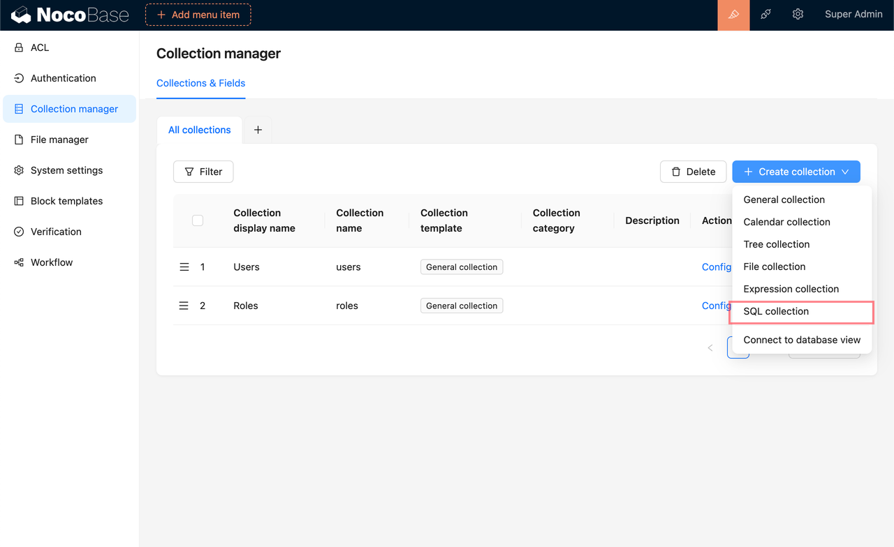 1. Enter your SQL query in the provided input box and click Execute. The system will analyze the query to determine the tables and fields involved, automatically extracting the relevant field metadata from the source tables.
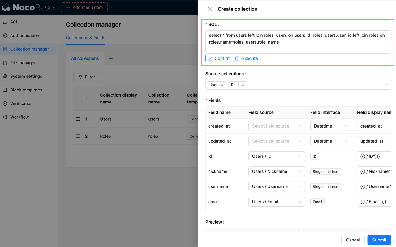 2. If the system's analysis of the source tables and fields is incorrect, you can manually select the appropriate tables and fields to ensure the correct metadata is used. Start by selecting the source table, then choose the corresponding fields in the field source section below.
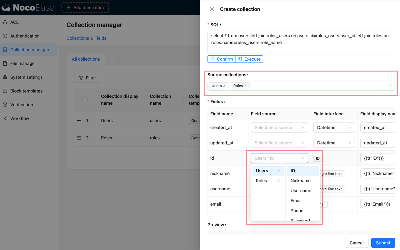 3. For fields that do not have a direct source, the system will infer the field type based on the data type. If this inference is incorrect, you can manually select the proper field type.
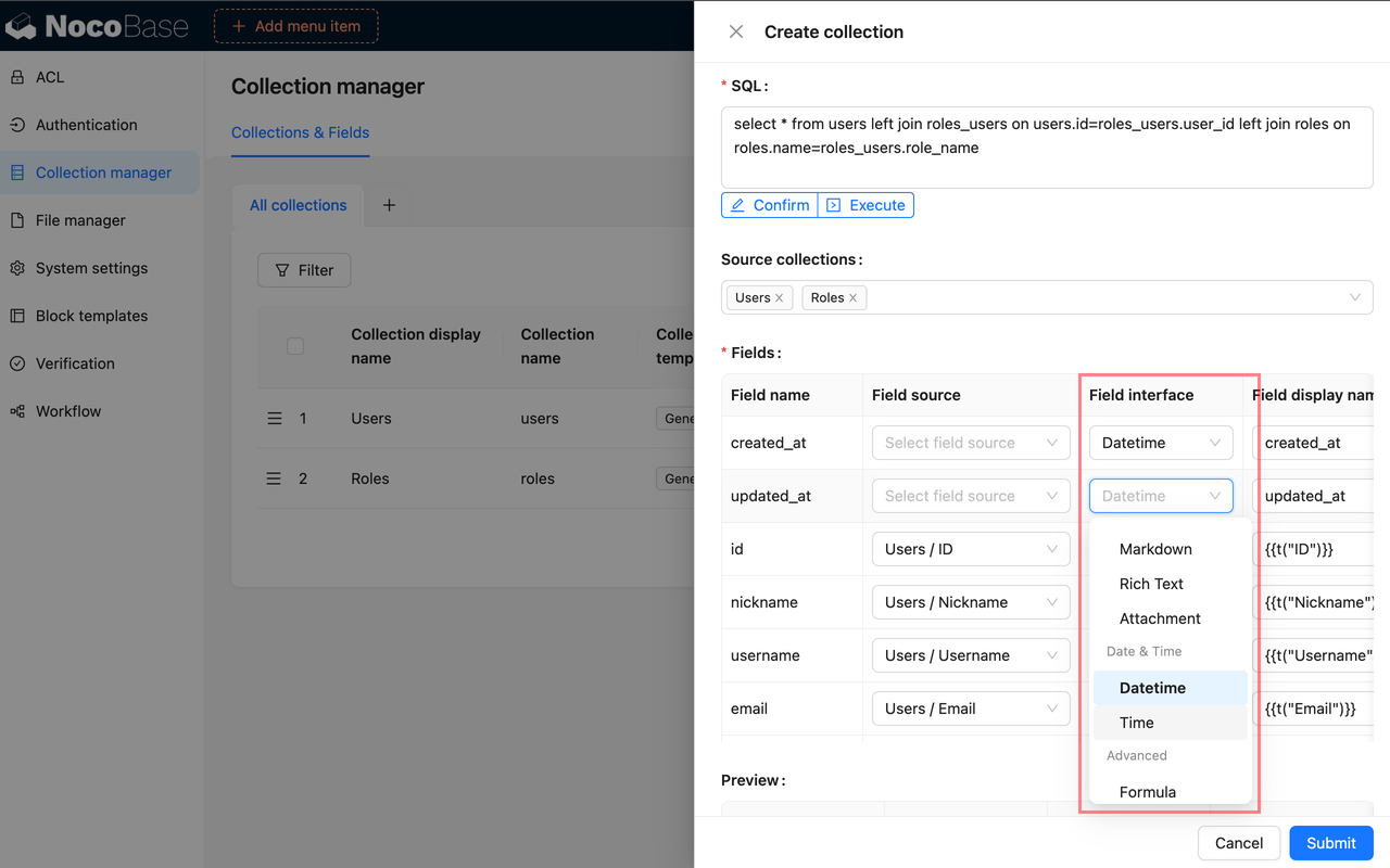 4. As you configure each field, you can preview its display in the preview area, allowing you to see the immediate impact of your settings.
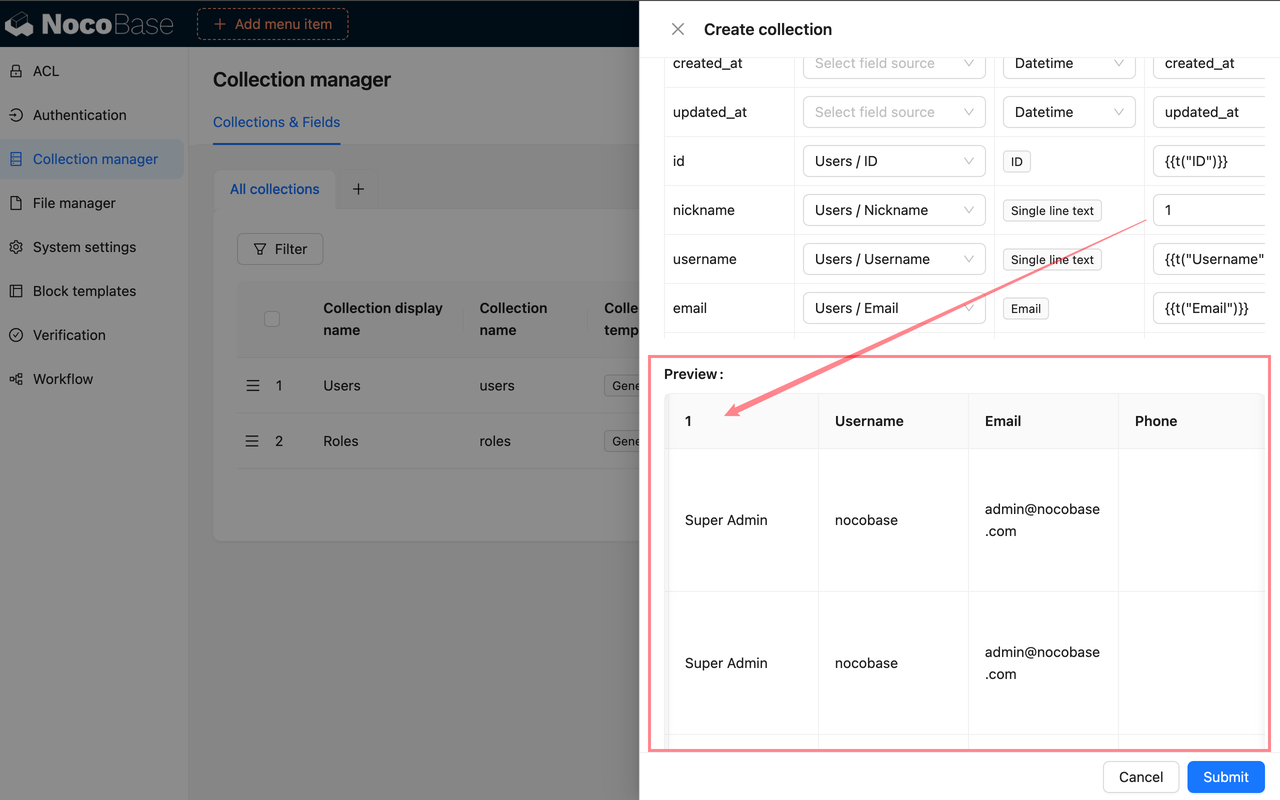 5. After you have completed the configuration and confirmed that everything is correct, click the Confirm button below the SQL input box to finalize the submission.
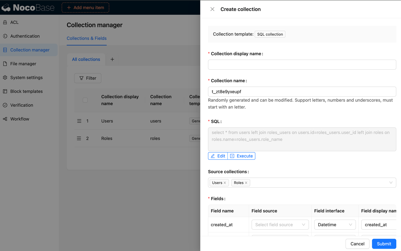 ### Editing
1. If you need to modify the SQL query, click the Edit button to directly alter the SQL statement and reconfigure the fields as needed.
2. To adjust the field metadata, use the Configure Fields option, which allows you to update the field settings just as you would for a regular table.
### Synchronization
If the SQL query remains unchanged but the underlying database table structure has been modified, you can synchronize and reconfigure the fields by selecting Configure Fields - Sync from Database.
### Editing
1. If you need to modify the SQL query, click the Edit button to directly alter the SQL statement and reconfigure the fields as needed.
2. To adjust the field metadata, use the Configure Fields option, which allows you to update the field settings just as you would for a regular table.
### Synchronization
If the SQL query remains unchanged but the underlying database table structure has been modified, you can synchronize and reconfigure the fields by selecting Configure Fields - Sync from Database.
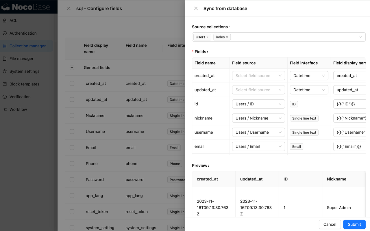 ### SQL Collection vs. Linked Database Views
| Template Type | Best Suited For | Implementation Method | Support for CRUD Operations |
| :--- | :--- | :--- | :--- |
| SQL | Simple models, lightweight use cases
### SQL Collection vs. Linked Database Views
| Template Type | Best Suited For | Implementation Method | Support for CRUD Operations |
| :--- | :--- | :--- | :--- |
| SQL | Simple models, lightweight use cases
Limited interaction with the database
Avoiding maintenance of views
Prefer UI-driven operations | SQL subquery | Not Supported |
| Connect to database view | Complex models
Requires database interaction
Data modification needed
Requires stronger and more stable database support | Database view | Partially Supported |
:::warning
When using SQL collection, be sure to select tables that are manageable within NocoBase. Using tables from the same database that are not connected to NocoBase may lead to inaccurate SQL query parsing. If this is a concern, consider creating and linking to a view.
:::
---
url: /data-sources/collection-tree/index.md
---
# Tree Collection
## Introduction
A tree structure collection is a data collection design pattern used for organizing hierarchical data. This collection structure mirrors a tree, where each data item may have one or more child items, and those child items can, in turn, have their own descendants.
## User Manual
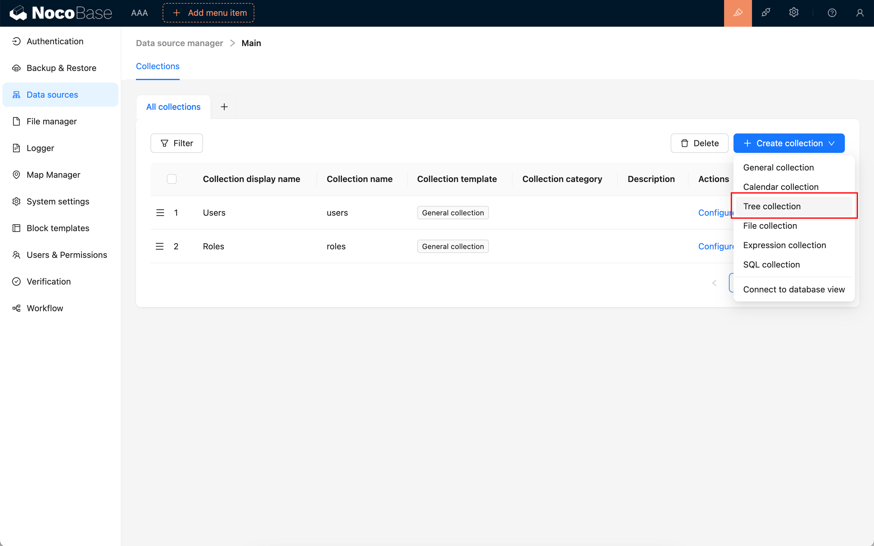
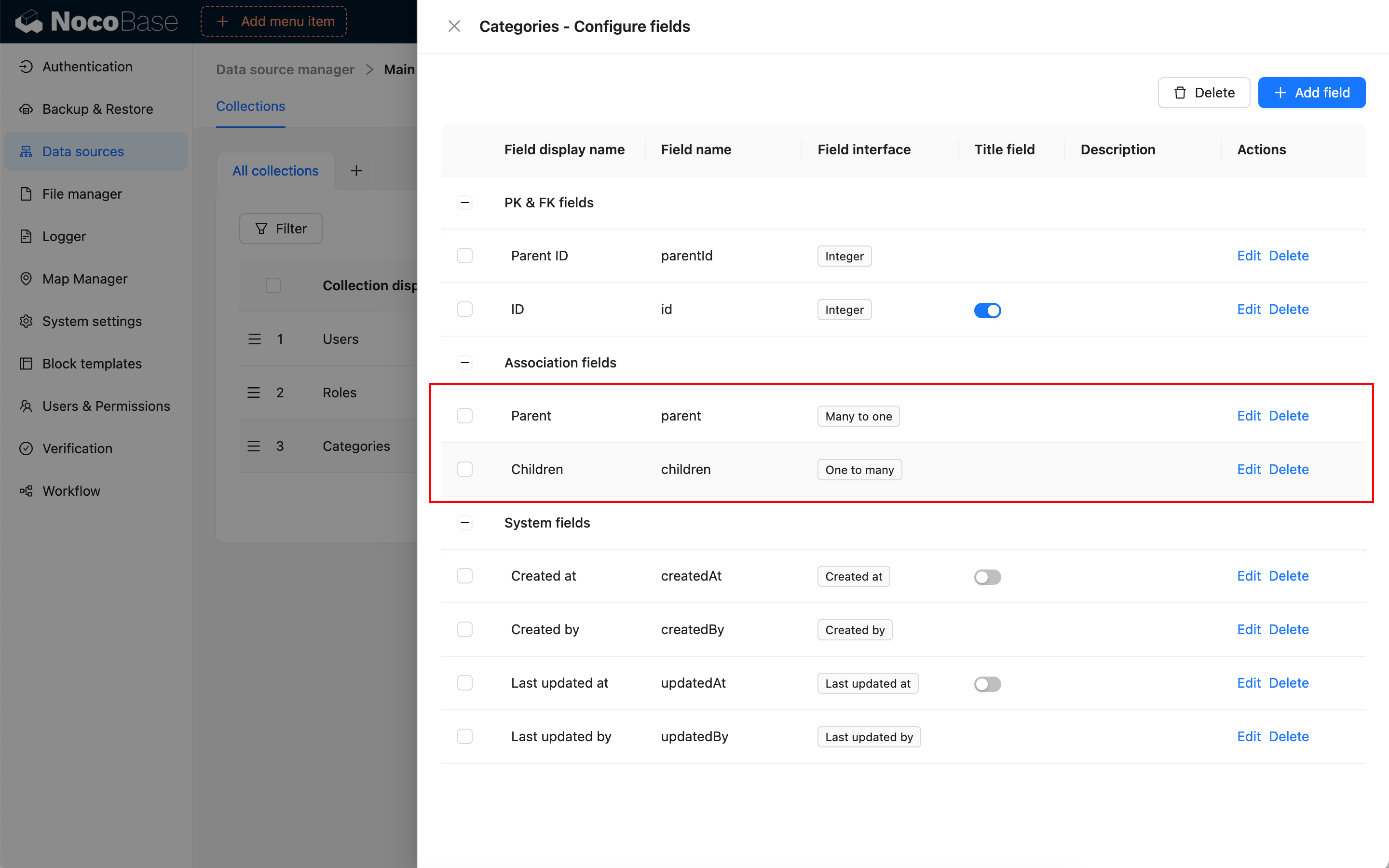
---
url: /data-sources/collection-view/index.md
---
# Database View
## Introduction
## Manual
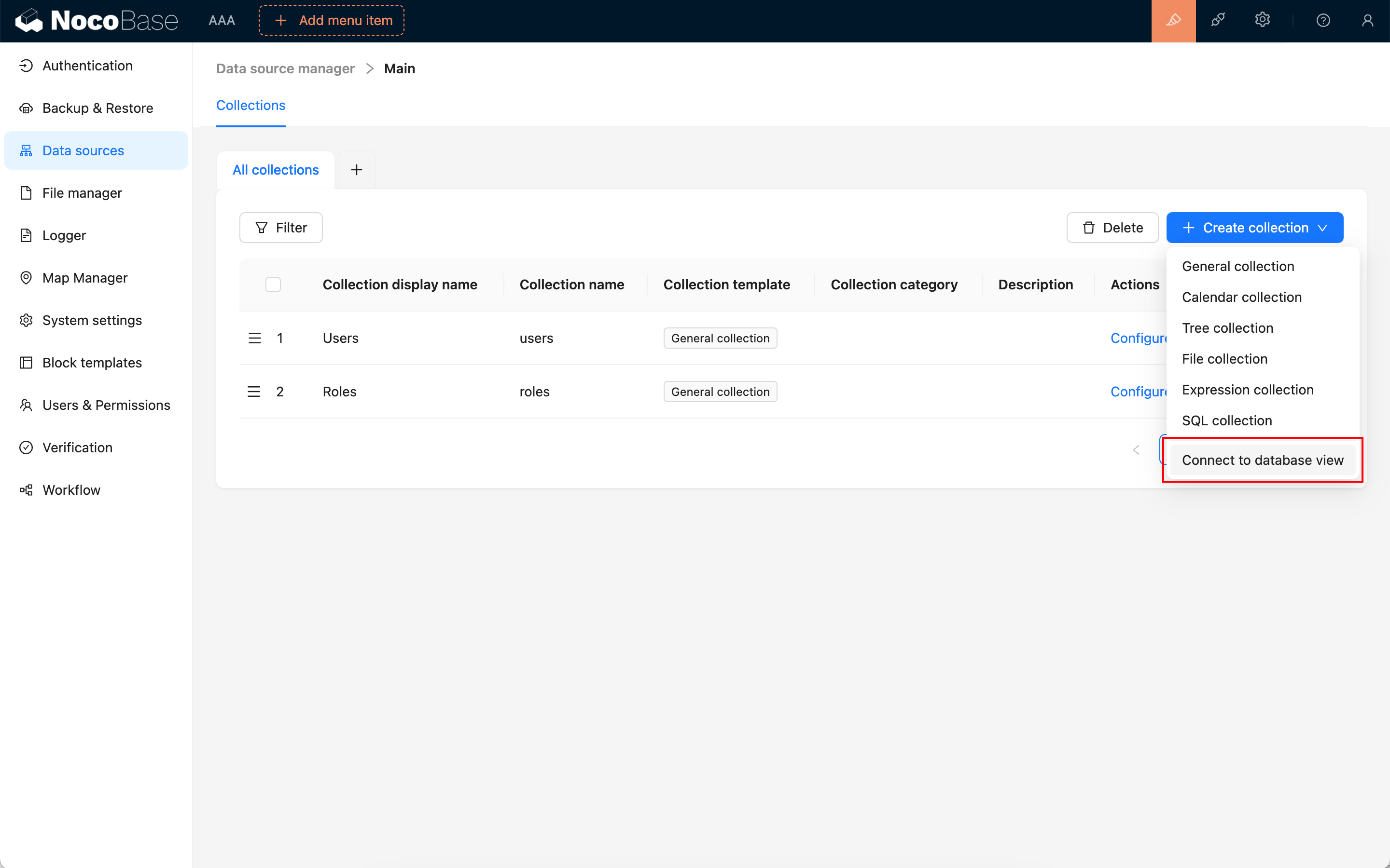
---
url: /data-sources/data-modeling/collection-fields/advanced/china-region.md
---
# China Region
## Introduction
## Field configuration
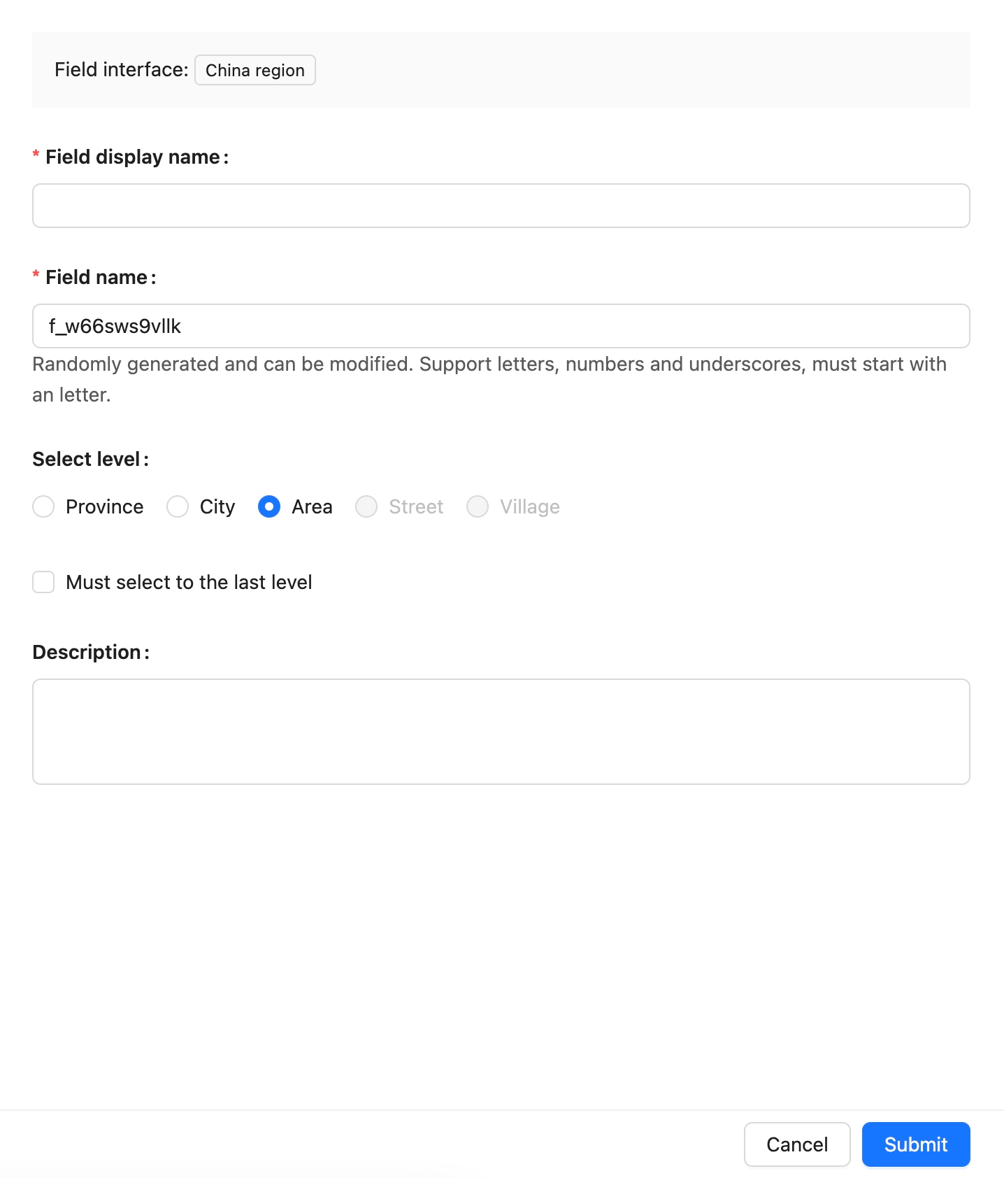
## Instructions
to be added.
---
url: /data-sources/data-modeling/collection-fields/advanced/collection-select.md
---
# Collection selector
## Introduction
## Field configuration
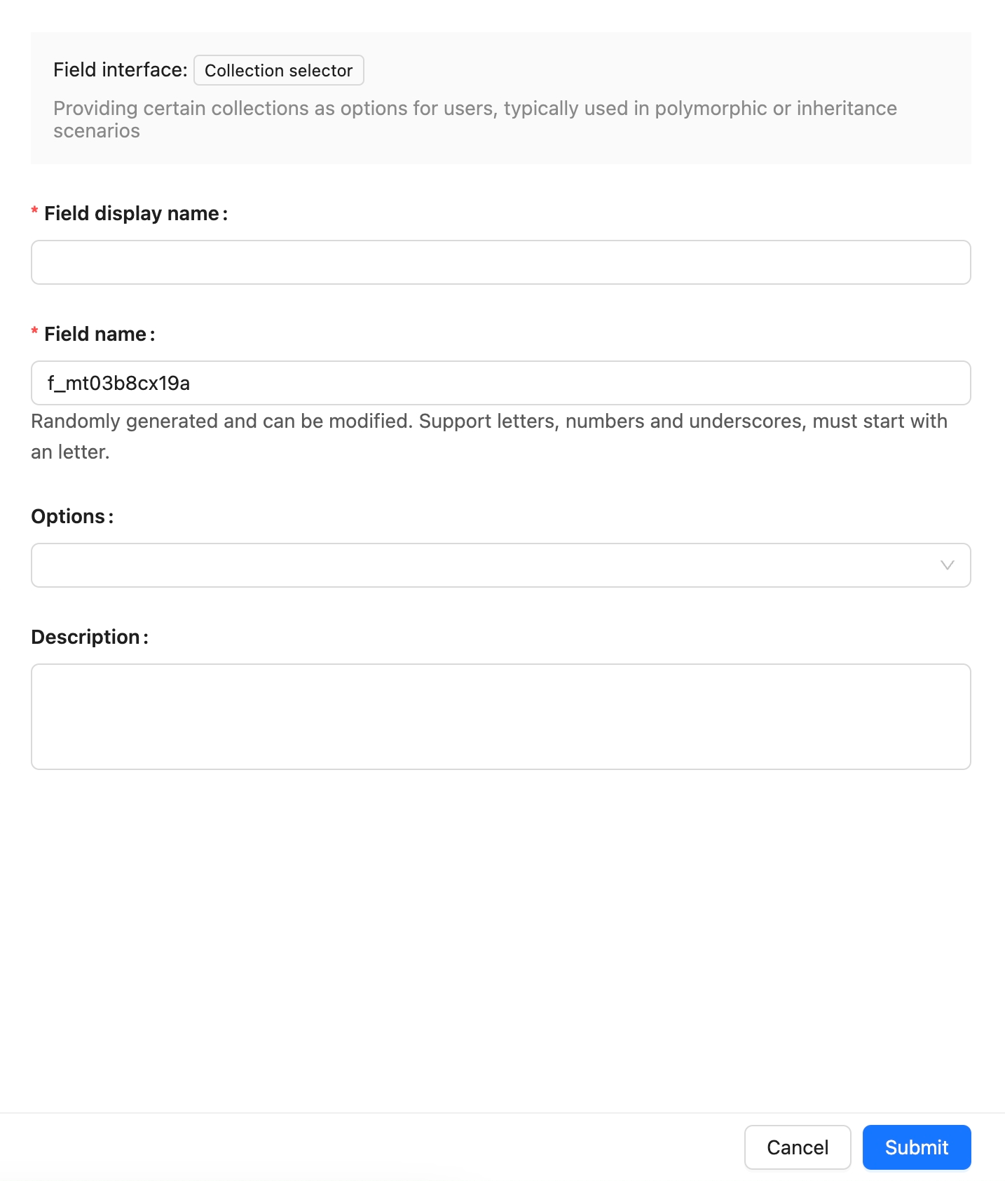
## Example
---
url: /data-sources/data-modeling/collection-fields/advanced/json.md
---
# JSON
## Introduction
## Field configuration

## Example
To be added.
---
url: /data-sources/data-modeling/collection-fields/advanced/nano-id.md
---
# Nano ID
## Introduction
## Field configuration
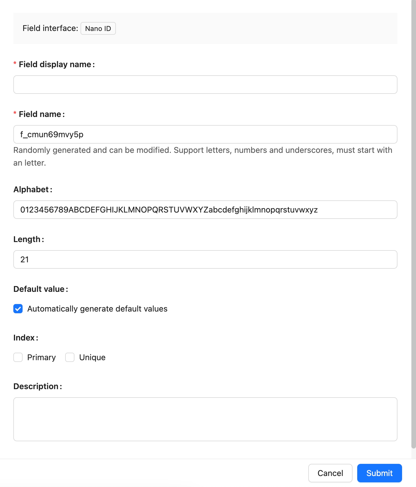
## Example
to be added.
---
url: /data-sources/data-modeling/collection-fields/advanced/snowflake-id.md
---
# Snowflake ID (53-bit)
## Introduction
https://github.com/nocobase/nocobase/tree/main/packages/core/snowflake-id
## Field configuration
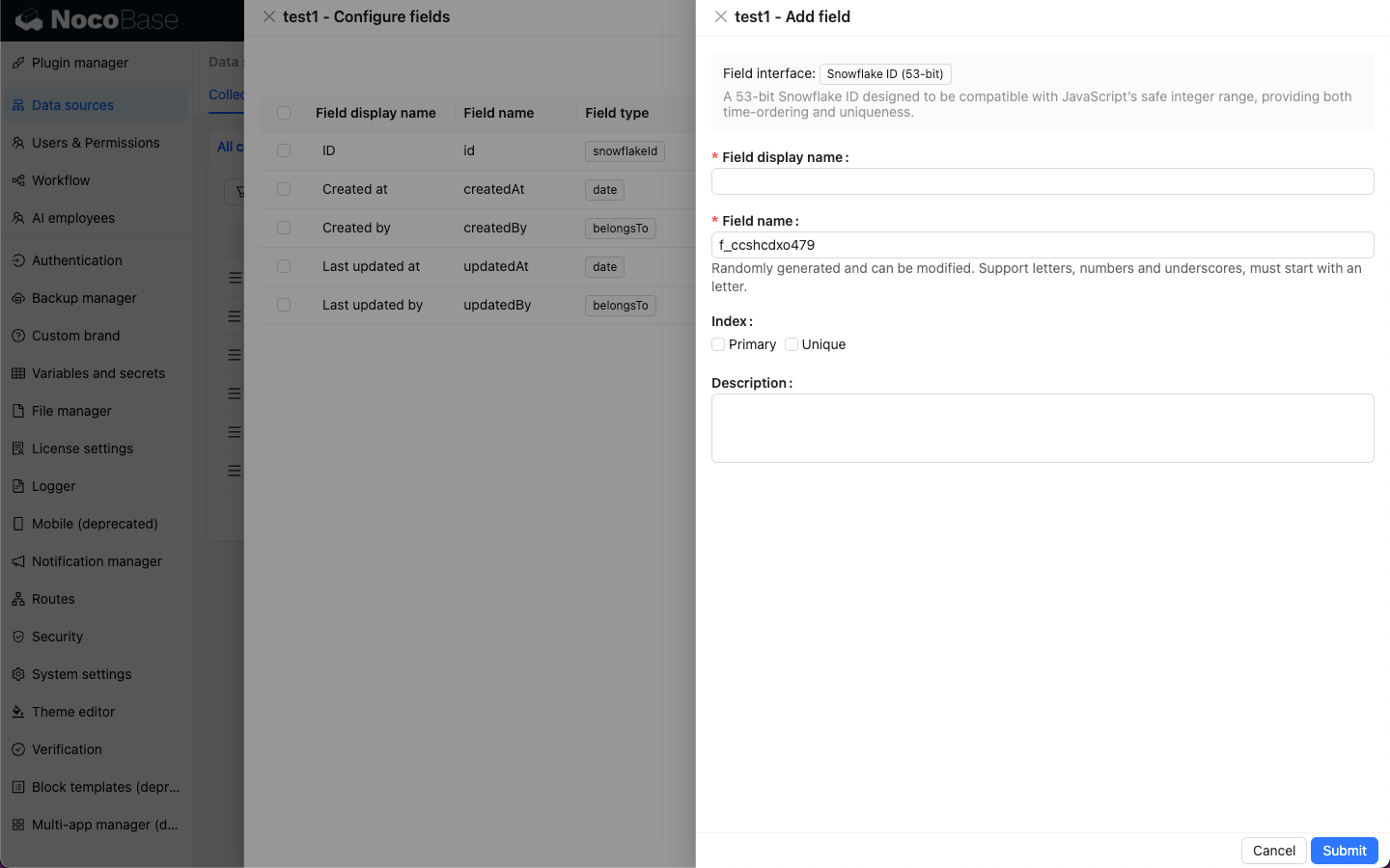
---
url: /data-sources/data-modeling/collection-fields/advanced/sort.md
---
# Collection selector
The Collection selector field is a special field type that allows users to select one or more collections from a predefined list. This field type is very useful in scenarios where you need to dynamically reference different collections, such as building configurable reports, dashboards, or complex applications that need to change data sources based on user selection.
## Use Cases
### Dynamic Report Generation
In a report generation module, users may need to select a collection from multiple collections as the data source for the report. By using the Collection selector, users can easily select the desired collection, and the system will dynamically generate the report based on the user's selection.
### Configurable Dashboards
In a dashboard application, users can customize the data displayed on the dashboard. The Collection selector allows users to choose the collections they are interested in, thereby displaying charts and statistical data from different data sources on the dashboard.
### Flexible Data Import/Export Tools
When developing a generic data import or export tool, you can use the Collection selector to let users specify the collection to operate on. This way, the same tool can be used to process data from any collection in the system, greatly improving the tool's reusability.
---
url: /data-sources/data-modeling/collection-fields/advanced/uuid.md
---
# UUID
## Introduction
## Field configuration
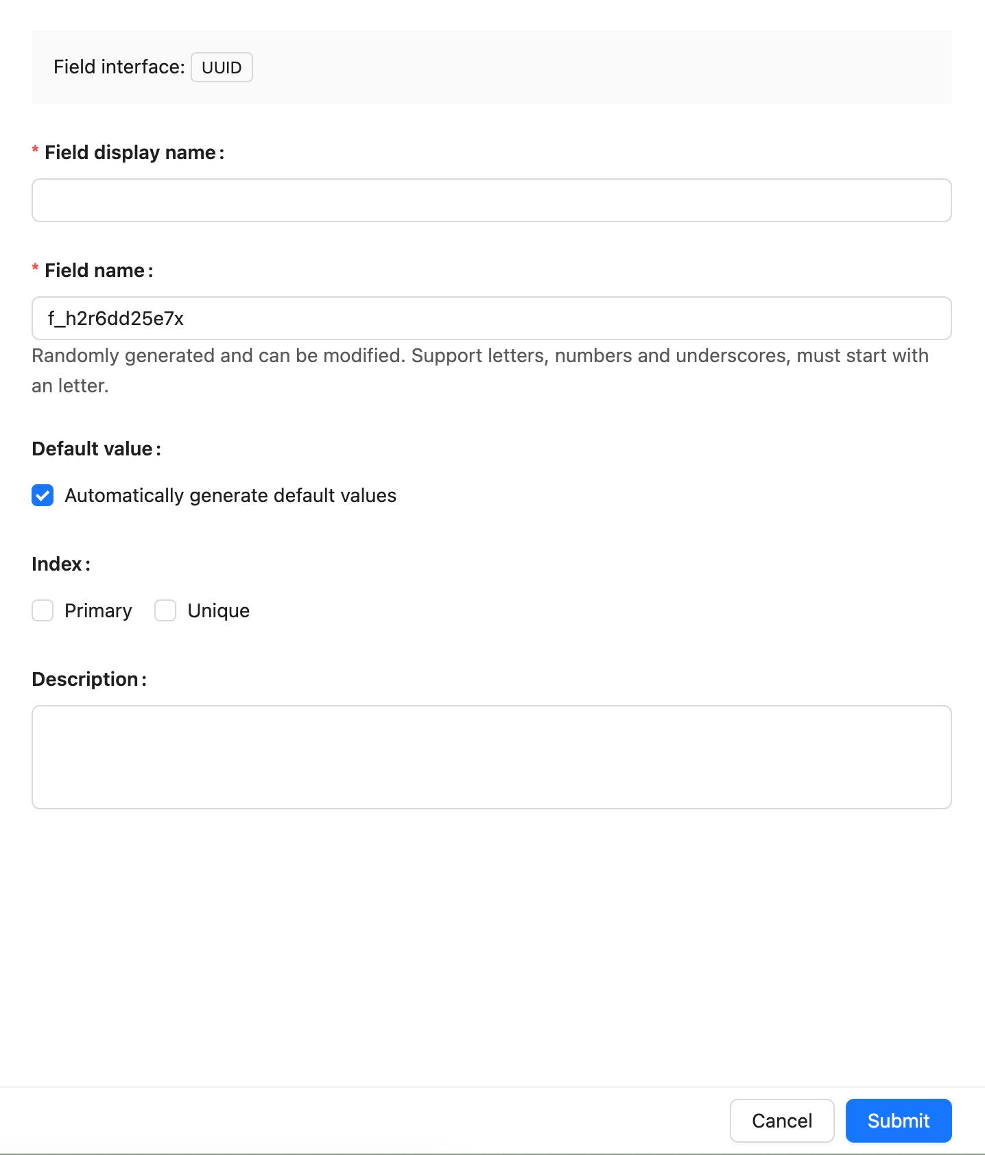
## Example
To be added.
---
url: /data-sources/data-modeling/collection-fields/associations/index.md
---
# Relationship Fields
In NocoBase, relationship fields are not actual fields but are used to establish connections between collections. This concept is equivalent to relationships in relational databases.
In relational databases, the most common types of relationships include the following:
- [One-to-One](./o2o/index.md): Each entity in two collections corresponds to only one entity in the other collection. This type of relationship is usually used to store different aspects of an entity in separate collections to reduce redundancy and improve data consistency.
- [One-to-Many](./o2m/index.md): Each entity in one collection can be associated with multiple entities in another collection. This is one of the most common relationship types. For example, one author can write multiple articles, but each article can have only one author.
- [Many-to-One](./m2o/index.md): Multiple entities in one collection can be associated with one entity in another collection. This type of relationship is also common in data modeling. For instance, multiple students can belong to the same class.
- [Many-to-Many](./m2m/index.md): Multiple entities in two collections can be associated with each other. This type of relationship typically requires an intermediary collection to record the associations between the entities. For example, the relationship between students and courses—a student can enroll in multiple courses, and a course can have multiple students.
These types of relationships play an important role in database design and data modeling, helping to describe complex real-world relationships and data structures.
---
url: /data-sources/data-modeling/collection-fields/associations/m2m/index.md
---
# Many-to-Many
In a course enrollment system, there are two entities: students and courses. A student can enroll in multiple courses, and a course can have multiple students enrolled, constituting a many-to-many relationship. In a relational database, to represent the many-to-many relationship between students and courses, an intermediary collection, such as an enrollment collection, is usually used. This collection can record which courses each student has chosen and which students have enrolled in each course. This design effectively represents the many-to-many relationship between students and courses.
ER Diagram:
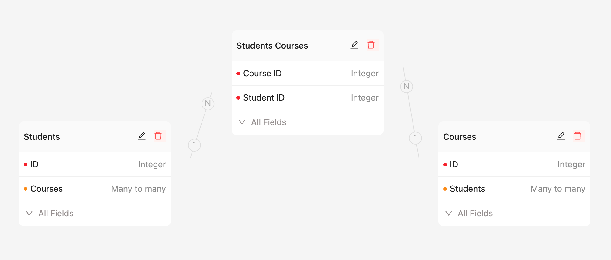
Field Configuration:
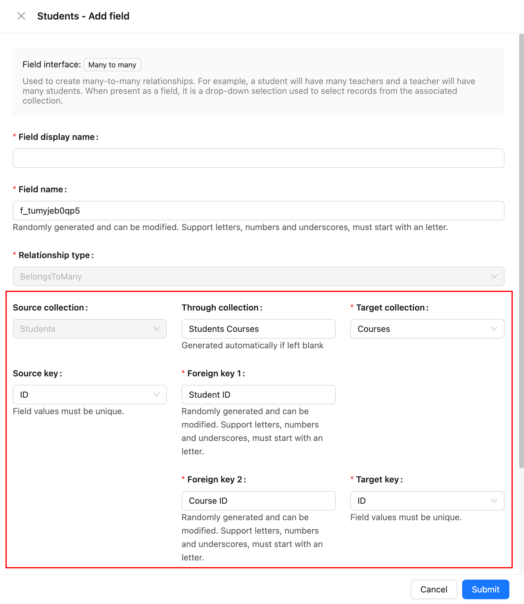
## Parameter Description
### Source Collection
The source collection, which is the collection where the current field resides.
### Target Collection
The target collection, which is the collection to be associated with.
### Through Collection
The intermediary collection, used when a many-to-many relationship exists between two entities. The intermediary collection has two foreign keys that are used to maintain the association between the two entities.
### Source Key
The field in the source collection that is referenced by the foreign key. It must be unique.
### Foreign Key 1
The field in the intermediary collection that establishes the association with the source collection.
### Foreign Key 2
The field in the intermediary collection that establishes the association with the target collection.
### Target Key
The field in the target collection that is referenced by the foreign key. It must be unique.
### ON DELETE
ON DELETE refers to the rules applied to foreign key references in related child collections when records in the parent collection are deleted. It is an option used when defining a foreign key constraint. Common ON DELETE options include:
- **CASCADE**: When a record in the parent collection is deleted, all related records in the child collection are automatically deleted.
- **SET NULL**: When a record in the parent collection is deleted, the foreign key values in the related child collection records are set to NULL.
- **RESTRICT**: The default option, it prevents the deletion of a parent collection record if there are related records in the child collection.
- **NO ACTION**: Similar to RESTRICT, it prevents the deletion of a parent collection record if there are related records in the child collection.
---
url: /data-sources/data-modeling/collection-fields/associations/m2o/index.md
---
# Many-to-One
In a library database, there are two entities: books and authors. An author can write multiple books, but each book usually has only one author. In this case, the relationship between authors and books is many-to-one. Multiple books can be associated with the same author, but each book can have only one author.
ER Diagram:
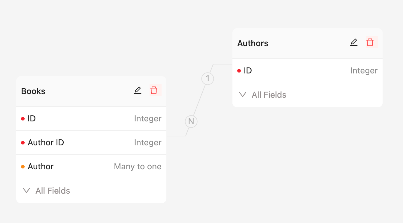
Field Configuration:
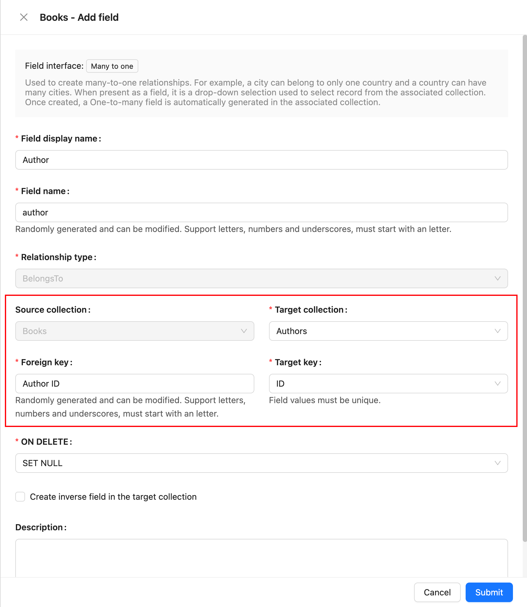
## Parameter Description
### Source Collection
The source collection, which is the collection where the current field resides.
### Target Collection
The target collection, which is the collection to be associated with.
### Foreign Key
The field in the source collection that is used to establish the association between the two collections.
### Target Key
The field in the target collection that is referenced by the foreign key. It must be unique.
### ON DELETE
ON DELETE refers to the rules applied to foreign key references in related child collections when records in the parent collection are deleted. It is an option used when defining a foreign key constraint. Common ON DELETE options include:
- **CASCADE**: When a record in the parent collection is deleted, all related records in the child collection are automatically deleted.
- **SET NULL**: When a record in the parent collection is deleted, the foreign key values in the related child collection records are set to NULL.
- **RESTRICT**: The default option, it prevents the deletion of a parent collection record if there are related records in the child collection.
- **NO ACTION**: Similar to RESTRICT, it prevents the deletion of a parent collection record if there are related records in the child collection.
---
url: /data-sources/data-modeling/collection-fields/associations/o2m/index.md
---
# One-to-Many
The relationship between a class and its students is an example of a one-to-many relationship: one class can have multiple students, but each student belongs to only one class.
ER Diagram:
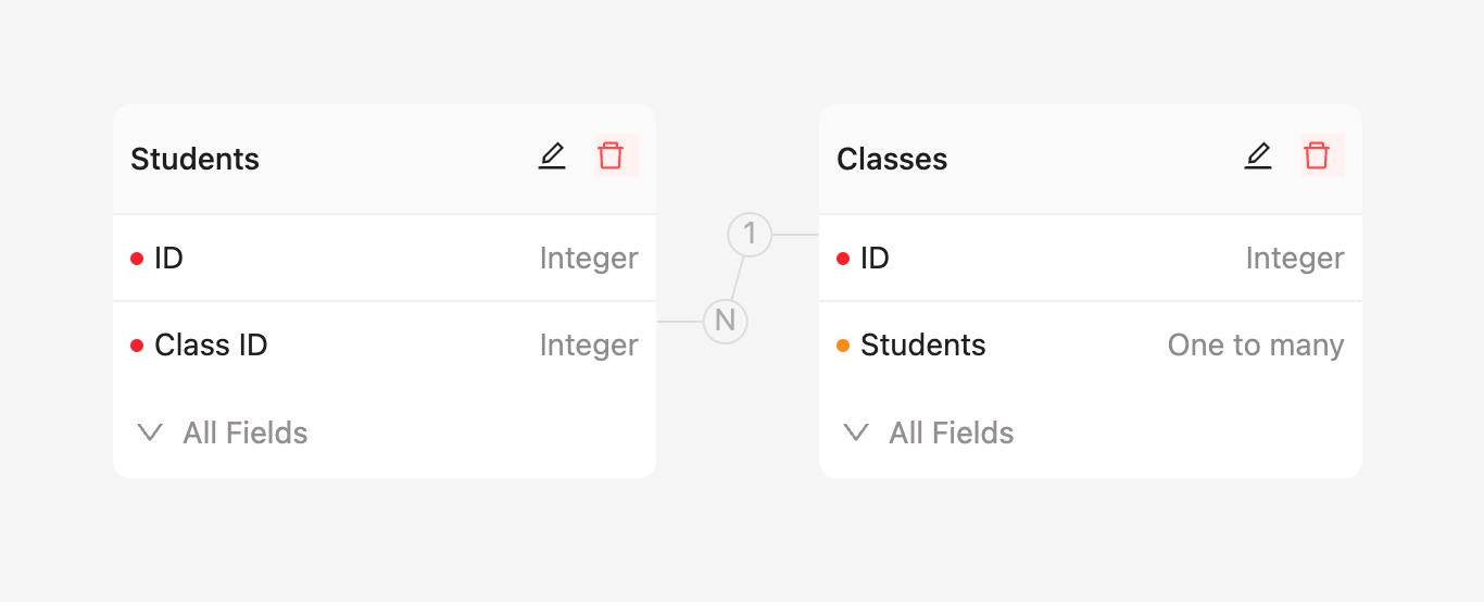
Field Configuration:
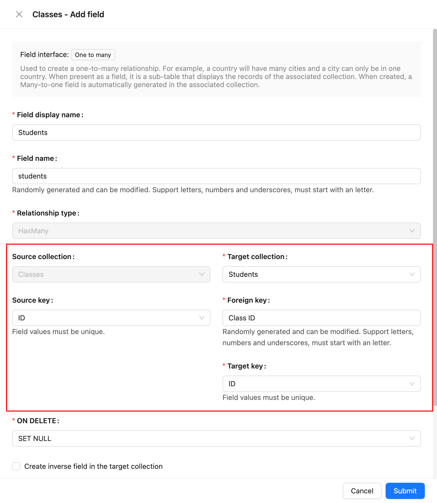
## Parameter Description
### Source Collection
The source collection, which is the collection where the current field resides.
### Target Collection
The target collection, which is the collection to be associated with.
### Source Key
The field in the source collection that is referenced by the foreign key. It must be unique.
### Foreign Key
The field in the target collection that is used to establish the association between the two collections.
### Target Key
The field in the target collection used to view each row record in the relationship block, usually a unique field.
### ON DELETE
ON DELETE refers to the rules applied to foreign key references in related child collections when records in the parent collection are deleted. It is an option used when defining a foreign key constraint. Common ON DELETE options include:
- **CASCADE**: When a record in the parent collection is deleted, all related records in the child collection are automatically deleted.
- **SET NULL**: When a record in the parent collection is deleted, the foreign key values in the related child collection records are set to NULL.
- **RESTRICT**: The default option, it prevents the deletion of a parent collection record if there are related records in the child collection.
- **NO ACTION**: Similar to RESTRICT, it prevents the deletion of a parent collection record if there are related records in the child collection.
---
url: /data-sources/data-modeling/collection-fields/associations/o2o/index.md
---
# One-to-One
In the relationship between employees and personal profiles, each employee can only have one personal profile record, and each personal profile record can only correspond to one employee. In this case, the relationship between the employee and the personal profile is one-to-one.
The foreign key in a one-to-one relationship can be placed in either the source collection or the target collection. If it represents "has one," the foreign key is more appropriately placed in the target collection; if it represents "belongs to," then the foreign key is better placed in the source collection.
For example, in the case mentioned above, where an employee has only one personal profile and the personal profile belongs to the employee, it is appropriate to place the foreign key in the personal profile collection.
## One-to-One (Has One)
This indicates that an employee has a personal profile record.
ER Relationship
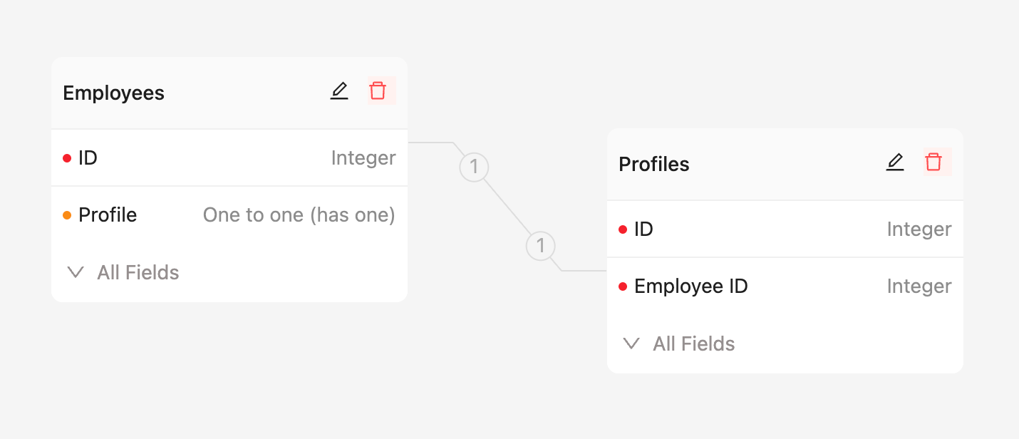
Field Configuration
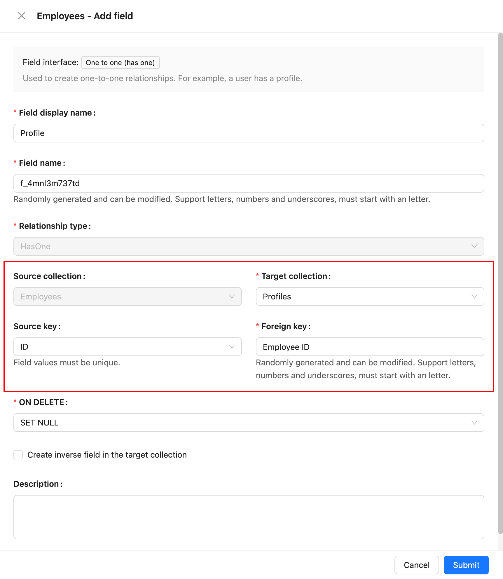
## One-to-One (Belongs To)
This indicates that a personal profile belongs to a specific employee.
ER Relationship
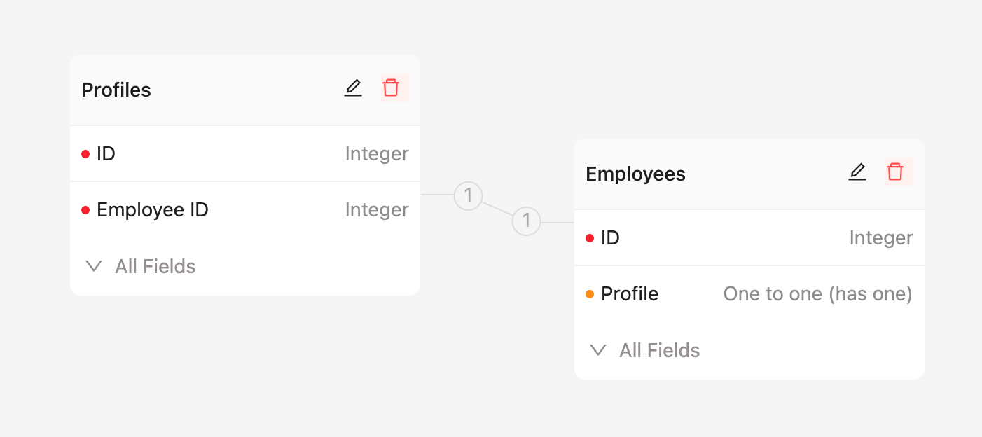
Field Configuration
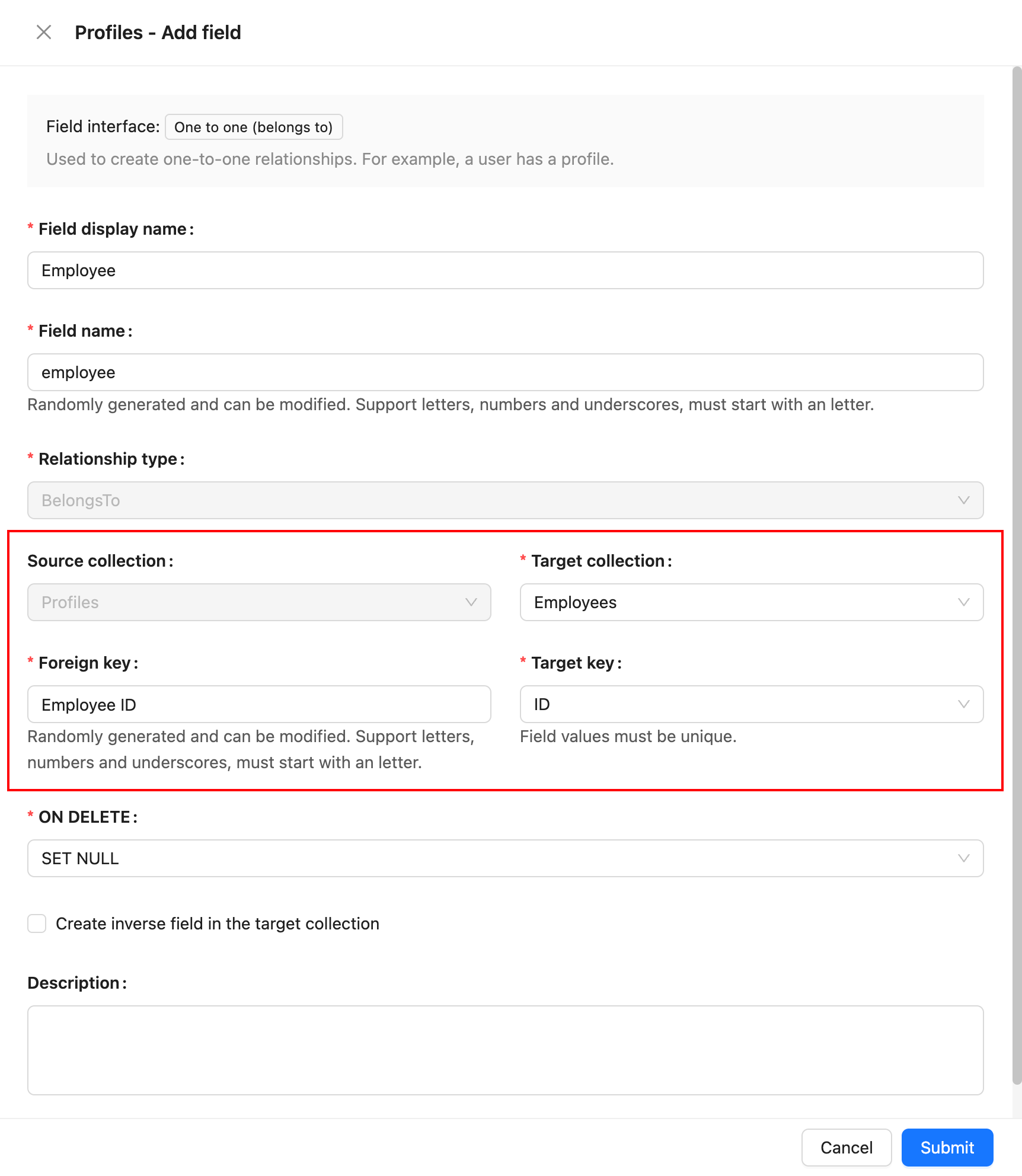
## Parameter Descriptions
### Source Collection
The source collection, which is the collection where the current field is located.
### Target Collection
The target collection, the collection that is being related.
### Foreign Key
Used to establish a relationship between two collections. In a one-to-one relationship, the foreign key can be placed in either the source collection or the target collection. If it represents "has one," the foreign key is more appropriately placed in the target collection; if it represents "belongs to," then the foreign key is better placed in the source collection.
### Source Key <- Foreign Key (Foreign Key in the Target collection)
The field referenced by the foreign key constraint must be unique. When the foreign key is placed in the target collection, it indicates "has one."
### Target Key <- Foreign Key (Foreign Key in the Source collection)
The field referenced by the foreign key constraint must be unique. When the foreign key is placed in the source collection, it indicates "belongs to."
### ON DELETE
ON DELETE refers to the action rules for the foreign key reference in the related child collection when deleting records from the parent collection. It is an option defined when establishing a foreign key constraint. Common ON DELETE options include:
- CASCADE: When a record in the parent collection is deleted, automatically delete all related records in the child collection.
- SET NULL: When a record in the parent collection is deleted, set the foreign key value in the related child collection to NULL.
- RESTRICT: The default option, where deletion of a parent collection record is refused if there are related records in the child collection.
- NO ACTION: Similar to RESTRICT, deletion of a parent collection record is refused if there are related records in the child collection.
---
url: /data-sources/data-modeling/collection-fields/basic/color.md
---
# Color
## Introduction
## Field configuration
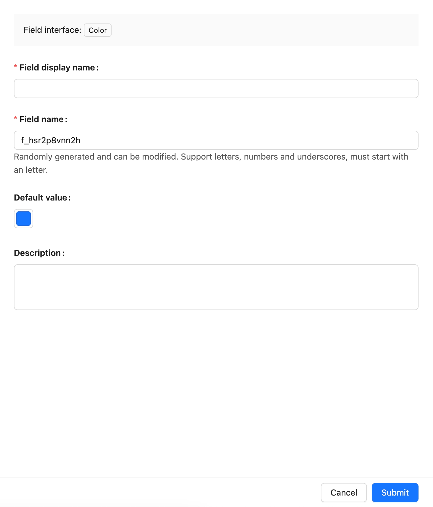
## Example
to be added.
---
url: /data-sources/data-modeling/collection-fields/basic/email.md
---
# Email
## Introduction
## Field configuration

## Example
To be added.
---
url: /data-sources/data-modeling/collection-fields/basic/icon.md
---
# Icon
## Introduction
## Field configuration

## Example
To be added.
---
url: /data-sources/data-modeling/collection-fields/basic/input.md
---
# Single Line Text
## Introduction
## Field Configuration

## Interface Configuration
### Edit Mode
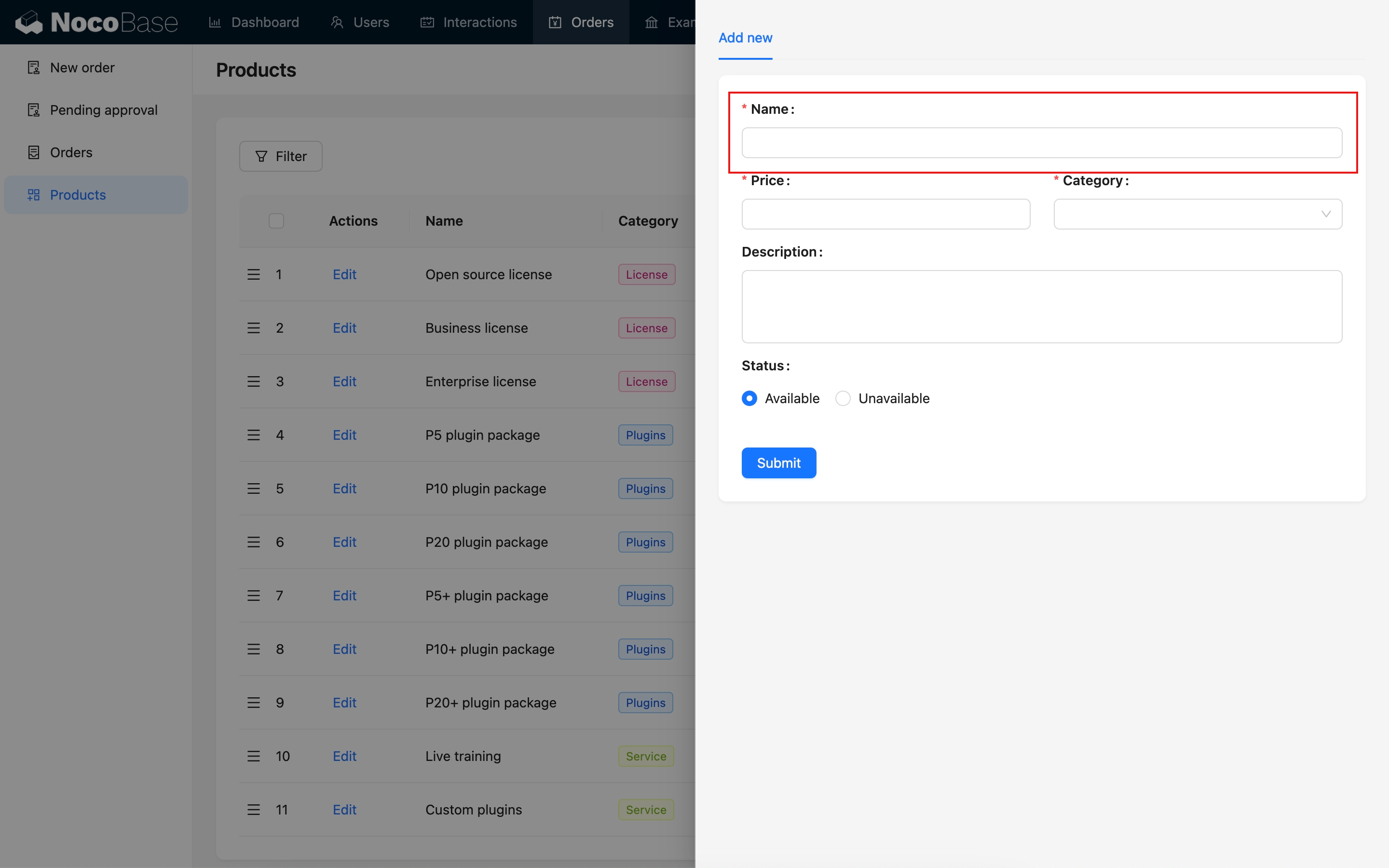
### Read-only Mode
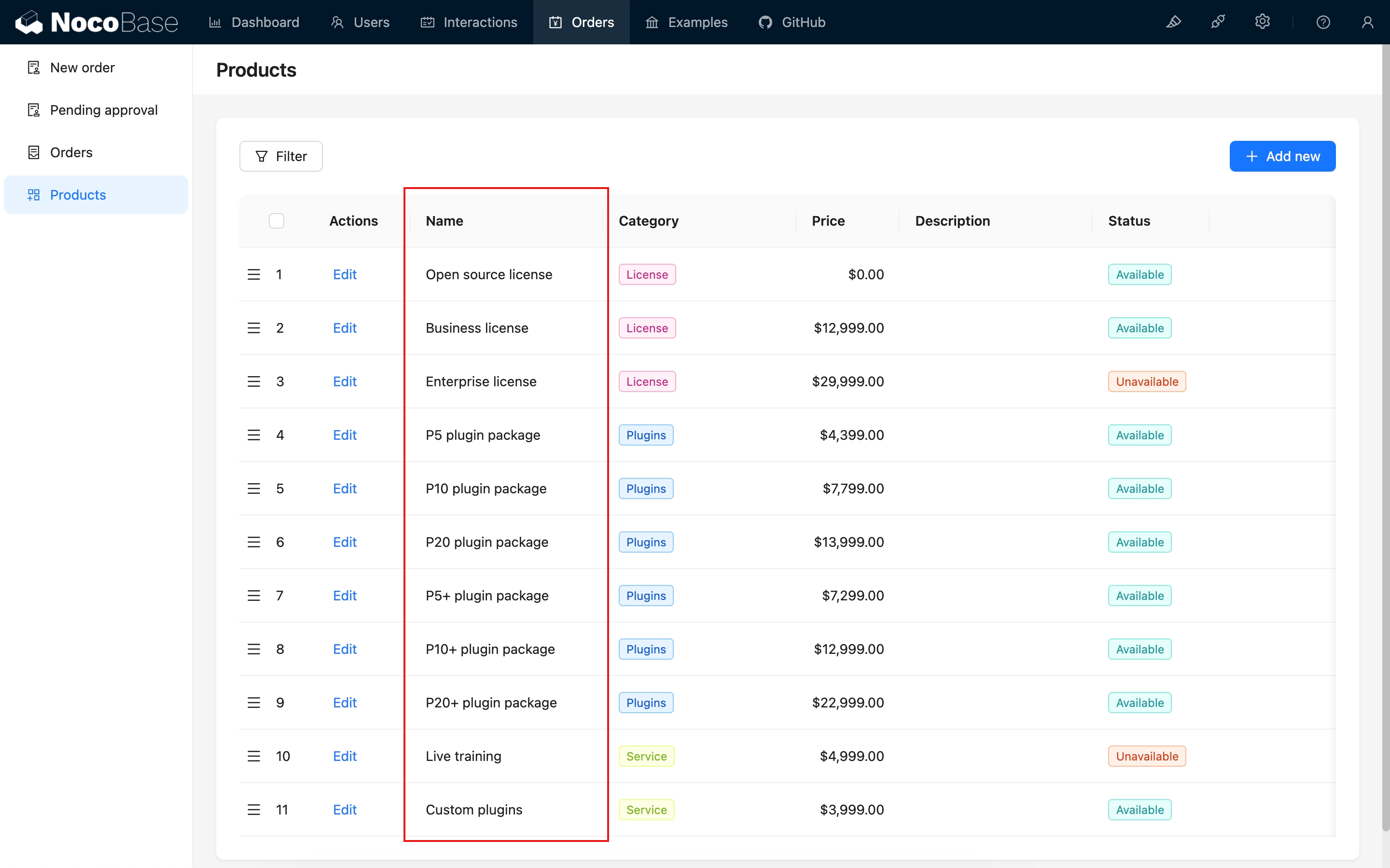
---
url: /data-sources/data-modeling/collection-fields/basic/integer.md
---
# Integer
## Introduction
## Field configuration
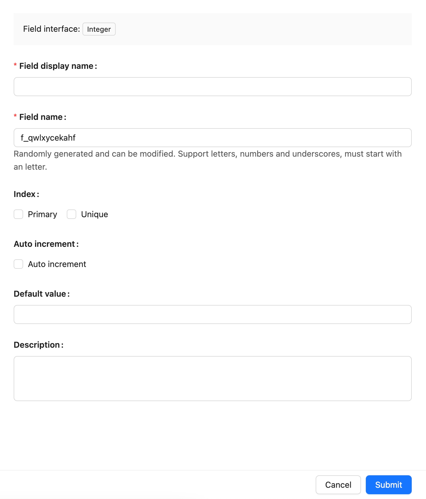
## Example
to be added.
---
url: /data-sources/data-modeling/collection-fields/basic/number.md
---
# Number
## Introduction
## Field configuration

## Example
To be added.
---
url: /data-sources/data-modeling/collection-fields/basic/password.md
---
# Password
## Introduction
## Field configuration

## Example
To be added.
---
url: /data-sources/data-modeling/collection-fields/basic/percent.md
---
# Percentage
## Introduction
## Field configuration

## Example
to be added.
---
url: /data-sources/data-modeling/collection-fields/basic/phone.md
---
# Phone
## Introduction
## Field Configuration
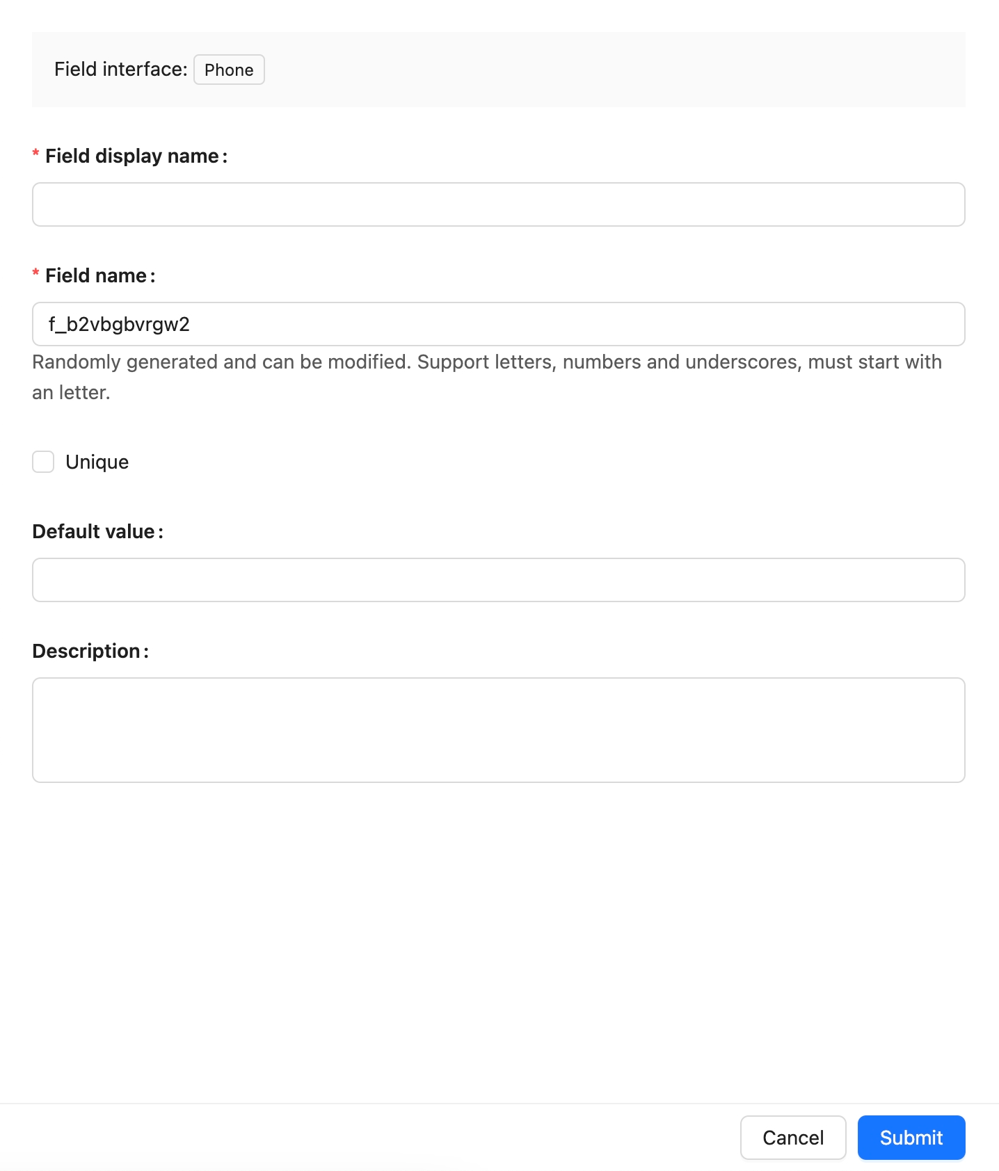
## Example
to be added.
---
url: /data-sources/data-modeling/collection-fields/basic/textarea.md
---
# Long Text
## Introduction
## Field Configuration

## UI Configuration
### Edit Mode

### View Mode

---
url: /data-sources/data-modeling/collection-fields/basic/url.md
---
# URL
## Introduction
## Field configuration
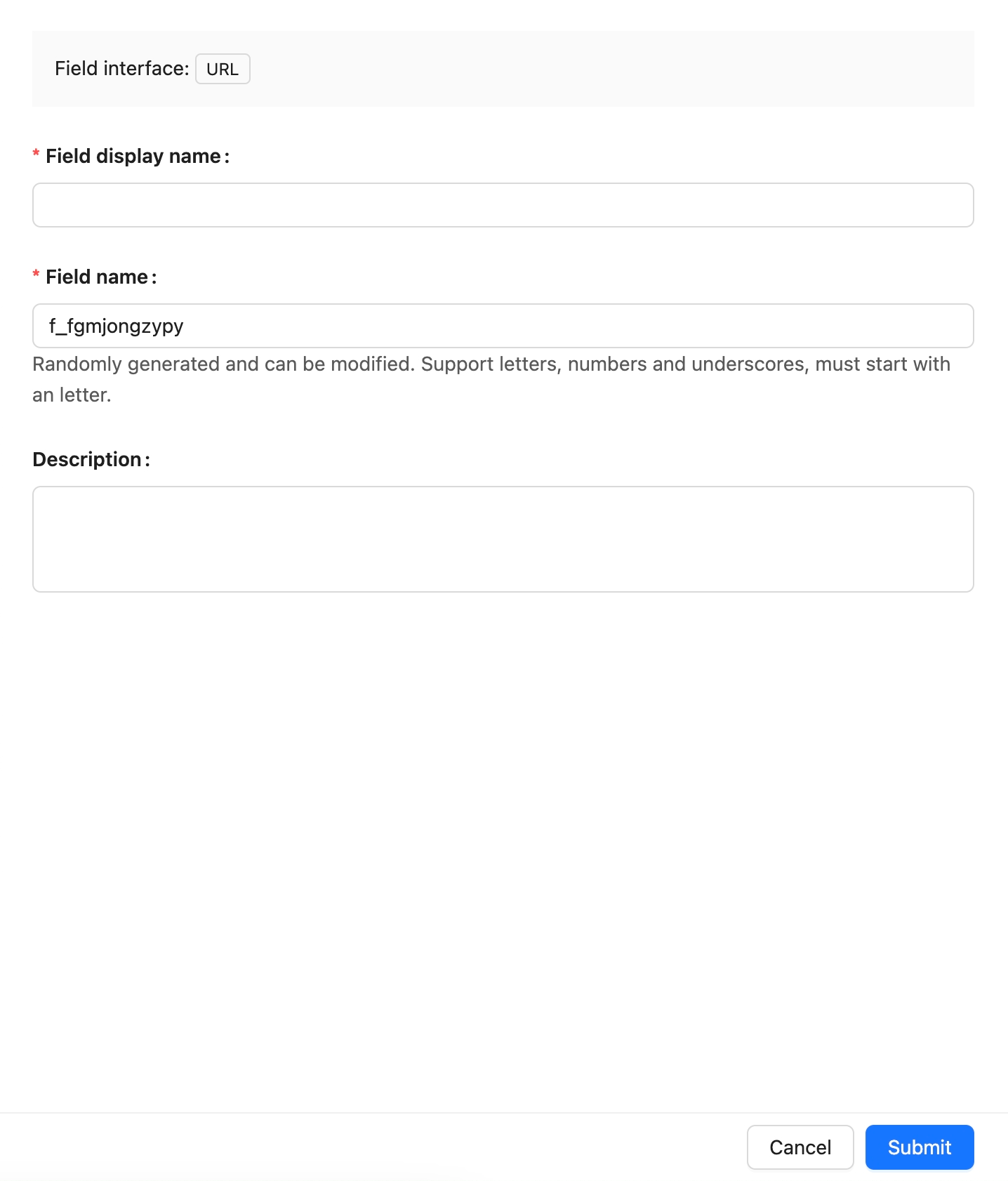
## Example
To be added.
---
url: /data-sources/data-modeling/collection-fields/choices/checkbox-group.md
---
# Checkbox group
## Introduction
## Field configuration
## Example
To be added.
---
url: /data-sources/data-modeling/collection-fields/choices/checkbox.md
---
# Checkbox
## Introduction
## Field configuration

## Example
to be added.
---
url: /data-sources/data-modeling/collection-fields/choices/china-region.md
---
# China Region
## Introduction
## Field configuration

## Example
To be added.
---
url: /data-sources/data-modeling/collection-fields/choices/multiple-select.md
---
# Multiple Select
## Introduction
## Field configuration

## Example
to be added.
---
url: /data-sources/data-modeling/collection-fields/choices/radio-group.md
---
# Radio Group
## Introduction
## Field configuration
## Example
to be added.
---
url: /data-sources/data-modeling/collection-fields/choices/select.md
---
# Single select
## Introduction
## Field configuration
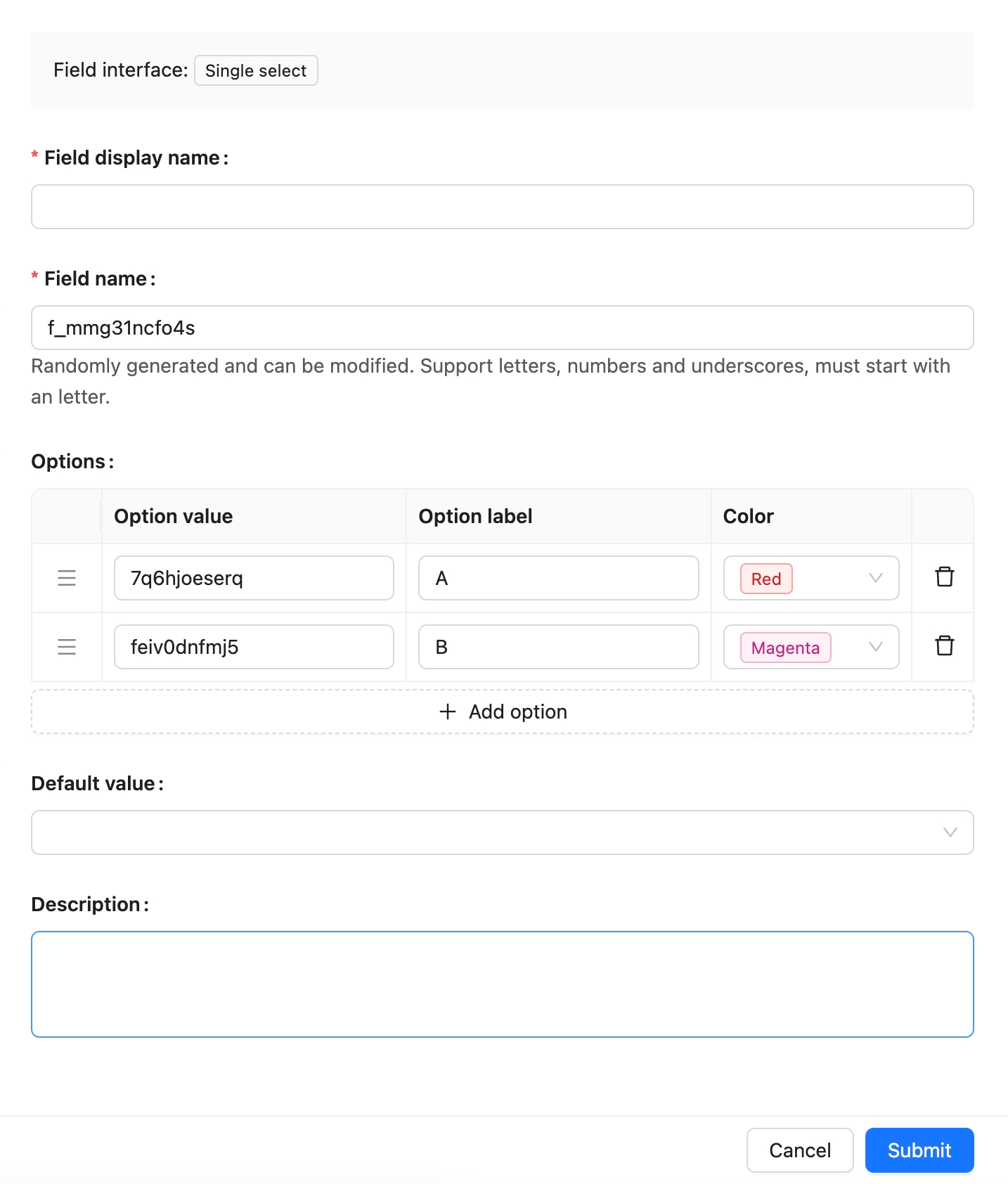
## Example
to be added.
---
url: /data-sources/data-modeling/collection-fields/datetime/date.md
---
# Date
## Introduction
## Field configuration
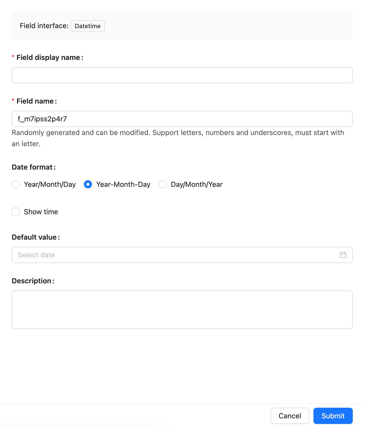
## Example
To be added.
---
url: /data-sources/data-modeling/collection-fields/datetime/datetime-without-tz.md
---
# Datetime (without time zone)
## Introduction
## Field configuration

## Example
To be added.
---
url: /data-sources/data-modeling/collection-fields/datetime/datetime.md
---
# Datetime (with time zone)
## Introduction
## Field configuration

## Example
To be added.
---
url: /data-sources/data-modeling/collection-fields/datetime/index.md
---
# DateTime Field Types
DateTime field types can be categorized as follows:
- **DateTime (with Time Zone):** These values are standardized to UTC (Coordinated Universal Time) and are subject to time zone adjustments when necessary.
- **DateTime (without Time Zone):** This type stores date and time data without incorporating any time zone information.
- **Date (without Time):** This format exclusively stores date information, omitting any time component.
- **Time:** Stores only time information, excluding the date.
- **Unix Timestamp:** This type represents the number of seconds that have elapsed since January 1, 1970, and is stored as a Unix timestamp.
Here are examples for each DateTime-related field type:
| **Field Type** | **Example Value** | **Description** |
|------------------------------|------------------------------|-------------------------------------------------------|
| DateTime (with Time Zone) | 2024-08-24T07:30:00.000Z | Converted to UTC and can be adjusted for time zones |
| DateTime (without Time Zone) | 2024-08-24 15:30:00 | Stores date and time without time zone considerations |
| Date (without Time) | 2024-08-24 | Captures only the date, with no time information |
| Time | 15:30:00 | Captures only the time, excluding any date details |
| Unix Timestamp | 1724437800 | Represents seconds since 1970-01-01 00:00:00 UTC |
## Data Source Comparisons
Below is a comparison table for NocoBase, MySQL, and PostgreSQL:
| **Field Type** | **NocoBase** | **MySQL** | **PostgreSQL** |
|-------------------------------|----------------------------|----------------------------|----------------------------------------|
| DateTime (with Time Zone) | Datetime with timezone | TIMESTAMP
DATETIME | TIMESTAMP WITH TIME ZONE |
| DateTime (without Time Zone) | Datetime without timezone | DATETIME | TIMESTAMP WITHOUT TIME ZONE |
| Date (without Time) | Date | DATE | DATE |
| Time | Time | TIME | TIME WITHOUT TIME ZONE |
| Unix Timestamp | Unix timestamp | INTEGER
BIGINT | INTEGER
BIGINT |
| Time (with Time Zone) | - | - | TIME WITH TIME ZONE |
**Note:**
- MySQL’s TIMESTAMP type covers a range between `1970-01-01 00:00:01 UTC` and `2038-01-19 03:14:07 UTC`. For dates and times outside this range, it is recommended to use DATETIME or BIGINT to store Unix timestamps.
## DateTime Storage Processing Workflow
### With Time Zone
This includes `DateTime (with Time Zone)` and `Unix Timestamp`.
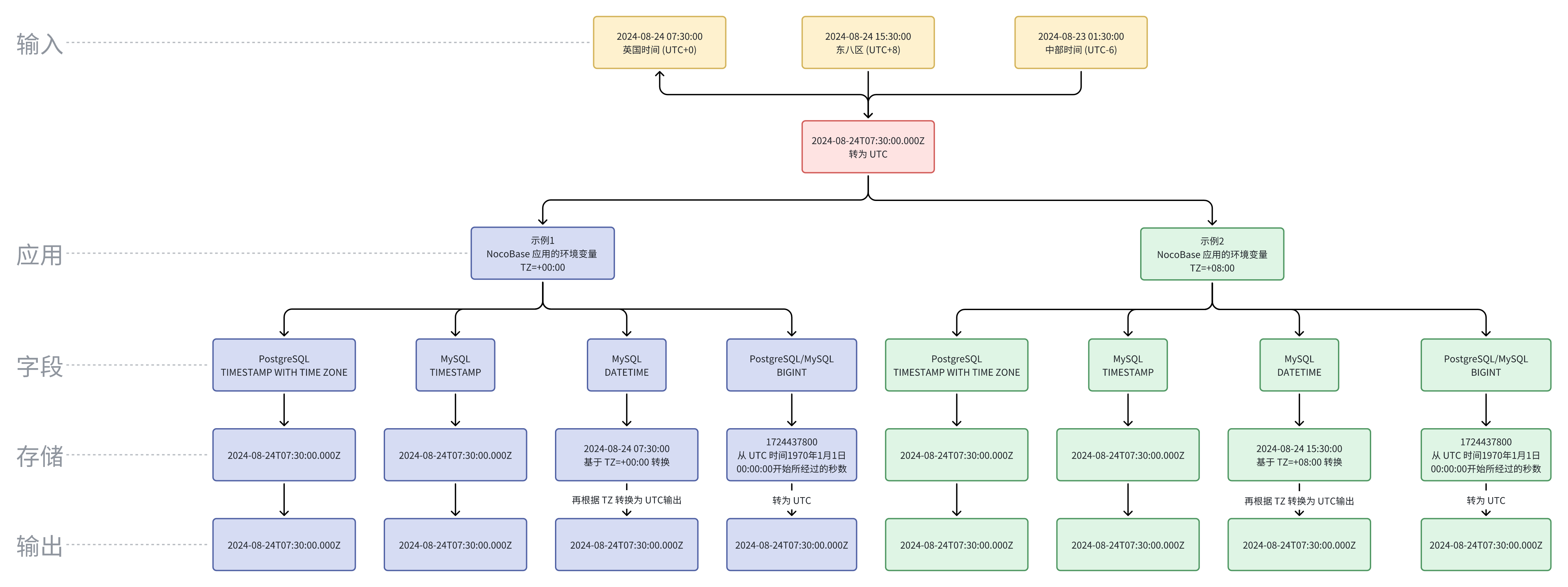
**Note:**
- To accommodate a broader range of dates, NocoBase uses the DATETIME type in MySQL for DateTime (with Time Zone) fields. The date value stored is converted based on the server's TZ environment variable, meaning that if the TZ environment variable changes, the stored DateTime value will also change.
- Since there is a time zone difference between UTC and local time, directly displaying the raw UTC value could lead to user confusion.
### Without Time Zone
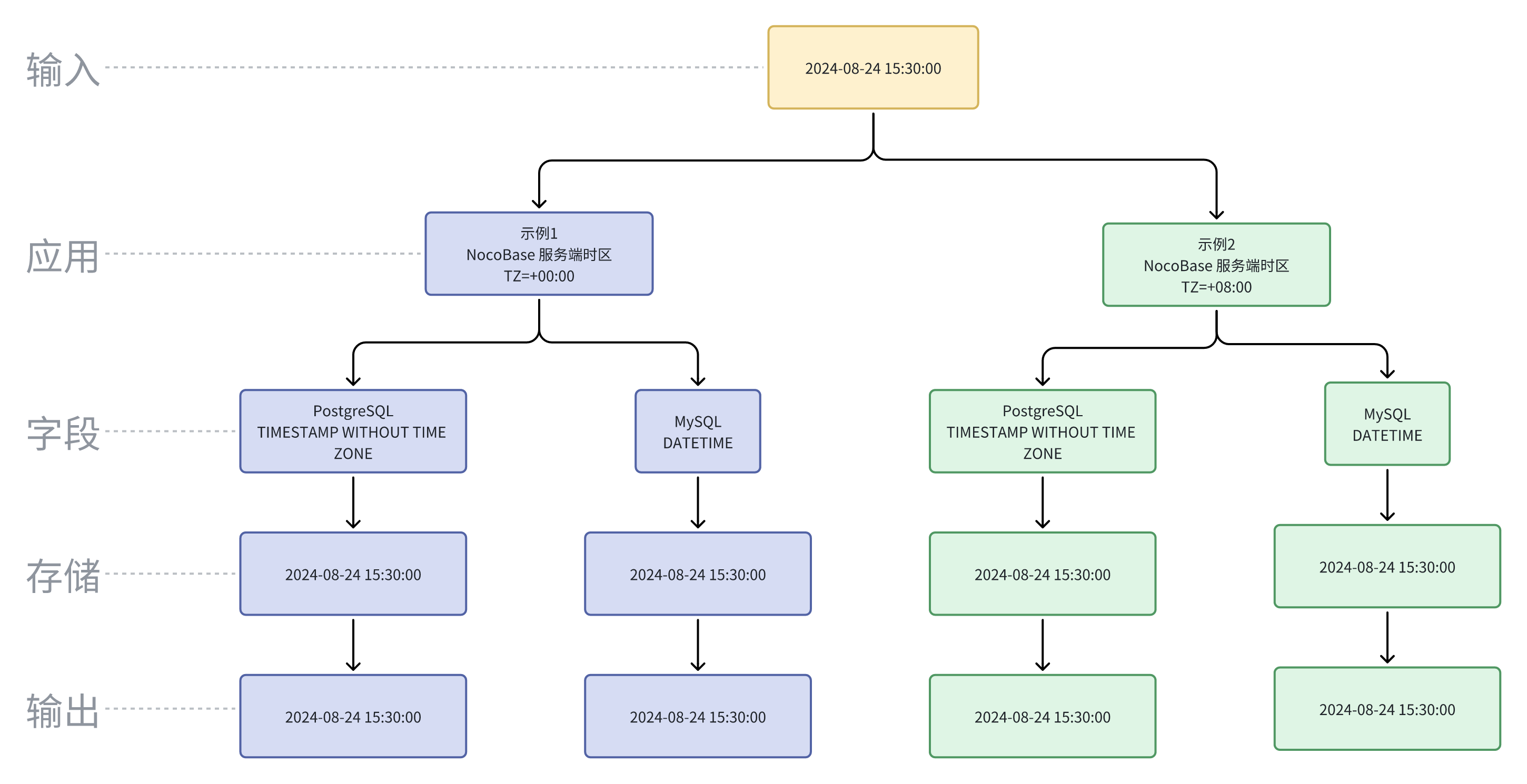
## UTC
UTC (Coordinated Universal Time) is the global time standard used to coordinate and synchronize time worldwide. It is a highly precise time standard, maintained by atomic clocks, and synchronized with the Earth's rotation.
The difference between UTC and local time can cause confusion when displaying raw UTC values. For example:
| **Time Zone** | **DateTime** |
|-----------------|---------------------------------|
| UTC | 2024-08-24T07:30:00.000Z |
| UTC+8 | 2024-08-24 15:30:00 |
| UTC+5 | 2024-08-24 12:30:00 |
| UTC-5 | 2024-08-24 02:30:00 |
| UTC+0 | 2024-08-24 07:30:00 |
| UTC-6 | 2024-08-23 01:30:00 |
These different times all correspond to the same moment, merely expressed in various time zones.
---
url: /data-sources/data-modeling/collection-fields/datetime/time.md
---
# Time
## Introduction
## Field configuration
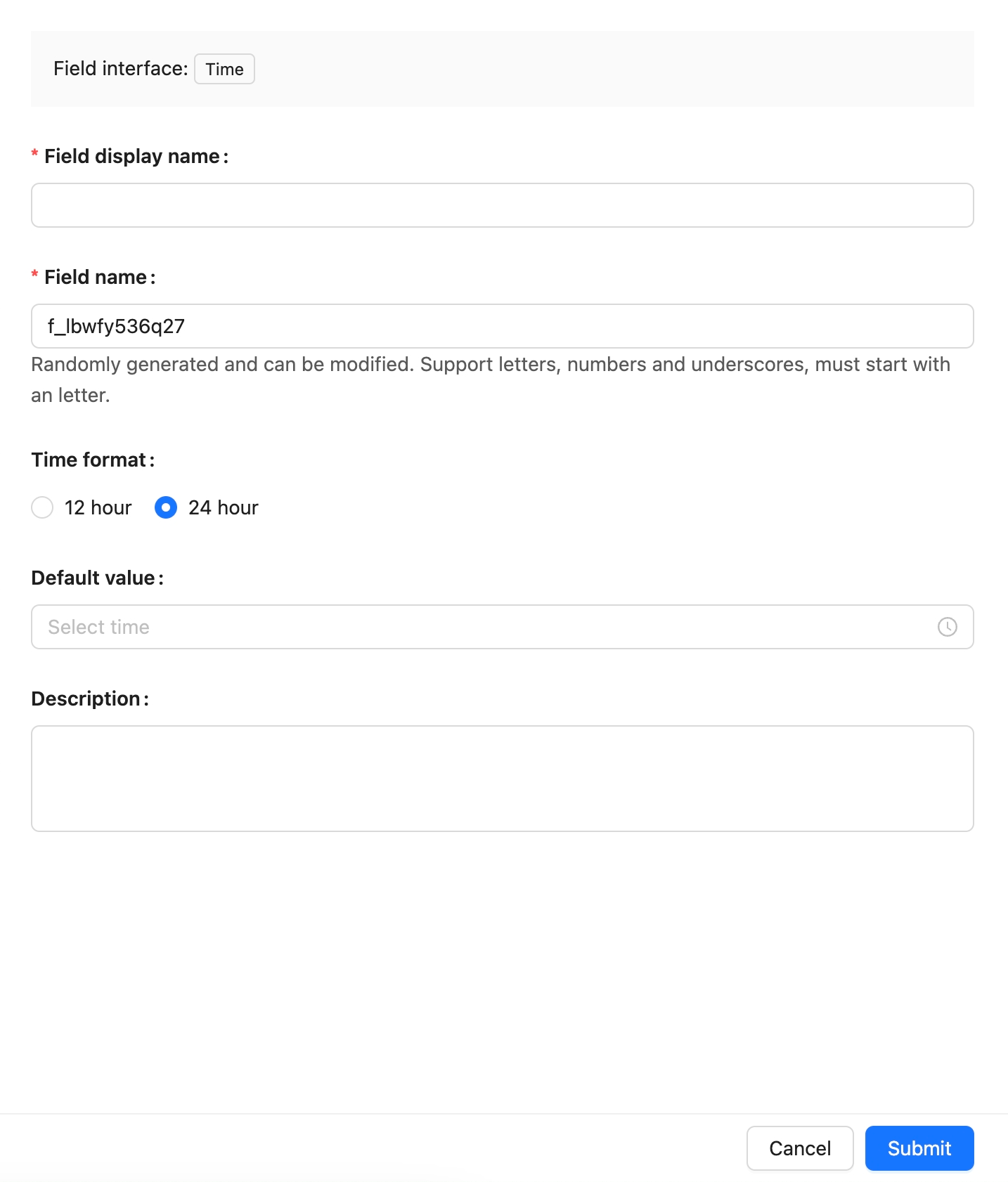
## Example
To be added.
---
url: /data-sources/data-modeling/collection-fields/datetime/unix-timestamp.md
---
# Unix Timestamp
## Introduction
## Field Configuration
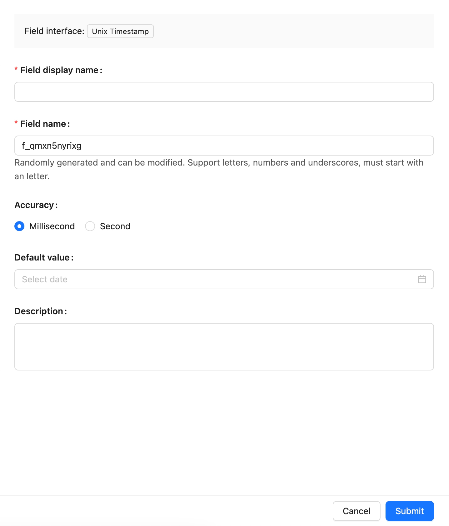
## Example
to be added.
---
url: /data-sources/data-modeling/collection-fields/geometric/circle.md
---
# Circle
## Introduction
## Field configuration

## Example
To be added.
---
url: /data-sources/data-modeling/collection-fields/geometric/line.md
---
# Line
## Introduction
## Field configuration

## Example
to be added.
---
url: /data-sources/data-modeling/collection-fields/geometric/point.md
---
# Point
## Introduction
## Field configuration
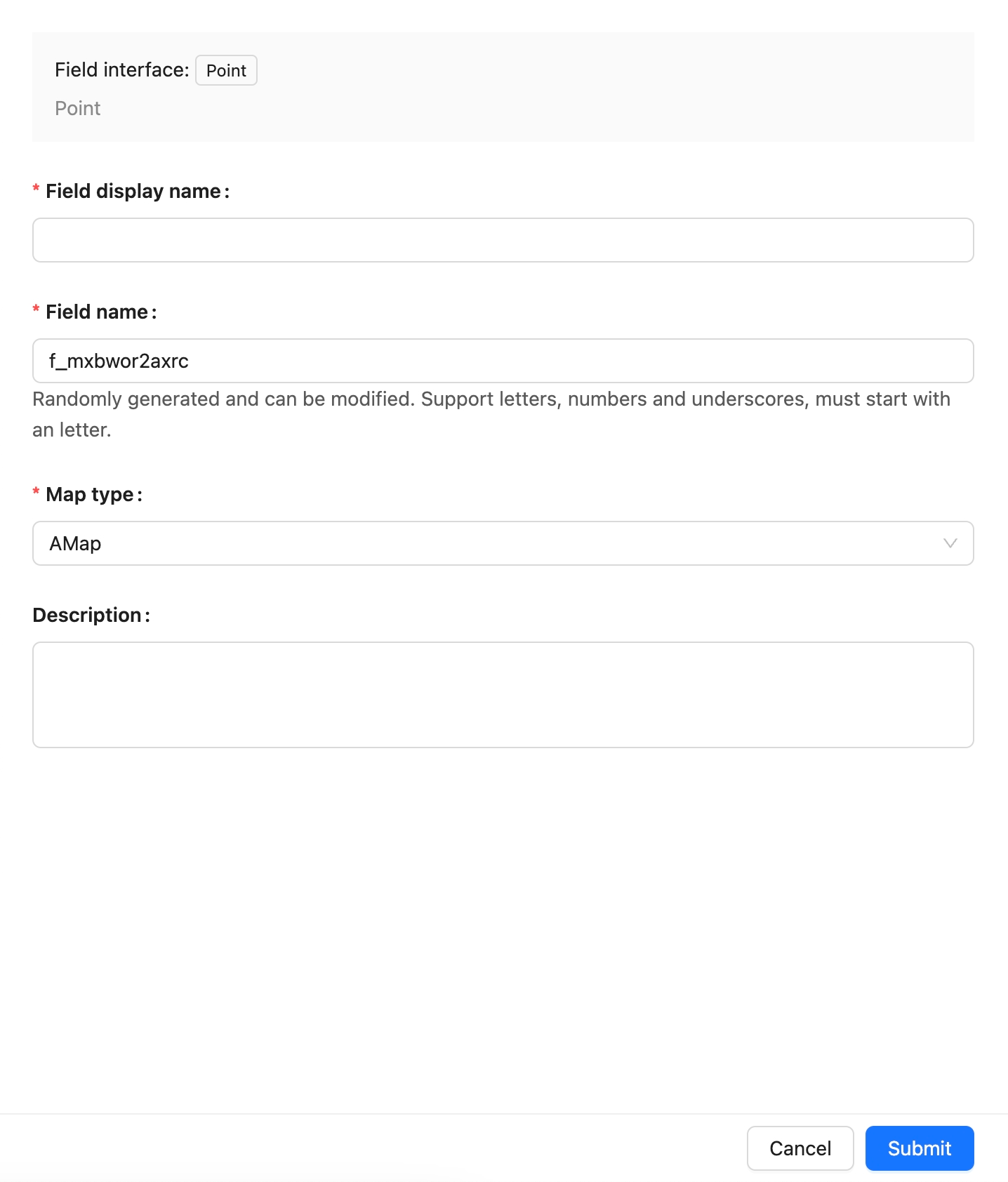
## Example
To be added.
---
url: /data-sources/data-modeling/collection-fields/geometric/polygon.md
---
# Polygon
## Introduction
## Field Configuration

## Example
to be added.
---
url: /data-sources/data-modeling/collection-fields/index.md
---
# Collection Fields
## Interface Types of Fields
NocoBase classifies fields into the following categories from the Interface perspective:
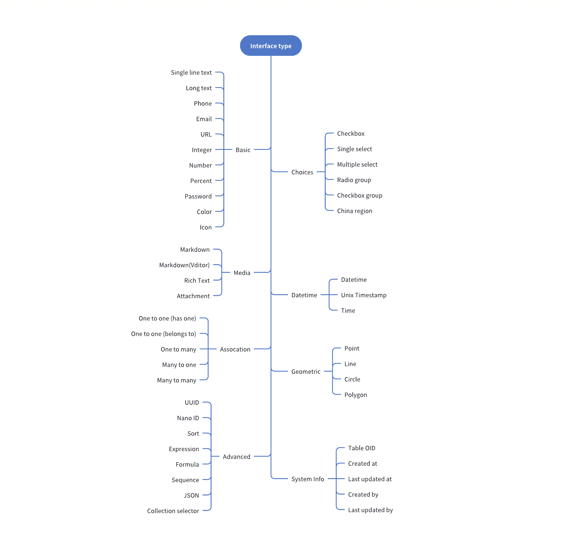
## Field Data Types
Each Field Interface has a default data type. For instance, for fields with the Interface as a Number, the default data type is double, but it can also be float, decimal, etc. The data types currently supported are:
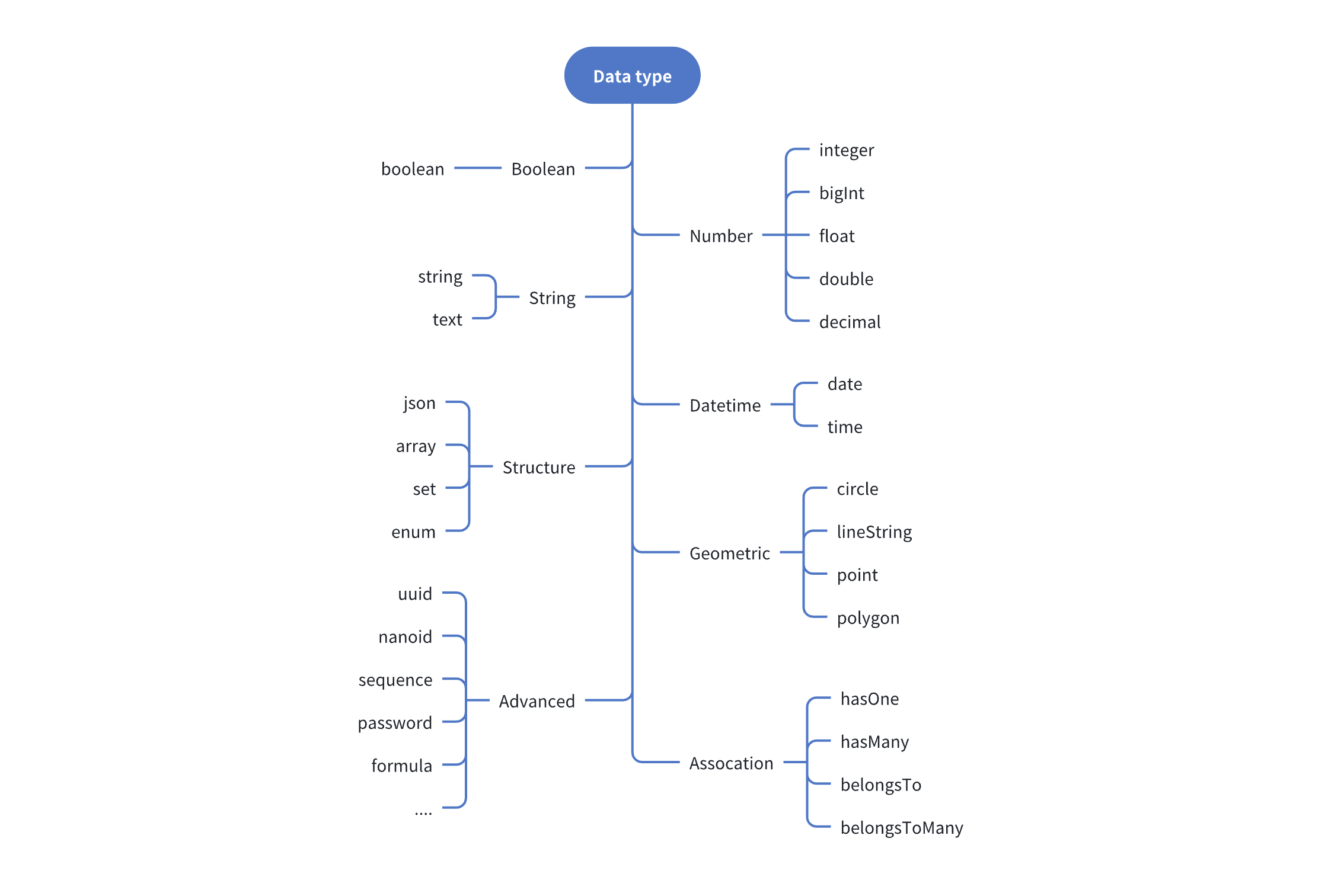
## Field Type Mapping
The process for adding new fields to the main database is as follows:
1. Select the Interface type
2. Configure the optional data type for the current Interface
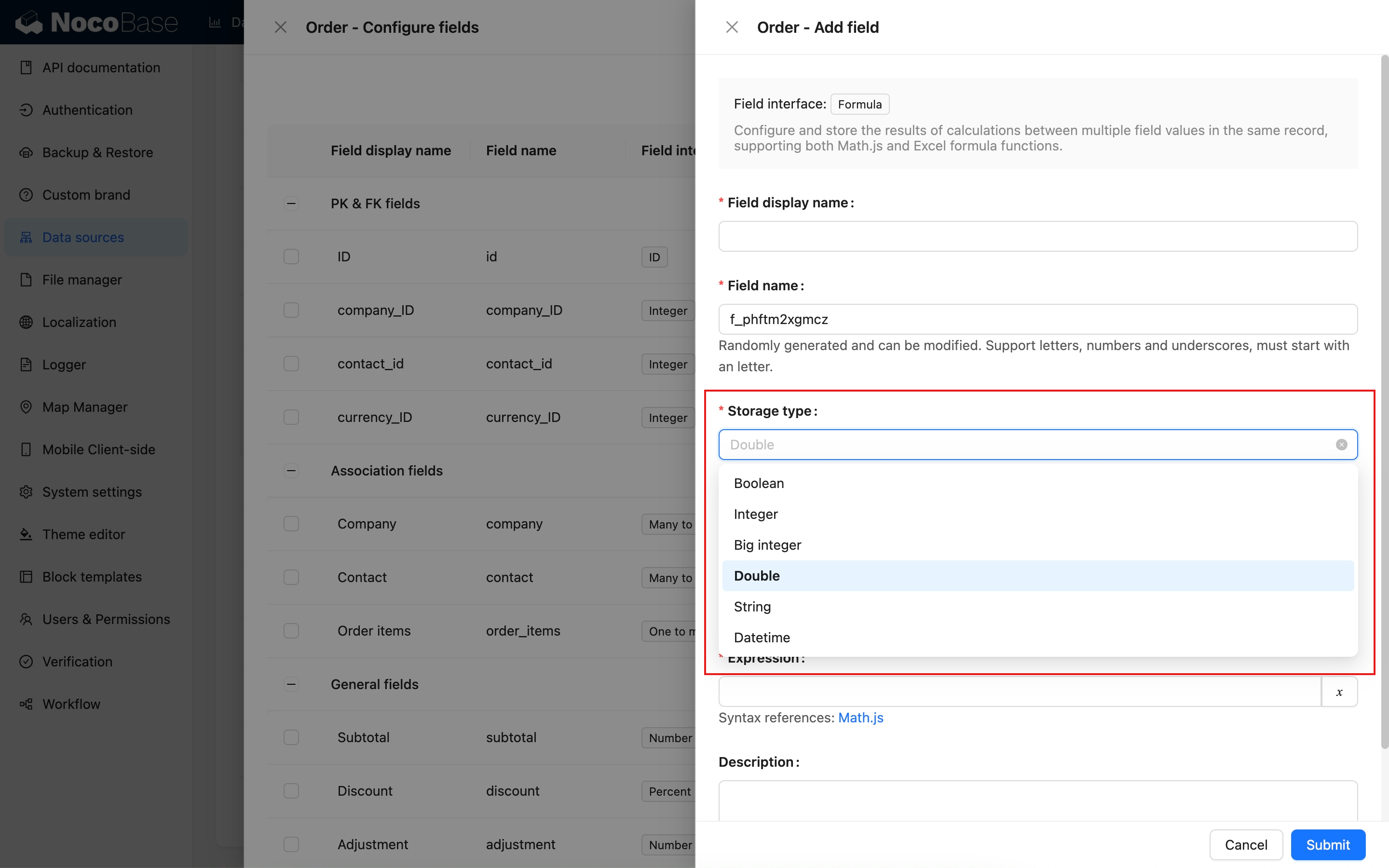
The process for field mapping from external data sources is:
1. Automatically map the corresponding data type (Field type) and UI type (Field Interface) based on the field type of the external database.
2. Modify to a more suitable data type and Interface type as needed
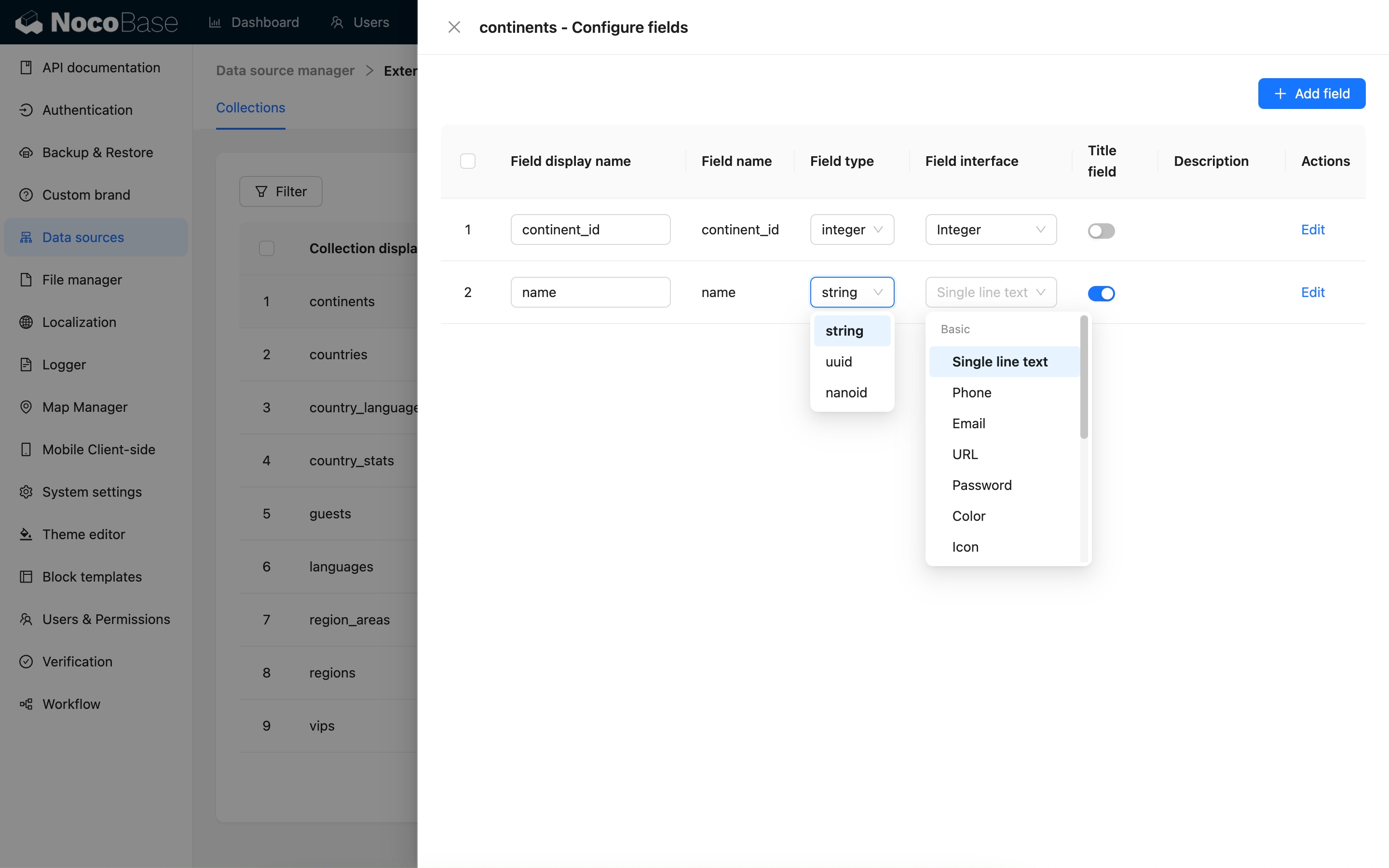
---
url: /data-sources/data-modeling/collection-fields/media/field-attachment.md
---
# Attachment Field
## Introduction
The system has a built-in "Attachment" field type to support file uploads in custom collections.
Under the hood, the attachment field is a many-to-many relationship field that points to the system's built-in "Attachments" (`attachments`) collection. When you create an attachment field in any collection, a many-to-many junction table is automatically generated. The metadata of uploaded files is stored in the "Attachments" collection, and the file information referenced in your collection is linked through this junction table.
## Field Configuration
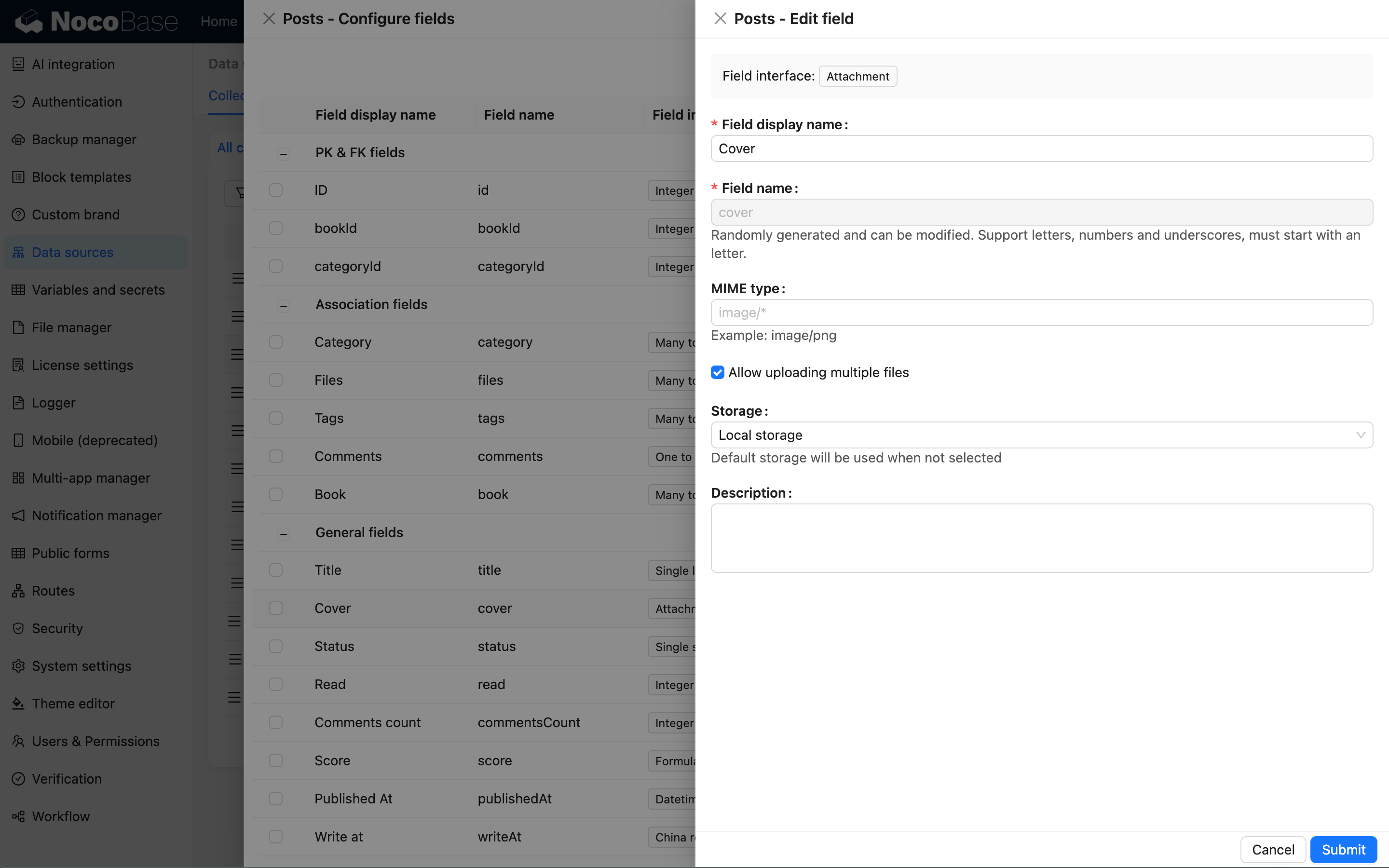
### MIME Type Whitelist
Used to restrict the types of files allowed for upload, using [MIME](https://developer.mozilla.org/en-US/docs/Web/HTTP/Basics_of_HTTP/MIME_types) syntax. For example, `image/*` represents image files. Multiple types can be separated by commas, such as `image/*,application/pdf`, which allows both image and PDF files.
### Storage
Select the storage engine for uploaded files. If left blank, the system's default storage engine will be used.
---
url: /data-sources/data-modeling/collection-fields/media/markdown.md
---
# Markdown
## Introduction
## Field configuration

## Example
To be added.
---
url: /data-sources/data-modeling/collection-fields/media/rich-text.md
---
# Rich Text
## Introduction
## Field configuration

## Example
to be added.
---
url: /data-sources/data-modeling/collection-fields/system-info/created-at.md
---
# Created At
## Introduction
## Field configuration
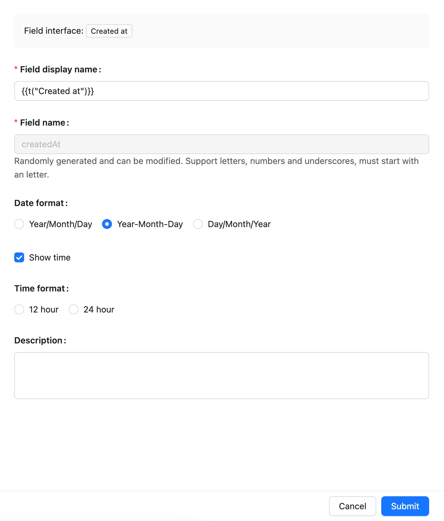
## Example
To be added.
---
url: /data-sources/data-modeling/collection-fields/system-info/created-by.md
---
# Created by
## Introduction
To be added
## Field Configuration
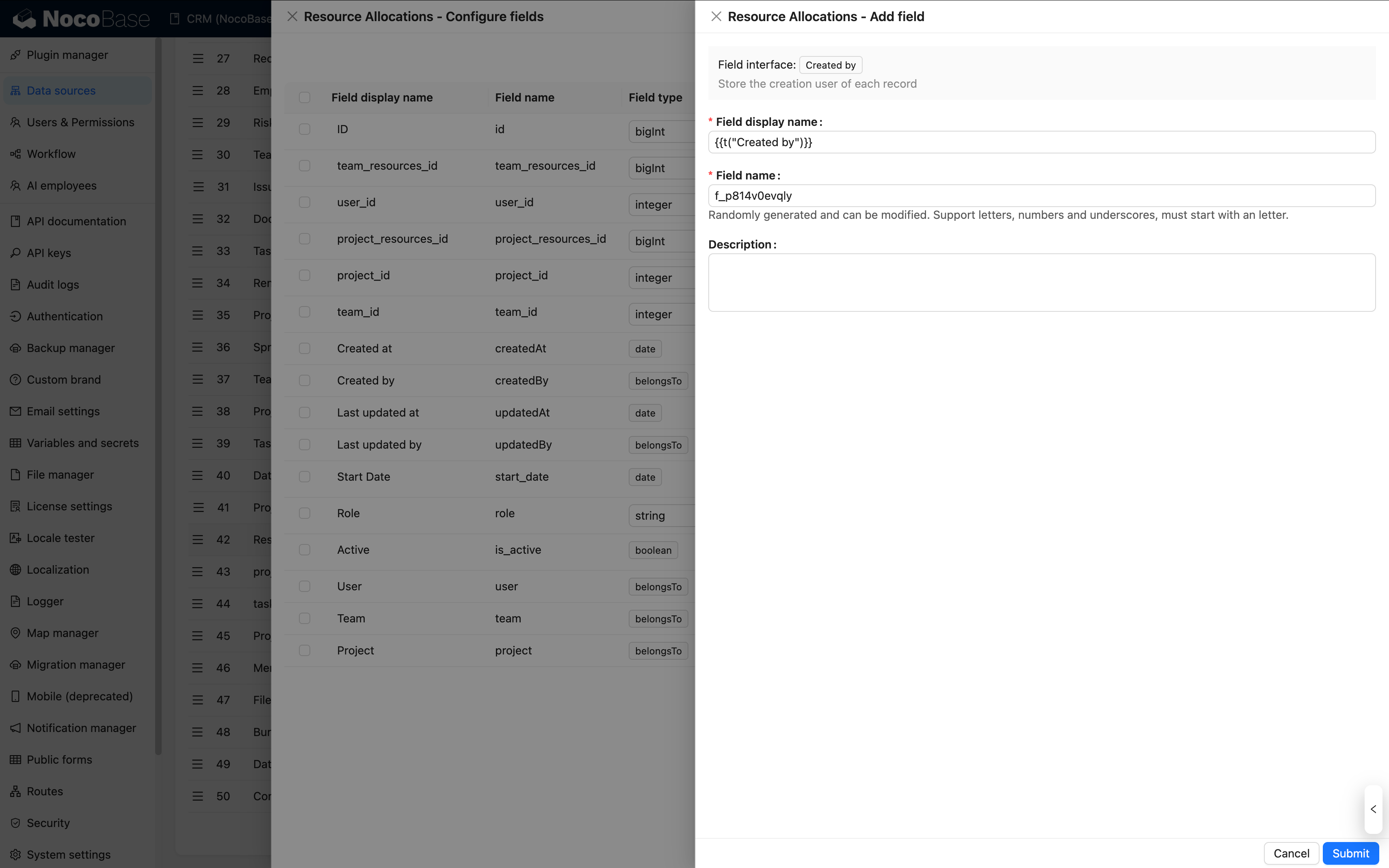
## Example
To be added
---
url: /data-sources/data-modeling/collection-fields/system-info/space.md
---
# Space
## Introduction
To be added
## Field Configuration

## Example
To be added
---
url: /data-sources/data-modeling/collection-fields/system-info/table-oid.md
---
# Table OID
## Introduction
## Field configuration
## Example
to be added.
---
url: /data-sources/data-modeling/collection-fields/system-info/updated-at.md
---
# Updated At
## Introduction
## Field Configuration

## Example
To be added.
---
url: /data-sources/data-modeling/collection-fields/system-info/updated-by.md
---
# Last updated by
## Introduction
To be added
## Field Configuration
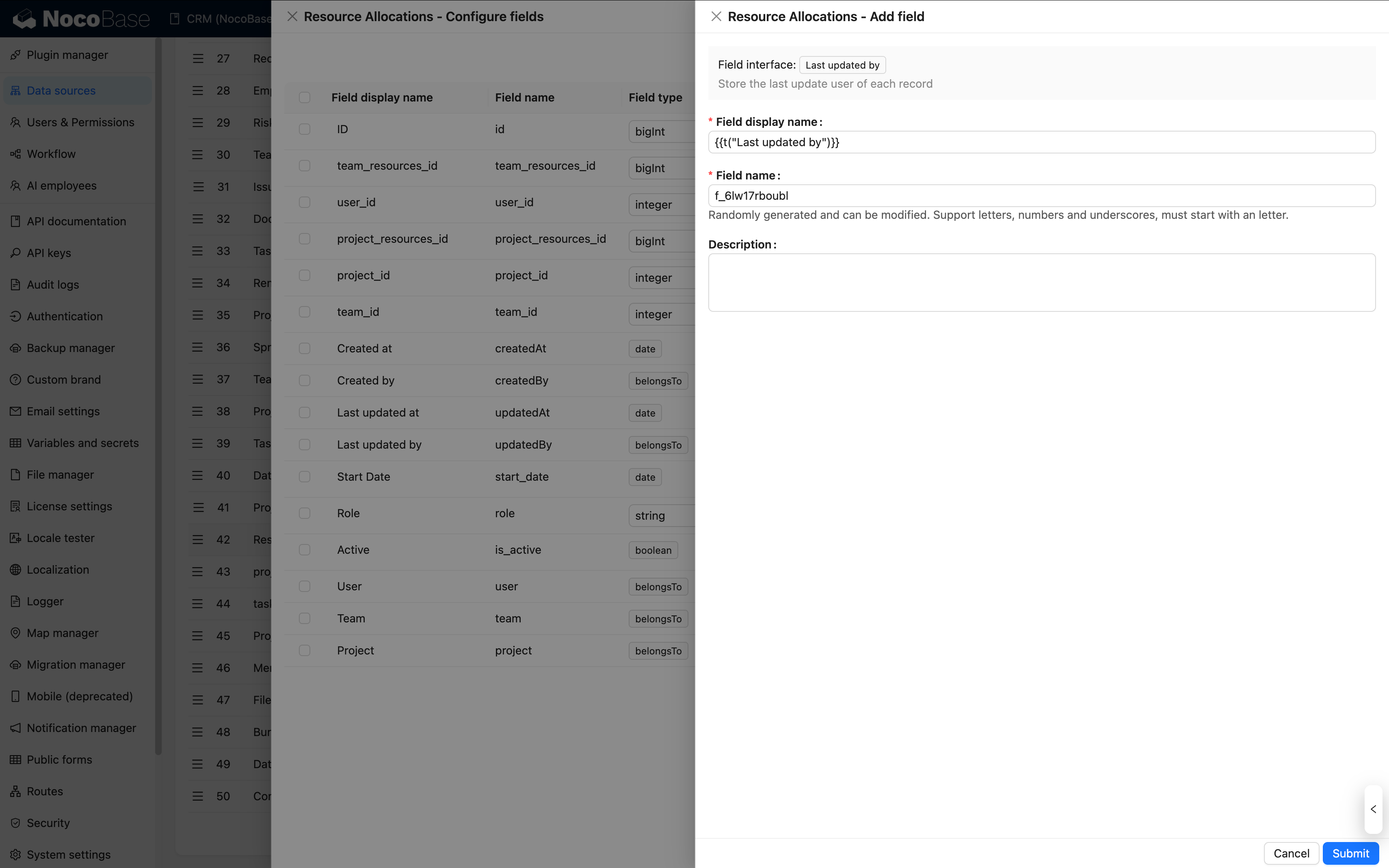
## Example
To be added
---
url: /data-sources/data-modeling/collection-fields/validation.md
---
# Field Validation
To ensure data accuracy, security, and consistency in collections, NocoBase provides field validation functionality. This feature consists of two main parts: rule configuration and rule application.
## Rule Configuration

NocoBase system fields integrate [Joi](https://joi.dev/api/) rules, with support as follows:
### String
Joi string types correspond to the following NocoBase field types: Single Line Text, Long Text, Phone, Email, URL, Password, and UUID.
#### Common Rules
- Min length
- Max length
- Length
- Pattern
- Required
#### Email

[View more options](https://joi.dev/api/?v=17.13.3#stringemailoptions)
#### URL

[View more options](https://joi.dev/api/?v=17.13.3#stringurioptions)
#### UUID

[View more options](https://joi.dev/api/?v=17.13.3#stringguid---aliases-uuid)
### Number
Joi number types correspond to the following NocoBase field types: Integer, Number, and Percentage.
#### Common Rules
- Greater than
- Less than
- Max value
- Min value
- Multiple
#### Integer
In addition to common rules, integer fields additionally support [integer validation](https://joi.dev/api/?v=17.13.3#numberinteger) and [unsafe integer validation](https://joi.dev/api/?v=17.13.3#numberunsafeenabled).

#### Number & Percentage
In addition to common rules, number and percentage fields additionally support [precision validation](https://joi.dev/api/?v=17.13.3#numberinteger).

### Date
Joi date types correspond to the following NocoBase field types: Date (with timezone), Date (without timezone), Date only, and Unix timestamp.
Supported validation rules:
- Greater than
- Less than
- Max value
- Min value
- Timestamp
- Required
### Association Fields
Association fields only support required validation. Note that required validation for association fields is currently not supported in sub-form or sub-table scenarios.

## Applying Validation Rules
After configuring field rules, the corresponding validation rules will be triggered when adding or modifying data.

Validation rules also apply to sub-table and sub-form components:


Note that in sub-form or sub-table scenarios, required validation for association fields does not take effect.

## Differences from Client-Side Field Validation
Client-side and server-side field validation are applied in different scenarios, with significant differences in implementation and rule trigger timing, so they need to be managed separately.
### Configuration Method Differences
- **Client-side validation**: Configure rules in edit forms (as shown in the figure below)
- **Server-side field validation**: Set field rules in Data Source → Collection Configuration


### Validation Trigger Timing Differences
- **Client-side validation**: Triggers validation in real-time as users fill in fields, displaying error messages immediately.
- **Server-side field validation**: Validates on the server side before data entry after data submission, with error messages returned through API responses.
- **Application scope**: Server-side field validation takes effect not only during form submission but also triggers in all scenarios involving data addition or modification, such as workflows and data imports.
- **Error messages**: Client-side validation supports custom error messages, while server-side validation does not currently support custom error messages.
---
url: /data-sources/data-modeling/collection.md
---
# Collection Overview
NocoBase provides a unique DSL to describe the structure of data, known as Collection, which unifies the data structure from various sources, providing a reliable foundation for data management, analysis, and application.
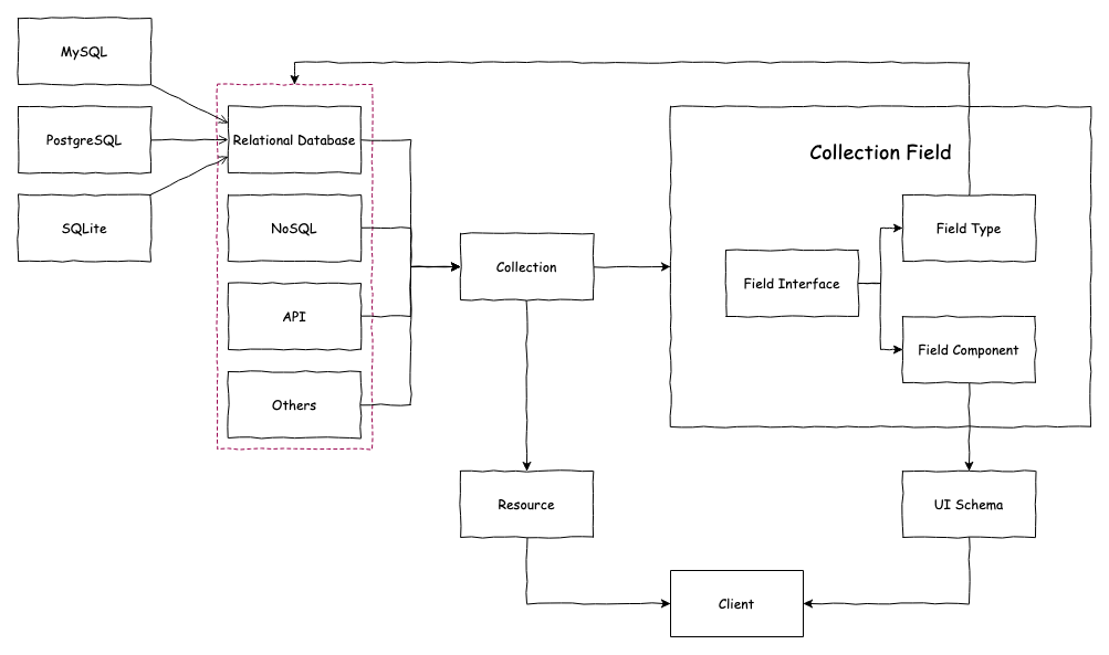
To conveniently use various data models, it supports various types of collections:
- [General collection](/data-sources/data-source-main/general-collection): Built-in common system fields;
- [Inheritance collection](/data-sources/data-source-main/inheritance-collection): You can create a parent collection and then derive a child collection from the parent collection. The child collection will inherit the structure of the parent collection and can also define its own columns.
- [Tree collection](/data-sources/collection-tree): Tree structure collection, currently only supports adjacency list design;
- [Calendar collection](/data-sources/calendar/calendar-collection): Used to create calendar-related event collections;
- [File collection](/data-sources/file-manager/file-collection): Used for file storage management;
- : Used for dynamic expression scenarios in workflows;
- [SQL collection](/data-sources/collection-sql): Not an actual database collection, but quickly presents SQL queries in a structured manner;
- [View collection](/data-sources/collection-view): Connects to existing database views;
- [External collection](/data-sources/collection-fdw): Allows the database system to directly access and query data in external data sources, based on FDW technology.
---
url: /data-sources/data-modeling/data-source.md
---
# Overview of Data Sources
---
url: /data-sources/data-modeling/index.md
---
# Overview
Data modeling is a key step in designing databases, involving a deep analysis and abstraction process of various types of data and their interrelationships in the real world. In this process, we try to reveal the intrinsic connections between data and formalize them into data models, laying the foundation for the database structure of the information system. NocoBase is a platform driven by data models, with the following features:
## Supports Access to Data from Various Sources
NocoBase supports data sources from various origins, including common databases, API/SDK platforms, and files.
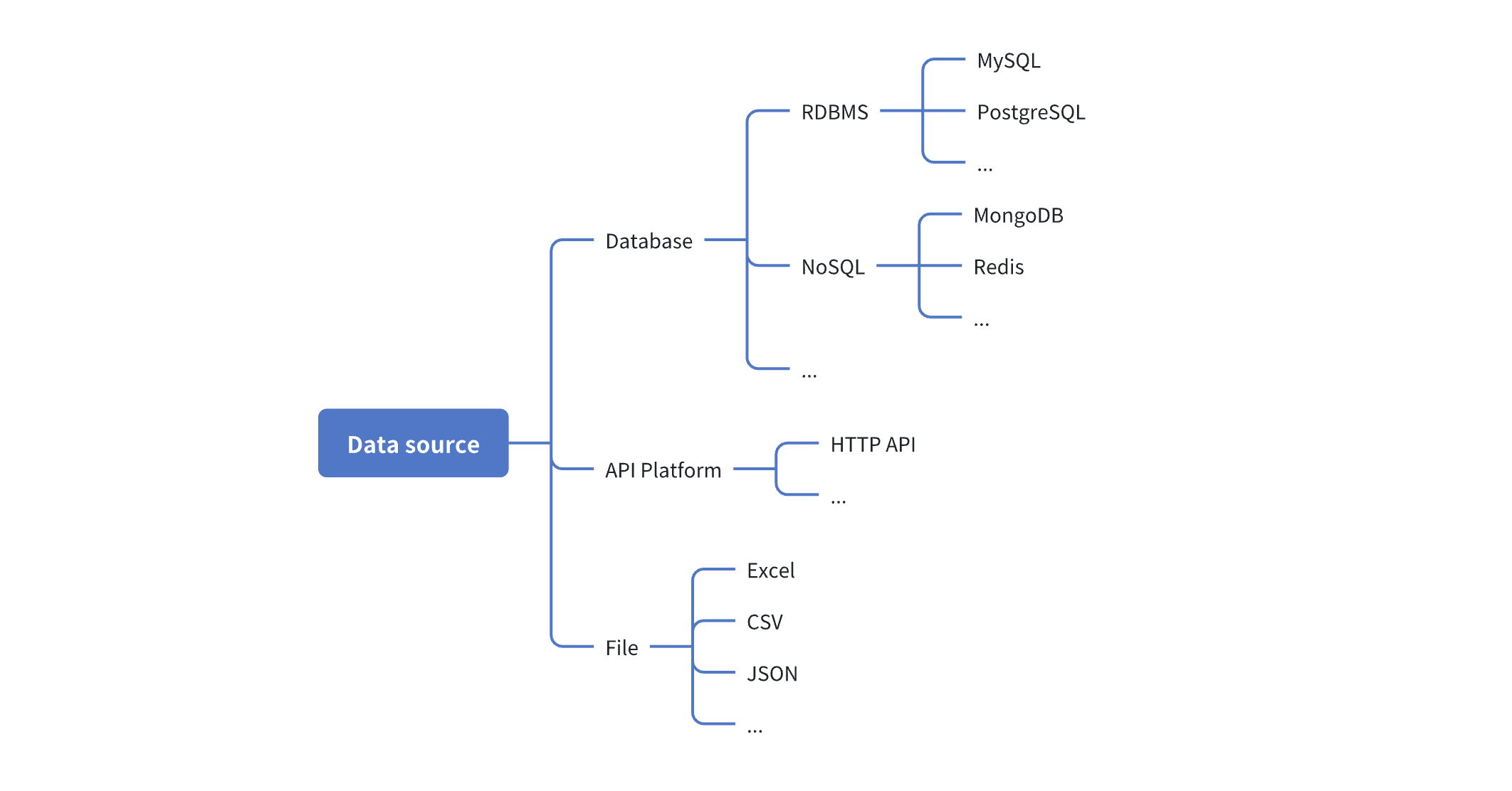
NocoBase provides a [data source manager](/data-sources/data-source-manager) for managing various data sources and their collections. The data source manager plugin only provides a management interface for all data sources and does not provide the ability to directly access data sources. It needs to be used in conjunction with various data source plugins. The currently supported data sources include:
- [Main Database](/data-sources/data-source-main): NocoBase's main database, supporting relational databases such as MySQL, PostgreSQL, and MariaDB.
- [KingbaseES](/data-sources/data-source-kingbase): Use KingbaseES database as a data source, which can be used as both a main database and an external database.
- [External MySQL](/data-sources/data-source-external-mysql): Use an external MySQL database as a data source.
- [External MariaDB](/data-sources/data-source-external-mariadb): Use an external MariaDB database as a data source.
- [External PostgreSQL](/data-sources/data-source-external-postgres): Use an external PostgreSQL database as a data source.
- [External MSSQL](/data-sources/data-source-external-mssql): Use an external MSSQL (SQL Server) database as a data source.
- [External Oracle](/data-sources/data-source-external-oracle): Use an external Oracle database as a data source.
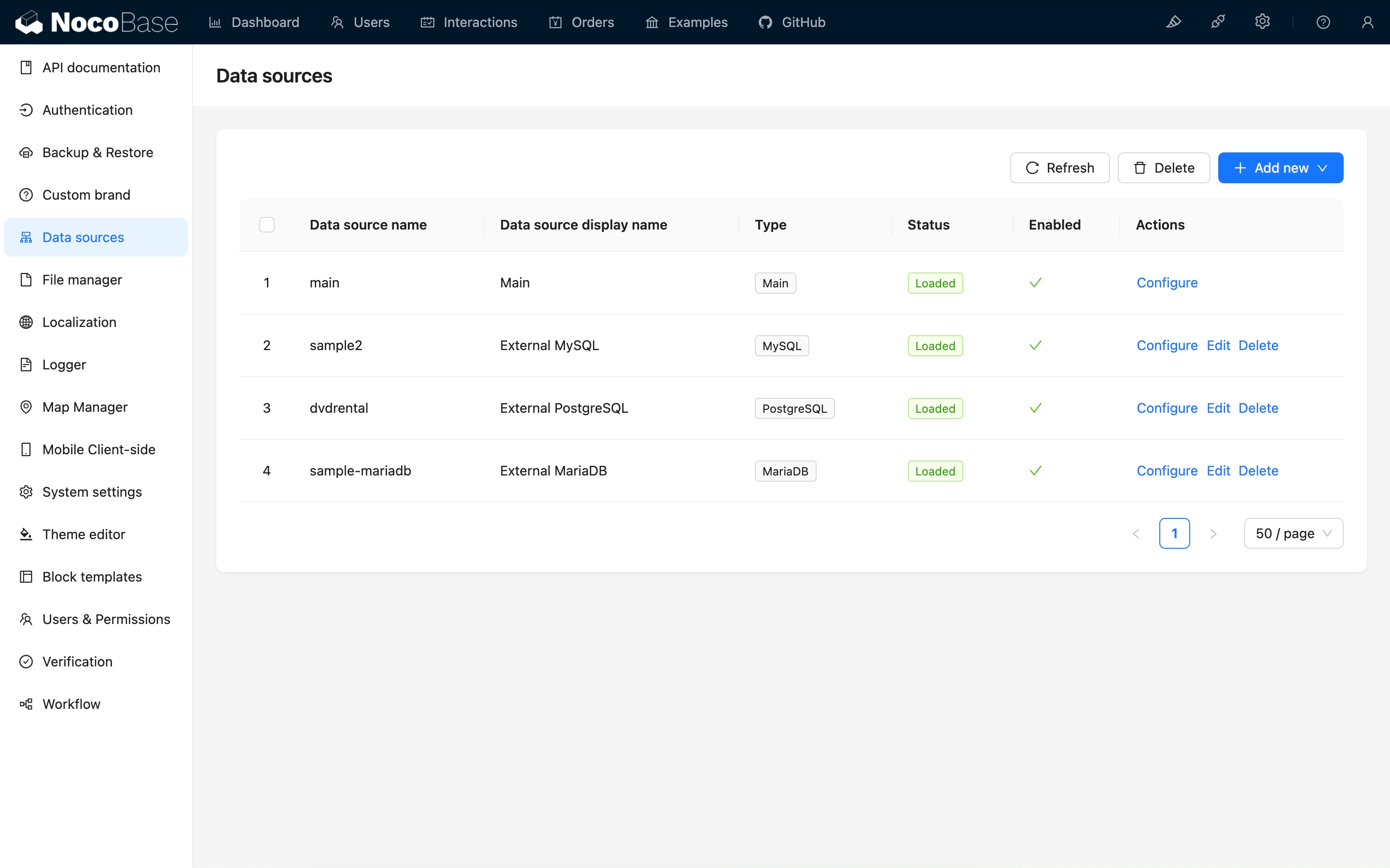
## Provides a Variety of Data Modeling Tools
**Simple collection management interface**: Used to create various models (collections) or connect to existing ones.
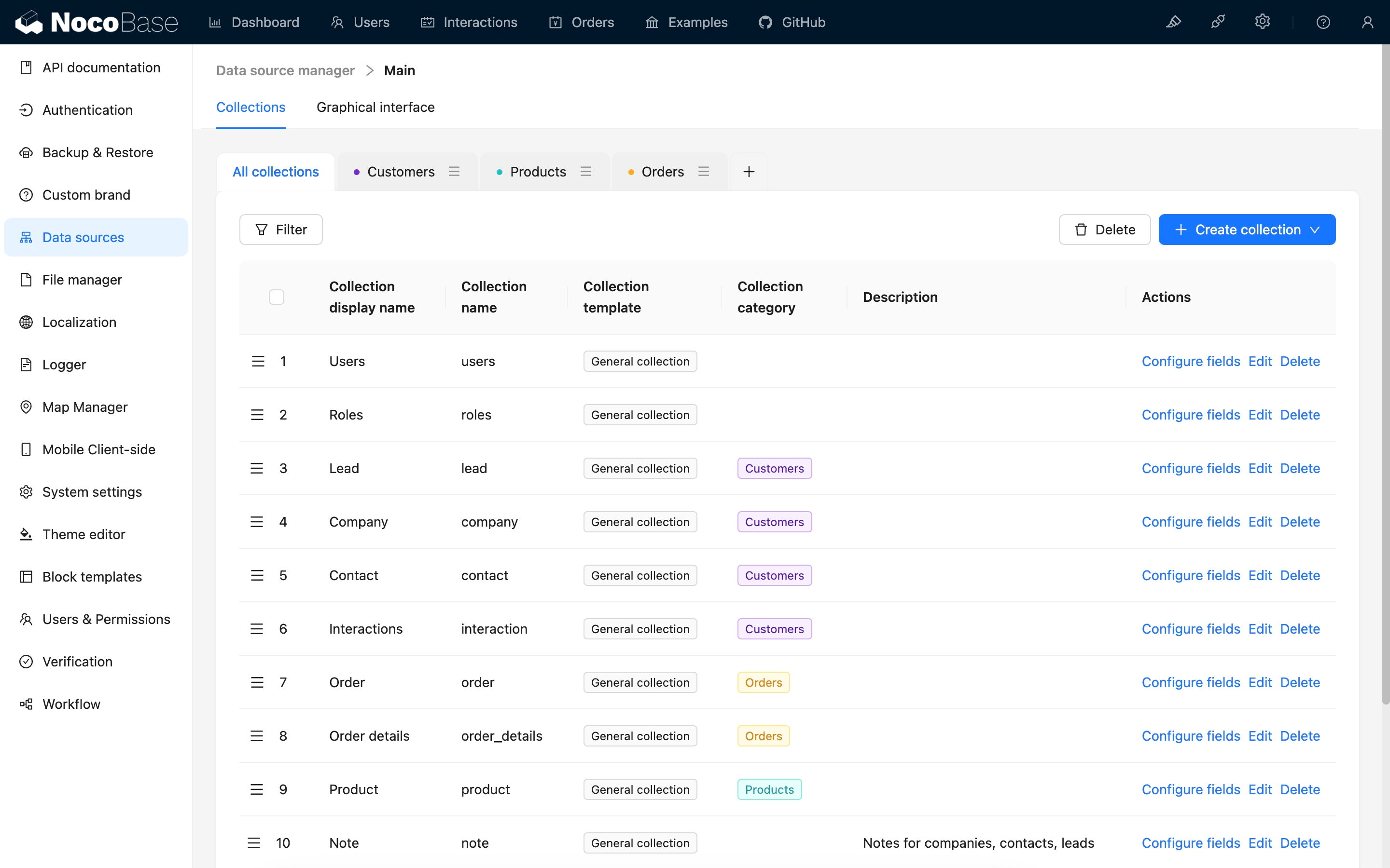
**ER-style visual interface**: Used to extract entities and their relationships from user and business requirements. It provides an intuitive and easy-to-understand way to describe data models. Through ER diagrams, you can more clearly understand the main data entities in the system and their relationships.
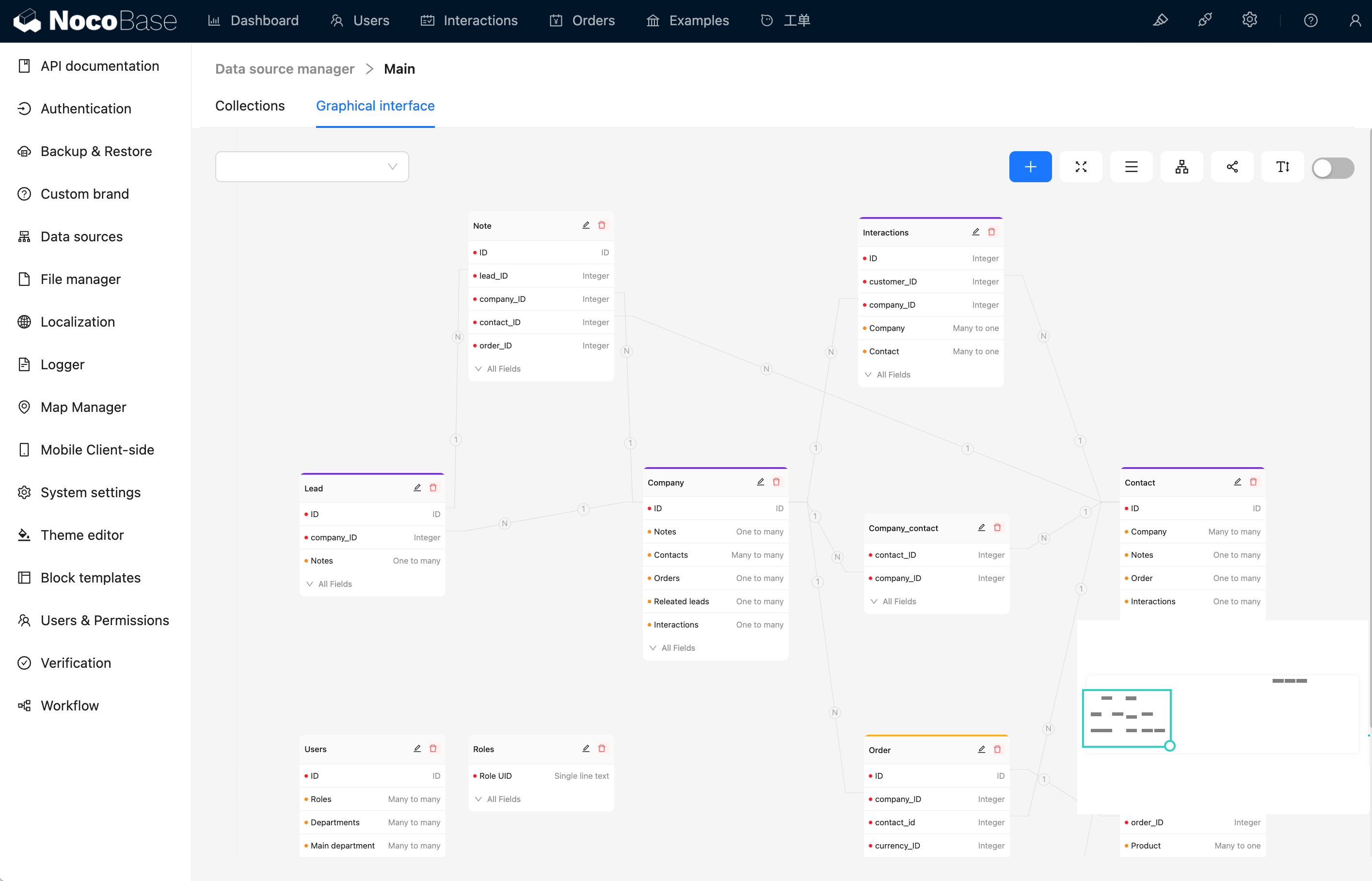
## Supports Various Types of Collections
- [General collection](/data-sources/data-source-main/general-collection): Built-in common system fields;
- [Calendar collection](/data-sources/calendar/calendar-collection): Used to create calendar-related event collections;
- Comment collection: Used for storing comments or feedback on data;
- [Tree collection](/data-sources/collection-tree): Tree-structured collection, currently only supports the adjacency list model;
- [File collection](/data-sources/file-manager/file-collection): Used for file storage management;
- [SQL collection](/data-sources/collection-sql): Not an actual database collection, but visualizes SQL queries in a structured manner;
- [Connect to database view](/data-sources/collection-view): Connects to existing database views;
- Expression collection: Used for dynamic expression scenarios in workflows;
- [Connect to foreign data](/data-sources/collection-fdw): Allows the database system to directly access and query data in external data sources based on FDW technology.
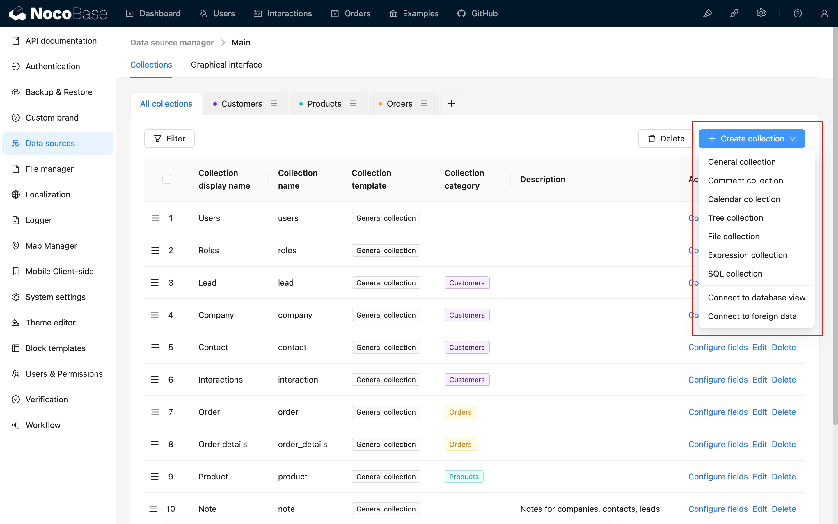
For more content, see the "[Collection / Overview](/data-sources/data-modeling/collection)" section.
## Provides a Rich Variety of Field Types

For more content, see the "[Collection Fields / Overview](/data-sources/data-modeling/collection-fields)" section.
---
url: /data-sources/data-modeling/main-vs-external-data-sources.md
---
# Main vs External Databases
The differences between main databases and external databases in NocoBase are primarily reflected in four aspects: database type support, collection type support, field type support, and backup and migration capabilities.
## 1. Database Type Support
For more details, see: [Data Source Manager](/data-sources/data-source-manager)
### Database Types
| Database Type | Main Database Support | External Database Support |
|------------------|---------------------------|------------------------------|
| PostgreSQL | ✅ | ✅ |
| MySQL | ✅ | ✅ |
| MariaDB | ✅ | ✅ |
| KingbaseES | ✅ | ✅ |
| MSSQL | ❌ | ✅ |
| Oracle | ❌ | ✅ |
### Collection Management
| Collection Management | Main Database Support | External Database Support |
|----------------------|-----------------------------|------------------------------|
| Basic Management | ✅ | ✅ |
| Visual Management | ✅ | ❌ |
## 2. Collection Type Support
For more details, see: [Collections](/data-sources/data-modeling/collection)
| Collection Type | Main Database | External Database | Description |
|----------------|-------------------|---------------------|-------------|
| General | ✅ | ✅ | Basic collection |
| View | ✅ | ✅ | Data source view |
| Inheritance | ✅ | ❌ | Supports data model inheritance, master data source only |
| File | ✅ | ❌ | Supports file uploads, master data source only |
| Comment | ✅ | ❌ | Built-in comment system, master data source only |
| Calendar | ✅ | ❌ | Collection for calendar views |
| Expression | ✅ | ❌ | Supports formula calculations |
| Tree | ✅ | ❌ | For tree structure data modeling |
| SQL | ✅ | ❌ | Collection defined through SQL |
| External Connection | ✅ | ❌ | Connection collection for external data sources, limited functionality |
## 3. Field Type Support
For more details, see: [Collection Fields](/data-sources/data-modeling/collection-fields)
### Basic Types
| Field Type | Main Database | External Database |
|-----------|----------------|-------------------|
| Single Line Text | ✅ | ✅ |
| Long Text | ✅ | ✅ |
| Phone | ✅ | ✅ |
| Email | ✅ | ✅ |
| URL | ✅ | ✅ |
| Integer | ✅ | ✅ |
| Number | ✅ | ✅ |
| Percentage | ✅ | ✅ |
| Password | ✅ | ✅ |
| Color | ✅ | ✅ |
| Icon | ✅ | ✅ |
### Choice Types
| Field Type | Main Database | External Database |
|-----------|----------------|-------------------|
| Checkbox | ✅ | ✅ |
| Single select | ✅ | ✅ |
| Multiple Select | ✅ | ✅ |
| Radio Group | ✅ | ✅ |
| Checkbox group | ✅ | ✅ |
| China region | ✅ | ❌ |
### Media Types
| Field Type | Main Database | External Database |
|-----------|----------------|-------------------|
| Media | ✅ | ✅ |
| Markdown | ✅ | ✅ |
| Markdown(Vditor) | ✅ | ✅ |
| Rich Text | ✅ | ✅ |
| Attachment(Association) | ✅ | ❌ |
| Attachment(URL) | ✅ | ✅ |
### Date & Time Types
| Field Type | Main Database | External Database |
|-----------|----------------|-------------------|
| Datetime(with time zone) | ✅ | ✅ |
| Datetime(without time zone) | ✅ | ✅ |
| Unix timestamp | ✅ | ✅ |
| Date(without time) | ✅ | ✅ |
| Time | ✅ | ✅ |
### Geometric Types
| Field Type | Main Database | External Database |
|-----------|----------------|-------------------|
| Point | ✅ | ✅ |
| Line | ✅ | ✅ |
| Circle | ✅ | ✅ |
| Polygon | ✅ | ✅ |
### Advanced Types
| Field Type | Main Database | External Database |
|-----------|----------------|-------------------|
| UUID | ✅ | ✅ |
| Nano ID | ✅ | ✅ |
| Sort | ✅ | ✅ |
| Formula | ✅ | ✅ |
| Sequence | ✅ | ✅ |
| JSON | ✅ | ✅ |
| Collection selector | ✅ | ❌ |
| Encryption | ✅ | ✅ |
### System Info Fields
| Field Type | Main Database | External Database |
|-----------|----------------|-------------------|
| Created at | ✅ | ✅ |
| Last updated at | ✅ | ✅ |
| Created by | ✅ | ❌ |
| Last updated by | ✅ | ❌ |
| Table OID | ✅ | ❌ |
### Association Types
| Field Type | Main Database | External Database |
|-----------|----------------|-------------------|
| One-to-one | ✅ | ✅ |
| One-to-many | ✅ | ✅ |
| Many-to-one | ✅ | ✅ |
| Many-to-many | ✅ | ✅ |
| Many-to-many (array) | ✅ | ✅ |
:::info
Attachment fields depend on file collections, which are only supported by main databases. Therefore, external databases do not currently support attachment fields.
:::
## 4. Backup and Migration Support Comparison
| Feature | Main Database | External Database |
|---------|-------------------|---------------------|
| Backup & Restore | ✅ | ❌ (User managed) |
| Migration Management | ✅ | ❌ (User managed) |
:::info
NocoBase provides backup, restore, and structure migration capabilities for main databases. For external databases, these operations need to be completed independently by users according to their own database environments. NocoBase does not provide built-in support.
:::
## Summary Comparison
| Comparison Item | Main Database | External Database |
|----------------|-------------------|---------------------|
| Database Types | PostgreSQL, MySQL, MariaDB, KingbaseES | PostgreSQL, MySQL, MariaDB, MSSQL, Oracle, KingbaseES |
| Collection Type Support | All collection types | Only general and view collections |
| Field Type Support | All field types | All field types except attachment fields |
| Backup & Migration | Built-in support | User managed |
## Recommendations
- **If you are using NocoBase to build a new business system**, please use the **main database**, which will allow you to use NocoBase's complete functionality.
- **If you are using NocoBase to connect to other systems' databases for basic CRUD operations**, then use **external databases**.
---
url: /data-sources/data-source-external-mariadb/index.md
---
# External Data Source - MariaDB
## Introduction
Use an external MariaDB database as a data source. Currently supported versions: MariaDB >= 10.3
## Installation
This is a commercial plugin. For detailed activation instructions, please refer to: [Commercial Plugin Activation Guide](https://www.nocobase.com/en/blog/nocobase-commercial-license-activation-guide)
## Usage Instructions
Refer to the [Data Source / External Database](/data-sources/data-source-manager/external-database) section.
---
url: /data-sources/data-source-external-mssql/index.md
---
# External Data Source - MSSQL
## Introduction
Use an external MSSQL database as a data source. Currently supported versions: SQL Server 2014-2019
## Installation
This is a commercial plugin. For detailed activation instructions, please refer to: [Commercial Plugin Activation Guide](https://www.nocobase.com/en/blog/nocobase-commercial-license-activation-guide)
## Usage Instructions
Refer to the [Data Source / External Database](/data-sources/data-source-manager/external-database) section.
---
url: /data-sources/data-source-external-mysql/index.md
---
# External Data Source - MySQL
## Introduction
Use an external MySQL database as a data source. Currently supported versions: MySQL >= 5.7
## Installation
This is a commercial plugin. For detailed activation instructions, please refer to: [Commercial Plugin Activation Guide](https://www.nocobase.com/en/blog/nocobase-commercial-license-activation-guide)
## Usage Instructions
Refer to the [Data Source / External Database](/data-sources/data-source-manager/external-database) section.
---
url: /data-sources/data-source-external-oracle/index.md
---
# External Data Source - Oracle
## Introduction
This plugin allows you to use an external Oracle database as a data source. It supports Oracle versions >= 11g.
## Installation
### Install Oracle Client
For Oracle server versions earlier than 12.1, you need to install the Oracle client.
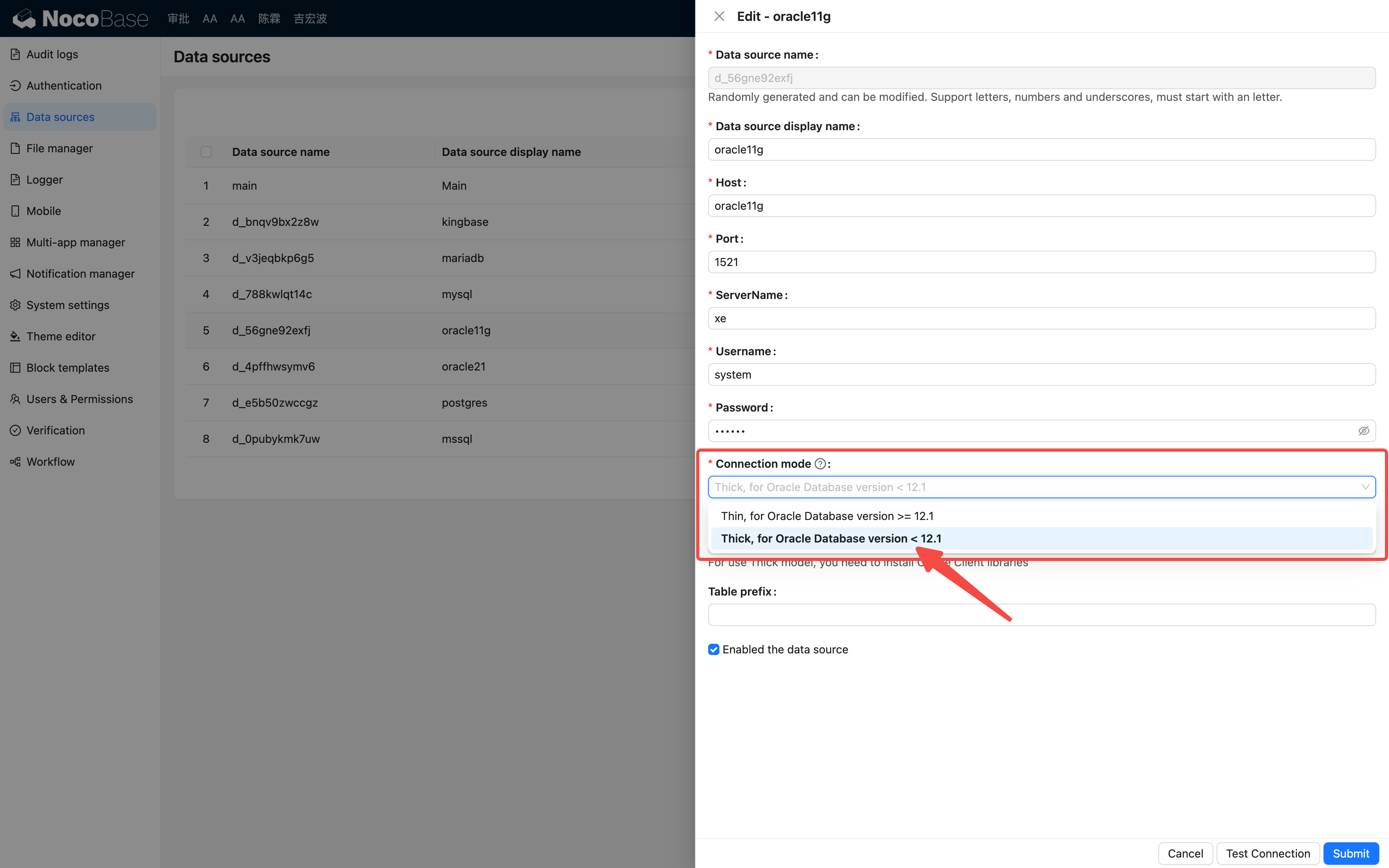
Example for Linux:
```bash
apt-get update
apt-get install -y unzip wget libaio1
wget https://download.oracle.com/otn_software/linux/instantclient/1925000/instantclient-basic-linux.x64-19.25.0.0.0dbru.zip
unzip instantclient-basic-linux.x64-19.25.0.0.0dbru.zip -d /opt/
echo /opt/instantclient_19_25 > /etc/ld.so.conf.d/oracle-instantclient.conf
ldconfig
```
If the client is not installed as described above, you will need to specify the path to the client (for more details, refer to the [node-oracledb documentation](https://node-oracledb.readthedocs.io/en/latest/user_guide/initialization.html)).
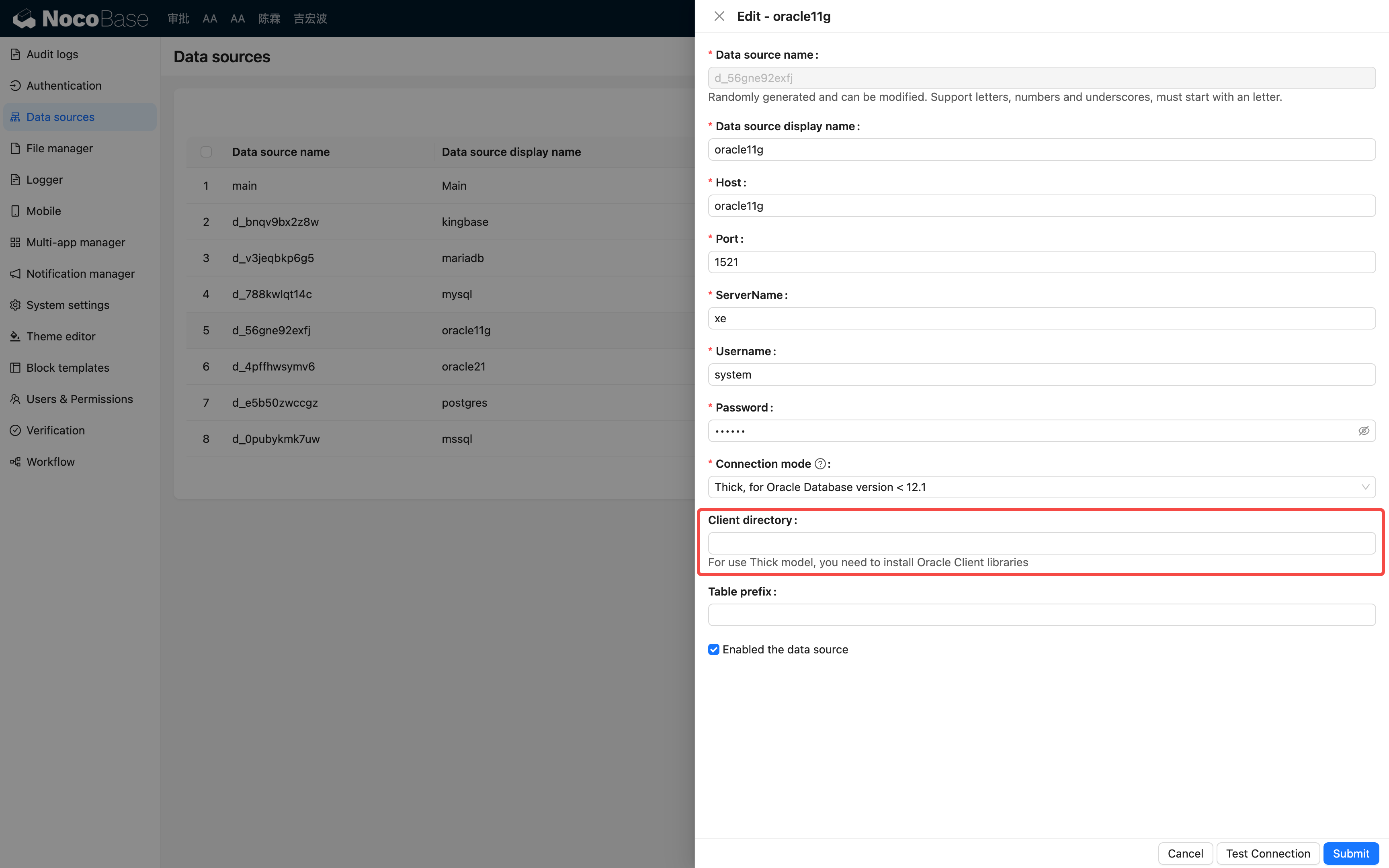
## Usage
For detailed instructions, refer to the [Data Source / External Database](/data-sources/data-source-manager/external-database) section.
---
url: /data-sources/data-source-external-postgres/index.md
---
# External Data Source - PostgreSQL
## Introduction
Use an external PostgreSQL database as a data source. Currently supported versions: PostgreSQL >= 9.5
## Installation
This is a commercial plugin. For detailed activation instructions, please refer to: [Commercial Plugin Activation Guide](https://www.nocobase.com/en/blog/nocobase-commercial-license-activation-guide)
## Usage Instructions
Refer to the [Data Source / External Database](/data-sources/data-source-manager/external-database) section.
---
url: /data-sources/data-source-kingbase/index.md
---
# Data Source - KingbaseES Database
## Introduction
KingbaseES can be used as a data source, either as the primary database or an external database.
:::warning
Currently, only KingbaseES databases running in pg mode are supported.
:::
## Installation
### Using as the Primary Database
Refer to the Installation documentation for the setup procedures, the difference is mainly due to the environment variables.
#### Environment Variables
Edit the .env file to add or modify the following environment variable configurations:
```bash
# Adjust DB parameters as needed
DB_DIALECT=kingbase
DB_HOST=localhost
DB_PORT=54321
DB_DATABASE=kingbase
DB_USER=nocobase
DB_PASSWORD=nocobase
```
#### Docker Installation
```yml
networks:
nocobase:
driver: bridge
services:
app:
image: nocobase/nocobase:latest
restart: always
networks:
- nocobase
depends_on:
- kingbase
environment:
# Application key for generating user tokens, etc.
# Changing APP_KEY invalidates old tokens
# Use a random string and keep it confidential
- APP_KEY=your-secret-key
# Database type
- DB_DIALECT=kingbase
# Database host, replace with existing database server IP if needed
- DB_HOST=kingbase
- DB_PORT=54321
# Database name
- DB_DATABASE=kingbase
# Database user
- DB_USER=nocobase
# Database password
- DB_PASSWORD=nocobase
# Timezone
- TZ=UTC
volumes:
- ./storage:/app/nocobase/storage
ports:
- "11000:80"
# Kingbase service for testing purposes only
kingbase:
image: nocobase/kingbase:v009r001c001b0030_single_x86
platform: linux/amd64
restart: always
privileged: true
networks:
- nocobase
volumes:
- ./storage/db/kingbase:/home/kingbase/userdata
environment:
ENABLE_CI: no # Must be set to no
DB_USER: nocobase
DB_PASSWORD: nocobase
DB_MODE: pg # pg only
NEED_START: yes
command: ["/usr/sbin/init"]
```
#### Installation Using create-nocobase-app
```bash
yarn create nocobase-app my-nocobase-app -d kingbase \
-e DB_HOST=localhost \
-e DB_PORT=54321 \
-e DB_DATABASE=kingbase \
-e DB_USER=nocobase \
-e DB_PASSWORD=nocobase \
-e TZ=UTC
```
### Using as an External Database
Execute the installation or upgrade command
```bash
yarn nocobase install
# or
yarn nocobase upgrade
```
Activate the Plugin
## User Guide
- Primary Database: Refer to the [Main data source](/data-sources/data-source-main/)
- External Database: See [Data Source / External Database](/data-sources/data-source-manager/external-database)
---
url: /data-sources/data-source-main/general-collection.md
---
# General Collection
## Introduction
It is used in most scenarios. A general collection can be used unless a special collection template is needed.
## User Manual
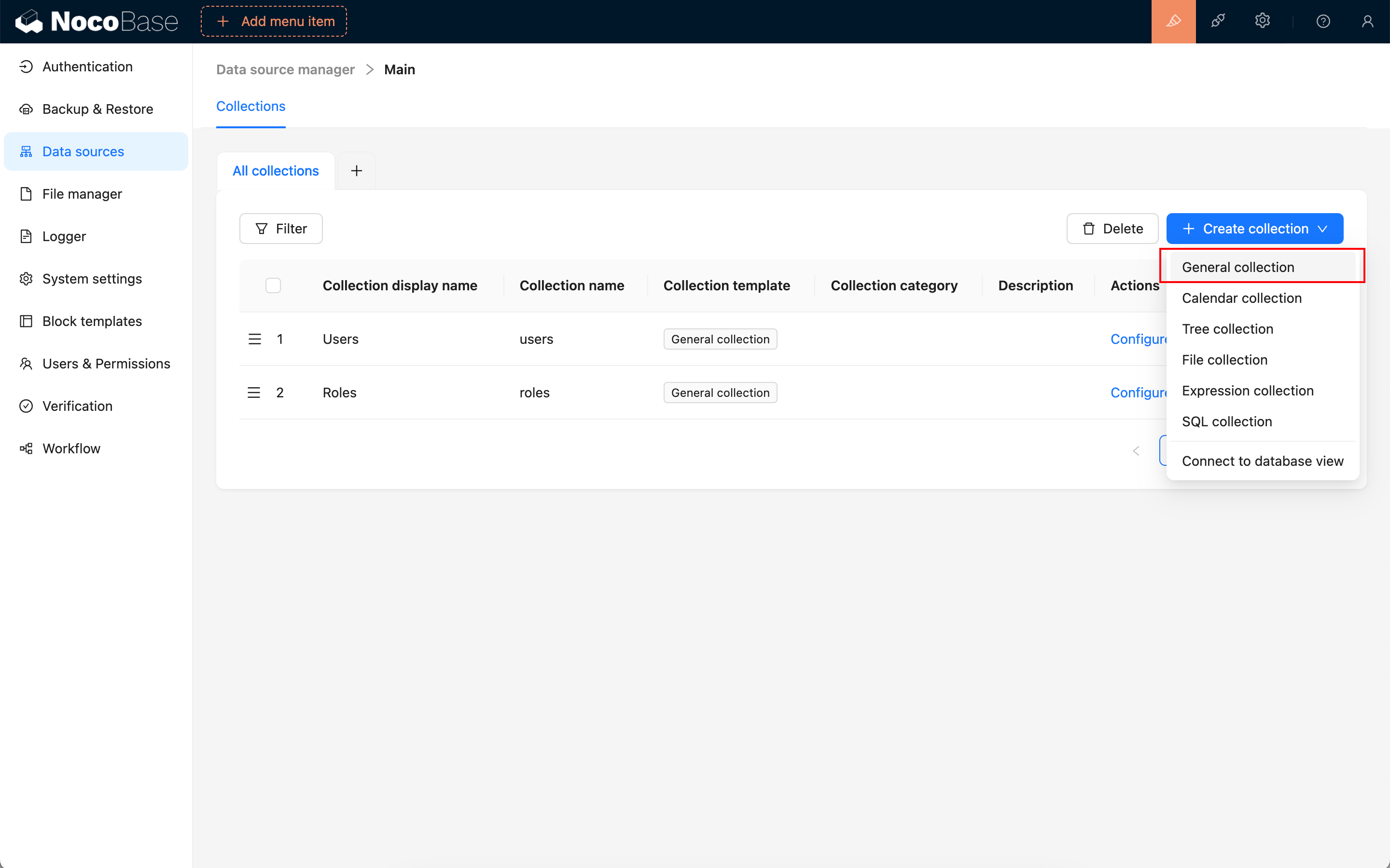
### Set Primary Key
When creating a collection, you need to specify a primary key field. It is recommended to enable the preset ID field when creating a new collection. The default primary key type for the ID field is Snowflake ID (53-bit).
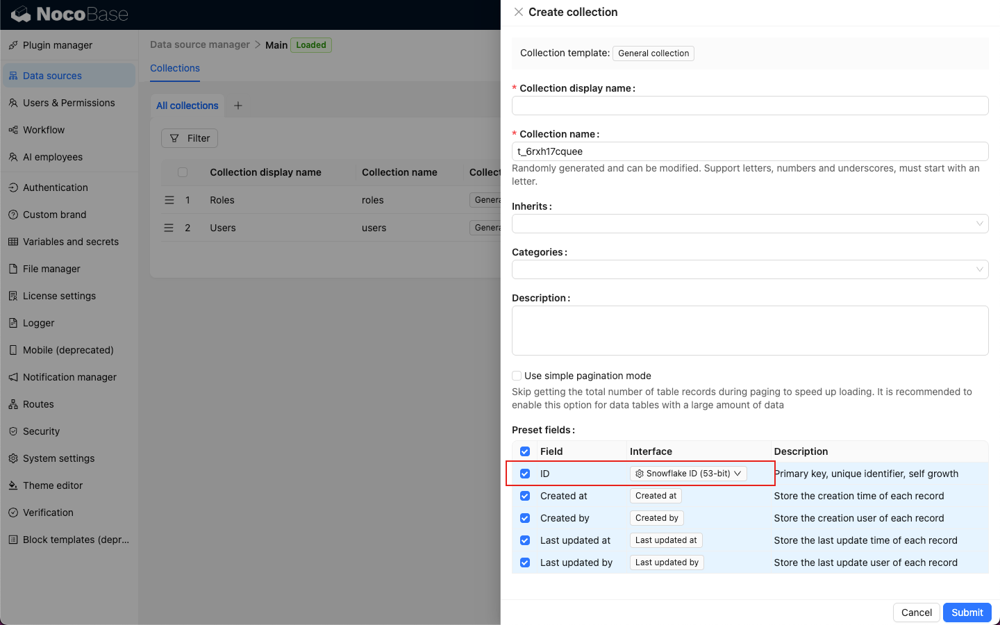
Hover over the Interface of the ID field to select other primary key types.
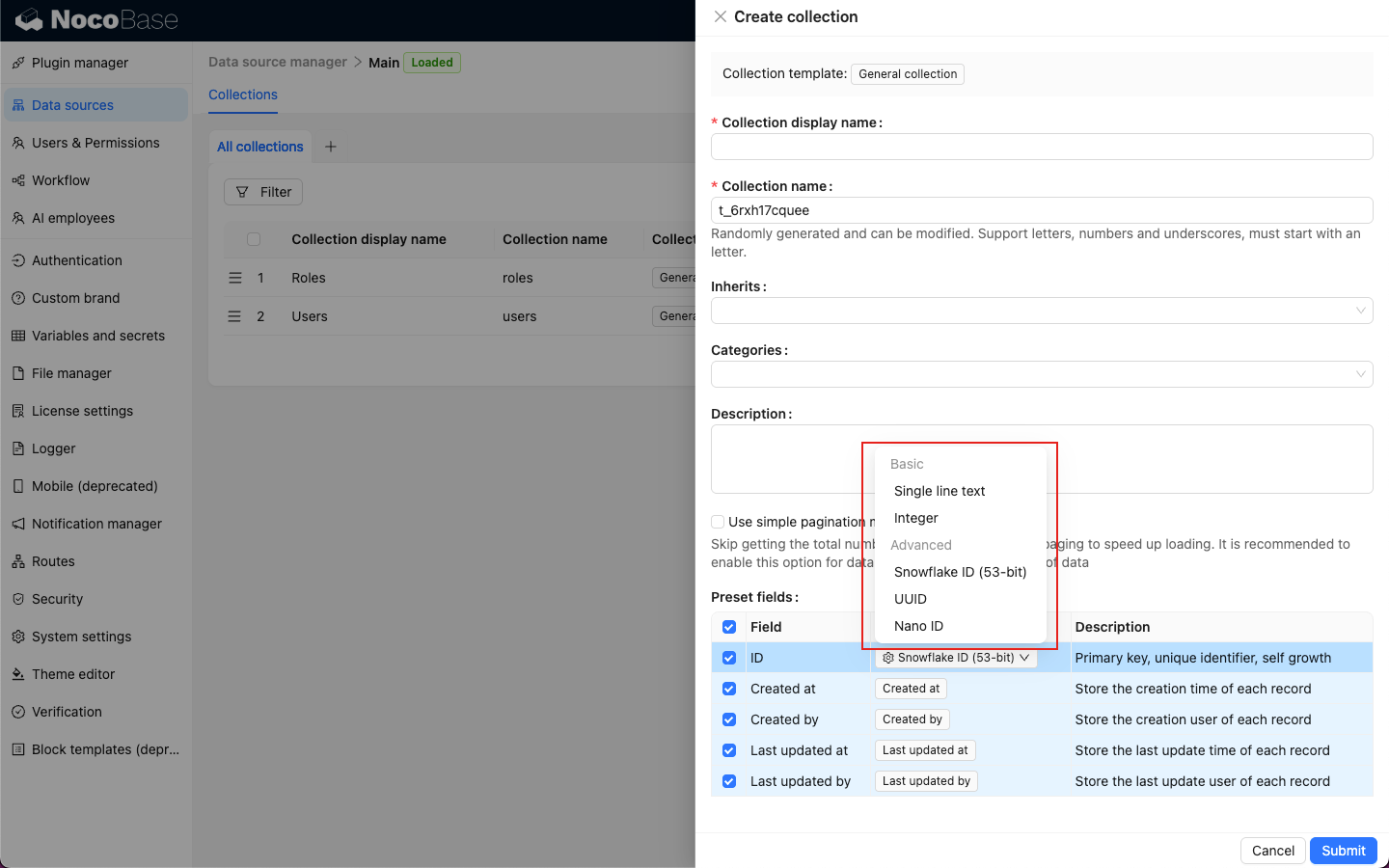
Available primary key types include:
- [Text](/data-sources/data-modeling/collection-fields/basic/input)
- [Integer](/data-sources/data-modeling/collection-fields/basic/integer)
- [Snowflake ID (53-bit)](/data-sources/data-modeling/collection-fields/advanced/snowflake-id)
- [UUID](/data-sources/data-modeling/collection-fields/advanced/uuid)
- [Nano ID](/data-sources/data-modeling/collection-fields/advanced/nano-id)
---
url: /data-sources/data-source-main/index.md
---
# Main DataBase
## Introduction
NocoBase's main database can be used to store both business data and the metadata of the application, including system table data and custom table data. The main database supports relational databases such as MySQL, PostgreSQL, etc. During the installation of the NocoBase application, the main database must be installed synchronously and cannot be deleted.
## Installation
This is a built-in plugin, no separate installation is required.
## Collection Management
The main data source provides complete collection management functionality, allowing you to create new tables through NocoBase and sync existing table structures from the database.
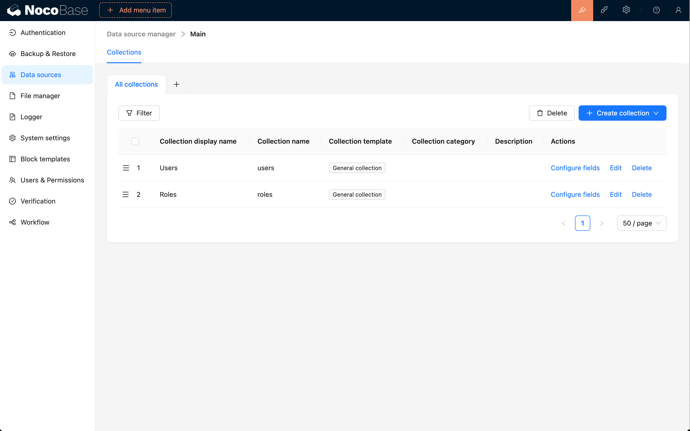
### Syncing Existing Tables from Database
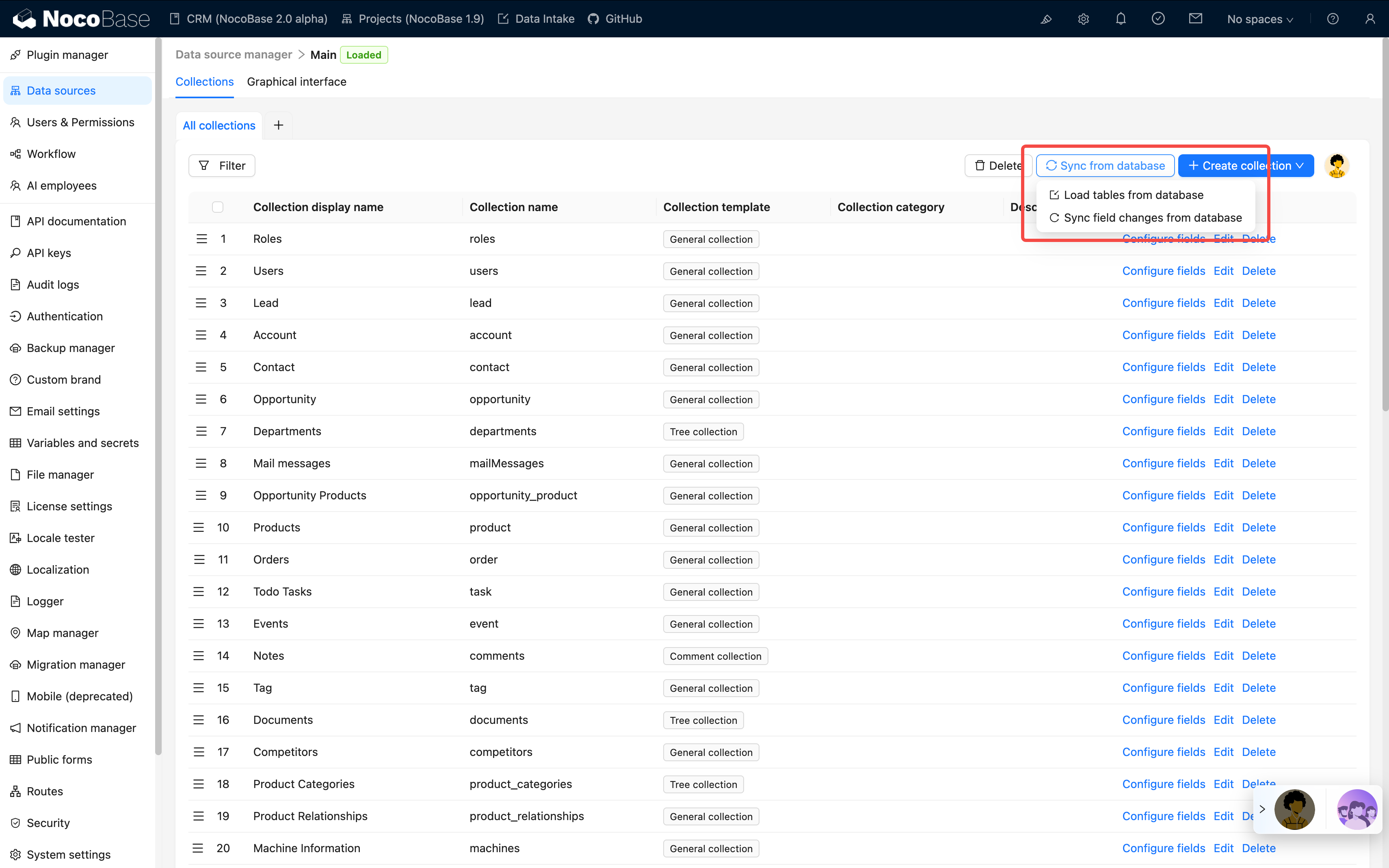
An important feature of the main data source is the ability to sync tables that already exist in the database into NocoBase for management. This means:
- **Protect Existing Investment**: If you already have numerous business tables in your database, there's no need to recreate them - you can sync and use them directly
- **Flexible Integration**: Tables created through other tools (such as SQL scripts, database management tools, etc.) can be brought under NocoBase management
- **Progressive Migration**: Support for gradually migrating existing systems to NocoBase, rather than all-at-once refactoring
Through the "Load from Database" feature, you can:
1. Browse all tables in the database
2. Select the tables you need to sync
3. Automatically identify table structures and field types
4. Import them into NocoBase for management with one click
### Support for Multiple Collection Types
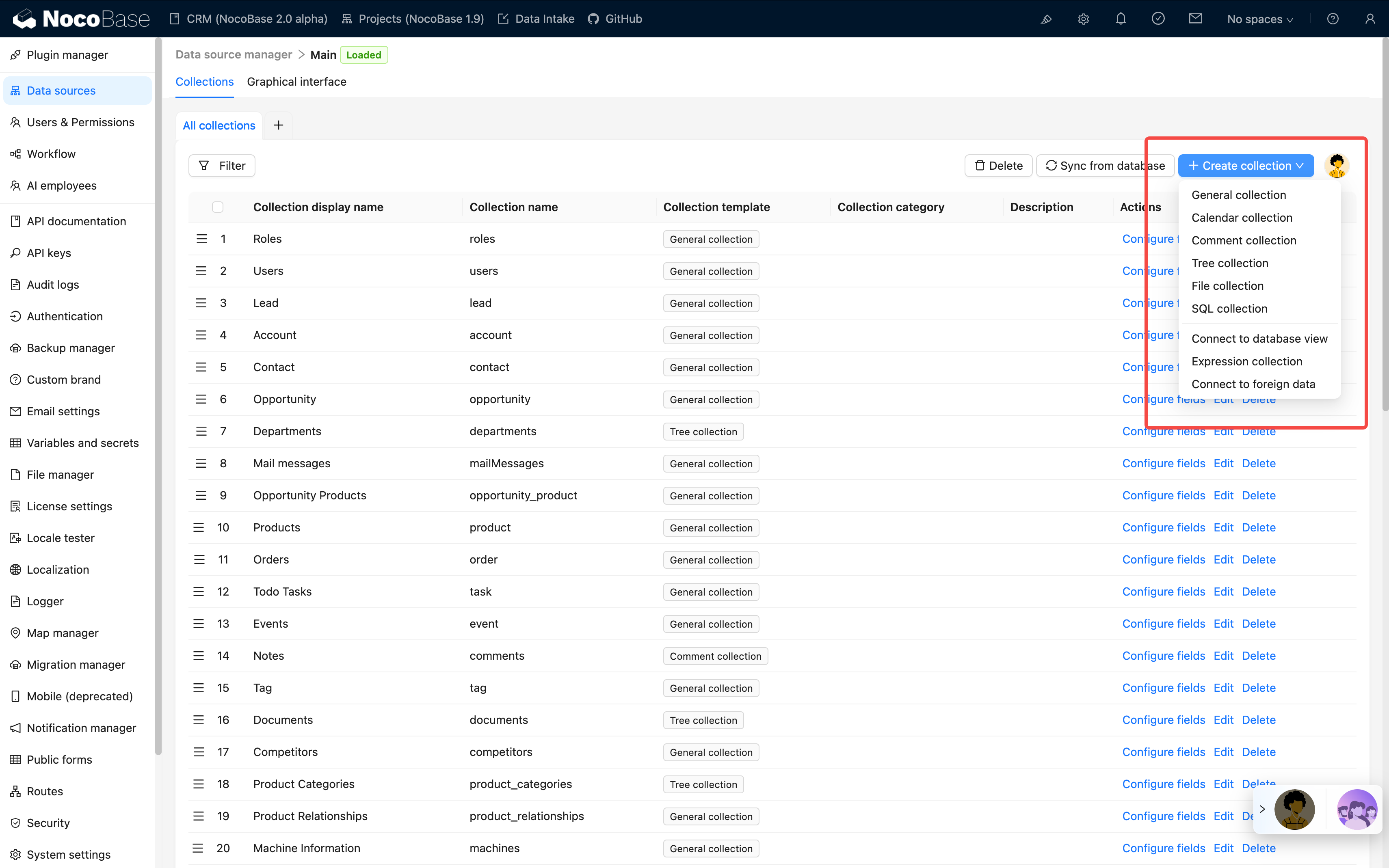
NocoBase supports creating and managing various types of collections:
- **General collection**: built-in commonly used system fields
- **Inheritance collection**: allows creation of a parent table from which child tables can be derived. Child tables inherit the parent table's structure and can define their own columns
- **Tree collection**: tree-structured table, currently only supports adjacency list design
- **Calendar collection**: for creating calendar-related event tables
- **File collection**: for managing file storage
- **Expression collection**: for dynamic expression scenarios in workflows
- **SQL Collection**: not an actual database table, but quickly presents SQL queries in a structured manner
- **Database View collection**: connects to existing database views
- **FDW collection**: allows the database system to directly access and query data in external data sources, based on FDW technology
### Supporting Classification Management of Collections
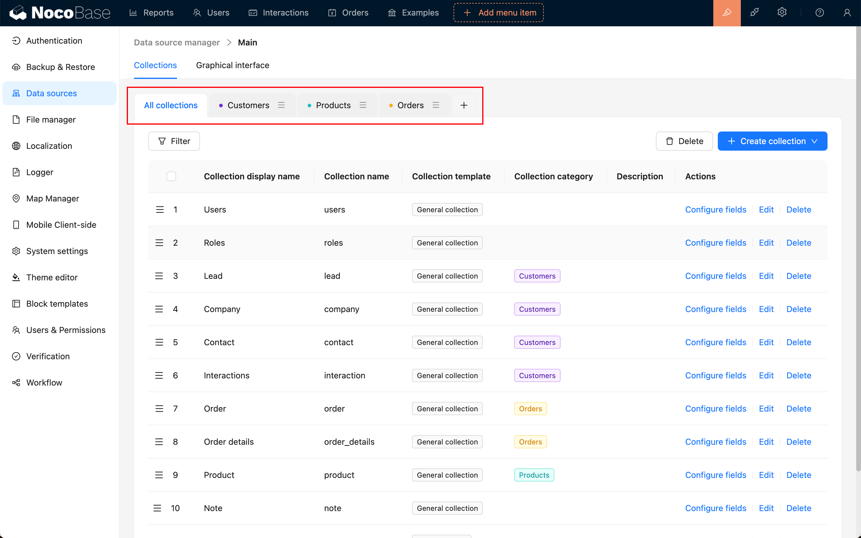
### Rich Field Types
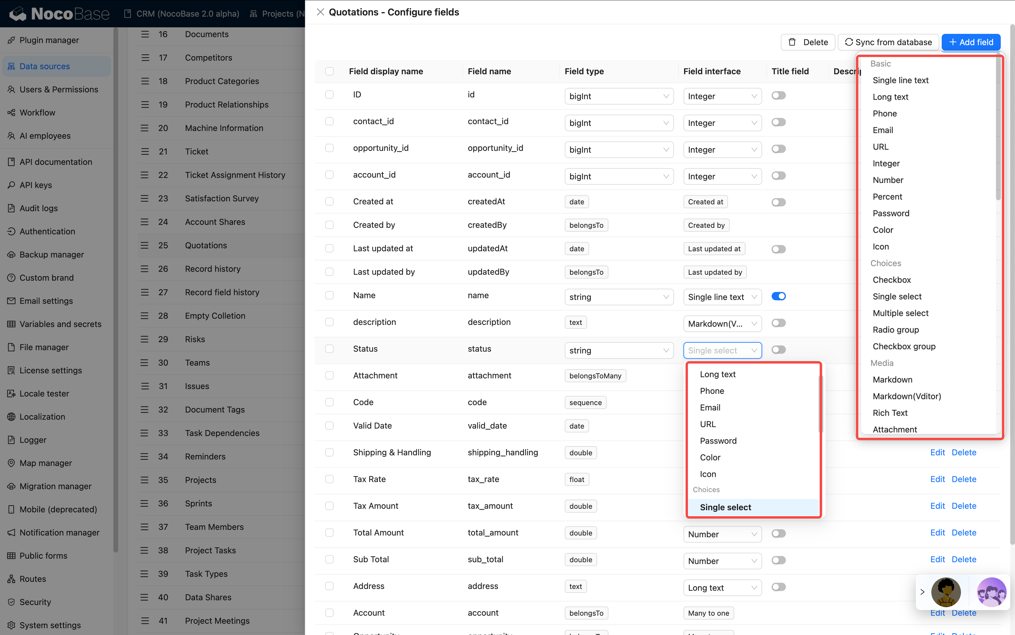
#### Flexible Field Type Conversion
NocoBase supports flexible field type conversion based on the same database type.
**Example: String Type Field Conversion Options**
When a database field is of String type, it can be converted to any of the following forms in NocoBase:
- **Basic**: Single line text, Long text, Phone, Email, URL, Password, Color, Icon
- **Choices**: Single select, Radio group
- **Media**: Markdown, Markdown(Vditor), Rich Text, Attachment (URL)
- **Date & Time**: Datetime (with time zone), Datetime (without time zone)
- **Advanced**: Sequence, Collection selector, Encryption
This flexible conversion mechanism means:
- **No Database Structure Modification Required**: The field's underlying storage type remains unchanged; only its representation in NocoBase changes
- **Adapt to Business Changes**: As business needs evolve, you can quickly adjust field display and interaction methods
- **Data Safety**: The conversion process does not affect the integrity of existing data
### Flexible Field-Level Synchronization
NocoBase not only syncs entire tables but also supports granular field-level sync management:
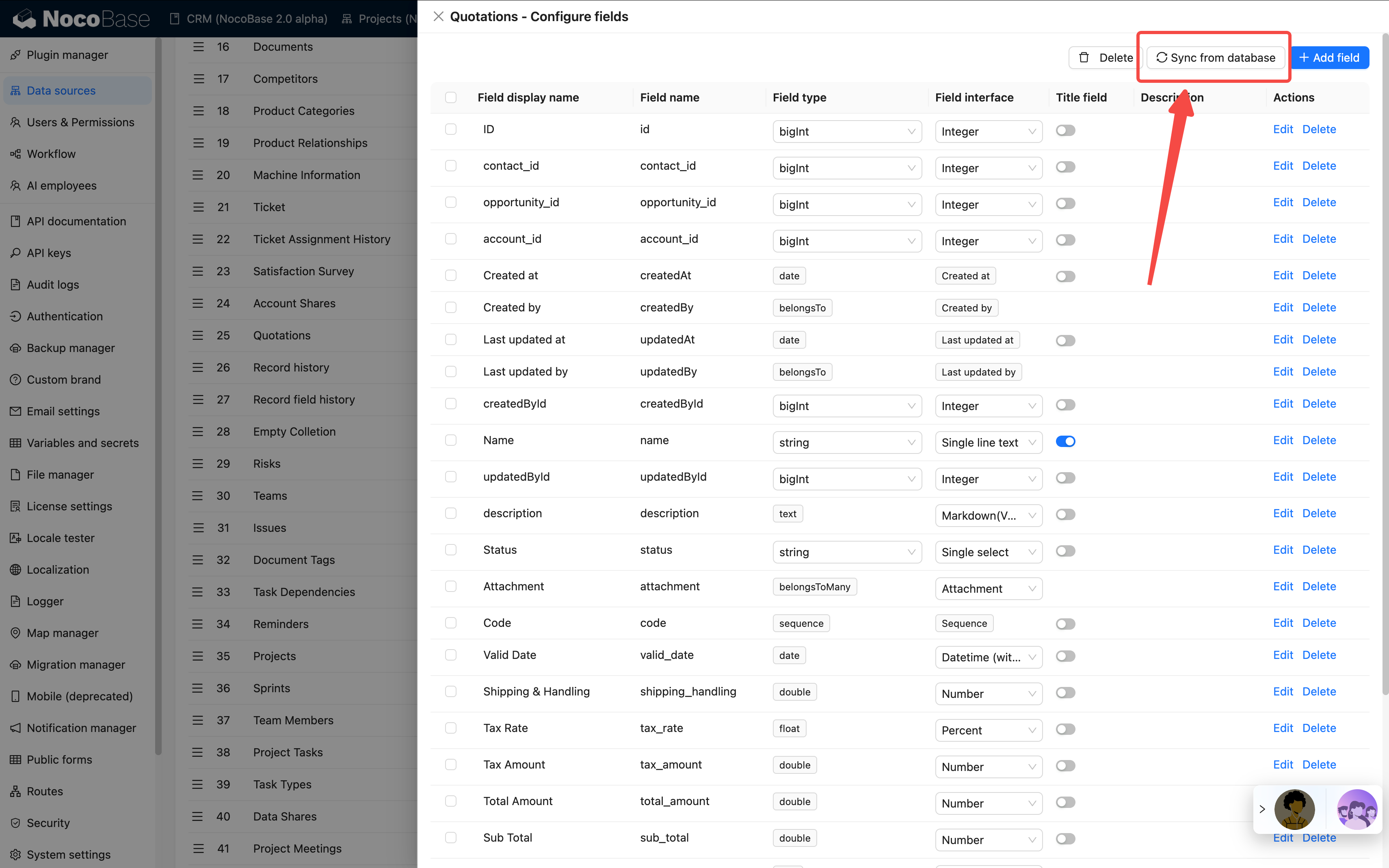
#### Field Synchronization Features:
1. **Real-time Sync**: When the database table structure changes, newly added fields can be synced at any time
2. **Selective Sync**: You can selectively sync the fields you need, rather than all fields
3. **Automatic Type Recognition**: Automatically identifies database field types and maps them to NocoBase field types
4. **Maintain Data Integrity**: The sync process does not affect existing data
#### Use Cases:
- **Database Schema Evolution**: When business needs change and new fields need to be added to the database, they can be quickly synced to NocoBase
- **Team Collaboration**: When other team members or DBAs add fields to the database, they can be synced promptly
- **Hybrid Management Mode**: Some fields managed through NocoBase, others through traditional methods - flexible combinations
This flexible synchronization mechanism allows NocoBase to integrate well into existing technical architectures, without requiring changes to existing database management practices, while still enjoying the convenience of low-code development that NocoBase provides.
See more in the [Collection Fields / Overview](/data-sources/data-modeling/collection-fields) section.
---
url: /data-sources/data-source-main/inheritance-collection.md
---
# Inheritance Collection
## Introduction
You can create a parent collection and derive child collection from that parent collection. The child collection will inherit the structure of the parent collection, and can also define its own columns. This design pattern helps organize and manage data with similar structures but possible differences.
Here are some common features of support for inheritable collections:
- Parent Collection: The parent collection contains common columns and data, defining the basic structure of the entire inheritance hierarchy.
- Child Collection: The child collection inherits the structure of the parent collection, but can also define its own columns. This allows each child collection to have the common properties of the parent collection while containing attributes specific to the subclass.
- Querying: When querying, you can choose to query the entire inheritance hierarchy, just the parent collection, or a specific child collection. This allows different levels of data to be retrieved and processed as needed.
- Inheritance Relationship: An inheritance relationship is established between the parent collection and the child collection, meaning that the structure of the parent collection can be used to define consistent attributes, while allowing the child collection to extend or override these attributes.
This design pattern helps to reduce data redundancy, simplify the database model, and make the data easier to maintain. However, it needs to be used with caution as inheritable collections can increase the complexity of queries, especially when dealing with the entire inheritance hierarchy. Databases that support inheritable collections generally provide specific syntax and tools to manage and query these collection structures.
## User Manual
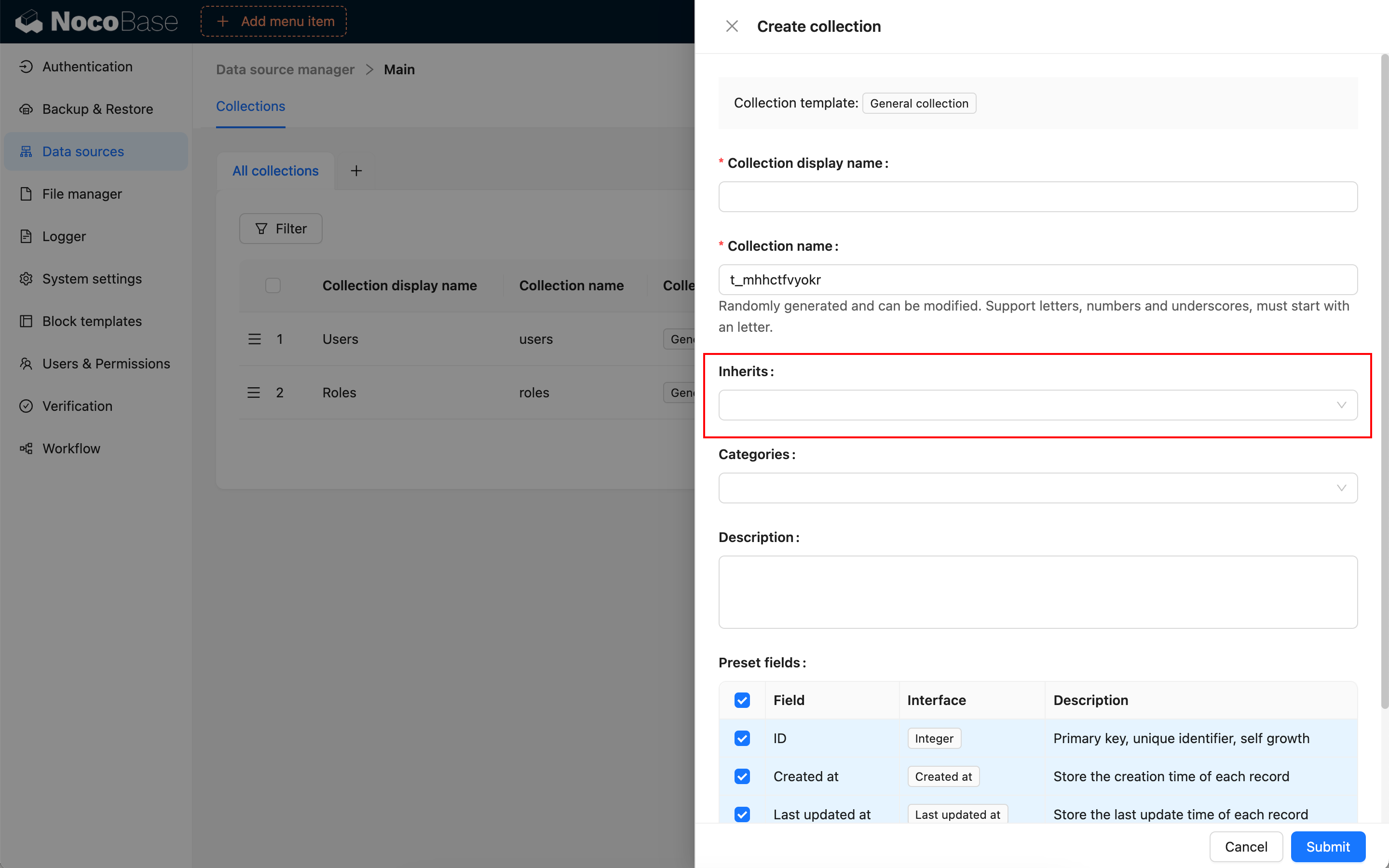
---
url: /data-sources/data-source-manager/external-database.md
---
# External Database
## Introduction
Use an existing external database as a data source. Currently supported external databases include MySQL, MariaDB, PostgreSQL, MSSQL, and Oracle.
## Usage Instructions
### Adding an External Database
After activating the plugin, you can select and add it from the "Add new" dropdown menu in data source management.
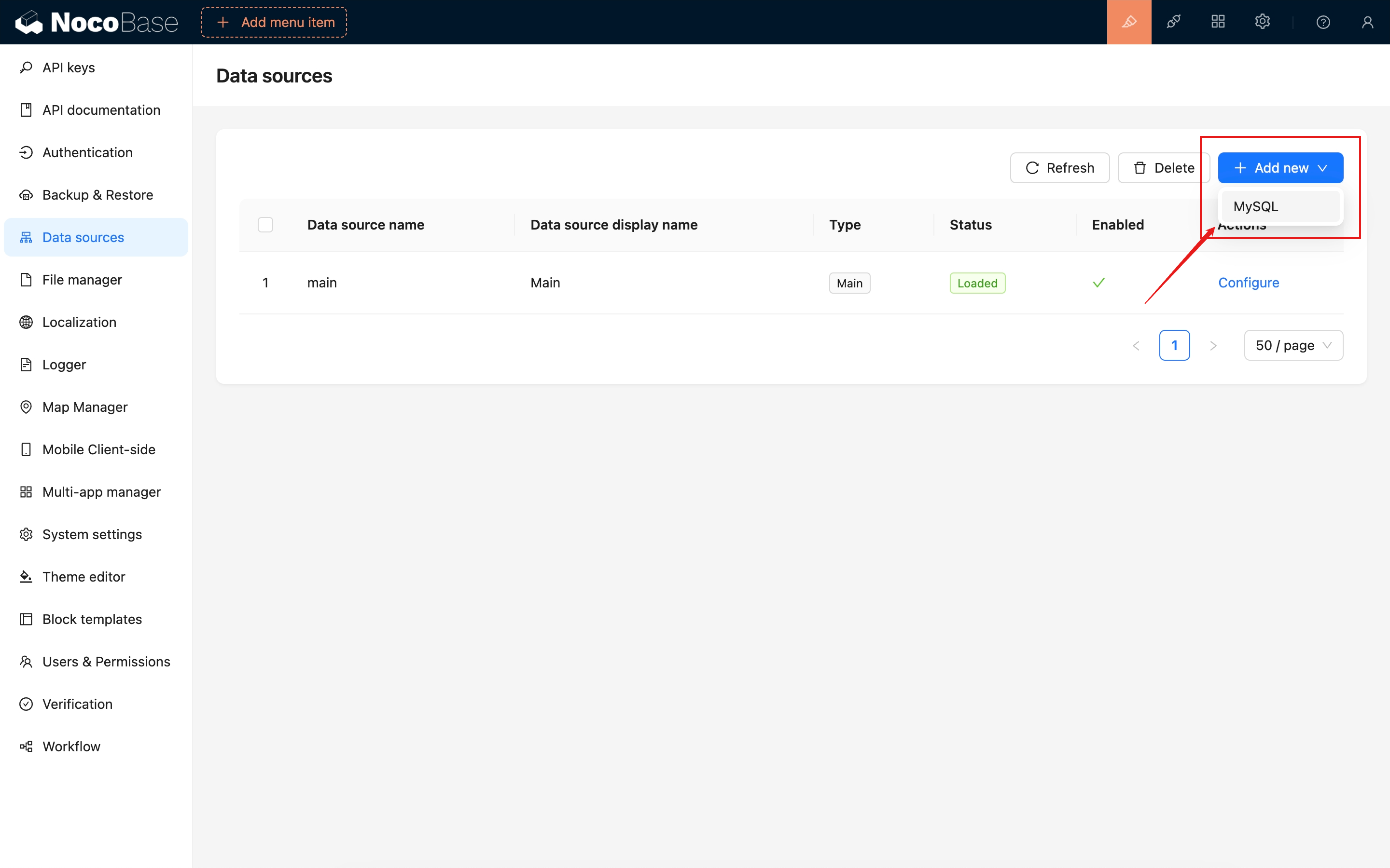
Fill in the information for the database you need to connect to.
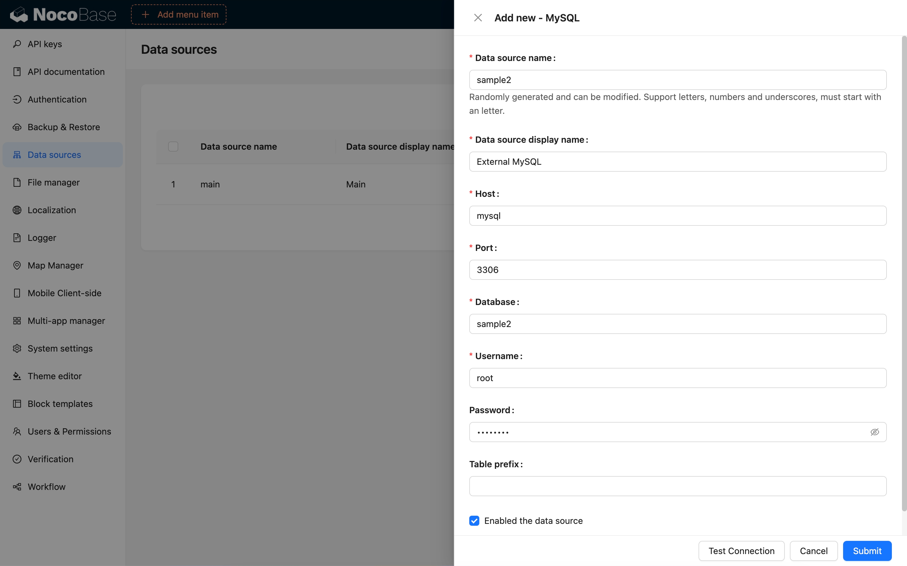
### Collection Synchronization
After establishing a connection with an external database, all collections within the data source will be read directly. External databases do not support adding collections or modifying the table structure directly. If modifications are needed, you can perform them through a database client and then click the "Refresh" button in the interface to synchronize.
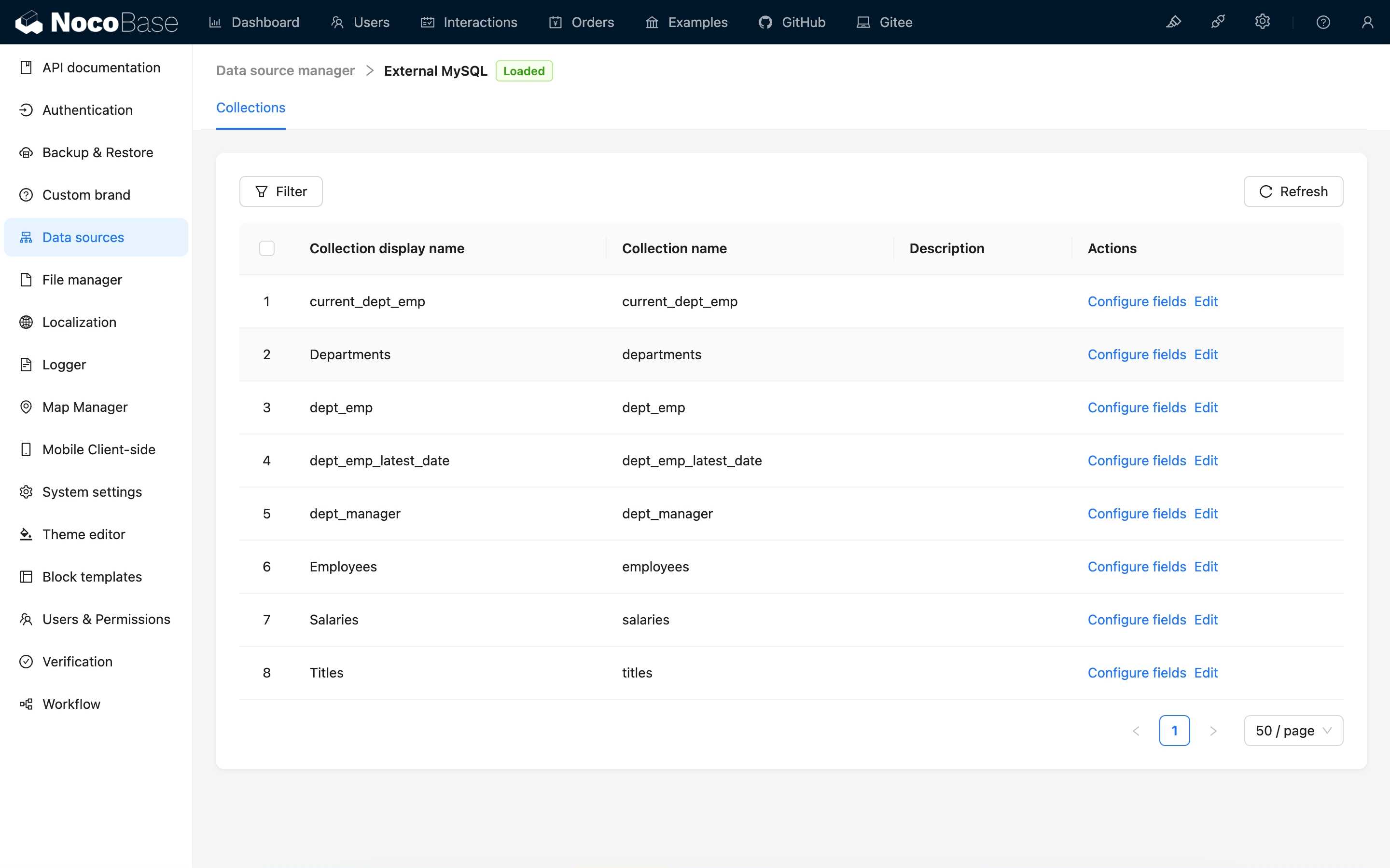
### Configuring Fields
The external database will automatically read and display the fields of existing collections. You can quickly view and configure the field's title, data type (Field type), and UI type (Field interface). You can also click the "Edit" button to modify more configurations.
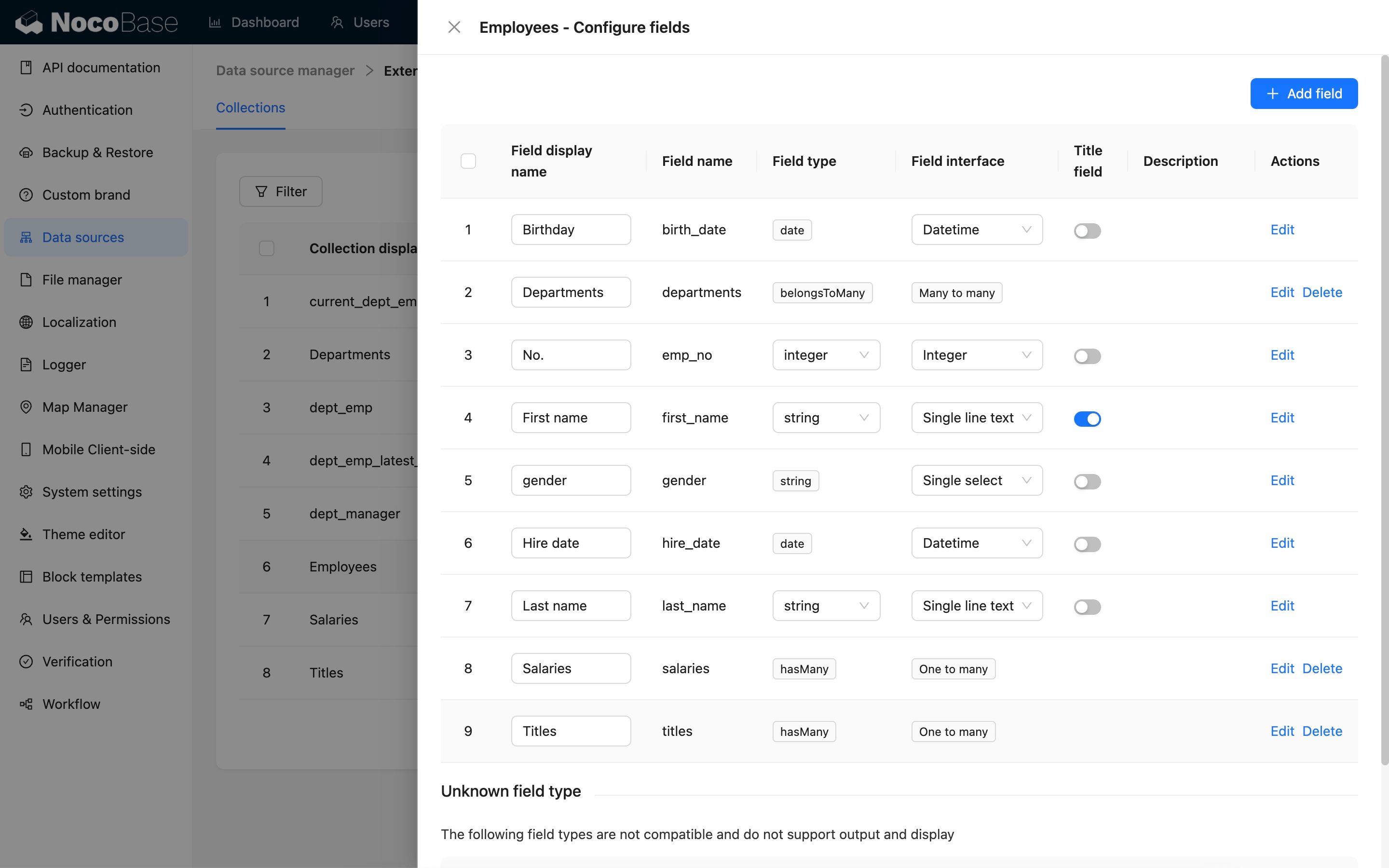
Because external databases do not support modifying the table structure, the only available type when adding a new field is the association field. Association fields are not actual fields but are used to establish connections between collections.
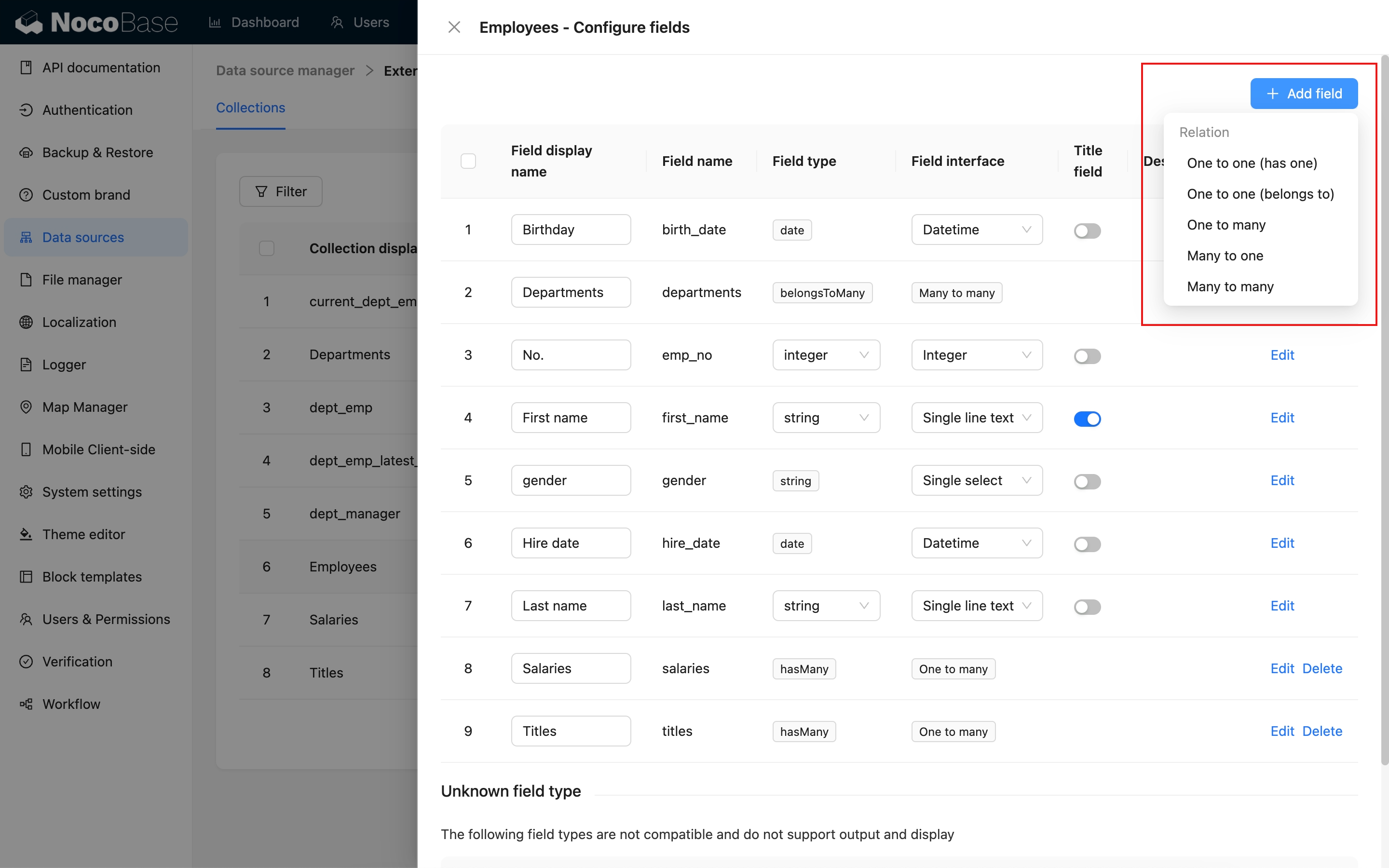
For more details, see the [Collection Fields/Overview](/data-sources/data-modeling/collection-fields) chapter.
### Field Type Mapping
NocoBase automatically maps the field types from the external database to the corresponding data type (Field type) and UI type (Field Interface).
- Data type (Field type): Defines the kind, format, and structure of data that a field can store.
- UI type (Field interface): Refers to the type of control used in the user interface to display and input field values.
| PostgreSQL | MySQL/MariaDB | NocoBase Data Type | NocoBase Interface Type |
| - | - | - | - |
| BOOLEAN | BOOLEAN
TINYINT(1) | boolean | checkbox
switch |
| SMALLINT
INTEGER
SERIAL
SMALLSERIAL | TINYINT
SMALLINT
MEDIUMINT
INTEGER | integer
boolean
sort | integer
sort
checkbox
switch
select
radioGroup |
| BIGINT
BIGSERIAL | BIGINT | bigInt
sort | integer
sort
checkbox
switch
select
radioGroup
unixTimestamp
createdAt
updatedAt |
| REAL | FLOAT | float | number
percent |
| DOUBLE PRECISION | DOUBLE PRECISION | double | number
percent |
| DECIMAL
NUMERIC | DECIMAL | decimal | number
percent
currency |
| VARCHAR
CHAR | VARCHAR
CHAR | string
password
uuid
nanoid | input
email
phone
password
color
icon
select
radioGroup
uuid
nanoid |
| TEXT | TEXT
TINYTEXT
MEDIUMTEXT
LONGTEXT | text
json | textarea
markdown
vditor
richText
url
json |
| UUID | - | uuid | uuid |
| JSON
JSONB | JSON | json | json |
| TIMESTAMP | DATETIME
TIMESTAMP | date | date
time
createdAt
updatedAt |
| DATE | DATE | dateOnly | datetime |
| TIME | TIME | time | time |
| - | YEAR | | datetime |
| CIRCLE | | circle | json
circle |
| PATH
GEOMETRY(LINESTRING) | LINESTRING | lineString | Json
lineString |
| POINT
GEOMETRY(POINT) | POINT | point | json
point |
| POLYGON
GEOMETRY(POLYGON) | POLYGON | polygon | json
polygon |
| GEOMETRY | GEOMETRY | - | - |
| BLOB | BLOB | blob | - |
| ENUM | ENUM | enum | select
radioGroup |
| ARRAY | - | array | multipleSelect
checkboxGroup |
| BIT | BIT | - | - |
| SET | SET | set | multipleSelect
checkboxGroup |
| RANGE | - | - | - |
### Unsupported Field Types
Unsupported field types are displayed separately. These fields require development adaptation before they can be used.
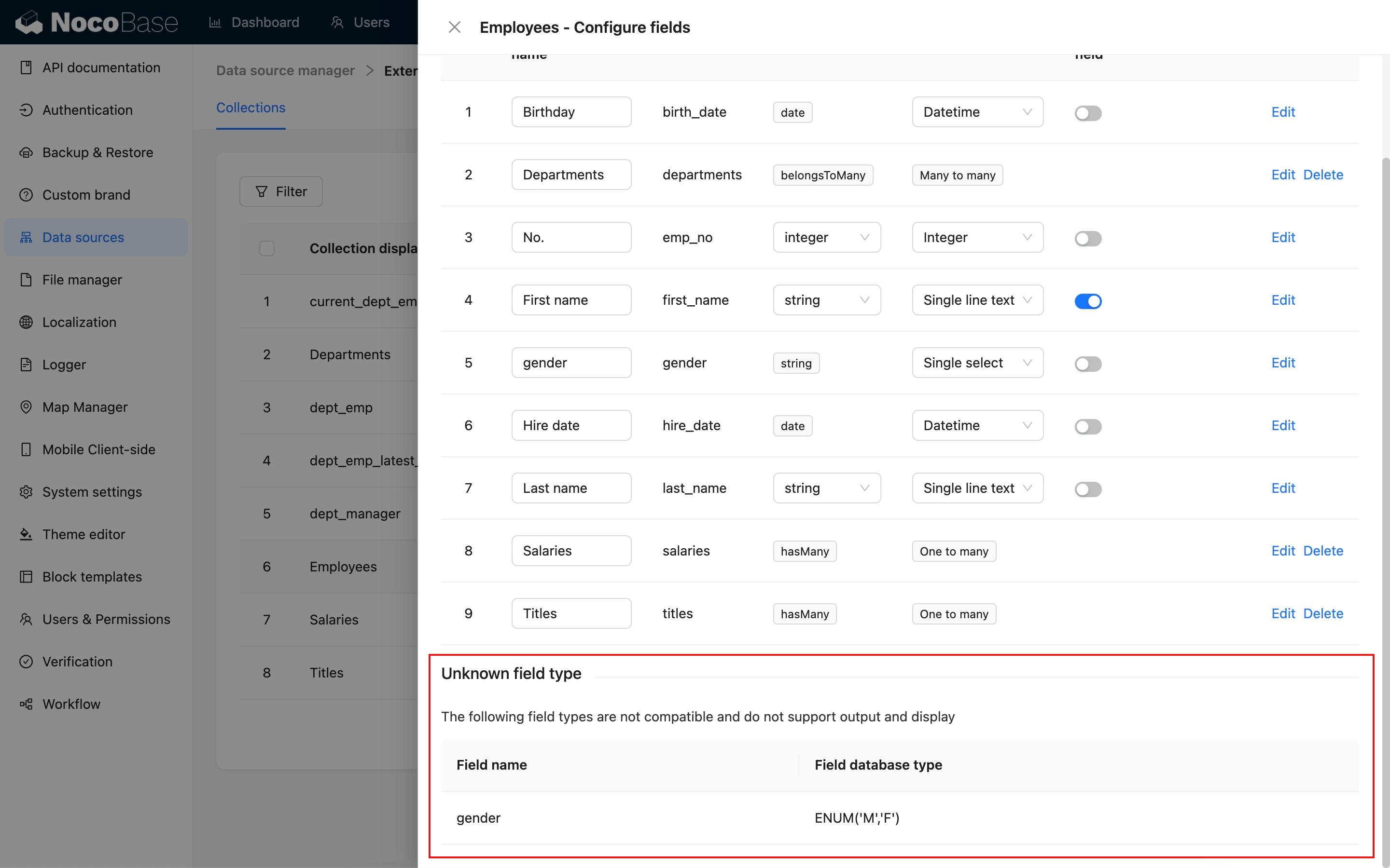
### Filter Target Key
Collections displayed as blocks must have a Filter target key configured. The filter target key is used to filter data based on a specific field, and the field value must be unique. By default, the filter target key is the collection's primary key field. For views, collections without a primary key, or collections with a composite primary key, you need to define a custom filter target key.
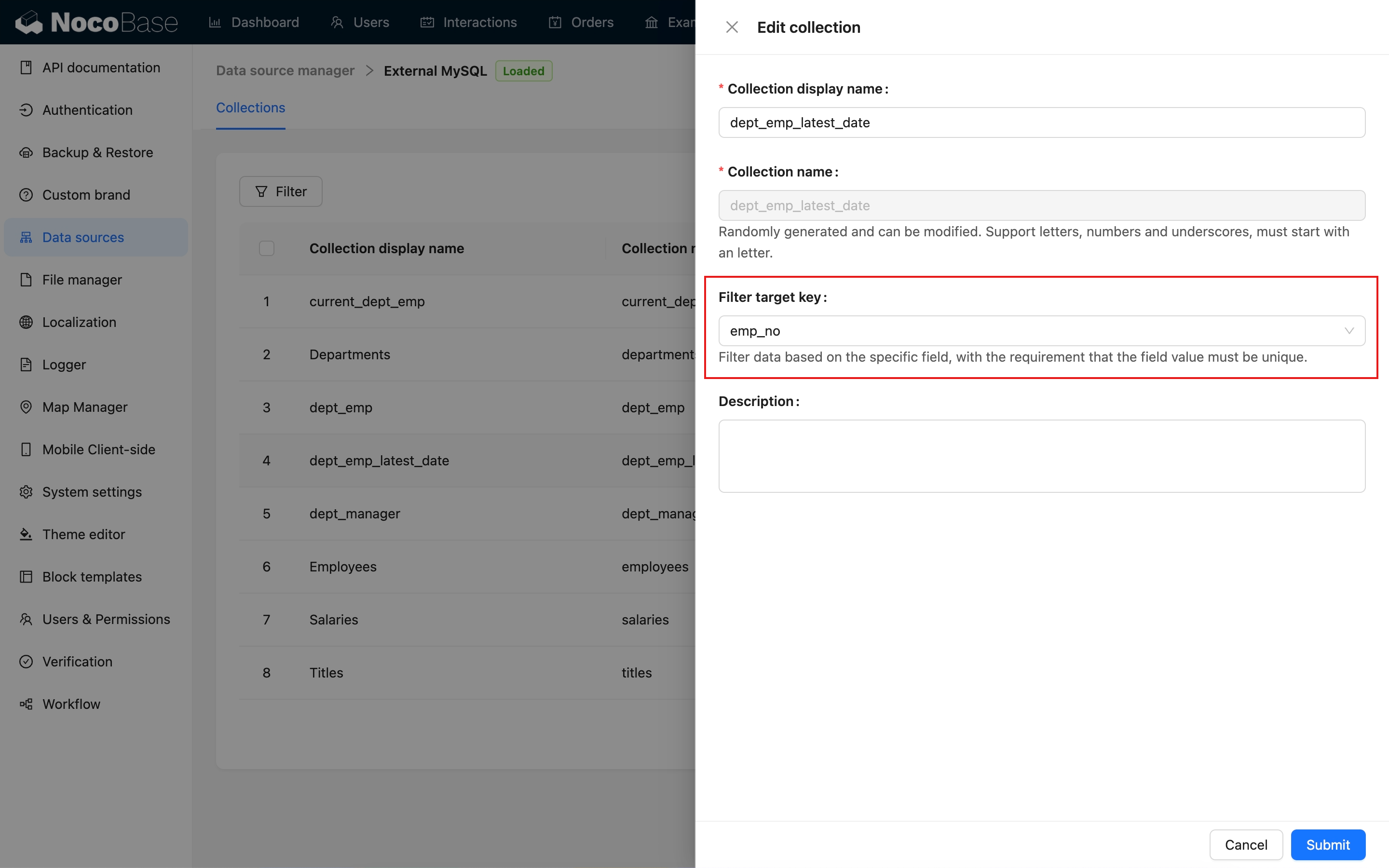
Only collections that have a filter target key configured can be added to the page.
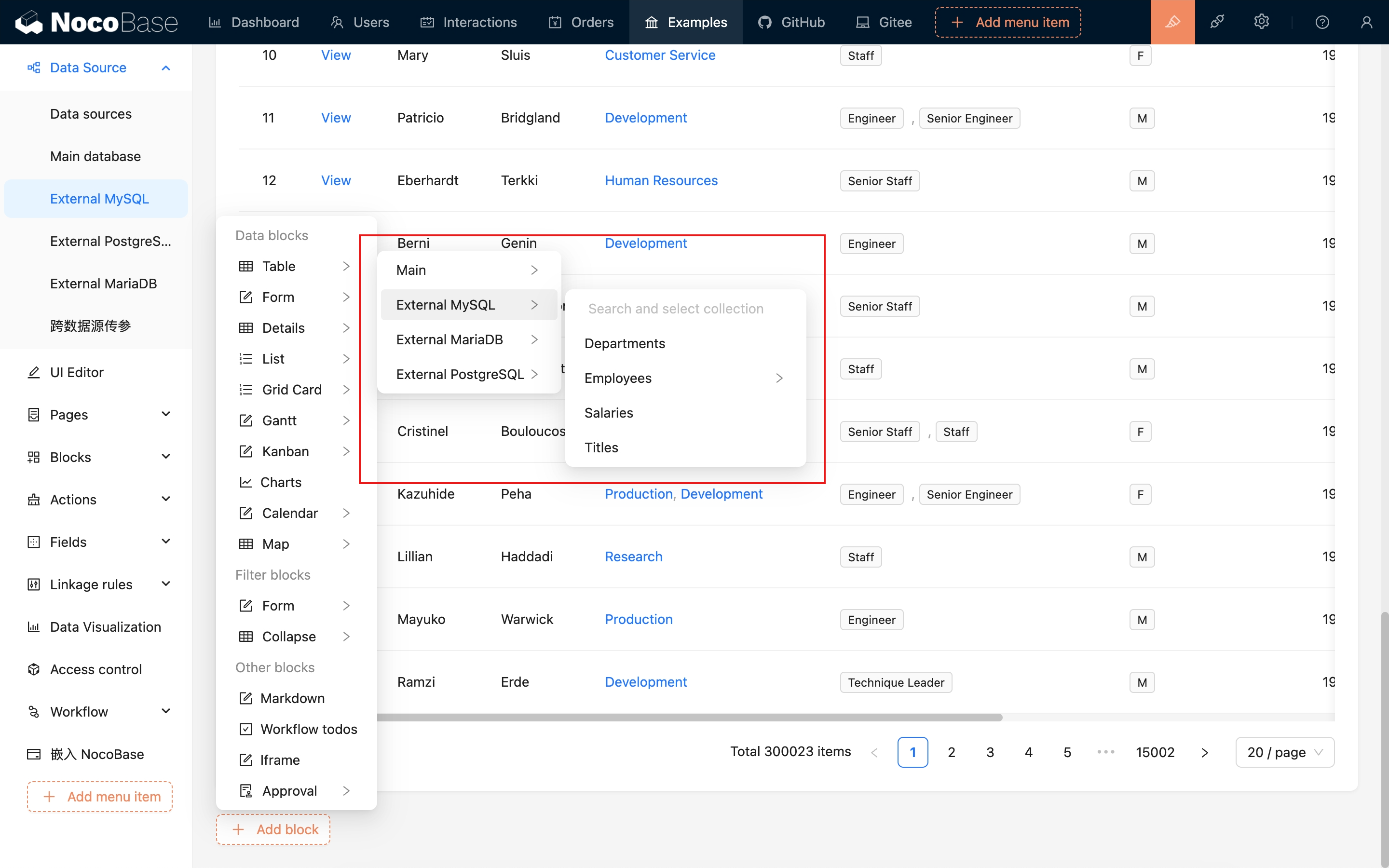
---
url: /data-sources/data-source-manager/index.md
---
# Data Source Manager
## Introduction
NocoBase provides a data source management plugin for managing data sources and their collections. The data source management plugin only provides a management interface for all data sources and does not provide the ability to access data sources. It needs to be used in conjunction with various data source plugins. The data sources currently supported for access include:
- [Main Database](/data-sources/data-source-main): NocoBase's main database, supporting relational databases such as MySQL, PostgreSQL, and MariaDB.
- [External MySQL](/data-sources/data-source-external-mysql): Use an external MySQL database as a data source.
- [External MariaDB](/data-sources/data-source-external-mariadb): Use an external MariaDB database as a data source.
- [External PostgreSQL](/data-sources/data-source-external-postgres): Use an external PostgreSQL database as a data source.
- [External MSSQL](/data-sources/data-source-external-mssql): Use an external MSSQL (SQL Server) database as a data source.
- [External Oracle](/data-sources/data-source-external-oracle): Use an external Oracle database as a data source.
In addition, more types can be extended through plugins, which can be common types of databases or platforms that provide APIs (SDKs).
## Installation
Built-in plugin, no separate installation required.
## Usage Instructions
When the application is initialized and installed, a data source is provided by default to store NocoBase data, known as the main database. For more information, see the [Main Database](/data-sources/data-source-main/) documentation.
### External Data Sources
External databases are supported as data sources. For more information, see the [External Database / Introduction](/data-sources/data-source-manager/external-database) documentation.
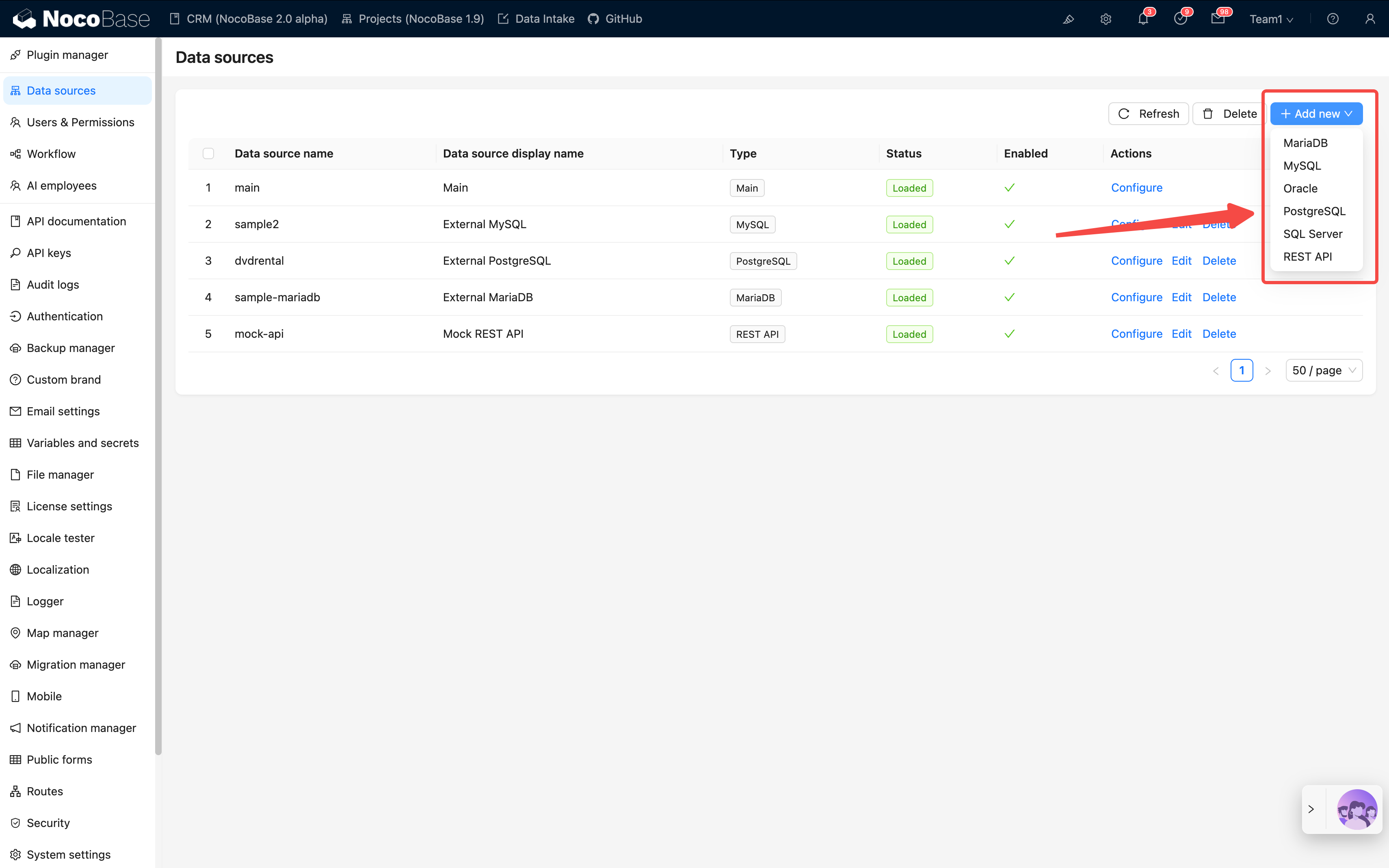
### Support for Syncing Custom Database Tables

You can also access data from HTTP API sources. For more information, see the [REST API Data Source](/data-sources/data-source-rest-api/) documentation.
---
url: /data-sources/data-source-rest-api/index.md
---
# REST API Data Source
## Introduction
This plugin allows you to integrate data from REST API sources seamlessly.
## Installation
This is a commercial plugin. For detailed activation instructions, please refer to: [Commercial Plugin Activation Guide](https://www.nocobase.com/en/blog/nocobase-commercial-license-activation-guide)
## Adding a REST API Source
After activating the plugin, you can add a REST API source by selecting it from the Add new dropdown menu in the data source management section.
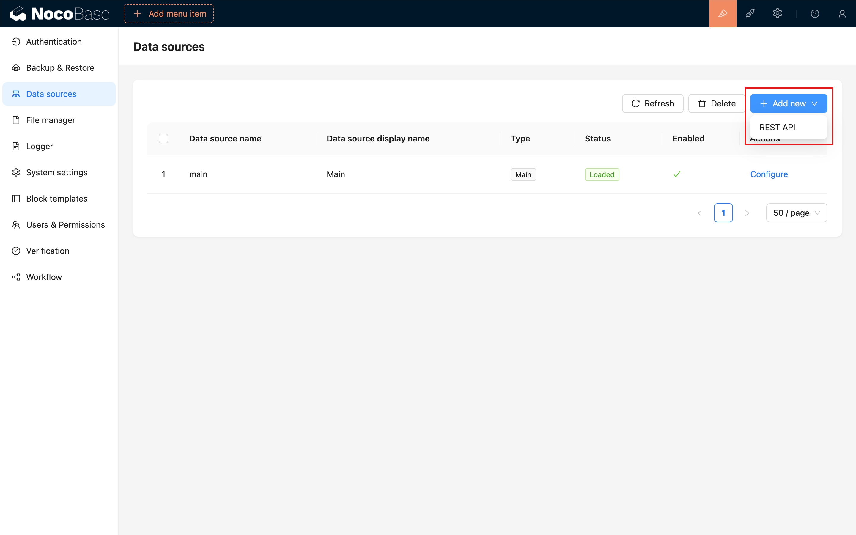
Configure the REST API source.
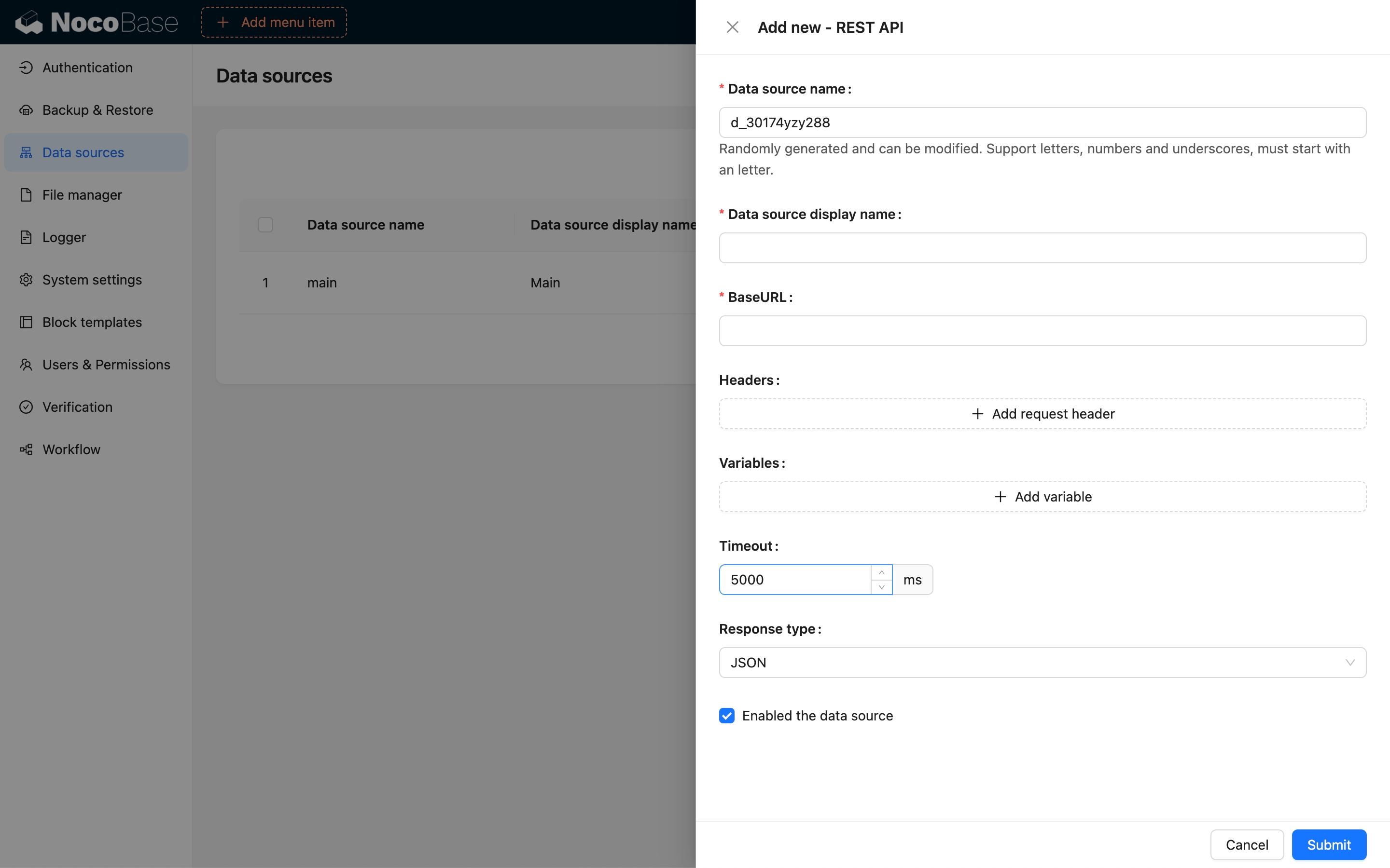
## Adding a Collection
In NocoBase, a RESTful resource is mapped to a Collection, such as a Users resource.
```bash
GET /users
POST /users
GET /users/1
PUT /users/1
DELETE /users/1
```
These API endpoints are mapped in NocoBase as follows:
```bash
GET /users:list
POST /users:create
POST /users:get?filterByTk=1
POST /users:update?filterByTk=1
POST /users:destroy?filterByTk=1
```
For a comprehensive guide on NocoBase API design specifications, refer to the API documentation.
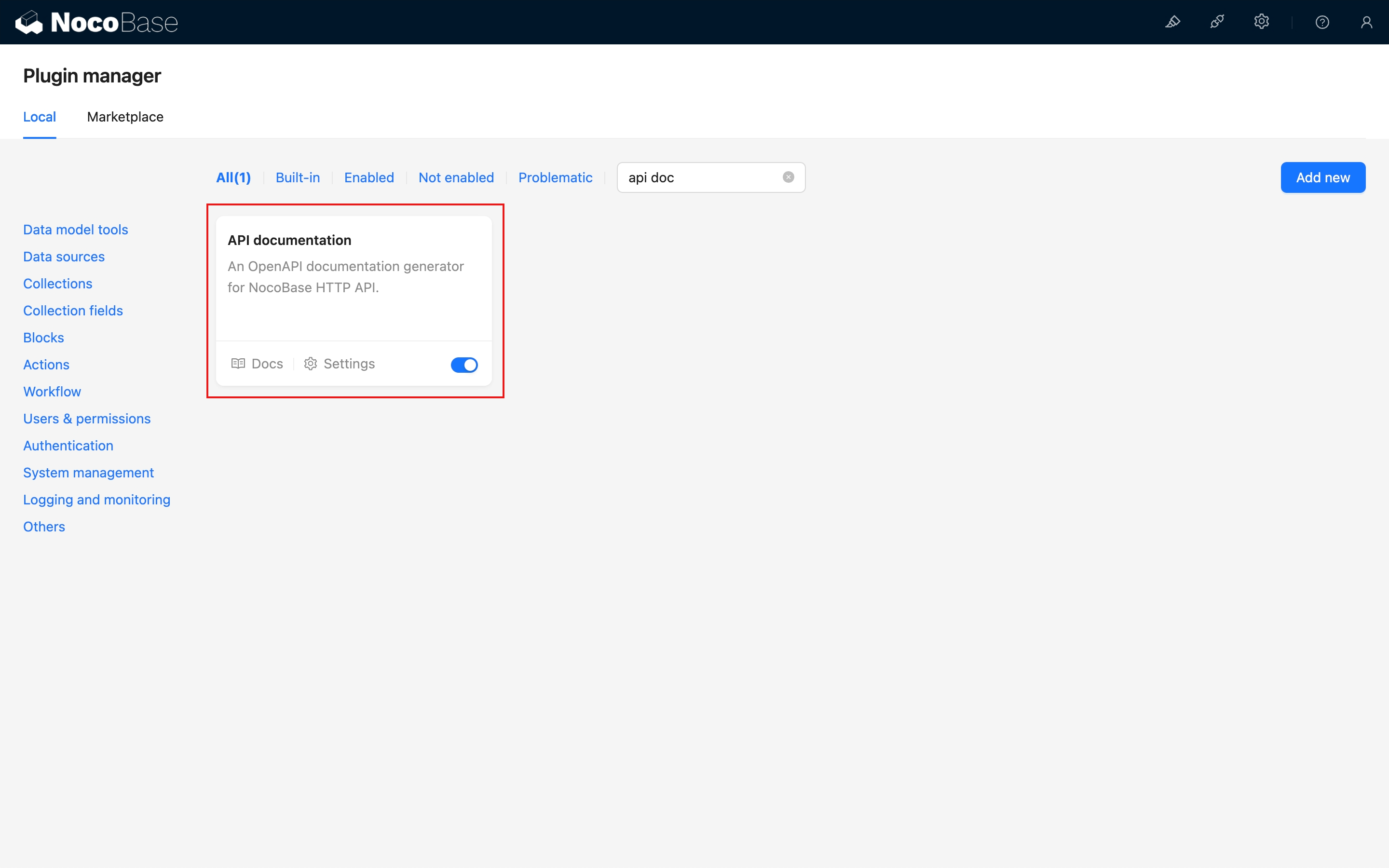
Check the "NocoBase API - Core" chapter for detailed information.
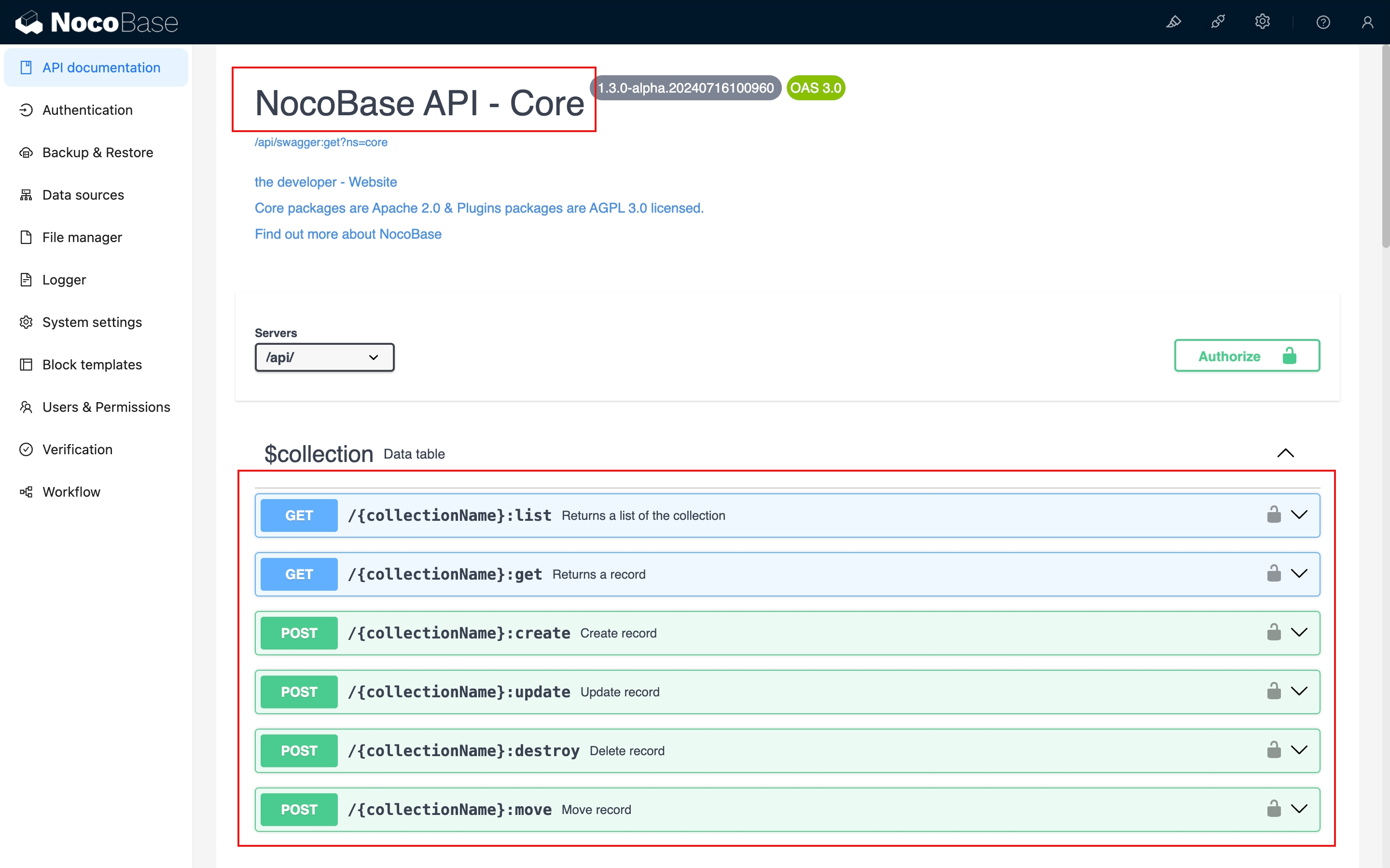
The Collection configuration for a REST API data source includes the following:
### List
Map the interface for viewing a list of resources.
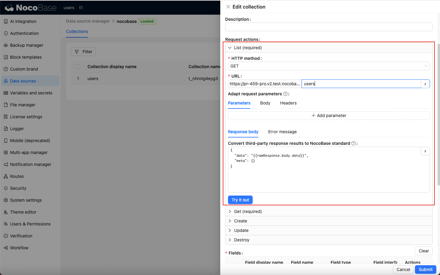
### Get
Map the interface for viewing resource details.
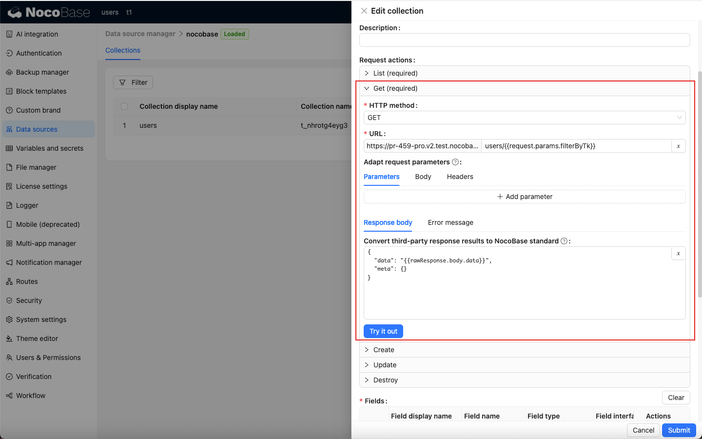
### Create
Map the interface for creating a resource.
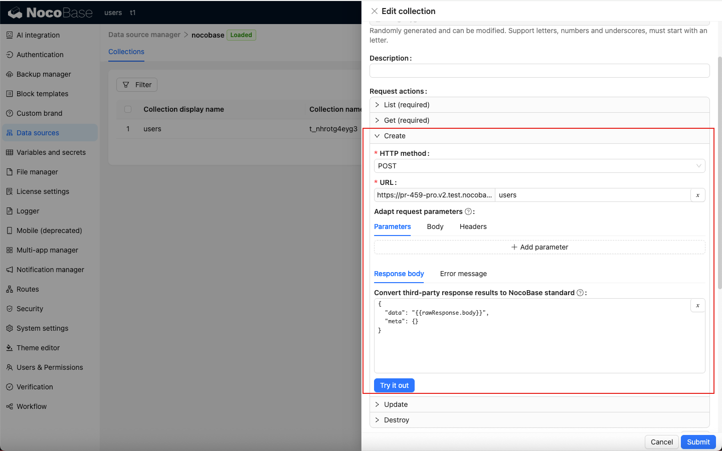
### Update
Map the interface for updating a resource.
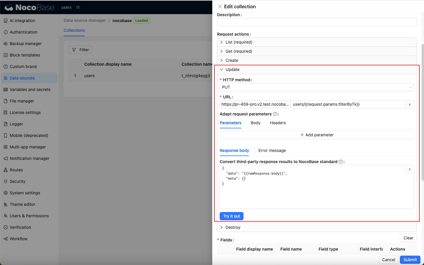
### Destroy
Map the interface for deleting a resource.
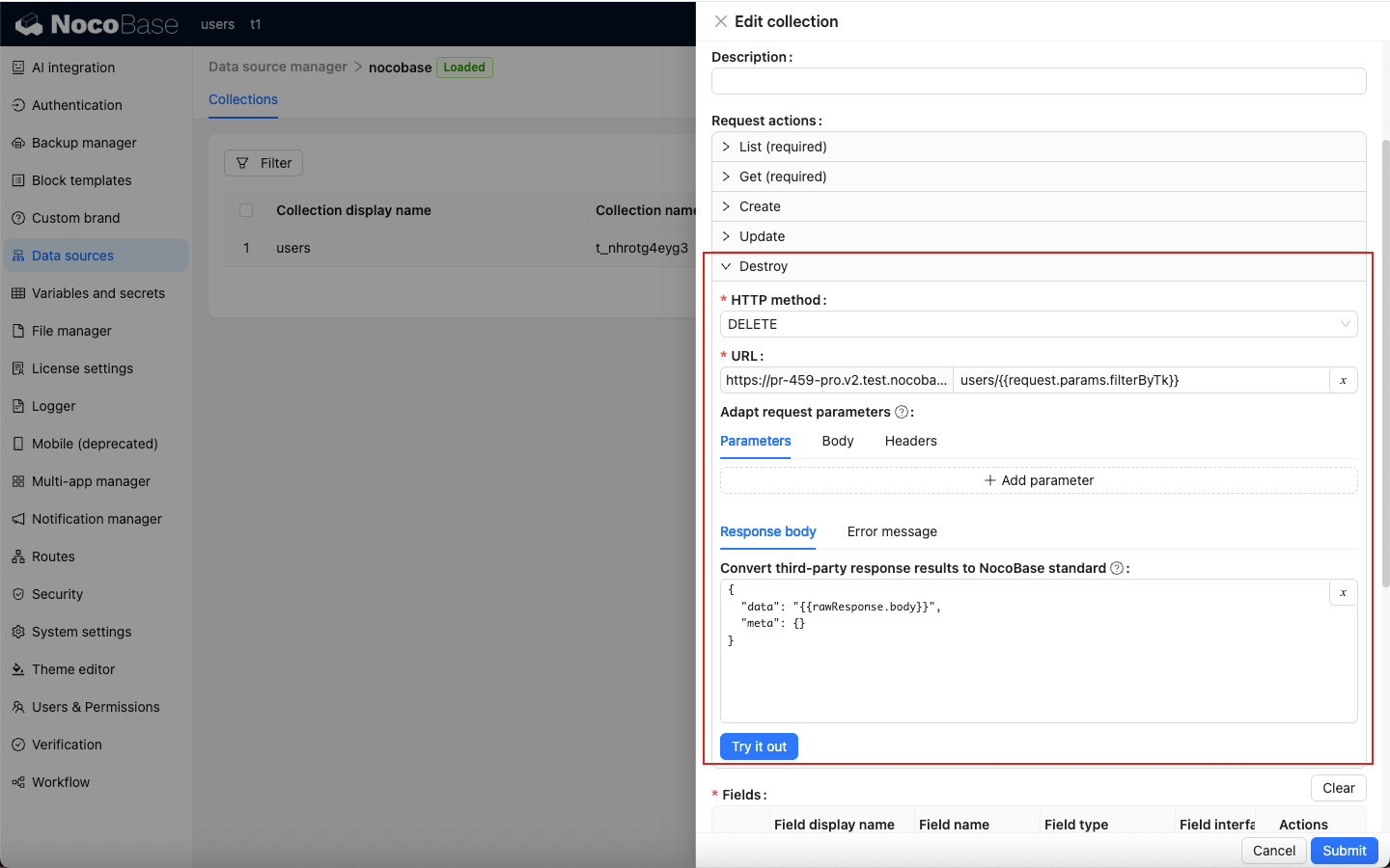
Both the List and Get interfaces are required to be configured.
## Debugging the API
### Request parameter integration
Example: Configure pagination parameters for the List API. If the third-party API does not support pagination natively, NocoBase will paginate based on the retrieved list data.
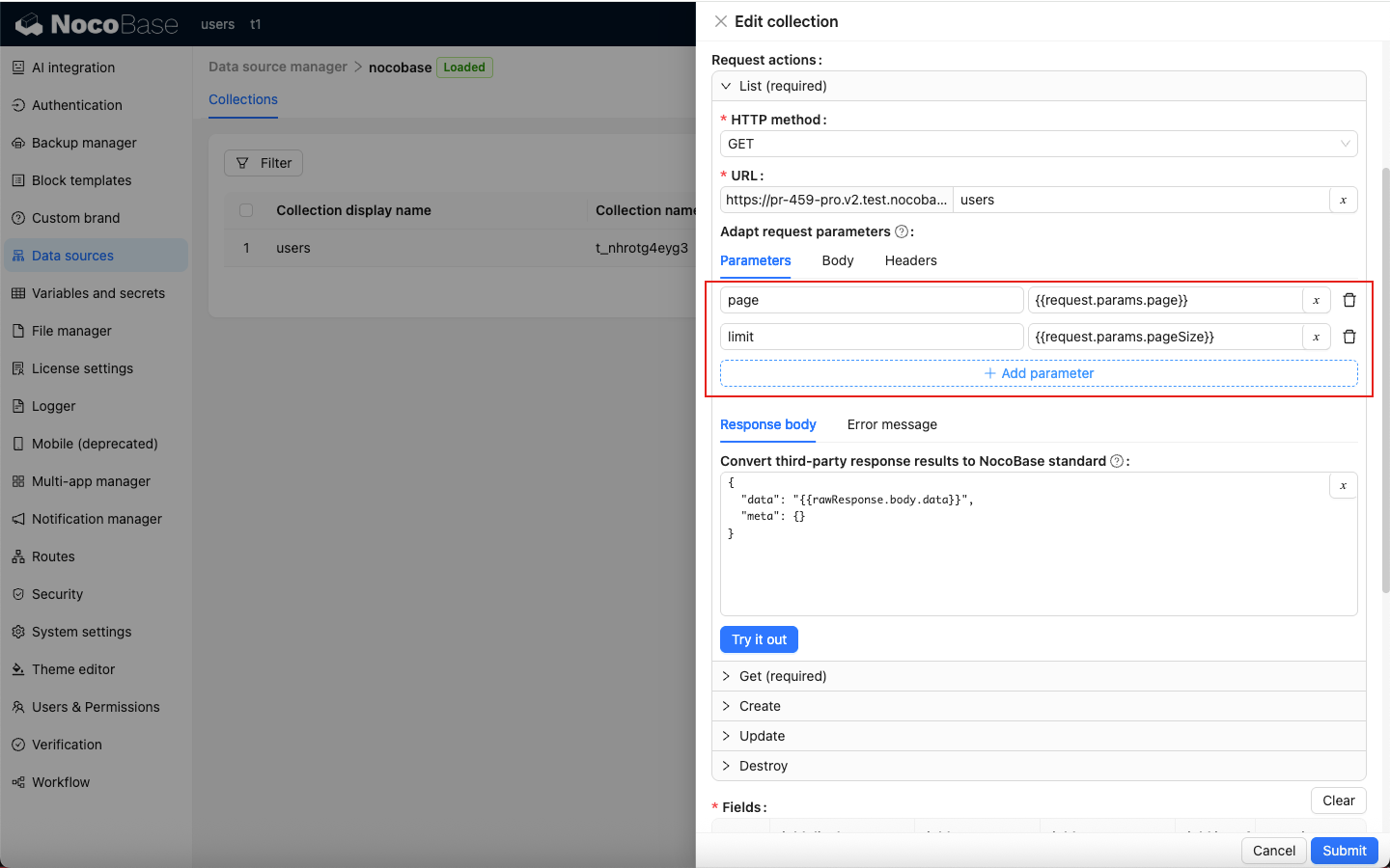
Please note that only variables added in the interface will take effect.
| Third-party API params name | NocoBase params |
| --------------------------- | --------------------------- |
| page | {{request.params.page}} |
| limit | {{request.params.pageSize}} |
You can click Try it out to debug and view the response.
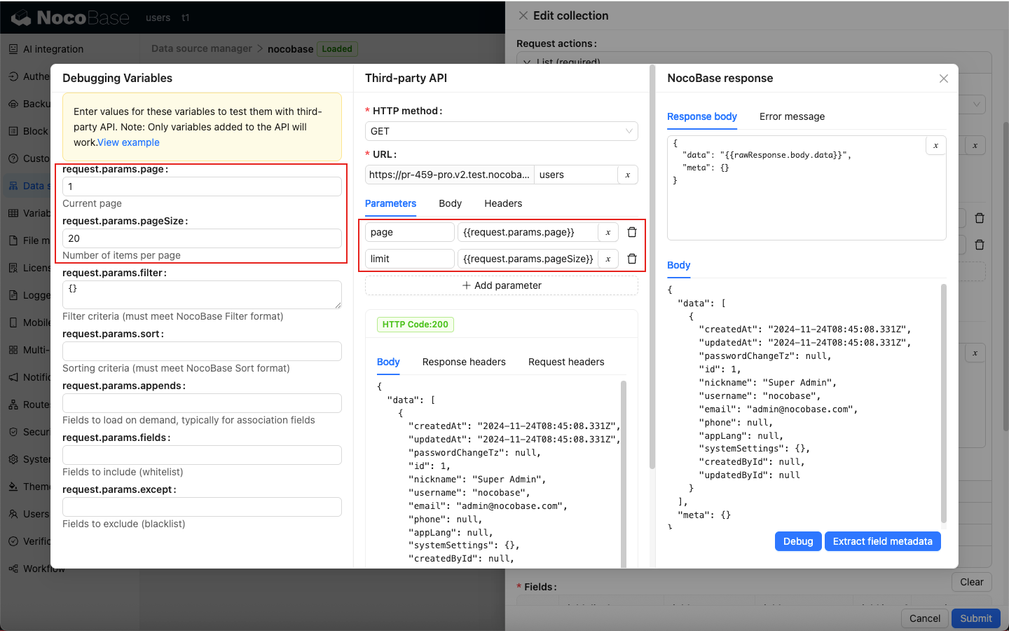
### Response format transformation
The response format of the third-party API may not be in NocoBase standard, and it needs to be transformed before it can be correctly displayed on the front end.
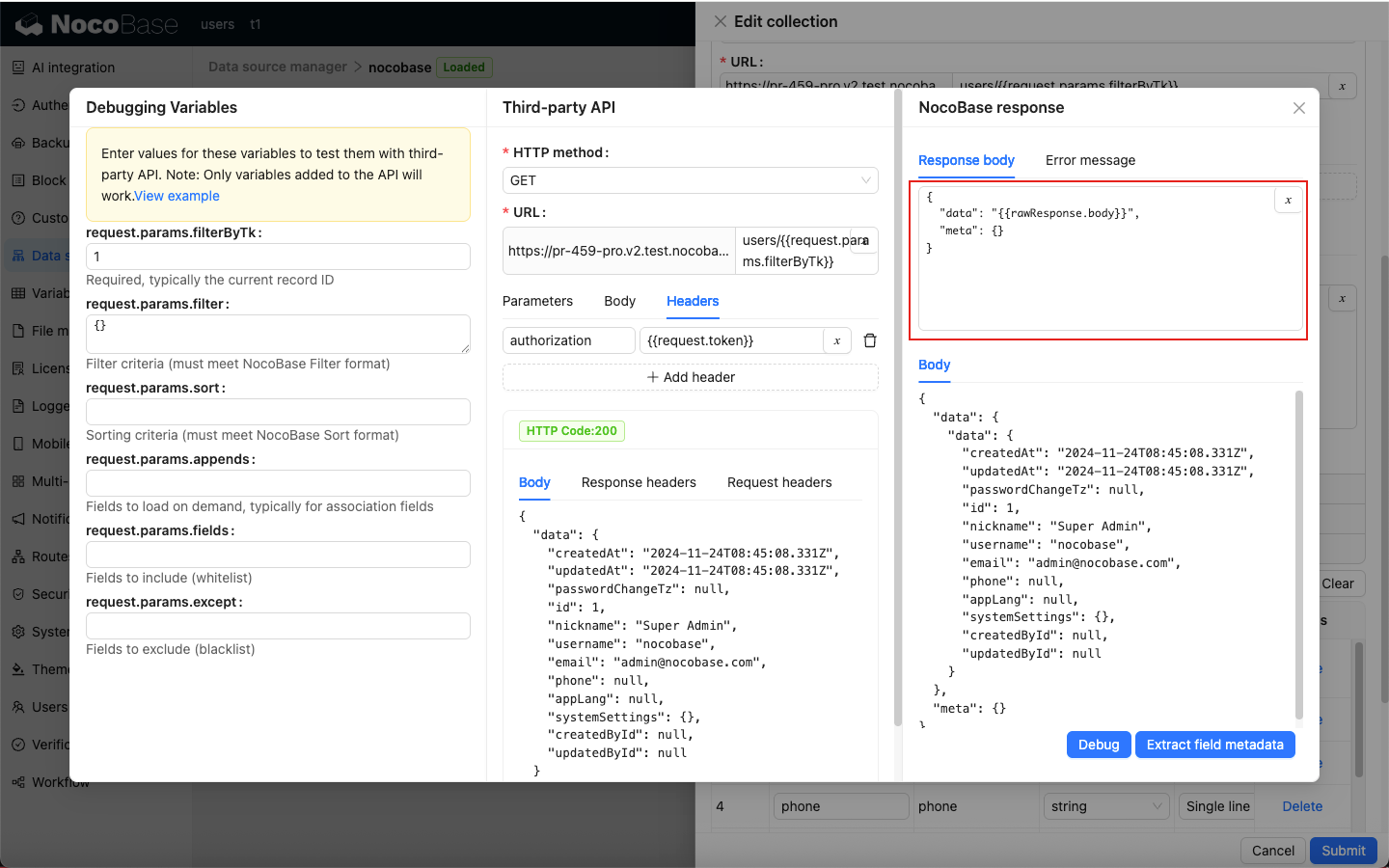
Adjust the conversion rules based on the response format of the third-party API to ensure the output conforms to the NocoBase standard.

Debugging process description
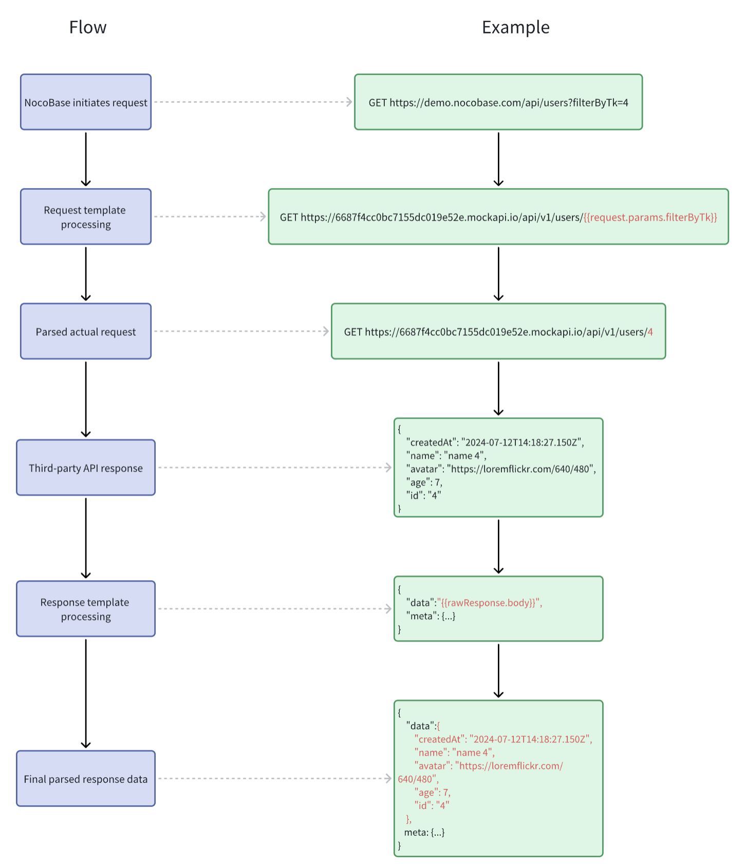
### Extract error message
When a third-party API throws an exception, its response format may not follow NocoBase’s standard. In such cases, the error message needs to be transformed before it can be correctly displayed on the frontend.
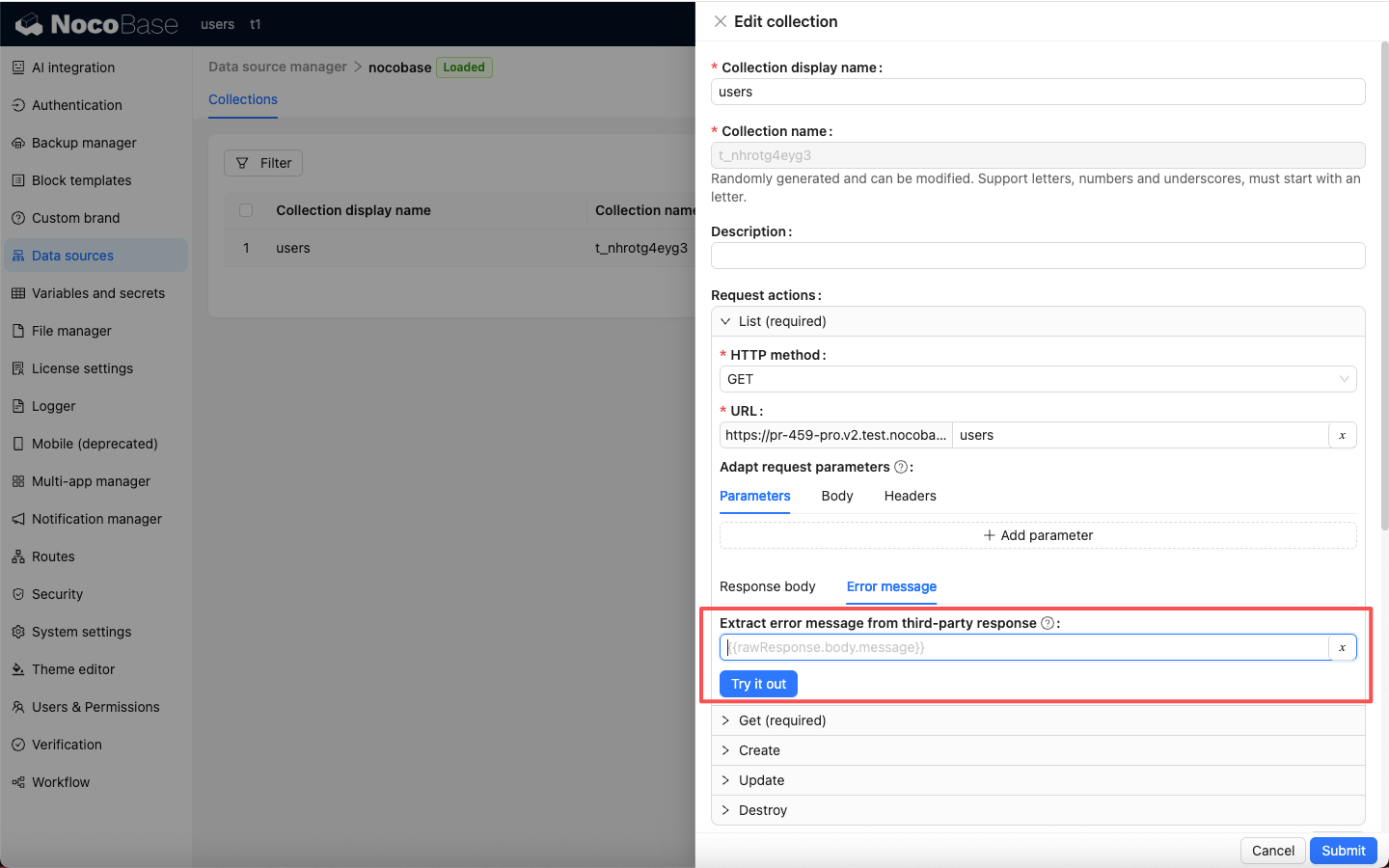
If no error message transformer is configured, NocoBase will apply the default transformation, converting the error into a message that contains the HTTP status code.
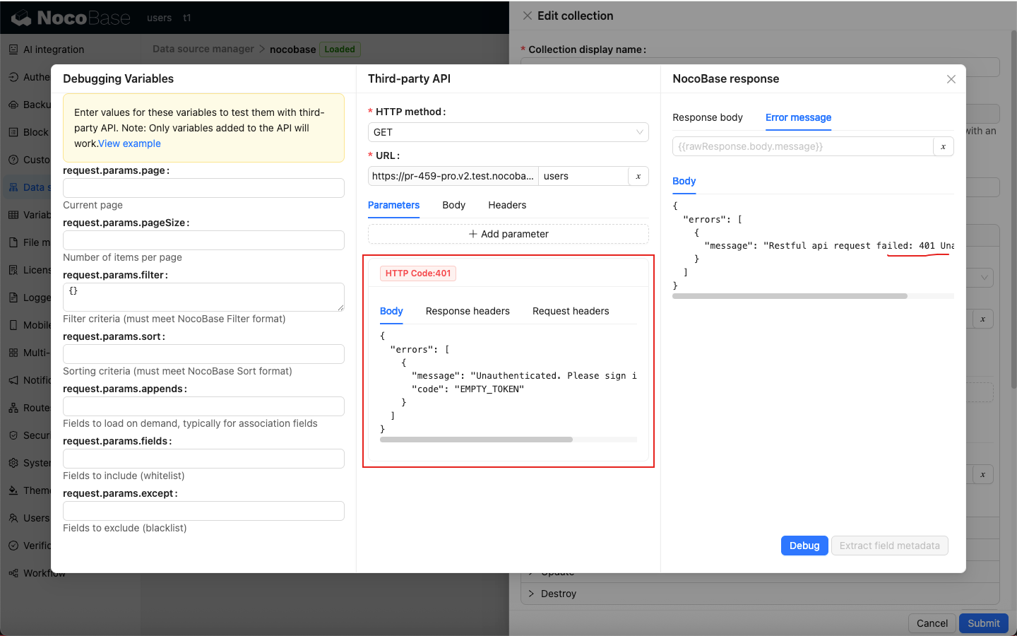
After configuring an error message transformer to match NocoBase’s output standard, the frontend will be able to properly display the exception messages returned by the third-party API.
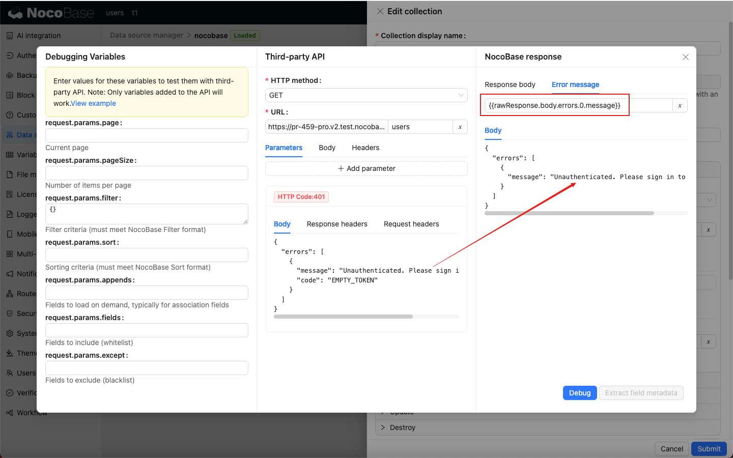
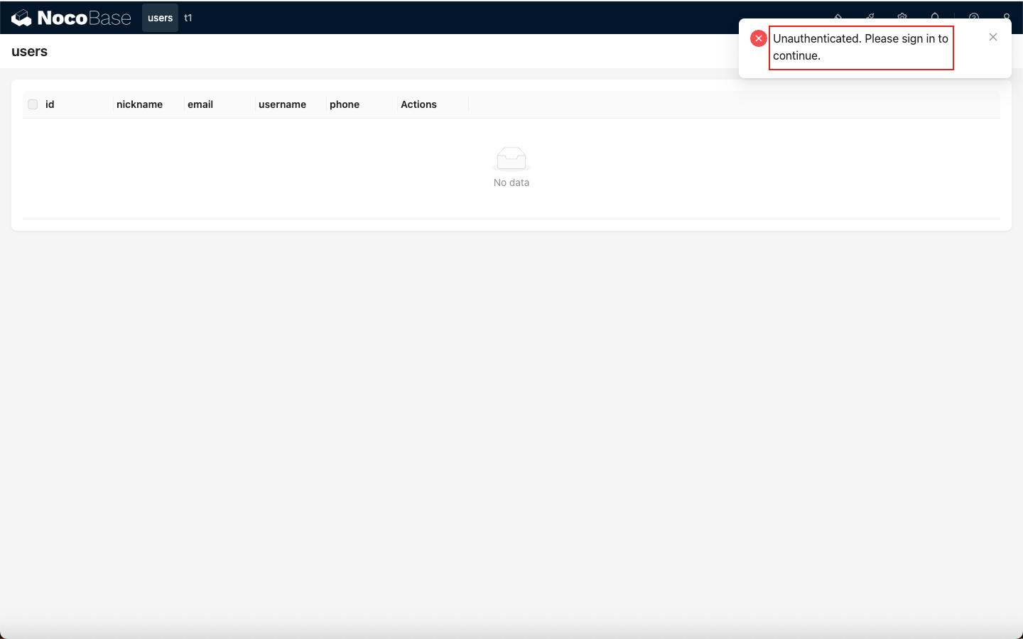
## Variables
The REST API data source supports three types of variables for API integration:
- Custom data source variables
- NocoBase request variables
- Third-party response variables
### Custom Data Source Variables
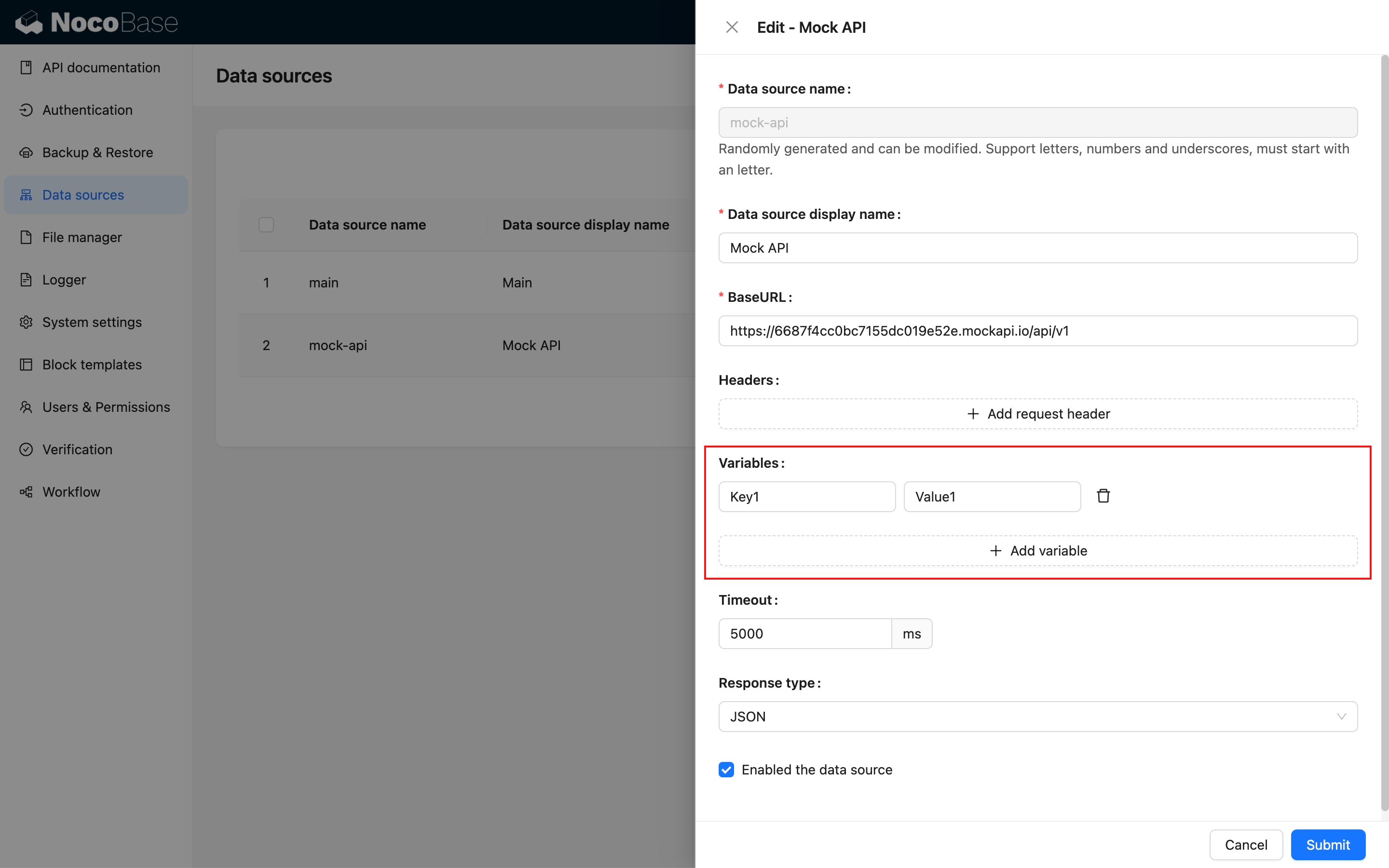
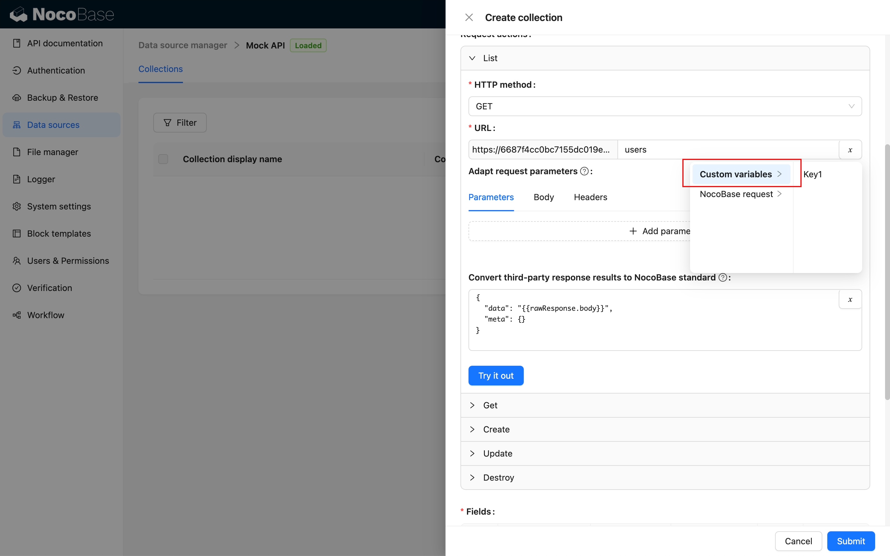
### NocoBase Request
- Params: URL query parameters (Search Params), which vary depending on the interface.
- Headers: Custom request headers, primarily providing specific X- information from NocoBase.
- Body: The request body.
- Token: The API token for the current NocoBase request.
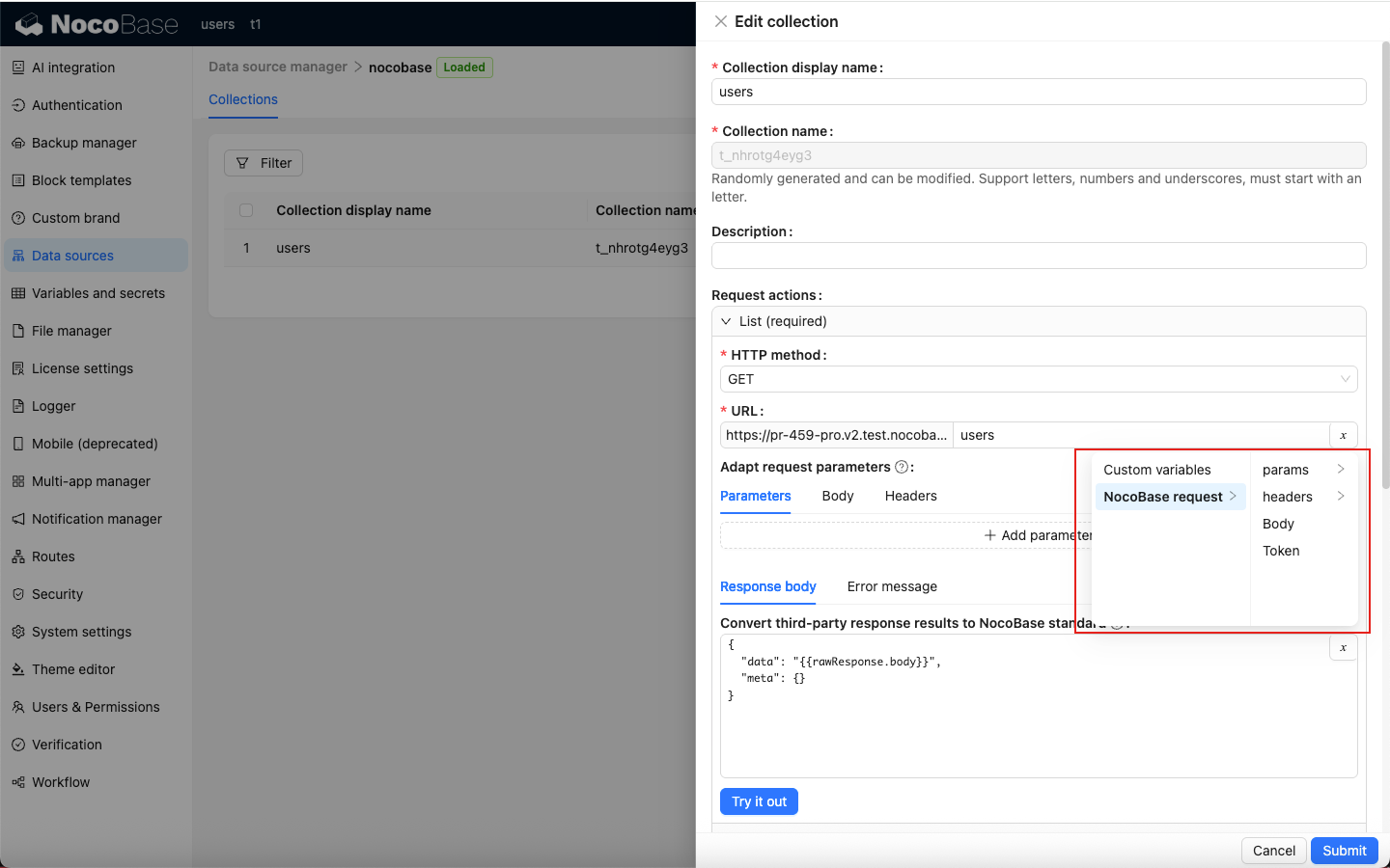
### Third-Party Responses
Currently, only the response body is available.
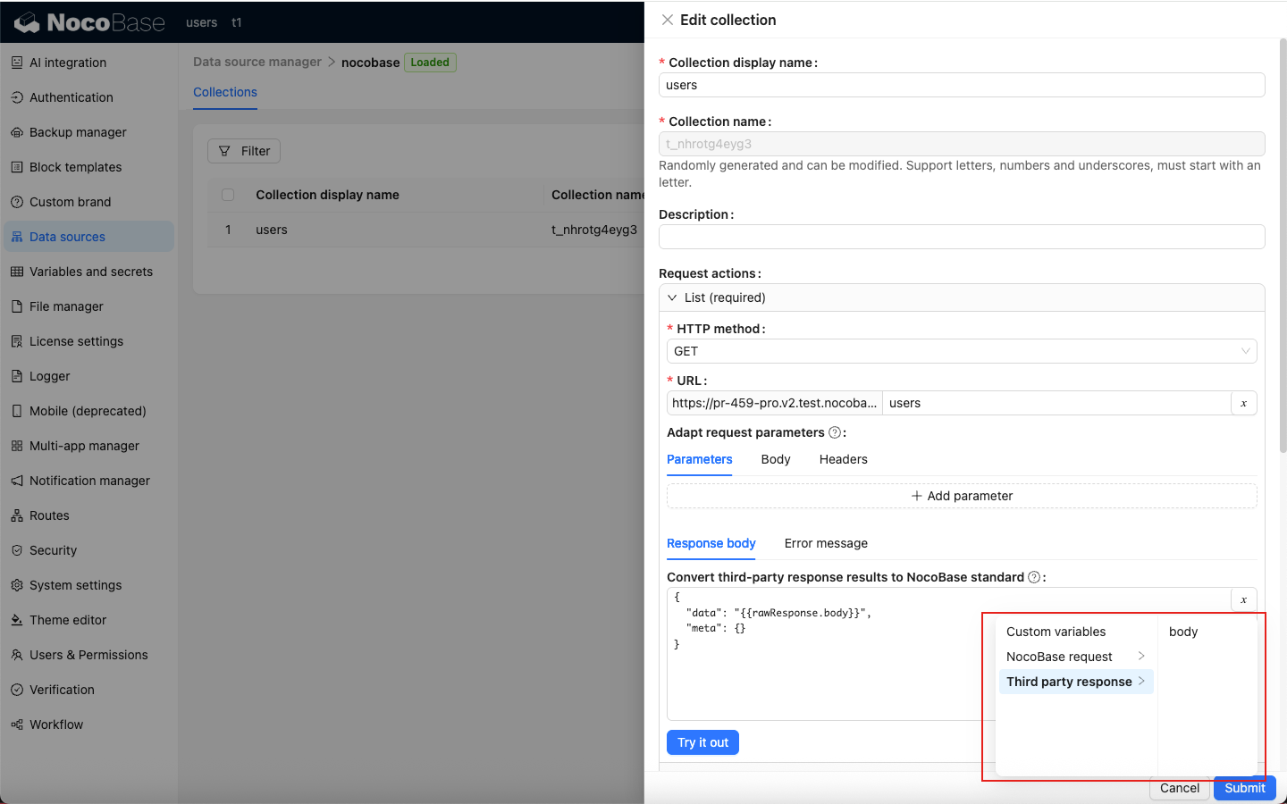
Below are the variables available for each interface:
### List
| Parameter | Description |
| ----------------------- | ---------------------------------------------------------- |
| request.params.page | Current page |
| request.params.pageSize | Number of items per page |
| request.params.filter | Filter criteria (must meet NocoBase Filter format) |
| request.params.sort | Sorting criteria (must meet NocoBase Sort format) |
| request.params.appends | Fields to load on demand, typically for association fields |
| request.params.fields | Fields to include (whitelist) |
| request.params.except | Fields to exclude (blacklist) |
### Get
| Parameter | Description |
| ------------------------- | ---------------------------------------------------------- |
| request.params.filterByTk | Required, typically the current record ID |
| request.params.filter | Filter criteria (must meet NocoBase Filter format) |
| request.params.appends | Fields to load on demand, typically for association fields |
| request.params.fields | Fields to include (whitelist) |
| request.params.except | Fields to exclude (blacklist) |
### Create
| Parameter | Description |
| ------------------------ | ------------------------- |
| request.params.whiteList | Whitelist |
| request.params.blacklist | Blacklist |
| request.body | Initial data for creation |
### Update
| Parameter | Description |
| ------------------------- | -------------------------------------------------- |
| request.params.filterByTk | Required, typically the current record ID |
| request.params.filter | Filter criteria (must meet NocoBase Filter format) |
| request.params.whiteList | Whitelist |
| request.params.blacklist | Blacklist |
| request.body | Data for update |
### Destroy
| Parameter | Description |
| ------------------------- | -------------------------------------------------- |
| request.params.filterByTk | Required, typically the current record ID |
| request.params.filter | Filter criteria (must meet NocoBase Filter format) |
## Field Configuration
Field metadata (Fields) is extracted from the CRUD interface data of the adapted resource to serve as the fields of the collection.
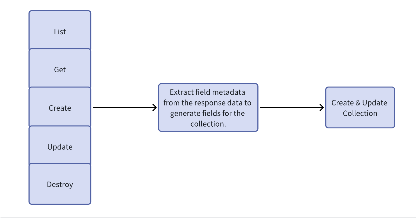
Extract field metadata.
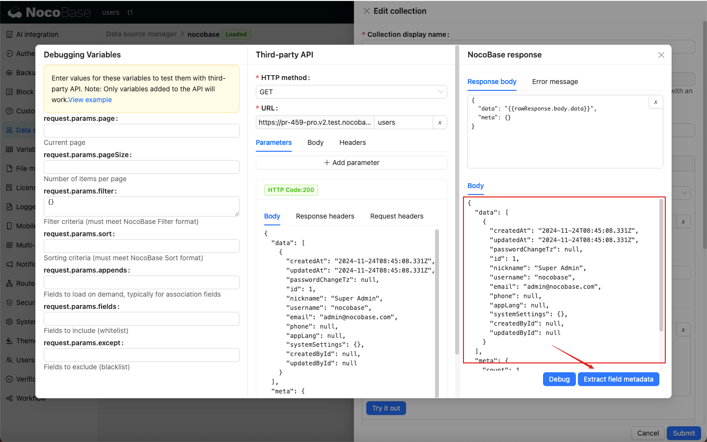
Fields and preview.
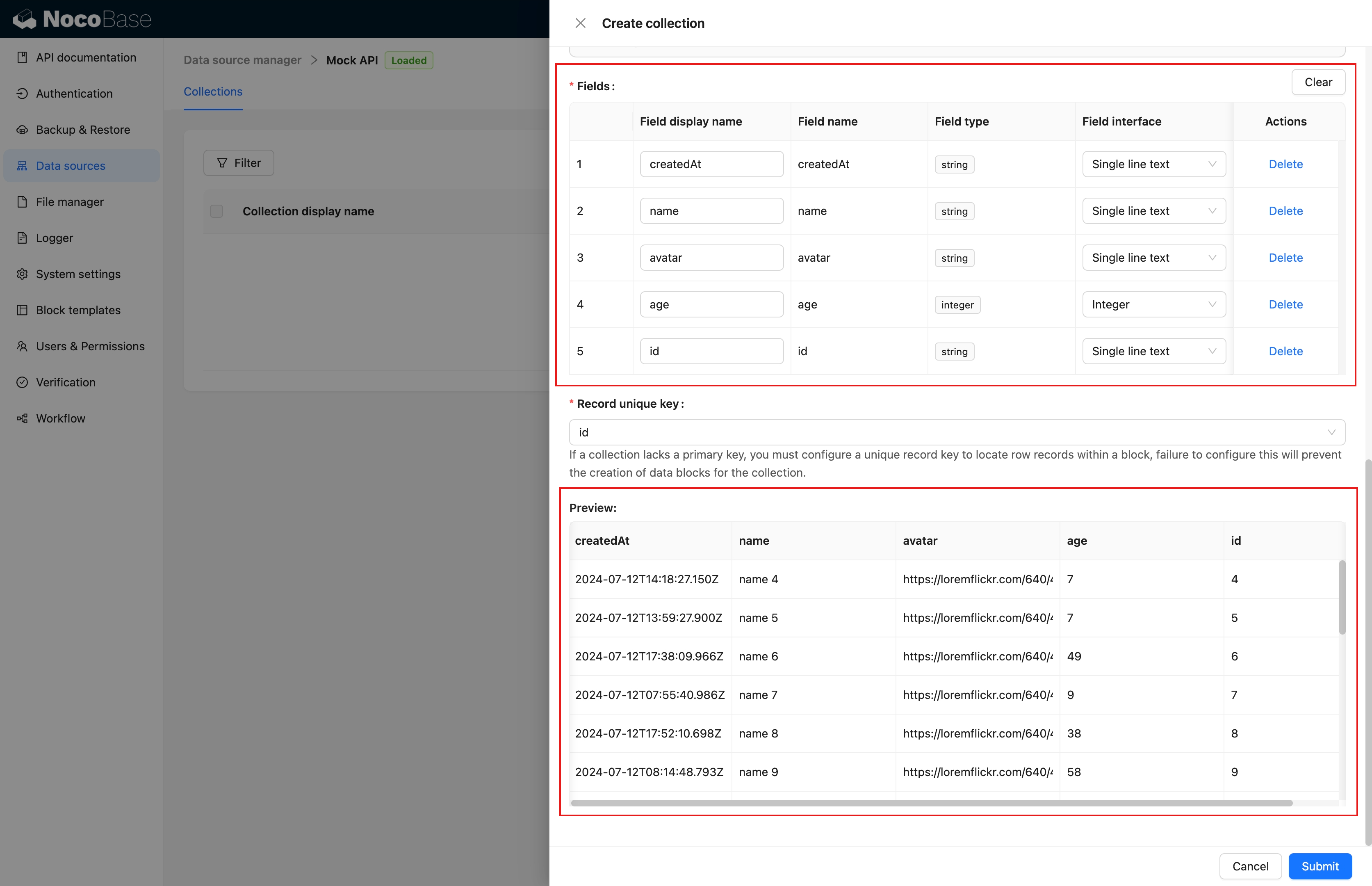
Edit fields (similar to other data sources).
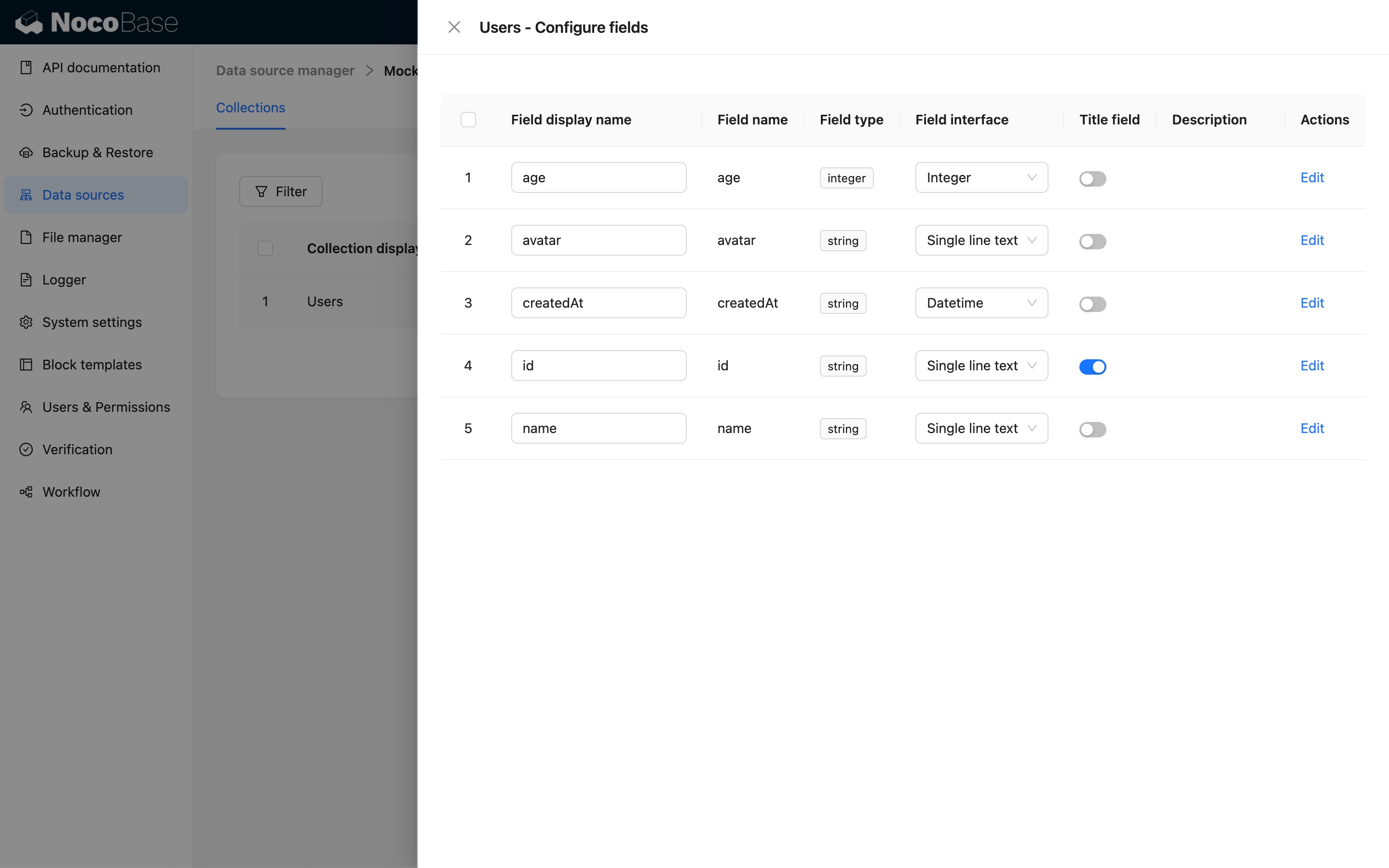
## Adding REST API Data Source Blocks
Once the collection is configured, you can add blocks to the interface.
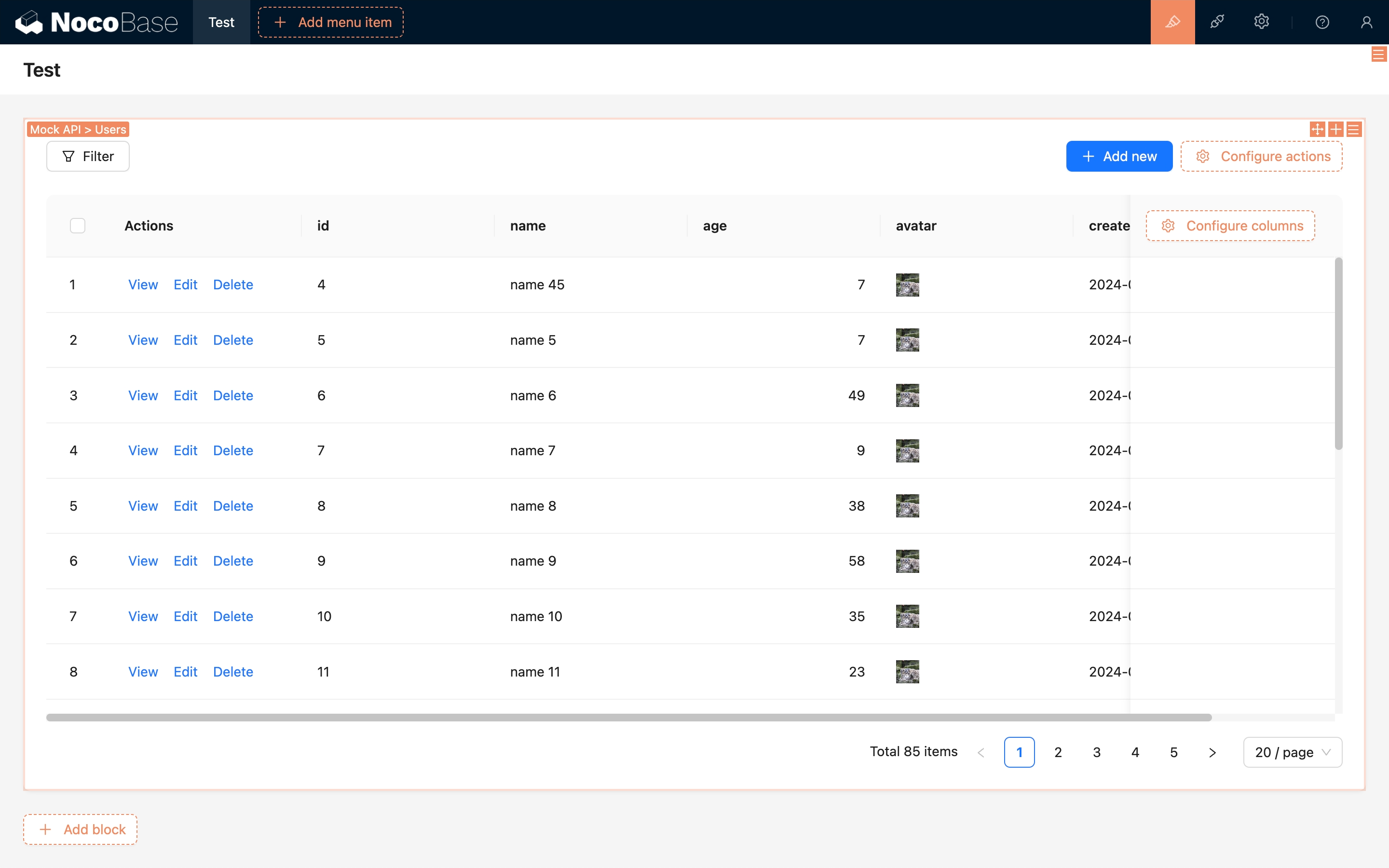
---
url: /data-sources/field-attachment-url/index.md
---
# Data Field: Attachment (URL)
## Introduction
Supports attachments in URL format.
## Installation
This plugin is a commercial plugin.
## User Manual
### Field Configuration
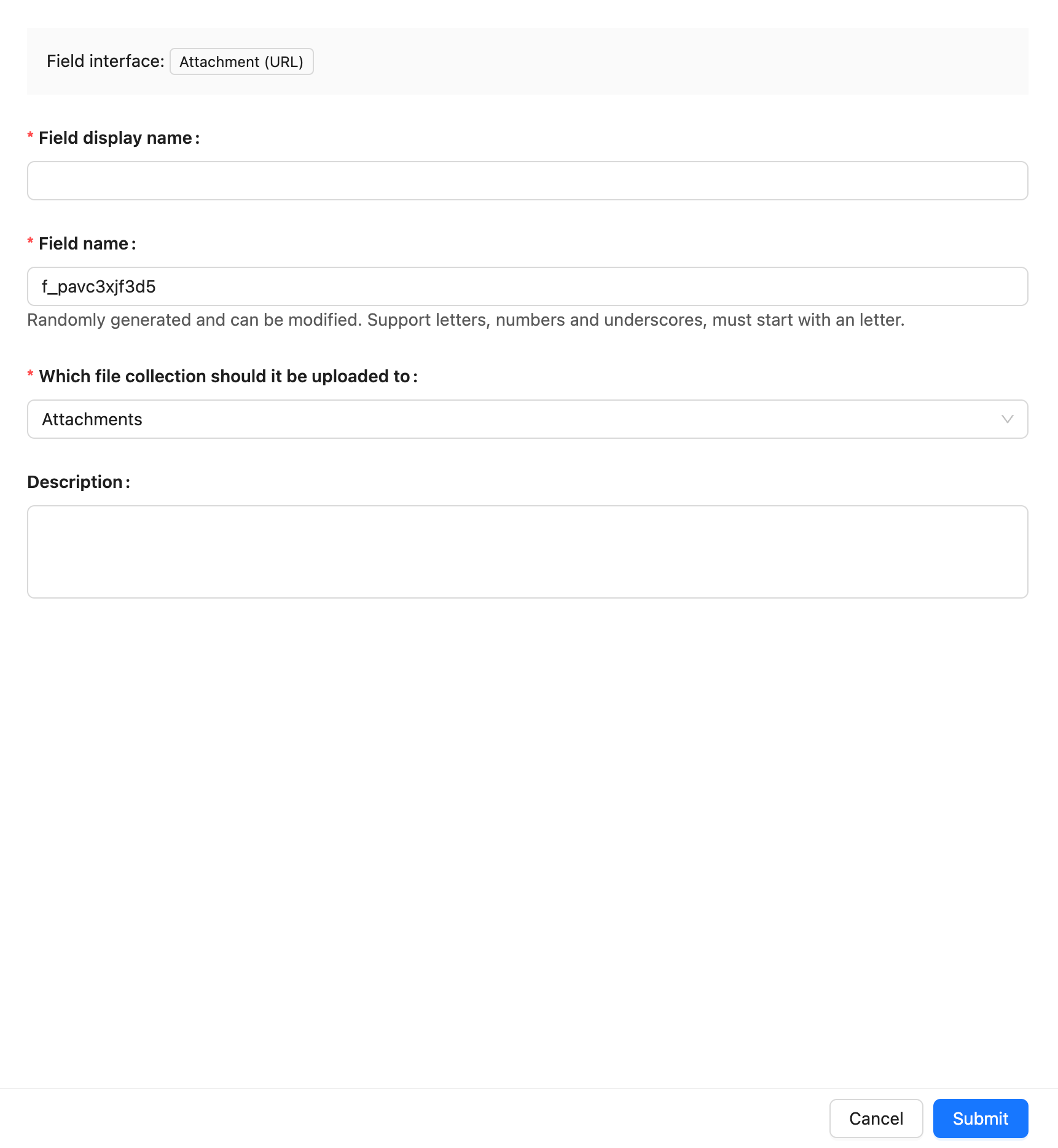
### External Data Source
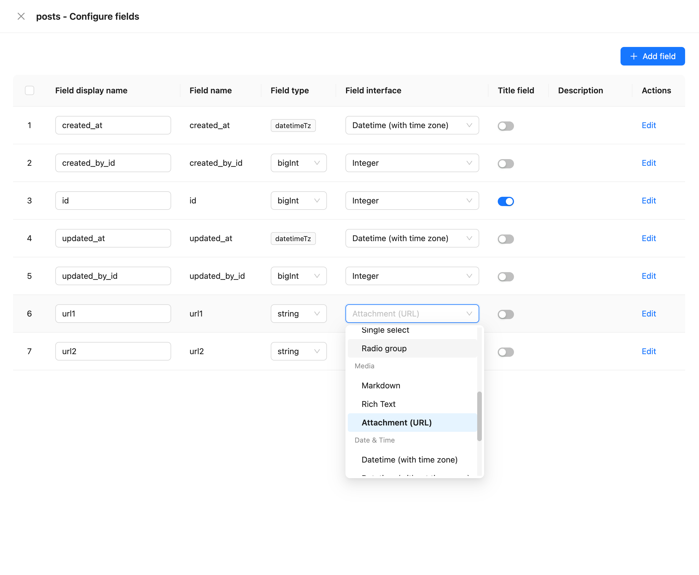
### Interface
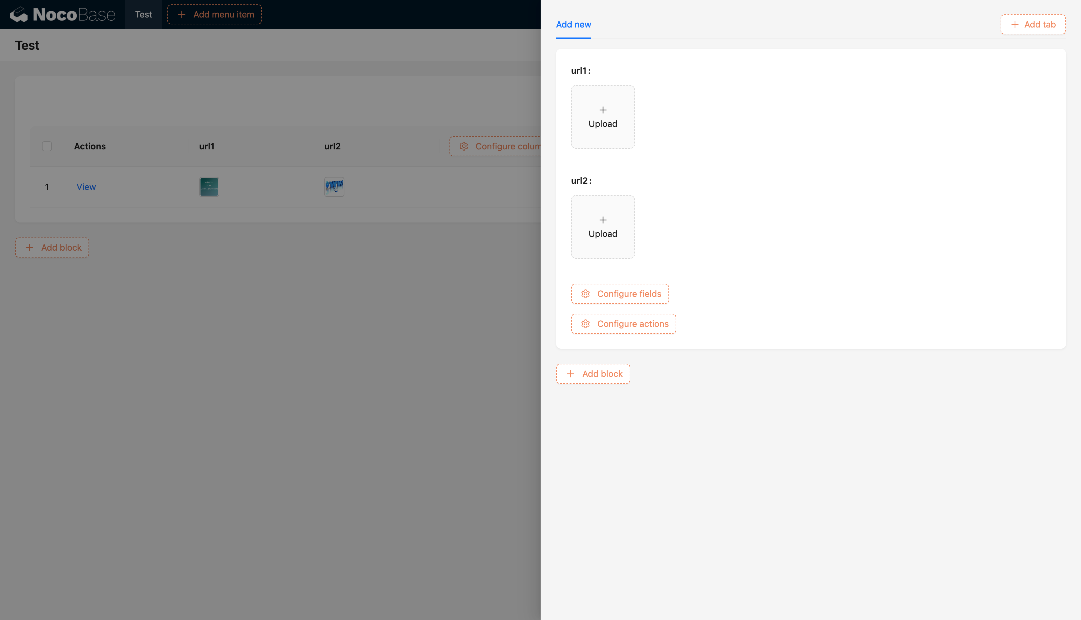
---
url: /data-sources/field-china-region/index.md
---
# China region
## Introduction
## Field configuration

## Examples
To be added.
---
url: /data-sources/field-encryption/index.md
---
# Encryption
## Introduction
You can encrypt sensitive business data—such as customer phone numbers, email addresses, or card numbers—so that it is stored in the database as ciphertext.
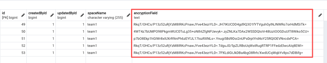
## Encryption Method
:::warning
The plugin automatically generates an `application key`, which is stored under the directory `/storage/apps/main/encryption-field-keys`.
Each `application key` is saved as a file whose name is the key ID, with the `.key` extension. Do not rename these files.
Keep your `application key` files safe. If an `application key` file is lost, encrypted data cannot be decrypted.
If the plugin is enabled in a sub-application, the key is stored under:
`/storage/apps/${sub-app-name}/encryption-field-keys`
:::
### How It Works
This plugin uses an **envelope encryption** scheme.
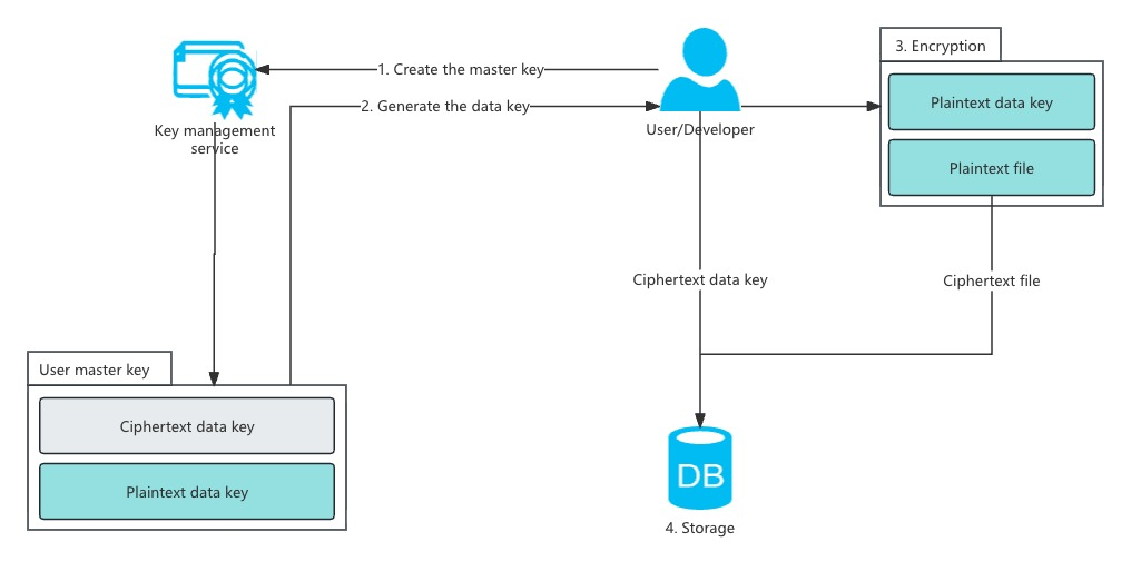
### Application and Field Key Creation
1. When you create your first encrypted field, NocoBase automatically generates a 32-byte `application key`, stores it in the default directory, and encodes it in base64.
1. Each time you create a new encrypted field, the system generates a random 32-byte `field key`, encrypts it using the `application key` and a randomly generated 16-byte `field IV` (AES), and stores the encrypted result in the `options` column of the `fields` table.
### Field Encryption Process
1. When writing data to an encrypted field, NocoBase retrieves the encrypted `field key` and `field IV` from the `options` column of the `fields` table.
2. The system decrypts the `field key` using the `application key` and `field IV`. It then encrypts the actual data using the `field key` and a randomly generated 16-byte `data IV` (AES).
3. The decrypted `field key` is also used to sign the plaintext using `HMAC-SHA256`, producing a base64-encoded `data signature` (used later for querying).
4. The 16-byte `data IV` and `ciphertext` are concatenated and encoded in base64.
5. The base64 `data signature` and base64 `ciphertext` are joined with a `.` separator.
6. The final string is stored in the database.
## Environment Variables
If you want to specify your own `application key`, you can set the environment variable `ENCRYPTION_FIELD_KEY_PATH`. The plugin will load all `.key` files in this directory as application keys.
**Application key file requirements:**
1. The file extension must be `.key`.
2. The filename is treated as the key ID; using a UUID is recommended.
3. The file content must be base64-encoded 32-byte binary data.
```bash
ENCRYPTION_FIELD_KEY_PATH=/path/to/my/app-keys/270263524860909922913.key
```
## Field Configuration
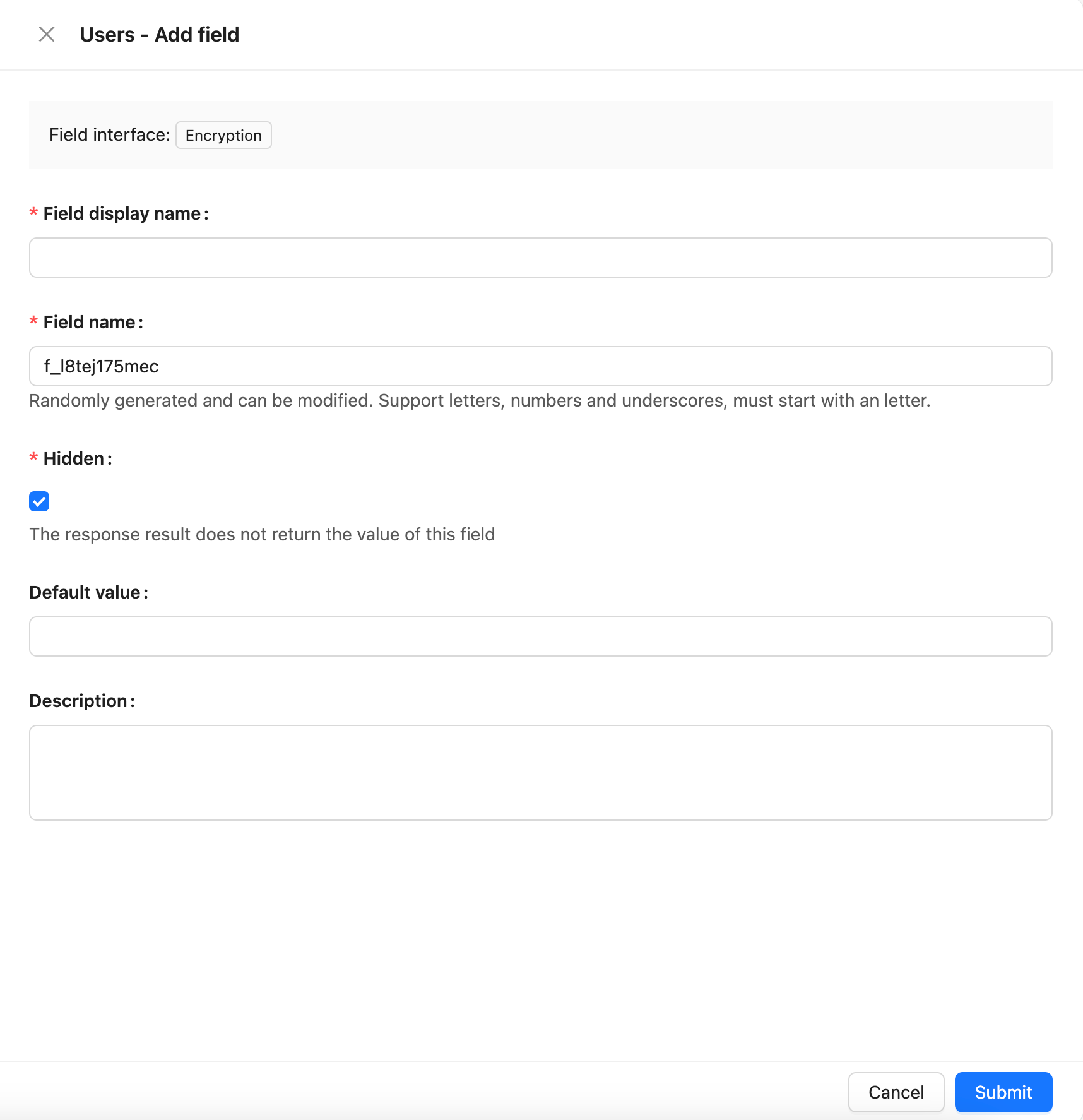
## How Encryption Affects Filtering
Encrypted fields only support the following filter operators:
* Equal to
* Not equal to
* Exists
* Does not exist
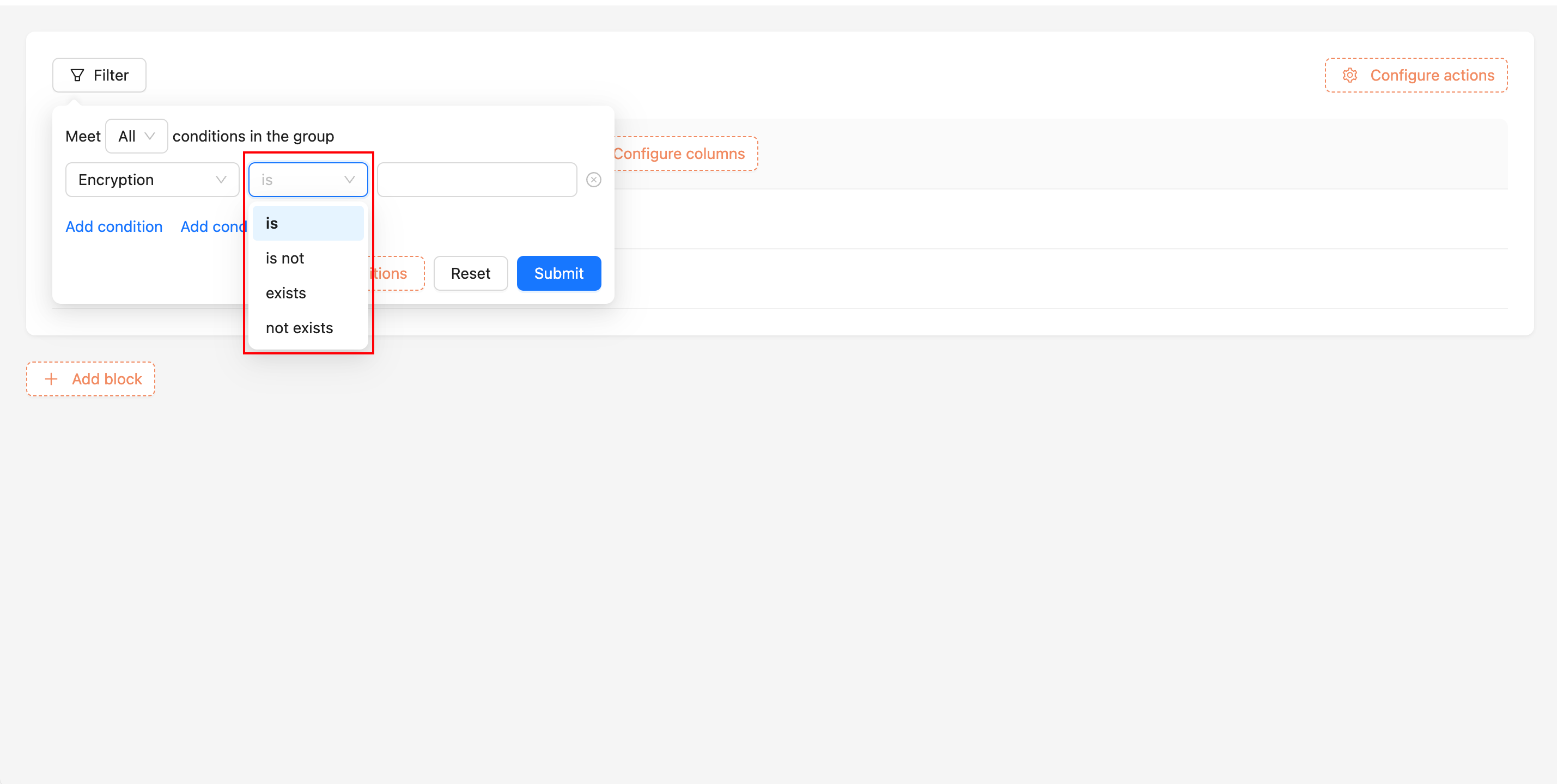
### How Filtering Works Internally
1. Retrieve the encrypted `field key` and decrypt it using the `application key`.
2. Use the `field key` to generate an `HMAC-SHA256 signature` for the user’s input.
3. Concatenate the signature with `.` and perform a **prefix search** on the encrypted field value in the database.
## Key Rotation
:::warning
Before running the key rotation command `nocobase key-rotation`, ensure that this plugin is already enabled in the application.
:::
When migrating an application to a new environment, you may want to replace the old application key. You can use the `nocobase key-rotation` command to generate a new application key.
The command requires the application key from the old environment. After running it, NocoBase generates a new application key and replaces the old one. The new key is stored in the default directory and base64-encoded.
```bash
# --key-path points to the old application key file corresponding to the encrypted data in the database
yarn nocobase key-rotation --key-path /path/to/old-app-keys/270263524860909922913.key
```
For rotating a sub-application’s key, add the `--app-name` parameter:
```bash
yarn nocobase key-rotation --app-name a_w0r211vv0az --key-path /path/to/old-app-keys/270263524860909922913.key
```
---
url: /data-sources/field-formula/index.md
---
# Formula
## Introduction
## Field Configuration
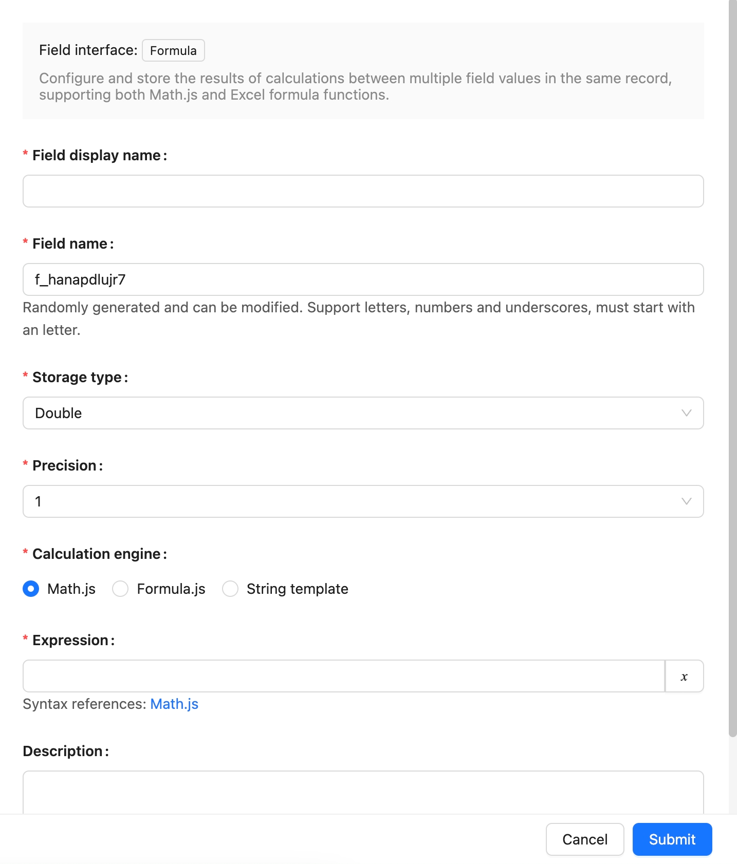
## Example
To be added.
---
url: /data-sources/field-m2m-array/index.md
---
# Many-to-Many (Array)
## Introduction
This feature allows you to use array fields in a data Collection to store multiple unique keys from the target table, thereby creating a many-to-many relationship between the two tables. For instance, consider the entities Articles and Tags. An article can be linked to multiple tags, with the article table storing the IDs of the corresponding records from the tags table in an array field.
:::warning{title=Note}
- Whenever possible, it's recommended to use a junction Collection to establish a standard [many-to-many](../data-modeling/collection-fields/associations/m2m/index.md) relationship instead of relying on this method.
- Currently, only PostgreSQL supports filtering source Collection data using fields from the target table for many-to-many relationships established with array fields. For example, in the scenario above, you can filter articles based on other fields in the tags table, such as the title.
:::
### Field Configuration
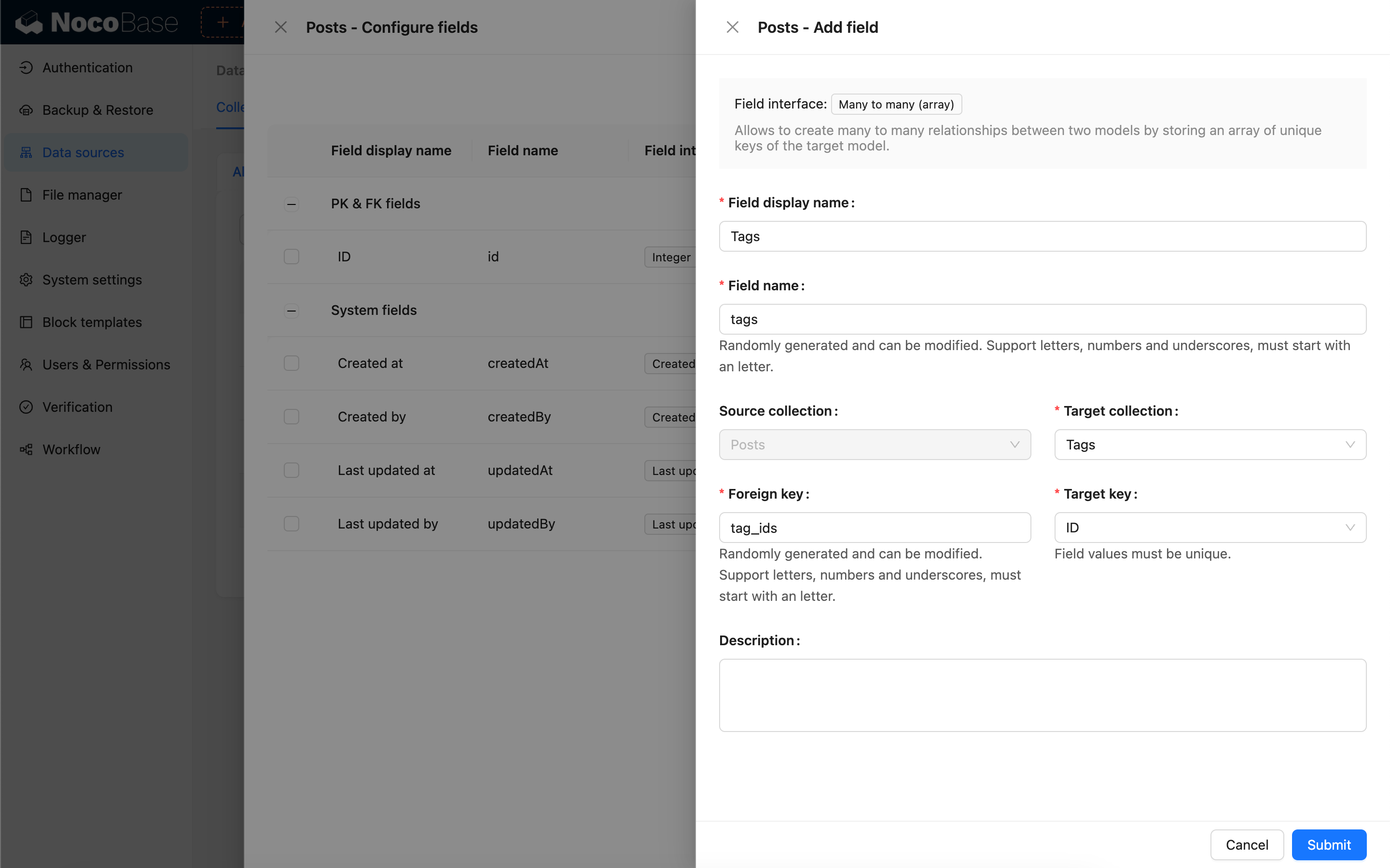
## Parameter Description
### Source collection
The source collection, where the current field resides.
### Target collection
The target collection with which the relationship is established.
### Foreign key
The array field in the source collection that stores the target key from the target table.
The corresponding relationships for array field types are as follows:
| NocoBase | PostgreSQL | MySQL | SQLite |
| -------- | ---------- | ------ | ------ |
| `set` | `array` | `JSON` | `JSON` |
### Target key
The field in the target collection that corresponds to the values stored in the source table's array field. This field must be unique.
---
url: /data-sources/field-markdown-vditor/index.md
---
# Markdown (Vditor)
## Introduction
## Field Configuration
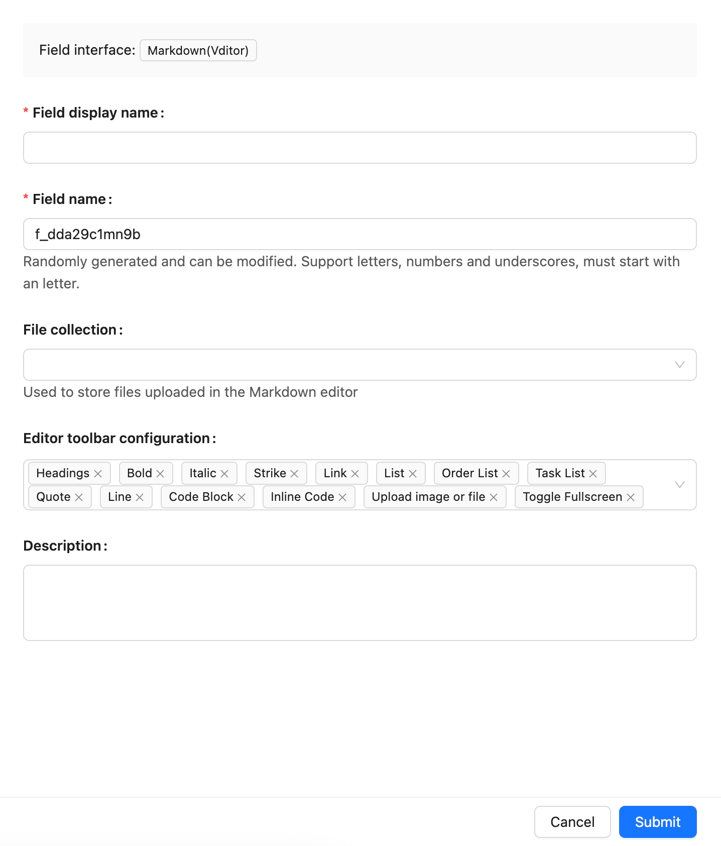
## Example
Coming soon.
---
url: /data-sources/field-sequence/index.md
---
# Sequence
## Introduction
## Field Configuration
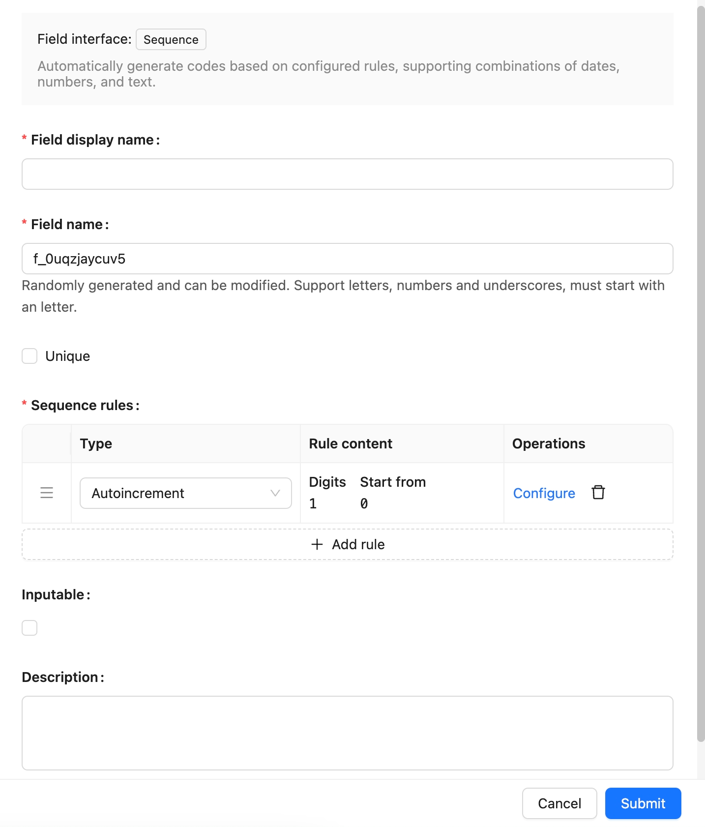
## Example
To be added
---
url: /data-sources/field-sort/index.md
---
# Sort Field
## Introduction
Sort fields are used to sort records in a collection, supporting sorting within groups.
:::warning
Since the sort field is part of the same collection, a record cannot be assigned to multiple groups when using group sorting.
:::
## Installation
Built-in plugin, no separate installation required.
## User Manual
### Create a Sort Field
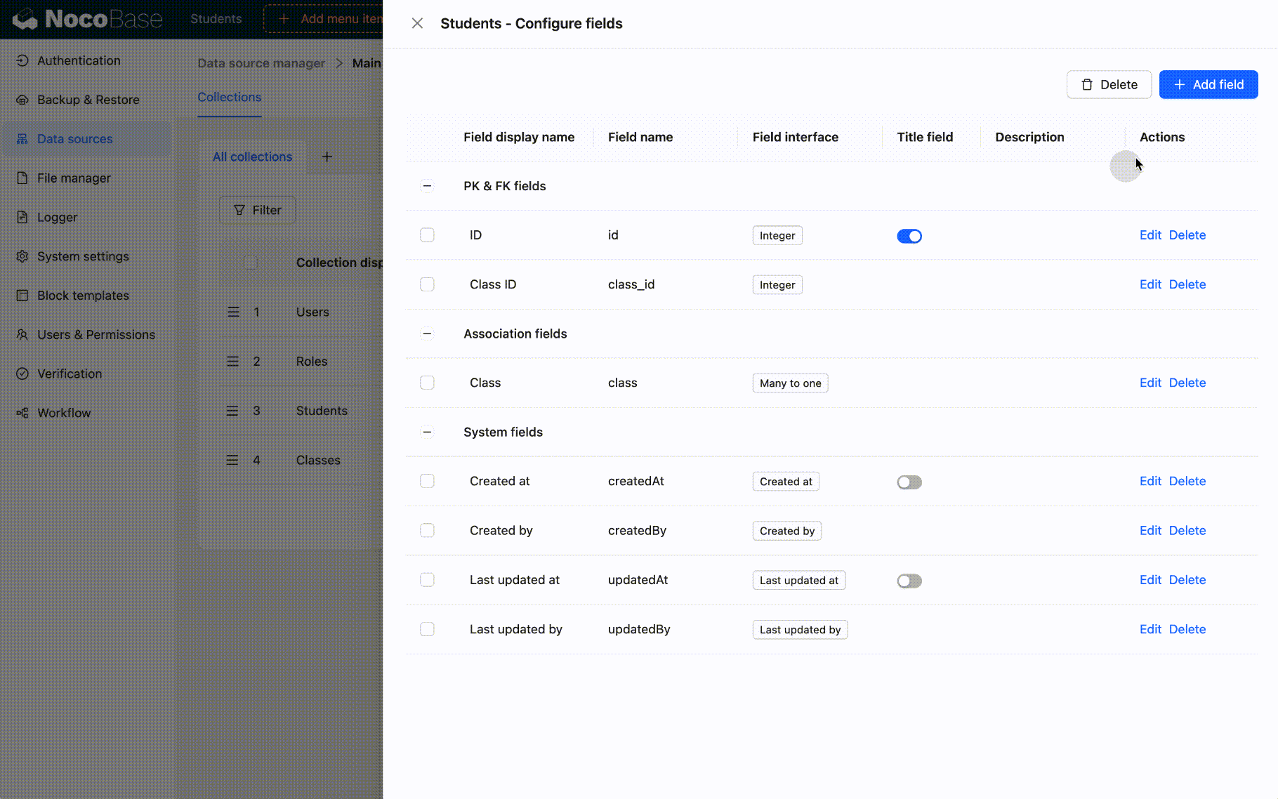
When creating sort fields, the sort values will be initialized:
- If group sorting is not selected, initialization will be based on the primary key field and creation date field.
- If group sorting is selected, the data will be grouped first, and then initialization will be based on the primary key field and creation date field.
:::warning{title="Explanation of Transaction Consistency"}
- When creating a field, if the sort value initialization fails, the sort field will not be created.
- Within a certain range, if a record moves from position A to position B, the sort values of all records between A and B will change. If any part of this update fails, the entire move operation is rolled back, and the sort values of the related records will not change.
:::
#### Example 1: Create the sort1 field
The sort1 field is not grouped.
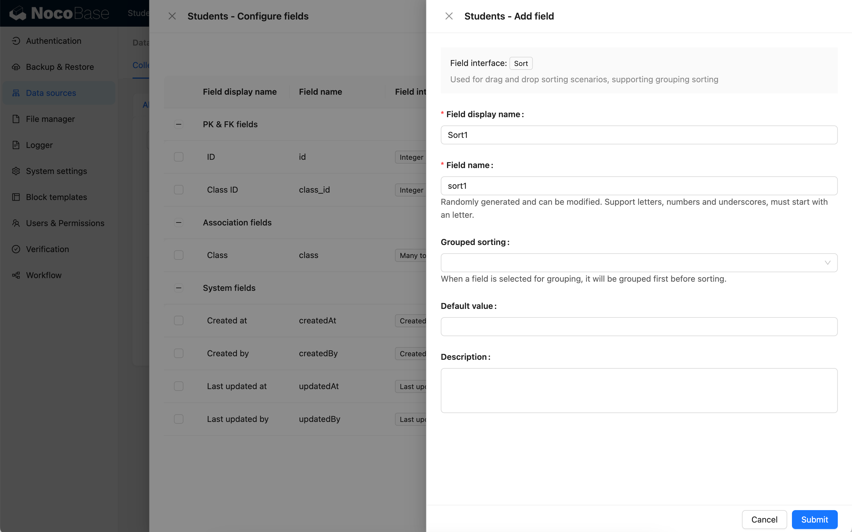
The sort fields of each record will be initialized based on the primary key field and creation date field.
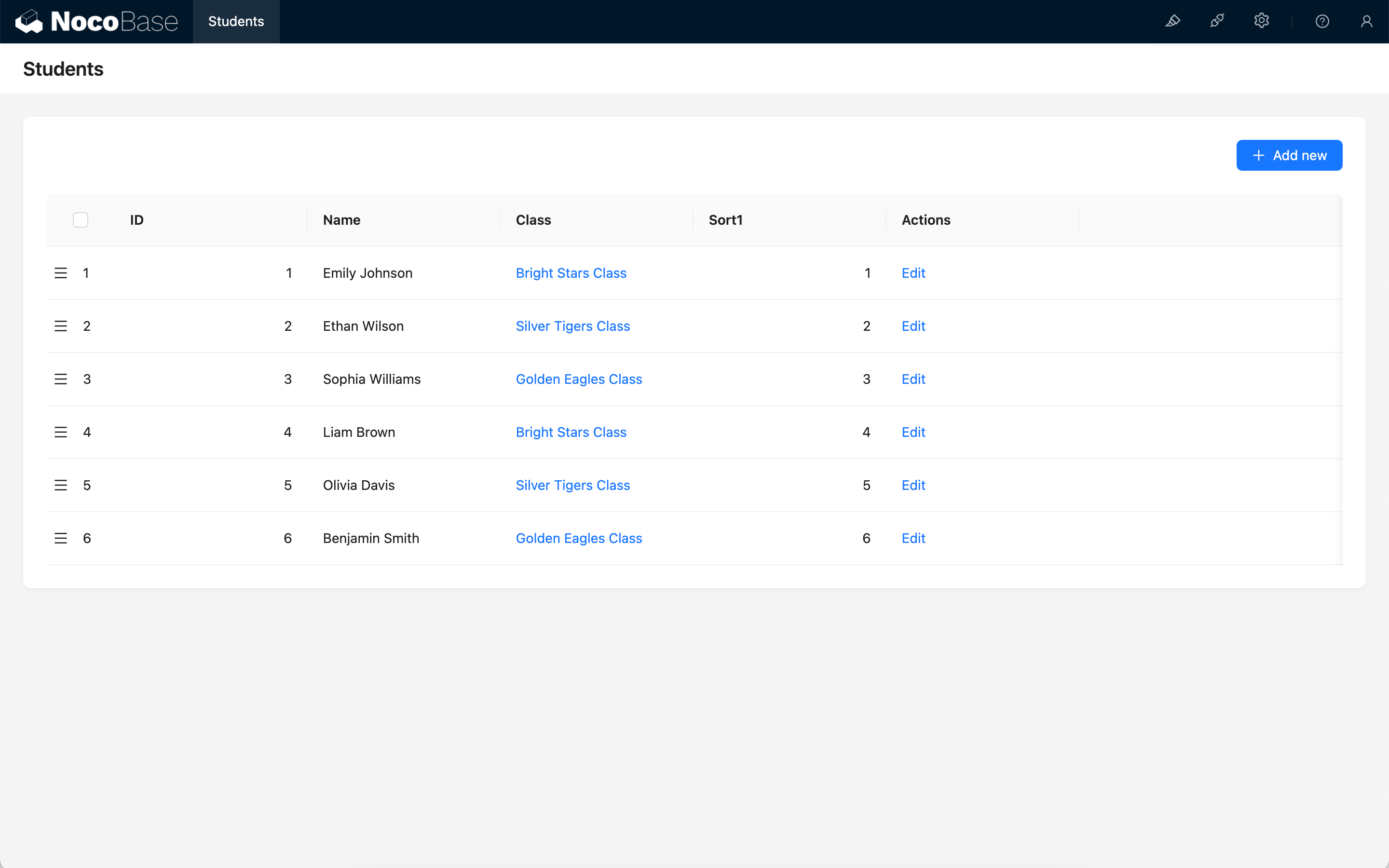
#### Example 2: Create a sort2 field based on Class ID grouping
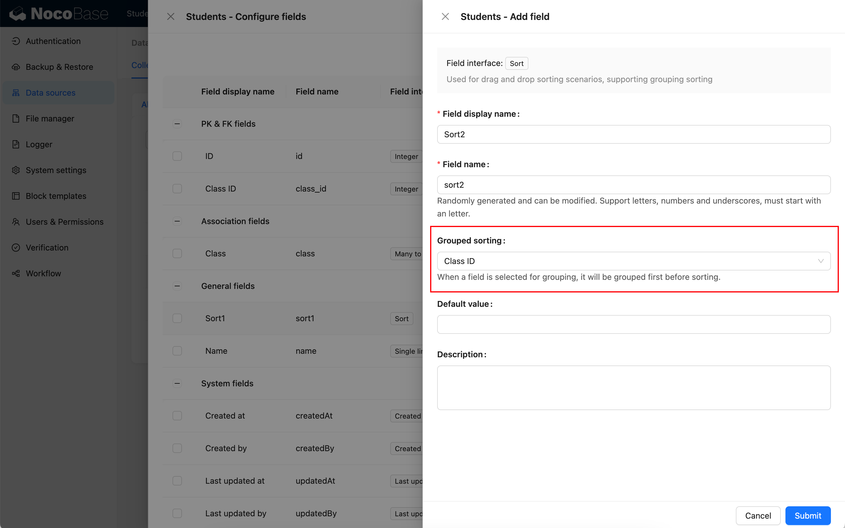
At this time, all records in the collection will be grouped first (grouped by Class ID), and then the sort field (sort2) will be initialized. The initial values of each record are:
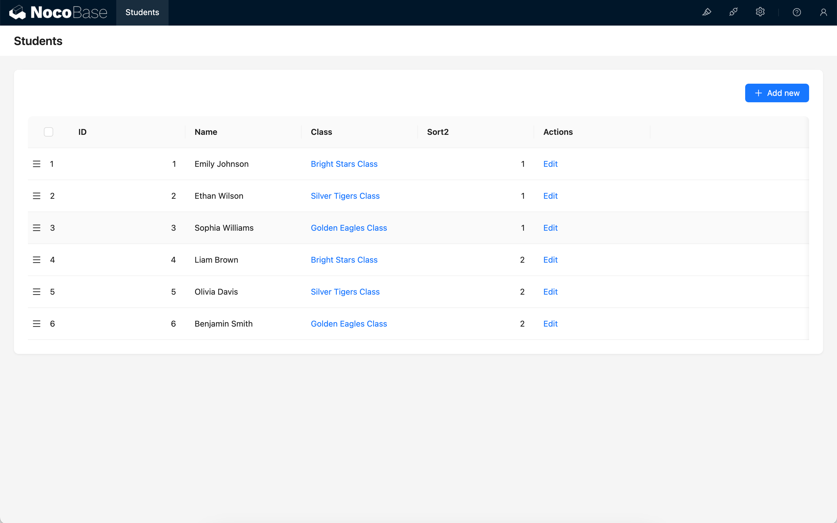
### Drag-and-Drop Sorting
Sort fields are mainly used for drag-and-drop sorting of records in various blocks. The blocks that currently support drag-and-drop sorting include tables and boards.
:::warning
- When the same sort field is used for drag-and-drop sorting, using it across multiple blocks may disrupt the existing order.
- The field for table drag-and-drop sorting cannot be a sort field with a grouping rule.
- Exception: In a one-to-many relationship table block, the foreign key can serve as a group.
- Currently, only the board block supports drag-and-drop sorting within groups.
:::
#### Drag-and-Drop Sorting of Table Rows
Table block
Relationship table block
:::warning
In a one-to-many relationship block:
- If an ungrouped sort field is selected, all records may participate in the sorting.
- If records are first grouped by the foreign key and then sorted, the sorting rule will only affect the data within the current group.
The final effect is consistent, but the number of records participating in the sort is different. For more details, see [Sorting Rule Explanation](#sorting-rule-explanation).
:::
#### Drag-and-Drop Sorting of Board Cards
### Sorting Rule Explanation
#### Displacement between ungrouped (or same-group) elements
Suppose there is a set of data:
```
[1,2,3,4,5,6,7,8,9]
```
When an element, say 5, moves forward to the position of 3, only the positions of items 3, 4, and 5 change. Item 5 takes the position of 3, and items 3 and 4 each shift back one position.
```
[1,2,5,3,4,6,7,8,9]
```
If we then move item 6 backward to the position of 8, item 6 takes the position of 8, and items 7 and 8 each shift forward one position.
```
[1,2,5,3,4,7,8,6,9]
```
#### Movement of elements between different groups
When sorting by group, if a record is moved to another group, its group assignment will also change. For example:
```
A: [1,2,3,4]
B: [5,6,7,8]
```
When item 1 is moved after item 6 (the default behavior), its group will also change from A to B.
```
A: [2,3,4]
B: [5,6,1,7,8]
```
#### Sort changes are unrelated to the data displayed on the interface
For example, consider a set of data:
```
[1,2,3,4,5,6,7,8,9]
```
The interface only displays a filtered view:
```
[1,5,9]
```
When item 1 is moved to the position of item 9, the positions of all intermediate items (2, 3, 4, 5, 6, 7, 8) will also change, even though they are not visible.
```
[2,3,4,5,6,7,8,9,1]
```
The interface now displays the new order based on the filtered items:
```
[5,9,1]
```
---
url: /data-sources/file-manager/field-attachment.md
---
# Attachment Field
## Introduction
The attachment field is a specialized relational field that connects directly to the file collection.
## Field Configuration
## Example
(Example to be added)
---
url: /data-sources/file-manager/file-collection.md
---
# File Collection
## Introduction
Files are records in a specially structured collection known as a file collection. It is used to store file metadata and can be managed through the File Manager.
## User Manual
Creating a File Collection
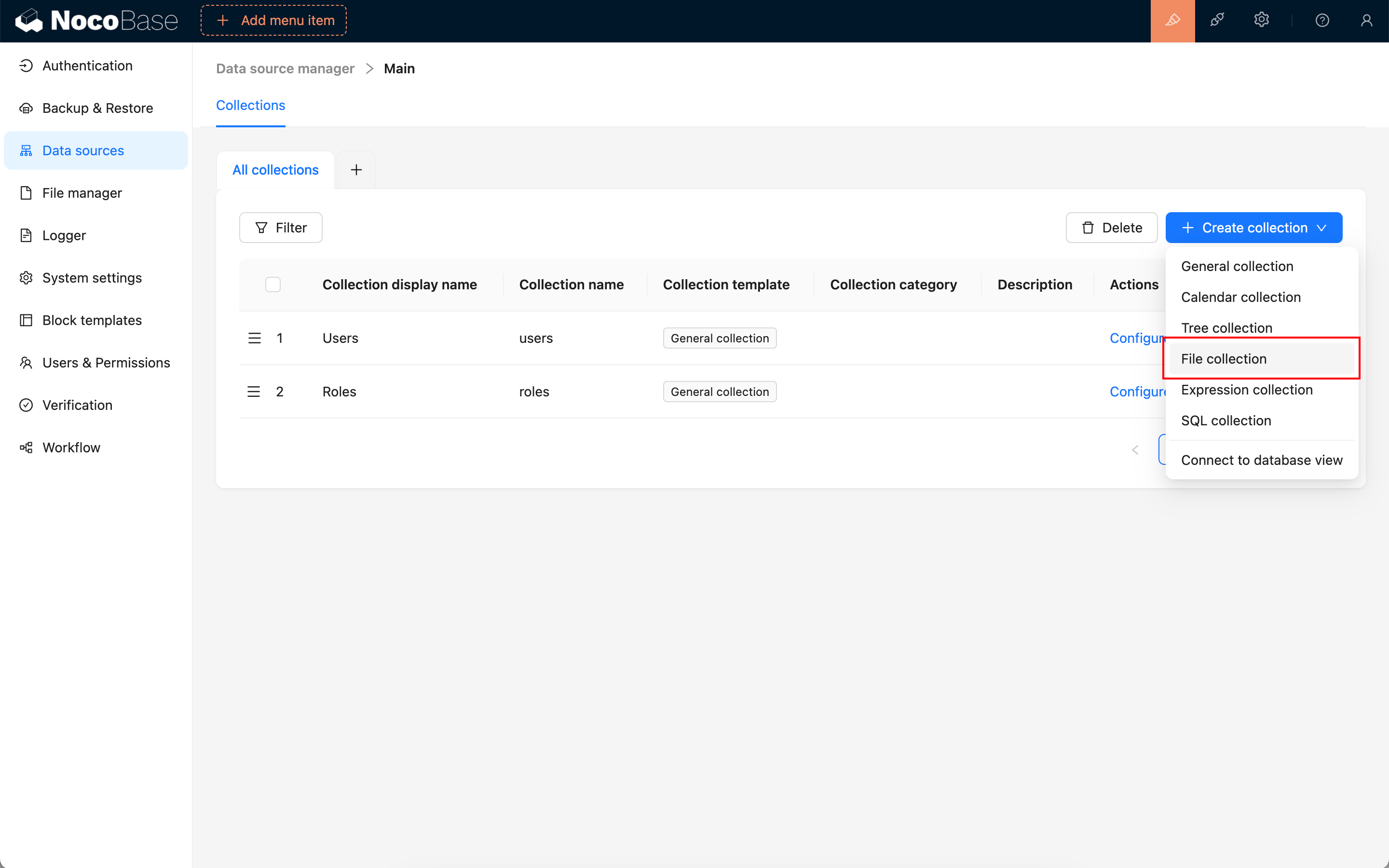
Preset Fields in a File Collection
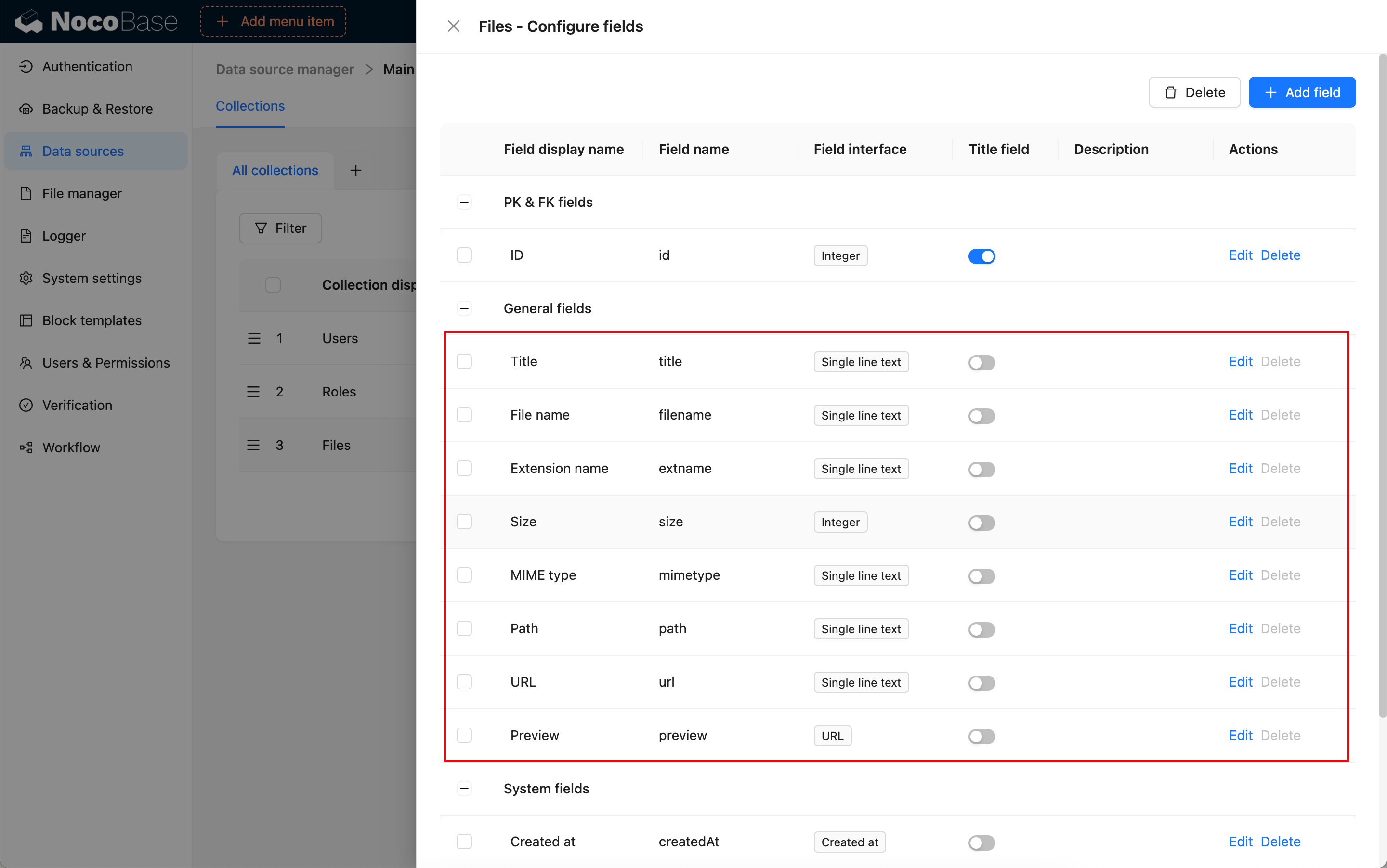
Using in Blocks
Association Field
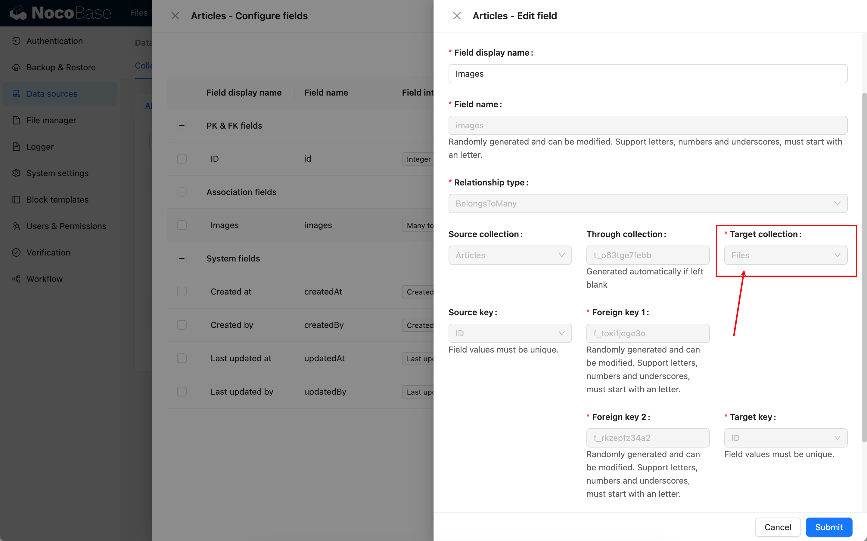
Association Blocks
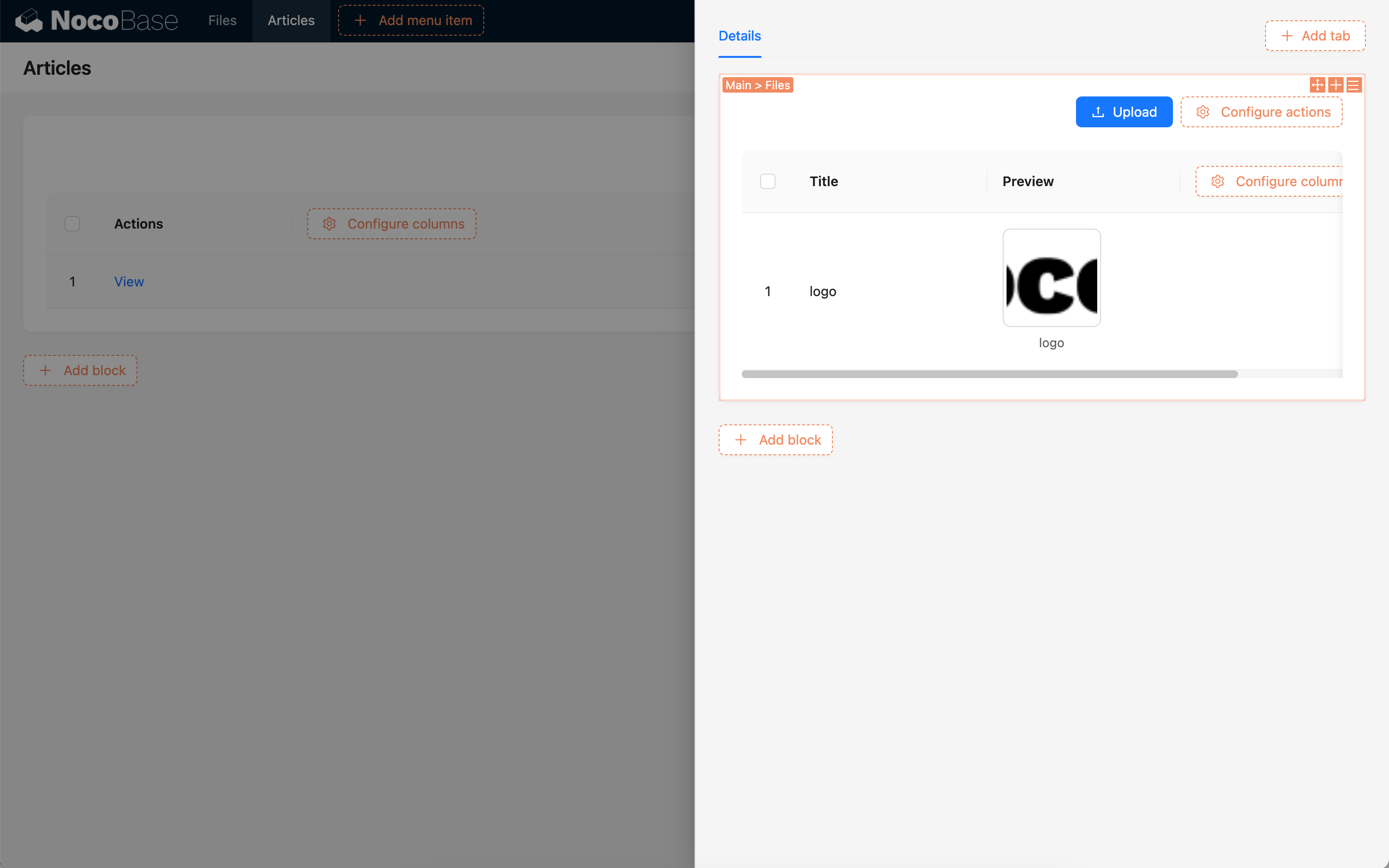
---
url: /data-sources/file-manager/http-api.md
---
# HTTP API
File uploads for both attachment fields and file collections can be handled via the HTTP API. The method of invocation differs depending on the storage engine used by the attachment or file collection.
## Server-side Upload
For built-in open-source storage engines like S3, OSS, and COS, the HTTP API call is the same as the one used by the user interface upload feature, where files are uploaded through the server. API calls require a user-based JWT token to be passed in the `Authorization` request header; otherwise, access will be denied.
### Attachment Field
Initiate a `create` action on the attachments resource (`attachments`) by sending a POST request and upload the binary content through the `file` field. After the call, the file will be uploaded to the default storage engine.
```shell
curl -X POST \
-H "Authorization: Bearer " \
-F "file=@" \
"http://localhost:3000/api/attachments:create"
```
To upload files to a different storage engine, you can use the `attachmentField` parameter to specify the storage engine configured for the collection field. If not configured, the file will be uploaded to the default storage engine.
```shell
curl -X POST \
-H "Authorization: Bearer " \
-F "file=@" \
"http://localhost:3000/api/attachments:create?attachmentField=."
```
### File Collection
Uploading to a file collection will automatically generate a file record. Initiate a `create` action on the file collection resource by sending a POST request and upload the binary content through the `file` field.
```shell
curl -X POST \
-H "Authorization: Bearer " \
-F "file=@" \
"http://localhost:3000/api/:create"
```
When uploading to a file collection, there is no need to specify a storage engine; the file will be uploaded to the storage engine configured for that collection.
## Client-side Upload
For S3-compatible storage engines provided through the commercial S3-Pro plugin, the HTTP API upload requires several steps.
### Attachment Field
1. Get storage engine information
Initiate a `getBasicInfo` action on the storages collection (`storages`), including the storage name, to request the storage engine's configuration information.
```shell
curl 'http://localhost:13000/api/storages:getBasicInfo/' \
-H 'Authorization: Bearer '
```
Example of returned storage engine configuration information:
```json
{
"id": 2,
"title": "xxx",
"name": "xxx",
"type": "s3-compatible",
"rules": { ... }
}
```
2. Get the presigned URL from the service provider
Initiate a `createPresignedUrl` action on the `fileStorageS3` resource by sending a POST request with file-related information in the body to obtain the presigned upload information.
```shell
curl 'http://localhost:13000/api/fileStorageS3:createPresignedUrl' \
-X POST \
-H 'Accept: application/json, text/plain, */*' \
-H 'Authorization: Bearer ' \
-H 'Content-Type: application/json' \
--data-raw '{"name":,"size":,"type":,"storageId":,"storageType":}'
```
> Note:
>
> * `name`: File name
> * `size`: File size (in bytes)
> * `type`: The MIME type of the file. You can refer to [Common MIME types](https://developer.mozilla.org/en-US/docs/Web/HTTP/MIME_types/Common_types)
> * `storageId`: The ID of the storage engine (the `id` field returned in step 1).
> * `storageType`: The type of the storage engine (the `type` field returned in step 1).
>
> Example request data:
>
> ```
> --data-raw '{"name":"a.png","size":4405,"type":"image/png","storageId":2,"storageType":"s3-compatible"}'
> ```
The data structure of the obtained presigned information is as follows:
```json
{
"putUrl": "https://xxxxxxx",
"fileInfo": {
"key": "xxx",
"title": "xxx",
"filename": "xxx",
"extname": ".png",
"size": 4405,
"mimetype": "image/png",
"meta": {},
"url": ""
}
}
```
3. Upload the file
Use the returned `putUrl` to make a `PUT` request, uploading the file as the body.
```shell
curl '' \
-X 'PUT' \
-T
```
> Note:
>
> * `putUrl`: The `putUrl` field returned in the previous step.
> * `file_path`: The local path of the file to be uploaded.
>
> Example request data:
>
> ```
> curl 'https://xxxxxxx' \
> -X 'PUT' \
> -T /Users/Downloads/a.png
> ```
4. Create the file record
After a successful upload, create the file record by initiating a `create` action on the attachments resource (`attachments`) with a POST request.
```shell
curl 'http://localhost:13000/api/attachments:create?attachmentField=.' \
-X POST \
-H 'Accept: application/json, text/plain, */*' \
-H 'Authorization: Bearer ' \
-H 'Content-Type: application/json' \
--data-raw '{"title":,"filename":<filename>,"extname":<extname>,"path":"","size":<size>,"url":"","mimetype":<mimetype>,"meta":<meta>,"storageId":<storageId>}'
```
> Explanation of dependent data in `data-raw`:
>
> * `title`: The `fileInfo.title` field returned in the previous step.
> * `filename`: The `fileInfo.key` field returned in the previous step.
> * `extname`: The `fileInfo.extname` field returned in the previous step.
> * `path`: Empty by default.
> * `size`: The `fileInfo.size` field returned in the previous step.
> * `url`: Empty by default.
> * `mimetype`: The `fileInfo.mimetype` field returned in the previous step.
> * `meta`: The `fileInfo.meta` field returned in the previous step.
> * `storageId`: The `id` field returned in step 1.
>
> Example request data:
>
> ```
> --data-raw '{"title":"ATT00001","filename":"ATT00001-8nuuxkuz4jn.png","extname":".png","path":"","size":4405,"url":"","mimetype":"image/png","meta":{},"storageId":2}'
> ```
### File Collection
The first three steps are the same as for uploading to an attachment field. However, in the fourth step, you need to create the file record by initiating a `create` action on the file collection resource with a POST request, uploading the file information in the body.
```shell
curl 'http://localhost:13000/api/<file_collection_name>:create' \
-H 'Authorization: Bearer <JWT>' \
-H 'Content-Type: application/json' \
--data-raw '{"title":<title>,"filename":<filename>,"extname":<extname>,"path":"","size":<size>,"url":"","mimetype":<mimetype>,"meta":<meta>,"storageId":<storageId>}'
```
> Explanation of dependent data in `data-raw`:
>
> * `title`: The `fileInfo.title` field returned in the previous step.
> * `filename`: The `fileInfo.key` field returned in the previous step.
> * `extname`: The `fileInfo.extname` field returned in the previous step.
> * `path`: Empty by default.
> * `size`: The `fileInfo.size` field returned in the previous step.
> * `url`: Empty by default.
> * `mimetype`: The `fileInfo.mimetype` field returned in the previous step.
> * `meta`: The `fileInfo.meta` field returned in the previous step.
> * `storageId`: The `id` field returned in step 1.
>
> Example request data:
>
> ```
> --data-raw '{"title":"ATT00001","filename":"ATT00001-8nuuxkuz4jn.png","extname":".png","path":"","size":4405,"url":"","mimetype":"image/png","meta":{},"storageId":2}'
> ```
---
url: /data-sources/file-manager/index.md
---
# File Manager
## Introduction
The File Manager plugin provides a file collection, attachment field, and file storage engines for effectively managing files. Files are records in a special type of collection, known as a file collection, which stores file metadata and can be managed through the File Manager. Attachment fields are specific association fields associated with the file collection. The plugin supports multiple storage methods, including local storage, Alibaba Cloud OSS, Amazon S3, and Tencent Cloud COS.
## User Manual
### File Collection
An attachments collection is built-in to store all files associated with attachment fields. Additionally, new file collections can be created to store specific files.
[Learn more in the File Collection documentation](/data-sources/file-manager/file-collection)
### Attachment Field
Attachment fields are specific association fields related to the file collection, which can be created through the "Attachment" field type or configured through an "Association" field.
[Learn more in the Attachment Field documentation](/data-sources/file-manager/field-attachment)
### File Storage Engine
The file storage engine is used to save files to specific services, including local storage (saving to the server's hard drive), cloud storage, etc.
[Learn more in the File Storage Engine documentation](./storage/index.md)
### HTTP API
File uploads can be handled via the HTTP API, see [HTTP API](./http-api.md).
## Development
*
---
url: /data-sources/file-manager/storage/aliyun-oss.md
---
# Aliyun OSS
Storage engine based on Aliyun OSS. You need to prepare the relevant accounts and permissions in advance.
## Configuration
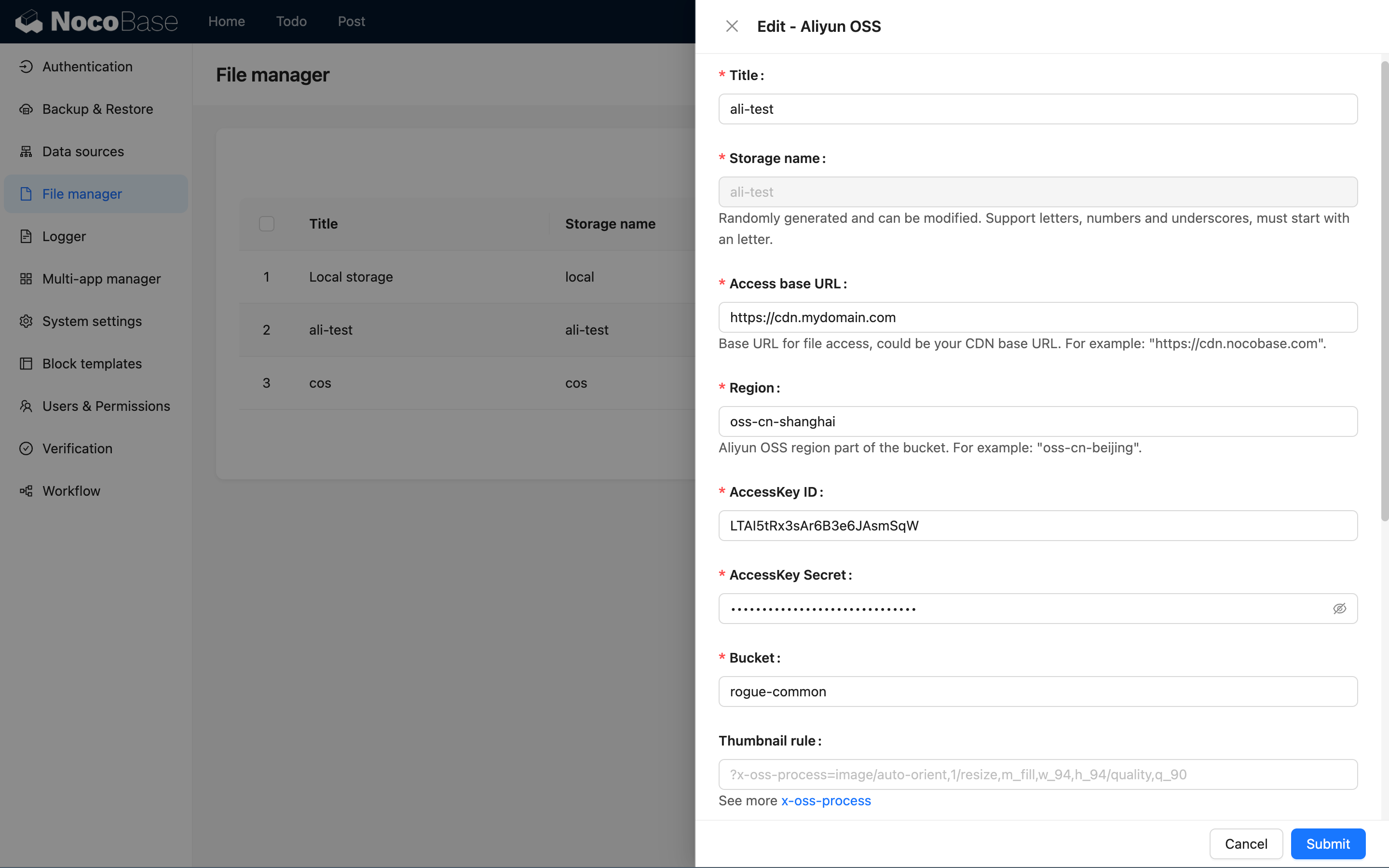
:::info{title=Note}
Only the specific parameters for the Aliyun OSS storage engine are introduced here. For common parameters, please refer to [Common Engine Parameters](./index.md#common-engine-parameters).
:::
### Region
Specify the region of the OSS storage, for example: `oss-cn-hangzhou`.
:::info{title=Note}
You can view the region information of the storage bucket in the [Aliyun OSS console](https://oss.console.aliyun.com/). You only need to use the prefix part of the region (without the full domain name).
:::
### AccessKey ID
Fill in the ID of the Alibaba Cloud authorized access key.
### AccessKey Secret
Fill in the secret of the Alibaba Cloud authorized access key.
### Bucket
Fill in the name of the OSS bucket.
---
url: /data-sources/file-manager/storage/amazon-s3.md
---
# Amazon S3
:::warning
Documentation Pending
:::
<!--
## Introduction
## Handbook -->
---
url: /data-sources/file-manager/storage/index.md
---
# Overview
## Built-in Engines
Currently, NocoBase supports the following built-in engine types:
- [Local Storage](./local.md)
- [Alibaba Cloud OSS](./aliyun-oss.md)
- [Amazon S3](./amazon-s3.md)
- [Tencent Cloud COS](./tencent-cos.md)
A local storage engine is automatically added during system installation and can be used directly. You can also add new engines or edit the parameters of existing ones.
## Common Engine Parameters
In addition to the specific parameters for different engine types, the following are common parameters (using local storage as an example):
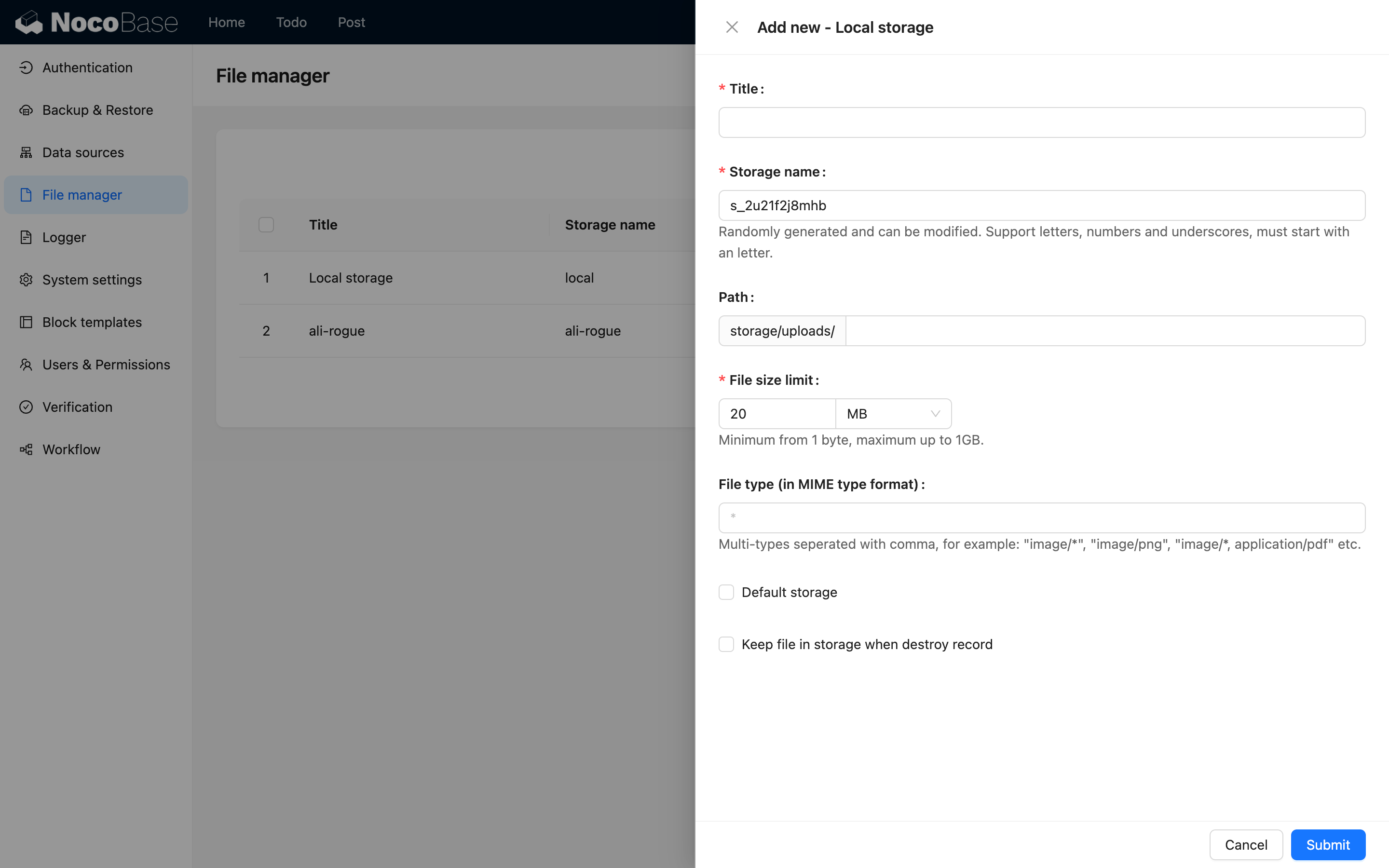
### Title
The name of the storage engine, used for human identification.
### System Name
The system name of the storage engine, used for system identification. It must be unique across the system. If left blank, it will be randomly generated by the system.
### Access base URL
The prefix of the URL address for external access to the file. This can be the base URL of a CDN, for example: "`https://cdn.nocobase.com/app`" (without the trailing "`/`").
### Path
The relative path used when storing files. This part will also be automatically concatenated to the final URL when accessed. For example: "`user/avatar`" (without the leading or trailing "`/`").
### File Size Limit
The size limit for files uploaded to this storage engine. Files exceeding this size cannot be uploaded. The system default limit is 20MB, and the maximum adjustable limit is 1GB.
### File Type
Limits the types of files that can be uploaded, using the [MIME](https://developer.mozilla.org/en-US/docs/Web/HTTP/Basics_of_HTTP/MIME_types) syntax description format. For example, `image/*` represents image files. Multiple types can be separated by commas, such as `image/*, application/pdf` to allow both image and PDF files.
### Default Storage Engine
When checked, this is set as the system's default storage engine. When an attachment field or file collection does not specify a storage engine, uploaded files will be saved to the default storage engine. The default storage engine cannot be deleted.
### Keep Files When Destroying Records
When checked, uploaded files in the storage engine are retained even when the data records in the attachment or file collection are deleted. By default, this is unchecked, meaning files in the storage engine are deleted along with the records.
:::info{title=Tip}
After a file is uploaded, the final access path is constructed by concatenating several parts:
```
<Access base URL>/<Path>/<FileName><Extension>
```
For example: `https://cdn.nocobase.com/app/user/avatar/20240529115151.png`.
:::
---
url: /data-sources/file-manager/storage/local.md
---
# Local storage
Uploaded files will be saved in a local directory on the server. This is suitable for small-scale or experimental scenarios where the total number of files managed by the system is relatively small.
## Options

:::info{title=Note}
This section only covers the specific options for the local storage engine. For common parameters, please refer to the [General Engine Parameters](./index.md#general-engine-parameters).
:::
### Path
The path represents both the relative path of the file stored on the server and the URL access path. For example, "`user/avatar`" (without the leading and trailing "`/`") represents:
1. The relative path of the uploaded file stored on the server: `/path/to/nocobase-app/storage/uploads/user/avatar`.
2. The URL prefix for accessing the file: `http://localhost:13000/storage/uploads/user/avatar`.
---
url: /data-sources/file-manager/storage/s3-pro.md
---
# File Storage: S3 (Pro)
## Introduction
Building on the file management plugin, this version adds support for file storage types compatible with the S3 protocol. Any object storage service supporting the S3 protocol can be seamlessly integrated, such as Amazon S3, Alibaba Cloud OSS, Tencent Cloud COS, MinIO, Cloudflare R2, etc., enhancing the compatibility and flexibility of storage services.
## Features
1. **Client Upload:** Files are uploaded directly to the storage service without passing through the NocoBase server, enabling a more efficient and faster upload experience.
2. **Private Access:** All file URLs are signed temporary authorization addresses, ensuring secure and time-limited access to files.
## Use Cases
1. **File Table Management:** Centrally manage and store all uploaded files, supporting various file types and storage methods for easy classification and retrieval.
2. **Attachment Field Storage:** Store attachments uploaded via forms or records and associate them with specific data entries.
## Plugin Configuration
1. Enable the `plugin-file-storage-s3-pro` plugin.
2. Navigate to "Setting -> FileManager" to access the file management settings.
3. Click the "Add new" button and select "S3 Pro".
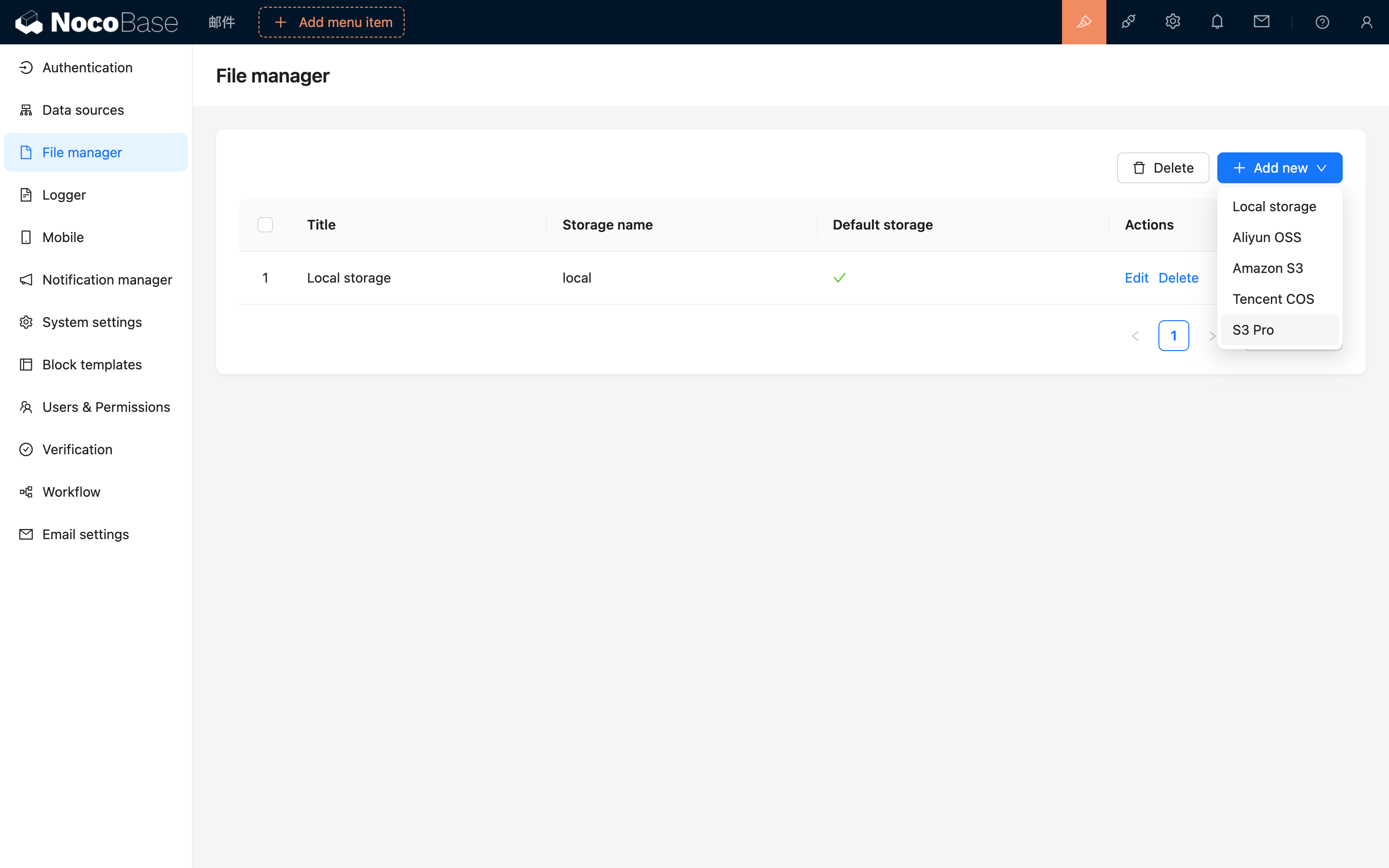
4. In the pop-up window, you will see a detailed form to fill out. Refer to the following documentation to obtain the relevant parameters for your file service and correctly input them into the form.
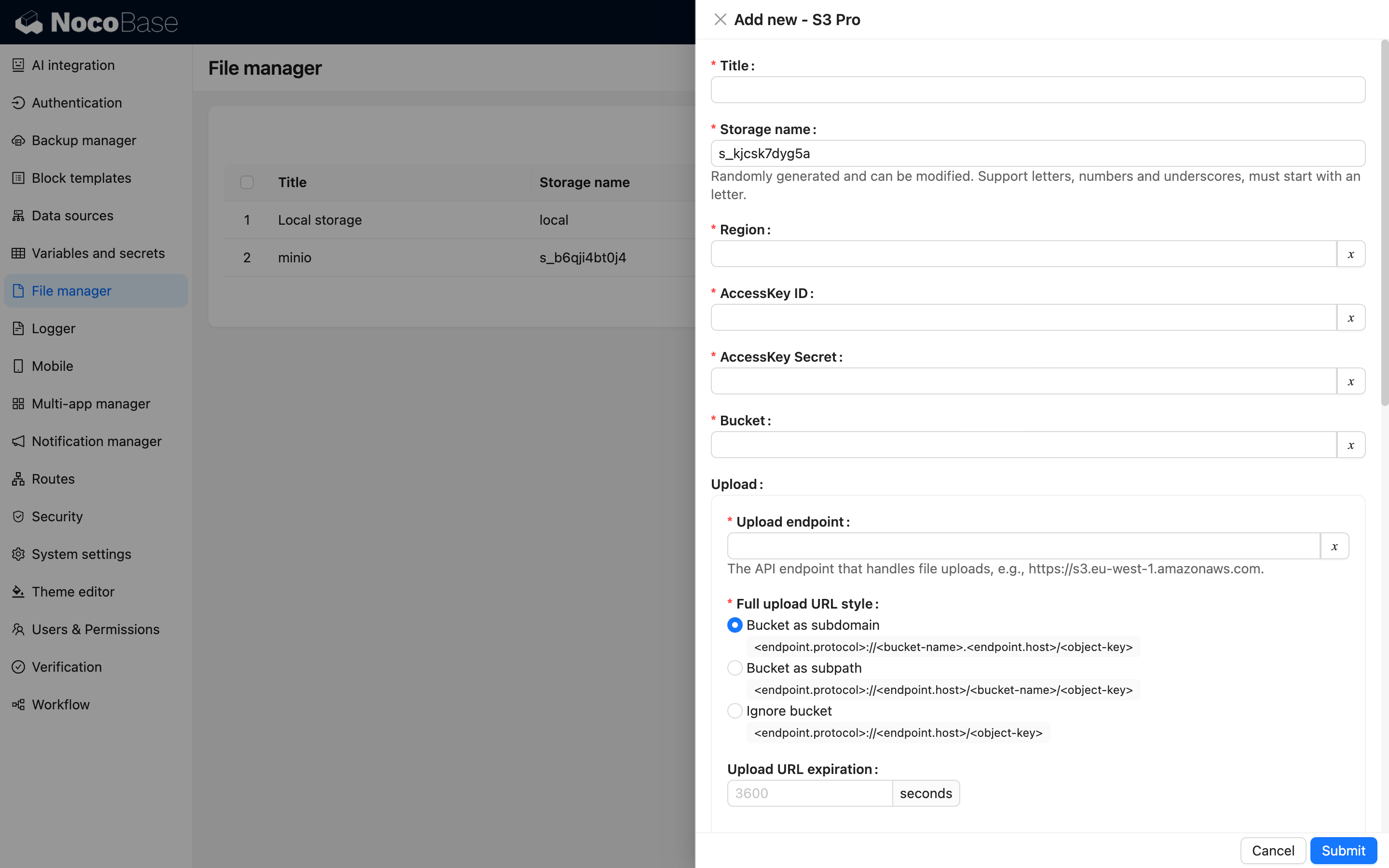
## Service Provider Configuration
### Amazon S3
#### Bucket Creation
1. Visit [Amazon S3 Console](https://ap-southeast-1.console.aws.amazon.com/s3/home).
2. Click the "Create bucket" button on the right-hand side.
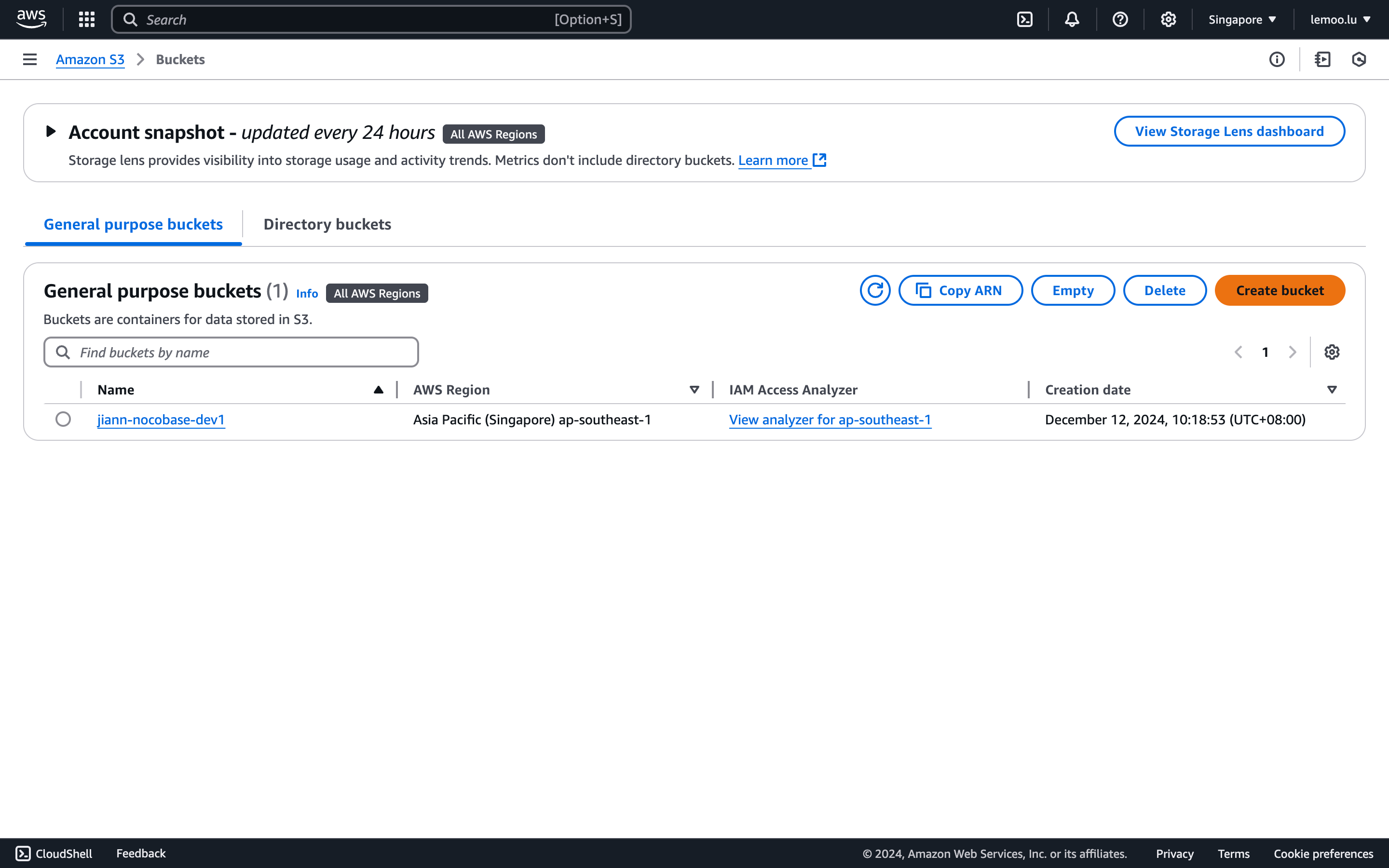
3. Fill in the `Bucket Name`, leave other fields as default, scroll to the bottom, and click the **"Create"** button to complete the process.
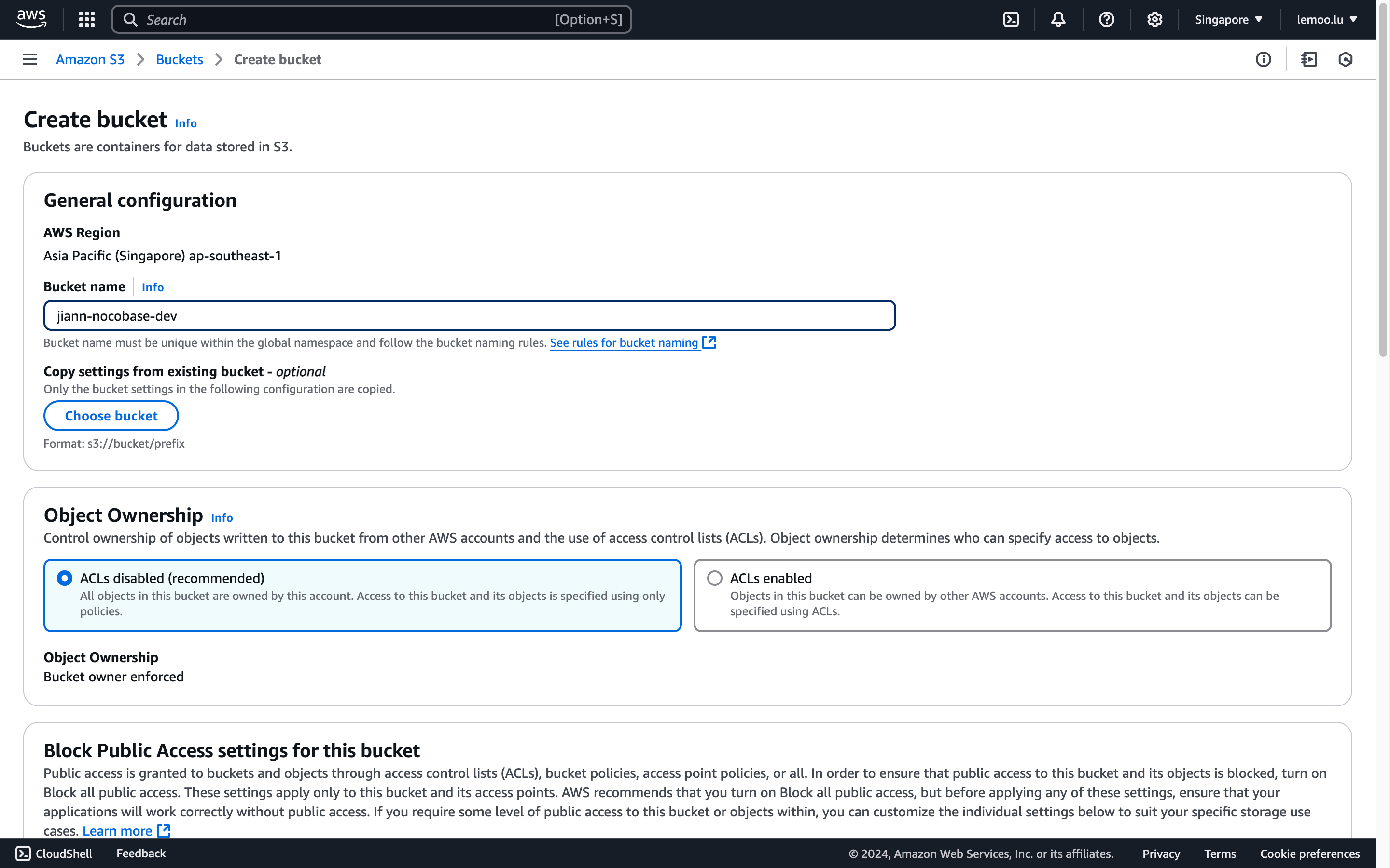
#### CORS Configuration
1. In the bucket list, find and click the newly created bucket to access its details.
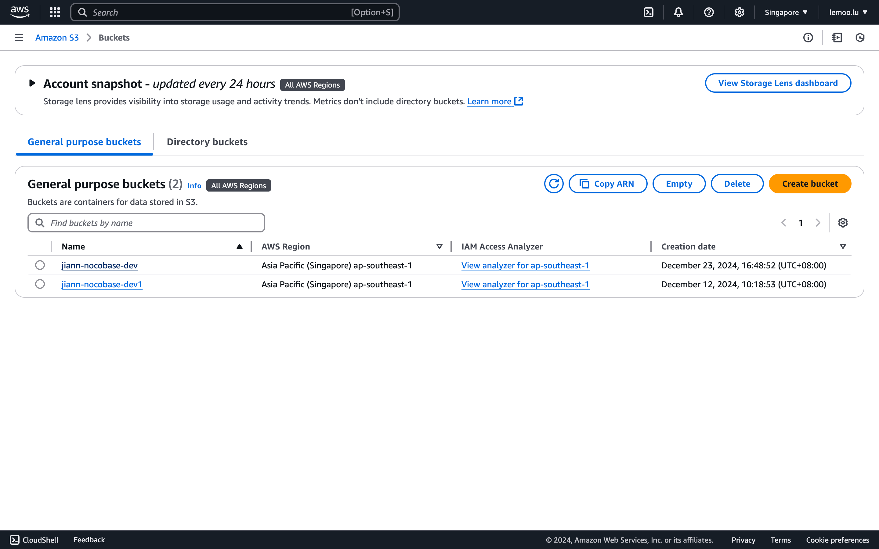
2. Navigate to the "Permission" tab and scroll down to the CORS configuration section.
3. Enter the following configuration (customize as needed) and save.
```json
[
{
"AllowedHeaders": [
"*"
],
"AllowedMethods": [
"POST",
"PUT"
],
"AllowedOrigins": [
"*"
],
"ExposeHeaders": [
"ETag"
],
"MaxAgeSeconds": 3000
}
]
```
#### AccessKey and SecretAccessKey Retrieval
1. Click the "Security credentials" button in the top-right corner.
2. Scroll to the "Access Keys" section and click "Create Access Key."
3. Agree to the terms (IAM usage is recommended for production environments).
4. Save the displayed Access Key and Secret Access Key.
#### Parameter Retrieval and Configuration
1. Use the retrieved `AccessKey ID` and `AccessKey Secret`.
2. Visit the bucket's properties panel to find the `Bucket Name` and `Region`.
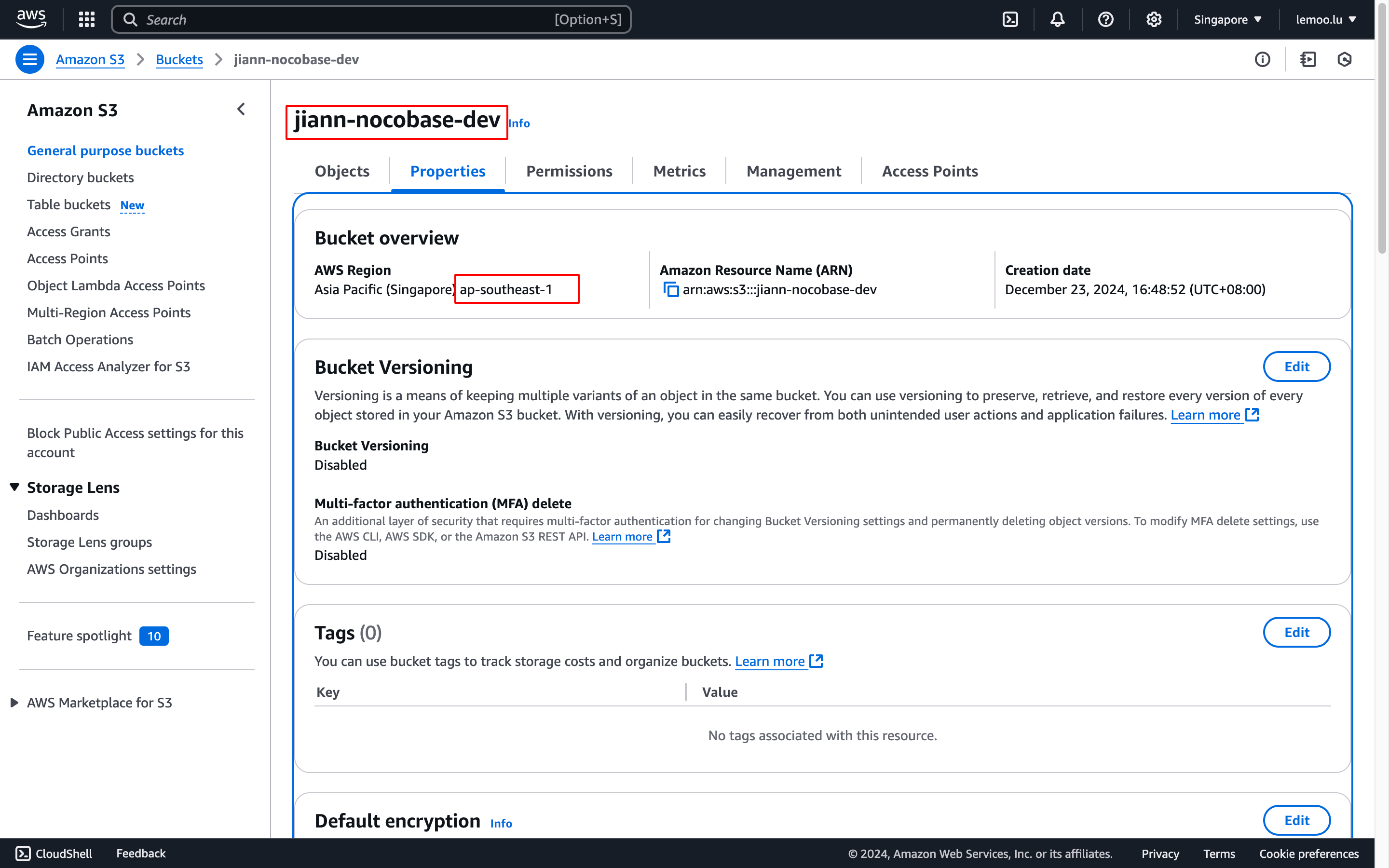
#### Public Access (Optional)
This is an optional configuration. Configure it when you need to make uploaded files completely public.
1. In the Permissions panel, scroll to "Object Ownership," click "Edit," and enable ACLs.
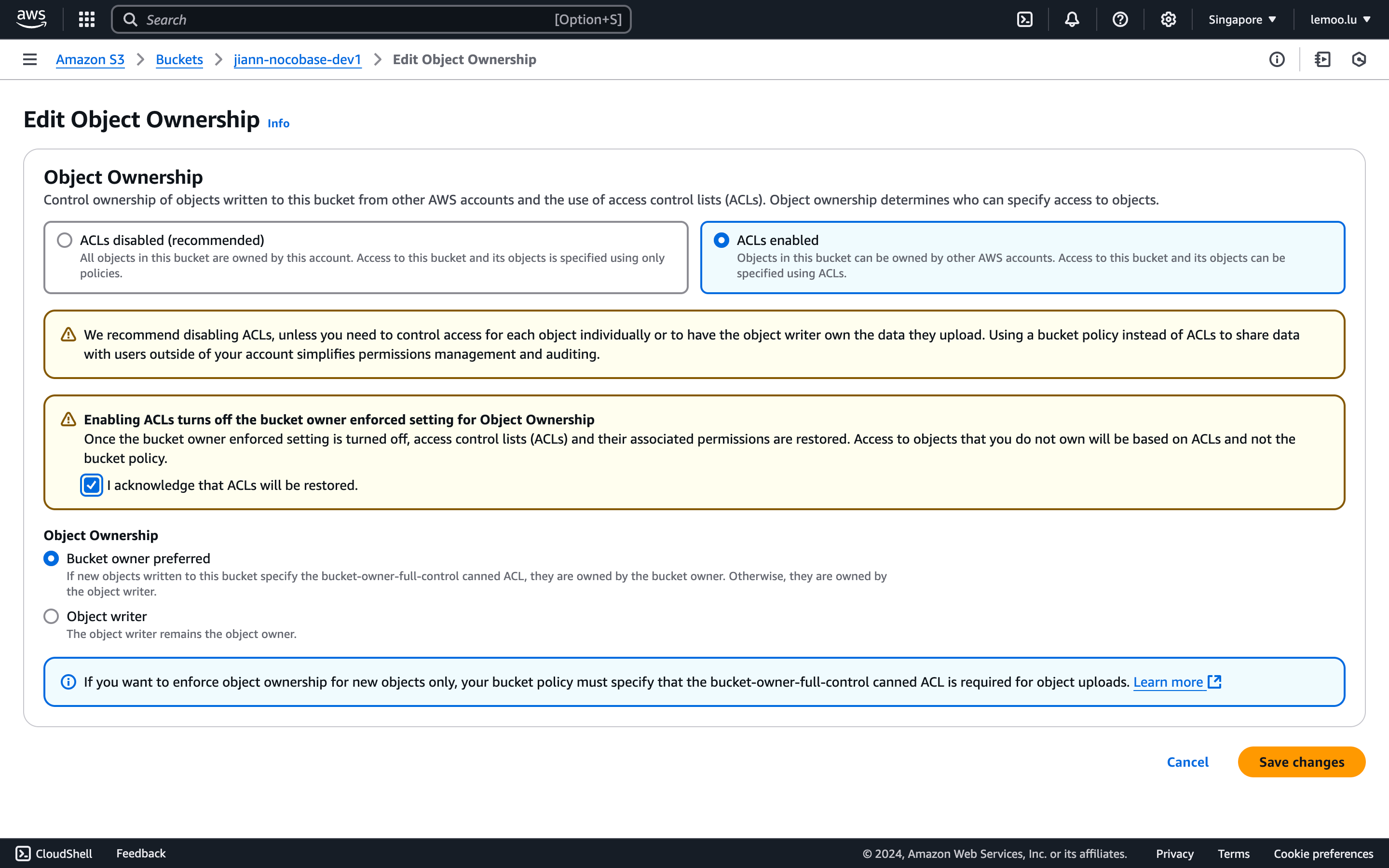
2. Scroll to "Block public access," click "Edit," and set it to allow ACL control.
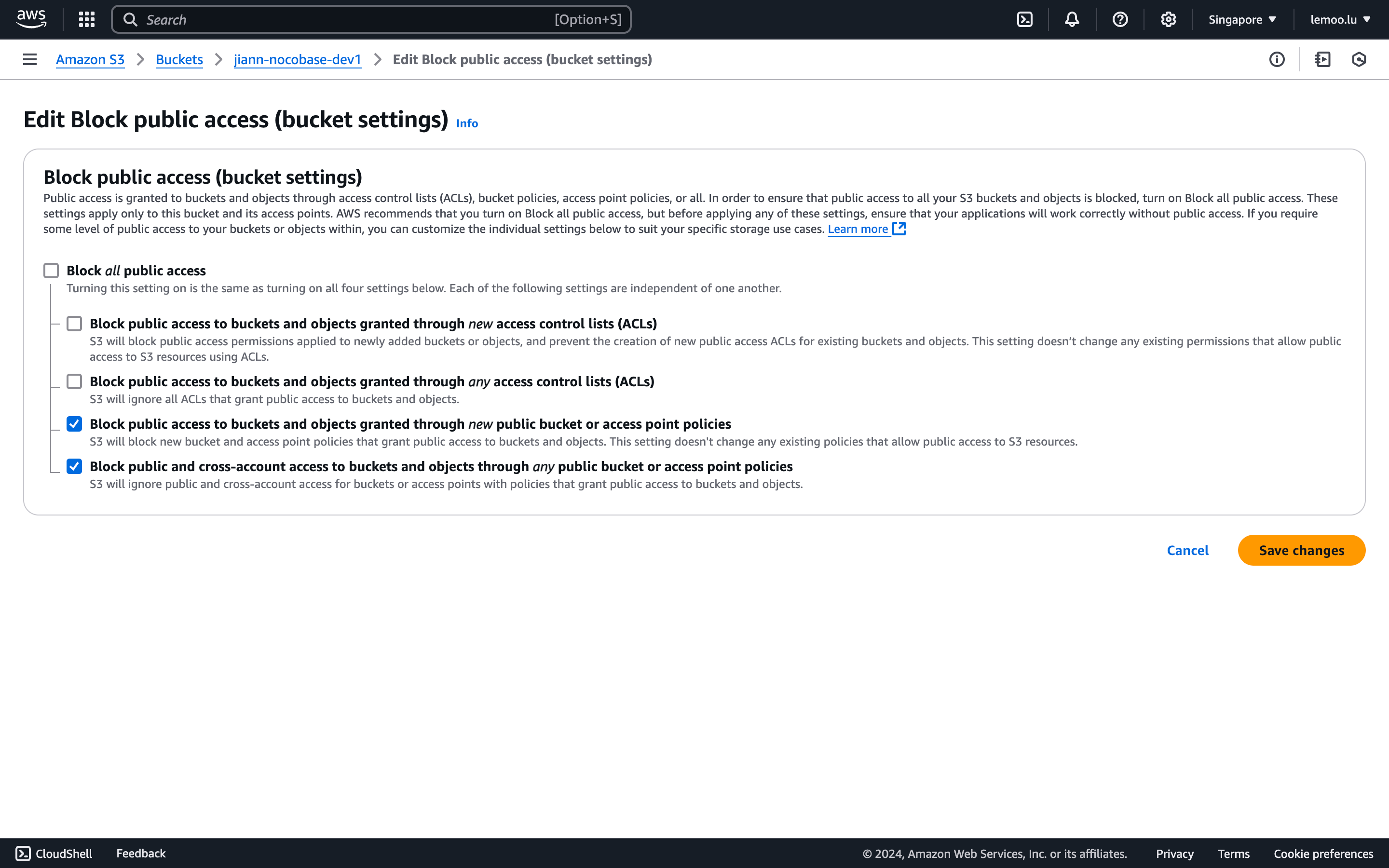
3. Check "Public access" in NocoBase.
#### Thumbnail Configuration (Optional)
This configuration is optional and should be used when you need to optimize the image preview size or effect. **Please note, this deployment may incur additional costs. For more details, refer to AWS's terms and pricing.**
1. Visit [Dynamic Image Transformation for Amazon CloudFront](https://aws.amazon.com/solutions/implementations/dynamic-image-transformation-for-amazon-cloudfront/?nc1=h_ls).
2. Click the `Launch in the AWS Console` button at the bottom of the page to start the deployment.
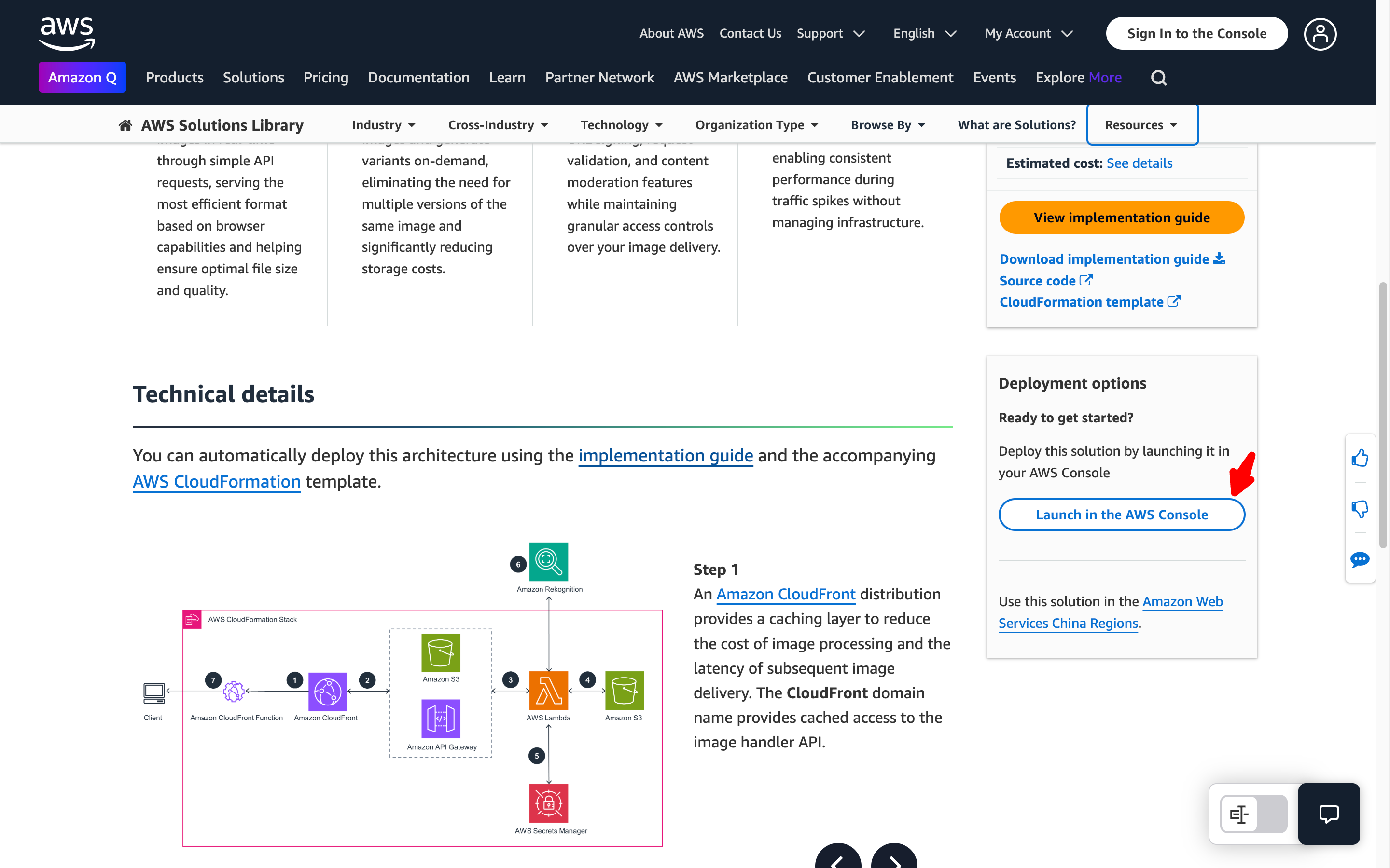
3. Follow the prompts to complete the configuration. The following options need special attention:
1. When creating the stack, you need to specify the Amazon S3 bucket name that contains the source images. Please enter the bucket name you created earlier.
2. If you chose to deploy the demo UI, after deployment, you can use the UI to test the image processing functionality. In the AWS CloudFormation console, select your stack, go to the "Outputs" tab, find the value corresponding to the `DemoUrl` key, and click the link to open the demo interface.
3. This solution uses the `sharp` Node.js library for efficient image processing. You can download the source code from the GitHub repository and customize it as needed.
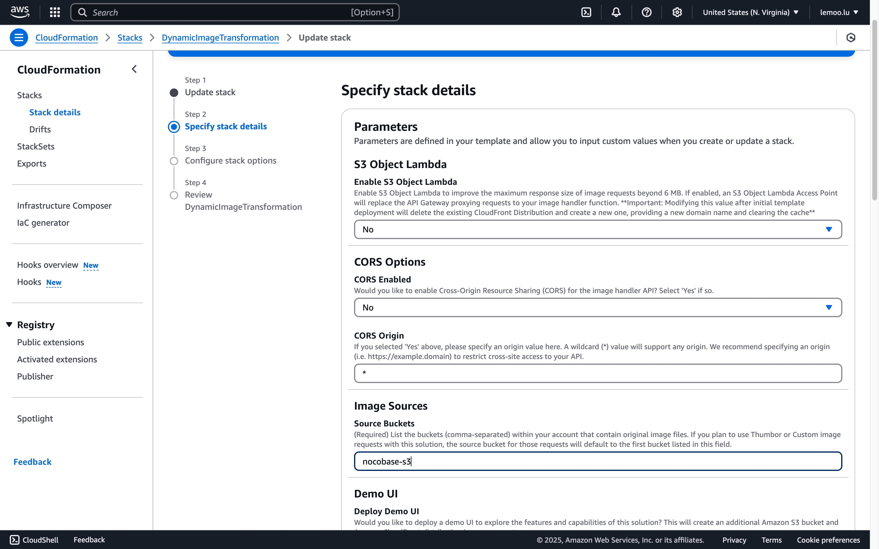
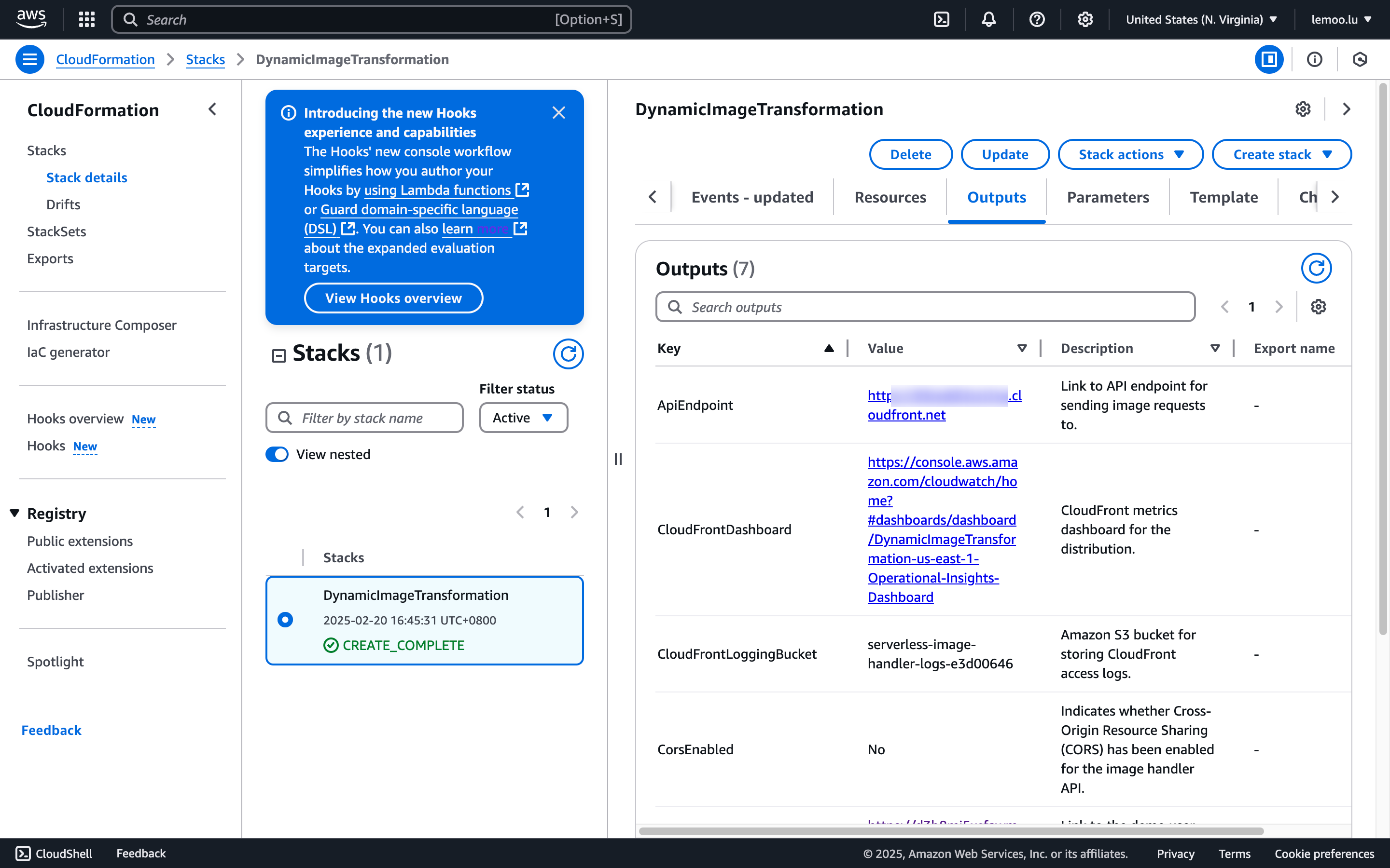
4. Once the configuration is complete, wait for the deployment status to change to `CREATE_COMPLETE`.
5. In the NocoBase configuration, please note the following:
1. `Thumbnail rule`: Fill in the image processing parameters, such as `?width=100`. For details, refer to the [AWS documentation](https://docs.aws.amazon.com/solutions/latest/serverless-image-handler/use-supported-query-param-edits.html).
2. `Access endpoint`: Enter the value from Outputs -> ApiEndpoint after deployment.
3. `Full access URL style`: Select **Ignore** (as the bucket name has already been filled in the configuration, it is not needed for access).
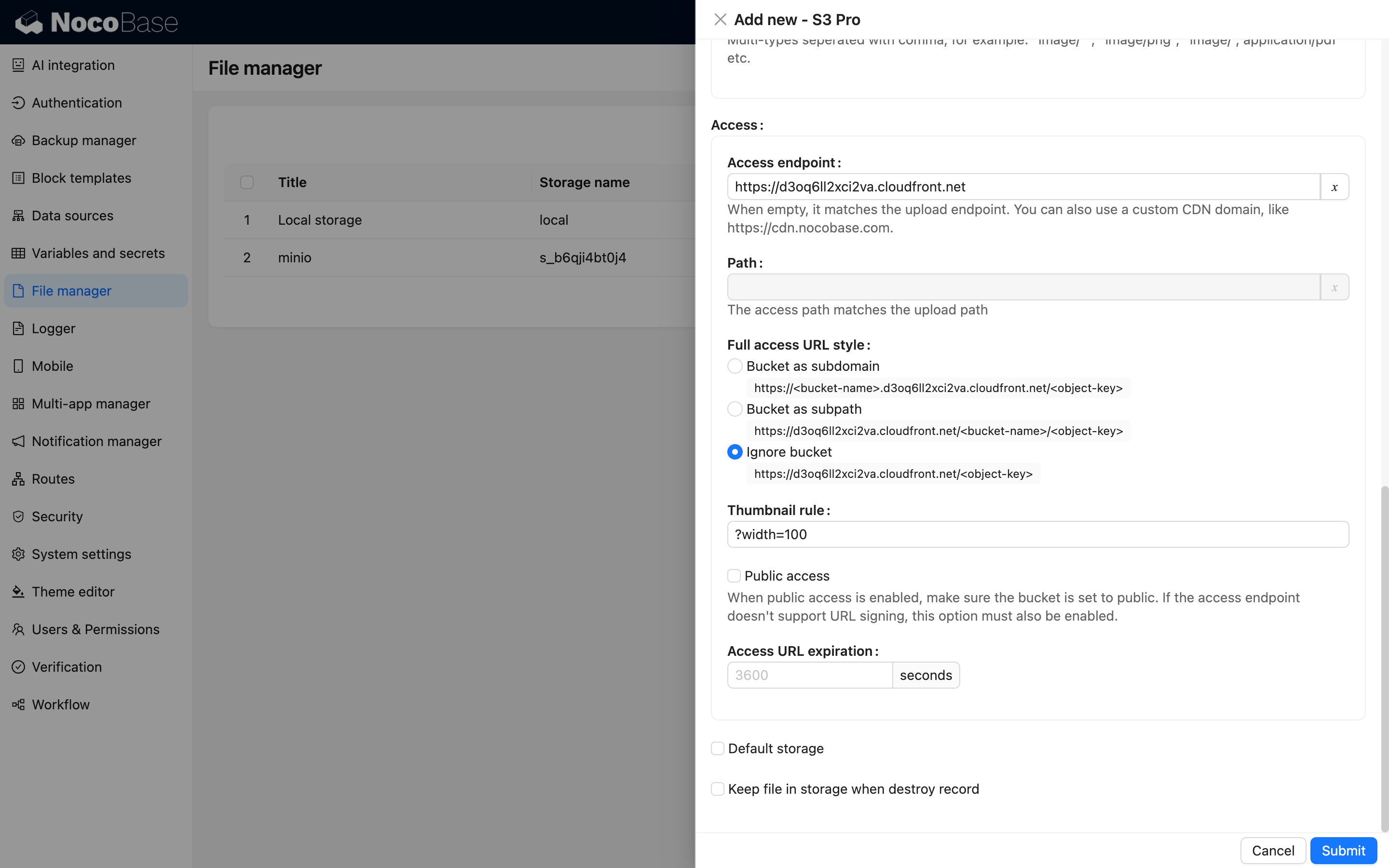
#### Configuration Example
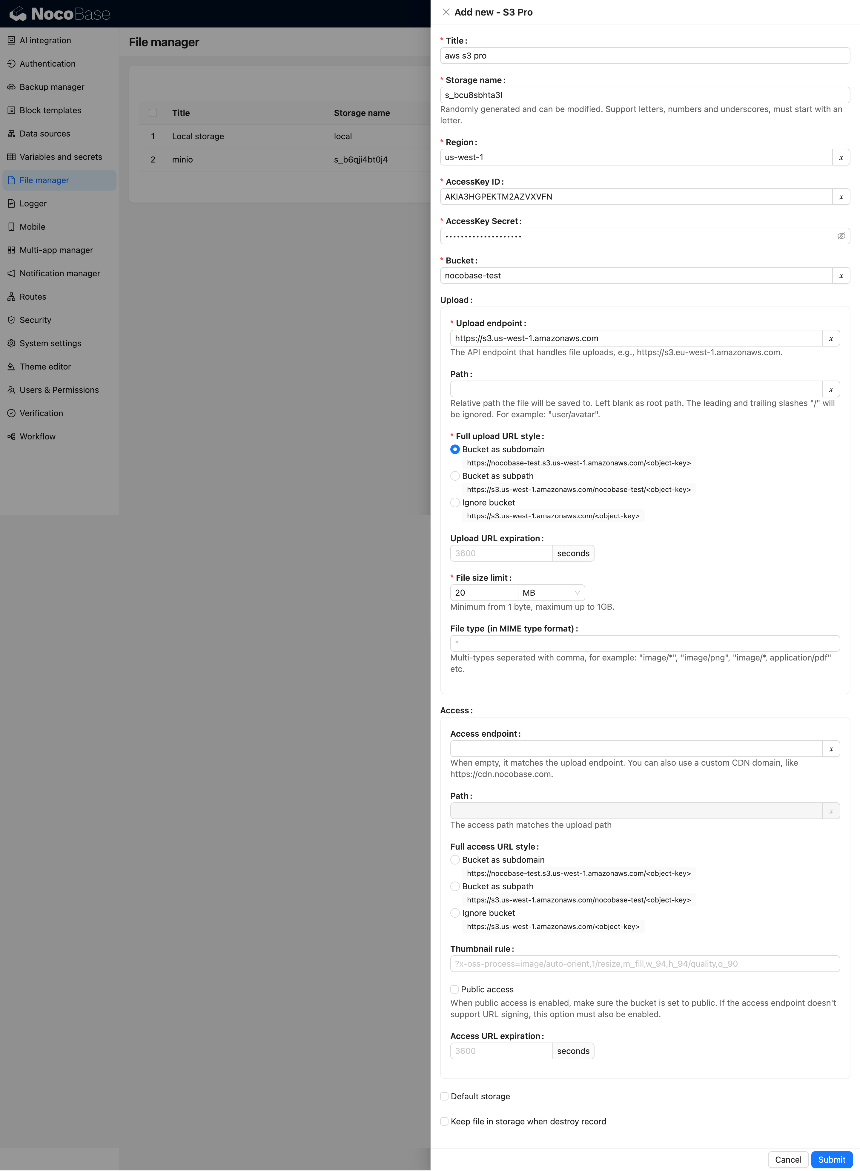
### Alibaba Cloud OSS
#### Bucket Creation
1. Open the [OSS Console](https://oss.console.aliyun.com/overview).
2. Select "Buckets" from the left menu and click "Create Bucket."
3. Fill in the bucket details and click "Create."
- `Bucket Name`: Choose based on your business needs.
- `Region`: Select the nearest region for your users.
- Other settings can remain default or customized as needed.
#### CORS Configuration
1. Navigate to the bucket details page of the bucket you just created.
2. Click "Content Security -> CORS" in the middle menu.
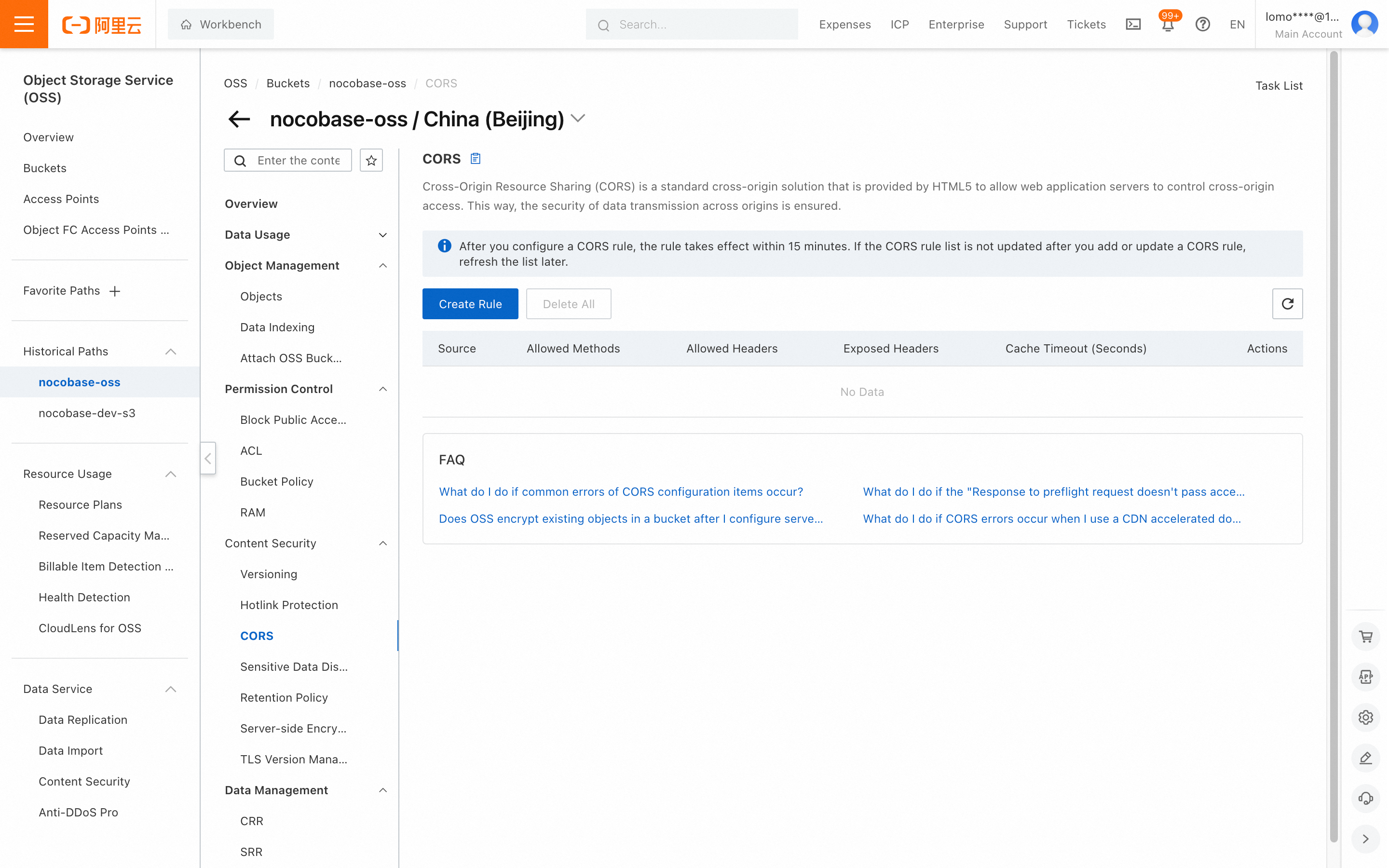
3. Click "Create Rule," complete the fields, scroll down, and click "OK." You can refer to the screenshot below or configure more detailed settings.
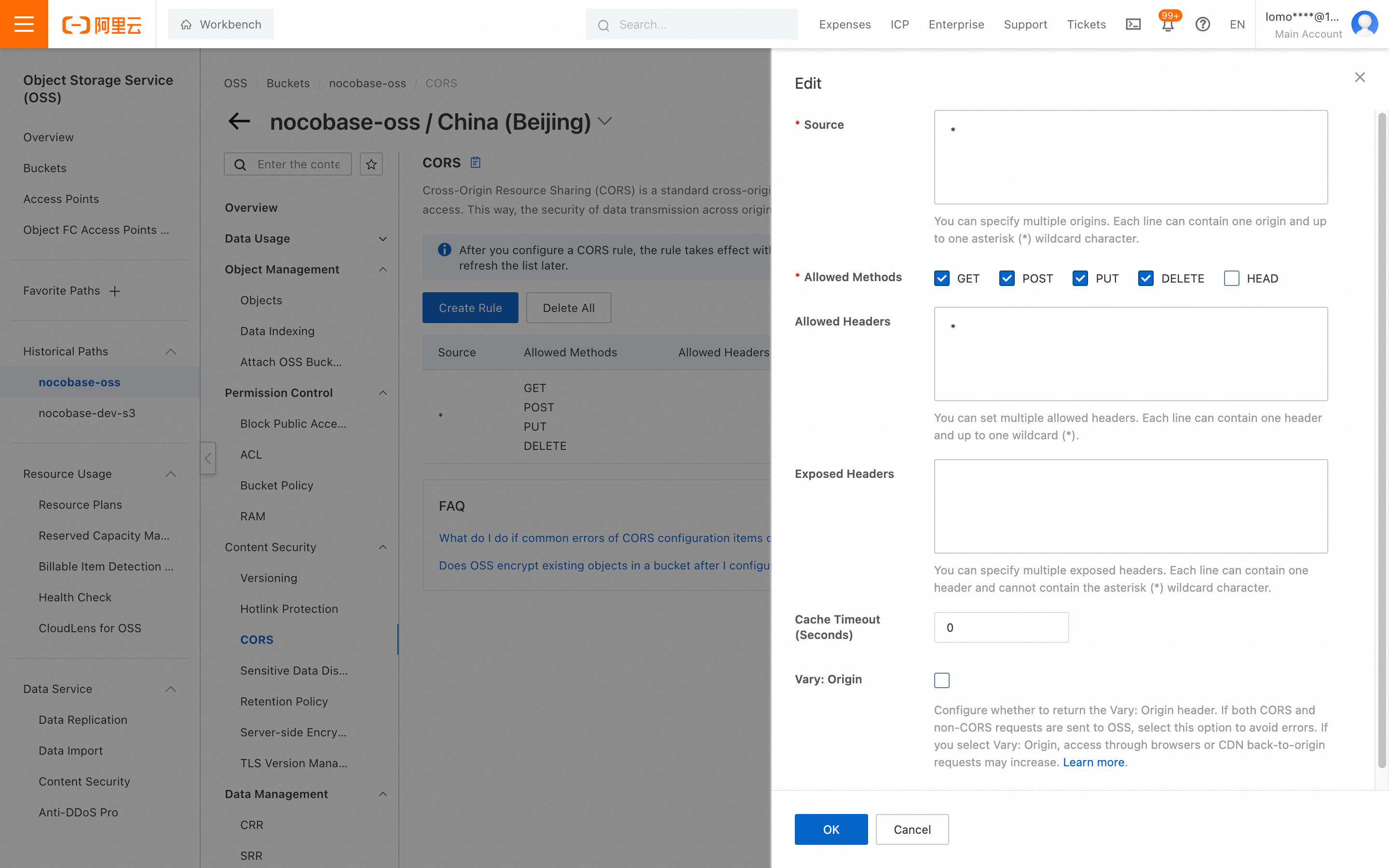
#### AccessKey and SecretAccessKey Retrieval
1. Click "AccessKey" under your account avatar in the top right corner.
2. For demonstration purposes, we will create an AccessKey using the main account. In a production environment, it is recommended to use RAM to create the AccessKey. For instructions, please refer to the [Alibaba Cloud documentation](https://www.alibabacloud.com/help/en/ram/user-guide/create-an-accesskey-pair).
3. Click the "Create AccessKey" button.
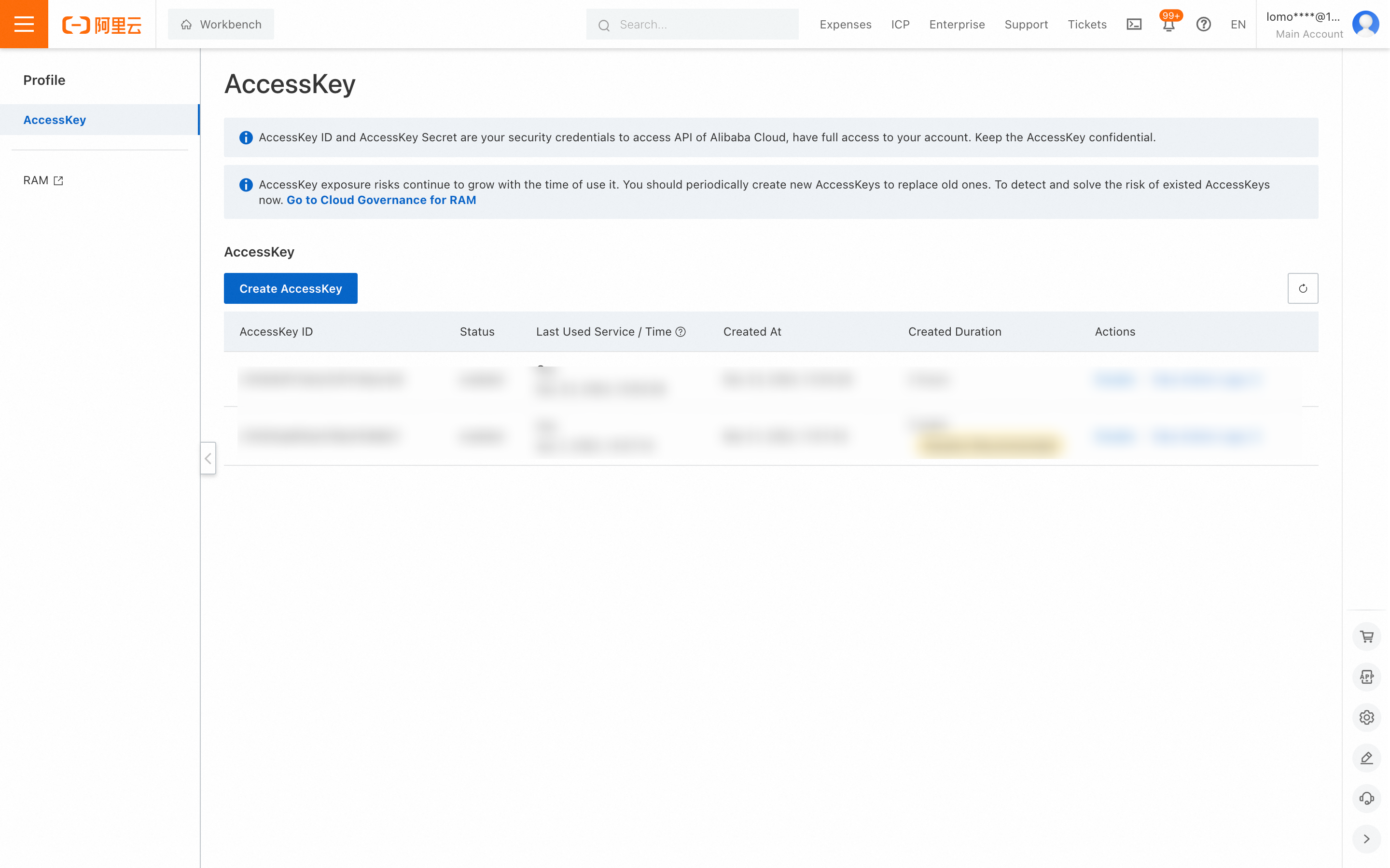
4. Complete the account verification.
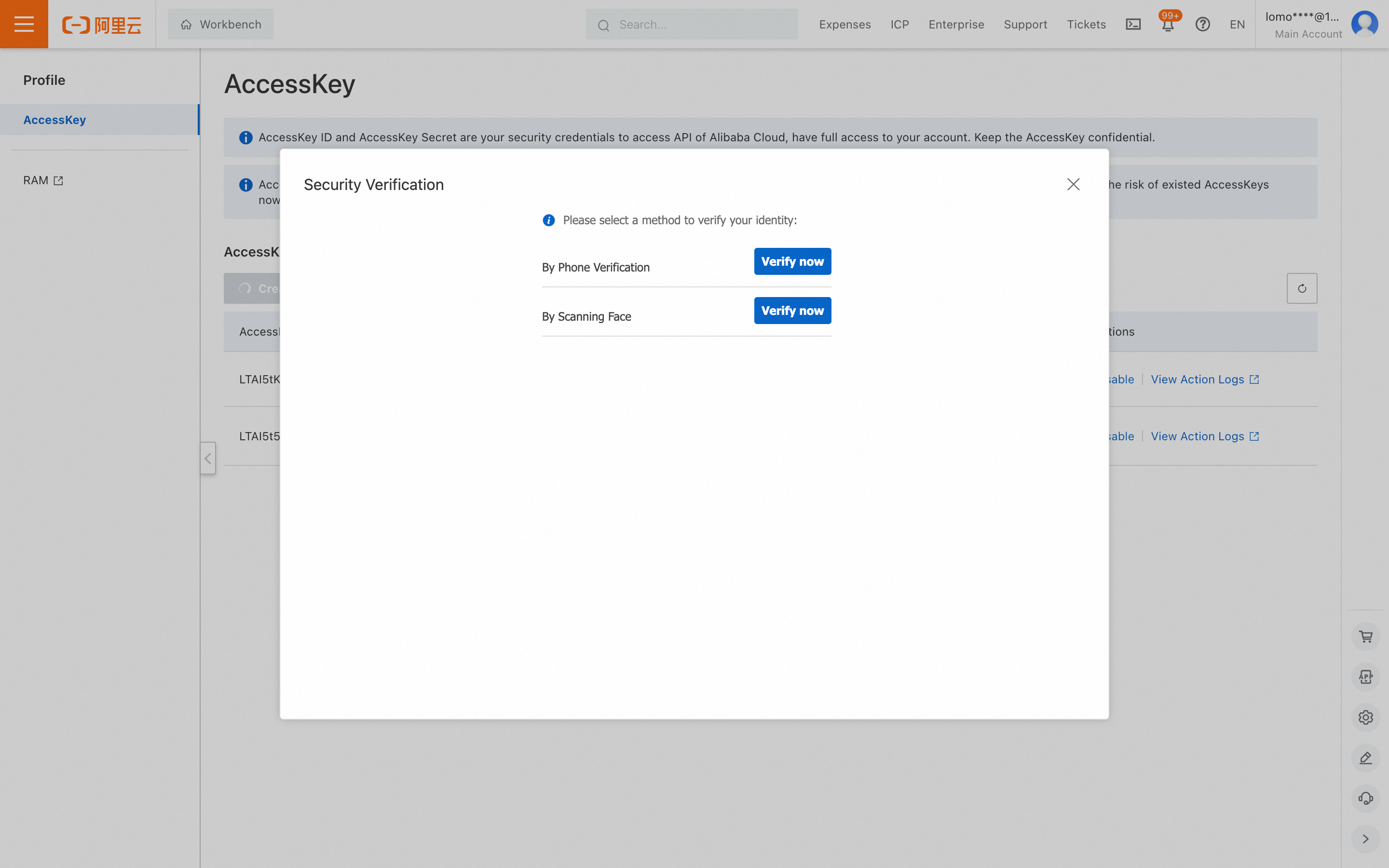
5. Save the displayed Access Key and Secret Access Key.
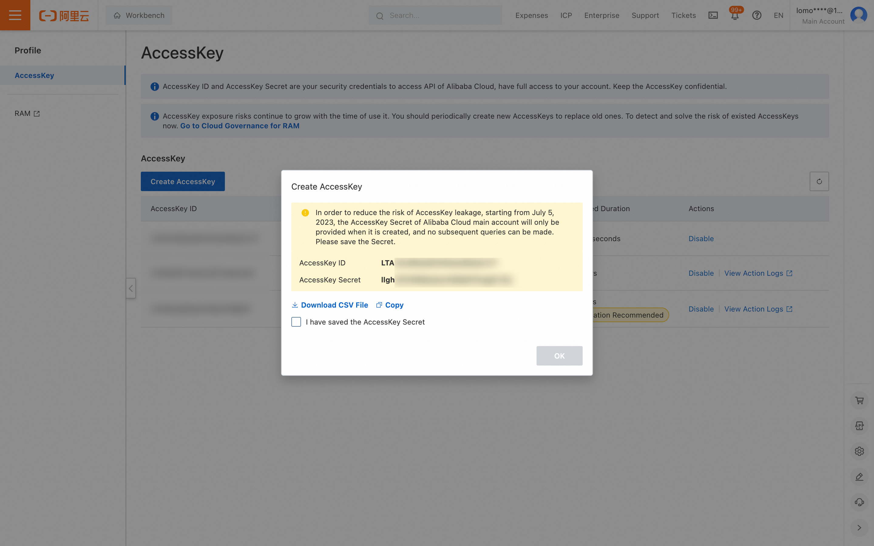
#### Parameter Retrieval and Configuration
1. Use the `AccessKey ID` and `AccessKey Secret` obtained in the previous step.
2. Go to the bucket details page to get the `Bucket` name.
3. Scroll down to get the `Region` (the trailing ".aliyuncs.com" is not needed).
4. Get the endpoint address and add the `https://` prefix when entering it into NocoBase.
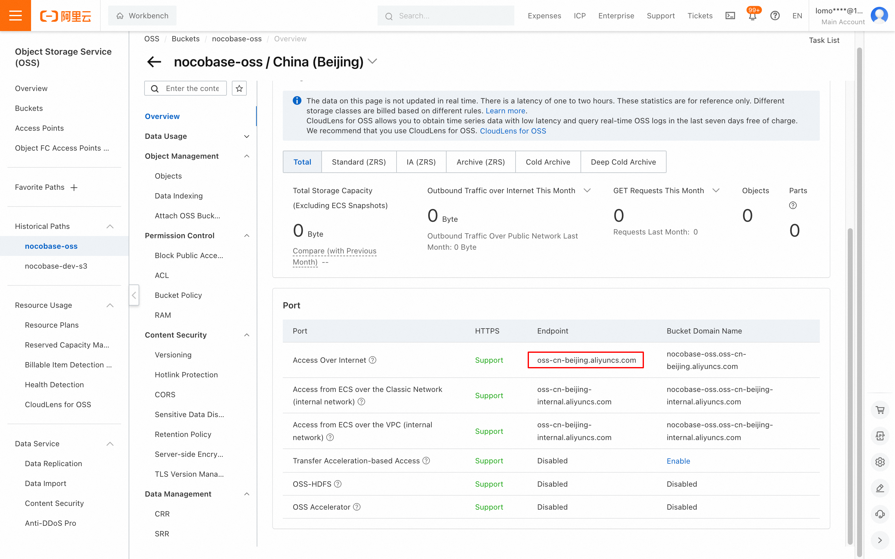
#### Thumbnail Configuration (Optional)
This configuration is optional and should only be used when optimizing the image preview size or effect.
1. Fill in the relevant parameters for `Thumbnail rule`. For specific parameter settings, refer to the Alibaba Cloud documentation on [Image Processing](https://www.alibabacloud.com/help/en/oss/user-guide/image-processing).
2. Keep the `Full upload URL style` and `Full access URL style` settings the same.
#### Configuration Example
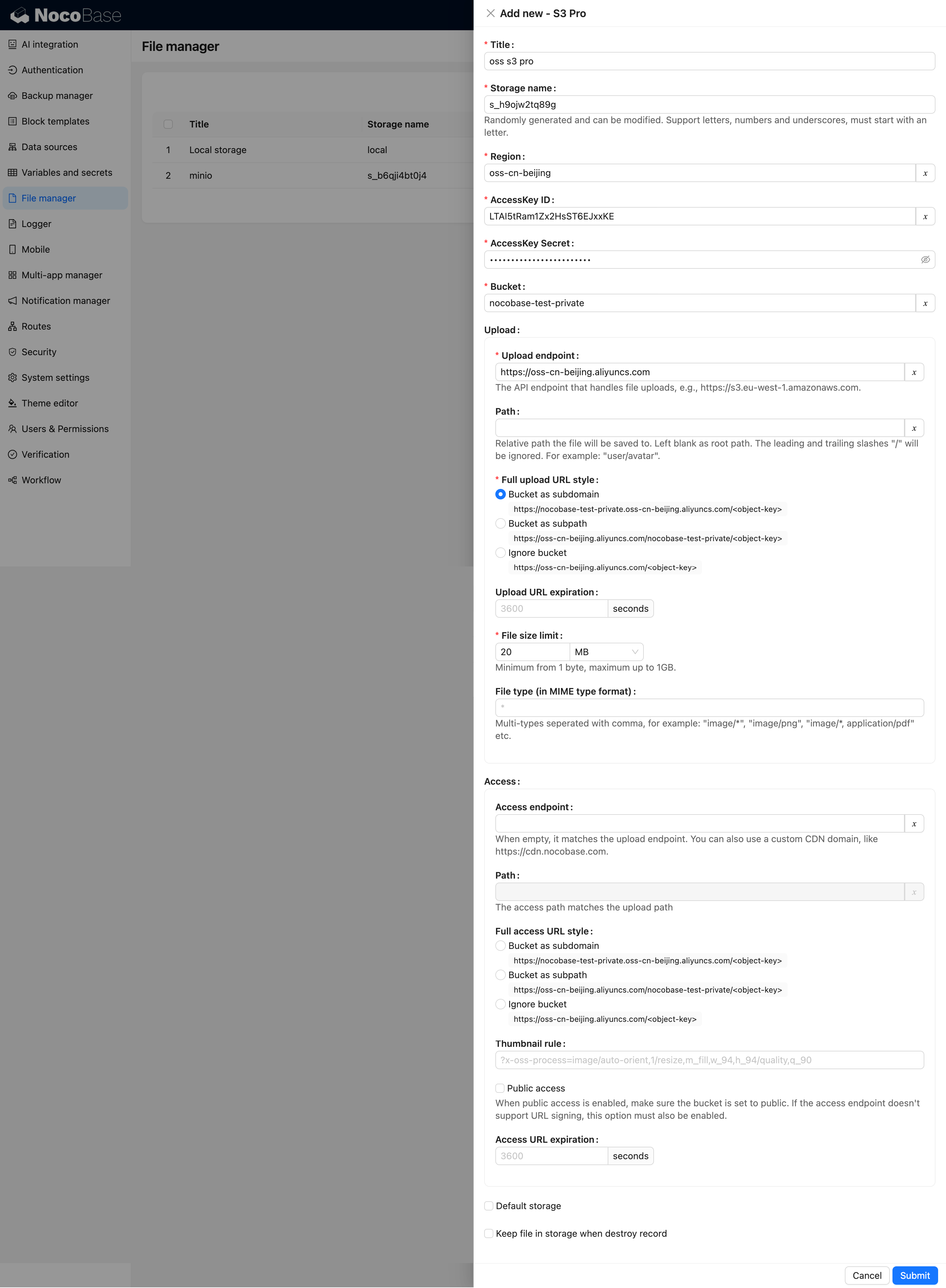
### MinIO
#### Bucket Creation
1. Click on the **Buckets** menu on the left -> Click **Create Bucket** to open the creation page.
2. Enter the Bucket name, then click the **Save** button.
#### AccessKey and SecretAccessKey Retrieval
1. Navigate to **Access Keys** -> Click the **Create access key** button to open the creation page.
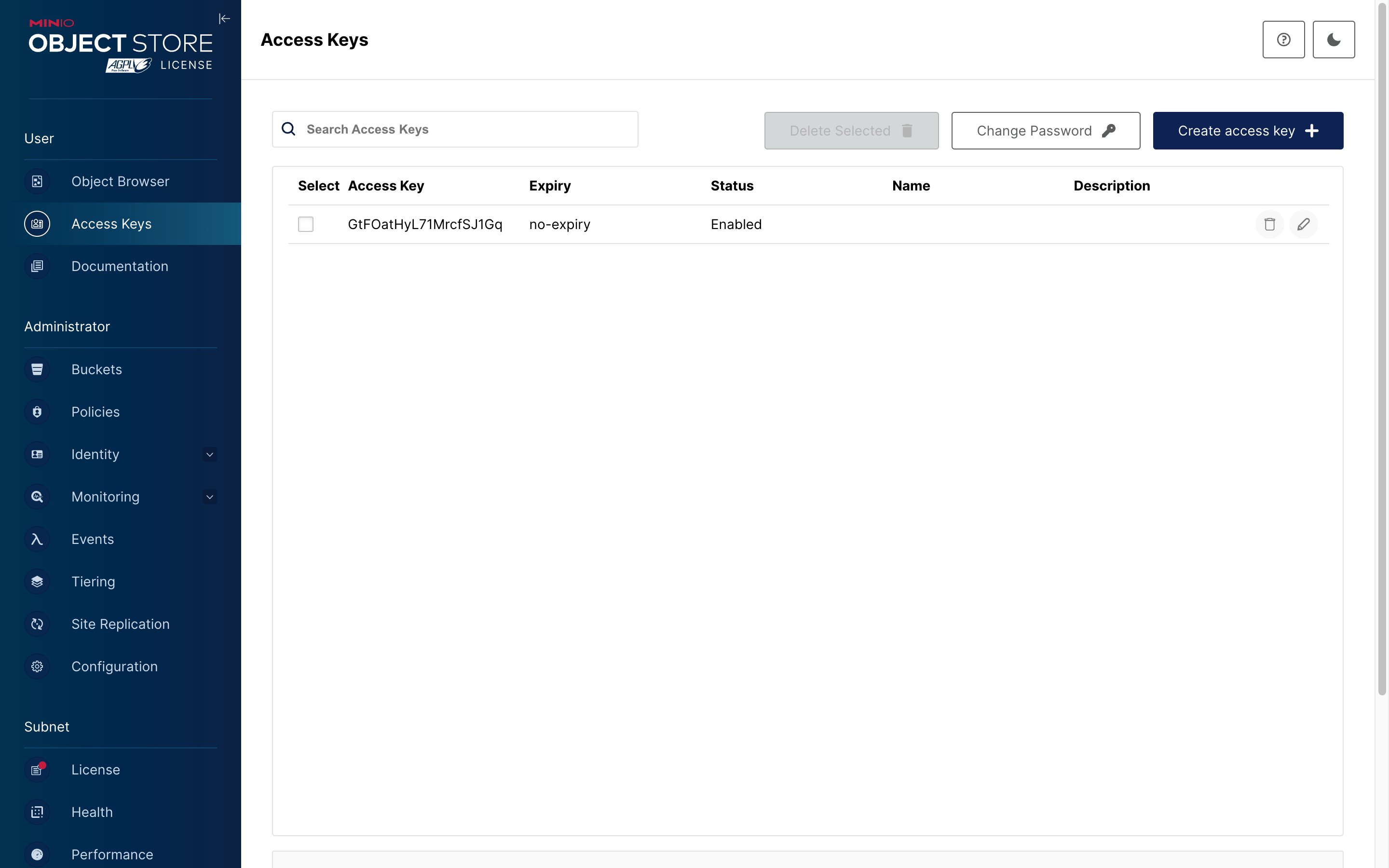
2. Click the **Save** button.
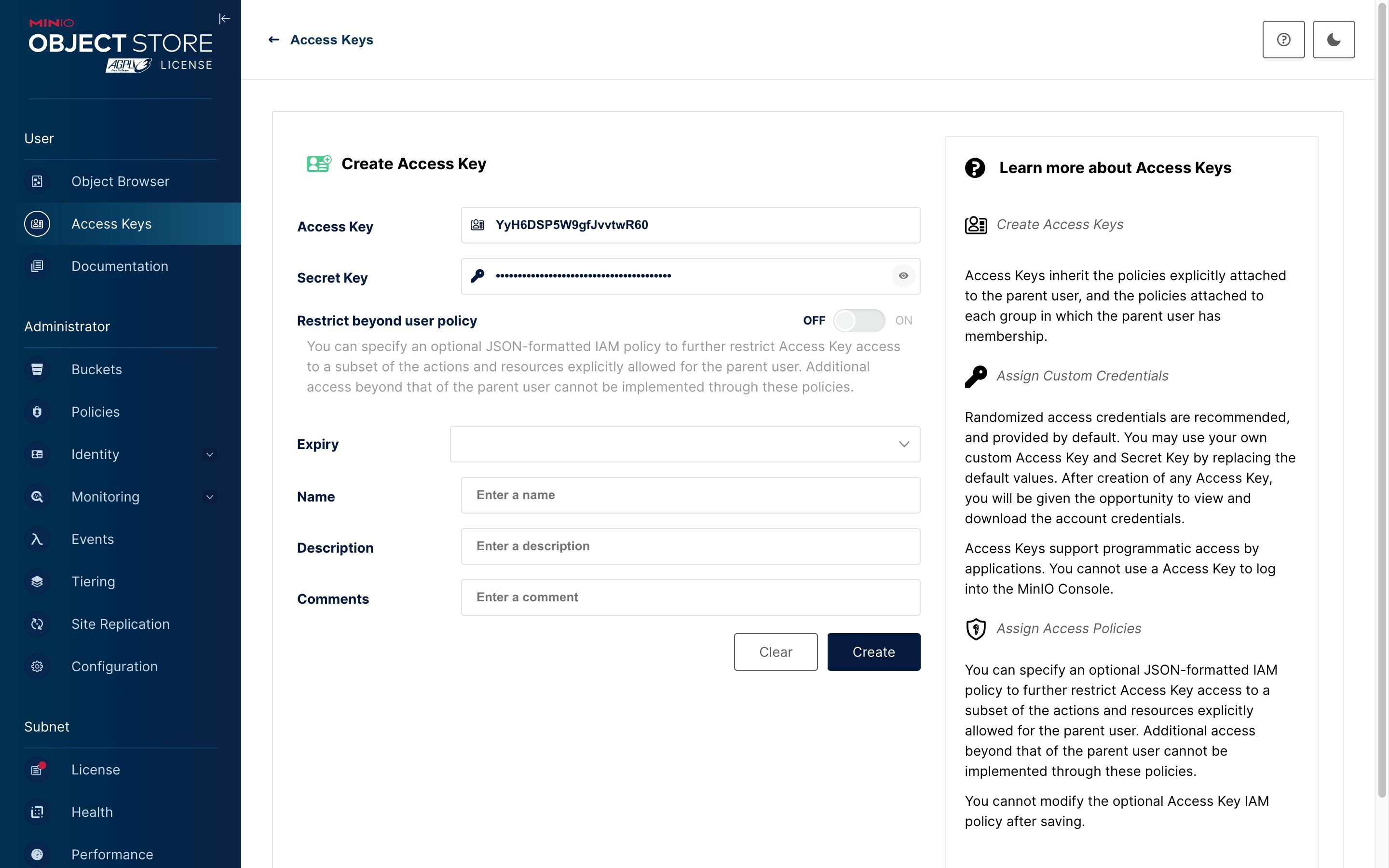
3. Save the **Access Key** and **Secret Key** from the popup window for future configuration.
#### Parameter Configuration
1. Go to the **File manager** page in NocoBase.
2. Click the **Add new** button and select **S3 Pro**.
3. Fill out the form:
- **AccessKey ID** and **AccessKey Secret**: Use the values saved from the previous step.
- **Region**: Privately deployed MinIO does not have the concept of a region; you can set it to `"auto"`.
- **Endpoint**: Enter the domain name or IP address of your deployed service.
- Set **Full access URL style** to **Path-Style**.
#### Configuration Example
### Tencent COS
Refer to the configurations for the file services above. The logic is similar.
#### Configuration Example
### Cloudflare R2
Refer to the configurations for the file services above. The logic is similar.
#### Configuration Example
## User Guide
Refer to the [file-manager plugin documentation](/data-sources/file-manager).
---
url: /data-sources/file-manager/storage/tencent-cos.md
---
# Tencent COS
A storage engine based on Tencent Cloud COS. Before use, you need to prepare the relevant account and permissions.
## Options

:::info{title=Hint}
This section only covers the specific options for the Tencent Cloud COS storage engine. For common parameters, please refer to [Common Engine Parameters](./index.md#common-engine-parameters).
:::
### Region
Fill in the region of the COS storage, for example: `ap-chengdu`.
:::info{title=Hint}
You can view the region information of the storage bucket in the [Tencent Cloud COS Console](https://console.cloud.tencent.com/cos), and only need to take the prefix part of the region (without the complete domain name).
:::
### SecretId
Fill in the ID of the Tencent Cloud authorized access key.
### SecretKey
Fill in the secret of the Tencent Cloud authorized access key.
### Bucket
Fill in the name of the COS bucket, for example: `qing-cdn-1234189398`.
---
url: /data-sources/graph-collection-manager/index.md
---
# Graph Collection Manager
## Introduction
This is a tool similar to ER diagrams, which currently only supports the main database.
## Installation
This preset plugin needs to be activated before it can be used.
## User Manual

---
url: /data-sources/index.md
---
# Overview
Data modeling is a key step in designing databases, involving a deep analysis and abstraction process of various types of data and their interrelationships in the real world. In this process, we try to reveal the intrinsic connections between data and formalize them into data models, laying the foundation for the database structure of the information system. NocoBase is a platform driven by data models, with the following features:
## Supports Access to Data from Various Sources
NocoBase supports data sources from various origins, including common databases, API/SDK platforms, and files.

NocoBase provides a [data source manager](/data-sources/data-source-manager) for managing various data sources and their collections. The data source manager plugin only provides a management interface for all data sources and does not provide the ability to directly access data sources. It needs to be used in conjunction with various data source plugins. The currently supported data sources include:
- [Main Database](/data-sources/data-source-main): NocoBase's main database, supporting relational databases such as MySQL, PostgreSQL, and MariaDB.
- [KingbaseES](/data-sources/data-source-kingbase): Use KingbaseES database as a data source, which can be used as both a main database and an external database.
- [External MySQL](/data-sources/data-source-external-mysql): Use an external MySQL database as a data source.
- [External MariaDB](/data-sources/data-source-external-mariadb): Use an external MariaDB database as a data source.
- [External PostgreSQL](/data-sources/data-source-external-postgres): Use an external PostgreSQL database as a data source.
- [External MSSQL](/data-sources/data-source-external-mssql): Use an external MSSQL (SQL Server) database as a data source.
- [External Oracle](/data-sources/data-source-external-oracle): Use an external Oracle database as a data source.

## Provides a Variety of Data Modeling Tools
**Simple collection management interface**: Used to create various models (collections) or connect to existing ones.

**ER-style visual interface**: Used to extract entities and their relationships from user and business requirements. It provides an intuitive and easy-to-understand way to describe data models. Through ER diagrams, you can more clearly understand the main data entities in the system and their relationships.

## Supports Various Types of Collections
- [General collection](/data-sources/data-source-main/general-collection): Built-in common system fields;
- [Calendar collection](/data-sources/calendar/calendar-collection): Used to create calendar-related event collections;
- Comment collection: Used for storing comments or feedback on data;
- [Tree collection](/data-sources/collection-tree): Tree-structured collection, currently only supports the adjacency list model;
- [File collection](/data-sources/file-manager/file-collection): Used for file storage management;
- [SQL collection](/data-sources/collection-sql): Not an actual database collection, but visualizes SQL queries in a structured manner;
- [Connect to database view](/data-sources/collection-view): Connects to existing database views;
- Expression collection: Used for dynamic expression scenarios in workflows;
- [Connect to foreign data](/data-sources/collection-fdw): Allows the database system to directly access and query data in external data sources based on FDW technology.

For more content, see the "[Collection / Overview](/data-sources/data-modeling/collection)" section.
## Provides a Rich Variety of Field Types

For more content, see the "[Collection Fields / Overview](/data-sources/data-modeling/collection-fields)" section.
---
url: /data-visualization/best-practices.md
---
# Best practices
Documentation in progress...
---
url: /data-visualization/faq.md
---
# FAQ
## Chart Selection
### Which chart should I use?
Answer: Choose based on your data and goals:
- Trend or change: line or area
- Value comparison: column or bar
- Composition: pie or donut
- Correlation or distribution: scatter
- Hierarchy or stage progress: funnel
For more chart types, see the [ECharts examples](https://echarts.apache.org/examples).
### What chart types does NocoBase support?
Answer: Visual mode includes common charts (line, area, column, bar, pie, donut, funnel, scatter, etc.). Custom mode supports all ECharts chart types.
## Data Query Issues
### Do Visual and SQL modes share configurations?
Answer: No. Their configurations are stored separately. The mode used in your last save takes effect.
## Chart Options
### How do I configure chart fields?
Answer: In Visual mode, select fields according to the chart type. For example, line or column charts require X and Y fields; pie charts require a category field and a value field. Click `Run query` first to verify the data; field mapping is automatically matched by default.
## Preview and Save
### Do I need to preview changes manually?
Answer: In Visual mode, changes are auto‑previewed. In SQL and Custom modes, to avoid frequent refreshes, finish editing and click `Preview` manually.
### Why is the preview lost after closing the dialog?
Answer: Preview is for temporary viewing. Save changes before closing; unsaved changes are not retained.
---
url: /data-visualization/index.md
---
# Overview
The NocoBase data visualization plugin provides visual data querying and a rich set of chart components. With simple configuration, you can quickly build dashboards, present insights, and support multi-dimensional analysis and display.
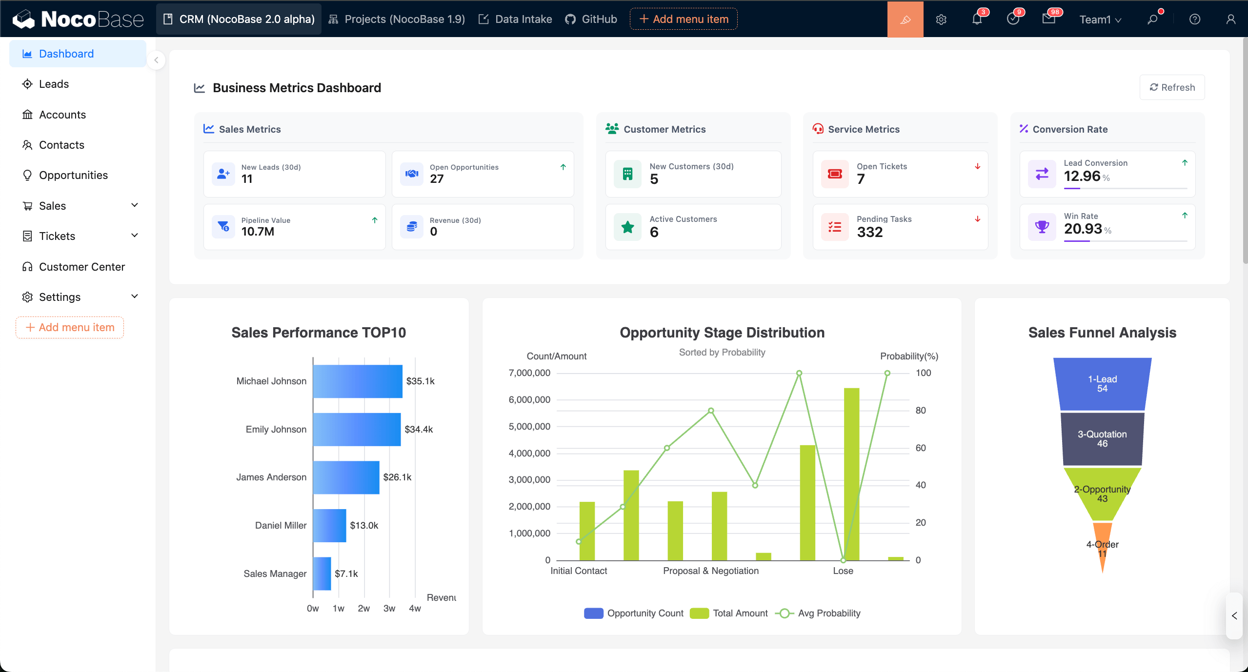
## Basic concepts
- Chart block: A configurable chart component on a page that supports data query, chart options, and interaction events.
- Data query (Builder/SQL): Configure visually with the Builder or write SQL to fetch data.
- Measures and Dimensions: Measures are used for numeric aggregation; Dimensions group data (for example, date, category, region).
- Field mapping: Map query result columns to core chart fields such as `xField`, `yField`, `seriesField`, or `Category / Value`.
- Chart options (Basic/Custom): Basic configures common properties visually; Custom returns a full ECharts `option` via JS.
- Run query: Run the query and fetch data in the configuration panel; switch to Table / JSON to inspect returned data.
- Preview and Save: Preview is temporary; clicking Save writes the configuration to the database and applies it.
- Context variables: Reuse page, user, and filter context (for example, `{{ ctx.user.id }}`) in queries and chart configuration.
- Filters and linkage: Page-level filter blocks collect unified conditions, automatically merge into chart queries, and refresh linked charts.
- Interaction events: Register events via `chart.on` to enable highlight, navigation, and drill-down.
## Installation
Data visualization is a built-in NocoBase plugin; it works out of the box with no separate installation required.
---
url: /data-visualization/quick-start.md
---
# Quick start
This guide walks through configuring a chart from scratch using the essential features. Optional capabilities are covered in later chapters.
Prerequisites:
- A data source and collection (table) are set up, and you have read permission.
## Add a chart block
In the page designer, click “Add block”, choose “Chart”, and add a chart block.
After adding, click “Configure” at the top‑right of the block.
The configuration panel opens on the right. It includes three sections: data query, chart options, and events.
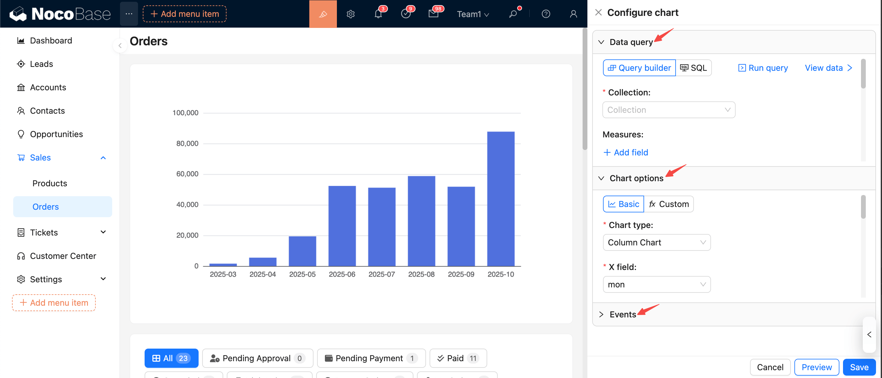
## Configure data query
In the data query panel, configure the data source, query filters, and related options.
- Select data source and collection
- Choose the data source and collection as the base for querying.
- If the collection is not selectable or empty, first check whether it exists and whether your user has permission.
- Configure measures
- Select one or more numeric fields as measures.
- Set aggregation for each measure: sum / count / avg / max / min.
- Configure dimensions
- Select one or more fields as grouping dimensions (date, category, region, etc.).
- For date/time fields, set a format (for example, `YYYY-MM`, `YYYY-MM-DD`) to keep the display consistent.
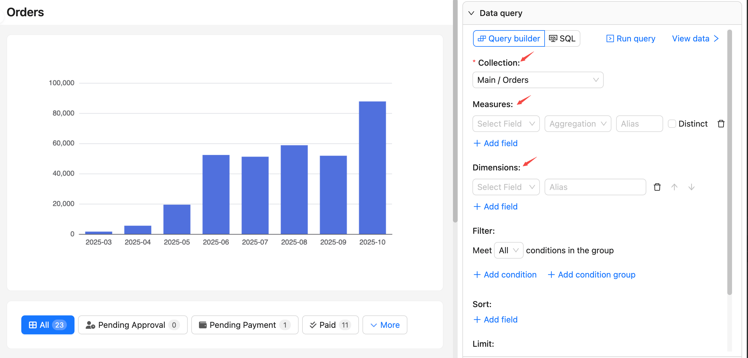
Other options like filter, sort, and pagination are optional.
## Run query and view data
- Click “Run query” to fetch data and render a preview chart directly on the left.
- Click “View data” to preview the returned data; you can switch between table and JSON formats. Click again to collapse the preview.
- If the result is empty or unexpected, return to the query panel and check collection permissions, field mappings for measures/dimensions, and data types.
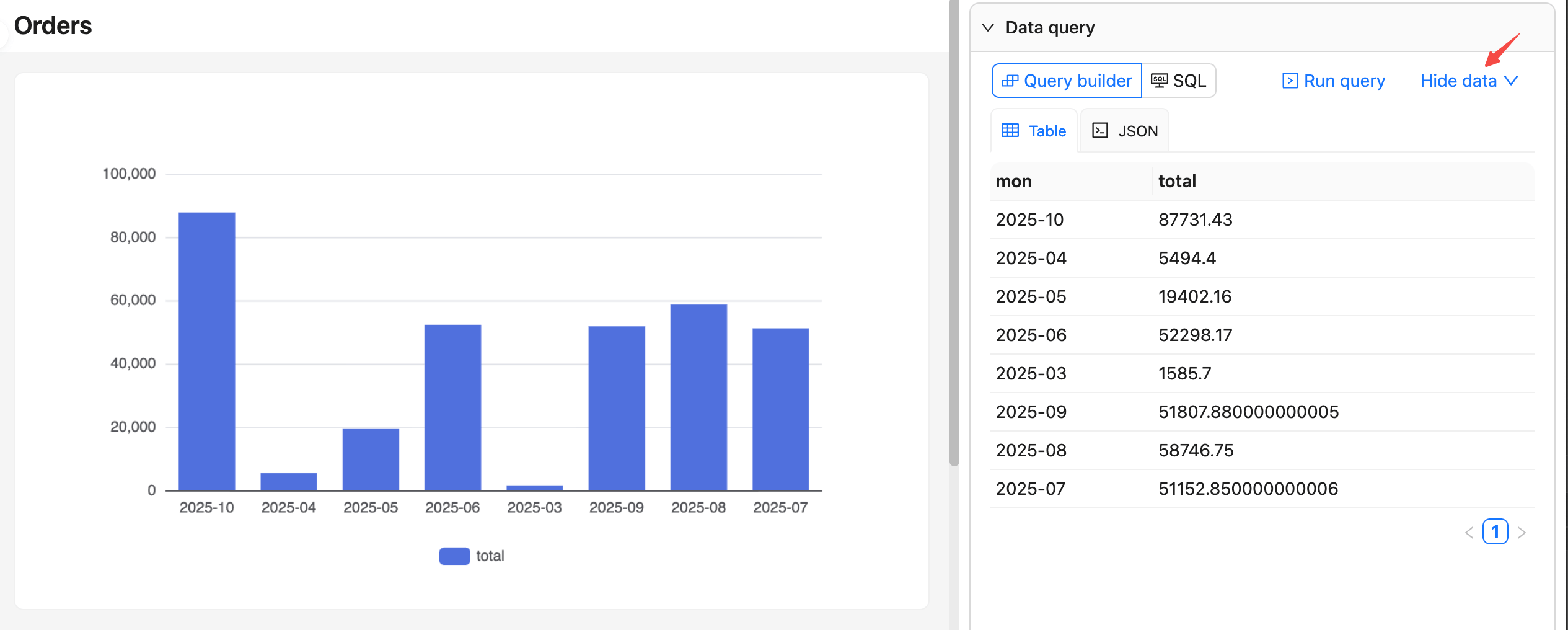
## Configure chart options
In the chart options panel, choose the chart type and configure its options.
- First select a chart type (line/area, column/bar, pie/donut, scatter, etc.).
- Complete the core field mappings:
- Line/area/column/bar: `xField` (dimension), `yField` (measure), `seriesField` (series, optional)
- Pie/donut: `Category` (categorical dimension), `Value` (measure)
- Scatter: `xField`, `yField` (two measures or dimensions)
- For more chart settings, refer to the ECharts docs: [Axis](https://echarts.apache.org/handbook/en/concepts/axis)
- After “Run query”, field mappings are auto‑filled by default. If you change dimensions/measures, recheck the mappings.
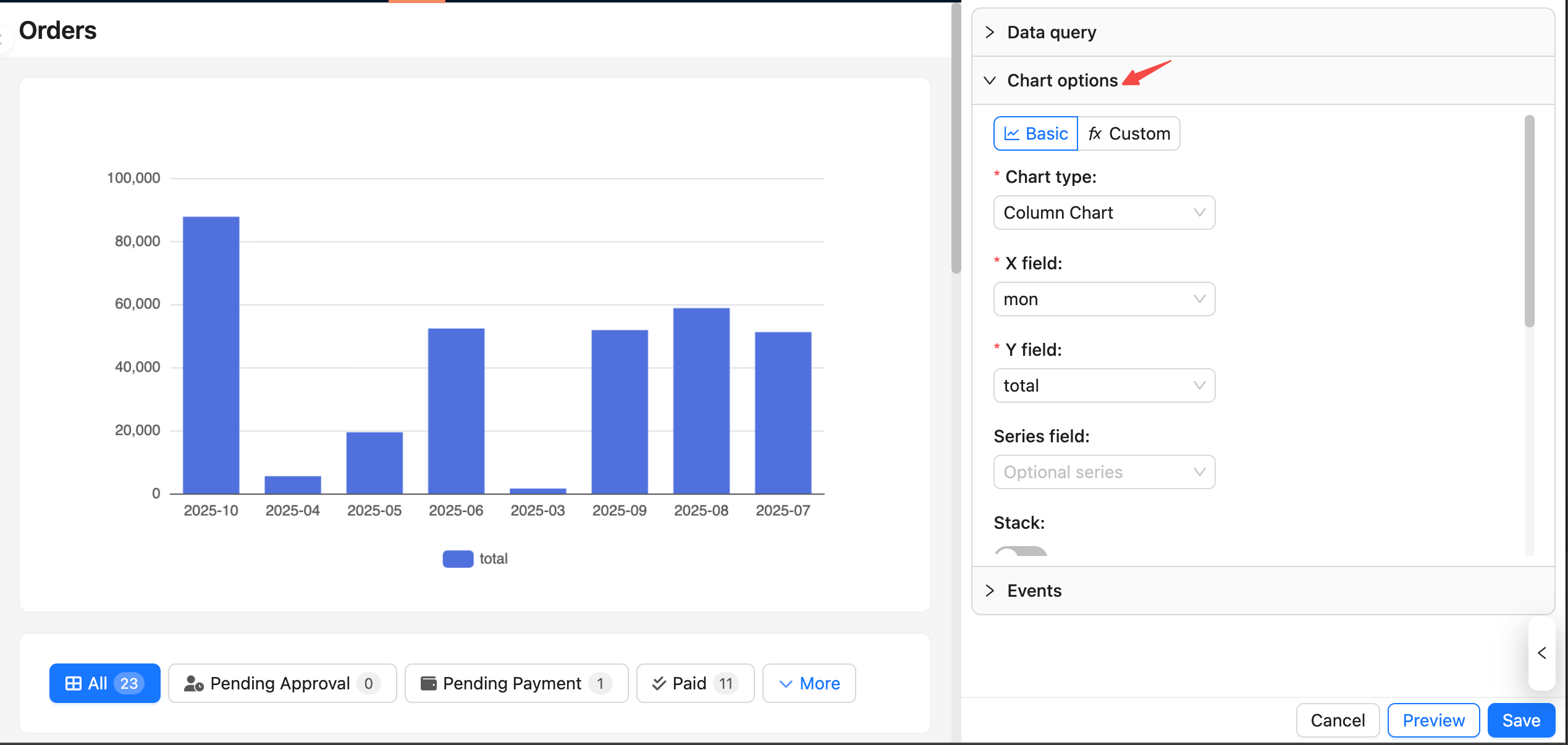
## Preview and Save
Changes update the preview in real time on the left, but they are not saved until you click “Save”.
You can also use the buttons at the bottom:
- Preview: Configuration changes refresh the preview automatically, or click “Preview” to trigger a refresh manually.
- Cancel: If you don’t want the current changes, click “Cancel” at the bottom or refresh the page to revert to the last saved state.
- Save: Click “Save” to persist the current query and chart configuration to the database; it becomes effective for all users.
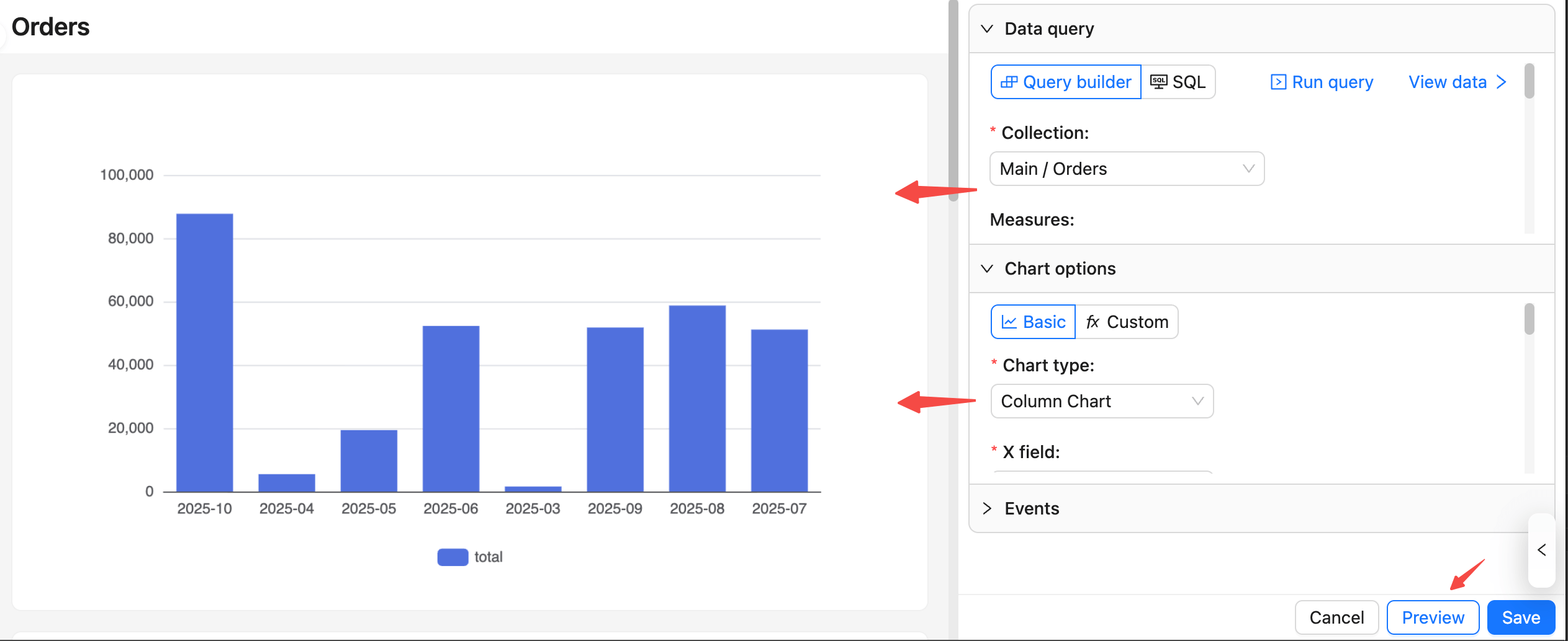
## Common tips
- Minimum viable setup: Select a collection plus at least one measure; adding dimensions is recommended for grouped display.
- For date dimensions, set an appropriate format (for example, monthly `YYYY-MM`) to avoid a discontinuous or messy X‑axis.
- If the query is empty or the chart does not display:
- Check the collection/permissions and field mappings.
- Use “View data” to confirm column names and types match the chart mapping.
- Preview is temporary: It is for validation and adjustments. It only takes effect after you click “Save”.
---
url: /database/index.md
---
# Database
:::tip
Content to be added
:::
---
url: /email-manager/advanced/auto-save-draft.md
---
# Auto-save Draft
You can enable the **Auto-save draft** feature in the **Save Draft** button.
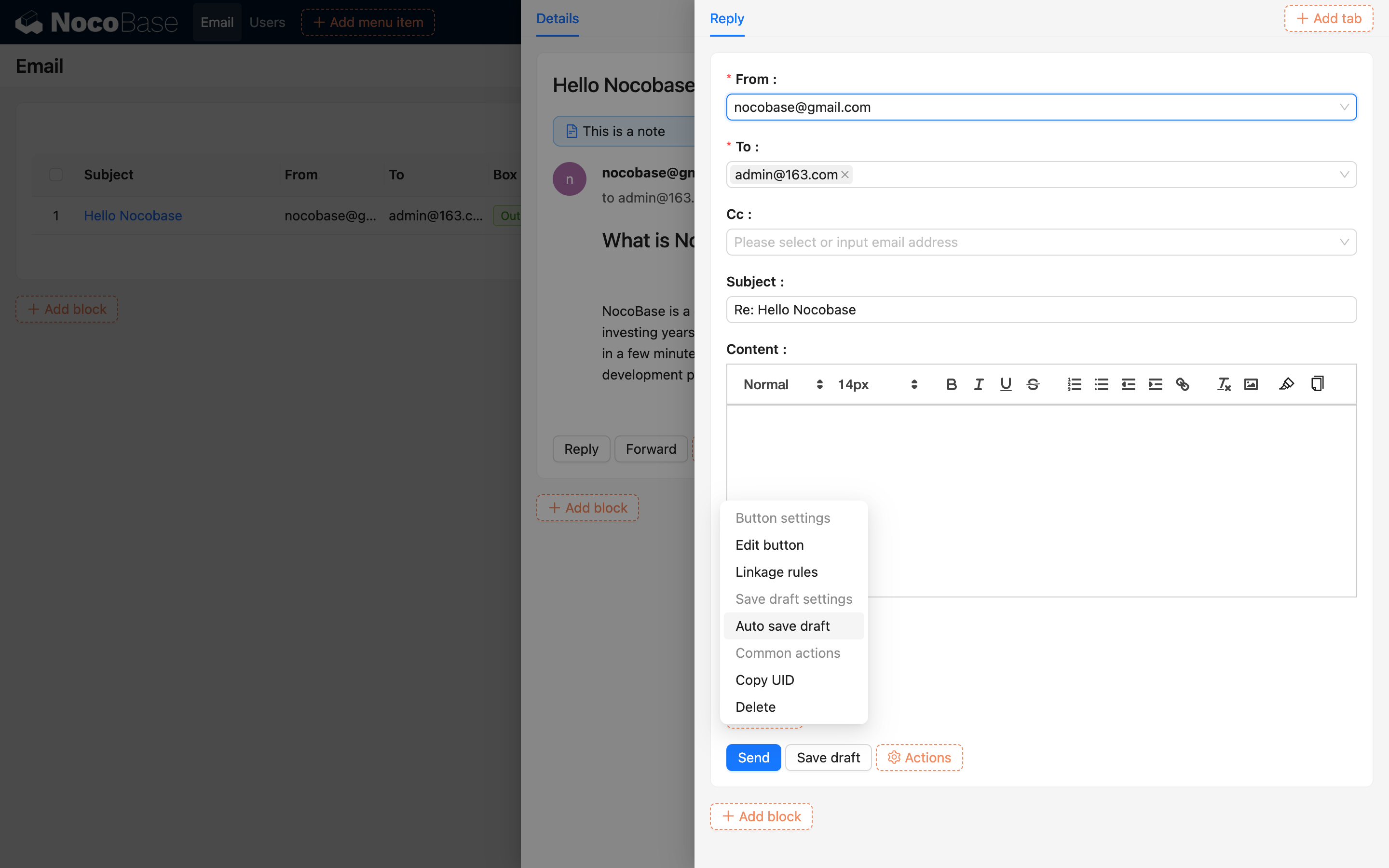
Once enabled, the system will automatically save drafts in real-time during the email editing process, ensuring no content is lost.
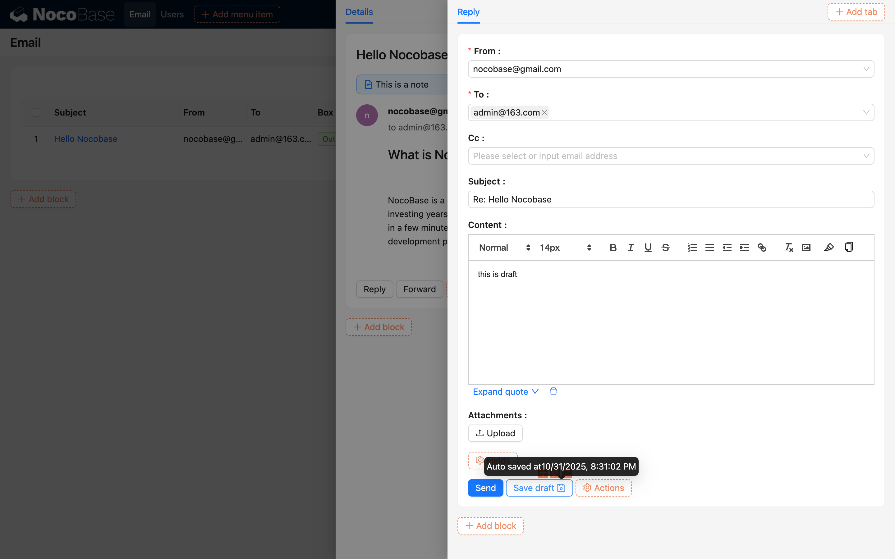
When you open the email editor again with the same sender and recipient, the system will prompt whether to use the saved draft.
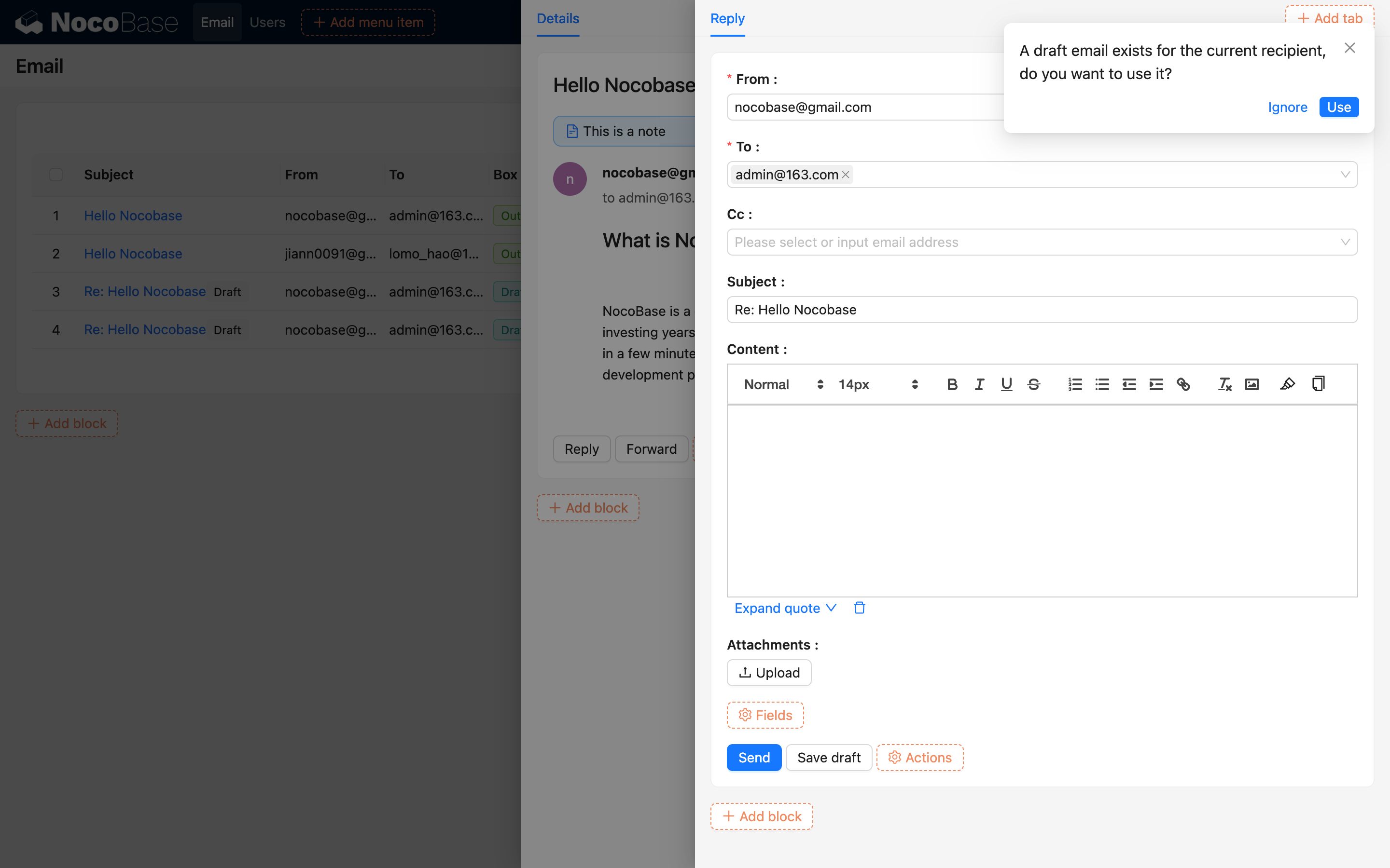
---
url: /email-manager/advanced/batch-send.md
---
# Bulk Send
## Bulk Send Overview
Support sending emails to multiple recipients in batches, with each recipient receiving an independent email.

## Bulk Send via Table
You can configure bulk selection and email sending functionality in a table.
1. Add a send email button to the table

2. Configure the recipient field (the system will extract email addresses from the selected table data).
.png)
3. Check the table rows you need to send.

If you need to send to all records in the table, you can set the recipient scope to **All records**.
.png)
After editing the email content, click the **Bulk send** button to complete the sending.

## Email Sending Tracking
After sending, you can view the sending status and email information in the Email Management Center.

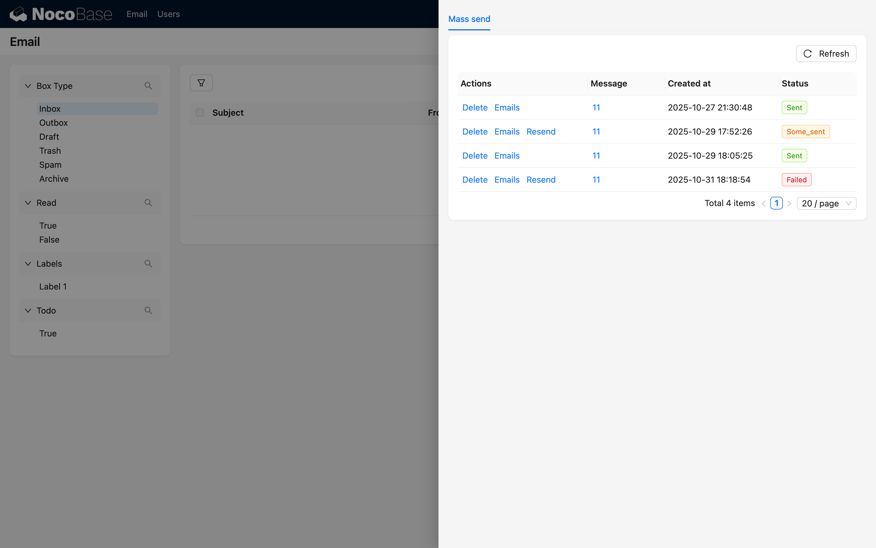
---
url: /email-manager/advanced/label.md
---
# Email Labels
On the right side of the email details, you can **select labels** for emails.
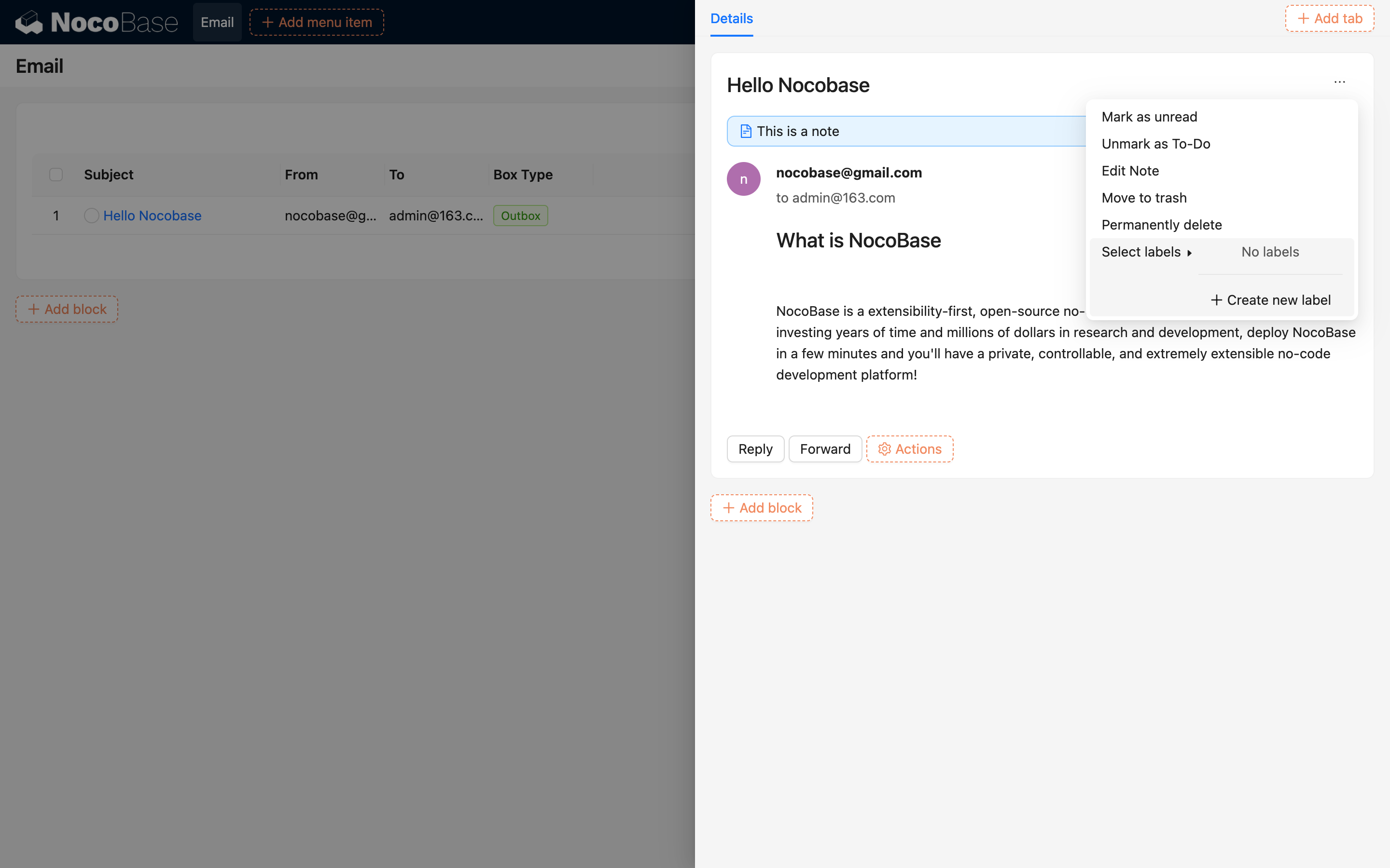

When creating a new label, it will be checked by default, or you can manually select other labels.
.png)
In the email list, you can view the corresponding labels for emails.

---
url: /email-manager/advanced/note.md
---
# Email Notes
On the right side of the email details, you can **edit notes**.

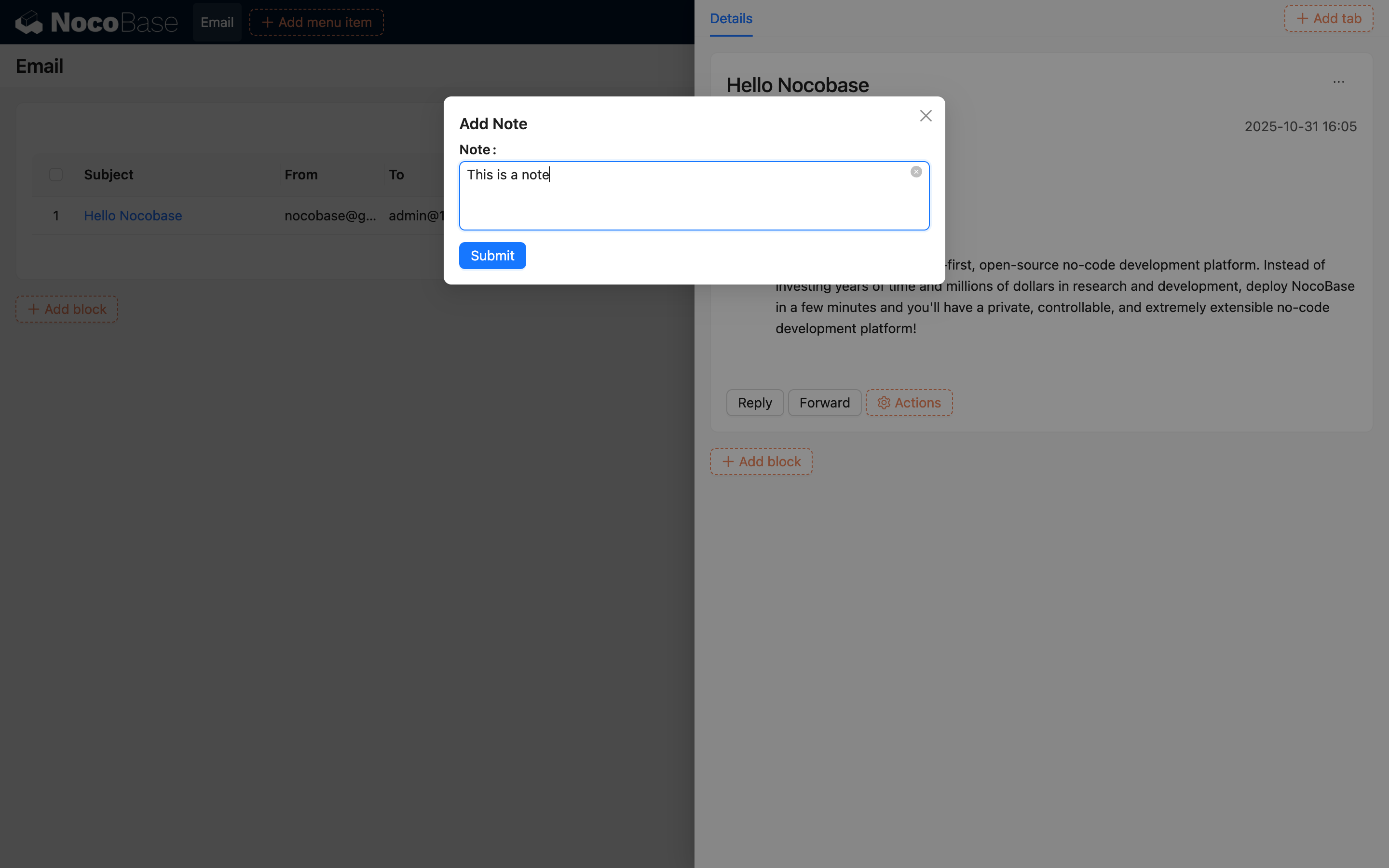
After adding notes, you can view the added notes in the email details.
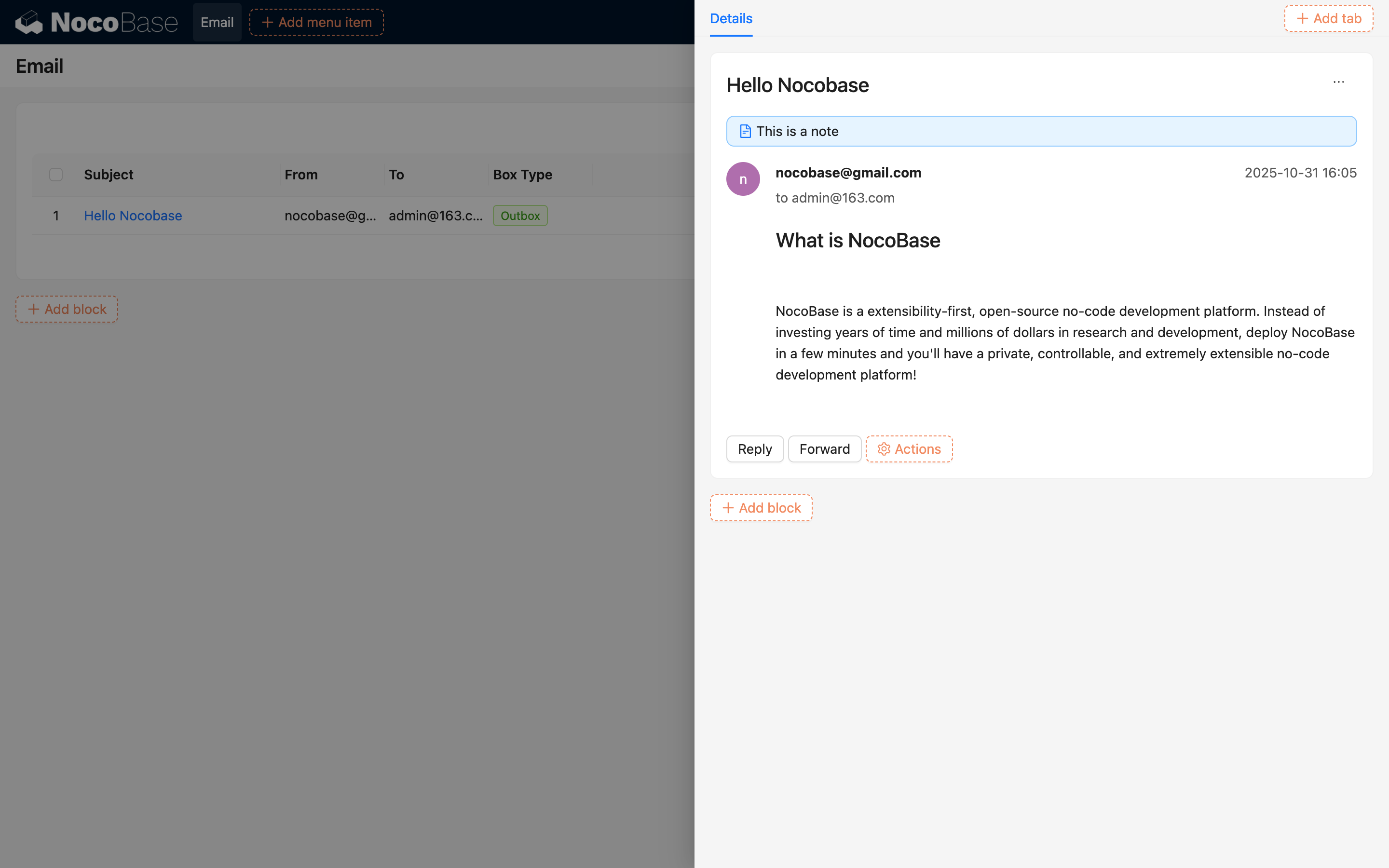
---
url: /email-manager/advanced/todo.md
---
# Email To-do
On the right side of the email details, you can **mark an email as to-do**.
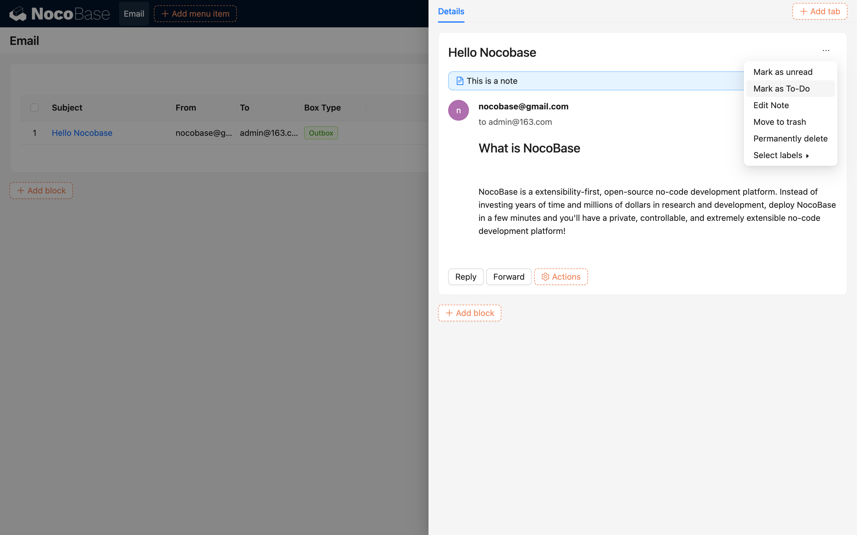
In the email list, you can view emails marked with a to-do flag.
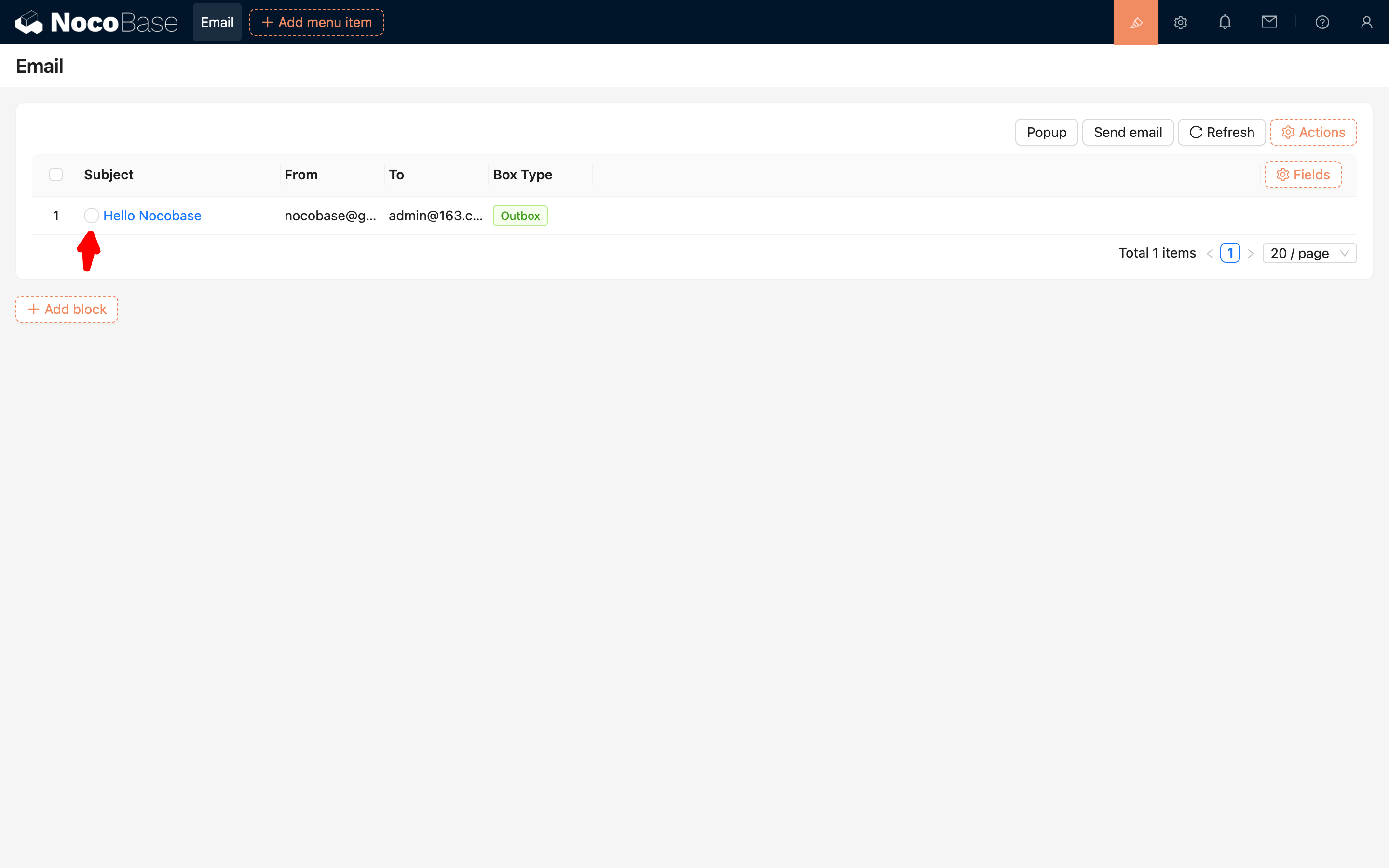
---
url: /email-manager/configuration/faq.md
---
# FAQ
## Emails Cannot Be Received After Authorizing a Microsoft Account
**Answer:** Currently only Outlook and Gmail email accounts support authorization login, Microsoft accounts and Google accounts are not supported. Please refer to: [answers.microsoft.com](https://answers.microsoft.com/zh-hans/outlook_com/forum/all/%E7%8E%B0%E6%9C%89%E5%BE%AE%E8%BD%AF%E8%B4%A6/dba12dda-a7c7-4346-8263-53f4a6d9dc68)
**Tip:** If you are unsure whether you have a "real Outlook.com email" or "Gmail email", you can try accessing Outlook.com or Gmail.com via web browser to check if you can log in directly and send emails normally. If not, it may mean you have not activated the corresponding email service and need to activate it or use a different email provider.
## Deauthorize Account
If you need to delete or re-authorize an already authorized email account, you can follow these steps:
#### **Gmail**
1. Open https://myaccount.google.com/u/0/connections and log in
2. Click on the corresponding application, then click Remove
#### **Outlook**
1. Open https://account.microsoft.com/ and log in
2. Click the "Apps and services that can access your data" button
3. Click Edit and Remove
---
url: /email-manager/configuration/gmail.md
---
# Google Configuration
### Prerequisites
For users to be able to integrate Google Gmail into NocoBase, the system must be deployed on a server that supports access to Google services. The backend will call the Google API.
### Register Account
1. Open https://console.cloud.google.com/welcome to enter Google Cloud
2. On first entry, you need to agree to the relevant terms
### Create App
1. Click "Select a project" at the top
2. Click the "NEW PROJECT" button in the pop-up layer
3. Fill in the project information
4. After the project is created, select the project
### Enable Gmail API
1. Click the "APIs & Services" button
2. Enter the APIs & Services panel
3. Search for **mail**
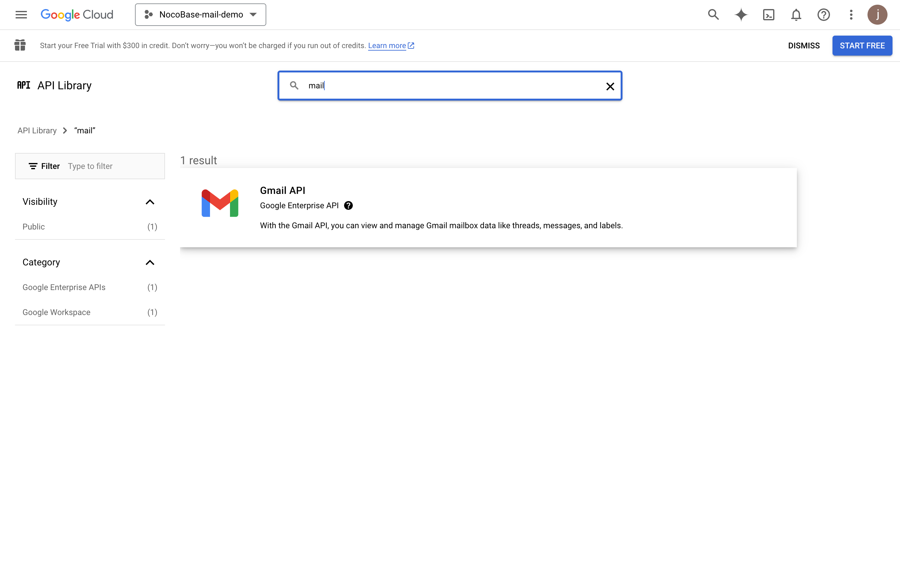
4. Click the **ENABLE** button to enable Gmail API
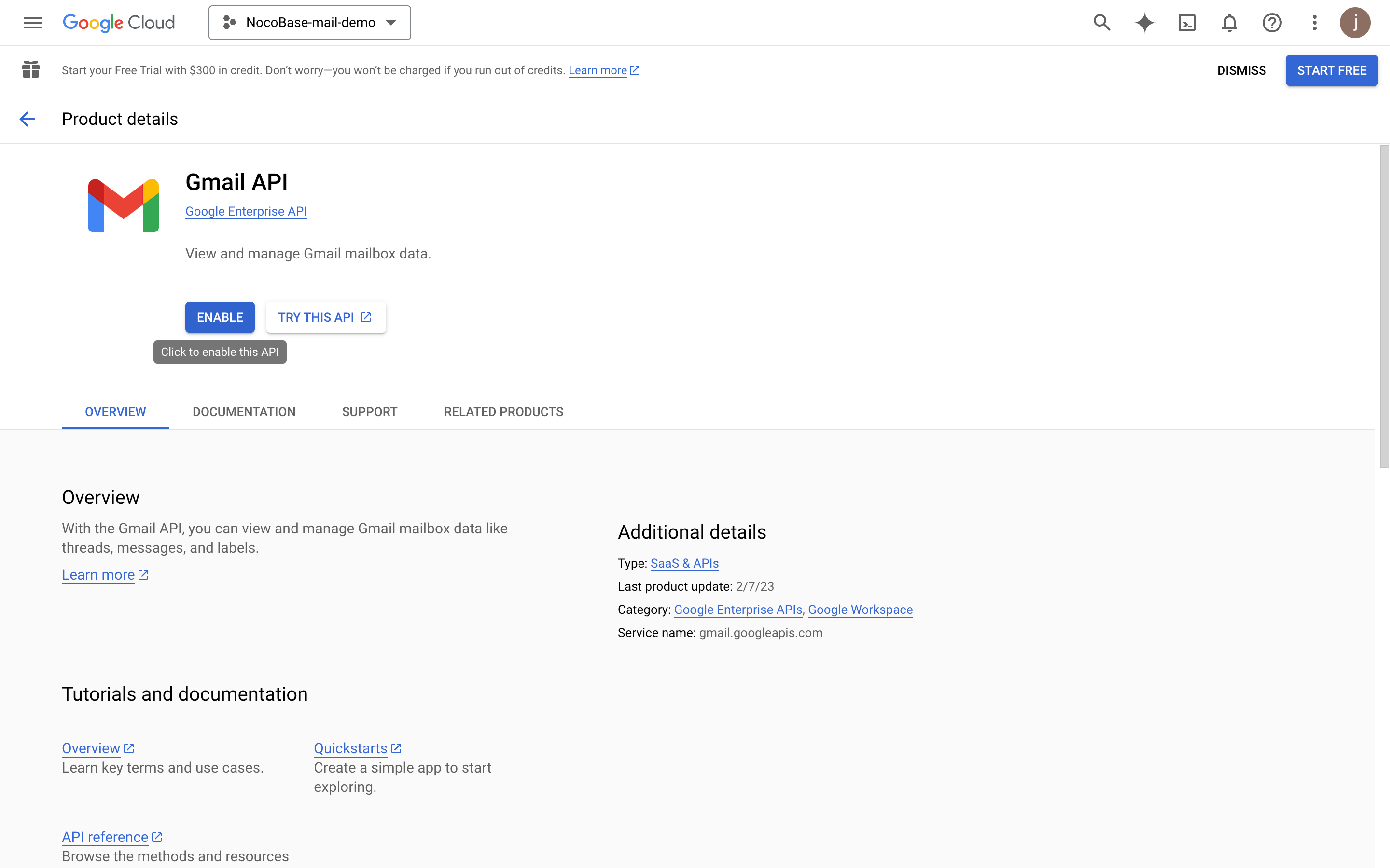
### Configure OAuth Consent Screen
1. Click the "OAuth consent screen" menu on the left
2. Select **External**
3. Fill in the project information (for display on the subsequent authorization page) and click save
4. Fill in Developer contact information and click continue
5. Click continue
6. Add test users for testing before app publication
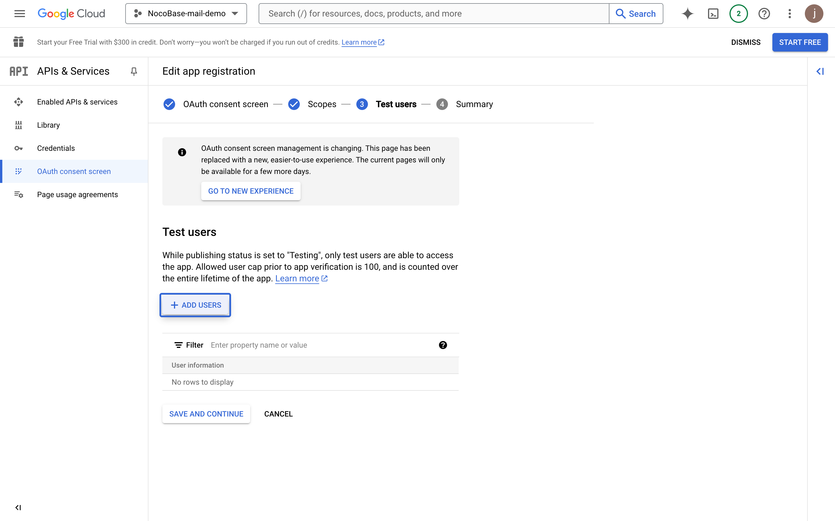
7. Click continue
8. Review the overview information and return to the dashboard
### Create Credentials
1. Click the **Credentials** menu on the left
2. Click the "CREATE CREDENTIALS" button and select "OAuth client ID"
3. Select "Web application"
4. Fill in the application information
5. Fill in the domain where the application will be finally deployed (this example is NocoBase's test address)
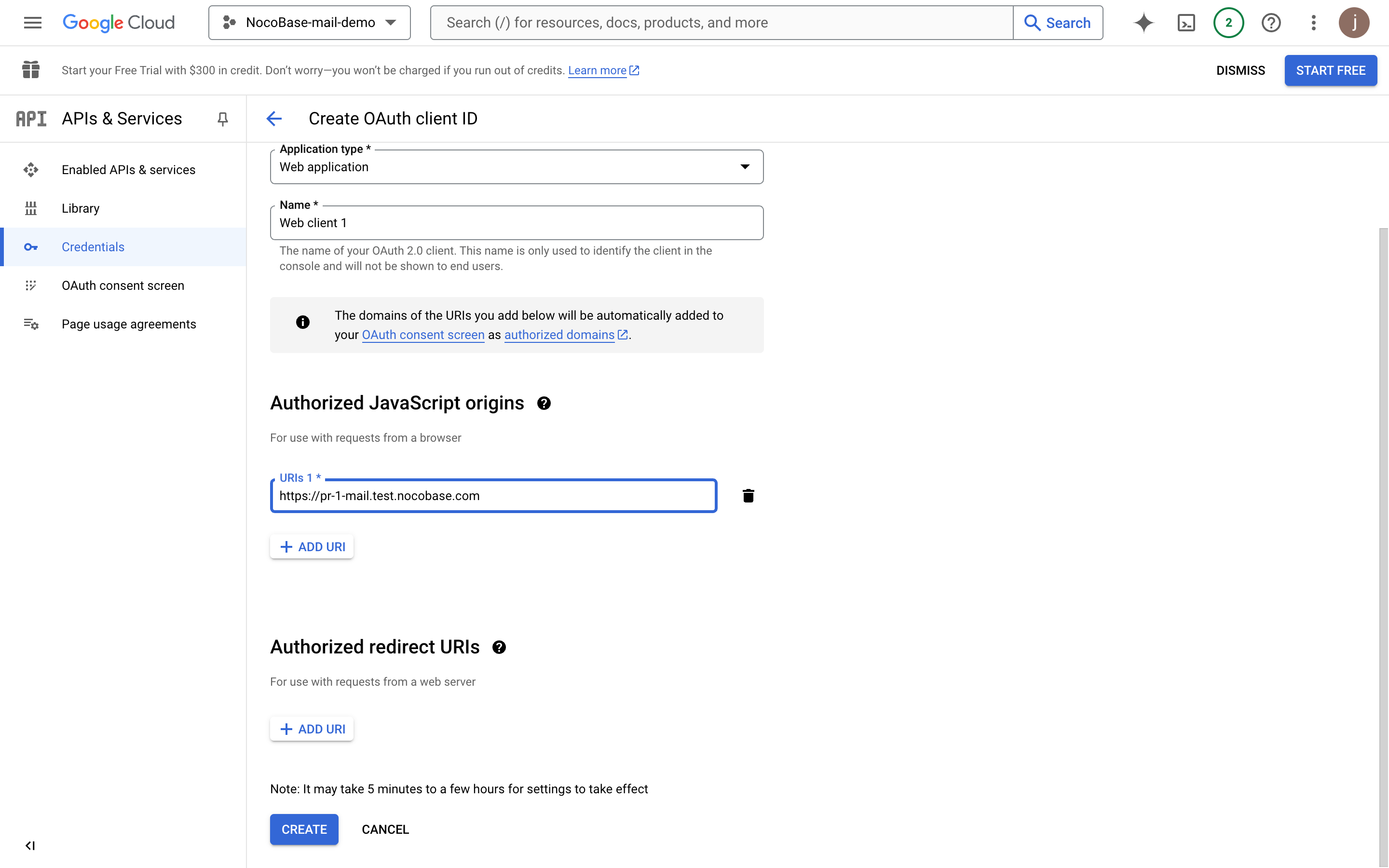
6. Add the authorized callback address, which must be `domain + "/admin/settings/mail/oauth2"`, for example: `https://pr-1-mail.test.nocobase.com/admin/settings/mail/oauth2`
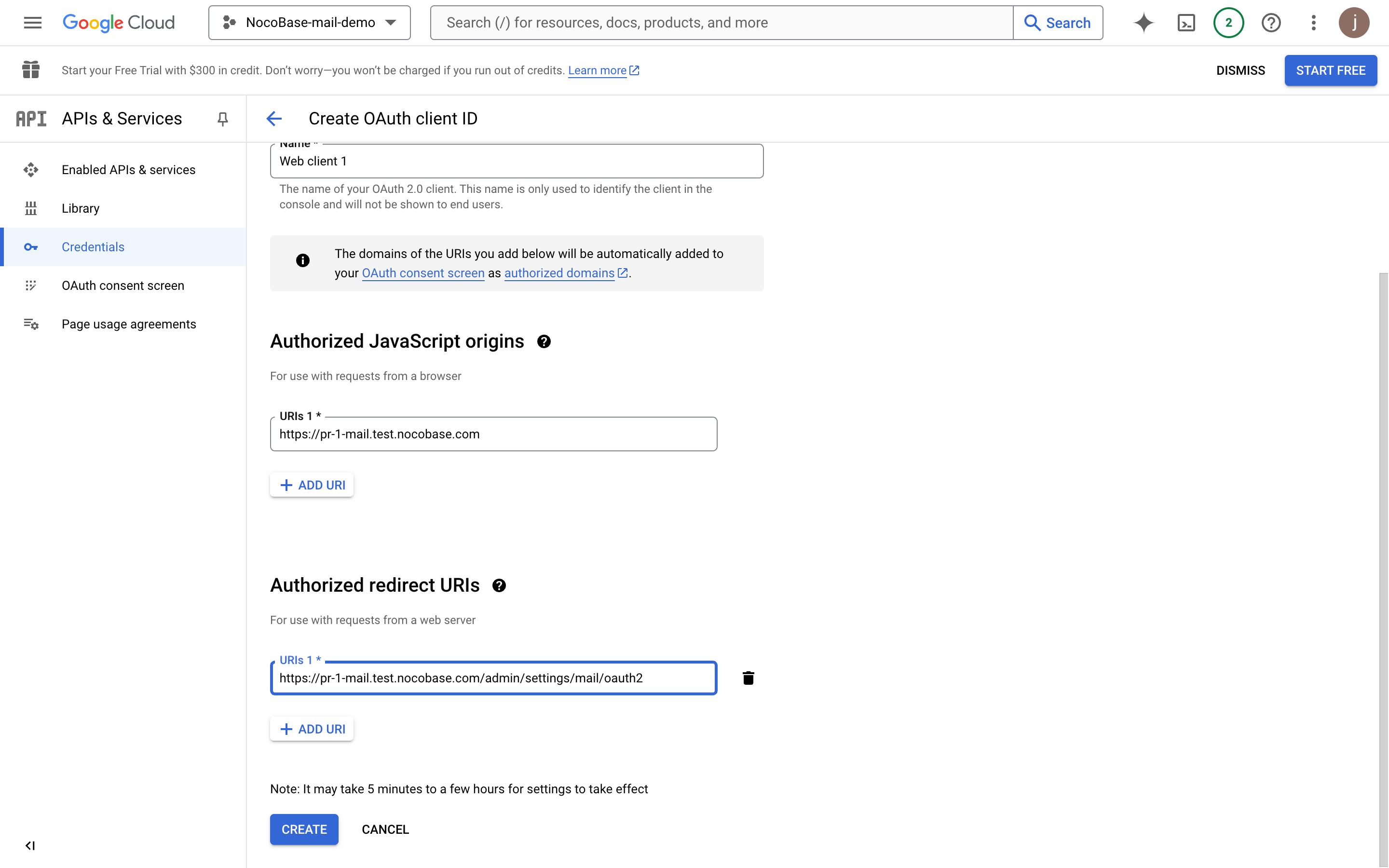
7. Click create to view OAuth information
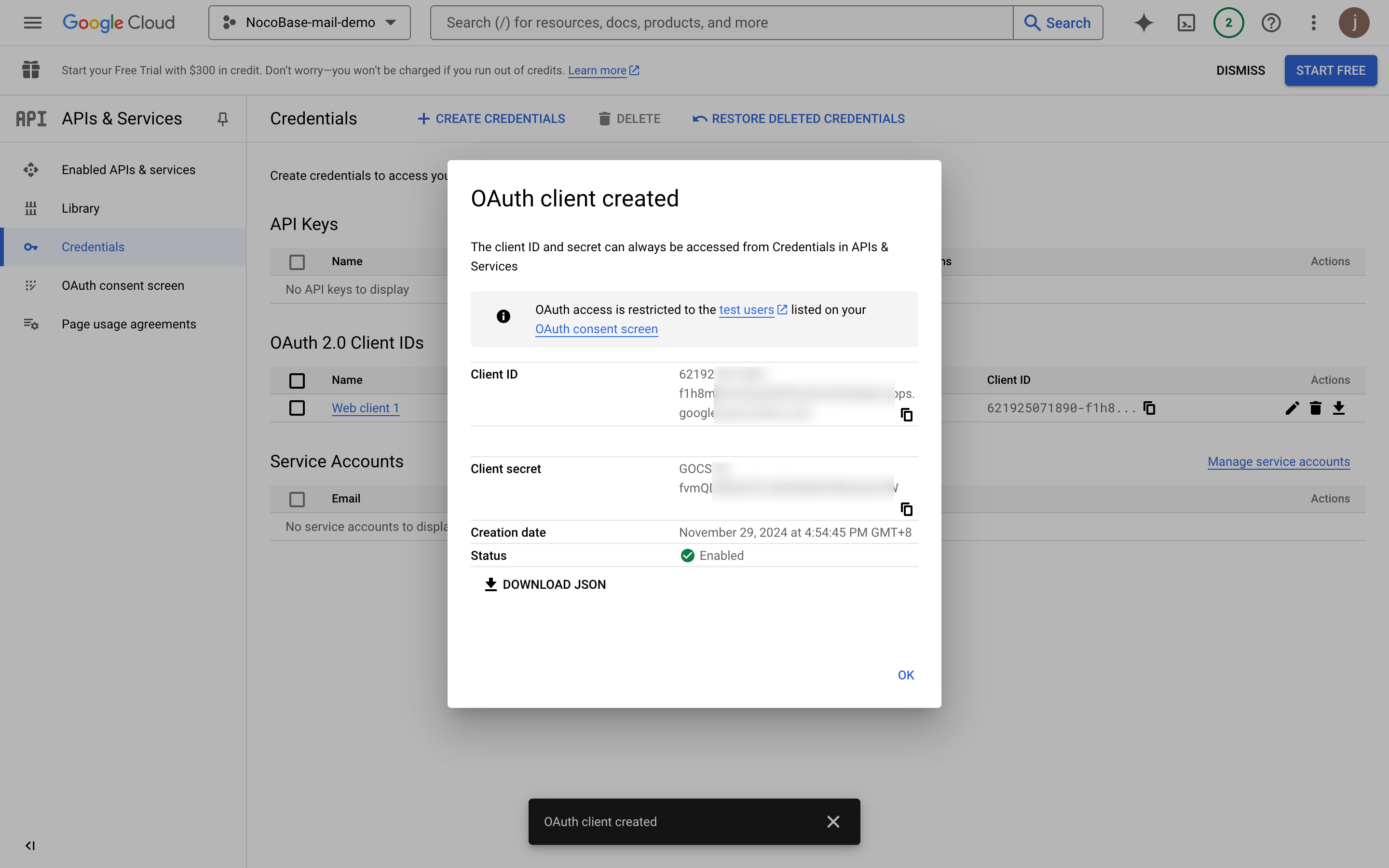
8. Copy the Client ID and Client Secret content and fill them into the email configuration page
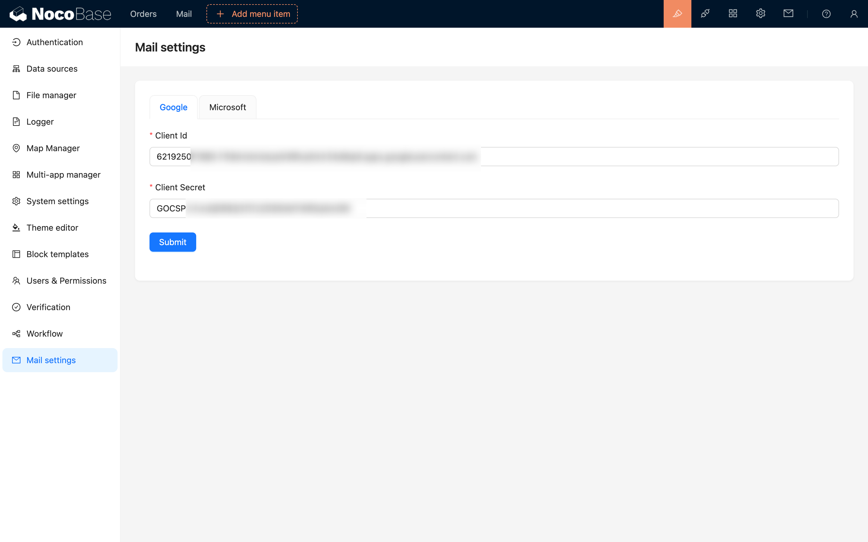
9. Click save to complete the configuration
### Application Publication
Proceed with publication after the above process is completed and test users authorize login, email sending, and other feature tests are finished.
1. Click the "OAuth consent screen" menu
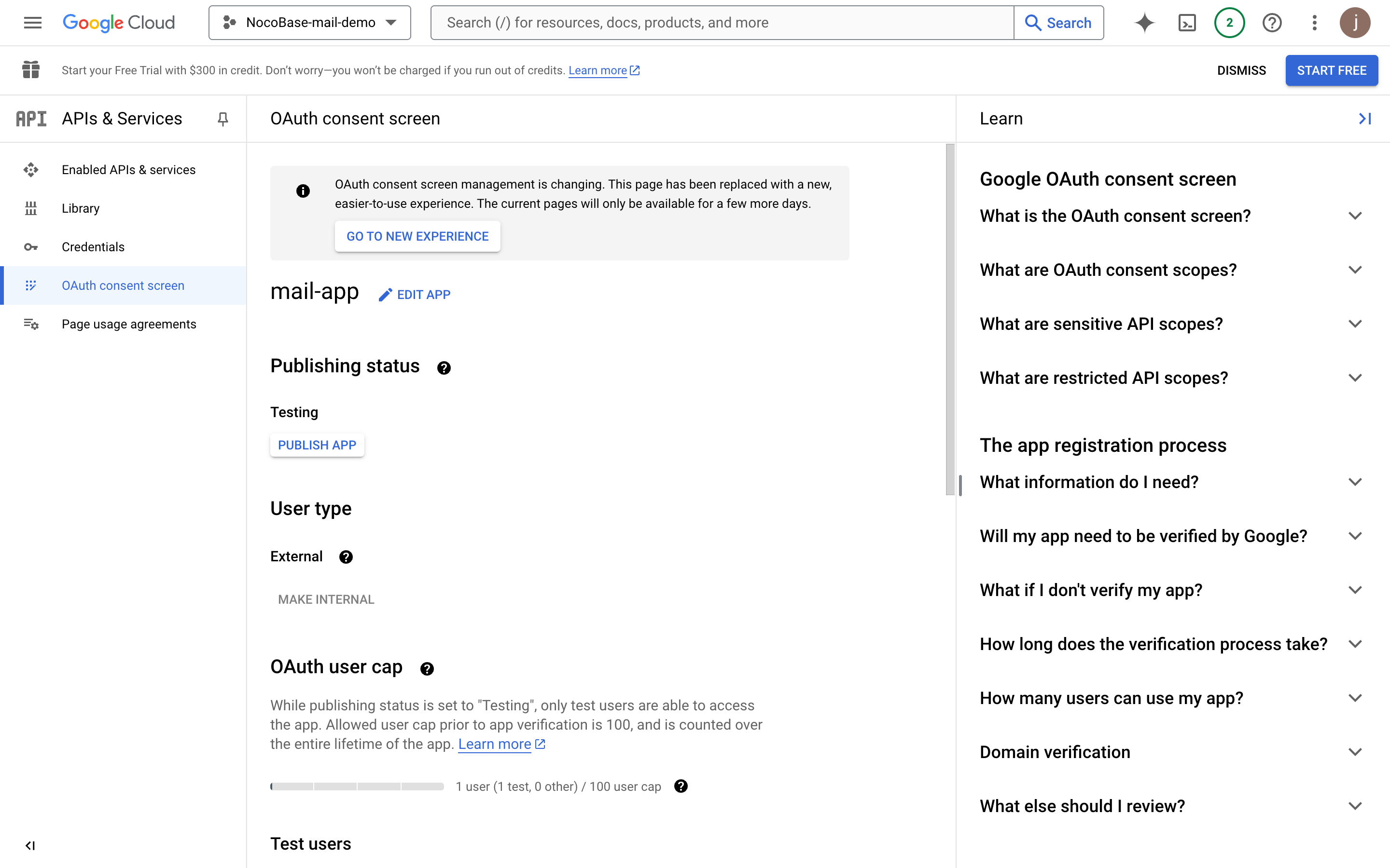
2. Click the "EDIT APP" button, then click "SAVE AND CONTINUE" button at the bottom
3. Click the "ADD OR REMOVE SCOPES" button to select user permission scopes
4. Search for "Gmail API" and check "Gmail API" (confirm that the Scope value is "https://mail.google.com/")
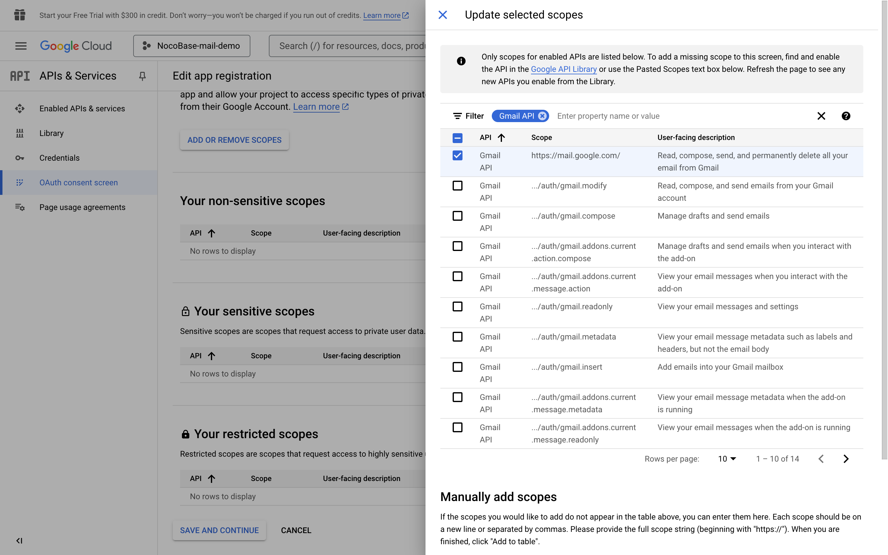
5. Click the **UPDATE** button at the bottom to save
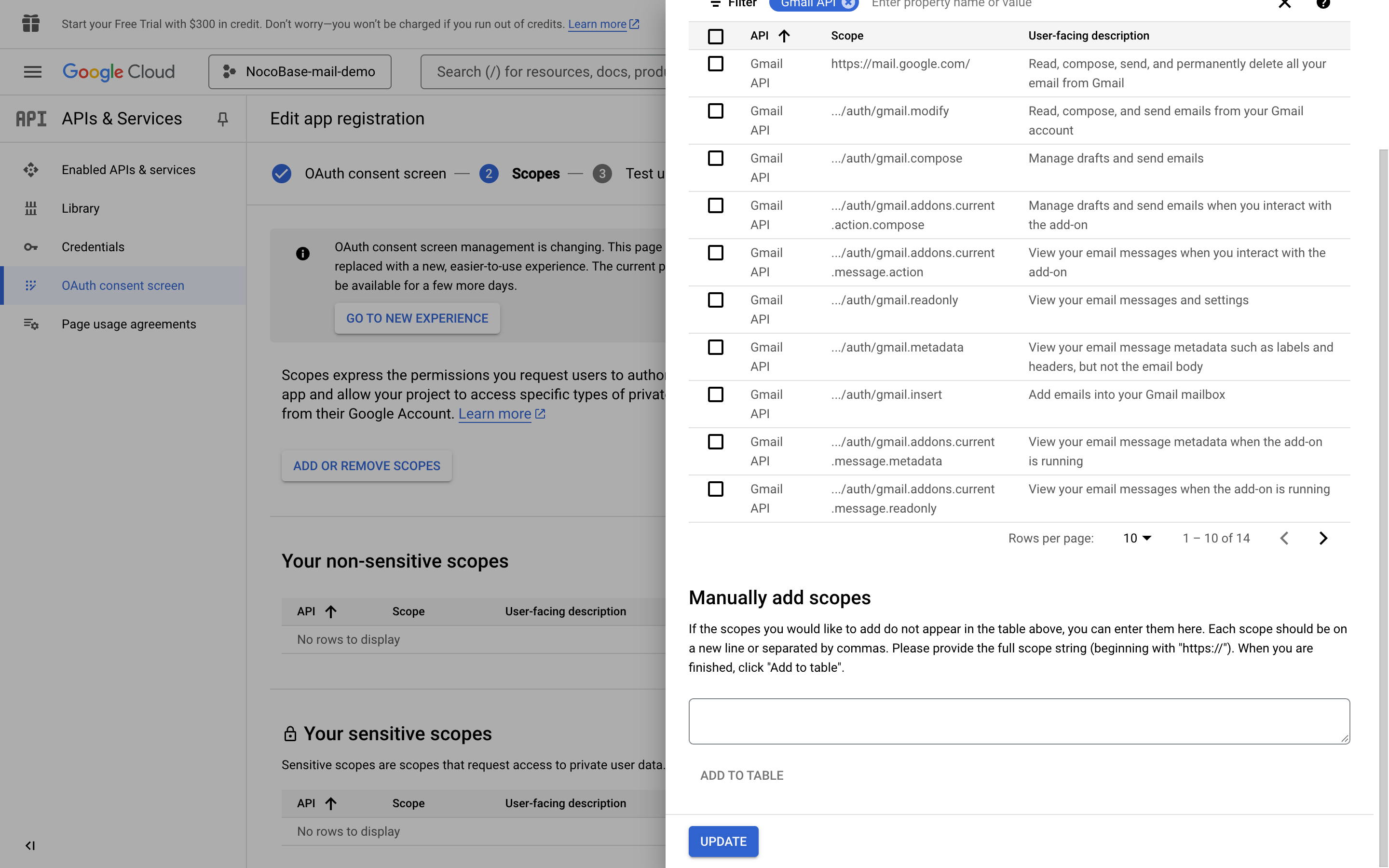
6. Click "SAVE AND CONTINUE" button at the bottom of each page, then finally click "BACK TO DASHBOARD" button to return to the dashboard page
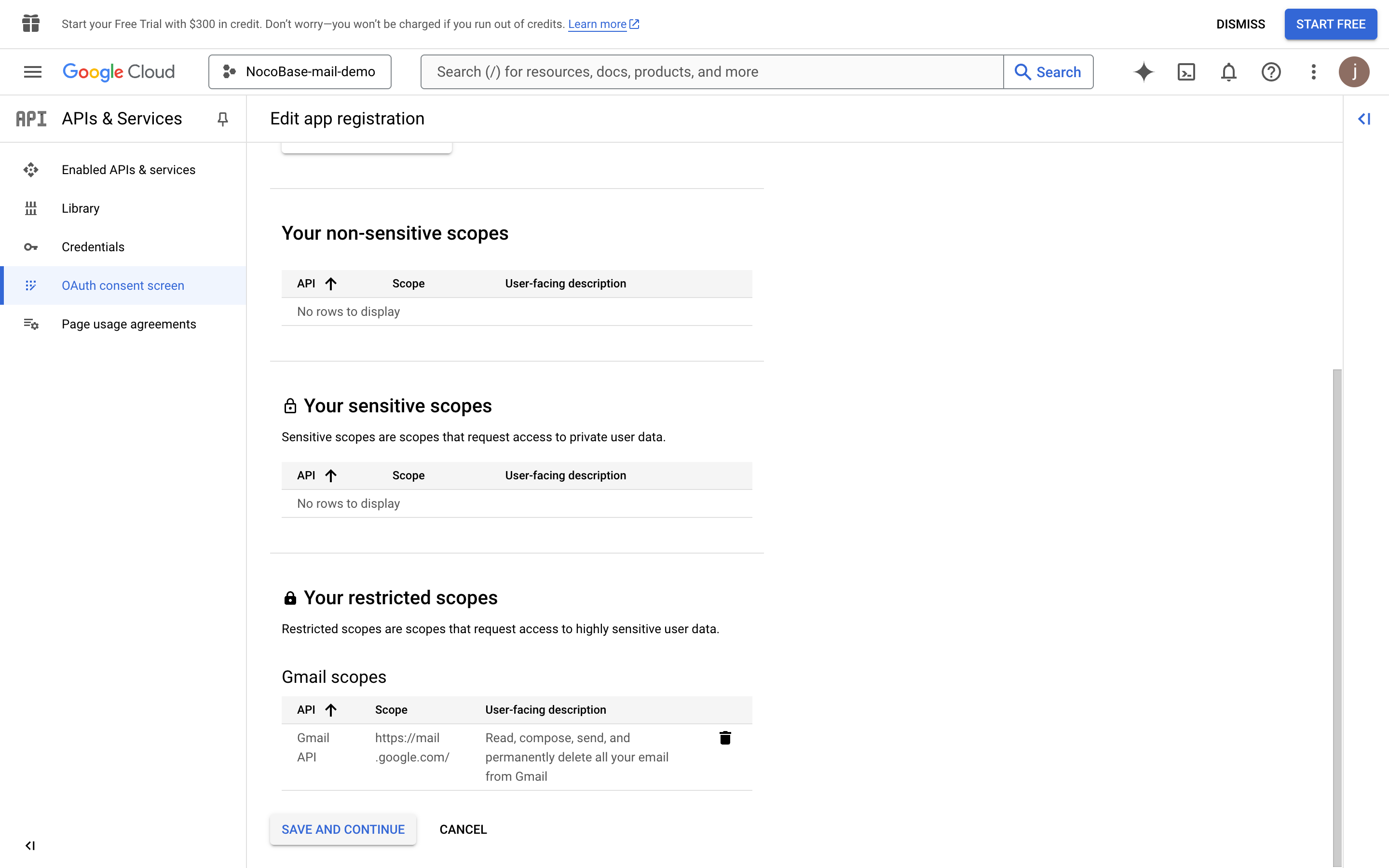
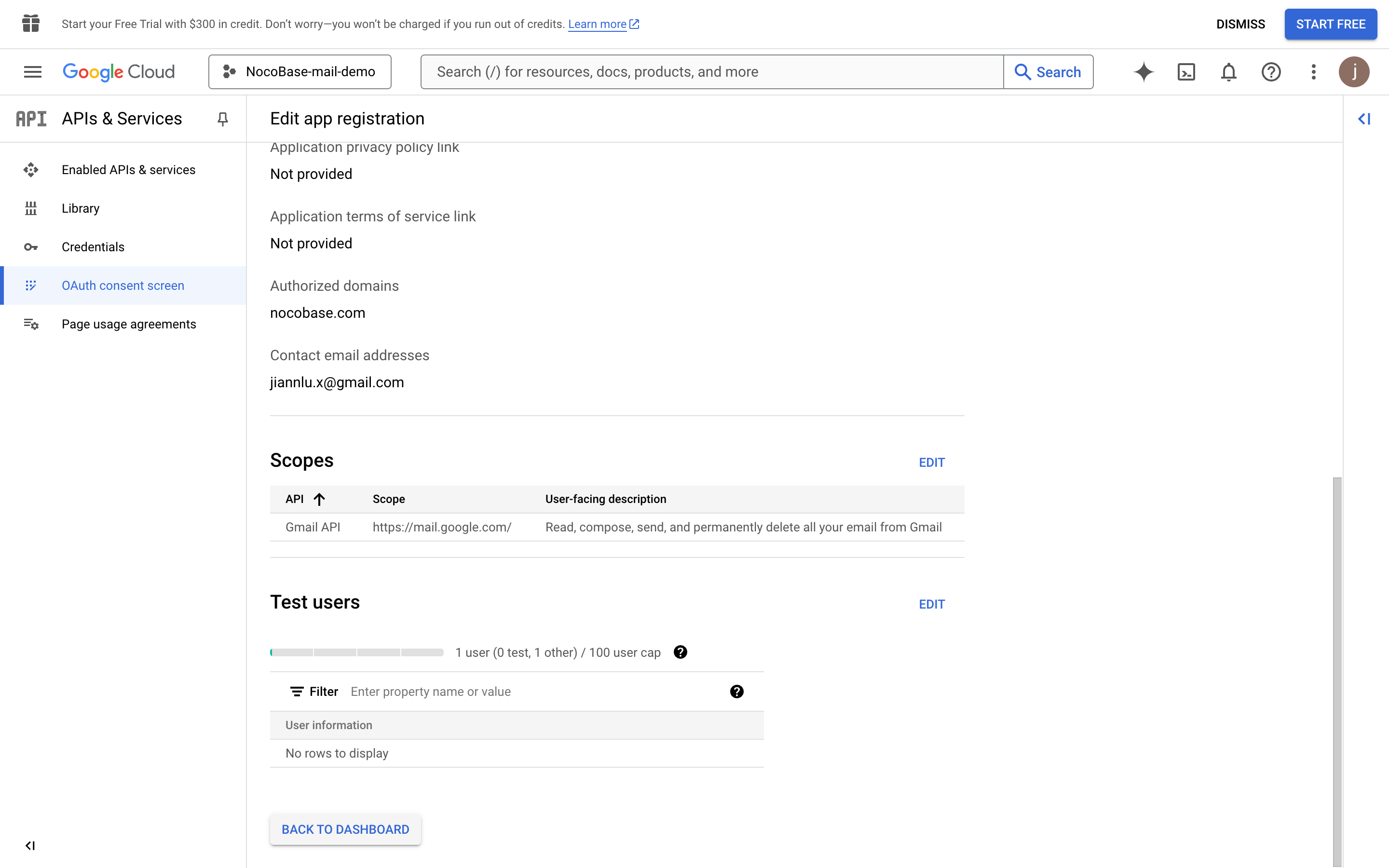
7. Click the **PUBLISH APP** button and a publication confirmation page appears showing the information required for publication. Then click the **CONFIRM** button
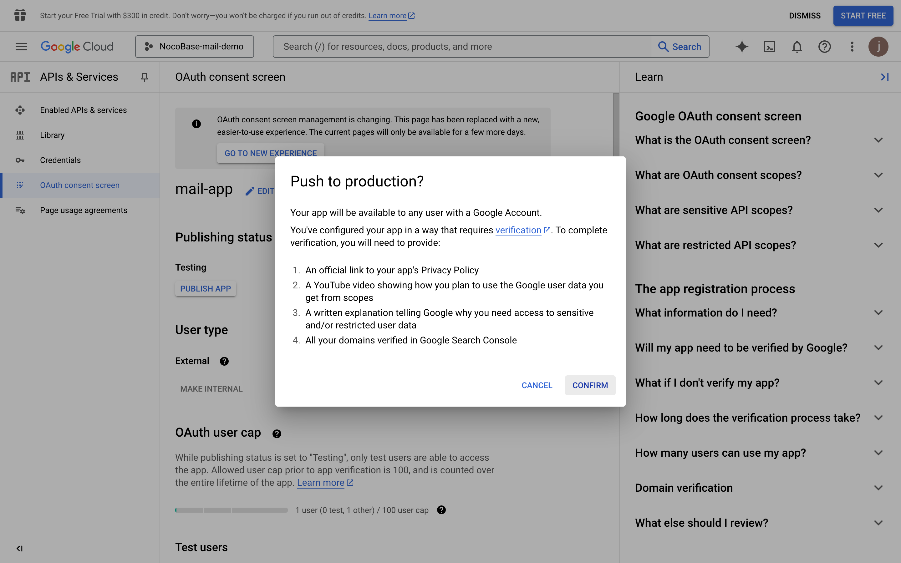
8. Return to the console page again, and you can see the publication status is "In production"
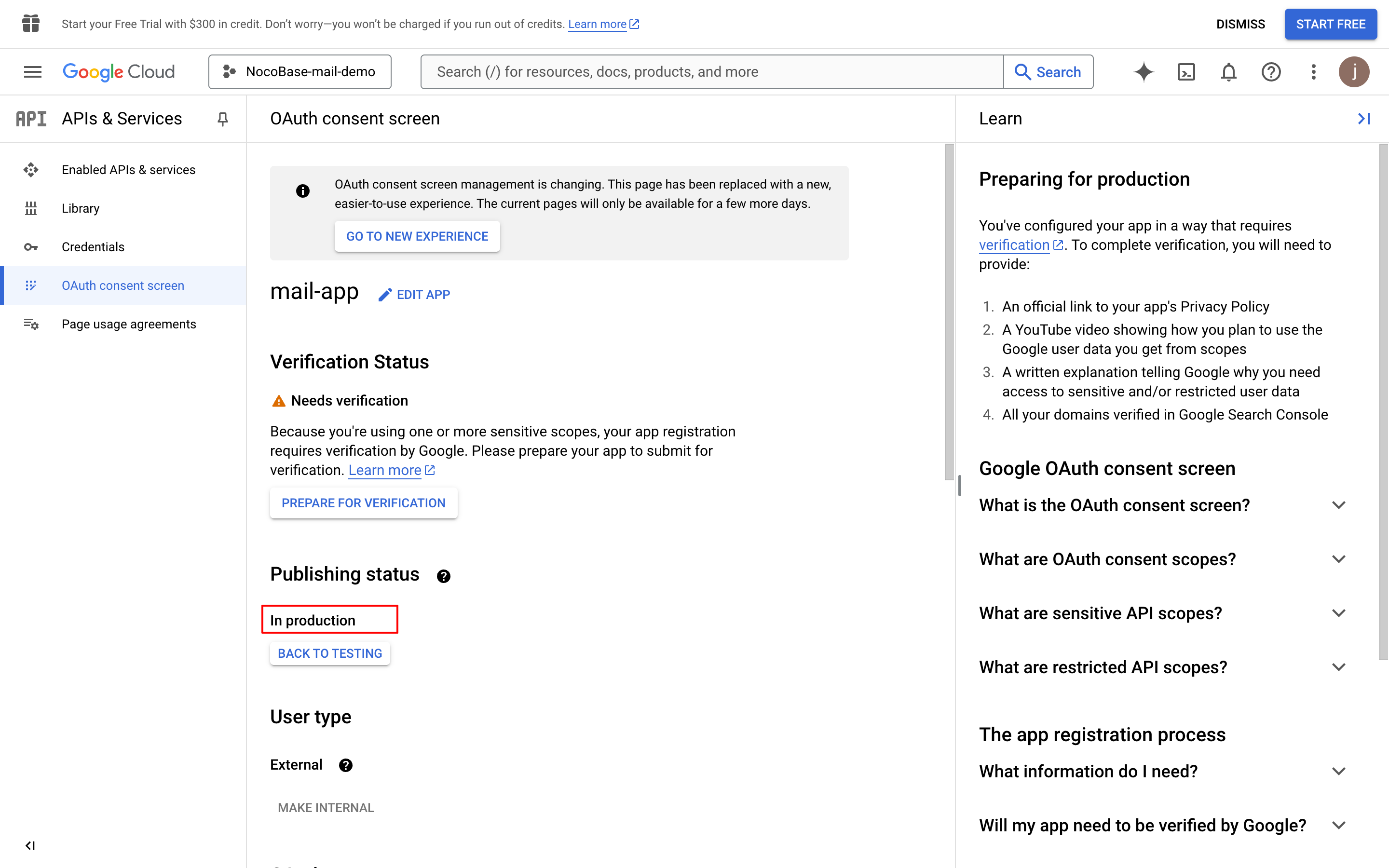
9. Click the "PREPARE FOR VERIFICATION" button, fill in the required information, and click the "SAVE AND CONTINUE" button (data in the image is for example only)
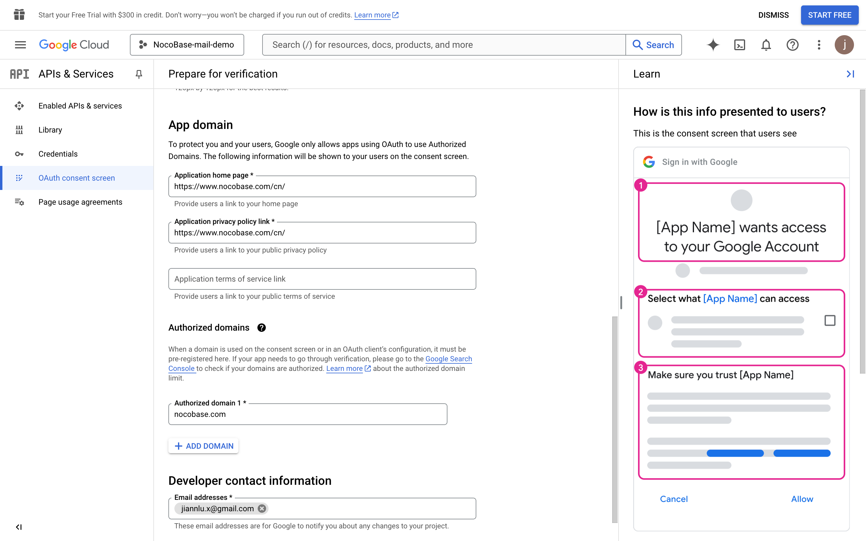
10. Continue filling in the necessary information (data in the image is for example only)
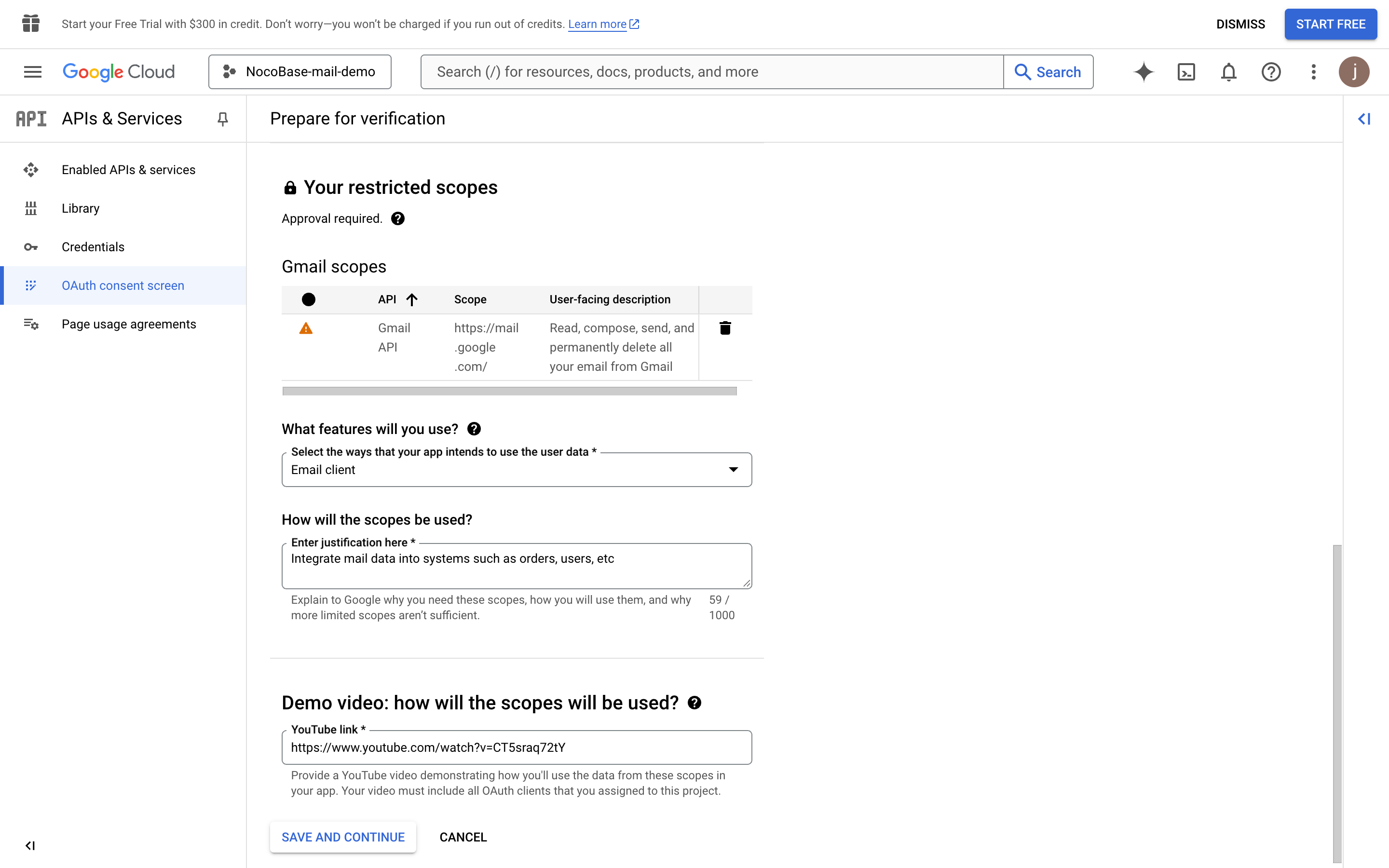
11. Click the "SAVE AND CONTINUE" button
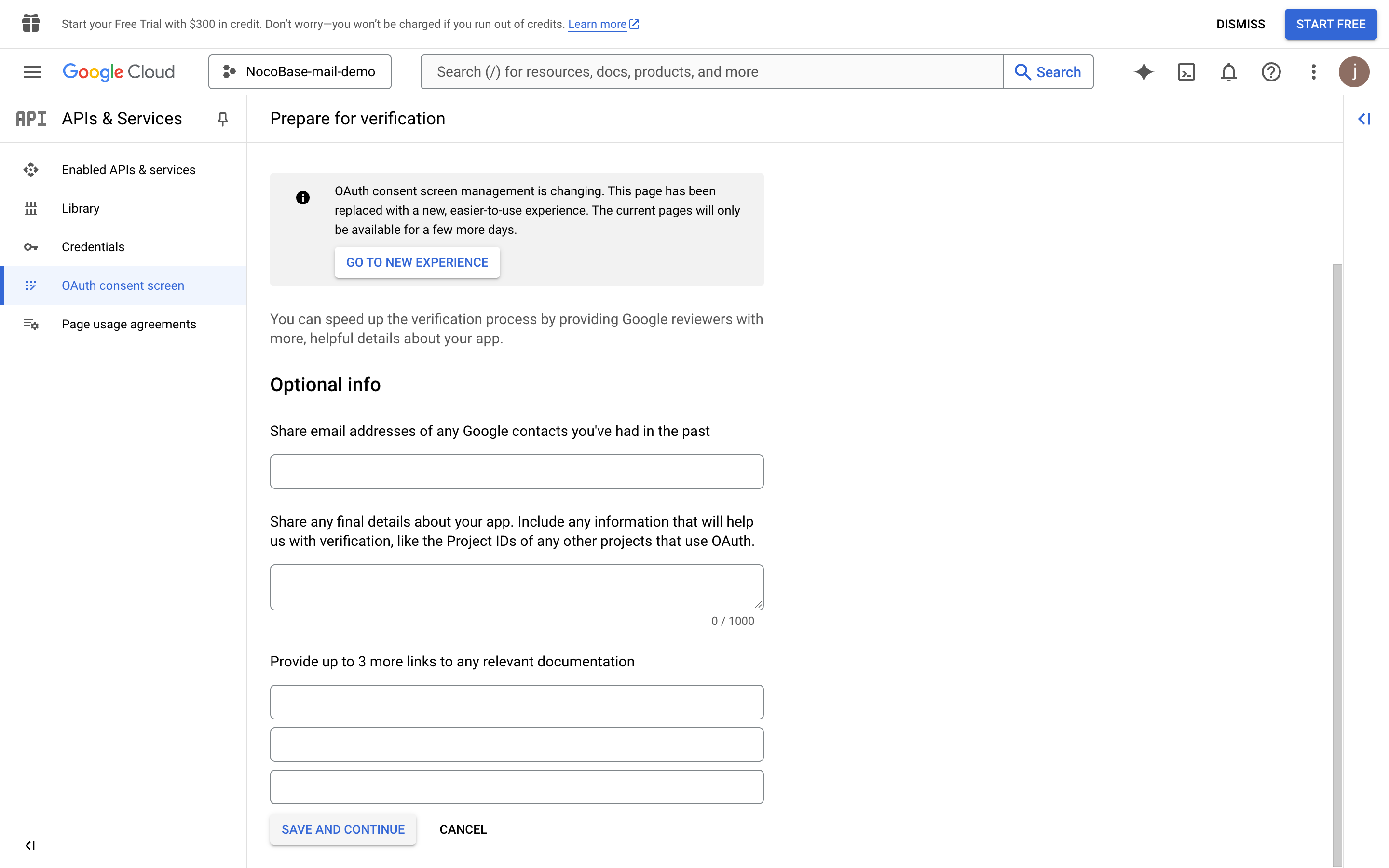
12. Click the "SUBMIT FOR VERIFICATION" button to submit Verification
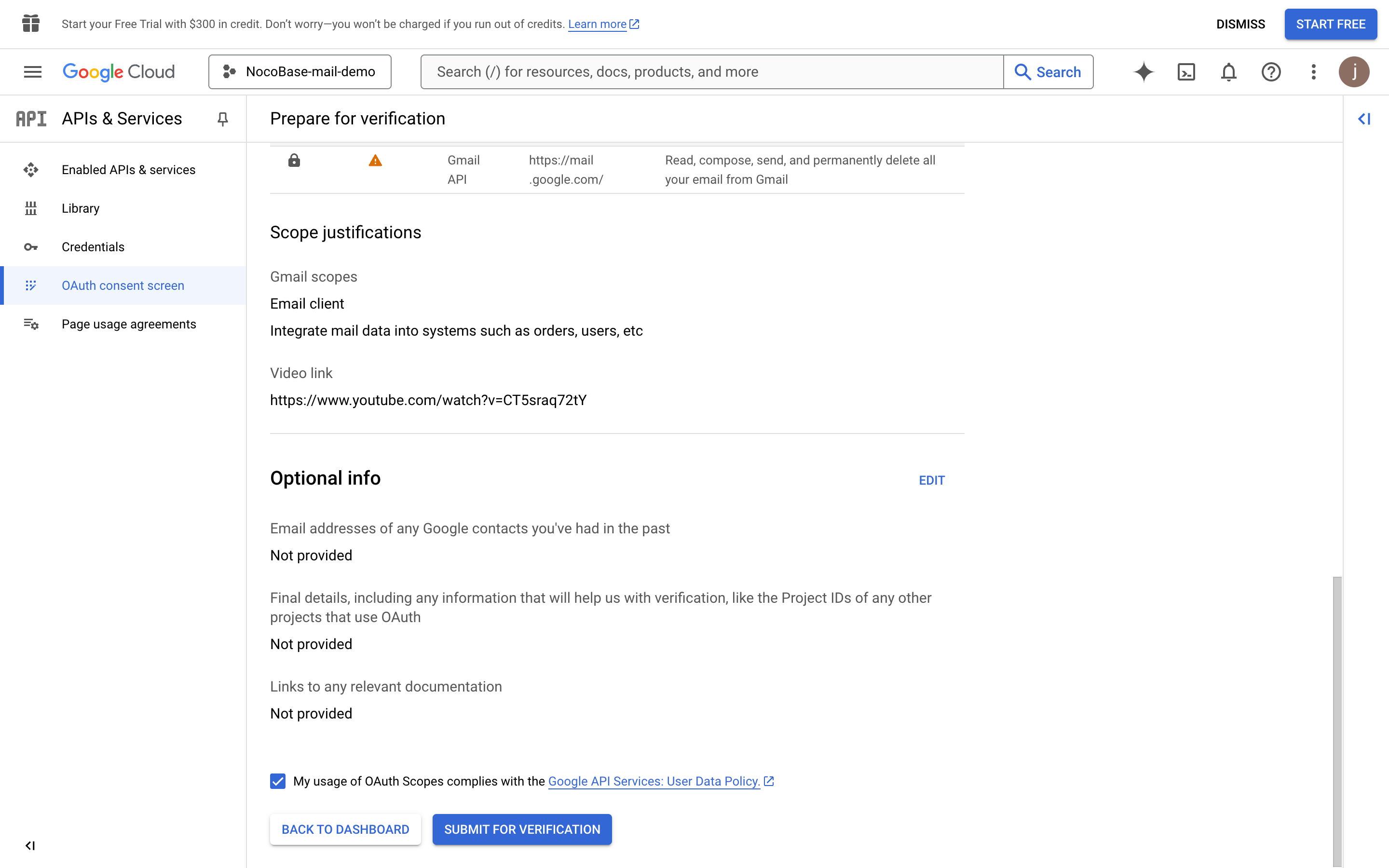
13. Wait for the approval result
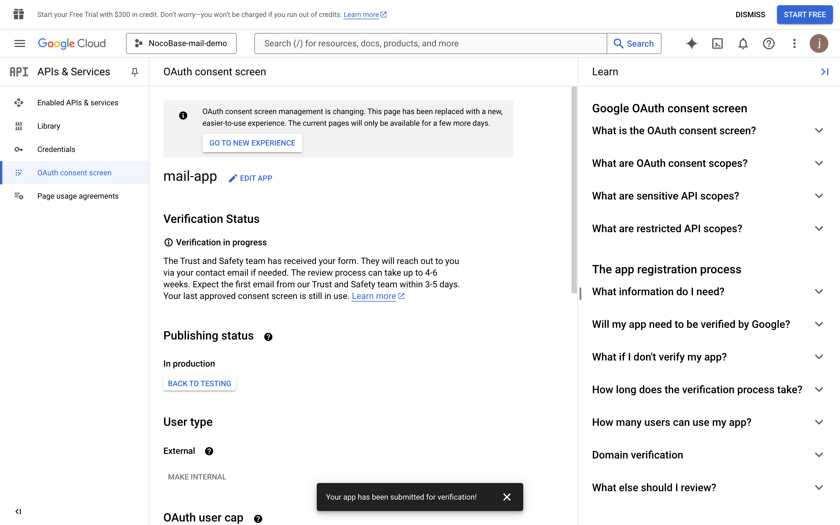
14. In case the approval has not been passed yet, users can click the unsafe link to authorize login
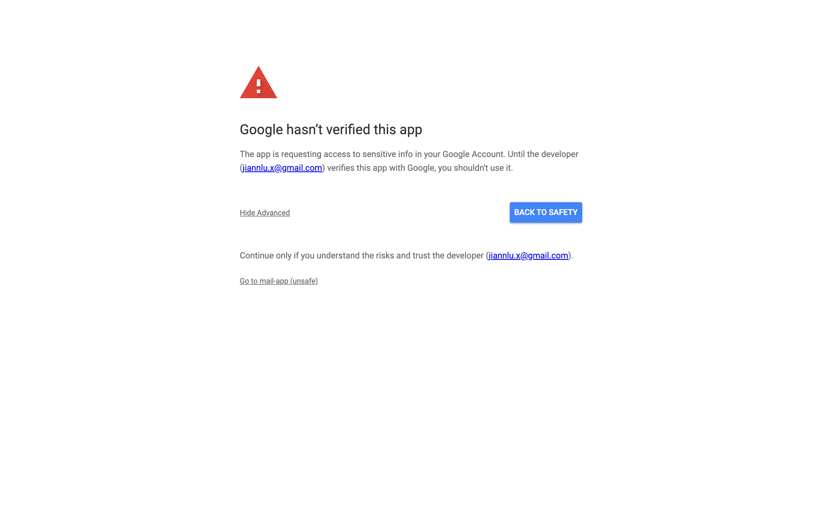
---
url: /email-manager/configuration/guide.md
---
# Configuration Guide
## Overview
After enabling the email plugin, administrators need to complete the related configuration first before regular users can integrate their email accounts into NocoBase (currently only Outlook and Gmail email accounts support authorization login; Microsoft accounts and Google accounts are not supported for direct integration).
The core of the configuration lies in the authentication settings for the email service provider's API calls. Administrators need to complete the following steps to ensure the plugin functions correctly:
1. **Obtain authentication information from the service provider**
- Log in to the email service provider's developer console (e.g., Google Cloud Console or Microsoft Azure Portal).
- Create a new application or project and enable the Gmail or Outlook email API service.
- Obtain the corresponding Client ID and Client Secret.
- Configure the Redirect URI to match the NocoBase plugin's callback address.
2. **Email Service Provider Configuration**
- Go to the Email plugin's configuration page.
- Provide the required API authentication information, including Client ID and Client Secret, to ensure proper authorization with the email service provider.
3. **Authorization Login**
- Users log in to their email accounts via the OAuth protocol.
- The plugin will automatically generate and store the user's authorization token for subsequent API calls and email operations.
4. **Connecting Email Accounts**
- After successful authorization, the user's email account will be connected to NocoBase.
- The plugin will synchronize the user's email data and provide features for managing, sending, and receiving emails.
5. **Using Email Features**
- Users can view, manage, and send emails directly within the platform.
- All operations are completed through the email service provider's API calls, ensuring real-time synchronization and efficient transmission.
Through the process described above, NocoBase's Email plugin provides users with efficient and secure email management services. If you encounter any issues during configuration, please refer to the relevant documentation or contact the technical support team for assistance.
## Plugin Configuration
### Enable the Email Plugin
1. Go to the plugin management page
2. Find the "Email manager" plugin and enable it
### Email Service Provider Configuration
After enabling the Email plugin, you can configure the email service providers. Currently, Google and Microsoft email services are supported. Click "Settings" -> "Email Settings" in the top bar to go to the settings page.
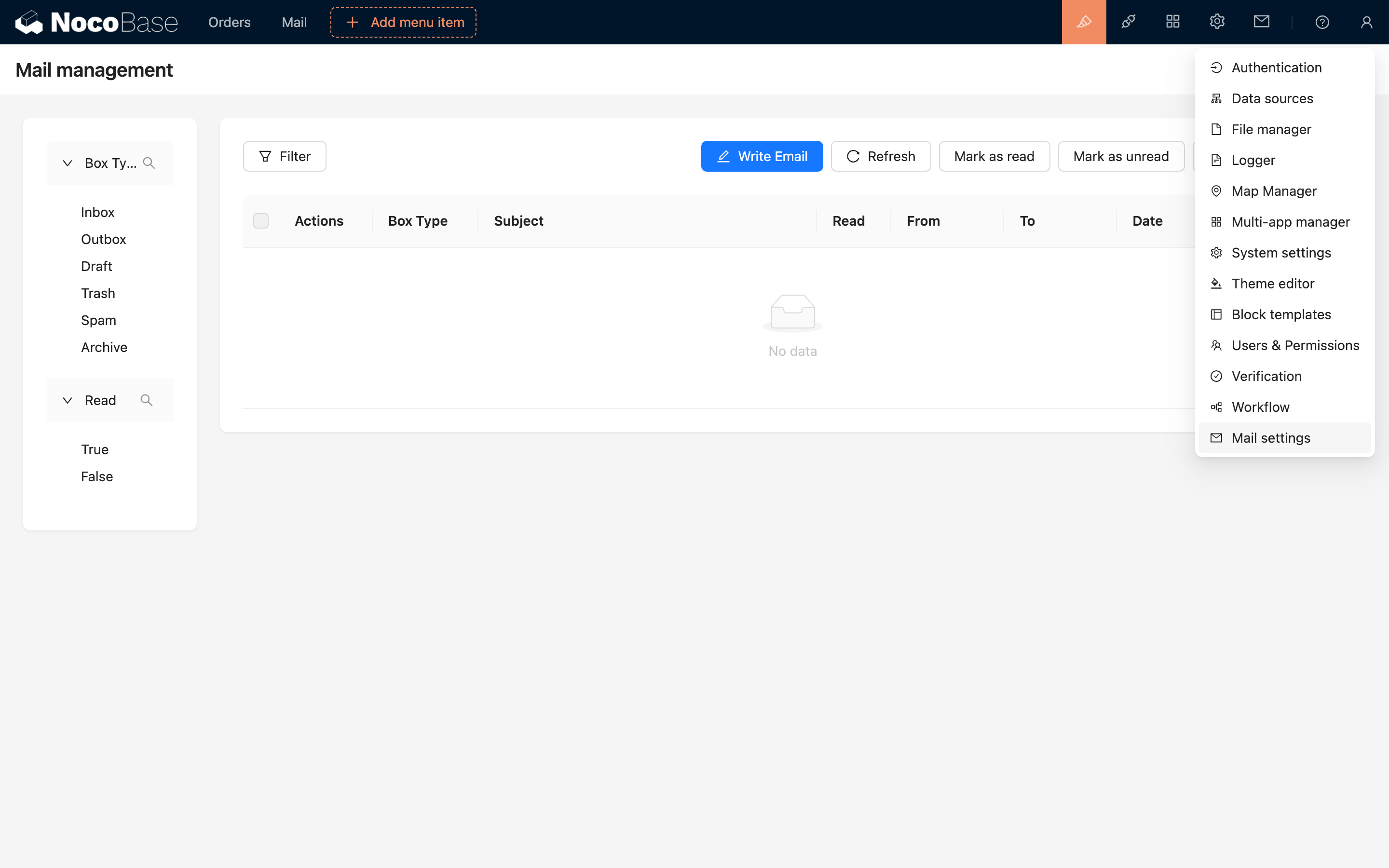
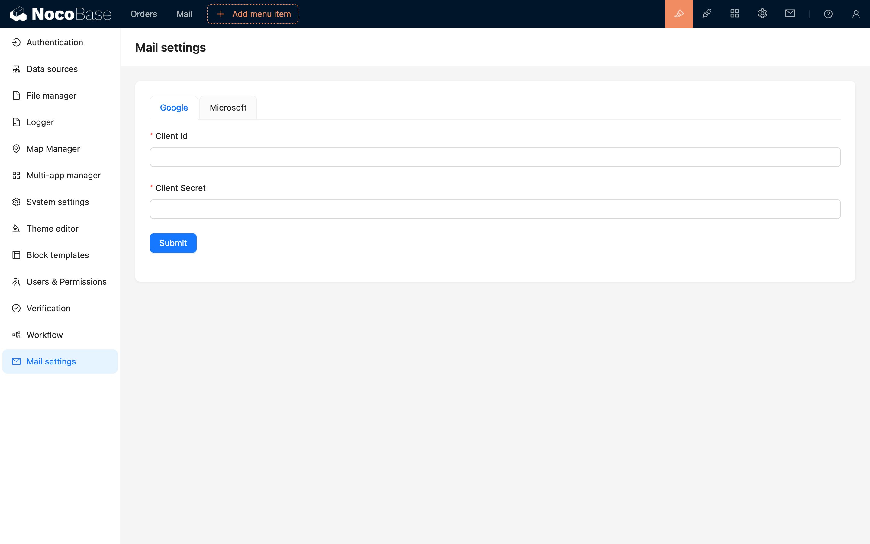
For each service provider, you need to fill in the Client ID and Client Secret. The following sections will detail how to obtain these two parameters.
---
url: /email-manager/configuration/outlook.md
---
# Microsoft Configuration
### Prerequisites
For users to be able to integrate Outlook email into NocoBase, the system must be deployed on a server that supports access to Microsoft services. The backend will call Microsoft API.
### Register Account
1. Open https://azure.microsoft.com/en-us/pricing/purchase-options/azure-account
2. Log in to your Microsoft account
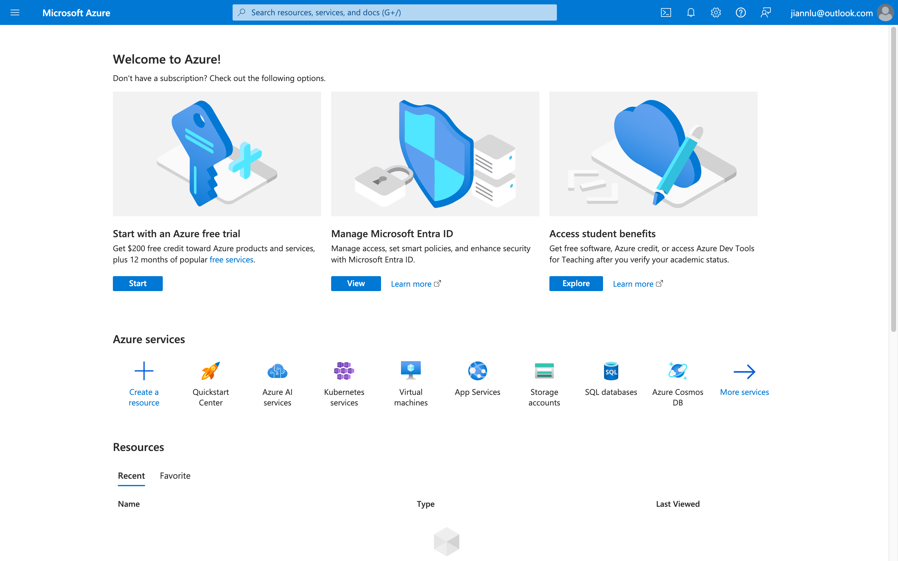
### Create Tenant
1. Open https://azure.microsoft.com/zh-cn/pricing/purchase-options/azure-account?icid=azurefreeaccount and log in to your account
2. Fill in basic information and obtain verification code
3. Fill in other information and continue
4. Fill in credit card information (can be created later)
### Get Client ID
1. Click the top menu and select **Microsoft Entra ID**
2. Select **App registrations** on the left
3. Click **New registration** at the top
4. Fill in the information and submit
The name can be anything, select account types as shown in the figure, and Redirect URI can be left blank for now
5. Obtain the Client ID
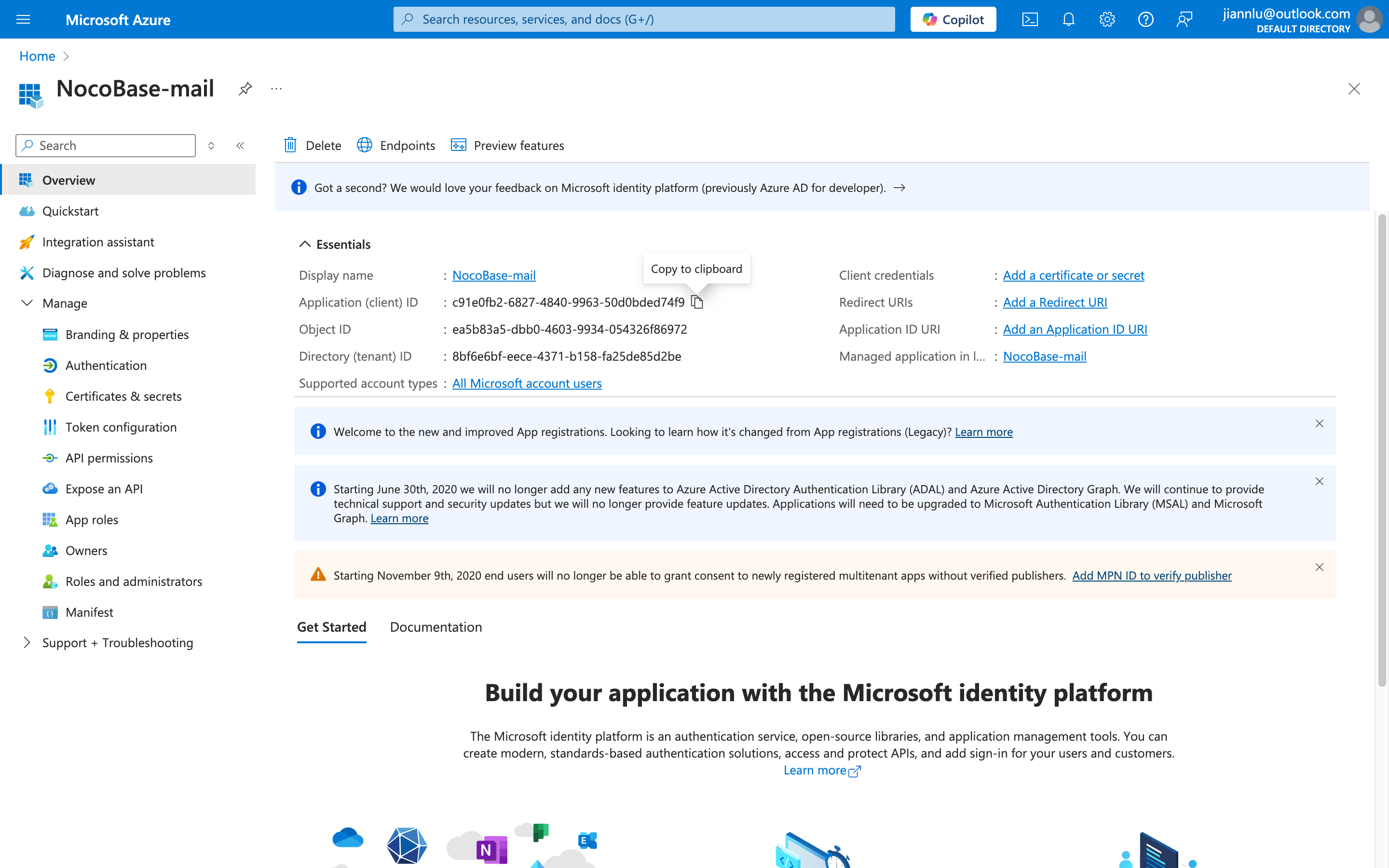
### API Permissions
1. Open the **API permissions** menu on the right
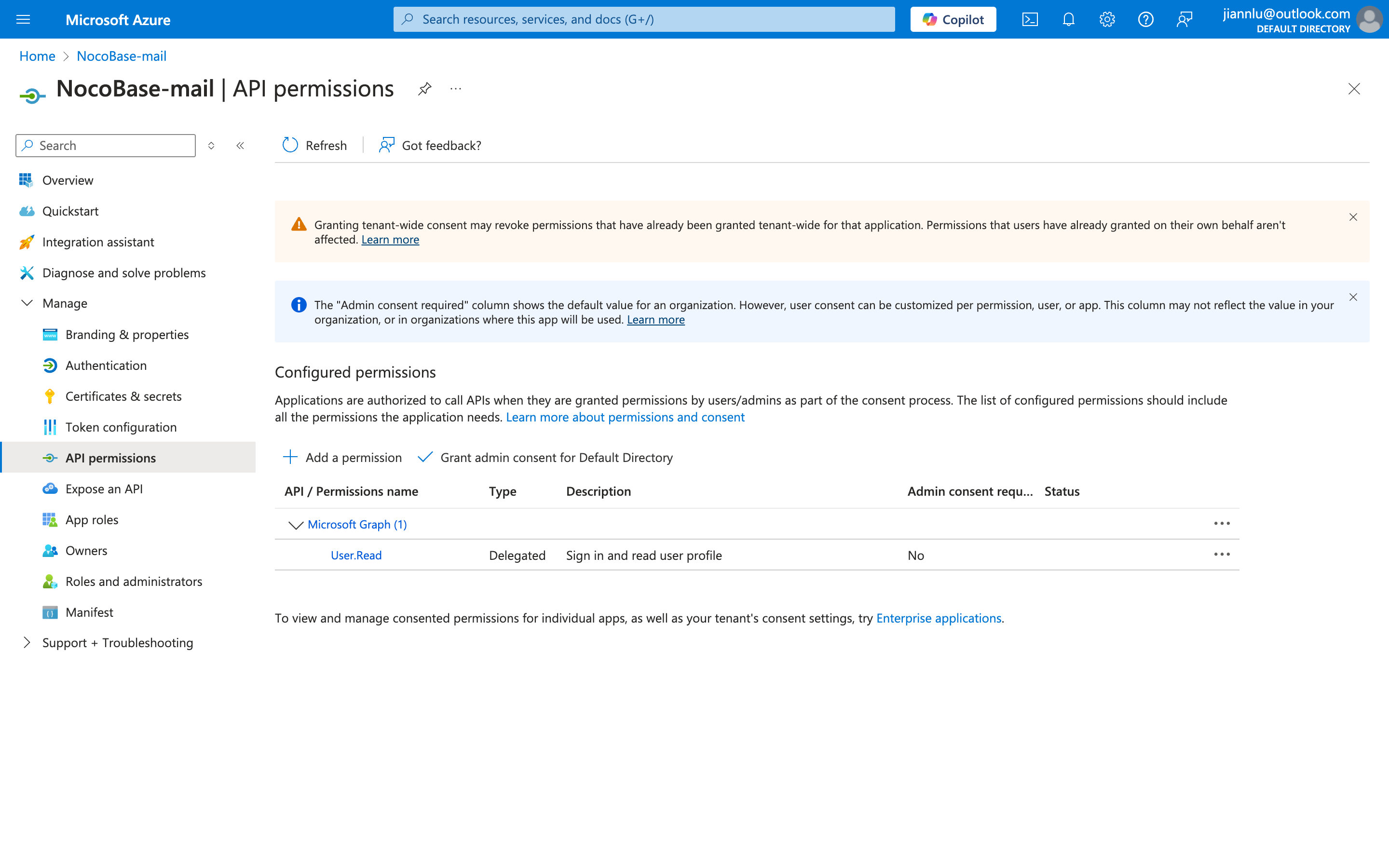
2. Click the **Add a permission** button
3. Click **Microsoft Graph**
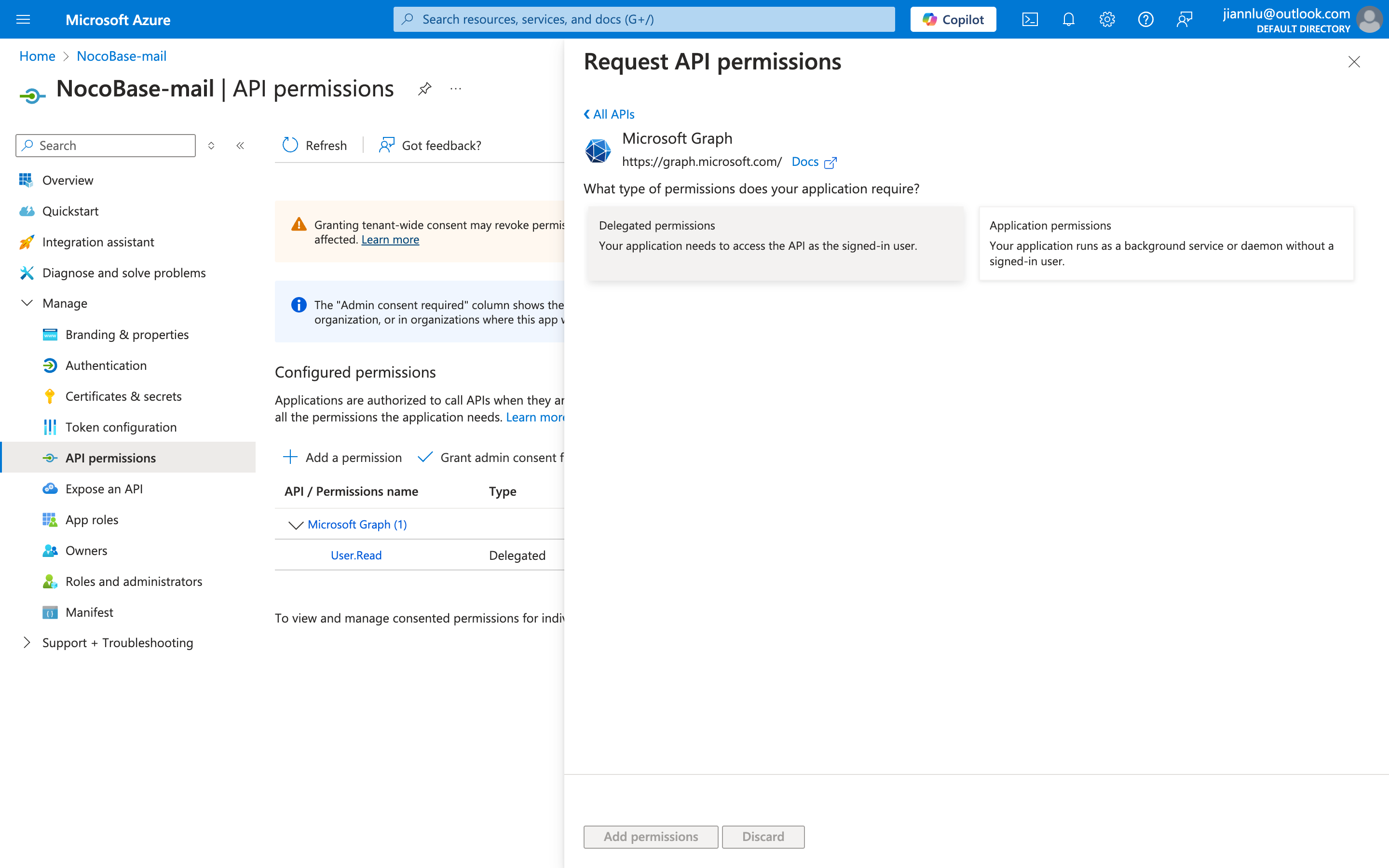
4. Search and add the following permissions, with the final result shown in the image below
1. `"email"`
2. `"offline_access"`
3. `"IMAP.AccessAsUser.All"`
4. `"SMTP.Send"`
5. `"offline_access"`
6. `"User.Read"` (By default)
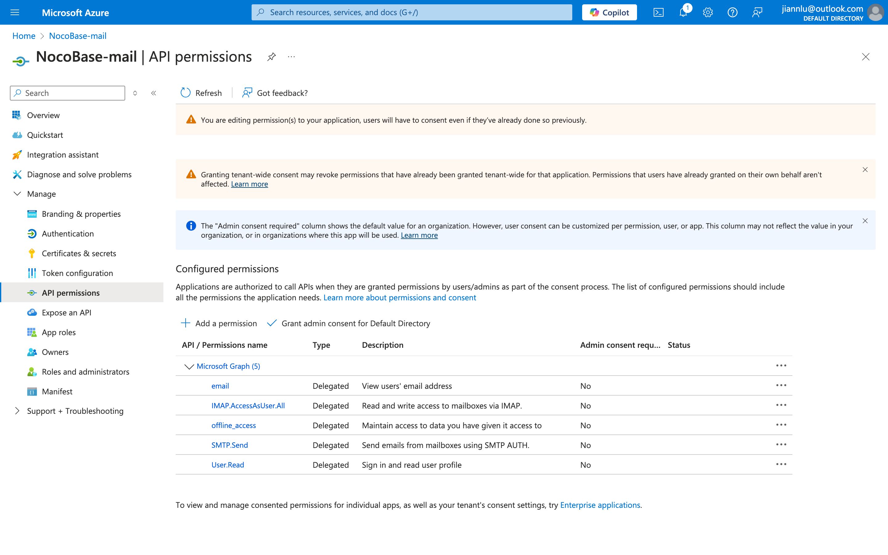
### Get Client Secret
1. Click **Certificates & secrets** on the left
2. Click the **New client secret** button
3. Fill in the description and expiration time, and add it
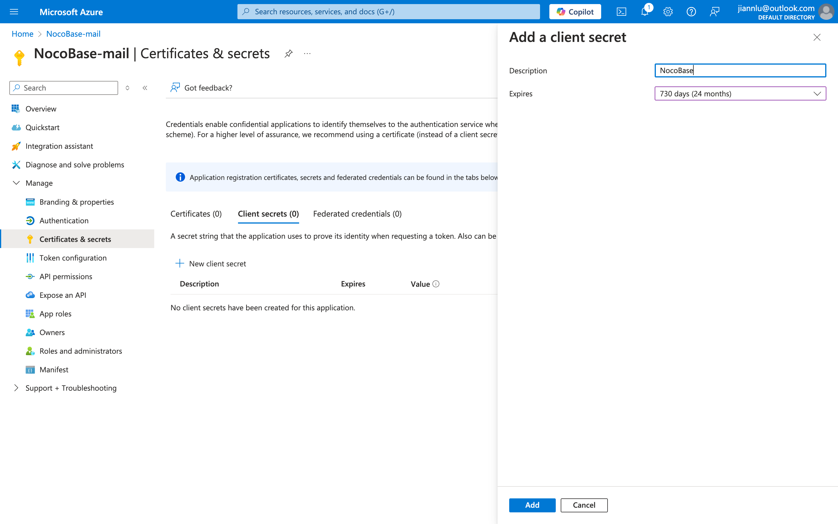
4. Obtain the Client Secret
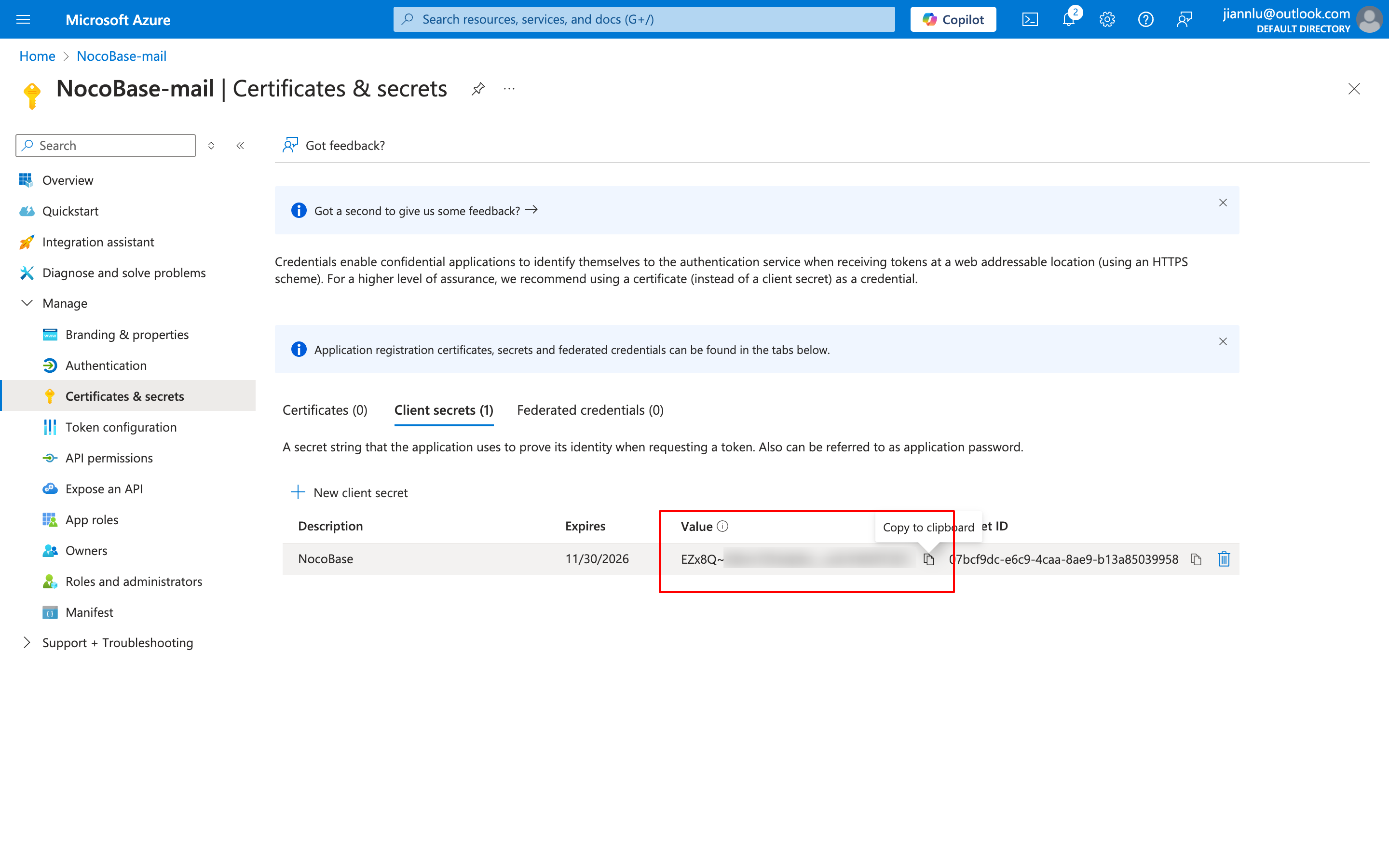
5. Copy the Client ID and Client Secret information respectively and fill them into the email configuration page
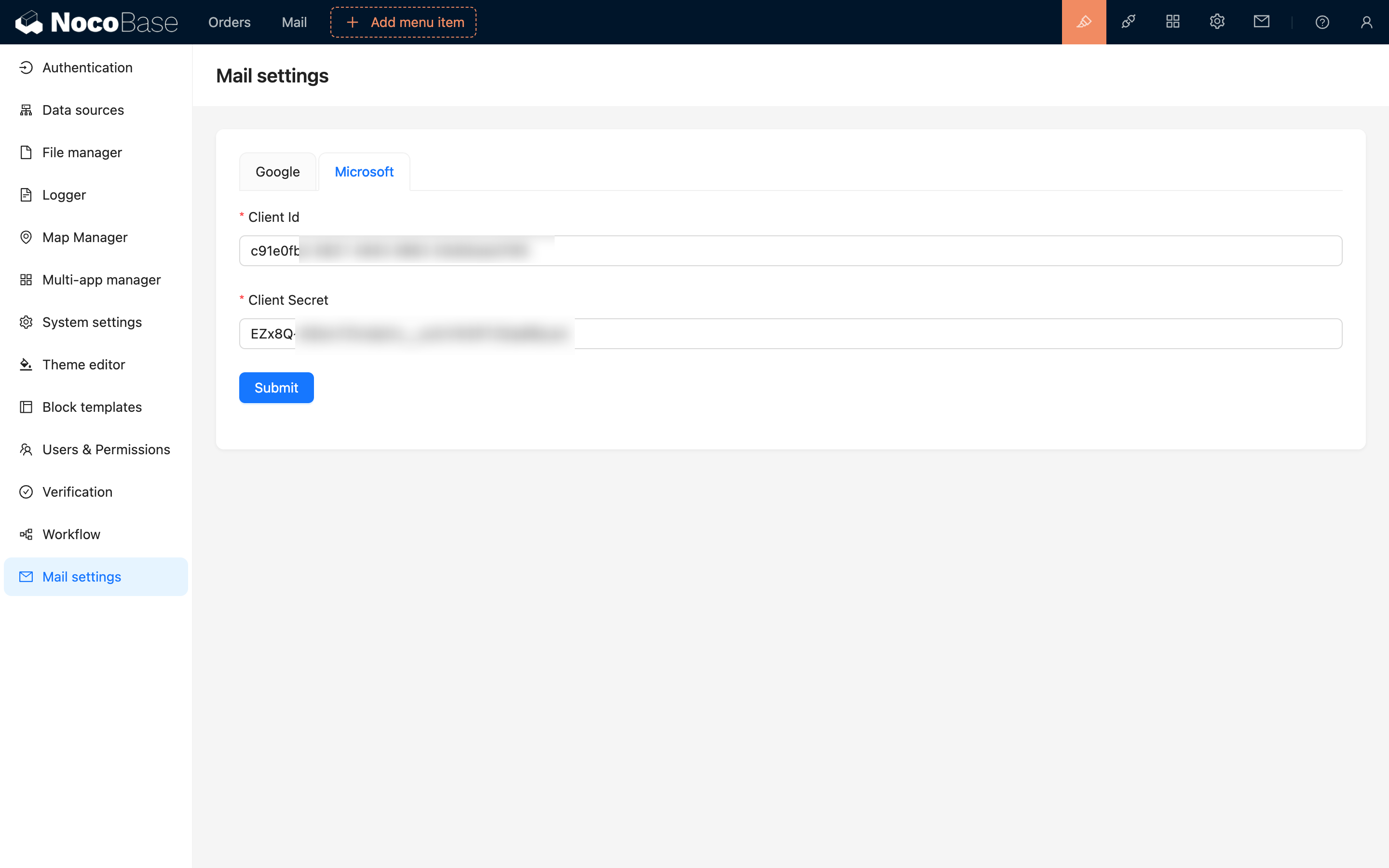
---
url: /email-manager/index.md
---
# Email Manager
## Introduction
Email Manager is an efficient and convenient tool that supports Gmail and Outlook email authorization integration, helping users incorporate email management, sending, and receiving capabilities into various blocks and pages. Through simple authorization configuration, users can achieve unified multi-account management and enjoy seamless email communication.
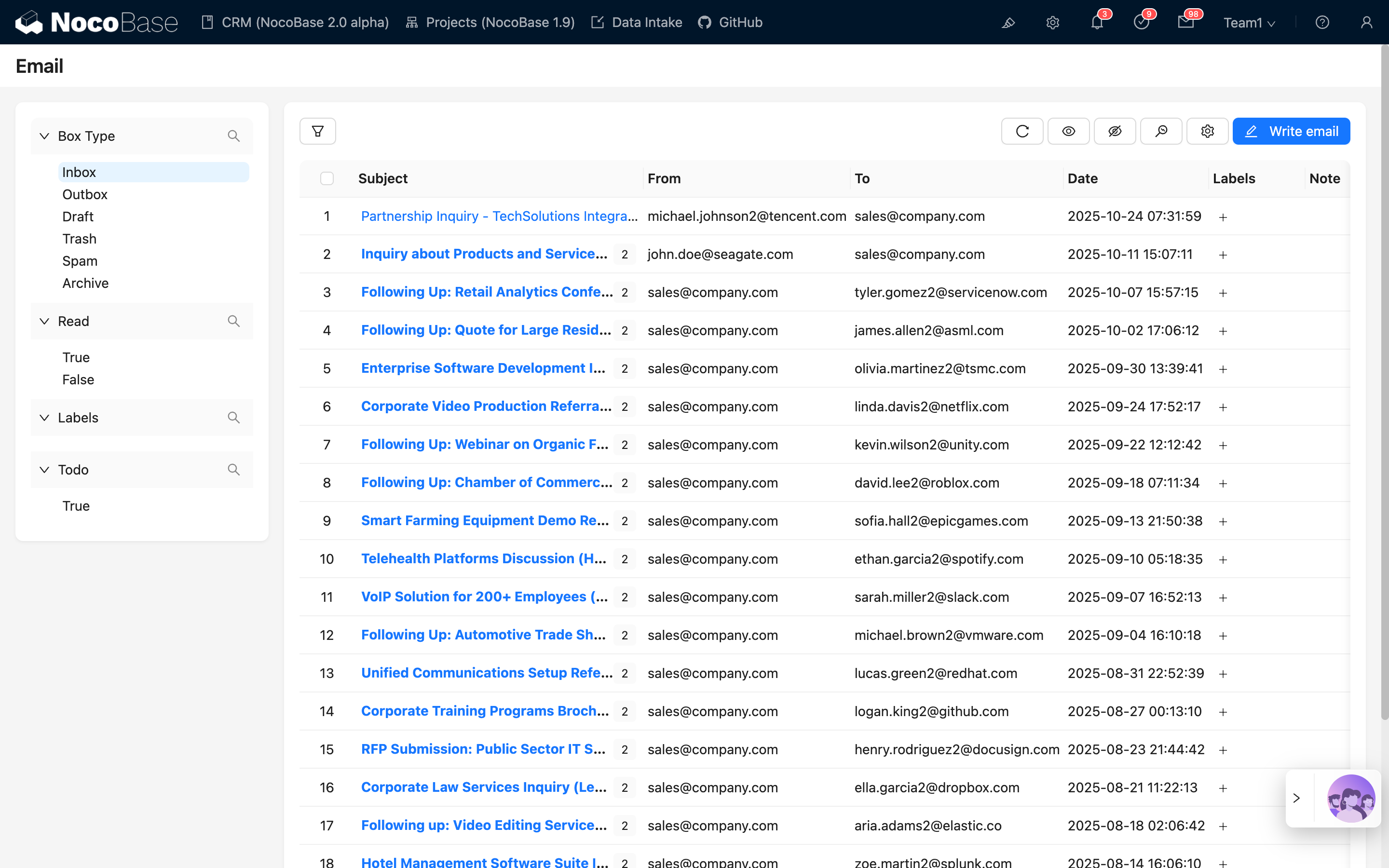
---
url: /email-manager/usage/configuration.md
---
# Block Configuration
## Email Message Block
### Add Block
On the configuration page, click the **Create block** button and select the **Email table** block to add an email message block.

### Field Configuration
Click the **Fields** button of the block to select the fields you need to display. For detailed operations, refer to the table's field configuration.

### Set Data Scope
The block's right-side configuration can select the data scope: all emails or the current logged-in user's emails.
.png)
### Filter Data by Email Address
Click the configuration button on the right side of the email message block and select **Data scope** to set the data range for filtering emails.
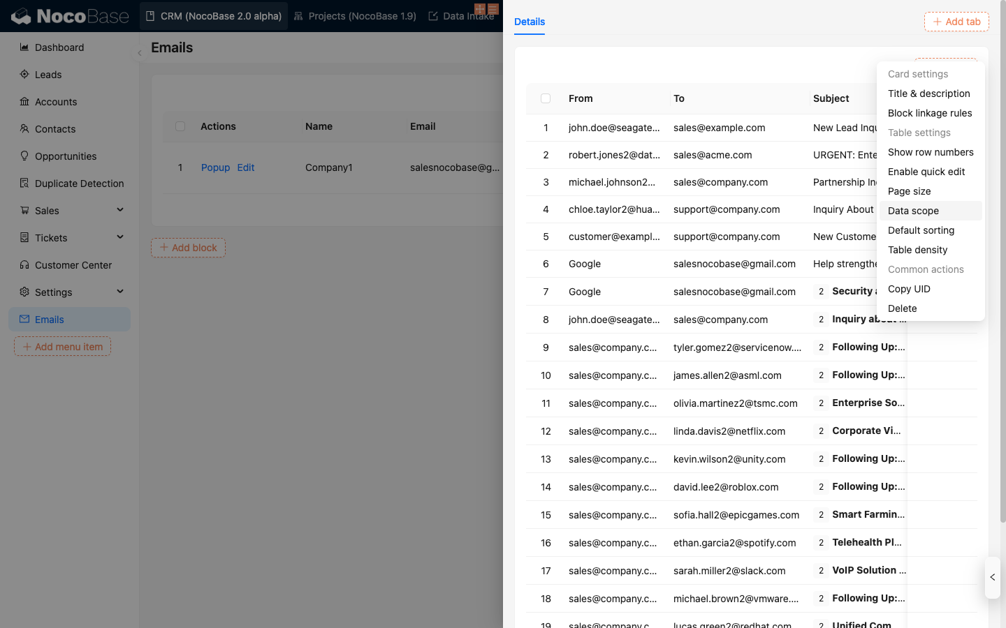
Configure the filter conditions, select the email address field you need to filter, and click **OK** to save.
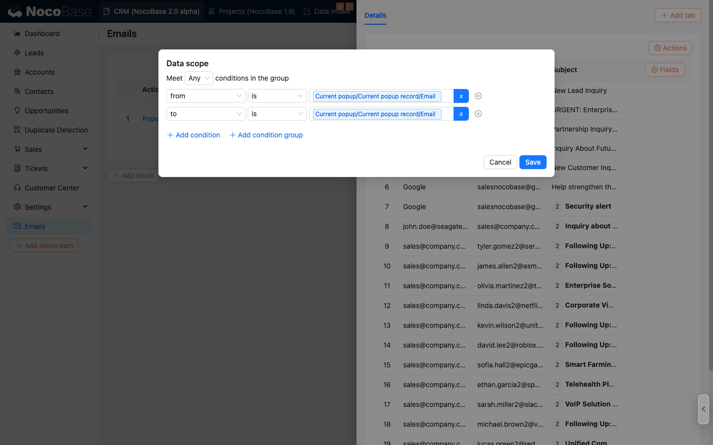
The email message block will display emails that meet the filter conditions.
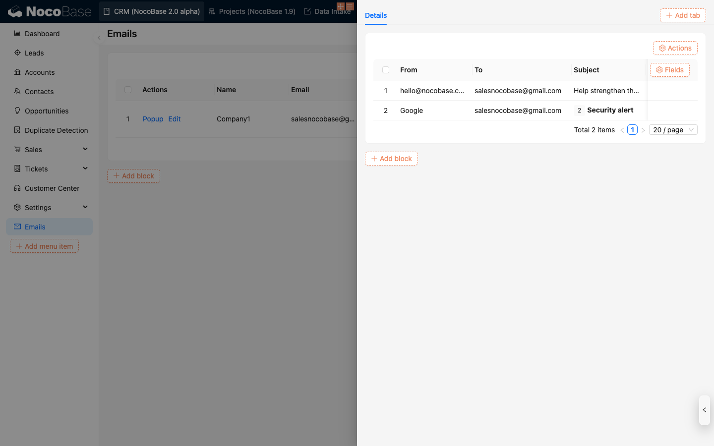
> Email address filtering is case-insensitive
### Filter Data by Email Domain
Create a field in the business table to store email domain information (type as JSON) for filtering email messages in subsequent operations.
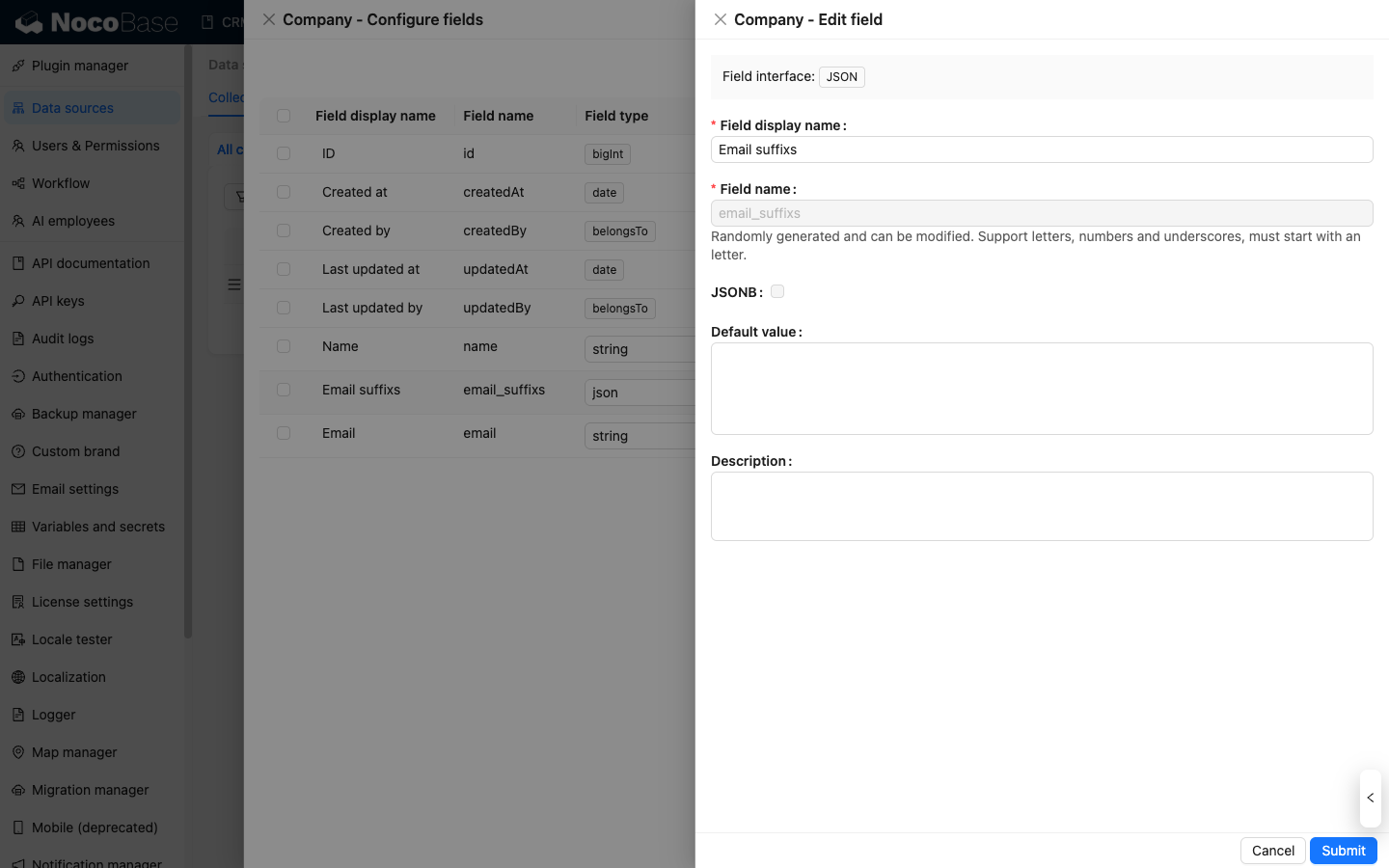
Maintain email domain information.
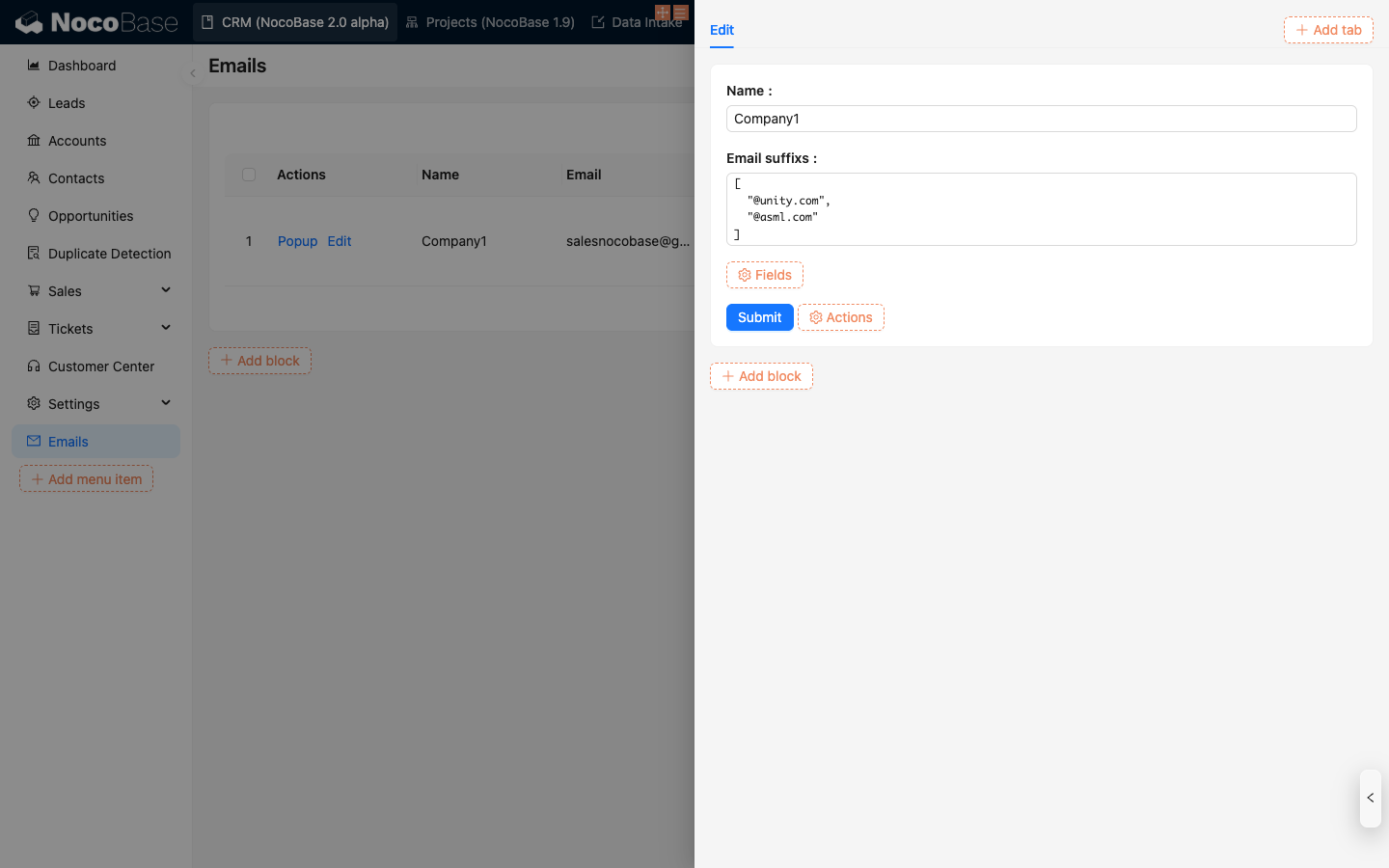
Click the configuration button on the right side of the email message block and select **Data scope** to set the data range for filtering emails.

Configure the filter conditions, select the email domain field you need to filter, and click **OK** to save.
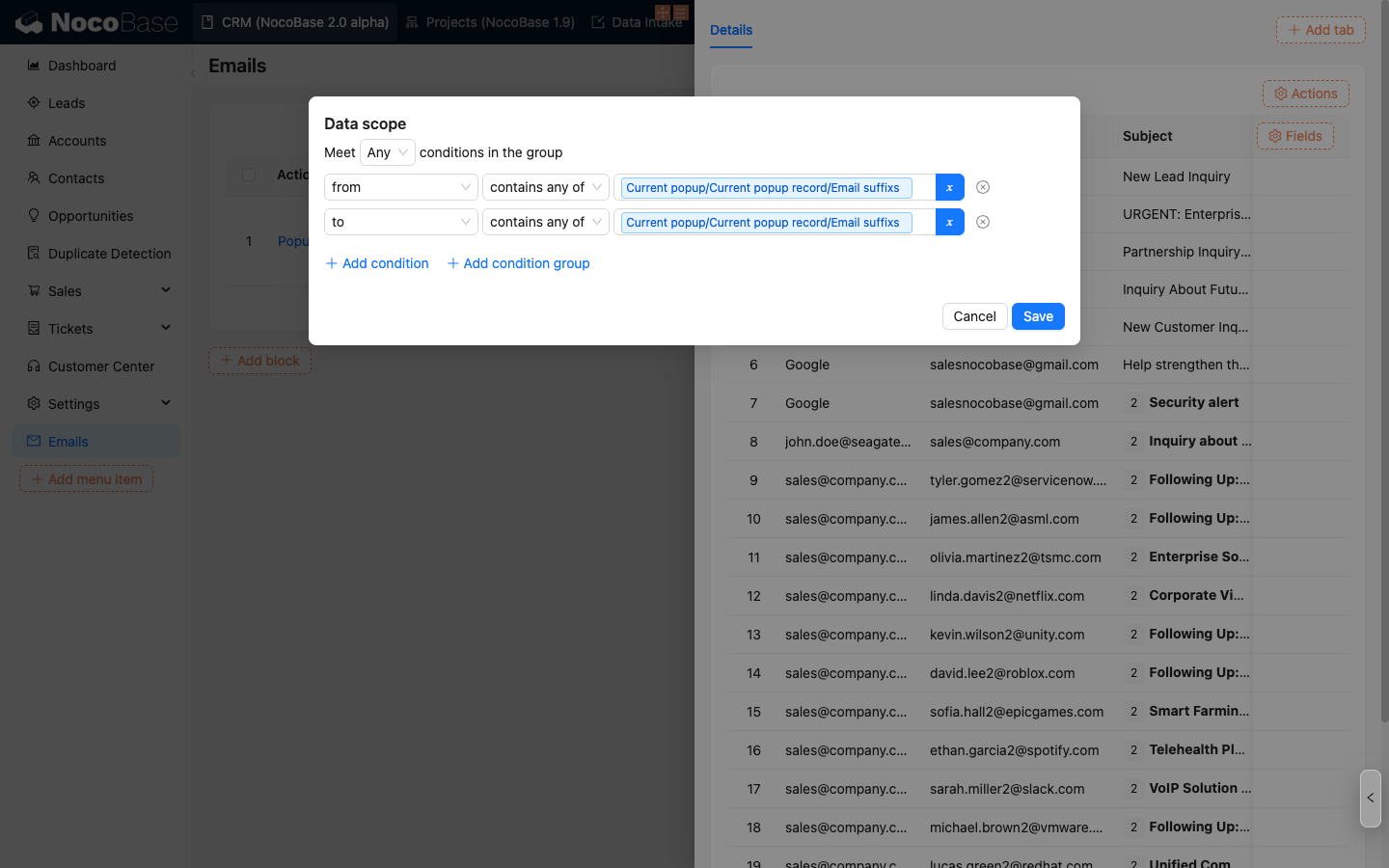
The email message table will display emails that meet the filter conditions.
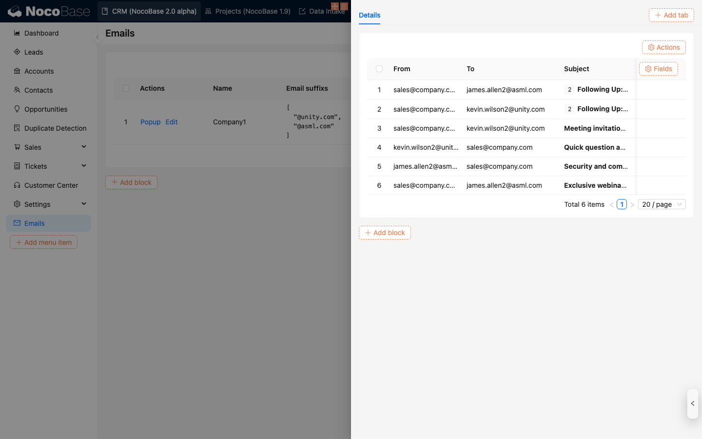
## Email Detail Block
First, enable the **Enable click to open** feature in the fields of the email message block.

Add an **Email details** block in the pop-up window.

You can view the detailed content of the email.

You can customize the buttons you need at the bottom.
> If the current email is in draft status, the draft editing form is displayed by default.
## Email Send Block
There are two ways to create an email sending form:
1. Add a **Send email** button at the top of the table:

2. Add an **Email send** block:

Both methods can create a complete email sending form.
.png)
Each field in the email form is consistent with ordinary forms and can be configured with **default values** or **linkage rules**, etc.
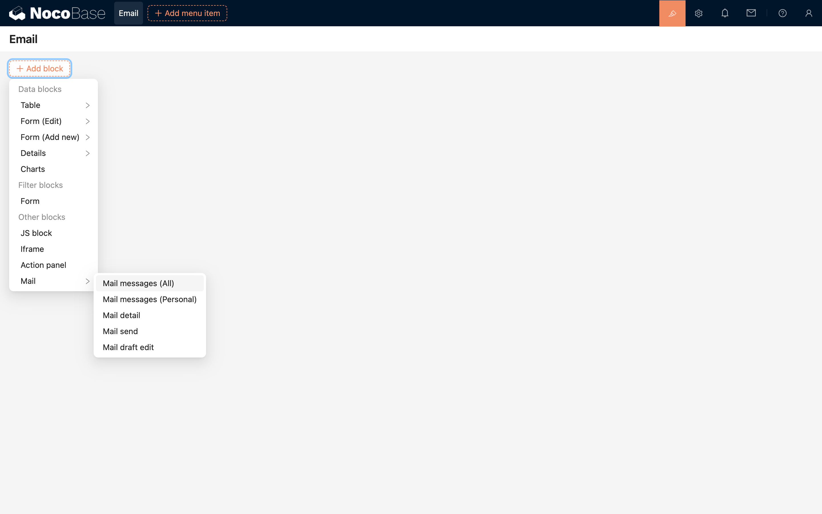
---
url: /email-manager/usage/guide.md
---
# Email Center
<PluginInfo commercial="true" name="email-manager"></PluginInfo>
## Introduction
After the email plugin is enabled, the system provides an email management center by default for account integration, email management, and feature configuration.
Click the email message icon in the upper right corner to enter the email management page.

## Account Association
### Associate Account
Click the **Settings** button, and after opening the floating layer, click the **Link account** button to select the email type you want to associate.


The browser automatically opens the login page for the corresponding email service. Log in to your account and authorize (the authorization process varies by service provider).

After authorization is complete, you will be redirected back to NocoBase. Select the synchronization start time to associate the account and synchronize data (the first synchronization may take a long time, please wait).

After data synchronization is complete, the current page will automatically close and return to the original email message page. At this point, you can see that the account has been associated.
.png)
### Delete Account
Click **Delete** to delete the account and associated emails.

## Email Management
### Email Filtering
The left side of the email management page is the filtering area, and the right side is the email list area.

Emails with the same subject are consolidated, and the subject field shows how many related emails there are in total.

Unread email titles are displayed in bold, and the email icon at the top displays the number of unread emails.
### Manual Email Synchronization
The current email synchronization interval is 5 minutes. If you need to force synchronize emails, you can click the **Sync emails** button.

### Send Email
Click the **Send email** button at the top to open the send panel.
.png)
Fill in the relevant information and send the email. Attachments only support files under 3MB.

### View Email
Click the **Subject** field on the row to view email details. Email details have two forms:
A single email form allows you to view detailed information directly.

Multiple emails with the same subject are displayed in list form by default, and you can click to expand or collapse.

After viewing the email details, the email status is set to read by default. You can click the **...** button on the right and select **Mark as unread** to set it as unread.
### Reply and Forward
After entering the email details, there are **Reply** and **Forward** buttons at the bottom for performing the corresponding operations.

Click the email message icon in the upper right corner to enter the email management page.
---
url: /email-manager/usage/signature.md
---
# Email Signature
## Signature Configuration
Go to the Email Management Center and click the Settings button.

Switch to the Signature panel.
.png)
Here you can manage signatures. Check the option before a signature to set it as the default signature.

## Signature Usage
In the email compose box, click the signature icon to select the desired signature.

---
url: /email-manager/usage/template.md
---
# Email Template
## Template Configuration
Go to the Email Management Center and click the Settings button.

Switch to the Template panel.

Here you can manage templates.

## Template Usage
In the email compose box, click the template icon to select the desired template.
.png)
---
url: /file-manager/field-attachment.md
---
# Attachment
## Introduction
The system has a built-in "Attachment" field type to support file uploads in custom collections.
The Attachment field is fundamentally a Many-to-Many association field that points to the built-in "Attachments" (`attachments`) collection. When an Attachment field is created in any collection, a junction table for the many-to-many relationship is automatically generated. The metadata of uploaded files is stored in the "Attachments" collection, and the file information referenced in the collection is associated through this junction table.
## Field Configuration

### MIME Type Restrictions
Used to restrict the types of files allowed for upload, using the [MIME](https://developer.mozilla.org/en-US/docs/Web/HTTP/Basics_of_HTTP/MIME_types) syntax format. For example: `image/*` represents image files. Multiple types can be separated by a comma, for example: `image/*,application/pdf` allows both image and PDF file types.
### Storage Engine
Select the storage engine for storing uploaded files. If left blank, the system's default storage engine will be used.
---
url: /file-manager/file-collection.md
---
# File Collection
## Introduction
A file collection is a collection specifically for storing file metadata, with built-in fields such as filename, size, type, and storage path.
## Create a File Collection

## Pre-defined Fields in File Collection

## Use in a Block

## Association Field

## Association Block

---
url: /file-manager/file-preview/index.md
---
# File Preview
In interfaces containing file fields (including attachment fields), you can preview files by clicking on the file thumbnail or icon. The built-in preview function supports various file types, including images, PDFs, and most file types natively supported by browsers.
For file types that do not support native preview, you can enable preview functionality by installing or extending the corresponding file preview plugins. For example, after installing the Office File Preview plugin, you can preview Word, Excel, and PowerPoint files.
Currently, NocoBase provides the following file preview plugins:
* [Office File Preview Plugin](../file-preview/ms-office.md)
---
url: /file-manager/file-preview/ms-office.md
---
# Office File Preview <Badge>v1.8.11+</Badge>
The Office File Preview plugin is used to preview Office format files in NocoBase applications, such as Word, Excel, and PowerPoint.
It is based on a public online service provided by Microsoft, which allows files accessible via a public URL to be embedded in a preview interface, enabling users to view these files in a browser without downloading or using Office applications.
## User Manual
By default, the plugin is in a **disabled** state. It can be used after being enabled in the plugin manager, with no additional configuration required.
After successfully uploading an Office file (Word / Excel / PowerPoint) to a file field in a collection, click the corresponding file icon or link to view the file content in the popup or embedded preview interface.
## Implementation Principle
The preview embedded by this plugin relies on Microsoft's public online service (Office Web Viewer). The main process is as follows:
- The frontend generates a publicly accessible URL for the file uploaded by the user (including S3 signed URLs);
- The plugin loads the file preview in an iframe using the following address:
```
https://view.officeapps.live.com/op/embed.aspx?src=<Public File URL>
```
- Microsoft's service requests the file content from this URL, renders it, and returns a viewable page.
## Notes
- Since this plugin relies on Microsoft's online service, ensure that the network connection is normal and that Microsoft's related services can be accessed.
- Microsoft will access the file URL you provide, and the file content will be briefly cached by its server for rendering the preview page. Therefore, there is a certain privacy risk. If you have concerns about this, it is recommended not to use the preview function provided by this plugin[^1].
- The file to be previewed must be a publicly accessible URL. Under normal circumstances, files uploaded to NocoBase will automatically generate accessible public links (including signed URLs generated by the S3-Pro plugin), but if the file has access permissions set or is stored in an internal network environment, it cannot be previewed[^2].
- The service does not support login authentication or resources in private storage. For example, files that are only accessible within an internal network or require login cannot use this preview function.
- After the file content is crawled by the Microsoft service, it may be cached for a short time. Even if the source file is deleted, the preview content may still be accessible for a period of time.
- There are recommended limits for file sizes: Word and PowerPoint files are recommended not to exceed 10MB, and Excel files are recommended not to exceed 5MB to ensure preview stability[^3].
- Currently, there is no official clear commercial use license description for this service. Please evaluate the risks yourself when using it[^4].
## Supported File Formats
The plugin only supports previews for the following Office file formats, based on the file's MIME type or file extension:
- Word documents:
`application/vnd.openxmlformats-officedocument.wordprocessingml.document` (`.docx`) or `application/msword` (`.doc`)
- Excel spreadsheets:
`application/vnd.openxmlformats-officedocument.spreadsheetml.sheet` (`.xlsx`) or `application/vnd.ms-excel` (`.xls`)
- PowerPoint presentations:
`application/vnd.openxmlformats-officedocument.presentationml.presentation` (`.pptx`) or `application/vnd.ms-powerpoint` (`.ppt`)
- OpenDocument text: `application/vnd.oasis.opendocument.text` (`.odt`)
Other file formats will not enable the preview function of this plugin.
[^1]: [What is the status of view.officeapps.live.com?](https://learn.microsoft.com/en-us/answers/questions/5191451/what-is-the-status-of-view-officeapps-live-com)
[^2]: [Microsoft Q&A - Access denied or non-public files cannot be previewed](https://learn.microsoft.com/en-us/answers/questions/1411722/https-view-officeapps-live-com-op-embed-aspx)
[^3]: [Microsoft Q&A - File size limits for Office Web Viewer](https://learn.microsoft.com/en-us/answers/questions/1411722/https-view-officeapps-live-com-op-embed-aspx#file-size-limits)
[^4]: [Microsoft Q&A - Commercial use of Office Web Viewer](https://learn.microsoft.com/en-us/answers/questions/5191451/what-is-the-status-of-view-officeapps-live-com#commercial-use)
---
url: /file-manager/http-api.md
---
# HTTP API
File uploads for both Attachment fields and File collections are supported via the HTTP API. The method of invocation differs depending on the storage engine used by the Attachment field or File collection.
## Server-side Upload
For built-in open-source storage engines in the project, such as S3, OSS, and COS, the HTTP API call is the same as the user interface upload function, and files are uploaded via the server. Calling the API requires passing a user-login-based JWT token through the `Authorization` request header; otherwise, access will be denied.
### Attachment Field
Initiate a `create` action on the attachments resource (`attachments`), send a POST request, and upload the binary content through the `file` field. After the call, the file will be uploaded to the default storage engine.
```shell
curl -X POST \
-H "Authorization: Bearer <JWT>" \
-F "file=@<path/to/file>" \
"http://localhost:3000/api/attachments:create"
```
To upload a file to a different storage engine, you can use the `attachmentField` parameter to specify the storage engine configured for the collection field (if not configured, it will be uploaded to the default storage engine).
```shell
curl -X POST \
-H "Authorization: Bearer <JWT>" \
-F "file=@<path/to/file>" \
"http://localhost:3000/api/attachments:create?attachmentField=<collection_name>.<field_name>"
```
### File Collection
Uploading to a File collection will automatically generate a file record. Initiate a `create` action on the File collection resource, send a POST request, and upload the binary content through the `file` field.
```shell
curl -X POST \
-H "Authorization: Bearer <JWT>" \
-F "file=@<path/to/file>" \
"http://localhost:3000/api/<file_collection_name>:create"
```
When uploading to a File collection, there is no need to specify a storage engine; the file will be uploaded to the storage engine configured for that collection.
## Client-side Upload
For S3-compatible storage engines provided through the commercial S3-Pro plugin, the HTTP API upload needs to be called in several steps.
### Attachment Field
1. Get Storage Engine Information
Initiate a `getBasicInfo` action on the storages collection (`storages`), carrying the storage name, to request the storage engine's configuration information.
```shell
curl 'http://localhost:13000/api/storages:getBasicInfo/<storage_name>' \
-H 'Authorization: Bearer <JWT>'
```
Example of returned storage engine configuration information:
```json
{
"id": 2,
"title": "xxx",
"name": "xxx",
"type": "s3-compatible",
"rules": { ... }
}
```
2. Get Presigned Information from the Service Provider
Initiate a `createPresignedUrl` action on the `fileStorageS3` resource, send a POST request, and include file-related information in the body to obtain the presigned upload information.
```shell
curl 'http://localhost:13000/api/fileStorageS3:createPresignedUrl' \
-X POST \
-H 'Accept: application/json, text/plain, */*' \
-H 'Authorization: Bearer <JWT>' \
-H 'Content-Type: application/json' \
--data-raw '{"name":<name>,"size":<size>,"type":<type>,"storageId":<storageId>,"storageType":<storageType>}'
```
> Note:
>
> * name: File name
> * size: File size (in bytes)
> * type: The MIME type of the file. You can refer to: [Common MIME types](https://developer.mozilla.org/docs/Web/HTTP/MIME_types/Common_types)
> * storageId: The ID of the storage engine (the `id` field returned in the first step)
> * storageType: The type of the storage engine (the `type` field returned in the first step)
>
> Example request data:
>
> ```
> --data-raw '{"name":"a.png","size":4405,"type":"image/png","storageId":2,"storageType":"s3-compatible"}'
> ```
The data structure of the obtained presigned information is as follows:
```json
{
"putUrl": "https://xxxxxxx",
"fileInfo": {
"key": "xxx",
"title": "xxx",
"filename": "xxx",
"extname": ".png",
"size": 4405,
"mimetype": "image/png",
"meta": {},
"url": ""
}
}
```
3. File Upload
Use the returned `putUrl` to initiate a `PUT` request and upload the file as the body.
```shell
curl '<putUrl>' \
-X 'PUT' \
-T <file_path>
```
> Note:
> * putUrl: The `putUrl` field returned in the previous step
> * file_path: The local path of the file to be uploaded
>
> Example request data:
> ```
> curl 'https://xxxxxxx' \
> -X 'PUT' \
> -T /Users/Downloads/a.png
> ```
4. Create File Record
After a successful upload, initiate a `create` action on the attachments resource (`attachments`) by sending a POST request to create the file record.
```shell
curl 'http://localhost:13000/api/attachments:create?attachmentField=<collection_name>.<field_name>' \
-X POST \
-H 'Accept: application/json, text/plain, */*' \
-H 'Authorization: Bearer <JWT>' \
-H 'Content-Type: application/json' \
--data-raw '{"title":<title>,"filename":<filename>,"extname":<extname>,"path":"","size":<size>,"url":"","mimetype":<mimetype>,"meta":<meta>,"storageId":<storageId>}'
```
> Description of dependent data in data-raw:
> * title: The `fileInfo.title` field returned in the previous step
> * filename: The `fileInfo.key` field returned in the previous step
> * extname: The `fileInfo.extname` field returned in the previous step
> * path: Empty by default
> * size: The `fileInfo.size` field returned in the previous step
> * url: Empty by default
> * mimetype: The `fileInfo.mimetype` field returned in the previous step
> * meta: The `fileInfo.meta` field returned in the previous step
> * storageId: The `id` field returned in the first step
>
> Example request data:
> ```
> --data-raw '{"title":"ATT00001","filename":"ATT00001-8nuuxkuz4jn.png","extname":".png","path":"","size":4405,"url":"","mimetype":"image/png","meta":{},"storageId":2}'
> ```
### File Collection
The first three steps are the same as for Attachment field uploads, but in the fourth step, you need to create a file record by initiating a create action on the File collection resource, sending a POST request, and uploading the file information via the body.
```shell
curl 'http://localhost:13000/api/<file_collection_name>:create' \
-H 'Authorization: Bearer <JWT>' \
-H 'Content-Type: application/json' \
--data-raw '{"title":<title>,"filename":<filename>,"extname":<extname>,"path":"","size":<size>,"url":"","mimetype":<mimetype>,"meta":<meta>,"storageId":<storageId>}'
```
> Description of dependent data in data-raw:
> * title: The `fileInfo.title` field returned in the previous step
> * filename: The `fileInfo.key` field returned in the previous step
> * extname: The `fileInfo.extname` field returned in the previous step
> * path: Empty by default
> * size: The `fileInfo.size` field returned in the previous step
> * url: Empty by default
> * mimetype: The `fileInfo.mimetype` field returned in the previous step
> * meta: The `fileInfo.meta` field returned in the previous step
> * storageId: The `id` field returned in the first step
>
> Example request data:
> ```
> --data-raw '{"title":"ATT00001","filename":"ATT00001-8nuuxkuz4jn.png","extname":".png","path":"","size":4405,"url":"","mimetype":"image/png","meta":{},"storageId":2}'
> ```
---
url: /file-manager/index.md
---
# File Manager
## Introduction
The File Manager plugin provides file collections, attachment fields, and file storage engines for easy management of user-uploaded files.
## Learn More
- [Storage Engines](./storage/index)
- [File Collection](./file-collection)
- [Attachment Field](./field-attachment)
- [File Preview](./file-preview)
- [HTTP API](./http-api)
- [Development](./development/index)
---
url: /file-manager/storage/aliyun-oss.md
---
# Storage Engine: Aliyun OSS
A storage engine based on Aliyun OSS. Before use, you need to prepare the relevant account and permissions.
## Configuration Parameters

:::info{title=Note}
This section only introduces the specific parameters for the Aliyun OSS storage engine. For general parameters, please refer to [General Engine Parameters](./index#引擎通用参数).
:::
### Region
Enter the region of the OSS storage, for example: `oss-cn-hangzhou`.
:::info{title=Note}
You can view the region information of your bucket in the [Aliyun OSS Console](https://oss.console.aliyun.com/), and you only need to use the region prefix (not the full domain name).
:::
### AccessKey ID
Enter the ID of your Aliyun access key.
### AccessKey Secret
Enter the Secret of your Aliyun access key.
### Bucket
Enter the name of the OSS bucket.
### Timeout
Enter the timeout for uploading to Aliyun OSS, in milliseconds. The default is `60000` milliseconds (i.e., 60 seconds).
---
url: /file-manager/storage/amazon-s3.md
---
# Storage Engine: Amazon S3
A storage engine based on Amazon S3. You need to prepare the relevant account and permissions before use.
## Configuration Parameters
:::info{title=Note}
This section only introduces the specific parameters for the Amazon S3 storage engine. For common parameters, please refer to [Common Engine Parameters](./index#引擎通用参数).
:::
### Region
Enter the S3 storage region, for example: `us-west-1`.
:::info{title=Note}
You can view the region information for your bucket in the [Amazon S3 console](https://console.aws.amazon.com/s3/), and you only need to use the region prefix (not the full domain name).
:::
### AccessKey ID
Enter the Amazon S3 AccessKey ID.
### AccessKey Secret
Enter the Amazon S3 AccessKey Secret.
### Bucket
Enter the S3 bucket name.
---
url: /file-manager/storage/index.md
---
# Overview
## Introduction
Storage engines are used to save files to specific services, including local storage (saved to the server's hard drive), cloud storage, etc.
Before uploading any files, you need to configure a storage engine. The system automatically adds a local storage engine during installation, which can be used directly. You can also add new engines or edit the parameters of existing ones.
## Storage Engine Types
Currently, NocoBase has built-in support for the following engine types:
- [Local Storage](./local)
- [Amazon S3](./amazon-s3)
- [Aliyun OSS](./aliyun-oss)
- [Tencent COS](./tencent-cos)
- [S3 Pro](./s3-pro)
The system automatically adds a local storage engine during installation, which can be used directly. You can also add new engines or edit the parameters of existing ones.
## Common Parameters
In addition to the specific parameters for different engine types, the following are common parameters (using local storage as an example):

### Title
The name of the storage engine, for human identification.
### System Name
The system name of the storage engine, used for system identification. It must be unique within the system. If left blank, the system will automatically generate a random one.
### Public URL prefix
The prefix part of the publicly accessible URL for the file. It can be the base URL of a CDN, such as: "`https://cdn.nocobase.com/app`" (no trailing "/").
### Path
The relative path used when storing files. This part will also be automatically appended to the final URL during access. For example: "`user/avatar`" (no leading or trailing "/").
### File size limit
The size limit for files uploaded to this storage engine. Files exceeding this size cannot be uploaded. The system default limit is 20MB, and it can be adjusted up to a maximum of 1GB.
### File types
You can restrict the types of files that can be uploaded, using the [MIME](https://developer.mozilla.org/en-US/docs/Web/HTTP/Basics_of_HTTP/MIME_types) syntax. For example: `image/*` represents image files. Multiple types can be separated by commas, such as: `image/*, application/pdf` which allows image and PDF files.
### Default storage engine
When checked, this is set as the system's default storage engine. When an attachment field or file collection does not specify a storage engine, uploaded files will be saved to the default storage engine. The default storage engine cannot be deleted.
### Keep file when record is deleted
When checked, the uploaded file in the storage engine will be kept even when the data record in the attachment or file collection is deleted. By default, this is not checked, meaning the file in the storage engine will be deleted along with the record.
:::info{title=Tip}
After a file is uploaded, the final access path is constructed by concatenating several parts:
```
<Public URL prefix>/<Path>/<Filename><Extension>
```
For example: `https://cdn.nocobase.com/app/user/avatar/20240529115151.png`.
:::
---
url: /file-manager/storage/local.md
---
# Storage Engine: Local Storage
Uploaded files will be saved in a local directory on the server's hard drive. This is suitable for scenarios with a small total volume of uploaded files managed by the system or for experimental purposes.
## Configuration Parameters

:::info{title=Note}
This section only introduces parameters specific to the local storage engine. For general parameters, please refer to [General Engine Parameters](./index.md#general-engine-parameters).
:::
### Path
Represents both the relative path for file storage on the server and the URL access path. For example, "`user/avatar`" (without leading or trailing slashes) represents:
1. The relative path on the server where uploaded files are stored: `/path/to/nocobase-app/storage/uploads/user/avatar`.
2. The URL prefix for accessing the files: `http://localhost:13000/storage/uploads/user/avatar`.
---
url: /file-manager/storage/s3-pro.md
---
# Storage Engine: S3 (Pro)
## Introduction
Building on the File Manager plugin, this adds support for S3 protocol-compatible file storage types. Any object storage service that supports the S3 protocol can be easily integrated, such as Amazon S3, Aliyun OSS, Tencent COS, MinIO, Cloudflare R2, etc., further enhancing the compatibility and flexibility of storage services.
## Features
1. Client-side upload: The file upload process does not go through the NocoBase server, but directly connects to the file storage service, providing a more efficient and faster upload experience.
2. Private access: When accessing files, all URLs are signed temporary authorized addresses, ensuring the security and timeliness of file access.
## Use Cases
1. **File collection management**: Centrally manage and store all uploaded files, supporting various file types and storage methods for easy classification and retrieval.
2. **Attachment field storage**: Used for data storage of attachments uploaded in forms or records, supporting association with specific data records.
## Plugin Configuration
1. Enable the plugin-file-storage-s3-pro plugin.
2. Click "Setting -> FileManager" to enter the file manager settings.
3. Click the "Add new" button and select "S3 Pro".

4. After the pop-up appears, you will see a form with many fields to fill in. You can refer to the subsequent documentation to obtain the relevant parameter information for the corresponding file service and fill it into the form correctly.

## Service Provider Configuration
### Amazon S3
#### Bucket Creation
1. Open https://ap-southeast-1.console.aws.amazon.com/s3/home to enter the S3 console.
2. Click the "Create bucket" button on the right.

2. Fill in the Bucket Name. Other fields can be left at their default settings. Scroll down to the bottom of the page and click the **"**Create**"** button to complete the creation.


#### CORS Configuration
1. Go to the buckets list, find and click the bucket you just created to enter its details page.

2. Click the "Permission" tab, then scroll down to find the CORS configuration section.


3. Enter the following configuration (you can customize it further) and save.
```json
[
{
"AllowedHeaders": [
"*"
],
"AllowedMethods": [
"POST",
"PUT"
],
"AllowedOrigins": [
"*"
],
"ExposeHeaders": [
"ETag"
],
"MaxAgeSeconds": 3000
}
]
```

#### Getting AccessKey and SecretAccessKey
1. Click the "Security credentials" button in the upper right corner of the page.

2. Scroll down to the "Access Keys" section and click the "Create Access Key" button.

3. Click to agree (this is a demonstration with the root account; it is recommended to use IAM in a production environment).

4. Save the Access key and Secret access key displayed on the page.

#### Getting and Configuring Parameters
1. The AccessKey ID and AccessKey Secret are the values you obtained in the previous step. Please fill them in accurately.
2. Go to the properties panel of the bucket details page, where you can get the Bucket name and Region information.

#### Public Access (Optional)
This is an optional configuration. Configure it when you need to make uploaded files completely public.
1. Go to the Permissions panel, scroll down to Object Ownership, click edit, and enable ACLs.

2. Scroll to Block public access, click edit, and set it to allow ACLs control.

3. Check Public access in NocoBase.
#### Thumbnail Configuration (Optional)
This configuration is optional and is used to optimize image preview size or effects. **Please note that this deployment solution may incur additional costs. For specific fees, please refer to the relevant AWS terms.**
1. Visit [Dynamic Image Transformation for Amazon CloudFront](https://aws.amazon.com/solutions/implementations/dynamic-image-transformation-for-amazon-cloudfront/?nc1=h_ls).
2. Click the `Launch in the AWS Console` button at the bottom of the page to start deploying the solution.

3. Follow the prompts to complete the configuration. Pay special attention to the following options:
1. When creating the stack, you need to specify the name of an Amazon S3 bucket that contains the source images. Please enter the name of the bucket you created earlier.
2. If you choose to deploy the demo UI, you can test the image processing features through this interface after deployment. In the AWS CloudFormation console, select your stack, go to the "Outputs" tab, find the value corresponding to the DemoUrl key, and click the link to open the demo interface.
3. This solution uses the `sharp` Node.js library for efficient image processing. You can download the source code from the GitHub repository and customize it as needed.


4. After the configuration is complete, wait for the deployment status to change to `CREATE_COMPLETE`.
5. In the NocoBase configuration, there are several points to note:
1. `Thumbnail rule`: Fill in image processing-related parameters, for example, `?width=100`. For details, refer to the [AWS documentation](https://docs.aws.amazon.com/solutions/latest/serverless-image-handler/use-supported-query-param-edits.html).
2. `Access endpoint`: Fill in the value of Outputs -> ApiEndpoint after deployment.
3. `Full access URL style`: You need to check **Ignore** (because the bucket name was already filled in during configuration, it is no longer needed for access).

#### Configuration Example

### Aliyun OSS
#### Bucket Creation
1. Open the OSS console https://oss.console.aliyun.com/overview

2. Click "Buckets" in the left menu, then click the "Create Bucket" button to start creating a bucket.

3. Fill in the bucket-related information and finally click the Create button.
1. The Bucket Name should suit your business needs; the name can be arbitrary.
2. Choose the Region closest to your users.
3. Other settings can be left as default or configured based on your requirements.

#### CORS Configuration
1. Go to the details page of the bucket created in the previous step.

2. Click "Content Security -> CORS" in the middle menu.

3. Click the "Create Rule" button, fill in the relevant content, scroll down, and click "OK". You can refer to the screenshot below or configure more detailed settings.

#### Getting AccessKey and SecretAccessKey
1. Click "AccessKey" under your profile picture in the upper right corner.

2. For demonstration purposes, we are creating an AccessKey using the main account. In a production environment, it is recommended to use RAM to create it. You can refer to https://www.alibabacloud.com/help/en/ram/user-guide/create-an-accesskey-pair
3. Click the "Create AccessKey" button.

4. Perform account verification.

5. Save the Access key and Secret access key displayed on the page.

#### Getting and Configuring Parameters
1. The AccessKey ID and AccessKey Secret are the values obtained in the previous step.
2. Go to the bucket details page to get the Bucket name.

3. Scroll down to get the Region (the trailing ".aliyuncs.com" is not needed).

4. Get the endpoint address, and add the https:// prefix when filling it into NocoBase.

#### Thumbnail Configuration (Optional)
This configuration is optional and should only be used when you need to optimize image preview size or effects.
1. Fill in the `Thumbnail rule` related parameters. For specific parameter settings, refer to [Image Processing Parameters](https://www.alibabacloud.com/help/en/object-storage-service/latest/process-images).
2. `Full upload URL style` and `Full access URL style` can be kept the same.
#### Configuration Example

### MinIO
#### Bucket Creation
1. Click the Buckets menu on the left -> click Create Bucket to go to the creation page.
2. Fill in the Bucket name and click the save button.
#### Getting AccessKey and SecretAccessKey
1. Go to Access Keys -> click the Create access key button to go to the creation page.

2. Click the save button.

1. Save the Access Key and Secret Key from the pop-up window for later configuration.

#### Parameter Configuration
1. Go to the NocoBase -> File manager page.
2. Click the Add new button and select S3 Pro.
3. Fill out the form:
- **AccessKey ID** and **AccessKey Secret** are the values saved in the previous step.
- **Region**: A self-hosted MinIO does not have the concept of a Region, so it can be configured as "auto".
- **Endpoint**: Fill in the domain name or IP address of your deployment.
- Full access URL style must be set to Path-Style.
#### Configuration Example

### Tencent COS
You can refer to the configuration of the file services mentioned above, as the logic is similar.
#### Configuration Example

### Cloudflare R2
You can refer to the configuration of the file services mentioned above, as the logic is similar.
#### Configuration Example

---
url: /file-manager/storage/tencent-cos.md
---
# Tencent Cloud COS
A storage engine based on Tencent Cloud COS. You need to prepare the relevant account and permissions before use.
## Configuration Parameters

:::info{title=Note}
This section only introduces the specific parameters for the Tencent Cloud COS storage engine. For general parameters, please refer to [General Engine Parameters](./index.md#general-engine-parameters).
:::
### Region
Enter the region for COS storage, for example: `ap-chengdu`.
:::info{title=Note}
You can view the region information of your bucket in the [Tencent Cloud COS Console](https://console.cloud.tencent.com/cos). You only need to use the region prefix (not the full domain name).
:::
### SecretId
Enter the ID of your Tencent Cloud access key.
### SecretKey
Enter the Secret of your Tencent Cloud access key.
### Bucket
Enter the name of the COS bucket, for example: `qing-cdn-1234189398`.
---
url: /flow-engine/create-flow-model.md
---
# Create FlowModel
## As a Root Node
### Build a FlowModel Instance
Build an instance locally
```ts
const model = engine.buildModel({
uid: 'unique1',
use: 'HelloModel',
});
```
### Save FlowModel
When a built instance needs to be persisted, it can be saved using the save method.
```ts
await model.save();
```
### Load FlowModel from Remote
A saved model can be loaded using loadModel. This method will load the entire model tree (including child nodes):
```ts
await engine.loadModel(uid);
```
### Load or Create FlowModel
If the model exists, it will be loaded; otherwise, it will be created and saved.
```ts
await engine.loadOrCreateModel({
uid: 'unique1',
use: 'HelloModel',
});
```
### Render FlowModel
```tsx pure
const model = engine.buildModel({
uid: 'unique1',
use: 'HelloModel',
});
const model = await engine.loadModel(uid);
const model = await engine.loadOrCreateModel(options);
<FlowModelRenderer model={model} />
```
## As a Child Node
When you need to manage the properties and behaviors of multiple sub-components or modules within a model, you need to use SubModel, such as in scenarios like nested layouts, conditional rendering, etc.
### Create SubModel
It is recommended to use `<AddSubModelButton />`
It can automatically handle issues such as adding, binding, and storing child Models. For details, see [AddSubModelButton Usage Instructions](https://pr-7056.client.docs-cn.nocobase.com/core/flow-engine/flow-sub-models/add-sub-model).
### Render SubModel
```tsx pure
model.mapSubModels('subKey', (subModel) => {
return <FlowModelRenderer model={subModel} />;
});
```
## As a ForkModel
Fork is typically used in scenarios where the same model template needs to be rendered in multiple locations (but with independent states), such as each row in a table.
### Create ForkModel
```tsx pure
const fork1 = model.createFork('key1', {});
const fork2 = model.createFork('key2', {});
```
### Render ForkModel
```tsx pure
<FlowModelRenderer model={fork1} />
<FlowModelRenderer model={fork2} />
```
---
url: /flow-engine/create-mock-client.md
---
# createMockClient
For examples and tests, it is generally recommended to quickly build a mock application using `createMockClient`. A mock application is a clean, empty application with no plugins activated, intended solely for examples and testing.
For example:
```tsx pure
import { createMockClient, Plugin } from '@nocobase/client';
class PluginHelloModel extends Plugin {
async afterAdd() {}
async beforeLoad() {}
async load() {}
}
// For example and test scenarios
const app = createMockClient({
plugins: [PluginHelloModel],
});
export default app.getRootComponent();
```
`createMockClient` provides `apiMock` to build mock API data.
```tsx pure
import { createMockClient, Plugin } from '@nocobase/client';
class PluginHelloModel extends Plugin {
async afterAdd() {}
async beforeLoad() {}
async load() {
const { data } = await this.context.api.request({
method: 'get',
url: 'users',
});
}
}
// For example and test scenarios
const app = createMockClient({
plugins: [PluginHelloModel],
});
app.apiMock.onGet('users').reply(200, {
data: {
id: 1,
name: 'John Doe',
},
});
export default app.getRootComponent();
```
Based on `createMockClient`, we can quickly extend functionality through plugins. Common APIs for `Plugin` include:
- plugin.router: Extend routes
- plugin.engine: Frontend engine (NocoBase 2.0)
- plugin.context: Context (NocoBase 2.0)
Example 1: Add a route via the router.
```tsx pure
import { createMockClient, Plugin } from '@nocobase/client';
class PluginHelloModel extends Plugin {
async afterAdd() {}
async beforeLoad() {}
async load() {
this.router.add('root', {
path: '/',
element: <div>Hello</div>,
});
}
}
// For example and test scenarios
const app = createMockClient({
plugins: [PluginHelloModel],
});
export default app.getRootComponent();
```
We will introduce more content in subsequent chapters.
---
url: /flow-engine/definitions/action-definition.md
---
# ActionDefinition
ActionDefinition defines reusable actions that can be referenced in multiple flows and steps. An action is the core execution unit in the FlowEngine, encapsulating specific business logic.
## Type Definition
```ts
interface ActionDefinition<TModel extends FlowModel = FlowModel, TCCtx extends FlowContext = FlowContext> {
name: string;
title?: string;
handler: (ctx: TCtx, params: any) => Promise<any> | any;
uiSchema?: Record<string, ISchema> | ((ctx: TCtx) => Record<string, ISchema> | Promise<Record<string, ISchema>>);
defaultParams?: Record<string, any> | ((ctx: TCtx) => Record<string, any> | Promise<Record<string, any>>);
beforeParamsSave?: (ctx: FlowSettingsContext<TModel>, params: any, previousParams: any) => void | Promise<void>;
afterParamsSave?: (ctx: FlowSettingsContext<TModel>, params: any, previousParams: any) => void | Promise<void>;
useRawParams?: boolean | ((ctx: TCtx) => boolean | Promise<boolean>);
uiMode?: StepUIMode | ((ctx: FlowRuntimeContext<TModel>) => StepUIMode | Promise<StepUIMode>);
scene?: ActionScene | ActionScene[];
sort?: number;
}
```
## Registration Method
```ts
// Global registration (via FlowEngine)
const engine = new FlowEngine();
engine.registerAction({
name: 'loadDataAction',
title: 'Load Data',
handler: async (ctx, params) => {
// Processing logic
}
});
// Model-level registration (via FlowModel)
class MyModel extends FlowModel {}
MyModel.registerAction({
name: 'processDataAction',
title: 'Process Data',
handler: async (ctx, params) => {
// Processing logic
}
});
// Use in a flow
MyModel.registerFlow({
key: 'dataFlow',
steps: {
step1: {
use: 'loadDataAction', // Reference global action
},
step2: {
use: 'processDataAction', // Reference model-level action
}
}
});
```
## Property Descriptions
### name
**Type**: `string`
**Required**: Yes
**Description**: The unique identifier for the action
Used to reference the action in a step via the `use` property.
**Example**:
```ts
name: 'loadDataAction'
name: 'processDataAction'
name: 'saveDataAction'
```
### title
**Type**: `string`
**Required**: No
**Description**: The display title for the action
Used for UI display and debugging.
**Example**:
```ts
title: 'Load Data'
title: 'Process Information'
title: 'Save Results'
```
### handler
**Type**: `(ctx: TCtx, params: any) => Promise<any> | any`
**Required**: Yes
**Description**: The handler function for the action
The core logic of the action, which receives the context and parameters, and returns the processing result.
**Example**:
```ts
handler: async (ctx, params) => {
const { model, flowEngine } = ctx;
try {
// Execute specific logic
const result = await performAction(params);
// Return result
return {
success: true,
data: result,
message: 'Action completed successfully'
};
} catch (error) {
return {
success: false,
error: error.message
};
}
}
```
### defaultParams
**Type**: `Record<string, any> | ((ctx: TCtx) => Record<string, any> | Promise<Record<string, any>>)`
**Required**: No
**Description**: The default parameters for the action
Fills parameters with default values before the action is executed.
**Example**:
```ts
// Static default parameters
defaultParams: {
timeout: 5000,
retries: 3,
format: 'json'
}
// Dynamic default parameters
defaultParams: (ctx) => {
return {
userId: ctx.model.uid,
timestamp: Date.now(),
version: ctx.flowEngine.version
}
}
// Asynchronous default parameters
defaultParams: async (ctx) => {
const config = await loadConfiguration();
return {
apiUrl: config.apiUrl,
apiKey: config.apiKey,
timeout: config.timeout
}
}
```
### uiSchema
**Type**: `Record<string, ISchema> | ((ctx: TCtx) => Record<string, ISchema> | Promise<Record<string, ISchema>>)`
**Required**: No
**Description**: The UI configuration schema for the action
Defines how the action is displayed in the UI and its form configuration.
**Example**:
```ts
uiSchema: {
'x-component': 'Form',
'x-component-props': {
layout: 'vertical',
labelCol: { span: 6 },
wrapperCol: { span: 18 }
},
properties: {
url: {
type: 'string',
title: 'API URL',
'x-component': 'Input',
'x-decorator': 'FormItem',
required: true
},
method: {
type: 'string',
title: 'HTTP Method',
'x-component': 'Select',
'x-decorator': 'FormItem',
enum: ['GET', 'POST', 'PUT', 'DELETE'],
default: 'GET'
},
timeout: {
type: 'number',
title: 'Timeout (ms)',
'x-component': 'InputNumber',
'x-decorator': 'FormItem',
default: 5000
}
}
}
```
### beforeParamsSave
**Type**: `(ctx: FlowSettingsContext<TModel>, params: any, previousParams: any) => void | Promise<void>`
**Required**: No
**Description**: Hook function executed before saving parameters
Executed before the action parameters are saved, can be used for parameter validation or transformation.
**Example**:
```ts
beforeParamsSave: (ctx, params, previousParams) => {
// Parameter validation
if (!params.url) {
throw new Error('URL is required');
}
// Parameter transformation
params.url = params.url.trim();
if (!params.url.startsWith('http')) {
params.url = 'https://' + params.url;
}
// Log changes
console.log('Parameters changed:', {
from: previousParams,
to: params
});
}
```
### afterParamsSave
**Type**: `(ctx: FlowSettingsContext<TModel>, params: any, previousParams: any) => void | Promise<void>`
**Required**: No
**Description**: Hook function executed after saving parameters
Executed after the action parameters are saved, can be used to trigger other operations.
**Example**:
```ts
afterParamsSave: (ctx, params, previousParams) => {
// Log records
console.log('Action params saved:', params);
// Trigger event
ctx.model.emitter.emit('actionParamsChanged', {
actionName: 'loadDataAction',
params,
previousParams
});
// Update cache
ctx.model.updateCache('actionParams', params);
}
```
### useRawParams
**Type**: `boolean | ((ctx: TCtx) => boolean | Promise<boolean>)`
**Required**: No
**Description**: Whether to use raw parameters
If `true`, the raw parameters are passed directly to the handler function without any processing.
**Example**:
```ts
// Static configuration
useRawParams: true
// Dynamic configuration
useRawParams: (ctx) => {
return ctx.model.isDebugMode;
}
```
### uiMode
**Type**: `StepUIMode | ((ctx: FlowRuntimeContext<TModel>) => StepUIMode | Promise<StepUIMode>)`
**Required**: No
**Description**: The UI display mode for the action
Controls how the action is displayed in the UI.
**Supported modes**:
- `'dialog'` - Dialog mode
- `'drawer'` - Drawer mode
- `'embed'` - Embed mode
- or a custom configuration object
**Example**:
```ts
// Simple mode
uiMode: 'dialog'
// Custom configuration
uiMode: {
type: 'dialog',
props: {
width: 800,
title: 'Action Configuration',
maskClosable: false
}
}
// Dynamic mode
uiMode: (ctx) => {
return ctx.model.isMobile ? 'drawer' : 'dialog';
}
```
### scene
**Type**: `ActionScene | ActionScene[]`
**Required**: No
**Description**: The usage scenarios for the action
Restricts the action to be used only in specific scenarios.
**Supported scenes**:
- `'settings'` - Settings scene
- `'runtime'` - Runtime scene
- `'design'` - Design-time scene
**Example**:
```ts
scene: 'settings' // Use only in the settings scene
scene: ['settings', 'runtime'] // Use in settings and runtime scenes
```
### sort
**Type**: `number`
**Required**: No
**Description**: The sorting weight for the action
Controls the display order of the action in a list. A smaller value means a higher position.
**Example**:
```ts
sort: 0 // Highest position
sort: 10 // Middle position
sort: 100 // Lower position
```
## Complete Example
```ts
class DataProcessingModel extends FlowModel {}
// Register data loading action
DataProcessingModel.registerAction({
name: 'loadDataAction',
title: 'Load Data',
handler: async (ctx, params) => {
const { url, method = 'GET', timeout = 5000 } = params;
try {
const response = await fetch(url, {
method,
timeout,
headers: {
'Content-Type': 'application/json'
}
});
if (!response.ok) {
throw new Error(`HTTP ${response.status}: ${response.statusText}`);
}
const data = await response.json();
return {
success: true,
data,
message: 'Data loaded successfully'
};
} catch (error) {
return {
success: false,
error: error.message
};
}
},
defaultParams: {
method: 'GET',
timeout: 5000
},
uiSchema: {
'x-component': 'Form',
properties: {
url: {
type: 'string',
title: 'API URL',
'x-component': 'Input',
'x-decorator': 'FormItem',
required: true
},
method: {
type: 'string',
title: 'HTTP Method',
'x-component': 'Select',
'x-decorator': 'FormItem',
enum: ['GET', 'POST', 'PUT', 'DELETE']
},
timeout: {
type: 'number',
title: 'Timeout (ms)',
'x-component': 'InputNumber',
'x-decorator': 'FormItem'
}
}
},
beforeParamsSave: (ctx, params) => {
if (!params.url) {
throw new Error('URL is required');
}
params.url = params.url.trim();
},
afterParamsSave: (ctx, params) => {
ctx.model.emitter.emit('dataSourceChanged', params);
},
uiMode: 'dialog',
scene: ['settings', 'runtime'],
sort: 0
});
// Register data processing action
DataProcessingModel.registerAction({
name: 'processDataAction',
title: 'Process Data',
handler: async (ctx, params) => {
const { data, processor, options = {} } = params;
try {
const processedData = await processData(data, processor, options);
return {
success: true,
data: processedData,
message: 'Data processed successfully'
};
} catch (error) {
return {
success: false,
error: error.message
};
}
},
defaultParams: (ctx) => ({
processor: 'default',
options: {
format: 'json',
encoding: 'utf8'
}
}),
uiSchema: {
'x-component': 'Form',
properties: {
processor: {
type: 'string',
title: 'Processor',
'x-component': 'Select',
'x-decorator': 'FormItem',
enum: ['default', 'advanced', 'custom']
},
options: {
type: 'object',
title: 'Options',
'x-component': 'Form',
'x-decorator': 'FormItem',
properties: {
format: {
type: 'string',
title: 'Format',
'x-component': 'Select',
enum: ['json', 'xml', 'csv']
},
encoding: {
type: 'string',
title: 'Encoding',
'x-component': 'Select',
enum: ['utf8', 'ascii', 'latin1']
}
}
}
}
},
scene: 'runtime',
sort: 1
});
```
---
url: /flow-engine/definitions/event-definition.md
---
# EventDefinition
EventDefinition defines the event handling logic in a flow, used to respond to specific event triggers. Events are an important mechanism in the FlowEngine for triggering flow execution.
## Type Definition
```ts
type EventDefinition<TModel extends FlowModel = FlowModel, TCtx extends FlowContext = FlowContext> = ActionDefinition<TModel, TCtx>;
```
EventDefinition is actually an alias for ActionDefinition, so it has the same properties and methods.
## Registration Method
```ts
// Global registration (via FlowEngine)
const engine = new FlowEngine();
engine.registerEvent({
name: 'clickEvent',
title: 'Click Event',
handler: async (ctx, params) => {
// Event handling logic
}
});
// Model-level registration (via FlowModel)
class MyModel extends FlowModel {}
MyModel.registerEvent({
name: 'submitEvent',
title: 'Submit Event',
handler: async (ctx, params) => {
// Event handling logic
}
});
// Usage in a flow
MyModel.registerFlow({
key: 'formFlow',
on: 'submitEvent', // Reference a registered event
steps: {
step1: {
use: 'processFormAction'
}
}
});
```
## Property Descriptions
### name
**Type**: `string`
**Required**: Yes
**Description**: The unique identifier for the event.
Used to reference the event in a flow via the `on` property.
**Example**:
```ts
name: 'clickEvent'
name: 'submitEvent'
name: 'customEvent'
```
### title
**Type**: `string`
**Required**: No
**Description**: The display title for the event.
Used for UI display and debugging.
**Example**:
```ts
title: 'Click Event'
title: 'Form Submit'
title: 'Data Change'
```
### handler
**Type**: `(ctx: TCtx, params: any) => Promise<any> | any`
**Required**: Yes
**Description**: The handler function for the event.
The core logic of the event, which receives the context and parameters, and returns the processing result.
**Example**:
```ts
handler: async (ctx, params) => {
const { model, flowEngine } = ctx;
try {
// Execute event handling logic
const result = await handleEvent(params);
// Return the result
return {
success: true,
data: result,
message: 'Event handled successfully'
};
} catch (error) {
return {
success: false,
error: error.message
};
}
}
```
### defaultParams
**Type**: `Record<string, any> | ((ctx: TCtx) => Record<string, any> | Promise<Record<string, any>>)`
**Required**: No
**Description**: The default parameters for the event.
Populates parameters with default values when the event is triggered.
**Example**:
```ts
// Static default parameters
defaultParams: {
preventDefault: true,
stopPropagation: false
}
// Dynamic default parameters
defaultParams: (ctx) => {
return {
timestamp: Date.now(),
userId: ctx.model.uid,
eventSource: 'user'
}
}
// Asynchronous default parameters
defaultParams: async (ctx) => {
const userInfo = await getUserInfo();
return {
user: userInfo,
session: await getSessionInfo()
}
}
```
### uiSchema
**Type**: `Record<string, ISchema> | ((ctx: TCtx) => Record<string, ISchema> | Promise<Record<string, ISchema>>)`
**Required**: No
**Description**: The UI configuration schema for the event.
Defines the display method and form configuration for the event in the UI.
**Example**:
```ts
uiSchema: {
'x-component': 'Form',
'x-component-props': {
layout: 'vertical'
},
properties: {
preventDefault: {
type: 'boolean',
title: 'Prevent Default',
'x-component': 'Switch',
'x-decorator': 'FormItem'
},
stopPropagation: {
type: 'boolean',
title: 'Stop Propagation',
'x-component': 'Switch',
'x-decorator': 'FormItem'
},
customData: {
type: 'object',
title: 'Custom Data',
'x-component': 'Form',
'x-decorator': 'FormItem',
properties: {
key: {
type: 'string',
title: 'Key',
'x-component': 'Input'
},
value: {
type: 'string',
title: 'Value',
'x-component': 'Input'
}
}
}
}
}
```
### beforeParamsSave
**Type**: `(ctx: FlowSettingsContext<TModel>, params: any, previousParams: any) => void | Promise<void>`
**Required**: No
**Description**: Hook function executed before saving parameters.
Executed before event parameters are saved, can be used for parameter validation or transformation.
**Example**:
```ts
beforeParamsSave: (ctx, params, previousParams) => {
// Parameter validation
if (!params.eventType) {
throw new Error('Event type is required');
}
// Parameter transformation
params.eventType = params.eventType.toLowerCase();
// Log changes
console.log('Event params changed:', {
from: previousParams,
to: params
});
}
```
### afterParamsSave
**Type**: `(ctx: FlowSettingsContext<TModel>, params: any, previousParams: any) => void | Promise<void>`
**Required**: No
**Description**: Hook function executed after saving parameters.
Executed after event parameters are saved, can be used to trigger other actions.
**Example**:
```ts
afterParamsSave: (ctx, params, previousParams) => {
// Log
console.log('Event params saved:', params);
// Trigger event
ctx.model.emitter.emit('eventConfigChanged', {
eventName: 'clickEvent',
params,
previousParams
});
// Update cache
ctx.model.updateCache('eventConfig', params);
}
```
### uiMode
**Type**: `StepUIMode | ((ctx: FlowRuntimeContext<TModel>) => StepUIMode | Promise<StepUIMode>)`
**Required**: No
**Description**: The UI display mode for the event.
Controls how the event is displayed in the UI.
**Supported modes**:
- `'dialog'` - Dialog mode
- `'drawer'` - Drawer mode
- `'embed'` - Embed mode
- Or a custom configuration object
**Example**:
```ts
// Simple mode
uiMode: 'dialog'
// Custom configuration
uiMode: {
type: 'dialog',
props: {
width: 600,
title: 'Event Configuration'
}
}
// Dynamic mode
uiMode: (ctx) => {
return ctx.model.isMobile ? 'drawer' : 'dialog';
}
```
## Built-in Event Types
The FlowEngine has the following common event types built-in:
- `'click'` - Click event
- `'submit'` - Submit event
- `'reset'` - Reset event
- `'remove'` - Remove event
- `'openView'` - Open view event
- `'dropdownOpen'` - Dropdown open event
- `'popupScroll'` - Popup scroll event
- `'search'` - Search event
- `'customRequest'` - Custom request event
- `'collapseToggle'` - Collapse toggle event
## Complete Example
```ts
class FormModel extends FlowModel {}
// Register form submit event
FormModel.registerEvent({
name: 'formSubmitEvent',
title: 'Form Submit Event',
handler: async (ctx, params) => {
const { formData, validation } = params;
try {
// Validate form data
if (validation && !validateFormData(formData)) {
throw new Error('Form validation failed');
}
// Process form submission
const result = await submitForm(formData);
return {
success: true,
data: result,
message: 'Form submitted successfully'
};
} catch (error) {
return {
success: false,
error: error.message
};
}
},
defaultParams: {
validation: true,
preventDefault: true,
stopPropagation: false
},
uiSchema: {
'x-component': 'Form',
properties: {
validation: {
type: 'boolean',
title: 'Enable Validation',
'x-component': 'Switch',
'x-decorator': 'FormItem',
default: true
},
preventDefault: {
type: 'boolean',
title: 'Prevent Default',
'x-component': 'Switch',
'x-decorator': 'FormItem',
default: true
},
stopPropagation: {
type: 'boolean',
title: 'Stop Propagation',
'x-component': 'Switch',
'x-decorator': 'FormItem',
default: false
},
customHandlers: {
type: 'array',
title: 'Custom Handlers',
'x-component': 'ArrayItems',
'x-decorator': 'FormItem',
items: {
type: 'object',
properties: {
name: {
type: 'string',
title: 'Handler Name',
'x-component': 'Input'
},
enabled: {
type: 'boolean',
title: 'Enabled',
'x-component': 'Switch'
}
}
}
}
}
},
beforeParamsSave: (ctx, params) => {
if (params.validation && !params.formData) {
throw new Error('Form data is required when validation is enabled');
}
},
afterParamsSave: (ctx, params) => {
ctx.model.emitter.emit('formEventConfigChanged', params);
},
uiMode: 'dialog'
});
// Register data change event
FormModel.registerEvent({
name: 'dataChangeEvent',
title: 'Data Change Event',
handler: async (ctx, params) => {
const { field, oldValue, newValue } = params;
try {
// Log data change
await logDataChange({
field,
oldValue,
newValue,
timestamp: Date.now(),
userId: ctx.model.uid
});
// Trigger related actions
ctx.model.emitter.emit('dataChanged', {
field,
oldValue,
newValue
});
return {
success: true,
message: 'Data change logged successfully'
};
} catch (error) {
return {
success: false,
error: error.message
};
}
},
defaultParams: (ctx) => ({
logLevel: 'info',
notify: true,
timestamp: Date.now()
}),
uiMode: 'embed'
});
// Using events in a flow
FormModel.registerFlow({
key: 'formProcessing',
title: 'Form Processing',
on: 'formSubmitEvent',
steps: {
validate: {
use: 'validateFormAction',
title: 'Validate Form',
sort: 0
},
process: {
use: 'processFormAction',
title: 'Process Form',
sort: 1
},
save: {
use: 'saveFormAction',
title: 'Save Form',
sort: 2
}
}
});
```
---
url: /flow-engine/definitions/flow-definition.md
---
# FlowDefinition
FlowDefinition defines the basic structure and configuration of a flow and is one of the core concepts of the FlowEngine. It describes the flow's metadata, trigger conditions, execution steps, etc.
## Type Definition
```ts
interface FlowDefinitionOptions<TModel extends FlowModel = FlowModel> {
key: string;
title?: string;
manual?: boolean;
sort?: number;
on?: FlowEvent<TModel>;
steps: Record<string, StepDefinition<TModel>>;
defaultParams?: Record<string, any> | ((ctx: FlowModelContext) => StepParam | Promise<StepParam>);
}
```
## Registration Method
```ts
class MyModel extends FlowModel {}
// Register a flow through the model class
MyModel.registerFlow({
key: 'pageSettings',
title: 'Page settings',
manual: false,
sort: 0,
on: 'click',
steps: {
step1: {
use: 'actionName',
title: 'First Step'
}
},
defaultParams: {
step1: { param1: 'value1' }
}
});
```
## Property Descriptions
### key
**Type**: `string`
**Required**: Yes
**Description**: The unique identifier for the flow.
It is recommended to use a consistent `xxxSettings` naming style, for example:
- `pageSettings`
- `tableSettings`
- `cardSettings`
- `formSettings`
- `detailsSettings`
- `buttonSettings`
- `popupSettings`
- `deleteSettings`
- `datetimeSettings`
- `numberSettings`
This naming convention facilitates identification and maintenance, and it is recommended to be used consistently across the project.
**Example**:
```ts
key: 'pageSettings'
key: 'tableSettings'
key: 'deleteSettings'
```
### title
**Type**: `string`
**Required**: No
**Description**: The human-readable title of the flow.
It is recommended to maintain a style consistent with the key, using `Xxx settings` naming, for example:
- `Page settings`
- `Table settings`
- `Card settings`
- `Form settings`
- `Details settings`
- `Button settings`
- `Popup settings`
- `Delete settings`
- `Datetime settings`
- `Number settings`
This naming convention is clearer and easier to understand, facilitating UI display and team collaboration.
**Example**:
```ts
title: 'Page settings'
title: 'Table settings'
title: 'Delete settings'
```
### manual
**Type**: `boolean`
**Required**: No
**Default**: `false`
**Description**: Whether the flow can only be executed manually.
- `true`: The flow can only be triggered manually and will not execute automatically.
- `false`: The flow can be executed automatically (it defaults to automatic execution when the `on` property is not present).
**Example**:
```ts
manual: true // Execute manually only
manual: false // Can be executed automatically
```
### sort
**Type**: `number`
**Required**: No
**Default**: `0`
**Description**: The execution order of the flow. The smaller the value, the earlier it executes.
Negative numbers can be used to control the execution order of multiple flows.
**Example**:
```ts
sort: -1 // Execute with priority
sort: 0 // Default order
sort: 1 // Execute later
```
### on
**Type**: `FlowEvent<TModel>`
**Required**: No
**Description**: The event configuration that allows this flow to be triggered by `dispatchEvent`.
Used only to declare the trigger event name (string or `{ eventName }`), does not include a handler function.
**Supported event types**:
- `'click'` - Click event
- `'submit'` - Submit event
- `'reset'` - Reset event
- `'remove'` - Remove event
- `'openView'` - Open view event
- `'dropdownOpen'` - Dropdown open event
- `'popupScroll'` - Popup scroll event
- `'search'` - Search event
- `'customRequest'` - Custom request event
- `'collapseToggle'` - Collapse toggle event
- Or any custom string
**Example**:
```ts
on: 'click' // Triggered on click
on: 'submit' // Triggered on submit
on: { eventName: 'customEvent', defaultParams: { param1: 'value1' } }
```
### steps
**Type**: `Record<string, StepDefinition<TModel>>`
**Required**: Yes
**Description**: The definition of the flow's steps.
Defines all the steps contained in the flow, with each step having a unique key.
**Example**:
```ts
steps: {
step1: {
use: 'actionName',
title: 'First Step',
sort: 0
},
step2: {
use: 'anotherAction',
title: 'Second Step',
sort: 1
}
}
```
### defaultParams
**Type**: `Record<string, any> | ((ctx: FlowModelContext) => StepParam | Promise<StepParam>)`
**Required**: No
**Description**: Flow-level default parameters.
When the model is instantiated (createModel), it populates the initial values for the step parameters of the "current flow". It only fills in missing values and does not overwrite existing ones. The fixed return shape is: `{ [stepKey]: params }`
**Example**:
```ts
// Static default parameters
defaultParams: {
step1: { param1: 'value1', param2: 'value2' },
step2: { param3: 'value3' }
}
// Dynamic default parameters
defaultParams: (ctx) => {
return {
step1: {
param1: ctx.model.uid,
param2: new Date().toISOString()
}
}
}
// Asynchronous default parameters
defaultParams: async (ctx) => {
const data = await fetchSomeData();
return {
step1: { data }
}
}
```
## Complete Example
```ts
class PageModel extends FlowModel {}
PageModel.registerFlow({
key: 'pageSettings',
title: 'Page settings',
manual: false,
sort: 0,
on: 'click',
steps: {
loadData: {
use: 'loadDataAction',
title: 'Load Data',
sort: 0,
preset: true
},
processData: {
use: 'processDataAction',
title: 'Process Data',
sort: 1,
paramsRequired: true
},
saveData: {
use: 'saveDataAction',
title: 'Save Data',
sort: 2,
hideInSettings: false
}
},
defaultParams: {
loadData: {
source: 'api',
cache: true
},
processData: {
format: 'json'
}
}
});
```
---
url: /flow-engine/definitions/model-definition.md
---
# ModelDefinition
ModelDefinition defines the creation options for a flow model, used to create a model instance via the `FlowEngine.createModelAsync()` method. It includes the model's basic configuration, properties, sub-models, and other information.
## Type Definition
```ts
interface CreateModelOptions {
uid?: string;
use: RegisteredModelClassName | ModelConstructor;
props?: IModelComponentProps;
flowRegistry?: Record<string, Omit<FlowDefinitionOptions, 'key'>>;
stepParams?: StepParams;
subModels?: Record<string, CreateSubModelOptions[]>;
parentId?: string;
subKey?: string;
subType?: 'array' | 'single';
sortIndex?: number;
flowRegistry?: Record<string, Omit<FlowDefinitionOptions, 'key'>>;
}
```
## Usage
```ts
const engine = new FlowEngine();
// Create a model instance
const model = await engine.createModelAsync({
uid: 'unique-model-id',
use: 'MyModel',
props: {
title: 'My Model',
description: 'A sample model'
},
stepParams: {
step1: { param1: 'value1' }
},
subModels: {
childModels: [
{
use: 'ChildModel',
props: { name: 'Child 1' }
}
]
}
});
```
## Property Descriptions
### uid
**Type**: `string`
**Required**: No
**Description**: The unique identifier for the model instance
If not provided, the system will automatically generate a unique UID.
**Example**:
```ts
uid: 'model-123'
uid: 'user-profile-model'
uid: 'data-processing-instance'
```
### use
**Type**: `RegisteredModelClassName | ModelConstructor`
**Required**: Yes
**Description**: The model class to use
Can be a registered model class name string, or the model class constructor.
**Example**:
```ts
// Use string reference
use: 'MyModel'
// Use constructor
use: MyModel
// Use dynamic reference
const ModelClass = await engine.getModelClassAsync('MyModel');
use: ModelClass
```
### props
**Type**: `IModelComponentProps`
**Required**: No
**Description**: The property configuration for the model
The properties object passed to the model constructor.
**Example**:
```ts
props: {
title: 'My Model',
description: 'A sample model instance',
config: {
theme: 'dark',
language: 'en-US'
},
metadata: {
version: '1.0.0',
author: 'Developer'
}
}
```
### stepParams
**Type**: `StepParams`
**Required**: No
**Description**: Step parameter configuration
Sets parameters for each step in the flow.
**Example**:
```ts
stepParams: {
loadData: {
url: 'https://api.example.com/data',
method: 'GET',
timeout: 5000
},
processData: {
processor: 'advanced',
options: {
format: 'json',
encoding: 'utf8'
}
},
saveData: {
destination: 'database',
table: 'processed_data'
}
}
```
### subModels
**Type**: `Record<string, CreateSubModelOptions[]>`
**Required**: No
**Description**: Sub-model configuration
Defines the sub-models of the model, supporting both array and single sub-models.
**Example**:
```ts
subModels: {
// Array-type sub-model
childModels: [
{
use: 'ChildModel1',
props: { name: 'Child 1', type: 'primary' }
},
{
use: 'ChildModel2',
props: { name: 'Child 2', type: 'secondary' }
}
],
// Single sub-model
singleChild: {
use: 'SingleChildModel',
props: { name: 'Single Child' }
}
}
```
### parentId
**Type**: `string`
**Required**: No
**Description**: The UID of the parent model
Used to establish a parent-child relationship between models.
**Example**:
```ts
parentId: 'parent-model-123'
parentId: 'master-instance'
```
### subKey
**Type**: `string`
**Required**: No
**Description**: The key name of the sub-model in the parent model
Used to identify the position of the sub-model within the parent model.
**Example**:
```ts
subKey: 'childModels'
subKey: 'subComponents'
subKey: 'nestedItems'
```
### subType
**Type**: `'array' | 'single'`
**Required**: No
**Description**: The type of the sub-model
- `'array'`: An array-type sub-model, which can contain multiple instances
- `'single'`: A single sub-model, which can only contain one instance
**Example**:
```ts
subType: 'array' // Array type
subType: 'single' // Single type
```
### sortIndex
**Type**: `number`
**Required**: No
**Description**: Sort index
Used to control the display order of the model in a list.
**Example**:
```ts
sortIndex: 0 // At the very front
sortIndex: 10 // Middle position
sortIndex: 100 // Further back
```
### flowRegistry
**Type**: `Record<string, Omit<FlowDefinitionOptions, 'key'>>`
**Required**: No
**Description**: Flow registry
Registers specific flow definitions for the model instance.
**Example**:
```ts
flowRegistry: {
'customFlow': {
title: 'Custom Flow',
manual: false,
steps: {
step1: {
use: 'customAction',
title: 'Custom Step'
}
}
},
'anotherFlow': {
title: 'Another Flow',
on: 'click',
steps: {
step1: {
handler: async (ctx, params) => {
// Custom processing logic
}
}
}
}
}
```
## Complete Example
```ts
class DataProcessingModel extends FlowModel {}
// Register the model class
engine.registerModelLoaders({
DataProcessingModel: {
// Dynamic import: the model module loads only when this model is first needed
loader: () => import('./DataProcessingModel'),
},
});
// Create a model instance
const model = await engine.createModelAsync({
uid: 'data-processing-001',
use: 'DataProcessingModel',
props: {
title: 'Data Processing Instance',
description: 'Processes user data with advanced algorithms',
config: {
algorithm: 'neural-network',
batchSize: 100,
learningRate: 0.01
},
metadata: {
version: '2.1.0',
author: 'Data Team',
createdAt: new Date().toISOString()
}
},
stepParams: {
loadData: {
source: 'database',
query: 'SELECT * FROM users WHERE active = true',
limit: 1000
},
preprocess: {
normalize: true,
removeOutliers: true,
encoding: 'utf8'
},
process: {
algorithm: 'neural-network',
layers: [64, 32, 16],
epochs: 100,
batchSize: 32
},
saveResults: {
destination: 'results_table',
format: 'json',
compress: true
}
},
subModels: {
dataSources: [
{
use: 'DatabaseSource',
props: {
name: 'Primary DB',
connection: 'mysql://localhost:3306/db1'
}
},
{
use: 'APISource',
props: {
name: 'External API',
url: 'https://api.external.com/data'
}
}
],
processors: [
{
use: 'DataProcessor',
props: {
name: 'Main Processor',
type: 'neural-network'
}
}
],
outputHandler: {
use: 'OutputHandler',
props: {
name: 'Results Handler',
format: 'json'
}
}
},
flowRegistry: {
'dataProcessingFlow': {
title: 'Data Processing Flow',
manual: false,
sort: 0,
steps: {
load: {
use: 'loadDataAction',
title: 'Load Data',
sort: 0
},
process: {
use: 'processDataAction',
title: 'Process Data',
sort: 1
},
save: {
use: 'saveDataAction',
title: 'Save Results',
sort: 2
}
}
},
'errorHandlingFlow': {
title: 'Error Handling Flow',
manual: true,
on: 'error',
steps: {
log: {
use: 'logErrorAction',
title: 'Log Error'
},
notify: {
use: 'notifyErrorAction',
title: 'Notify Admin'
}
}
}
}
});
// Use the model
model.applyFlow('dataProcessingFlow');
```
---
url: /flow-engine/definitions/step-definition.md
---
# StepDefinition
StepDefinition defines a single step in a flow. Each step can be an action, event handling, or other operation. A step is the basic execution unit of a flow.
## Type Definition
```ts
interface StepDefinition<TModel extends FlowModel = FlowModel>
extends Partial<Omit<ActionDefinition<TModel, FlowRuntimeContext<TModel>>, 'name'>> {
key?: string;
isAwait?: boolean;
use?: string;
sort?: number;
preset?: boolean;
paramsRequired?: boolean;
hideInSettings?: boolean;
uiMode?: StepUIMode | ((ctx: FlowRuntimeContext<TModel>) => StepUIMode | Promise<StepUIMode>);
}
```
## Usage
```ts
class MyModel extends FlowModel {}
MyModel.registerFlow({
key: 'pageSettings',
steps: {
step1: {
use: 'actionName',
title: 'First Step',
sort: 0,
preset: true
},
step2: {
handler: async (ctx, params) => {
// Custom processing logic
return { result: 'success' };
},
title: 'Second Step',
sort: 1
}
}
});
```
## Property Descriptions
### key
**Type**: `string`
**Required**: No
**Description**: The unique identifier for the step within the flow.
If not provided, the key name of the step in the `steps` object will be used.
**Example**:
```ts
steps: {
loadData: { // key is 'loadData'
use: 'loadDataAction'
}
}
```
### use
**Type**: `string`
**Required**: No
**Description**: The name of a registered ActionDefinition to use.
The `use` property allows you to reference a registered action, avoiding duplicate definitions.
**Example**:
```ts
// Register the action first
MyModel.registerAction({
name: 'loadDataAction',
handler: async (ctx, params) => {
// Data loading logic
}
});
// Use it in a step
steps: {
step1: {
use: 'loadDataAction', // Reference the registered action
title: 'Load Data'
}
}
```
### title
**Type**: `string`
**Required**: No
**Description**: The display title of the step.
Used for UI display and debugging.
**Example**:
```ts
title: 'Load Data'
title: 'Process Information'
title: 'Save Results'
```
### sort
**Type**: `number`
**Required**: No
**Description**: The execution order of the step. The smaller the value, the earlier it executes.
Used to control the execution order of multiple steps in the same flow.
**Example**:
```ts
steps: {
step1: { sort: 0 }, // Executes first
step2: { sort: 1 }, // Executes next
step3: { sort: 2 } // Executes last
}
```
### handler
**Type**: `(ctx: FlowRuntimeContext<TModel>, params: any) => Promise<any> | any`
**Required**: No
**Description**: The handler function for the step.
When the `use` property is not used, you can define the handler function directly.
**Example**:
```ts
handler: async (ctx, params) => {
// Get context information
const { model, flowEngine } = ctx;
// Processing logic
const result = await processData(params);
// Return result
return { success: true, data: result };
}
```
### defaultParams
**Type**: `Record<string, any> | ((ctx: FlowRuntimeContext<TModel>) => Record<string, any> | Promise<Record<string, any>>)`
**Required**: No
**Description**: The default parameters for the step.
Fills parameters with default values before the step is executed.
**Example**:
```ts
// Static default parameters
defaultParams: {
timeout: 5000,
retries: 3,
format: 'json'
}
// Dynamic default parameters
defaultParams: (ctx) => {
return {
userId: ctx.model.uid,
timestamp: Date.now()
}
}
// Asynchronous default parameters
defaultParams: async (ctx) => {
const config = await loadConfig();
return {
apiUrl: config.apiUrl,
apiKey: config.apiKey
}
}
```
### uiSchema
**Type**: `Record<string, ISchema> | ((ctx: FlowRuntimeContext<TModel>) => Record<string, ISchema> | Promise<Record<string, ISchema>>)`
**Required**: No
**Description**: The UI configuration schema for the step.
Defines how the step is displayed in the interface and its form configuration.
**Example**:
```ts
uiSchema: {
'x-component': 'Form',
'x-component-props': {
layout: 'vertical'
},
properties: {
name: {
type: 'string',
title: 'Name',
'x-component': 'Input'
},
age: {
type: 'number',
title: 'Age',
'x-component': 'InputNumber'
}
}
}
```
### beforeParamsSave
**Type**: `(ctx: FlowSettingsContext<TModel>, params: any, previousParams: any) => void | Promise<void>`
**Required**: No
**Description**: A hook function that runs before the parameters are saved.
Executes before the step parameters are saved, and can be used for parameter validation or transformation.
**Example**:
```ts
beforeParamsSave: (ctx, params, previousParams) => {
// Parameter validation
if (!params.name) {
throw new Error('Name is required');
}
// Parameter transformation
params.name = params.name.trim().toLowerCase();
}
```
### afterParamsSave
**Type**: `(ctx: FlowSettingsContext<TModel>, params: any, previousParams: any) => void | Promise<void>`
**Required**: No
**Description**: A hook function that runs after the parameters are saved.
Executes after the step parameters are saved, and can be used to trigger other operations.
**Example**:
```ts
afterParamsSave: (ctx, params, previousParams) => {
// Record logs
console.log('Step params saved:', params);
// Trigger other operations
ctx.model.emitter.emit('paramsChanged', params);
}
```
### uiMode
**Type**: `StepUIMode | ((ctx: FlowRuntimeContext<TModel>) => StepUIMode | Promise<StepUIMode>)`
**Required**: No
**Description**: The UI display mode for the step.
Controls how the step is displayed in the interface.
**Supported modes**:
- `'dialog'` - Dialog mode
- `'drawer'` - Drawer mode
- `'embed'` - Embed mode
- Or a custom configuration object
**Example**:
```ts
// Simple mode
uiMode: 'dialog'
// Custom configuration
uiMode: {
type: 'dialog',
props: {
width: 800,
title: 'Step Configuration'
}
}
// Dynamic mode
uiMode: (ctx) => {
return ctx.model.isMobile ? 'drawer' : 'dialog';
}
```
### preset
**Type**: `boolean`
**Required**: No
**Description**: Whether it is a preset step.
Parameters for steps with `preset: true` need to be filled in at creation time. Those without this flag can be filled in after the model is created.
**Example**:
```ts
steps: {
step1: {
preset: true, // Parameters must be filled in at creation time
use: 'requiredAction'
},
step2: {
preset: false, // Parameters can be filled in later
use: 'optionalAction'
}
}
```
### paramsRequired
**Type**: `boolean`
**Required**: No
**Description**: Whether the step parameters are required.
If `true`, a configuration dialog will open before adding the model.
**Example**:
```ts
paramsRequired: true // Parameters must be configured before adding the model
paramsRequired: false // Parameters can be configured later
```
### hideInSettings
**Type**: `boolean`
**Required**: No
**Description**: Whether to hide the step in the settings menu.
**Example**:
```ts
hideInSettings: true // Hide in settings
hideInSettings: false // Show in settings (default)
```
### isAwait
**Type**: `boolean`
**Required**: No
**Default**: `true`
**Description**: Whether to wait for the handler function to complete.
**Example**:
```ts
isAwait: true // Wait for the handler function to complete (default)
isAwait: false // Do not wait, execute asynchronously
```
## Complete Example
```ts
class DataProcessingModel extends FlowModel {}
DataProcessingModel.registerFlow({
key: 'dataProcessing',
title: 'Data Processing',
steps: {
loadData: {
use: 'loadDataAction',
title: 'Load Data',
sort: 0,
preset: true,
paramsRequired: true,
defaultParams: {
source: 'api',
timeout: 5000
},
uiMode: 'dialog'
},
processData: {
handler: async (ctx, params) => {
const data = await ctx.model.getData();
return processData(data, params);
},
title: 'Process Data',
sort: 1,
defaultParams: (ctx) => ({
userId: ctx.model.uid,
timestamp: Date.now()
}),
beforeParamsSave: (ctx, params) => {
if (!params.processor) {
throw new Error('Processor is required');
}
},
afterParamsSave: (ctx, params) => {
ctx.model.emitter.emit('dataProcessed', params);
}
},
saveData: {
use: 'saveDataAction',
title: 'Save Data',
sort: 2,
hideInSettings: false,
uiMode: {
type: 'drawer',
props: {
width: 600,
title: 'Save Configuration'
}
}
}
}
});
```
---
url: /flow-engine/event-flow.md
---
# Event Flow
In FlowEngine, all interface components are **event-driven**.
The behavior, interaction, and data changes of components are triggered by events and executed through a flow.
## Static Flow vs. Dynamic Flow
In FlowEngine, flows can be divided into two types:
### **1. Static Flow**
- Defined by developers in code;
- Acts on **all instances of a Model class**;
- Commonly used to handle the general logic of a Model class;
### **2. Dynamic Flow**
- Configured by users on the interface;
- Only takes effect on a specific instance;
- Commonly used for personalized behavior in specific scenarios;
In short: **A static flow is a logic template defined on a class, while a dynamic flow is personalized logic defined on an instance.**
## Linkage Rules vs. Dynamic Flow
In the FlowEngine configuration system, there are two ways to implement event logic:
### **1. Linkage Rules**
- Are **encapsulations of built-in event flow steps**;
- Simpler to configure and more semantic;
- Essentially, they are still a simplified form of an **event flow (Flow)**.
### **2. Dynamic Flow**
- Complete Flow configuration capabilities;
- Customizable:
- **Trigger (on)**: Defines when to trigger;
- **Execution steps (steps)**: Defines the logic to be executed;
- Suitable for more complex and flexible business logic.
Therefore, **Linkage Rules ≈ Simplified Event Flow**, and their core mechanisms are consistent.
## Consistency of FlowAction
Both **Linkage Rules** and **Event Flows** should use the same set of **FlowActions**.
That is to say:
- **FlowAction** defines the actions that can be called by a Flow;
- Both share one action system, rather than implementing two separate ones;
- This ensures logic reuse and consistent extension.
## Conceptual Hierarchy
Conceptually, the core abstract relationship of FlowModel is as follows:
```bash
FlowModel
└── FlowDefinition
├── FlowEventDefinition
│ ├── Global Events
│ └── Local Events
└── FlowActionDefinition
├── Global Actions
└── Local Actions
```
### Hierarchy Description
- **FlowModel**
Represents a model entity with configurable and executable flow logic.
- **FlowDefinition**
Defines a complete set of flow logic (including trigger conditions and execution steps).
- **FlowEventDefinition**
Defines the trigger source of the flow, including:
- **Global events**: such as application startup, data loading completion;
- **Local events**: such as field changes, button clicks.
- **FlowActionDefinition**
Defines the executable actions of the flow, including:
- **Global actions**: such as refreshing the page, global notifications;
- **Local actions**: such as modifying field values, switching component states.
## Summary
| Concept | Purpose | Scope |
|------|------|-----------|
| **Static Flow** | Flow logic defined in code | All instances of XXModel |
| **Dynamic Flow** | Flow logic defined on the interface | A single FlowModel instance |
| **FlowEvent** | Defines the trigger (when to trigger) | Global or local |
| **FlowAction** | Defines the execution logic | Global or local |
| **Linkage Rule** | Simplified encapsulation of event flow steps | Block, Action level |
---
url: /flow-engine/flow-context.md
---
# Context System Overview
The NocoBase FlowEngine's context system is divided into three layers, each corresponding to a different scope. Proper use can achieve flexible sharing and isolation of services, configurations, and data, improving business maintainability and scalability.
- **FlowEngineContext (Global Context)**: Globally unique, accessible by all models and flows, suitable for registering global services, configurations, etc.
- **FlowModelContext (Model Context)**: Used for sharing context within a model tree. Sub-models automatically delegate to the parent model's context, supporting same-name overrides. Suitable for model-level logic and data isolation.
- **FlowRuntimeContext (Flow Runtime Context)**: Created each time a flow is executed, persisting throughout the entire flow execution cycle. Suitable for data passing, variable storage, and recording runtime status within the flow. Supports two modes: `mode: 'runtime' | 'settings'`, corresponding to runtime mode and settings mode respectively.
All `FlowEngineContext` (Global Context), `FlowModelContext` (Model Context), and `FlowRuntimeContext` (Flow Runtime Context) are subclasses or instances of `FlowContext`.
---
## 🗂️ Hierarchy Diagram
```text
FlowEngineContext (Global Context)
│
├── FlowModelContext (Model Context)
│ ├── Sub FlowModelContext (Sub-model)
│ │ ├── FlowRuntimeContext (Flow Runtime Context)
│ │ └── FlowRuntimeContext (Flow Runtime Context)
│ └── FlowRuntimeContext (Flow Runtime Context)
│
├── FlowModelContext (Model Context)
│ └── FlowRuntimeContext (Flow Runtime Context)
│
└── FlowModelContext (Model Context)
├── Sub FlowModelContext (Sub-model)
│ └── FlowRuntimeContext (Flow Runtime Context)
└── FlowRuntimeContext (Flow Runtime Context)
```
- `FlowModelContext` can access the properties and methods of `FlowEngineContext` through a delegate mechanism, enabling the sharing of global capabilities.
- A sub-model's `FlowModelContext` can access the parent model's context (synchronous relationship) through a delegate mechanism, supporting same-name overrides.
- Asynchronous parent-child models do not establish a delegate relationship to avoid state pollution.
- `FlowRuntimeContext` always accesses its corresponding `FlowModelContext` through a delegate mechanism, but it does not propagate changes upwards.
---
## 🧭 Runtime and Settings Mode (mode)
`FlowRuntimeContext` supports two modes, distinguished by the `mode` parameter:
- **`mode: 'runtime'` (Runtime mode)**: Used during the actual execution phase of the flow. Properties and methods return real data. For example:
```js
console.log(runtimeCtx.steps.step1.result); // 42
```
- **`mode: 'settings'` (Settings mode)**: Used during the flow design and configuration phase. Property access returns a variable template string, facilitating expression and variable selection. For example:
```js
console.log(settingsCtx.steps.step1.result); // '{{ ctx.steps.step1.result }}'
```
This dual-mode design ensures data availability at runtime and facilitates variable referencing and expression generation during configuration, enhancing the flexibility and usability of the FlowEngine.
---
## 🤖 Context Information for Tools/LLMs
In certain scenarios (such as RunJS code editing in JS*Model or AI coding), the "caller" needs to understand the following without executing the code:
- What **static capabilities** are available under the current `ctx` (API documentation, parameters, examples, documentation links, etc.).
- What **available variables** exist in the current interface/runtime (e.g., dynamic structures like "current record", "current popup record", etc.).
- A **small-volume snapshot** of the current running environment (used for prompts).
### 1) `await ctx.getApiInfos(options?)` (Static API Information)
### 2) `await ctx.getVarInfos(options?)` (Variable Structure Information)
- Built based on `defineProperty(...).meta` (including meta factory).
- Supports `path` clipping and `maxDepth` depth control.
- Expands downward only when needed.
Common parameters:
- `maxDepth`: Maximum expansion depth (default is 3).
- `path: string | string[]`: Clipping, only outputs the specified path subtree.
### 3) `await ctx.getEnvInfos()` (Runtime Environment Snapshot)
Node structure (simplified):
```ts
type EnvNode = {
description?: string;
getVar?: string; // Can be used directly for await ctx.getVar(getVar), starting with "ctx."
value?: any; // Resolved/serializable static value
properties?: Record<string, EnvNode>;
};
```
---
url: /flow-engine/flow-definition.md
---
# FlowModel Configuration
## EventDefinition
## ActionDefinition/StepDefinition
---
url: /flow-engine/flow-engine-and-plugins.md
---
# Relationship between FlowEngine and Plugins
**FlowEngine** is not a plugin, but a **core API** provided for plugins to use, connecting core capabilities with business extensions.
In NocoBase 2.0, all APIs are centralized in FlowEngine, and plugins can access FlowEngine via `this.engine`.
```ts
class PluginHello extends Plugin {
async load() {
this.engine.registerModelLoaders({ ... });
}
}
```
## Context: Centrally Managed Global Capabilities
FlowEngine provides a centralized **Context** that brings together the APIs needed for various scenarios, for example:
```ts
class PluginHello extends Plugin {
async load() {
// Router extension
this.engine.context.router;
// Make a request
this.engine.context.api.request();
// i18n related
this.engine.context.i18n;
this.engine.context.t('Hello');
}
}
```
> **Note**:
> Context in 2.0 solves the following problems from 1.x:
>
> * Scattered context, inconsistent calls
> * Context is lost between different React render trees
> * Can only be used within React components
>
> For more details, see the **FlowContext chapter**.
---
## Shortcut Aliases in Plugins
To simplify calls, FlowEngine provides some aliases on the plugin instance:
* `this.context` → equivalent to `this.engine.context`
* `this.router` → equivalent to `this.engine.context.router`
## Example: Extending the Router
```tsx pure
import { createMockClient, Plugin } from '@nocobase/client';
class PluginHelloModel extends Plugin {
async afterAdd() {}
async beforeLoad() {}
async load() {
this.router.add('root', {
path: '/',
element: <div>Hello</div>,
});
}
}
// For example and testing scenarios
const app = createMockClient({
plugins: [PluginHelloModel],
});
export default app.getRootComponent();
```
In this example:
* The plugin extends the route for the `/` path using the `this.router.add` method;
* `createMockClient` provides a clean mock application for easy demonstration and testing;
* `app.getRootComponent()` returns the root component, which can be directly mounted to the page.
---
url: /flow-engine/flow-model-lifecycle.md
---
# FlowModel Lifecycle
## model Methods
Internal calls
```ts
class MyModel extends FlowModel {
onInit() {}
onMount() {}
useHooksBeforeRender() {}
render() {}
onUnMount() {}
onDispatchEventStart() {}
onDispatchEventEnd() {}
onDispatchEventError() {}
}
```
## model.emitter
For external triggers
- onSubModelAdded
- onSubModelRemoved
- onSubModelMoved
## Process
1. Construct model
- onInit
2. Render model
- onDispatchEventStart
- dispatchEvent('beforeRender')
- onDispatchEventEnd
- render
- onMount
3. Unmount component
- onUnMount
4. Trigger flow
- onDispatchEventStart
- onDispatchEventEnd
5. Re-render
- onUnMount
- onDispatchEventStart
- dispatchEvent('beforeRender')
- onDispatchEventEnd
- onUnMount
---
url: /flow-engine/flow-model-options.md
---
# FlowModel Configuration
---
url: /flow-engine/flow-model-renderer.md
---
# Render FlowModel
`FlowModelRenderer` is the core React component for rendering a `FlowModel`. It is responsible for converting a `FlowModel` instance into a visual React component.
## Basic Usage
### FlowModelRenderer
```tsx pure
import { FlowModelRenderer } from '@nocobase/flow-engine';
// Basic usage
<FlowModelRenderer model={myModel} />
```
### FieldModelRenderer
For controlled field Models, use `FieldModelRenderer` to render:
```tsx pure
import { FieldModelRenderer } from '@nocobase/flow-engine';
// Controlled field rendering
<FieldModelRenderer model={fieldModel} />
```
## Props
### FlowModelRendererProps
| Parameter | Type | Default | Description |
|------|------|--------|------|
| `model` | `FlowModel` | - | The FlowModel instance to render |
| `uid` | `string` | - | The unique identifier for the flow model |
| `fallback` | `React.ReactNode` | `<Skeleton.Button size="small" />` | Fallback content to display on rendering failure |
| `showFlowSettings` | `boolean \| object` | `false` | Whether to show the entry for flow settings |
| `flowSettingsVariant` | `'dropdown' \| 'contextMenu' \| 'modal' \| 'drawer'` | `'dropdown'` | The interaction style for flow settings |
| `hideRemoveInSettings` | `boolean` | `false` | Whether to hide the remove button in the settings |
| `showTitle` | `boolean` | `false` | Whether to display the model title in the top-left corner of the border |
| `skipApplyAutoFlows` | `boolean` | `false` | Whether to skip applying auto flows |
| `inputArgs` | `Record<string, any>` | - | Extra context passed to `useApplyAutoFlows` |
| `showErrorFallback` | `boolean` | `true` | Whether to wrap the outermost layer with the `FlowErrorFallback` component |
| `settingsMenuLevel` | `number` | - | Settings menu level: 1=current model only, 2=include child models |
| `extraToolbarItems` | `ToolbarItemConfig[]` | - | Additional toolbar items |
### `showFlowSettings` Detailed Configuration
When `showFlowSettings` is an object, the following configurations are supported:
```tsx pure
showFlowSettings={{
showBackground: true, // Show background
showBorder: true, // Show border
showDragHandle: true, // Show drag handle
style: {}, // Custom toolbar style
toolbarPosition: 'inside' // Toolbar position: 'inside' | 'above' | 'below'
}}
```
## Rendering Lifecycle
The entire rendering cycle calls the following methods in order:
1. **model.dispatchEvent('beforeRender')** - `beforeRender` event
2. **model.render()** - Executes the model's render method
3. **model.onMount()** - Component mount hook
4. **model.onUnmount()** - Component unmount hook
## Usage Examples
### Basic Rendering
```tsx pure
import { FlowModelRenderer } from '@nocobase/flow-engine';
function MyComponent() {
const model = useFlowModel();
return (
<FlowModelRenderer
model={model}
fallback={<div>Loading...</div>}
/>
);
}
```
### Rendering with Flow Settings
```tsx pure
// Show settings but hide the remove button
<FlowModelRenderer
model={myModel}
showFlowSettings={true}
hideRemoveInSettings={true}
/>
// Show settings and title
<FlowModelRenderer
model={myModel}
showFlowSettings={true}
showTitle={true}
/>
// Use context menu mode
<FlowModelRenderer
model={myModel}
showFlowSettings={true}
flowSettingsVariant="contextMenu"
hideRemoveInSettings={true}
/>
```
### Custom Toolbar
```tsx pure
<FlowModelRenderer
model={myModel}
showFlowSettings={true}
extraToolbarItems={[
{
key: 'custom-action',
title: 'Custom Action',
icon: 'SettingOutlined',
onClick: () => {
console.log('Custom action');
}
}
]}
/>
```
### Skipping Auto Flows
```tsx pure
<FlowModelRenderer
model={myModel}
skipApplyAutoFlows={true}
showErrorFallback={false}
/>
```
### Field Model Rendering
```tsx pure
import { FieldModelRenderer } from '@nocobase/flow-engine';
function FormField({ model, onChange, ...props }) {
return (
<FieldModelRenderer
model={model}
onChange={onChange}
{...props}
/>
);
}
```
## Error Handling
`FlowModelRenderer` has a comprehensive built-in error handling mechanism:
- **Automatic Error Boundary**: `showErrorFallback={true}` is enabled by default
- **Auto Flow Errors**: Catches and handles errors during the execution of auto flows
- **Rendering Errors**: Displays fallback content when model rendering fails
```tsx pure
<FlowModelRenderer
model={myModel}
showErrorFallback={true}
fallback={<div>Rendering failed, please try again</div>}
/>
```
## Performance Optimization
### Skipping Auto Flows
For scenarios where auto flows are not needed, you can skip them to improve performance:
```tsx pure
<FlowModelRenderer
model={myModel}
skipApplyAutoFlows={true}
/>
```
### Reactive Updates
`FlowModelRenderer` uses the `observer` from `@formily/reactive-react` for reactive updates, ensuring that the component automatically re-renders when the model's state changes.
## Notes
1. **Model Validation**: Ensure the passed `model` has a valid `render` method.
2. **Lifecycle Management**: The model's lifecycle hooks will be called at the appropriate times.
3. **Error Boundary**: It is recommended to enable the error boundary in a production environment to provide a better user experience.
4. **Performance Consideration**: For scenarios involving rendering a large number of models, consider using the `skipApplyAutoFlows` option.
---
url: /flow-engine/flow-model-repository.md
---
# FlowModel Persistence
FlowEngine provides a complete persistence system.

## IFlowModelRepository
`IFlowModelRepository` is the model persistence interface for FlowEngine, defining operations such as remote loading, saving, and deleting of models. By implementing this interface, model data can be persisted to a backend database, API, or other storage media, enabling data synchronization between the frontend and backend.
### Main Methods
- **findOne(query: Query): Promise<FlowModel \| null>**
Loads model data from a remote source based on the unique identifier `uid`.
- **save(model: FlowModel): Promise<any\>**
Saves the model data to remote storage.
- **destroy(uid: string): Promise<boolean\>**
Deletes the model from remote storage based on `uid`.
### FlowModelRepository Example
```ts
class FlowModelRepository implements IFlowModelRepository<FlowModel> {
constructor(private app: Application) {}
async findOne(query) {
const { uid, parentId } = query;
// Implementation: Get model by uid
return null;
}
async save(model: FlowModel) {
console.log('Saving model:', model);
// Implementation: Save model
return model;
}
async destroy(uid: string) {
// Implementation: Delete model by uid
return true;
}
}
```
### Set FlowModelRepository
```ts
flowEngine.setModelRepository(new FlowModelRepository(this.app));
```
## Model Management Methods Provided by FlowEngine
### Local Methods
```ts
await flowEngine.createModelAsync(options); // Create a local model instance
flowEngine.getModel(uid); // Get a local model instance
flowEngine.removeModel(uid); // Remove a local model instance
```
### Remote Methods (Implemented by ModelRepository)
```ts
await flowEngine.loadModel(uid); // Load model from remote
await flowEngine.saveModel(model); // Save model to remote
await flowEngine.destroyModel(uid); // Delete model from remote
```
## model Instance Methods
```ts
const model = await this.flowEngine.createModelAsync({
use: 'FlowModel',
});
await model.save(); // Save to remote
await model.destroy(); // Delete from remote
```
---
url: /flow-engine/flow-model-settings.md
---
# FlowModel Flow and Configuration
FlowModel provides a "Flow"-based approach to implement component configuration logic, making component behavior and configuration more extensible and visual.
## Custom Model
You can create a custom component model by extending `FlowModel`. The model needs to implement the `render()` method to define the component's rendering logic.
```ts
class MyModel extends FlowModel {
render() {
return <Button {...this.props} />;
}
}
```
## Registering a Flow
Each model can register one or more **Flows** to describe the component's configuration logic and interaction steps.
```ts
MyModel.registerFlow({
key: 'buttonSettings',
title: 'Button Settings',
steps: {
general: {
title: 'General Configuration',
uiSchema: {
title: {
type: 'string',
title: 'Button Title',
'x-decorator': 'FormItem',
'x-component': 'Input',
},
},
defaultParams: {
type: 'primary',
},
handler(ctx, params) {
ctx.model.setProps('children', params.title);
ctx.model.setProps('type', params.type);
},
},
},
});
```
Description
- `key`: The unique identifier for the Flow.
- `title`: The name of the Flow, used for UI display.
- `steps`: Defines the configuration steps (Step). Each step includes:
- `title`: The step title.
- `uiSchema`: The configuration form structure (compatible with Formily Schema).
- `defaultParams`: Default parameters.
- `handler(ctx, params)`: Triggered on save to update the model's state.
## Rendering the Model
When rendering a component model, you can use the `showFlowSettings` parameter to control whether to enable the configuration feature. If `showFlowSettings` is enabled, a configuration entry (such as a settings icon or button) will automatically appear in the upper-right corner of the component.
```ts
<FlowModelRenderer model={model} showFlowSettings />
```
## Manually Opening the Configuration Form with openFlowSettings
In addition to opening the configuration form through the built-in interaction entry, you can also manually call
`openFlowSettings()`.
``` ts
flowSettings.open(options: FlowSettingsOpenOptions): Promise<boolean>;
model.openFlowSettings(options?: Omit<FlowSettingsOpenOptions, 'model'>): Promise<boolean>;
```
### Parameter Definitions
``` ts
interface FlowSettingsOpenOptions {
model: FlowModel; // Required, the model instance it belongs to
preset?: boolean; // Renders only steps marked as preset=true (default false)
flowKey?: string; // Specify a single Flow
flowKeys?: string[]; // Specify multiple Flows (ignored if flowKey is also provided)
stepKey?: string; // Specify a single step (usually used with flowKey)
uiMode?: 'dialog' | 'drawer'; // The container for displaying the form, default 'dialog'
onCancel?: () => void; // Callback when cancel is clicked
onSaved?: () => void; // Callback after the configuration is saved successfully
}
```
### Example: Opening a Specific Flow's Configuration Form in Drawer Mode
``` ts
await model.openFlowSettings({
flowKey: 'buttonSettings',
uiMode: 'drawer',
onSaved: () => {
console.log('Button settings saved');
},
});
```
---
url: /flow-engine/flow-model-usage.md
---
# Using and Rendering FlowModel
---
url: /flow-engine/flow-model-vs-react-component.md
---
# FlowModel vs React.Component
## Comparison of Basic Responsibilities
| Feature/Capability | `React.Component` | `FlowModel` |
| --- | --- | --- |
| Rendering Capability | Yes, the `render()` method generates UI | Yes, the `render()` method generates UI |
| State Management | Built-in `state` and `setState` | Uses `props`, but state management relies more on the model tree structure |
| Lifecycle | Yes, e.g., `componentDidMount` | Yes, e.g., `onInit`, `onMount`, `onUnmount` |
| Purpose | Building UI components | Building data-driven, flow-based, structured "model trees" |
| Data Structure | Component tree | Model tree (supports parent-child models, multi-instance Fork) |
| Child Components | Using JSX to nest components | Using `setSubModel`/`addSubModel` to explicitly set sub-models |
| Dynamic Behavior | Event binding, state updates drive UI | Registering/dispatching Flows, handling automatic flows |
| Persistence | No built-in mechanism | Supports persistence (e.g., `model.save()`) |
| Supports Fork (multiple renderings) | No (requires manual reuse) | Yes (`createFork` for multiple instantiations) |
| Engine Control | None | Yes, managed, registered, and loaded by `FlowEngine` |
## Lifecycle Comparison
| Lifecycle Hook | `React.Component` | `FlowModel` |
| --- | --- | --- |
| Initialization | `constructor`, `componentDidMount` | `onInit`, `onMount` |
| Unmounting | `componentWillUnmount` | `onUnmount` |
| Responding to Input | `componentDidUpdate` | `onBeforeAutoFlows`, `onAfterAutoFlows` |
| Error Handling | `componentDidCatch` | `onAutoFlowsError` |
## Construction Structure Comparison
**React:**
```tsx pure
class MyComponent extends React.Component {
render() {
return <div>Hello</div>;
}
}
```
**FlowModel:**
```tsx pure
class HelloModel extends FlowModel {
render() {
return <div>Hello</div>;
}
}
```
## Component Tree vs Model Tree
* **React Component Tree**: A UI rendering tree formed by nested JSX at runtime.
* **FlowModel Model Tree**: A logical structure tree managed by FlowEngine, which can be persisted, and allows dynamic registration and control of sub-models. Suitable for building page blocks, action flows, data models, etc.
## Special Features (FlowModel Specific)
| Function | Description |
| --- | --- |
| `registerFlow` | Register flow |
| `applyFlow` / `dispatchEvent` | Execute/trigger flow |
| `setSubModel` / `addSubModel` | Explicitly control the creation and binding of sub-models |
| `createFork` | Supports reusing a model's logic for multiple renderings (e.g., each row in a table) |
| `openFlowSettings` | Flow step settings |
| `save` / `saveStepParams()` | The model can be persisted and integrated with the backend |
## Summary
| Item | React.Component | FlowModel |
| --- | --- | --- |
| Suitable Scenarios | UI layer component organization | Data-driven flow and block management |
| Core Idea | Declarative UI | Model-driven structured flow |
| Management Method | React controls the lifecycle | FlowModel controls the model's lifecycle and structure |
| Advantages | Rich ecosystem and toolchain | Strongly structured, flows can be persisted, sub-models are controllable |
> FlowModel can be used complementarily with React: Use React for rendering within a FlowModel, while its lifecycle and structure are managed by FlowEngine.
---
url: /flow-engine/flow-model.md
---
# Starting with FlowModel
## Custom FlowModel
```tsx pure
class HelloModel extends FlowModel {
render() {
return (
<div>
<h1>Hello, NocoBase!</h1>
<p>This is a simple block rendered by HelloModel.</p>
</div>
);
}
}
```
## Available FlowModel Base Classes
| Base Class Name | Description |
| ----------------------- | ----------------------------------------- |
| `BlockModel` | Base class for all blocks |
| `CollectionBlockModel` | Collection block, inherits from BlockModel |
| `ActionModel` | Base class for all actions |
## Registering FlowModel
```ts
export class PluginHelloClient extends Plugin {
async load() {
this.engine.registerModelLoaders({
HelloModel: {
// Dynamic import: the model module loads only when this model is first needed
loader: () => import('./HelloModel'),
},
});
}
}
```
## Rendering FlowModel
```tsx pure
<FlowModelRenderer model={model} />
```
---
url: /flow-engine/index.md
---
# What is FlowEngine?
FlowEngine is a new front-end no-code, low-code development engine introduced in NocoBase 2.0. It combines models (Model) with flows (Flow) to simplify front-end logic and enhance reusability and maintainability. At the same time, by leveraging the configurable nature of Flow, it provides no-code configuration and orchestration capabilities for front-end components and business logic.
## Why is it called FlowEngine?
Because in FlowEngine, the properties and logic of components are no longer statically defined, but are driven and managed by a **Flow**.
* **Flow**, like a data stream, breaks down logic into ordered steps (Step) and applies them to the component sequentially;
* **Engine** signifies that it is an engine that drives front-end logic and interactions.
Therefore, **FlowEngine = A front-end logic engine driven by flows**.
## What is a Model?
In FlowEngine, a Model is an abstract model of a component, responsible for:
* Managing the component's **properties (Props) and state**;
* Defining the component's **rendering method**;
* Hosting and executing the **Flow**;
* Uniformly handling **event dispatching** and **lifecycles**.
In other words, **the Model is the logical brain of the component**, turning it from a static element into a configurable and orchestratable dynamic unit.
## What is a Flow?
In FlowEngine, a **Flow is a logical flow that serves the Model**.
Its purpose is to:
* Break down property or event logic into steps (Step) and execute them sequentially in a flow-like manner;
* Manage property changes as well as event responses;
* Make logic **dynamic, configurable, and reusable**.
## How to understand these concepts?
You can think of a **Flow** as a **stream of water**:
* **A Step is like a node along the stream's path**
Each Step performs a small task (e.g., setting a property, triggering an event, calling an API), just as water has an effect when it passes through a gate or a waterwheel.
* **The flow is ordered**
Water flows along a predetermined path from upstream to downstream, passing through all Steps in sequence; similarly, the logic in a Flow is executed in the defined order.
* **The flow can be branched and combined**
A stream of water can be split into multiple smaller streams or merged together; a Flow can also be broken down into multiple sub-flows or combined into more complex logical chains.
* **The flow is configurable and controllable**
The direction and volume of a water stream can be adjusted with a sluice gate; the execution method and parameters of a Flow can also be controlled through configuration (stepParams).
Analogy Summary
* A **component** is like a waterwheel that needs a stream of water to turn;
* The **Model** is the base and controller of this waterwheel, responsible for receiving the water and driving its operation;
* The **Flow** is that stream of water that passes through each Step in order, causing the component to continuously change and respond.
So in FlowEngine:
* **Flow allows logic to move naturally like a stream of water**;
* **Model makes the component the carrier and executor of this stream**.
---
url: /flow-engine/js-model/js-action.md
---
# JS Action
---
url: /flow-engine/js-model/js-block.md
---
# JS Block
---
---
url: /flow-engine/js-model/js-column.md
---
# JS Table Column
---
url: /flow-engine/js-model/js-field.md
---
# JS 字段
---
url: /flow-engine/js-model/js-item.md
---
# JS Item
---
url: /flow-engine/learning-roadmap.md
---
# Learning Roadmap
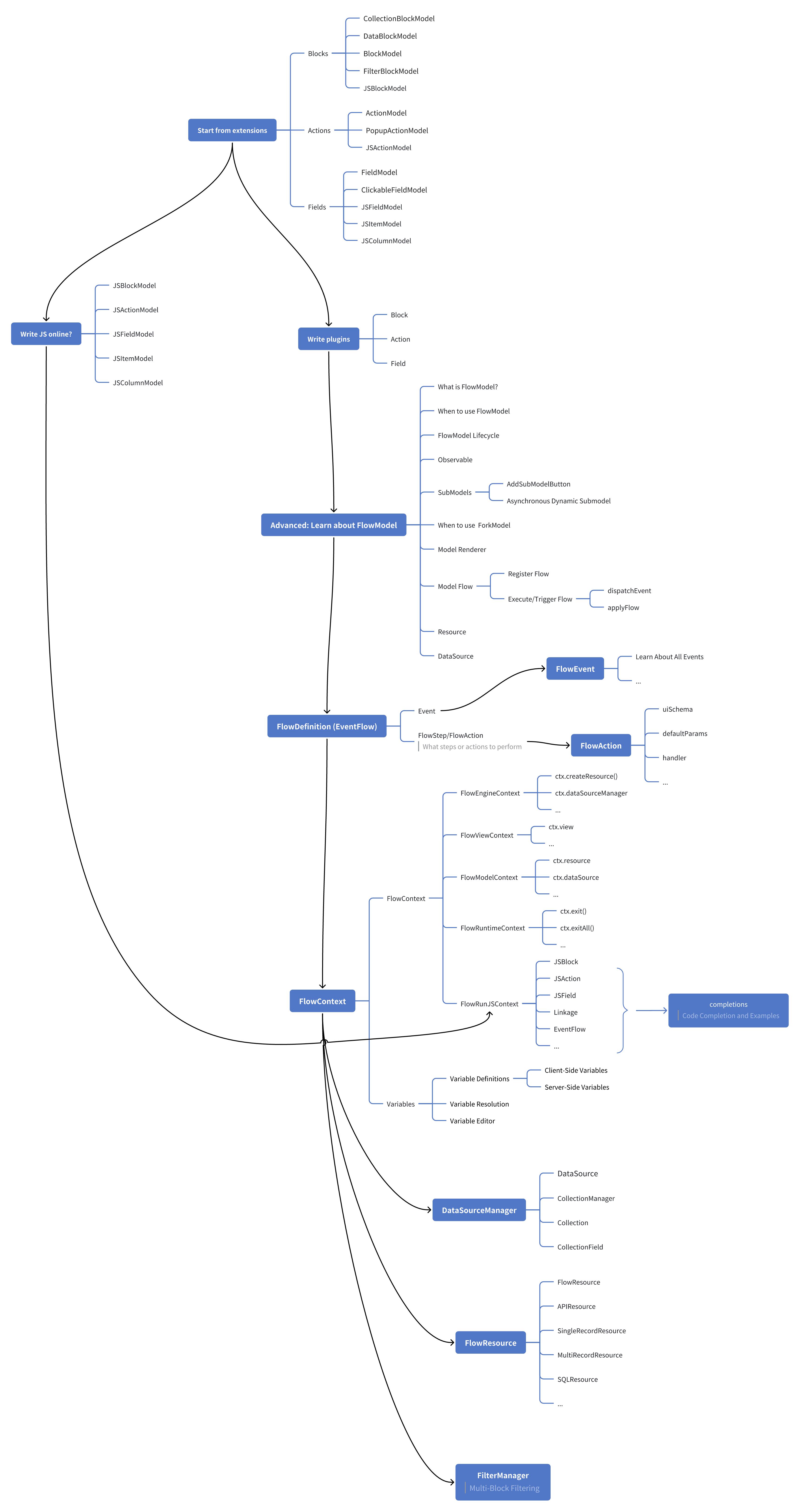
---
url: /flow-engine/model-definition.md
---
# China Region Field
## Introduction
The China Region Field plugin (`field-china-region`) adds the "China Region" field type to NocoBase.
## Installation
In the main NocoBase interface, go to "Plugin Manager", find the "China Region" plugin, and enable it.
## Usage
In the collection configuration, add a new field and select "China Region" as the field type.

### Field Configuration
In the field configuration, you can set the display mode for the field:
- Province
- Province/City
- Province/City/District
- Province/City/District/County

### Interface Configuration
In the interface configuration, you can configure various interface forms for the "China Region" field.
#### Province/City/District

#### Province

#### City

#### District

---
url: /flow-engine/observable.md
---
# Reactivity Mechanism: Observable
:::info
NocoBase's Observable reactivity mechanism is essentially similar to [MobX](https://mobx.js.org/README.html). The current underlying implementation uses [@formily/reactive](https://github.com/alibaba/formily/tree/next/packages/reactive), and its syntax and concepts are highly compatible with [MobX](https://mobx.js.org/README.html). It was not used directly for historical reasons.
:::
In NocoBase 2.0, `Observable` reactive objects are ubiquitous. It is the core of the underlying data flow and UI responsiveness, and is widely used in components like FlowContext, FlowModel, and FlowStep.
## Why choose Observable?
NocoBase chose Observable over other state management solutions like Redux, Recoil, Zustand, and Jotai for the following main reasons:
- **Extremely flexible**: Observable can make any object, array, Map, Set, etc., reactive. It naturally supports deep nesting and dynamic structures, making it very suitable for complex business models.
- **Non-intrusive**: You can directly manipulate the original object without defining actions, reducers, or additional stores, providing an excellent development experience.
- **Automatic dependency tracking**: By wrapping a component with `observer`, the component automatically tracks the Observable properties it uses. When the data changes, the UI refreshes automatically without the need for manual dependency management.
- **Suitable for non-React scenarios**: The Observable reactivity mechanism is not only applicable to React but can also be combined with other frameworks to meet a broader range of reactive data needs.
## Why use observer?
`observer` listens for changes in Observable objects and automatically triggers updates to React components when the data changes. This keeps your UI in sync with your data without having to manually call `setState` or other update methods.
## Basic Usage
```tsx
import React from 'react';
import { Input } from 'antd';
import { observer, observable } from '@nocobase/flow-engine';
const obs = observable.deep({
value: 'aa'
});
const MyComponent = observer(() => {
return (
<div>
<Input
defaultValue={obs.value}
onChange={(e) => {
obs.value = e.target.value;
}}
/>
<div>{obs.value}</div>
</div>
);
});
export default MyComponent;
```
For more information on reactive usage, please refer to the [@formily/reactive](https://reactive.formilyjs.org/) documentation.
---
url: /flow-engine/quickstart.md
---
# Quick Start: Building an Orchestratable Button Component
In React, we usually render a button component like this:
```tsx pure
import { Button } from 'antd';
export default function App() {
return <Button type="primary">Primary Button</Button>;
}
```
Although the code above is simple, it's a **static component** and cannot meet the needs of a no-code platform for configurability and orchestration capabilities.
In NocoBase's FlowEngine, we can quickly build components that support configuration and are event-driven using **FlowModel + FlowDefinition**, achieving more powerful no-code capabilities.
---
## Step 1: Render the Component Using FlowModel
<code src="./demos/quickstart-1-basic.tsx"></code>
### 🧠 Key Concepts
- `FlowModel` is the core component model in FlowEngine, encapsulating component logic, rendering, and configuration capabilities.
- Every UI component can be instantiated and managed uniformly through `FlowModel`.
### 📌 Implementation Steps
#### 1. Create a custom model class
```tsx pure
class MyModel extends FlowModel {
render() {
return <Button {...this.props} />;
}
}
```
#### 2. Create a model instance
```ts
const model = await this.flowEngine.createModelAsync({
uid: 'my-model',
use: 'MyModel',
props: {
type: 'primary',
children: 'Primary Button',
},
});
```
#### 3. Render using `<FlowModelRenderer />`
```tsx pure
<FlowModelRenderer model={model} />
```
---
## Step 2: Add PropsFlow to Make Button Properties Configurable
<code src="./demos/quickstart-2-register-propsflow.tsx"></code>
### 💡 Why Use PropsFlow?
Using Flow instead of static props allows for:
- Dynamic configuration
- Visual editing
- State replay and persistence
### 🛠 Key Modifications
#### 1. Define the Flow for button properties
```tsx pure
const buttonSettings = defineFlow({
key: 'buttonSettings',
title: 'Button Settings',
steps: {
general: {
title: 'General Configuration',
uiSchema: {
title: {
type: 'string',
title: 'Button Title',
'x-decorator': 'FormItem',
'x-component': 'Input',
},
type: {
type: 'string',
title: 'Type',
'x-decorator': 'FormItem',
'x-component': 'Select',
enum: [
{ label: 'Primary', value: 'primary' },
{ label: 'Default', value: 'default' },
{ label: 'Danger', value: 'danger' },
{ label: 'Dashed', value: 'dashed' },
{ label: 'Link', value: 'link' },
{ label: 'Text', value: 'text' },
],
},
icon: {
type: 'string',
title: 'Icon',
'x-decorator': 'FormItem',
'x-component': 'Select',
enum: [
{ label: 'Search', value: 'SearchOutlined' },
{ label: 'Add', value: 'PlusOutlined' },
{ label: 'Delete', value: 'DeleteOutlined' },
{ label: 'Edit', value: 'EditOutlined' },
{ label: 'Settings', value: 'SettingOutlined' },
],
},
},
defaultParams: {
type: 'primary',
},
// Step handler function, sets model properties
handler(ctx, params) {
ctx.model.setProps('children', params.title);
ctx.model.setProps('type', params.type);
ctx.model.setProps('icon', params.icon ? React.createElement(icons[params.icon]) : undefined);
},
},
},
});
MyModel.registerFlow(buttonSettings);
```
#### 2. Use `stepParams` instead of static `props`
```diff
const model = await this.flowEngine.createModelAsync({
uid: 'my-model',
use: 'MyModel',
- props: {
- type: 'primary',
- children: 'Primary Button',
- },
+ stepParams: {
+ buttonSettings: {
+ general: {
+ title: 'Primary Button',
+ type: 'primary',
+ },
+ },
+ },
});
```
> ✅ Using `stepParams` is the recommended approach in FlowEngine, as it avoids issues with non-serializable data (like React components).
#### 3. Enable the property configuration interface
```diff
- <FlowModelRenderer model={model} />
+ <FlowModelRenderer model={model} showFlowSettings />
```
---
## Step 3: Support Button Event Flow (EventFlow)
<code src="./demos/quickstart-3-register-eventflow.tsx"></code>
### 🎯 Scenario: Show a confirmation dialog after clicking the button
#### 1. Listen for the onClick event
Add onClick in a non-intrusive way
```diff
const myPropsFlow = defineFlow({
key: 'buttonSettings',
steps: {
general: {
// ... omitted
handler(ctx, params) {
// ... omitted
+ ctx.model.setProps('onClick', (event) => {
+ ctx.model.dispatchEvent('click', { event });
+ });
},
},
},
});
```
#### 2. Define the event flow
```ts
const myEventFlow = defineFlow({
key: 'clickSettings',
on: 'click',
title: 'Button Event',
steps: {
confirm: {
title: 'Confirmation Action Configuration',
uiSchema: {
title: {
type: 'string',
title: 'Dialog Prompt Title',
'x-decorator': 'FormItem',
'x-component': 'Input',
},
content: {
type: 'string',
title: 'Dialog Prompt Content',
'x-decorator': 'FormItem',
'x-component': 'Input.TextArea',
},
},
defaultParams: {
title: 'Confirm Action',
content: 'You clicked the button, are you sure?',
},
async handler(ctx, params) {
// Dialog
const confirmed = await ctx.modal.confirm({
title: params.title,
content: params.content,
});
// Message
await ctx.message.info(`You clicked the button, confirmation result: ${confirmed ? 'Confirmed' : 'Canceled'}`);
},
},
},
});
MyModel.registerFlow(myEventFlow);
```
**Additional Notes:**
- EventFlow allows the button's behavior to be flexibly configured through a flow, such as showing dialogs, messages, making API calls, etc.
- You can register different event flows for different events (like `onClick`, `onMouseEnter`, etc.) to meet complex business requirements.
#### 3. Configure event flow parameters
When creating the model, you can configure the default parameters for the event flow via `stepParams`:
```ts
const model = await this.flowEngine.createModelAsync({
uid: 'my-model',
use: 'MyModel',
stepParams: {
buttonSettings: {
general: {
title: 'Primary Button',
type: 'primary',
},
},
clickSettings: {
confirm: {
title: 'Confirm Action',
content: 'You clicked the button, are you sure?',
},
},
},
});
```
---
## Model Comparison: ReactComponent vs FlowModel
Flow does not change how components are implemented. It simply adds support for PropsFlow and EventFlow to a ReactComponent, allowing the component's properties and events to be configured and orchestrated visually.
### ReactComponent
```mermaid
graph TD
Button[ButtonComponent]
Button --> Props[Props]
Button --> Events[Events]
Props --> title[title]
Props --> type[type]
Props --> icon[icon]
Events --> onClick[onClick]
```
### FlowModel
```mermaid
graph TD
Button[ButtonModel]
Button --> Props[PropsFlow]
Button --> Events[EventFlow]
Props --> title[title]
Props --> type[type]
Props --> icon[icon]
Events --> onClick[onClick]
```
## Summary
Through the three steps above, we have completed a button component that supports configuration and event orchestration, with the following advantages:
- 🚀 Visually configure properties (like title, type, icon)
- 🔄 Event responses can be managed by a flow (e.g., click to show a dialog)
- 🔧 Supports future extensions (like conditional logic, variable binding, etc.)
This pattern is also applicable to any UI component, such as forms, lists, and charts. In NocoBase's FlowEngine, **everything is orchestratable**.
---
url: /flow-engine/register-flow-model.md
---
# Register FlowModel
## Start with a custom FlowModel
```tsx pure
class HelloModel extends FlowModel {
render() {
return (
<div>
<h1>Hello, NocoBase!</h1>
<p>This is a simple block rendered by HelloModel.</p>
</div>
);
}
}
```
## Available FlowModel base classes
| Base Class Name | Description |
| ----------------------- | ----------------------------------------- |
| `BlockModel` | Base class for all blocks |
| `CollectionBlockModel` | Collection block, inherits from BlockModel |
| `ActionModel` | Base class for all actions |
## Register FlowModel
```ts
export class PluginHelloClient extends Plugin {
async load() {
this.engine.registerModelLoaders({
HelloModel: {
// Dynamic import: the model module loads only when this model is first needed
loader: () => import('./HelloModel'),
},
});
}
}
```
---
url: /flow-engine/runjs-extension-points.md
---
# RunJS Plugin Extension Points (ctx Documentation / Snippets / Scene Mapping)
When a plugin adds or extends RunJS capabilities, it is recommended to register the "context mapping / `ctx` documentation / example code" through **official extension points**. This ensures:
- CodeEditor can provide auto-completion for `ctx.xxx.yyy`.
- AI coding can obtain structured `ctx` API references and examples.
This chapter introduces two extension points:
- `registerRunJSContextContribution(...)`
- `registerRunJSSnippet(...)`
## 1. `registerRunJSContextContribution`
Used to register RunJS "contributions." Typical use cases include:
- Adding/overriding `RunJSContextRegistry` mappings (`modelClass` -> `RunJSContext`, including `scenes`).
- Extending `RunJSDocMeta` (descriptions/examples/completion templates for the `ctx` API) for `FlowRunJSContext` or custom `RunJSContext`.
### Behavior Description
- Contributions are executed collectively during the `setupRunJSContexts()` phase.
- If `setupRunJSContexts()` has already completed, **late registrations will be executed immediately** (no need to re-run setup).
- Each contribution will be executed **at most once** for each `RunJSVersion`.
### Example: Adding a JS-writable Model Context
```ts
import { registerRunJSContextContribution, FlowRunJSContext, RunJSContextRegistry } from '@nocobase/flow-engine';
registerRunJSContextContribution(({ version, FlowRunJSContext: BaseCtx, RunJSContextRegistry: Registry }) => {
if (version !== 'v1') return;
class MyPluginRunJSContext extends BaseCtx {}
// 1) ctx documentation/completion (RunJSDocMeta)
MyPluginRunJSContext.define({
label: 'MyPlugin RunJS context',
properties: {
myPlugin: {
description: 'My plugin namespace',
detail: 'object',
properties: {
hello: {
description: 'Say hello',
detail: '(name: string) => string',
completion: { insertText: `ctx.myPlugin.hello('World')` },
},
},
},
},
});
// 2) model -> context mapping (scene affects editor completion/snippet filtering)
Registry.register('v1', 'MyPluginJSModel', MyPluginRunJSContext, { scenes: ['block'] });
});
```
## 2. `registerRunJSSnippet`
Used to register example code snippets for RunJS, which are used for:
- CodeEditor snippet completion.
- Serving as examples/reference materials for AI coding (can be filtered by scene/version/locale).
### Recommended ref Naming
It is suggested to use: `plugin/<pluginName>/<topic>`, for example:
- `plugin/plugin-my/foo`
- `plugin/plugin-my/api-request-example`
Avoid conflicts with core `global/*` or `scene/*` namespaces.
### Conflict Strategy
- By default, existing `ref` entries are not overwritten (returns `false` without throwing an error).
- To explicitly overwrite, pass `{ override: true }`.
### Example: Registering a Snippet
```ts
import { registerRunJSSnippet } from '@nocobase/flow-engine';
registerRunJSSnippet('plugin/plugin-my/hello', async () => ({
default: {
label: 'Hello (My Plugin)',
description: 'Minimal example for my plugin',
prefix: 'my-hello',
versions: ['v1'],
scenes: ['block'],
contexts: ['*'],
content: `
// My plugin snippet
ctx.message.success('Hello from plugin');
`,
},
}));
```
## 3. Best Practices
- **Layered Maintenance of Documentation + Snippets**:
- `RunJSDocMeta`: Descriptions/completion templates (short, structured).
- Snippets: Long examples (reusable, filterable by scene/version).
- **Avoid Excessive Prompt Length**: Examples should be concise; prioritize "minimal runnable templates."
- **Scene Priority**: If your JS code primarily runs in scenarios like forms or tables, ensure the `scenes` field is filled correctly to improve the relevance of completions and examples.
## 4. Hiding Completions Based on Actual ctx: `hidden(ctx)`
Certain `ctx` APIs are highly context-specific (e.g., `ctx.popup` is only available when a popup or drawer is open). If you want to hide these unavailable APIs during completion, you can define `hidden(ctx)` for the corresponding entry in `RunJSDocMeta`:
- Returns `true`: Hides the current node and its subtree.
- Returns `string[]`: Hides specific sub-paths under the current node (supports returning multiple paths; paths are relative; subtrees are hidden based on prefix matching).
`hidden(ctx)` supports `async`: You can use `await ctx.getVar('ctx.xxx')` to determine visibility (at the user's discretion). It is recommended to keep this logic fast and side-effect-free (e.g., avoid network requests).
Example: Show `ctx.popup.*` completions only when `popup.uid` exists.
```ts
FlowRunJSContext.define({
properties: {
popup: {
description: 'Popup context (async)',
hidden: async (ctx) => !(await ctx.getVar('ctx.popup'))?.uid,
properties: {
uid: 'Popup uid',
},
},
},
});
```
Example: Popup is available but some sub-paths are hidden (relative paths only; e.g., hiding `record` and `parent.record`).
```ts
FlowRunJSContext.define({
properties: {
popup: {
description: 'Popup context (async)',
hidden: async (ctx) => {
const popup = await ctx.getVar('ctx.popup');
if (!popup?.uid) return true;
const hidden: string[] = [];
if (!popup?.record) hidden.push('record');
if (!popup?.parent?.record) hidden.push('parent.record');
return hidden;
},
properties: {
uid: 'Popup uid',
record: 'Popup record',
parent: {
properties: {
record: 'Parent record',
},
},
},
},
},
});
```
Note: CodeEditor always enables completion filtering based on the actual `ctx` (fail-open, does not throw errors).
## 5. Runtime `info/meta` and Context Information API (for Completions and LLMs)
In addition to maintaining `ctx` documentation statically via `FlowRunJSContext.define()`, you can also inject **info/meta** at runtime via `FlowContext.defineProperty/defineMethod`. You can then output **serializable** context information for CodeEditor or LLMs using the following APIs:
- `await ctx.getApiInfos(options?)`: Static API information.
- `await ctx.getVarInfos(options?)`: Variable structure information (sourced from `meta`, supports path/maxDepth expansion).
- `await ctx.getEnvInfos()`: Runtime environment snapshot.
### 5.1 `defineMethod(name, fn, info?)`
`info` supports (all optional):
- `description` / `detail` / `examples`
- `ref: string | { url: string; title?: string }`
- `params` / `returns` (JSDoc-like)
> Note: `getApiInfos()` outputs static API documentation and will not include fields like `deprecated`, `disabled`, or `disabledReason`.
Example: Providing documentation links for `ctx.refreshTargets()`.
```ts
ctx.defineMethod('refreshTargets', async () => {
// ...
}, {
description: 'Refresh data of the target blocks',
detail: '() => Promise<void>',
ref: { url: 'https://docs.nocobase.com/', title: 'Docs' },
});
```
### 5.2 `defineProperty(key, { meta?, info? })`
- `meta`: Used for the variable selector UI (`getPropertyMetaTree` / `FlowContextSelector`). It determines visibility, tree structure, disabling, etc. (supports functions/async).
- Common fields: `title` / `type` / `properties` / `sort` / `hidden` / `disabled` / `disabledReason` / `buildVariablesParams`
- `info`: Used for static API documentation (`getApiInfos`) and descriptions for LLMs. It does not affect the variable selector UI (supports functions/async).
- Common fields: `title` / `type` / `interface` / `description` / `examples` / `ref` / `params` / `returns`
When only `meta` is provided (without `info`):
- `getApiInfos()` will not return this key (as static API docs are not inferred from `meta`).
- `getVarInfos()` will build the variable structure based on `meta` (used for variable selectors/dynamic variable trees).
### 5.3 Context Information API
Used to output "available context capability information."
```ts
type FlowContextInfosEnvNode = {
description?: string;
getVar?: string; // Can be used directly in await ctx.getVar(getVar), recommended to start with "ctx."
value?: any; // Resolved static value (serializable, returned only when inferable)
properties?: Record<string, FlowContextInfosEnvNode>;
};
type FlowContextApiInfos = Record<string, any>; // Static documentation (top-level)
type FlowContextVarInfos = Record<string, any>; // Variable structure (expandable by path/maxDepth)
type FlowContextEnvInfos = {
popup?: FlowContextInfosEnvNode;
block?: FlowContextInfosEnvNode;
flowModel?: FlowContextInfosEnvNode;
resource?: FlowContextInfosEnvNode;
record?: FlowContextInfosEnvNode;
currentViewBlocks?: FlowContextInfosEnvNode;
};
```
Common parameters:
- `getApiInfos({ version })`: RunJS documentation version (defaults to `v1`).
- `getVarInfos({ path, maxDepth })`: Trimming and maximum expansion depth (defaults to 3).
Note: The results returned by the above APIs do not contain functions and are suitable for direct serialization to LLMs.
### 5.4 `await ctx.getVar(path)`
When you have a "variable path string" (e.g., from configuration or user input) and want to retrieve the runtime value of that variable directly, use `getVar`:
- Example: `const v = await ctx.getVar('ctx.record.roles.id')`
- `path` is an expression path starting with `ctx.` (e.g., `ctx.record.id` / `ctx.record.roles[0].id`).
Additionally: Methods or properties starting with an underscore `_` are treated as private members and will not appear in the output of `getApiInfos()` or `getVarInfos()`.
---
url: /flow-engine/what-is-flow-engine.md
---
# What is FlowEngine?
FlowEngine is a new front-end no-code/low-code development engine introduced in NocoBase 2.0. It combines Models and Flows to simplify front-end logic and improve reusability and maintainability. At the same time, it leverages the configurability of Flows to provide no-code configuration and orchestration capabilities for front-end components and business logic.
## Why is it called FlowEngine?
Because in FlowEngine, a component's properties and logic are no longer statically defined, but are driven and managed by **Flows**.
* **Flow**, like a data stream, breaks down logic into ordered steps (Steps) that are progressively applied to the component.
* **Engine** signifies that it is an engine that drives front-end logic and interactions.
Therefore, **FlowEngine = A front-end logic engine driven by Flows**.
## What is a Model?
In FlowEngine, a Model is an abstract model of a component, responsible for:
* Managing the component's **properties (Props) and state**.
* Defining the component's **rendering method**.
* Hosting and executing **Flows**.
* Uniformly handling **event dispatching** and **lifecycles**.
In other words, **a Model is the logical brain of a component**, transforming it from a static unit into a configurable and orchestratable dynamic unit.
## What is a Flow?
In FlowEngine, **a Flow is a logic stream that serves a Model**.
Its purpose is to:
* Break down property or event logic into steps (Steps) and execute them sequentially in a stream.
* Manage property changes as well as event responses.
* Make logic **dynamic, configurable, and reusable**.
## How to understand these concepts?
You can think of a **Flow** as a **stream of water**:
* **A Step is like a node along the water stream**
Each Step performs a small task (e.g., setting a property, triggering an event, calling an API), just as a stream of water has an effect when it passes through a gate or a water wheel.
* **Flows are ordered**
A stream of water follows a predetermined path from upstream to downstream, passing through all Steps in sequence; similarly, the logic in a Flow is executed in the defined order.
* **Flows can be branched and combined**
A stream of water can be split into multiple smaller streams or merged together; a Flow can also be broken down into multiple sub-flows or combined into more complex logical chains.
* **Flows are configurable and controllable**
The direction and volume of a water stream can be adjusted with a sluice gate; the execution method and parameters of a Flow can also be controlled through configuration (stepParams).
Analogy Summary
* A **component** is like a water wheel that needs a stream of water to turn.
* A **Model** is the base and controller of this water wheel, responsible for receiving the water stream and driving its operation.
* A **Flow** is that stream of water, passing through each Step in order, driving the component to continuously change and respond.
So, in FlowEngine:
* **Flows allow logic to move naturally like a stream of water**.
* **Models enable components to become the carriers and executors of this stream**.
---
url: /get-started/deployment/cluster.md
---
# Cluster Deployment
NocoBase supports deploying applications in cluster mode to improve application performance and availability. Cluster deployment allows you to run different instances of the application on multiple servers, or run multiple processes in multi-core mode on a single server.
For details, please refer to the [Cluster Mode](/cluster-mode/) documentation.
---
url: /get-started/deployment/common-commands/docker-compose.md
---
# docker compose
---
url: /get-started/deployment/common-commands/pm2.md
---
# pm2
---
url: /get-started/deployment/internal.md
---
# Intranet Deployment
---
url: /get-started/deployment/intranet/create-nocobase-app.md
---
# Install and Upgrade NocoBase in Intranet (create-nocobase-app)
Intranet environments cannot directly access the npm registry. You need to create the project and install dependencies in an internet-connected environment, then package the complete project and migrate it to the intranet server for deployment.
**Overall flow**: Create project on internet → Install dependencies and package → Copy to intranet → Extract, configure, and start
:::tip Prerequisites
- Both internet and intranet machines need **Node.js 20+** and **Yarn 1.22.x** installed
- Database: MySQL 8.0.17+, MariaDB 10.9+, or PostgreSQL 10+ (can be deployed on intranet or internet)
- **Node.js version and OS architecture** must match between internet and intranet machines; otherwise some native modules in `node_modules` may be incompatible
- Project **installation path must be identical** on both sides (e.g., `/app/my-nocobase-app`), otherwise it will not run after migration
:::
## Internet Environment
Create the project and install dependencies in an internet-connected environment.
### First-time Installation
#### 1. Create Project on Internet
Run the following on a machine with npm access. **Important**: First switch to the target parent directory (e.g., `cd /app`) so the project path is `/app/my-nocobase-app`, matching the intranet deployment path.
<Tabs>
<Tab label="Latest version">
<Tabs>
<Tab label="PostgreSQL">
```bash
yarn create nocobase-app my-nocobase-app -d postgres \
--skip-dev-dependencies \
-e APP_ENV=production \
-e DB_HOST=localhost \
-e DB_PORT=5432 \
-e DB_DATABASE=nocobase \
-e DB_USER=nocobase \
-e DB_PASSWORD=nocobase \
-e TZ=Asia/Shanghai
```
</Tab>
<Tab label="MySQL">
```bash
yarn create nocobase-app my-nocobase-app -d mysql \
--skip-dev-dependencies \
-e APP_ENV=production \
-e DB_HOST=localhost \
-e DB_PORT=3306 \
-e DB_DATABASE=nocobase \
-e DB_USER=nocobase \
-e DB_PASSWORD=nocobase \
-e TZ=Asia/Shanghai
```
</Tab>
<Tab label="MariaDB">
```bash
yarn create nocobase-app my-nocobase-app -d mariadb \
--skip-dev-dependencies \
-e APP_ENV=production \
-e DB_HOST=localhost \
-e DB_PORT=3306 \
-e DB_DATABASE=nocobase \
-e DB_USER=nocobase \
-e DB_PASSWORD=nocobase \
-e TZ=Asia/Shanghai
```
</Tab>
</Tabs>
</Tab>
<Tab label="Beta version">
<Tabs>
<Tab label="PostgreSQL">
```bash
npx create-nocobase-app@beta my-nocobase-app -d postgres \
--skip-dev-dependencies \
-e APP_ENV=production \
-e DB_HOST=localhost \
-e DB_PORT=5432 \
-e DB_DATABASE=nocobase \
-e DB_USER=nocobase \
-e DB_PASSWORD=nocobase \
-e TZ=Asia/Shanghai
```
</Tab>
<Tab label="MySQL">
```bash
npx create-nocobase-app@beta my-nocobase-app -d mysql \
--skip-dev-dependencies \
-e APP_ENV=production \
-e DB_HOST=localhost \
-e DB_PORT=3306 \
-e DB_DATABASE=nocobase \
-e DB_USER=nocobase \
-e DB_PASSWORD=nocobase \
-e TZ=Asia/Shanghai
```
</Tab>
<Tab label="MariaDB">
```bash
npx create-nocobase-app@beta my-nocobase-app -d mariadb \
--skip-dev-dependencies \
-e APP_ENV=production \
-e DB_HOST=localhost \
-e DB_PORT=3306 \
-e DB_DATABASE=nocobase \
-e DB_USER=nocobase \
-e DB_PASSWORD=nocobase \
-e TZ=Asia/Shanghai
```
</Tab>
</Tabs>
</Tab>
<Tab label="Alpha version">
<Tabs>
<Tab label="PostgreSQL">
```bash
npx create-nocobase-app@alpha my-nocobase-app -d postgres \
--skip-dev-dependencies \
-e APP_ENV=production \
-e DB_HOST=localhost \
-e DB_PORT=5432 \
-e DB_DATABASE=nocobase \
-e DB_USER=nocobase \
-e DB_PASSWORD=nocobase \
-e TZ=Asia/Shanghai
```
</Tab>
<Tab label="MySQL">
```bash
npx create-nocobase-app@alpha my-nocobase-app -d mysql \
--skip-dev-dependencies \
-e APP_ENV=production \
-e DB_HOST=localhost \
-e DB_PORT=3306 \
-e DB_DATABASE=nocobase \
-e DB_USER=nocobase \
-e DB_PASSWORD=nocobase \
-e TZ=Asia/Shanghai
```
</Tab>
<Tab label="MariaDB">
```bash
npx create-nocobase-app@alpha my-nocobase-app -d mariadb \
--skip-dev-dependencies \
-e APP_ENV=production \
-e DB_HOST=localhost \
-e DB_PORT=3306 \
-e DB_DATABASE=nocobase \
-e DB_USER=nocobase \
-e DB_PASSWORD=nocobase \
-e TZ=Asia/Shanghai
```
</Tab>
</Tabs>
</Tab>
</Tabs>
:::warning Parameter notes
- `--skip-dev-dependencies` skips dev dependencies (for production deployment to reduce size)
- `APP_ENV=production` sets the app to production mode
- `TZ` sets the application timezone (defaults to system timezone)
- `DB_*` are database settings; update them to match your database
:::
#### 2. Change Directory
```bash
cd my-nocobase-app
```
#### 3. Install Dependencies
```bash
yarn install
```
:::tip Commercial Plugins (Optional)
Steps 4–7 below are only for downloading commercial plugins. If you only use the open-source version, skip steps 4–7 and go directly to step 8 to package.
:::
#### 4. Install NocoBase
```bash
yarn nocobase install
```
#### 5. Run NocoBase
```bash
yarn start
```
#### 6. Enter License Key
Visit:
```
http://<internet-server-ip>:13000/admin/settings/license-settings
```
#### 7. Download Commercial Plugins
```bash
yarn nocobase pkg download-pro
```
#### 8. Package the Project
```bash
# Run from inside my-nocobase-app; the archive is created in the parent directory
# Excludes .env (sensitive); only packages storage/plugins (commercial plugins, etc.)
tar -czf ../nocobase-app.tar.gz \
--exclude='./.env' \
--exclude='./storage' \
. \
./storage/plugins
```
### Application Upgrade
#### 1. Upgrade Application Code and Plugins
```bash
yarn nocobase upgrade
```
#### 2. Repackage the Project
```bash
tar -czf ../nocobase-app.tar.gz \
--exclude='./.env' \
--exclude='./storage' \
. \
./storage/plugins
```
## Intranet Environment
Migrate the packaged project to the intranet server.
### First-time Installation
#### 1. Upload Application Code and Plugins
Copy `nocobase-app.tar.gz` to the intranet server (e.g., via USB or file share), then extract (use the full path if the tar.gz is not in the current directory):
```bash
mkdir -p /app/my-nocobase-app
tar -xzf nocobase-app.tar.gz -C /app/my-nocobase-app
```
#### 2. Change Directory
```bash
cd /app/my-nocobase-app
```
#### 3. Configure .env File
Create a `.env` file in the project root. Refer to the internet environment config and **update these**:
- `DB_HOST`: Change to the intranet database address (if the database is on another intranet server)
- `DB_PORT`, `DB_DATABASE`, `DB_USER`, `DB_PASSWORD`: Match the actual intranet database configuration
- `APP_KEY`: Keep the same as the internet environment if possible; otherwise existing tokens will be invalidated
You can run `cat .env` in the internet project root to view the full config, then copy and adjust for the intranet.
#### 4. Install NocoBase
```bash
yarn nocobase install
```
#### 5. Start NocoBase
```bash
yarn start -d
```
#### 6. Log in to NocoBase
Visit `http://<intranet-server-ip>:13000` and log in with the initial account.
#### 7. Enter License Key
Commercial users need to enter the License Key. Visit:
```
http://<intranet-server-ip>:13000/admin/settings/license-settings
```
### Upgrade Application
#### 1. Stop the Application
```bash
cd /app/my-nocobase-app
yarn nocobase pm2-stop
```
#### 2. Overwrite Application Code and Plugins
Copy `nocobase-app.tar.gz` to the intranet server, then extract:
```bash
tar -xzf nocobase-app.tar.gz -C /app/my-nocobase-app
```
#### 3. Upgrade Application
```bash
cd /app/my-nocobase-app
yarn nocobase upgrade --skip-code-update
```
#### 4. Restart Application
```bash
yarn start -d
```
#### 5. Enter License Key (if authorization changed)
If the License authorization has changed, enter it again. Visit:
```
http://<intranet-server-ip>:13000/admin/settings/license-settings
```
## FAQ
**Q: Intranet startup fails with "module or binary not found"?**
A: Ensure Node.js version and OS architecture match between internet and intranet (e.g., both Linux x64, Node 20.x). If they differ, run `yarn install` again in the same environment and repackage.
**Q: Path-related errors after extraction?**
A: Ensure the intranet extraction path matches the internet creation path (e.g., both `/app/my-nocobase-app`). Use the `-C` option with `tar -xzf` to specify the same path.
**Q: Database connection failed?**
A: Confirm `DB_HOST` in `.env` points to a database address reachable from the intranet, and that the port and firewall rules are correct.
---
url: /get-started/deployment/intranet/docker.md
---
# Install and Upgrade NocoBase in Intranet (Docker)
:::tip
Content to be added
:::
---
url: /get-started/deployment/production.md
---
# Production Environment Deployment
When deploying NocoBase in a production environment, installing dependencies can be cumbersome due to differences in build methods across various systems and environments. For a complete functional experience, we recommend deploying with **Docker**. If your system environment cannot use Docker, you can also deploy using **create-nocobase-app**.
:::warning
It is not recommended to deploy directly from source code in a production environment. The source code has many dependencies, is large in size, and a full compilation has high CPU and memory requirements. If you must deploy from source code, it is recommended to first build a custom Docker image and then deploy it.
:::
## Deployment Process
For production environment deployment, you can refer to the existing installation and upgrade steps.
### New Installation
- [Docker Installation](../installation/docker.mdx)
- [create-nocobase-app Installation](../installation/create-nocobase-app.mdx)
### Upgrading the Application
- [Upgrading a Docker Installation](../installation/docker.mdx)
- [Upgrading a create-nocobase-app Installation](../installation/create-nocobase-app.mdx)
### Installing and Upgrading Third-Party Plugins
- [Installing and Upgrading Plugins](../install-upgrade-plugins.mdx)
## Static Asset Proxy
In a production environment, it is recommended to manage static assets with a proxy server, for example:
- [nginx](./static-resource-proxy/nginx.md)
- [caddy](./static-resource-proxy/caddy.md)
- [cdn](./static-resource-proxy/cdn.md)
## Common Operations Commands
Depending on the installation method, you can use the following commands to manage the NocoBase process:
- [docker compose](./common-commands/docker-compose.md)
- [pm2](./common-commands/pm2.md)
---
url: /get-started/deployment/static-resource-proxy/caddy.md
---
# Caddy
---
url: /get-started/deployment/static-resource-proxy/cdn.md
---
# CDN
---
url: /get-started/deployment/static-resource-proxy/nginx.md
---
# Nginx
---
url: /get-started/install-upgrade-plugins.md
---
# Install and Upgrade Plugins
## Built-in Plugins
NocoBase built-in plugins are automatically updated with the core version and require no manual action.
## Commercial Plugins
For detailed installation and upgrade instructions, please refer to: [Commercial Plugin Activation Guide](https://www.nocobase.com/en/blog/nocobase-commercial-license-activation-guide)
## Third-party Plugins
### Installing Plugins via Command Line
```bash
yarn pm pull https://github.com/nocobase/plugin-auth-cas/releases/download/v1.4.0/plugin-auth-cas-1.4.0.tgz
yarn pm pull /your/path/plugin-auth-cas-1.4.0.tgz
```
If the plugin is already installed and needs to be upgraded, run the following command:
```bash
yarn nocobase upgrade --skip-code-update
```
### Manual Upload and Extraction
Please download the plugin package to your local machine first, then manually upload and extract it to the `./storage/plugins` directory. If the plugin is already enabled, execute the following command to complete the plugin upgrade after uploading and extracting.
> ⚠️ **Note**: To avoid cache issues, please ensure that the NocoBase application is stopped before execution.
```bash
yarn nocobase upgrade --skip-code-update
```
### Correct Way to Extract a Plugin
The following example demonstrates how to correctly extract a plugin package to the specified directory:
```bash
mkdir -p /my-nocobase/storage/plugins/@nocobase/plugin-auth-cas && \
tar -xvzf /downloads/plugin-auth-cas-1.4.0.tgz \
-C /my-nocobase/storage/plugins/@nocobase/plugin-auth-cas \
--strip-components=1
```
This command will extract the plugin to the specified directory without creating an extra `package` directory layer.
```bash
/my-nocobase/storage/plugins/@nocobase/plugin-auth-cas
```
### Example of a Correct Directory Structure
```bash
./plugin-auth-cas/dist/server/migrations/20240425200816-change-locale-module.js
./plugin-auth-cas/dist/server/auth.js
./plugin-auth-cas/client.js
./plugin-auth-cas/dist/constants.js
./plugin-auth-cas/dist/externalVersion.js
./plugin-auth-cas/dist/client/index.js
./plugin-auth-cas/dist/index.js
./plugin-auth-cas/dist/server/index.js
./plugin-auth-cas/dist/server/actions/login.js
./plugin-auth-cas/dist/server/plugin.js
./plugin-auth-cas/server.js
./plugin-auth-cas/dist/server/actions/service.js
./plugin-auth-cas/dist/locale/en-US.json
./plugin-auth-cas/dist/locale/ko_KR.json
./plugin-auth-cas/package.json
./plugin-auth-cas/dist/locale/zh-CN.json
./plugin-auth-cas/README.md
./plugin-auth-cas/README.zh-CN.md
./plugin-auth-cas/dist/server/migrations/20240425200816-change-locale-module.d.ts
./plugin-auth-cas/dist/server/auth.d.ts
./plugin-auth-cas/client.d.ts
./plugin-auth-cas/dist/constants.d.ts
./plugin-auth-cas/dist/client/index.d.ts
./plugin-auth-cas/dist/client/locale/index.d.ts
./plugin-auth-cas/dist/index.d.ts
./plugin-auth-cas/dist/server/index.d.ts
./plugin-auth-cas/dist/server/actions/login.d.ts
./plugin-auth-cas/dist/client/Options.d.ts
./plugin-auth-cas/dist/server/plugin.d.ts
./plugin-auth-cas/server.d.ts
./plugin-auth-cas/dist/server/actions/service.d.ts
./plugin-auth-cas/dist/client/SigninPage.d.ts
./plugin-auth-cas/LICENSE.txt
```
---
url: /get-started/installation/create-nocobase-app.md
---
# create-nocobase-app Installation
:::tip Prerequisites
- Node.js 20+, Yarn 1.22.x installed
- One of the following databases configured and running: MySQL 8.0.17+, MariaDB 10.9+, or PostgreSQL 10+
:::
## 1. Create a NocoBase Project
Select the NocoBase version ([Version Comparison](../quickstart.md)) and database type, then execute the corresponding command.
<Tabs>
<Tab label="Latest Version">
<Tabs>
<Tab label="PostgreSQL">
```bash
yarn create nocobase-app my-nocobase-app -d postgres \
-e DB_HOST=localhost \
-e DB_PORT=5432 \
-e DB_DATABASE=nocobase \
-e DB_USER=nocobase \
-e DB_PASSWORD=nocobase \
-e TZ=UTC
```
</Tab>
<Tab label="MySQL">
```bash
yarn create nocobase-app my-nocobase-app -d mysql \
-e DB_HOST=localhost \
-e DB_PORT=3306 \
-e DB_DATABASE=nocobase \
-e DB_USER=nocobase \
-e DB_PASSWORD=nocobase \
-e TZ=UTC
```
</Tab>
<Tab label="MariaDB">
```bash
yarn create nocobase-app my-nocobase-app -d mariadb \
-e DB_HOST=localhost \
-e DB_PORT=3306 \
-e DB_DATABASE=nocobase \
-e DB_USER=nocobase \
-e DB_PASSWORD=nocobase \
-e TZ=UTC
```
</Tab>
</Tabs>
</Tab>
<Tab label="Beta Version">
<Tabs>
<Tab label="PostgreSQL">
```bash
npx create-nocobase-app@beta my-nocobase-app -d postgres \
-e DB_HOST=localhost \
-e DB_PORT=5432 \
-e DB_DATABASE=nocobase \
-e DB_USER=nocobase \
-e DB_PASSWORD=nocobase \
-e TZ=UTC
```
</Tab>
<Tab label="MySQL">
```bash
npx create-nocobase-app@beta my-nocobase-app -d mysql \
-e DB_HOST=localhost \
-e DB_PORT=3306 \
-e DB_DATABASE=nocobase \
-e DB_USER=nocobase \
-e DB_PASSWORD=nocobase \
-e TZ=UTC
```
</Tab>
<Tab label="MariaDB">
```bash
npx create-nocobase-app@beta my-nocobase-app -d mariadb \
-e DB_HOST=localhost \
-e DB_PORT=3306 \
-e DB_DATABASE=nocobase \
-e DB_USER=nocobase \
-e DB_PASSWORD=nocobase \
-e TZ=UTC
```
</Tab>
</Tabs>
</Tab>
<Tab label="Alpha Version">
<Tabs>
<Tab label="PostgreSQL">
```bash
npx create-nocobase-app@alpha my-nocobase-app -d postgres \
-e DB_HOST=localhost \
-e DB_PORT=5432 \
-e DB_DATABASE=nocobase \
-e DB_USER=nocobase \
-e DB_PASSWORD=nocobase \
-e TZ=UTC
```
</Tab>
<Tab label="MySQL">
```bash
npx create-nocobase-app@alpha my-nocobase-app -d mysql \
-e DB_HOST=localhost \
-e DB_PORT=3306 \
-e DB_DATABASE=nocobase \
-e DB_USER=nocobase \
-e DB_PASSWORD=nocobase \
-e TZ=UTC
```
</Tab>
<Tab label="MariaDB">
```bash
npx create-nocobase-app@alpha my-nocobase-app -d mariadb \
-e DB_HOST=localhost \
-e DB_PORT=3306 \
-e DB_DATABASE=nocobase \
-e DB_USER=nocobase \
-e DB_PASSWORD=nocobase \
-e TZ=UTC
```
</Tab>
</Tabs>
</Tab>
</Tabs>
:::warning Environment Variable Description
- `TZ` is used to set the application's time zone, defaulting to the operating system's time zone.
- `APP_KEY` is the application's secret key, used for generating user tokens, etc. (If `APP_KEY` is modified, old tokens will become invalid). It can be any random string. **Please change it to your own secret key and ensure it is not exposed.**
- `DB_*` are database-related configurations. Please modify them according to your actual database connection information.
:::
## 2. Switch Directory
```bash
cd my-nocobase-app
```
## 3. Install Dependencies
📢 This step may take several minutes depending on your network environment and system configuration.
```bash
yarn install
```
:::tip Production Environment Tip
When deploying to a production environment, you can install only the necessary dependencies to reduce the size:
```bash
yarn install --production
```
:::
## 4. Install NocoBase
```bash
yarn nocobase install --lang=en-US
```
The installation process will automatically create the database table structure and initialize data.
## 5. Start NocoBase
**Development Environment**
```bash
yarn dev
```
**Production Environment**
```bash
yarn start
```
## 6. Log in to NocoBase
Open [http://localhost:13000](http://localhost:13000) in your browser. The initial account and password are `admin@nocobase.com` and `admin123`.
:::warning Account Security Tip
After your first login, please change the default password immediately to ensure system security.
:::
---
url: /get-started/installation/docker.md
---
# Docker Installation
:::tip Prerequisites
- [Docker](https://docs.docker.com/get-docker/) and Docker Compose are installed
- Ensure the Docker service is running
:::
## 1. Create docker-compose.yml
```bash
# Create a folder named my-project (or any other name) to store the system files generated by NocoBase
mkdir my-project && cd my-project
# Create an empty docker-compose.yml file
vi docker-compose.yml
```
## 2. Configure docker-compose.yml
Choose a NocoBase version ([Version Comparison](../quickstart.md)) and database type, then copy the corresponding configuration into docker-compose.yml.
:::tip Configuration Notes
- **Choose an image**: `latest` `latest-full` `beta` `beta-full` `alpha` `alpha-full` `1.7.14` `1.7.14-full`
- For production environments, it is recommended to pin a specific version number to avoid unintentional automatic upgrades. [View all versions](https://hub.docker.com/r/nocobase/nocobase/tags)
- Docker Hub image: `nocobase/nocobase:latest-full`
- The **full image** includes PostgreSQL 16/17 client, MySQL 8.0 client, Oracle 19.25 client required for backup and migration management plugins, as well as LibreOffice required for template printing (PDF).
- If you need to build your own image, you can refer to the official [Dockerfile (slim version)](https://github.com/nocobase/nocobase/blob/main/docker/nocobase/Dockerfile) and [Dockerfile-full (full version)](https://github.com/nocobase/nocobase/blob/main/docker/nocobase/Dockerfile-full)
- **Modify `APP_KEY`**: Please replace `your-secret-key` with a random string, which is used to encrypt sensitive information such as user tokens.
- **Use an existing database**: If you already have a database service, please change `DB_HOST` to the database server address, and delete or comment out the database service configuration (e.g., `postgres`, `mysql`, `mariadb` services).
- **Port mapping**: By default, port 80 of the container is mapped to port 13000 of the host. You can modify it as needed.
:::
<Tabs>
<Tab label="Latest version">
<Tabs>
<Tab label="PostgreSQL">
```yml
networks:
nocobase:
driver: bridge
services:
app:
image: nocobase/nocobase:latest-full
restart: always
networks:
- nocobase
depends_on:
- postgres
environment:
# Application key, used to generate user tokens, etc.
# If APP_KEY is changed, old tokens will become invalid
# Can be any random string, and ensure it is not leaked
- APP_KEY=your-secret-key
# Database type, supports postgres, mysql, mariadb
- DB_DIALECT=postgres
# Database host, can be replaced with an existing database server IP
- DB_HOST=postgres
# Database port
- DB_PORT=5432
# Database name
- DB_DATABASE=nocobase
# Database user
- DB_USER=nocobase
# Database password
- DB_PASSWORD=nocobase
# Timezone, please change it to your local timezone, e.g., America/New_York
- TZ=Etc/UTC
volumes:
- ./storage:/app/nocobase/storage
ports:
- '13000:80'
# init: true
# If you use an existing database service, you can skip starting postgres
postgres:
image: postgres:16
restart: always
command: postgres -c wal_level=logical
environment:
POSTGRES_USER: nocobase
POSTGRES_DB: nocobase
POSTGRES_PASSWORD: nocobase
volumes:
- ./storage/db/postgres:/var/lib/postgresql/data
networks:
- nocobase
```
</Tab>
<Tab label="MySQL">
```yml
networks:
nocobase:
driver: bridge
services:
app:
image: nocobase/nocobase:latest-full
restart: always
networks:
- nocobase
depends_on:
- mysql
environment:
# Application key, used to generate user tokens, etc.
# If APP_KEY is changed, old tokens will become invalid
# Can be any random string, and ensure it is not leaked
- APP_KEY=your-secret-key
# Database type, supports postgres, mysql, mariadb
- DB_DIALECT=mysql
# Database host, can be replaced with an existing database server IP
- DB_HOST=mysql
# Database port
- DB_PORT=3306
# Database name
- DB_DATABASE=nocobase
# Database user
- DB_USER=root
# Database password
- DB_PASSWORD=nocobase
# Whether to convert table and field names to snake case
- DB_UNDERSCORED=true
# Timezone, please change it to your local timezone, e.g., America/New_York
- TZ=Etc/UTC
volumes:
- ./storage:/app/nocobase/storage
ports:
- '13000:80'
# init: true
# If you use an existing database service, you can skip starting mysql
mysql:
image: mysql:8
environment:
MYSQL_DATABASE: nocobase
MYSQL_USER: nocobase
MYSQL_PASSWORD: nocobase
MYSQL_ROOT_PASSWORD: nocobase
restart: always
volumes:
- ./storage/db/mysql:/var/lib/mysql
networks:
- nocobase
```
</Tab>
<Tab label="MariaDB">
```yml
networks:
nocobase:
driver: bridge
services:
app:
image: nocobase/nocobase:latest-full
restart: always
networks:
- nocobase
depends_on:
- mariadb
environment:
# Application key, used to generate user tokens, etc.
# If APP_KEY is changed, old tokens will become invalid
# Can be any random string, and ensure it is not leaked
- APP_KEY=your-secret-key
# Database type, supports postgres, mysql, mariadb
- DB_DIALECT=mariadb
# Database host, can be replaced with an existing database server IP
- DB_HOST=mariadb
# Database port
- DB_PORT=3306
# Database name
- DB_DATABASE=nocobase
# Database user
- DB_USER=root
# Database password
- DB_PASSWORD=nocobase
# Whether to convert table and field names to snake case
- DB_UNDERSCORED=true
# Timezone, please change it to your local timezone, e.g., America/New_York
- TZ=Etc/UTC
volumes:
- ./storage:/app/nocobase/storage
ports:
- '13000:80'
# init: true
# If you use an existing database service, you can skip starting mariadb
mariadb:
image: mariadb:11
environment:
MYSQL_DATABASE: nocobase
MYSQL_USER: nocobase
MYSQL_PASSWORD: nocobase
MYSQL_ROOT_PASSWORD: nocobase
restart: always
volumes:
- ./storage/db/mariadb:/var/lib/mysql
networks:
- nocobase
```
</Tab>
</Tabs>
</Tab>
<Tab label="Beta version">
<Tabs>
<Tab label="PostgreSQL">
```yml
networks:
nocobase:
driver: bridge
services:
app:
image: nocobase/nocobase:beta-full
restart: always
networks:
- nocobase
depends_on:
- postgres
environment:
# Application key, used to generate user tokens, etc.
# If APP_KEY is changed, old tokens will become invalid
# Can be any random string, and ensure it is not leaked
- APP_KEY=your-secret-key
# Database type, supports postgres, mysql, mariadb
- DB_DIALECT=postgres
# Database host, can be replaced with an existing database server IP
- DB_HOST=postgres
# Database port
- DB_PORT=5432
# Database name
- DB_DATABASE=nocobase
# Database user
- DB_USER=nocobase
# Database password
- DB_PASSWORD=nocobase
# Timezone, please change it to your local timezone, e.g., America/New_York
- TZ=Etc/UTC
volumes:
- ./storage:/app/nocobase/storage
ports:
- '13000:80'
# init: true
# If you use an existing database service, you can skip starting postgres
postgres:
image: postgres:16
restart: always
command: postgres -c wal_level=logical
environment:
POSTGRES_USER: nocobase
POSTGRES_DB: nocobase
POSTGRES_PASSWORD: nocobase
volumes:
- ./storage/db/postgres:/var/lib/postgresql/data
networks:
- nocobase
```
</Tab>
<Tab label="MySQL">
```yml
networks:
nocobase:
driver: bridge
services:
app:
image: nocobase/nocobase:beta-full
restart: always
networks:
- nocobase
depends_on:
- mysql
environment:
# Application key, used to generate user tokens, etc.
# If APP_KEY is changed, old tokens will become invalid
# Can be any random string, and ensure it is not leaked
- APP_KEY=your-secret-key
# Database type, supports postgres, mysql, mariadb
- DB_DIALECT=mysql
# Database host, can be replaced with an existing database server IP
- DB_HOST=mysql
# Database port
- DB_PORT=3306
# Database name
- DB_DATABASE=nocobase
# Database user
- DB_USER=root
# Database password
- DB_PASSWORD=nocobase
# Whether to convert table and field names to snake case
- DB_UNDERSCORED=true
# Timezone, please change it to your local timezone, e.g., America/New_York
- TZ=Etc/UTC
volumes:
- ./storage:/app/nocobase/storage
ports:
- '13000:80'
# init: true
# If you use an existing database service, you can skip starting mysql
mysql:
image: mysql:8
environment:
MYSQL_DATABASE: nocobase
MYSQL_USER: nocobase
MYSQL_PASSWORD: nocobase
MYSQL_ROOT_PASSWORD: nocobase
restart: always
volumes:
- ./storage/db/mysql:/var/lib/mysql
networks:
- nocobase
```
</Tab>
<Tab label="MariaDB">
```yml
networks:
nocobase:
driver: bridge
services:
app:
image: nocobase/nocobase:beta-full
restart: always
networks:
- nocobase
depends_on:
- mariadb
environment:
# Application key, used to generate user tokens, etc.
# If APP_KEY is changed, old tokens will become invalid
# Can be any random string, and ensure it is not leaked
- APP_KEY=your-secret-key
# Database type, supports postgres, mysql, mariadb
- DB_DIALECT=mariadb
# Database host, can be replaced with an existing database server IP
- DB_HOST=mariadb
# Database port
- DB_PORT=3306
# Database name
- DB_DATABASE=nocobase
# Database user
- DB_USER=root
# Database password
- DB_PASSWORD=nocobase
# Whether to convert table and field names to snake case
- DB_UNDERSCORED=true
# Timezone, please change it to your local timezone, e.g., America/New_York
- TZ=Etc/UTC
volumes:
- ./storage:/app/nocobase/storage
ports:
- '13000:80'
# init: true
# If you use an existing database service, you can skip starting mariadb
mariadb:
image: mariadb:11
environment:
MYSQL_DATABASE: nocobase
MYSQL_USER: nocobase
MYSQL_PASSWORD: nocobase
MYSQL_ROOT_PASSWORD: nocobase
restart: always
volumes:
- ./storage/db/mariadb:/var/lib/mysql
networks:
- nocobase
```
</Tab>
</Tabs>
</Tab>
<Tab label="Alpha version">
<Tabs>
<Tab label="PostgreSQL">
```yml
networks:
nocobase:
driver: bridge
services:
app:
image: nocobase/nocobase:alpha-full
restart: always
networks:
- nocobase
depends_on:
- postgres
environment:
# Application key, used to generate user tokens, etc.
# If APP_KEY is changed, old tokens will become invalid
# Can be any random string, and ensure it is not leaked
- APP_KEY=your-secret-key
# Database type, supports postgres, mysql, mariadb
- DB_DIALECT=postgres
# Database host, can be replaced with an existing database server IP
- DB_HOST=postgres
# Database port
- DB_PORT=5432
# Database name
- DB_DATABASE=nocobase
# Database user
- DB_USER=nocobase
# Database password
- DB_PASSWORD=nocobase
# Timezone, please change it to your local timezone, e.g., America/New_York
- TZ=Etc/UTC
volumes:
- ./storage:/app/nocobase/storage
ports:
- '13000:80'
# init: true
# If you use an existing database service, you can skip starting postgres
postgres:
image: postgres:16
restart: always
command: postgres -c wal_level=logical
environment:
POSTGRES_USER: nocobase
POSTGRES_DB: nocobase
POSTGRES_PASSWORD: nocobase
volumes:
- ./storage/db/postgres:/var/lib/postgresql/data
networks:
- nocobase
```
</Tab>
<Tab label="MySQL">
```yml
networks:
nocobase:
driver: bridge
services:
app:
image: nocobase/nocobase:alpha-full
restart: always
networks:
- nocobase
depends_on:
- mysql
environment:
# Application key, used to generate user tokens, etc.
# If APP_KEY is changed, old tokens will become invalid
# Can be any random string, and ensure it is not leaked
- APP_KEY=your-secret-key
# Database type, supports postgres, mysql, mariadb
- DB_DIALECT=mysql
# Database host, can be replaced with an existing database server IP
- DB_HOST=mysql
# Database port
- DB_PORT=3306
# Database name
- DB_DATABASE=nocobase
# Database user
- DB_USER=root
# Database password
- DB_PASSWORD=nocobase
# Whether to convert table and field names to snake case
- DB_UNDERSCORED=true
# Timezone, please change it to your local timezone, e.g., America/New_York
- TZ=Etc/UTC
volumes:
- ./storage:/app/nocobase/storage
ports:
- '13000:80'
# init: true
# If you use an existing database service, you can skip starting mysql
mysql:
image: mysql:8
environment:
MYSQL_DATABASE: nocobase
MYSQL_USER: nocobase
MYSQL_PASSWORD: nocobase
MYSQL_ROOT_PASSWORD: nocobase
restart: always
volumes:
- ./storage/db/mysql:/var/lib/mysql
networks:
- nocobase
```
</Tab>
<Tab label="MariaDB">
```yml
networks:
nocobase:
driver: bridge
services:
app:
image: nocobase/nocobase:alpha-full
restart: always
networks:
- nocobase
depends_on:
- mariadb
environment:
# Application key, used to generate user tokens, etc.
# If APP_KEY is changed, old tokens will become invalid
# Can be any random string, and ensure it is not leaked
- APP_KEY=your-secret-key
# Database type, supports postgres, mysql, mariadb
- DB_DIALECT=mariadb
# Database host, can be replaced with an existing database server IP
- DB_HOST=mariadb
# Database port
- DB_PORT=3306
# Database name
- DB_DATABASE=nocobase
# Database user
- DB_USER=root
# Database password
- DB_PASSWORD=nocobase
# Whether to convert table and field names to snake case
- DB_UNDERSCORED=true
# Timezone, please change it to your local timezone, e.g., America/New_York
- TZ=Etc/UTC
volumes:
- ./storage:/app/nocobase/storage
ports:
- '13000:80'
# init: true
# If you use an existing database service, you can skip starting mariadb
mariadb:
image: mariadb:11
environment:
MYSQL_DATABASE: nocobase
MYSQL_USER: nocobase
MYSQL_PASSWORD: nocobase
MYSQL_ROOT_PASSWORD: nocobase
restart: always
volumes:
- ./storage/db/mariadb:/var/lib/mysql
networks:
- nocobase
```
</Tab>
</Tabs>
</Tab>
</Tabs>
## 3. Install and Start NocoBase
```bash
# Pull the latest image
docker compose pull
# Run in the background (installation will run automatically on the first run)
docker compose up -d
# View installation and running logs
docker compose logs -f app
app-postgres-app-1 | nginx started
app-postgres-app-1 | yarn run v1.22.15
app-postgres-app-1 | $ cross-env DOTENV_CONFIG_PATH=.env node -r dotenv/config packages/app/server/lib/index.js install -s
app-postgres-app-1 | Done in 2.72s.
app-postgres-app-1 | yarn run v1.22.15
app-postgres-app-1 | $ pm2-runtime start --node-args="-r dotenv/config" packages/app/server/lib/index.js -- start
app-postgres-app-1 | 2022-04-28T15:45:38: PM2 log: Launching in no daemon mode
app-postgres-app-1 | 2022-04-28T15:45:38: PM2 log: App [index:0] starting in -fork mode-
app-postgres-app-1 | 2022-04-28T15:45:38: PM2 log: App [index:0] online
app-postgres-app-1 | 🚀 NocoBase server running at: http://localhost:13000/
```
## 4. Log in to NocoBase
Open [http://localhost:13000](http://localhost:13000) in your browser. The initial account and password are `admin@nocobase.com` and `admin123`.
:::warning Account Security Notice
After logging in for the first time, please change the default password promptly to ensure system security.
:::
---
url: /get-started/installation/env.md
---
# Environment Variables
## How to Set Environment Variables?
### Git Source Code or `create-nocobase-app` Installation Method
Set environment variables in the `.env` file in the project's root directory. After modifying the environment variables, kill the application process and restart it.
### Docker Installation Method
Modify the `docker-compose.yml` configuration and set the environment variables in the `environment` parameter. Example:
```yml
services:
app:
image: nocobase/nocobase:latest
environment:
- APP_ENV=production
```
You can also use `env_file` to set environment variables in the `.env` file. Example:
```yml
services:
app:
image: nocobase/nocobase:latest
env_file: .env
```
After modifying the environment variables, rebuild the app container:
```yml
docker-compose up -d app
```
## Global Environment Variables
### TZ
Used to set the application's time zone, with the default being the system's time zone.
https://en.wikipedia.org/wiki/List_of_tz_database_time_zones
:::warning
Time-related operations will be handled according to this time zone. Changing TZ may affect date values in the database. For more details, refer to [Date & Time Overview](/data-sources/data-modeling/collection-fields/datetime).
:::
### APP_ENV
Application environment, default is `development`, options include:
- `production` production environment
- `development` development environment
```bash
APP_ENV=production
```
### APP_KEY
The application's secret key, used for generating user tokens, etc. Change it to your own application key and ensure it is not leaked.
:::warning
If APP_KEY is changed, old tokens will become invalid.
:::
```bash
APP_KEY=app-key-test
```
### APP_PORT
Application port, default is `13000`.
```bash
APP_PORT=13000
```
### API_BASE_PATH
NocoBase API address prefix, default is `/api/`.
```bash
API_BASE_PATH=/api/
```
### API_BASE_URL
### CLUSTER_MODE
> `v1.6.0+`
The multi-core (cluster) mode for starting app. If this variable is configured, it will be passed to the `pm2 start` command as the `-i <instances>` parameter. The options are consistent with the pm2 `-i` parameter (refer to [PM2: Cluster Mode](https://pm2.keymetrics.io/docs/usage/cluster-mode/)), including:
- `max`: Use the maximum number of CPU cores
- `-1`: Use the maximum number of CPU cores minus one
- `<number>`: Specify the number of cores
The default value is empty, meaning it is not enabled.
:::warning{title="Attention"}
This mode requires the use of plugins related to cluster mode. Otherwise, the functionality of the application may encounter unexpected issues.
:::
For more information, see [Cluster Mode](/cluster-mode).
### PLUGIN_PACKAGE_PREFIX
Plugin package prefix, default is `@nocobase/plugin-,@nocobase/preset-`.
For example, to add the `hello` plugin to the `my-nocobase-app` project, the plugin's full package name would be `@my-nocobase-app/plugin-hello`.
PLUGIN_PACKAGE_PREFIX can be configured as:
```bash
PLUGIN_PACKAGE_PREFIX=@nocobase/plugin-,@nocobase-preset-,@my-nocobase-app/plugin-
```
The correspondence between plugin name and package name is as follows:
- `users` plugin package name is `@nocobase/plugin-users`
- `nocobase` plugin package name is `@nocobase/preset-nocobase`
- `hello` plugin package name is `@my-nocobase-app/plugin-hello`
### DB_DIALECT
Database type, options include:
- `mariadb`
- `mysql`
- `postgres`
```bash
DB_DIALECT=mysql
```
### DB_HOST
Database host (required when using MySQL or PostgreSQL databases).
Default is `localhost`.
```bash
DB_HOST=localhost
```
### DB_PORT
Database port (required when using MySQL or PostgreSQL databases).
- Default port for MySQL and MariaDB is 3306
- Default port for PostgreSQL is 5432
```bash
DB_PORT=3306
```
### DB_DATABASE
Database name (required when using MySQL or PostgreSQL databases).
```bash
DB_DATABASE=nocobase
```
### DB_USER
Database user (required when using MySQL or PostgreSQL databases).
```bash
DB_USER=nocobase
```
### DB_PASSWORD
Database password (required when using MySQL or PostgreSQL databases).
```bash
DB_PASSWORD=nocobase
```
### DB_TABLE_PREFIX
Data table prefix.
```bash
DB_TABLE_PREFIX=nocobase_
```
### DB_UNDERSCORED
Whether database table and field names are converted to snake case style. Default is `false`. If using a MySQL (MariaDB) database with `lower_case_table_names=1`, then `DB_UNDERSCORED` must be set to `true`.
:::warning
When `DB_UNDERSCORED=true`, the actual table and field names in the database will not match what is displayed in the UI. For example, `orderDetails` will be stored as `order_details` in the database.
:::
### DB_LOGGING
Database log switch, default is `off`, options include:
- `on` on
- `off` off
```bash
DB_LOGGING=on
```
### DB_POOL_MAX
Maximum number of connections in the pool. Default is `5`.
### DB_POOL_MIN
Minimum number of connections in the pool. Default is `0`.
### DB_POOL_IDLE
The maximum time, in milliseconds, that a connection can be idle before being released. Default is `10000` (10 seconds).
### DB_POOL_ACQUIRE
The maximum time, in milliseconds, that the pool will try to get a connection before throwing an error. Default is `60000` (60 seconds).
### DB_POOL_EVICT
The time interval, in milliseconds, after which the connection pool will remove idle connections. Default is `1000` (1 second).
### DB_POOL_MAX_USES
The number of times a connection can be used before it is discarded and replaced. Default is `0` (unlimited).
### LOGGER_TRANSPORT
Log output method, multiple values separated by `,`. Default is `console` in development, `console,dailyRotateFile` in production.
Options:
- `console` - `console.log`
- `file` - Output to a file
- `dailyRotateFile` - Output to daily rotating files
```bash
LOGGER_TRANSPORT=console,dailyRotateFile
```
### LOGGER_BASE_PATH
File-based log storage path, default is `storage/logs`.
```bash
LOGGER_BASE_PATH=storage/logs
```
### LOGGER_LEVEL
Output log level. Default is `debug` in development and `info` in production. Options:
- `error`
- `warn`
- `info`
- `debug`
- `trace`
```bash
LOGGER_LEVEL=info
```
The database log output level is `debug`, controlled by `DB_LOGGING`, and is unaffected by `LOGGER_LEVEL`.
### LOGGER_MAX_FILES
Maximum number of log files to keep.
- When `LOGGER_TRANSPORT` is `file`: Default is `10`.
- When `LOGGER_TRANSPORT` is `dailyRotateFile`: Use `[n]d` to represent days. Default is `14d`.
```bash
LOGGER_MAX_FILES=14d
```
### LOGGER_MAX_SIZE
Log rotation by size.
- When `LOGGER_TRANSPORT` is `file`: Unit is `byte`. Default is `20971520 (20 * 1024 * 1024)`.
- When `LOGGER_TRANSPORT` is `dailyRotateFile`: Use `[n]k`, `[n]m`, `[n]g`. Default is not set.
```bash
LOGGER_MAX_SIZE=20971520
```
### LOGGER_FORMAT
Log print format. Default is `console` in development and `json` in production. Options:
- `console`
- `json`
- `logfmt`
- `delimiter`
```bash
LOGGER_FORMAT=json
```
Reference: [Log Format](/log-and-monitor/logger/index.md#log-format)
### CACHE_DEFAULT_STORE
Unique identifier for the caching method, specifying the server's default cache. Default is `memory`. Built-in options include:
- `memory`
- `redis`
```bash
CACHE_DEFAULT_STORE=memory
```
### CACHE_MEMORY_MAX
Maximum number of items in the memory cache. Default is `2000`.
```bash
CACHE_MEMORY_MAX=2000
```
### CACHE_REDIS_URL
Redis connection URL, optional. Example: `redis://localhost:6379`
```bash
CACHE_REDIS_URL=redis://localhost:6379
```
### TELEMETRY_ENABLED
Enable telemetry data collection. Default is `off`.
```bash
TELEMETRY_ENABLED=on
```
### TELEMETRY_METRIC_READER
Enabled monitoring metric collectors. Default is `console`. Other values should refer to the names registered by corresponding collector plugins, such as `prometheus`. Multiple values are separated by `,`.
```bash
TELEMETRY_METRIC_READER=console,prometheus
```
### TELEMETRY_TRACE_PROCESSOR
Enabled trace data processors. Default is `console`. Other values should refer to the names registered by corresponding processor plugins. Multiple values are separated by `,`.
```bash
TELEMETRY_TRACE_PROCESSOR=console
```
## Experimental Environment Variables
### APPEND_PRESET_LOCAL_PLUGINS
Used to append preset local plugins. The value is the package name (the `name` parameter in `package.json`), with multiple plugins separated by commas.
:::info
1. Ensure the plugin is downloaded locally and can be found in the `node_modules` directory. For more details, see [Plugin Organization](/plugin-development/project-structure).
2. After adding the environment variable, the plugin will appear on the plugin manager page only after an initial installation (`nocobase install`) or upgrade (`nocobase upgrade`).
:::
```bash
APPEND_PRESET_LOCAL_PLUGINS=@my-project/plugin-foo,@my-project/plugin-bar
```
### APPEND_PRESET_BUILT_IN_PLUGINS
Used to append built-in plugins that are installed by default. The value is the package name (the `name` parameter in `package.json`), with multiple plugins separated by commas.
:::info
1. Ensure the plugin is downloaded locally and can be found in the `node_modules` directory. For more details, see [Plugin Organization](/plugin-development/project-structure).
2. After adding the environment variable, the plugin will be automatically installed or upgraded during the initial installation (`nocobase install`) or upgrade (`nocobase upgrade`).
:::
```bash
APPEND_PRESET_BUILT_IN_PLUGINS=@my-project/plugin-foo,@my-project/plugin-bar
```
## Temporary Environment Variables
The installation of NocoBase can be assisted by setting temporary environment variables, such as:
```bash
yarn cross-env \
INIT_APP_LANG=en-US \
INIT_ROOT_EMAIL=demo@nocobase.com \
INIT_ROOT_PASSWORD=admin123 \
INIT_ROOT_NICKNAME="Super Admin" \
nocobase install
# Equivalent to
yarn nocobase install \
--lang=en-US \
--root-email=demo@nocobase.com \
--root-password=admin123 \
--root-nickname="Super Admin"
# Equivalent to
yarn nocobase install -l en-US -e demo@nocobase.com -p admin123 -n "Super Admin"
```
### INIT_APP_LANG
Language at the time of installation. Default is `en-US`. Options include:
- `en-US`
- `zh-CN`
```bash
yarn cross-env \
INIT_APP_LANG=en-US \
nocobase install
```
### INIT_ROOT_EMAIL
Root user email.
```bash
yarn cross-env \
INIT_APP_LANG=en-US \
INIT_ROOT_EMAIL=demo@nocobase.com \
nocobase install
```
### INIT_ROOT_PASSWORD
Root user password.
```bash
yarn cross-env \
INIT_APP_LANG=en-US \
INIT_ROOT_EMAIL=demo@nocobase.com \
INIT_ROOT_PASSWORD=admin123 \
nocobase install
```
### INIT_ROOT_NICKNAME
Root user nickname.
```bash
yarn cross-env \
INIT_APP_LANG=en-US \
INIT_ROOT_EMAIL=demo@nocobase.com \
INIT_ROOT_PASSWORD=admin123 \
INIT_ROOT_NICKNAME="Super Admin" \
nocobase install
```
## Other Plugin-Provided Environment Variables
### WORKFLOW_SCRIPT_MODULES
Workflow JavaScript node available modules list. For details, see "[JavaScript Node: Using External Modules](/workflow/nodes/javascript#using-external-modules)".
### WORKFLOW_LOOP_LIMIT
Maximum loop count limit for workflow loop nodes. For details, see "[Loop Node](/workflow/nodes/loop#WORKFLOW_LOOP_LIMIT)".
---
url: /get-started/installation/git.md
---
# Install from Git Source
:::tip Prerequisites
- Git, Node.js 20+, and Yarn 1.22.x are installed
- A required database is configured and running: MySQL 8.0.17+, MariaDB 10.9+, or PostgreSQL 10+
:::
## 1. Download NocoBase to your local machine
Choose a NocoBase version ([Version Comparison](../quickstart.md)) and run the corresponding command.
<Tabs>
<Tab label="Latest version">
```bash
git clone https://github.com/nocobase/nocobase.git -b main --depth=1 my-nocobase
```
</Tab>
<Tab label="Beta version">
```bash
git clone https://github.com/nocobase/nocobase.git -b next --depth=1 my-nocobase
```
</Tab>
<Tab label="Alpha version">
```bash
git clone https://github.com/nocobase/nocobase.git -b develop --depth=1 my-nocobase
```
</Tab>
</Tabs>
## 2. Change directory
```bash
cd my-nocobase
```
## 3. Install dependencies
📢 This step may take more than ten minutes, depending on your network environment, system configuration, and other factors.
```bash
yarn install --frozen-lockfile
```
## 4. Set environment variables
The environment variables required by NocoBase are stored in the `.env` file in the root directory. Modify the environment variables according to your actual situation.
```bash
TZ=UTC
APP_KEY=your-secret-key
DB_HOST=localhost
DB_PORT=5432
DB_DATABASE=postgres
DB_USER=nocobase
DB_PASSWORD=nocobase
```
:::warning Environment Variable Descriptions
- `TZ` is used to set the application's time zone, which defaults to the operating system's time zone.
- `APP_KEY` is the application's secret key, used for generating user tokens, etc. (If `APP_KEY` is changed, old tokens will become invalid). It can be any random string. Please change it to your own secret key and ensure it is not exposed.
- `DB_*` are database-related. If you are not using the default database service from the example, please modify them according to your actual situation.
:::
## 5. Install NocoBase
```bash
yarn nocobase install --lang=en-US
```
## 6. Start NocoBase
**Development environment**
```bash
yarn dev
```
**Production environment (not recommended)**
It is not recommended to deploy from source in a production environment. For production, please refer to [Production Deployment](../deployment/production.md).
```bash
yarn build
yarn start
```
## 7. Log in to NocoBase
Open [http://localhost:13000](http://localhost:13000) in your browser. The initial account and password are `admin@nocobase.com` and `admin123`.
:::warning Account Security Warning
After logging in for the first time, please change the default password promptly to ensure system security.
:::
---
url: /get-started/quickstart.md
---
# Installation and Version Comparison
You can install NocoBase in different ways.
## Version Comparison
| Item | **Latest (Stable)** | **Beta** | **Alpha (Development)** |
|------|---------------------|----------|-------------------------|
| **Features** | Stable features; Well tested; only bug fixes. | Includes upcoming features that have undergone initial testing and may have a few issues. | Development build with the latest features, which may be incomplete or unstable. |
| **Audience** | Users who require a stable experience and production deployments. | Users who want early access to new features and can provide feedback. | Technically proficient users and contributors interested in cutting-edge development. |
| **Stability** | ★★★★★ | ★★★★☆ | ★★☆☆☆ |
| **Recommended for Production** | Recommended | Use with caution | Use with caution |
## Installation Method Comparison
| Item | **Docker Installation (Recommended)** | **create-nocobase-app Installation** | **Git Source Code Installation** |
|------|--------------------------|------------------------------|------------------|
| **Features** | No code required; quick installation; suitable for fast trials. | Independent application codebase; supports plugin extensions and UI customization. | Obtain the latest source code; suitable for contribution and debugging. |
| **Scenarios** | No-code users; users who want to quickly deploy to a server. | Front-end/full-stack developers; team projects; low-code development. | Technical developers; users who want to try unreleased versions. |
| **Technical Requirement** | ★☆☆☆☆ | ★★★☆☆ | ★★★★★ |
| **Upgrade Method** | Pull the latest image and restart the container. | Update dependencies with yarn. | Synchronize updates through Git. |
| **Tutorials** | [<code>Installation</code>](#) [<code>Upgrade</code>](#) [<code>Deployment</code>](#) | [<code>Installation</code>](#) [<code>Upgrade</code>](#) [<code>Deployment</code>](#) | [<code>Installation</code>](#) [<code>Upgrade</code>](#) [<code>Deployment</code>](#) |
---
url: /get-started/system-requirements.md
---
# System Requirements
The system requirements described in this document apply **only to the NocoBase application service itself**, and cover the compute and memory resources required by the application processes. They **do not cover dependent third-party services**, including but not limited to:
- API gateways / reverse proxies
- Database services (for example, MySQL or PostgreSQL)
- Cache services (for example, Redis)
- Middleware such as message queues or object storage
Except for functionality validation or purely experimental scenarios, **we strongly recommend deploying the above third-party services separately** on dedicated servers or containers, or by using the corresponding cloud services.
The system configuration and capacity planning of those services must be evaluated and tuned separately based on the **actual data size, workload, and concurrency level**.
## Single-Node Deployment Mode
Single-node deployment mode means the NocoBase application service runs on a single server or container instance.
### Minimum Hardware Requirements
| Resource | Requirement |
| --- | --- |
| CPU | 1 core |
| Memory | 2 GB |
**Applicable scenarios:**
- Micro businesses
- Proof of concept (POC)
- Development / testing environments
- Scenarios with almost no concurrent access
:::info{title=Tips}
- This specification only ensures that the system can run; it does not guarantee performance.
- As the data size or concurrent requests grow, system resources may quickly become a bottleneck.
- For **source code development, plugin development, or building and deploying from source**, reserve **at least 4 GB of free memory** to make sure dependency installation, compilation, and build steps complete successfully.
:::
### Recommended Hardware Requirements
| Resource | Recommended Spec |
| --- | --- |
| CPU | 2 cores |
| Memory | ≥ 4 GB |
**Applicable scenarios:**
Suitable for small to medium workloads with limited concurrency in production environments.
:::info{title=Tips}
- With this configuration, the system can handle routine admin operations and lightweight business workloads.
- When business complexity, concurrent access, or background tasks grow, consider upgrading the hardware specification or migrating to cluster mode.
:::
## Cluster Mode
Cluster mode is designed for medium to large workloads with higher concurrency. You can scale horizontally to improve availability and throughput (see [Cluster Mode](/cluster-mode) for details).
### Node Hardware Requirements
In cluster mode, the recommended hardware configuration for each application node (Pod / instance) is identical to the single-node deployment mode.
**Minimum per-node configuration:**
- CPU: 1 core
- Memory: 2 GB
**Recommended per-node configuration:**
- CPU: 2 cores
- Memory: 4 GB
### Planning the Number of Nodes
- Scale the number of nodes as needed (2–N).
- The actual number of nodes depends on:
- Concurrent traffic
- Business logic complexity
- Background jobs and asynchronous workloads
- Responsiveness of external dependencies
Recommendations for production environments:
- Adjust the node count dynamically based on monitoring metrics (CPU, memory, request latency, and so on).
- Reserve a resource buffer to handle traffic spikes.
---
url: /get-started/translations.md
---
# Translation
The default language of NocoBase is English. Currently, the main application supports English, Italian, Dutch, Simplified Chinese, and Japanese. We sincerely invite you to contribute translations for additional languages, enabling users around the world to enjoy an even more convenient NocoBase experience.
---
## I. System Localization
### 1. System Interface and Plugin Translation
#### 1.1 Translation Scope
This applies only to the localization of the NocoBase system interface and plugins, and does not cover other custom content (such as data tables or Markdown blocks).
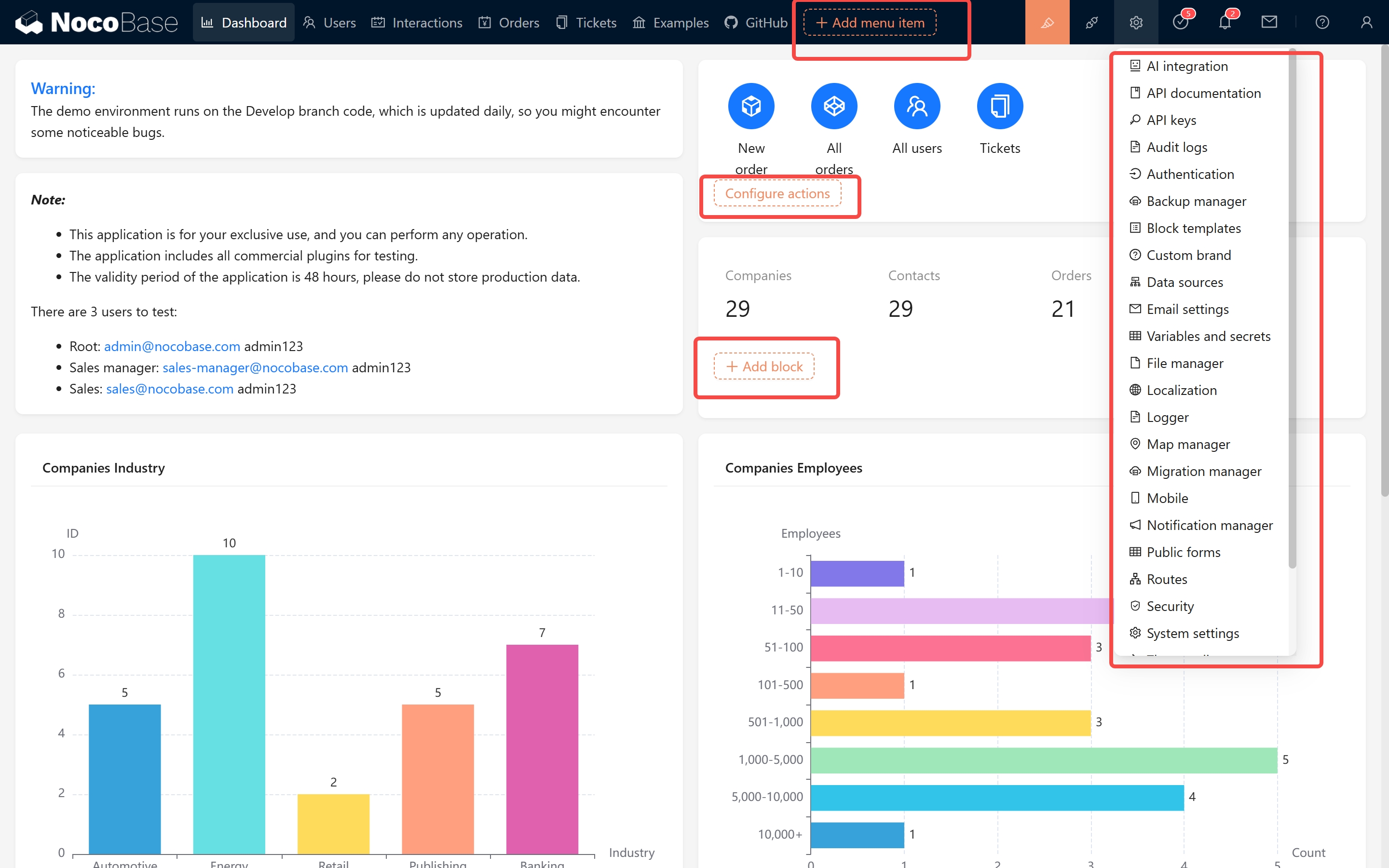
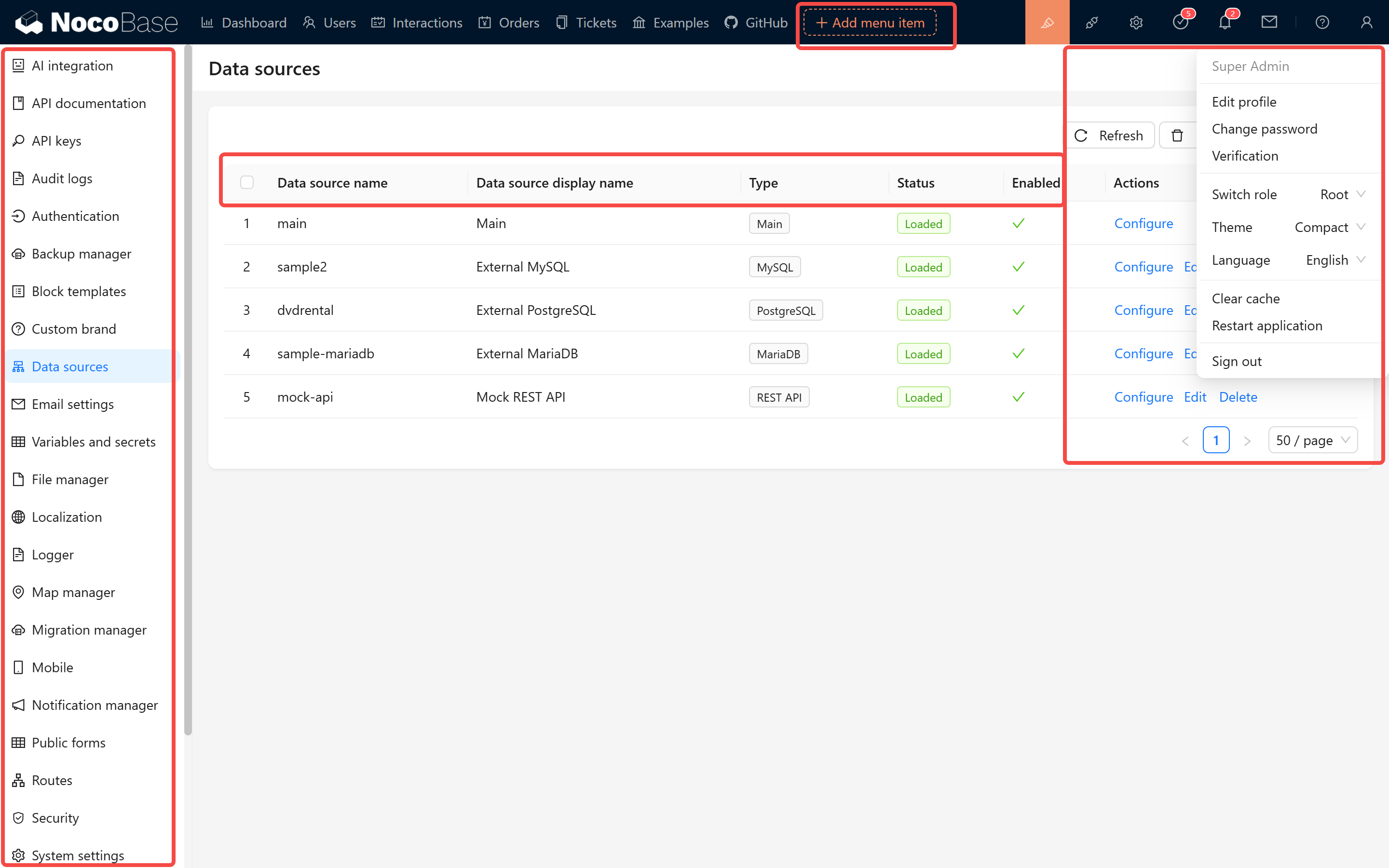
#### 1.2 Localization Content Overview
NocoBase uses Git to manage its localization content. The primary repository is:
https://github.com/nocobase/nocobase/tree/main/locales
Each language is represented by a JSON file named according to its language code (e.g., de-DE.json, fr-FR.json). The file structure is organized by plugin modules, using key-value pairs to store translations. For example:
```json
{
// Client plugin
"@nocobase/client": {
"(Fields only)": "(Fields only)",
"12 hour": "12 hour",
"24 hour": "24 hour"
// ...other key-value pairs
},
"@nocobase/plugin-acl": {
// Key-value pairs for this plugin
}
// ...other plugin modules
}
```
When translating, please gradually convert it to a structure similar to the following:
```json
{
// Client plugin
"@nocobase/client": {
"(Fields only)": "(Fields only - translated)",
"12 hour": "12 hour - translated",
"24 hour": "24 hour - translated"
// ...other key-value pairs
},
"@nocobase/plugin-acl": {
// Key-value pairs for this plugin
}
// ...other plugin modules
}
```
#### 1.3 Translation Testing and Synchronization
- After completing your translation, please test and verify that all texts display correctly.
We've also released a translation validation plugin - search for `Locale tester` in the plugin marketplace.
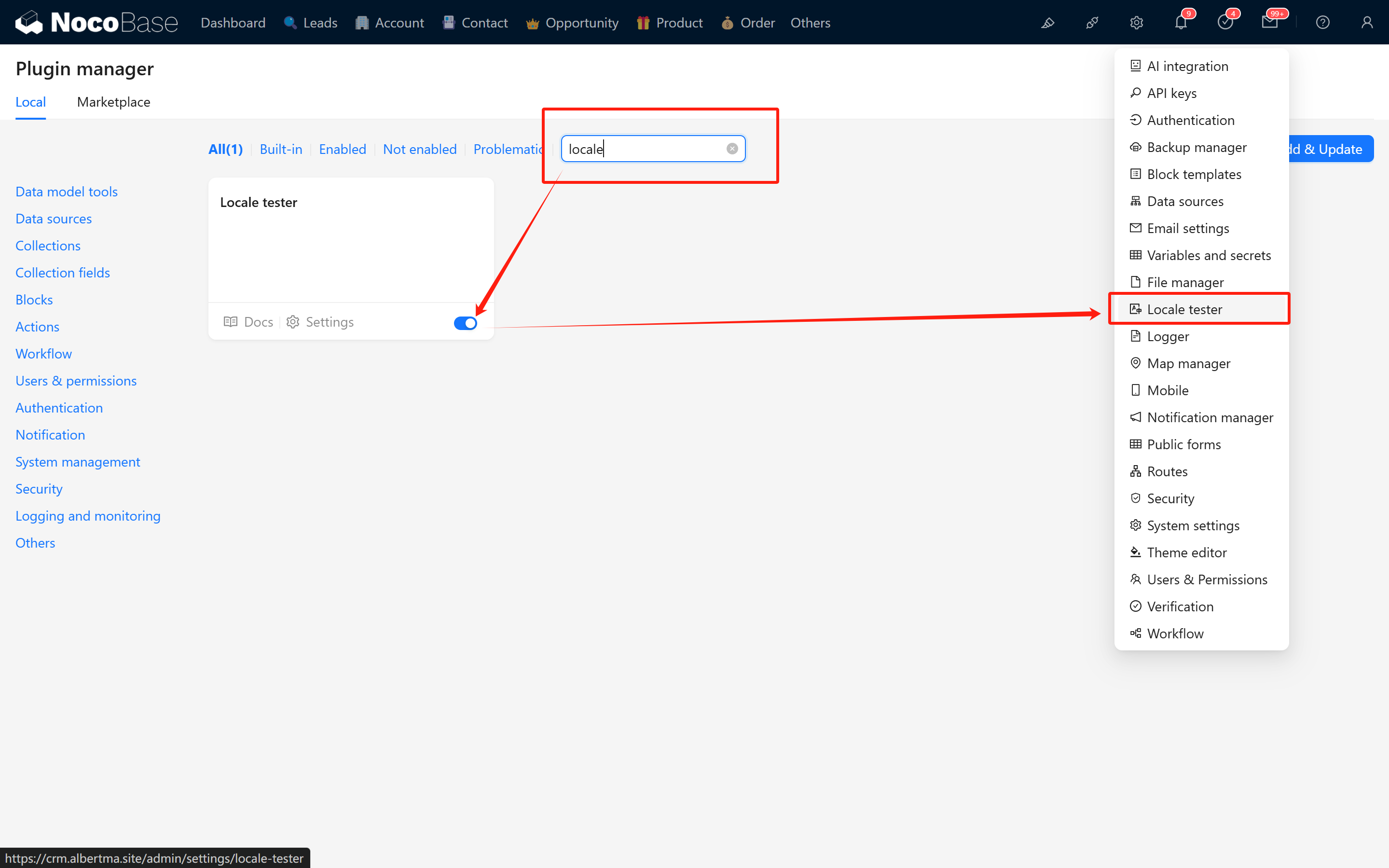
After installation, copy the JSON content from the corresponding localization file in the git repository, paste it inside, and click OK to verify if the translation content is effective.
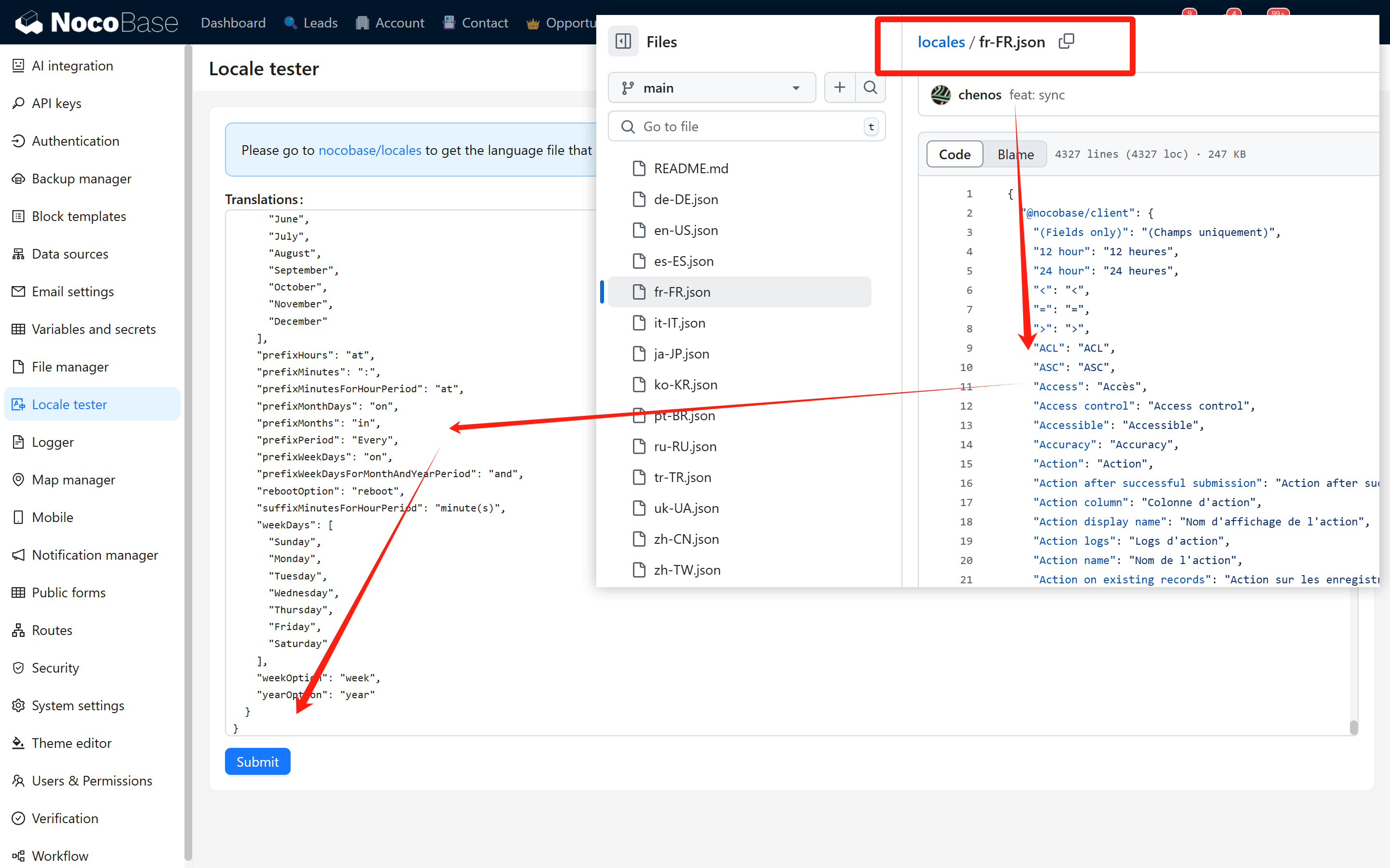
- Once submitted, system scripts will automatically synchronize the localization content to the code repository.
#### 1.4 NocoBase 2.0 Localization Plugin
> **Note:** This section is under development. The localization plugin for NocoBase 2.0 has some differences from the 1.x version. Details will be provided in a future update.
<!-- TODO: Add details about 2.0 localization plugin differences -->
## II. Documentation Localization (NocoBase 2.0)
The documentation for NocoBase 2.0 is managed in a new structure. The documentation source files are located in the main NocoBase repository:
https://github.com/nocobase/nocobase/tree/next/docs
### 2.1 Documentation Structure
The documentation uses [Rspress](https://rspress.dev/) as the static site generator and supports 22 languages. The structure is organized as follows:
```
docs/
├── docs/
│ ├── en/ # English (source language)
│ ├── cn/ # Simplified Chinese
│ ├── ja/ # Japanese
│ ├── ko/ # Korean
│ ├── de/ # German
│ ├── fr/ # French
│ ├── es/ # Spanish
│ ├── pt/ # Portuguese
│ ├── ru/ # Russian
│ ├── it/ # Italian
│ ├── tr/ # Turkish
│ ├── uk/ # Ukrainian
│ ├── vi/ # Vietnamese
│ ├── id/ # Indonesian
│ ├── th/ # Thai
│ ├── pl/ # Polish
│ ├── nl/ # Dutch
│ ├── cs/ # Czech
│ ├── ar/ # Arabic
│ ├── he/ # Hebrew
│ ├── hi/ # Hindi
│ ├── sv/ # Swedish
│ └── public/ # Shared assets (images, etc.)
├── theme/ # Custom theme
├── rspress.config.ts # Rspress configuration
└── package.json
```
### 2.2 Translation Workflow
1. **Sync with English source**: All translations should be based on the English documentation (`docs/en/`). When the English documentation is updated, translations should be updated accordingly.
2. **Branch strategy**:
- Use the `develop` or `next` branch as the reference for the latest English content
- Create your translation branch from the target branch
3. **File structure**: Each language directory should mirror the English directory structure. For example:
```
docs/en/get-started/index.md → docs/ja/get-started/index.md
docs/en/api/acl/acl.md → docs/ja/api/acl/acl.md
```
### 2.3 Contributing Translations
1. Fork the repository: https://github.com/nocobase/nocobase
2. Clone your fork and checkout the `develop` or `next` branch
3. Navigate to the `docs/docs/` directory
4. Find the language directory you want to contribute to (e.g., `ja/` for Japanese)
5. Translate the markdown files, keeping the same file structure as the English version
6. Test your changes locally:
```bash
cd docs
yarn install
yarn dev
```
7. Submit a Pull Request to the main repository
### 2.4 Translation Guidelines
- **Keep formatting consistent**: Maintain the same markdown structure, headings, code blocks, and links as the source
- **Preserve frontmatter**: Keep any YAML frontmatter at the top of files unchanged unless it contains translatable content
- **Image references**: Use the same image paths from `docs/public/` - images are shared across all languages
- **Internal links**: Update internal links to point to the correct language path
- **Code examples**: Generally, code examples should not be translated, but comments within code can be translated
### 2.5 Navigation Configuration
The navigation structure for each language is defined in `_nav.json` and `_meta.json` files within each language directory. When adding new pages or sections, make sure to update these configuration files.
## III. Website Localization
The website pages and all content are stored in:
https://github.com/nocobase/website
### 3.1 Getting Started and Reference Resources
When adding a new language, please refer to the existing language pages:
- English: https://github.com/nocobase/website/tree/main/src/pages/en
- Chinese: https://github.com/nocobase/website/tree/main/src/pages/cn
- Japanese: https://github.com/nocobase/website/tree/main/src/pages/ja
Global style modifications are located at:
- English: https://github.com/nocobase/website/blob/main/src/layouts/BaseEN.astro
- Chinese: https://github.com/nocobase/website/blob/main/src/layouts/BaseCN.astro
- Japanese: https://github.com/nocobase/website/blob/main/src/layouts/BaseJA.astro
The website's global component localization is available at:
https://github.com/nocobase/website/tree/main/src/components
### 3.2 Content Structure and Localization Method
We use a mixed content management approach. English, Chinese, and Japanese content and resources are regularly synchronized from the CMS system and overwritten, while other languages can be edited directly in local files. Local content is stored in the `content` directory, organized as follows:
```
/content
/articles # Blog articles
/article-slug
index.md # English content (default)
index.cn.md # Chinese content
index.ja.md # Japanese content
metadata.json # Metadata and other localization properties
/tutorials # Tutorials
/releases # Release information
/pages # Some static pages
/categories # Category information
/article-categories.json # Article category list
/category-slug # Individual category details
/category.json
/tags # Tag information
/article-tags.json # Article tag list
/release-tags.json # Release tag list
/tag-slug # Individual tag details
/tag.json
/help-center # Help center content
/help-center-tree.json # Help center navigation structure
....
```
### 3.3 Content Translation Guidelines
- About Markdown Content Translation
1. Create a new language file based on the default file (e.g., `index.md` to `index.fr.md`)
2. Add localized properties in the corresponding fields in the JSON file
3. Maintain consistency in file structure, links, and image references
- JSON Content Translation
Many content metadata are stored in JSON files, which typically contain multilingual fields:
```json
{
"id": 123,
"title": "English Title", // English title (default)
"title_cn": "中文标题", // Chinese title
"title_ja": "日本語タイトル", // Japanese title
"description": "English description",
"description_cn": "中文描述",
"description_ja": "日本語の説明",
"slug": "article-slug", // URL path (usually not translated)
"status": "published",
"publishedAt": "2025-03-19T12:00:00Z"
}
```
**Translation Notes:**
1. **Field Naming Convention**: Translation fields typically use the `{original_field}_{language_code}` format
- For example: title_fr (French title), description_de (German description)
2. **When Adding a New Language**:
- Add a corresponding language suffix version for each field that needs translation
- Do not modify the original field values (such as title, description, etc.), as they serve as default language (English) content
3. **CMS Synchronization Mechanism**:
- The CMS system periodically updates English, Chinese and Japanese content
- The system will only update/overwrite content for these three languages (some properties in the JSON), and **will not delete** language fields added by other contributors
- For example: if you added a French translation (title_fr), CMS synchronization will not affect this field
### 3.4 Configuring Support for a New Language
To add support for a new language, you need to modify the `SUPPORTED_LANGUAGES` configuration in the `src/utils/index.ts` file:
```typescript
export const SUPPORTED_LANGUAGES = {
en: {
code: 'en',
locale: 'en-US',
name: 'English',
default: true
},
cn: {
code: 'cn',
locale: 'zh-CN',
name: 'Chinese'
},
ja: {
code: 'ja',
locale: 'ja-JP',
name: 'Japanese'
},
// Example of adding a new language:
fr: {
code: 'fr',
locale: 'fr-FR',
name: 'French'
}
};
```
### 3.5 Layout Files and Styles
Each language needs corresponding layout files:
1. Create a new layout file (e.g., for French, create `src/layouts/BaseFR.astro`)
2. You can copy an existing layout file (such as `BaseEN.astro`) and translate it
3. The layout file contains translations for global elements like navigation menus, footers, etc.
4. Be sure to update the language switcher configuration to properly switch to the newly added language
### 3.6 Creating Language Page Directories
Create independent page directories for the new language:
1. Create a folder named with the language code in the `src` directory (e.g., `src/fr/`)
2. Copy the page structure from other language directories (e.g., `src/en/`)
3. Update page content, translating titles, descriptions and text into the target language
4. Ensure pages use the correct layout component (e.g., `.layout: '@/layouts/BaseFR.astro'`)
### 3.7 Component Localization
Some common components also need translation:
1. Check components in the `src/components/` directory
2. Pay special attention to components with fixed text (like navigation bars, footers, etc.)
3. Components may use conditional rendering to display content in different languages:
```astro
{Astro.url.pathname.startsWith('/en') && <p>English content</p>}
{Astro.url.pathname.startsWith('/cn') && <p>中文内容</p>}
{Astro.url.pathname.startsWith('/fr') && <p>Contenu français</p>}
```
### 3.8 Testing and Validation
After completing the translation, conduct thorough testing:
1. Run the website locally (usually using `yarn dev`)
2. Check how all pages display in the new language
3. Verify that the language switching functionality works properly
4. Ensure all links point to the correct language version pages
5. Check responsive layouts to ensure translated text doesn't break page design
## IV. How to Start Translating
If you want to contribute a new language translation to NocoBase, please follow these steps:
| Component | Repository | Branch | Notes |
|-----------|------------|--------|-------|
| System Interface | https://github.com/nocobase/nocobase/tree/main/locales | main | JSON locale files |
| Documentation (2.0) | https://github.com/nocobase/nocobase | develop / next | `docs/docs/<lang>/` directory |
| Website | https://github.com/nocobase/website | main | See Section III |
After completing your translation, please submit a Pull Request to NocoBase. The new languages will appear in the system configuration, allowing you to select which languages to display.
## NocoBase 1.x Documentation
For NocoBase 1.x translation guide, please refer to:
https://docs.nocobase.com/welcome/community/translations
---
url: /get-started/upgrading/create-nocobase-app.md
---
# Upgrading a create-nocobase-app Installation
:::warning Preparation before upgrading
- Be sure to back up the database first
- Stop the running NocoBase instance
:::
## 1. Stop the running NocoBase instance
If it's not a background process, stop it with `Ctrl + C`. In a production environment, execute the `pm2-stop` command to stop it.
```bash
yarn nocobase pm2-stop
```
## 2. Execute the upgrade command
Simply execute the `yarn nocobase upgrade` command.
```bash
# Switch to the corresponding directory
cd my-nocobase-app
# Execute the upgrade command
yarn nocobase upgrade
# Start
yarn dev
```
### Upgrading to a specific version
Modify the `package.json` file in the project's root directory, and change the version numbers for `@nocobase/cli` and `@nocobase/devtools` (you can only upgrade, not downgrade). For example:
```diff
{
"dependencies": {
- "@nocobase/cli": "1.5.11"
+ "@nocobase/cli": "1.6.0-beta.8"
},
"devDependencies": {
- "@nocobase/devtools": "1.5.11"
+ "@nocobase/devtools": "1.6.0-beta.8"
}
}
```
Then execute the upgrade command
```bash
yarn install
yarn nocobase upgrade --skip-code-update
```
---
url: /get-started/upgrading/docker.md
---
# Upgrading a Docker Installation
:::warning Before you upgrade
- Be sure to back up your database
:::
## 1. Switch to the directory where docker-compose.yml is located
For example
```bash
# MacOS, Linux...
cd /your/path/my-project/
# Windows
cd C:\your\path\my-project
```
## 2. Update the image version number
:::tip About Version Numbers
- Alias versions, like `latest`, `latest-full`, `beta`, `beta-full`, `alpha`, `alpha-full`, usually don't need to be changed.
- Numeric version numbers, like `1.7.14`, `1.7.14-full`, need to be changed to the target version number.
- Only upgrades are supported; downgrades are not!!!
- It is recommended to pin to a specific numeric version in a production environment to avoid unintentional automatic upgrades. [View all versions](https://hub.docker.com/r/nocobase/nocobase/tags)
:::
```yml
# ...
services:
app:
# Use a specific version number for production
image: nocobase/nocobase:1.7.14-full
# You can also use an alias version (may upgrade automatically, use with caution in production)
# image: nocobase/nocobase:latest-full
# image: nocobase/nocobase:beta-full
# ...
```
## 3. Restart the container
```bash
# Pull the latest image
docker compose pull app
# Recreate the container
docker compose up -d app
# Check the status of the app process
docker compose logs -f app
```
## 4. Upgrading third-party plugins
Refer to [Install and Upgrade Plugins](../install-upgrade-plugins.mdx)
## 5. Rollback instructions
NocoBase does not support downgrading. If you need to roll back, please restore the database backup from before the upgrade and change the image version back to the original version.
## 6. Frequently Asked Questions (FAQ)
**Q: Slow or failed image pull**
This is often due to network issues. You can try configuring a Docker mirror to speed up downloads or simply try again later.
**Q: Version has not changed**
Confirm that you have changed `image` to the new version number and successfully executed `docker compose pull app` and `up -d app`.
**Q: Commercial plugin download or update failed**
For commercial plugins, please verify the license key in the system, and then restart the Docker container. For details, see [NocoBase Commercial License Activation Guide](https://www.nocobase.com/blog/nocobase-commercial-license-activation-guide).
---
url: /get-started/upgrading/git.md
---
# Upgrading a Git Source Installation
:::warning Preparation Before Upgrading
- Be sure to back up your database first
- Stop the running NocoBase instance (`Ctrl + C`)
:::
## 1. Switch to the NocoBase project directory
```bash
cd my-nocobase-app
```
## 2. Pull the latest code
```bash
git pull
```
## 3. Delete cache and old dependencies (optional)
If the normal upgrade process fails, you can try clearing the cache and dependencies and then re-downloading them.
```bash
# Clear nocobase cache
yarn nocobase clean
# Delete dependencies
yarn rimraf -rf node_modules # equivalent to rm -rf node_modules
```
## 4. Update dependencies
📢 Due to factors such as network environment and system configuration, this next step may take more than ten minutes.
```bash
yarn install
```
## 5. Run the upgrade command
```bash
yarn nocobase upgrade
```
## 6. Start NocoBase
```bash
yarn dev
```
:::tip Production Environment Tip
It is not recommended to deploy a NocoBase installation from source code directly in a production environment (for production environments, please refer to [Production Deployment](../deployment/production.md)).
:::
## 7. Upgrading third-party plugins
Refer to [Install and Upgrade Plugins](../install-upgrade-plugins.mdx)
---
url: /index.md
---
---
url: /integration/block-iframe/index.md
---
# Iframe Block
## Introduction
The IFrame block allows embedding external web pages or content into the current page. Users can integrate external applications seamlessly by configuring a URL or directly inserting HTML code. With HTML, users can flexibly customize content to meet specific display needs, making it ideal for customized scenarios. This approach enables loading external resources without redirection, enhancing user experience and page interactivity.
## Installation
It's a built-in plugin, no installation is required.
## Adding Blocks
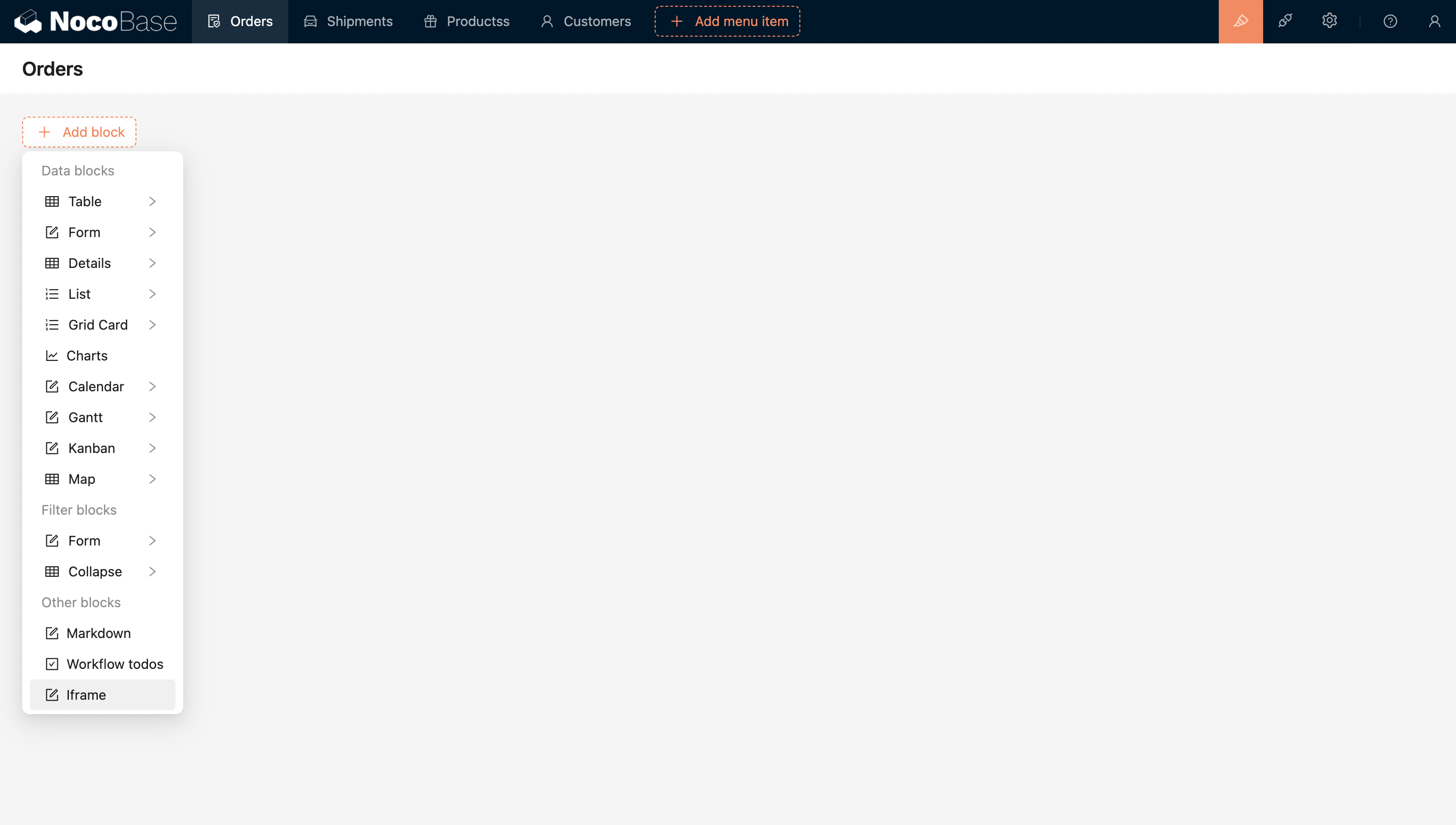
Configure the URL or Html to directly embed the external application.
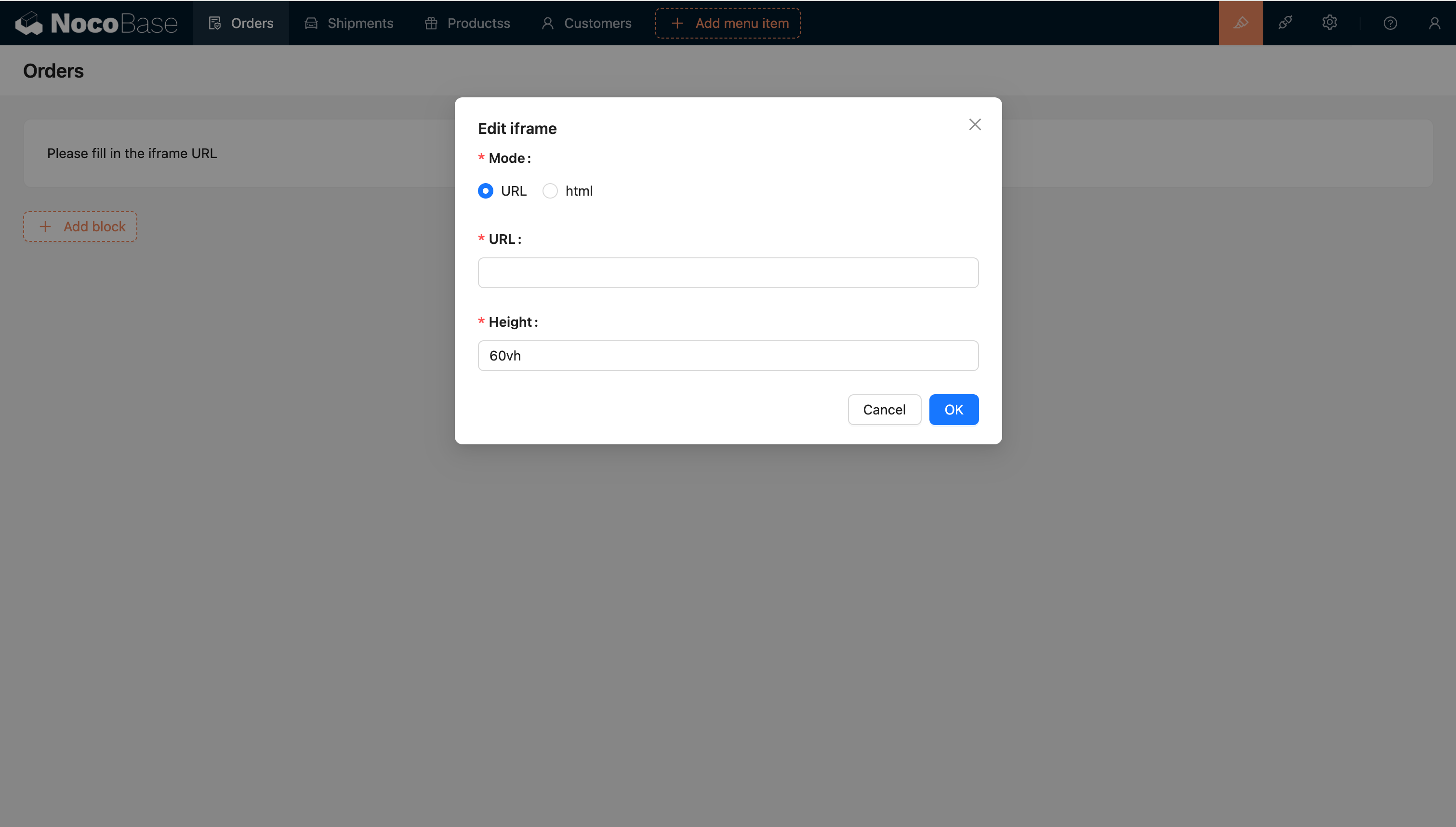
## Template engine
### String Template
The default template engine.
### Handlebars
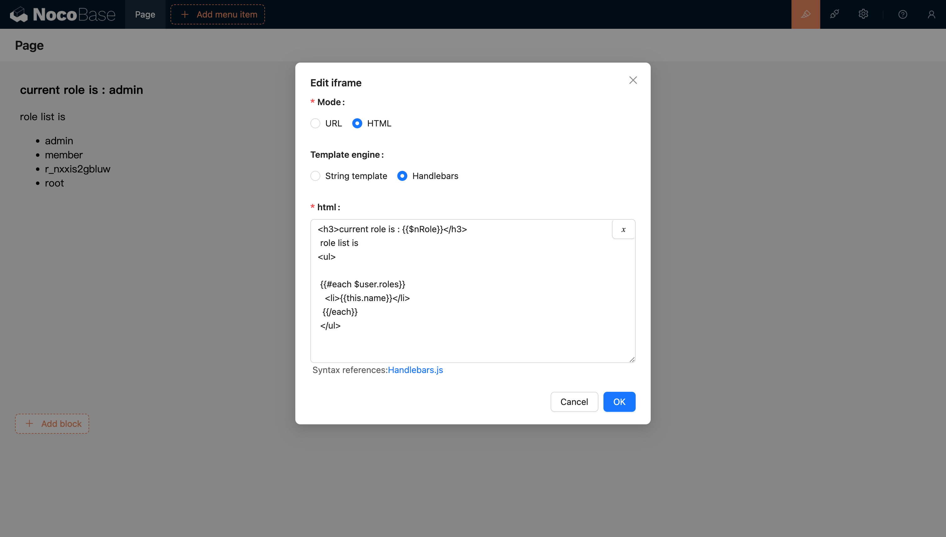
For more information, refer to the Handlebars template documentation.
## Passing Variables
### HTML Support for Variable Parsing
#### Support for Selecting Variables from the Variable Selector in the Current Block Context
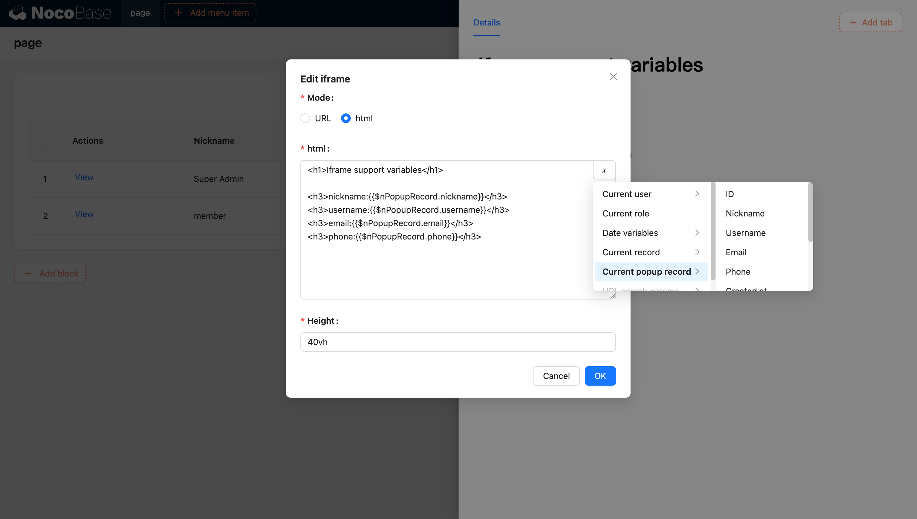
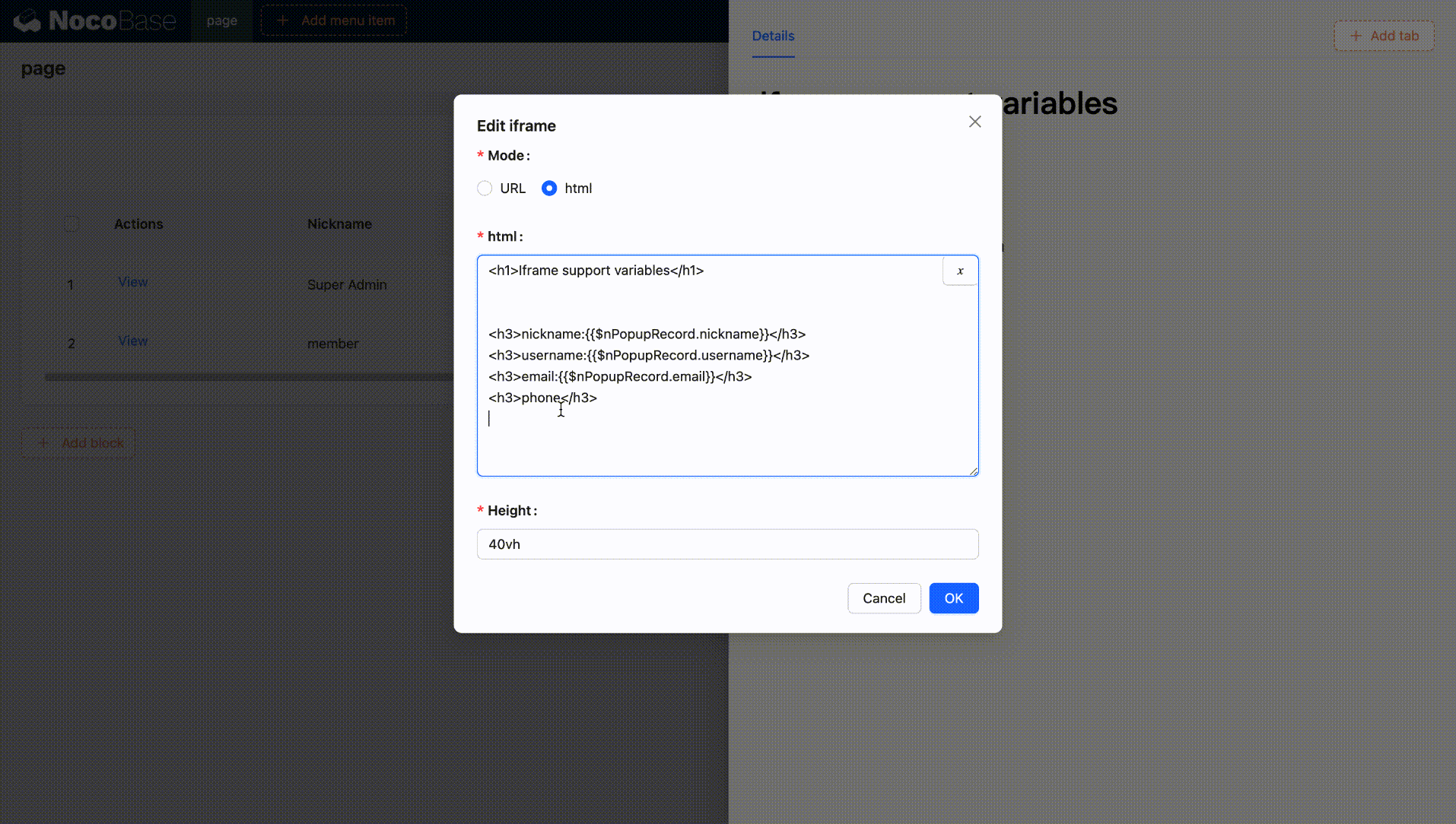
#### Support for Injecting Variables into the Application and Using Them through Code
You can also inject custom variables into the application through code and use them in HTML. For example, creating a dynamic calendar application using Vue 3 and Element Plus:
```html
<!doctype html>
<html lang="en">
<head>
<meta charset="UTF-8" />
<meta name="viewport" content="width=device-width, initial-scale=1.0" />
<title>Vue3 CDN Example