

Use NocoBase to build a linkable operational dashboard
This article takes the operation dashboard of the "work order system" as an example to introduce how to use NocoBase's chart block, filter block and JS block in combination to build a data dashboard that supports filter linkage, chart drill-down and custom styles.
Although the examples are from work order scenarios, these methods are also applicable to business systems such as CRM, equipment operations, project management, approval flow, customer success, etc.
What this article wants to introduce is not "how to use JS blocks to write a large screen", but how to combine NocoBase's native block capabilities and JS blocks: Let the native blocks be responsible for standard capabilities, and let the JS blocks complement the personalized experience.
scene target
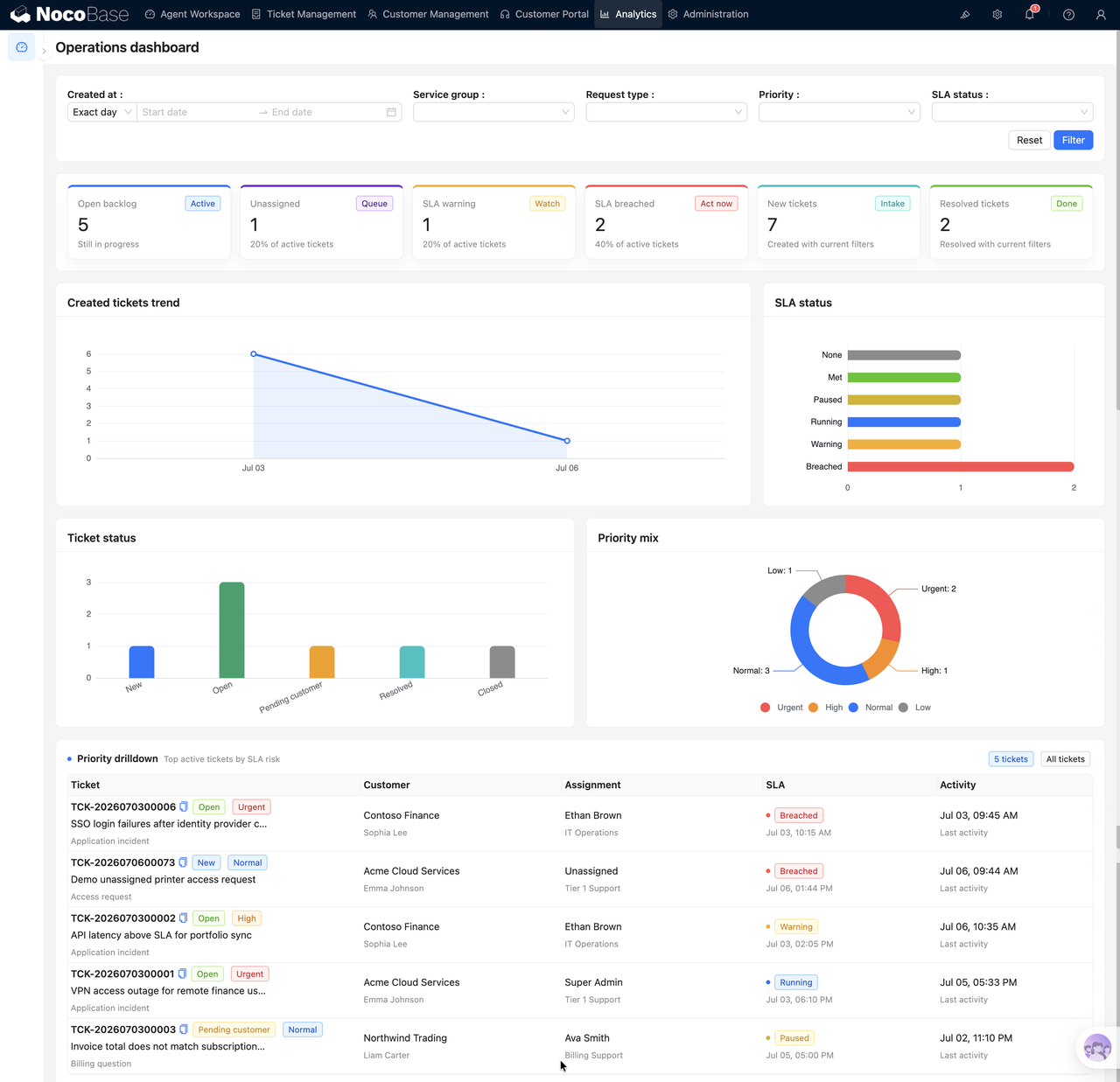
We hope to build an Operations dashboard to help the operation or service team quickly determine the current workload:
- How many open work orders are there currently?
- Which work orders are at SLA risk?
- What is the trend in new work orders?
- What is the status and priority distribution of work orders?
- After clicking on a chart, you can view the corresponding details
The page can be roughly divided into four layers:
- Top filter area: time, service group, request type, priority, SLA status
- KPI statistics area: Open backlog, Unassigned, SLA warning, etc.
- Chart analysis area: trend, status, SLA, priority distribution
- Drill-down detail area: Click on the chart to display matching records
First, clarify a construction idea
When many people make data dashboards, they tend to think of the problem as one of two options:
Either use all NocoBase's native blocks, which are simple to configure, but worry that the style and interaction are not flexible enough; or simply write a large JS block and control the query, chart, filtering, and drill-down by yourself, but this will lose the convenience brought by low-code configuration.
In fact, the more recommended way is to combine the two.
In this Operations dashboard, we did not write the entire page as a large JS screen, but split it according to responsibilities:
- Top filtering uses the filtering block that comes with the NocoBase system;
- Trend charts, status distribution, and SLA distribution use native chart blocks;
- KPI cards and drill-down details use JS blocks;
- Filter blocks affect both chart blocks and JS blocks;
- After the chart is clicked, the drill-down conditions are passed to the JS detail block below.
The advantage of this is that standard statistics and filtering still retain the configuration capabilities of NocoBase, while personalized display and complex interactions are completed by JS blocks. The page is neither "configurable only" nor "all code", but configuration and code each perform their own duties.
1. How to customize the style of the chart block
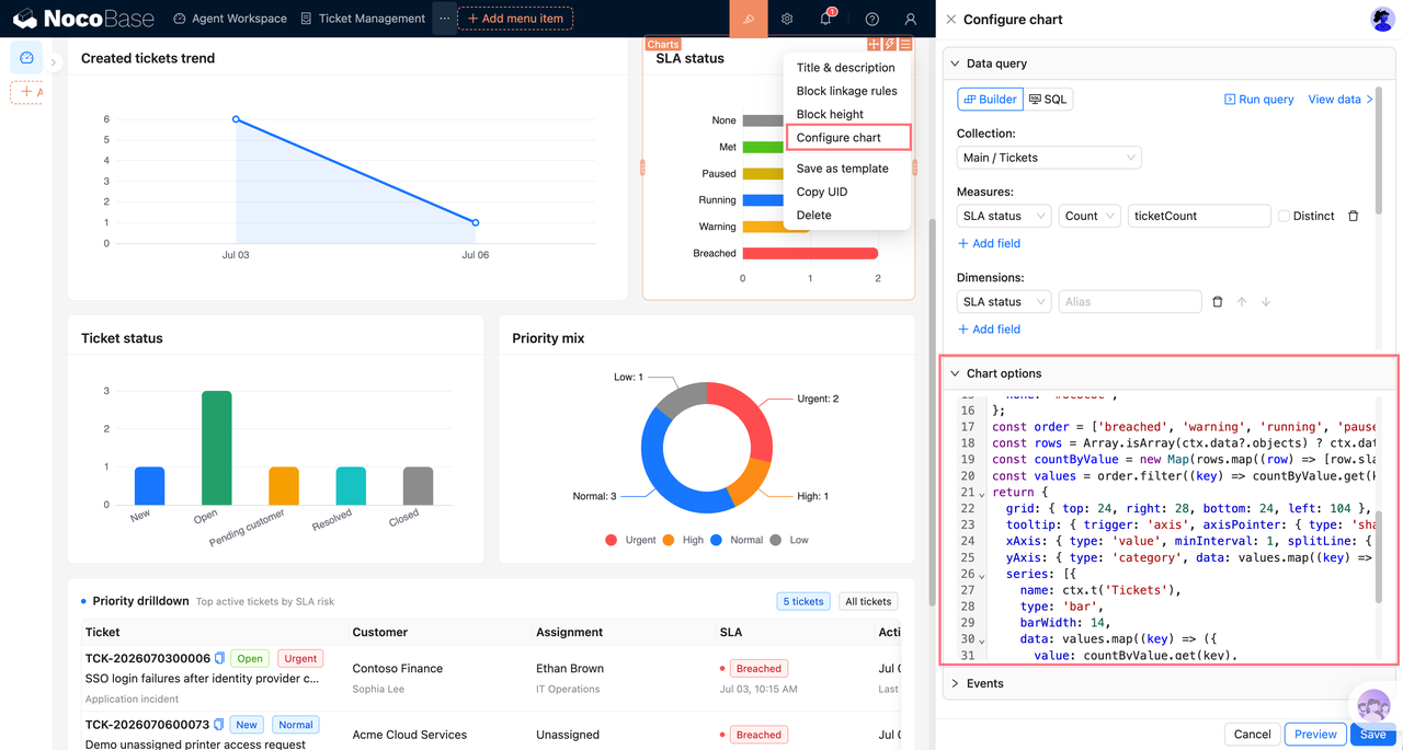
The chart block of NocoBase can first use Query builder to define the statistical caliber, and then use the custom ECharts option to adjust the style.
Taking "work order status statistics" as an example, Query builder can be configured as:
- Datasheet: tickets
- Metrics: id count, alias ticketCount
- Dimensions: status
The key is that when customizing the style, you do not need to rewrite the query, you only need to process the chart display based on ctx.data.objects.
This line of code reads the chart query results. Then define status labels and colors:
It is recommended that all visible copywriting use ctx.t() to facilitate subsequent multi-language support.
When generating chart data, you can attach drill-down information to each chart data point:
The most critical thing here is ticketingDrilldown. It is not a standard field of ECharts, but a business context that we put in ourselves, which will be used when clicking on the chart later.
Finally return to ECharts option:
The core idea of this part is:
- Query builder is responsible for statistics;
- Custom option is responsible for visual expression;
- Custom fields are responsible for carrying drill-down context.
2. Let the system filter block become the observation scope of the entire page
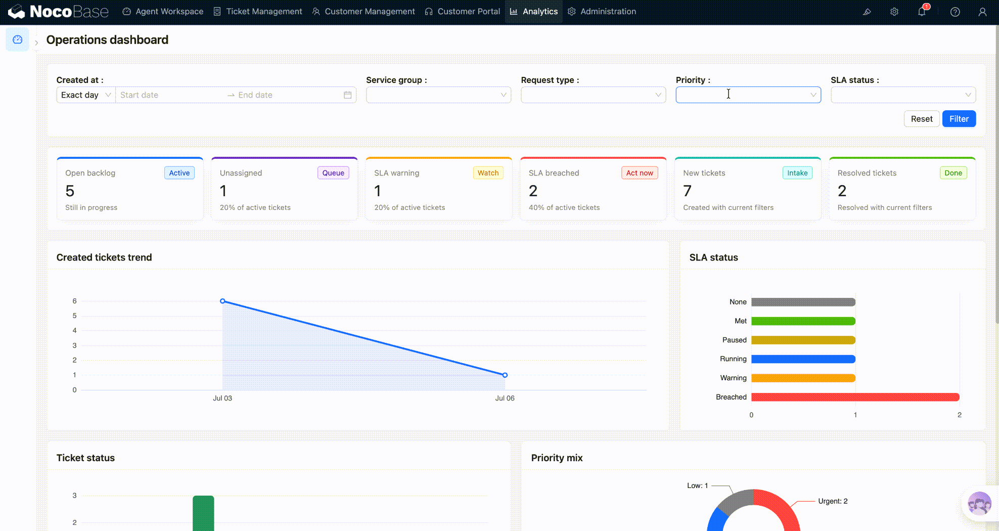
The filter area in the operational dashboard should not be just an isolated form. It represents the current observation diameter of the entire page.
For example, if the user selects a service group, a request type, and a creation time, then KPIs, trend charts, status distribution, and drill-down details should all be displayed based on the same set of conditions. Otherwise, the numbers in different blocks on the page will fight with each other, and it will be difficult for users to judge which data is the result within the current range.
Here we directly use the filtering block that comes with the NocoBase system instead of writing a filtering component ourselves. Native filter blocks can be naturally bound to chart blocks, allowing the chart block to continue to use the Query builder, permissions, refresh and filter mechanisms.
Top Dashboard scope can configure these filter items:
- Created at
- Service group
- Request type
- Priority
- SLA status
For JS blocks, you only need to read the same set of filter conditions in the code and then convert them into query filters. In this way, KPIs and drill-down details can also be consistent with the native chart.
The combination of filter conditions can be encapsulated into a small function:
Count by filter:
The key points here are:
The JS block queries business data through resources instead of writing SQL directly. This makes it easier to keep consistent with NocoBase's permissions, data sources, and page runtimes.
3. Use JS blocks to display KPI cards
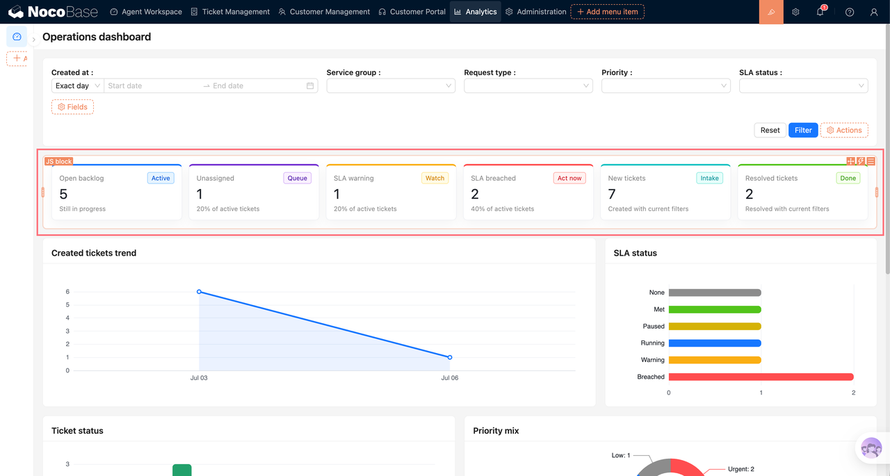
KPIs are better suited to use JS blocks. Because KPI is usually not a single query, but a combination of multiple business calibers: unfinished, unassigned, SLA warning, SLA breached, new, resolved, etc.
The JS block can requery data based on the current filtering range and render it into a statistical card.
The key points of JS blocks are:
- Use
ctx.makeResource()to query data; - Use
ctx.libs.antdto render the interface; - Use
ctx.render()to output content; - Re-render JS chunks after filtering changes.
In a real page, the filter button and reset button can configure the event flow so that they refresh the KPI JS block and drill-down JS block at the same time after completing the native filter action. In this way, the user clicks once to filter, and both charts and custom content will be updated based on the same range.
4. Chart linkage JS block for drill-down
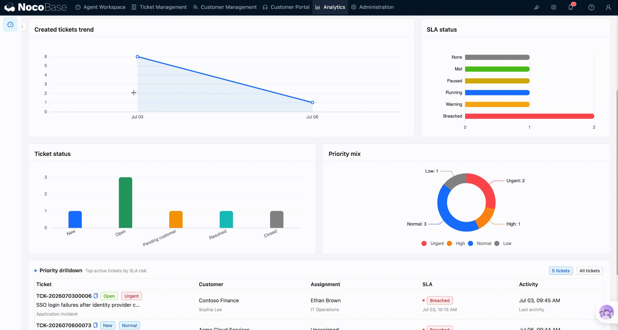
Clicking on the chart to drill down is a very practical interaction in the dashboard.
In the work order scenario, the user clicks the "Status: Open" column, and all Open work orders are displayed in the detail area below; when the user clicks "SLA breached", all overtime work orders are displayed below.
The implementation idea is:
- Chart data points carry
ticketingDrilldown; - The chart event reads this drill-down information;
- Write drill-down information into the target JS block context;
- Trigger the target JS block to re-render.
The key code in the chart event is as follows. First find the drill-down JS block:
Then write the drill-down conditions obtained by clicking on the chart into the target block:
The most critical are these two lines:
The first line passes the drill-down condition to the JS block, and the second line triggers the JS block refresh.
Finally bind the chart click event:
It is recommended here that you must return cleanup:
In this way, when the chart is reconfigured or re-rendered, old events can be cleaned up to avoid repeated binding.
The above click event-related code is applicable to v2.2.0-beta.10 and above versions. Reference to the old version code:
5. How to display details in drill-down JS blocks
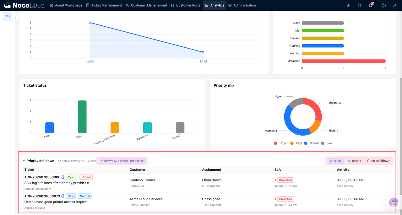
Drill down into the JS block to read the ticketingDashboardDrilldown just written, and then query the data according to the filter in it.
If the user has not clicked on the chart, display a prompt. After clicking, query the work order based on drilldown.filter:
Then render the table:
If you need to clear drill-down conditions, you can refer to
The key points in this part are:
- The chart is only responsible for passing the filter;
- The JS block is responsible for querying and displaying details;
- Click on different charts to share the same drill-down block.
Practical suggestions
1. Don’t rush to code the complex page as a whole
The most important lesson from this page is: don’t pit native capabilities against JS capabilities.
If a capability is already a native capability of NocoBase, such as filtering, chart query, table display, and permission control, the native block will be used first. In this way, when fields, filter conditions, and chart caliber are subsequently adjusted, they can still be configured on the interface.
JS blocks are more suitable for processing parts that native blocks are not good at, such as combining multiple indicators into a set of KPIs, special card styles, displaying a set of custom details after clicking on the chart, or passing business context between different blocks.
In other words, the native block is responsible for "configurable standard capabilities", and the JS block is responsible for "business-oriented personalized experience". This is also the most reusable construction idea for this dashboard.
2. For simple statistics, use the chart block Query builder first.
This preserves NocoBase's standard query, permissions, filtering and refreshing capabilities. Only when the default chart style cannot express the business focus, use the customized ECharts option for visual optimization.
3. KPI cards give priority to using JS blocks
KPIs often require multiple queries, condition combinations, and custom layouts, and JS blocks are more flexible. Especially when KPIs need to respond to the same set of system filter conditions, it will be clearer to use JS blocks to handle them uniformly.
4. Chart events should return cleanup
Recommended writing method:
Do not directly use chart.off('click') to clear all click events, as this may accidentally delete the chart block or configure the panel's own monitoring.
Let AI help you build it
This type of dashboard is very suitable for AI-assisted generation because it involves data models, statistical calibers, chart styles, and page interactions at the same time. You can hand it the content of this article and ask questions using the prompt words below.
You can ask questions like this:
If you already have a page, you can also let AI help you optimize it:
In this way, the content generated by AI will be closer to the real business, rather than just giving isolated code.
If you choose to let AI help you build it, please use the backup manager to back up the project before starting.