

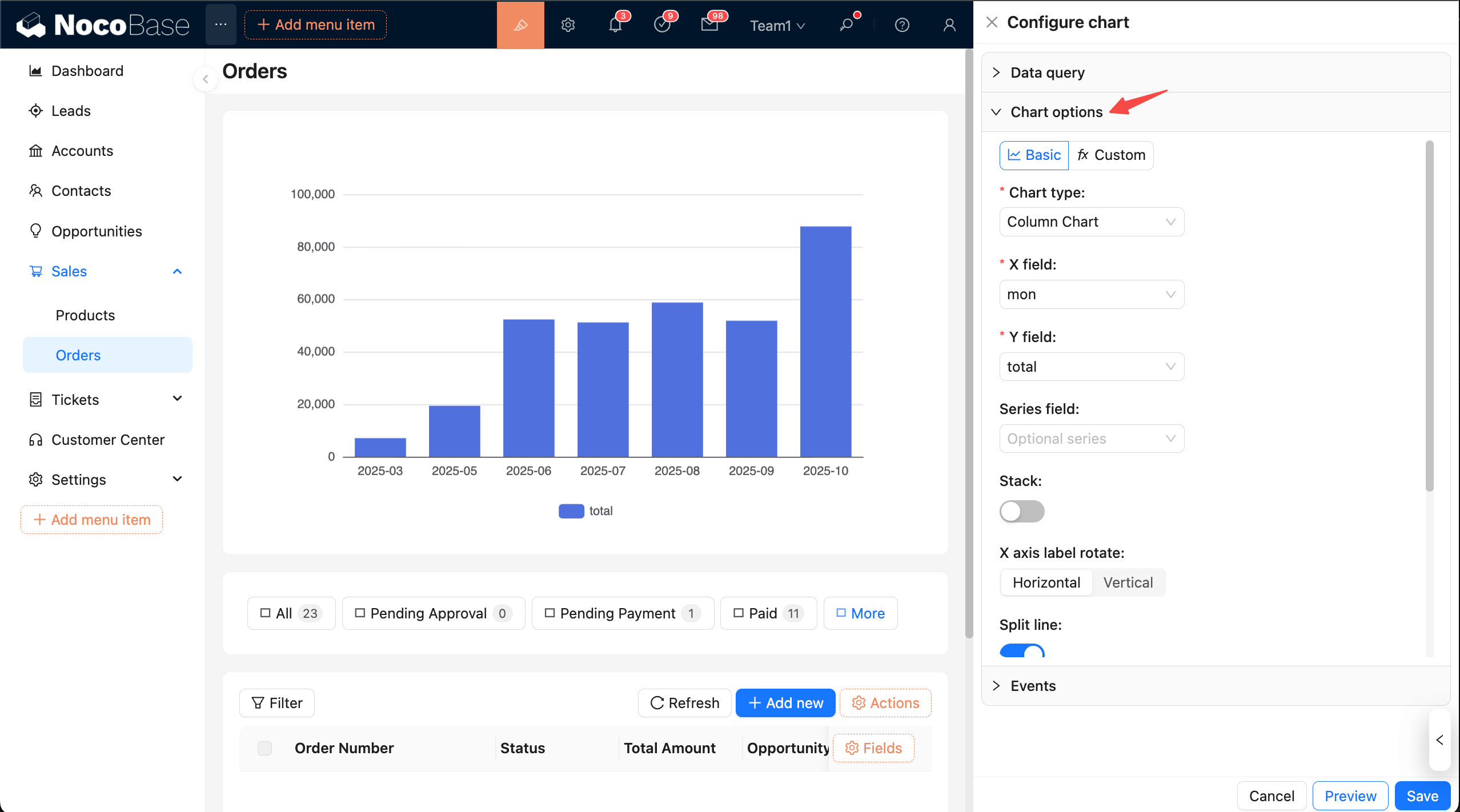
Chart options
Configure how charts are displayed. Two modes are supported: Basic (visual) and Custom (JS). Basic is ideal for quick mapping and common properties; Custom fits complex scenarios and advanced customization.
Panel layout
Tips: To configure more easily, collapse other panels first.
Top action bar Mode selection:
- Basic: Visual configuration. Choose a type and complete field mapping; adjust common properties with switches.
- Custom: Write JS in the editor and return an ECharts
option.
Basic mode
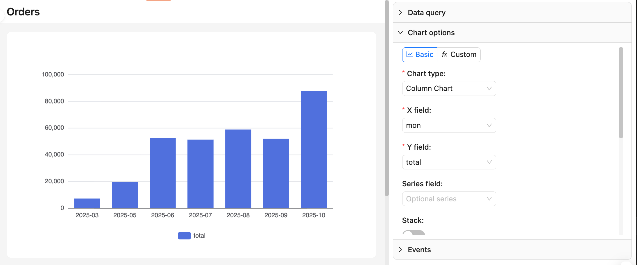
Choose chart type
- Supported: line, area, column, bar, pie, donut, funnel, scatter, etc.
- Required fields vary by chart type. First confirm column names and types in “Data query → View data”.
Field mapping
- Line/area/column/bar:
xField: dimension (date, category, region)yField: measure (aggregated numeric value)seriesField(optional): series grouping (for multiple lines/groups)
- Pie/donut:
Category: categorical dimensionValue: measure
- Funnel:
Category: stage/categoryValue: value (usually count or percentage)
- Scatter:
xField,yField: two measures or dimensions for axes
For more chart options, refer to the ECharts docs: Axis and Examples
Notes:
- After changing dimensions or measures, recheck the mapping to avoid empty or misaligned charts.
- Pie/donut and funnel must provide a “category + value” combination.
Common properties
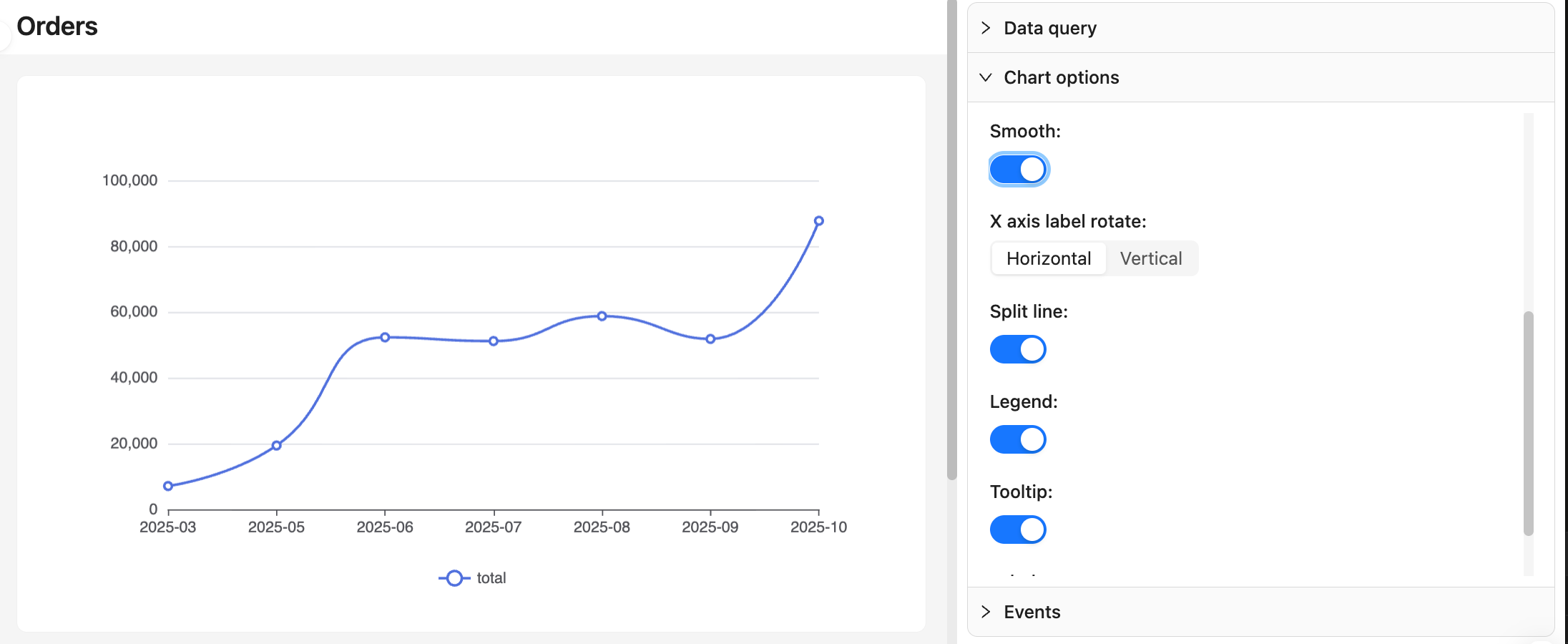
- Stack, smooth (line/area)
- Labels, tooltip, legend
- Axis label rotation, split lines
- Pie/donut radius and inner radius, funnel sort order
Recommendations:
- Use line/area for time series with moderate smoothing; use column/bar for category comparison.
- With dense data, avoid showing all labels to prevent overlap.
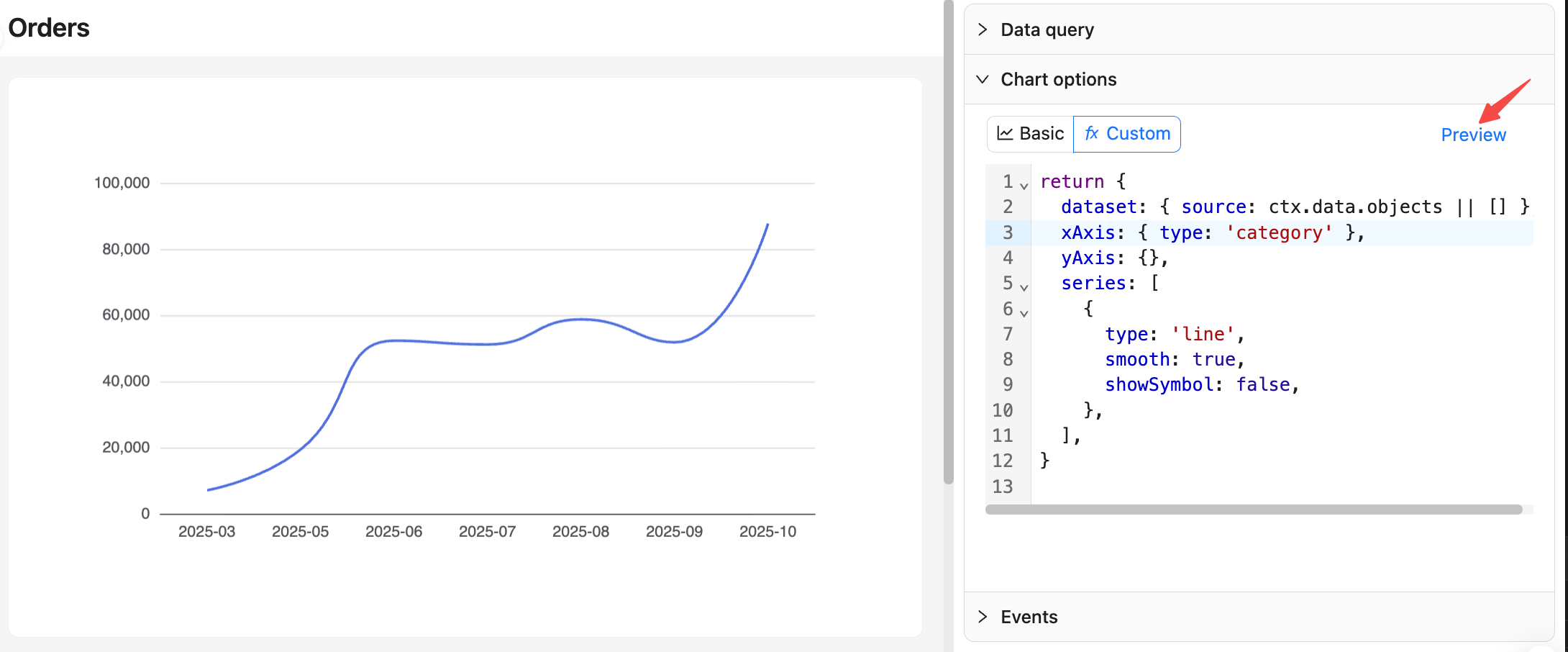
Custom mode
Return a full ECharts option. Suitable for advanced customization such as merging multiple series, complex tooltips, and dynamic styles. Recommended approach: consolidate data in dataset.source. For details, see ECharts docs: Dataset
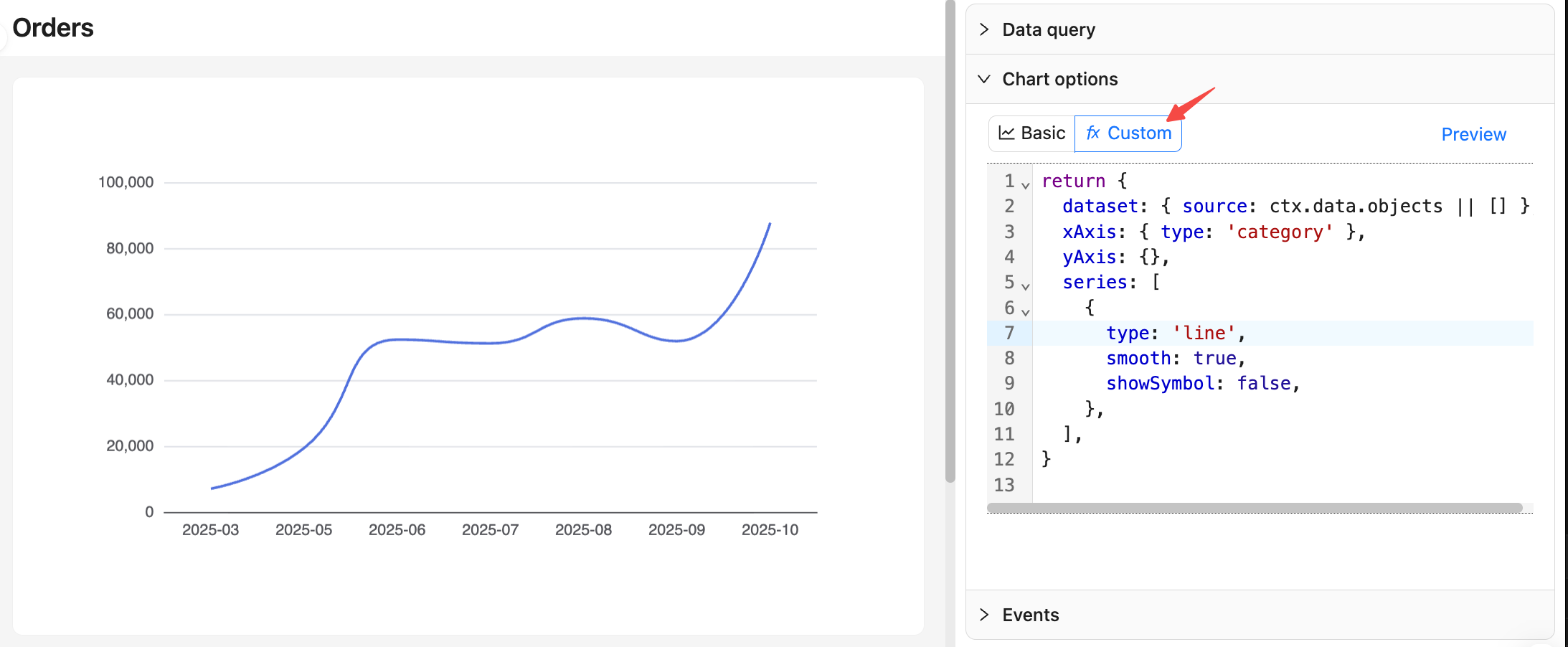
Data context
ctx.data.objects: array of objects (each row as an object, recommended)ctx.data.rows: 2D array (with header)ctx.data.columns: 2D array grouped by columns
Example: monthly orders line chart
Preview and Save
- In Custom mode, after editing, click the Preview button on the right to update the chart preview.
- At the bottom, click Save to apply and persist; click Cancel to revert all changes made this time.
TIP
For more on chart options, see Advanced — Custom chart configuration.