Styles & Themes - Kiểu và Theme
Trong NocoBase, khuyến nghị dùng antd-style để viết kiểu component. Nó có thể kết hợp với theme token của Antd để thực hiện thích ứng theme động — ví dụ tự động hỗ trợ chế độ tối.
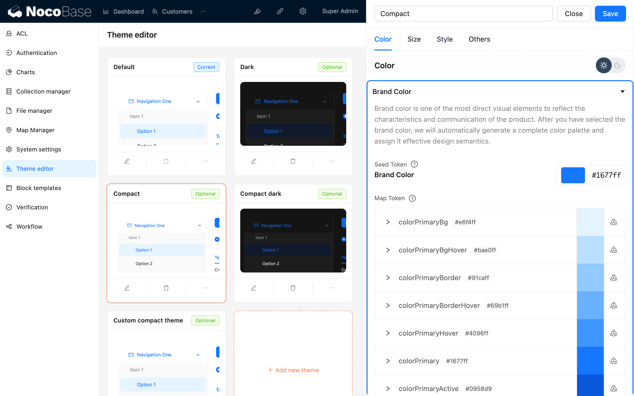
NocoBase còn cung cấp Plugin trình chỉnh sửa theme, có thể chỉnh biến theme trực tiếp trên giao diện.
Viết kiểu
createStyles (khuyến nghị)
createStyles là cách viết kiểu phổ biến nhất, hỗ trợ cả CSS object và CSS string template:
import { createStyles } from 'antd-style';

const useStyles = createStyles(({ token, css }) => ({
  // Cách viết CSS object
  container: {
    backgroundColor: token.colorBgLayout,
    borderRadius: token.borderRadiusLG,
    maxWidth: 400,
    width: '100%',
    height: 180,
    display: 'flex',
    alignItems: 'center',
    justifyContent: 'center',
    flexDirection: 'column',
    marginLeft: 'auto',
    marginRight: 'auto',
  },
  // Cách viết CSS string template
  card: css`
    color: ${token.colorTextTertiary};
    box-shadow: ${token.boxShadow};
    &:hover {
      color: ${token.colorTextSecondary};
      box-shadow: ${token.boxShadowSecondary};
    }
    padding: ${token.padding}px;
    border-radius: ${token.borderRadius}px;
    background: ${token.colorBgContainer};
    transition: all 100ms ${token.motionEaseInBack};
    margin-bottom: 8px;
    cursor: pointer;
  `,
}));

export default () => {
  // Đối tượng styles sẽ được cache, không cần lo về vấn đề re-render
  const { styles, cx, theme } = useStyles();

  return (
    <div className={cx('a-simple-create-style-demo-classname', styles.container)}>
      <div className={styles.card}>createStyles Demo</div>
      <div>Chế độ theme hiện tại: {theme.appearance}</div>
    </div>
  );
};
Cách dùng chi tiết tham khảo createStyles API.
createStylish
createStylish được dùng để tạo các đoạn kiểu có thể tái sử dụng, phù hợp để chia sẻ kiểu giữa nhiều component:
import { createStyles, createStylish, css } from 'antd-style';

const useStylish = createStylish(({ token, css }) => {
  const containerBgHover = css`
    cursor: pointer;
    transition: 150ms background-color ease-in-out;
    &:hover {
      background: ${token.colorFillQuaternary};
    }
  `;

  const defaultButtonBase = css`
    color: ${token.colorTextSecondary};
    background: ${token.colorFillQuaternary};
    border-color: transparent;
  `;

  return {
    defaultButton: css`
      ${defaultButtonBase};
      &:hover {
        color: ${token.colorText};
        background: ${token.colorFillSecondary};
        border-color: transparent;
      }
      &:focus {
        ${defaultButtonBase};
        border-color: ${token.colorPrimary};
      }
    `,

    containerBgHover,

    containerBgL2: css`
      ${containerBgHover};
      border-radius: 4px;
      background: ${token.colorFillQuaternary};
      &:hover {
        background: ${token.colorFillTertiary};
      }
    `,
  };
});

const useStyles = createStyles({
  container: {
    backgroundColor: '#f5f5f5',
    maxWidth: 400,
    width: '100%',
    height: 180,
    display: 'flex',
    alignItems: 'center',
    justifyContent: 'center',
  },
  btn: css`
    padding: 24px;
  `,
});

export default () => {
  const { styles, cx } = useStyles();
  const stylish = useStylish();

  return (
    <div className={styles.container}>
      <div className={cx(styles.btn, stylish.defaultButton)}>
        stylish Button
      </div>
    </div>
  );
};
Cách dùng chi tiết tham khảo createStylish API.
createGlobalStyle
createGlobalStyle được dùng để tiêm kiểu toàn cục. Thường dùng khá ít, phần lớn tình huống createStyles là đủ:
import { createGlobalStyle } from 'antd-style';

const Global = createGlobalStyle`
  .some-class {
    color: hotpink;
  }
`;

export default () => {
  return (
    <div>
      <Global />
      <div className="some-class">Màu yêu thích của các chàng trai mạnh mẽ</div>
    </div>
  );
};
Cách dùng chi tiết tham khảo createGlobalStyle API.
Sử dụng theme token
Theme token của Antd có thể dùng trực tiếp trong createStyles và createGlobalStyle. Tham chiếu các biến như màu sắc, khoảng cách, bo góc thông qua token, component sẽ tự động thích ứng khi chuyển theme (bao gồm cả chế độ tối).
Dùng trong createStyles
import { SmileOutlined } from '@ant-design/icons';
import { Button, Space } from 'antd';
import { createStyles } from 'antd-style';

const useStyles = createStyles(({ token, css }) => {
  const commonCard = css`
    border-radius: ${token.borderRadiusLG}px;
    padding: ${token.paddingLG}px;
  `;

  return {
    container: css`
      background-color: ${token.colorBgLayout};
      padding: 24px;
    `,
    primaryCard: css`
      ${commonCard};
      background: ${token.colorPrimary};
      color: ${token.colorTextLightSolid};
    `,
    defaultCard: css`
      ${commonCard};
      background: ${token.colorBgContainer};
      color: ${token.colorText};
    `,
  };
});

const App = () => {
  const { styles } = useStyles();

  return (
    <div className={styles.container}>
      <Space direction={'vertical'} style={{ width: '100%' }} size={16}>
        <Space>
          <Button title={'Mô tả nút chức năng'} icon={<SmileOutlined />} />
          Nút thao tác
        </Space>
        <div className={styles.defaultCard}>Card thông thường</div>
        <div className={styles.primaryCard}>Card chính</div>
      </Space>
    </div>
  );
};

export default App;
Dùng trong createGlobalStyle
import { createGlobalStyle, ThemeProvider } from 'antd-style';

const Global = createGlobalStyle`
  .ant-custom-button {
    color: ${(p) => p.theme.colorPrimary};
    background: ${(p) => p.theme.colorPrimaryBg};
    height: ${(p) => p.theme.controlHeight}px;
    border-radius: ${(p) => p.theme.borderRadius}px;
    padding: 0 ${(p) => p.theme.paddingContentHorizontal}px;

    :hover {
      background: ${(p) => p.theme.colorPrimaryBgHover};
      color: ${(p) => p.theme.colorPrimaryTextActive};
    }

    :active {
      background: ${(p) => p.theme.colorPrimaryBorder};
      color: ${(p) => p.theme.colorPrimaryText};
    }

    border: none;
    cursor: pointer;
  }
`;

export default () => {
  return (
    <ThemeProvider>
      <Global />
      <button className="ant-custom-button">Nút không tồn tại trong antd</button>
    </ThemeProvider>
  );
};
Danh sách token đầy đủ tham khảo Antd Seed Token.
Debug theme
NocoBase cung cấp Plugin trình chỉnh sửa theme, có thể xem trước và điều chỉnh biến theme theo thời gian thực trên giao diện:
Liên kết liên quan

