Styles & Themes
In NocoBase, the recommended approach for writing component styles is antd-style. It works with Antd's theme token to enable dynamic theme adaptation — such as automatic dark mode support.
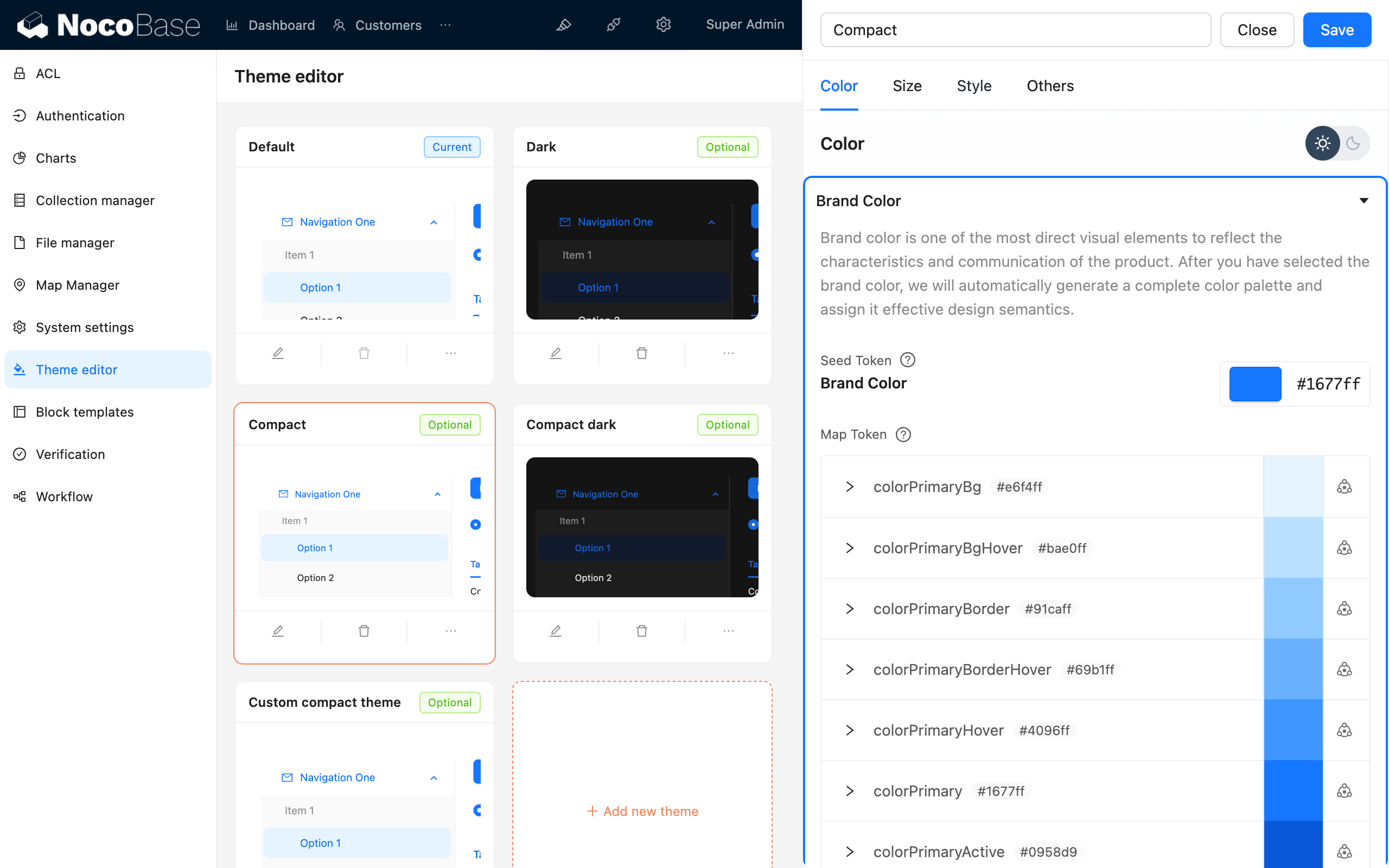
NocoBase also provides a Theme Editor plugin that allows you to adjust theme variables directly in the UI.
Writing Styles
createStyles (Recommended)
createStyles is the most commonly used styling approach, supporting both CSS object and CSS string template syntax:
import { createStyles } from 'antd-style';

const useStyles = createStyles(({ token, css }) => ({
  // CSS object syntax
  container: {
    backgroundColor: token.colorBgLayout,
    borderRadius: token.borderRadiusLG,
    maxWidth: 400,
    width: '100%',
    height: 180,
    display: 'flex',
    alignItems: 'center',
    justifyContent: 'center',
    flexDirection: 'column',
    marginLeft: 'auto',
    marginRight: 'auto',
  },
  // CSS string template syntax
  card: css`
    color: ${token.colorTextTertiary};
    box-shadow: ${token.boxShadow};
    &:hover {
      color: ${token.colorTextSecondary};
      box-shadow: ${token.boxShadowSecondary};
    }
    padding: ${token.padding}px;
    border-radius: ${token.borderRadius}px;
    background: ${token.colorBgContainer};
    transition: all 100ms ${token.motionEaseInBack};
    margin-bottom: 8px;
    cursor: pointer;
  `,
}));

export default () => {
  // The styles object is cached — no need to worry about re-render issues
  const { styles, cx, theme } = useStyles();

  return (
    <div className={cx('a-simple-create-style-demo-classname', styles.container)}>
      <div className={styles.card}>createStyles Demo</div>
      <div>Current theme mode: {theme.appearance}</div>
    </div>
  );
};
For detailed usage, refer to the createStyles API.
createStylish
createStylish is used to create reusable style fragments, suitable for sharing styles across multiple components:
import { createStyles, createStylish, css } from 'antd-style';

const useStylish = createStylish(({ token, css }) => {
  const containerBgHover = css`
    cursor: pointer;
    transition: 150ms background-color ease-in-out;
    &:hover {
      background: ${token.colorFillQuaternary};
    }
  `;

  const defaultButtonBase = css`
    color: ${token.colorTextSecondary};
    background: ${token.colorFillQuaternary};
    border-color: transparent;
  `;

  return {
    defaultButton: css`
      ${defaultButtonBase};
      &:hover {
        color: ${token.colorText};
        background: ${token.colorFillSecondary};
        border-color: transparent;
      }
      &:focus {
        ${defaultButtonBase};
        border-color: ${token.colorPrimary};
      }
    `,

    containerBgHover,

    containerBgL2: css`
      ${containerBgHover};
      border-radius: 4px;
      background: ${token.colorFillQuaternary};
      &:hover {
        background: ${token.colorFillTertiary};
      }
    `,
  };
});

const useStyles = createStyles({
  container: {
    backgroundColor: '#f5f5f5',
    maxWidth: 400,
    width: '100%',
    height: 180,
    display: 'flex',
    alignItems: 'center',
    justifyContent: 'center',
  },
  btn: css`
    padding: 24px;
  `,
});

export default () => {
  const { styles, cx } = useStyles();
  const stylish = useStylish();

  return (
    <div className={styles.container}>
      <div className={cx(styles.btn, stylish.defaultButton)}>
        stylish Button
      </div>
    </div>
  );
};
For detailed usage, refer to the createStylish API.
createGlobalStyle
createGlobalStyle is used to inject global styles. It's rarely needed in most cases — createStyles is usually sufficient:
import { createGlobalStyle } from 'antd-style';

const Global = createGlobalStyle`
  .some-class {
    color: hotpink;
  }
`;

export default () => {
  return (
    <div>
      <Global />
      <div className="some-class">Hotpink is the color of choice</div>
    </div>
  );
};
For detailed usage, refer to the createGlobalStyle API.
Using Theme Tokens
Antd's theme tokens can be used directly in createStyles and createGlobalStyle. By referencing tokens for colors, spacing, border radius, and other variables, your components will automatically adapt to theme changes (including dark mode).
In createStyles
import { SmileOutlined } from '@ant-design/icons';
import { Button, Space } from 'antd';
import { createStyles } from 'antd-style';

const useStyles = createStyles(({ token, css }) => {
  const commonCard = css`
    border-radius: ${token.borderRadiusLG}px;
    padding: ${token.paddingLG}px;
  `;

  return {
    container: css`
      background-color: ${token.colorBgLayout};
      padding: 24px;
    `,
    primaryCard: css`
      ${commonCard};
      background: ${token.colorPrimary};
      color: ${token.colorTextLightSolid};
    `,
    defaultCard: css`
      ${commonCard};
      background: ${token.colorBgContainer};
      color: ${token.colorText};
    `,
  };
});

const App = () => {
  const { styles } = useStyles();

  return (
    <div className={styles.container}>
      <Space direction={'vertical'} style={{ width: '100%' }} size={16}>
        <Space>
          <Button title={'Tooltip for the button'} icon={<SmileOutlined />} />
          Action Button
        </Space>
        <div className={styles.defaultCard}>Default Card</div>
        <div className={styles.primaryCard}>Primary Card</div>
      </Space>
    </div>
  );
};

export default App;
In createGlobalStyle
import { createGlobalStyle, ThemeProvider } from 'antd-style';

const Global = createGlobalStyle`
  .ant-custom-button {
    color: ${(p) => p.theme.colorPrimary};
    background: ${(p) => p.theme.colorPrimaryBg};
    height: ${(p) => p.theme.controlHeight}px;
    border-radius: ${(p) => p.theme.borderRadius}px;
    padding: 0 ${(p) => p.theme.paddingContentHorizontal}px;

    :hover {
      background: ${(p) => p.theme.colorPrimaryBgHover};
      color: ${(p) => p.theme.colorPrimaryTextActive};
    }

    :active {
      background: ${(p) => p.theme.colorPrimaryBorder};
      color: ${(p) => p.theme.colorPrimaryText};
    }

    border: none;
    cursor: pointer;
  }
`;

export default () => {
  return (
    <ThemeProvider>
      <Global />
      <button className="ant-custom-button">A button that doesn't exist in antd</button>
    </ThemeProvider>
  );
};
For a complete list of tokens, refer to Antd Seed Token.
Debugging Themes
NocoBase provides a Theme Editor plugin that allows you to preview and adjust theme variables in real time: