

Field Extension
In NocoBase, Field components are used in tables and forms to display and edit data. By extending FieldModel-related base classes, you can customize how fields are rendered — such as displaying data in a special format or using a custom component for editing.
Example: Custom Display Field
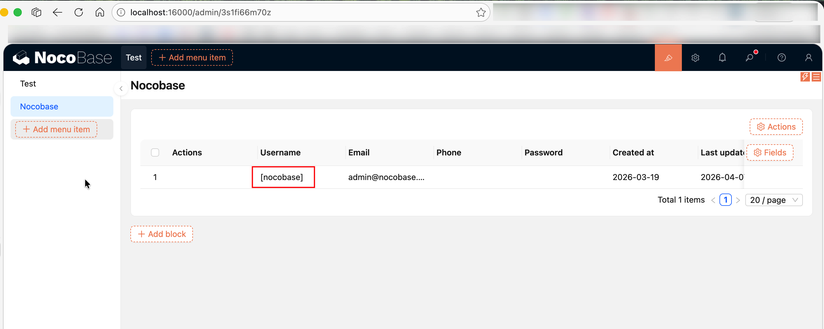
The following example creates a simple display field that wraps the field value with square brackets []:
Key points:
renderComponent(value)— Receives the current field's value as a parameter and returns the rendered JSXthis.context.record— Gets the full data record of the current rowthis.context.recordIndex— Gets the index of the current rowClickableFieldModel— ExtendsFieldModelwith click interaction capabilitiesDisplayItemModel.bindModelToInterface()— Binds the field model to a specified field interface type (e.g.,inputfor text input fields), so that this display component can be selected for fields of that type
Registering Fields
Register with registerModelLoaders for lazy loading in the Plugin's load() method:
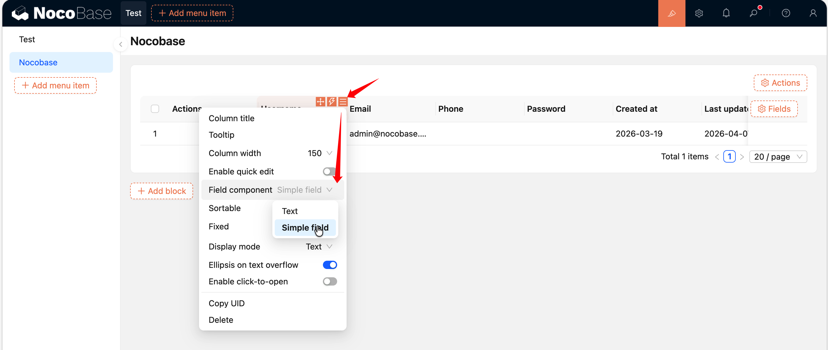
After registration, find a field column of the corresponding type in a table block (for example, the above example binds to input, which corresponds to single-line text fields), click the column's configuration button, and you can switch to this custom display component in the "Field component" dropdown menu. For a complete hands-on example, see Building a Custom Field Component.
Full Source Code
- @nocobase-example/plugin-field-simple — Custom field component example
Related Links
- Plugin Tutorial: Building a Custom Field Component — Build a custom field display component from scratch
- Plugin Tutorial: Building a Full-Stack Data Management Plugin — Custom fields in a real-world complete plugin
- FlowEngine Overview — FlowModel basics
- Block Extension — Custom blocks
- Action Extension — Custom action buttons
- FlowDefinition — Complete parameters and event types for registerFlow
- FlowEngine Full Documentation — Complete reference