
Business pages compose existing containers, headings and content areas. The application shell owns branding, navigation and global actions. These components are application-owned source, with shadcn conventions for interactive components. See UI components and interactions for adding components.
The product catalog example uses default template 1.0.0-beta.85, an English interface and fixed product fixtures. It makes no product API calls or writes. Search and the long-heading switch live in the parent page's memory and reset when leaving the catalog or reloading. See Example source and setup to run it.
Choose where to change the layout
| Change | Location |
|---|---|
| Filters, tables and forms on a business page | The page and its local components under client/pages/ |
| Page padding, section spacing, headings and actions | client/components/page-container.tsx and page-header.tsx |
| Branding, sidebar footer and global header actions | client/layouts/components/ |
| The relationship between sidebar, header and content | client/layouts/app-layout.tsx |
| Inline, dialog, drawer or covering child views | The parent's Outlet and the child's layout component |
| The shared shell for sign-in and standalone pages | client/routing/standalone-page-layout.tsx |
Add menu entries through route navigation declarations, preserving existing selection and permission filtering. See Pages, routes and navigation.
Compose a business page
Page container, heading and actions
A regular page uses one PageContainer, with PageHeader for its heading, description and page-level actions. The catalog extracts this composition into ProductPageFrame; the page owns filtering and table content:
import { PageContainer } from '#components/page-container';
import { PageHeader } from '#components/page-header';

// Outer structure of ProductPageFrame; the next section adds its columns.
<PageContainer>
  <PageHeader title={title} description={description} actions={actions} />
  {children}
</PageContainer>
PageContainer supplies w-full space-y-6 p-6 md:p-8 and accepts normal section attributes. PageHeader accepts React nodes for title, description and actions, rendering its title as an h1. A page using ProductPageFrame needs no additional page container.
Sign in and open Product catalog from the sidebar. Click Long heading to inspect wrapping alongside the action area. On narrow screens, actions move below the heading.
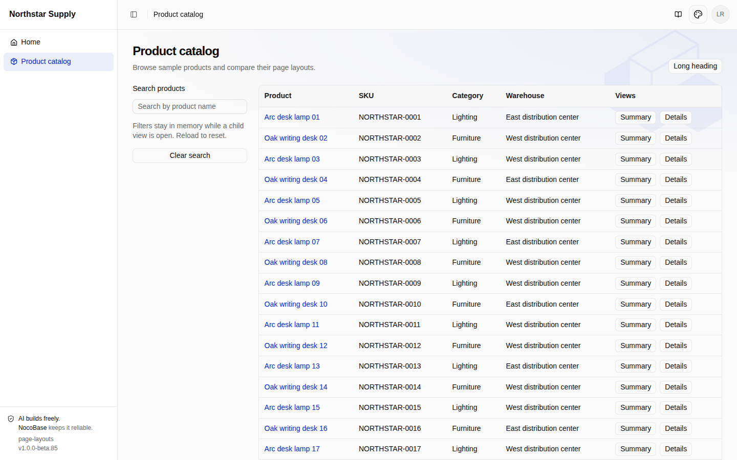
View page composition · View the layout component
Responsive filters and list
Pass the filters and list into layout slots while keeping data and event handling in the page:
// Inside ProductPageFrame, after PageHeader.
<div className="grid min-w-0 gap-6 lg:grid-cols-[14rem_minmax(0,1fr)]">
  <aside aria-label={filterLabel} className="flex min-w-0 flex-col gap-4">
    {filters}
  </aside>
  <div className="min-w-0">{children}</div>
</div>
At the lg breakpoint and above, the filter column is 14rem wide and the list takes the remaining space. Below it, filters precede the list vertically. minmax(0,1fr) and min-w-0 let the content column shrink without a wide table expanding the application. Translate filterLabel so assistive technology can identify the filter region.
Enter lamp in Search products to show lighting products, or an unknown name for the no-match state. Narrow the window: filters should sit above the table.
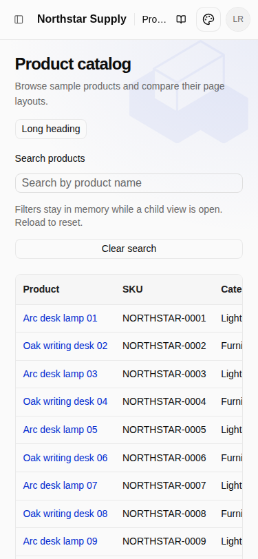
View the layout component. Keep a page-specific frame in its page directory; move it to client/components/ when multiple pages actually share it.
Long content and scrolling
The application shell owns vertical page scrolling. The table owns horizontal scrolling. The example reuses DataTable, whose internal table container already has overflow-x-auto:
import { DataTable } from '#components/data-table';

// The catalog page defines columns and the filter state.
<DataTable
  columns={columns}
  data={products.filter((product) =>
    product.name.toLowerCase().includes(query.toLowerCase()),
  )}
  pagination={false}
  emptyMessage={t('layouts.empty')}
/>
The example displays 48 records together to make scrolling observable. On a narrow screen, scroll horizontally inside the table; the application itself should not gain a horizontal scrollbar. Scrolling down the list leaves the application header in place. Filters and the list need no additional fixed-height vertical scrollers.
View the list source. See Themes and styles for color and spacing conventions.
Customize the application shell
Branding, sidebar and header actions
AppLayout combines the sidebar, header and content region. Edit the corresponding component for a local change. The example's AppBrand shows Northstar Supply when expanded and retains the icon when collapsed. HeaderActions adds Catalog guide alongside the existing theme and account controls:
import { BookOpen } from 'lucide-react';
import { Link } from 'react-router';
import { Button } from '#components/ui/button';

// Inside HeaderActions, before the existing ThemeSettings and UserMenu.
<Button
  variant="ghost"
  size="icon"
  aria-label={t('layouts.guide')}
  title={t('layouts.guide')}
  render={<Link to="/catalog-guide" />}
>
  <BookOpen />
</Button>
This template's Base UI components compose with render. Click the book icon to open the guide. The branding and header entry are visible in the catalog screenshot.
View branding · View header actions
Change app-layout.tsx when rearranging the overall regions. Preserve RouteTreeProvider, PageBreadcrumbProvider, permission filtering, useSyncServerLocale() and the account menu's session handling: they support return navigation, breadcrumbs, menu visibility, locale synchronization and sign-out.
Sidebar collapse and mobile navigation
Reuse AppSidebarProvider, AppSidebar and AppSidebarToggle for the template's desktop and mobile behavior:
// AppLayout excerpt; the full source also provides route context and the header.
<AppSidebarProvider>
  <AppSidebar label={navigationLabel} footer={<AppSidebarFooter />}>
    <NavigationMenu
      items={menuItems}
      label={navigationLabel}
      selectedKey={selectedKey}
    />
  </AppSidebar>
  {/* Header and main content column */}
</AppSidebarProvider>
On desktop, the header toggle collapses navigation to icons; a reload retains that preference. On mobile, the same entry opens a navigation panel whose open state is independent of desktop collapse. Avoid keeping a second sidebar state in the page.
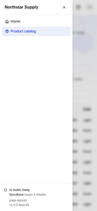
View the application shell · View sidebar components
Organize child pages
Tabs and inline child routes
An inline child renders at the parent's chosen position. The product detail's Overview and Handling notes share the heading, return link and page container. The parent renders Outlet after its tab navigation:
import { Outlet } from 'react-router';

// Inside the detail PageContainer, after PageHeader and tab navigation.
<Outlet />
overview.tsx renders product information; handling.tsx adds handling notes. Neither creates another PageContainer or primary heading. Open Details from the list to enter Overview, then select Handling notes. Both the URL and content change. A direct link or reload stays on that section.
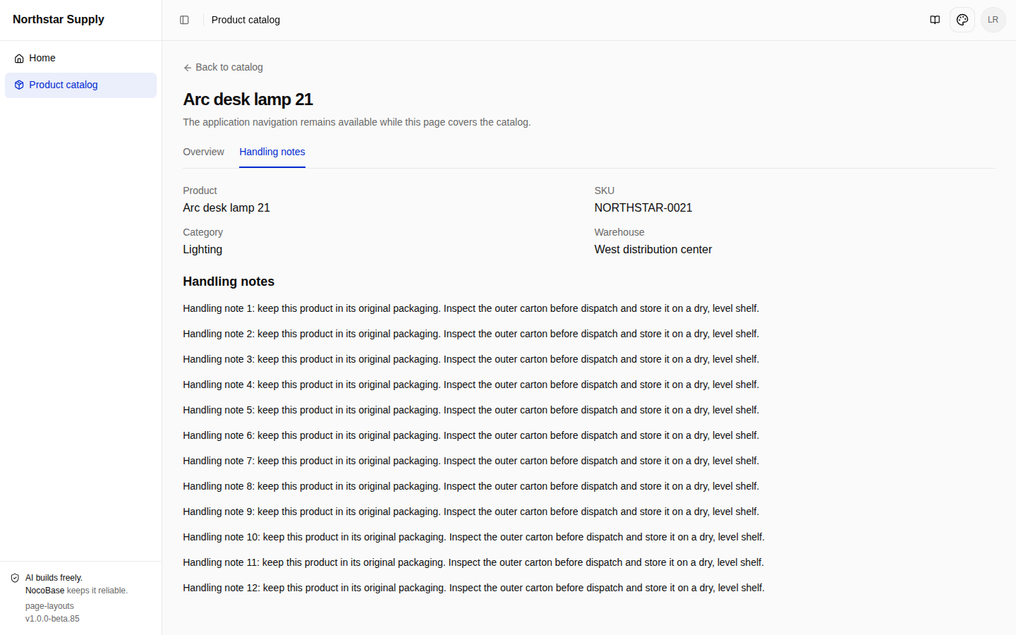
View the parent detail page · View the inline section. Default-section redirects and child route registration are covered in Pages, routes and navigation.
Dialogs, drawers and covering child pages
These components determine how a child page appears. Declare children in routes.ts, then place the parent's Outlet after its page container, as a sibling:
<>
  <ProductPageFrame {...frameProps}>{/* Product list */}</ProductPageFrame>
  <Outlet />
</>
This lets RouteChildPage cover the parent and make its controls inert while retaining the list DOM. Do not render another AppLayout or BrowserRouter inside the child.
Summary displays compact product information in a dialog:
import { RouteDialog } from '#components/route-dialog';

<RouteDialog
  title={t('layouts.summaryTitle')}
  description={t('layouts.readOnly')}
  className="sm:max-w-md"
  footer={<CloseProduct />}
>
  <ProductInfo />
</RouteDialog>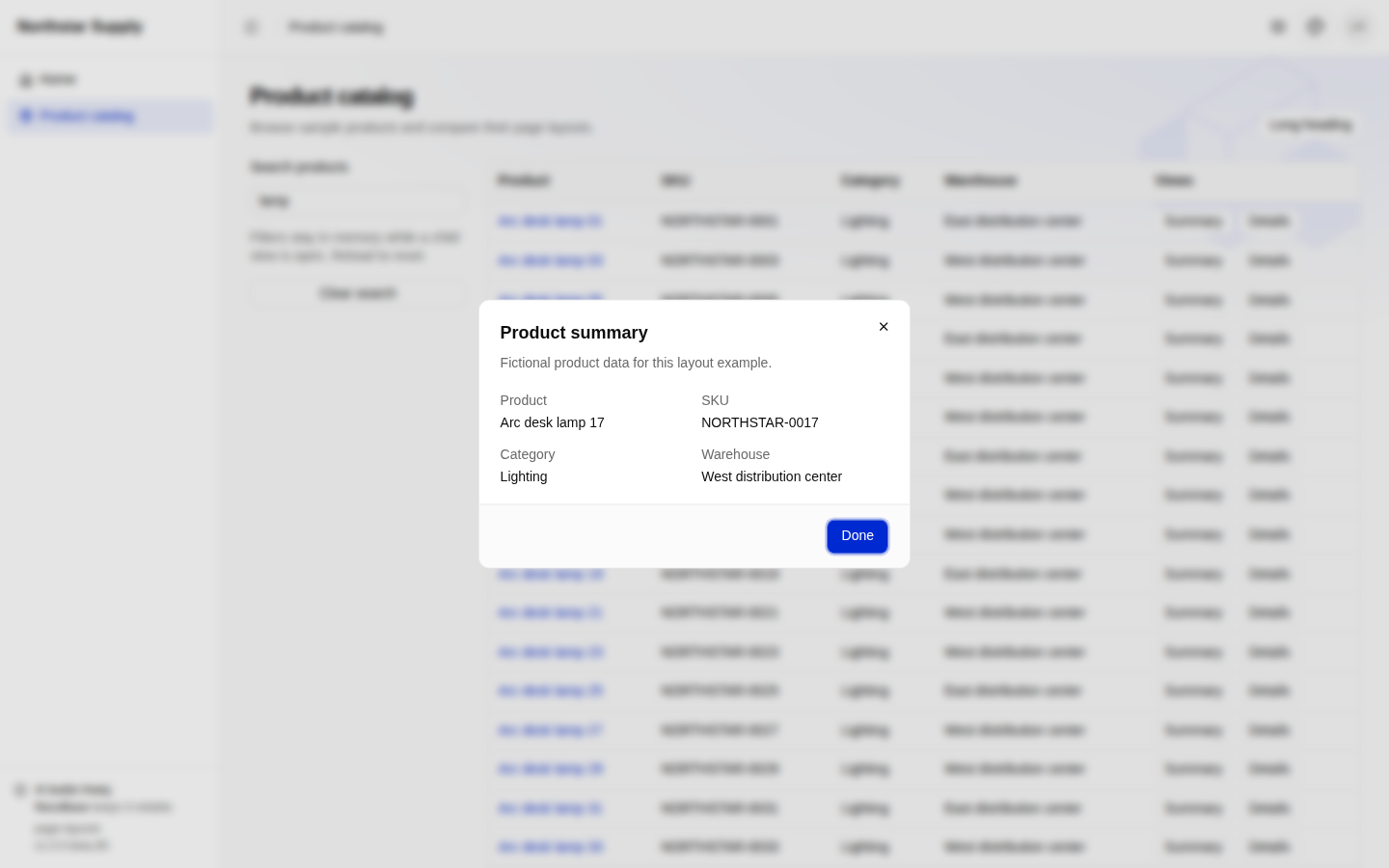
Clicking a product name opens a drawer with longer content:
import { RouteDrawer } from '#components/route-drawer';

<RouteDrawer
  title={t('layouts.drawerTitle')}
  description={t('layouts.readOnly')}
  footer={<CloseProduct />}
>
  <ProductInfo extended />
</RouteDrawer>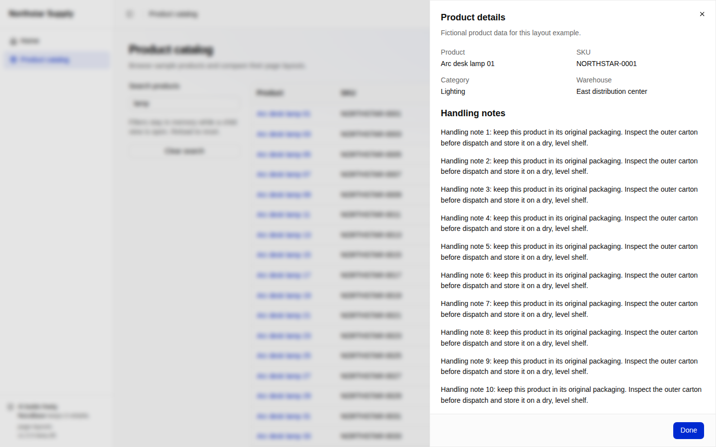
Dialogs and drawers supply their own padding, scrolling body and fixed footer. Do not nest a PageContainer inside them. Pass buttons directly to footer; the close component calls useRouteOverlay() from inside the overlay:
import { useRouteOverlay } from '#components/use-route-overlay';
import { Button } from '#components/ui/button';
import { useTranslation } from '@nocobase/i18n/client';

function CloseProduct() {
  const { close } = useRouteOverlay();
  const { t } = useTranslation();
  return <Button onClick={() => void close()}>{t('layouts.done')}</Button>;
}
Details uses RouteChildPage to cover the application content region while leaving the sidebar and header usable. It owns a page container:
import { RouteChildPage } from '#components/route-child-page';

<RouteChildPage>
  <PageContainer>
    <BackButton>{t('layouts.back')}</BackButton>
    <PageHeader title={product?.name ?? t('layouts.missing')} />
    {/* Tab navigation and inline Outlet */}
  </PageContainer>
</RouteChildPage>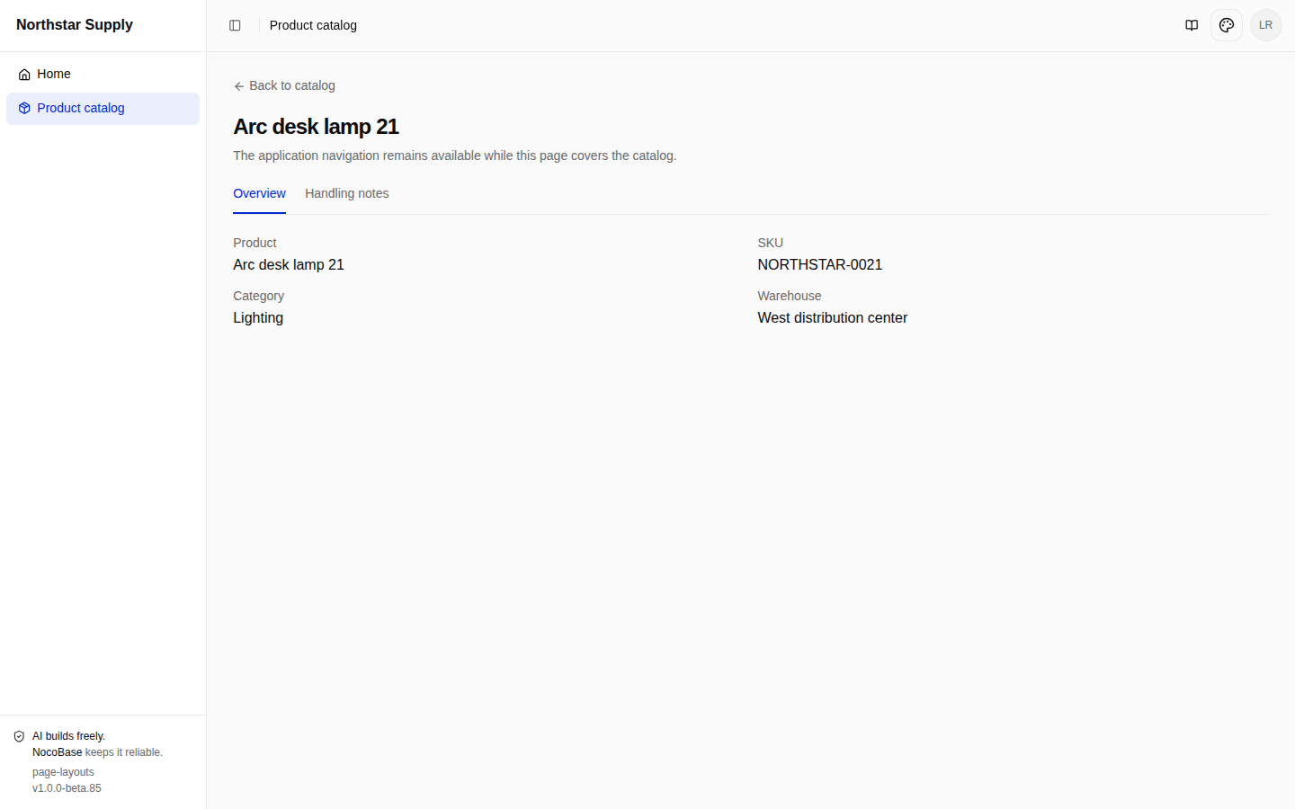
The covering page is non-modal and does not close with Esc. This example uses Back to catalog. A page with an adequate breadcrumb return path can keep that instead of adding a duplicate back link.
View the dialog · View the drawer · View the covering page · View route declarations
Preserve parent state and scroll position
The default shell separates positioning from scrolling:
// Main content structure from AppLayout.
<main className="app-brand-surface relative isolate min-w-0 flex-1 overflow-hidden">
  {/* Brand watermark */}
  <div className="h-full overflow-y-auto">
    <Outlet />
  </div>
</main>
main is the positioning boundary for covering pages; the inner div scrolls the page vertically. RouteChildPage likewise positions its outer element and scrolls inside, so its surface neither moves with the parent list nor stretches to the list's height.
Search for lamp, scroll down and open Summary or Details, then close or return. The parent remains mounted, retaining its filter and scroll position. Dialogs and drawers also restore focus to their trigger. A full reload recreates in-memory state. For URL-backed filters and editing, see Pages, routes and navigation and Data requests and state.
View the shell · View parent and child composition
Sign-in and standalone layouts
The template's AppRouter selects layouts by auth: required pages use AppLayout after authentication and session preparation. guest and optional pages use StandalonePageLayout with their respective authentication rules.
Catalog guide is a public static explanation, declared with optional authentication:
{
  name: 'catalogGuide',
  path: '/catalog-guide',
  auth: 'optional',
  authz: 'skip',
  componentLoader: () => import('./guide.js'),
}
Its PageContainer uses className="mx-auto max-w-3xl pt-24" to constrain content width and leave room for the top controls. Signed-in users and guests can open the guide. Open product catalog sends an unauthenticated visitor to sign-in.
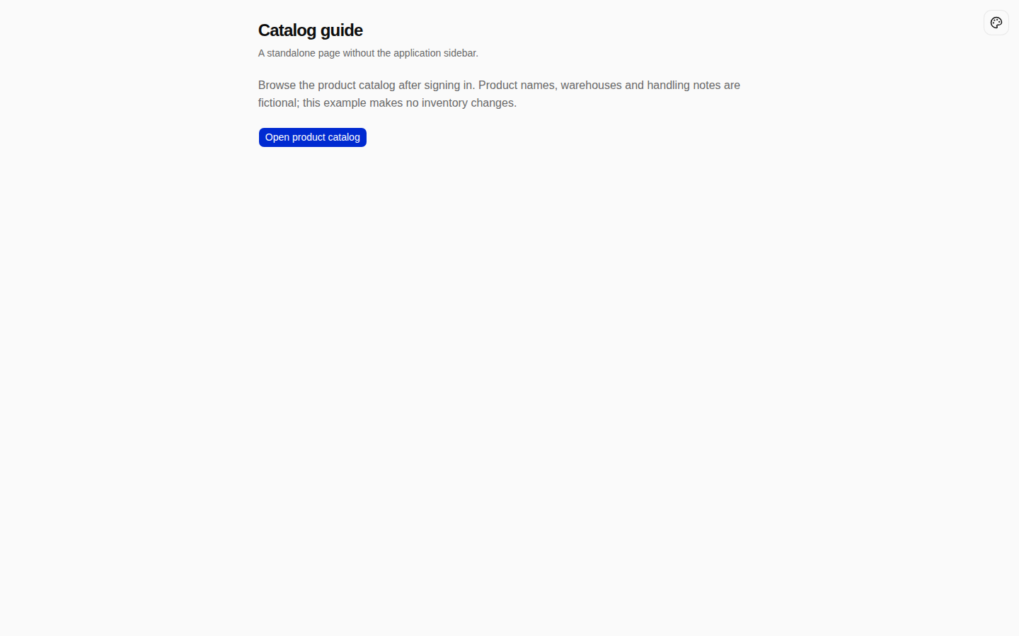
auth describes access conditions: making a protected page public to remove its sidebar changes who can enter it. For a different authenticated shell, customize the application's route composition while preserving authentication, session preparation and authorization. An arbitrary layout field does not establish that integration.
View the guide · View layout selection · View the standalone shell
Check the layout
Try these actions in the running example:
- Toggle the long heading at desktop width and 375px. Inspect headings, actions, filters and table; horizontal scrolling stays inside the table.
- Collapse navigation and reload. Open mobile navigation and check its entries remain usable.
- Open each child presentation from a filtered, scrolled list. Return and check retained state and keyboard focus.
- Scroll the drawer's long content while its heading and Done remain reachable. Scroll a covering page while application navigation stays available.
- Open child URLs directly, reload, and use browser Back and Forward. Check presentation and return destinations.
- Search for a nonexistent name, or replace a detail URL's product ID with
missing, and check the state message. - Switch between English and Chinese, light and dark modes. Check wrapping, borders and controls. Visiting the catalog after sign-out should lead to sign-in.
Example source and setup
The complete example App uses Node.js 24 and pnpm 11. Products are fixtures; template accounts, sessions and settings still need a database. The following SQLite configuration was verified. For another database, install its driver and configure the connection as described in Create an app.
git clone https://github.com/nocobase/docs-examples-v3.git
cd docs-examples-v3
git checkout 929240c07561b2fa02afbe82a3a104a6f0a908b0
cd apps/page-layouts
pnpm install --frozen-lockfile
pnpm nocobase config init --dialect sqlite
pnpm nocobase config check
pnpm dev
Open the application address printed at startup, including its base path. Register a demonstration account through the sign-in page, sign in, then select Product catalog. With the default /main/ prefix, the catalog is /main/layouts and the public guide is /main/catalog-guide. The fixture catalog is available to all signed-in users; administration retains the template's real permission checks.
The README maps usages to code and screenshots and provides component and browser test commands. Browser tests create an independent account in the local example database. Product persistence, inventory operations and business-role authorization are outside this example's scope.