
Build business interfaces with the application's existing shadcn components and semantic theme tokens. Change colors, spacing, fonts, and radii in the theme files so lists, forms, and dialogs adapt together. NocoBase UI Library components and business blocks follow the same component conventions.
The product catalog example uses default template 1.0.0-beta.85. It includes a product list, an edit dialog, and three presets. Product edits stay in memory and reset on reload; appearance preferences use the template's browser storage mechanism. You can run the example before trying each feature.
Color modes and theme presets
Appearance has two independent settings:
- Color mode:
light,dark, orsystem, selecting the light or dark rules.systemfollows the operating system. - Theme preset: the palette, fonts, density, radii, and shadows. Each preset supports both light and dark modes. Selecting a preset does not change the color mode.
The template includes compact (Compact) and default (Spacious). default is a preset ID, not an instruction to select a default automatically. The example also registers brand (Brand).
These files belong to the application template and can be maintained in your application:
| File | Purpose |
|---|---|
client/theme/themes/*.css | Preset tokens and light/dark rules |
client/styles.css | Preset imports and connections to Tailwind utilities |
client/theme/theme-presets.ts | Preset IDs and translated label keys |
client/theme/theme-provider.tsx | Theme state, saved choices, and synchronization between tabs |
AppThemeProvider is already registered at the application root. Business components consume its state; they need neither another provider nor another run of shadcn init.
Build components with theme tokens
Colors and interaction states
Choose classes by purpose rather than a fixed color. The catalog panel uses bg-card text-card-foreground, with text-muted-foreground for supporting text:
// client/pages/products/index.tsx: panel markup inside the component
<section className='overflow-hidden rounded-lg border border-border bg-card text-card-foreground shadow-sm'>
  <div className='flex flex-col gap-2 border-b border-border p-6'>
    <h2 className='font-heading text-lg font-semibold'>{t('products.inventory')}</h2>
    <p className='text-sm text-muted-foreground'>{t('products.editHint')}</p>
  </div>
  <DataTable columns={columns} data={products} pagination={false} getRowId={(product) => product.id} />
</section>
DataTable is the application's existing table component; columns and products are defined in this page. See the product page source for imports, column definitions, and data.
Select surface and foreground classes together:
| Purpose | Classes |
|---|---|
| Page | bg-background text-foreground |
| Cards and panels | bg-card text-card-foreground |
| Floating surfaces | bg-popover text-popover-foreground |
| Primary actions | bg-primary text-primary-foreground |
| Supporting text | text-muted-foreground |
| Dividers and error text | border-border, text-destructive |
Reuse existing buttons, inputs, and dialogs, which already handle hover, focus, and disabled states. When validation fails, set aria-invalid and show an error message rather than relying on color alone. See the edit form source.
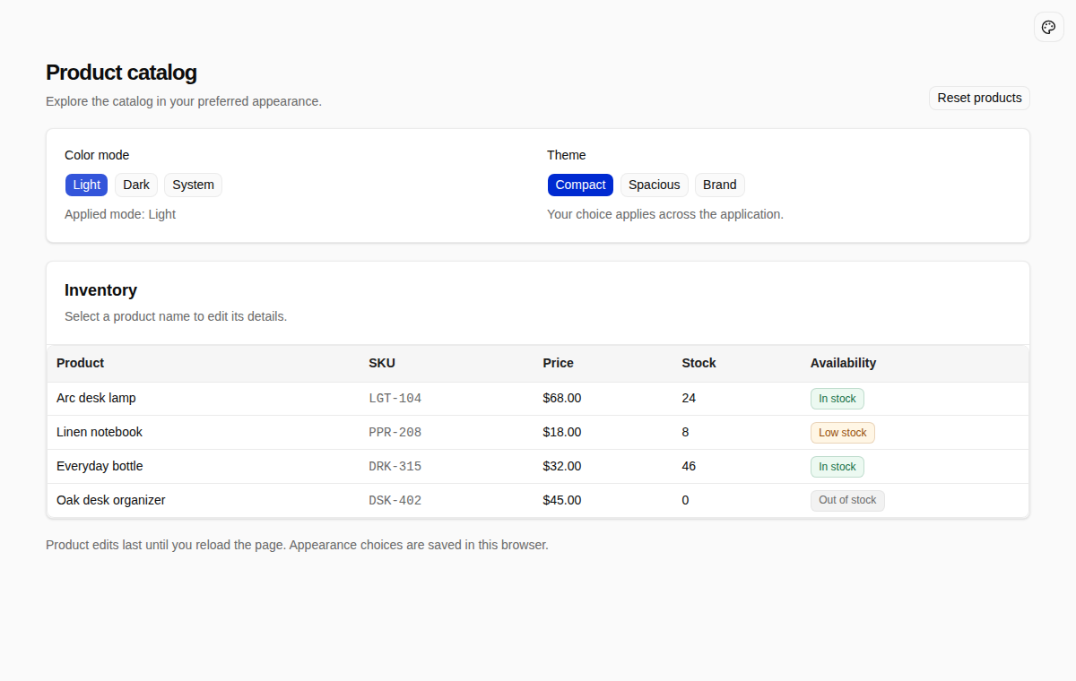
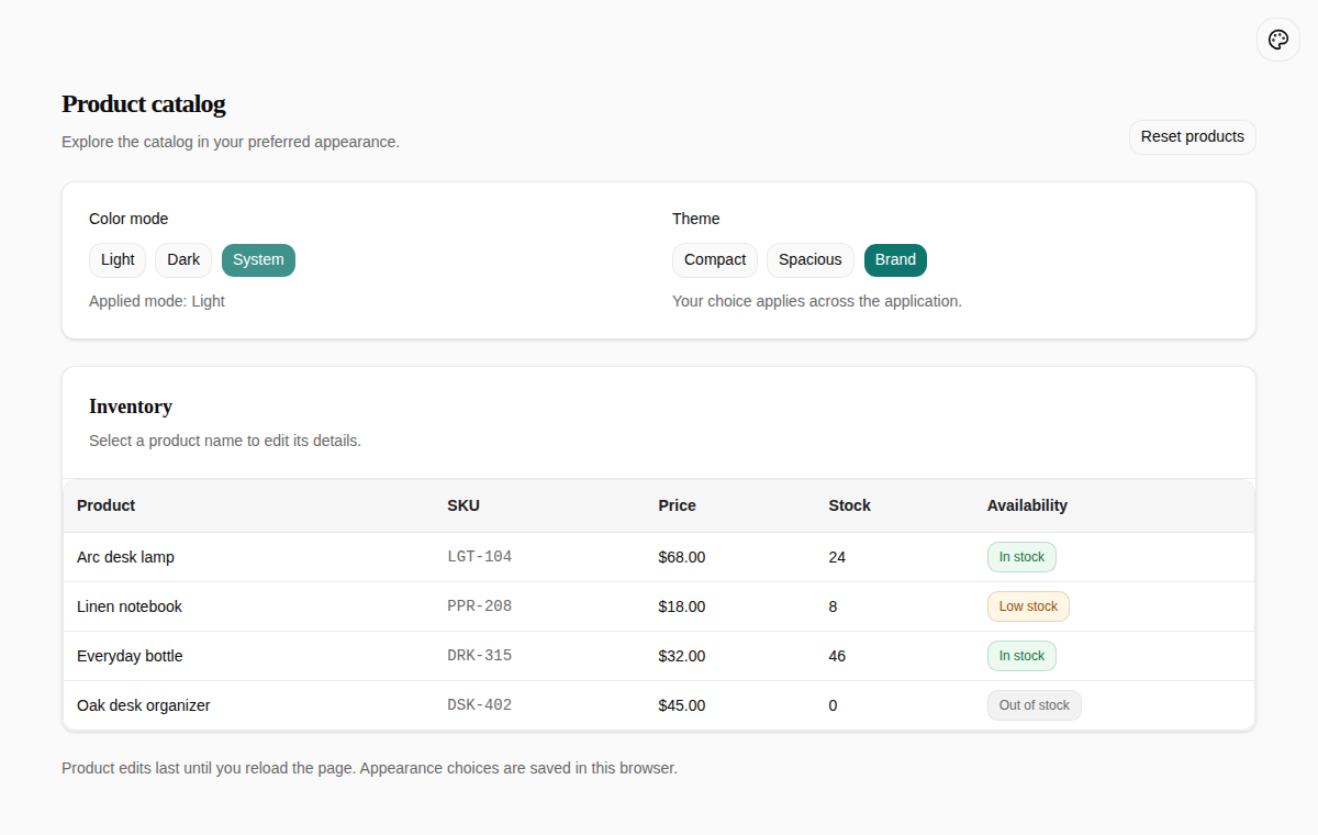
Select Light → Compact to inspect panels, the table, and status badges. Then select Dark: the same components use the dark tokens.
Spacing, radii, and fonts
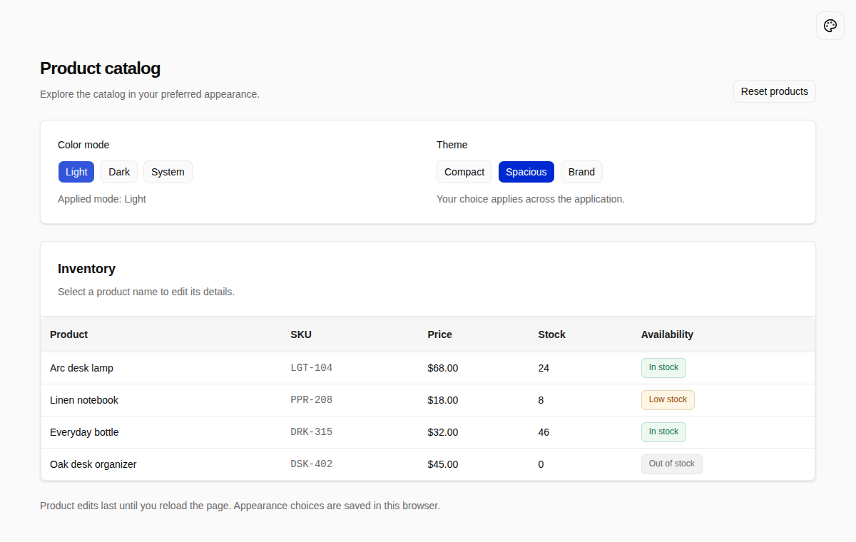
Dimensions also use theme utilities. Above, p-6 reads --spacing, rounded-lg reads --radius, and shadow-sm reads --shadow-sm. Use font-heading for headings, font-sans for body text, and font-mono for code or SKUs.
// client/pages/products/index.tsx: contents of the SKU column
<code className='text-sm text-muted-foreground'>{row.original.sku}</code>
text-sm uses both a font-size token and a line-height token. Changing font sizes while retaining an unsuitable fixed height can clip input or button text, so check these controls when adjusting density.
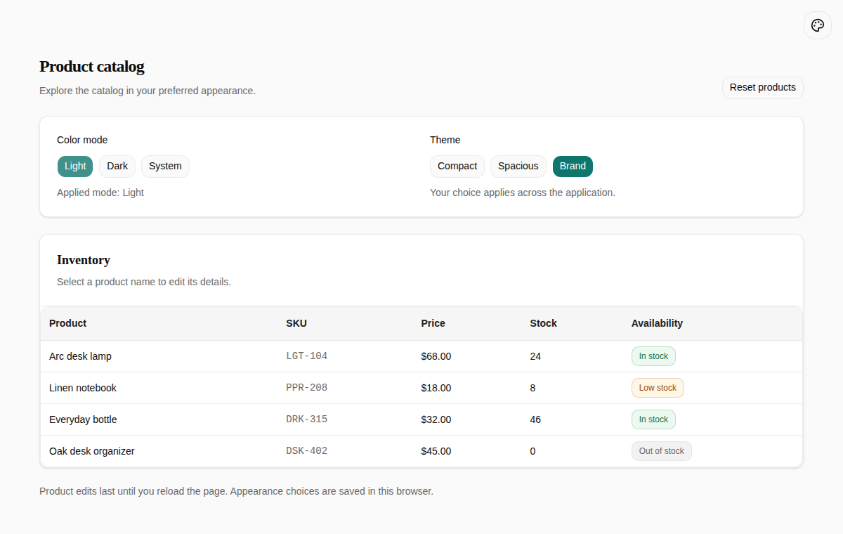
Select Spacious to increase table and panel spacing while keeping the same colors. Brand also demonstrates serif headings and larger corners; see Add a brand preset.
Customize theme presets
Change an existing preset
Edit its CSS file directly. The example changes --spacing in compact.css from the template's 0.225rem to 0.21rem:
/* client/theme/themes/compact.css: a token in the existing rule */
:root[data-theme='compact'],
.theme-preview[data-theme='compact'] {
  /* Retain the other tokens. */
  --spacing: 0.21rem;
}
Selecting Compact tightens the product panels, buttons, and table, as shown in the Compact screenshot. .theme-preview applies the same tokens to the appearance selector's thumbnails.
The template's Compact and Spacious presets share colors, fonts, and shadows; they differ in density. Change both files when updating their shared palette or fonts. Add a separate preset when you want to retain a different appearance alongside them. Keep existing IDs: browser preferences and configuration refer to them.
View the Compact preset source
Add a brand preset
Copy a complete preset to client/theme/themes/brand.css and change the IDs in its selectors to brand. Retain all color and non-color tokens, then adjust the values you need. The excerpt below shows selected changes; the complete Brand preset includes the remaining tokens.
/* client/theme/themes/brand.css: excerpt */
:root[data-theme='brand'],
.theme-preview[data-theme='brand'] {
  /* Retain the remaining tokens from the complete preset. */
  --font-heading: var(--font-serif);
  --spacing: 0.25rem;
  --radius: 0.75rem;
  --primary: #0f766e;
  --primary-foreground: rgb(255 255 255);
  --accent: #f0fdfa;
  --accent-foreground: #115e59;
  --ring: var(--primary);
}

:root.dark[data-theme='brand'],
:root.dark .theme-preview[data-theme='brand'] {
  /* Retain the full set of dark color tokens. */
  --primary: #5eead4;
  --primary-foreground: #042f2e;
  --accent: #134e4a;
  --accent-foreground: #99f6e4;
  --ring: var(--primary);
}
Values are complete CSS colors: HEX, RGB, or OKLCH, without an additional hsl() wrapper. Adjust backgrounds and foregrounds together, covering light, dark, and preview selectors. Do not include bare :root or :root.dark rules in the new preset: they can override other presets' fallback values.
Then connect the preset in three places:
-
Import it after the existing presets in
client/styles.css, keepingdefault.cssfirst.@import './theme/themes/default.css'; @import './theme/themes/compact.css'; @import './theme/themes/brand.css'; -
Append it to
client/theme/theme-presets.ts, keepingcompactfirst.export const themePresets = [ { id: 'compact', labelKey: 'appearance.themes.compact' }, { id: 'default', labelKey: 'appearance.themes.default' }, { id: 'brand', labelKey: 'appearance.themes.brand' }, ] as const; export type ThemePresetId = (typeof themePresets)[number]['id']; -
Extend the application locale files while preserving existing translations. The English entry is below; extend
systemZhCN.appearancein the Chinese file in the same way withbrand: '品牌'. See Localization.// client/locales/en-US.ts: a field in the enUS object appearance: { ...systemEnUS.appearance, themes: { ...systemEnUS.appearance.themes, brand: 'Brand' }, },
The stylesheet entry, preset registry, and locale sources contain the complete implementation.
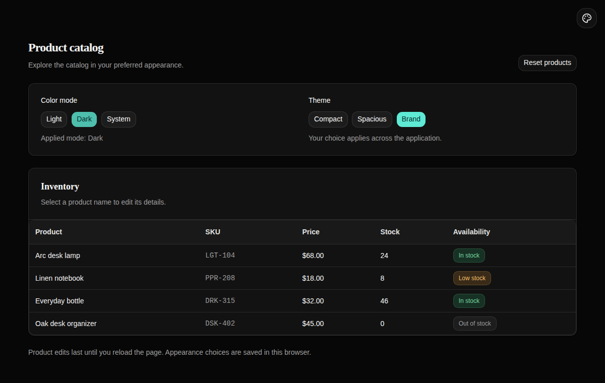
The appearance panel lists the new preset automatically. Select Brand, then Light and Dark, to see the primary color, heading font, and radii change together.
Read and change appearance
Change the color mode
Import useTheme() from next-themes. theme is the selected light, dark, or system value; resolvedTheme is the actual light or dark mode. Change the selection with setTheme().
// client/pages/products/appearance-controls.tsx: ColorModeControls excerpt
import { useTheme } from 'next-themes';
import { Button } from '#components/ui/button';

// Inside the component; t comes from useTranslation().
const { theme, resolvedTheme, setTheme } = useTheme();

// Render the mode buttons.
{(['light', 'dark', 'system'] as const).map((mode) => (
  <Button
    key={mode}
    variant={theme === mode ? 'default' : 'outline'}
    aria-pressed={theme === mode}
    onClick={() => setTheme(mode)}
  >
    {t(`appearance.${mode}`)}
  </Button>
))}
Select System. The page's Applied mode reads resolvedTheme. Change the operating system's appearance: the applied mode follows while System stays selected. Do not use theme === 'dark' to detect the actual colors in system mode.
Change the theme preset
The application template's useThemePreset() returns the current preset and the setPreset() function. The example builds its buttons from the registry, so the ID type follows the registered presets:
// client/pages/products/appearance-controls.tsx: PresetControls excerpt
import { useThemePreset } from '../../theme/theme-context.js';
import { themePresets } from '../../theme/theme-presets.js';

// Inside the component; Button and t are the same as in the previous example.
const { preset, setPreset } = useThemePreset();

{themePresets.map(({ id, labelKey }) => (
  <Button
    key={id}
    variant={preset === id ? 'default' : 'outline'}
    aria-pressed={preset === id}
    onClick={() => setPreset(id)}
  >
    {t(labelKey)}
  </Button>
))}
Use both hooks inside the existing AppThemeProvider. Business components should not manipulate storage keys or <html> attributes, or maintain a second copy of the appearance selection in local state.
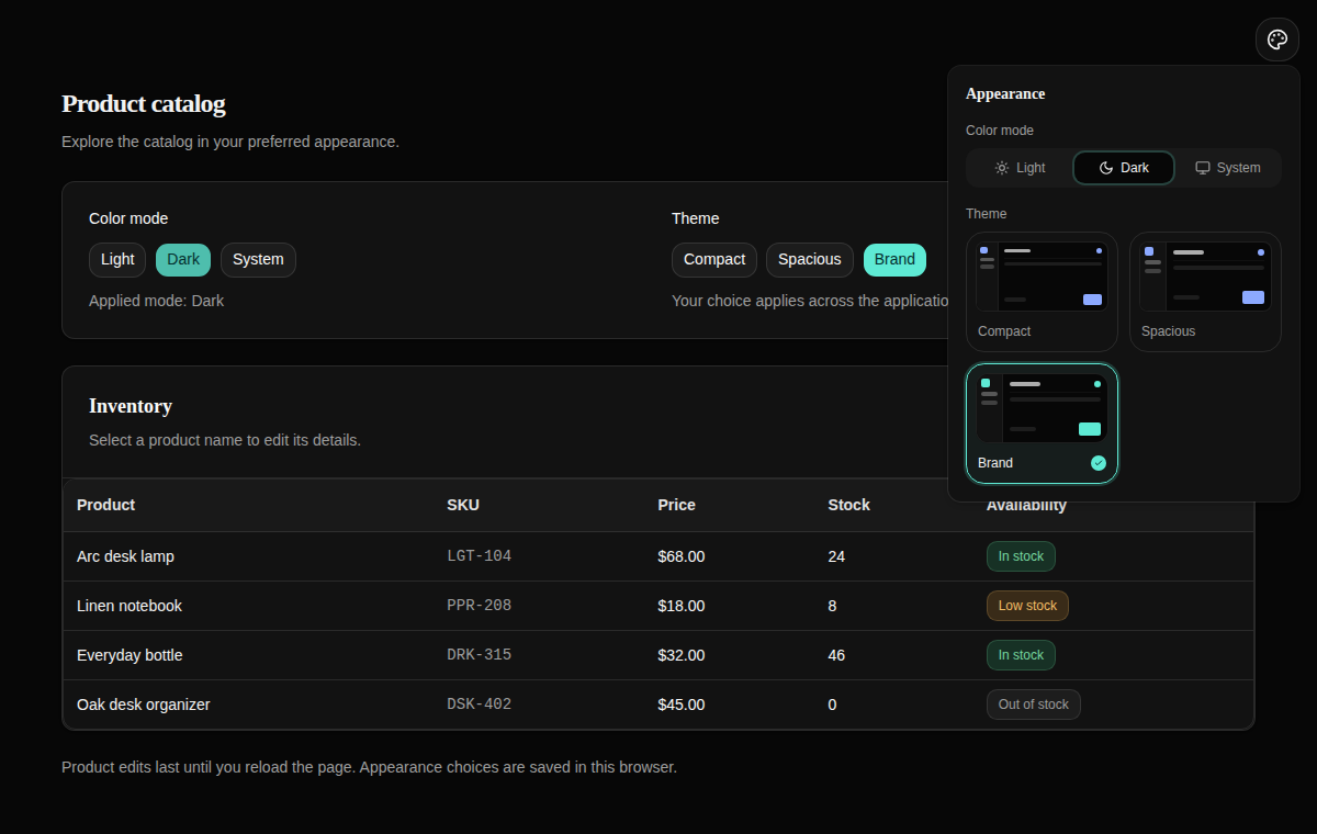
Choose a preset on the product page, then open Appearance in the upper-right corner. Its corresponding option and thumbnail are selected. Changing the preset there updates the page buttons too. Reloading or opening another tab of the same application retains the choice.
Configure appearance defaults
Set the default mode and preset
Run this command from the application root to give browsers without saved preferences the dark Brand appearance:
pnpm nocobase config set client.app.defaultColorScheme=dark client.app.defaultTheme=brand --jsonIt sets these values in config.yml:
client:
  app:
    defaultColorScheme: dark
    defaultTheme: brand
defaultColorScheme accepts light, dark, or system; defaultTheme must name a registered preset. Development mode restarts the server after configuration changes. For other modes, restart the server, then reload the page. Do not replace this configuration with an AppThemeProvider defaultTheme prop: startup and React mounting could then use different defaults.
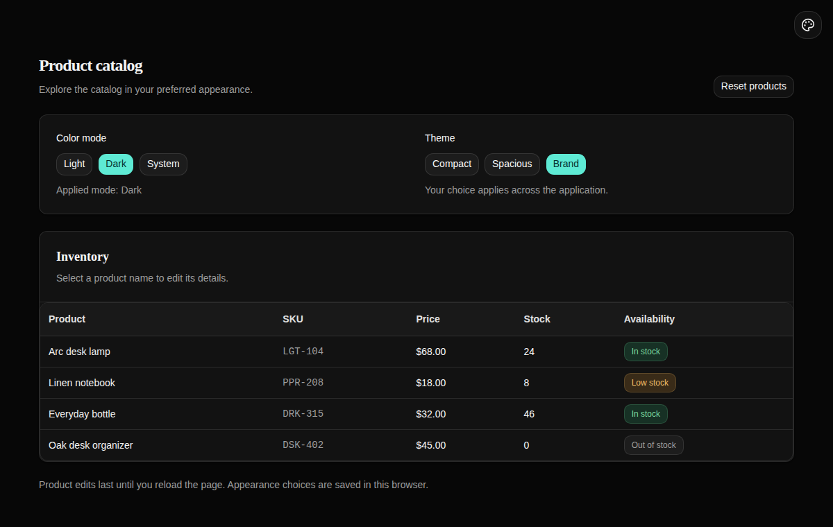
Open the product page in a fresh private window. Dark and Brand should be selected. This applies defaults without saving an explicit user preference.
Restore the example's initial configuration:
pnpm nocobase config set client.app.defaultColorScheme=system client.app.defaultTheme=compact --jsonView the example configuration
Defaults and saved preferences
Each setting independently uses its first valid source: a saved browser choice, a config.yml default, then the built-in fallback. The color mode fallback is system; the preset fallback is the first registry entry, compact in this example. Invalid modes and unregistered preset IDs are ignored.
To verify this, select Light → Spacious in one window, then change the configured defaults to Dark → Brand. Reloading the original window retains Light and Spacious; a fresh private window uses Dark and Brand. Saving only a color mode leaves the preset free to use its configured default, and vice versa.
Preferences are isolated by browser origin and application deployment path. They do not synchronize through the signed-in account across devices. When storage is unavailable, selections still work for the current page but may not survive a reload.
View the preference resolution source
Check the theme in use
After editing a preset, inspect actual pages in light mode, dark mode, and narrow layouts. Pay particular attention to body text, supporting text, primary buttons, keyboard focus, and dialogs. Check foreground/background contrast together; a successful CSS build cannot establish readability.
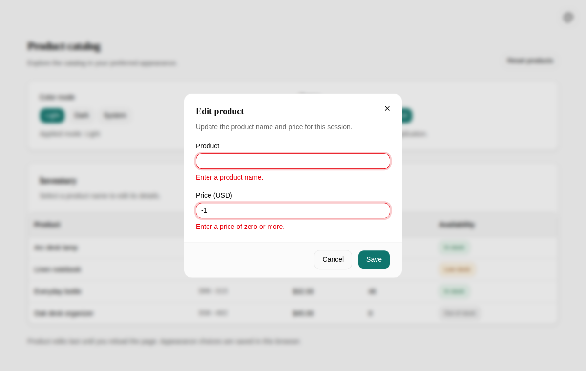
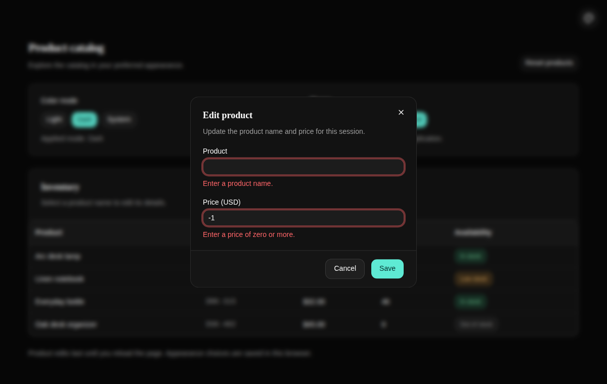
Select Arc desk lamp, clear the product name, enter -1 as the price, and select Save. The dialog should retain the inputs, show both errors, and focus the name field. Correcting and saving updates the list; reloading restores the demonstration data. Escape cancels and returns focus to the product link that opened the dialog.
On narrow screens, the appearance controls stack vertically. The wide table scrolls within its own region rather than widening the whole page.
Run the theme and page tests and the type check from the example App's root:
pnpm exec vitest run tests/client/theme-tokens.test.ts tests/client/theme-preferences.test.ts tests/client/client-theme.test.tsx tests/client/app-locale-coverage.test.ts tests/client/products.test.tsx
pnpm exec tsc -p tsconfig.json --noEmit
These tests cover token completeness, preference fallbacks, switching, and form interactions. The example README provides the browser test command. Screenshots and automated assertions still need to be considered alongside a visual readability check.
Example source and setup
The complete example and README require Node.js 24 or later and pnpm 11. Dependencies are locked in the committed pnpm-lock.yaml. Get the source in a separate directory:
git clone https://github.com/nocobase/docs-examples-v3.git
cd docs-examples-v3
git checkout d2a4fc7ef80558996299c2475abeefe049aa6874
cd apps/themes-and-styles
pnpm install --frozen-lockfile
pnpm nocobase config init --dialect sqlite --json
pnpm nocobase config check --json
pnpm dev
Append products to the application URL printed at startup: an application mounted at /main/ serves the demo at /main/products. The demonstration page needs no sign-in. SQLite is used to run this standalone example; themes do not depend on a particular database or external service. Keep an existing application's configuration rather than initializing it again.
The README maps each usage to source files, supplies browser checks, and records verification scope. The catalog uses fixed English demonstration data and does not call a product API.