

FlowEngine
In NocoBase, the FlowEngine is the core engine that drives visual configuration. Blocks, fields, and action buttons in the NocoBase interface are all managed by FlowEngine — including their rendering, configuration panels, and configuration persistence.
For plugin developers, FlowEngine provides two core concepts:
- FlowModel — A configurable component model responsible for rendering UI and managing props
- Flow — A configuration flow that defines the component's configuration panel and data processing logic
If your component needs to appear in the "Add block / field / action" menu, or needs to support visual configuration by users in the interface, you need to wrap it with a FlowModel. If these capabilities aren't needed, a plain React component is sufficient — see Component vs FlowModel.
What is FlowModel
Unlike regular React components, FlowModel not only handles UI rendering but also manages where props come from, configuration panel definitions, and configuration persistence. In short: a regular component's props are hardcoded, while FlowModel's props are dynamically generated through Flows.
To learn more about FlowEngine's overall architecture, see FlowEngine Full Documentation. Below we introduce how to use it from a plugin developer's perspective.
Minimal Example
Creating and registering a FlowModel takes three steps:
1. Extend a Base Class and Implement renderComponent
renderComponent() is the model's rendering method, similar to a React component's render(). tExpr() is used for deferred translation — because define() executes at module load time, when i18n hasn't been initialized yet. See Context Common Capabilities -> tExpr for details.
2. Register in the Plugin
3. Use in the Interface
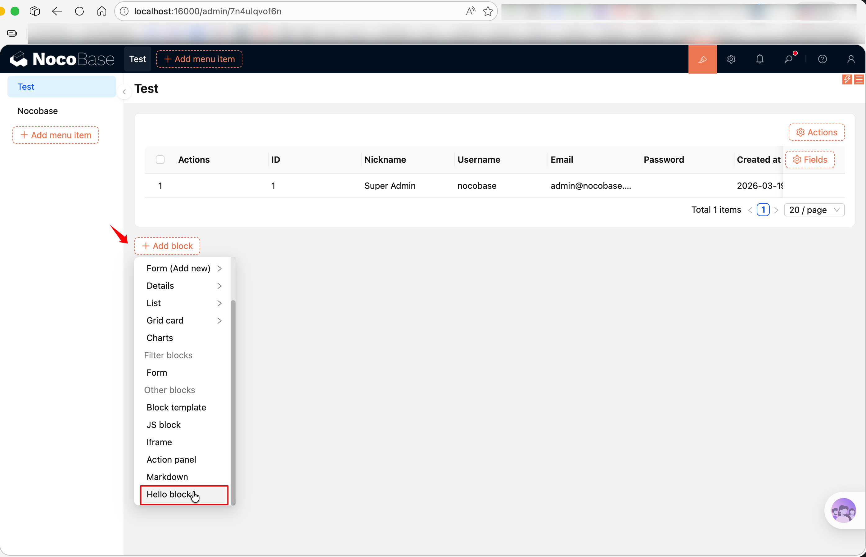
After registration and enabling the plugin (see Plugin Development Overview for enabling plugins), create a new page in the NocoBase interface and click "Add block" to see your "Hello block".
Adding Configuration with registerFlow
Rendering alone isn't enough — the core value of FlowModel lies in being configurable. Using registerFlow(), you can add configuration panels to a model, allowing users to modify properties in the interface.
For example, a block that supports editing HTML content:
Key points here:
on: 'beforeRender'— Indicates this Flow executes before rendering; configuration panel values are written tothis.propsbefore renderinguiSchema— Defines the configuration panel UI in JSON Schema format. See UI Schema for syntax referencehandler(ctx, params)—paramscontains the values the user entered in the configuration panel, which are set to the model viactx.model.propsdefaultParams— Default values for the configuration panel
Common uiSchema Patterns
uiSchema is based on JSON Schema. v2 is compatible with uiSchema syntax, though its use cases are limited — it's mainly used in Flow configuration panels to describe form UI. For most runtime component rendering, it's recommended to use Ant Design components directly without going through uiSchema.
Here are the most commonly used component types (see UI Schema for a complete reference):
Each field is wrapped with 'x-decorator': 'FormItem', which automatically adds a title and layout.
define() Parameter Reference
FlowModel.define() sets the model's metadata and controls how it appears in menus. The most commonly used parameter in plugin development is label, but it supports more:
Most plugins only need to set label:
If you need to control sorting or visibility, add sort and hide:
FlowModel Base Class Selection
NocoBase provides multiple FlowModel base classes. Choose based on what you're extending:
Generally speaking, use TableBlockModel for table blocks (most common, out-of-the-box), CollectionBlockModel or BlockModel for fully custom rendering, FieldModel for fields, and ActionModel for action buttons.
Related Links
- Block Extension — Develop blocks using the BlockModel series of base classes
- Field Extension — Develop custom fields using FieldModel
- Action Extension — Develop action buttons using ActionModel
- Component vs FlowModel — Not sure which approach to use?
- FlowDefinition — Complete parameter reference and event type list for registerFlow
- FlowEngine Full Documentation — Complete reference for FlowModel, Flow, and Context
- FlowEngine Quick Start — Build an orchestratable button component from scratch
- Plugin Development Overview — Overall introduction to plugin development
- UI Schema — uiSchema syntax reference