

System Overview & Dashboards
This chapter covers the two main dashboards — Analytics (data analysis center) and Overview (daily workspace).
System Overview
CRM 2.0 is a complete sales management system covering the entire process from lead acquisition to order delivery. After logging in, the top menu bar is your main navigation entry.
Multi-language & Themes
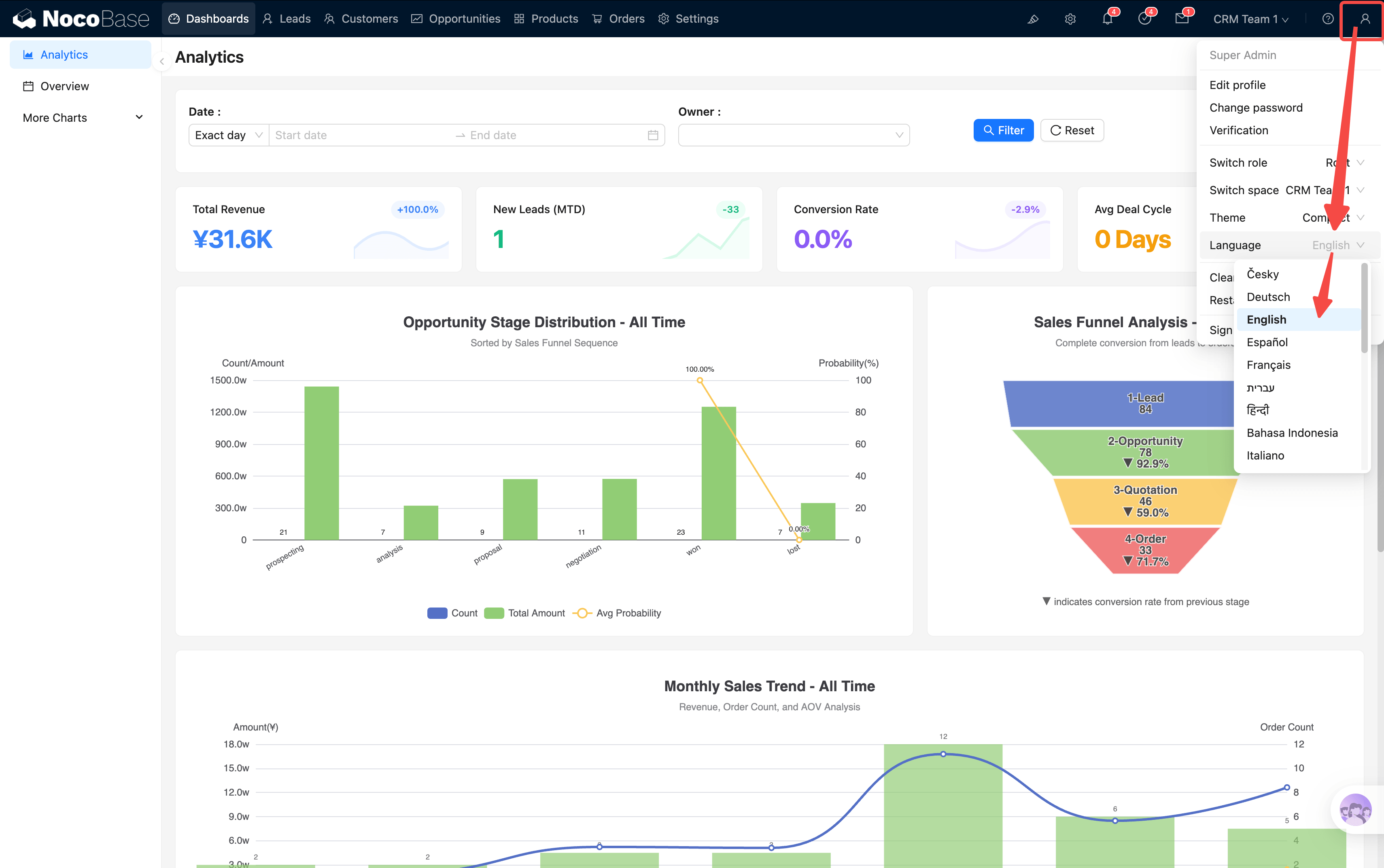
The system supports language switching (top-right corner). All JS blocks and charts are adapted for multiple languages.
Both light and dark themes are supported, but we currently recommend light theme + compact mode for higher information density. Some display issues in dark mode will be fixed in future updates.
Analytics — Data Analysis Center
Analytics is the first page in the menu bar and the first screen you see when opening the system.
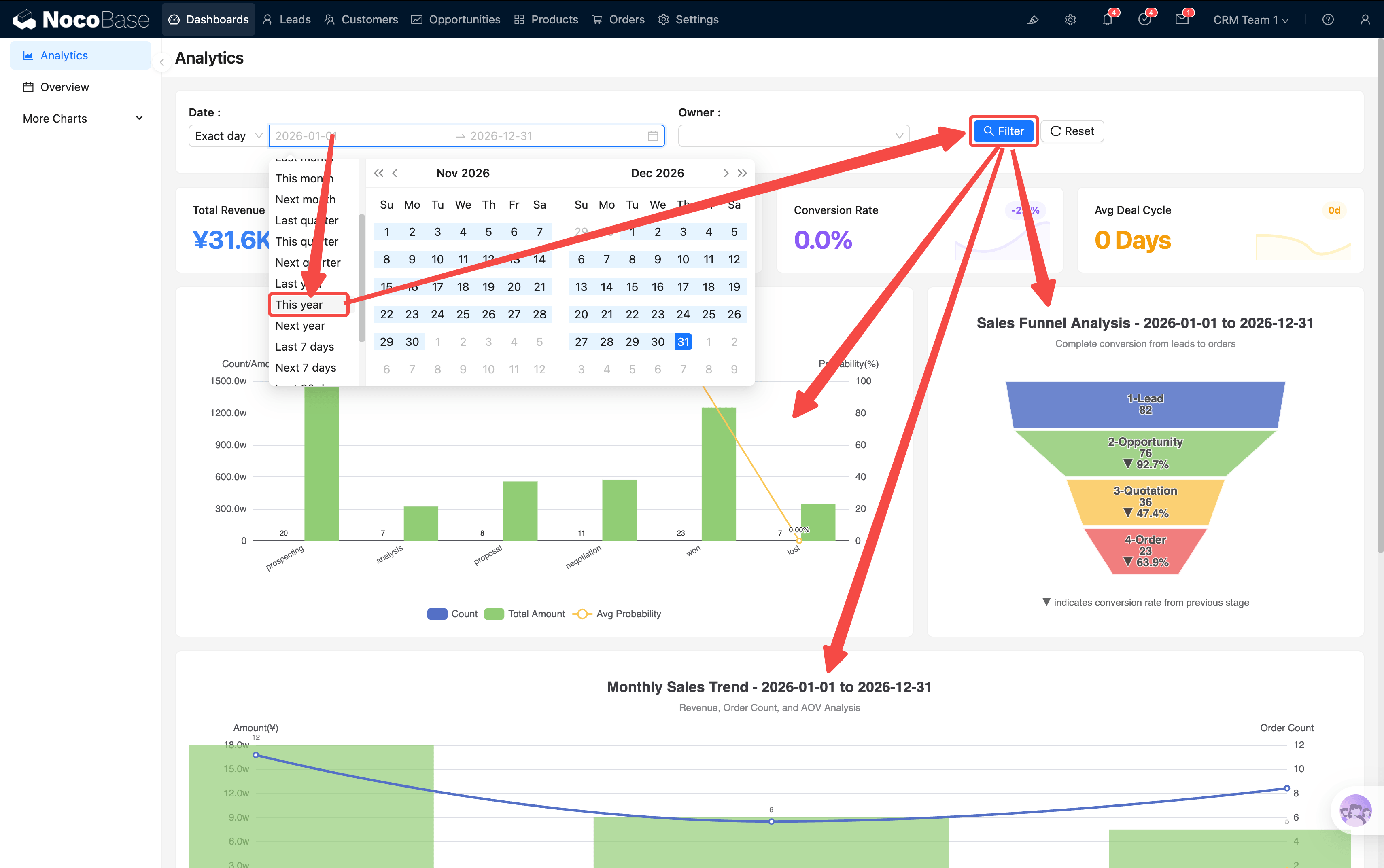
Global Filters
At the top of the page, there is a filter bar with Date Range and Owner filter conditions. After filtering, all KPI cards and charts on the page refresh in sync.
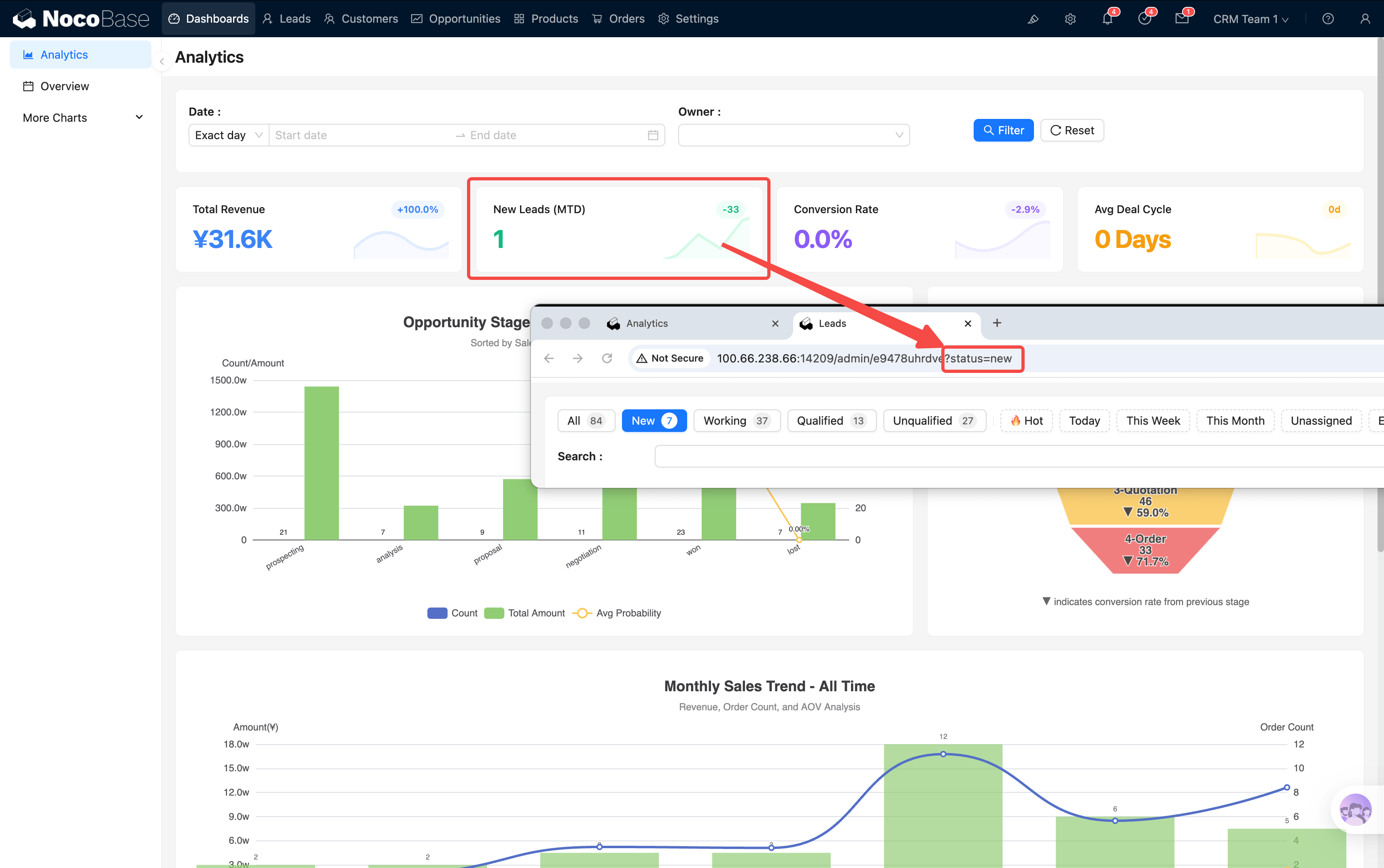
KPI Cards
Below the filter bar are 4 KPI cards:
Each card supports click-through drill-down — popups show more detailed analysis charts. With customization capability, you can drill further (company → department → individual).
When you click a KPI card to jump to a list page, the URL carries filter parameters (e.g., ?status=new). If you notice fewer records, it's because this parameter is still active. Navigate back to the dashboard and re-enter the list page to restore full data.
Charts Area
Below the KPIs are 5 core charts:
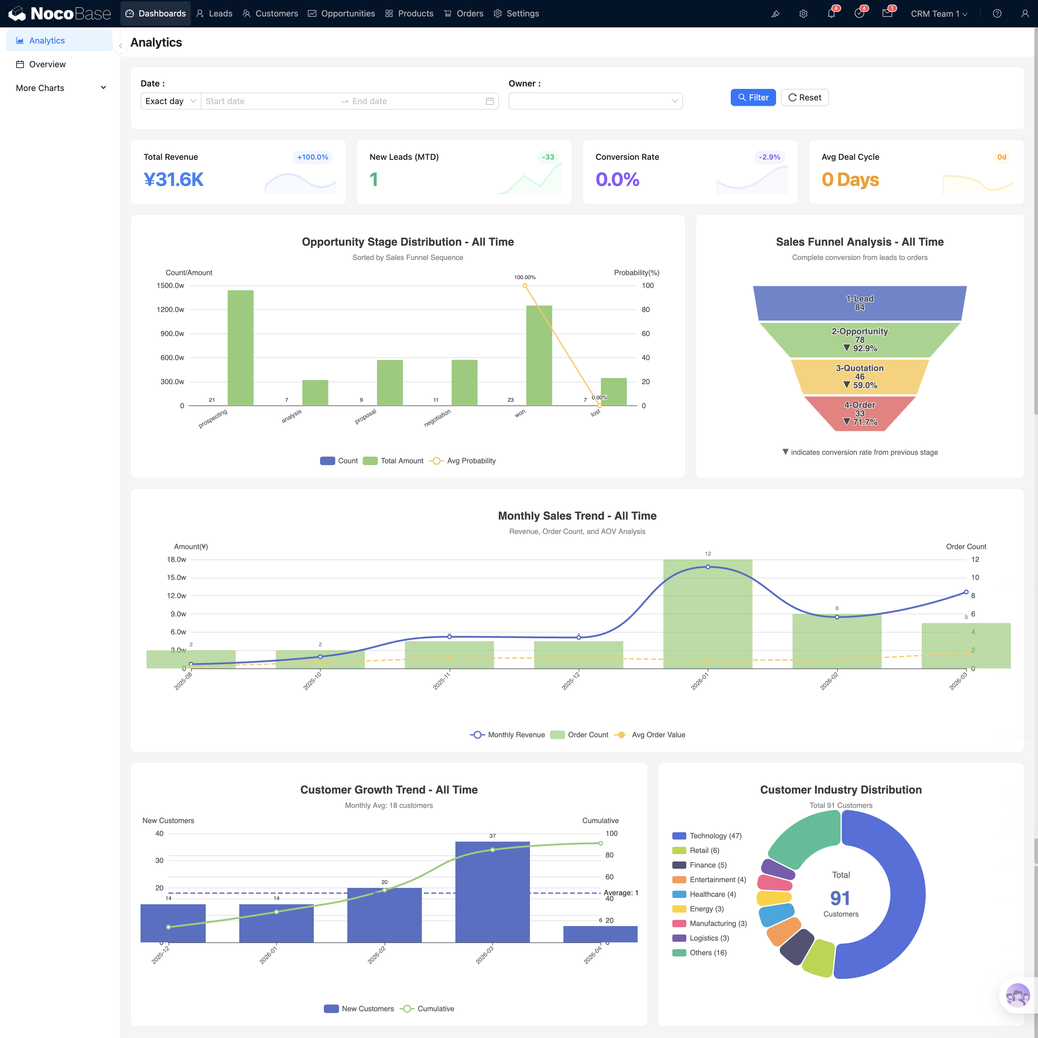
Sales Funnel
Shows the conversion rate across the full pipeline: Lead → Opportunity → Quotation → Order. Each layer is clickable, redirecting to the corresponding entity list page (e.g., clicking the Opportunity layer → jumps to the opportunity list).
Monthly Sales Trend
Bar chart shows monthly revenue, with line overlays for order count and average order value. Clicking a month's bar → jumps to the Orders page with that month's time filter pre-applied (e.g., ?month=2026-02), showing that month's order details directly.
Customer Growth Trend
Bar chart shows monthly new customer count, line shows cumulative total. Clicking a month's bar → jumps to Customers page filtered to that month's new customers.
Industry Distribution
Pie chart shows customer distribution by industry with associated order amounts. Clicking an industry segment → jumps to Customers page filtered to that industry.
Opportunity Stage Drill-through
Clicking a stage bar in the Opportunity Stage Distribution chart opens a deep analysis popup for that stage:
- Monthly trend: Monthly changes for opportunities in this stage
- By owner: Who is working on these opportunities
- By customer: Which customers have opportunities in this stage
- Bottom summary: Select customers to view cumulative amounts
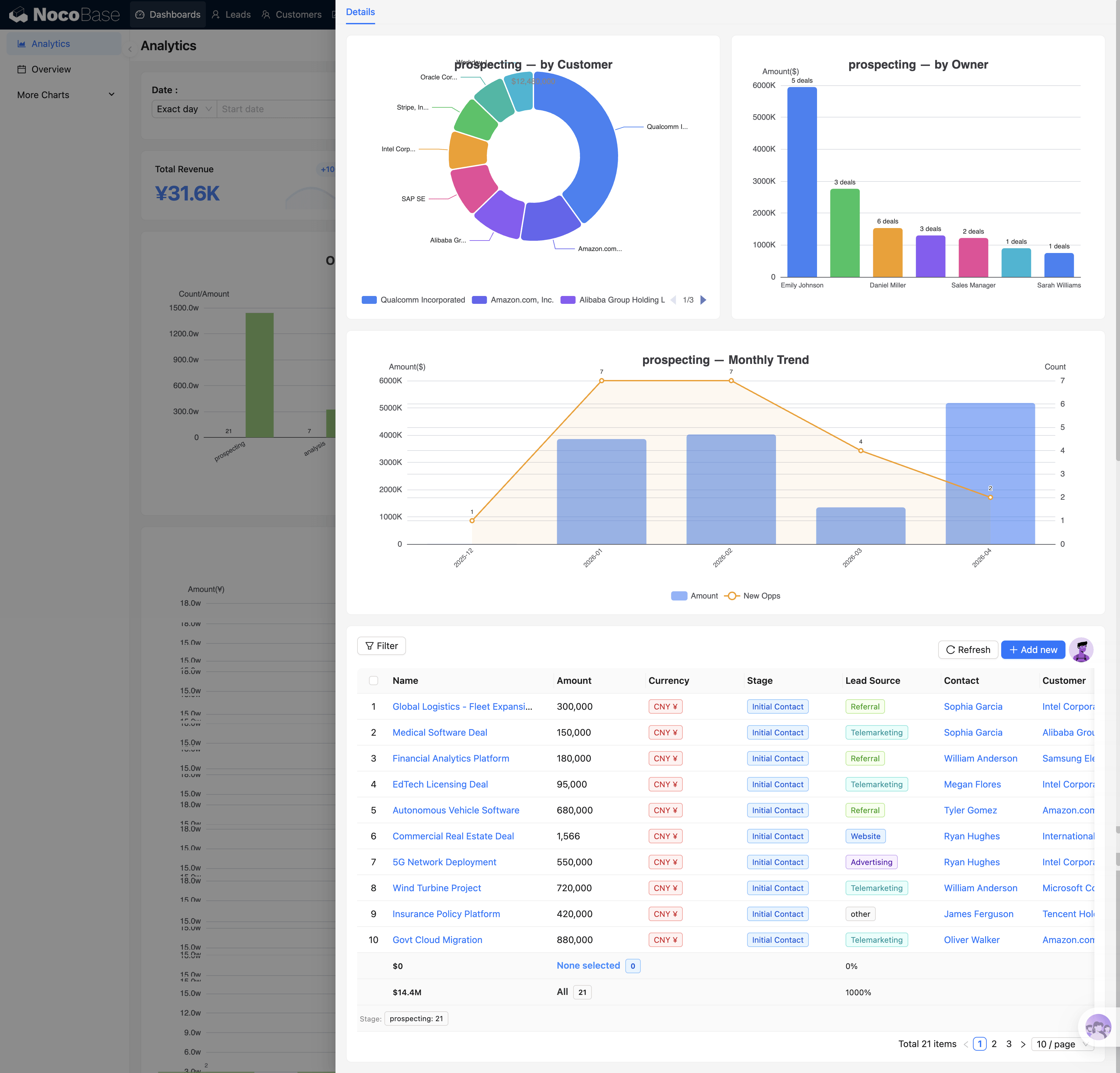
Each stage (Prospecting / Analysis / Proposal / Negotiation / Won / Lost) has different drill-through content, reflecting the focus areas of each stage.
The core question this chart answers: Where in the funnel is the most drop-off? If the Proposal stage has many opportunities piling up but few moving to Negotiation, it suggests a problem in the quotation process.
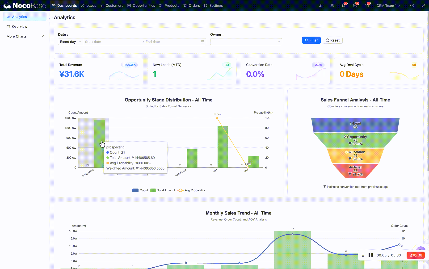
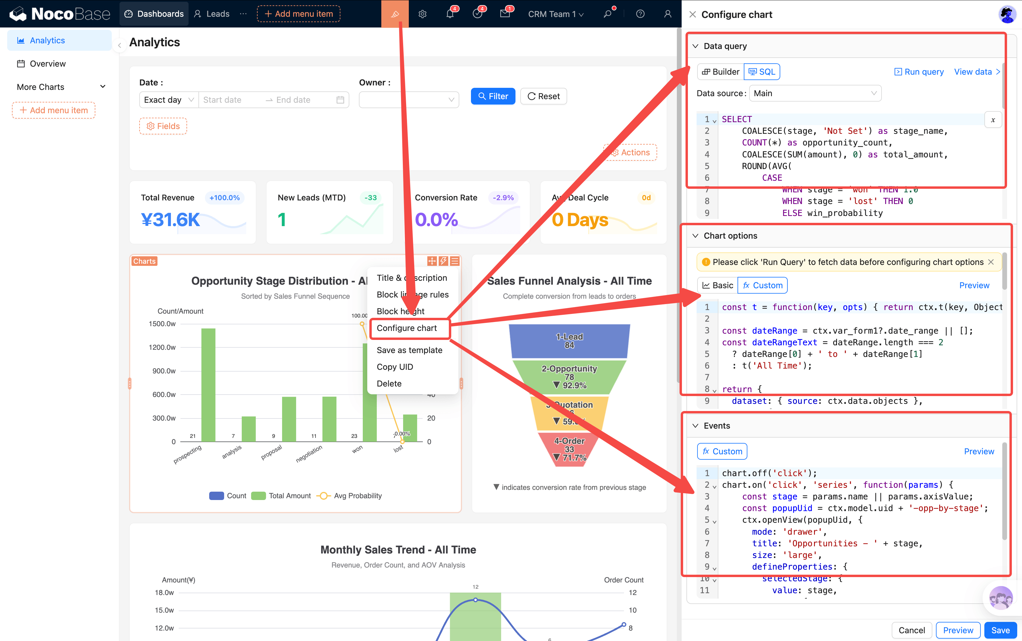
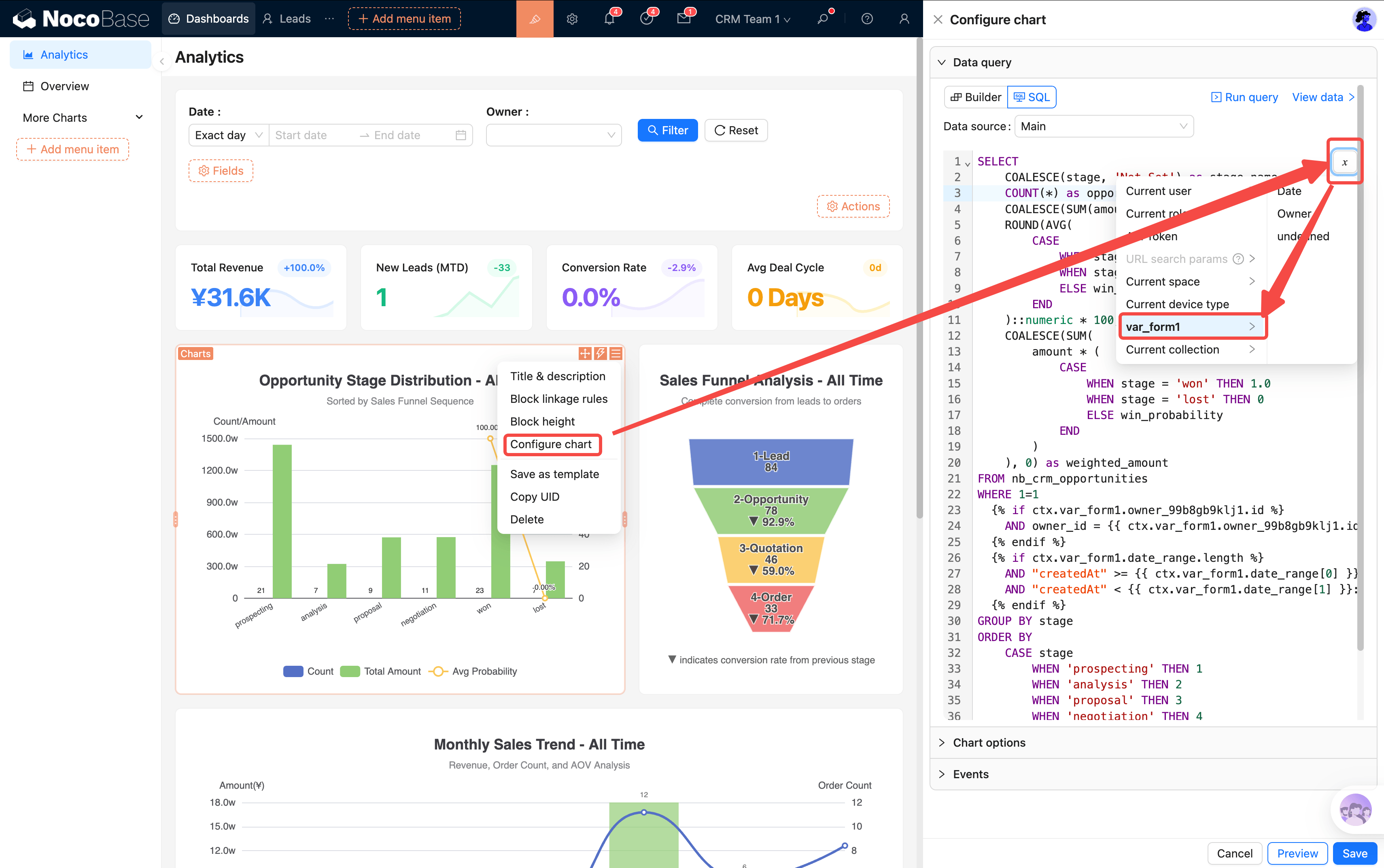
Chart Configuration (Advanced)
Each chart has three configuration dimensions:
- SQL Data Source: Determines what data the chart displays; you can verify queries in the SQL builder
- Chart Style: JSON configuration in the customization area, controlling chart appearance
- Events: Click behavior (popup OpenView / page redirect)
Filter Linkage
When any filter condition in the top filter bar is changed, all KPI cards and charts on the page refresh simultaneously — no need to set filters individually. Typical usage:
- View someone's performance: Select an Owner → all page data switches to that person's leads, opportunities, and orders
- Compare time periods: Switch date range from "This Month" to "This Quarter" → trend chart ranges update in sync
The linkage between filter bar and charts is implemented through page event flows — form variables are injected before rendering, and charts reference filter values through variables in their SQL.
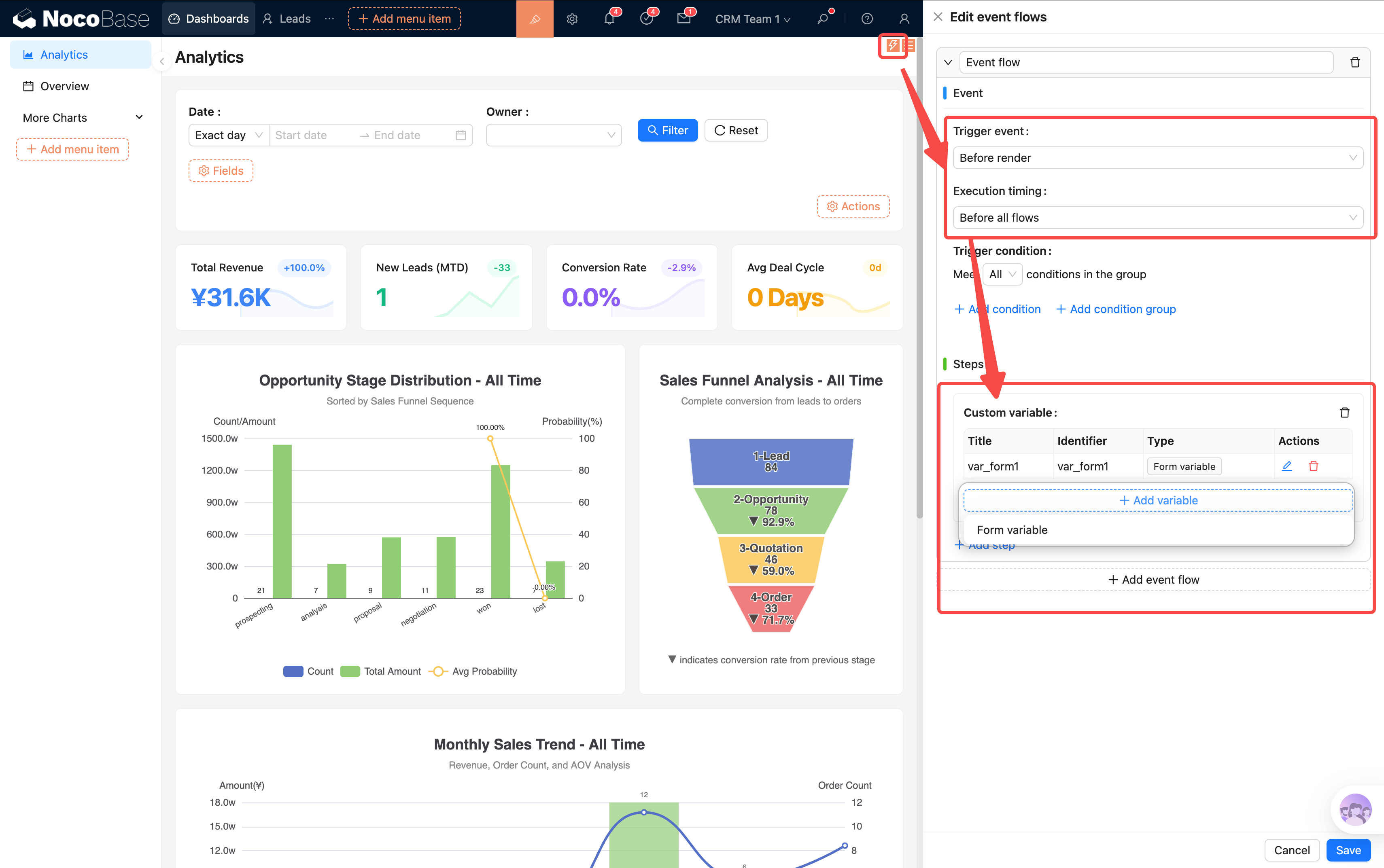
SQL templates currently only support if syntax for conditional logic. We recommend referencing existing templates in the system, or using AI to assist with modifications.
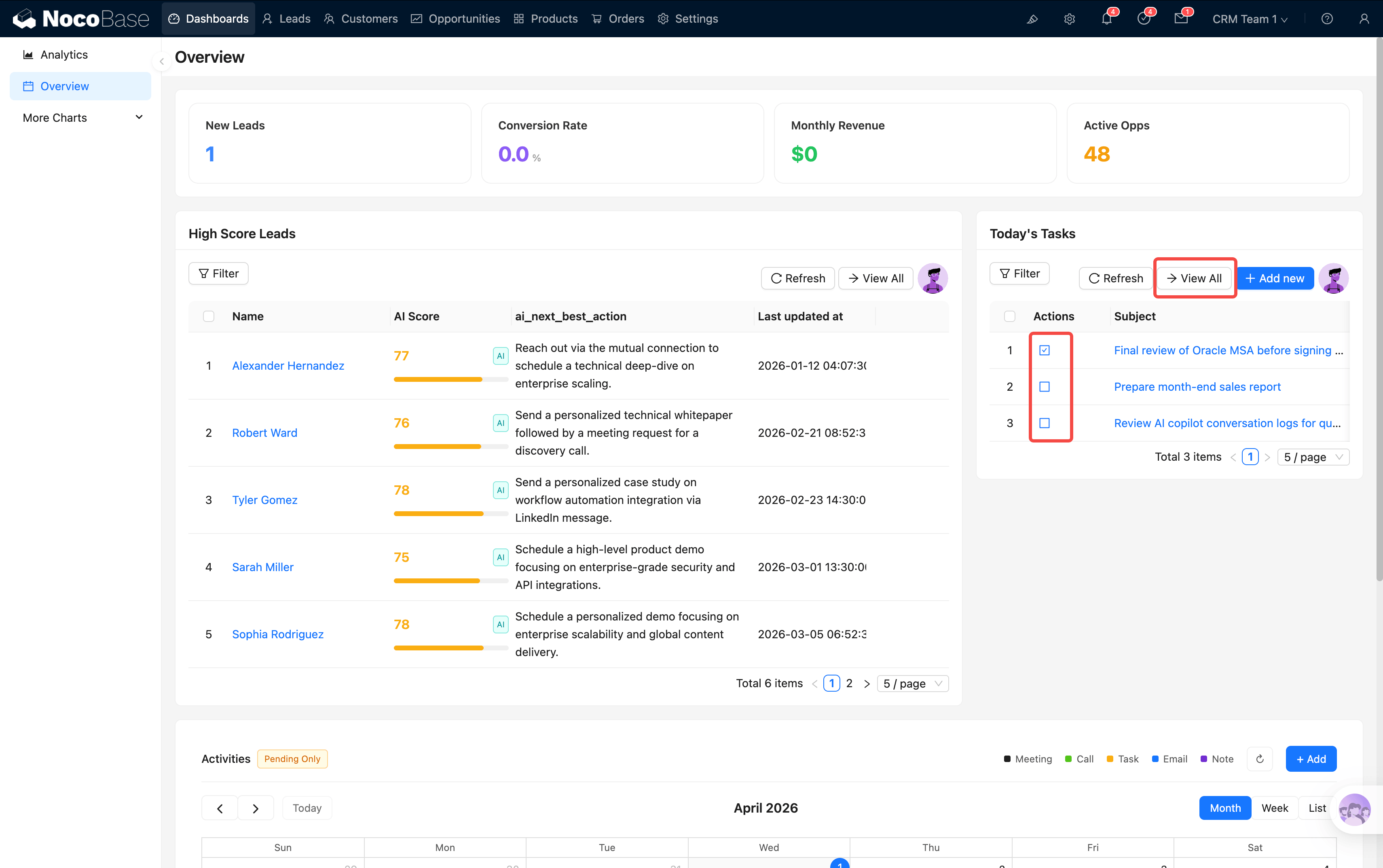
Overview — Daily Workspace
Overview is the second dashboard page, focused on daily operations rather than data analysis. The core question it answers: What should I do today? Which leads are worth following up on?
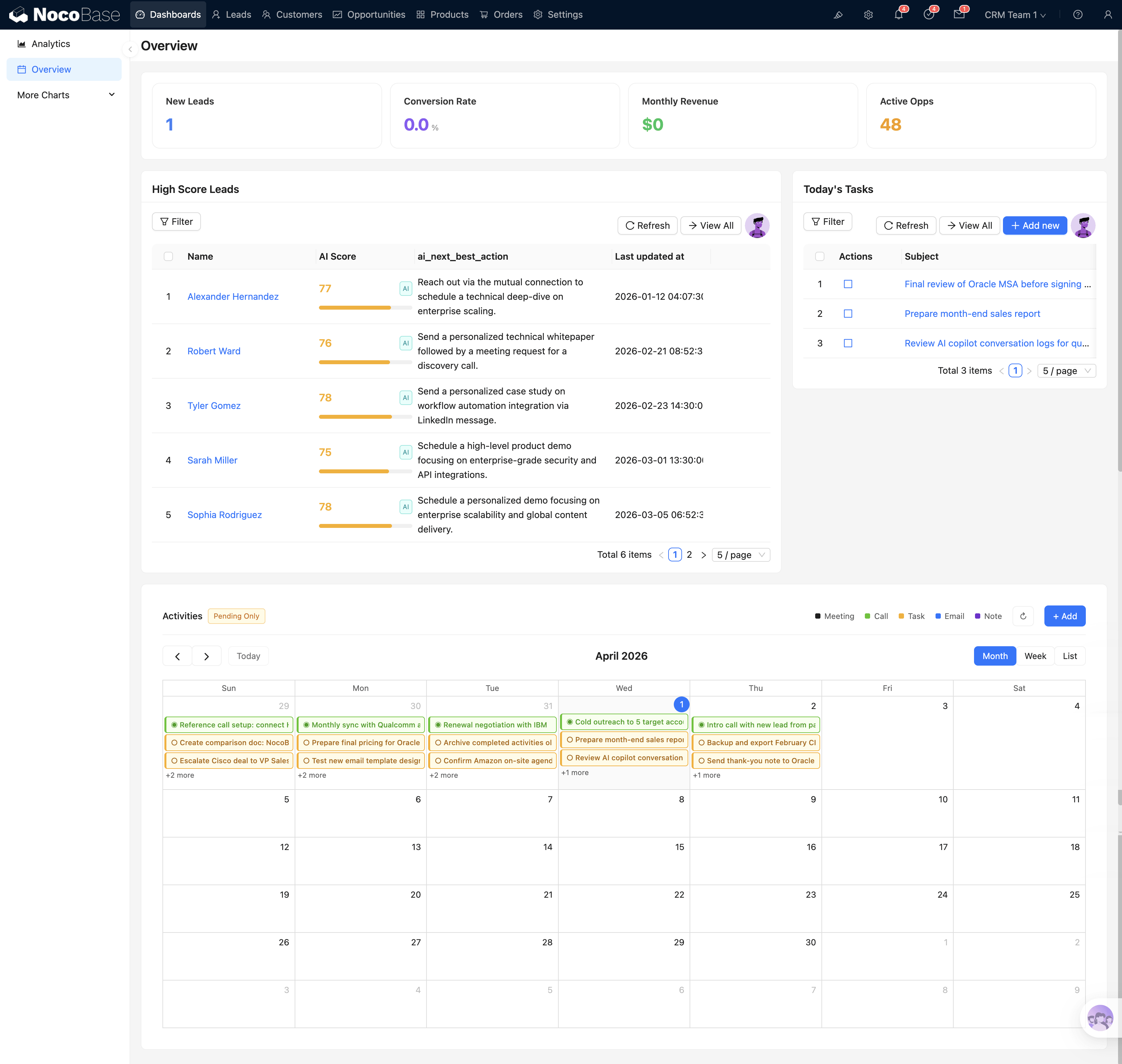
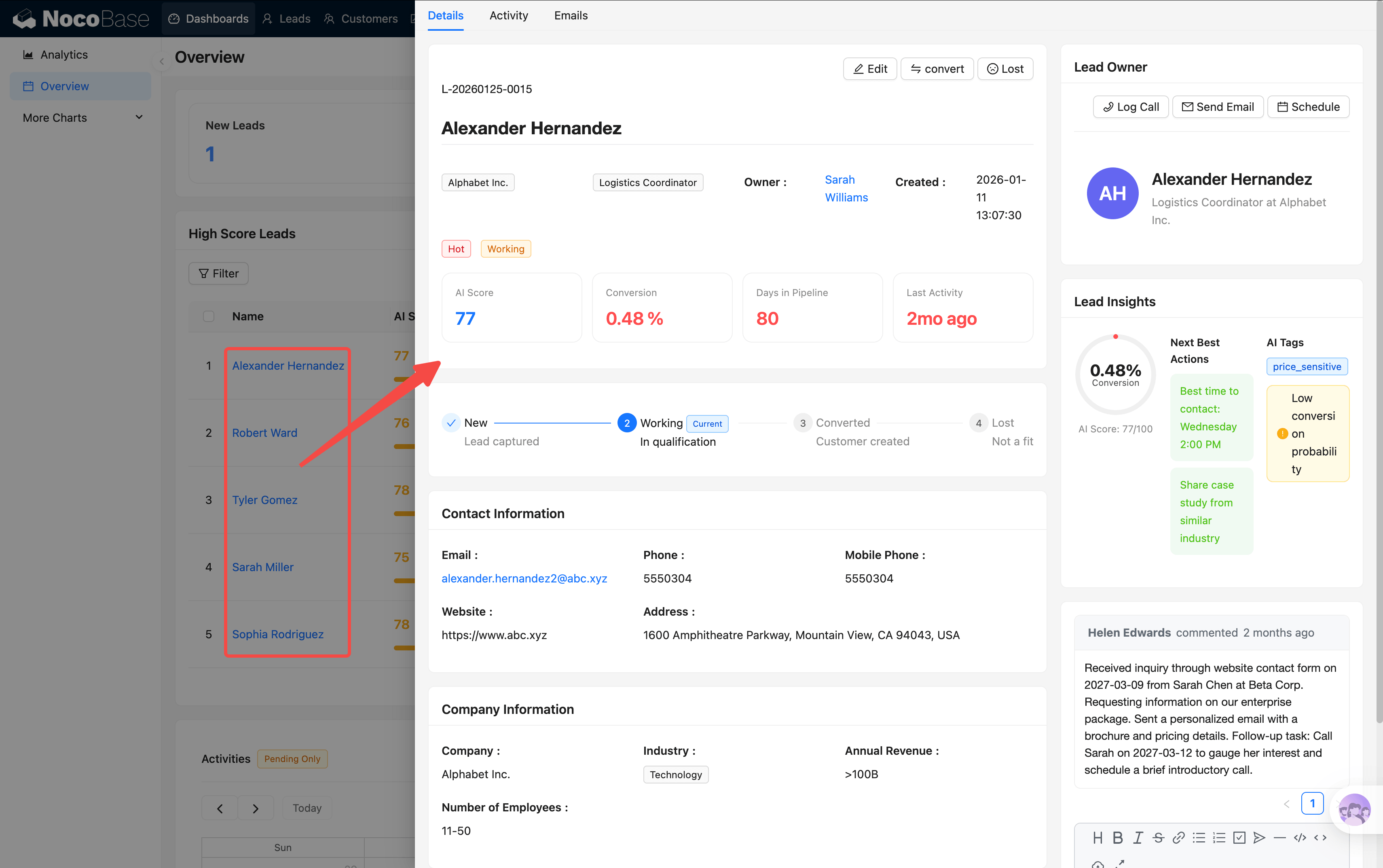
Top Leads
Automatically filters leads with AI score ≥ 75 and status New / Working (Top 5), showing for each:
- AI Score Gauge: Circular gauge visually showing lead quality (green = high score = worth prioritizing)
- AI Recommended Next Step: System auto-recommends follow-up actions based on lead characteristics (e.g., "Schedule a demo")
- Lead Basic Info: Name, company, source, creation time
Click a lead name to jump to its details, or click "View All" to go to the leads list page. A quick glance at this table each morning tells you who to contact first.
Today's Tasks
A list of today's activities (meetings, calls, tasks, etc.), supporting:
- One-click complete: Click "Done" to mark a task complete; it turns gray
- Overdue reminder: Unfinished overdue tasks are highlighted in red
- View details: Click the task name to open details
- Create new: Add a new activity record directly here
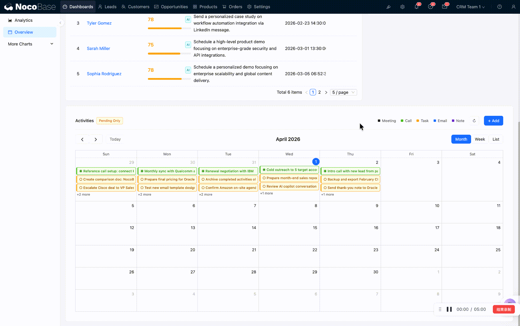
Activity Calendar
FullCalendar view with activities color-coded by type (meetings/calls/tasks/emails/notes). Supports month/week/day switching, drag-to-reschedule, and click-to-view details.
Other Dashboards (More Charts)
Three additional dashboards for different roles are available in the menu. They are provided as references and can be hidden as needed:
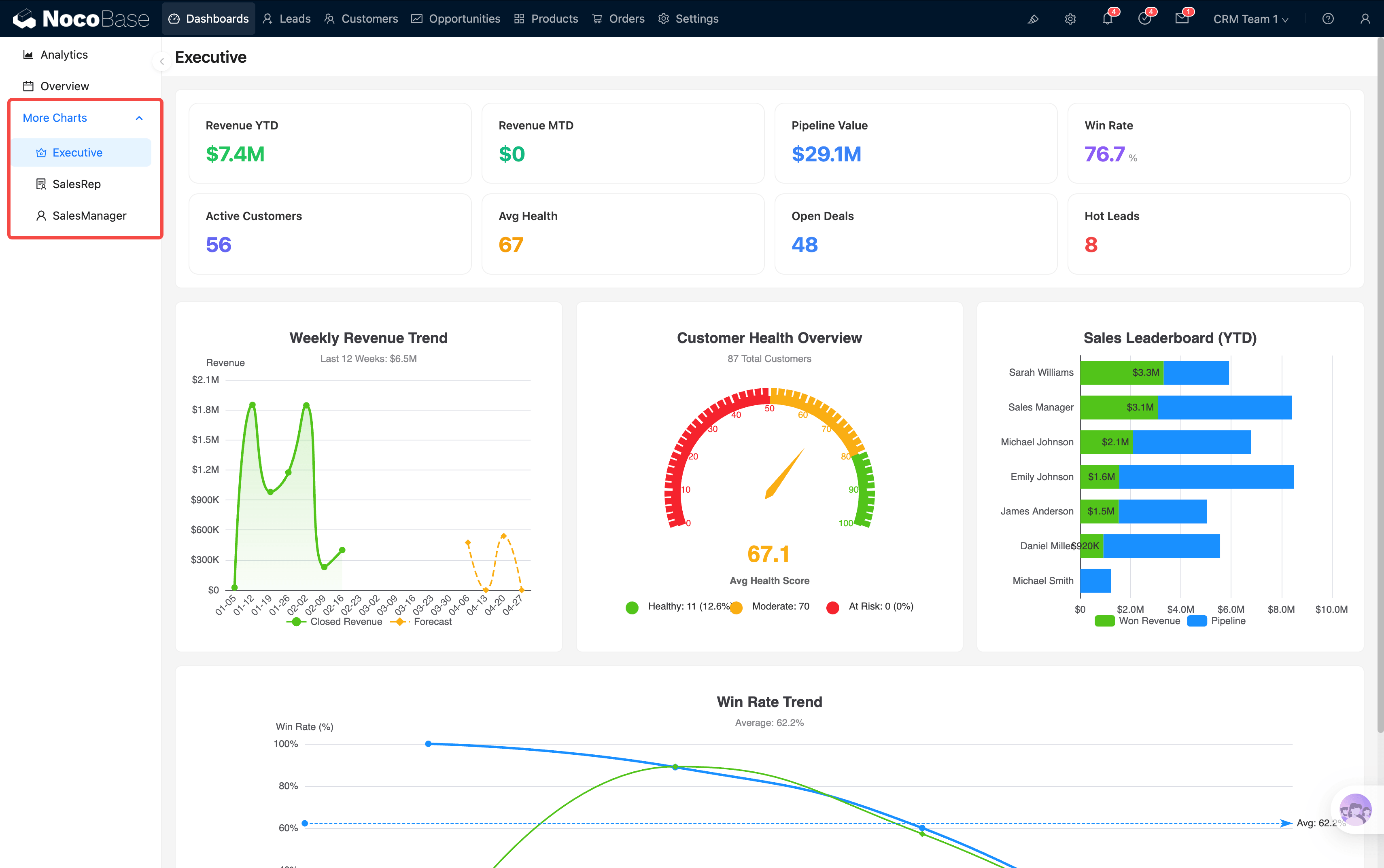
Dashboards you don't need can be hidden from the menu without affecting system functionality.
KPI Drill-through
You may have noticed that almost every number and chart above is "clickable." This is the core interaction pattern in the CRM — KPI drill-through: click a summary number → see the detailed data behind it.
Drill-through comes in two forms:
Example: In the Analytics "Monthly Sales Trend" chart, you notice February's revenue bar is notably low → click that bar → the system jumps to the Orders page with month = 2026-02 pre-applied → you immediately see all February order details to investigate further.
The dashboard isn't just for viewing — it's the system's navigation hub. Every number is an entry point, guiding you from macro to micro, layer by layer to the root cause.
After understanding the system layout and dashboards, go back to the User Guide for subsequent chapters.