

Mobile Layout
In NocoBase, the mobile layout is used to build dedicated navigation and pages for mobile devices. It is available at /mobile by default and uses a bottom tab bar as its primary navigation, making it more suitable for data entry, lookup, approval, and task processing on a phone.
The mobile and desktop layouts use the same data sources and business data, but their menus, routes, and page content are configured separately. This lets you reorganize pages around mobile workflows without being constrained by the desktop page structure.
Open and preview the mobile layout
By default, you can click 「Mobile」 in Settings to open the layout, or visit /mobile directly.
It is best to build pages in a desktop browser. The desktop view provides a mobile preview area and a toolbar at the top:
- 「UI Editor」 turns UI building mode on or off.
- 「Tablet preview」 checks the display on wider mobile devices.
- 「Mobile preview」 restores the phone-sized preview area.
- 「QR code」 opens the current mobile URL on a phone.
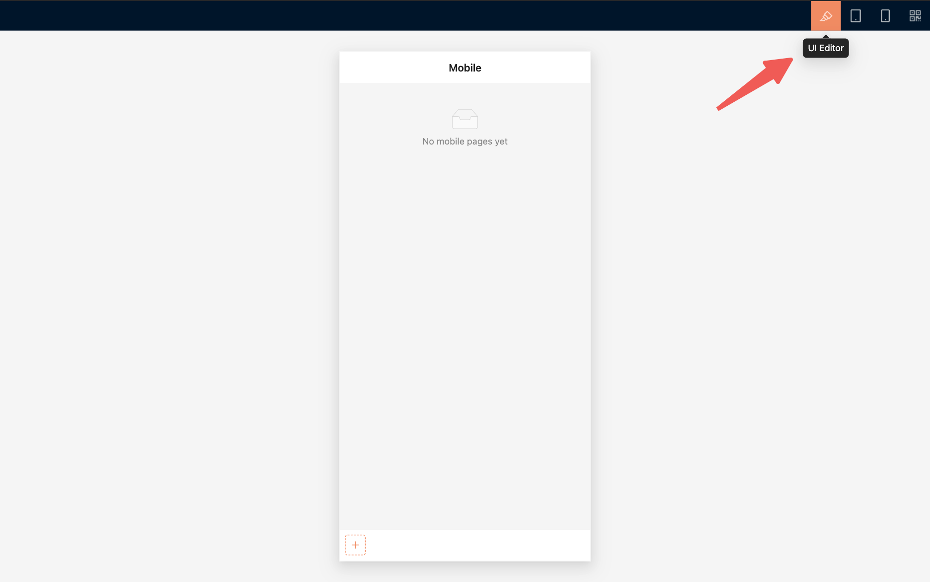
After building the pages on a computer, scan the QR code and check them on a physical device. Pay particular attention to navigation, scrolling, form input, pop-up pages, and safe areas.
Build mobile navigation
The mobile layout uses a bottom tab bar as its primary navigation. Primary navigation currently supports mainly pages and links.
Add a page
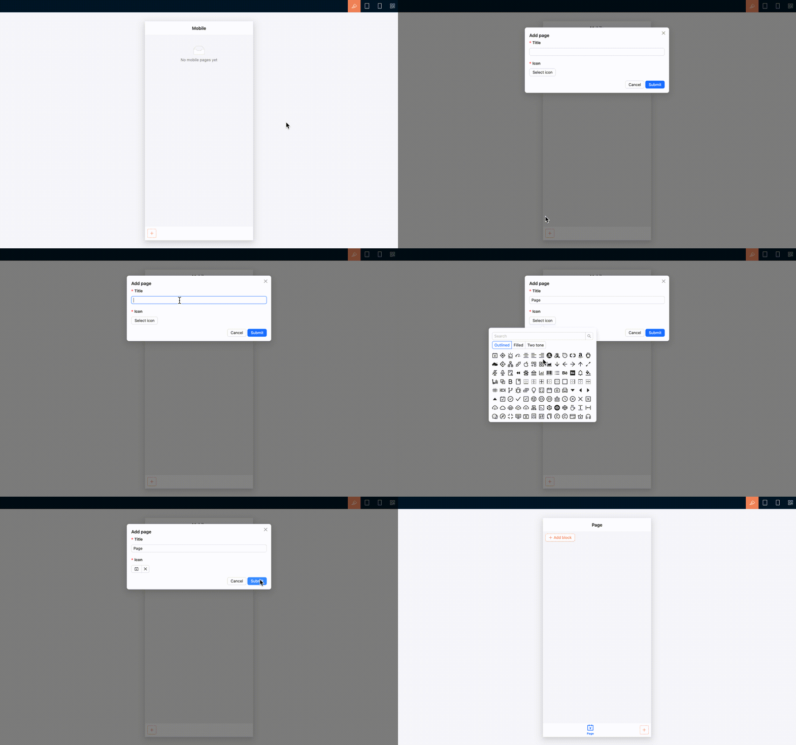
- Open 「UI Editor」.
- Click the add button on the right side of the bottom tab bar.
- Select 「Page」.
- Enter a page title and select an icon.
- Submit the form to open the new page, then continue adding page content.
Add a link
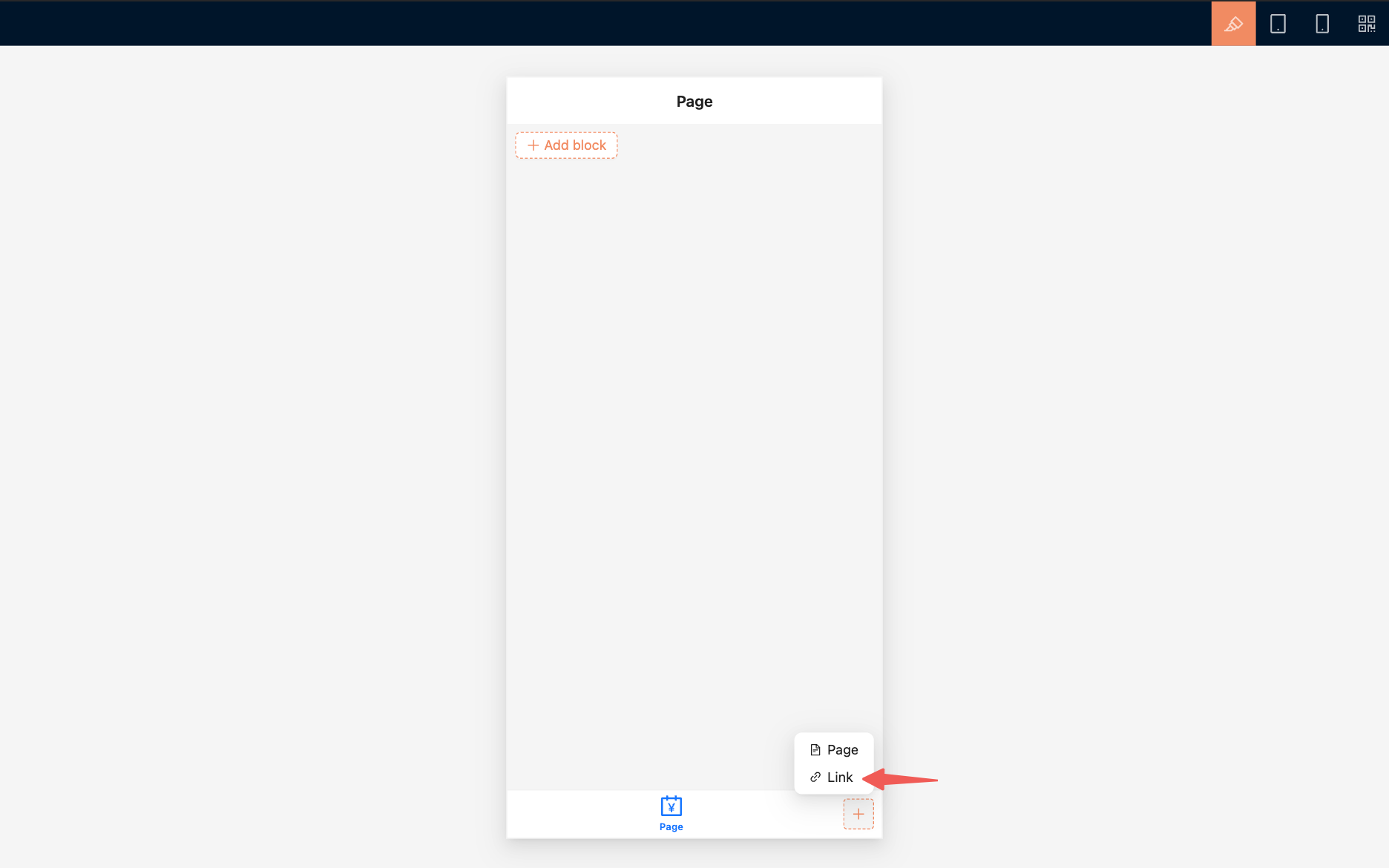
To open an internal or external URL, select 「Link」 and configure its title, icon, and URL.
A link can open in the current window or a new window, depending on its configuration.
Arrange navigation
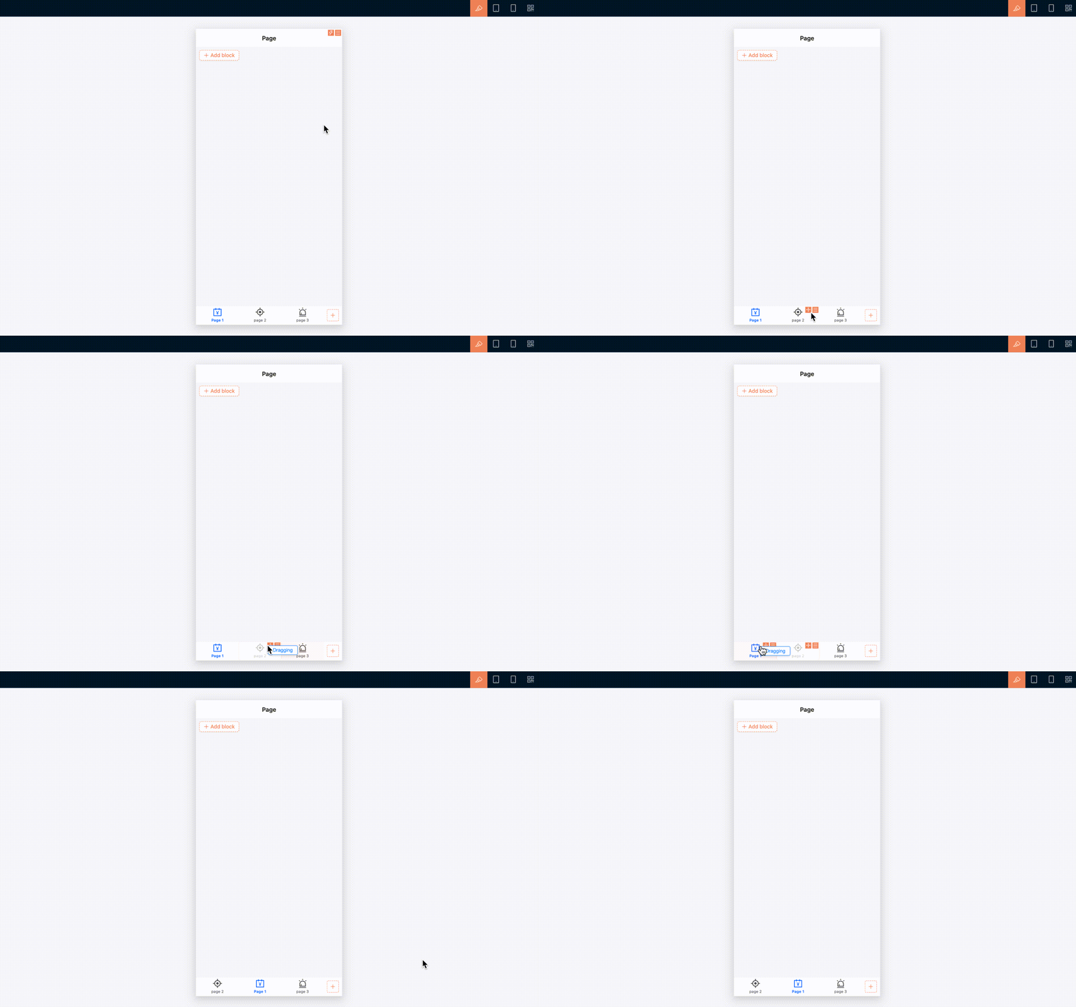
In UI building mode, drag bottom tabs to reorder them. You can also edit a tab's title and icon, configure linkage rules, copy its UID, or delete it.
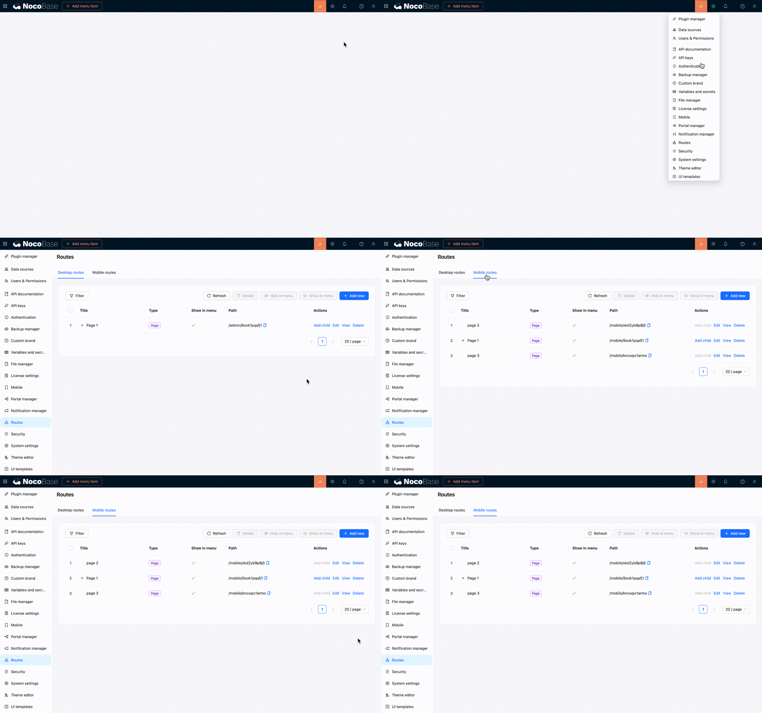
To view, show, hide, or delete mobile routes in one place, open 「Settings / Routes / Mobile routes」.
Build a mobile page
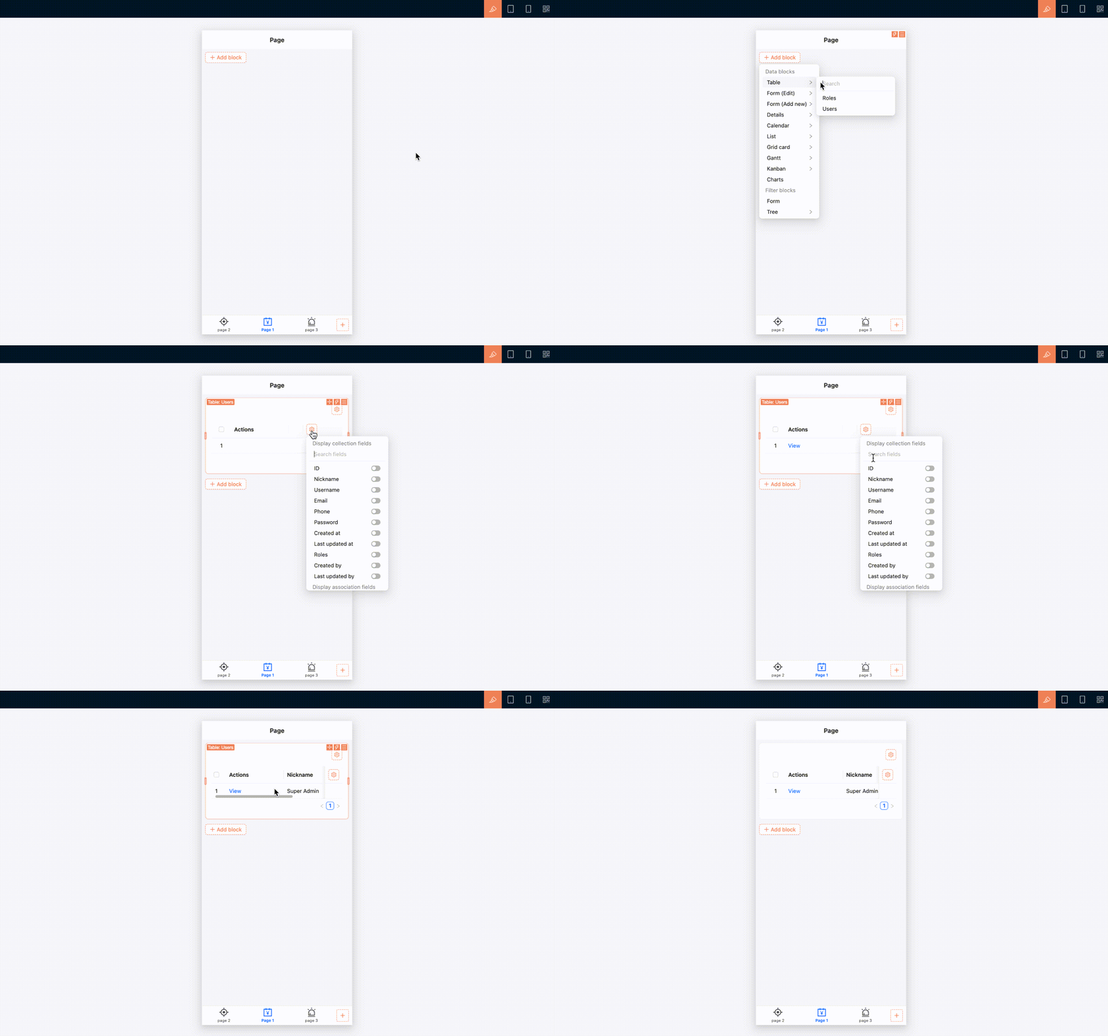
Create and open a mobile page before adding blocks to it. The approach to building page content is essentially the same as on desktop: use blocks, fields, and actions to organize business content. However, mobile navigation and some component interactions are adjusted for smaller screens.
Add page content
- Open the mobile page you want to build.
- Make sure 「UI Editor」 is enabled.
- Click 「Add block」 on the page.
- Select a table, form, details, filter, or another block.
- Continue configuring fields, actions, and block settings.
Use page tabs
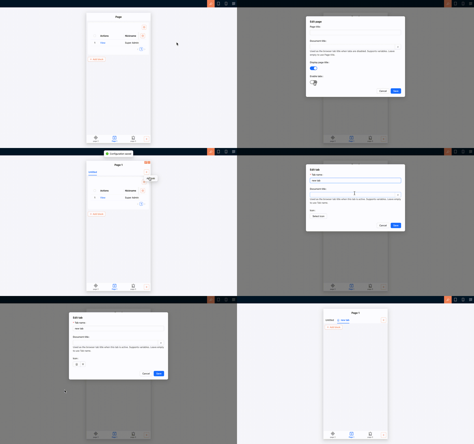
A mobile page can also use tabs. If multiple pieces of content belong under the same navigation entry but remain relatively independent, place them in separate tabs.
- Open the page settings and enable 「Enable page tabs」. You can also edit the page under 「Settings / Routes / Mobile routes」 and select 「Enable page tabs」.
- Turn on 「UI Editor」.
- Click 「Add tab」 on the right side of the page tab bar.
- Add the tab, then configure its name and page content.
If a mobile page contains only a small amount of content, use a single page. You do not need to enable tabs.
Mobile interactions for common components
Common components adjust their arrangement and interactions for the mobile layout. For instance, multi-column content automatically switches to a single column that is easier to browse vertically; selection and date-time fields use mobile-friendly pickers; and filters, associated record selection, and subpages use interfaces designed for touch interaction.
Tables remain tables on mobile, with horizontal scrolling for columns that extend beyond the screen. Any additional mobile behavior depends on the support provided by each block.
Pages and subpages
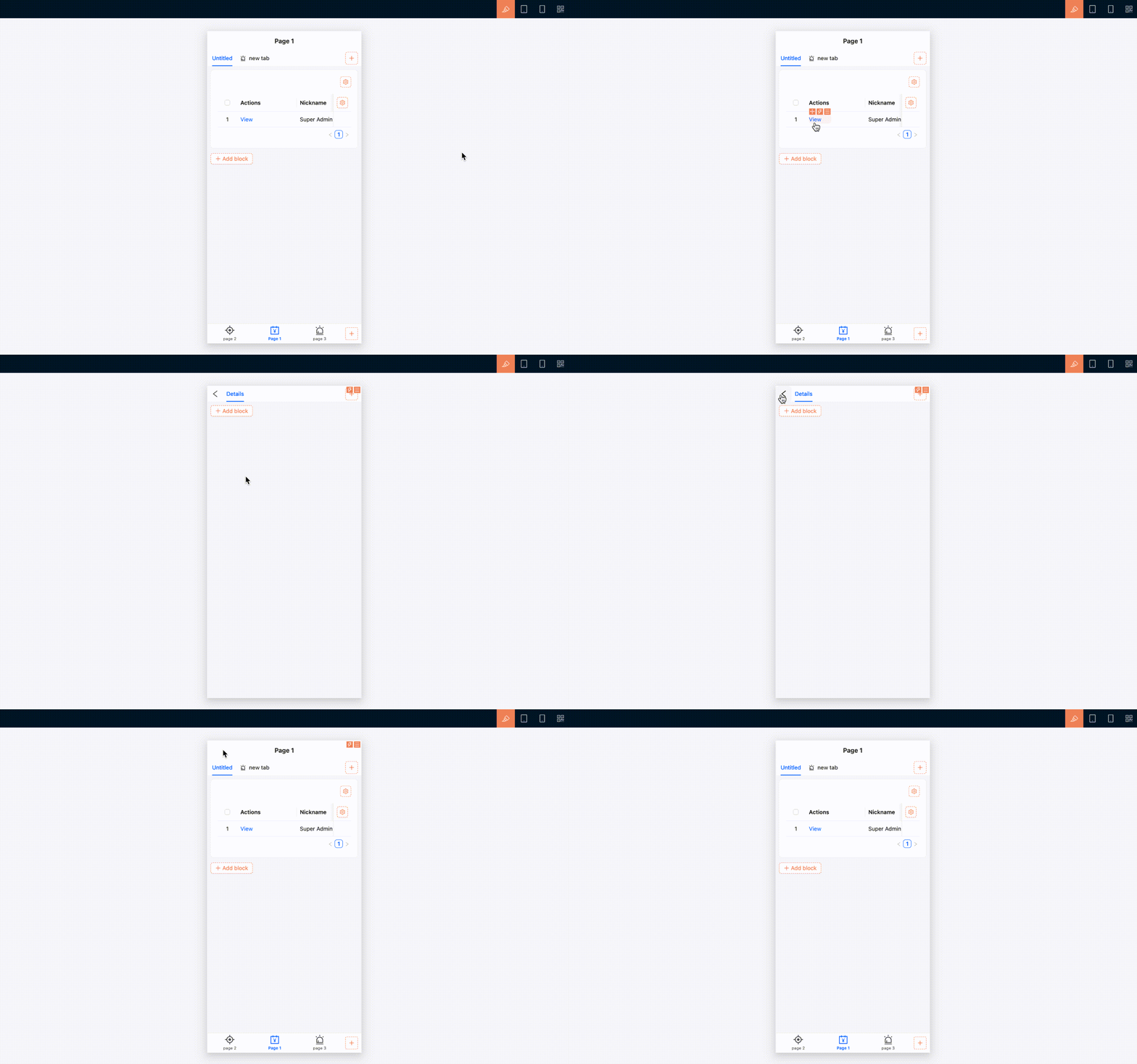
Content opened from view, edit, associated record selection, and similar actions appears as a mobile subpage. The subpage provides a back button that returns you to the previous page.
When you open a deeper subpage, the bottom tab bar is hidden to leave more room for the current content. It reappears when you close the subpage or return to the previous level.
When switching between bottom tabs, the state of open pages is preserved, making it easier to move between mobile tasks.
Manage routes and permissions
Mobile routes can be maintained in the Route Manager. Open 「Settings / Routes / Mobile routes」 to add, edit, delete, show, or hide pages and links, or to configure tabs for a page.
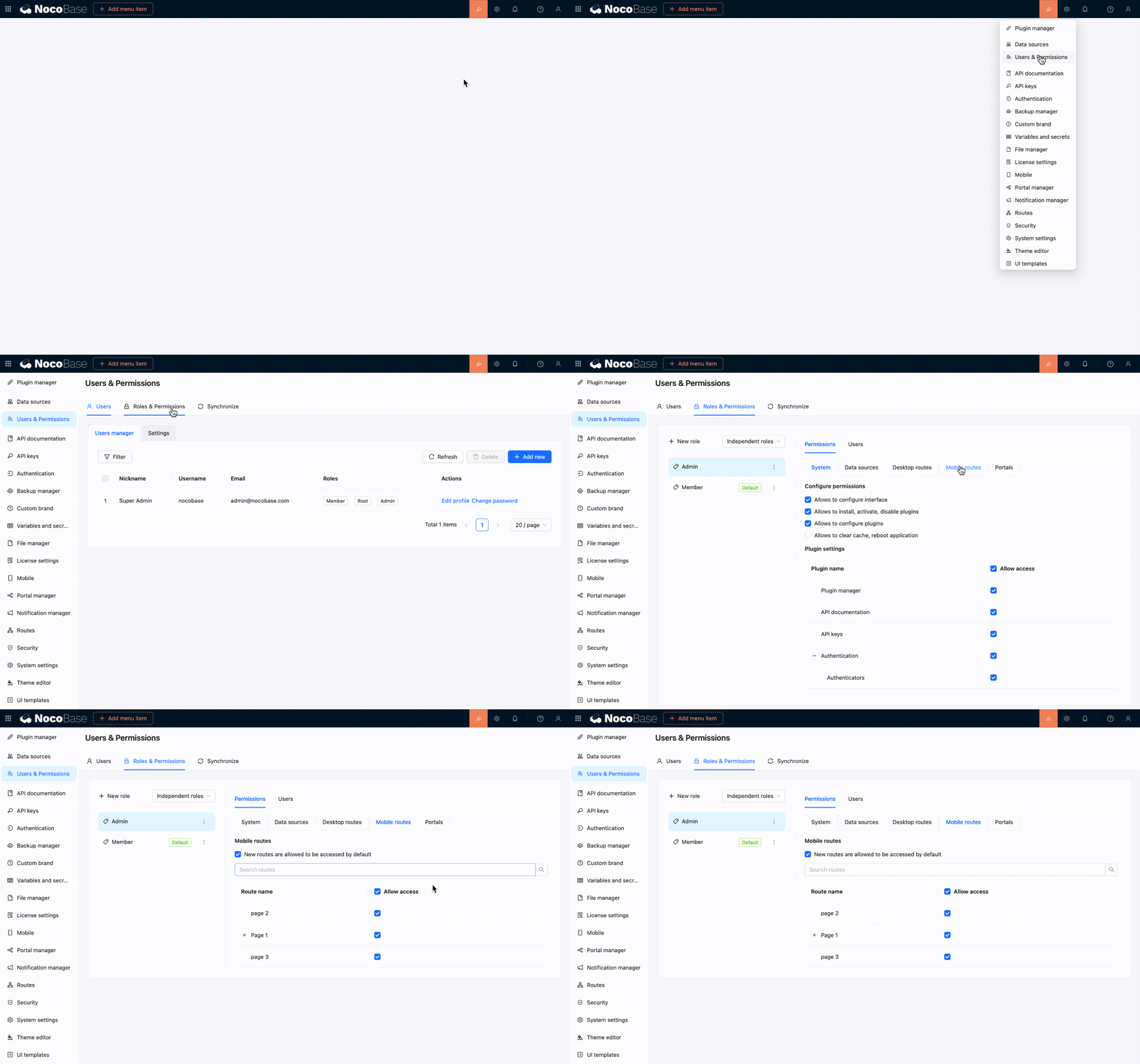
Mobile route access permissions are configured separately from desktop permissions. Under role permissions, open 「Mobile routes」 and select the pages the current role can access. See Permission configuration for details.
Relationship with the desktop layout
You can build separate desktop and mobile pages from the same data table. For instance, a desktop page may use a table with many fields for data processing, while a mobile page may use a simpler list or form for on-site data entry.
The two layouts do not synchronize pages automatically. Changes to desktop pages, menus, or routes do not update the mobile configuration, and mobile changes do not affect desktop pages.
If mobile users only need occasional access to desktop pages, try the responsive desktop layout first. Build a separate mobile layout only when you need dedicated navigation and page workflows for mobile devices.
Related links
- UI layout overview — Compare desktop and mobile layout use cases
- Desktop layout — Use the default desktop layout and its narrow-screen responsiveness
- Blocks — Add business content to mobile pages
- Fields — Configure mobile forms and data display fields
- Actions — Configure actions on mobile pages
- Route Manager — Manage mobile pages, links, and tabs
- Permission configuration — Control which mobile routes each role can access