

Desktop Layout
In NocoBase, the desktop layout is the default application interface. It is designed for data management, form entry, business configuration, and everyday work on a computer, and can also be used on mobile devices.
The desktop layout is available at /admin by default. If the application has its own access prefix, the actual URL automatically includes that prefix.
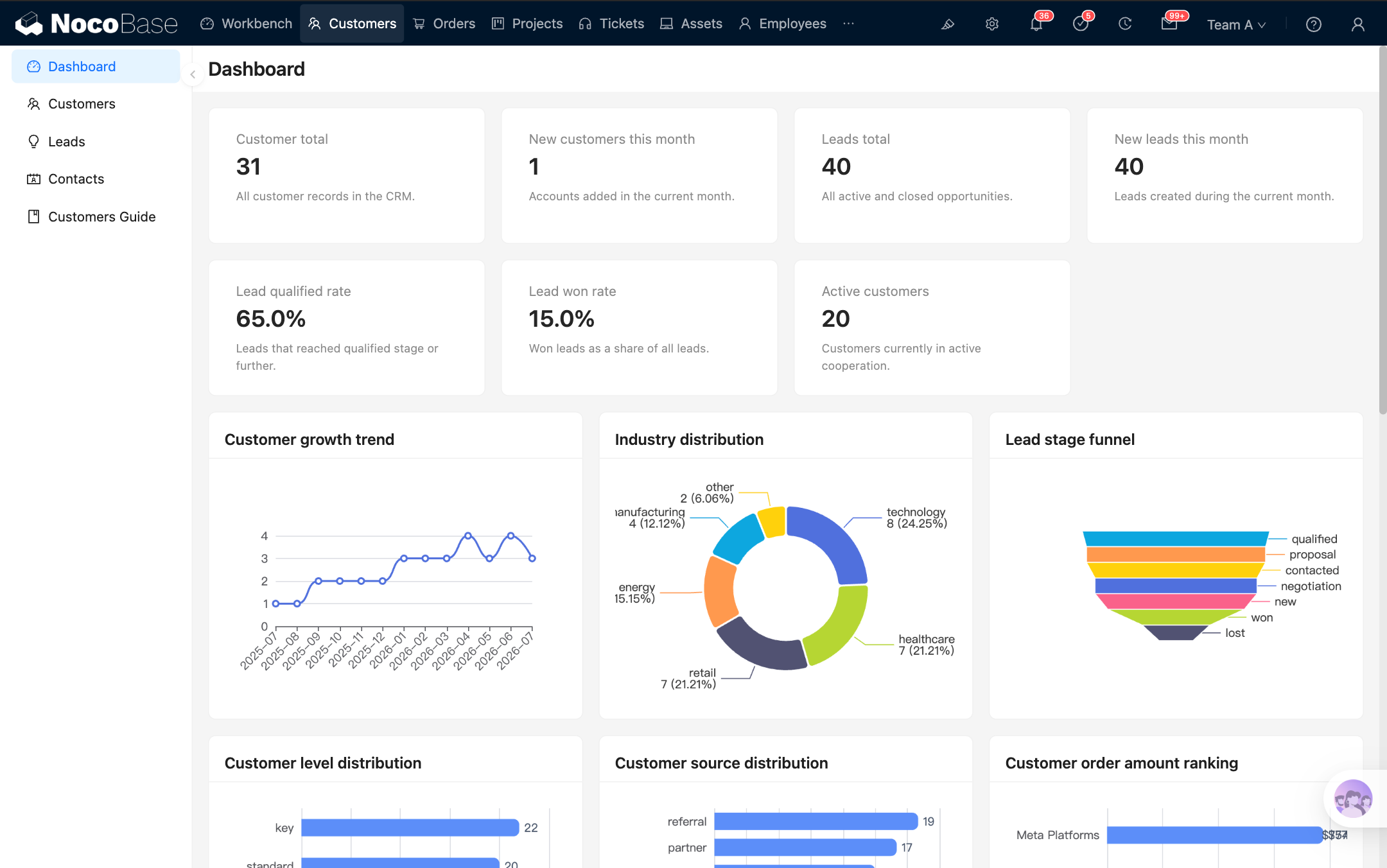
Build a page
Step 1: Open the desktop layout
Visit /admin to open the desktop layout. After signing in, the application usually opens this layout directly.
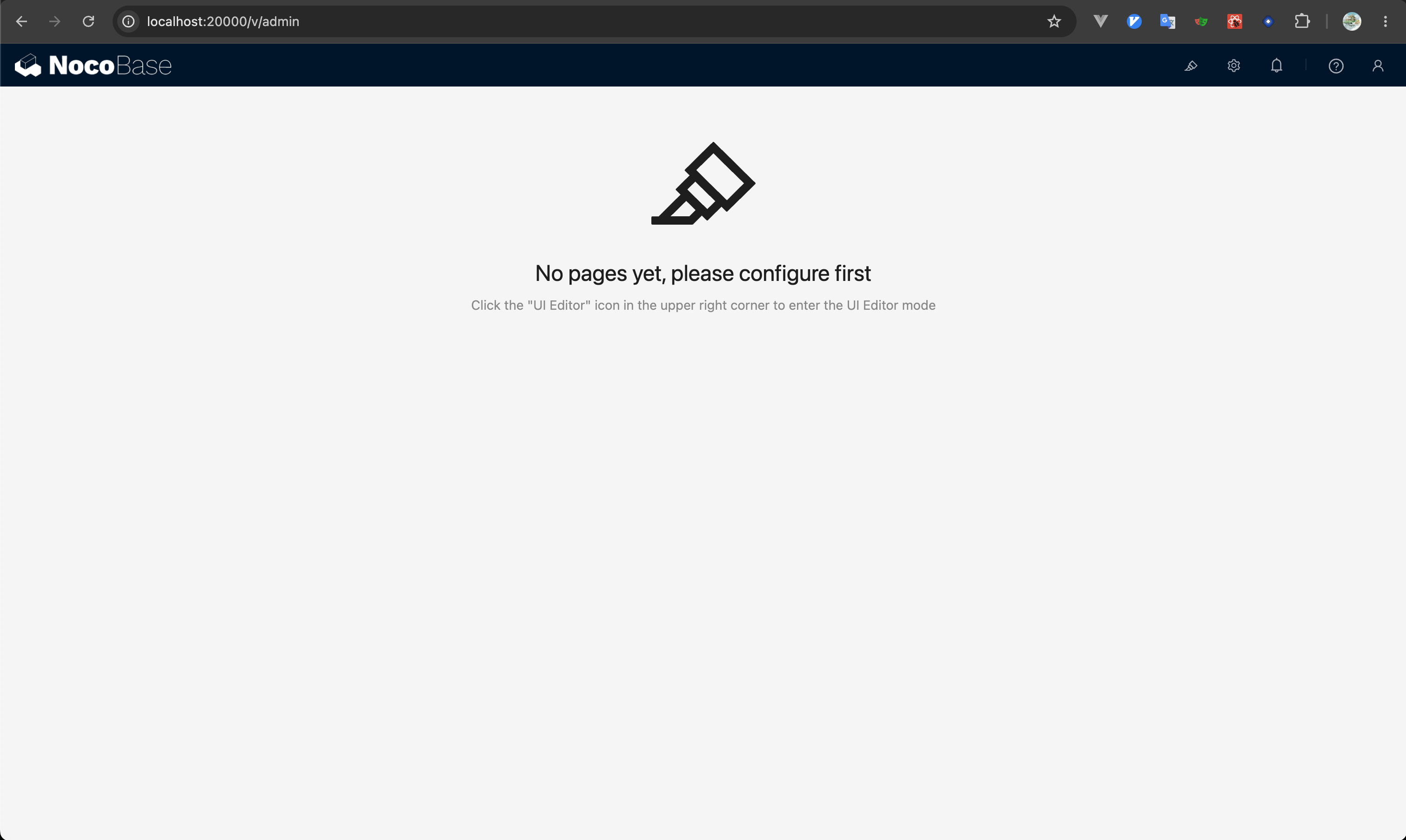
Step 2: Open UI Editor
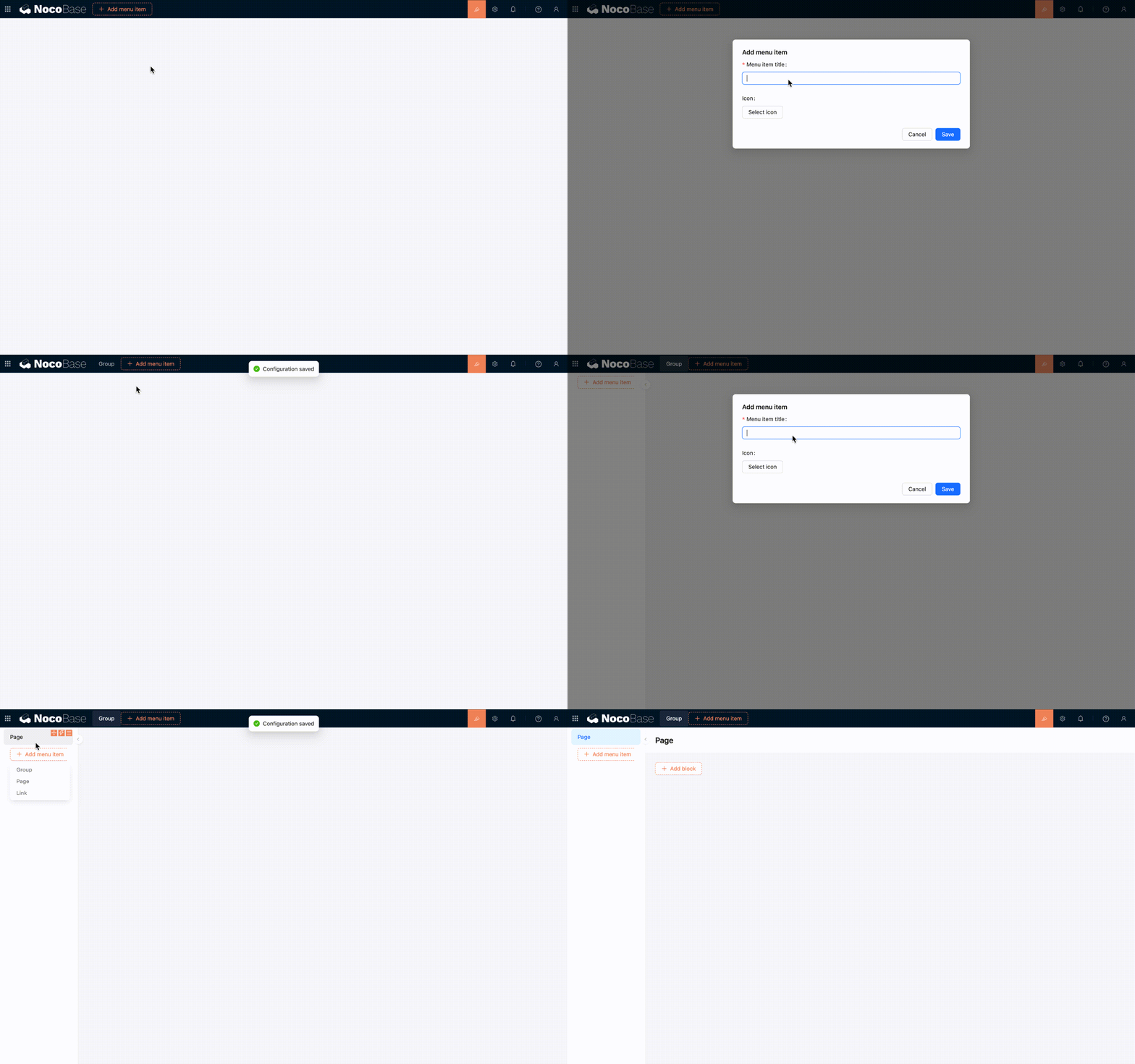
Click 「UI Editor」 in the upper-right corner of the page to enter UI building mode. Configuration entries then appear around menus, pages, blocks, fields, and actions.
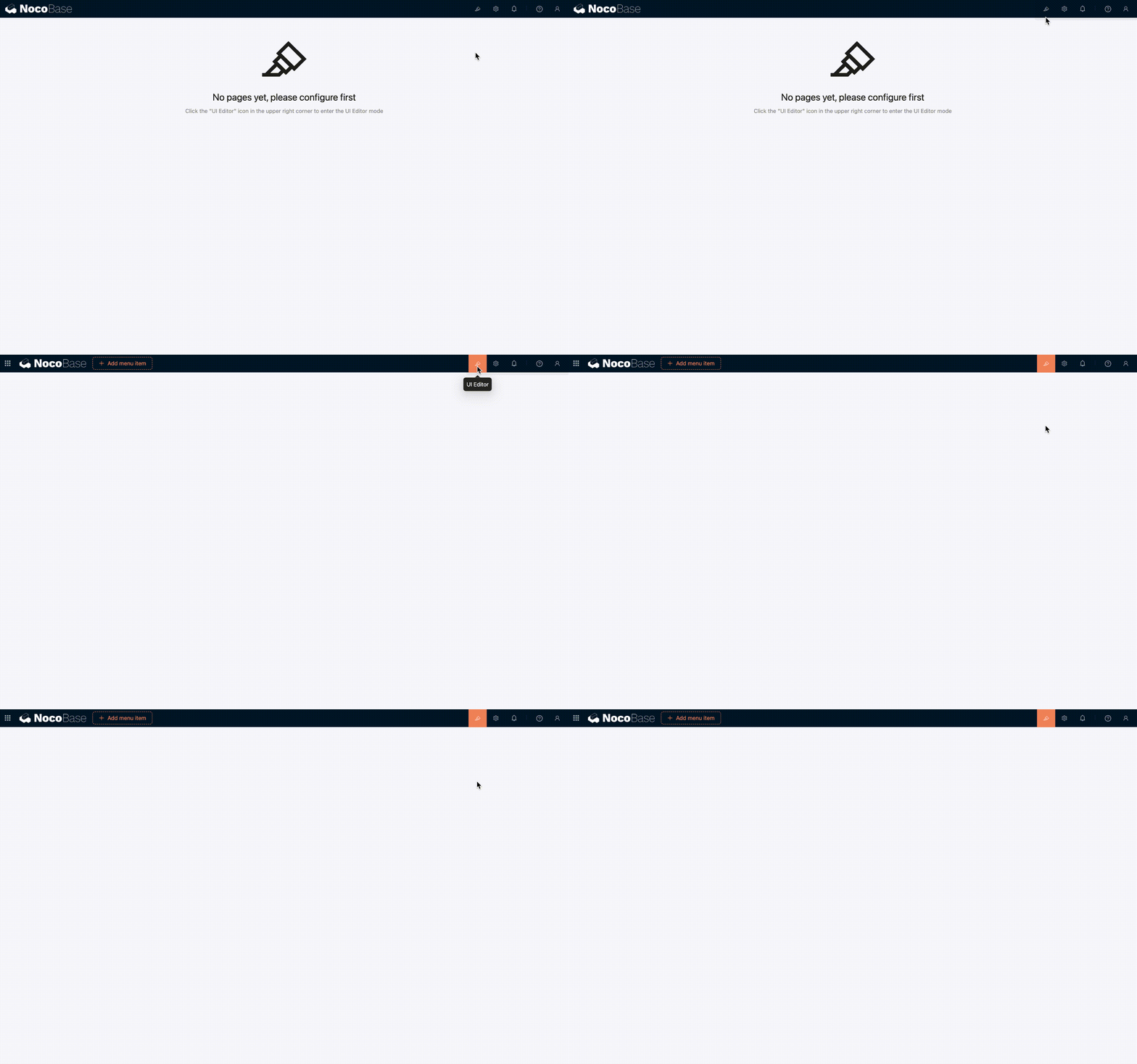
Step 3: Create menus and pages
You can add groups, pages, or links in the navigation area, and enable tabs for a page. After creating a page, open it and add the blocks you need.
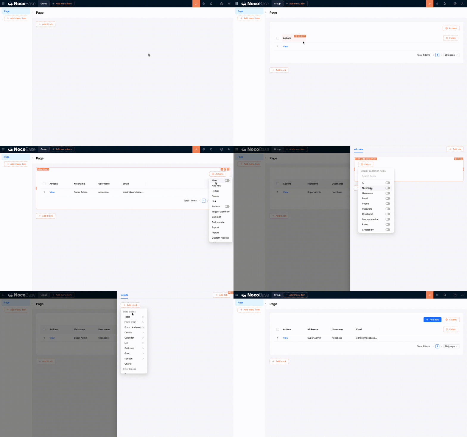
Page content is built in the same way as other interfaces: add blocks first, then configure fields and actions for your business needs.
Step 4: Configure page content
Add table, form, details, filter, or other blocks to the page, then adjust the fields, actions, and arrangement of the blocks. Each change is reflected directly on the current page.
Manage routes and menus
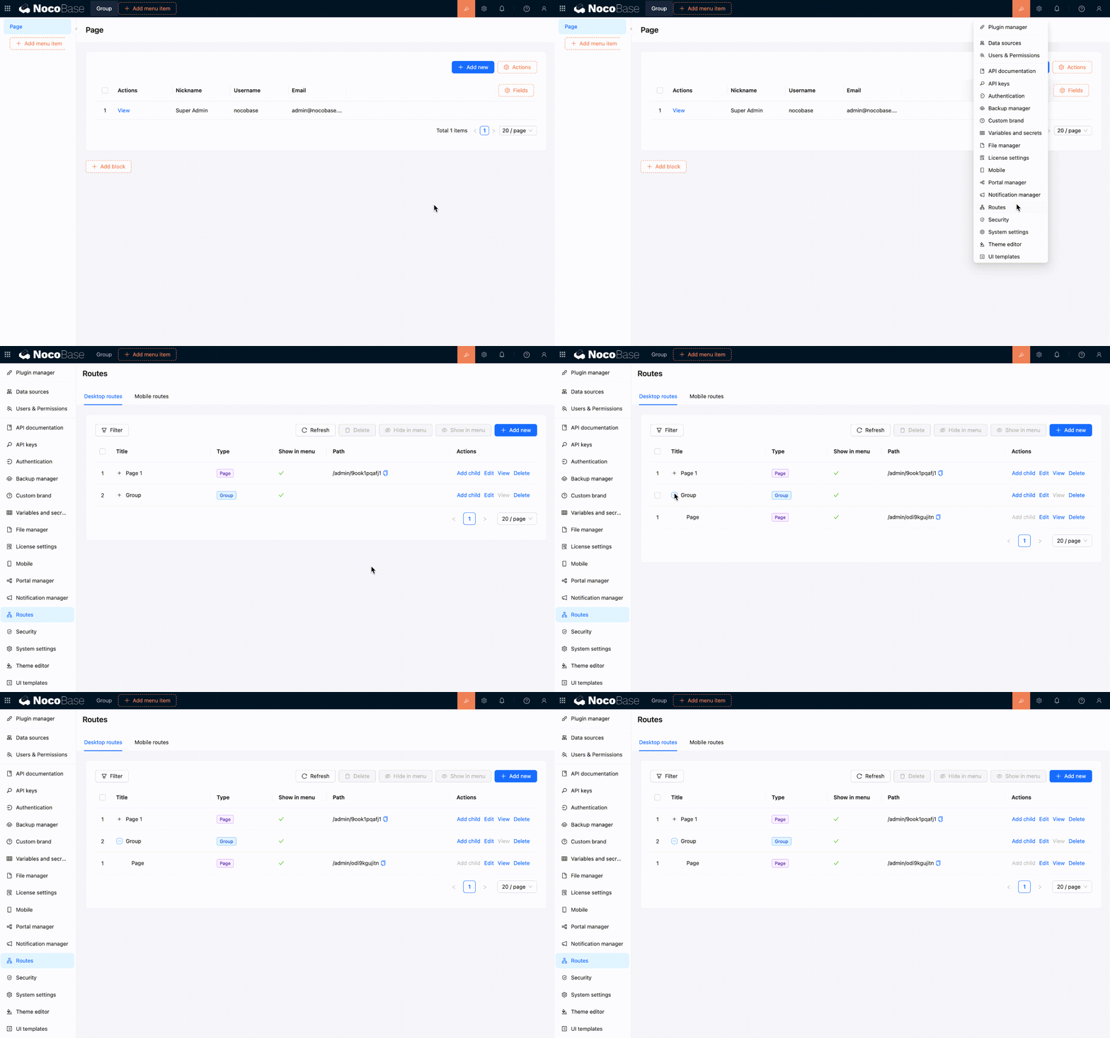
When you add a page or link in the navigation area, it also appears in the Route Manager. Changes made in the Route Manager also update the menu.
The desktop layout supports these common route types:
- Group — Organizes multiple pages and links under the same navigation group.
- Page — Opens a page where you can continue adding blocks.
- Link — Opens an internal or external URL.
- Tab — Organizes multiple content tabs within a page.
In the Route Manager, you can add, edit, delete, show, or hide routes. It is often the more convenient place to reorganize the entire menu structure.
Responsive behavior on narrow screens
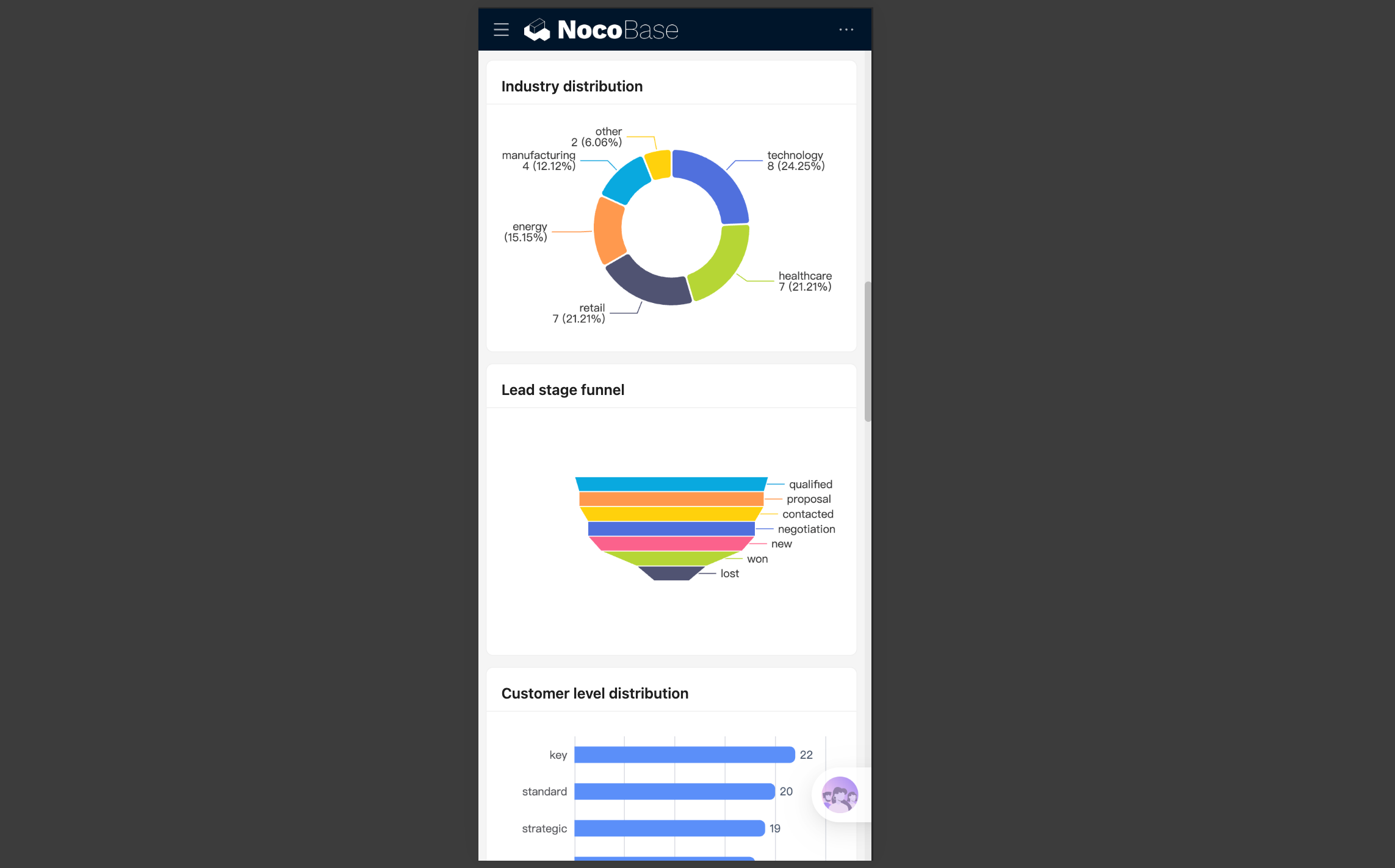
The desktop layout can be used directly on a phone or in a narrow browser window. In narrow-screen mode, it still uses the same desktop routes and pages. It does not automatically switch to the mobile layout.
Layout changes
The navigation menu collapses, and top actions move into a more compact entry. Page margins and spacing between blocks also shrink, while the content area adapts to the visible height of the mobile browser.
UI Editor is not available on narrow screens. To change menus or pages, you need to return to a desktop browser and make the changes there.
How page content adapts
Common components also adjust their interactions for narrow screens, making them easier to use on a phone. For instance, multi-column blocks switch to a single column, tables allow horizontal scrolling for columns that extend beyond the screen, and pagination and action entries become more compact. Selection, date and time, filter, and subpage interactions also use forms that are easier to operate on a phone.
If you only access the application from a phone occasionally, the responsive desktop layout is usually enough. If you need separate bottom navigation, mobile pages, and mobile workflows, build a mobile layout as well.
Recommendations
- Use the desktop layout by default for work performed mainly on a computer.
- Finish building the page on a wide screen, then narrow the window to check its responsive behavior.
- If a page contains many table columns or horizontal actions, keep only the necessary content to reduce the workload on smaller screens.
- If the desktop and mobile workflows differ significantly, separate pages are usually clearer.
Related links
- UI layout overview — Compare desktop and mobile layout use cases
- Mobile layout — Build separate mobile navigation and pages
- Blocks — Add and configure blocks on a page
- Fields — Configure fields in tables, forms, and details blocks
- Actions — Configure actions on pages and blocks
- Route Manager — Manage desktop menus and routes in one place
- Permission configuration — Control which desktop routes each role can access