Kanban
Block: KanbanCommunity Edition+Introduction
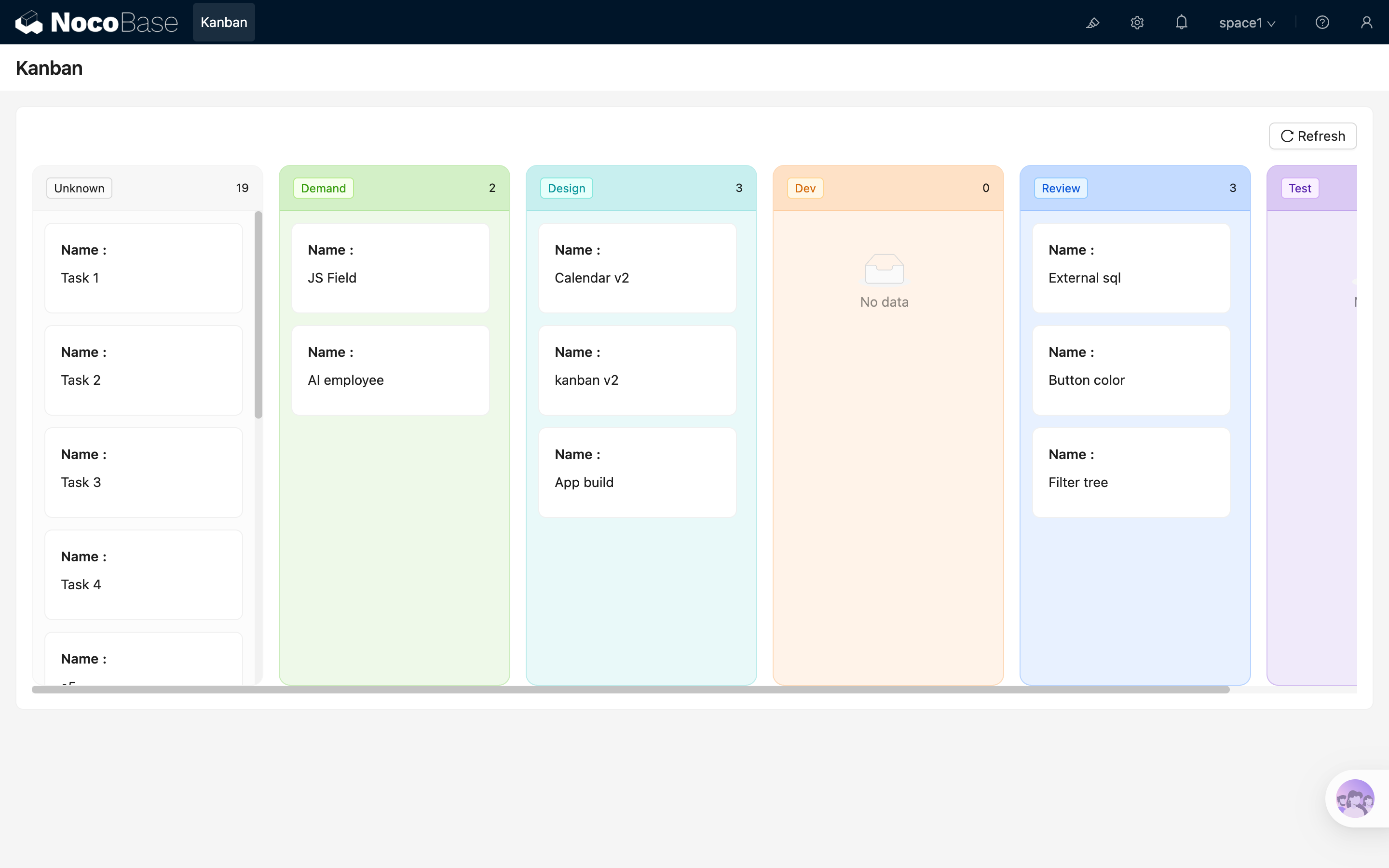
The Kanban block displays records in grouped columns. It is suitable for scenarios such as task status workflows, sales pipeline tracking, and ticket processing, where data needs to be viewed and progressed by stages.
Add block
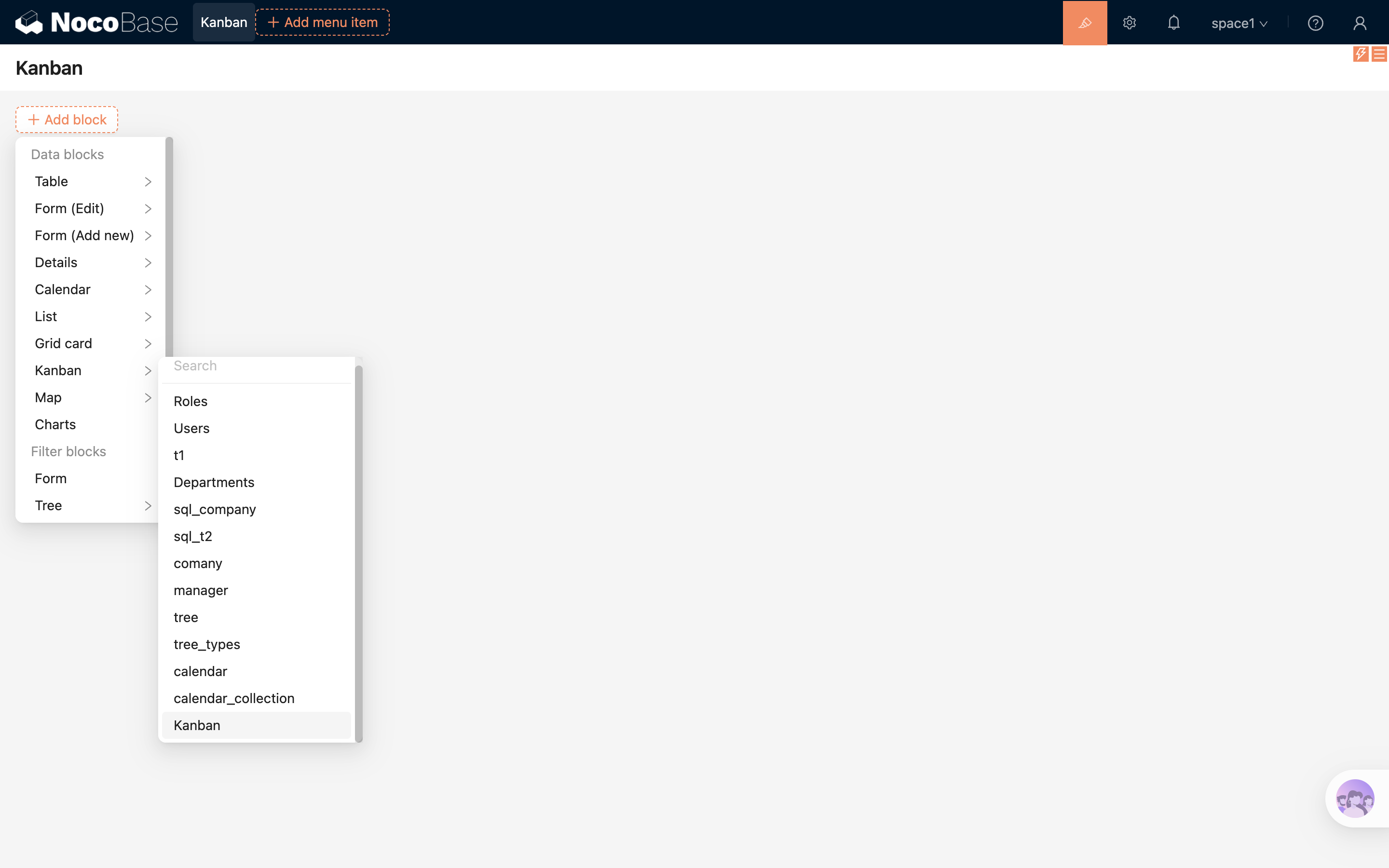
.png)
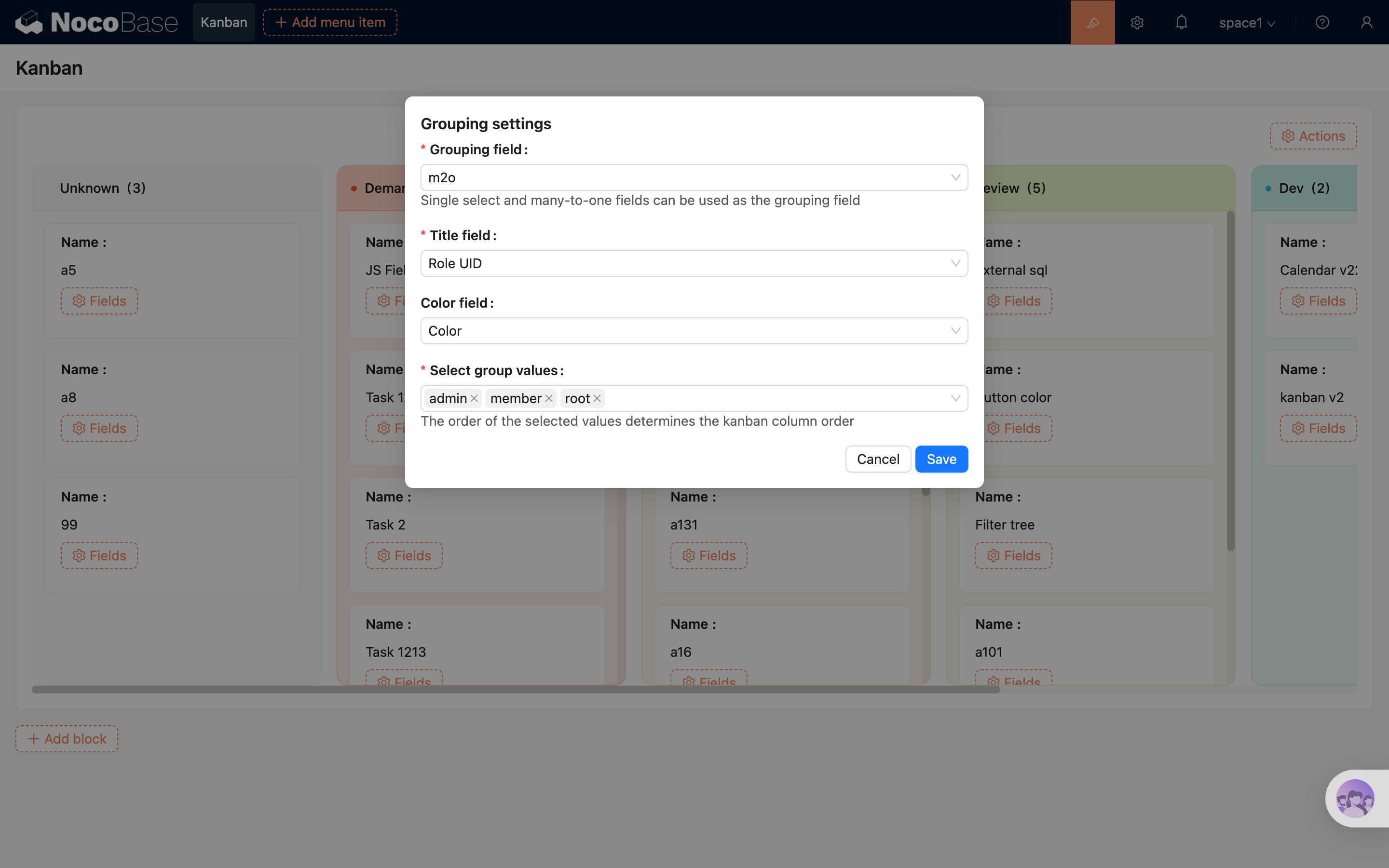
After selecting the "Kanban" block and choosing a data table, complete the grouping configuration in the popup:
- Select the "Grouping field". The Kanban block creates columns based on the values of this field.
- Select the "Grouping values" to control which columns are displayed and their order.
- To use drag-and-drop sorting, enable "Enable drag and drop sorting" and select a "Drag and drop sorting field" that matches the current grouping field.
After completing the configuration, you can create the Kanban block.
Block Settings
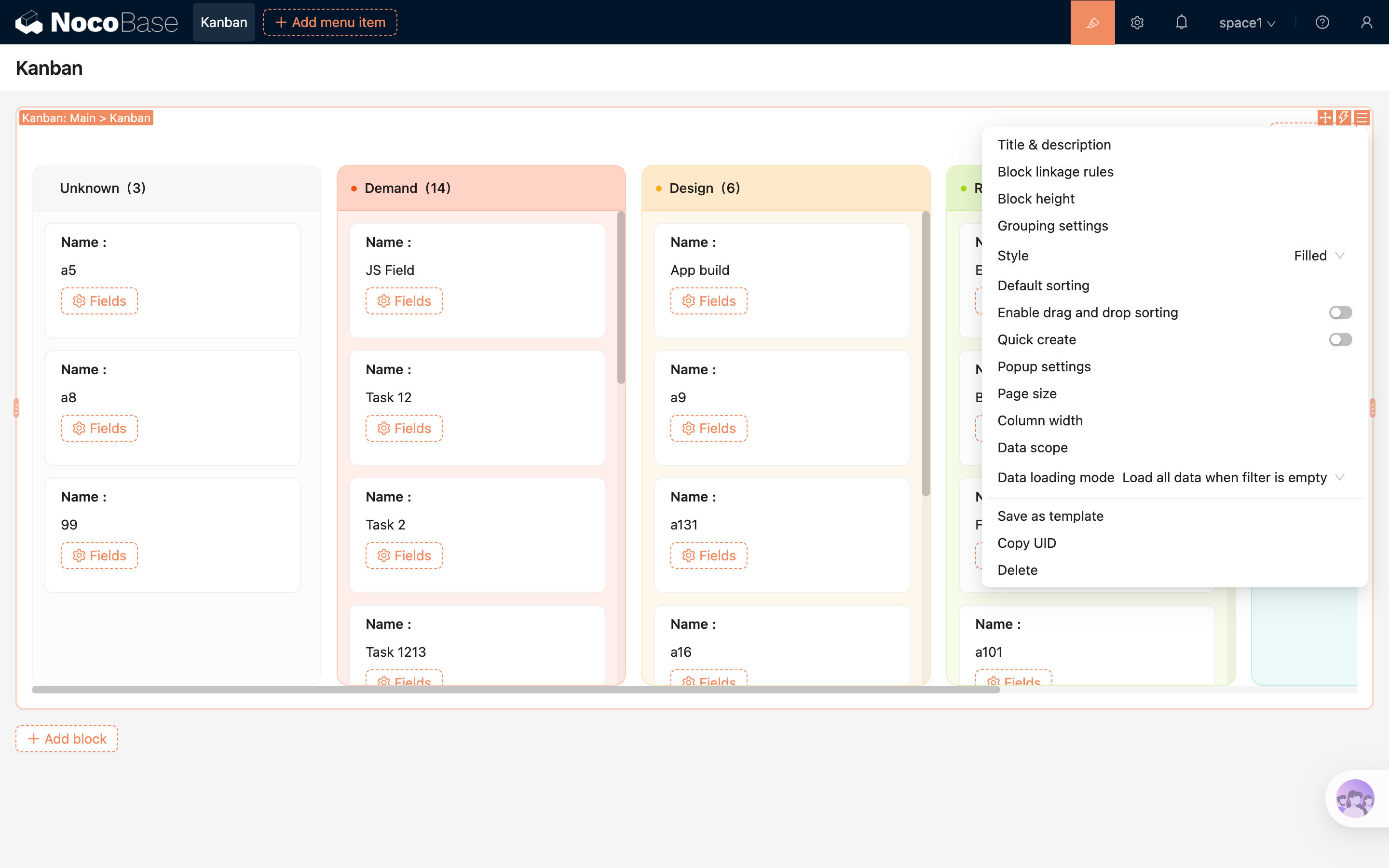
Grouping Settings
The Kanban block requires a grouping field to be specified first. Records will be distributed into different columns based on the field values.
- The grouping field supports single select fields and many-to-one fields.
- For single select fields, the column title and color reuse the label and color defined in the field options.
- For many-to-one fields, grouping options are loaded from related records.
- When the grouping field is a many-to-one field, additional configurations are available:
- Title field: Determines which related field value is displayed in the column header.
- Color field: Determines the background color of the column header and container.
- “Select grouping values” allows you to control which columns are displayed and their order.
- Records with empty grouping values will be displayed in the "Unknown" column.
.png)
Style
The Kanban block supports two column styles:
Classic: Keeps a lighter default column background.Filled: Uses the column color to render both the header and the column container background, suitable for scenarios with more distinct status colors.
.png)
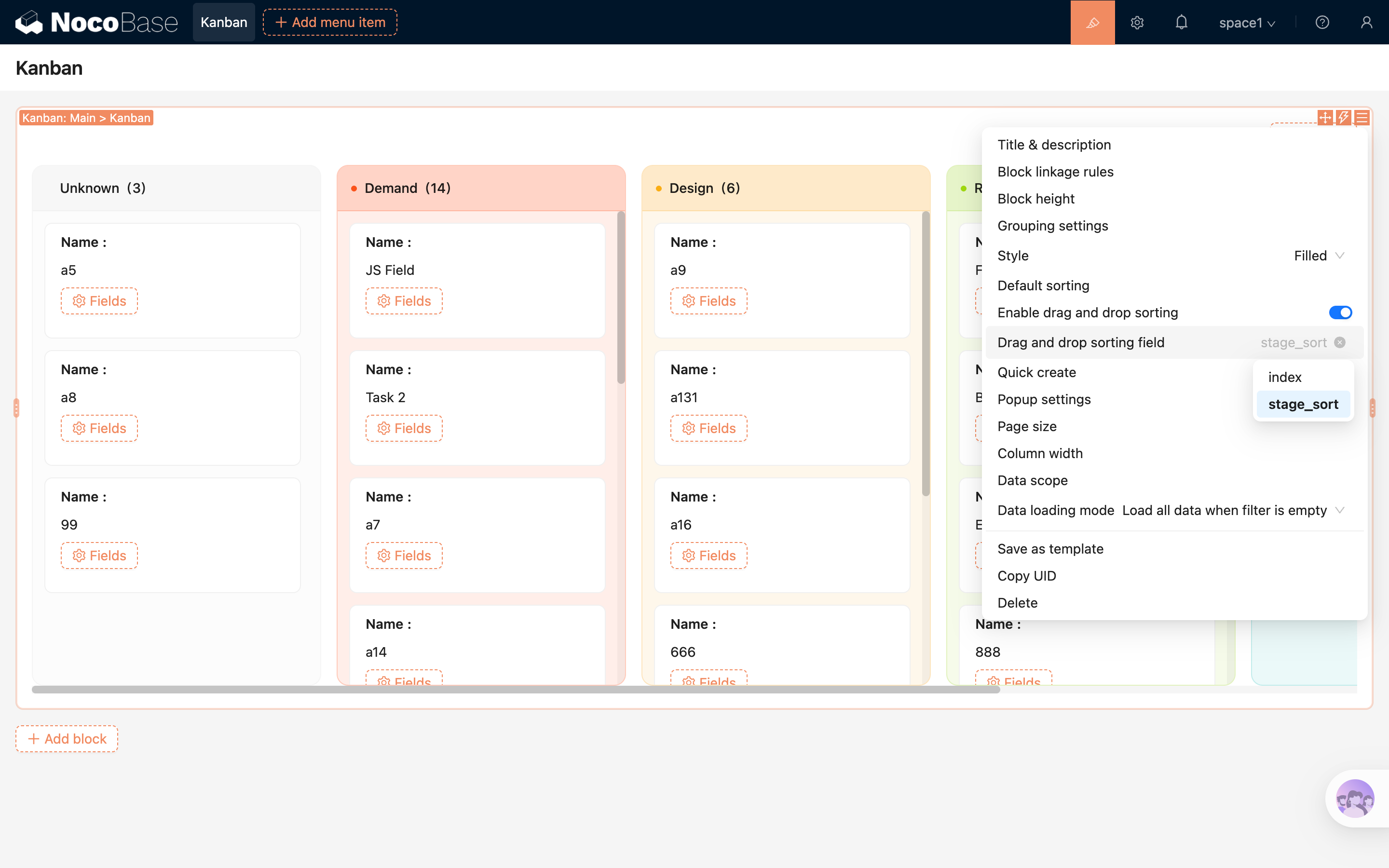
Drag-and-Drop Settings
After enabling drag-and-drop, cards can be moved directly to adjust their order.
- When “Enable drag-and-drop sorting” is turned on, you can further select a “sorting field”.
- Drag-and-drop sorting relies on the sorting field, which must be compatible with the current grouping field.
- When dragging a card to another column, both the grouping field value and the sorting position will be updated.
For more details, refer to Sorting Field
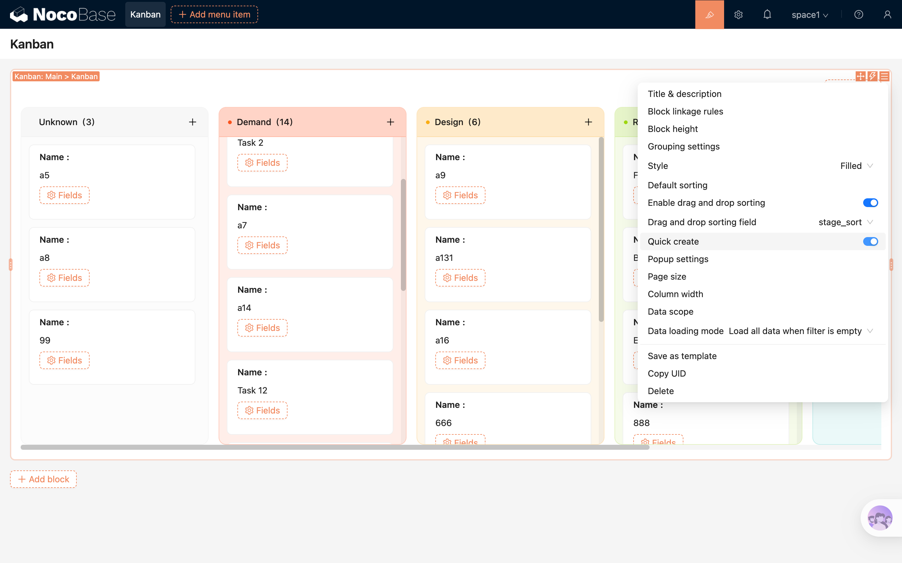
Quick Create
After enabling “Quick Create”, a plus button will appear on the right side of each column header.
- Clicking the plus button opens the create popup with the current column as context.
- The form will automatically fill in the corresponding grouping value of the column.
- If the current column is “Unknown”, the grouping field will be prefilled as empty.
Popup Settings
The block-level “Popup Settings” control the behavior of the popup opened by the quick create button in the column header.
- Configure the opening method, such as drawer, modal, or page.
- Configure the popup size.
- Bind a popup template or continue adding block content within the popup.
Items per Column
Controls the number of records initially loaded in each column. When there are many records, more can be loaded by scrolling.
Column Width
Sets the width of each column, allowing adjustments based on card content density.
Data Scope
Limits the range of data displayed in the Kanban block.
For example: only show tasks created by the current user, or only show records under a specific project.
For more details, refer to Data Scope
Field Configuration
The Kanban card uses a detail-style field layout to display summary information of each record.
Add Fields
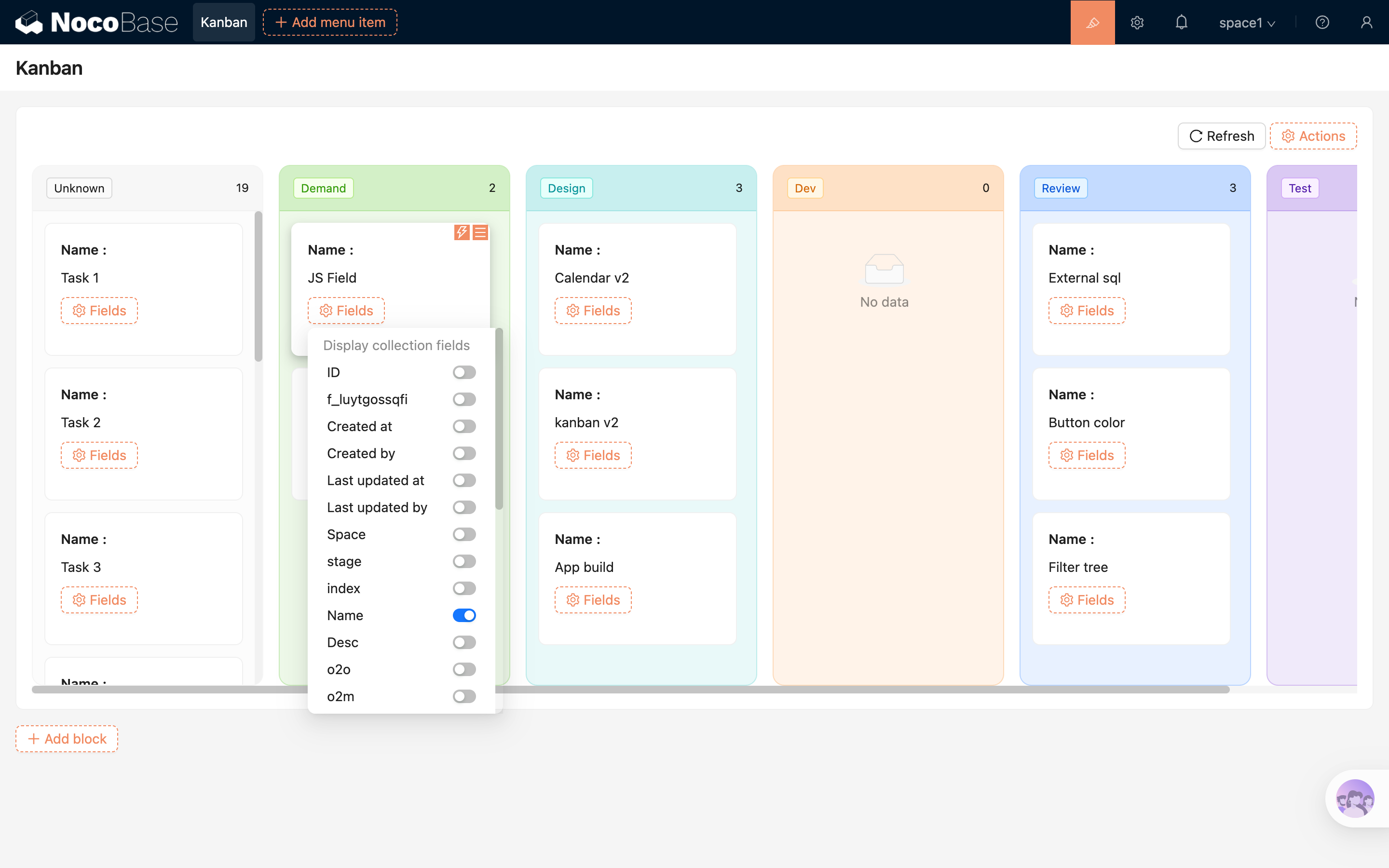
Field configuration options can refer to Detail Field
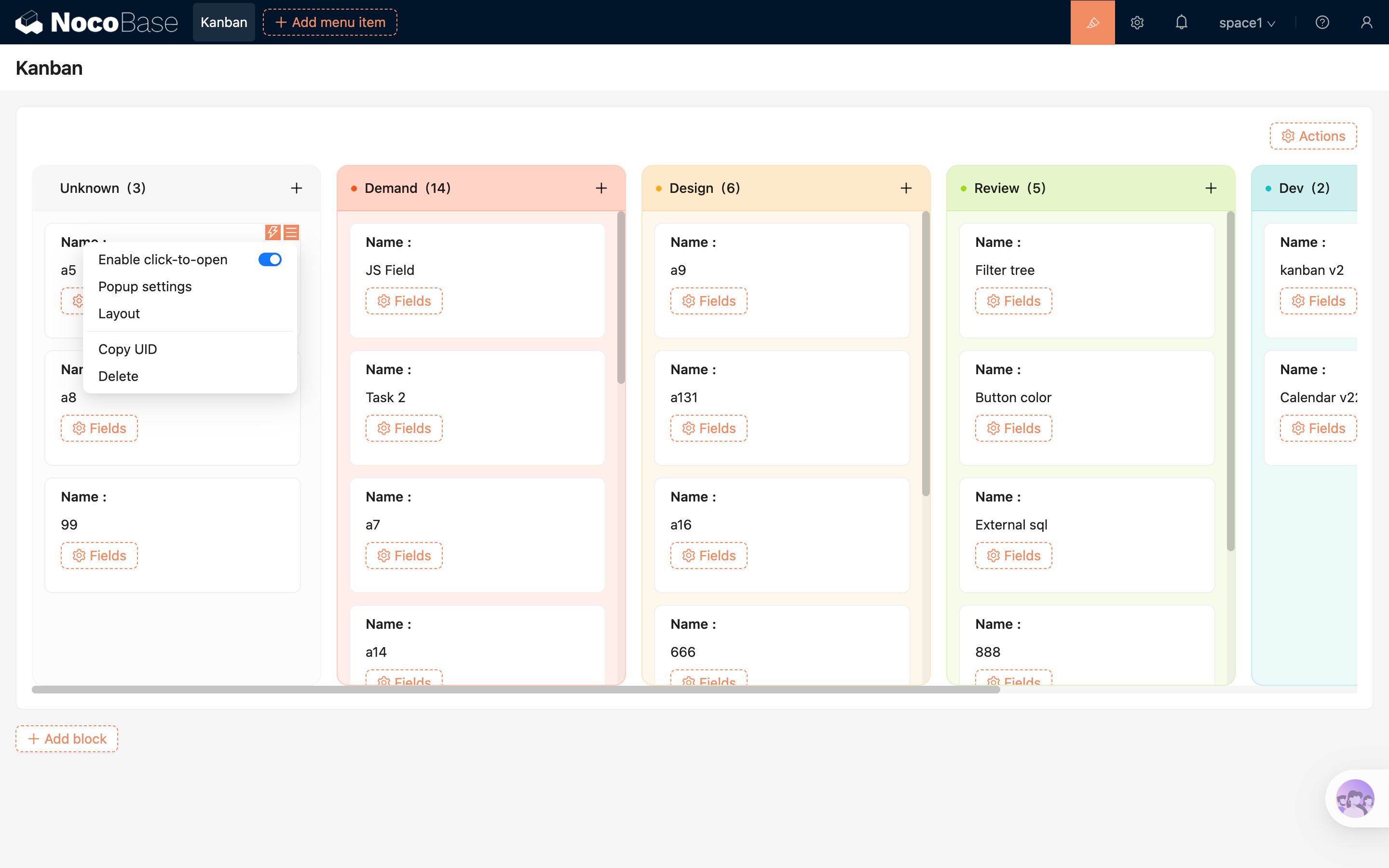
Card Settings
The card itself supports the following settings:
- Enable click to open: When enabled, clicking a card opens the corresponding record.
- Popup settings: Configure the opening method, size, and template for card click behavior.
- Layout: Adjust the display layout of fields within the card.
.png)
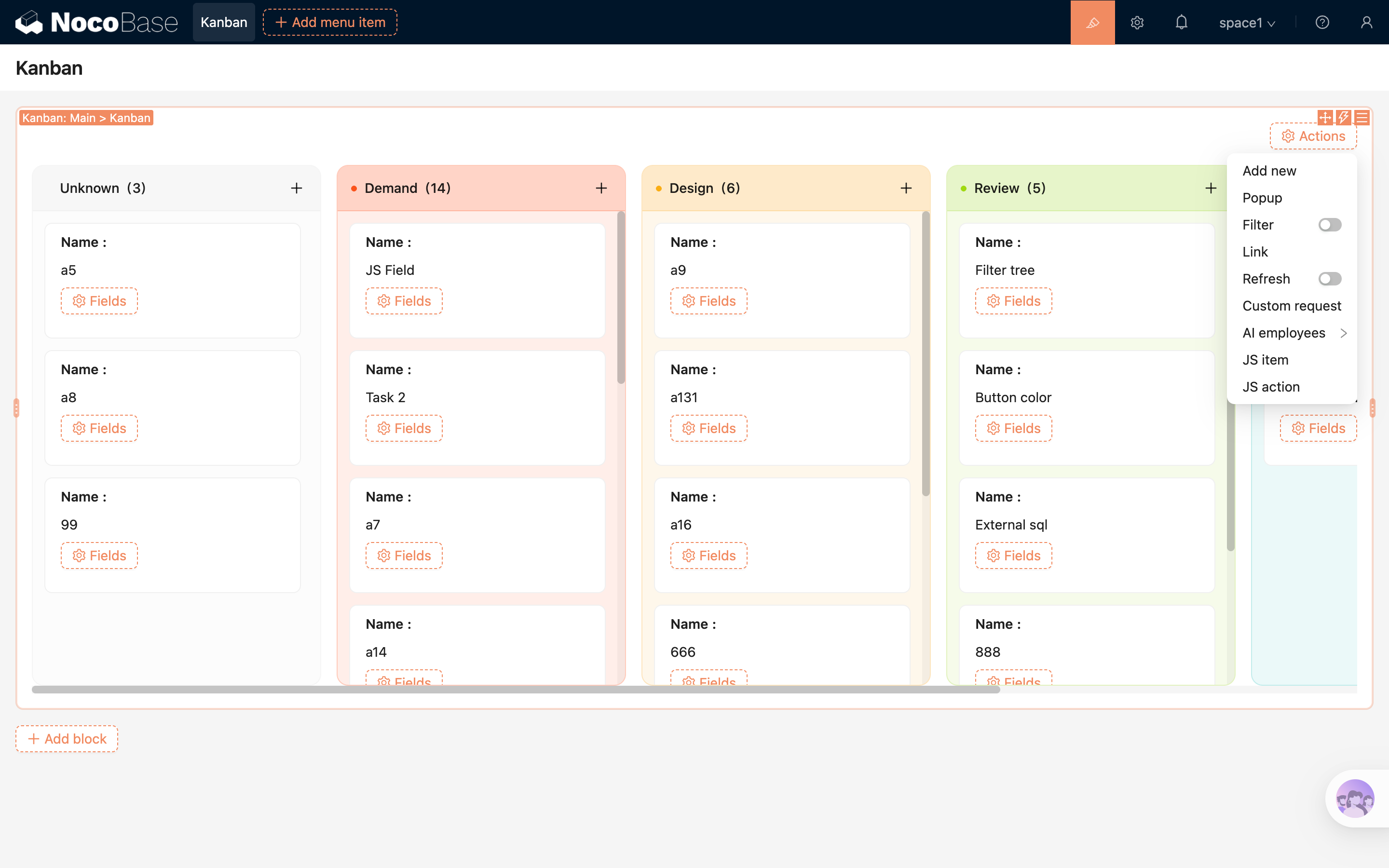
Action Configuration
The Kanban block supports configuring global actions at the top. The available action types depend on the enabled capabilities in the current environment.